What is Shinto Torii?
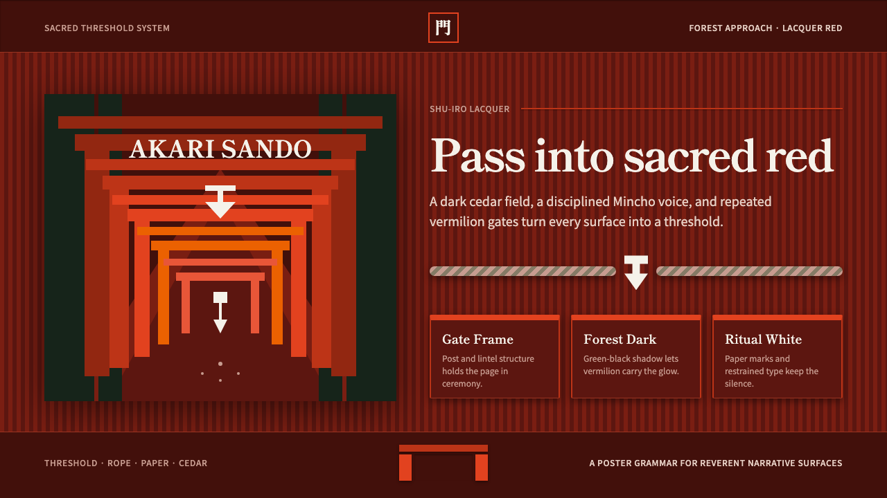
Shinto Torii holds the dark with a single sacred red — vermilion gates marking the threshold between the ordinary world and the divine.
Shinto Torii in brief
Shinto Torii draws its visual language from the gates that mark the entrance to Japanese Shinto shrines, most famously the tunnel of thousands of gates forming the Senbon Torii at Fushimi Inari Taisha in Kyoto, where lacquered vermilion posts stand shoulder to shoulder against the green-black of a cryptomeria forest. Each gate is a threshold in the most literal sense: a physical marker of the boundary between the ordinary, everyday world and a sacred space set apart from it.
The architecture is deceptively simple — a torii is fundamentally post-and-lintel construction, two upright columns supporting one or two horizontal crossbeams — and this system translates that structural simplicity directly into a visual grammar. Gates frame content the way a torii frames a shrine path; a sacred rope called shimenawa divides space the way it divides consecrated ground from ordinary ground at a shrine; folded paper streamers called shide mark points of significance the way they mark sacred trees, stones, and ropes throughout Shinto practice.
Visually, the system holds saturated vermilion — a specific shu-iro red — against deep green-black and near-black grounds, evoking the gates glowing against the dark forest behind them. Typography carries its own discipline drawn from shrine signage: a serif Mincho face for ceremonial or sacred labeling, paired with a clean sans for everyday, functional text, with layouts remaining conscious of vertical arrangement in a nod to traditional Japanese written composition.

Where does Shinto Torii come from?
Torii gates mark the entrance to Shinto shrines across Japan, and while their exact origins are debated among scholars, they are understood to predate written record and to have developed alongside Shinto practice itself as a way of physically demarcating sacred ground — the space where kami, the spirits or deities of Shinto belief, are considered present. Passing beneath a torii is understood as a ritual act of crossing from the profane into the sacred, and shrine visitors traditionally bow before passing through.
The most iconic expression of this system is Fushimi Inari Taisha, the head shrine of the Inari network — Inari being the kami associated with rice, fertility, and prosperity, whose worship spread through a network of thousands of affiliated shrines across Japan. At Fushimi Inari, individual donors, historically merchants and businesses seeking favor for prosperity, funded the construction of gates as offerings, and over centuries this practice produced the famous tunnel of thousands of closely spaced vermilion torii winding up the mountain behind the main shrine — the Senbon Torii, meaning roughly a thousand gates, though the actual count runs into the many thousands.
A second major site associated with this aesthetic is Itsukushima Shrine on the island of Miyajima, whose iconic torii appears to float on the water at high tide, framed against the sea and mountains beyond. The shrine complex, with its pier-like buildings built out over the tidal flat, demonstrates the same post-and-lintel vermilion vocabulary applied at monumental architectural scale rather than in the repeated small gates of Fushimi Inari.
The maintenance and use of these gates rests with two distinct traditions of craft. The kannushi, Shinto priests, oversee the ritual and liturgical life of the shrine — the ceremonies, the purification rites, the ongoing relationship between the shrine and its kami — while the miyadaiku, specialist shrine carpenters trained in a distinct joinery tradition passed down through apprenticeship, are responsible for the physical construction and periodic reconstruction of shrine buildings and gates, since wooden torii are re-lacquered and, at many shrines, entirely rebuilt on a fixed cycle to keep the vermilion finish and the structure itself perpetually fresh rather than allowing it to age and decay in place.
What defines the Shinto Torii look?
Color
A single saturated vermilion — the specific shu-iro red used on shrine gates — dominates against deep green-black or near-black grounds evoking a forest at dusk. This is a two-tone discipline at heart: one sacred red held against near-darkness, with white appearing only in small, significant amounts for shide paper and ceremonial accents.
Post-and-Lintel Framing
The torii's structural logic — two verticals supporting one or two horizontals — becomes a compositional device for framing any content. A gate shape marks a threshold or entry point, echoing the ritual function of passing from ordinary space into a marked, significant one.
Shimenawa Division
The sacred rope used to demarcate consecrated ground translates into a thick, rope-like divider used to separate sections of content, distinct from a plain thin rule. Where it appears, it signals a boundary of significance, not merely a visual break.
Shide Markers
The zigzag-folded white paper streamers used to mark sacred objects become a small, angular white accent motif, reserved for calling out points of particular significance — a highlighted item, a notable callout — against the surrounding red and dark grounds.
Typography
A serif Mincho-style face is reserved for ceremonial or significant labeling, while everyday functional text uses a clean sans, mirroring the mix of formal calligraphy and plain signage found at actual shrines. Layouts stay conscious of vertical arrangement, a nod to traditional Japanese written composition even in horizontal digital contexts.
Repetition and Procession
Where a single gate marks one threshold, the Senbon Torii's repeated arcade of gates suggests procession and accumulation — many small offerings forming one continuous path. This translates into repeated framing devices marching in sequence, suggesting a journey through content rather than a single static view.
Darkness as Ground
The forest backdrop behind shrine gates is deep and near-black rather than neutral gray, giving the vermilion its glowing intensity by contrast. This system favors a genuinely dark ground over a merely dim one, since the drama of the red depends on real darkness surrounding it.

Who shaped Shinto Torii?
The nationwide network of shrines dedicated to Inari, the kami of rice, fertility, and prosperity, headed by Fushimi Inari Taisha in Kyoto, which grew over centuries through donor-funded gate construction into the famous thousands-strong Senbon Torii tunnel that defines this aesthetic's most iconic image.
Shinto priests who oversee the ritual, ceremonial, and liturgical life of a shrine, the kannushi maintain the ongoing relationship between the shrine and its enshrined kami, and their ceremonial practice — purification rites, seasonal festivals — shapes the significance attached to gates, ropes, and paper markers.
Specialist carpenters trained in a distinct joinery tradition passed down through apprenticeship, the miyadaiku are responsible for the physical construction and periodic rebuilding of shrine gates and structures, ensuring the vermilion lacquer finish remains vivid rather than aging in place.
How do you use Shinto Torii today?
This style communicates threshold, significance, and the marking of a boundary between the ordinary and the set-apart, and it works best whenever a product wants a moment to feel deliberately entered rather than casually encountered.
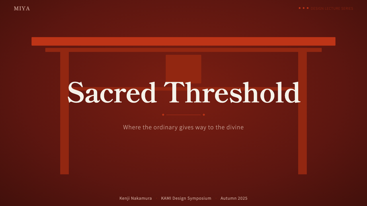
For presentation slides, the aesthetic gives cover pages real drama: a deep green-black or near-black ground with a single vermilion gate-shaped frame around the title, evoking the moment of passing beneath a torii. Content slides can use the gate motif to frame section introductions specifically — reserving it for genuine transitions rather than every slide — while a shimenawa-style rope divider marks major section breaks rather than minor ones.
For web interfaces, the style suits onboarding flows, milestone celebrations, or premium-tier gating, where the metaphor of crossing a threshold into a marked space maps naturally onto crossing into a new account state or a higher subscription tier. A dark, near-black background with vermilion used only for the primary call to action creates the same glowing-against-darkness effect the gates achieve in a forest, and shide-style white accents work well as small badges marking newly unlocked or highlighted items.
For editorial and marketing content, the style suits travel writing, cultural storytelling, and narratives about tradition, ceremony, or heritage. A gate-shaped frame around a feature image signals significance without needing explanatory text, and vertical typographic elements — even small ones — nod to the tradition's written conventions in a way horizontal-only layouts cannot.
The most common mistake is spreading vermilion too widely across a composition, treating it as a general accent color rather than the single, sacred note it is meant to be. The style depends on scarcity: red glows precisely because it appears against overwhelming darkness in small, deliberate amounts, and diluting it into a broader palette collapses that contrast entirely.
Shinto Torii — FAQ
Why is only one red used instead of a range of warm tones?
The specific shu-iro vermilion used on shrine gates is a fixed, recognizable color with its own cultural weight, and the entire aesthetic depends on that single, consistent red repeating across every gate and marker. Introducing a range of warm tones would dilute the recognizability and sacred specificity that the color carries.
How dark should the background actually be?
Genuinely dark — near-black or deep green-black rather than a mid-tone gray. The vermilion's glowing quality depends on real contrast with true darkness; a merely dim or muted background weakens the effect and makes the red look flat rather than luminous.
Is the gate motif meant to be used on every section or just key transitions?
Just key transitions. A torii marks a specific, significant threshold, not a routine divider — using the gate shape for every section break dilutes its meaning into decoration. It should be reserved for genuine moments of entry: a new chapter, a milestone, a tier unlock.
What typography choices reinforce this aesthetic best?
A serif Mincho-style face for ceremonial or significant labels, paired with a clean sans for everyday text, mirrors the actual mix found on shrine signage. Awareness of vertical composition, even in small typographic details, reinforces the connection to traditional Japanese written convention more than color or motif alone can.
Can this style work for casual, everyday consumer products?
It is better suited to moments of significance than routine, everyday interactions. Because the entire visual grammar is built around marking a threshold as sacred or set apart, applying it to mundane, high-frequency interface elements dilutes its impact — it works best reserved for onboarding, milestones, or premium moments rather than everyday UI chrome.
Related design styles
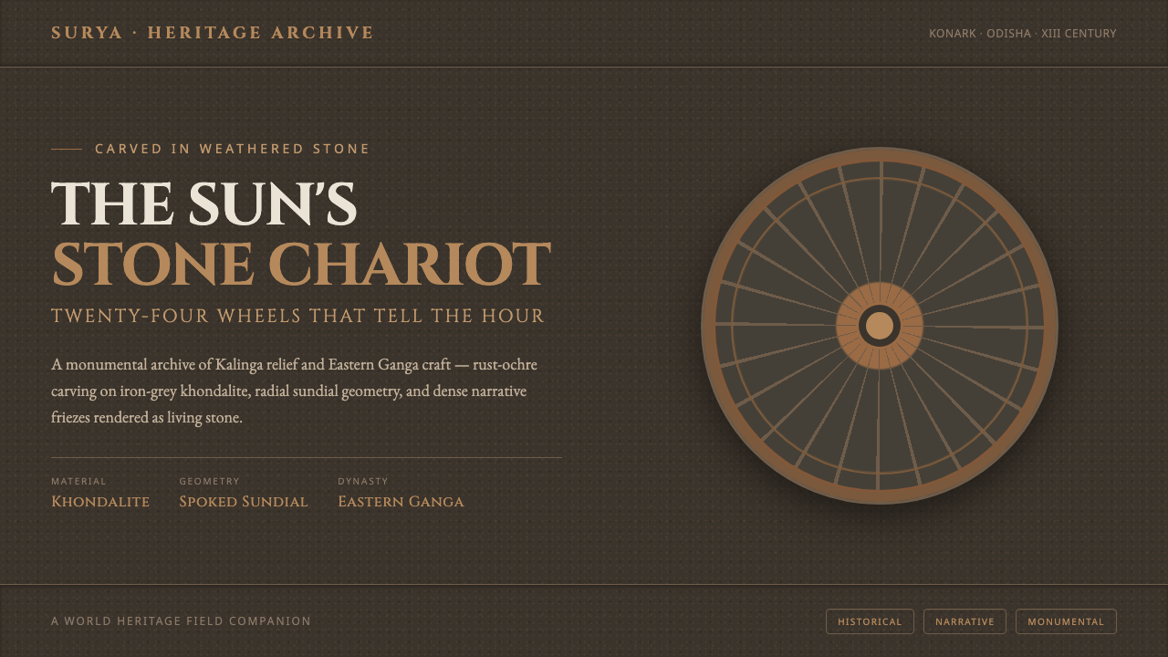 Konark Sun Temple WheelHeavy as carved stone. Rust-ochre sundial wheels and Cinzel inscription on ir…
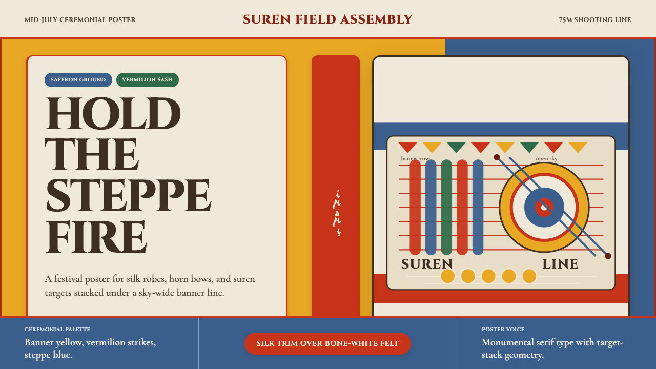 Mongolian Naadam ArcheryFestival heat at full draw. Saffron ground, vermilion trim, suren circles.
 Zoroastrian Fire TempleSacred fire in stone darkness. Cinzel capitals, ember orange, and gold relief…
 Autumn Momiji 紅葉Stillness catches fire. Momiji gradients burn against chestnut timber and wid…
 Mongolian Nomadic SteppeSteppe memory in jewel tones. Blood-red felt, saffron, indigo, and bordered u…
 Aboriginal Wandjina KimberleyAncestral presence in stone. Chalk white haloes and red ochre outlines sit on…