Design style guide设计风格指南
What is Mongolian Naadam Archery?什么是 Mongolian Naadam Archery?
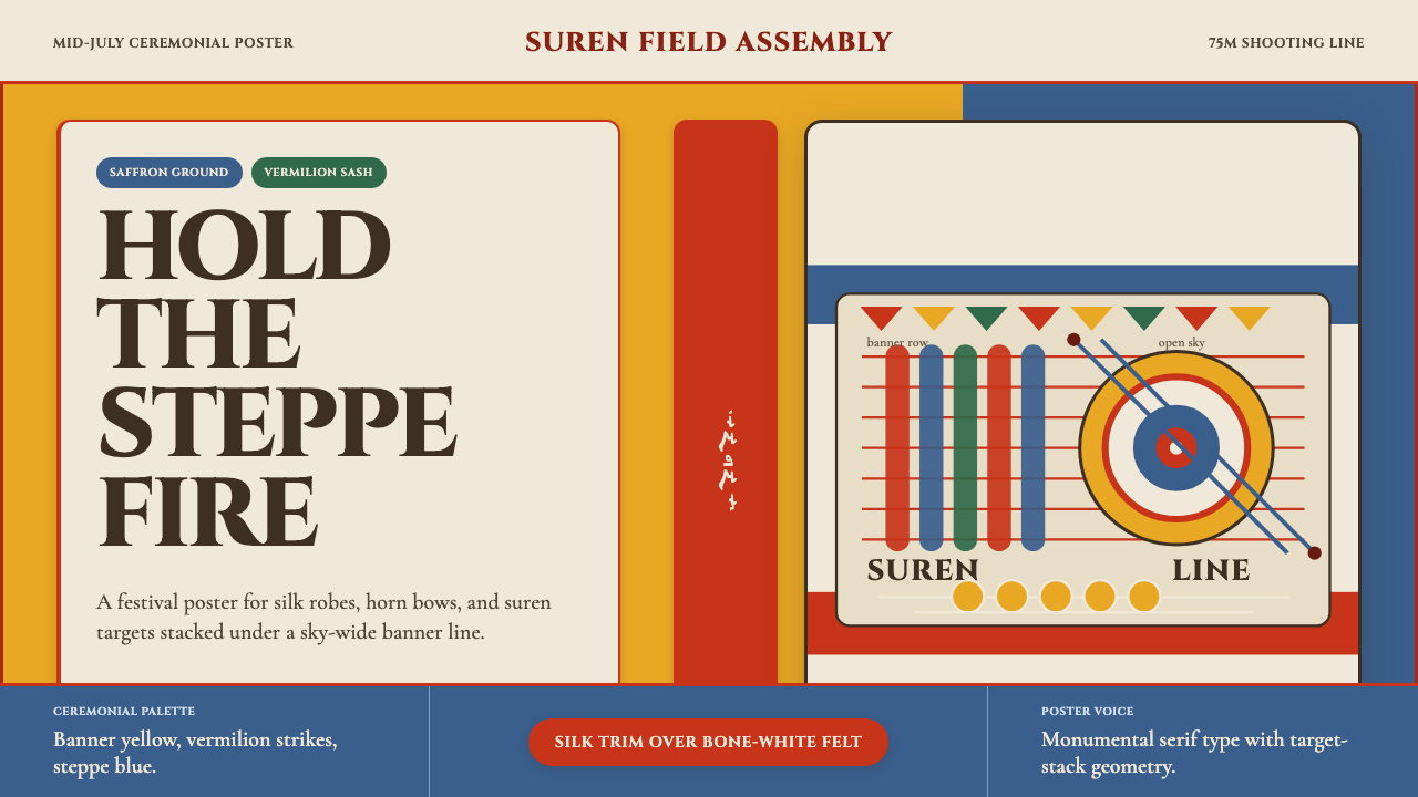
Mongolian Naadam archery translates the visual thunder of the steppe's oldest festival — saffron grounds, vermilion strikes, and bone-white felt — into a design system built for ceremony and impact.那达慕射箭将草原最古老节庆的视觉雷鸣——藏红花黄底、朱红点睛、骨白毡面——凝结成一套为仪典与冲击力而生的设计语言。
Mongolian Naadam Archery in briefMongolian Naadam Archery 速览
Mongolian Naadam archery is a design aesthetic drawn from the visual spectacle of the Naadam festival — the annual celebration of Mongolia's "three manly games" of archery, wrestling, and horse racing. The style captures the mid-July intensity of archers in silk deel robes drawing composite horn bows at distant suren cylinder targets, surrounded by saffron banners, vermilion-trimmed costumes, and the great open blue of the steppe sky. It is a system defined by saturated, ceremonially charged color, monumental typography, and a sense of weight that matches the gravity of a national ritual.蒙古那达慕射箭是一种从那达慕节庆视觉奇观中汲取灵感的设计美学。那达慕是蒙古"男儿三艺"——射箭、摔跤、赛马——的年度盛典。这种风格捕捉了七月烈日下的竞技场景:弓手身着丝绸长袍,挽开牛角复合弓,瞄准远处的苏仁木靶,四周是藏红花黄旗帜、朱红镶边服饰,以及草原天空的无边蓝。这是一套由高饱和度仪典色彩、纪念碑式排版与厚重分量感共同定义的系统,与国家祭典的庄严相称。
Unlike many historical design aesthetics that abstract their source into neutral geometry, this style stays close to its origins. The palette reads immediately as festive and Central Asian: a deep saffron or warm amber ground — the color of traditional Mongolian silk and Buddhist altar cloth — punctuated by vermilion trim that echoes the red sashes worn by champion archers. A steppe-sky blue provides the cooling counterweight, and bone-white felt surfaces serve as the page or canvas. Black is reserved for structural lines and high-contrast type, never used as a dominant field.与许多将来源抽象为中性几何的历史设计美学不同,这种风格始终贴近它的起源。色板直接传递出节庆感与中亚属性:深邃的藏红花黄或温暖的琥珀色底——蒙古传统丝绸与佛教祭坛布的颜色——朱红镶边在其中点睛,呼应冠军弓手腰间的红腰带。草原天空蓝提供冷静的对位,骨白毡面充当页面或画布,黑色只保留给结构线条与高对比度文字,从不作为主导底面。
The visual register is ceremonial rather than minimal. Where Bauhaus removes ornament, Naadam archery embraces pattern as cultural signal — the circular suren target motif, the repeating border rhythms of traditional Mongolian textile work, the layered sashes and medallions of the archer's costume. These elements are not decoration applied over a neutral grid; they are the load-bearing vocabulary of a style that communicates dignity, heritage, and festive exuberance simultaneously.这套视觉体系属于仪典气质,而非极简气质。包豪斯削减装饰,那达慕射箭则将图案作为文化信号来拥抱——圆形苏仁靶的母题、蒙古传统纺织品重复的边饰节奏、弓手服饰的层叠腰带与奖章。这些元素并非覆盖在中性网格上的装饰;它们是这种风格的承重词汇,同时传递着尊严、文化传承与节庆欢腾。
See the Mongolian Naadam Archery design system →查看 Mongolian Naadam Archery 完整设计系统 →
Where does Mongolian Naadam Archery come from?Mongolian Naadam Archery 从何而来?
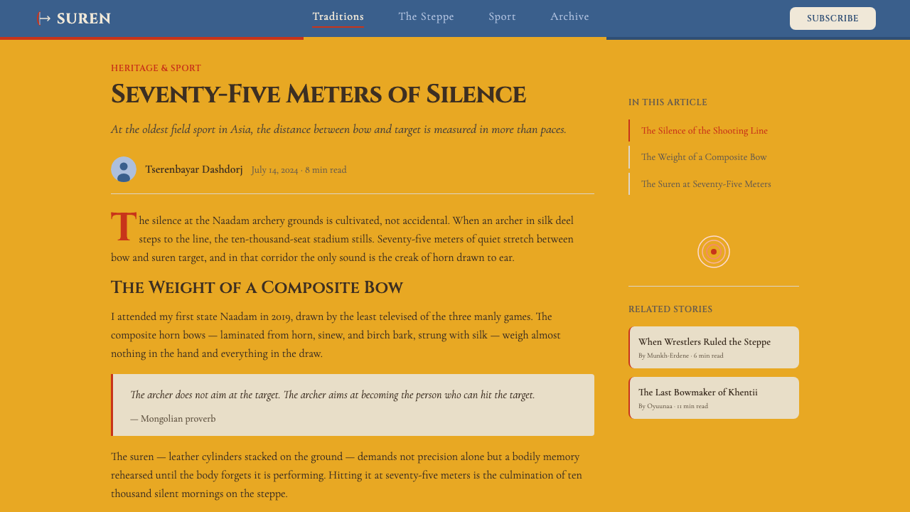
The Naadam festival — its full name, eriin gurvan naadam, means the "three manly games" — has roots that stretch back to the pre-imperial steppe cultures of Central Asia, where archery, wrestling, and horsemanship were not sports but survival skills and measures of military readiness. Annual gatherings to test these skills among tribal confederations predate the Mongol Empire of Chinggis Khan by centuries. The suren archery target — a cylinder of interlocked leather rings that emits a resonant clap when struck — is itself an ancient design, its form unchanged for more than a millennium.那达慕——全称“男儿三艺”(eriin gurvan naadam)——的根源延伸至中亚草原帝国前的游牧文化。在那个年代,射箭、摔跤与骑术不是运动,而是生存技能与军事战备的标尺。部落联盟每年举办这类技艺竞技,其历史比成吉思汗建立蒙古帝国早了数百年。苏仁弓靶——由互锁皮圈组成的圆柱形靶,中靶时发出共鸣般的清响——本身就是一件古老器物,其形态千年来未曾改变。
The festival took its modern ceremonial form in 1696, when the Qing court codified it as an official institution, embedding it within the administrative and tributary framework of Outer Mongolia. This Qing-era formalization introduced the elaborate costume protocols still visible today: the category-specific colors of archers' robes, the sashes denoting champion status, the precise sequence of ritual songs sung by judges when an arrow strikes its mark. The aesthetic of the modern Naadam visual identity is thus a layered palimpsest — ancient steppe utility beneath Qing dynastic ceremony.那达慕的现代仪典形态成形于1696年,清廷将其正式编入制度,纳入外蒙古的行政与藩属框架。这次清代的规范化引入了至今仍可见的繁复服饰礼制:弓手袍服因品级而异的颜色体系、标示冠军身份的腰带、裁判在箭中靶时依次唱颂的仪式歌谣。现代那达慕视觉识别系统的美学因此是一张层叠的书写羊皮纸——古老草原实用性之上,覆盖着清朝宫廷礼仪的华丽。
The 1921 Mongolian Revolution, led by Damdin Sükhbaatar and backed by Soviet forces, transformed Naadam from a court ritual into a national holiday, reframed as a celebration of the People's Revolution on July 11. This political recontextualization did not strip the festival of its traditional visual language; instead, it amplified it. Saffron and vermilion remained the dominant colors, but they were now read as national rather than imperial — symbols of Mongolian sovereignty and cultural continuity after centuries of Qing and later Chinese authority.1921年蒙古革命——由苏赫巴托尔领导、苏联力量为后盾——将那达慕从宫廷仪典转化为全国性节日,以7月11日人民革命纪念日的庆典形式重新界定。这次政治语境的转变没有剥去节日的传统视觉语言,反而将其放大。藏红花黄与朱红依旧是主色,但如今被读解为民族的而非帝国的——是经历数百年清治、再经历中国统治之后,蒙古主权与文化延续性的象征。
The anthropologist Caroline Humphrey and the historian Jack Weatherford have both written extensively about Naadam as a living performance of Mongolian identity. Weatherford's work on Chinggis Khan and the steppe empires situates Naadam within a much longer history of Central Asian festival culture, while Humphrey's ethnographic research on the ritual dimensions of Mongolian pastoralism illuminates how the festival's visual language functions as more than spectacle — it is a seasonal renewal of social bonds and cosmological order. The design aesthetic that draws on Naadam is therefore not simply ethnic pattern-borrowing; it is an engagement with one of the world's most continuous festival traditions.人类学家卡罗琳·汉弗里与历史学家杰克·韦瑟福德都曾大量书写那达慕作为蒙古认同活态演绎的意义。韦瑟福德对成吉思汗与草原帝国的研究,将那达慕置于中亚节庆文化更长远的历史视野之中;汉弗里对蒙古牧业仪式维度的民族志研究,则揭示了这一节日的视觉语言如何超越景观本身,成为社会纽带与宇宙秩序的季节性更新。因此,汲取那达慕灵感的设计美学,绝不只是对民族图案的简单挪用——它是对世界上传承最为连续的节庆传统之一的深度介入。
What defines the Mongolian Naadam Archery look?Mongolian Naadam Archery 的视觉特征是什么?
Color色彩
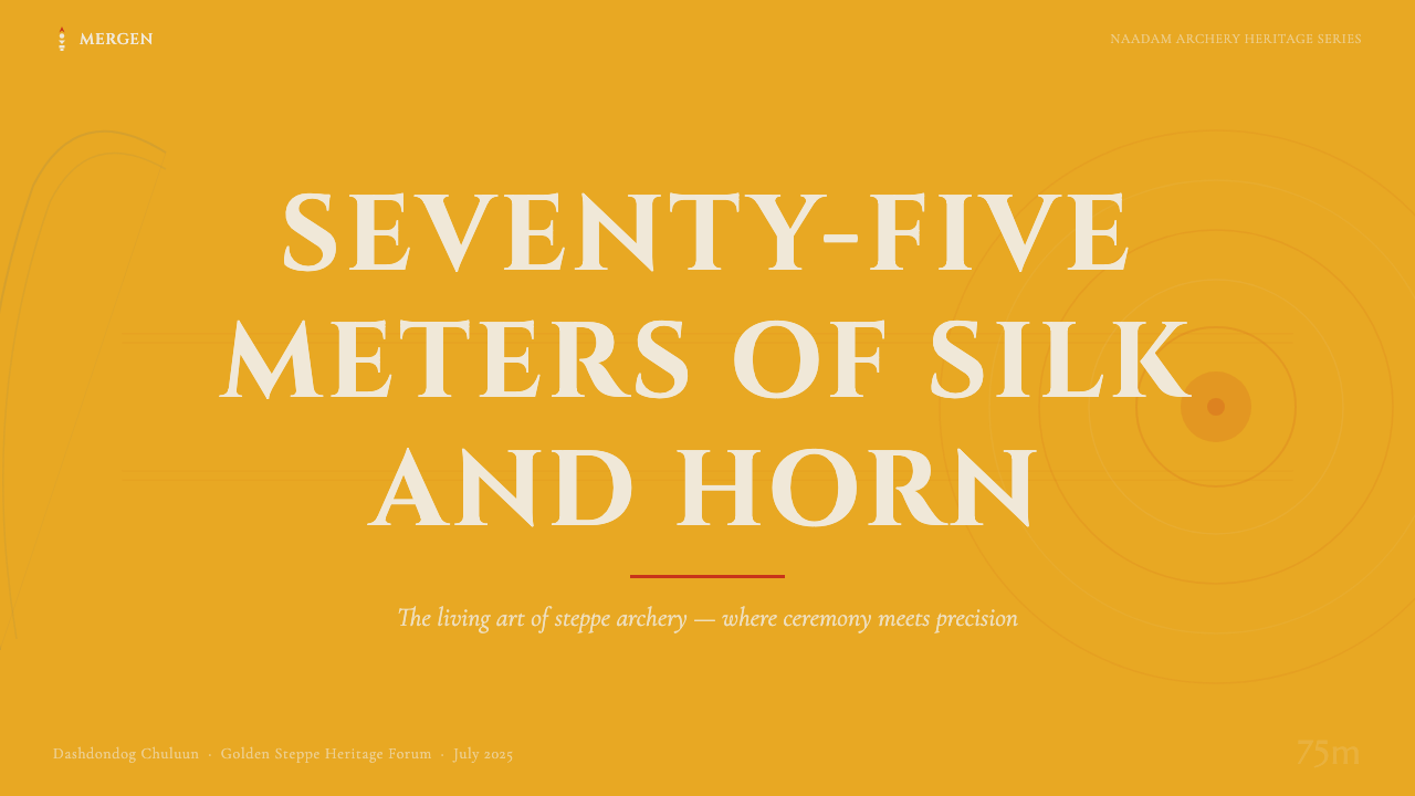
The palette is built on four primary fields: a deep saffron or warm amber ground that reads as ceremonial and solar; vermilion red deployed as accent and trim, drawn from the crimson sashes and decorative borders of the archer's costume; steppe-sky blue used for informational panels and breathing space; and bone-white felt as the neutral surface. These colors are saturated and warm by nature — they do not suggest restraint but rather festive fullness. Black serves structural and typographic functions only; it never dominates as a background. The saturation level is high throughout, mimicking the visual intensity of silk dye under July sun.色板建立在四种主要色域之上:深邃的藏红花黄或温暖的琥珀色底,传递仪典感与太阳意象;朱红作为强调色与镶边,源自弓手服饰的深红腰带与装饰边框;草原天空蓝用于信息区块与呼吸空间;骨白毡面作为中性载体。这些颜色天生饱和而温暖——它们不暗示克制,而是节庆的丰盛。黑色只承担结构与排版功能,从不作为主导底面。整体饱和度偏高,模拟七月烈日下丝绸染料的视觉强度。
Typography字体排印
Type in this system carries ceremonial weight. Display headings are monumental in scale, often set in sturdy serif letterforms that echo the carved or embossed quality of official inscription — the aesthetic of proclamation rather than conversation. Body text is set with generous leading, giving the page an open, processional quality. Contrast between heading and body is extreme: the headline towers over the content below it, in keeping with the festival's own sense of scale — the vast stadium, the 75-meter shooting range, the single archer silhouetted against sky. Decorative letterforms with geometric bracketing or slab serifs reinforce the steppe-craft quality.这套系统的字体具有仪典分量。展示性标题体量宏大,常选用厚重的衬线字形,呼应官方铭文的刻凿或压印质感——是宣告的美学,而非对话的美学。正文行距宽裕,赋予页面开阔而庄重的气息。标题与正文之间的对比极为强烈:标题高耸于内容之上,契合节庆本身的尺度感——辽阔的体育场、七十五米的射程、孤立于天空中的弓手剪影。带有几何托架或厚衬线的装饰字形进一步强化了草原工艺的质感。
The Suren Circle Motif苏仁圆靶母题
The suren archery target — a cylinder of stacked leather rings — is the visual anchor of the entire aesthetic. In two-dimensional work, the suren circle appears as a recurring motif: as section dividers, as bullet or list markers, as frame devices for featured content, and as the primary decorative unit in border patterns. The circle is solid in feel — not a mere outline — and carries a sense of depth and precision. Concentric ring compositions evoke both the physical target and the Buddhist mandala tradition that runs deep through Mongolian visual culture.苏仁弓靶——由层叠皮圈构成的圆柱——是整套美学的视觉锚点。在二维作品中,苏仁圆形作为反复出现的母题:用作章节分隔符、列表标记、特色内容的框架,以及边饰图案的基本装饰单元。这个圆形在感觉上是实心的——不只是轮廓线——并承载着深度感与精准感。同心圆构图既唤起实体靶标,也回应深植于蒙古视觉文化的藏传佛教坛城传统。
Textile Border Patterns纺织品边饰图案
Mongolian festival costume incorporates intricate bands of geometric ornament — interlocking fret patterns, diagonal step repeats, and stylized cloud and horn motifs — that run along sleeve edges, collar borders, and hem lines. In this design system, these border patterns translate into frame elements, section rules, and decorative bands that articulate the structure of a layout without interrupting its information flow. The patterns are geometric and repeating rather than figurative, making them adaptable to digital media while preserving their cultural specificity.蒙古节庆服饰融入了精细的几何装饰带——互锁回纹、斜向台阶重复、程式化云纹与犄角纹——沿袖口、领边与下摆分布。在这套设计系统中,这些边饰图案转化为框架元素、章节线条与装饰带,在不干扰信息流动的前提下清晰界定版面结构。这些图案是几何性、重复性的,而非具象性的,因而既能适应数字媒介,又能保留其文化特异性。
Depth and Layering深度与层叠
Unlike flat design systems that refuse any illusion of depth, this aesthetic uses layering expressively. A saffron ground layer, a patterned border layer, a content panel in steppe-sky blue, and a type layer in bone-white or black stack in a way that evokes the layered costume of the archer — sash over robe over underlayer. The depth is not photorealistic or shadow-based; it is felt as a sequence of ceremonial planes, each with its assigned role. This layering gives the system a sense of material richness without relying on gradients or soft shadows.与拒绝任何深度幻觉的平面设计系统不同,这套美学将层叠作为表达手段。藏红花黄底层、图案边饰层、草原天空蓝内容面板层、骨白或黑色文字层,以一种让人联想到弓手服饰层叠结构的方式叠加——腰带覆于长袍,长袍覆于内衬。这种深度不是写实的,也不依赖阴影;它被感受为一系列仪典平面的序列,每一层都有其指定的角色。这种层叠为系统赋予材质丰富感,而无需依赖渐变或柔和投影。
Ceremonial Scale仪典尺度
Everything in this system reads large. Hero compositions occupy the full width of their container; target motifs are generous in size; border bands are thick enough to register as structural rather than decorative. This is a system designed for the scale of a stadium and the drama of a national festival, not for the intimate precision of a utility interface. When applied to digital screens, this sense of scale means generous padding, large typographic measures, and a preference for one dominant visual element per section rather than a dense grid of small components.这套系统中的一切都读来宏大。主视觉构图占满容器全宽,靶标母题尺寸充裕,边饰带足够厚重,以结构性而非装饰性的方式呈现。这是一套为体育场尺度与国家节庆戏剧感而生的系统,而非为实用界面的精巧细密。应用于数字屏幕时,这种尺度感意味着宽裕的内边距、大字号排版,以及每个章节区域倾向于一个主视觉元素而非密集的小组件网格。
Warm Materiality温暖的材质感
The aesthetic suggests physical materials without literally simulating them — the warmth of undyed felt, the sheen of silk, the rough grip of horn. In two-dimensional work, this translates to textured grounds that carry a slight grain rather than clinical smoothness, to color fields that favor warmth over coolness, and to an overall sensory quality that feels handcrafted and inhabited rather than machine-produced. The materiality is implied rather than rendered; it lives in the warmth of the color choices and the density of the pattern work.这套美学暗示实物材质,却不直接模拟它们——未经染色的毡布的温度、丝绸的光泽、牛角的粗粝握感。在二维作品中,这转化为带有轻微纹理而非临床光滑的底面色域,转化为偏暖而非偏冷的色彩倾向,以及一种整体性的感官质感——它让人感受到手工与人居气息,而非机器生产的精确。这种材质感是暗示性的而非描绘性的;它存在于色彩选择的温暖与图案工作的密度之中。
See the Mongolian Naadam Archery design system →查看 Mongolian Naadam Archery 完整设计系统 →
Who shaped Mongolian Naadam Archery?谁塑造了 Mongolian Naadam Archery?
Sükhbaatar led the 1921 Mongolian Revolution that transformed Naadam from a Qing-era court institution into a national holiday celebrating Mongolian independence. As the revolution's defining hero — his equestrian statue stands at the center of Ulaanbaatar's main square — his legacy is inseparable from the festival's modern identity. The July 11 Naadam opening ceremony at the Central Stadium, with its procession of archers in traditional silk costumes, is in part a commemoration of the revolutionary founding he represents, which is why the festival's visual language carries both ancient steppe roots and modern national pride simultaneously.苏赫巴托尔领导了1921年蒙古革命,将那达慕从清朝宫廷制度转化为庆祝蒙古独立的全国性节日。作为这场革命的定义性英雄——他的骑马铜像矗立于乌兰巴托中央广场——他的遗产与那达慕的现代身份密不可分。中央体育场7月11日那达慕开幕式上,弓手们身着传统丝绸服饰列队行进,这一景象部分正是对他所代表的革命奠基时刻的纪念,这也是那达慕视觉语言同时承载古老草原根脉与现代民族自豪感的原因所在。
Weatherford's widely read work on Chinggis Khan and the Mongol Empire placed Naadam within the longer arc of Central Asian festival culture and the role of the three games in Mongol military and social organization. His research helped international audiences understand that Naadam is not a folkloric performance preserved for tourism but a living tradition whose rules, rituals, and visual language have remained substantively continuous across eight centuries of political change. This perspective — that the festival's aesthetics carry real historical weight — is foundational for anyone working with the Naadam visual system.韦瑟福德广受阅读的成吉思汗与蒙古帝国研究,将那达慕置于中亚节庆文化更长远的脉络之中,并探讨了"三艺"在蒙古军事与社会组织中的作用。他的研究帮助国际读者理解:那达慕并非为旅游业保存的民俗表演,而是一项活态传统,其规则、仪式与视觉语言在八百年政治变迁中始终保持了实质性的连续性。这一视角——节日美学承载着真实的历史分量——对任何与那达慕视觉系统共事的人来说都是根本性的。
Humphrey's ethnographic work on Mongolian shamanism, pastoralism, and ritual practice provides the deepest scholarly account of how the Naadam festival functions as a cosmological event rather than merely a sporting competition. Her research reveals the ritual logic behind the costume's color coding, the significance of the suren target's circular form, and the way that the festival's visual language enacts relationships between the human, natural, and spirit worlds. For designers working in this aesthetic, Humphrey's work is a reminder that the colors and patterns in play are not merely decorative choices but carriers of meaning with specific cultural obligations.汉弗里对蒙古萨满教、牧业与仪式实践的民族志研究,为理解那达慕作为宇宙论事件而非单纯体育竞技提供了最深入的学术阐释。她的研究揭示了服饰色彩编码背后的仪式逻辑、苏仁靶圆形的象征意涵,以及节日视觉语言如何演绎人类、自然与灵界之间的关系。对于在这套美学框架内工作的设计师来说,汉弗里的研究是一个提醒:这些色彩与图案不只是装饰性选择,而是承载着特定文化义务的意义载体。
The aduuchin — the officials who judge archery competitions and lead the ritual songs sung when an arrow strikes the suren — are not named figures in the way of individual artists or scholars, but they represent the living transmission of the festival's aesthetic protocol. The songs, hand gestures, and costume distinctions that mark an archer's achievement are collectively maintained by this officiating tradition, which functions as the living style guide for the Naadam visual system. The fact that these protocols have survived intact across Qing codification, socialist reframing, and post-1990 democratic transition testifies to the aesthetic system's resilience.那达慕的"体育评判"传统——负责裁定射箭比赛、在箭中苏仁靶时领唱仪式歌谣的官员——不是可以具名的艺术家或学者,但他们代表着节日美学规范的活态传承。标志弓手成就的歌谣、手势与服饰区分,由这一裁判传统集体维系,构成那达慕视觉系统的活态风格指南。这些规范在清廷编制、社会主义重构、1990年后民主转型中完整存续,证明了这套美学系统的韧性。
How do you use Mongolian Naadam Archery today?今天怎么用 Mongolian Naadam Archery?
Mongolian Naadam archery is one of the relatively rare design aesthetics that brings genuine ceremonial authority to digital work — a quality that most contemporary styles struggle to achieve. Applying it well requires understanding that the system's power comes from commitment to its color relationships and pattern vocabulary, not from partial borrowing. A saffron ground with vermilion trim and steppe-sky blue panels, paired with monumental type and the suren circle motif, produces an unmistakable visual signature. Diluting any of these elements — desaturating the saffron, softening the vermilion, replacing the circle motif with generic decoration — collapses the system back into generic ethnic-adjacent pastiche.蒙古那达慕射箭是为数不多能为数字作品带来真正仪典权威感的设计美学之一——这是大多数当代风格难以企及的品质。正确应用它,需要理解这套系统的力量来自对色彩关系与图案词汇的全心投入,而非局部挪用。藏红花黄底配朱红镶边与草原天空蓝区块、辅以纪念碑式排版与苏仁圆形母题,能够产生一种无可混淆的视觉签名。一旦削弱其中任何元素——降低藏红花黄的饱和度、柔化朱红、以通用装饰替代圆形母题——整个系统就会坍塌回泛化的「民族风邻近」仿制品。
For presentation slides, this aesthetic excels on cover and chapter-opening pages where maximum visual impact is required. A full-bleed saffron ground with a large suren circle in bone-white, a vermilion decorative border band, and a monumental headline in a sturdy serif creates an opening that reads as both prestigious and specific. Content slides work best when they pull back from the full intensity — steppe-sky blue panels on a lighter ground, with the suren circle reduced to a subtle list-marker or section divider, give the content room to breathe while maintaining the palette. Data slides benefit from the system's ceremonial quality: bars and charts colored in the primary palette take on a trophy-like quality, appropriate for any context where results are being honored rather than merely reported.对于演示文稿,这套美学在需要最大视觉冲击力的封面页与章节首页上表现尤为出色。满版藏红花黄底,叠加骨白大苏仁圆形、朱红装饰边饰带,配以厚重衬线体的宏大标题,创造出一个兼具威望感与辨识度的开场。内容页则适合从全强度退一步——在较浅的底面上以草原天空蓝面板承载内容,苏仁圆形缩减为微妙的列表标记或章节分割线,让内容有空间呼吸,同时维持整体色调。数据页从系统的仪典气质中获益:以主色板着色的柱状图与图表呈现出奖杯般的品质,适用于任何以荣耀而非单纯汇报成绩为目的的场景。
For web interfaces and dashboards, the aesthetic is well-suited to cultural institutions, heritage brands, sports organizations, and any product that wants to communicate both festivity and gravitas. The approach requires a strict hierarchy: the saffron ground is reserved for hero sections and major feature blocks; steppe-sky blue and bone-white handle the informational load. Navigation should be typographically bold, with generous sizing and the suren motif used sparingly as a wayfinding element. Card components work well with a slight warm-ground fill and a vermilion or steppe-blue border accent — never a generic drop shadow. Pricing and tier pages suit the system's sense of ceremony: tier names set in large, weighty type over saffron grounds communicate distinction in a way that generic pricing grids cannot.对于网页界面与仪表板,这套美学特别适合文化机构、文化遗产品牌、体育组织,以及任何希望同时传递节庆感与庄重感的产品。方法需要严格的层级:藏红花黄底保留给英雄区域与主要特色区块,草原天空蓝与骨白承担信息负载。导航应在排版上大胆,字号充裕,苏仁母题作为路径指引元素克制使用。卡片组件适合略带暖色底面填充,以朱红或草原蓝作为边框强调——绝不是通用的投影效果。定价与等级页面契合这套系统的仪典感:在藏红花黄底上以大字号厚重排版呈现的层级名称,传递的区分感是通用定价网格无法企及的。
For editorial and marketing work, the style's poster-like authority is its strongest asset. Full-width feature sections that alternate saffron-on-black and bone-on-saffron create a processional rhythm appropriate for long-form cultural storytelling. Marketing pages for events, festivals, or heritage products benefit from the combination of bold color and decorative border patterns: the pattern does the work of communicating "this is special" before a single word is read. When used for social media or short-form content, a single suren circle on a saffron ground with a vermilion headline is enough to establish the visual identity immediately.对于编辑与营销内容,这种风格的海报式权威感是其最强资产。藏红花黄底黑字与骨白底藏红花黄字交替的全宽特色章节,创造出一种适合长篇文化叙事的庄重节奏。活动、节庆或文化遗产产品的营销页面,受益于大胆色彩与装饰边饰图案的组合:图案在第一个字被阅读之前就已完成「这是特别的」的传递工作。用于社交媒体或短内容时,藏红花黄底上一个苏仁圆形加朱红标题,就足以立刻建立视觉识别。
A common mistake when applying this aesthetic is treating the rich palette as license for visual density. The most effective Naadam-archery-derived work is actually selective about where it concentrates pattern and color. An entire screen covered in repeating geometric border patterns reads as wallpaper, not ceremony. The authentic festival aesthetic places the patterned ornament at borders and transition points — the edges of a costume, the lip of a tent, the frame of a banner — while the center field remains relatively open and focused on the primary content. Designers should reserve the full saffron-vermilion-blue intensity for one or two moments per layout and allow the rest to breathe in neutral bone-white or open sky.应用这套美学时最常见的错误,是将丰富的色板理解为视觉密度的许可证。最有效的那达慕射箭派生作品,实际上对图案与色彩的集中点是有选择性的。一整屏重复几何边饰图案读来像壁纸,而非仪典。真实的节庆美学将图案装饰集中于边界与过渡点——服饰的边缘、蒙古包的门沿、旗帜的框架——而中心区域保持相对开阔,聚焦于主要内容。设计师应将藏红花黄—朱红—天空蓝的全强度时刻保留给每个版面的一两处,让其余区域在骨白或开阔的天空色中自然呼吸。
See the Mongolian Naadam Archery design system →查看 Mongolian Naadam Archery 完整设计系统 →
Mongolian Naadam Archery — FAQMongolian Naadam Archery · 常见问题
Is this aesthetic too culturally specific for global audiences?这套美学对于全球受众来说是否过于文化特异?
Cultural specificity is precisely what makes this aesthetic powerful rather than generic. The saffron-vermilion-blue palette with suren circle motifs communicates ceremony, heritage, and festive authority to audiences regardless of whether they can identify its Mongolian origins — these are warm, saturated, pattern-rich visual signals that read as celebratory and significant across cultures. The risk runs in the other direction: desaturating or simplifying the aesthetic to make it more "universal" typically strips it of everything that made it worth using in the first place. For brands or products that genuinely relate to Central Asian culture, Mongolian heritage, or nomadic traditions, the specificity is a feature, not a constraint.文化特异性恰恰是使这套美学强劲而非泛化的原因所在。藏红花黄—朱红—天空蓝配以苏仁圆形母题,无论受众是否能识别其蒙古起源,都能传递仪典感、文化传承感与节庆权威感——这些是温暖、高饱和、图案丰富的视觉信号,在不同文化中都被读解为庆典性与重要性。风险其实来自另一个方向:将这套美学去饱和或简化以求「普世化」,通常会剥去使它值得使用的一切特质。对于真正与中亚文化、蒙古文化遗产或游牧传统相关联的品牌或产品,这种特异性是优势,而非限制。
How does this style handle dark-background layouts?这种风格如何处理深色背景版面?
The canonical form is light-ground: saffron, bone-white, and steppe-sky blue are the dominant fields, with black used only structurally. A dark inversion is possible but requires careful recalibration. On a deep black or very dark navy ground, saffron functions as a powerful accent rather than a ground — it reads as lantern-light or fire, which actually deepens the ceremonial quality. Vermilion can serve as the dominant structural color in a dark version. The critical constraint is that all three primary colors — saffron, vermilion, and blue — should not appear simultaneously at high saturation against a dark ground, as this produces visual noise rather than ceremony. Choose one as foreground and use the others as secondary or structural notes.这套美学的规范形式是浅色底面:藏红花黄、骨白与草原天空蓝是主要色域,黑色只作结构性使用。深色反转版本可行,但需要仔细重新校准。在深黑或极深藏青底面上,藏红花黄作为强调色而非底面,读来如灯笼光或火光——这实际上加深了仪典气质。朱红在深色版本中可承担主导结构色的角色。关键限制是:三种主色——藏红花黄、朱红与天空蓝——不应在深色底面上同时以高饱和度出现,那样产生的是视觉噪声而非仪典感。选择一种作前景,其余作为次要或结构性音符。
How do suren circle motifs scale across different use contexts?苏仁圆形母题如何在不同应用场景中进行缩放?
The suren circle is remarkably flexible across scales. At the largest scale — as a full-bleed hero element — it anchors an entire composition and carries full ceremonial weight. At medium scale, as a section frame or featured-content medallion, it signals hierarchy and marks importance. At small scale, as a list marker or ornamental dot, it maintains the visual vocabulary without overwhelming the information density. The circle should always read as solid and purposeful rather than decorative — an outline-only version loses the weight that makes the motif work. The concentric-ring variant, where multiple ring outlines echo outward from a center, evokes the physical suren target most directly and works best at medium-to-large scale where the rings are clearly legible.苏仁圆形在不同尺度下拥有极强的适应性。最大尺度——作为满版英雄元素——它锚定整个构图,承载完整的仪典分量。中等尺度——作为章节框架或特色内容奖章——它标示层级、强调重要性。小尺度——作为列表标记或装饰点——它维持视觉词汇而不淹没信息密度。圆形应始终读来实心而有意图,而非装饰性的——纯轮廓线版本会失去使这个母题奏效的重量感。同心圆变体——多圈轮廓由中心向外扩散——最直接地唤起实体苏仁靶,在中到大尺度(各圈清晰可读时)最为有效。
What kinds of products and brands suit this aesthetic?哪类产品和品牌适合这套美学?
The aesthetic is well-suited to any context where celebration, heritage, and a sense of earned distinction matter. Natural fits include cultural institutions and museums working with Central Asian or nomadic collections; sports organizations and events, particularly those celebrating athletic achievement or national competition; heritage food and beverage brands; luxury goods that want to signal non-Western cultural provenance; and festival or event brands of any kind. It is less suited to contexts demanding clinical neutrality — healthcare, financial compliance tools, or analytical software where the palette's warmth and festive associations would actively undermine trust. Products that need to appear lightweight or playful will also find the system's ceremonial weight a poor match.这套美学适合任何庆典感、文化遗产感与应得荣誉感至关重要的场景。天然契合的对象包括:与中亚或游牧藏品相关的文化机构与博物馆;体育组织与赛事,尤其是庆祝运动成就或民族竞技的场合;文化遗产食品与饮料品牌;希望传达非西方文化出身的奢侈品;以及任何类型的节庆或活动品牌。它不适合需要临床中性感的场景——医疗健康、金融合规工具,或分析软件,在那些场合这套色板的温暖感与节庆联想会主动损害信任感。需要呈现轻盈或趣味感的产品,也会发现这套系统的仪典分量是一个不匹配。
How should pattern and ornament be balanced against information density?如何在图案装饰与信息密度之间取得平衡?
The authentic festival model offers the clearest guidance here: pattern is always peripheral and the center is always open. In the physical festival, the decorative intensity is concentrated at the costume's edges, the banner's borders, and the tent's entryway — not spread uniformly across the entire visual field. Applied digitally, this means border patterns should frame sections rather than fill them; the suren circle should appear as a punctuation element rather than wallpaper tiling; the full-intensity saffron ground should be used for framing and transition moments rather than as a continuous background across the entire interface. The information itself — body text, data, navigation — should sit against the calmer bone-white or open sky-blue fields. When pattern and information compete for the same visual plane, both lose.真实的节庆范式在此提供了最清晰的指引:图案永远在外围,中心永远是开阔的。在实体节庆中,装饰密度集中于服饰边缘、旗帜边框与蒙古包门口——而非均匀铺满整个视觉场。应用于数字媒介,这意味着边饰图案应框定章节而非填充章节;苏仁圆形应作为标点元素而非瓷砖式铺陈;全强度藏红花黄底应用于框架与过渡时刻,而非作为整个界面的连续背景。信息本身——正文、数据、导航——应置于更平静的骨白或开阔天空蓝底面之上。当图案与信息在同一视觉平面竞争时,两者都会失败。
Related design styles相关设计风格
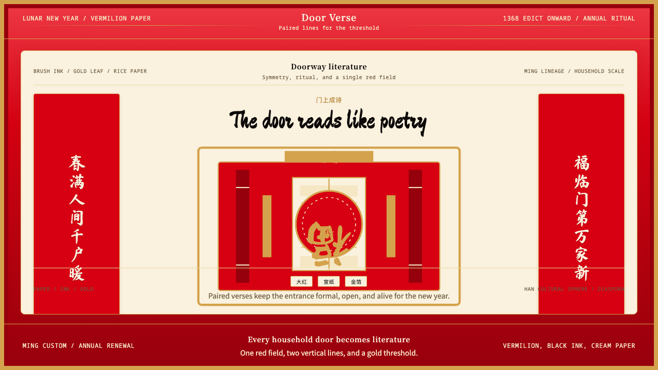 Chinese Spring Festival Red CoupletLiterature on the door. Vermilion paper, vertical pairs, and gold calligraphy.门上成诗。大红纸、竖联对称与金墨呼应。
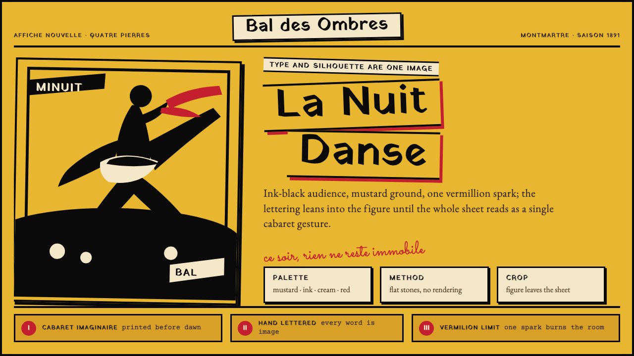 Toulouse-Lautrec Belle ÉpoqueNight becomes gesture. Mustard ground, black silhouette, hand lettering, one…夜色化作手势:芥末底、墨黑剪影、手绘字与一抹朱红。
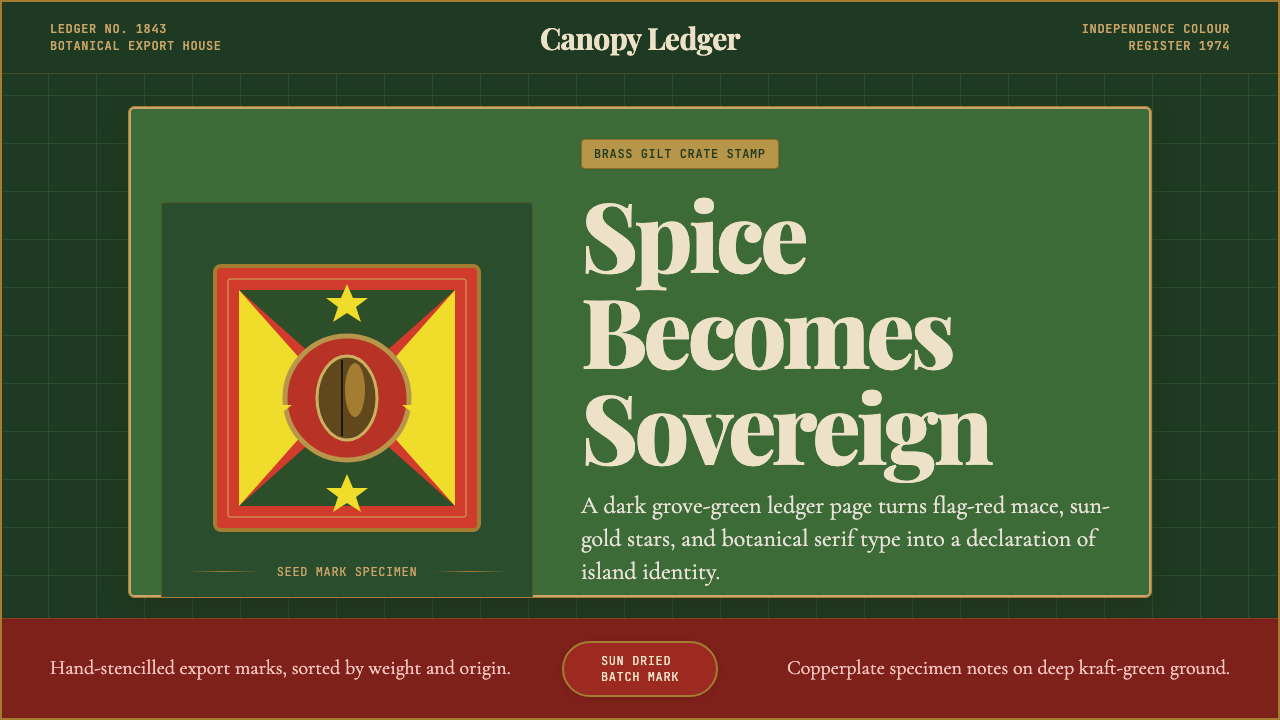 Grenadian Spice & Nutmeg FlagSpice becomes sovereign. Grove green, flag red, brass borders, and serif ledg…香料成为主权宣言:林冠绿、旗红、黄铜边框与账本衬线。
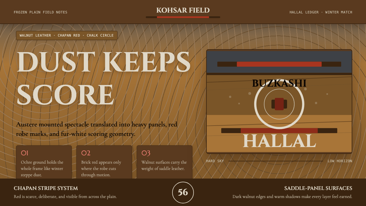 Hazara Buzkashi (Goat-Carcass Polo)The steppe endures. Ochre dust, walnut panels, and chapan-red stripes score t…草原只求持久:赭尘底、核桃皮革面板与袍红条纹定调。
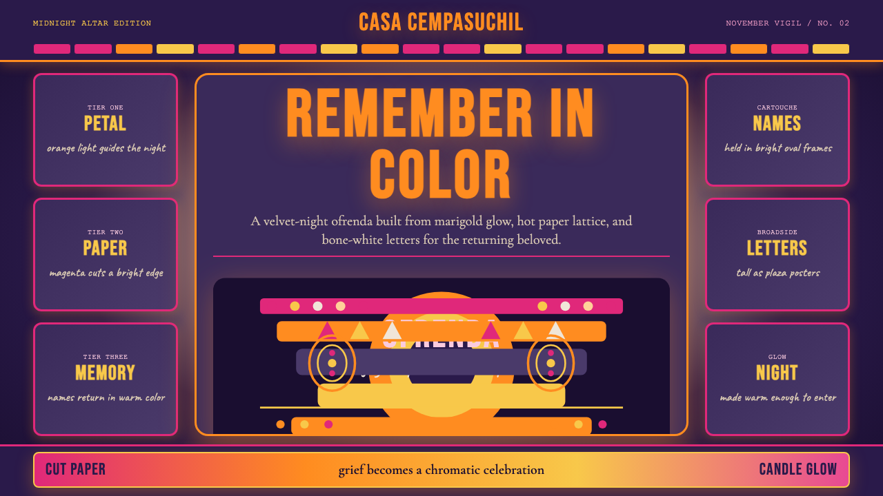 Mexican Día de Muertos (Marigold Ofrenda)Joy outruns mourning. Marigold orange and magenta lattice blaze on velvet pur…喜悦胜过哀悼。丝绒紫底上,万寿菊橙与洋红剪纸燃亮。
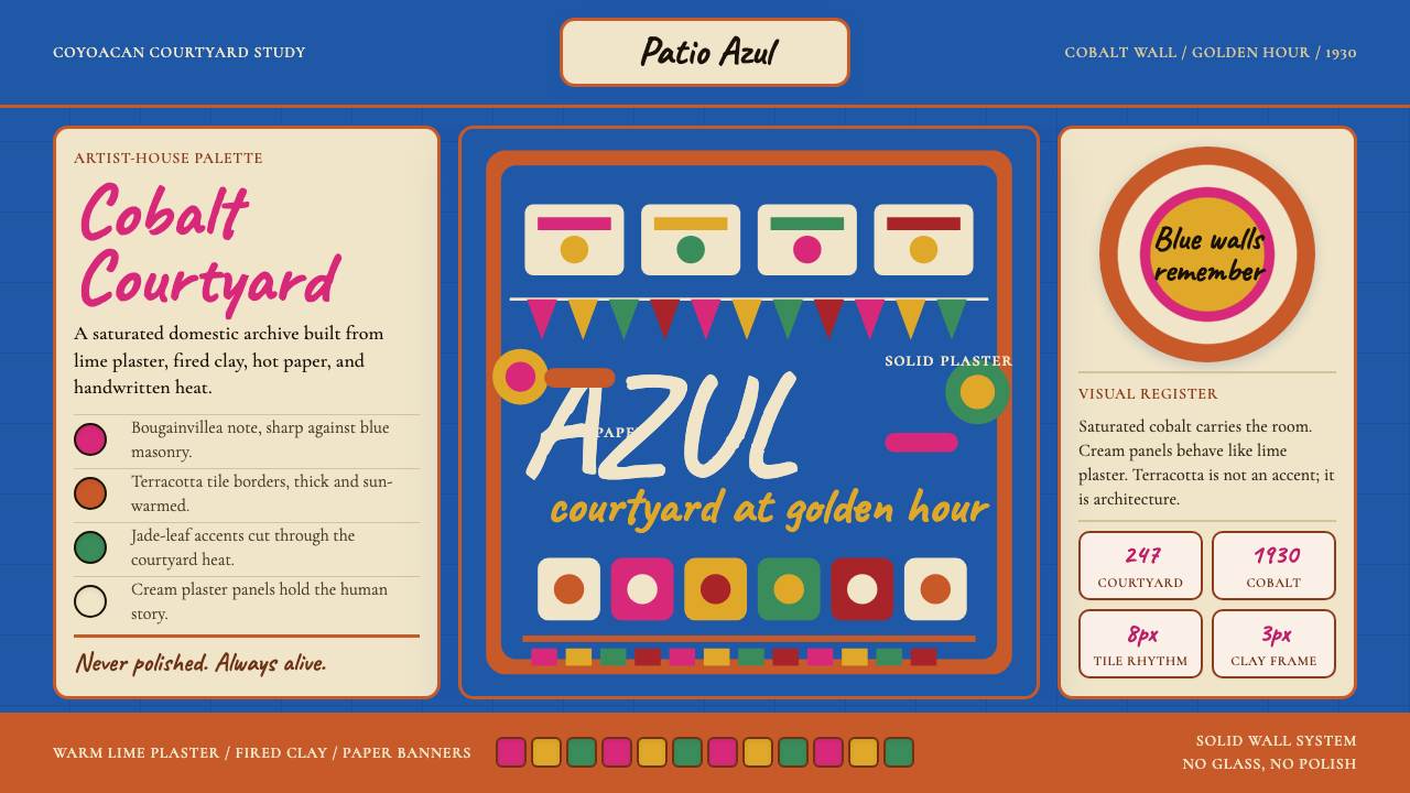 Mexican Frida Blue House (Coyoacán 1930)Maximum color, intimate walls. Cobalt, cream panels, terracotta grid, cut-pap…浓烈而私密。钴蓝墙、奶油面板、赤陶网格与剪纸节奏。