Design style guide设计风格指南
What is Hazara Buzkashi (Goat-Carcass Polo)?什么是 Hazara Buzkashi (Goat-Carcass Polo)?
Buzkashi distills the Central Asian steppe into a design language of ochre dust, chapan-red stripes, and walnut leather — austere warmth that endures because it was never decorative to begin with.布兹卡什将中亚草原提炼为一套视觉语言:赭黄尘土、袍红条纹、核桃皮革——这种粗粝的暖意之所以经久不衰,正因为它从未以装饰为目的。
Hazara Buzkashi (Goat-Carcass Polo) in briefHazara Buzkashi (Goat-Carcass Polo) 速览
Hazara Buzkashi (Goat-Carcass Polo) is a design system rooted in Central Asia's most ferocious equestrian sport — buzkashi, in which mounted chapandaz riders wrestle a headless goat carcass across frozen plains and deposit it inside a chalk circle to score. The visual language drawn from this tradition is not decorative pageantry but the raw material conditions of the game itself: ochre dust rising from cracked earth, the brick-red and dark-stripe chapan robes worn by riders, white kalpak fur caps against a leaden winter sky, and the deep walnut tones of oiled saddle leather.哈扎拉布兹卡什(山羊马球)是一套根植于中亚最激烈马术运动的设计系统。布兹卡什中,骑手(chapandaz)骑马在冻原上争夺一具无头山羊,将其掷入粉笔圈内方算得分。这一传统所衍生的视觉语言并非装饰性的仪仗,而是这项运动本身的原始物质条件:从龟裂土地上腾起的赭黄尘云、骑手身穿的砖红深条纹长袍(chapan)、铅灰冬天映衬下的白色毡帽皮毛,以及浸过油脂的马鞍散发出的深沉核桃色调。
The design system translates these steppe realities into digital surface. Color is sparse and purposeful — an ochre ground that carries the weight of dried clay, chapan-red accents that mark emphasis with the same authority as the game's chalk scoring circle, and fur-white highlights reserved for moments of maximum contrast. Texture is implied through tone rather than literal simulation: surfaces feel worn and substantial without resorting to photographic grain. Nothing in this system is applied for decoration; every element justifies its presence the way a rider justifies every piece of tack — by surviving contact with the game.这套设计系统将草原的真实质地转化为数字界面。用色克制而有目的:赭黄底面携带着干燥黏土的厚重感,袍红强调色以粉笔计分圈同等的权威感标示重点,毛白高光只在需要最大对比的时刻出现。质感通过色调而非字面模拟来暗示:界面表面感觉磨损而厚实,却不借助摄影纹理。这套系统里没有任何元素是为装饰而存在的——每个元素的出现都如同骑手的每件马具,以能否经受比赛来证明自身存在的必要。
The result is a dark interface aesthetic that reads as austere and historically grounded rather than merely brooding. It suits contexts where durability and authority matter more than warmth or approachability — a dashboard that should feel like a command post rather than a welcome mat, a product page that signals craftsmanship over friendliness. The steppe does not decorate; it endures.最终呈现的是一种深色界面美学,读来令人感受到简朴与历史根基,而非单纯的阴郁。它适合那些耐久性与权威感比温度感或亲切感更重要的场景——一个应当像指挥所而非欢迎门廊的仪表板,一个传递工艺感而非友善感的产品页面。草原不事装饰;它只求持久。
Where does Hazara Buzkashi (Goat-Carcass Polo) come from?Hazara Buzkashi (Goat-Carcass Polo) 从何而来?
Buzkashi's roots reach into the Mongol-era steppe of the thirteenth century, when mounted warriors trained for battle through equestrian games that required both individual prowess and the capacity to hold a contested object in violent, shifting conditions. The sport spread across the khanates and survived the collapse of the Mongol empire, taking root most deeply in the regions that would become Afghanistan, Tajikistan, Uzbekistan, and Kyrgyzstan. Among Hazara communities in the central Afghan highlands of Hazarajat, and on the northern plains around Mazar-i-Sharif and Kunduz, buzkashi became more than sport — it was a demonstration of masculine authority, a vehicle for political patronage, and a seasonal rite tied to the winter and spring calendars.布兹卡什的根源可追溯至十三世纪蒙古时代的草原。那时,骑马的武士通过马术游戏来训练作战能力——这些游戏要求个人技艺与在激烈混乱的争夺中守住目标物的能力并重。这项运动随着汗国版图扩展,并在蒙古帝国崩溃后留存下来,在阿富汗、塔吉克斯坦、乌兹别克斯坦和吉尔吉斯斯坦一带扎根最深。在阿富汗中部高原哈扎拉贾特的哈扎拉社区,以及马扎里沙里夫和昆都士附近的北部平原上,布兹卡什早已超越运动本身——它是男性权威的彰显,政治庇护关系的载体,也是与冬春历法相连的季节性仪式。
The Hazara people, who are among Afghanistan's Shia Muslim minority, developed their own relationship to buzkashi within a broader Central Asian equestrian culture. The game in Hazarajat took place against a backdrop of mountain winter — the visual palette of that landscape, stone grey and bone white and the dusty ochre of dried grass, became the ground register of the design system. The chapan robe, worn by riders across the region, supplied the system's accent color: a deep brick-red banded with dark stripes, sometimes reversed to dark ground with red bands, depending on the rider's provenance and the formality of the occasion.哈扎拉人是阿富汗什叶派穆斯林少数族裔,他们在更广泛的中亚马术文化中形成了自己与布兹卡什的独特关系。哈扎拉贾特的比赛在山地严冬的背景下进行——那片景观的视觉调色板,石灰色、骨白色与干草的赭黄尘色,成为这套设计系统的基底色调。整个地区骑手所穿的长袍(chapan)为系统提供了强调色:深砖红镶深色条纹,有时根据骑手出处与场合正式程度反转为深底配红条。
The sport was codified as Afghanistan's national sport in 1956 under King Mohammed Zahir Shah, who standardized some rules and introduced organized championship tournaments. This formalization did not domesticate the game — buzkashi remains violent, contested, and fiercely individual — but it brought it into contact with national identity politics. The design system draws specifically from the pre-formalization visual tradition, the game as played in Hazarajat and on the northern steppe before championship rules imposed uniformity: the informal, regional, dust-heavy aesthetic rather than any cleaned-up national spectacle.1956年,穆罕默德·查希尔·沙阿国王将布兹卡什列为阿富汗国家运动,制定了部分规则并设立正式锦标赛。这一规范化过程并未驯化这项运动——布兹卡什至今仍然激烈、充满争议且个人色彩鲜明——但它将这项运动带入了民族身份政治的视野。这套设计系统刻意取法锦标赛规则统一之前的视觉传统:在规章施加统一性之前,哈扎拉贾特和北部草原上实际进行的比赛——那种非正式的、地方性的、尘土飞扬的美学,而非任何经过整饬的国家展演。
Scholarly attention to buzkashi as a cultural form began in earnest with anthropologist G. Whitney Azoy, whose 1982 fieldwork in Afghanistan produced the landmark study treating buzkashi as a mirror of Afghan political culture — the game's chaos and its dependence on a patronage network of powerful khans providing a legible model for understanding Afghan governance. Louis Dupree and Robert Canfield contributed further ethnographic context, and Henri-Jacques Stoker documented the material culture of the chapandaz in detail. These sources establish the visual and social particulars — the clothing, the equipment, the setting, the seasonal rhythms — that underpin the design system's aesthetic decisions.人类学家惠特尼·阿佐伊(G. Whitney Azoy)于1982年在阿富汗进行的田野工作开启了学界对布兹卡什作为文化形态的系统研究,他的标志性著作将这项运动视为阿富汗政治文化的镜子——比赛的混沌状态以及它对权贵赞助网络的依赖,为理解阿富汗治理提供了清晰的模型。路易斯·杜普里和罗伯特·坎菲尔德贡献了更多民族志背景,亨利-雅克·斯托克则详细记录了chapandaz骑手的物质文化。这些资料确立了设计系统所有美学决策背后的视觉与社会细节——服饰、器具、场景与季节节律。
What defines the Hazara Buzkashi (Goat-Carcass Polo) look?Hazara Buzkashi (Goat-Carcass Polo) 的视觉特征是什么?
Color Palette色彩调板
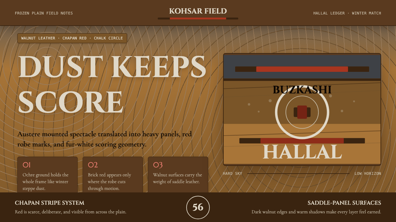
The palette is built from three steppe-derived registers. Ochre — the color of dust clouds and dried grass — serves as the primary ground, giving every surface the weight of sun-bleached earth. Chapan-red, a deep brick tone drawn from the dyed wool of traditional riding robes, functions as the accent: used sparingly, it marks emphasis with the authority of a chalk scoring circle on frozen ground. Fur-white, the near-luminous tone of kalpak fleece against a grey sky, appears only at the highest contrast points. Over all of these sits a dark field drawn from the winter sky and shadow — not a pure black but a blue-tinged deep tone that gives the system its night-steppe quality.调色板由三种草原衍生的色调构成。赭黄——尘云与干草的颜色——作为主要底色,赋予每个界面层次日晒褪色的泥土厚重感。袍红(chapan-red),从传统骑马长袍染色羊毛中提炼出的深砖红,作为强调色使用:克制出现时,它以粉笔计分圈在冻地上的权威感标示重点。毛白,毡帽羊毛在灰天映衬下近乎发光的色调,只在对比度最高的节点出现。覆盖其上的是从冬日天空与阴影中取来的深色底场——非纯黑,而是带蓝调的深沉色调,赋予整套系统夜间草原的气质。
Surface and Texture表面与质感
Surfaces in this system imply material weight without simulating it literally. The leather register — smooth, dense, slightly dulled by use — is carried through tone and value contrast rather than photographic grain. Dark panels feel like oiled walnut; lighter insets read as scraped hide. No gradients smooth the transitions between planes; instead, hard tonal steps create the sense of distinct material layers. The effect is substantial and worn, not pristine.这套系统中的界面层次暗示材料的厚重感,但并非字面模拟。皮革质感——光滑、致密、略被使用磨去光泽——通过色调与明度对比而非摄影纹理来传递。深色面板感觉像浸过油的核桃木;较浅的嵌入区读来像刮过的生皮。平面之间的过渡没有渐变来平滑;取而代之的是硬边色调阶跃,制造出不同材料层次分明的感受。整体效果厚实而磨损,而非一尘不染。
Typography Register字体排印基调
The typographic voice is dense and authoritative — weighted forms that read as carved rather than printed. Hierarchy is established through dramatic size contrast, with headers set at a scale that dominates the field and body text set compact enough to emphasize the density of information. Letter-spacing is tight in display settings, reinforcing the system's sense of compression and endurance. There is no decorative flourish in letterforms; the type should feel like the stenciled markings on equipment rather than calligraphy.字体排印的基调浓重而权威——字重感觉像刻凿而非印刷。层级通过戏剧性的尺寸对比建立:标题以主导视野的体量呈现,正文紧凑到足以强调信息密度。展示性文字的字间距收紧,强化系统的压缩感与持久感。字形没有任何装饰性花饰;文字应当感觉像设备上的模板标记,而非书法。
Structural Geometry结构几何
Layout is governed by strong horizontal banding — echoing the layered visual strata of the steppe landscape, where sky, distant ridge, midground plain, and foreground dust each occupy a distinct horizontal register. Within those bands, content is aligned to a rigorous vertical grid. Angles and diagonals appear rarely and only as deliberate directional signals, never as decoration. The overall impression is of a landscape viewed from horseback: wide, stratified, and composed under pressure.版面由强劲的水平分层主导——呼应草原景观的层叠视觉层次:天空、远山、中景平原与前景尘土各占一条清晰的水平带。在这些横带内,内容对齐严格的垂直网格。角度与斜线极少出现,仅作为蓄意的方向信号,绝非装饰。整体印象是从马背上俯瞰的景观:开阔、分层,在压力下构图。
Contrast and Emphasis对比与强调
Contrast in this system is blunt and unapologetic. The ochre-on-dark and fur-white-on-dark pairings create readings that are immediately legible at distance — a practical quality that mirrors the game's requirement that scoring events be visible across a chaotic, dust-obscured field. Chapan-red functions as a single punctuation mark: used once per composition, never distributed decoratively. When red appears, it carries authority; when it is absent, the composition reads as all structure, no commentary.这套系统的对比直接而毫不妥协。赭黄叠深色与毛白叠深色的搭配在远处即可清晰辨读——这种实用特质映照了布兹卡什的现实需求:得分事件必须在混沌尘土弥漫的赛场上一目了然。袍红作为单一的标点使用:每个构图出现一次,绝不分散装饰。红色出现时,它携带权威;红色缺席时,构图则呈现为纯结构,无任何注脚。
Depth and Layering深度与层叠
Depth is conveyed through tonal layering rather than shadow softness. Background fields sit at the darkest register; mid-ground panels lift slightly in tone like raised leather; foreground type and interactive elements are the lightest or the most saturated. Where shadows appear, they are hard and directional — the shadow of an object under a flat winter sun rather than the ambient softness of indoor light. This creates a sense of planes stacked on top of one another, visible and distinct.深度通过色调层叠而非阴影柔化来传达。背景场在最暗的调性区间;中景面板色调略微抬升,如同鼓起的皮革;前景文字与交互元素是最亮或饱和度最高的部分。阴影出现时,呈硬边且有方向感——冬日平光下物体的投影,而非室内环境光的柔和漫射。这制造出平面逐层叠放的感受,清晰可辨。
Motion and Interaction动效与交互
When the system moves, it moves deliberately and without ease curves that imply elasticity. Transitions are abrupt rather than smooth — a panel arrives, it does not glide. Hover states shift tone crisply, without bloom or glow. The interaction model mirrors the game's physics: weight, contact, resolution. Nothing lingers or fades out gracefully; elements complete their transitions and hold. The overall effect is that the interface feels responsive in the sense of consequential — actions land with perceptible weight.这套系统的动效果断而不暧昧,不使用暗示弹性的缓动曲线。过渡是突然的而非平滑的——面板到位,而非滑入。悬停状态干脆地切换色调,没有光晕或发光效果。交互模型映照了布兹卡什的物理感:重量、接触、决断。没有任何元素优雅地残留或淡出;元素完成过渡后便保持。整体效果是:这个界面的响应感意味着后果——操作以可感知的重量落定。
Who shaped Hazara Buzkashi (Goat-Carcass Polo)?谁塑造了 Hazara Buzkashi (Goat-Carcass Polo)?
American anthropologist whose 1982 study of buzkashi remains the definitive ethnographic account of the game as a political and social institution. Azoy conducted fieldwork in Afghanistan and argued that buzkashi's dependence on powerful khans who sponsor horses, feed riders, and manage the chaos of competition served as a working model for understanding Afghan political culture. His documentation of the visual material of the game — clothing, equipment, the landscape conditions — established the factual foundation that design systems in this tradition draw upon.美国人类学家,其1982年关于布兹卡什的研究至今仍是这项运动作为政治与社会制度的权威民族志记录。阿佐伊在阿富汗进行了田野工作,认为布兹卡什对强力可汗的依赖——这些人赞助马匹、供养骑手并管理比赛的混乱局面——为理解阿富汗政治文化提供了可操作的模型。他对比赛视觉物质文化的记录——服饰、器具、景观条件——为这一传统的设计系统奠定了事实基础。
American archaeologist and ethnographer who spent decades in Afghanistan documenting its material and social culture. Dupree's comprehensive work on Afghan society provided crucial context for understanding buzkashi within the broader structures of rural Afghan life — the seasonal rhythms, the patronage economies, the regional variation in how the game was played across Hazarajat, the northern plains, and the Uzbek communities of the west. His records of the game's pre-formalization form are invaluable for understanding the regional visual particulars that informed this design system.美国考古学家和民族志学者,在阿富汗度过数十年,记录其物质与社会文化。杜普里关于阿富汗社会的全面著作为理解布兹卡什在阿富汗农村生活更广泛结构中的位置提供了关键背景——季节节律、庇护经济、比赛方式在哈扎拉贾特、北部平原和西部乌兹别克社区之间的地区差异。他对这项运动规范化之前形态的记录,对于理解这套设计系统所汲取的地方视觉特殊性而言弥足珍贵。
Cultural anthropologist whose work focused on the ethnic and religious diversity of Afghanistan, including detailed attention to the Hazara communities of central Afghanistan. Canfield's research illuminated the ways in which Hazara identity — historically marginalized within Afghan political structures — was expressed and negotiated through cultural practices including equestrian traditions. His work provides the specific Hazara cultural lens through which this design system approaches buzkashi, distinguishing the Hazarajat tradition from the northern Uzbek and Tajik variants of the game.文化人类学家,研究重点是阿富汗的民族与宗教多样性,包括对阿富汗中部哈扎拉社区的详细关注。坎菲尔德的研究阐明了哈扎拉认同——历史上在阿富汗政治结构中处于边缘位置——如何通过包括马术传统在内的文化实践得以表达与协商。他的工作提供了这套设计系统审视布兹卡什时的哈扎拉文化视角,将哈扎拉贾特传统与北部乌兹别克和塔吉克变体加以区分。
Documentarian who produced detailed visual records of chapandaz riders, their equipment, and the material culture surrounding buzkashi. Stoker's work is among the primary visual sources for the specific textile and leather particulars that this design system translates into digital form — the construction of the chapan robe, the colors and patterns of regional variations, the worn quality of leather tack, the forms of the kalpak. Where other scholars focused on the game's social meaning, Stoker focused on its surfaces.纪实学者,留下了关于chapandaz骑手、其器具及布兹卡什周边物质文化的详细视觉记录。斯托克的工作是这套设计系统转化为数字形式的主要视觉来源之一——chapan长袍的制作工艺、地方变体的色彩与图案、皮革马具的磨损质感、毡帽的形态。其他学者专注于这项运动的社会意义,而斯托克专注于它的表面。
Afghanistan's last king, who reigned from 1933 to 1973 and formalized buzkashi as the Afghan national sport in 1956, introducing standardized championship tournaments. Zahir Shah's codification brought the game into official national identity discourse, but it also created a split between the formalized competition version and the regional, informal game still played across Hazarajat and the northern steppe. This design system is explicitly oriented toward the pre-formalization visual tradition — the dusty, contested, regionally varied game rather than the national spectacle. Zahir Shah represents the institutional moment this system deliberately steps back from.阿富汗末代国王,1933年至1973年在位,1956年将布兹卡什正式列为阿富汗国家运动,并设立标准化锦标赛。查希尔·沙阿的法典化将这项运动带入官方民族身份话语,但也在正式竞赛版本与哈扎拉贾特和北部草原至今仍在进行的地方性非正式比赛之间制造了分裂。这套设计系统明确取向于法典化之前的视觉传统——尘土飞扬、充满争议、具有地方差异的比赛,而非经过整饬的国家展演。查希尔·沙阿代表着这套系统刻意退后一步的制度化时刻。
How do you use Hazara Buzkashi (Goat-Carcass Polo) today?今天怎么用 Hazara Buzkashi (Goat-Carcass Polo)?
Hazara Buzkashi is a highly specific design register — it rewards contexts where authority, endurance, and material honesty are the dominant values, and it resists application in environments that call for lightness, friendliness, or decorative richness. Before reaching for this system, the designer should ask whether the product's character genuinely calls for steppe severity or whether a warmer or more neutral system would serve better. Used correctly, it projects a particular kind of credibility: aged, tested, not performing effort because it does not need to.哈扎拉布兹卡什是一套高度特定的设计语系——它在权威感、持久性与材料诚实性占主导价值的场景中回报丰厚,而在需要轻盈、友善或装饰丰富性的环境中则表现抵触。在取用这套系统之前,设计师应当扪心自问:产品的气质是否真正需要草原的严峻,还是一套更温暖或更中性的系统会更好服务目的。用对了,它传递一种特定的可信度:历经时间、久经考验,不必刻意表现努力,因为它不需要。
For presentation slides, this system performs most powerfully on cover and section-break frames. A cover built on the dark field with a single chapan-red typographic accent and an ochre secondary element communicates gravity and intentionality before a word is read. Content slides should be treated as horizontal registers — information distributed across clear bands with generous vertical breathing room between them, no decorative dividers, and no color used except for the single functional accent. Data visualizations in this system should read as diagrammatic rather than illustrative: solid bars, hard edges, no gradient fills, with the ochre and chapan-red used to distinguish primary from secondary data series.在演示文稿中,这套系统在封面与章节分隔页上最为有力。一张建立在深色底场上、以单一袍红字体强调和赭黄次要元素构成的封面,在任何文字被阅读之前便传递出庄重与意图。内容页应当被处理为水平分层——信息分布在清晰的横带内,各带之间留有充裕的纵向呼吸空间,无装饰性分割线,除单一功能性强调色外不使用其他色彩。这套系统中的数据可视化应当读来具有示意图品质而非插图品质:实心柱形、硬边,无渐变填充,用赭黄和袍红区分主次数据系列。
For web interfaces, the system is especially well suited to command-style dashboards, analytics tools, and any product page where a premium or durable positioning is commercially important. The approach: establish a dark ground at the deepest tone, reserve the ochre for interactive states and navigational emphasis, use chapan-red as a singular call-to-action color, and hold fur-white strictly for primary headings and maximum-contrast moments. Avoid introducing additional hues — the palette's power comes from its restriction, and any dilution reads as a loss of nerve. Card components should have hard drop shadows at a consistent angle rather than diffuse ambient shadows; borders, where they appear, should be single-weight and in a tone only marginally lighter than the ground.对于网页界面,这套系统尤其适合指令式仪表板、分析工具,以及任何溢价或耐久性定位在商业上重要的产品页面。方法如下:以最深色调建立深色底场,将赭黄保留给交互状态与导航强调,以袍红作为唯一的行动号召色,将毛白严格保留给主要标题与最大对比时刻。避免引入额外色相——调色板的力量来自其限制,任何稀释都读作信念动摇。卡片组件应有一致角度的硬边投影,而非弥散的环境阴影;边框若出现,应为单一粗细,色调仅比底场略浅。
For editorial and marketing applications, the system generates strong poster-quality layouts. A full-width feature section alternating between ochre-on-dark and white-on-dark — with the chapan-red appearing only in a key word or a CTA button — produces the visual rhythm of a chapan robe seen in motion: banded, ordered, striking. Marketing copy should match the register: declarative, compressed, without rhetorical softness. The system is an uncomfortable fit for campaigns whose primary emotion is warmth, joy, or playfulness.对于编辑与营销应用,这套系统生成强劲的海报级版面。一个全宽特性区块在赭黄叠深色与白色叠深色之间交替——袍红只出现在一个关键词或行动号召按钮上——产生运动中的chapan长袍所呈现的视觉节律:分层、有序、醒目。营销文案应当匹配这一基调:陈述式、压缩的、没有修辞上的柔化。这套系统与以温暖、欢乐或嬉戏为主要情感的营销活动并不相合。
A common failure mode when applying this system is treating the dark ground as permission to add visual complexity — layering textures, adding subtle patterns, or introducing additional accent colors to relieve the austerity. The steppe is not complex; it is severe. Any element added to relieve the severity undermines the system's source logic. The correct response to tension in the composition is to remove elements, not to add them. A second common error is using chapan-red as a fill color for large areas rather than as a punctuation mark; this collapses the hierarchy and eliminates the accent's authority, turning a controlled system into something merely aggressive.应用这套系统时常见的失败模式是将深色底场理解为增加视觉复杂性的许可——叠加纹理、添加微妙图案,或引入额外强调色来缓解简朴感。草原并不复杂;它是严酷的。任何为缓解严酷而添加的元素都会破坏系统的源逻辑。应对构图紧张的正确回应是移除元素,而非添加。第二个常见错误是将袍红用作大面积填充色而非标点符号;这会崩溃层级、消除强调色的权威,把一套受控系统变成单纯的攻击性存在。
Hazara Buzkashi (Goat-Carcass Polo) — FAQHazara Buzkashi (Goat-Carcass Polo) · 常见问题
Is this system only usable for dark-mode interfaces?这套系统只能用于深色模式界面吗?
The canonical form of the system is dark — the winter-sky ground is its defining register. A light inversion is technically possible but requires significant rebalancing: the ochre ground that works as a warm neutralizing tone in dark contexts becomes dominant and heavy in a light context, and the chapan-red accent loses some of its authority when it is no longer punching against deep dark tone. If a light variant is required, the most coherent approach is to treat the ochre as the primary ground rather than pure white, reserve the dark tones for type and structural lines only, and keep the chapan-red accent even more restricted than in the dark version. The result is warmer and drier than most light-ground systems — less International Style, more faded steppe map.这套系统的标准形态是深色的——冬日天空般的底场是其定义性特征。浅色反转在技术上可行,但需要大幅重新平衡:在深色背景中作为温暖中和色的赭黄底色,在浅色背景中会变得主导且沉重;当袍红强调色不再是在深暗色调上凸显时,也会损失部分权威。若必须使用浅色变体,最连贯的方法是以赭黄而非纯白作为主要底色,将深色调仅保留给文字与结构线条,并将袍红强调色控制得比深色版本更为克制。结果比大多数浅色底系统更温暖也更干燥——少了些国际主义风格,多了几分褪色草原地图的感觉。
How does this system relate to other Central Asian or Middle Eastern design traditions?这套系统与其他中亚或中东设计传统有何关系?
Hazara Buzkashi is deliberately particular rather than pan-regional. It draws specifically from the material visual culture of the game as played in Hazarajat and on the northern Afghan steppe — the clothing, the landscape, the equipment — not from the broader decorative traditions of the Islamic world or the geometric patterns of Central Asian textile arts. Those traditions feature arabesque, intricate geometry, and saturated polychrome that are the opposite of this system's austerity. The system is closer in spirit to nomadic utility than to courtly ornament: it is the aesthetic of people and equipment under weather, not of architecture or ceremony.哈扎拉布兹卡什是刻意特定而非泛地区性的。它明确取材于布兹卡什在哈扎拉贾特和阿富汗北部草原上实际进行时的物质视觉文化——服饰、景观、器具——而非伊斯兰世界更广泛的装饰传统或中亚纺织艺术的几何图案。那些传统以阿拉伯式花纹、繁复几何与饱和多色为特征,与这套系统的简朴性恰恰相反。这套系统在精神上更接近游牧实用性而非宫廷装饰:它是人与器具在风霜之中的美学,而非建筑或仪典的美学。
What kinds of products or brands should avoid this system?哪类产品或品牌应当回避这套系统?
This system is not appropriate for consumer products that depend on emotional warmth, playfulness, or sensory richness. Food and beverage brands, children's products, wellness applications, social platforms, and any product whose user experience depends on the user feeling welcomed, relaxed, or delighted will find this system counterproductive — its severity reads as cold or uninviting in those contexts. It is also poorly suited to products that need to communicate accessibility or approachability as a value proposition. The system's core message is something like endurance and authority; if your product's core message is something like ease and delight, there is a fundamental mismatch between the design register and the commercial intent.这套系统不适合依赖情感温度、嬉戏感或感官丰富性的消费产品。食品饮料品牌、儿童产品、健康应用、社交平台,以及任何用户体验依赖于让用户感到受欢迎、放松或愉悦的产品,都会发现这套系统适得其反——在那些场景中,它的严酷性会被解读为冷漠或令人退却。它也不适合需要将亲切感或可达性作为价值主张来传递的产品。这套系统的核心信息是某种形式的持久与权威;如果你的产品核心信息是轻松与愉悦,那么设计语系与商业意图之间存在根本性的错配。
Can this system work alongside photography, or does it require flat graphics only?这套系统能与摄影并用吗,还是只能使用平面图形?
Photography can work within this system, but it requires careful treatment. Images should be selected for their tonal compatibility with the palette — scenes with dusty light, leaden skies, worn surfaces, or strong directional shadow. Bright, saturated, or high-key imagery from typical stock photography will conflict with the system's register. When photography appears in the layout, it should be treated as a material surface rather than a window: cropped aggressively, placed within a hard-edged frame, and if necessary treated with a tonal overlay that pulls it into the ochre-dark register. The treatment should feel archival and dense, not airy or documentary.摄影可以在这套系统中使用,但需要谨慎处理。图片应当依据与调色板的色调兼容性来筛选——带有尘光、铅灰天空、磨损表面或强烈定向阴影的场景。典型图库摄影中明亮、高饱和或高调的图像会与系统基调冲突。当摄影图像出现在版面中时,应当将其作为材料表面而非窗口来处理:激进裁切,置于硬边框内,必要时施以色调叠加,使其融入赭黄-深色调系。处理效果应当感觉档案式且浓厚,而非通透或纪录片式。
How should interactive states be handled without making the interface feel cluttered?如何在不让界面显得杂乱的前提下处理交互状态?
Interactive states in this system should follow the same logic as emphasis in the source culture: conspicuous, unambiguous, and brief. Hover states work best as a hard tonal shift — the element lightens or darkens by a visible amount with no transition delay, creating a response that feels immediate rather than animated. Focus states should be indicated by a chapan-red outline or underline at full opacity, never a glowing ring or a soft halo. Active and selected states can use a slight ochre tint as a background fill. The rule is that every interactive state should be readable in terms of the palette's existing logic — the interface communicates change through the same tonal vocabulary it uses for everything else, without introducing new visual properties like glow, blur, or animation curves.这套系统中的交互状态应当遵循与源文化中强调相同的逻辑:醒目、清晰且短暂。悬停状态最好以硬边色调切换呈现——元素以可感知的幅度变亮或变暗,无过渡延迟,制造出即时而非动画化的响应感。焦点状态应当以满透明度的袍红轮廓或下划线标示,绝不使用发光圆环或柔和光晕。激活与选中状态可使用略带赭黄色调的背景填充。规则是:每一个交互状态都应在调色板既有逻辑的框架内可读——界面通过与所有其他元素相同的色调词汇传递变化,不引入光晕、模糊或动画曲线等新的视觉属性。
Related design styles相关设计风格
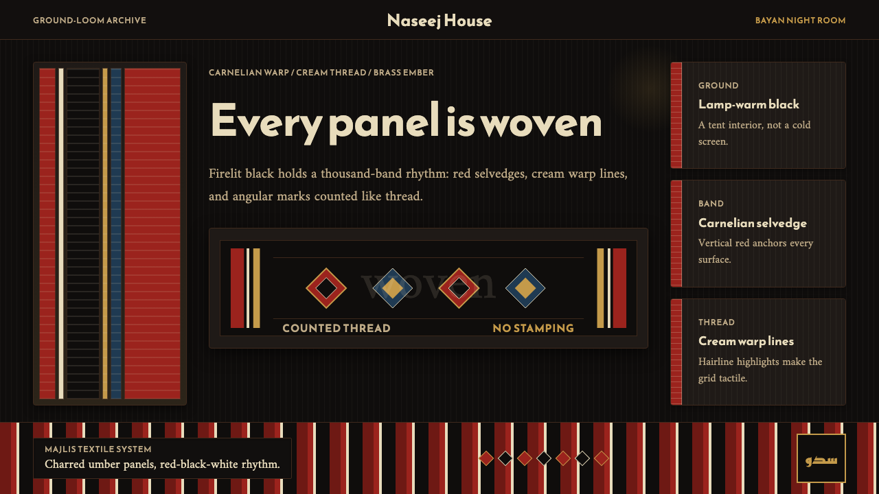 Kuwaiti Sadu Bedouin WeaveFirelit craft, not dark mode. Carnelian bands and cream warp lines make each…火光里的手工感。朱砂红竖带与奶白经线让面板像织物。
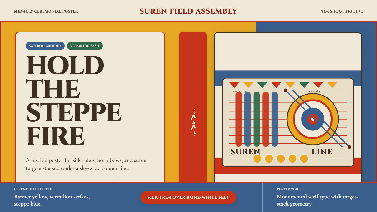 Mongolian Naadam ArcheryFestival heat at full draw. Saffron ground, vermilion trim, suren circles.满弓的节庆热度。藏红花黄底、朱红镶边、苏仁圆靶。
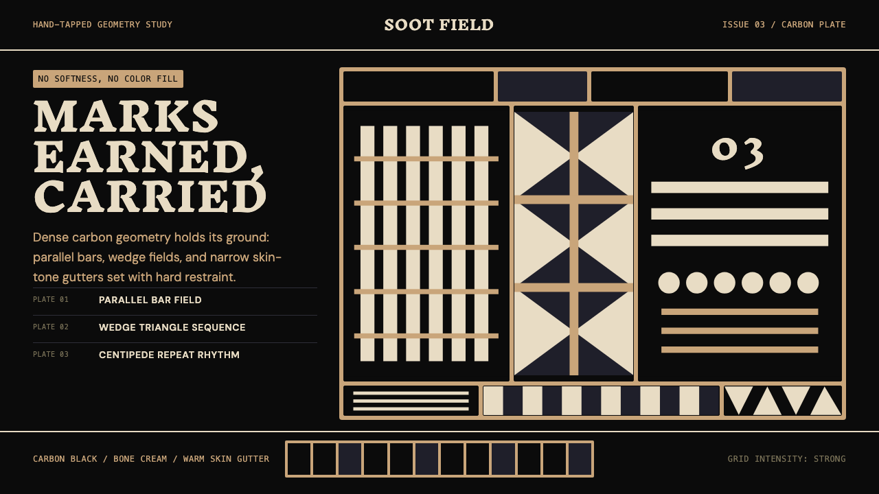 Samoan Tatau (Pe'a)Gravitas without softness. Soot-black geometry locks into warm skin-tone gutt…无柔化的重量:烟黑几何嵌入暖肤色窄沟。
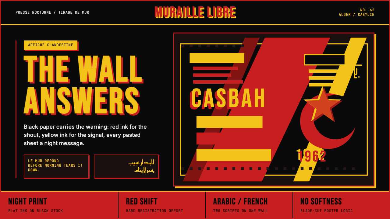 Algerian Casbah Poster (1954–1962)Every surface is a manifesto. Blood red, warning yellow, and stencil type hit…每个表面都是宣言:血红、警示黄与模板字撞上黑色新闻纸。
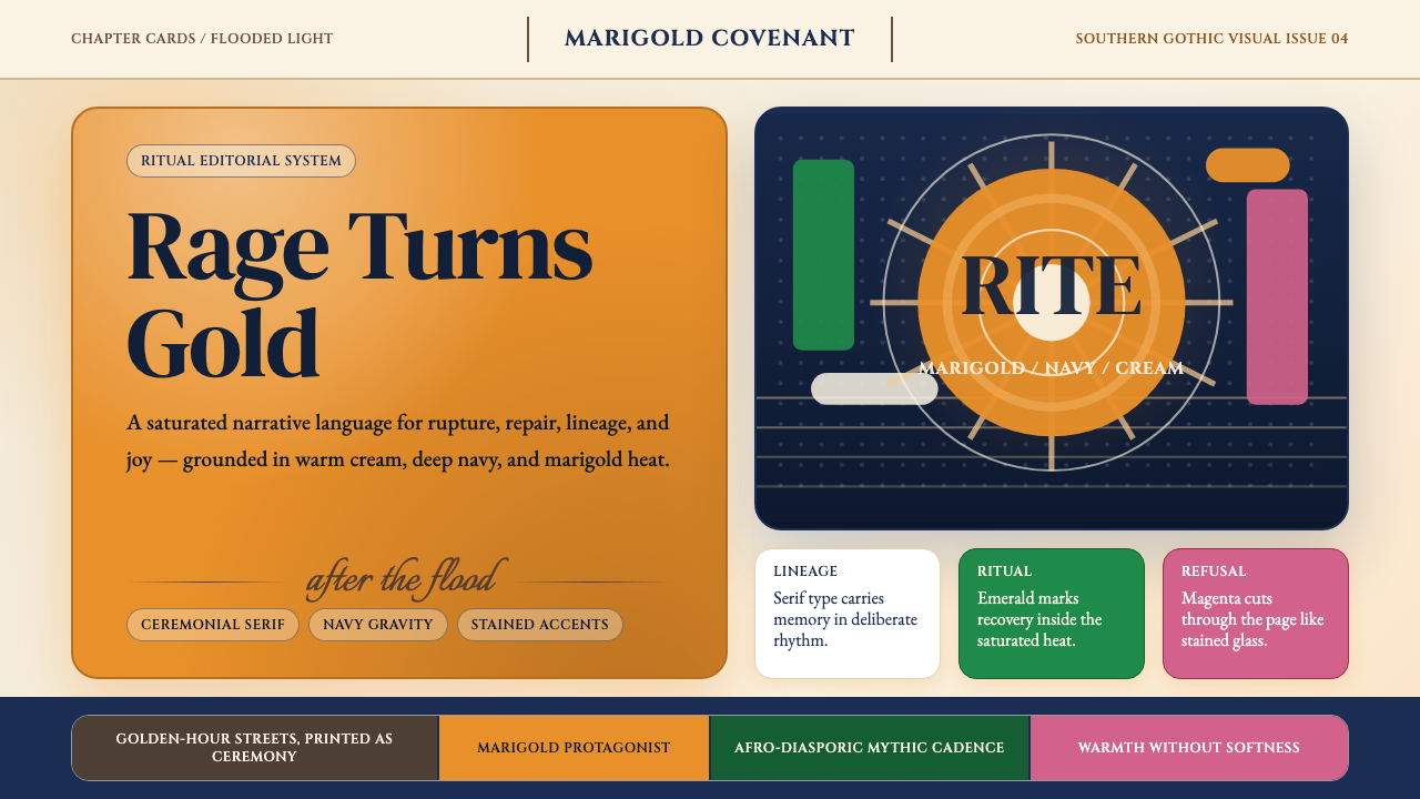 Beyoncé — LemonadeMythic heat refuses restraint. Marigold blocks, navy gravity, serif ceremony.神话般热度拒绝收敛。金盏黄块面、深海军蓝与仪式衬线成形。
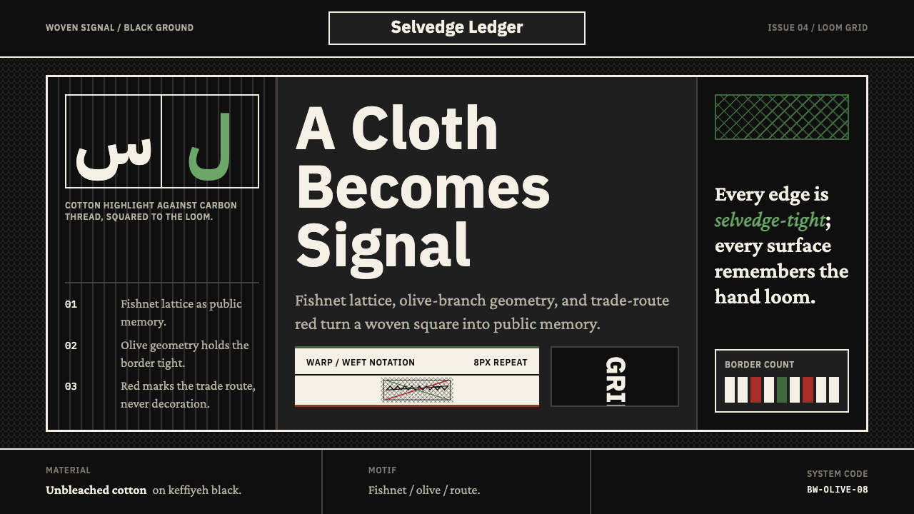 Levantine Keffiyeh Black & WhitePolitical textile, not ornament. Cotton type and fishnet lattice cut through…政治纺织,不是装饰。棉白字体与渔网格纹切入黑底。