Design style guide设计风格指南
What is Algerian Casbah Poster (1954–1962)?什么是 Algerian Casbah Poster (1954–1962)?
Born in the casbah and the maquis camps, the FLN's silkscreen posters fused blood-red ink, stenciled Arabic script, and flat partisan printing into one of the twentieth century's most urgent visual languages.诞生于卡斯巴老城与丛林营地,民族解放阵线的丝网印刷海报将血红油墨、模板阿拉伯文与游击队印刷的粗粝质感熔为一炉,成为二十世纪最紧迫的视觉语言之一。
Algerian Casbah Poster (1954–1962) in briefAlgerian Casbah Poster (1954–1962) 速览
The Algerian Casbah Poster style refers to the visual system produced by the Front de Libération Nationale (FLN) and allied cultural cells during Algeria's War of Independence (1954–1962). Printed on whatever paper was available — newsprint, recycled stock, coarse cardboard — and pulled through crude silkscreen frames in clandestine workshops hidden inside the labyrinthine casbah of Algiers and the mountain camps of Kabylie, these posters were not made for gallery walls. They were made for walls in the literal sense: plastered on the façades of the medina at night, passed hand to hand through networks of resistance couriers, reproduced in solidarity publications as far as Havana and Paris.阿尔及利亚卡斯巴海报风格,指的是民族解放阵线(FLN)及其盟友文化小组在1954至1962年阿尔及利亚独立战争期间所形成的视觉体系。这些海报以任何可得的纸张印制——新闻纸、旧纸板、粗糙卡纸——通过隐藏在阿尔及尔迷宫般的卡斯巴老城和卡比利亚山地营地的地下工坊,以简陋的丝网框架拖印而成。它们不是为画廊墙壁而生,而是为真正意义上的墙壁而生:深夜张贴在麦地那的外立面上,经抵抗运动传递网络在人与人之间辗转流传,在远至哈瓦那和巴黎的国际声援出版物中被复制。
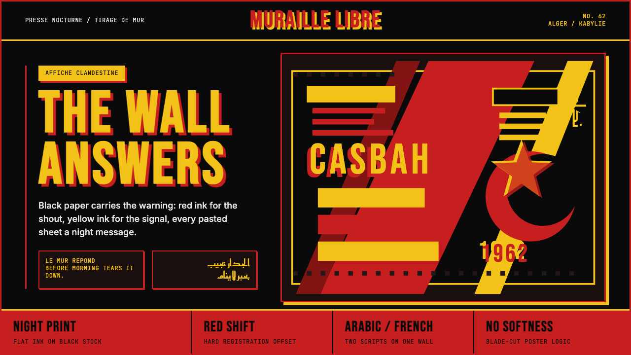
The visual grammar that emerged from these conditions is defined by scarcity transformed into strength. A strict, dark ground — black or near-black newsprint — serves as the field. Against it, two or three flat colors do all the work: blood red for urgency and sacrifice, warning yellow for the Islamic crescent and star and for marginal text that demands attention, and white or pale cream for stenciled portraits and large text blocks. There are no gradients, no halftones, no decorative flourishes. Ink either covers or it does not. Registration between layers is intentionally imprecise — the slight offset between a red field and a black figure is not a flaw to be corrected but a signature of the physical conditions under which the work was made.从这些物质条件中生长出来的视觉语法,以匮乏转化为力量为本质。深色底面——黑色或接近黑色的新闻纸——作为图底。在其上,两到三种平涂色彩承担一切表达:血红色传递紧迫与牺牲,警示黄标示伊斯兰星月以及呼唤关注的边注文字,白色或浅奶油色则呈现模板印刷的人物肖像与大段文字。没有渐变,没有半色调,没有装饰性的花样。油墨要么覆盖,要么不覆盖。各色层之间的套印有意保持不精确——红色区域与黑色轮廓之间轻微的偏移,不是需要纠正的瑕疵,而是这些作品在特定物质条件下诞生的签名。
What distinguishes this system from other revolutionary graphic traditions of the same era is its bilingual visual field. Arabic script and French roman type coexist on the same surface, neither subordinate to the other. The Arabic is often hand-cut or stenciled in a bold, condensed calligraphic hand derived from Maghrebi tradition; the French appears in whatever flat san-serif letterform the available type or stencil could produce. This dual-language, dual-script composition is not a design choice in the contemporary sense — it is a document of the cultural situation: a colonized society asserting its native language in the same breath that it addresses the international press in the colonizer's tongue.这套视觉体系与同时代其他革命平面传统最显著的区别,在于它的双语视觉场域。阿拉伯文与法语罗马字母共处于同一界面,互不从属。阿拉伯文通常以粗壮、紧缩的手写或模板体呈现,源自马格里布书法传统;法语则采用任何可得的模板或活字所能提供的平直无衬线字形。这种双语双文字的并置构图,并非当代意义上的设计选择,而是一份文化状况的历史文件:一个被殖民的社会在用母语发出呐喊的同时,用殖民者的语言向国际媒体发言。
Where does Algerian Casbah Poster (1954–1962) come from?Algerian Casbah Poster (1954–1962) 从何而来?
The FLN launched its armed uprising on the night of 1 November 1954, attacking French military and police targets in coordinated actions across northern Algeria. The political context had been building for decades: France had held Algeria as an integral department since 1830, treating it not as a colony but as sovereign French territory, while systematically denying full citizenship to the Muslim majority. The war that began in 1954 was simultaneously a war of national liberation, an anti-colonial uprising, and a brutal internal struggle within the Algerian independence movement itself. By the time it ended in 1962 with the Évian Accords and Algerian independence, somewhere between 300,000 and 1.5 million Algerians had died — estimates vary enormously depending on the source.1954年11月1日夜间,民族解放阵线在阿尔及利亚北部各地发动协调一致的武装起义,袭击法国军事和警察目标。政治积怨由来已久:法国自1830年起将阿尔及利亚作为不可分割的本土省份,而非殖民地,但同时系统性地剥夺穆斯林多数群体的完整公民权。1954年爆发的战争同时是一场民族解放战争、反殖民起义,也是阿尔及利亚独立运动内部的激烈博弈。到1962年以《埃维昂协议》和阿尔及利亚独立告终时,约三十万至一百五十万阿尔及利亚人在战争中死亡——数字因来源不同而差异悬殊。
The FLN's propaganda operation was run partly from inside Algeria and partly from external bases in Tunisia and Morocco, beyond the reach of French military pressure. Within the country, the Casbah of Algiers — the dense, Ottoman-period medina that climbs the hillside above the European colonial quarter — became the central nervous system of urban resistance. Its layered, interlocking architecture made French military penetration difficult and provided cover for clandestine printing operations. It was here and in the maquis camps of Kabylie that the visual language of the movement was forged: not in a design school, not according to a theoretical program, but in immediate response to the need to communicate quickly, cheaply, and irrepressibly to populations that were partly literate in Arabic, partly literate in French, and often illiterate in both.民族解放阵线的宣传工作一部分在阿尔及利亚境内展开,另一部分在突尼斯和摩洛哥的境外基地运作,以规避法国的军事压力。在国内,阿尔及尔的卡斯巴——攀爬于欧洲殖民区上方山坡的奥斯曼时期麦地那迷宫——成为城市抵抗运动的神经中枢。其层叠交错的建筑格局使法国军队难以渗透,也为地下印刷工坊提供了掩护。正是在这里以及卡比利亚的丛林营地,运动的视觉语言得以锻造:不在设计学校,不依照任何理论纲领,而是出于即刻的需要——用最快速、最廉价、最无法压制的方式,向那些部分以阿拉伯语识字、部分以法语识字、而往往两种都不识字的人群传递讯息。
The cultural figures around whom the movement's visual identity coalesced were a cross-section of the Algerian intelligentsia shaped by both Maghrebi tradition and French colonial education. M'hamed Issiakhem, a painter who had lost his arm in a hunting accident as a child and who studied at the École des Beaux-Arts in Paris, brought European painterly sensibility to the poster idiom. Mohamed Khadda, who would become one of Algeria's most important abstract painters after independence, worked in the visual orbit of the resistance and later developed an aesthetic that explicitly connected modernist abstraction to Arabic calligraphic tradition. Frantz Fanon, the Martinican psychiatrist and theorist who joined the FLN in Tunisia and wrote 'The Wretched of the Earth' during the war, provided much of the intellectual framework that gave the visual propaganda its ethical weight: the argument that colonial violence dehumanizes both colonizer and colonized, and that the cultural assertion of the colonized — including visual culture — is an inseparable part of political liberation.围绕运动视觉身份凝聚起来的文化人物,是马格里布传统与法国殖民教育共同塑造的阿尔及利亚知识分子群体的横截面。M'hamed Issiakhem是一位幼年因狩猎事故失去一臂、后在巴黎国立美术学院就读的画家,他将欧洲绘画感性带入了海报语言。穆罕默德·卡达后来成为独立后阿尔及利亚最重要的抽象画家之一,他在抵抗运动的视觉氛围中工作,此后发展出将现代主义抽象与阿拉伯书法传统明确连接的美学。来自马提尼克的精神病学家与思想家弗朗茨·法农在突尼斯加入民族解放阵线,并在战争期间写就《大地上的受苦者》,为这批视觉宣传材料提供了大部分伦理重量:殖民暴力同时使殖民者与被殖民者失去人性,而被殖民者的文化主张——包括视觉文化——是政治解放不可分割的组成部分。
The posters found international distribution through solidarity networks that connected the Algerian independence movement to anti-colonial struggles worldwide. The Fédération de France du FLN organized support and distribution among Algerian migrant workers in metropolitan France; international solidarity organizations reproduced the visual material in publications circulating across the Non-Aligned world. The Tiers-mondiste poster tradition — solidarity graphics linking liberation struggles in Algeria, Cuba, Vietnam, and later Angola and Mozambique — drew directly on the visual conventions the Algerian material had established: dark grounds, flat color, stenciled portraiture, bilingual or multilingual text. By the time Algeria gained independence in July 1962, the visual grammar of the casbah printer had become a foundational reference for revolutionary graphic design on four continents.这些海报经由声援网络获得国际传播,将阿尔及利亚独立运动与全球反殖民斗争连接起来。民族解放阵线驻法联合会在法国本土的阿尔及利亚移民工人中组织支持与发行;国际声援组织在流通于不结盟世界的出版物中复制这批视觉材料。第三世界主义海报传统——将阿尔及利亚、古巴、越南及后来的安哥拉、莫桑比克等解放斗争相互连接的声援图形——直接沿用了阿尔及利亚材料所确立的视觉惯例:深色底面、平涂色彩、模板肖像、双语或多语文字。到1962年7月阿尔及利亚获得独立时,卡斯巴印刷工的视觉语法已成为四大洲革命平面设计的基础参照。
After independence, the aesthetic life of the movement transformed. Djamila Bouhired, a resistance fighter whose trial and near-execution in 1957 made her the most internationally recognizable face of the Algerian cause — her portrait stenciled on countless surfaces — became a symbol of postwar Algeria. The Aouchem manifesto of 1967, signed by Issiakhem, Khadda, and others, called for an Algerian modernism rooted in the Amazigh and Arabo-Berber visual inheritance rather than imported Western models. The roughness and urgency of the wartime visual language was retrospectively claimed as a foundation for post-colonial Algerian cultural identity.
What defines the Algerian Casbah Poster (1954–1962) look?Algerian Casbah Poster (1954–1962) 的视觉特征是什么?
Dark Ground深色底面
The visual system is built on a foundation of deep, dark ink — black newsprint or a dense black printed field that absorbs light rather than reflecting it. This is partly a material legacy of wartime printing conditions, where cheap newsprint was the available substrate, and partly a deliberate rhetorical gesture: the dark ground signals night, clandestinity, and the conditions of underground resistance. All other colors read as emergent — torn out of darkness — rather than applied to a neutral surface.这套视觉体系建立在深暗油墨的基底上——黑色新闻纸或浓密的印刷黑色,吸收而非反射光线。这一特征部分源于战时印刷条件的物质遗留,廉价新闻纸是唯一可得的纸张;部分则是一种蓄意的修辞姿态:深色底面意味着黑夜、秘密与地下抵抗的生存条件。所有其他颜色都显得像是从黑暗中撕裂而出,而非被施加于中性表面。
Blood Red and Warning Yellow血红与警示黄
The two dominant accent colors carry precise cultural and rhetorical weight. The red — a saturated, arterial tone — is the color of sacrifice and urgency, of blood and fire, of the revolution in its most physical dimension. The yellow serves a different function: it marks the Islamic crescent and star, the movement's emblematic symbol, and appears in marginal text and annotations that demand attention. The combination of deep red against black creates an almost physically visceral sensation; yellow against black creates maximum luminosity — the visual equivalent of a shout.两种主要强调色各自承载着精确的文化与修辞分量。红色——饱和的动脉红调——是牺牲与紧迫的颜色,是血与火的颜色,是革命最具肉身维度的体现。黄色则服务于不同功能:它标示运动的象征性符号——伊斯兰星月,并出现于呼唤注意的边注与批注文字中。深红与黑色的叠合产生近乎生理上的内脏感;黄色与黑色的组合创造出最大的发光度——视觉上等同于一声呐喊。
Hard Registration Offset硬边套色偏移
A signature visual quality of the system is the visible misregistration between ink layers — a slight but deliberate or unavoidable offset between the color fields and the outlines or figures printed over them. In professional printing this would be a defect. Here it is an aesthetic fact: it records the conditions of production, the shaking hands and improvised equipment of clandestine printing. Contemporary applications of the style often preserve or exaggerate this offset as a mark of authenticity, recognizing that the roughness is the meaning.这套体系的标志性视觉特质之一,是各油墨层之间可见的套印偏移——色彩区域与其上叠印的轮廓或图形之间轻微但明确(或不可避免)的位移。在专业印刷中,这是需要纠正的瑕疵。在这里,它是一个美学事实:它记录了生产条件,记录了地下印刷的颤抖的双手与即兴拼凑的设备。这种风格的当代应用往往刻意保留甚至夸大这种偏移,将其视为真实性的标记,认识到粗糙本身就是意义所在。
Stenciled Portraiture模板印刷的人物肖像
Human figures appear primarily through the stencil — hand-cut templates that allow a portrait or a silhouette to be reproduced quickly across multiple surfaces. The stencil imposes its own formal logic: fine gradations of tone are impossible, so faces and figures reduce to bold contrast between light and dark areas. Eyes become dark voids or bright points; features are read by shadow and highlight alone. The stenciled portrait is both faster than typeset text and more emotionally immediate — a fighter's face recognized at a glance before any word is read.人物形象主要通过模板呈现——手工裁切的模板允许一张肖像或一个轮廓在多个表面上快速复制。模板强加了自身的形式逻辑:细腻的色调渐变是不可能的,因此面孔与身躯简化为明暗区域之间的强烈对比。眼睛成为深沉的暗部或明亮的光点;面部特征仅凭阴影与高光传达。模板肖像比排印文字更快捷,也更具直接的情感冲击——在任何文字被阅读之前,一名战士的面孔已经被瞬间认出。
Bilingual Visual Field双语视觉场域
Arabic and French share the picture plane without hierarchy. The Arabic script — typically rendered in a bold, condensed hand derived from Maghrebi calligraphic tradition — occupies the same visual weight and spatial priority as the French text. This coexistence is not decorative; it is political. It refuses the colonial assumption that French is the language of public address and Arabic the language of private life. The resulting compositions are dense, often difficult to parse without knowledge of both scripts, and visually complex in ways that most European graphic traditions of the period were not.阿拉伯文与法语在同一画面中并存,互不从属。阿拉伯文——通常以源自马格里布书法传统的粗壮紧缩手写体呈现——与法语文本占据相同的视觉分量和空间优先级。这种共存不是装饰性的,而是政治性的。它拒绝了法语是公共表达语言、阿拉伯语是私人生活语言这一殖民假设。由此形成的构图密度高,不熟悉两种文字的人往往难以解读,其视觉复杂性远超同时代大多数欧洲平面传统。
Flat Ink, No Gradients平涂油墨,无渐变
Every element in the system is flat — ink either covers the substrate or it does not. There are no blended transitions between colors, no soft shadows suggesting volume, no atmospheric effects implying depth. This flatness is simultaneously a technical constraint of silkscreen printing at scale and a rhetorical choice: gradients soften, modulate, and aestheticize. A flat color field is uncompromising. The refusal of gradation is the refusal of ambiguity.这套体系中的每个元素都是平涂的——油墨要么覆盖纸张,要么不覆盖。没有颜色之间的混融过渡,没有暗示体积的柔和阴影,没有暗示深度的大气效果。这种平面性既是大规模丝网印刷的技术制约,也是一种修辞选择:渐变使一切柔化、调制与审美化。平涂色域是不妥协的。对渐变的拒绝,就是对模糊性的拒绝。
Urgency as Structure紧迫性作为结构
Unlike design systems organized around aesthetic equilibrium, the casbah poster system is organized around rhetorical urgency. Composition is not balanced for restful viewing but weighted for impact: the most important visual element — a face, a phrase, a symbol — is the largest, the most saturated, the most immediately visible. Secondary information clusters densely around it or along the edges. The result is a compositional logic closer to a warning sign than a gallery work, where the hierarchy of attention is non-negotiable and the viewer is not invited to linger but commanded to look.与围绕审美均衡组织的设计体系不同,卡斯巴海报体系围绕修辞上的紧迫性而组织。构图不为平和的观看而平衡,而是为视觉冲击而加重:最重要的视觉元素——一张面孔、一句话语、一个符号——是最大的、最饱和的、最即刻可见的。次要信息密集地聚集在其周围或沿边缘排布。由此形成的构图逻辑更接近警示标志而非画廊作品——注意力的层级不可协商,观看者不是被邀请驻足,而是被命令注视。
Who shaped Algerian Casbah Poster (1954–1962)?谁塑造了 Algerian Casbah Poster (1954–1962)?
Issiakhem is among the most significant visual artists associated with the Algerian independence movement. Having lost his arm in a childhood accident and trained at the École des Beaux-Arts in Paris, he brought a painterly depth to the bold, reduced visual vocabulary of partisan graphics. After independence he became a leading figure in Algerian cultural life, teaching and exhibiting widely. His work negotiated the difficult space between European modernist training and the imperative to forge a distinctly Algerian visual language — a tension that defines the most serious aesthetic work to emerge from the independence generation.Issiakhem是与阿尔及利亚独立运动相关联的最重要视觉艺术家之一。他幼年因意外失去一臂,后在巴黎国立美术学院接受训练,将绘画性深度带入了游击队图形的粗犷简约视觉词汇。独立后他成为阿尔及利亚文化生活的核心人物,广泛执教与参展。他的作品在欧洲现代主义训练与锻造独特阿尔及利亚视觉语言的迫切需求之间斡旋——这种张力定义了独立一代中最严肃的美学创作。
Khadda worked in the visual orbit of the resistance during the war years and became after independence one of Algeria's most internationally recognized painters. His great achievement was to develop a form of abstraction that grounded itself explicitly in the Arabic calligraphic tradition and Amazigh visual heritage rather than simply importing the visual logic of European abstract expressionism. His formulation — that modernity and indigenous tradition are not opposites but generative tensions — became the intellectual backbone of the Aouchem manifesto, which he co-signed in 1967 and which shaped postcolonial Algerian visual culture for a generation.卡达在战争年间活动于抵抗运动的视觉氛围中,独立后成为阿尔及利亚最具国际知名度的画家之一。他的重要成就在于发展出一种抽象形式,这种抽象明确植根于阿拉伯书法传统和柏柏尔视觉遗产,而非简单移植欧洲抽象表现主义的视觉逻辑。他的主张——现代性与本土传统不是对立面,而是生产性张力——成为他于1967年联署的《阿乌切姆宣言》的思想支柱,并塑造了后殖民时代阿尔及利亚视觉文化整整一代。
Bouhired was a resistance fighter in the Algiers network of the FLN who was arrested, tortured, tried, and sentenced to death by French military authorities in 1957. Her trial provoked an international outcry, and her image — reproduced in posters, pamphlets, and solidarity publications across the world — became the most recognizable face of the Algerian independence cause. She was not a graphic designer, but her face became the primary visual material of the movement's poster language: stenciled, simplified to its essential contrasts, and reproduced endlessly. Her survival (the death sentence was commuted) and her continued political engagement after independence made her a living embodiment of the visual archive that bore her image.布希雷德是民族解放阵线阿尔及尔网络的一名抵抗运动战士,1957年被法国军事当局逮捕、刑讯、审判并判处死刑。她的审判引发国际强烈抗议,她的形象——在世界各地的海报、小册子和声援出版物中广泛复制——成为阿尔及利亚独立事业最具辨识度的面孔。她不是平面设计师,但她的面孔成为运动海报语言的首要视觉素材:以模板印刷,简化至本质对比,被无数次复制。她的幸存(死刑被减免)以及她在独立后持续的政治参与,使她成为那份以她的形象为素材的视觉档案的活的化身。
Fanon was a psychiatrist from Martinique who joined the FLN in Tunisia and served as editor of its publication El Moudjahid. His two major books written during and immediately after the war — 'A Dying Colonialism' and 'The Wretched of the Earth' — provided the movement with its most sophisticated theoretical account of why cultural production, including visual propaganda, was inseparable from political liberation. His argument that colonialism operates partly by devaluing and suppressing the cultural expressions of the colonized gave the casbah posters an intellectual frame: the act of printing, in Arabic, in public, at risk, was itself a revolutionary act, not merely a vehicle for delivering political messages.法农是来自马提尼克的精神病学家,在突尼斯加入民族解放阵线并担任其出版物《圣战者》的编辑。他在战争期间及战后写就的两部重要著作——《垂死的殖民主义》与《大地上的受苦者》——为运动提供了最具理论深度的论述,说明为何包括视觉宣传在内的文化生产与政治解放不可分割。他关于殖民主义部分通过贬低和压制被殖民者文化表达来运作的论点,为卡斯巴海报提供了智识框架:以阿拉伯文,在公共场所,冒着风险印刷——这本身就是一种革命行为,而不仅仅是传递政治信息的载体。
The Aouchem group — its name means 'tattoo' in Tamazight, the Amazigh language — was formed in 1967 by a circle of Algerian painters including Issiakhem and Khadda. Their manifesto explicitly rejected the importation of Western modernist styles as a replacement for colonial culture and called instead for an art rooted in Algeria's own visual inheritance: Amazigh tattoo motifs, Arabic calligraphic tradition, and the rough material honesty of the wartime poster practice. Though Aouchem was a post-independence formation, it represents the direct intellectual continuity of the casbah poster aesthetic — the claim that visual roughness, material directness, and cultural specificity are not primitive but principled.阿乌切姆小组——其名称在塔马泽特语(柏柏尔语)中意为「纹身」——于1967年由包括Issiakhem和卡达在内的一批阿尔及利亚画家组成。他们的宣言明确拒绝将西方现代主义风格作为殖民文化的替代品引入,转而呼吁植根于阿尔及利亚自身视觉遗产的艺术:柏柏尔纹身母题、阿拉伯书法传统,以及战时海报实践的粗粝物质诚实。尽管阿乌切姆是独立后的组织,但它代表了卡斯巴海报美学的直接思想延续——主张视觉的粗糙性、材料的直接性与文化的特殊性不是原始的,而是有原则的。
How do you use Algerian Casbah Poster (1954–1962) today?今天怎么用 Algerian Casbah Poster (1954–1962)?
The Algerian Casbah Poster style is one of the most potent — and most easily misused — historical references available to contemporary designers. Its power derives entirely from its material conditions and political urgency: the dark ground, the hard red, the registration offset, the stenciled face. Applying these elements decoratively, stripped of their meaning, produces a kind of aesthetic tourism that trivializes the original. Used honestly — with awareness of what the system was made to do and what it cost to make it — it remains one of the most arresting visual languages in the twentieth-century repertoire.阿尔及利亚卡斯巴海报风格是当代设计师可援引的历史参照中最有力量——也最容易被滥用——的之一。它的力量完全来源于其物质条件与政治紧迫性:深色底面、硬朗红色、套印偏移、模板印刷的面孔。将这些元素剥离其意义而装饰性地使用,产生的是一种美学旅游,使原作的分量变得轻浮。诚实地使用它——清醒地认识这套体系是为了做什么而生,以及制作它付出了什么代价——它仍是二十世纪视觉遗产中最令人屏息的视觉语言之一。
For presentation slides, the style works best in contexts where the content itself carries genuine urgency or moral weight: advocacy work, investigative reporting, public health communications, social justice campaigns. A cover slide built on this system uses the dark ground as its base, reserves one saturated accent color for a single focal element — a statistic, a portrait, a phrase — and treats all other information as secondary. Content slides should be sparse: one idea per surface, text rendered in high contrast against the dark field, no decorative elements. If data must appear, treat charts as geometric shapes in their own right — flat bars or arcs in the restricted palette, labeled with high-contrast type, no grid lines or background shading.对于演示文稿,这种风格最适合内容本身承载着真实紧迫性或道德分量的场景:倡导工作、调查报道、公共卫生传播、社会正义运动。以这套体系构建的封面页以深色底面为基础,将一种饱和强调色保留给单一焦点元素——一个数据、一张肖像、一句话——将其他所有信息置于次要地位。内容页应保持简疏:每个画面承载一个想法,文字以高对比度呈现于深色底面,无装饰性元素。如必须呈现数据,应将图表本身视为几何形态——在受限色板中的平涂条形或弧形,以高对比度字体标注,无网格线或背景阴影。
For web interfaces, the style is genuinely challenging to deploy at scale, because the visual intensity that makes a single poster arresting becomes exhausting across an entire interface. The most effective approach is to use the system selectively: a dark-ground hero section or a full-bleed alert banner built on casbah conventions, with the remainder of the interface adopting a lighter, less confrontational treatment. Dashboard elements that benefit from the style include status indicators and alert states, where the red-yellow-black palette communicates urgency without ambiguity. Navigation and information architecture should remain legible and calm — the style functions as a signal register, not a continuous background texture.对于网页界面,这种风格在大规模部署时确实具有挑战性,因为使单张海报引人注目的视觉强度,在整个界面中会令人疲惫。最有效的方式是有选择性地使用:用卡斯巴惯例构建一个深色底面的英雄区或满幅警示横幅,而界面其余部分采用更轻盈、对抗性更低的处理。受益于这种风格的仪表板元素包括状态指示器和警示状态,红-黄-黑色板在那里无歧义地传递紧迫感。导航与信息架构应保持清晰可读与平稳——这种风格作为信号寄存器发挥作用,而非持续的背景肌理。
For editorial and marketing work, the style has a direct line to social-documentary and activist design traditions that have remained continuously vital from the 1960s to the present. Editorial spreads can use the dark-ground, high-contrast, stencil-portrait grammar effectively for profiles of activists, coverage of conflicts, or any content where the visual needs to carry emotional weight before a word is read. Marketing applications are more constrained: the style signals political commitment, material scarcity, and collective struggle — associations that fit some campaigns and actively damage others. Organizations working on rights, environment, and equity causes find the visual register immediately legible; commercial brands that borrow it without that context tend to read as cynical.对于编辑与营销工作,这种风格与1960年代至今持续活跃的社会纪录片和活动家设计传统有着直接的血脉联系。编辑版面可以有效地将深色底面、高对比度、模板肖像的语法用于活动人士报道、冲突报道,或任何视觉需要在文字被阅读之前就承载情感分量的内容。营销应用则更受限制:这种风格传递政治承诺、物质匮乏与集体斗争的讯号——这些关联适合某些运动,却会严重损害其他运动。从事权利、环境和公平议题的组织发现这套视觉语域立即可读;没有这种背景却借用它的商业品牌往往被解读为虚伪。
The most common mistake when applying this style is flattening it into a generic 'grunge' aesthetic — adding texture overlays, distressing type, layering halftone patterns — without understanding that the original system's roughness was functional, not decorative. The casbah poster does not look the way it looks because someone chose a worn texture filter; it looks the way it looks because it was printed with imprecise equipment on cheap paper in dangerous conditions. A contemporary application that wants the style's authority must earn it through structural honesty: commit to the restricted palette, accept the flat ink, and resist the temptation to smooth out the edges that carry the meaning.应用这种风格时最常见的错误,是将其简化为一种通用的「做旧」美学——叠加纹理滤镜、做旧文字、分层加网点——而不理解原始体系的粗糙是功能性的,而非装饰性的。卡斯巴海报之所以呈现那种面貌,不是因为有人选择了一个磨损纹理滤镜,而是因为它是在危险条件下用不精确的设备在廉价纸张上印制的。想要获得这种风格权威感的当代应用,必须通过结构诚实来赢得:承诺于受限色板,接受平涂油墨,抵制磨平那些承载着意义的粗糙边缘的诱惑。
Algerian Casbah Poster (1954–1962) — FAQAlgerian Casbah Poster (1954–1962) · 常见问题
How is this style different from other revolutionary poster traditions of the same era?这种风格与同时代其他革命海报传统有何不同?
The Algerian system shares features with Cuban revolutionary posters, Soviet constructivist graphics, and Vietnamese war posters — all use flat color, bold type, and the stencil or silkscreen — but it is distinguished by two things most of the others lack: genuine bilingualism and the specific register of imprecision that comes from clandestine printing rather than state-sponsored production. Cuban and Soviet posters were produced with institutional resources; the casbah posters were made in hiding. That difference in production conditions is visible in the work, and it is precisely this difference that gives the system its peculiar authority. The roughness is not a style choice; it is evidence.阿尔及利亚体系与古巴革命海报、苏联构成主义图形和越南战争海报有共同之处——都使用平涂色彩、粗体字和模板或丝网印刷——但它被两件大多数同类传统所缺乏的东西所区别:真正的双语性,以及来自秘密印刷(而非国家资助生产)的特定不精确性。古巴和苏联的海报是在机构资源支持下生产的;卡斯巴海报是在隐秘状态下制作的。这种生产条件的差异在作品中清晰可见,也正是这种差异赋予了这套体系其独特的权威感。粗糙不是风格选择,而是证据。
Can this style work for products and brands that have no connection to political struggle?这种风格能用于与政治斗争毫无关联的产品和品牌吗?
It can work visually, but it carries risk. The style's visual signature — dark ground, blood red, rough registration — is so saturated with historical meaning that it functions almost like a quotation. Using it in a purely commercial context without that context creates a disconnect that sophisticated audiences often read as cynical. That said, some contexts work well: music labels, small-run publishing, documentary film, independent journalism, and organizations whose work genuinely involves risk, scarcity, or advocacy. The style rewards authenticity and punishes pretense. If the work earns it, the visual authority is real; if the work doesn't earn it, the style becomes a costume.视觉上可以奏效,但存在风险。这种风格的视觉签名——深色底面、血红色、粗糙的套印——已被历史意义如此深度浸染,以至于它几乎像是一种引用。在完全商业化的语境中使用它而缺乏相应的背景,会产生一种断裂,精明的受众往往将其解读为虚伪。话虽如此,某些场景确实适合:音乐厂牌、小批量出版、纪录片、独立新闻业,以及那些工作真正涉及风险、匮乏或倡导的组织。这种风格奖励真实,惩罚伪装。如果作品配得上它,视觉权威是真实的;如果作品配不上它,这种风格就变成了一件戏服。
What is the role of Arabic calligraphy in the system, and how should a designer approach it today?阿拉伯书法在这套体系中扮演什么角色?当代设计师应如何处理这一元素?
Arabic calligraphy in the original posters is not decorative — it is the primary language of address to the Algerian population, and its bold, condensed Maghrebi forms were chosen for legibility at distance and rapid reproduction through stencil. For contemporary designers working outside the Arabic-speaking world, the element requires the most care. Using Arabic script without fluency in the language and its calligraphic traditions is a form of appropriation that can easily misfire — letterforms misread, meanings distorted, cultural specificity reduced to decoration. The better approach is to ask what the bilingual visual field represents: not Arabic specifically, but the principle that the designed surface can carry more than one cultural register simultaneously. That principle can be applied with cultural materials appropriate to the specific design context.原始海报中的阿拉伯书法不是装饰性的——它是向阿尔及利亚民众发出呼吁的主要语言,其粗壮紧缩的马格里布字形是为了远距离可读性和通过模板快速复制而选择的。对于在阿拉伯语世界之外工作的当代设计师,这一元素需要最为谨慎的处理。在不精通这种语言及其书法传统的情况下使用阿拉伯文字,是一种容易出错的挪用——字形被误读,含义被扭曲,文化特殊性被简化为装饰。更好的方式是思考双语视觉场域所代表的内涵:不是阿拉伯文本身,而是一个设计界面可以同时承载不止一种文化层次的原则。这个原则可以用适合特定设计语境的文化素材来实践。
How does the dark ground interact with accessibility requirements for digital interfaces?深色底面如何与数字界面的可及性要求相互作用?
The dark-ground, high-contrast palette of the casbah poster system is in many respects naturally well-suited to accessibility: white or near-white text on a very dark background exceeds standard contrast requirements comfortably. The area of potential difficulty is the secondary accent colors. Warning yellow against black produces strong contrast; blood red against black is more borderline, particularly for users with certain forms of color vision deficiency who may not distinguish red from dark backgrounds at lower saturations. In digital applications, it is worth verifying that interactive elements relying on red alone for their distinction meet contrast requirements, and where they do not, pairing the color signal with a shape or text indicator.卡斯巴海报体系的深色底面、高对比度色板,在许多方面天然符合可及性要求:极深背景上的白色或接近白色的文字,舒适地超过标准对比度要求。潜在的困难在于次要强调色。警示黄与黑色的组合产生强烈对比;血红色与黑色的组合则更接近边界,尤其对于某些色觉障碍的用户而言,他们在较低饱和度下可能无法区分红色与深背景。在数字应用中,值得验证仅凭红色本身区分的交互元素是否满足对比度要求,若不满足,则将色彩信号与形状或文字指示符配对使用。
Is there a risk of this style appearing dated, given its strong historical associations?鉴于这种风格强烈的历史关联,它是否存在显得过时的风险?
The irony is that the casbah poster system does not feel dated in the way that many design styles of the same period do. This is partly because it was never fashionable in the mainstream design sense — it was always marginal, underground, produced under constraint — and partly because the political conditions it was made to address (colonial domination, armed resistance, the right of peoples to determine their own cultural forms) have not resolved themselves into comfortable history. When a style is tied to ongoing questions rather than closed historical chapters, it retains urgency. The greater risk is not that it looks old but that it is used so often as a shorthand for radical credibility that it begins to feel like a gesture rather than a commitment.讽刺之处在于,卡斯巴海报体系并不像同时代许多设计风格那样显得过时。这部分是因为它从未在主流设计意义上流行过——它始终是边缘的、地下的、在制约条件下产生的;部分是因为它被用于回应的政治条件(殖民统治、武装抵抗、人民决定自身文化形式的权利)从未被解决成舒适的历史。当一种风格与持续进行的问题而非封闭的历史章节相连时,它保留了紧迫性。更大的风险不是它看起来陈旧,而是它作为激进公信力的简写被频繁使用,以至于开始感觉像一种姿态而非一种承诺。
Related design styles相关设计风格
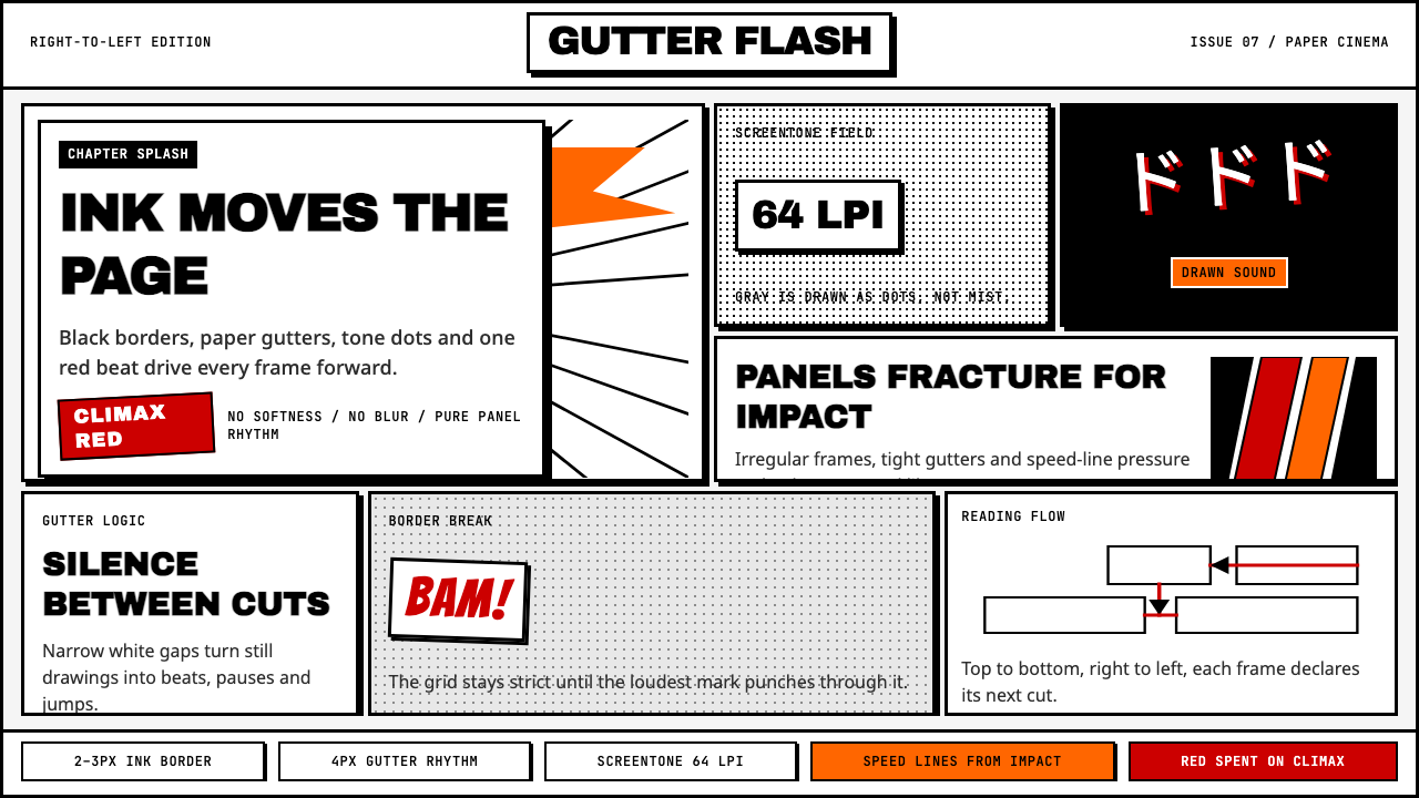 Manga Panel LayoutCinema in ink. Black panels, screentone dots, speed lines, and one red strike.墨线即电影:黑框、网点、速度线与一记少年红。
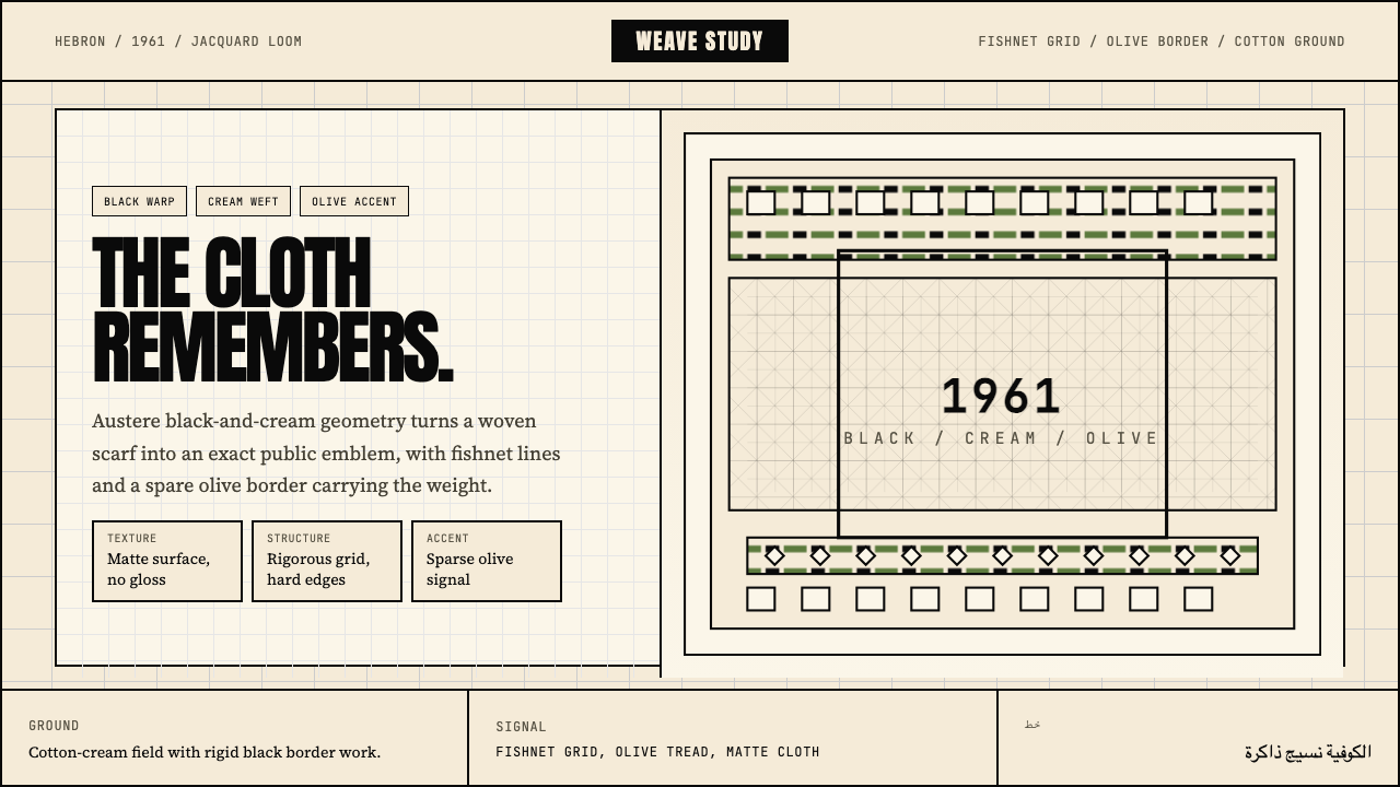 Palestinian Keffiyeh GridMemory in black and cream. Fishnet grid, olive border, and austere Anton type.黑白承载记忆。渔网格、橄榄边与峻厉标题字。
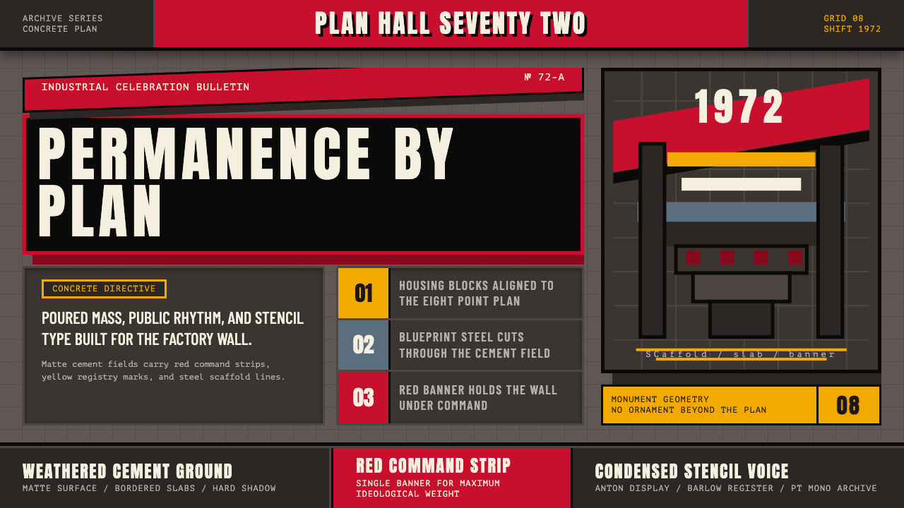 Soviet Brutalism (1972)Concrete refuses to breathe. Cement gray, Soviet red banners, and Anton stenc…混凝土拒绝呼吸:水泥灰底、苏维埃红旗与 Anton 钢模字锁住网格。
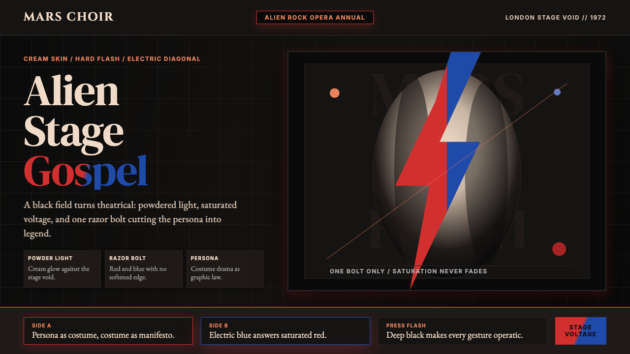 Bowie — Ziggy StardustTheater at full voltage. Cream-on-black portrait cut by one red and electric-…满电压的剧场感:黑底奶油肖像,被红与电蓝闪电劈开。
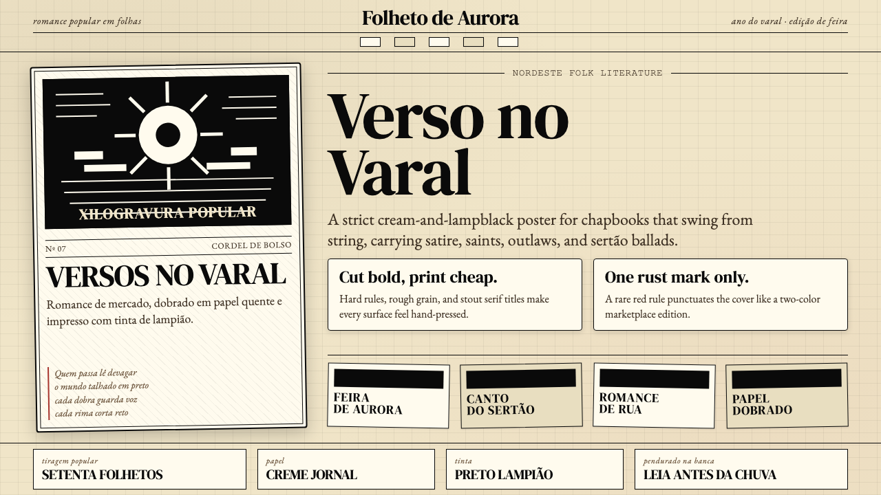 Brazilian Cordel (Northeast Folk Literature)Folk poetry, cut in lampblack. Cream newsprint, bordered chapbooks, one rust-…民间诗被灯黑刻出:奶油新闻纸、黑框小册与一笔锈红。
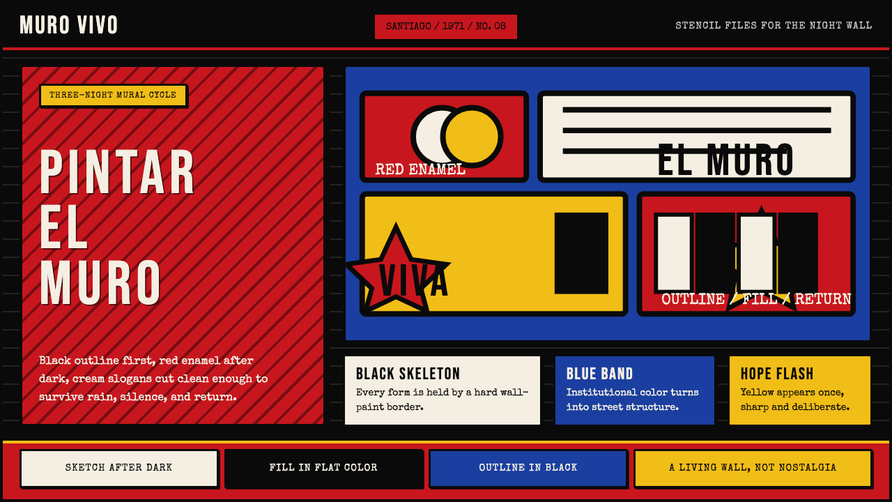 Chilean BRP Ramona Parra 1971Resistance stays alive. Blood red panels, black outlines, and stencil type re…抵抗仍在呼吸:血红墙面、粗黑轮廓与模板字重建街墙。