What is Soviet Brutalism (1972)?什么是 Soviet Brutalism (1972)?
Soviet Brutalism cast ideology in poured concrete and billboard stencil — a visual language built to outlast the individuals who made it.苏联粗野主义将意识形态浇铸进混凝土与巨幅钢模字体——这套视觉语言生来就要比创造它的个人更持久。
Soviet Brutalism (1972) in briefSoviet Brutalism (1972) 速览
Soviet Brutalism is the visual system that emerged from the USSR's monumental building and propaganda campaigns of the late 1950s through the mid-1980s. It fuses architectural Brutalism — the unapologetic use of raw, board-formed concrete as both structure and surface — with the state poster tradition: bold condensed stencil letterforms, a palette anchored in weathered cement gray and Soviet red, and compositional geometry derived from Constructivism's unfinished project. The result is a style that reads simultaneously as a physical material and a printed graphic.苏联粗野主义是苏联自1950年代末至1980年代中期大规模建设与宣传运动中涌现出的视觉系统。它将建筑粗野主义——以裸露的板模混凝土同时充当结构与表面的毫不掩饰的做法——与国家海报传统相融合:粗重的窄体钢模字形、以风化水泥灰和苏维埃红为核心的色板,以及源自构成主义未竟遗产的几何构图逻辑。最终呈现出一种同时具有物质材料感与印刷图形感的风格。
Where Bauhaus used geometry to rationalize industrial production, Soviet Brutalism used it to proclaim the permanence of the collective. Housing micro-rayons, cascade war memorials, factory mosaic murals, and Five-Year-Plan posters all share the same formal logic: monumental scale, compressed but legible type, a limited palette that does not compete for attention, and silhouette imagery of workers, machines, and monuments against austere geometric grounds. Everything is heavy, matte, and unambiguous.包豪斯用几何来理性化工业生产,苏联粗野主义则用几何来宣示集体的永恒。微区住宅楼群、阶梯式战争纪念碑、工厂马赛克壁画与五年计划海报,共享着同一套形式逻辑:纪念碑式的尺度、压缩而可读的字体、不争夺注意力的有限色板,以及在朴素几何底面上劳动者、机器与纪念碑的剪影图像。一切都厚重、亚光、毫无歧义。
The 1972 moment that this design system captures is specific: the high-water mark of Soviet poster culture, when state graphic design had absorbed Constructivist lessons and settled into a mature visual language used in print, enamel signage, textile banners, and architectural surface decoration simultaneously. It is the moment before détente softened the visual rhetoric — dense, confident, and relentlessly frontal.这套设计系统所定格的1972年时刻具有特殊性:苏联海报文化的顶峰时期,国家平面设计已充分吸收构成主义的教益,并在印刷品、搪瓷标牌、纺织横幅与建筑表面装饰中同步运作,沉淀为成熟的视觉语言。这是缓和政策软化视觉修辞之前的时刻——致密、自信、毫不犹豫地正面出击。
See the Soviet Brutalism (1972) design system查看 Soviet Brutalism (1972) 完整设计系统
Where does Soviet Brutalism (1972) come from?Soviet Brutalism (1972) 从何而来?
The architectural roots of Soviet Brutalism lie in Khrushchev's 1955 decree condemning the decorative excesses of Stalinist architecture — the ornate spires and cornices of the Seven Sisters skyscrapers — as wasteful of state resources. This top-down edict redirected Soviet construction toward prefabricated concrete panel systems and monolithic cast-in-place structures. Suddenly raw concrete was not a sign of poverty but of rational socialist planning. Architects across the USSR, from Moscow to Tashkent to Yerevan, were handed a material and a mandate: build permanently, build legibly, build at scale.苏联粗野主义建筑的根源在于赫鲁晓夫1955年颁布的命令——该命令谴责斯大林主义建筑的装饰过度,将七姐妹摩天楼上繁复的尖顶与檐口定性为对国家资源的浪费。这一自上而下的指令将苏联建设方向转向预制混凝土板系统和整体现浇结构。裸露的混凝土突然间不再是贫困的标志,而是理性社会主义规划的体现。从莫斯科到塔什干再到埃里温,苏联各地的建筑师被赋予了一种材料与一项使命:永久地建造,清晰地建造,大规模地建造。
The graphic tradition that ran parallel to and through Soviet architecture drew its energy from an earlier source: the Soviet avant-garde of the 1920s. Constructivist designers — Alexander Rodchenko, El Lissitzky, Varvara Stepanova — had already established the visual grammar of diagonal dynamics, bold sans-serif type, photomontage, and a red-black-white palette working together as a single rhetorical machine. By the 1930s, Stalin's Socialist Realism had partially suppressed this abstraction in favor of heroic figuration. But the underlying formal discipline — the grid, the stencil, the silhouette — survived in anonymous state graphic production: factory safety posters, collective farm signs, and municipal enamel plaques that blanketed every public surface in the Soviet Union.与苏联建筑平行并交织其中的平面设计传统,从更早的源头汲取能量:1920年代苏联前卫运动。构成主义设计师——亚历山大·罗德钦科、埃尔·利西茨基、瓦尔瓦拉·斯捷潘诺娃——已经建立了对角动态、粗体无衬线字、摄影蒙太奇以及红黑白色板作为单一修辞机器协同运作的视觉语法。1930年代,斯大林的社会主义现实主义以英雄式具象部分压制了这种抽象倾向。但底层的形式纪律——网格、钢模、剪影——在匿名的国家平面生产中延续下来:工厂安全海报、集体农庄标牌、覆盖苏联每一处公共表面的市政搪瓷铭牌。
The 1960s brought a partial rehabilitation of abstract and geometric approaches. International exchanges, including Soviet participation in world expositions, exposed state designers to Western modernism without endorsing its individualism. Soviet graphic design journals published studies of Polish poster school work and Yugoslav experimental typography. By the early 1970s, a distinctly Soviet hybrid had emerged: geometric rigor and bold stencil type — legible to a worker with a ten-second glance — combined with monumental photographic silhouettes and the authoritative weight of architectural concrete texture. The 1972 Munich Olympics (in which the USSR competed) and the simultaneous Sapporo Winter Games prompted an unusual burst of state graphic production, the artifacts of which serve as benchmarks for this aesthetic moment.1960年代带来了对抽象与几何方法的部分平反。苏联参与世界博览会等国际交流,使国家设计师接触到西方现代主义,却无需认可其个人主义。苏联平面设计期刊发表了对波兰海报流派与南斯拉夫实验性排版的研究。到1970年代初,一种独特的苏联混合体已然成形:几何严谨性与粗体钢模字型(工人十秒一瞥即可辨读)与纪念碑式摄影剪影以及建筑混凝土质感的权威厚重感相结合。1972年慕尼黑奥运会(苏联参赛)与同期萨波罗冬奥会激发了一轮罕见的国家平面设计产出热潮,留下的那些物件至今是这一美学时刻的参照基准。
Geographically, Soviet Brutalism was never purely Russian. Some of its most concentrated built examples stand in Armenia, Georgia, and the Central Asian republics, where local architects like Jim Torosyan and Viktor Jorbenadze combined Brutalist mass with references to regional vernacular geometry. In Poland, East Germany, and Yugoslavia — outside the USSR proper — allied Brutalism developed its own inflections, sometimes more formally experimental, sometimes more ornamentally decorated. The 1972 design system draws primarily on the metropolitan Soviet core: the propaganda poster vocabulary of Moscow and Leningrad studios, the monumental public sculpture tradition associated with Yevgeny Vuchetich, and the civic architecture of the late Khrushchev and Brezhnev eras.从地理上看,苏联粗野主义从来就不是纯粹的俄罗斯现象。其最为集中的建成实例中,部分屹立于亚美尼亚、格鲁吉亚和中亚各加盟共和国,当地建筑师如吉姆·托罗相与维克托·约尔别纳泽将粗野主义的体量与对地区本土几何元素的引用相结合。在波兰、东德和南斯拉夫——苏联版图之外——盟友式粗野主义发展出各自的变体,有时形式上更具实验性,有时装饰上更为繁复。1972年设计系统主要汲取大都会苏联核心的资源:莫斯科与列宁格勒设计工作室的宣传海报词汇,与叶甫根尼·武切季奇相关联的纪念性公共雕塑传统,以及赫鲁晓夫晚期与勃列日涅夫时代的市民建筑。
What defines the Soviet Brutalism (1972) look?Soviet Brutalism (1972) 的视觉特征是什么?
Color色彩
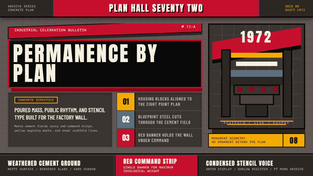
The palette is built around a small number of load-bearing tones. Weathered cement gray — not a clean neutral but a heavy, slightly warm gray with residual texture — serves as the dominant ground. Against it, Soviet red functions as the single high-saturation accent: the color of banner fabric, propaganda enamel, and revolutionary blood. A near-black charcoal carries structural lines and type at full weight. Occasional off-white or bare paper tones appear in highlights and lettering. Secondary colors, if they appear at all, are muted and industrial — ochre, oxide brown, military khaki — never clean or bright. The system is built for dominance, not variety.色板围绕少数几个承重色调构建。风化水泥灰——不是干净的中性色,而是带有残余质感的厚重、微暖的灰——充当主导底色。与之相对,苏维埃红作为唯一的高饱和强调色发挥作用:横幅布料、宣传搪瓷与革命之血的颜色。接近黑色的炭灰以满重量承载结构线条与文字。偶尔出现的近白色或裸纸色调用于高光与字体。若出现辅色,也是静默的工业色——赭黄、氧化棕、军用卡其——绝不清澈或明亮。这套系统是为支配而建,而非为多样性而生。
Typography字体排印
Display type is condensed and stencil-derived: letterforms cut from metal or cardboard templates, with characteristic notches and bridges where the stencil material had to remain connected. This is not a stylistic affectation but a trace of the actual production method — posters painted through physical stencils at billboard scale. Body text, when present, is set tight and compact in a narrow weight, occupying as little ground as possible. There is dramatic contrast in scale between headline and supporting text: the headline might occupy a third of the composition while everything else recedes to near-caption size. Uppercase dominates; mixed case is rarely used.展示字体是窄体的、源自钢模的:字形从金属或纸板模板中剪出,带有特征性的缺口与桥接——那是模板材料必须保持连接之处留下的痕迹。这不是风格上的做作,而是实际生产方式的印记——在广告牌尺度上通过实体钢模刷制的海报。当正文出现时,以窄字重紧凑排列,尽可能少占版面。标题与辅助文字之间存在戏剧性的尺度落差:标题可能占据构图的三分之一,而其他一切则退缩至近乎说明文字的大小。大写字母占主导;混合大小写极少使用。
Geometry and Composition几何形态与构图
Soviet Brutalist composition inherits the Constructivist grid but strips out its playful diagonal dynamism. Layouts tend toward vertical monumentality: elements stack rather than rotate, the horizon line sits low or is entirely absent, and figures rise against open sky or flat geometric grounds. Rectangles and hard-edged polygons dominate. Circles appear, but as contained elements — a medallion, a sun, a machine gear — not as free-floating focal points. The overall composition is frontal, symmetrical or nearly so, and designed to be read at distance. There is no invitation to linger; everything resolves at first glance.苏联粗野主义的构图继承了构成主义的网格,但剥除了其嬉戏的对角动态。版面倾向于垂直的纪念碑性:元素叠加而非旋转,地平线低置或完全缺失,人物形象在开阔天空或平面几何底面前高耸。矩形和硬边多边形占主导。圆形出现,但作为被包含的元素——奖章、太阳、机械齿轮——而非自由浮动的焦点。整体构图是正面的、对称或近乎对称的,设计来在远处被识读。没有流连的邀请;一切在第一眼就解决了。
Texture and Surface质感与表面
Unlike Bauhaus, which insisted on flatness as a principle, Soviet Brutalism incorporates simulated or referenced material texture as a carrier of meaning. The rough grain of board-formed concrete, the weave of banner fabric, the coarse dot structure of low-resolution newsprint — these surface qualities are not decorative. They signal weight, age, permanence, and collective labor. In two-dimensional work, texture appears as a background field rather than a foreground element, grounding the composition in materiality rather than ornamenting it. The effect is that even a printed poster carries a sense of mass.与包豪斯将平面性作为原则的坚持不同,苏联粗野主义将模拟或引用性的材料质感纳入意义的载体。板模混凝土的粗糙颗粒、横幅布料的织纹、低分辨率新闻纸的粗网点——这些表面品质并非装饰性的。它们传递重量、历史、永恒与集体劳动。在二维作品中,质感作为背景场域而非前景元素出现,将构图锚定于物质性而非点缀它。其效果是:即使是一张印刷海报也携带着一种体量感。
Silhouette and Figure剪影与人物
Human figures in Soviet Brutalist work are almost never portrayed with facial detail or individual expression. Instead, they appear as upward-facing silhouettes — workers with raised tools, athletes in motion, soldiers in formation — where the body's posture communicates collective purpose rather than individual character. The silhouette is cut sharp and held against a plain geometric ground or an open sky. This treatment simultaneously elevates the figure to symbolic status and effaces its particularity. The same logic applies to architecture: buildings and monuments appear as silhouettes or outlines, rendered in their most recognizable profile.苏联粗野主义作品中的人物形象几乎从不以面部细节或个人表情呈现。他们以仰视的剪影出现——举起工具的工人、运动中的运动员、列队中的士兵——身体的姿势传达集体目标而非个人性格。剪影被剪裁得锐利,置于简洁的几何底面或开阔天空前。这种处理同时将人物提升至象征地位,并抹去其特殊性。同样的逻辑适用于建筑:楼宇和纪念碑以最可辨认的轮廓线以剪影或轮廓形式呈现。
Density and Hierarchy密度与层级
Soviet Brutalism does not rely on white space as an organizing principle. Where Bauhaus uses the empty field as a compositional element, Soviet Brutalism fills the ground — every area carries either a tone, a texture, or an image. Hierarchy is established through scale and contrast rather than through spacing: the largest element is the most important, the highest-contrast element commands first attention. Supporting information is present but subordinated, pushed toward corners or the base of the composition. This creates a visual weight that communicates seriousness and finality; nothing is tentative, nothing is quiet.苏联粗野主义不依赖留白作为组织原则。包豪斯将空白区域作为构图元素,苏联粗野主义则填满底面——每个区域都承载着色调、质感或图像。层级通过尺度与对比而非间距来建立:最大的元素最重要,对比度最高的元素首先抓住注意力。辅助信息存在但被从属化,被推向角落或构图的底部。这创造了一种传递严肃性与终结感的视觉重量;没有什么是试探性的,没有什么是安静的。
Banner and Emblem Motifs横幅与徽章母题
Certain recurring formal motifs characterize Soviet Brutalist work: the diagonal banner or ribbon cutting across a composition, the starburst or radiant aureole behind a central figure, the laurel or wheat-sheaf framing device, the five-pointed star as punctuation mark. These are not arbitrary decoration — they are the shared symbolic vocabulary of a visual system that needed to communicate identically in dozens of languages across a continent-spanning state. In contemporary design applications, these motifs can be used sparingly as compositional anchors that signal the reference without overloading it.某些反复出现的形式母题是苏联粗野主义作品的特征:斜切构图的对角横幅或丝带,中心人物后方的星芒或放射性光晕,月桂枝或麦穗构成的框架装置,作为标点符号的五角星。这些不是任意的装饰——它们是一套视觉系统的共同象征词汇,这套系统需要在跨越大陆的国家中以数十种语言传达相同的内容。在当代设计应用中,这些母题可以作为构图锚点被节制地使用,暗示参照而不过度堆砌。
See the Soviet Brutalism (1972) design system查看 Soviet Brutalism (1972) 完整设计系统
Who shaped Soviet Brutalism (1972)?谁塑造了 Soviet Brutalism (1972)?
Pavlov was among the most prolific Soviet architects of the Brutalist period, responsible for a series of landmark public and institutional buildings in Moscow and other major Soviet cities. His work demonstrated how raw concrete could be deployed at civic scale with formal rigor and symbolic weight — not merely as an economical building material but as an architectural statement. The visual logic of his facades — grid-based modular repetition, recessed windows creating deep shadow, weight concentrated at the base — directly parallels the compositional principles of Soviet graphic design of the same era.帕夫洛夫是粗野主义时期苏联最多产的建筑师之一,在莫斯科及其他主要苏联城市留下了一系列地标性公共与机构建筑。他的作品展示了如何在市民尺度上以形式严谨性和象征分量运用裸露混凝土——不仅仅作为经济的建筑材料,而是作为建筑宣言。他的立面视觉逻辑——基于网格的模块化重复、凹入窗洞制造的深影、向基部集中的重量——与同时代苏联平面设计的构图原则直接呼应。
Vuchetich was the preeminent Soviet monumental sculptor, responsible for the massive figurative installations at Mamayev Kurgan in Volgograd — including the figure known internationally as The Motherland Calls — and the Treptower Park Soviet War Memorial in East Berlin. His work defines the visual scale and ideological ambition of Soviet Brutalism at its most extreme: the human figure amplified to architectural dimensions, gesture replacing individual expression, stone and metal achieving the visual weight of poured concrete. The upward-facing silhouette that recurs in Soviet graphic design is in large part derived from the visual grammar his monuments established.武切季奇是苏联首要的纪念碑雕塑家,负责伏尔加格勒马马耶夫山岗的大型具象装置群——包括国际上被称为《祖国母亲在召唤》的雕像——以及东柏林特雷普托尔公园的苏联战争纪念碑。他的作品以最极端的形式定义了苏联粗野主义的视觉尺度与意识形态抱负:人物形象被放大至建筑维度,姿态取代个人表情,石材与金属实现了浇铸混凝土的视觉重量。在苏联平面设计中反复出现的仰视剪影,在很大程度上源自他的纪念碑所确立的视觉语法。
Torosyan was a leading architect in Soviet Armenia, whose work in Yerevan and surrounding regions represents one of the most distinctive regional inflections of Soviet Brutalism. Working primarily in local volcanic tuff stone alongside cast concrete, he demonstrated how Brutalist mass and monumental geometry could absorb local material and formal traditions without compromising ideological clarity. His buildings are among the most photographed examples of late Soviet architecture precisely because they complicate the usual assumption that Brutalism was a homogeneous, centrally directed style.托罗相是苏联亚美尼亚的重要建筑师,其在埃里温及周边地区的作品代表了苏联粗野主义最具特色的地区性变体之一。他主要以当地火山凝灰岩与浇铸混凝土并用,展示了粗野主义的体量与纪念性几何如何在不损害意识形态清晰度的前提下吸收地方材料与形式传统。他的建筑是晚期苏联建筑中被拍摄最多的例子之一,恰恰因为它们使通常的假设——粗野主义是一种同质的、中央指令的风格——变得复杂。
Jorbenadze designed some of the most formally audacious Brutalist structures built anywhere in the Soviet Union, including several landmark public buildings in Tbilisi, Georgia, that pushed cast concrete into sculptural territory rarely attempted in official Soviet practice. His work represents the latitude that peripheral Soviet republics sometimes enjoyed in architectural experimentation, and it stands as evidence that Soviet Brutalism at its best was not a single frozen form but a set of formal commitments — weight, geometry, material honesty — that could be interpreted with genuine ambition.约尔别纳泽设计了苏联各地形式上最为大胆的粗野主义建筑之一,包括格鲁吉亚第比利斯的数座地标性公共建筑,将浇铸混凝土推向官方苏联实践中极少尝试的雕塑性领域。他的作品代表了苏联边缘加盟共和国有时在建筑实验上享有的自由度,也作为证据表明:苏联粗野主义在其最佳状态下不是单一的冻结形态,而是一套形式承诺——重量、几何、材料诚实——这套承诺可以以真正的抱负加以诠释。
Much of the most powerful Soviet graphic design of the 1960s and 1970s was produced by anonymous collectives and state-employed designers working through organizations such as TASS Windows, Iskusstvo publishing, and regional Kombinat studios. Individual authorship was rarely credited; the work belonged to the state. This collective anonymity is itself a formal principle with visual consequences: styles were codified into manuals, stencils were shared across studios, and the resulting consistency of visual language across a vast geographic territory was unprecedented in design history. Contemporary applications of Soviet Brutalism implicitly reference this anonymous authority.1960至70年代许多最有力量的苏联平面设计,是由通过塔斯社橱窗、艺术出版社以及各地区综合工作室等机构工作的匿名集体和国家雇用设计师制作的。个人署名极少出现;作品属于国家。这种集体匿名性本身就是一种具有视觉后果的形式原则:风格被编纂为手册,钢模在工作室间共享,由此在广袤地理版图上形成的视觉语言一致性在设计史上前所未有。当代苏联粗野主义的应用隐含地援引了这种匿名的权威性。
How do you use Soviet Brutalism (1972) today?今天怎么用 Soviet Brutalism (1972)?
Soviet Brutalism translates powerfully into contemporary design work when the goal is to project authority, permanence, or ideological confidence. It is a particularly strong choice for brands and products that want to signal that they are serious, built to last, and uninterested in trends. The visual weight of the style carries meaning before a single word is read — it is a posture as much as an aesthetic. But applying it well requires understanding that the style's power comes from restraint within a very limited formal vocabulary, not from accumulating its most recognizable symbols.当目标是传递权威、永恒或意识形态自信时,苏联粗野主义能有力地转化为当代设计作品。对于希望传达严肃、经久耐用且对潮流毫无兴趣的品牌和产品来说,这是特别有力的选择。这种风格的视觉重量在读到第一个字之前就已传达意义——它既是美学,也是姿态。但要将其运用得当,需要理解:这种风格的力量来自于在极有限的形式词汇中的克制,而非积累其最具辨识度的符号。
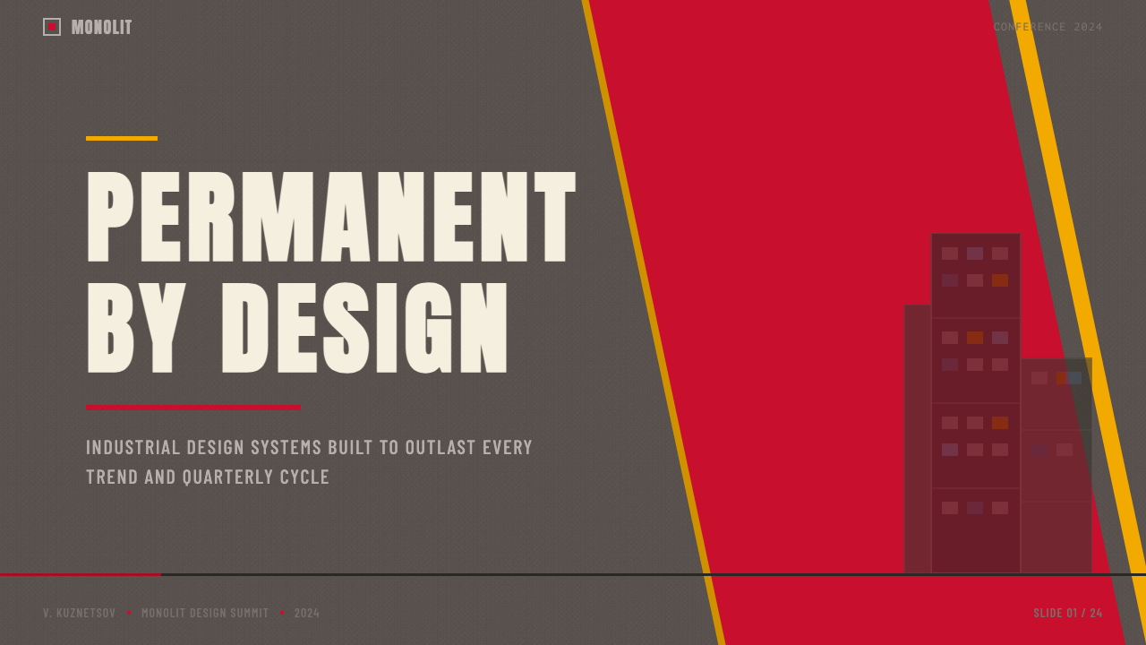
For presentation decks, Soviet Brutalism is exceptional on cover pages and section dividers where monumental impact matters. A cover built from a dominant cement-gray field, one large stencil-style headline in near-white, and a single high-contrast Soviet-red geometric accent — a band, a bar, a hard-edged polygon — communicates with the frontal directness of a propaganda poster. Content slides should maintain the density principle: no generous padding, text aligned to a firm grid, data visualized as flat geometric shapes in the same limited palette. Avoid the temptation to lighten the style for readability; contrast and weight are how the system communicates hierarchy.在演示文稿中,苏联粗野主义在封面页与章节分隔页上表现卓越——在这些场合,纪念碑式的冲击力至关重要。一张由主导性的水泥灰底面、一个以近白色呈现的大型钢模风格标题,以及单一高对比度苏维埃红几何元素——一条色带、一根横条、一个硬边多边形——构成的封面,以宣传海报般的正面直接感传达信息。内容页应维持密度原则:无宽松留白,文字对齐紧实网格,数据以相同有限色板中的平面几何形可视化。避免为了可读性而减轻风格的诱惑;对比度与重量是这个系统传达层级的方式。
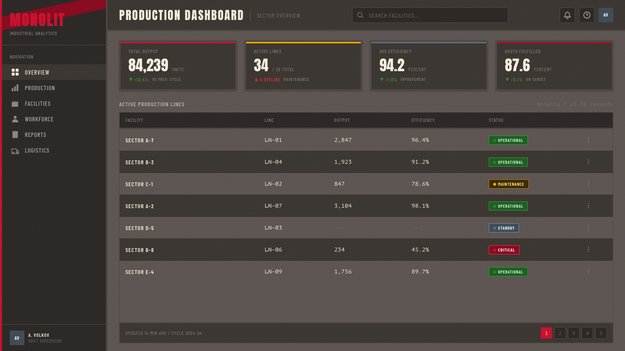
For web interfaces, the style suits dashboards, analytics tools, and B2B platforms where seriousness and data density are features rather than liabilities. The approach requires committing to a heavy visual weight: near-black grounds or cement-toned grounds with Soviet-red interactive accents, bold condensed type for labels and headings, flat borders rather than soft shadows, and minimal rounded corners. Navigation should be typographic and compact. The danger in web applications is using too much of the palette simultaneously — the red accent must remain truly sparse, reserved for the one element that most needs to communicate urgency or action.对于网页界面,这种风格适合仪表板、分析工具以及严肃性与数据密度是特性而非负担的B2B平台。这种方式要求承诺于厚重的视觉重量:接近黑色或水泥色调的底面搭配苏维埃红的交互强调色,粗重的窄体字用于标签与标题,平面边框而非柔和阴影,以及极少的圆角。导航应当是字体性的且紧凑的。在网页应用中,危险在于同时使用过多色板——红色强调色必须保持真正的稀疏,只留给最需要传达紧迫性或行动感的那一个元素。
For editorial and marketing work, Soviet Brutalism functions as a strong compositional system for feature pieces, manifestos, annual reports, and campaign materials where authority is the primary register. A full-spread editorial layout benefits from the low horizon line principle: a large silhouette figure or architectural photograph treated in high-contrast duotone occupying the upper two-thirds of the composition, with compressed headline type anchored at the base. Marketing posters work on the same logic as the original state posters: one dominant visual hierarchy, one accent color, a slogan-scale headline, and supporting copy subordinated in scale. The style is particularly effective for campaigns that position a brand as a builder or a long-term thinker.对于编辑与营销内容,苏联粗野主义作为权威性是主基调的专题报道、宣言、年度报告和战役材料的构图系统效果强劲。全版编辑版面得益于低地平线原则:一个以高对比度双色调处理的大型剪影人物或建筑照片占据构图的上三分之二,压缩的标题字型锚定于底部。营销海报遵循与原始国家海报相同的逻辑:一个主导性的视觉层级,一个强调色,一个口号尺度的标题,以及在尺度上被从属化的辅助文案。这种风格对于将品牌定位为建造者或长期思考者的战役尤为有效。
The most common mistake when applying Soviet Brutalism is mistaking it for a set of graphic symbols — stars, banners, stencil fonts — that can be layered onto any layout to produce the effect. Authentic Soviet Brutalist design does not use these symbols decoratively; every element present is load-bearing. The second common error is softening the palette: introducing warmer tones, more varied grays, or brighter reds in an attempt to make the style more approachable. The approach of the original work was precisely the opposite — the limited, severe palette is what creates the sense of institutional inevitability. A third error is ignoring density. The style does not use whitespace as a luxury; if large empty areas appear, the composition is not reading as Soviet Brutalist, it is reading as a pale quotation of it.应用苏联粗野主义时最常见的错误,是将其误解为一套可以叠加到任何版面上以产生效果的图形符号——星形、横幅、钢模字体。真实的苏联粗野主义设计不将这些符号装饰性地使用;每个存在的元素都是承重的。第二个常见错误是软化色板:引入更暖的色调、更多样的灰色或更明亮的红色,试图使风格更平易近人。原始作品的做法恰恰相反——有限而严峻的色板正是制造机构必然性感的东西。第三个错误是忽视密度。这种风格不将留白作为一种奢侈;如果大面积空白区域出现,构图就不会被读解为苏联粗野主义,而是被读解为对它的苍白引用。
See the Soviet Brutalism (1972) design system查看 Soviet Brutalism (1972) 完整设计系统
Soviet Brutalism (1972) — FAQSoviet Brutalism (1972) · 常见问题
How does Soviet Brutalism differ from Constructivism?苏联粗野主义与构成主义有何不同?
Constructivism (roughly 1920–1934) was an avant-garde movement driven by individual artists and designers who were also theorists — Rodchenko, Lissitzky, Tatlin — and who believed that art could and should transform social consciousness through radical formal innovation. Its compositions are dynamic, diagonal, and energetically unstable. Soviet Brutalism, by contrast, is institutional and monumental: it emerged from state organs, not avant-garde studios, and its formal language prioritizes permanence and legibility over dynamism. Where Constructivism rotates and thrusts, Soviet Brutalism stacks and looms. The two share a grid, a red-black-white palette, and a sans-serif sensibility, but the emotional registers are entirely different — Constructivism is urgent and forward-projecting, Soviet Brutalism is final and backward-validating.构成主义(大约1920—1934年)是由同时身为理论家的个体艺术家和设计师驱动的前卫运动——罗德钦科、利西茨基、塔特林——他们相信艺术能够且应当通过激进的形式创新改变社会意识。其构图是动态的、对角的、充满活力的不稳定。苏联粗野主义则截然相反,是机构性的和纪念碑式的:它从国家机关而非前卫工作室中涌现,其形式语言将永恒与可读性置于动态之上。构成主义旋转与冲刺,苏联粗野主义叠加与凌迫。两者共享网格、红黑白色板和无衬线感性,但情感基调完全不同——构成主义是紧迫的、面向未来的,苏联粗野主义是终结的、向后验证的。
Can this style work for non-political or commercial projects?这种风格能用于非政治性或商业项目吗?
Yes, but it requires deliberate recontextualization. The style's connotations — collective action, state authority, ideological permanence — are strong and specific. In commercial work, these translate best into attributes like reliability, seriousness, long-term commitment, and industrial-scale capability. Technology infrastructure companies, labor-focused platforms, manufacturing brands, and organizations working on large civic problems can absorb these associations productively. Where it struggles: consumer lifestyle products, anything requiring warmth or playfulness, and any brand whose positioning relies on individual expression or personalization. The style works best when the product itself has something genuinely monumental about it — or wants to make the case that it does.可以,但需要刻意的重新语境化。这种风格的内涵——集体行动、国家权威、意识形态的永恒——是强烈而具体的。在商业作品中,这些最好转化为可靠性、严肃性、长期承诺和工业规模能力等属性。技术基础设施公司、以劳工为导向的平台、制造业品牌,以及致力于大型市民问题的组织,能够有效地吸收这些联想。力不从心之处:消费者生活方式产品、任何需要温暖感或趣味性的产品,以及任何定位依赖个人表达或个性化的品牌。当产品本身确实有某种纪念碑式的特质——或想要主张它具有这种特质——时,这种风格效果最佳。
Is the style inherently dark-background, or can it work on light grounds?这种风格本质上是深色背景的,还是也能在浅色底面上奏效?
Historic Soviet posters used both. The cement-gray ground that characterizes this design system reads as a mid-tone rather than a dark background — it is heavy without being black. A light-ground variant is historically legitimate: many Soviet posters used near-white or pale yellow grounds with black type and red accents. The critical issue is maintaining the visual weight, which depends not on background darkness but on type boldness, element density, and the sparingness of the red accent. A light-ground version that spreads the red liberally or uses a lightweight typeface will not read as Soviet Brutalist; a light-ground version that preserves the density, the stencil-weight type, and the single-accent discipline can be just as convincing.历史上的苏联海报两者皆有。表征这套设计系统的水泥灰底面读起来是中间色调而非深色背景——厚重而非黑色。浅色底面变体在历史上是合理的:许多苏联海报使用接近白色或浅黄色的底面搭配黑色文字和红色强调。关键问题是维持视觉重量,而这不取决于背景深度,而取决于字体粗度、元素密度以及红色强调色的节制使用。一个浅色底面版本若大量铺设红色或使用细字重字体,将不会被读解为苏联粗野主义;而一个保持密度、钢模字重以及单一强调纪律的浅色底面版本则可以同样有说服力。
How should photography be used within this aesthetic?摄影在这种美学中应如何使用?
Photography in Soviet Brutalist work is never used naturalistically. Historic posters either avoided photography entirely in favor of painted silhouettes and geometric forms, or used photography processed into stark high-contrast duotones that reduced the image to near-silhouette quality. In contemporary applications, the principle holds: photographs should be treated in high-contrast duotone using the palette's tones rather than their natural colors, cropped tightly and composed against flat geometric grounds rather than allowed to bleed freely, and selected for images where the subject is readable as a strong silhouette. Portrait photography showing individual faces in detail runs counter to the style's collective logic and should be avoided or abstracted.苏联粗野主义作品中的摄影从不以自然主义方式使用。历史上的海报或者完全回避摄影,转而使用绘制的剪影与几何形态,或者使用处理成强烈高对比度双色调的摄影,将图像简化为接近剪影的质量。在当代应用中,这一原则同样有效:照片应以色板的色调而非自然色彩进行高对比度双色调处理,紧凑裁切并置于平面几何底面之上而非自由出血,且应选取主体可被读解为强烈剪影的图像。展示个人面部细节的人像摄影与这种风格的集体逻辑相悖,应当避免或加以抽象化。
What distinguishes a thoughtful Soviet Brutalism application from kitsch?深思熟虑的苏联粗野主义应用与低俗模仿之间的区别是什么?
Kitsch Soviet Brutalism uses the visual symbols — the stars, the hammers, the red banners — as costume. Thoughtful application uses the formal principles — weight, geometry, density, frontal composition, hierarchical scale — and arrives at the symbols only when they serve the specific communicative need. The most convincing contemporary work in this mode often contains very few of the obvious iconographic references; it is recognizable as Soviet Brutalist because of how elements are placed and weighted, not because of which symbols are present. A secondary test: does the work feel like it was designed for distance and durability, or for close inspection and novelty? Soviet Brutalism was made to be read at thirty meters on a concrete wall; if it only works on screen at full resolution, the formal logic has not been internalized.低俗的苏联粗野主义将视觉符号——星形、锤子、红色横幅——作为服装使用。深思熟虑的应用则运用形式原则——重量、几何、密度、正面构图、层级尺度——只有当符号服务于具体的传达需求时才引入它们。这种模式下最令人信服的当代作品往往包含极少显著的图像志参照;它被识别为苏联粗野主义,是因为元素的放置和权重方式,而非因为哪些符号的存在。次级测试:这件作品感觉像是为距离与耐久性设计的,还是为近距离检视与新奇感设计的?苏联粗野主义是被制作来在混凝土墙上三十米外被识读的;如果它只在屏幕上以全分辨率有效,形式逻辑就没有被内化。
Related design styles相关设计风格
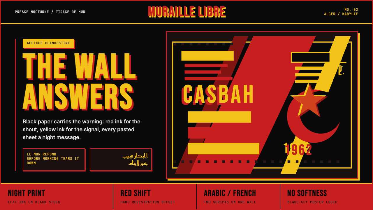 Algerian Casbah Poster (1954–1962)Every surface is a manifesto. Blood red, warning yellow, and stencil type hit…每个表面都是宣言:血红、警示黄与模板字撞上黑色新闻纸。
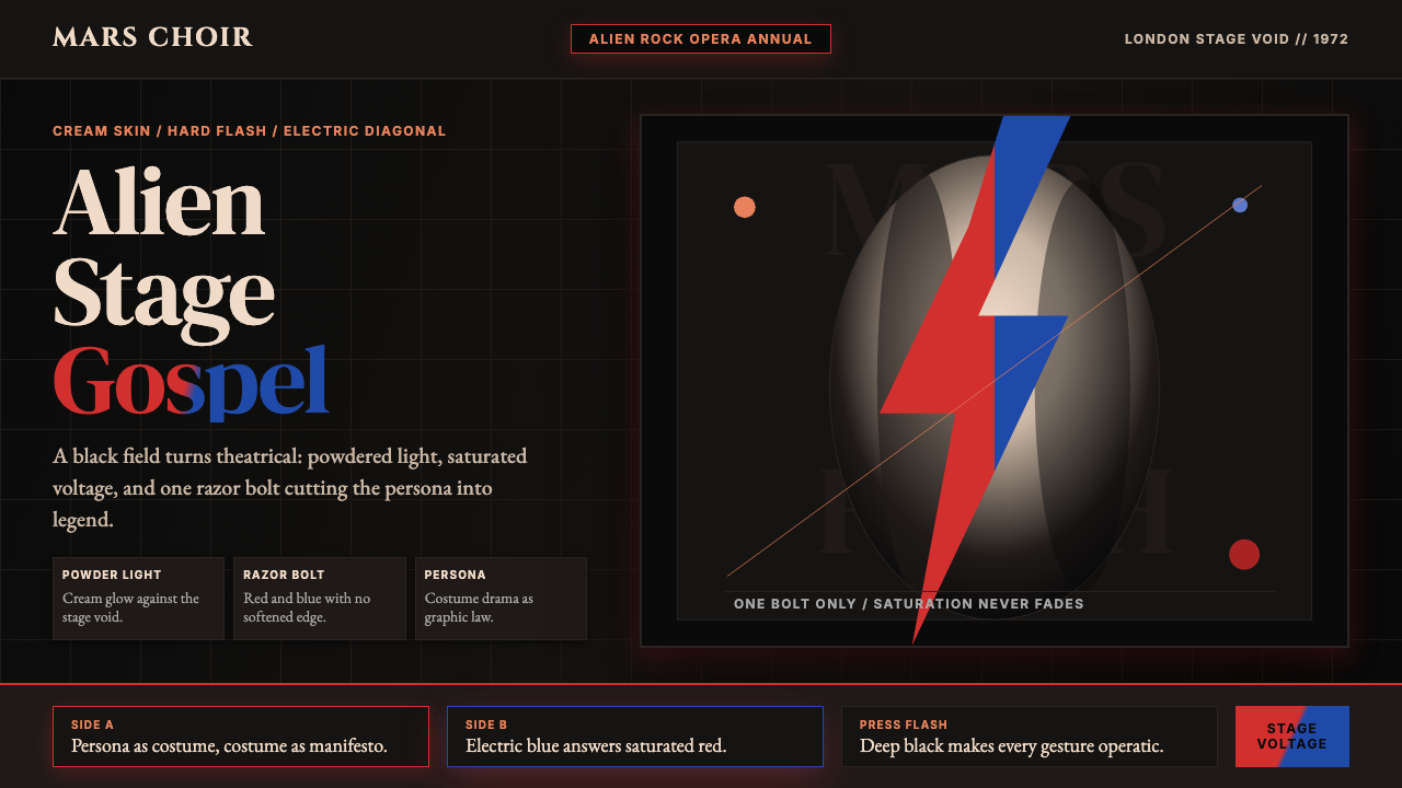 Bowie — Ziggy StardustTheater at full voltage. Cream-on-black portrait cut by one red and electric-…满电压的剧场感:黑底奶油肖像,被红与电蓝闪电劈开。
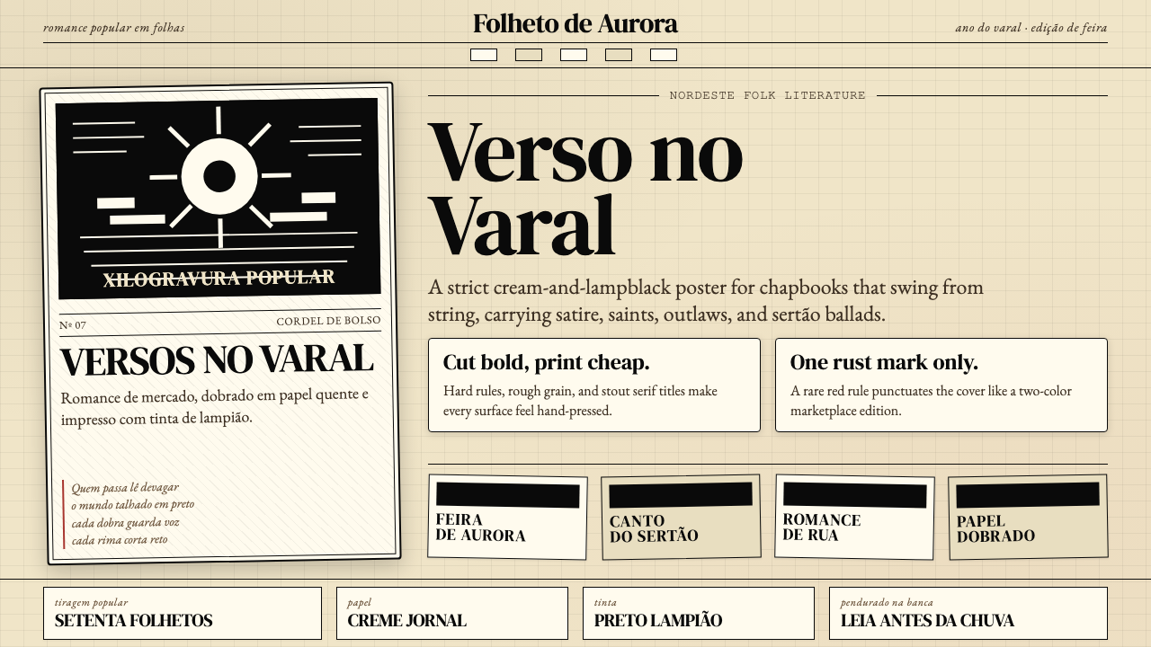 Brazilian Cordel (Northeast Folk Literature)Folk poetry, cut in lampblack. Cream newsprint, bordered chapbooks, one rust-…民间诗被灯黑刻出:奶油新闻纸、黑框小册与一笔锈红。
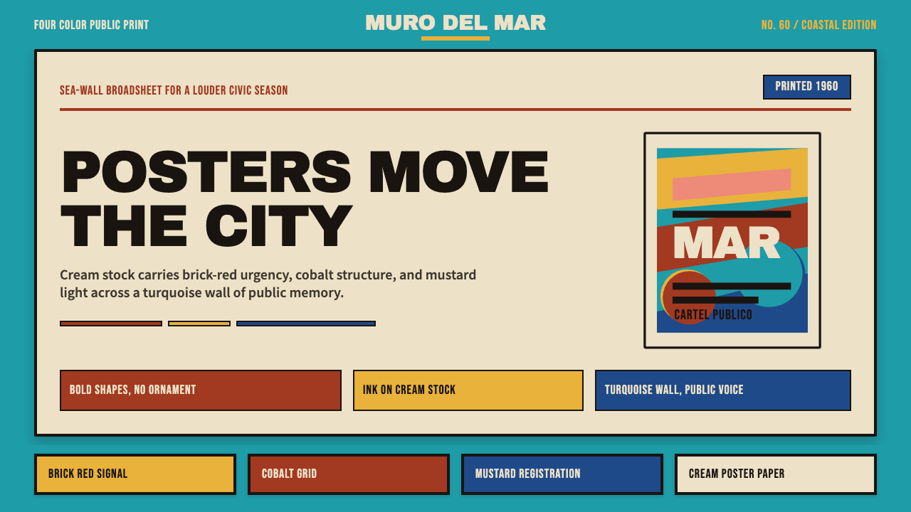 Cuban Malecón 1960 PosterPublic voice in flat ink. Turquoise wall, cream stock, brick red and cobalt b…平面油墨的公共之声:绿松石墙、奶油纸、砖红与钴蓝色条。
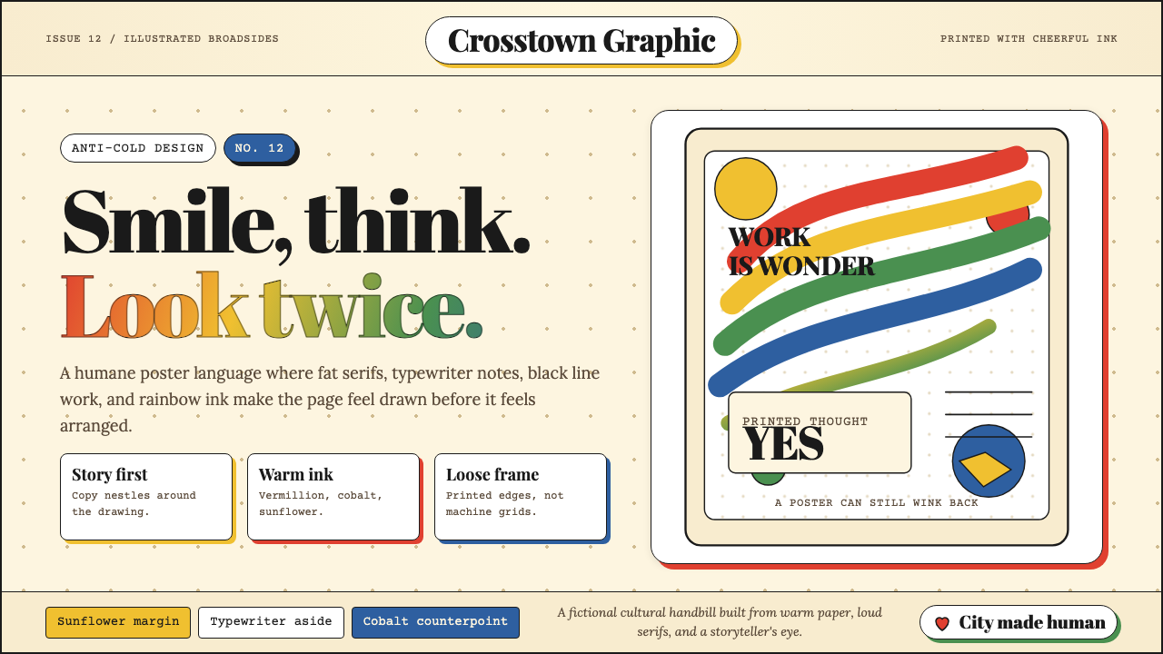 Milton Glaser / Push PinWarm counter-Swiss joy. Vermillion, cobalt and sunflower arcs orbit fat serif…温暖地反叛瑞士冷感:奶油纸上朱砂、钴蓝、向日葵弧线环绕粗衬线。
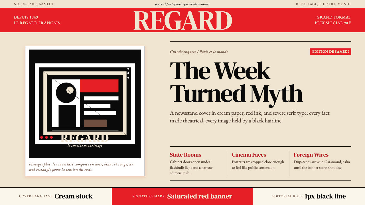 Paris MatchThe cover shouts in one red slab. Cream paper, serif headlines, and black rul…一块红色横幅在呐喊。奶油纸、衬线标题与黑色细线制造戏剧。