What is Milton Glaser / Push Pin?什么是 Milton Glaser / Push Pin?
Milton Glaser and Push Pin Studios proved that illustration is graphic design — and that warmth, wit, and eclecticism are just as rigorous as any grid.米尔顿·格拉瑟与 Push Pin Studios 证明了插画即平面设计——温暖、机智与折衷主义,与任何网格一样严谨。
Milton Glaser / Push Pin in briefMilton Glaser / Push Pin 速览
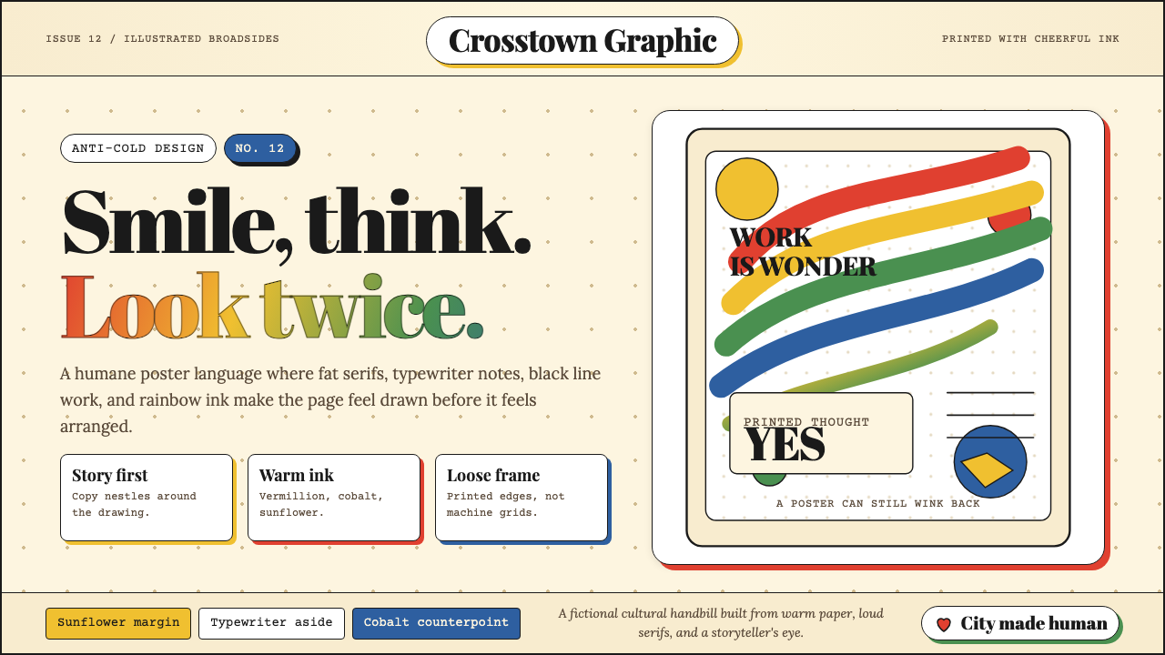
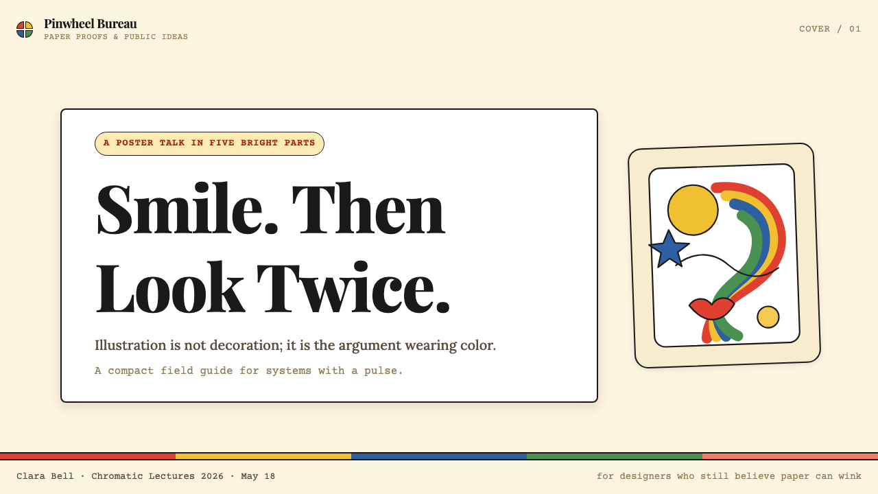
Milton Glaser / Push Pin is the American counter-movement to Swiss International Style: eclectic, illustrative, and unapologetically warm. Where Swiss minimalism sought universal rules and mechanical neutrality, Push Pin embraced historical ornament, hand-drawn line, and the expressive power of a storyteller's eye. The resulting visual language is not chaos — it is a different kind of discipline, one that prizes wit, surprise, and human connection over rational systems.Milton Glaser / Push Pin 是美国对瑞士国际主义的反向运动:折衷、插画驱动,毫不掩饰地温暖。瑞士极简主义追求普世规则与机械中立,Push Pin 则拥抱历史装饰、手绘线条与讲故事者的表现力。由此产生的视觉语言并非混乱——它是另一种规律,一种以机智、惊喜与人情味优先于理性系统的规律。
The aesthetic is built on a warm palette of vermillion, cobalt blue, and sunflower yellow deployed against cream or off-white grounds. Composition is driven by illustration and arc rather than the orthogonal grid. Serifs — historicist, slab, or display-weight — coexist with typewriter-body text, and the pairing is deliberate: different typographic eras in conversation signal erudition rather than inconsistency. Period-mixing is a method, not a mistake.这套美学建立在温暖的色盘之上:朱砂红、钴蓝、向日葵黄铺展于奶油或米白底面。构图由插画与弧线引领,而非正交网格主导。历史主义衬线、平板衬线或展示级字重的衬线体与打字机感的正文字体共存,这种搭配是刻意为之:不同字体时代的对话传递的是博学,而非随意。跨时代混搭是一种方法,不是错误。
The style is also fundamentally optimistic. Glaser's work — from concert posters to food packaging to the 'I ❤ NY' mark — assumes that the viewer is intelligent, curious, and capable of delight. The visual complexity invites lingering rather than demanding instant comprehension. This makes Push Pin a powerful counter-choice whenever a design brief calls for personality, narrative, and the kind of warmth that geometric minimalism structurally cannot provide.这种风格在根本上是乐观的。格拉瑟的作品——从音乐会海报到食品包装再到「I ❤ NY」标志——预设观者是聪慧的、好奇的、有能力感到喜悦的。视觉复杂性邀请人驻足欣赏,而非强求瞬间理解。这使得 Push Pin 成为强有力的反向选择:当设计简报呼唤个性、叙事,以及几何极简主义在结构上无法提供的那种温度时,它便是最恰当的答案。
See the Milton Glaser / Push Pin design system查看 Milton Glaser / Push Pin 完整设计系统
Where does Milton Glaser / Push Pin come from?Milton Glaser / Push Pin 从何而来?
Push Pin Studios was founded in New York City in 1954 by Milton Glaser, Seymour Chwast, Ed Sorel, and Reynold Ruffins — four graduates of the Cooper Union school of art. The name came from the pushpin bulletin boards on which they displayed their work. From the start, the studio positioned itself as an alternative to the clean rationalism then dominating American corporate design. While Madison Avenue agencies refined Swiss-influenced grids, Push Pin raided art history for Victorian engravings, Art Nouveau flourishes, and Art Deco geometry, recombining them with a Pop sensibility.Push Pin Studios 于 1954 年在纽约由米尔顿·格拉瑟、西摩·奇瓦斯特、埃德·索雷尔与雷诺兹·鲁芬斯共同创立——四人均毕业于库伯联合艺术学院。工作室以他们展示作品所用的图钉留言板命名。从创立之初,工作室就将自己定位为当时主导美国企业设计的理性主义清流的替代选项。当麦迪逊大道的广告公司在精炼瑞士影响下的网格系统时,Push Pin 正在洗劫艺术史,从维多利亚时代的雕版印刷、新艺术运动的花饰到装饰艺术的几何中取材,以波普感性重新组合。
The studio published its own promotional magazine, the Push Pin Monthly Graphic (later Push Pin Almanack), which it sent to art directors and clients. This self-published vehicle was itself a design statement — each issue adopted a completely different visual register, from mock-Victorian broadsheets to psychedelic color fields, demonstrating the studio's argument that no single style should monopolize graphic communication. The Almanack became internationally influential, arriving in design studios from London to Tokyo and introducing a generation of designers to the possibility of a post-Swiss eclecticism.工作室出版了自己的推广杂志《Push Pin Monthly Graphic》(后更名为《Push Pin Almanack》),寄送给各地艺术总监与客户。这份自出版刊物本身就是一份设计宣言——每期采用截然不同的视觉语域,从仿维多利亚时代的宽幅印刷品到迷幻色域,论证着没有任何单一风格应当垄断平面传播。《年鉴》获得了国际影响力,出现在伦敦到东京的设计工作室中,向一代设计师展示了后瑞士折衷主义的可能性。
Milton Glaser's individual career within and after Push Pin produced several works that achieved cultural-artifact status. In 1966 he designed a poster of Bob Dylan for Columbia Records in which the musician's silhouetted profile is surrounded by a mass of rainbow-colored hair rendered in sinuous lines drawn from Art Nouveau. The poster was included as an insert in Dylan's Greatest Hits album and is estimated to have reached several million households, making it one of the most widely distributed posters in American print history. In 1977, commissioned to rebrand New York State tourism, Glaser sketched the 'I ❤ NY' logotype — combining a capital I, a red heart symbol, and the letters NY — on a scrap of paper in the back of a taxi. The mark has since been reproduced on billions of objects and remains the most recognizable city identity in the world.格拉瑟在 Push Pin 内外的个人生涯产生了几件达到文化文物地位的作品。1966 年,他为哥伦比亚唱片公司设计了鲍勃·迪伦的海报:音乐人的侧影轮廓被一片取材自新艺术运动的彩虹色卷曲发丝所环绕。这张海报作为插页收入迪伦的《Greatest Hits》专辑,估计进入了数百万个家庭,成为美国印刷史上传播最广的海报之一。1977 年,受托为纽约州旅游形象重塑,格拉瑟在出租车后座的一张纸片上草就了「I ❤ NY」字标——将大写字母 I、红心符号与字母 NY 组合在一起。这个标志此后被印制于数十亿件物品之上,至今仍是全球辨识度最高的城市标识。
Glaser remained active as a designer and educator until his death in June 2020, the day of his ninety-first birthday. Seymour Chwast, his longest-running Push Pin collaborator, continued working into his nineties, maintaining the studio's commitment to illustration-as-design and to the idea that graphic work should carry personal voice. The Push Pin legacy is now studied in virtually every American design school, and its influence is visible wherever contemporary designers resist the pull of systematic minimalism in favor of narrative, warmth, and visual surprise.格拉瑟作为设计师与教育者持续活跃,直至 2020 年 6 月他九十一岁生日当天辞世。他最长期的 Push Pin 合作者西摩·奇瓦斯特工作至九十高龄,始终坚守「插画即设计」的信念,以及平面作品应当携带个人声音的主张。Push Pin 的遗产如今在几乎所有美国设计学院都被研究,它的影响在当代设计师抵制系统性极简主义、转而追求叙事、温度与视觉惊喜时清晰可见。
What defines the Milton Glaser / Push Pin look?Milton Glaser / Push Pin 的视觉特征是什么?
Warm Eclectic Palette温暖的折衷色盘
The signature Push Pin palette centers on a warm triad: vermillion red, deep cobalt blue, and saturated sunflower yellow, deployed against cream or aged-paper grounds rather than clinical white. Unlike the symbolic rigor of Bauhaus primaries, these colors feel painterly and tactile — they suggest pigment, not pixel. Warm neutrals and earthy ochres enter the palette frequently, softening the composition and evoking the hand-printed quality of lithographic posters from the late nineteenth and early twentieth centuries.Push Pin 的标志性色盘以温暖三角色为核心:朱砂红、深钴蓝与饱和的向日葵黄,铺展于奶油色或旧纸感底面而非无菌的纯白。与包豪斯三原色的象征严格性不同,这些颜色充满笔触感与触觉性——它们暗示颜料,而非像素。暖中性色与土赭色频繁进入色盘,柔化构图,唤起十九世纪末至二十世纪初石版印刷海报的手印质感。
Illustration as Structure插画作为结构
In Push Pin work, the illustration is not decoration applied to a layout — it is the layout. Figurative and decorative drawing determines where the eye travels, where type is anchored, and how the composition breathes. Line quality ranges from delicate crosshatching that evokes Victorian engraving to bold flat silhouettes that read at poster scale. This integration of image and text as a single compositional act distinguishes the style from approaches that treat imagery as a container to be filled with type.在 Push Pin 的作品中,插画不是附加于版面之上的装饰——它就是版面本身。具象与装饰性的绘画决定了视线的走向、文字的锚定位置,以及构图的呼吸节奏。线条品质从唤起维多利亚时代雕版的细腻交叉排线,到在海报尺度下清晰可读的大胆平面剪影,跨度广泛。这种将图像与文字融为单一构图行为的整合方式,使该风格有别于将图像视为待填充文字容器的设计路径。
Historicist Type Mixing历史主义字体混用
Push Pin typography refuses the modernist commitment to a single-family system. Display headlines may draw from ornate Victorian wood type or Art Nouveau letterforms full of organic curve; body text often takes a more readable, book-like serif; captions or supporting text might employ a typewriter or slab register. The deliberate collision of typographic eras signals the studio's core argument: that history is a resource to be mined rather than a tradition to be escaped. The mixing is always purposeful — each face is chosen for its cultural resonance within the particular piece.Push Pin 的字体排印拒绝现代主义对单一字体家族系统的承诺。展示级标题可能取自维多利亚时代繁复的木刻字体,或充满有机曲线的新艺术风格字形;正文通常采用可读性更强、书籍感的衬线体;图注或辅助文字则可能带有打字机或平板衬线的气质。字体时代的刻意碰撞传递了工作室的核心主张:历史是可供开采的资源,而非需要逃脱的传统。混用始终是有目的的——每种字体都因其在具体作品中的文化共鸣而被选择。
Arc, Curve, and Organic Line弧线、曲线与有机线条
Where Swiss modernism is orthogonal, Push Pin is curvilinear. Arcs structure compositions, lines flow rather than march, and borders undulate or feature hand-drawn irregularity rather than mechanical precision. The sinuous quality owes debts to Art Nouveau, to psychedelic poster art of the 1960s, and to the organic drawing traditions of mid-century American illustration. This curvilinear energy makes the style feel alive and in motion even when static — a quality that flat geometric systems rarely achieve.瑞士现代主义是正交的,Push Pin 则是曲线性的。弧线结构化构图,线条流动而非行进,边框起伏或带有手绘的不规则性,而非机械精度。这种蜿蜒品质承袭自新艺术运动、1960 年代迷幻海报艺术,以及二十世纪中叶美国插画的有机绘画传统。这种曲线能量使风格在静止状态下也充满生机与运动感——这是平面几何系统极少能实现的品质。
Pop Color over Vintage Texture波普色彩叠加复古质感
A characteristic Push Pin juxtaposition places flat, saturated pop color directly over aged, textured surfaces — a screaming yellow fills a shape traced over a Victorian engraving ground, or a flat cobalt silhouette sits on a ground that reads like worn letterpress paper. This collision between the immediate and the historical is not random: it compresses time, asserting that visual traditions from different eras can inhabit the same plane and converse as equals. The tension between smooth pop color and rough antique texture is itself the message.Push Pin 的一个典型并置方式是将平面的饱和波普色彩直接叠加于老旧、有质感的表面之上——炽烈的黄色填满一个描摹在维多利亚时代雕版底纹之上的形状,或一个平面的钴蓝剪影坐落于状如磨损活版印刷纸张的底面上。这种即时性与历史性的碰撞并非随意为之:它压缩了时间,断言来自不同时代的视觉传统可以栖居于同一平面,以平等的姿态对话。光滑波普色彩与粗粝古典质感之间的张力,本身就是信息。
Asymmetric, Story-Led Composition非对称的叙事驱动构图
Push Pin layouts are asymmetric, but the organizing logic is narrative rather than mathematical. Composition follows the story the piece is telling: figures face each other or reach toward type, directional lines lead the eye through a sequence, masses of color suggest weight and mood rather than grid alignment. There is no rigid modular system; instead, there is the designer's cultivated sense of what a composition needs to feel complete, surprising, and alive. This approach demands strong visual judgment but rewards it with work that is unmistakably handmade.Push Pin 的版面是非对称的,但组织逻辑是叙事性的,而非数学性的。构图追随作品讲述的故事:人物互望或伸向文字,方向性线条引导视线按序穿行,色块的重量与情绪暗示远超网格对齐。没有刚性的模块化系统;取而代之的是设计者对构图何时感觉完整、令人惊喜、充满生机的培养出的敏感判断力。这种方式要求强烈的视觉判断力,但以明显带有手作温度的作品作为回报。
Wit and Cultural Quotation机智与文化引用
Push Pin work consistently demonstrates intellectual wit — the knowing reference, the unexpected historical citation, the visual pun that rewards attention. Glaser and his collaborators drew on sources from Renaissance portraiture to Japanese woodblock prints to dime-novel illustration without hierarchical prejudice, treating world visual culture as a shared commons. This erudite playfulness communicates that design can be both learned and fun, that sophistication and warmth are not opposites. The wit is never ironic in the detached postmodern sense; it is warm, collegial, and aimed at connection.Push Pin 的作品始终展现出知性的机智——有意为之的引用、意外的历史典故、奖励专注者的视觉双关。格拉瑟与合作者无等级偏见地从文艺复兴肖像画到日本木版画、从廉价小说插图中汲取灵感,将世界视觉文化视为共享的公共资源。这种博学的嬉戏传达了一种信念:设计可以既渊博又有趣,精致与温暖并非对立。这种机智绝非超然的后现代式反讽——它是温暖的、平等的,以连接为目标。
See the Milton Glaser / Push Pin design system查看 Milton Glaser / Push Pin 完整设计系统
Who shaped Milton Glaser / Push Pin?谁塑造了 Milton Glaser / Push Pin?
Glaser co-founded Push Pin Studios in 1954, left to open Milton Glaser Inc. in 1974, and remained prolific for the next five decades. His 1966 Bob Dylan poster brought psychedelic line work and Art Nouveau curves into mainstream American print culture in a single image. His 'I ❤ NY' mark, sketched in the back of a taxi in 1977, became the most imitated city identity in history. Glaser also redesigned New York magazine with Clay Felker, bringing an editorial design sensibility to weekly journalism that influenced magazine layout worldwide. He taught for decades at the School of Visual Arts in New York and argued consistently that design is fundamentally a humanist discipline — not a problem-solving system but a meaning-making practice.格拉瑟于 1954 年联合创立 Push Pin Studios,1974 年离开后自立门户成立 Milton Glaser Inc.,此后五十年间始终保持旺盛的创作力。他 1966 年的鲍勃·迪伦海报以一张图像将迷幻线条与新艺术曲线带入美国主流印刷文化。1977 年在出租车后座草就的「I ❤ NY」字标,成为历史上被模仿最多的城市标识。格拉瑟还与克莱·费尔克共同重新设计了《纽约》杂志,将一种编辑设计感性引入周刊新闻,影响了全球的杂志版面设计。他在纽约视觉艺术学院执教数十年,始终坚持设计从根本上是一门人文学科——不是解题系统,而是意义生产的实践。
Chwast co-founded Push Pin with Glaser and remained its longest-running creative force, working actively into his nineties. His visual style is more overtly cartoonish and satirical than Glaser's — deeply influenced by American comic strips, Victorian illustration, and the graphic arts of political caricature. Chwast's anti-war posters of the Vietnam era became iconic examples of illustration used for direct political argument, and his typographic experiments — including his own display typefaces drawn in deliberately naive, irregular letterforms — pushed the studio's eclecticism further toward visual storytelling. He was instrumental in establishing the Push Pin aesthetic as a lasting alternative canon within American graphic design.奇瓦斯与格拉瑟共同创立 Push Pin,并成为工作室持续时间最长的创意核心力量,工作至九十高龄。他的视觉风格比格拉瑟更为明显地带有卡通与讽刺气质——深受美国漫画条、维多利亚时代插画和政治讽刺漫画平面艺术的影响。越战时期奇瓦斯的反战海报成为以插画进行直接政治论辩的标志性案例,他的字体实验——包括以刻意天真、不规则字形绘制的自有展示字体——将工作室的折衷主义进一步推向视觉叙事。他在将 Push Pin 美学确立为美国平面设计史中持久的替代正典方面功不可没。
Sorel, another founding member of Push Pin, left the studio relatively early to pursue a career as an editorial illustrator and caricaturist, contributing regularly to The New Yorker, The Atlantic, and other major publications over several decades. His sharp caricatures of political figures drew on European satirical print traditions — Daumier, Rowlandson, Gillray — and demonstrated that the Push Pin commitment to illustration as a primary communicative tool extended naturally into journalism and social commentary. Sorel's career illustrated the breadth of the Push Pin diaspora: the studio was as much an attitude toward image-making as it was a house style.索雷尔是 Push Pin 的另一位创始成员,相对较早离开工作室,转而发展为编辑插画师与讽刺漫画家,数十年间持续为《纽约客》《大西洋月刊》等主要刊物供稿。他对政治人物的犀利讽刺漫画借鉴了欧洲讽刺版画传统——杜米埃、罗兰森、吉勒雷——并证明了 Push Pin 将插画作为主要传播工具的承诺自然延伸至新闻业与社会评论领域。索雷尔的生涯展示了 Push Pin 散布影响的广度:工作室与其说是一种门派风格,不如说是一种对图像创作的态度。
McMullan was among the second generation of Push Pin-affiliated illustrators whose work carried the studio's sensibility into theater and cultural poster design. His long collaboration with the Lincoln Center Theater — producing hand-painted season posters that combined loose watercolor rendering with expressive lettering — became one of the most visible examples of illustration-led design in American cultural institutions. McMullan's posters demonstrated that the Push Pin conviction, that image and typography should form a single emotional argument, could sustain a long-form institutional identity without ever becoming formulaic.麦克穆伦是与 Push Pin 相关联的第二代插画师之一,他的作品将工作室的气质带入了剧院与文化海报设计领域。他与林肯中心剧院长期合作,创作手绘季演海报,将松动的水彩渲染与富有表现力的手写字结合在一起,成为美国文化机构中插画驱动设计最具能见度的案例之一。麦克穆伦的海报证明了 Push Pin 的信念——图像与字体应当构成单一的情感论点——能够在长期的机构视觉识别中保持生命力,而不会流于公式化。
How do you use Milton Glaser / Push Pin today?今天怎么用 Milton Glaser / Push Pin?
Milton Glaser / Push Pin is a style that rewards specificity of application. It is not a neutral container — it arrives with a strong personality, a warm emotional register, and an inherent association with American cultural vitality of the mid-to-late twentieth century. Used well, it lends a project authority, wit, and a sense of handmade care that is structurally unavailable to minimalist systems. The first question to ask is not how but whether: does the project's subject matter and audience welcome warmth, narrative, and visual complexity, or does it demand the rational clarity that geometric minimalism provides?Milton Glaser / Push Pin 是一种需要精准施用的风格。它不是中性容器——它携带着强烈的个性、温暖的情感基调,以及与二十世纪中后期美国文化活力的内在关联。运用得当,它为项目赋予权威感、机智与一种手作关怀,而这种品质在结构上是极简系统所无法提供的。首先要问的不是如何用,而是是否该用:项目的主题与受众是否欢迎温度、叙事与视觉复杂性,还是它要求几何极简主义所提供的理性清晰?
For presentation slides, Push Pin works with particular power on covers and section dividers, where a bold illustrative moment can establish the personality of an entire deck before a word of content is read. A cover composition anchored by a central illustrative figure, surrounded by curving ornamental type set in a warm cream-and-vermillion palette, communicates energy and confidence immediately. Content slides should be handled with restraint: preserve the warm ground color and historicist type choices, but reduce illustrative complexity so that information hierarchy remains legible. Data slides can incorporate the style's decorative sensibility through border treatments, hand-drawn chart embellishments, and warm palette fills for bars and segments — while keeping the underlying data structures clean and readable.在演示文稿中,Push Pin 在封面页与章节分隔页上尤为有力——一个大胆的插画性时刻能在任何内容被阅读之前就确立整套幻灯片的个性。以中央插画人物为核心的封面构图,被弯曲的装饰性字体所环绕,置于温暖的奶油与朱砂色盘之上,立即传递出能量与自信。内容页应当克制处理:保留温暖的底色与历史主义字体选择,但降低插画复杂度,使信息层级保持清晰可读。数据页可通过边框处理、手绘图表装饰以及柱图与扇区的暖色填充融入风格的装饰感性——同时保持底层数据结构的简洁可读。
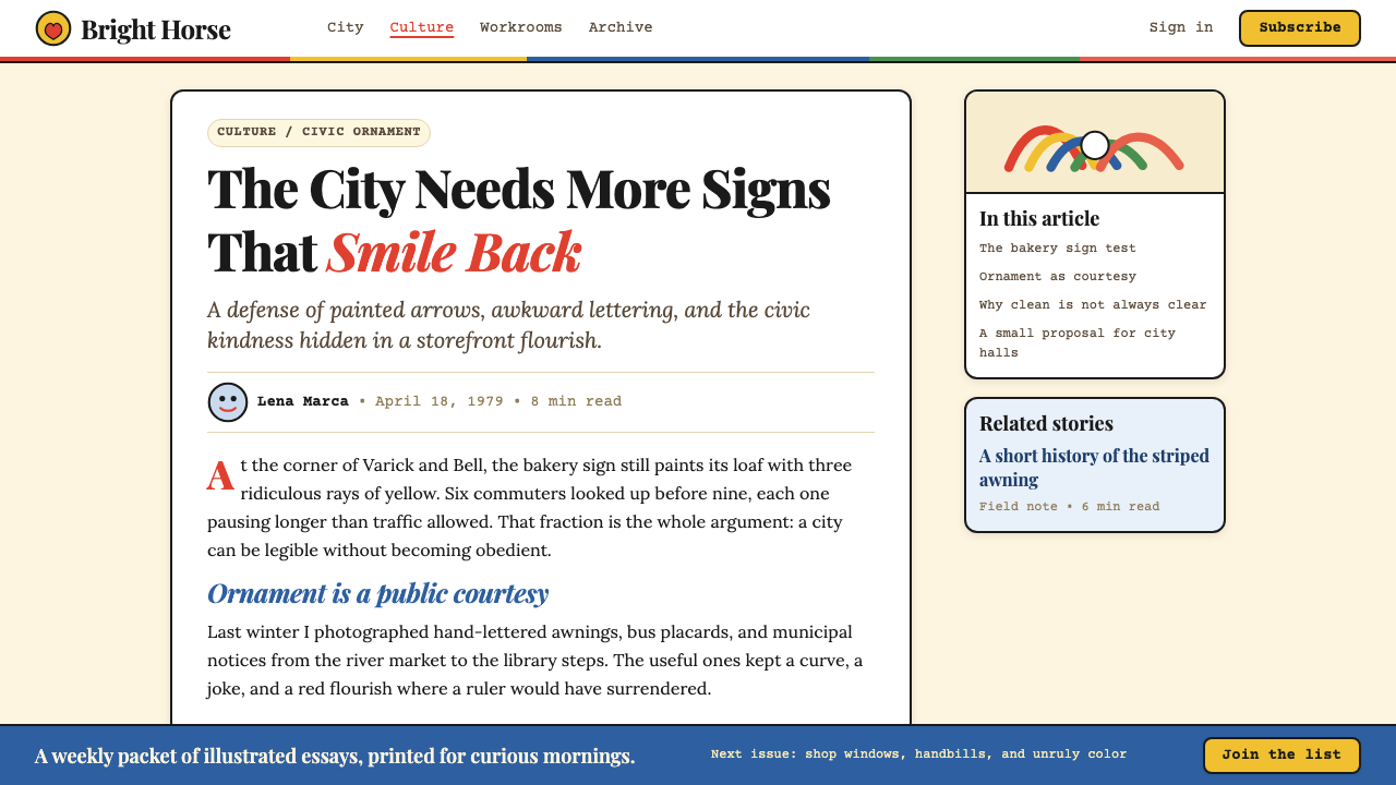
For web interfaces, the style is most naturally at home in editorial contexts — cultural publications, food and lifestyle brands, independent bookshops, creative agencies, and music platforms where personality is a competitive advantage. Dashboard and pricing page applications are possible but require discipline: anchor the layout with a clear typographic hierarchy, limit the illustrative elements to accent positions rather than letting them compete with functional UI components, and ensure that interactive states are communicated through clearly readable color shifts rather than decorative elaboration. The style's characteristic asymmetry can create visual interest in hero sections and feature blocks without undermining the usability of forms, tables, or navigation.对于网页界面,这种风格最自然地契合编辑性场景——文化刊物、食品与生活方式品牌、独立书店、创意机构,以及个性是竞争优势的音乐平台。仪表板与定价页面的应用是可能的,但需要纪律:以清晰的字体层级锚定版面,将插画性元素限定于点缀位置而非让其与功能性界面组件竞争,并确保交互状态通过清晰可读的色彩变化而非装饰性繁复来传达。这种风格特有的非对称性可以在主图区与特性区块中创造视觉趣味,而不影响表单、表格或导航的可用性。
For editorial and marketing work, Push Pin is closest to its native territory. A feature article layout in this style uses a generously scaled illustrative drop cap or opening image, warm body text in a readable book serif, and section breaks marked by ornamental rules or small decorative devices rather than plain horizontal lines. Pull quotes can be set in a contrasting display face at an angle or within an arched or oval frame. Marketing pages benefit from the style's poster logic: treat each content section as a self-contained visual argument with its own illustration, color key, and typographic register, then compose the page as a sequence of distinct moments rather than a single continuous grid.对于编辑与营销内容,Push Pin 最接近其原生领地。这种风格的特稿版面使用大尺度插画式首字下沉或开篇图像,可读书籍衬线体的温暖正文,以及以装饰性细线或小装饰符号而非素朴水平线标记段落分隔。引用语可以在对比鲜明的展示字体中以一定角度排列,或置于拱形或椭圆形边框内。营销页面受益于这种风格的海报逻辑:将每个内容区块视为带有自己的插画、色彩基调与字体调性的自足视觉论点,然后将页面组合为一系列独特时刻的序列,而非单一连续的网格。
A common mistake when applying this style is mistaking eclecticism for anything-goes. Push Pin's historical promiscuity is always purposeful — each borrowed element is chosen for its cultural resonance and its function within the specific composition. Mixing too many historical references without clear editorial logic produces visual noise rather than wit. A second common error is under-investing in the illustrative elements: applying the warm palette and historicist typefaces to a layout that lacks genuine illustration results in something that reads as vaguely retro without any of the style's narrative power. The illustration is not optional decoration; it is the engine of the approach.应用这种风格时最常见的错误是将折衷主义误解为随心所欲。Push Pin 的历史性博采始终是有目的的——每个借用的元素都因其文化共鸣及其在具体构图中的功能而被选择。在缺乏清晰编辑逻辑的情况下混杂过多历史引用,产生的是视觉噪音而非机智。第二个常见错误是对插画性元素投入不足:将温暖的色盘与历史主义字体应用于缺乏真正插画的版面,结果只会显得模糊地复古,而没有这种风格任何叙事力量。插画不是可选的装饰;它是这种方法的引擎。
See the Milton Glaser / Push Pin design system查看 Milton Glaser / Push Pin 完整设计系统
Milton Glaser / Push Pin — FAQMilton Glaser / Push Pin · 常见问题
How is Push Pin different from other retro or vintage design styles?Push Pin 风格与其他复古或怀旧设计风格有何不同?
Most retro design styles simulate a specific historical period — they reproduce the printing artifacts, color limitations, and type conventions of a particular era in order to evoke nostalgia. Push Pin is something different: it is a method of active historical quotation, not passive reproduction. Glaser and his collaborators chose elements from Victorian, Art Nouveau, Art Deco, and other traditions not to evoke a time but to make an argument — about the richness of visual history, about the intelligence of the viewer, about the possibility of graphic design as cultural commentary. The difference is visible in the results: Push Pin work feels contemporary and witty even decades later, while most period simulation ages quickly.大多数复古设计风格是在模拟特定历史时期——重现某个时代的印刷痕迹、色彩限制与字体惯例,以唤起怀旧情绪。Push Pin 是另一回事:它是一种主动历史引用的方法,而非被动复制。格拉瑟与合作者从维多利亚时代、新艺术运动、装饰艺术等传统中选取元素,不是为了唤起某个时代,而是为了提出一个论点——关于视觉历史的丰富性,关于观者的智识,关于平面设计作为文化评论的可能性。这种差异在结果中清晰可见:Push Pin 的作品数十年后仍感觉当代而富有机智,而大多数时代模拟则迅速老化。
Can the Push Pin style work for digital-native interfaces, or is it inherently print-oriented?Push Pin 风格能用于原生数字界面,还是它本质上是印刷导向的?
The style originated in print and its deepest strengths are print-adjacent: the textured grounds, the hand-drawn line quality, the lithographic color relationships all translate most naturally to static surfaces. That said, the style adapts to digital contexts provided the designer accepts certain trade-offs. Textured grounds may need simplification for performance. Highly detailed illustration may need to be reserved for large-format moments — hero sections, splash screens, empty states — rather than applied throughout an interface. Micro-interactions should use the palette and typographic register rather than animated illustration, which can easily become overwhelming. Used this way, Push Pin digital work retains the style's warmth and personality without fighting against the performance and legibility requirements of interactive software.这种风格起源于印刷,其最深层的优势也与印刷相邻:质感底面、手绘线条品质、石版印刷式的色彩关系,都最自然地转化为静态表面。话虽如此,只要设计者接受某些权衡,这种风格仍可适应数字场景。质感底面可能需要为性能而简化。高度精细的插画可能需要保留给大尺度时刻——主图区、启动屏、空状态——而非遍布整个界面。微交互应使用色盘与字体调性而非动态插画,后者很容易变得令人不适。如此使用,Push Pin 数字化作品在不与交互软件的性能与可读性要求相抗衡的前提下,保留了这种风格的温度与个性。
The style feels complex — how do you keep it from looking cluttered?这种风格感觉很复杂——如何防止它看起来杂乱?
The key discipline is compositional hierarchy: every Push Pin piece has a single dominant element — usually the central illustration — and everything else is subordinate to it. Clutter happens when multiple elements compete for primacy at the same scale and contrast level. Glaser's compositions are actually highly controlled: the illustrative mass anchors a clear center of gravity, type is placed in relation to that anchor rather than independently, and the decorative elements (borders, ornamental rules, secondary color fills) are consistently smaller and lower in contrast than the primary figure. The eclecticism operates within a clear visual hierarchy, not outside it. When applying the style, establish the dominant element first and let everything else find its supporting position.关键纪律在于构图层级:每件 Push Pin 作品都有一个单一的主导元素——通常是中心插画——其他一切都从属于它。杂乱发生在多个元素以相同尺度和对比度竞争主导权时。格拉瑟的构图实际上控制严谨:插画性的体量锚定清晰的重心,文字相对于这个锚点定位而非独立放置,装饰性元素(边框、装饰细线、辅助色填充)在尺度与对比度上始终低于主体形象。折衷主义在清晰的视觉层级内部运作,而非游离于其外。应用这种风格时,先确立主导元素,让其他一切找到各自的配角位置。
Is this style appropriate for brands that want to appear modern and forward-looking?这种风格适合希望显得现代且面向未来的品牌吗?
It depends on what kind of modernity the brand is claiming. Push Pin is not suited to projecting technological rationalism or clinical efficiency — for those signals, geometric systems are structurally better aligned. But there is a kind of modernity that values craft over automation, personality over neutrality, and cultural depth over optimized minimalism — and for that version of contemporary, Push Pin is a strong choice. Brands in independent food, music, publishing, fashion, cultural institutions, and creative services can use the style to signal that they are modern in the sense of confident, cultured, and human rather than modern in the sense of algorithmic and scalable.这取决于品牌主张的是哪种现代性。Push Pin 不适合投射技术理性主义或临床效率——对于这些信号,几何系统在结构上更为契合。但存在另一种现代性,它重视手作胜于自动化,重视个性胜于中立,重视文化深度胜于优化的极简主义——对于那个版本的当代感,Push Pin 是有力的选择。独立食品、音乐、出版、时尚、文化机构和创意服务领域的品牌,可以用这种风格来传递一种「现代」:自信的、有文化底蕴的、有人情味的现代,而非算法化的、可无限规模化的现代。
How should imagery and photography be handled within a Push Pin layout?在 Push Pin 风式版面中,如何处理图像与摄影?
Push Pin is fundamentally a drawn style, and photography sits uneasily within it when treated naturalistically. Where photography appears in Push Pin-influenced work, it benefits from being treated as a graphic element: cropped aggressively into an illustrative shape, given a duotone wash in the palette's warm tones, or framed within an ornamental border that makes it read as a considered artifact rather than a documentary snapshot. Alternatively, photography can be deliberately set in tension with illustration — a photographic figure surrounded by drawn ornamentation — but this requires compositional confidence to avoid looking unresolved. As a general rule, if the brief allows it, drawn or painted imagery is more internally consistent with the style than photographic imagery and will require less compensatory treatment.Push Pin 从根本上是一种绘画性风格,摄影在被自然主义处理时与它格格不入。在受 Push Pin 影响的作品中,摄影若要出现,将其作为图形元素处理会更有利:激进地裁剪为插画性形状,用色盘的暖调做双色调处理,或置于装饰性边框内使其读起来像一件经过深思熟虑的器物而非纪录性快照。另一种方式是刻意将摄影与插画置于张力之中——一个摄影性人物被手绘装饰所环绕——但这需要构图上的自信以避免显得未竟其功。作为一般原则,如果简报允许,绘制或绘画的图像在风格内部一致性上优于摄影图像,所需的补偿性处理也更少。
Related design styles相关设计风格
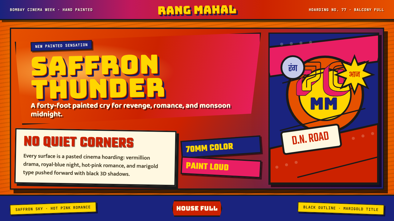 Bollywood Poster Art (1970s)Subtlety is unaffordable. Saffron fields, Bungee shadows, diagonal hoarding d…节制太便宜:藏红花底、Bungee黑影与斜向招贴制造十米戏剧。
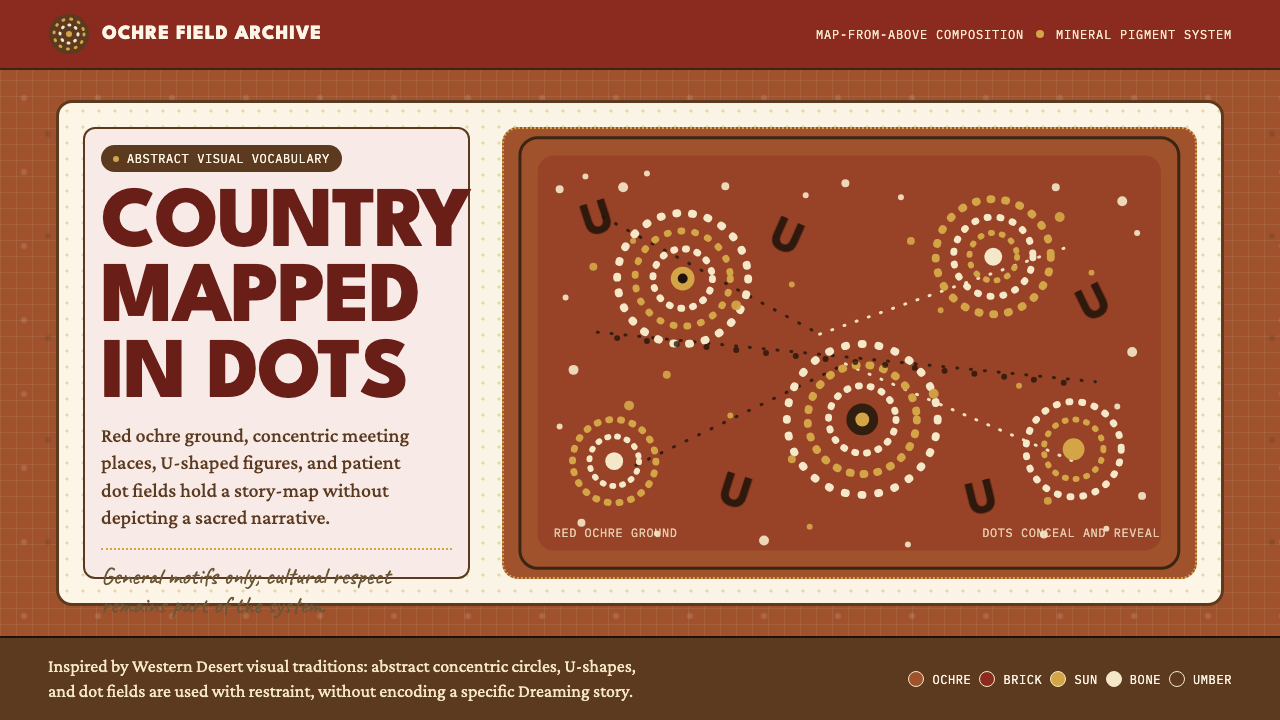 Aboriginal Dot PaintingAncient story-map energy. Red ochre, bone dots, concentric circles, and U-mar…古老故事地图感:红赭底、骨白点、同心圆与 U 形构成大地。
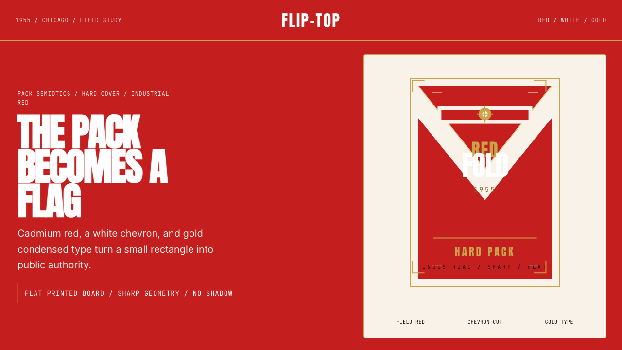 Marlboro Red Flip-Top (1955)Authority in one fold. Cadmium red, white chevron, and gold type read like a…一折成旗。镉红、白人字与金字排出强硬权威。
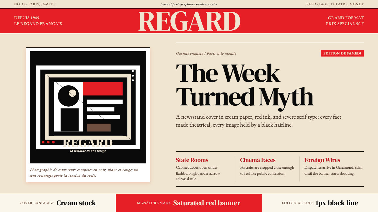 Paris MatchThe cover shouts in one red slab. Cream paper, serif headlines, and black rul…一块红色横幅在呐喊。奶油纸、衬线标题与黑色细线制造戏剧。
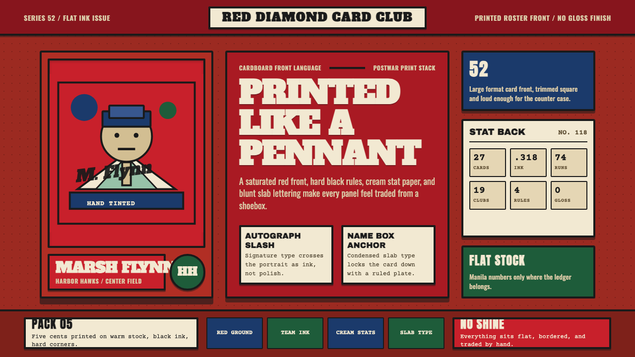 Topps Baseball CardCardboard heat. Brick-red slab panels, cream stats, and condensed type feel p…纸卡热度:砖红板块、米黄数据与压缩粗体,像平版印刷。
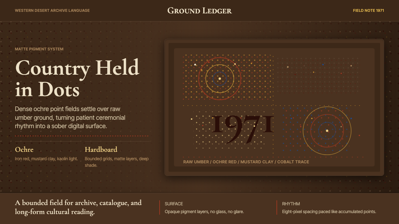 Aboriginal Dot Painting (Papunya 1971)Ochre memory, held steady. Raw umber ground, Cormorant type, disciplined dot-…赭石记忆沉稳留存:生赭黑地、Cormorant 字体与克制点阵。