What is Topps Baseball Card?
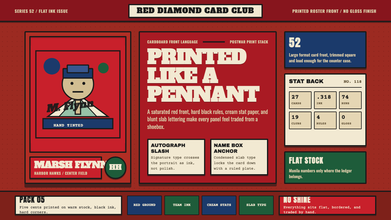
The 1952 Topps baseball card is a masterclass in American vernacular print design — saturated colour panels, hand-tinted black-and-white portraits, facsimile signatures, and heavy condensed type that feels like it was stamped, not set.
Topps Baseball Card in brief
The 1952 Topps baseball card set is the canonical reference point for American sports-card design: a fully saturated, single-colour ground panel carrying a hand-tinted player portrait, a slashed facsimile autograph across the chest, a slab-serif name box in bold condensed lettering, and a team logo anchored below. The back is warm manila stock dense with statistics. Nothing is decorative in a frivolous sense — every element does a job.
As a design system, the 1952 Topps card translates the logic of flat commercial print — letterpress ink on stiff cardboard, no gradients, no photography, limited colour registration — into a coherent visual grammar. The palette is driven by team identity: each player's panel colour corresponds to their franchise, which gives the full set the feel of a codified system rather than a collection of individual illustrations.
The style's defining quality is controlled flatness with emotional warmth. The hand-tinted portrait sits inside the colour field like a window: the tinting adds just enough warmth and flesh tone to the black-and-white photograph without pretending to be full-colour photography. The result is an aesthetic that is simultaneously graphic and intimate — more poster than snapshot, more emblem than photograph.
Where does Topps Baseball Card come from?
The American sports-card tradition began in the 1860s, when tobacco companies inserted illustrated cards into cigarette packages as stiffeners and collectibles. By the early twentieth century, cards had expanded to confectionery, gum, and candy brands, and the subjects had grown to include athletes across multiple sports. Topps Chewing Gum, founded in Brooklyn in 1938, entered the baseball card market in 1951 and released its landmark 1952 set — widely regarded as the first true modern baseball card — the following year.
The 1952 set was designed primarily under the direction of Sy Berger, a Topps employee who would go on to shape the company's card design for decades. Berger oversaw the decision to use large-format cards (compared to the small, narrow cards that preceded them), full team-colour grounds, and hand-tinted photographic portraits. The art studio work was done by commercial artists who specialised in the kind of flat, printed illustration common to mid-century American advertising: limited palette, strong outline, controlled tint. The facsimile autograph — reproduced directly from player signatures — was a deliberate authenticity signal, connecting the mass-produced card to the individual athlete.
The 1952 set acquired legendary status partly through scarcity. Unsold inventory from the run was dumped into the Atlantic Ocean by a Topps distributor — a loss that made surviving high-grade examples extraordinarily rare. The Mickey Mantle card from the set, number 311, became the single most iconic American sports collectible of the twentieth century and a benchmark for the hobby. Its visual design — Mantle's portrait floating on a saturated red-orange field, his name in a cream slab box, the Yankees emblem below — became the template every subsequent Topps set was judged against.
The broader cultural context was postwar American optimism and the rise of mass consumer culture. Baseball was the national pastime in its most culturally dominant era, and Topps cards were both affordable luxury objects and social currencies among children and adolescents. The card's visual language — bold, direct, saturated, warm — reflected and reinforced the period's confidence in graphic commercial print as a medium of civic and popular identity.
What defines the Topps Baseball Card look?
Colour Ground
Each card's dominant colour field is fully saturated and tied to the player's team identity, making the set function as a colour-coded catalogue. The grounds are warm and opaque: brick red, royal blue, forest green, deep gold, navy. There are no pastels, no tints, no half-strength values. The saturated field acts as the card's primary visual statement — before the face, before the name, the colour identifies the franchise.
Hand-Tinted Portrait
The player photographs are black-and-white originals that commercial artists hand-coloured using transparent dye washes, adding flesh tones to skin, colour to uniforms, and a warm ambient cast to the background. The technique is deliberate in its restraint: the tinting does not simulate photography but rather translates a photographic subject into the register of print illustration. The result sits between documentary and designed — recognisably a real person, but rendered in the language of a poster.
Condensed Slab-Serif Type
Player names appear in heavy condensed slab-serif lettering — a typeface category with thick bracketed serifs and uniform stroke weight, historically associated with broadside printing, circus posters, and newspaper headlines. The condensed proportion allows long names to fill a fixed-width box without breaking, while the heavy weight reads at a distance. The name box sits in cream or white against the saturated colour ground, creating the sharpest contrast on the card face.
Facsimile Autograph
A reproduction of the player's handwritten signature is printed across the lower portion of the portrait, typically in blue or black ink on the colour ground. The facsimile autograph is not applied casually — it sits at a naturalistic diagonal as if the player had signed the card personally. This element bridges the card's graphic language with a human gesture, introducing an organic, non-geometric line into an otherwise tightly controlled composition.
Team Emblem Anchor
A simplified team logo or city emblem occupies the lower portion of the card, below the name box, providing the third tier of identity information after colour and name. The emblems are rendered in flat print with limited colour registration — they are graphic marks, not photographic reproductions of patches or medals. Their placement creates a visual weight at the base of the card that grounds the composition and prevents the saturated colour ground from reading as abstract.
Warm Manila Reverse
The card back uses a warm, cream-to-tan stock colour as its ground — the natural colour of the unprinted cardboard rather than applied white. Statistics, biographical notes, and a cartoon or biographical blurb are printed in black ink at small scale, fitting maximum information into the constrained format. The back's utilitarian density is a deliberate aesthetic choice: where the front is visual spectacle, the back is encyclopedic record.
Flat Print Quality
The entire visual system assumes flat, offset or letterpress printing on stiff cardboard stock. There are no gradients, no soft shadows, no lens flare, no simulated gloss. Colours sit next to each other in hard-edged registration; the hand-tinting adds warmth but preserves the flat-print quality. Every tonal transition is either the paper's ground colour or a solid application of ink. The printed, physical quality of the card is not incidental — it is the style's essential character.

Who shaped Topps Baseball Card?
Berger joined Topps in the late 1940s and is widely credited as the principal architect of the 1952 Topps set's format and visual logic. He oversaw the shift to larger cards, the decision to tie colour grounds to team identity, and the inclusion of statistics on card backs. Berger continued at Topps for over fifty years, negotiating player contracts and refining card design through multiple eras, but the 1952 set remains his most consequential design decision.
The Brooklyn-based company that produced the 1952 set was not primarily a design firm but a confectionery manufacturer that understood collectibility as a product feature. Topps's business model — inserting cards into gum packages — required designs that were visually compelling at the size and budget of a mass-market consumer product. This constraint produced the card's economy: maximum identity information in minimum space, using the cheapest effective printing methods available.
The 1952 Topps Mickey Mantle card is the most famous American sports card ever produced. Its visual composition — Mantle's portrait set against a vivid saturated ground, his facsimile signature cutting diagonally across the image, his name in the slab-serif box, the Yankees interlocking NY below — became the definitive image of the 1952 set's design language. The card's scarcity (much of the print run was discarded) transformed it from a consumer product into a cultural artefact, and it has served as the benchmark for card condition grading and auction valuation ever since.
The hand-tinting and portrait illustration work on the 1952 set was carried out by anonymous commercial artists working in the tradition of mid-century American advertising illustration. These studios specialised in the controlled, limited-palette colourisation of photographs for print reproduction — a skill that was standard in advertising, catalogue design, and editorial illustration before full-colour photography became economically viable for mass-market print. Their work on the Topps cards inherited this vocabulary and adapted it to the extremely constrained format of a small cardboard rectangle.
Beyond its individual designers, the 1952 Topps set is significant as a system: a coherent visual language applied uniformly across a set of several hundred cards, each subject to the same compositional rules while differentiated by team colour and player portrait. The set demonstrated that a rigorous visual system could function as both a product line and a cultural catalogue — establishing conventions for American sports-card design that persisted for decades and continue to influence collector-market nostalgia design today.
How do you use Topps Baseball Card today?
The 1952 Topps card style transfers most naturally to contexts that need to feel simultaneously authoritative and warm — sports branding, memorabilia, anniversary editions, cultural heritage projects, and any interface or marketing material that wants to evoke mid-century American confidence without irony. The key is understanding what the card's visual system is actually doing: using flat saturated colour to assert team or brand identity at a glance, using condensed heavy type to deliver information at density, and using the hand-rendered portrait to add human specificity inside the grid.
For presentation slides, the 1952 Topps idiom works well on cover slides and section dividers. A cover can use a full saturated colour panel as background — associating the presentation with a specific visual identity — with a large portrait photograph treated as a flat tinted image (desaturate it and add a warm colour wash) overlaid with a bold condensed title in a cream or white name-box band. Content slides should be sparser: use the warm manila tone as the background, print black body text, and reserve the saturated team colour for data highlights, column headers, or accent bars in charts. Data slides can treat bars and segments as coloured card panels — simple, saturated, no gradients.
For web interfaces and product design, the 1952 Topps vocabulary suits sports betting platforms, fantasy sports dashboards, athletic brand landing pages, vintage goods marketplaces, and collector community platforms. The approach: choose one dominant saturated colour as the brand ground (the team colour equivalent), use a warm cream as the neutral surface, set all display type in a heavy condensed serif or slab-serif, and treat card components as literal card shapes — rectangular, hard-edged, with a coloured header band and a cream body. Profile cards, stat summaries, and match cards all map naturally onto the format.
For editorial and marketing work, the style lends itself to poster-mode layouts — large portrait image, oversized condensed headline, minimal body copy, strong colour field. Event announcements, campaign launches, and anniversary commemorations benefit from the card's inherent sense of occasion. Print applications are particularly natural, since the style was born in print: broadsheet inserts, magazine spreads, and packaging all absorb the vocabulary without translation.
The most common mistake when working with this style is mistaking nostalgia for pastiche. The 1952 card's power comes from its economy and its logic — not from its surface vintage texture. Adding faux-aged paper grain, distressed ink textures, or halftone overlays on top of the card's visual system produces illustration nostalgia, not design integrity. The correct approach is to reproduce the card's structural principles faithfully — flat colour, dense condensed type, portrait within field, autograph gesture — and let the period feeling emerge from the logic rather than from applied texture.
Topps Baseball Card — FAQ
How is the 1952 Topps style different from general vintage Americana?
General vintage Americana is a broad category that encompasses distressed textures, sepia tones, hand-lettered script, and faded-flag imagery. The 1952 Topps card is none of these: its colours are fully saturated, not faded; its type is mechanical slab-serif, not hand-lettered; its surfaces are flat print, not distressed. The card reads as modern within its own historical moment — it was the state of the art in flat commercial print design in 1952. Applying it correctly means reproducing its precision and saturation, not its age.
Can this style work in a dark or night-mode interface?
The 1952 card's canonical form is light-ground — the warm manila back and the name box's cream field are core to the aesthetic. A dark inversion is possible but requires deliberate recalibration. On a dark background, the saturated team colours retain their intensity and can anchor large panels effectively. The cream name-box logic can be inverted to a dark field with a light-type name label. The key risk is that saturated colours on a dark background tend to glow rather than read as flat print — adding a slight desaturation or using the colours at full opacity against deep neutral grounds helps preserve the printed, non-glowing character of the original.
Is the facsimile autograph element necessary in digital adaptations?
No — the facsimile autograph is one of the most contextually specific elements and transfers awkwardly outside sports-card or athlete-profile contexts. Its function on the original card is to create a human gesture inside a mechanically produced object. In digital interfaces, this role can be served by other means: a handwritten-style accent line, a signature-inspired logotype, or simply the absence of any element in that zone — letting the portrait and colour field carry the composition without the autograph. Forcing the autograph into non-sports contexts produces costume rather than coherent design.
What typeface categories are appropriate substitutes for the original slab-serif?
The original name-box lettering belongs to the American wood-type slab-serif tradition: condensed, heavy, bracketed serifs, high x-height, and very little optical variation in stroke weight. Contemporary equivalents to look for are typefaces described as condensed Egyptian, condensed slab, or athletic condensed — categories that maintain the same structural features. The key qualities to match are condensed proportion (narrow width relative to height), heavy weight (thick strokes dominating the form), and mechanical consistency (no calligraphic variation). Script faces, display romans, and humanist sans-serifs are all wrong directions.
How should the style handle colour in a multi-team or multi-brand context?
The 1952 set's use of team colours as ground differentiators is actually a sophisticated system for managing visual variety within a consistent template. In a multi-brand or multi-category context, the same logic applies directly: assign each brand, team, product line, or category its own saturated ground colour, keep the name box and body areas in a consistent neutral (cream or white), and let the ground colour carry the differentiation. The constraint to observe is that the ground colours should all be of similar saturation and warmth — avoid mixing cold saturated colours with warm ones, as this breaks the system's coherence. Think of the set as a family of cards, not a collection of individual design exercises.
Related design styles
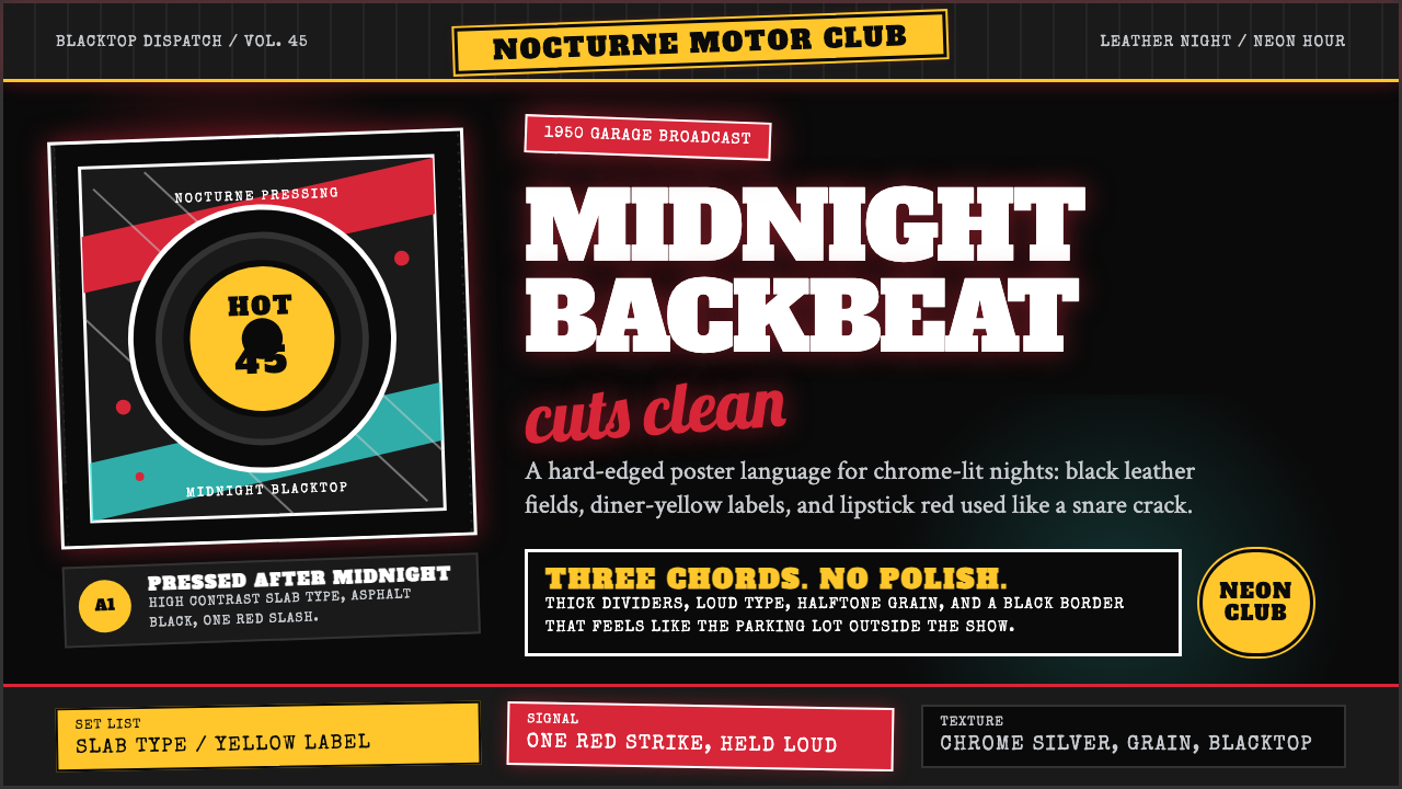 Rockabilly Greaser (1950)Loud after midnight. Asphalt black, chrome-yellow circles, and one lipstick-r…
 Algerian Casbah Poster (1954–1962)Every surface is a manifesto. Blood red, warning yellow, and stencil type hit…
 Marvel Comics (Kirby Era)Populist color hits hard. Red-blue-yellow panels, black rules, and halftone d…
 Public Enemy — Fight the PowerTakes a side loudly. Red bands, black ink, and target geometry hit like a ral…
 Atari 2600 (Woodgrain)Woodgrain meets raw pixels. Walnut panels frame Bungee type and CMYK raster b…
 Converse Chuck TaylorPopulist and loud. Saturated red circles, Bungee type, black stitch lines on…