What is Public Enemy — Fight the Power?什么是 Public Enemy — Fight the Power?
Public Enemy's crosshair logo, saturated red on deep black, and monumental display type turned a rap record into a visual manifesto that still commands every room it enters.Public Enemy 的准星标志、黑底饱和红与纪念碑式展示字,把一张说唱唱片变成了视觉宣言——进入任何空间,立刻主导气场。
Public Enemy — Fight the Power in briefPublic Enemy — Fight the Power 速览
Public Enemy — Fight the Power is a design system drawn from the visual identity surrounding the group's landmark 1989 single, which formed the sonic and aesthetic backbone of Spike Lee's film Do the Right Thing. The style is built on a small number of decisions made with absolute conviction: deep black fields, saturated red bands and accents, chunky zero-radius display type, and the crosshair-encircled B-boy silhouette logo that functions simultaneously as emblem, warning, and rallying image.Public Enemy — Fight the Power 这套设计系统,来源于 Public Enemy 1989 年那首里程碑式单曲的视觉识别体系——该曲同时也是 Spike Lee 电影《Do the Right Thing》的主题曲与美学骨架。这套风格由数量极少的决定构成,每一个都彻底而坚决:深黑色底面、饱和红色分栏与强调元素、粗壮的零圆角展示字,以及那个以准星套住 B-boy 剪影的标志——它同时是徽章、警告与集结号令。
Where most design systems earn authority through elegance or refinement, this one earns it through weight and directness. Every element behaves like a placard or a broadside — nothing decorates, everything declares. The visual vocabulary descends not from commercial branding but from the revolutionary political poster tradition: high contrast, flat color, compressed information, maximum impact at a distance.大多数设计系统以优雅或精致赢得权威;这套系统靠的是重量与直接。每个元素的行为都像示威标语牌或揭帖——没有装饰,只有宣言。它的视觉词汇不源于商业品牌,而是来自革命政治海报的传统:高对比度、平铺色块、信息高度压缩、在远处仍具最大冲击力。
As a contemporary design system it is precise and surprisingly disciplined. The palette is narrow — red, black, and selective military-green accents — and every departure from it reads as a mistake rather than a creative choice. Type is monumental in scale, set without irony, and allowed to fill the frame. Buttons carry no radius. Dividing lines are thin, exact, and red. The system speaks loudly, but it does not ramble.作为当代设计系统,它精确而出人意料地克制。色板窄小——红色、黑色,以及选择性的军用迷彩绿点缀——任何偏离都像是失误而非创意选择。字体在版面中以纪念碑式的尺度呈现,毫无反讽意味,允许铺满整个画框。按钮无圆角。分割线细、准、红。这套系统说话声音很大,但从不啰嗦。
See the Public Enemy — Fight the Power design system查看 Public Enemy — Fight the Power 完整设计系统
Where does Public Enemy — Fight the Power come from?Public Enemy — Fight the Power 从何而来?
Public Enemy formed on Long Island, New York in 1985, built around the partnership between rapper Chuck D — whose baritone delivery gave the group its gravitas — and the court-jester counterpoint of Flavor Flav, whose oversized clock and theatrical antics underscored rather than undermined the group's seriousness. The DJ Terminator X completed the sonic architecture. From the beginning, the group positioned itself within a tradition of Black political speech, citing the Black Panther Party, Malcolm X, and the broader currents of Black nationalist thought as reference points both lyrical and visual.Public Enemy 于 1985 年在美国纽约长岛成军,核心是说唱歌手 Chuck D 与 Flavor Flav 的组合——Chuck D 低沉的嗓音赋予乐队庄重感,而 Flavor Flav 戴着夸张大钟的弄臣形象,非但没有削弱这种严肃性,反而以反差强化了它。DJ Terminator X 完成了声音架构。从一开始,乐队就将自身置于黑人政治言说的传统中,将黑豹党、马尔科姆·X 和更广泛的黑人民族主义思潮作为歌词与视觉上的双重参照。
The visual system that defined the group emerged partly from necessity and partly from conviction. The Def Jam Recordings environment of the mid-1980s operated with limited budgets but high graphic ambition, producing sleeves and promotional materials in which bold typography and stark contrast had to substitute for expensive photography or illustration. Into this environment came the crosshair-target logo, designed to place the B-boy figure — already a hip-hop icon — inside the crosshairs of a gunsight. The image spoke plainly about surveillance, targeting, and the violence directed at Black men in America, without requiring a single word of explanation.定义该乐队的视觉系统,一部分源于必要,一部分源于信念。1980 年代中期的 Def Jam 唱片公司以有限预算运营,但视觉野心高远,其唱片封套和宣传物料必须用粗重字体与强烈对比来替代昂贵的摄影或插图。在这种环境下,准星标志应运而生:它将 B-boy 形象——已是嘻哈文化的图腾——置于瞄准镜的准心之中。这个图像清晰地表达了关于监控、被瞄准以及针对黑人男性的暴力这些主题,无需任何文字说明。
Fight the Power was composed in 1989 at Spike Lee's direct request for a theme song for Do the Right Thing, his film set in the Bedford-Stuyvesant neighborhood of Brooklyn on the hottest day of the summer. The film, which climaxes in a race riot, demanded a soundtrack that matched its urgency. The resulting track — and the visual campaign surrounding it — amplified the existing Public Enemy aesthetic into something more concentrated: the red and black palette intensified, the typography grew heavier, the political-poster reference became explicit. The film's opening sequence, featuring Rosie Perez dancing to Fight the Power before graphics in the group's visual style, essentially made the design system a character in the film itself.《Fight the Power》于 1989 年应 Spike Lee 的直接委约而生,作为其电影《Do the Right Thing》的主题曲——这部影片以夏日最热一天为背景,发生在布鲁克林的贝德福德-斯泰弗森特街区,以种族骚乱为高潮。影片需要与其紧迫性相匹配的声音。由此诞生的音轨与围绕它展开的视觉宣传活动,将既有的 Public Enemy 美学提炼得更为集中:红黑色板更加强烈,字体更加沉重,政治海报的参照变得明确而直接。影片开场,Rosie Perez 在乐队视觉风格的画面前随《Fight the Power》起舞——这实际上使这套设计系统成为了电影本身的一个角色。
The broader movements feeding into this visual system were well-established. Black Power revolutionary imagery — the raised fist, the targeting reticle, the confrontational portrait — had been circulating in American political culture since the 1960s. The Public Enemy aesthetic did not invent these devices; it translated them into the register of late-1980s hip-hop, combining the political poster's directness with the energy of a concert flyer and the precision of a logo system. The military-camo green accents echoed both actual military surplus fashion circulating in hip-hop communities of the period and the long history of resistance movements adopting martial imagery.滋养这套视觉系统的更广泛运动早已根深蒂固。黑人权力革命意象——握紧的拳头、瞄准镜准心、直面镜头的对抗性肖像——自 1960 年代起就在美国政治文化中流传。Public Enemy 的美学并非发明了这些装置;它将它们翻译进 1980 年代末嘻哈的语境,把政治海报的直接性与演出传单的能量、标志系统的精准融为一体。军用迷彩绿的点缀,既呼应了当时嘻哈社区流行的军用剩余品时尚,也呼应了抵抗运动采用军事意象这一漫长历史。
What defines the Public Enemy — Fight the Power look?Public Enemy — Fight the Power 的视觉特征是什么?
Color System色彩系统
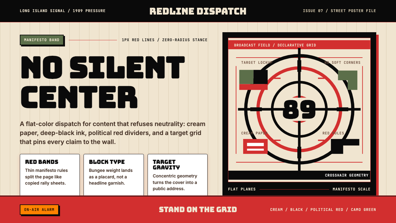
The palette is built on three non-negotiable anchors: deep black as the dominant field, saturated red as the structural accent and emotional trigger, and selective military-camo green as a secondary presence. White appears sparingly, only as reversed type or breathing space. The red is not decorative — it divides, marks, and warns. Nothing bleeds between these colors; transitions are hard cuts, never gradients. Saturation is deliberately at maximum: the palette reads across a crowded room, from a moving car, in direct sunlight.色板建立在三个不可妥协的锚点上:深黑色作为主导底面,饱和红色作为结构性强调与情感触发,军用迷彩绿作为次要存在。白色极少出现,仅作为反白文字或呼吸空间。红色不是装饰——它划分、标记、警告。这些颜色之间没有过渡,切换是硬切,从不渐变。饱和度刻意调至最高:这套色板能在拥挤的人群中被看见,在行驶的车上被读懂,在直射阳光下保持清晰。
Typography字体排印
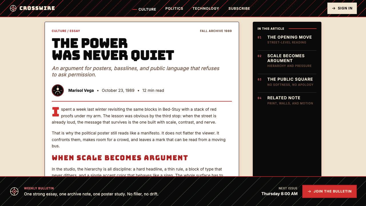
Display type is chunky, compressed, and monumental — the kind of letterforms that need no delicacy and want none. It is set at large sizes with minimal tracking, filling the frame rather than floating in it. Body text, where it appears, is secondary and subservient, never competing with the headline for dominance. All caps is the default register for primary statements. There are no script faces, no decorative serifs, no flourishes. The letterforms communicate the same way the music does: at volume, without apology.展示字体粗壮、紧缩、具有纪念碑式的分量——这种字形不需要精致,也不想要。它以大尺寸、极小字间距设置,铺满画框而非漂浮其中。正文(若出现)是次要与从属的,从不与标题争夺主导权。全大写是主要陈述的默认格式。没有手写体,没有装饰衬线,没有花饰。字形的传达方式与音乐相同:大声,无需道歉。
Logo and Iconography标志与图像符号
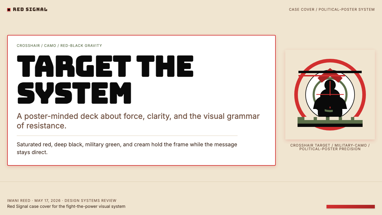
The crosshair-target B-boy logo is the system's visual center of gravity. A silhouetted break-dancer is placed precisely within the concentric rings and cross lines of a gunsight — a composition that transforms a symbol of hip-hop cultural freedom into an image of surveillance and targeting. The icon is always flat, always high-contrast, and always read as a unified mark rather than an assemblage of parts. Secondary iconography follows the same logic: geometric, unambiguous, and legible at any scale.准星套 B-boy 的标志是这套系统的视觉重心。一个霹雳舞者的剪影被精确地置于瞄准镜的同心圆环与十字线中——这个构图将嘻哈文化自由的符号转化为一个关于监控与被瞄准的意象。图标始终是平面的、高对比度的,始终作为一个统一标记而非零件组合来阅读。次级图像符号遵循同样的逻辑:几何化、无歧义、在任何尺寸下均可辨读。
Layout and Geometry版面与几何
Layouts are organized by horizontal red rules — thin, precise, and structural — that divide the page the way a manifesto is divided into clauses rather than the way a magazine is divided into sections. The grid is tight and deliberate; negative space is used sparingly, and when it appears it reads as silence between statements rather than as aesthetic breathing room. Compositions favor asymmetry without apology: heavy type blocks anchor one side while the logo or a red band claims the other. Nothing is centered for the sake of comfort.版面由细而精准的红色水平线条组织——这些线条像宣言被分成条款那样划分页面,而非像杂志那样划分版块。网格紧密而刻意;留白使用克制,一旦出现,它读起来像陈述之间的沉默,而非美学上的呼吸空间。构图以不妥协的方式偏爱不对称:沉重的文字块锚定一侧,标志或红色色带占据另一侧。没有任何元素因为舒适感而居中。
Flatness and Zero Ornament平面性与零装饰
Every surface is flat. No gradients simulate depth, no soft shadows suggest ambient light, no textures import the physical world into the design. Depth — where it exists — comes from the visual weight of large flat shapes against each other, not from lighting effects. Buttons carry no radius and no shadow; they sit on the page like stenciled rectangles. This flatness is not a modernist aesthetic preference — it is the production logic of the political broadside: reproducible at any size, at any print quality, with no information lost in compression.所有表面都是平面的。没有渐变模拟深度,没有柔和阴影暗示环境光,没有纹理将物理世界引入设计。深度——如果存在的话——来自大面积平面形之间的视觉重量对比,而非来自光照效果。按钮没有圆角,没有阴影,它们像模板印出的矩形那样贴在页面上。这种平面性不是现代主义的美学偏好——它是政治揭帖的生产逻辑:在任何尺寸、任何印刷质量下都可以复制,压缩时不丢失任何信息。
Military and Tactical Accents军事与战术点缀
Military camouflage green appears as a third-color accent, used selectively to signal solidarity with resistance movements and to break the binary tension of red-and-black without introducing softness. The tactical reference extends beyond color: the crosshair in the logo, the grid-like precision of layouts, and the sense that every element has been placed with operational rather than decorative intent. The aesthetic is combat-ready — not aggressive for aesthetic reasons, but purposeful in the way that any tool designed for high-stakes deployment is purposeful.军用迷彩绿作为第三色点缀出现,被选择性地用于表达与抵抗运动的团结,并在不引入柔和感的情况下打破红黑二元的张力。这种战术参照超越了颜色本身:标志中的准心、版面近乎网格的精准度,以及每个元素都像是出于操作目的而非装饰目的被放置的感觉。这套美学随时备战——并非出于审美原因的攻击性,而是一种专为高风险部署而设计的工具所具有的那种目的性。
Emotional Register情感基调
The system communicates at a specific emotional temperature: urgent, uncompromising, and fully committed to its position. There is no irony, no softening, no invitation to interpret the message as optional. This is the rarest quality to replicate correctly, because it requires the designer to genuinely commit to the design choices rather than treating them as stylistic options. A version of this system applied half-heartedly — with gradients introduced for modernity, or rounded corners added for approachability — loses not just visual coherence but the entire communicative logic the system is built on.这套系统以特定的情感温度传达信息:紧迫、不妥协、对自身立场完全投入。没有反讽,没有软化,没有暗示信息可以被视为可选项的空间。这是最难被正确复制的品质,因为它要求设计师真正投入于设计决定,而非将它们视为风格选项。如果以半心半意的方式应用这套系统——为了现代感引入渐变,或为了亲切感添加圆角——失去的不仅是视觉连贯性,而是整套系统赖以建立的传达逻辑。
See the Public Enemy — Fight the Power design system查看 Public Enemy — Fight the Power 完整设计系统
Who shaped Public Enemy — Fight the Power?谁塑造了 Public Enemy — Fight the Power?
Born Carlton Douglas Ridenhour, Chuck D is the primary lyrical and intellectual force behind Public Enemy. His delivery — dense, metronomic, and politically explicit — set the template for what conscious rap could achieve. He was equally invested in the group's visual presentation, understanding from the beginning that in hip-hop the image and the music had to operate as a single argument. His political education, which drew on Black nationalist thinkers including Malcolm X and the Black Panther Party, shaped the iconographic choices that made the group's visual identity as legible as a political party's campaign materials.本名 Carlton Douglas Ridenhour,Chuck D 是 Public Enemy 的核心歌词与思想力量。他的说唱方式——信息密集、节拍机械、政治立场明确——为有意识说唱(conscious rap)能够实现什么树立了范本。他同样深度参与乐队的视觉呈现,从一开始就明白:在嘻哈文化中,图像与音乐必须作为一个整体论点运作。他的政治教育汲取自马尔科姆·X、黑豹党等黑人民族主义思想家,这塑造了乐队视觉识别中的图像学选择,使其像一个政党的竞选材料那样清晰可读。
William Jonathan Drayton Jr., known as Flavor Flav, functions within the Public Enemy visual system as its necessary counterweight. His theatrical costume — the oversized clock, the baseball cap worn sideways, the court-jester energy — does not undermine the group's seriousness but provides a point of human scale against which Chuck D's political gravity can be measured. In design terms, Flavor Flav is the unexpected accent color: his presence stops the system from becoming so severe that it alienates rather than recruits. Every effective propaganda aesthetic needs an element that invites rather than demands.本名 William Jonathan Drayton Jr.,Flavor Flav 在 Public Enemy 的视觉系统中充当必要的平衡力量。他的舞台造型——夸张的大钟、歪戴的棒球帽、弄臣般的能量——并未削弱乐队的严肃性,而是提供了一个人性化的尺度参照,使 Chuck D 的政治分量得以被衡量。从设计角度看,Flavor Flav 是那个意外的强调色:他的存在阻止了这套系统严苛到令人疏离而非招募的程度。任何有效的宣传美学都需要一个邀请而非强制的元素。
Norman Lee Rogers, who performed as Terminator X, was Public Enemy's DJ and sonic architect. His role in the group's visual identity is less direct but structurally important: the turntablist as figure — hands on records, body angled over equipment — became part of the visual shorthand of the era's political rap imagery, appearing in promotional photographs and artwork as a symbol of mastery over the machinery of sound reproduction. The precision and technical control implied by his performance practice mirrors the controlled aggression of the group's design system.本名 Norman Lee Rogers,Terminator X 是 Public Enemy 的 DJ 与声音架构师。他在乐队视觉识别中的角色不那么直接,但具有结构性意义:转盘手的形象——双手压在唱片上,身体俯身于设备之上——成为那个时代政治说唱视觉语言的一部分,出现在宣传照片和美术作品中,象征着对声音复制机器的掌控。他的演出实践所暗示的精准与技术控制,与乐队设计系统中那种受控的攻击性形成呼应。
Director Spike Lee commissioned Fight the Power for Do the Right Thing and in doing so became the amplifier through which the Public Enemy visual system reached its widest audience. His decision to open the film with the song — and to shoot the opening sequence against graphics and imagery drawn from the group's visual world — transformed a music video aesthetic into cinematic visual language. Lee's own work across films, commercials, and his production company 40 Acres and a Mule Filmworks was consistently concerned with the visual representation of Black American life, and his partnership with Public Enemy represented a convergence of two aesthetics that shared deep structural assumptions about boldness, confrontation, and legibility.导演 Spike Lee 委约创作了《Fight the Power》用于《Do the Right Thing》,由此成为 Public Enemy 视觉系统触达最广泛受众的放大器。他决定以这首歌开场,并用取自乐队视觉世界的图像拍摄开场段落——这将一种音乐录影带美学转化为了电影视觉语言。Lee 在电影、广告及其制片公司 40 Acres and a Mule Filmworks 的一贯工作,都关注黑人美国生活的视觉呈现。他与 Public Enemy 的合作,代表了两种共享深层结构假设的美学的汇合——关于大胆、对抗与可读性的共同信念。
How do you use Public Enemy — Fight the Power today?今天怎么用 Public Enemy — Fight the Power?
The Public Enemy — Fight the Power system is correctly applied when the design's position is genuine and specific. It suits any context that requires a declaration rather than a suggestion: a product launch that is genuinely disrupting its market, a publication with a defined editorial standpoint, a social campaign that cannot afford to be misunderstood. It fails when applied to content that is merely trying to appear bold — the visual system has a high tolerance-detection threshold, and a half-committed application reads immediately as costume rather than conviction.Public Enemy — Fight the Power 系统在设计立场真实而具体时才能被正确应用。它适合任何需要宣言而非建议的场合:一次真正颠覆市场的产品发布、一份有明确编辑立场的出版物、一场不能被误解的社会运动。它在只是试图「看起来大胆」的内容中会失效——这套视觉系统的容忍度检测阈值很高,半心半意的应用会立刻读起来像戏服而非信念。
For presentation slides, the system works with particular force on covers and section openers. A cover built in this system leads with a large-scale red band or full-bleed black field, sets the title in a heavy, condensed display face at maximum size, and places the logo or a geometric red accent at a deliberate asymmetric position. Content slides should retain the structural logic: a thin red rule to separate header from body, type set in two clear scales only, and data visualizations treated as flat geometric objects — bar charts and proportional blocks in the red-and-black palette, with no three-dimensional effects or gradient fills. The data does not need decoration; it needs to be legible.在演示文稿中,这套系统在封面和章节开场页上展现最强的力量。用这套系统制作的封面:以大面积红色色带或满版黑色底面打头,将标题以最大尺寸的粗壮紧缩展示字设置,将标志或几何红色强调元素置于刻意的不对称位置。内容页应保留结构逻辑:以细红线分隔标题与正文,字体仅以两个清晰的尺度设置,数据可视化作为平面几何对象处理——柱状图与比例色块用红黑色板,无任何三维效果或渐变填充。数据不需要装饰,它需要的是可读性。
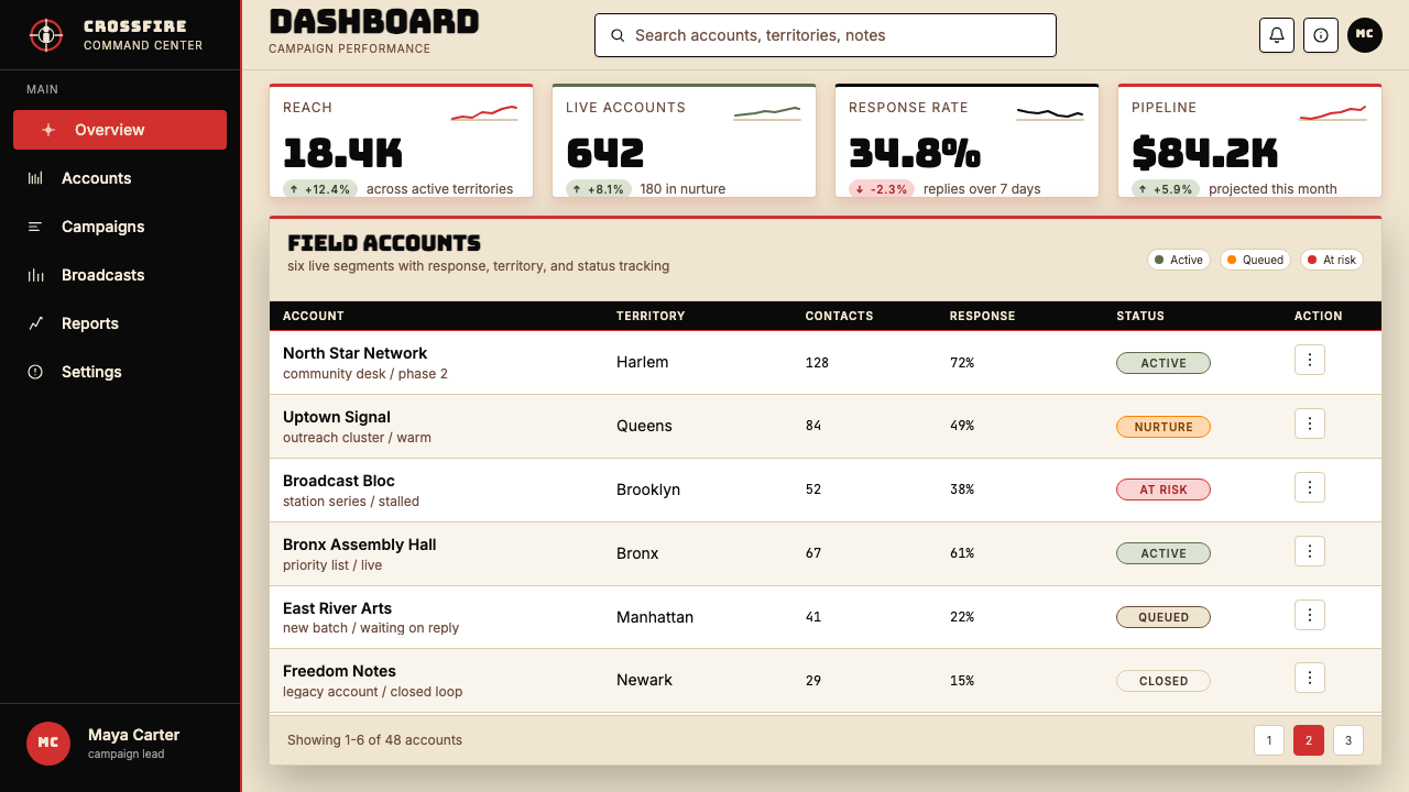
For web interfaces and dashboards, the system translates effectively when information density is high and hierarchy needs to be immediately readable. Use the full-bleed black background for primary navigation and high-priority alert states; reserve the red accent for interactive elements, active states, and genuinely critical notifications. Pricing and comparison pages benefit from the system's binary clarity: feature availability as flat red checkmarks or black crossed circles, tier names in heavy type at large scale, call-to-action buttons as solid-color blocks with no border radius and no shadow. The system does not accommodate ghost buttons or outline-only states — those suggest optionality, and this system does not traffic in optionality.对于网页界面与仪表板,当信息密度高且层级需要立即可读时,这套系统的转化最为有效。满版黑色背景用于主导航与高优先级警示状态;红色强调色保留给可交互元素、激活状态和真正关键的通知。定价与比较页面受益于这套系统的二元清晰度:功能可用性以平面红色复选标记或黑色叉圆呈现,套餐名称以大尺寸粗重字体设置,行动号召按钮为实色色块、无边框圆角、无阴影。这套系统不容纳幽灵按钮或纯轮廓状态——那些暗示着可选择性,而这套系统不经营可选择性。
For editorial and marketing applications, the system handles long-form content by establishing hierarchy through weight and scale rather than decorative elements. Article layouts in this system use a wide type measure with the headline set at a scale that dominates the page, a pull quote formatted in red — tightly set, full-cap — and section breaks marked by the thin red rule. Marketing pages work as a sequence of manifestos: each full-width block states one claim, in large type, on alternating black and red fields. Photography, where used, should be treated as high-contrast — effectively duotone in the system's colors — and never as a full-color naturalistic image sitting in a layout. The image should be working as hard as the type.对于编辑与营销应用,这套系统通过字重与尺寸而非装饰元素建立长篇内容的层级。使用这套系统的文章版面:标题以主导整页的尺寸设置,引文以红色格式化——紧密排列、全大写——章节分隔以细红线标记。营销页面作为宣言序列运作:每个满版色块陈述一个主张,以大字体呈现,在黑色与红色底面之间交替。摄影图像(若使用)应作为高对比度处理——在系统色彩中本质上是双色调——而非作为坐落在版面中的全彩自然主义图像。图像应该和文字一样努力地工作。
The most common mistake when applying this system is treating the red as a decoration rather than a structural element. In authentic applications, red appears where the layout needs to be cut, marked, or divided — not where something needs to look energetic. A second common error is softening the type choices: adding letter-spacing for elegance, choosing a geometric sans that is refined rather than blunt, or setting the headline at a comfortable rather than commanding size. The system's effectiveness is entirely dependent on the designer resisting the impulse to make things more comfortable. Comfort is the opposite of what this system is for.应用这套系统时最常见的错误,是将红色视为装饰而非结构性元素。在真实应用中,红色出现在版面需要被切分、标记或划分的地方——而非某物需要看起来充满能量的地方。第二个常见错误是软化字体选择:为了优雅而增加字间距,选择精致而非钝实的几何无衬线体,或以舒适而非有统治力的尺寸设置标题。这套系统的有效性完全依赖于设计师抵制让事物变得更舒适的冲动。舒适,是这套系统所对立的一切。
See the Public Enemy — Fight the Power design system查看 Public Enemy — Fight the Power 完整设计系统
Public Enemy — Fight the Power — FAQPublic Enemy — Fight the Power · 常见问题
Is this system only appropriate for activist or political content?这套系统只适合活动主义或政治内容吗?
No — but it is only appropriate for content with a genuine, specific position. A fintech product that is genuinely replacing a predatory lending system, a health platform that takes an unambiguous stance on a medical issue, a news publication with a declared editorial line: these can all use the system honestly. What does not work is applying it to neutral, undifferentiated, or ambiguous products. The visual system broadcasts a position; if there is no position to broadcast, the system becomes incoherent. The question to ask is not whether the content is political, but whether the content has a conviction worth designing around.不——但它只适合具有真实、具体立场的内容。一个正在替代掠夺性贷款体系的金融科技产品、一个在某医学议题上立场明确的健康平台、一份声明了编辑路线的新闻出版物:这些都可以诚实地使用这套系统。不起作用的是将它应用于中立、无差异或立场模糊的产品。这套视觉系统在播报一个立场;如果没有立场可以播报,系统就会变得不连贯。要问的问题不是内容是否具有政治性,而是内容是否有一个值得围绕其设计的信念。
Can the system work on a light or white background?这套系统能在浅色或白色背景上运作吗?
Yes, but the inversion changes the system's emotional register significantly. A white-ground version — black type, red structural lines, minimal use of any dark field — reads as political-poster restraint rather than rallying urgency. It is cleaner and potentially more versatile for extended reading contexts, but it loses the compressed intensity that a deep black field provides. If using a light background, resist the temptation to soften the palette or introduce warmth: the type should remain monumental, the red should remain saturated, and the structural rules should remain thin and exact. The white ground is a choice, not a compromise.可以,但这种反转会显著改变系统的情感基调。白色底面版本——黑色字体、红色结构线、极少使用深色色块——读起来像政治海报的克制,而非集结的紧迫感。它更整洁,在延伸阅读语境中潜在地更通用,但失去了深黑色底面所提供的压缩强度。如果使用浅色背景,要抵制软化色板或引入温暖感的诱惑:字体应保持纪念碑式的分量,红色应保持饱和,结构性线条应保持细而精准。白色底面是一个选择,而不是一种妥协。
How does this system relate to other high-contrast political design traditions?这套系统与其他高对比度政治设计传统有何关联?
The Public Enemy visual system sits in a lineage that includes Soviet Constructivism, Black Panther Party graphic design, Situationist International propaganda, and the DIY xerox broadside culture of 1980s activism. All of these traditions share structural assumptions: flat color, heavy type, maximum contrast, zero ornament, and a production logic that prioritizes reproducibility over refinement. The Public Enemy aesthetic is distinguished from European Constructivism by its specifically African-American cultural references — the B-boy figure, the hip-hop typography conventions — and from earlier Black Power imagery by its engagement with late-1980s mass media and recording-industry production values. It is politically descended but visually evolved.Public Enemy 的视觉系统处于一个谱系之中,包括苏联构成主义、黑豹党平面设计、情境主义国际宣传,以及 1980 年代活动主义的 DIY 复印传单文化。所有这些传统共享结构性假设:平铺色块、粗重字体、最大对比度、零装饰,以及一种将可复制性置于精致之上的生产逻辑。Public Enemy 美学与欧洲构成主义的区别在于其特定的非裔美国人文化参照——B-boy 形象、嘻哈排印习惯——并在 1980 年代晚期大众媒体与唱片工业生产价值的参与中,与早期黑人权力意象区别开来。它在政治上有所传承,但在视觉上已经演化。
What is the most important thing to get right when applying this system?应用这套系统时最重要的是把握什么?
Commitment. The system has no tolerance for hedging. Every individual decision — type size, color application, layout structure — needs to be made at full intensity, because the system's coherence depends on each element reinforcing every other. A single soft decision — a rounded button, a gradient in a background, a display face set at a restrained size — propagates through the layout as doubt, and the system reads as uncertain. This is the opposite of what it communicates. The practical implication is that this system should not be applied incrementally or used as a light influence on an otherwise neutral layout. It is a commitment, not a seasoning.投入。这套系统对于犹豫没有任何容忍。每一个单独的决定——字体尺寸、色彩应用、版面结构——都需要以全强度做出,因为系统的连贯性依赖于每个元素相互强化。任何一个软化的决定——圆角按钮、背景中的渐变、以克制尺寸设置的展示字——都会作为疑虑在版面中蔓延,系统读起来就会显得不确定。而这与它所传达的一切正好相反。实际含义是:这套系统不应该被增量式地应用,也不应该被用作对其他中立版面的轻度影响。它是一种投入,而非一种调味。
Does the system age well, or does it read as period-specific to the late 1980s?这套系统经得住时间考验吗,还是会被读作特属于 1980 年代末的产物?
The system ages well because its foundational logic — maximum contrast, flat color, structural typography, zero ornament — is not tied to any specific production technology or media environment. The same principles that made Public Enemy's visual identity effective on a record sleeve in 1989 make it effective on a digital screen today. What does feel period-specific is the particular letterform conventions of late-1980s hip-hop display type — but these can be updated by choosing contemporary typefaces that share the same properties of weight and compression without the historical connotation. The aesthetic system is durable; the specific historical references within it are optional.这套系统经得住时间考验,因为它的基础逻辑——最大对比度、平铺色块、结构性排印、零装饰——并不与任何特定的生产技术或媒介环境绑定。同样的原则在 1989 年使 Public Enemy 的视觉识别在唱片封套上有效,今天同样使其在数字屏幕上有效。感觉特属于某个时代的,是 1980 年代末嘻哈展示字体的特定字形习惯——但这可以通过选择当代字体来更新,只要这些字体共享相同的字重与紧缩属性,而不带历史特定的联想。美学系统是耐久的;其中的特定历史参照是可选的。
Related design styles相关设计风格
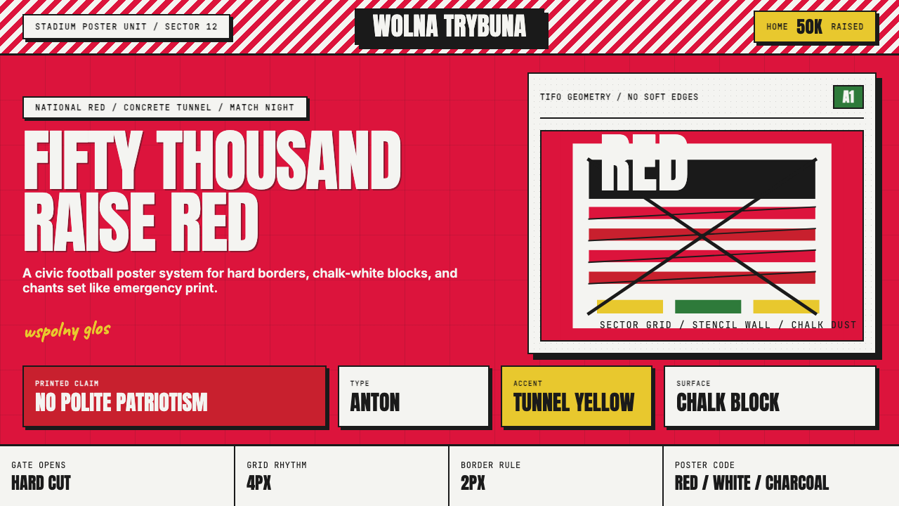 Polish Solidarity Stadium GraphicDefiance fills the stands. Stadium red, Anton stencil type, and chalk-white b…看台燃成反抗:体育场红、模板粗字与粉白硬块。
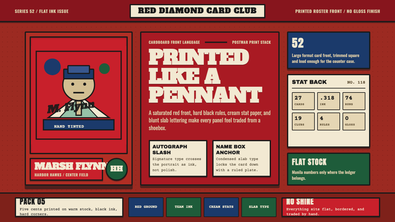 Topps Baseball CardCardboard heat. Brick-red slab panels, cream stats, and condensed type feel p…纸卡热度:砖红板块、米黄数据与压缩粗体,像平版印刷。
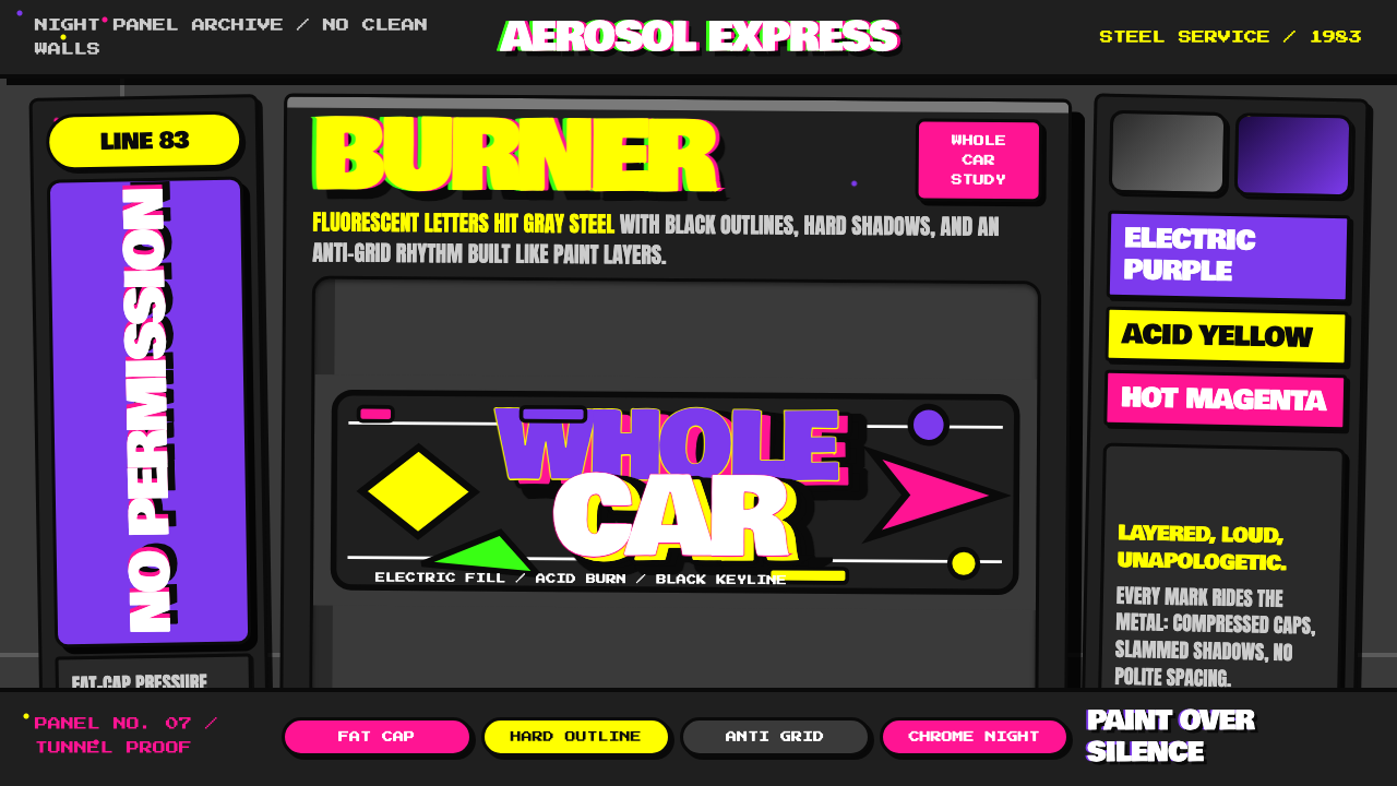 NYC Subway Graffiti (1983)Bombed steel gets loud. Electric purple and acid yellow stack as hard-outline…钢板被炸响:电紫与酸黄层叠,黑线框出狂野字形。
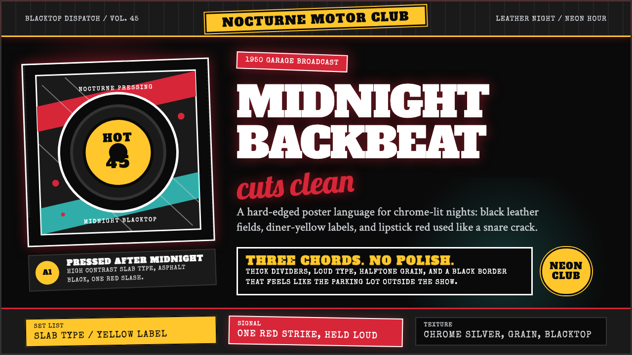 Rockabilly Greaser (1950)Loud after midnight. Asphalt black, chrome-yellow circles, and one lipstick-r…午夜后更响:沥青黑、铬黄圆标与一记唇膏红。
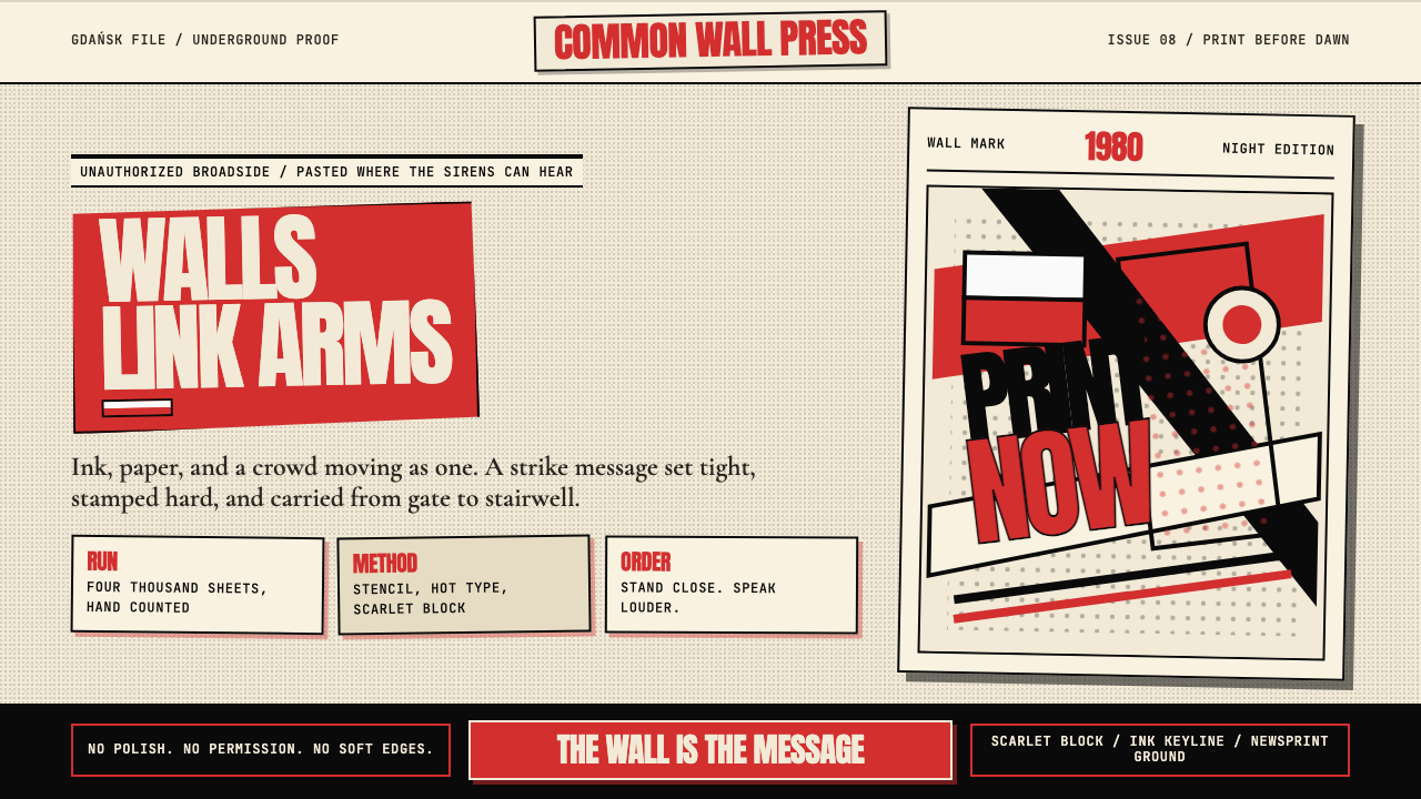 Solidarność Poland 1980Urgency becomes type. Scarlet blocks, ink keylines, and halftone cream hit li…急迫化为文字:猩红色块、黑色描边与半调米纸像墙上海报。
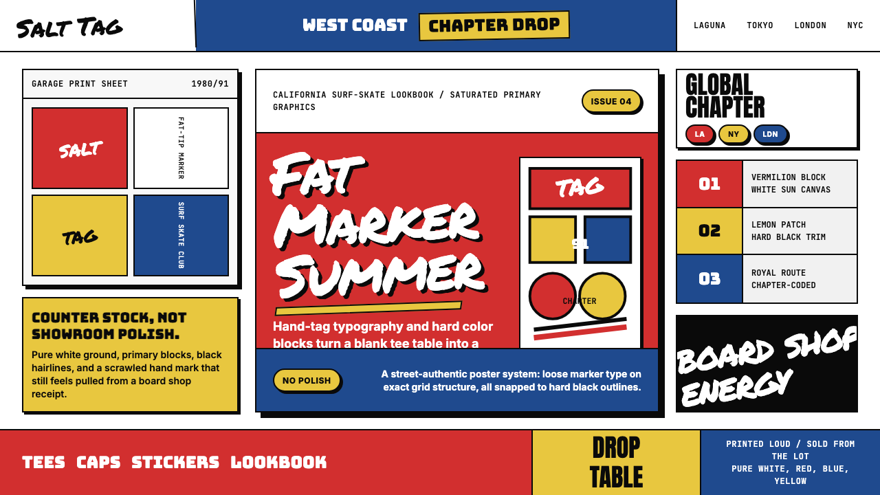 Stüssy StreetwearStreetwear starts rough. Vermilion blocks, marker script, and black hairlines…街头从粗粝开始。朱红色块、马克笔字与黑细线撞上纯白。