Design style guide设计风格指南
What is Polish Solidarity Stadium Graphic?什么是 Polish Solidarity Stadium Graphic?
Where Cold War defiance meets modern football frenzy, the Polish Solidarity Stadium Graphic channels a nation's history of resistance into raw visual thunder.冷战式的反抗精神与现代足球狂热在此相撞——波兰团结工会体育场图形将一个民族的抵抗历史化为原始的视觉轰鸣。
Polish Solidarity Stadium Graphic in briefPolish Solidarity Stadium Graphic 速览
Polish Solidarity Stadium Graphic is a visual language born from the collision of two potent traditions: Poland's legendary underground poster culture of the 1980s, rooted in the Solidarność resistance movement, and the raw graphic energy of contemporary football ultras stadium choreography. The result is a style that feels simultaneously political and tribal, historical and alive — as though the stands of Stadion Narodowy in Warsaw had been plastered with handmade protest placards the night before a crucial match.波兰团结工会体育场图形是两种强大传统激烈碰撞的产物:一是波兰1980年代植根于团结工会抵抗运动的传奇地下海报文化,二是当代足球极端球迷看台编排的原始图形能量。由此诞生的风格同时带有政治性与部落性、历史感与当下感——仿佛华沙国家体育场的看台,在一场关键比赛前夜被人贴满了手工制作的抗议标语。
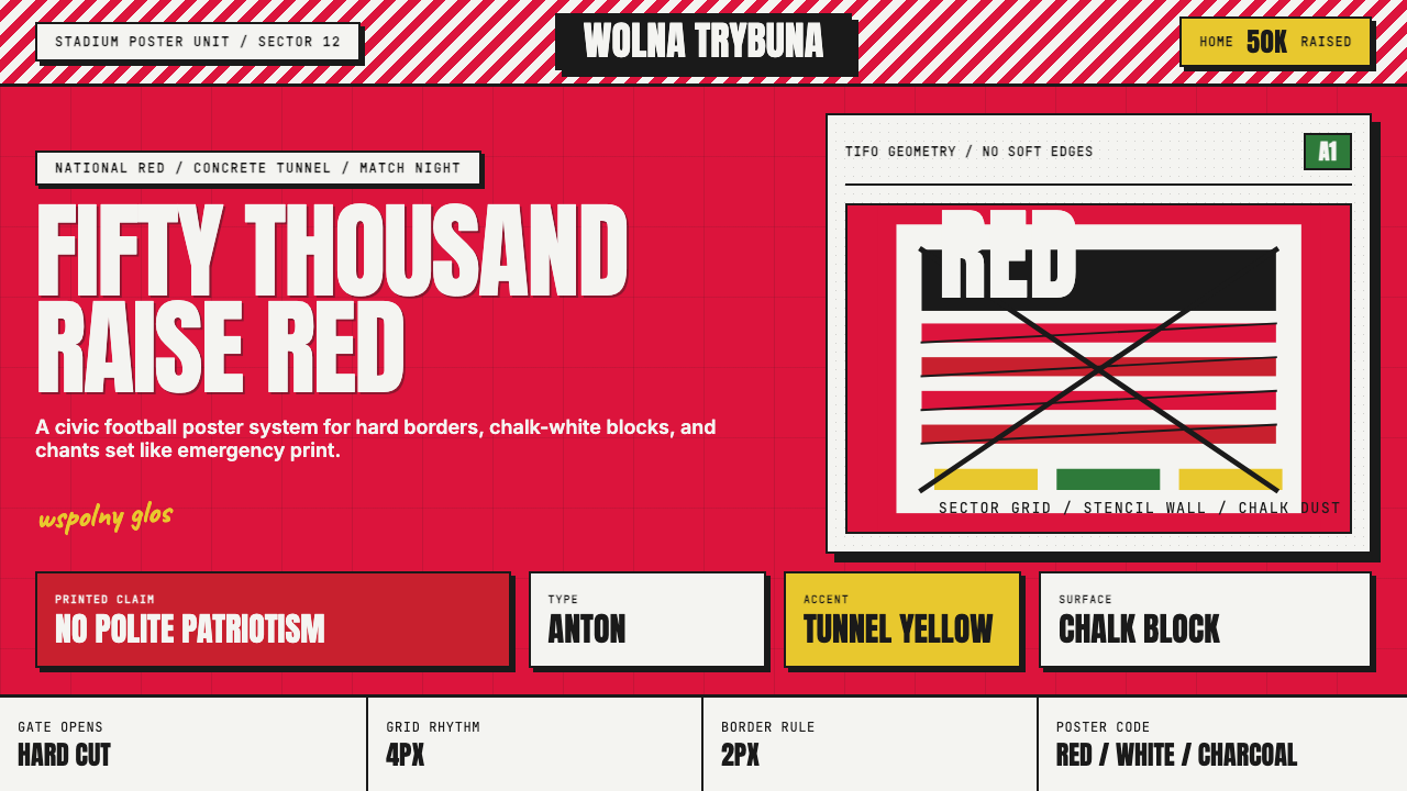
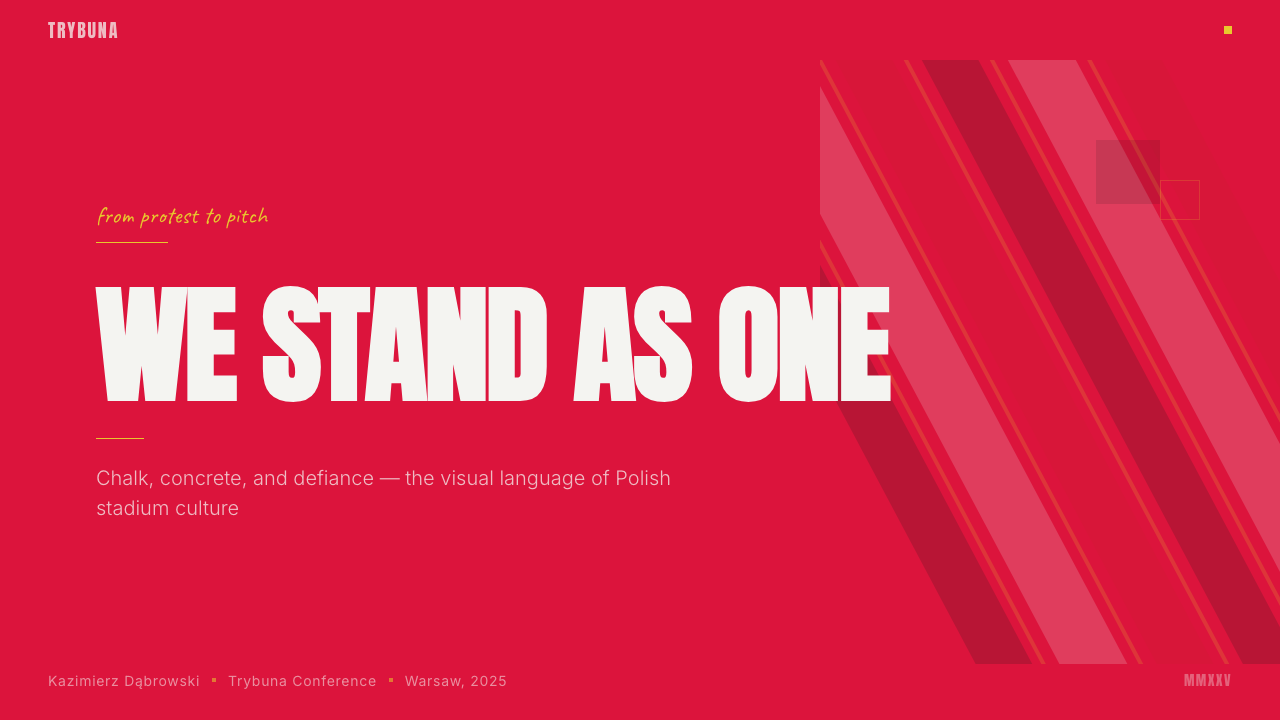
At its core, this design system is defined by maximum emotional intensity delivered through minimal means. A dominant stadium red saturates the page completely, evoking national flags, blood, and passion in equal measure. Chalk-white surfaces carve out breathing space for content, while charcoal stencil typography punches through both like spray-painted slogans on a concrete tunnel wall. The textures are deliberately rough — stencil edges that blur slightly, ink that appears to bleed into coarse paper, halftone dot patterns that recall underground photocopied leaflets.这套设计系统的核心是以最简的手段传递最强的情感冲击。浓烈的体育场红饱和地充满整个画面,以同等分量唤起国旗、热血与激情。粉笔白的表面为内容划出呼吸空间,炭黑模板字体从中穿透而出,如同喷涂在混凝土隧道墙上的口号。肌理是刻意粗粝的——模板边缘略带晕染,墨水仿佛渗入粗糙纸张,半调网点图案让人想起地下运动中用复印机印制的传单。
This is not a polished corporate aesthetic. Its power comes from authenticity and urgency. Every visual choice echoes the handmade quality of resistance materials — the kind of graphic that gets printed in a basement at midnight and posted before dawn. Applied to modern contexts, this rawness functions as a badge of genuine conviction, separating it sharply from the slick, algorithm-optimized visuals that dominate contemporary digital communication.这不是一种精致的企业美学。它的力量来自真实性与紧迫感。每一个视觉决定都呼应着抵抗材料的手工特质——那种在地下室午夜赶印、黎明前张贴上墙的图形。将这种粗粝感移植到现代语境中,它成为真实信念的徽记,与当代数字传播中那些光滑、算法优化的视觉形成鲜明切割。
Where does Polish Solidarity Stadium Graphic come from?Polish Solidarity Stadium Graphic 从何而来?
The immediate visual ancestry of this style runs through the Polish Poster School — one of the most distinctive national traditions in twentieth-century graphic design — and specifically through the political and cultural posters produced in and around the Solidarność upheaval of 1980. The movement that began in the Gdańsk Shipyard in August 1980, organized under the independent trade union Solidarność, generated an enormous body of unofficial visual communication that had to be produced quickly, cheaply, and covertly. Screen printing, stenciling, and photocopying were the technologies of resistance, and their physical marks became the aesthetic signature of defiance.这种风格的直接视觉渊源可追溯至波兰海报学派——二十世纪平面设计中最具辨识度的民族传统之一——尤其是1980年前后围绕团结工会运动产生的政治与文化海报。1980年8月始于格但斯克造船厂的这场运动,在独立工会团结工会的旗帜下,催生了大量非官方视觉传播材料,这些材料必须被快速、廉价、秘密地生产出来。丝网印刷、模板喷涂与复印机是抵抗的技术工具,它们在物质上留下的痕迹,成为反抗精神的美学签名。
Tomasz Sarnecki's celebrated High Noon poster from 1989 — depicting Gary Cooper as a lone marshal striding forward, with a Solidarność badge in place of a sheriff's star — is perhaps the single most iconic artifact connecting American popular culture to Polish political resistance. It was printed in vast quantities and distributed through underground networks during the semi-free elections, demonstrating that poster design could function as a mass-mobilization tool with the urgency and clarity of a film still. The boldness of the composition, the single dominant figure against a flat background, and the strategic use of symbolic color all feed directly into the stadium graphic tradition.托马什·萨尔内茨基1989年的著名海报《正午》——描绘加里·库珀扮演的独行警长大步向前,警徽位置换成了团结工会徽章——或许是将美国流行文化与波兰政治抵抗相连接的最具标志性的单件作品。它在半自由选举期间被大量印制并通过地下网络发行,证明海报设计可以凭借电影剧照的紧迫感与清晰度发挥大规模动员作用。构图的大胆、在平面背景上独立行进的单一主导人物、象征性色彩的策略运用,都直接滋养了体育场图形传统。
Jerzy Janiszewski, who designed the original Solidarność logotype in 1980, produced something equally remarkable: a wordmark in which the letters support and lean on one another like comrades in a crowd, with the Polish flag rendered as a banner above. This typographic gesture — letters as a community rather than a purely visual sequence — influenced how subsequent Polish graphic designers thought about type as a vehicle for collective identity rather than individual expression. The stadium context amplified this logic: tifo choreography is, by definition, a collective act, and the graphic systems supporting it must communicate mass solidarity at a glance.设计了1980年原版团结工会标志字体的耶日·亚尼谢夫斯基,创造出同样非凡的东西:一个词组标识,其中每个字母彼此支撑、相互倚靠,如同人群中的同志,波兰国旗作为横幅悬于其上。这个排印手势——将字母理解为一个共同体而非纯粹的视觉序列——影响了此后的波兰平面设计师如何将字体理解为集体身份的载体,而非个人表达的工具。体育场语境放大了这一逻辑:看台编排从定义上说就是集体行为,支撑它的图形系统必须在一瞥之间传达大众团结。
The modern football design layer emerged particularly forcefully around UEFA EURO 2012, which Poland co-hosted with Ukraine. The tournament required a visual identity robust enough to work at every scale, from pitch-side hoardings to television graphics to ultras merchandise, and the resulting host-brand language — developed partly through the Warsaw studio Mamastudio — synthesized international contemporary sports design with the sharp, stencil-informed aesthetic of the Polish poster tradition. Edgar Bąk's contribution to this graphic ecosystem brought a rigorous conceptual approach that kept the visual language from sliding into mere nostalgia, grounding it instead in formal geometry and disciplined reduction. The Ekstraklasa rebranding in 2015 consolidated this aesthetic direction for domestic football, creating a coherent visual framework within which individual club identities — with all their partisan energy — could coexist.现代足球设计这一层面的力量,在2012年波兰与乌克兰联合承办的欧洲杯中得到了特别强烈的体现。赛事需要一套在每个尺度上都同样有力的视觉识别系统——从球场广告牌到电视图形再到球迷周边——而由此形成的东道主品牌视觉语言(部分由华沙工作室Mamastudio参与开发)将国际当代体育设计与波兰海报传统中锐利的模板美学融合在一起。埃德加·邦克对这套图形生态系统的贡献,带来了严格的概念方法,使视觉语言没有滑向单纯的怀旧,而是扎根于形式几何与纪律性简化之中。2015年波兰顶级联赛的品牌重塑巩固了这一美学方向,创造出一套连贯的视觉框架,使各家俱乐部的身份——连同其全部的党派能量——得以在其中共存。
What defines the Polish Solidarity Stadium Graphic look?Polish Solidarity Stadium Graphic 的视觉特征是什么?
Dominant Color Field主导色域
The palette is built on a single overwhelming chromatic statement: full-saturation stadium red that functions not as an accent but as the primary surface on which everything else is placed. This is red as environment, not highlight. Chalk-white appears as the secondary structural color, carving out card surfaces and content areas from the red ground with the crispness of freshly printed stencil on dark concrete. A deep charcoal — neither pure black nor grey — handles all typographic weight and structural lines, carrying the gritty residue of underground print culture.色板建立在一种单一的压倒性色彩陈述之上:全饱和度的体育场红,不作为强调色,而作为承载一切其他元素的主要表面。这是作为环境的红色,而非高光。粉笔白作为第二结构色出现,从红色底面上雕刻出卡片表面与内容区域,有如深色混凝土上新印模板的清晰锐利。深炭黑——既非纯黑亦非灰色——承担所有字体重量与结构线条,携带着地下印刷文化的粗粝余韵。
Stencil Typography模板字体
Type in this system is deliberately blunt and physical. Letterforms are constructed on the logic of the stencil — condensed, uppercase, with deliberate gaps and bridges that allow the template to hold together structurally. Headlines do not suggest refinement; they declare. The letterforms carry visible weight that makes them feel stamped rather than set, printed by hand pressure rather than digital precision. Body text, where it appears, uses the same unapologetically utilitarian logic at smaller scale, maintaining the system's character without competing with headline dominance.这套系统中的字体是刻意钝重而物质性的。字形构建于模板的逻辑之上——窄体、大写,带有刻意保留的缺口与连桥,使模板在结构上能够自持。标题不是在建议,而是在宣告。字形承载着可见的重量,使它们感觉像是被压印而非被排版,是由手的力量而非数字精度印出的。正文(若出现)在更小的尺度上遵循同样毫不妥协的实用主义逻辑,在不与标题争夺主导权的同时维持系统的整体气质。
Rough Texture and Print Memory粗粝肌理与印刷记忆
Where most contemporary design systems smooth away evidence of their production, this one deliberately preserves and amplifies it. Halftone dot patterns evoke the photocopied pamphlet; ink bleeds suggest screen printing on absorbent paper; stencil edges carry slight imprecision rather than digital cleanliness. These are not decorative gestures — they are traces of a specific historical production context, reminding viewers that this visual language was originally made under conditions of urgency and limited resources. The rough texture is the aesthetic proof of authenticity.大多数当代设计系统努力抹去生产过程的痕迹,这套系统却刻意保留并放大这些痕迹。半调网点图案令人想起复印的小册子;墨水渗透暗示着在吸水纸上进行丝网印刷;模板边缘带有轻微的不精确,而非数字化的整洁。这些不是装饰性姿态——它们是特定历史生产语境的痕迹,提醒观看者,这套视觉语言最初是在紧迫感与资源匮乏的条件下制作的。粗粝的肌理是真实性的美学证明。
Mass Scale and Legibility大尺度与可读性
Stadium graphics must communicate across distances that would defeat refined or detailed design. This system is calibrated for mass-scale legibility: composition is reduced to large, high-contrast blocks, typography is oversized relative to any conventional measure, and detail is eliminated in favor of immediate impact. The informational content of any single graphic element must be graspable in the half-second a viewer might have before the crowd shifts. This demand for extreme legibility at scale, inherited from both the political poster and the stadium tifo, shapes everything from letter spacing to the ratio of type to image.体育场图形必须在精细或详细的设计无法胜任的距离上传递信息。这套系统针对大尺度可读性而校准:构图被简化为大面积高对比度的色块,字体尺寸远超任何常规标准,细节被消除以换取即时冲击力。任何单一图形元素的信息内容必须能在观看者拥有的半秒钟内被把握,在人群移位之前完成传递。这种对极端可读性的需求——同时继承自政治海报与看台编排——形塑了从字间距到字体与图像比例的一切决定。
Collective Identity Over Individual Expression集体认同超越个体表达
The visual logic of this system is constitutively plural. Its gestures — the mass of red, the block typography, the tifo-scale composition — are not designed for a single viewer seated at a comfortable distance but for thousands acting and feeling together. This is reflected in how the style handles space: rather than the intimate negative space of contemplative design, it uses compressed, charged space where elements press against each other with the density of a packed terrace. The individual disappears into the collective; the graphic becomes the crowd.这套系统的视觉逻辑本质上是复数的。它的姿态——大面积的红色、块状排版、看台编排式的构图——不是为坐在舒适距离外的单个观看者设计的,而是为成千上万一同行动与感受的人设计的。这一点在风格处理空间的方式上得到体现:它不使用沉思性设计中那种亲密的留白,而是使用压缩的、充满张力的空间,元素之间相互挤压,如同拥挤看台的密度。个体消失于集体之中;图形成为人群本身。
Symbolic Charge of National Iconography国家图像的象征力量
The red and white duochrome is not arbitrary — it mirrors the Polish national flag with the directness of a declaration rather than the subtlety of an allusion. Eagle silhouettes, shield motifs, and badge compositions draw on heraldic vocabulary that carries centuries of cultural weight. When these forms appear in this system, they are never decorative citations; they carry the full emotional freight of national identity consciously mobilized, of a people that has had to fight for its right to exist and remembers the cost. This symbolic intensity is what distinguishes the style from generic sports branding.红白双色并非随意之选——它以宣言式的直接而非隐喻式的含蓄,镜像了波兰国旗。鹰的剪影、盾形纹章与徽章构图汲取了承载数百年文化分量的纹章学词汇。当这些形态在这套系统中出现时,它们绝不是装饰性的援引;它们承载着被有意调动的国家认同的全部情感重量,承载着一个曾不得不为自己的存在权利而战斗并铭记代价的民族的记忆。这种象征强度,是这种风格与普通体育品牌相区别的根本所在。
Hard-Edge Contrast Without Gradient硬边对比,拒绝渐变
Transitions between colors and surfaces happen at hard edges rather than through gradients or blending. The boundary between stadium red and chalk-white is a cut, not a fade. This formal decision connects the style to both the screen-printed poster tradition — where ink sits on top of paper with physical abruptness — and to the way tifo panels are made: flat sections of color placed together, not blended. The absence of gradient is also a political statement: ambiguity and softening are luxuries of comfortable positions, and this aesthetic does not allow for them.色彩与表面之间的过渡发生在硬边上,而非通过渐变或混融。体育场红与粉笔白之间的边界是一道切割,而非一次淡出。这一形式决定将这种风格与丝网印刷海报传统相连接——油墨以物质性的突兀坐落于纸张之上——也与看台编排板的制作方式相连接:各色平面区块并置而非融合。渐变的缺席同时也是一种政治声明:模糊与柔化是舒适立场的奢侈品,而这套美学不允许它们存在。
Who shaped Polish Solidarity Stadium Graphic?谁塑造了 Polish Solidarity Stadium Graphic?
Sarnecki was the Polish graphic designer whose High Noon poster became an emblem of the Solidarność electoral campaign in 1989. By transposing an American Western film image — Gary Cooper's lone marshal walking toward danger — onto the political landscape of Poland's semi-free elections, he demonstrated that poster design could bridge popular culture and political urgency without sacrificing either. The boldness of the central figure against a flat white ground, the deliberate isolation of the Solidarność badge replacing the sheriff's star, and the controlled use of a single dominant color established formal principles that flow directly into the stadium graphic tradition. His work remains one of the most studied examples of politically engaged design in the late twentieth century.萨尔内茨基是波兰平面设计师,他的《正午》海报成为1989年团结工会竞选运动的标志性图像。通过将一部美国西部片的形象——加里·库珀扮演的独行警长走向危险——移植到波兰半自由选举的政治风景中,他证明了海报设计可以在不牺牲任何一方的前提下连接大众文化与政治紧迫感。平白背景上中心人物的大胆感、将警徽替换为团结工会徽章的刻意孤立、以及对单一主导色的克制运用——这些确立的形式原则直接流入了体育场图形传统。他的作品至今仍是二十世纪末政治介入设计中被研究最多的案例之一。
Janiszewski designed the original Solidarność logotype in 1980, working from within the Gdańsk Shipyard strike during the movement's founding moment. His wordmark — in which letterforms support and lean on each other like figures in a collective — was produced under extraordinary conditions and has since become one of the most studied examples of typographic design as political act. The logo's illegibility to international audiences was irrelevant: its visual content was internal, communicating to a community that read it as an image of solidarity before reading it as a word. This approach to type as communal gesture rather than pure readability vehicle shaped subsequent Polish graphic thinking deeply.亚尼谢夫斯基于1980年在格但斯克造船厂罢工期间、在运动的创立时刻设计了原版团结工会标志字体。他的词组标识——字母彼此支撑倚靠如同集体中的个体——是在极端条件下完成的,此后成为被研究最多的排版设计作为政治行为的案例之一。这个标识对国际受众的不可辨读性无关紧要:它的视觉内容是内向的,先于阅读词语,就以团结的图像与内部群体进行沟通。这种将字体作为集体姿态而非纯粹可读性载体的方法,深刻塑造了此后的波兰平面设计思维。
Mamastudio is a Warsaw-based design studio whose work on the UEFA EURO 2012 visual identity — the tournament co-hosted by Poland and Ukraine — brought the formal sensibility of the Polish poster tradition into dialogue with contemporary international sports design. Their approach demonstrated that the aggressive directness of stencil-influenced typography and saturated national color fields could function effectively at the scale and complexity demands of a major international tournament, from official communications to street-level fan experiences. Their work represents the most visible modern bridge between the historic Solidarność aesthetic and current Polish sports visual culture.Mamastudio是一家华沙设计工作室,其参与波兰与乌克兰联合承办的2012年欧洲杯视觉识别设计,将波兰海报传统的形式感性带入与当代国际体育设计的对话之中。他们的方法证明,受模板影响的字体的攻击性直接感与饱和的国家色彩场域,可以在一场重大国际赛事的尺度与复杂度要求下有效运作——从官方传播到街头球迷体验。他们的工作代表了历史性的团结工会美学与当前波兰体育视觉文化之间最显著的现代桥梁。
Edgar Bąk is a Warsaw-based graphic designer known for rigorous conceptual work that resists decoration without abandoning warmth. His contributions to the Polish sports design ecosystem brought a formal discipline that anchored the tradition's emotional energy in clear structural thinking rather than nostalgic pastiche. Bąk's work demonstrates how the stencil-and-red aesthetic can be pushed toward conceptual clarity rather than mere stylistic quotation — a distinction that matters for a tradition in danger of becoming a costume rather than a living language. His recognition in international design communities has helped establish contemporary Polish graphic design as a distinct voice in European visual culture.埃德加·邦克是华沙平面设计师,以拒绝装饰却不放弃温度的严格概念性工作著称。他对波兰体育设计生态系统的贡献,带来了一种形式纪律,将这一传统的情感能量锚定在清晰的结构思维中,而非怀旧的仿制。邦克的工作展示了模板与红色的美学如何可以被推向概念清晰,而非单纯的风格引用——这一区别对于一个面临沦为服装而非活的语言风险的传统至关重要。他在国际设计界的认可,帮助确立了当代波兰平面设计作为欧洲视觉文化中一个独特声音的地位。
The Polish Poster School is less a single institution than a sustained cultural tradition in which successive generations of Polish designers used the poster form — one of the few creative outlets permitted or at least tolerated under socialist governance — to develop a distinctively expressive national graphic language. Designers such as Henryk Tomaszewski, Waldemar Świerzy, and Jan Lenica established the idiom: painterly surfaces, strong symbolic imagery, condensed emotional intensity. Their legacy created a design culture comfortable with bold color and political courage, and that comfort — transmitted through art schools in Warsaw, Kraków, and Łódź — is what made the Solidarność moment graphically so powerful and what continues to inform the stadium graphic tradition today.波兰海报学派与其说是一个单一机构,不如说是一种持续的文化传统——历代波兰设计师在社会主义治理下利用海报这一少数被允许或至少被容忍的创作出口,发展出一种独特的表现性民族图形语言。亨里克·托马谢夫斯基、瓦尔德马尔·希维尔齐、扬·莱尼察等设计师确立了这一惯用语法:绘画性的表面、强烈的象征意象、凝缩的情感强度。他们的遗产创造了一种对大胆色彩与政治勇气感到自在的设计文化,而这种自在——经由华沙、克拉科夫与罗兹的艺术学校传承——正是使团结工会时刻在视觉上如此有力的原因,也是至今继续滋养体育场图形传统的根基。
How do you use Polish Solidarity Stadium Graphic today?今天怎么用 Polish Solidarity Stadium Graphic?
Applying the Polish Solidarity Stadium Graphic style requires a clear-eyed understanding of what makes it work: it is a system of extremes — maximum saturation, maximum contrast, maximum typographic weight — that earns its intensity through historical grounding and formal discipline. Used carelessly, it becomes aggressive without meaning. Used with attention to its structural logic, it produces visual work with genuine emotional authority.运用波兰团结工会体育场图形风格,需要清醒地理解是什么使它有效:这是一套极端的系统——最大饱和度、最大对比度、最大字体重量——它的强度来自历史根基与形式纪律的共同支撑。使用不当,它会变得毫无意义的攻击性。在理解其结构逻辑的情况下使用,它能产生具有真实情感权威的视觉作品。
For presentation slides, this style excels at moments requiring declared conviction rather than reasoned argument. Cover slides benefit from a full-bleed stadium red ground with a single large stencil-weight headline in chalk-white — the composition should feel like a placard, not a title card. Content slides must work harder to remain functional: establish a chalk-white content area within the red environment, use the charcoal typographic system at a legible weight and scale, and resist the temptation to introduce red text on white ground except for single-word emphasis. Data slides in this system function best when charts are treated as graphic objects — bold strokes, flat color fills, no soft gradients, axis labels in a utilitarian condensed style.在演示文稿中,这种风格在需要宣示信念而非推演论证的时刻表现出色。封面幻灯片适合使用体育场红满幅底色,搭配一个粉笔白的大型模板重量标题——构图应该有标语的感觉,而非标题卡的感觉。内容幻灯片需要在保持功能性上多下功夫:在红色环境中划定一块粉笔白内容区,以可读的字重和尺寸使用炭黑字体系统,并抵制在白底上使用红色文字的诱惑,除非用于单字强调。这套系统中的数据幻灯片在将图表作为图形对象处理时效果最佳——粗重笔触、平面色彩填充、无软渐变、坐标轴标签使用实用主义窄体风格。
For web and digital interfaces, this style is well-suited to contexts requiring strong brand assertion and emotional identification: supporter communities, activist platforms, cultural institutions with a political dimension, or brands whose identity is built on clear value positions rather than neutral service. Navigation should be typographic and bold; hero sections should commit fully to the red ground rather than attempting a softer color dilution; card components use hard-edge white panels against the red field. Interactive states are best signaled through color reversal — white on red becoming red on white — rather than through hover shadows or opacity shifts.对于网页与数字界面,这种风格适合需要强烈品牌主张与情感认同的语境:球迷社群、活动人士平台、具有政治维度的文化机构,或那些身份建立在清晰价值立场而非中性服务之上的品牌。导航应当是字体性的且粗重有力;英雄区块应当完全投身于红色底面,而非尝试做颜色稀释;卡片组件在红色场域上使用硬边白色面板。交互状态最好通过色彩反转来信号——红底白字变成白底红字——而非通过悬停投影或不透明度变化。
For editorial and marketing applications, this style carries inherent graphic weight that works for headlines, campaign materials, and event communications. A poster or social graphic in this system should reduce its message to the fewest possible words at the largest possible size — prolific body text fights the style's nature. Marketing sequences work well as bold alternations: full-red page followed by full-white page, with the charcoal type system providing continuity. The rough texture elements — halftone, ink bleed, stencil imprecision — should be introduced sparingly; used on every element they become a cacophony rather than a signature.对于编辑与营销应用,这种风格携带内在的图形重量,适用于标题、活动材料与赛事传播。这套系统中的海报或社交图形应将信息压缩至最少的文字、以最大的尺寸呈现——冗长的正文与风格的本质相抗衡。营销序列在大胆交替中效果良好:全红页面紧接全白页面,以炭黑字体系统提供连续性。粗粝肌理元素——半调网点、墨水渗透、模板不精确——应当节制引入;用于每个元素则会变成嘈杂而非签名。
The most common mistake when working with this style is treating the red as an accent color rather than the primary field. When the background remains neutral and red is applied only to buttons, links, or highlights, the system loses its essential character — the feeling of total environmental immersion that distinguishes it from generic sports branding. A related error is smoothing the rough texture elements into digital cleanliness; the imprecision is not a limitation to be corrected but the quality that makes the style's historical claims legible. Finally, overloading the composition with too many typographic levels undermines the mass-scale legibility that is the style's structural raison d'être — when in doubt, fewer elements, larger, bolder.使用这种风格时最常见的错误,是将红色当作强调色而非主要场域。当背景保持中性,红色仅被应用于按钮、链接或高亮时,这套系统失去了它的本质特征——那种将它与普通体育品牌区别开来的全环境沉浸感。相关的错误是将粗粝肌理元素打磨成数字化的整洁;不精确性不是需要纠正的局限,而是使这种风格的历史主张得以可读的品质。最后,在构图中堆叠过多的字体层级,会破坏大尺度可读性这一风格在结构上的存在理由——有疑问时,更少的元素,更大,更粗重。
Polish Solidarity Stadium Graphic — FAQPolish Solidarity Stadium Graphic · 常见问题
Is this style exclusively suited to Polish or Eastern European contexts?这种风格是否只适合波兰或东欧语境?
The historical roots are unmistakably Polish, but the formal vocabulary — stencil typography, saturated national color fields, hard-edge composition, rough print texture — has proven universally communicable. What the style requires is not national affiliation but contextual alignment: it works for any brand or project where collective identity, historical grounding, and declared conviction are genuine values rather than marketing positions. Football clubs across Europe, activist campaigns, cultural events with a political dimension, and heritage brands with authentic community roots have all adapted this visual language credibly without claiming Polish identity. The caveat is honesty: using the aesthetic as pure visual style without any underlying community commitment tends to read as hollow.历史根源无疑是波兰的,但形式词汇——模板字体、饱和的国家色彩场域、硬边构图、粗粝印刷肌理——已被证明具有普遍的传达力。这种风格所需要的不是民族归属,而是语境契合:它适用于任何以集体认同、历史根基与宣示信念为真实价值(而非营销立场)的品牌或项目。欧洲各地的足球俱乐部、活动人士运动、具有政治维度的文化活动,以及拥有真实社群根基的传承品牌,都在不宣称波兰身份的情况下可信地改编了这套视觉语言。需要注意的是诚实:在没有任何底层社群承诺的情况下将美学作为纯粹视觉风格使用,往往会显得空洞。
How does this style relate to other football or sports visual systems?这种风格与其他足球或体育视觉系统有何关联?
Contemporary sports design tends toward either hyper-polished global neutrality — smooth gradients, the same handful of condensed sans-serif typefaces, photographic hero imagery — or toward a deliberately rough vernacular that signals authenticity. This style belongs firmly in the second category, but it is distinguished from generic sports roughness by the depth of its historical backing. Where many sports brands invoke street culture or DIY aesthetics as stylistic gestures, this visual language carries documented connection to a specific resistance movement, a national poster tradition, and the actual social rituals of Polish football ultras culture. This historical specificity gives it a kind of moral weight that pure aestheticization cannot replicate.当代体育设计倾向于两个方向:超级精致的全球中性——平滑渐变、同一批窄体无衬线字体、摄影英雄图像——或刻意粗粝的本地风格以信号真实性。这种风格坚定地属于第二类,但它被历史深度与众多普通体育品牌的粗粝感区别开来。许多体育品牌援引街头文化或DIY美学作为风格姿态,而这套视觉语言却携带着与特定抵抗运动、民族海报传统以及波兰足球极端球迷文化实际社会仪式的有据可查的连接。这种历史特殊性赋予它一种纯粹美学化无法复制的道德分量。
Can the style work effectively in digital-first contexts without losing its print heritage?这种风格在数字优先的语境中能有效运作,同时不失去其印刷传统吗?
Yes, but it requires deliberate translation rather than literal transfer. The rough texture elements — halftone patterns, ink bleed effects, stencil imprecision — must be used as intentional references rather than simulated reality; a halftone pattern on a screen is never identical to a halftone on newsprint, and attempting exact simulation produces an uncanny effect. The more productive approach is to preserve the structural logic of the print tradition — hard edges, flat color fields, blunt typographic weight — while allowing the texture elements to serve as punctuation rather than foundation. Digital implementations work best when they commit fully to the color and typographic system and use the rough texture as a knowing wink at the tradition, rather than attempting comprehensive reproduction of physical print qualities.可以,但需要有意的转译而非字面移植。粗粝肌理元素——半调图案、墨水渗透效果、模板不精确——必须作为有意的引用而非模拟的现实来使用;屏幕上的半调图案永远不等同于新闻纸上的半调,试图精确模拟会产生令人不适的效果。更有成效的做法是保留印刷传统的结构逻辑——硬边、平面色彩场域、钝重的字体重量——同时允许肌理元素作为标点而非基础发挥作用。数字实现在完全投身于色彩与字体系统、将粗粝肌理作为对传统的会心一笑而非试图全面再现物质印刷品质时,效果最佳。
What happens when the red-and-white palette conflicts with another brand's established colors?当红白色板与其他品牌已有色彩冲突时该怎么办?
This is the style's most significant practical constraint. The red-and-white duochrome is so central to the system's identity — so tied to the Polish national flag and the Solidarność legacy — that substituting a different primary color fundamentally alters the character of the work. A dark-green-and-white version might be structurally competent but loses the political and historical resonance entirely. The more honest approach is to acknowledge that this specific style is not right for every brand, and to use its structural lessons — stencil typography, hard-edge contrast, mass-scale legibility, rough texture — in conjunction with a different color system rather than forcing the original palette onto an incompatible context.这是这种风格最显著的实践约束。红白双色对这套系统的身份认同如此核心——如此紧密地与波兰国旗和团结工会遗产相连——以至于用另一种主色替换,从根本上改变了作品的性质。深绿与白色的版本在结构上可能是合格的,但完全失去了政治与历史共鸣。更诚实的做法是承认这种特定风格并非适合每一个品牌,并将其结构教义——模板字体、硬边对比、大尺度可读性、粗粝肌理——与不同的色彩系统结合使用,而非将原始色板强加于不相容的语境。
How should this style handle photographic imagery?这种风格应该如何处理摄影图像?
Photography in this system works best when it is treated as a graphic element rather than a documentary window. The most historically consistent approach is to convert photographic images to high-contrast duotone — using the system's charcoal and chalk-white, or charcoal and red — so that photographic content reads as a flat, graphic shape rather than a naturalistic representation. Silhouetting figures against the red ground, as in political poster tradition, is highly effective. Full-color, naturalistic photography tends to fight the system's chromatic severity and dilute the stencil energy; if full-color imagery is required, it works better contained within a white card element rather than set directly against the red field.这套系统中的摄影在被当作图形元素而非纪录性窗口处理时效果最佳。历史上最一致的做法是将摄影图像转换为高对比度双色调——使用系统的炭黑与粉笔白,或炭黑与红色——使摄影内容读起来像平面图形形状,而非自然主义表现。如政治海报传统中那样,将人物剪影置于红色底面上,效果极为有力。全彩自然主义摄影往往与系统的色彩严肃性相抗衡,稀释模板能量;如果必须使用全彩图像,将其包含在白色卡片元素内,而非直接置于红色场域上,效果更好。
Related design styles相关设计风格
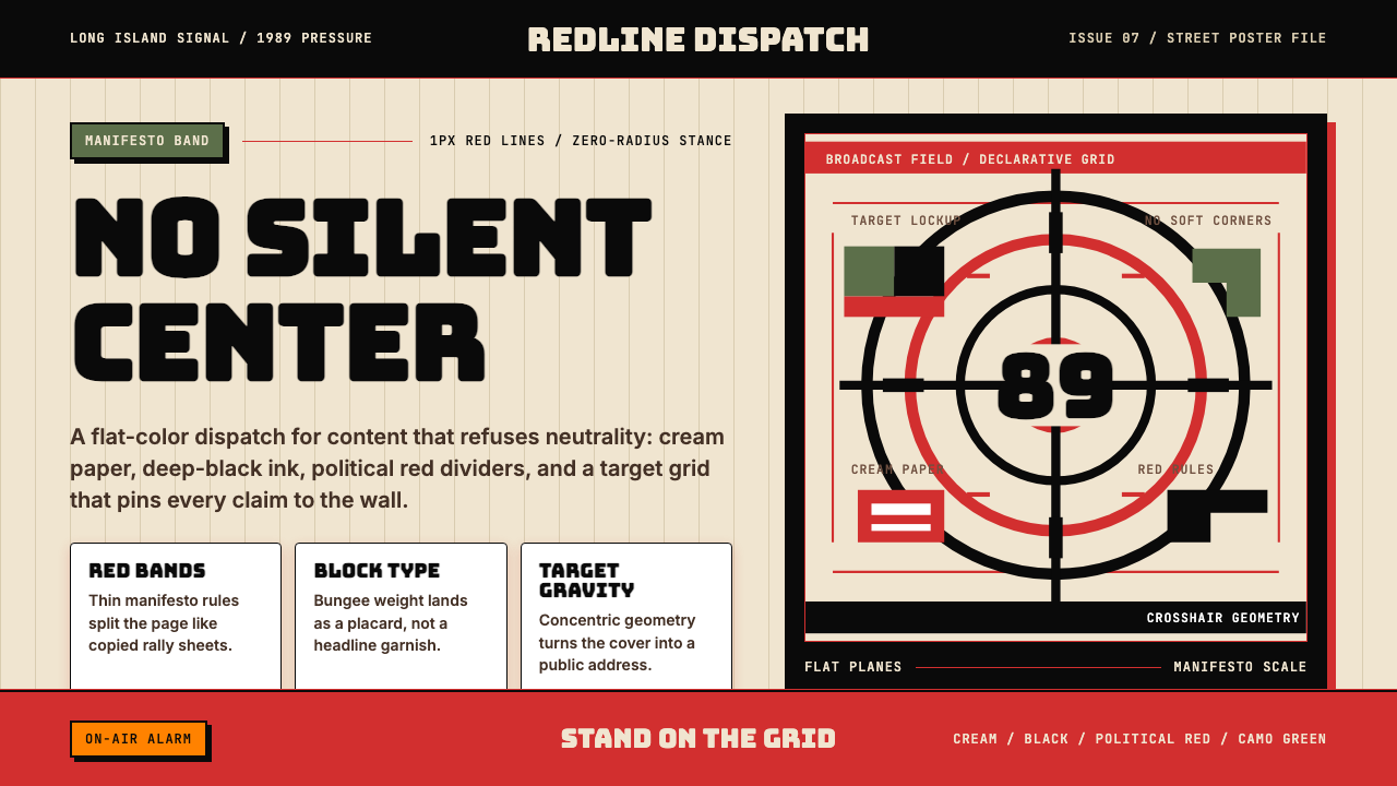 Public Enemy — Fight the PowerTakes a side loudly. Red bands, black ink, and target geometry hit like a ral…立场响亮:红色分栏、黑墨与准星几何像集会海报。
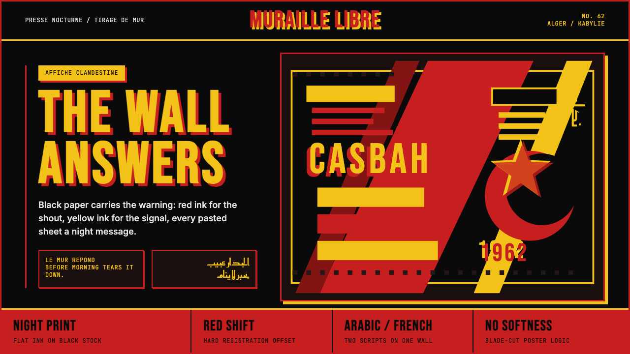 Algerian Casbah Poster (1954–1962)Every surface is a manifesto. Blood red, warning yellow, and stencil type hit…每个表面都是宣言:血红、警示黄与模板字撞上黑色新闻纸。
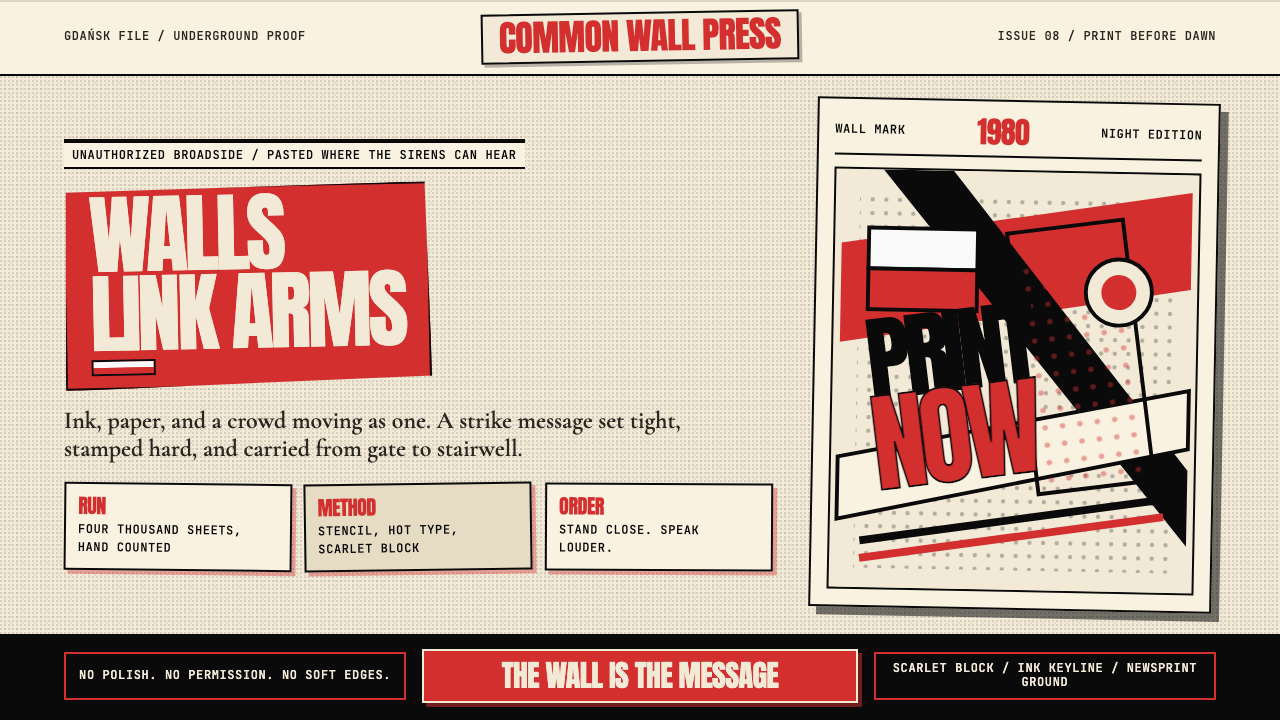 Solidarność Poland 1980Urgency becomes type. Scarlet blocks, ink keylines, and halftone cream hit li…急迫化为文字:猩红色块、黑色描边与半调米纸像墙上海报。
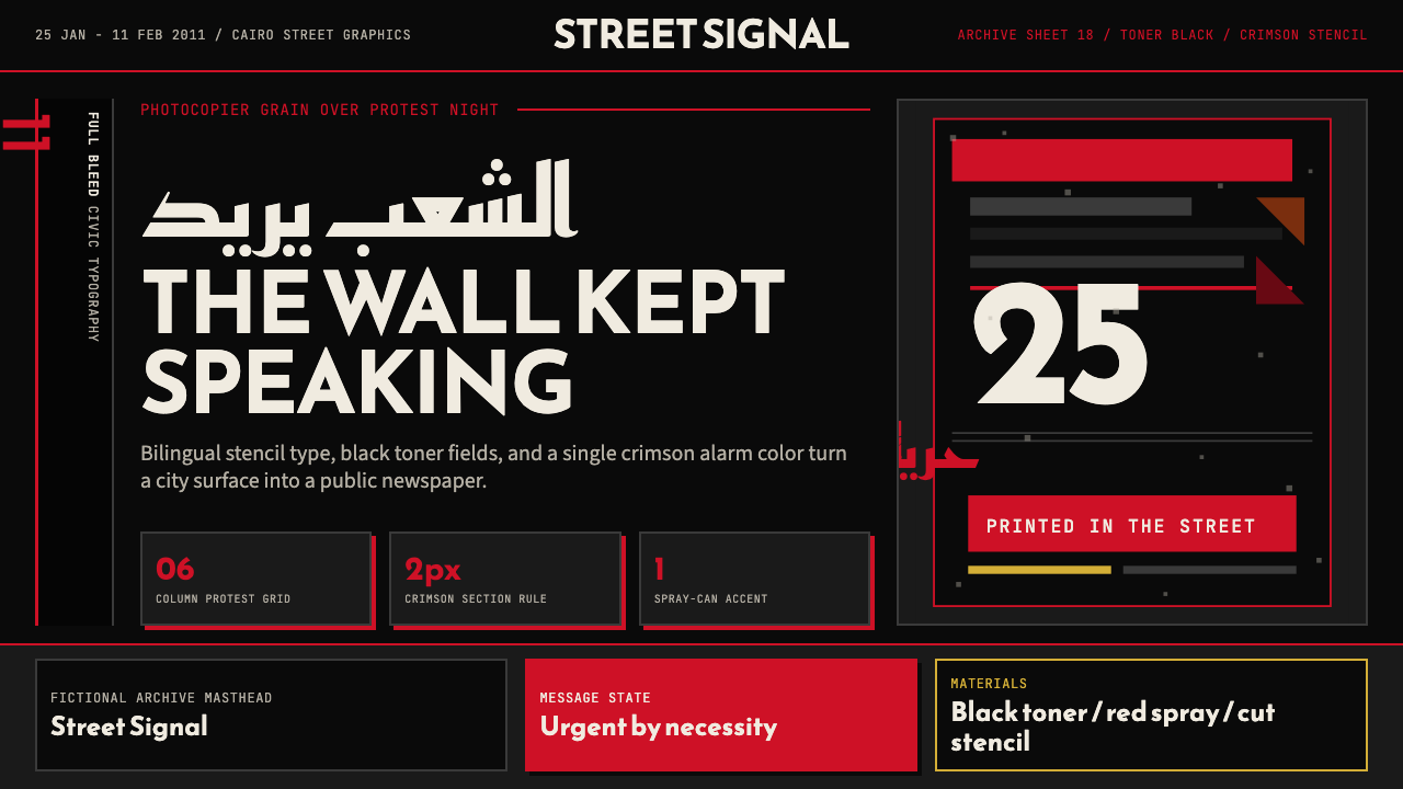 Tahrir Square 2011Civic signal, not polish. Photocopier black and crimson stencils on a hard gr…公民信号,不加修饰。复印黑与猩红模板压进硬网格。
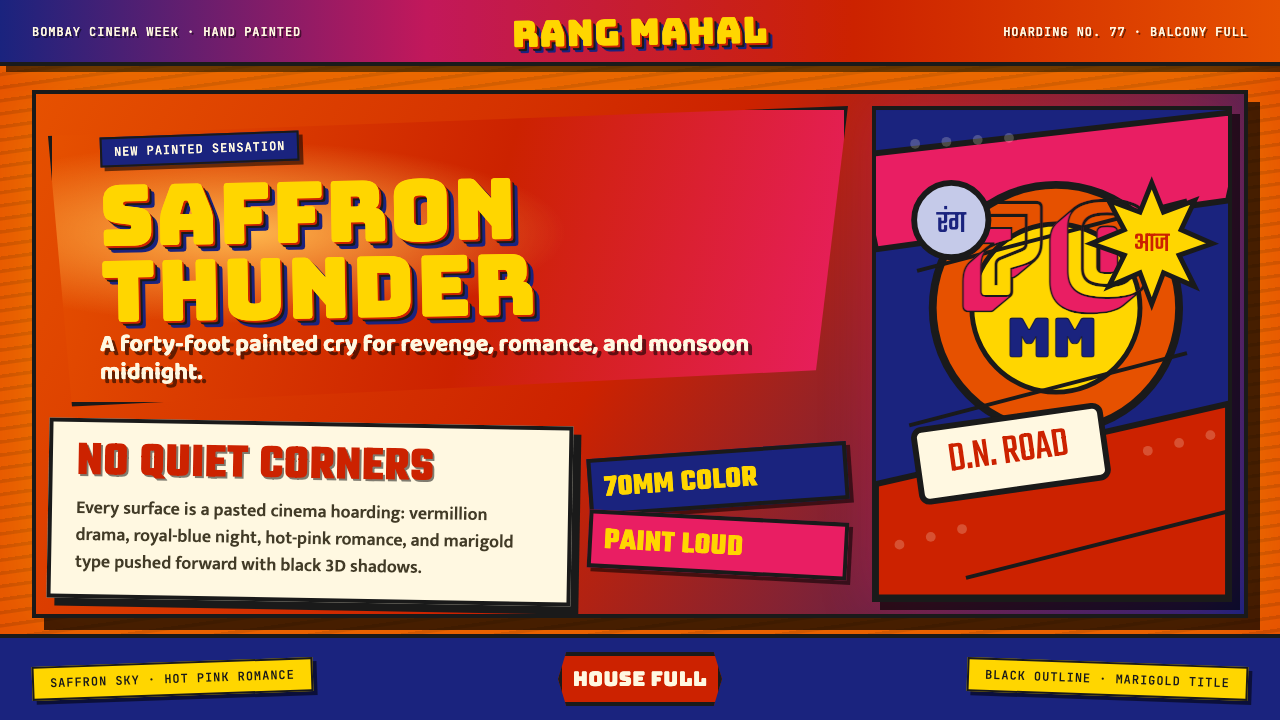 Bollywood Poster Art (1970s)Subtlety is unaffordable. Saffron fields, Bungee shadows, diagonal hoarding d…节制太便宜:藏红花底、Bungee黑影与斜向招贴制造十米戏剧。
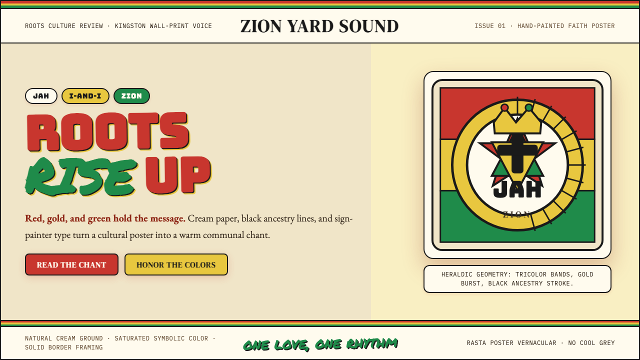 Caribbean Rastafarian (Jamaica)Warm faith, loud color. Red-gold-green bands and black poster type carry the…温暖信仰,高饱和发声:红金绿横带与黑色海报字承载吟唱。