What is Solidarność Poland 1980?什么是 Solidarność Poland 1980?
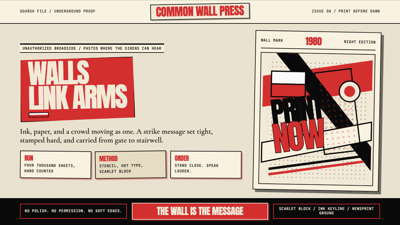
Jerzy Janiszewski painted scarlet letters that linked arms like striking workers — and within months, one handmade logo had become the most politically charged typographic act of the twentieth century.耶日·亚尼谢夫斯基画出一排手写猩红字母,字母彼此挽臂如同罢工工人——几个月内,这个手绘标志成为二十世纪政治张力最强的排版行动。
Solidarność Poland 1980 in briefSolidarność Poland 1980 速览
Solidarność Poland 1980 is a graphic design language born inside a political emergency. Its immediate origin is the logo painted by Jerzy Janiszewski on a strike-committee banner at the Gdańsk Lenin Shipyard in August 1980: scarlet hand-lettered characters packed so tightly they lean on one another, with the cross-stroke of the final letter flying a miniature Polish flag. From that single image a broader visual vocabulary expanded — one rooted in the traditions of the Polish Poster School but charged with the urgency of underground resistance.「团结工会 1980」是一种诞生于政治紧急状态下的视觉语言。它最直接的起点,是耶日·亚尼谢夫斯基于 1980 年 8 月在格但斯克列宁造船厂罢工委员会横幅上手绘的那个标志:猩红色手写字母紧密挤压、彼此倚靠,最后一个字母的横笔顶着一面微型波兰国旗。从那一个图像出发,一套更广泛的视觉词汇随之展开——植根于波兰海报学派的传统,却因地下抵抗运动的急迫性而充满张力。
The aesthetic is built on a handful of uncompromising decisions: a scarlet that reads as alarm and conviction simultaneously, ink-black that communicates with the gravity of a press statement, and an off-white newsprint ground that anchors the whole in the material reality of the samizdat page. Typography is expressive and human rather than engineered; letterforms carry the slight irregularity of the hand and the speed of the brush. The grid, where it exists at all, is organic — structured by the logic of a wall poster or a broadsheet, not by a design manual.这套美学建立在几个毫不妥协的决定之上:猩红色同时传达警报与信念,墨黑色带有新闻声明般的分量,泛黄的新闻纸底面将整体锚定在地下出版物(samizdat)的物质现实中。字体设计是表达性的、人性化的,而非经过精密工程处理的;字形保留着手的轻微不规则与笔刷的速度感。网格——若有的话——是有机的,遵循墙报或大幅印刷品的逻辑,而非某份设计手册的规范。
What distinguishes this style from other politically motivated aesthetics of the period is its combination of folk warmth and graphic severity. The crowded, interlocking letterforms suggest solidarity in the most literal sense — bodies pressed together, supporting one another. The color choices evoke the Polish national palette without any need for explicit symbolism. The halftone textures of newsprint reproduction add documentary weight to compositions that might otherwise read as pure agitprop. The result is a visual language that communicates urgency, community, and defiance in the same gesture.这种风格与同时期其他具有政治动机的美学的区别,在于它将民间温度与图形严峻感结合在一起。那些拥挤交织的字母形态,以最字面的方式传达「团结」的含义——身体紧靠,相互支撑。色彩选择唤起波兰民族色调,无需任何显性符号。新闻纸半调印刷的肌理为构图增添了纪录片式的分量,使作品不至于沦为纯粹的宣传图像。最终呈现出一种视觉语言:在同一个姿态中,同时传达急迫、共同体与抗争。
See the Solidarność Poland 1980 design system查看 Solidarność Poland 1980 完整设计系统
Where does Solidarność Poland 1980 come from?Solidarność Poland 1980 从何而来?
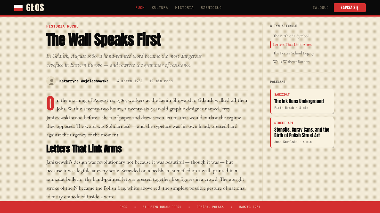
The immediate context was the summer of 1980 in Poland. A wave of strikes, beginning at the Gdańsk Lenin Shipyard in August, rapidly spread across the country. Workers demanded not just economic concessions but independent trade unions — a direct challenge to the communist state. The Inter-Factory Strike Committee (MKS) needed a visual identity quickly. Janiszewski, a young graphic design student, produced the now-iconic logotype in a single afternoon: the word 'Solidarność' in hand-lettered red, with the characters pressed together so closely that the composition read as a crowd rather than a word. Within weeks the logo appeared on banners, leaflets, badges, and walls across Poland. Within months, it had reached the front pages of Western newspapers.直接背景是 1980 年夏天的波兰。从 8 月格但斯克列宁造船厂开始的罢工浪潮迅速席卷全国。工人们要求的不仅是经济上的让步,更是独立的工会组织——对共产主义国家的直接挑战。跨工厂罢工委员会(MKS)迫切需要一个视觉标识。年轻的平面设计学生亚尼谢夫斯基在一个下午里创作出如今举世闻名的标志字体:用手写红字拼出「Solidarność」,字符紧密挤压,整体构图读起来像一群人而非一个单词。数周内,这个标志出现在波兰各地的横幅、传单、徽章和墙壁上;数月内,它登上了西方报纸的头版。
The deeper visual roots of the style lie in the Polish Poster School (Polska Szkoła Plakatu), a movement that had developed in Poland from the 1950s onward. Figures like Henryk Tomaszewski, Roman Cieślewicz, and Jan Lenica had built an internationally admired tradition of poster art that combined fine-art sensibility with populist communicative directness. Their posters used photomontage, hand-drawn lettering, bold silhouette, and surrealistic juxtaposition to produce images that rewarded both rapid reading at distance and close attention. The Solidarność aesthetic absorbed this tradition without citation, treating its strategies as common visual property available to anyone with a brush and a political conviction.这种风格更深层的视觉根源在于波兰海报学派(Polska Szkoła Plakatu)——一个自 1950 年代起在波兰发展起来的运动。亨里克·托马谢夫斯基、罗曼·切斯莱维奇和扬·莱尼察等人建立了一个享誉国际的海报艺术传统,将纯艺术的感受力与平民式的传达直接性融为一体。他们的海报借助照片蒙太奇、手绘字体、大面积剪影和超现实主义并置,创作出既能在远处快速阅读、又经得起近距离细看的图像。团结工会美学无需注脚地吸收了这一传统,将其策略视为任何人只要手持画笔与政治信念便可取用的公共视觉财产。
The samizdat press — the underground network of self-published texts and pamphlets that operated throughout the Soviet bloc — provided the material substrate for the style. Printing was clandestine and equipment was improvised; newsprint, mimeograph, and offset litho all left their traces in the aesthetic. The halftone grain of photocopied images, the slight misregistration of two-color printing, the coarse texture of uncoated paper — these technical artifacts of underground publication became expressive properties absorbed into the visual language. The style thus carries within it the evidence of its own production conditions.地下出版网络(samizdat)——在整个苏联集团运作的自费出版文本与小册子网络——为这种风格提供了物质基础。印刷是秘密进行的,设备是临时拼凑的;新闻纸、油印机和胶版印刷都在美学上留下了痕迹。复印图像的半调颗粒感、双色印刷的轻微套准偏差、无涂层纸张的粗糙质感——这些地下出版的技术痕迹成为被吸收进视觉语言的表达性属性。这种风格因此在自身之中携带着它的生产条件的证据。
By 1981, when the Polish communist government imposed martial law and forced Solidarność underground, the visual system had already achieved the robustness of a living folk tradition. It did not require a design office or professional production to reproduce. Anyone with red paint, a rough letterform, and access to a wall could participate. This radical reproducibility — not despite the style's irregularity but because of it — proved to be one of its most important properties. The aesthetic survived a decade of suppression and resurfaced intact for the Round Table Talks of 1989 and the free elections that followed, demonstrating that visual languages built for resistance have a durability that those designed for calm institutional communication rarely achieve.到 1981 年波兰共产党政府宣布戒严、迫使团结工会转入地下时,这套视觉系统已经获得了一种活态民间传统的坚韧性。它不需要设计事务所或专业制作来复制——任何人,只要有红色颜料、一个粗略的字形、以及一面墙,就可以参与其中。这种激进的可复制性——不是尽管有风格的不规则性,而是恰恰因为这种不规则性——被证明是其最重要的属性之一。这套美学在经历十年压制之后,于 1989 年圆桌谈判和随后的自由选举中完好再现,证明了为抵抗而建立的视觉语言,拥有那些为平静的制度传播而设计的语言鲜少能达到的持久力。
What defines the Solidarność Poland 1980 look?Solidarność Poland 1980 的视觉特征是什么?
Scarlet as Signal猩红作为信号
The defining color is a warm, vivid scarlet — not the cool primary red of offset process printing, but the hotter, slightly orange-shifted red of hand-mixed paint and ribbon ink. This red functions simultaneously as alarm, national symbol, and emotional call to presence. It is deployed in large flat masses — filling letterforms, flooding background panels, cutting bold horizontal bands — and it is never graduated or softened. Against the off-white of newsprint or the stark white of a poster ground, this scarlet achieves a physical intensity that cooler reds cannot replicate.这套风格的定义色彩是一种温暖、鲜明的猩红——不是胶版印刷的冷调原色红,而是手工混合颜料与色带油墨那种更热烈、略带橙调的红。这种红色同时作为警报、民族象征与情感召唤发挥作用。它以大面积平涂形式部署——填满字形、铺满背景面板、切割粗犷的水平色带——从不渐变或柔化。在新闻纸的泛黄白或海报底面的纯白映衬下,这种猩红达到了较冷红调无法复制的物质强度。
Ink-Black and Newsprint Ground墨黑与新闻纸底面
The palette beyond scarlet is starkly two-tone: a deep, saturated ink-black and an off-white that carries the memory of newsprint, uncoated paper, and mimeograph sheets. The black is used for photomontage imagery, dense text blocks, and strong keyline borders — it brings documentary gravity to the composition. The off-white ground is never a pure designer white; it has the slight warmth and texture of cheap reproduction paper, grounding the work in the material conditions of its production. Together, these three tonal registers — scarlet, black, newsprint cream — constitute the complete chromatic vocabulary of the style.猩红之外的色板是鲜明的双色调:深度饱和的墨黑,以及一种带有新闻纸、无涂层纸张与油印页记忆的泛白色。黑色用于照片蒙太奇图像、密集的文字块和粗犷的轮廓边框——它为构图带来纪录片式的分量。泛白底面从不是纯净的设计师白;它具有廉价复制纸张特有的轻微暖调与质感,将作品锚定在其生产的物质条件中。这三个色调层级——猩红、黑色、新闻纸奶白——共同构成这种风格的完整色彩词汇。
Expressive Hand Lettering表达性手绘字体
Typography in this tradition is emphatically not mechanical. The letterforms are brush-painted or hand-drawn, carrying the slight irregularity, variation in stroke weight, and gestural energy of the human hand working at speed. Letters lean into one another, their spacing compressed to the point of physical contact, conveying solidarity in a literal as well as political sense. Serifs, when they appear, are of the rough cut-in kind associated with hot-metal newspaper setting — blunt, authoritative, direct. This typographic warmth distinguishes the style from the geometric precision of Swiss or Bauhaus traditions and is one of its most emotionally accessible properties.这一传统中的排版绝非机械性的。字形是用笔刷绘制或手工描画的,带有人手在快速工作时特有的轻微不规则感、笔画粗细变化与姿态能量。字母相互倚靠,间距压缩至近乎身体接触,以字面和政治的双重意义传达「团结」。衬线——若出现的话——是与铅字报纸排版相关联的粗糙切入式风格——钝拙、权威、直接。这种排版温度使这种风格有别于瑞士或包豪斯传统的几何精准性,也是其最具情感可达性的属性之一。
Photomontage and Halftone Texture照片蒙太奇与半调肌理
Following the Polish Poster School tradition, imagery enters the visual system primarily through photomontage: black-and-white photographs cut, combined, and reproduced at high contrast against the flat graphic elements. The halftone dot patterns of newsprint reproduction — a consequence of offset or screen printing on coarse paper — are treated not as technical imperfections to be minimized but as expressive properties in their own right. The grain, the dot spread, the tonal compression of cheap reproduction all contribute to the documentary roughness that gives the style its visual credibility. This halftone texture distinguishes authentic evocations of the style from clean digital reproductions.遵循波兰海报学派传统,图像通过照片蒙太奇进入视觉系统:黑白照片被裁切、拼合,以高对比度复制于平面图形元素之上。新闻纸印刷的半调网点图案——粗糙纸张上胶版或丝网印刷的结果——不被视为需要最小化的技术缺陷,而是被当作具有自身价值的表达性属性。廉价复制的颗粒感、网点扩散和色调压缩,都为这种风格的纪录片式粗粝感做出了贡献,赋予了其视觉可信度。这种半调肌理将这一风格的真实唤起与干净的数字复制区别开来。
Poster Logic and the Wall as Medium海报逻辑与墙作为媒介
The organizing principle of layouts is the wall poster: maximum legibility at a distance, information hierarchies resolved in seconds rather than minutes, and a visual center of gravity that operates before conscious reading begins. Compositions are rarely symmetrical; they are weighted toward decisive asymmetry, with a dominant element — a word, a face, a color block — commanding attention before supporting elements register. Borders, when they appear, are thick ruled lines functioning as frames that separate this message from the surrounding visual field, not as decorative additions. The layout announces itself rather than inviting the viewer to explore.版式的组织原则是墙面海报:在远处保持最大可读性,信息层级在数秒内而非数分钟内完成解析,视觉重心在有意识的阅读开始之前已经发挥作用。构图鲜少对称;它偏向决定性的非对称——一个主导元素(一个词、一张脸、一块色块)在辅助元素被注意到之前就已经抓住注意力。边框——若出现的话——是粗实线条,用于将这条信息与周围视觉场分隔开来,而非作为装饰性补充。版式是主动宣告自身,而非邀请观看者去探索。
Raw Production Marks as Aesthetic原始制作痕迹作为美学
Unlike design movements that seek to conceal their production methods, this aesthetic embraces the marks of its own making as positive visual content. The slight bleed of red ink past the edge of a letterform, the visible brush stroke in a filled shape, the registration variance of two-color screen printing, the physical imprecision of rubber-stamp reproduction — these are not flaws. They are evidence of human hands, material urgency, and the specific conditions of clandestine production. In contemporary applications of the style, deliberately preserving or simulating these marks is essential to maintaining authenticity; over-refinement produces a polished pastiche that communicates nothing of the original emotional register.与那些努力隐藏制作方法的设计运动不同,这套美学将自身制作的痕迹作为积极的视觉内容加以接纳。红色油墨轻微渗出字形边缘、填充形状中可见的笔刷笔触、双色丝网印刷的套准偏差、橡皮图章复制的物理不精确——这些都不是缺陷。它们是人手的证据、物质紧迫性的见证,以及秘密制作的特定条件的印记。在当代对这种风格的应用中,刻意保留或模拟这些痕迹对于维持真实性至关重要;过度精致化会产生一种光滑的仿制品,与原作的情感层次毫无关联。
National Symbolism Without Illustration无需插图的民族象征
The style carries a strong sense of Polish national identity without relying on explicit patriotic illustration. The scarlet-and-white palette directly echoes the Polish national flag; the serif letterform tradition connects to centuries of Polish print culture; the reference to folk hand-painting bridges the fine-art poster tradition to popular craft. These associations operate subliminally — through color, material, and form — rather than through pictorial symbols. This approach allows the visual language to be reused in contemporary contexts without the specific political references, while retaining the underlying emotional resonances of urgency, community, and resilience that the original context produced.这种风格承载着强烈的波兰民族认同感,却不依赖明确的爱国主义插图。猩红与白色的色板直接呼应波兰国旗;衬线字体传统与数百年的波兰印刷文化相连;对民间手绘传统的指涉,将纯艺术海报传统与大众手工艺相连通。这些联想通过色彩、材料与形态在潜意识中发挥作用,而非通过图像符号。这种方式使这套视觉语言能够在当代语境中重新使用,无需携带具体的政治指涉,同时保留原始语境所产生的那种急迫、共同体与韧性的底层情感共鸣。
See the Solidarność Poland 1980 design system查看 Solidarność Poland 1980 完整设计系统
Who shaped Solidarność Poland 1980?谁塑造了 Solidarność Poland 1980?
Janiszewski was a graphic design student in 1980 when he created the Solidarność logo in a single afternoon at the Gdańsk shipyard, working on the strike committee banner at the direct request of the workers. The logo's decisive formal idea — letters packed so tightly they support each other, with the flag of Poland carried on the final stroke — came entirely from his interpretation of the political moment. He donated the design to the movement, refusing any payment or copyright claim, so that it could be freely reproduced by anyone who needed it. The logo went on to become one of the most recognized political symbols of the twentieth century and one of the few typographic marks that carries the full weight of a historical event in its form alone.1980 年,亚尼谢夫斯基还是一名平面设计学生,他在格但斯克造船厂应工人的直接请求,在一个下午里为罢工委员会横幅创作了团结工会标志。这个标志决定性的形式理念——字母紧密排列彼此支撑,波兰国旗由最后一笔携带——完全来自他对政治时刻的诠释。他将这个设计无偿献给运动,拒绝任何报酬或版权主张,使任何需要它的人都能自由复制。这个标志后来成为二十世纪最广为人知的政治符号之一,也是少数几个仅凭形式本身就承载着一段历史事件全部分量的排版标记之一。
Tomaszewski is the central figure of the Polish Poster School, whose half-century of work between the 1940s and 1990s established the visual idiom that the Solidarność movement inherited. His posters combined hand-drawn lettering, painterly color application, and imagery that operated at the edge of figuration and abstraction, communicating through intuition rather than diagram. His teaching at the Warsaw Academy of Fine Arts shaped generations of Polish designers and embedded an approach to visual communication that prized individual gesture, formal wit, and emotional directness over systematized production. The humanist typographic warmth of the Solidarność style traces directly to the tradition he cultivated.托马谢夫斯基是波兰海报学派的核心人物,他在 1940 年代至 1990 年代长达半个世纪的创作建立了团结工会运动所继承的视觉惯用语。他的海报将手绘字体、绘画性的色彩运用,以及在具象与抽象边界运作的图像结合在一起,通过直觉而非图解来传达。他在华沙美术学院的教学塑造了几代波兰设计师,并植入了一种视觉传达方式——珍视个体姿态、形式机智与情感直接性,胜过系统化生产。团结工会风格中人文主义排版温度的根源,直接可以追溯至他所培育的传统。
Cieślewicz was among the most technically inventive of the Polish poster generation, distinguished by his mastery of photomontage as a fine-art form. Working in Poland through the 1960s and later from Paris, he developed a visual language that used high-contrast photographic fragments, optical pattern, and collage to create images of extraordinary psychological intensity. His formal strategies — particularly the use of tightly cropped black-and-white photography against flat graphic fields — fed directly into the samizdat aesthetic that Solidarność publications employed. His work demonstrated that documentary photography and expressive design could occupy the same compositional space without either subordinating the other.切斯莱维奇是波兰海报一代中技术上最具创造力的人物之一,以将照片蒙太奇作为纯艺术形式的掌握著称。他在 1960 年代于波兰创作,后来从巴黎工作,发展出一种视觉语言——使用高对比度摄影碎片、光学图案与拼贴来创作具有非凡心理强度的图像。他的形式策略——特别是在平面图形区域中使用紧密裁切的黑白摄影——直接哺育了团结工会出版物所采用的地下出版美学。他的作品证明了纪录性摄影与表达性设计可以在同一构图空间中并存,而任何一方都不会被另一方所压倒。
Lenica brought a surrealist and expressionist sensibility to the Polish Poster School that distinguished him from the more politically direct work of his contemporaries. His posters — particularly for theatre and opera — used organic, metamorphic letterforms and figurative imagery that seemed to grow and mutate across the picture surface. Though his own work was less overtly political than that of Tomaszewski or Cieślewicz, his formal experiments with letterforms that behave like living things directly prefigured the way the Solidarność logo would be read: as characters that are also bodies, type that is also crowd. His influence is felt in the expressive, breathing quality of hand-lettered forms across the broader stylistic family.莱尼察为波兰海报学派带来了超现实主义与表现主义的感受力,使其有别于同时代人更具政治直接性的作品。他的海报——特别是为剧场与歌剧创作的——使用有机的、变形性的字形与具象图像,这些元素看起来在画面表面生长和变异。尽管他自己的作品政治性不如托马谢夫斯基或切斯莱维奇那样明显,但他对字形如同生命体般行为方式的形式探索,直接预示了人们阅读团结工会标志的方式:字符同时也是身体,文字同时也是人群。他的影响体现在这一更广泛风格家族中手绘字形那种表达性的、充满呼吸感的品质上。
One of the defining characteristics of the Solidarność visual tradition is the extent to which it was produced by anonymous designers, printers, and activists operating without institutional support. The underground press network that sustained the movement from 1981 through 1989 generated an enormous body of typographic and graphic work whose creators are largely unrecorded. These anonymous practitioners — working by night on duplicating machines in apartments and church basements — constituted a distributed design workforce that collectively developed and refined the visual language of the movement. Their contribution is not legible through individual authorship but through the consistency and vitality of a graphic system that survived a decade of suppression without institutional maintenance.团结工会视觉传统的一个决定性特征,在于它在很大程度上是由匿名设计师、印刷工人和活动人士在没有机构支持的情况下创作的。从 1981 年到 1989 年维系运动的地下出版网络产生了大量排版与图形作品,而其创作者大多未被记录。这些匿名实践者——在公寓和教堂地下室里于夜间在复印机上工作——构成了一支分散的设计劳动力,集体地发展和精炼了运动的视觉语言。他们的贡献无法通过个人署名来识别,但可以通过一套图形系统的连贯性与活力来感知——这套系统在经历了十年压制之后,在没有机构维护的情况下完好存续。
How do you use Solidarność Poland 1980 today?今天怎么用 Solidarność Poland 1980?
Solidarność Poland 1980 translates well into contemporary design work when the intended message involves urgency, conviction, or solidarity — whether literal or metaphorical. The style's emotional register is serious and engaged; it works in contexts where the audience is being called to attention or action, not being entertained or reassured. Correctly applying it requires understanding what the visual language is actually doing: using scarlet to arrest attention and signal commitment, using rough typographic texture to communicate human presence, and using the density and compression of composition to suggest collective force.当预期信息涉及紧迫感、信念或团结——无论是字面意义还是隐喻意义上的——「团结工会 1980」都能很好地转化为当代设计作品。这种风格的情感基调是严肃而投入的;它适用于受众被召唤去注意或行动的场景,而非被娱乐或安抚的场景。正确应用它需要理解这套视觉语言实际上在做什么:用猩红色截获注意力并传达承诺,用粗粝的排版质感传达人的存在,用构图的密度与压缩感暗示集体力量。
For presentation slides, the style performs strongly on both cover and feature content pages. A cover built in this aesthetic works through bold asymmetry: a large scarlet block or scarlet lettering commands the primary field, while a black-on-newsprint-white secondary text area grounds the composition. The title should feel hand-lettered in spirit even if set digitally — condensed, tight-spaced, weighted toward the heavy end. Content slides adopt a broadsheet logic: a clear primary headline at large scale, a secondary information column, and a thick black rule separating structural zones. Data slides are best handled through high-contrast bar and area charts in the primary palette — black, scarlet, and newsprint white — with chart elements treated as bold graphic objects rather than polished data visualizations.对于演示文稿,这种风格在封面页和主要内容页上都表现强劲。以这种美学构建的封面通过大胆的非对称性发挥作用:一个大面积猩红色块或猩红色字体主导主要视野,而黑色文字置于新闻纸白底的次要文本区则为构图提供锚定。标题应当在精神上感觉像手绘字体——即使是数字排版也应压缩、紧密间距、偏向粗重一端。内容页采用大幅报纸逻辑:大尺度的清晰主标题、次要信息栏目,以及分隔结构区域的粗黑实线。数据页最好通过主色板中的高对比度柱状图和面积图来处理——黑色、猩红与新闻纸白——将图表元素视为大胆的图形对象而非精致的数据可视化。
For web interfaces, this style suits contexts where conviction and community are core brand values: advocacy platforms, cooperative or union-affiliated products, cultural institutions with a social mission, and editorial platforms covering politics, labor, or social movements. Dashboard layouts work well when structured around a strong typographic hierarchy with scarlet used exclusively for primary calls to action or critical alerts. Navigation should feel editorial — large, confident type with minimal graphic embellishment. Pricing or membership pages respond well to the style's poster logic: each tier defined by a bold scarlet-highlighted headline, dense but legible body text, and a visual language that treats joining as an act of affiliation rather than a commercial transaction.对于网页界面,这种风格适合信念与共同体是核心品牌价值的场景:倡导平台、合作社或工会关联产品、具有社会使命的文化机构,以及报道政治、劳工或社会运动的编辑平台。当围绕强劲的排版层级构建、猩红色专门用于主要行动号召或关键警示时,仪表板布局效果很好。导航应当感觉像编辑性的——大而自信的字体,图形装饰极少。定价或会员页面对这种风格的海报逻辑响应良好:每个等级由一个醒目的猩红色高亮标题定义,文字密集但清晰,整体视觉语言将加入视为一种隶属行为而非商业交易。
For editorial and marketing work, the style supports content with genuine political or social substance. Magazine spreads and article layouts using this aesthetic should lead with large, manually-weighted headline type, use a dense columnar body text structure that recalls broadsheet newspaper layout, and rely on high-contrast black-and-white photography or photomontage rather than color photography. Marketing materials for social enterprises, nonprofits, or mission-driven brands benefit from the style's combination of emotional directness and visual authority — but only when the organizational values genuinely align with the aesthetic's origins. The style communicates authentically for causes; it communicates inauthentically for consumer products unrelated to solidarity or collective action.对于编辑和营销工作,这种风格支持具有真实政治或社会内容的作品。使用这种美学的杂志版面和文章布局应以大尺度、手动加权感的标题字体开头,使用密集的栏目式正文结构——令人联想到大幅报纸版面——并依赖高对比度黑白摄影或照片蒙太奇,而非彩色摄影。社会企业、非营利组织或使命驱动品牌的营销材料,受益于这种风格结合情感直接性与视觉权威性的能力——但前提是组织价值观与这套美学的起源真正契合。这种风格为有理想的事业提供真实的传达;当被用于与团结或集体行动无关的消费品时,则会产生不真实的效果。
A common mistake when applying this style is treating the scarlet as a general accent color to be used liberally throughout a layout, rather than as a loaded signal deployed sparingly for maximum impact. In the original posters and banners, scarlet dominates compositionally but is the only non-neutral color present; distributing it across many small elements dilutes its force and produces something closer to generic red-and-black branding than to the Solidarność aesthetic. A related error is over-polishing the typographic and surface elements: digital tools make it easy to produce technically perfect letterforms and perfectly registered color blocks, but the style's emotional power depends on the visible evidence of human production. Retaining controlled roughness — in letterform, in texture, in edge quality — is not a stylistic indulgence but a structural requirement.应用这种风格时最常见的错误,是将猩红色视为可以在整个版面中自由使用的通用点缀色,而非一种被节制部署以产生最大冲击力的有分量的信号。在原始的海报与横幅中,猩红色在构图上占主导地位,但却是其中唯一存在的非中性色彩;将它分散在许多小元素上会稀释其力量,产生出更接近通用红黑品牌形象而非团结工会美学的效果。一个相关的错误是过度精致化排版和表面元素:数字工具使产生技术上完美的字形和完美套准的色块变得容易,但这种风格的情感力量依赖于人工制作的可见证据。保留受控的粗粝感——在字形、质感与边缘质量上——不是一种风格上的放纵,而是一种结构性要求。
See the Solidarność Poland 1980 design system查看 Solidarność Poland 1980 完整设计系统
Solidarność Poland 1980 — FAQSolidarność Poland 1980 · 常见问题
How is Solidarność Poland 1980 different from Soviet Constructivist design?「团结工会 1980」与苏联构成主义设计有何不同?
Both share a commitment to bold political communication, geometric visual structure, and strong typographic presence — and the Polish Poster School was certainly aware of Constructivist precedents. But the differences are fundamental. Soviet Constructivism was a state-sponsored avant-garde, developed within institutions by trained designers with access to professional printing equipment. Solidarność design emerged from underground conditions: hand-painted, hand-printed, improvised. Constructivism is angular, mechanical, and grid-governed; its emotional temperature is utopian and expansive. Solidarność is compressed, hand-made, and deliberately rough; its emotional temperature is urgent and resistant. The most telling formal difference is typographic: Constructivism favors clean geometric sans-serif letterforms; the Solidarność tradition is built on expressive hand-lettering and the serifs of hot-metal newspaper type.两者都有对大胆政治传达、几何视觉结构和强劲排版存在的共同承诺——波兰海报学派对构成主义先例当然是知晓的。但两者的差异是根本性的。苏联构成主义是由国家资助的先锋派,由受过训练的设计师在机构内部、使用专业印刷设备发展而来。团结工会设计则从地下条件中涌现:手绘、手工印刷、即兴拼凑。构成主义是有棱角的、机械性的、由网格统治的;其情感温度是乌托邦式的、开阔的。团结工会美学则是压缩的、手工制作的、刻意粗粝的;其情感温度是紧迫的、抵抗性的。最能说明问题的形式差异在于排版:构成主义偏爱干净的几何无衬线字形;团结工会传统则建立在表达性手绘字体与铅字报纸型衬线字体上。
Can this style work for commercial brands, or does using it feel appropriative?这种风格可以用于商业品牌吗?使用它会不会感觉像是挪用?
The question of cultural and political appropriation is worth taking seriously here. The Solidarność aesthetic is not merely historical style — it is the visual language of a specific political struggle that involved real sacrifice. Using it for commercial purposes that bear no relationship to the values of labor solidarity, collective action, or democratic resistance risks producing work that feels cynical or hollow. That said, the style can work honestly for organizations whose actual mission aligns with its values: cooperatives, trade unions, nonprofit advocacy organizations, social enterprises, and media platforms covering labor and politics. The test is whether the organization can claim the aesthetic's values as genuinely its own, not whether it can technically reproduce the visual forms.文化与政治挪用的问题在这里值得认真对待。团结工会美学不仅仅是一种历史风格——它是一场涉及真实牺牲的具体政治斗争的视觉语言。将其用于与劳工团结、集体行动或民主抵抗价值观毫无关联的商业目的,有产生愤世嫉俗或空洞作品的风险。话虽如此,这种风格对于真实使命与其价值观契合的组织来说是可以诚实使用的:合作社、工会、非营利倡导组织、社会企业,以及报道劳工与政治的媒体平台。检验标准是:该组织能否真正将这套美学的价值观视为自己的,而不是它是否能在技术上复制这些视觉形式。
How do you apply halftone texture in digital work without it looking like a cliché filter?在数字作品中如何运用半调肌理,而不让它看起来像陈腐的滤镜效果?
The key is using halftone texture structurally rather than decoratively. In the original samizdat and poster work, the halftone was a consequence of the printing process applied to photographic imagery — it appeared on images, not on flat color blocks or typographic elements. In contemporary digital work, applying a blanket halftone overlay across an entire composition will read as a nostalgia filter rather than as an authentic structural choice. Instead, use halftone treatment selectively: on photographic elements to simulate offset reproduction on coarse paper, on tonal transitions between color fields, or on specific elements where documentary texture serves the meaning. The grain should feel like evidence of a process, not like a visual effect applied after the fact.关键在于将半调肌理作为结构性手段而非装饰性手段来使用。在原始的地下出版物和海报作品中,半调是印刷工艺应用于摄影图像的结果——它出现在图像上,而非平面色块或排版元素上。在当代数字作品中,在整个构图上覆盖一层统一的半调效果,会被解读为怀旧滤镜,而非真实的结构性选择。相反,应选择性地使用半调处理:在摄影元素上模拟粗糙纸张上的胶版复制效果,在色彩区域之间的色调过渡处,或在特定元素上——当纪录片式质感服务于意义的时候。颗粒感应当感觉像一个过程的证据,而非事后施加的视觉效果。
Is the style suited to light and delicate content, or does it always read as heavy and confrontational?这种风格适合轻盈细腻的内容吗?还是它总是显得沉重而对抗性强?
The style's natural gravity is heavy, urgent, and confrontational — those are structural properties of the design language, not just its historical associations. Attempting to deploy it for delicate, intimate, or soft content will almost always produce a mismatch between form and content that reads as unresolved. The style is genuinely not suited to wellness brands, personal narratives focused on vulnerability or interiority, children's content, fine dining, or any context where the emotional goal is comfort and ease. Within its appropriate range, however, there is more tonal variation than the bluntest applications suggest: the expressive hand-lettering tradition within the Polish Poster School includes wit, irony, and visual warmth alongside its political severity. The style can accommodate intellectual humor and cultural complexity — it is not limited to the single emotional note of protest.这种风格天然的基调是沉重的、紧迫的、对抗性的——这些是设计语言的结构性属性,而不仅仅是其历史联想。试图将其用于细腻、亲密或柔软的内容,几乎总是会产生形式与内容之间的错位感,令人感到未解决。这种风格确实不适合健康品牌、聚焦于脆弱或内省的个人叙事、儿童内容、精致餐饮,或任何情感目标是舒适与轻松的场景。然而,在其适宜的范围内,存在比最生硬的应用所暗示的更多的基调变化:波兰海报学派中的表达性手绘字体传统,在其政治严肃性之外还包含了机智、反讽与视觉温度。这种风格可以容纳智识幽默与文化复杂性——它并不局限于抗议这单一的情感基调。
What is the most important single thing to get right when applying this style?应用这种风格时,最重要的单一要素是什么?
The scarlet. Its weight, its warmth, and its restraint. The entire visual system is organized around the principle that one color carries the full emotional and communicative burden — and that this is only possible when every other color decision defers to it. Scarlet that is too cold reads as corporate red. Scarlet used on too many elements loses its alarm function. Scarlet rendered without the slight warmth and material richness of mixed paint becomes just another accent color in a red-and-black palette. Get the red right — warm, vivid, structurally dominant, and sparing — and the rest of the visual language will organize itself around it. Fail to get it right, and no amount of hand-lettering texture or halftone grain will produce the correct emotional result.猩红色。它的分量、它的温度,以及它的克制。整套视觉系统围绕一个原则组织:一种色彩承载全部情感与传达的重担——而这只有在所有其他色彩决定都让位于它时才成为可能。过于冷调的猩红会被读解为企业红。用在过多元素上的猩红失去其警报功能。没有混合颜料那种轻微温度与物质丰富感的猩红,只是红黑色板中的又一个点缀色。把红色调对——温暖、鲜明、在结构上占主导地位、且被节制使用——其余的视觉语言就会围绕它自行组织。若调不对,再多的手绘字体质感或半调颗粒感都无法产生正确的情感结果。
Related design styles相关设计风格
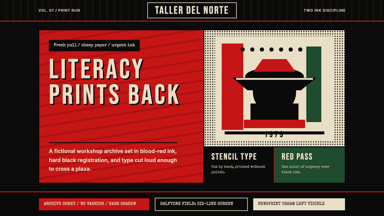 Nicaraguan Sandinista FSLN 1979Urgency in two inks. Blood red, jet black, halftone dots, and cut-stencil typ…双色油墨里的紧迫感:血红与漆黑、半色调网点、模板字。
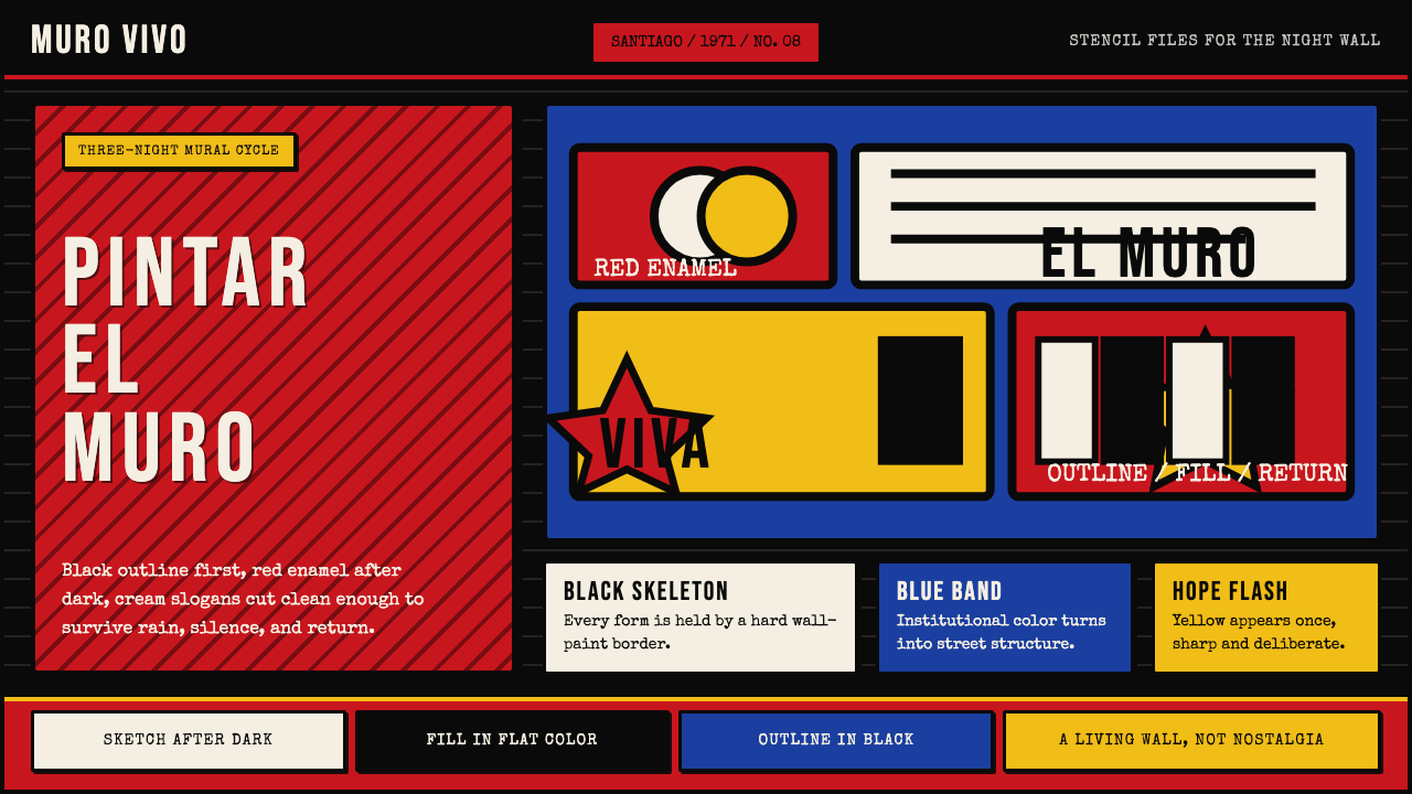 Chilean BRP Ramona Parra 1971Resistance stays alive. Blood red panels, black outlines, and stencil type re…抵抗仍在呼吸:血红墙面、粗黑轮廓与模板字重建街墙。
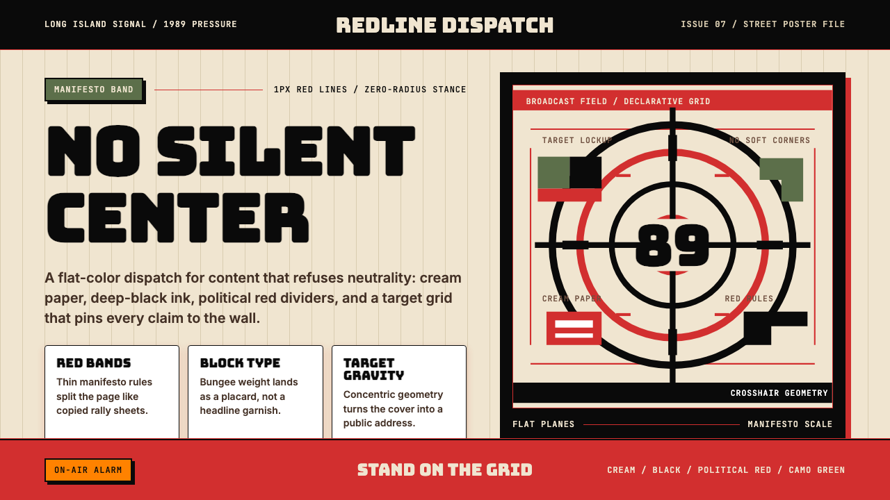 Public Enemy — Fight the PowerTakes a side loudly. Red bands, black ink, and target geometry hit like a ral…立场响亮:红色分栏、黑墨与准星几何像集会海报。
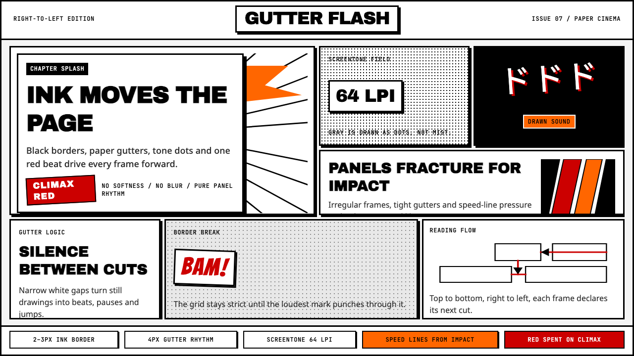 Manga Panel LayoutCinema in ink. Black panels, screentone dots, speed lines, and one red strike.墨线即电影:黑框、网点、速度线与一记少年红。
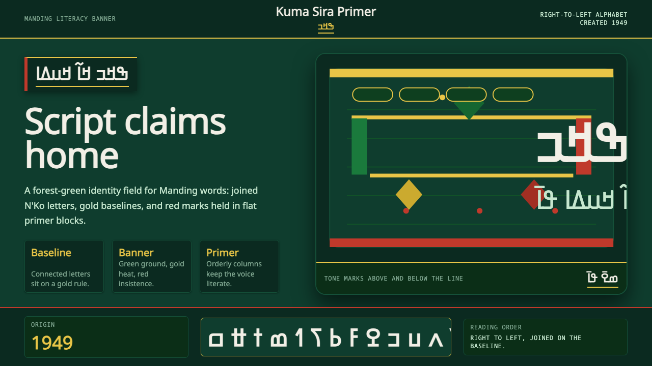 N'Ko ScriptIdentity writes itself. Forest green and gold baselines anchor joined N'Ko le…身份自书:森林绿与金色基线托起连笔N'Ko字形。
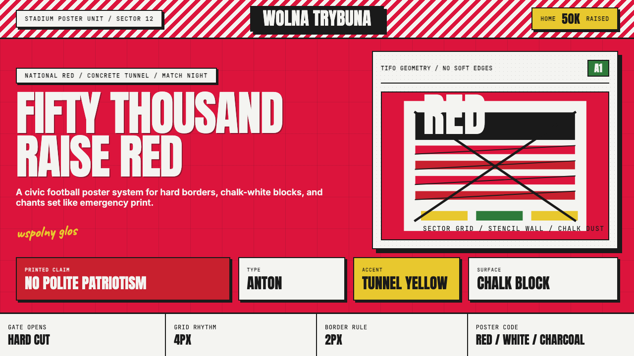 Polish Solidarity Stadium GraphicDefiance fills the stands. Stadium red, Anton stencil type, and chalk-white b…看台燃成反抗:体育场红、模板粗字与粉白硬块。