What is N'Ko Script?
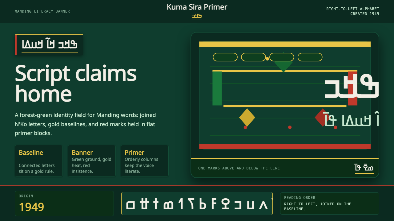
N'Ko turns Solomana Kanté's 1949 Manding writing system into a design language of its own — deep forest green, confident flat color, and flowing right-to-left connected letterforms built to declare identity, not decorate a page.
N'Ko Script in brief
N'Ko is a design system built around a true, independently invented alphabet — not a decorative script or a stylized version of an existing writing system, but a full 27-letter writing system created specifically for the Manding languages of West Africa. Because the script itself was invented as an act of cultural assertion rather than evolving gradually from an older tradition, everything built around it in this design system carries that same deliberate, declarative quality.
Visually, the system centers on a deep forest green field, a color long associated with African cultural and Pan-African political identity rather than chosen for mood or trend. Against this green, gold and a warm Manding red appear as confident, flat accent blocks — never gradients, never soft transitions — reinforcing the sense that every color choice is a statement rather than a decorative flourish. Letterforms flow in continuous, connected strokes along a baseline, with small curved diacritic marks floating above and below to indicate tone, giving the whole script a rhythmic, unbroken quality very different from the discrete, boxed letters of Latin typography.
The overall effect is identity-forward rather than ornamental. This is a system that exists to make a script — and the people and history behind it — visible and legible on its own terms, not to serve as an exotic decorative motif borrowed for visual interest. Any design work drawing on this system should carry that same weight of intention.
Where does N'Ko Script come from?
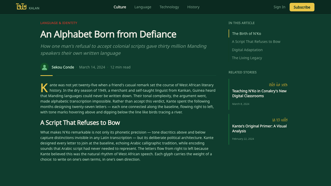
N'Ko was created in 1949 by Solomana Kanté, a Guinean scholar and writer, in direct response to a widespread colonial-era claim that African languages had no indigenous writing systems of their own and were therefore 'primitive' compared to European languages. Kanté, who spoke Manding languages including Maninka, set out to prove this claim false by inventing a complete, original alphabet rather than adapting Arabic or Latin script, which were the two writing systems most commonly used to transcribe Manding languages at the time.
The name N'Ko itself means 'I say' in the Manding languages the script serves, and it was designed as a genuinely phonetic system tailored to the specific sounds of these languages — including tonal distinctions that Latin script struggles to represent cleanly. The script is written right to left, with letters joined along a continuous baseline in a flowing, cursive-like manner, and tone is marked through small diacritic strokes placed above or below each letter rather than through separate tone letters.
N'Ko spread gradually through informal networks of teachers and community literacy programs across Guinea, Mali, and Côte d'Ivoire, regions where Manding languages such as Maninka, Bambara, and Dyula are widely spoken, rather than through state education systems, which largely continued to use French or Arabic. This grassroots transmission gave the script a strong association with community self-education and cultural pride rather than institutional or governmental authority — it was, and largely remains, a script learned because people chose to learn it.
Because N'Ko emerged during the era of African decolonization and Pan-African political thought, it became closely associated with a broader movement asserting the legitimacy and sophistication of indigenous African languages, literatures, and knowledge systems against colonial narratives that had dismissed them. Printed N'Ko materials — primers, newspapers, and religious and literary texts — along with community banners promoting literacy, became visual artifacts of this movement, which is the direct source of the deep green, gold, and red visual identity this design system inherits.
What defines the N'Ko Script look?
Forest Green Ground
The dominant field is a deep, saturated forest green rather than a neutral white or black, drawing directly from the color's long association with African cultural banners and Pan-African identity. This ground is treated as confident and foundational, not as one option among many neutral choices.
Flat Confident Color Blocks
Gold and Manding red appear as solid, flat accent fields rather than gradients or soft washes. Each color block reads as a deliberate assertion — a statement of identity — rather than a decorative gradient chosen to look modern or soft.
Right-to-Left Connected Letterforms
N'Ko script flows right to left with letters joined continuously along a baseline, producing a rhythmic, unbroken visual line very different from the discrete, boxed letterforms of Latin typography. Any layout using this script must respect this directionality structurally, not merely mirror a Latin layout.
Floating Tone Diacritics
Small curved marks appear above and below the baseline to indicate tone, a functional necessity of the Manding languages the script serves. These marks add rhythmic visual texture along the text line without disrupting its continuous flow, functioning as musical notation might above a melodic line.
Cultural Banner Aesthetic
The system draws its compositional confidence from literacy-campaign banners and printed primers, which favored bold, legible, large-scale presentation over subtlety, since their purpose was to be read and understood by new literacy learners at a glance. This heritage favors clarity and visual assertion over intricate ornamentation.
Identity Over Decoration
Every visual choice in this system traces back to an act of assertion — a script invented to prove indigenous linguistic sophistication, colors tied to cultural and political identity, letterforms designed for genuine phonetic accuracy. Nothing here should be treated as an exotic ornamental motif divorced from that history.
Grassroots Print Texture
Printed N'Ko materials historically came from community literacy programs and small presses rather than polished state publishing, giving associated print artifacts a direct, unpretentious, slightly utilitarian print quality rather than a refined editorial finish. This texture reflects the script's genuinely grassroots transmission.
Who shaped N'Ko Script?
Kanté, a Guinean scholar and writer, invented the N'Ko alphabet single-handedly in 1949 as a deliberate response to colonial-era claims that African languages lacked their own writing systems. His creation of a complete, phonetically tailored alphabet for the Manding languages — rather than adapting an existing script — remains the foundational act this entire design system draws its meaning from.
Rather than spreading through state school systems, N'Ko was carried forward largely by informal networks of community teachers who taught the script person to person across Guinea, Mali, and Côte d'Ivoire. This grassroots teaching tradition is why N'Ko carries an association with self-directed community pride rather than institutional or governmental authority.
Small presses and community publishers produced primers, newspapers, and literary and religious texts in N'Ko script, turning the alphabet from a teaching tool into a living print culture. Their output established the direct, unpretentious print texture associated with the script and gave Manding-language literature a written form entirely independent of French or Arabic script.
N'Ko's adoption was carried forward by a broader current of Pan-African and decolonial thought that saw the invention and use of an indigenous African script as a direct assertion of linguistic and cultural sophistication against colonial-era dismissal. This political and cultural context is why the script's visual identity carries real historical weight rather than functioning as neutral typography.
How do you use N'Ko Script today?
N'Ko suits projects genuinely centered on West African language, culture, or identity — literacy and education platforms, cultural institutions, Pan-African community organizations, and heritage or diaspora-facing brands. Because the source material carries real historical and political weight, this style should not be applied casually as a generic 'African' decorative motif to unrelated products.
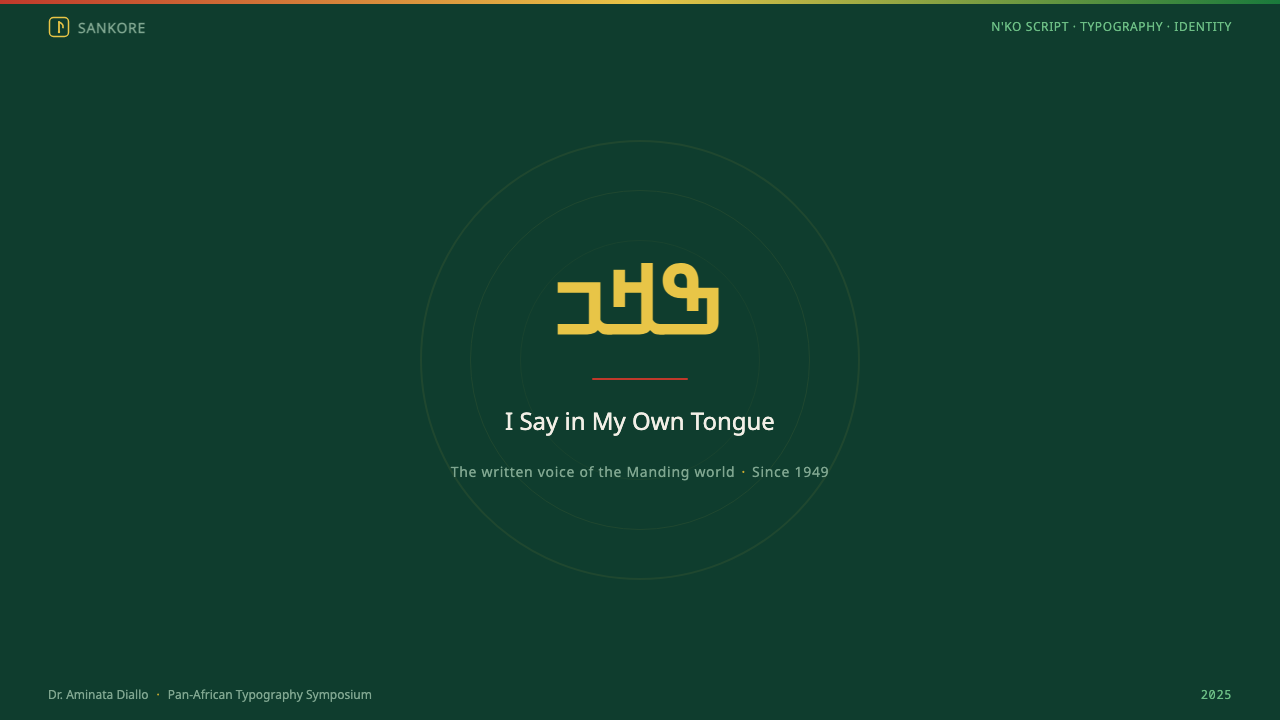
On presentation slides, the system supports strong cover pages built on a solid forest-green field with a gold or red flat-color accent shape anchoring one corner, echoing the confident composition of a literacy-campaign banner. Content slides should respect right-to-left reading structure where actual N'Ko text is present, and use flat, unblended color blocks rather than gradients for section dividers or highlight boxes.
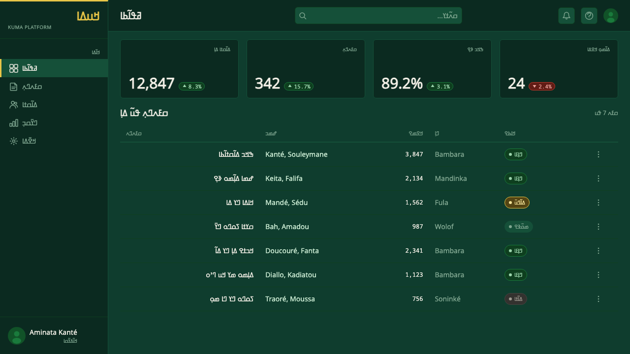
For web interfaces, this system fits platforms serving Manding-speaking communities directly, language-learning tools, cultural archives, and Pan-African media or advocacy organizations. Dashboards and content pages should preserve the deep green ground as the dominant tone, reserving gold and red for genuine emphasis — primary actions, key data points — rather than spreading them thin as generic accent colors. Any interface presenting actual N'Ko script must support right-to-left text flow correctly rather than merely flipping a Latin layout. Pricing and account pages should carry the same restraint as the print tradition the system draws from: one confident green field, sparing gold highlights for the recommended tier, and no decorative pattern filler.
In editorial and marketing contexts, the style is well suited to storytelling about language preservation, African literary and intellectual history, and community-driven education movements. A feature layout can use the green field as a recurring section background with gold rule lines marking transitions, in the spirit of a printed literacy primer rather than a purely decorative pattern.
The most common mistake is extracting only the color palette or letterform silhouette for decorative use without any connection to the script's actual linguistic and political history — reducing a genuine, still-living alphabet to a generic 'ethnic' pattern. Any authentic application should engage with the real script, its right-to-left structure, and the specific cultural context it comes from, rather than treating it as visual texture alone. A second, related mistake is softening the flat, confident color blocking into pastel tints or gradients in the name of modern polish — doing so erases the very quality, assertive rather than tentative, that gives the system its meaning.
N'Ko Script — FAQ
Is N'Ko a decorative script or a real writing system?
N'Ko is a fully functioning, independently invented alphabet with 27 letters, created in 1949 specifically to represent the sounds of the Manding languages, including tonal distinctions. It is actively used today for literacy, publishing, and communication across Manding-speaking communities and their diaspora, not a stylized or purely decorative script.
Why is right-to-left direction so important to respect in this style?
N'Ko is written right to left with letters joined continuously along the baseline, so any layout presenting real N'Ko text must flow in that direction structurally — reversing only surface elements while keeping a Latin-style left-to-right structure would misrepresent how the script is actually read and would be legible to no one who reads N'Ko.
Why does the palette lean on forest green rather than a broader color range?
Forest green carries a specific, long-standing association with African cultural banners and Pan-African political identity, which is the same context N'Ko itself emerged from as a decolonial, identity-asserting project. Using it as the dominant ground keeps the design system tied to that real historical meaning rather than treating color as an arbitrary aesthetic choice.
Is it appropriate to use N'Ko-derived design elements for unrelated commercial products?
This requires real care. Because the script's origin is tied to a specific decolonial and cultural-pride history, applying it as pure decoration on products with no connection to Manding language, culture, or community risks flattening that history into an exotic pattern. It is best reserved for projects that genuinely engage with West African language, education, or cultural identity.
What gives the script its flowing, rhythmic visual quality?
Letters are joined continuously along a single baseline in a cursive-like manner, rather than sitting as discrete boxed characters the way Latin letters typically do, and small curved tone diacritics float above and below that line. Together these produce an unbroken, musical visual rhythm along each line of text that is structurally different from the letter-by-letter spacing of Latin typography.
Related design styles
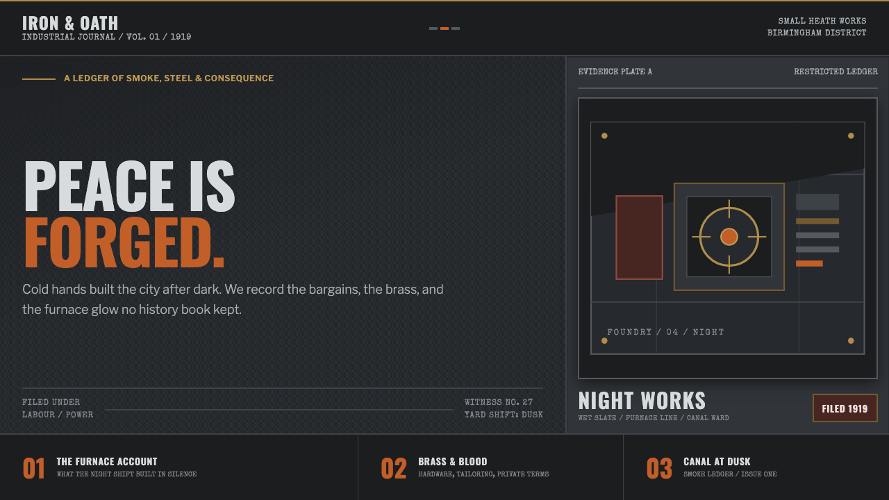 Peaky Blinders (1919)Industrial menace, struck alive. Cold slate grids meet one rare furnace-orang…
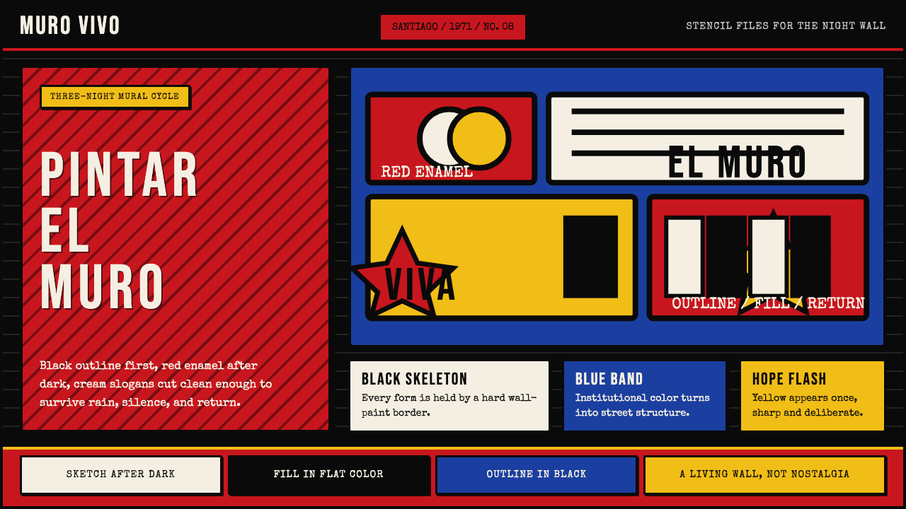 Chilean BRP Ramona Parra 1971Resistance stays alive. Blood red panels, black outlines, and stencil type re…
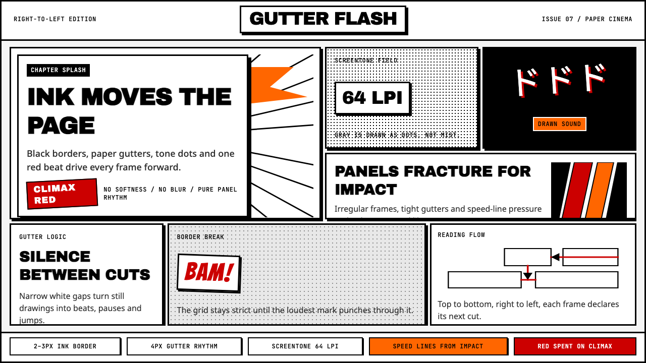 Manga Panel LayoutCinema in ink. Black panels, screentone dots, speed lines, and one red strike.
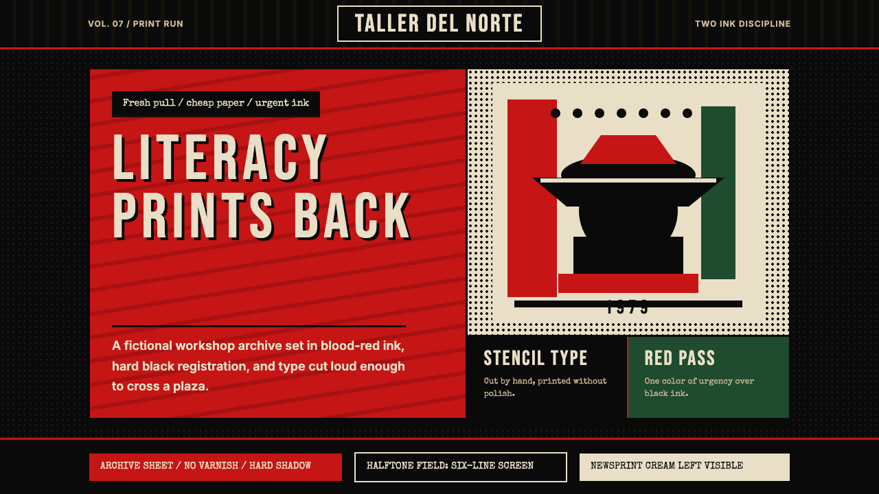 Nicaraguan Sandinista FSLN 1979Urgency in two inks. Blood red, jet black, halftone dots, and cut-stencil typ…
 Tunisian Jasmine Revolution (2010)Raw urgency wins. Red browser grids and mono hashtags compress 3am protest in…
 Attack on Titan (2013)Dread becomes duty. Stone-gray bands, engraved caps and one steel-blue crest…