Design style guide设计风格指南
What is Nicaraguan Sandinista FSLN 1979?什么是 Nicaraguan Sandinista FSLN 1979?
Blood red over jet black on cheap newsprint — the Sandinista silkscreen workshops of 1979 turned political urgency into a visual language that still crackles with revolutionary heat.廉价新闻纸上的血红与漆黑——1979年桑地诺丝网印刷工坊将政治紧迫感铸成一套至今仍灼热的视觉语言。
Nicaraguan Sandinista FSLN 1979 in briefNicaraguan Sandinista FSLN 1979 速览
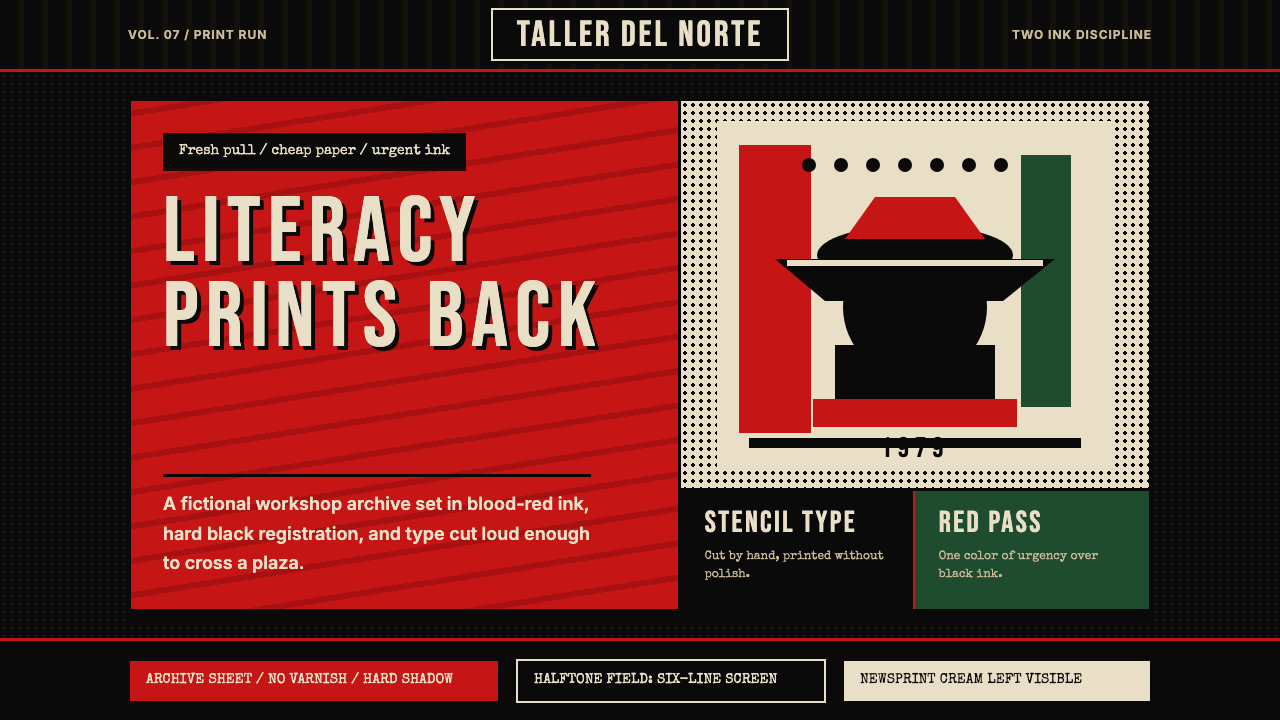
The Nicaraguan Sandinista FSLN 1979 style is a visual system rooted in the revolutionary silkscreen workshops that flourished under the first Sandinista government from 1979 to 1990. It is defined by a ruthlessly restricted two-color palette — blood red and jet black — applied to cheap, slightly yellowed newsprint grounds. Every surface reads like a freshly pulled print: flat color blocks with visible ink bleed at the edges, halftone dot-matrix portraits, hand-cut stencil lettering, and the unmistakable silhouette of Augusto César Sandino's wide-brimmed hat against a stark horizon.尼加拉瓜桑地诺民族解放阵线1979风格,是一套植根于1979至1990年第一届桑地诺政府时期丝网印刷工坊的视觉系统。它的核心是极度克制的双色色板——血红与漆黑——施印于廉价、略带黄化的新闻纸底面上。每一个界面元素都像是刚从印版上揭下的印刷品:边缘可见油墨渗透的平涂色块、半色调网点肖像、手工刻制的模板字体,以及奥古斯托·塞萨尔·桑地诺标志性宽檐帽剪影映在苍白天际的轮廓。
What makes this aesthetic distinctive is its honesty about the material conditions under which it was produced. The imperfections are not affectations — misregistered color layers, rough stencil edges, uneven ink coverage — they are the direct record of workshop printers working at speed under political pressure. The visual system carries the urgency of its origins: it communicates not through elegance but through directness, contrast, and the unmistakable authority of the stencil mark.这套美学的独特之处在于对生产条件的诚实。套色偏移、模板边缘的粗糙感、油墨覆盖的不均匀——这些都不是刻意为之的风格腔调,而是工坊印刷者在政治压力下快速作业留下的直接印记。这套视觉系统携带着它诞生时的紧迫感:它传达的力量不靠优雅,而靠直接、对比,以及模板印记无可置疑的权威性。
Compared to the cooler rationalism of European political modernism or the monumental grandeur of Soviet constructivism, the Sandinista silkscreen tradition is raw and human-scaled. It was made for walls, telephone poles, and community gathering spaces — surfaces that demanded legibility at a distance and durability in tropical heat — and those production demands shaped every aesthetic choice.与欧洲政治现代主义更冷静的理性主义,或苏联构成主义的宏大纪念碑感相比,桑地诺丝网印刷传统是粗粝而有人的尺度的。它为墙壁、电话杆和社区集会空间而生——这些表面要求在远距离下清晰可辨,在热带气候中经久耐用——而这些生产需求塑造了每一个美学决定。
See the Nicaraguan Sandinista FSLN 1979 design system →查看 Nicaraguan Sandinista FSLN 1979 完整设计系统 →
Where does Nicaraguan Sandinista FSLN 1979 come from?Nicaraguan Sandinista FSLN 1979 从何而来?
The aesthetic roots of this style reach back further than July 1979. Augusto César Sandino, the guerrilla leader who fought against U.S. military occupation of Nicaragua from 1927 until his assassination in 1934, had already become a visual icon by the time the FSLN was founded in his name in 1961. The Sandino silhouette — wide-brimmed campesino hat, angular jaw, simple line — was already in circulation as a political emblem before the revolution. When the Sandinistas marched into Managua on July 19, 1979, ending forty-three years of Somoza family dictatorship, they inherited and immediately amplified this visual tradition.这套风格的美学根源远早于1979年7月。游击队领袖奥古斯托·塞萨尔·桑地诺从1927年起抗击美国对尼加拉瓜的军事占领,直至1934年遇刺身亡——早在以他名字命名的桑地诺民族解放阵线于1961年成立之前,桑地诺的视觉形象就已成为一个政治图腾。宽檐农民帽、棱角分明的下颌、简洁的线条——桑地诺剪影作为政治象征早已在民间流传。1979年7月19日,桑地诺阵线攻入马那瓜,终结索摩查家族长达四十三年的独裁统治,他们继承并立即放大了这一视觉传统。
The institutional engine of the movement's visual culture was the Ministry of Culture, directed by the poet-priest Ernesto Cardenal. Cardenal's ministry established the Talleres de Cultura Popular — popular culture workshops — in cities across Nicaragua, including Managua, Estelí, Matagalpa, and León. These workshops trained working-class and campesino printers in silkscreen technique and supplied them with the materials to produce political posters at scale. The workshops operated on a principle of collective authorship: many of the most powerful images have no individual attribution, only the stamp of the workshop and the movement.这场运动视觉文化的制度引擎,是由诗人-神父埃内斯托·卡德纳尔主持的文化部。卡德纳尔的文化部在尼加拉瓜全国各城市——包括马那瓜、埃斯特利、马塔加尔帕和莱昂——建立了「人民文化工坊」(Talleres de Cultura Popular)。这些工坊向工人阶级和农民印刷工传授丝网印刷技术,并为他们提供大规模生产政治海报所需的材料。工坊遵循集体署名原则:许多最有力量的图像没有个人作者,只有工坊与运动的印章。
The Cruzada Nacional de Alfabetización — the National Literacy Crusade of 1980 — became one of the most intensive deployments of this visual system. The crusade sent thousands of young volunteers into rural areas to teach reading, and the silkscreen workshops produced an enormous volume of literacy campaign materials: instructional posters, mobilization broadsides, and portrait sheets of revolutionary heroes. The visual constraint was imposed partly by economics — the country had few resources — and partly by ideology: a poster that required expensive four-color printing was a poster that could only be made in a few places. Two-color silkscreen could be reproduced anywhere there was a frame, a squeegee, and a screen.1980年的「全国扫盲运动」(Cruzada Nacional de Alfabetización)成为这套视觉系统最密集的一次部署。这场运动将数千名年轻志愿者派往农村地区教授阅读,丝网印刷工坊为此生产了大量扫盲运动材料:教学海报、动员传单,以及革命英雄的肖像版画。视觉约束一半来自经济现实——国家资源匮乏——一半来自意识形态:需要昂贵四色印刷的海报,只能在少数地点制作;而双色丝网印刷在任何有网框、刮刀和丝网的地方都可以完成。
The artistic lineage of Camilo Minero, the Salvadoran-born muralist who worked extensively with the Sandinista cultural brigades, represents the transnational dimension of the movement's visual culture. Central American political printmaking of the late 1970s and 1980s was a regional conversation, not an isolated national phenomenon: artists and techniques circulated across borders, and the Nicaraguan workshops were in dialogue with Cuban printmaking institutions, Chilean exile graphic traditions, and the broader Latin American poster movement that had been building since the Cuban Revolution of 1959.在桑地诺文化队伍中大量工作的萨尔瓦多裔壁画家卡米洛·米内罗,代表着这场运动视觉文化的跨国维度。1970至80年代末中美洲政治版画是一场地区性对话,而非孤立的民族现象:艺术家与技法跨越国境流通,尼加拉瓜工坊与古巴版画机构、智利流亡平面传统,以及自1959年古巴革命以来持续建构的拉丁美洲海报运动处于持续的对话与交流之中。
What defines the Nicaraguan Sandinista FSLN 1979 look?Nicaraguan Sandinista FSLN 1979 的视觉特征是什么?
Two-Color Discipline双色纪律
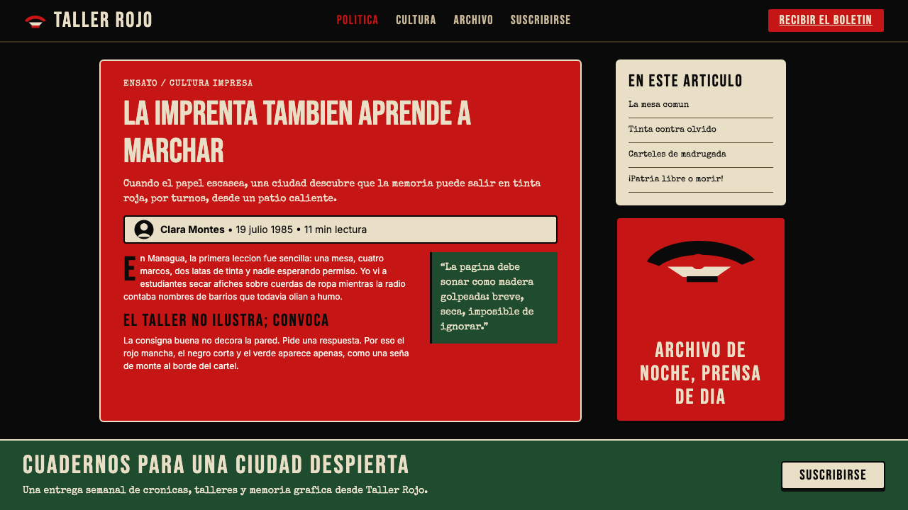
The defining constraint of this visual system is the hard limit of two colors: blood red and jet black, always over a cream or off-white newsprint ground. No intermediate tones are mixed; no gradients soften the transitions. The red carries all the symbolic weight — revolution, sacrifice, urgency — while black handles structure, silhouette, and type. This enforced economy is not a poverty of means but a declaration: the message is clear enough not to need more.这套视觉系统最根本的约束是两色硬限:血红与漆黑,始终叠印于奶油色或接近白色的新闻纸底面上。不调配中间色调,没有渐变柔化过渡。红色承载全部象征重量——革命、牺牲、紧迫感——黑色负责结构、剪影与文字。这种强制的经济性不是手段的匮乏,而是一种宣言:信息本身已足够清晰,无需更多。
Halftone Dot-Matrix Portraits半色调网点肖像
Photographic source material — portraits of Sandino, fallen compañeros, literacy campaign participants — is translated into large-format halftone screens. The dots are coarse and visible, functioning as both a reproduction technique and a visual texture. At reading distance, the portrait resolves; at close range, the grid of dots is exposed. This dual legibility connects the human subject to the mechanical process of reproduction, embedding the image in its political and material context.摄影素材——桑地诺的肖像、牺牲的战友、扫盲运动参与者——被转化为大幅半色调网点印刷。网点粗犷可见,同时充当复制技术与视觉质感。在阅读距离上,肖像得以辨识;在近距离时,网点的格栅暴露无遗。这种双重可读性将人物主体与复制的机械过程联结,使图像嵌入其政治与物质语境之中。
Hand-Cut Stencil Typography手工刻制模板字体
Text is rendered through hand-cut stencils rather than typeset metal or digital composition. The letterforms are simplified to their most readable essentials — enclosed counters are bridged, curves are approximated by straight cuts, and individual character spacing is eyeballed rather than measured. The resulting type has the authority of a proclamation painted on a wall: slightly imperfect, urgently legible, impossible to mistake for commercial production.文字通过手工刻制的模板而非金属活字或数字排版呈现。字形被简化至最基本的可读形态——封闭的内腔以桥接连通,曲线以直切近似,字符间距依目测而非测量调整。由此形成的字体具有墙壁告示的权威感:略带不完美,充满紧迫的可读性,绝不会被误认为商业印刷品。
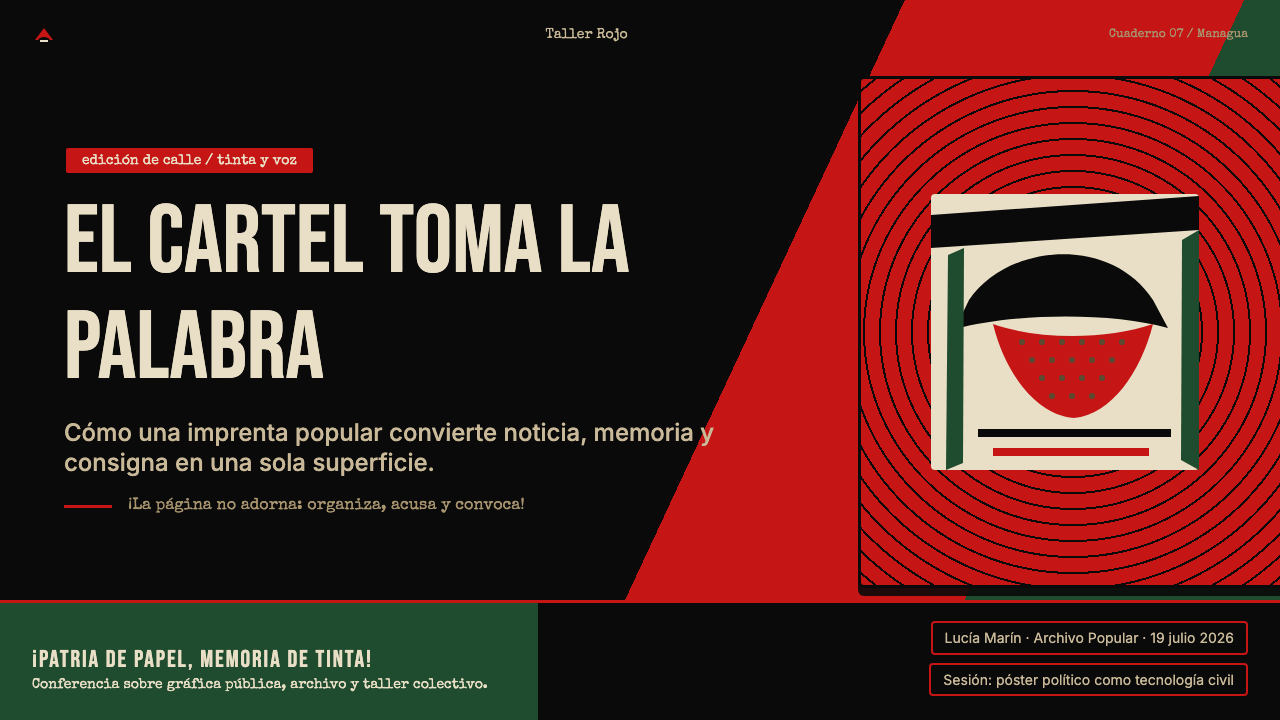
Flat Silhouette and the Sandino Icon平面剪影与桑地诺图腾
Figurative imagery is reduced to clean silhouette — most iconically, the Sandino figure: wide sombrero, upright posture, often set against a rising sun or stark horizontal ground line. No internal detail is rendered; the silhouette works through outline alone. This reduction is not simplification for simplicity's sake but a formal response to the silkscreen medium, where every additional color layer adds cost, complexity, and registration risk.具象图像被简化为干净的剪影——最具标志性的是桑地诺形象:宽大草帽、挺拔姿态,常置于升起的太阳或简洁的地平线之上。内部细节全部省略;剪影仅靠轮廓运作。这种简化并非为简洁而简洁,而是对丝网印刷媒介的形式回应——每增加一个色层都意味着成本、复杂度和套色风险的叠加。
Ink Bleed and Registration Imperfection油墨渗透与套色偏移
Where the ink meets the paper ground, the edge is never perfectly sharp — a slight halo of color bleeds into the grain of the newsprint, and where red and black layers overlap, a narrow zone of disturbance reads as deep maroon. Color registration between passes is intentionally imperfect: the two layers may offset by a visible margin, creating a sense of layering and physical depth that a single clean print cannot achieve. These imperfections are the signature of the human hand in the mechanical process.油墨与纸面相遇之处,边缘从不完全锋利——颜色略微渗入新闻纸的纤维,在红黑两层重叠的地方,形成一道深褐色的扰动带。两次过网之间的套色偏移是有意为之:两个色层可能以可见的距离错开,产生一种分层感与物理深度感,这是单次套印无法实现的。这些不完美是人手介入机械过程的签名。
Diagonal Composition and Urgency斜线构图与紧迫感
Where European modernism favored horizontal stability, the Sandinista poster tradition reaches for diagonal thrust. Raised fists, upward-pointing rifles, marching columns, and rising sun rays all drive the eye along diagonals that suggest movement and momentum. This compositional energy is not chaos — it is directed urgency, always resolving toward a focal point of text or silhouette that carries the message.欧洲现代主义偏爱水平方向的稳定感,而桑地诺海报传统则追求斜线的冲击力。高举的拳头、向上指向的步枪、行进的队列、升起的光芒——所有这些都将视线沿斜线引导,暗示运动与动势。这种构图能量并非混乱,而是定向的紧迫感,始终朝向承载信息的文字焦点或剪影收敛。
Newsprint Ground as Active Element新闻纸底面作为主动元素
The unprinted surface — the cream or buff color of cheap newsprint — is not a neutral background but an active third tone in the composition. Where the silkscreen leaves the paper bare, the warm ground shows through, providing contrast against the black without requiring a third ink pass. The slight warmth of aged newsprint also contributes to the emotional register of the style: it suggests something printed and distributed in haste, under pressure, meant to be read and passed along.未印刷的表面——廉价新闻纸的奶油色或淡黄色——不是中性的背景,而是构图中主动的第三个色调。丝网在纸面留白之处,温暖的底色透出,与黑色形成对比,无需第三道油墨。泛黄的旧新闻纸带来的微微暖意也参与构建了这种风格的情感质地:它暗示着某种在紧迫中印刷与分发、用于传阅的东西。
See the Nicaraguan Sandinista FSLN 1979 design system →查看 Nicaraguan Sandinista FSLN 1979 完整设计系统 →
Who shaped Nicaraguan Sandinista FSLN 1979?谁塑造了 Nicaraguan Sandinista FSLN 1979?
Sandino never lived to see the revolution that bore his name, but his image — particularly the silhouette of his wide campesino sombrero — became the most reproduced icon of the 1979 movement and remains the visual anchor of this entire design system. As a historical figure, Sandino organized a guerrilla campaign against U.S. Marine occupation from 1927 to 1933, refusing to sign a peace treaty and maintaining armed resistance until the Marines withdrew. His assassination in 1934, ordered by the Somoza-family patriarch Anastasio Somoza García, made him a martyr whose image carried enormous political charge for subsequent generations of Nicaraguan and broader Latin American leftists.桑地诺从未亲眼目睹以他名字命名的革命,但他的形象——尤其是宽大农民草帽的剪影——成为1979年运动中被复制最广的图腾,也是这整套设计系统的视觉锚点。作为历史人物,桑地诺从1927年至1933年组织了一场对抗美国海军陆战队占领的游击战,拒绝签署和平条约,坚持武装抵抗直至海军撤离。1934年,他在索摩查家族族长阿纳斯塔西奥·索摩查·加西亚的命令下遭到暗杀,成为殉道者,其形象对此后几代尼加拉瓜及整个拉丁美洲左翼人士具有巨大的政治感召力。
Cardenal was simultaneously one of Latin America's most celebrated poets and the Sandinista government's Minister of Culture from 1979 to 1987. He directed the institutional apparatus that made the silkscreen workshops possible: funding, organizing, and legitimizing the Talleres de Cultura Popular as a serious cultural project rather than mere propaganda production. His own identity as a liberation theologian — a Catholic priest who believed revolutionary politics and spiritual practice were compatible — gave the cultural ministry a moral and aesthetic authority that pure political commissioning could not have achieved. Cardenal understood that the workshops were not just printing political messages but training a generation in visual literacy and collective cultural production.卡德纳尔既是拉丁美洲最受赞誉的诗人之一,也是1979至1987年桑地诺政府的文化部长。他主持了使丝网印刷工坊得以运转的制度机器:资助、组织「人民文化工坊」,并将其确立为严肃的文化项目而非单纯的宣传生产。作为解放神学家——一位相信革命政治与精神实践相容的天主教神父——他给予文化部一种纯粹政治委托无法实现的道德与美学权威。卡德纳尔深知,这些工坊不仅仅是在印刷政治信息,而是在训练一代人的视觉素养与集体文化生产能力。
As the public face and political leader of the FSLN through the 1979 revolution and the subsequent government years, Ortega became one of the most depicted human subjects in the Sandinista visual canon. His portrait — typically rendered in the coarse halftone style characteristic of the workshops — appeared on posters alongside Sandino's silhouette as a living continuation of the revolutionary tradition. The visual pairing of the historical martyr and the living comandante was a deliberate compositional strategy that the workshops returned to repeatedly, connecting present struggle to historical legitimacy.作为1979年革命及其后政府时期桑地诺民族解放阵线的公众面孔与政治领袖,奥尔特加成为桑地诺视觉典范中被描绘最多的人物之一。他的肖像——通常以工坊特有的粗粝半色调风格呈现——与桑地诺的剪影并列出现在海报上,作为革命传统在当代的延续。历史殉道者与在世指挥官的视觉并置,是工坊反复回归的一种刻意构图策略,将当下的斗争与历史的合法性相连接。
Born in El Salvador, Minero worked extensively with Sandinista cultural brigades in Nicaragua and represents the transnational character of Central American political printmaking in this era. He trained in muralism and silkscreen at institutions in Cuba and Mexico before bringing those skills to Nicaragua, where he helped professionalize the workshop technique while maintaining its raw, handmade character. His work exemplifies how the Sandinista visual tradition was not invented in isolation but assembled from a living network of Latin American revolutionary art practices that circulated across national borders throughout the late twentieth century.米内罗生于萨尔瓦多,大量参与尼加拉瓜桑地诺文化队伍的工作,代表了这一时代中美洲政治版画的跨国性格。他在古巴和墨西哥的机构接受壁画与丝网印刷训练,随后将这些技能带入尼加拉瓜,在保持手工制作的原始质感的同时,帮助提升了工坊的技术水准。他的工作体现了桑地诺视觉传统并非在孤立中被发明,而是从二十世纪末拉丁美洲各国之间持续流通的革命艺术实践网络中汇聚而成。
How do you use Nicaraguan Sandinista FSLN 1979 today?今天怎么用 Nicaraguan Sandinista FSLN 1979?
The Nicaraguan Sandinista FSLN 1979 style carries an unmistakable political charge, and that charge is both its greatest asset and the first thing a designer must reckon with honestly. It is a style that communicates collective urgency, grassroots production, and ideological commitment. Applied with awareness, it is extraordinarily effective for projects where those values are authentic to the context — social movements, nonprofit campaigns, community-organized events, activist zines and publications, and any communication that wants to position itself explicitly as being made by and for the people it addresses. Applied carelessly or ironically, it reads as cultural appropriation of a still-living political tradition.尼加拉瓜桑地诺民族解放阵线1979风格携带着无可混淆的政治感召力,而这种感召力既是它最大的资产,也是设计师必须诚实面对的第一件事。这是一套传达集体紧迫感、草根生产性质和意识形态承诺的风格。在其价值观与语境真实契合的项目中——社会运动、非营利组织活动、社区组织的事件、活动人士的小报与出版物,以及任何想要明确表明自己「由它所面向的人群制作」的传播物——它极为有效。若漫不经心或带有反讽意味地使用,则会被解读为对一个仍然活着的政治传统的文化挪用。
For presentation slides, the style works with particular strength in contexts that call for a manifesto register rather than a corporate one. A cover slide in this system is built around a single bold silhouette or halftone portrait, a short declarative headline in stencil-weight type, and the two-color restriction held without exception. Content slides should lean into the newsprint quality: treat white slide backgrounds as the off-white of cheap paper, use red exclusively for emphasis and calls to action, and keep body text in heavy black. Data slides in this system become proclamation graphics — bar charts with heavy red bars against black type, numbers treated as visual objects rather than data decorations.在演示文稿中,这套风格在需要宣言式而非企业式表达的语境中最为有力。这套系统中的封面页建立在单一大胆的剪影或半色调肖像、一行以模板字重排印的简短宣言性标题,以及毫无例外地坚守双色限制之上。内容页应充分利用新闻纸的质地:将白色幻灯片底面视为廉价纸张的米白色,将红色专用于强调与行动召唤,正文保持厚重的黑色。在这套系统中,数据页成为公告式图形——红色粗条形图配黑色字体,数字作为视觉对象而非数据装饰处理。
For web interfaces, the style is best suited to advocacy and campaign sites, community platforms, and culturally specific projects where the rawness is a feature rather than a bug. Navigation should be typographic, set in heavy block letterforms with no icon decoration. Hero sections work well as full-bleed halftone image fields with bold stencil-weight text overlaid in red or reversed white. Interactive states — hover, active, focus — can use registration-shift effects, simulating the slight misalignment of a second silkscreen pass. The restriction to red and black must be held: introducing a third color immediately dissolves the visual tension that gives the style its power.对于网络界面,这套风格最适合倡导与活动站点、社区平台,以及粗粝感本身是特色而非缺陷的文化特定项目。导航应为字体性的,以粗重块状字形设置,无图标装饰。英雄区块适合做成满出血的半色调图像底面,叠加以红色或反白的模板字重文字。交互状态——悬停、激活、聚焦——可以使用套色偏移效果,模拟丝网印刷第二次过网时的轻微错位。红与黑的双色限制必须坚守:引入第三种颜色会立即消解赋予这套风格力量的视觉张力。
For editorial and marketing work, the style is particularly well-suited to book covers, event posters, zine spreads, and any printed piece where the physical material of production can echo the original newsprint ground. A Sandinista-derived layout uses bold, asymmetric type placement, bleeds the halftone imagery to the edge of the page, and allows generous areas of unprinted ground to read as an active compositional element. In marketing contexts, the style signals authenticity, community grounding, and political seriousness — associations that are powerful for the right organizations and potentially alienating for the wrong ones.在编辑与营销工作中,这套风格尤其适合书籍封面、活动海报、小报版面,以及任何可以让物理生产材料呼应原始新闻纸底面的印刷品。桑地诺衍生的版面使用大胆的非对称文字布置,将半色调图像出血至页面边缘,并允许大面积的未印刷底面作为主动的构图元素存在。在营销语境中,这套风格传递真实性、社区根基感与政治严肃性——这些关联对合适的组织极具力量,对不合适的组织则可能产生距离感。
A common mistake when applying this style is treating the imperfections as a texture filter applied over otherwise conventional design. Ink bleed, registration shift, and rough stencil edges are not decorative overlays — they are the result of specific production logic. If those imperfections are added digitally without the underlying compositional discipline — the two-color restriction, the halftone translation of photography, the stencil simplification of type — the result is costume, not commitment. The style works only when the constraints are adopted structurally, not applied cosmetically.应用这套风格时最常见的错误,是将其不完美之处视为叠加在本质上普通的设计上面的纹理滤镜。油墨渗透、套色偏移、模板边缘的粗糙感,都不是装饰性叠加——它们是特定生产逻辑的结果。如果这些不完美以数字方式添加,却没有底层的构图纪律——双色限制、摄影的半色调转化、字体的模板简化——结果只是戏服,而非承诺。这套风格只有在结构上采纳约束、而非表面上施加装饰时,才能真正奏效。
See the Nicaraguan Sandinista FSLN 1979 design system →查看 Nicaraguan Sandinista FSLN 1979 完整设计系统 →
Nicaraguan Sandinista FSLN 1979 — FAQNicaraguan Sandinista FSLN 1979 · 常见问题
Is this style only appropriate for explicitly political or leftist projects?这套风格只适用于明确的政治或左翼项目吗?
Not exclusively, but the political genealogy is close enough to the surface that it will always inflect the message. The style has been adopted by cultural institutions, music venues, independent bookshops, food cooperatives, and street art projects that share its aesthetic values — rawness, handmade quality, collective production, urgency — without necessarily endorsing any specific political platform. What matters is that the organization or project can honestly claim a relationship to those values. Using the style purely for aesthetic novelty, without any substantive connection to grassroots or community-facing work, tends to produce results that read as hollow or ironic rather than powerful.并非仅限于此,但其政治谱系离表面足够近,总会渗透进信息之中。这套风格已被文化机构、音乐场所、独立书店、食品合作社和街头艺术项目所采用——这些使用者认同其美学价值(粗粝感、手工品质、集体生产、紧迫感),但不一定认同任何具体的政治纲领。关键在于,组织或项目能否真实声称与这些价值观存在关联。若纯粹为了美学新鲜感而使用,与草根或面向社区的工作毫无实质联系,往往会产生空洞或反讽感,而非力量。
How do I introduce visual hierarchy without adding more colors?在不添加更多颜色的情况下,如何建立视觉层级?
The Sandinista visual tradition manages hierarchy through four levers, none of which require additional color. Scale is the most powerful: a headline rendered at many times the size of body text dominates without any color shift. Density is the second: areas of heavy ink coverage — large filled shapes, bold text blocks — read as heavier and more urgent than areas of fine detail or bare ground. Reversal is the third: text in white reversed out of a black or red field sits at a different visual tier than text printed directly in black on the cream ground. And silhouette quality is the fourth: a clean, simple shape with no internal detail reads at a hierarchy above a complex or detailed element, because the eye resolves it first.桑地诺视觉传统通过四个杠杆管理层级,没有一个需要额外颜色。尺度最为有力:标题以正文数倍大小呈现,无需任何色彩变化即可主导视觉。密度是第二个:大面积油墨覆盖区域——大块填充形状、粗重文字块——比精细细节或空白底面区域读来更沉重、更紧迫。反白是第三个:从黑色或红色底面上反白的文字,与直接以黑色印在奶油底面上的文字处于不同的视觉层级。剪影质量是第四个:一个干净、简洁、无内部细节的形状,比复杂或精细的元素更先被视线解析,因此处于更高的视觉层级。
Can this style work in digital interfaces, or is it inherently print-based?这套风格能在数字界面中使用吗?还是说它本质上是印刷媒介的风格?
The style translates to digital interfaces, but it requires deliberate translation rather than direct copy. On screens, ink bleed and registration shift must be simulated — and they should be used sparingly, as accent elements rather than global textures. The two-color discipline, the halftone treatment of imagery, the stencil weight of type, and the use of the light ground as an active compositional element all carry across to digital without loss. The chief adjustment is that screens offer true black and saturated red at no additional production cost — which the workshop printers did not have — and this abundance can tempt overuse. Holding the same restraint that economic necessity imposed on the original workshops is the key discipline for digital translation.这套风格可以移植到数字界面,但需要有意识的转译,而非直接复制。在屏幕上,油墨渗透与套色偏移必须进行模拟——且应克制使用,作为强调元素而非全局纹理。双色纪律、图像的半色调处理、字体的模板字重,以及将浅色底面作为主动构图元素使用,这些都可以无损地迁移至数字环境。主要的调整在于:屏幕提供真正的黑色与饱和红色,无需额外生产成本——而这是工坊印刷者所不具备的条件——这种丰裕感容易诱发过度使用。在数字转译中,关键的纪律是坚守与经济必要性曾经施加于原始工坊同等的克制。
What distinguishes authentic Sandinista-derived work from generic revolutionary pastiche?真正源自桑地诺传统的作品与泛泛的「革命风格」仿作有何区别?
The distinction lies in structural commitment versus surface decoration. A pastiche borrows the red-and-black palette, adds some distressed texture, and places a raised-fist icon somewhere on the composition. Authentic derivation begins with the two-color discipline as a structural constraint — not a visual flavor — and then works through every design decision in light of that constraint. Type is simplified to stencil weight because additional typographic complexity would require phototypesetting or digital tools the workshops did not have. Photography becomes halftone because full photographic reproduction is a four-color process. The imperfections exist because they are inevitable products of the medium. When the constraints drive the decisions rather than the aesthetic imitating the outcomes, the result has the integrity of the original.区别在于结构性承诺与表面装饰之间的差异。仿作借用红黑色板,添加一些做旧纹理,在构图某处放置一个高举拳头的图标。真正的衍生从将双色纪律作为结构性约束开始——而非一种视觉风味——然后在这一约束的光照下处理每一个设计决定。字体简化至模板字重,因为更多的排印复杂性需要工坊所不具备的照相排版或数字工具。摄影转化为半色调,因为完整的摄影复制是四色过程。不完美之处的存在,是因为它们是媒介不可避免的产物。当约束驱动决定、而非美学模仿结果时,作品才具有原作的完整性。
How should the Sandino silhouette be used, given its specific historical meaning?考虑到桑地诺剪影具有特定的历史含义,应该如何使用它?
The Sandino silhouette — wide sombrero, upright figure — is one of the most politically loaded icons in Latin American visual culture, and its use outside of explicitly Nicaraguan or FSLN contexts requires care. In design work that draws on this style without claiming to represent the Sandinista movement, the silhouette is best treated as a compositional archetype rather than appropriated directly: a bold human silhouette in a wide-brimmed hat, set against a horizon, communicates the compositional values of the style without deploying the specific historical symbol. For work that is explicitly in dialogue with Nicaraguan history or Latin American revolutionary culture, the direct use of the icon can be entirely appropriate — but that dialogue should be substantive, not decorative.桑地诺剪影——宽大草帽、挺拔身形——是拉丁美洲视觉文化中政治符号负载最重的图腾之一,在明确的尼加拉瓜或桑地诺民族解放阵线语境之外使用它需要谨慎。在借鉴这种风格但并不声称代表桑地诺运动的设计工作中,剪影最好作为构图原型处理,而非直接挪用:一个大胆的宽檐帽人物剪影映衬于地平线,能够传达这套风格的构图价值,而不必动用特定的历史符号。对于明确与尼加拉瓜历史或拉丁美洲革命文化进行对话的作品,直接使用这一图腾完全可能是恰当的——但这种对话应当是实质性的,而非装饰性的。
Related design styles相关设计风格
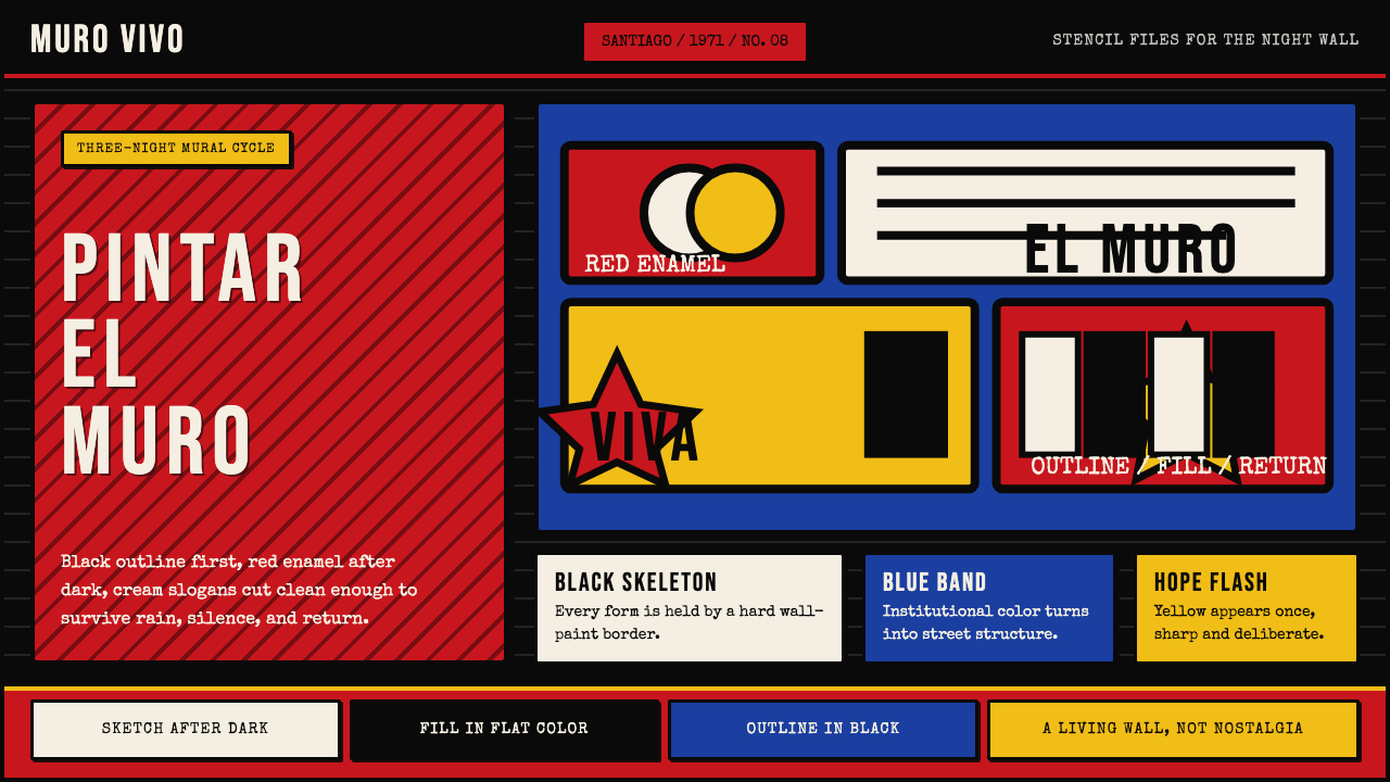 Chilean BRP Ramona Parra 1971Resistance stays alive. Blood red panels, black outlines, and stencil type re…抵抗仍在呼吸:血红墙面、粗黑轮廓与模板字重建街墙。
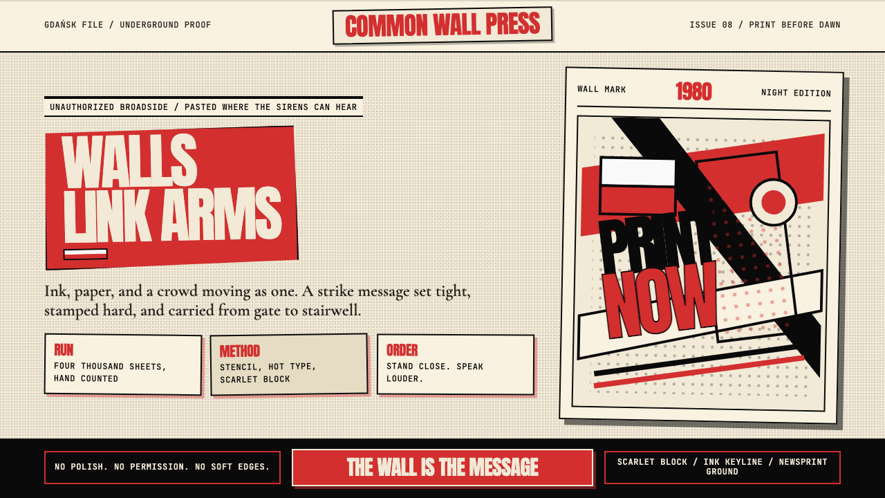 Solidarność Poland 1980Urgency becomes type. Scarlet blocks, ink keylines, and halftone cream hit li…急迫化为文字:猩红色块、黑色描边与半调米纸像墙上海报。
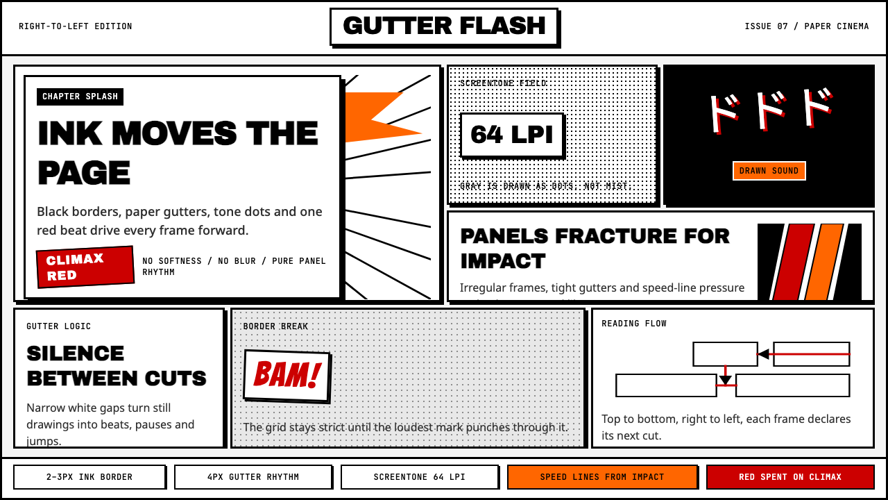 Manga Panel LayoutCinema in ink. Black panels, screentone dots, speed lines, and one red strike.墨线即电影:黑框、网点、速度线与一记少年红。
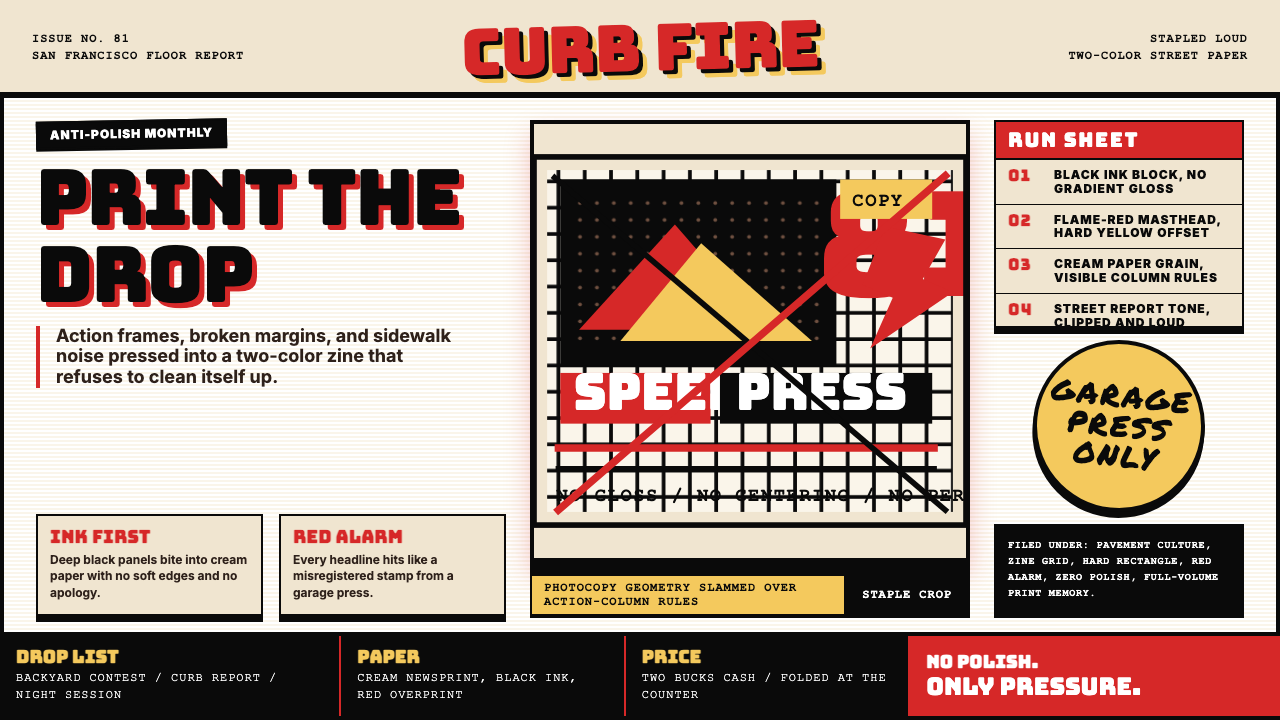 Thrasher Skate Zine (1981)Loud without polish. Flame red type, black ink blocks, and cream zine grids h…粗粝而响亮:火焰红大字、黑墨块与米色小报网格重击页面。
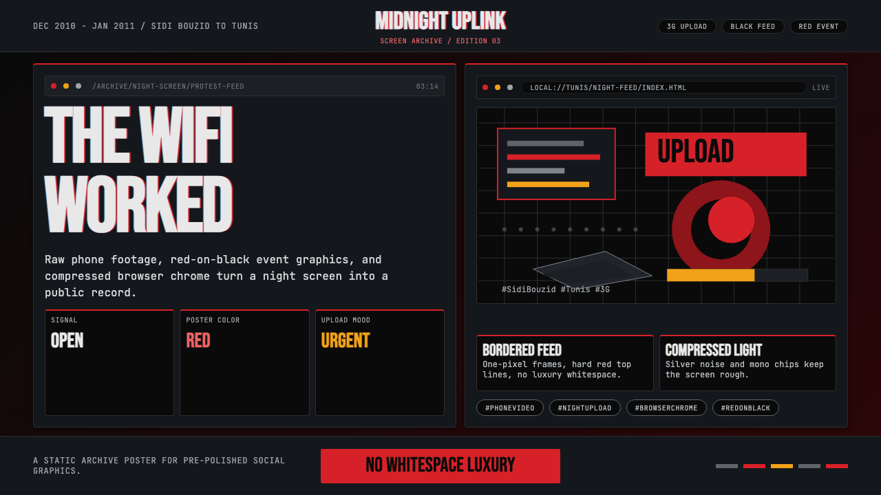 Tunisian Jasmine Revolution (2010)Raw urgency wins. Red browser grids and mono hashtags compress 3am protest in…原始紧迫感取胜:红色浏览器网格与等宽话题压缩凌晨抗议。
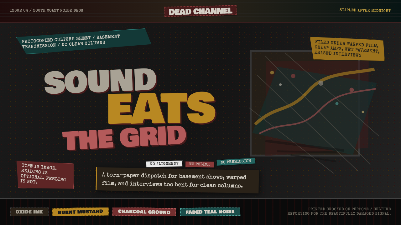 Grunge (Carson 1993)Carson's anti-rules, photocopied. Oxblood on charcoal, distressed type, delib…大卫·卡森颠覆现代主义排版的粗粝美学:暗红与焦黄、炭灰底、刻意打破的网格、油墨…