What is Thrasher Skate Zine (1981)?什么是 Thrasher Skate Zine (1981)?
Thrasher took skateboarding's raw energy and printed it — flame-red type on newsprint, black ink slammed hard, zero apology.Thrasher 把滑板文化的原始能量印上纸面——火焰红大字压在报纸上,黑墨重击,毫不道歉。
Thrasher Skate Zine (1981) in briefThrasher Skate Zine (1981) 速览
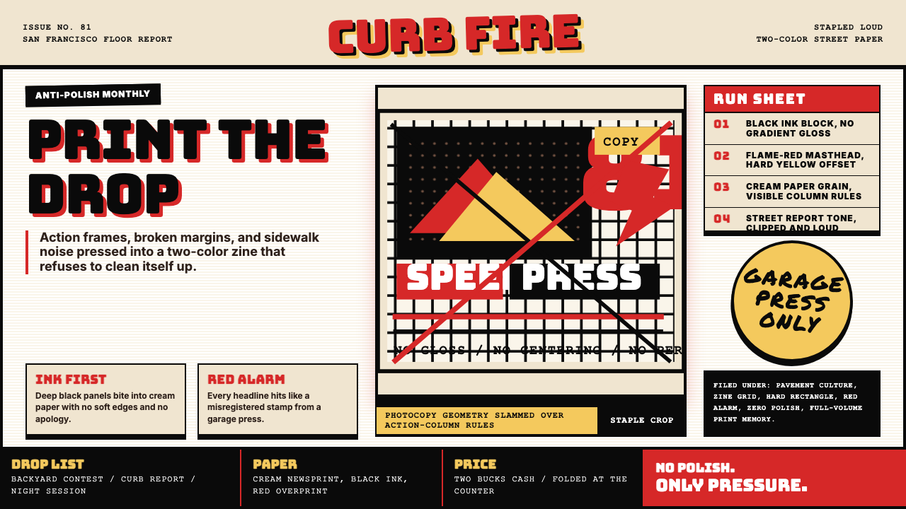
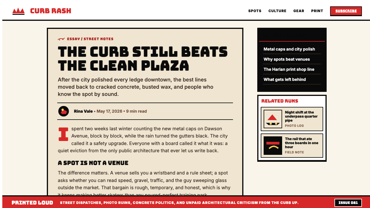
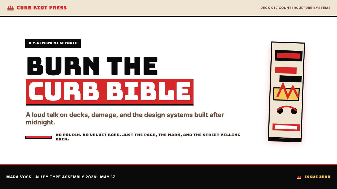
Thrasher Skate Zine is the visual language that emerged from the 1981 San Francisco skateboarding magazine of the same name: a combustible mix of DIY zine production values, street-photography brutalism, and the populist anti-establishment energy of the skateboarding counterculture. Its defining marks are a flame-red wordmark, dense black ink, cream newsprint grounds, chunky display type, and hard-edged rectangular layouts that look assembled rather than designed.Thrasher 滑板杂志风格是从 1981 年同名旧金山滑板杂志中生长出来的一套视觉语言:DIY 小报的制作质感、街头摄影的粗粝力道,以及滑板亚文化里那股来自平民阶层的反建制能量,三者在这里爆炸性地混合。它的标志性元素包括:火焰红的标题字、浓重的黑色油墨、米色新闻纸底面、粗壮的展示字体,以及硬边矩形分栏——整个版面看起来像是拼接出来的,而不是设计出来的。
The style is emphatically non-precious. Images bleed to the edge or get cropped without ceremony. White space is not cultivated as breathing room but surrendered under the pressure of content — more photos, more headlines, more coverage. Where Bauhaus used restraint as a philosophical commitment, Thrasher uses density as a badge of authenticity: if it looks overloaded, it looks real.这种风格骨子里拒绝矫情。图片出血到版边,或者被毫不客气地裁掉。留白不是被精心经营的呼吸空间,而是在内容的压迫下节节退让——更多照片,更多标题,更多报道。包豪斯把克制当作哲学承诺,Thrasher 则把密度当作真实性的勋章:看起来超载,才看起来真实。
Over four decades the aesthetic has migrated far beyond its origins. The Thrasher flame logo, unchanged in its essential aggression, has appeared on high-fashion runways and luxury collaborations — but the underlying visual code retains its street credibility precisely because it refuses polish. Designers now apply the Thrasher-zine grammar to streetwear lookbooks, brand campaigns, event posters, and digital interfaces wherever anti-corporate rawness is the intended signal.四十多年来,这套美学已经远远溢出它的起源地。Thrasher 的火焰 logo 从未改变其本质上的攻击性,却已出现在高端时装秀场和奢侈品联名系列上——但这套视觉密码之所以始终保有街头可信度,恰恰是因为它拒绝抛光。如今,设计师们将 Thrasher 杂志的视觉语法应用于街头服饰的造型手册、品牌推广活动、活动海报和数字界面——凡是需要传递反企业、原生感的场合,它都在那里。
See the Thrasher Skate Zine (1981) design system查看 Thrasher Skate Zine (1981) 完整设计系统
Where does Thrasher Skate Zine (1981) come from?Thrasher Skate Zine (1981) 从何而来?
Thrasher Magazine was founded in January 1981 by Eric Swenson and Kevin Thatcher in San Francisco, initially as a free publication distributed through skate shops in Northern California. The city and the moment were formative: San Francisco's Mission District and the wider Bay Area had a thriving skate scene whose participants were largely working-class teenagers with no mainstream cultural representation and no budget for glossy production. The magazine's visual rough edges were not a stylistic choice so much as an economic fact — newsprint was cheap, offset lithography was available, and the fire-engine red that became the publication's signature was one of the most economical ways to add a second ink color to a black-and-white print run.Thrasher 杂志由 Eric Swenson 和 Kevin Thatcher 于 1981 年 1 月在旧金山创刊,最初是一份通过北加州滑板店免费发行的小册子。这座城市与这个时刻都至关重要:旧金山 Mission 区及整个湾区拥有活跃的滑板圈,参与者大多是工薪阶层的青少年,既没有主流文化的话语权,也没有精致印刷的预算。杂志粗粝的视觉边缘与其说是风格选择,不如说是经济事实——新闻纸价格低廉,胶版印刷触手可及,而那抹成为这份杂志标志的火红色,不过是在黑白印刷流程中加入第二种颜色最经济的方式之一。
The 1980s skateboard counterculture that shaped Thrasher's aesthetic was deliberately antagonistic toward mainstream design and media. Where surfing had found its way into corporate advertising and mainstream sportswear by the late 1970s, skateboarding in the early 1980s was legally marginalized — municipalities banned skating from public spaces, schools expelled skaters — and the culture responded by building its own parallel infrastructure: DIY ramps, self-organized contests, and self-published media. Thrasher was the most prominent node in that network, and its visual defiance — loud, unrefined, unashamed — was a direct expression of the subculture's relationship to institutions that had excluded it.塑造了 Thrasher 美学的 1980 年代滑板反文化,对主流设计与媒体采取了一种主动对抗的姿态。冲浪文化到 1970 年代末已经进入企业广告和主流运动品牌,而 1980 年代初的滑板运动却处于法律边缘——市政当局禁止在公共场所滑板,学校开除滑手——这种文化作为回应建立起了自己的平行基础设施:自建坡道、自办比赛、自出版媒体。Thrasher 是这张网络中最重要的节点,它的视觉反叛——嘈杂、粗糙、毫不羞耻——直接表达了这个亚文化与那些将其排斥在外的机构之间的关系。
Jake Phelps, who joined the magazine in the mid-1980s and served as editor-in-chief for nearly three decades until his death in 2019, became the most important steward of the aesthetic's integrity. Phelps was famously resistant to mainstream co-optation, famously abrasive in his editorial voice, and deeply committed to the idea that Thrasher's visual language should remain inseparable from actual skateboarding — not fashion, not art, not lifestyle marketing. Under his tenure the design stayed confrontational: heavy photo crops, aggressive type sizing, and a consistent refusal to adopt the cleaner production values that were becoming standard in music or sports publishing.Jake Phelps 在 1980 年代中期加入杂志,担任主编近三十年,直至 2019 年辞世,成为守护这套美学完整性最重要的人。Phelps 对主流收编抱有著名的抗拒,编辑风格著名地尖刻,并深深相信 Thrasher 的视觉语言应当与真实的滑板运动保持不可分割的关系——而不是时尚,不是艺术,不是生活方式营销。在他任内,这套设计始终保持对抗性:大胆的照片裁切、激进的字号选择,以及对当时音乐或体育出版物中已经成为标准的更精良制作规范的一贯拒绝。
The 2010s brought what critics described as the canonization of skater-streetwear: Supreme, Palace, and similar brands began citing Thrasher's visual grammar explicitly, and the magazine itself entered collaborations with luxury houses. This crossover is now a familiar cultural pattern — subcultural aesthetics absorbed and commodified by the mainstream — but Thrasher's case is notable because the source material itself remained in print and on newsstands throughout, never softening its presentation to accommodate new audiences. The tension between the style's underground origins and its current cultural ubiquity is now part of its meaning, and designers who invoke it are borrowing that tension along with the flame-red palette.2010 年代带来了批评者所称的滑手街头服饰的经典化:Supreme、Palace 等品牌开始明确援引 Thrasher 的视觉语法,杂志本身也进入了与奢侈品牌的联名合作。这种跨界如今已是熟悉的文化模式——亚文化美学被主流吸收并商品化——但 Thrasher 的案例值得关注,因为这份原始出版物本身在整个过程中始终在报摊上继续发行,从未柔化其呈现方式去迎合新受众。这种风格的地下起源与当下文化泛在性之间的张力,如今已经成为其意义的一部分;援引它的设计师在借用火焰红色板的同时,也在借用这种张力。
What defines the Thrasher Skate Zine (1981) look?Thrasher Skate Zine (1981) 的视觉特征是什么?
Color色彩
The palette is anchored by a single aggressive primary: a flame red that functions more as a shout than an accent. Against cream newsprint or stark white, the red claims maximum attention — wordmarks, masthead elements, pull quotes, and section tags all reach for it. Black takes the structural load: ink blocks, photo backgrounds, and display type in the heaviest available weight. The cream of the newsprint ground is not a chosen color but an inherited one, and its warmth keeps the red-and-black combination from reading as purely alarming. Secondary colors and tints are rare and, when present, are photographic rather than decorative — the colors of a skater's gear or a California sunset bleeding through a photograph.这套色板由单一的、攻击性的主色锚定:一种火焰红,其作用更像是一声呐喊,而非一处强调。在米色报纸纸张或纯白底面的衬托下,这种红色占据了最大的注意力——标题字、版头元素、突出引文与栏目标签全都向它索取。黑色承担结构性重量:大面积墨块、照片背景以及以最重字重印制的展示字体。米色的新闻纸底色不是一种被选择的颜色,而是一种被继承的颜色;它的温度防止红与黑的组合读起来显得纯然惊恐。次要颜色和色调极为罕见,一旦出现,也是来自摄影而非装饰——滑手装备的色彩,或者透过照片渗出的加利福尼亚落日。
Typography字体排印
Type in the Thrasher system is blunt and hierarchical. Display headlines are set at the maximum size the page can absorb — thick strokes, compressed or condensed proportions, no letterspacing that might soften the impact. Body text is set small and tight, a foil to the headline's aggression that also communicates volume: a lot of coverage packed into limited space. Italics appear frequently in captions and pull quotes, adding a raw momentum to the text. The overall impression is that type has been applied with force rather than placed with care — which is the intention.Thrasher 体系中的字体排印直接而有层次感。展示标题以页面能够承受的最大尺寸排版——笔划粗重,字形压缩或收窄,不留任何可能柔化冲击力的字距。正文字号小而紧凑,与标题的攻击性形成对位,同时也传递出一种容量感:大量报道被压缩进有限的空间里。斜体在图注和摘引中频繁出现,为文字增添了一种原生的动势。整体印象是:文字是被用力砸上去的,而不是被小心安放的——这正是它的意图。
Photography and Image Treatment摄影与图像处理
Photography is the soul of the Thrasher aesthetic. Skate photography demands extreme angles — fisheye lenses inches from the ground, overhead shots of aerial tricks, long-lens compressions of urban terrain — and the magazine embraced these perspectives as compositional assets rather than technical footnotes. Images are cropped aggressively: limbs cut off, backgrounds obliterated, the moment of peak action isolated without margin. Halftone dot patterns and high-contrast reproduction are valued over smooth gradation; an overexposed sky or crushed shadow is a mark of authenticity, not a production error.摄影是 Thrasher 美学的灵魂。滑板摄影要求极端的角度——鱼眼镜头贴地数厘米,空中技巧的俯拍,对城市地形的长焦压缩——杂志将这些视角接受为构图资产,而非技术脚注。图片的裁切极具侵略性:四肢被切掉,背景被消灭,动作巅峰的瞬间在没有任何留白的情况下被孤立出来。半色调网点图案和高对比度复制比光滑的渐变更受重视;过曝的天空或压暗的阴影是真实性的标志,而非制作失误。
Layout and Grid版面与网格
Thrasher layouts operate on an implied grid that is systematically overridden. The underlying structure is a standard magazine column system, but images are allowed to bleed across columns, captions are dropped into unexpected corners, and headlines break across the gutter without apology. The result reads as organized chaos: there is enough underlying structure to prevent true illegibility, but enough willful disruption to communicate that the designer — and the skateboarding culture it represents — answers to no external authority about what a magazine page should look like.Thrasher 的版面建立在一套被系统性突破的隐性网格之上。底层结构是标准的杂志分栏体系,但图片被允许跨栏出血,图注被甩进意想不到的角落,标题毫不道歉地跨越装订线。最终效果读起来像是有组织的混乱:有足够的底层结构防止真正的不可读性,但也有足够多的蓄意破坏,传递出这样的信息——这个设计师,以及它所代表的滑板文化,不向任何外部权威低头,不接受任何关于一张杂志版面应该长什么样的规定。
Texture and Print Grain质感与印刷颗粒
The newsprint substrate is not a neutral background — it is an active textural element. Ink spreads slightly on newsprint, softening hard edges in a way that coated paper would not permit, and the visible paper grain gives even solid black areas a depth that digital reproduction must deliberately approximate. Reproduction artifacts — slight misregistrations, visible halftone rosettes, occasional ink bleed — are not cleaned up in the Thrasher aesthetic; they are preserved as evidence of the physical production process and by extension of the culture's handmade, non-corporate character.新闻纸底材不是一种中性的背景,而是一种主动的质感元素。油墨在新闻纸上会略微扩散,使硬边以涂布纸无法允许的方式变得柔和;可见的纸张纹理赋予了即使是纯黑色区域也无法在数字复制中轻易获得的深度,后者必须刻意近似这种效果。复制痕迹——轻微的套印偏差、可见的半色调玫瑰纹、偶尔的油墨渗透——在 Thrasher 的美学中不会被清除;它们被保留下来,作为实体生产过程的证据,延伸而言也是这种文化的手工制作、非企业属性的证据。
Anti-Polish as Principle以粗粝为原则
The Thrasher aesthetic contains a self-regulating mechanism against refinement. Any element that begins to look too considered, too finished, or too aligned with mainstream graphic design standards reads as inauthentic within the system. This is not accidental roughness but a deliberate cultural position: polish is associated with corporate production, corporate production is associated with the institutional world that skateboarding defined itself against, and therefore polish undermines the message. Contemporary designers must understand this principle to apply the style without neutralizing it.Thrasher 美学内含一套对抗精致化的自我调节机制。任何开始显得过于经过考量、过于完成、或过于接近主流平面设计标准的元素,在这套体系内都会读起来显得不真实。这不是偶然的粗粝,而是一种刻意的文化立场:精良的制作与企业化生产相关联,企业化生产与滑板运动定义自身所反对的那个机构世界相关联,因此精良制作会削弱它的信息。当代设计师必须理解这一原则,才能在不令其失效的前提下运用这种风格。
Wordmark and Brand Mark字标与品牌标志
The Thrasher wordmark — heavy, all-caps, set in red with a baseline that often carries a flame motif — functions as a territorial declaration rather than a corporate identifier. It is large when it appears, frequently bled to an edge or corner, and treated as a compositional anchor rather than a mere label. The flame element, whether rendered as literal fire illustration or implied through the red color and aggressive letterform weight, has become one of the most recognized subcultural symbols of the late twentieth and early twenty-first centuries — legible at a distance, legible at small scale, legible across cultures.Thrasher 的字标——粗重、全大写、以红色印制,基线处常常带有火焰造型——作用更像是一种领地宣告,而非一个企业标识符。它出现时往往占据相当大的尺寸,经常出血到版边或角落,被当作构图锚点而非单纯的标签。火焰元素,无论是以字面上的火焰插图呈现,还是通过红色和攻击性的字体字重加以暗示,都已成为二十世纪末至二十一世纪初最具辨识度的亚文化符号之一——在远处可读,在小尺寸下可读,跨文化可读。
See the Thrasher Skate Zine (1981) design system查看 Thrasher Skate Zine (1981) 完整设计系统
Who shaped Thrasher Skate Zine (1981)?谁塑造了 Thrasher Skate Zine (1981)?
Swenson co-founded Thrasher in 1981 alongside Kevin Thatcher, providing the organizational and publishing infrastructure that allowed the magazine to survive its early years as a free distribution zine and grow into an internationally recognized title. His decision to anchor the publication to genuine skate-community values — rather than adapting to mainstream advertising demands — established the editorial and visual independence that remains the magazine's defining characteristic.Swenson 于 1981 年与 Kevin Thatcher 共同创立了 Thrasher,提供了让杂志在最初几年作为免费发行小册子存活并最终成长为国际知名刊物的组织与出版基础设施。他将出版物锚定于真实的滑板社群价值观——而非迎合主流广告商的需求——这一决定奠定了杂志至今仍是其定义性特征的编辑与视觉独立性。
Thatcher was the editorial co-founder and early editor whose sensibility shaped the magazine's voice in its foundational years. His background in and commitment to the skating community gave the publication its insider authority — the sense that it was written and designed by people who actually skated, for people who actually skated — a quality that distinguished it from later, more polished skateboarding media that entered the market as the sport gained mainstream visibility.Thatcher 是编辑层面的联合创始人,也是早期主编,他的审美感性塑造了杂志在奠基岁月里的声音。他对滑板社群的深度参与赋予了这份出版物内部人的权威感——那种由真正滑板的人写给真正滑板的人的感觉——这种品质使它区别于后来随着这项运动获得主流关注而涌入市场的、更为精良的滑板媒体。
Phelps joined Thrasher in the mid-1980s and served as editor-in-chief from 1993 until his death in 2019. More than any other individual, he is responsible for the aesthetic's integrity across the decades of pressure from mainstream co-optation. Phelps rejected sponsorship arrangements and collaborations he deemed inauthentic, maintained the magazine's confrontational editorial voice, and kept the visual language raw even as production technology advanced and competitors adopted cleaner digital design standards. His presence ensured that the Thrasher aesthetic remained a live cultural position rather than a nostalgic pose.Phelps 于 1980 年代中期加入 Thrasher,自 1993 年起担任主编直至 2019 年辞世。比任何其他个人都更多,他对这套美学在数十年主流收编压力下的完整性负责。Phelps 拒绝了他认为不真实的赞助安排和合作,维护了杂志对抗性的编辑声音,并在制作技术不断进步、竞争对手纷纷采用更简洁的数字设计标准的同时,保持了视觉语言的粗粝。他的存在确保了 Thrasher 的美学始终是一种鲜活的文化立场,而非一种怀旧的姿态。
Friedman was among the most influential photographers to shoot for Thrasher in its early years, working in the late 1970s and 1980s. His images established many of the compositional conventions that define the aesthetic: low-angle perspectives that foreground the board and the terrain, high-contrast printing that strips away middle tones, and a documentary honesty that refused to glamorize the subject. Friedman later applied similar visual principles to his landmark documentation of early hip-hop and punk, demonstrating the aesthetic's cross-subcultural legibility.Friedman 是 Thrasher 创刊早期最有影响力的摄影师之一,活跃于 1970 年代末至 1980 年代。他的图像建立了定义这套美学的许多构图惯例:将滑板和地形推至前景的低角度视角、剥离中间色调的高对比度印刷,以及拒绝美化拍摄对象的纪录片式诚实。Friedman 后来将类似的视觉原则应用于他对早期嘻哈和朋克的标志性记录,展示了这套美学跨亚文化的可读性。
Gonzales, a professional skateboarder who rose to prominence through Thrasher's coverage in the mid-1980s, contributed to the magazine's visual language not as a designer but as a subject whose street skating style embodied the aesthetic's values. His skating — improvisational, urban, resistant to the choreography of the contest format — translated directly into the kind of photography the magazine prized. Gonzales later pursued painting and illustration, and the rawness of his visual art extended Thrasher's visual values into fine-art and fashion contexts.Gonzales 是一位在 1980 年代中期通过 Thrasher 的报道崭露头角的职业滑手,他对杂志视觉语言的贡献不是以设计师的身份,而是以拍摄对象的身份——他的街头滑板风格具体体现了这套美学的价值观。他的滑行方式——即兴的、城市性的、抵制竞赛格式编排性的——直接转化为杂志所珍视的那类摄影。Gonzales 后来从事绘画与插图,他视觉艺术的粗粝感将 Thrasher 的视觉价值延伸进了纯艺术与时尚语境。
How do you use Thrasher Skate Zine (1981) today?今天怎么用 Thrasher Skate Zine (1981)?
The Thrasher Skate Zine aesthetic is most effective when the brief explicitly calls for anti-establishment credibility, subcultural authenticity, or aggressive visual energy. It is a style with a strong point of view — applying it correctly means committing to its roughness rather than refining it toward comfort. The first question to ask is whether the product or brand genuinely earns the posture: the style reads as authentic when the context is genuinely connected to street culture, independent production, or counterculture values, and as appropriation when it is purely cosmetic.Thrasher 滑板杂志美学在需求明确要求反建制可信度、亚文化真实性或激进视觉能量时最为有效。这是一种有强烈立场的风格——正确运用它意味着投身于它的粗粝,而不是将它精炼至舒适。首先要问的问题是,这个产品或品牌是否真正有资格摆出这种姿态:当语境真实地与街头文化、独立制作或反文化价值观相连时,这种风格读起来是真实的;当它纯粹只是外观上的借用时,读起来则是挪用。
For presentation slides — covers and content pages alike — the Thrasher grammar translates into bold asymmetric compositions anchored by the flame-red accent. A cover works well with a full-bleed photograph cropped to isolate action, overprinted with a heavy wordmark or headline in maximum-weight type. Content slides should resist the urge toward alignment: allow text blocks to sit at tension with image crops, use a single saturated accent color for section tags or call-outs, and let the page feel slightly overloaded rather than spaciously composed. Data visualizations in this style are treated as raw readouts — bar charts and tables gain credibility from tight spacing and maximum-contrast rendering, with no decorative chart elements.对于演示文稿——无论是封面还是内容页——Thrasher 语法转化为以火焰红强调色为锚点的大胆非对称构图。封面适合使用出血裁切、孤立动作的满版照片,在其上叠印以最重字重排设的粗大字标或标题。内容页应该抵制对齐的冲动:让文字块与图片裁切保持张力,使用单一的饱和强调色作为栏目标签或引文标注,让版面感觉略显超载,而不是宽松舒适。这种风格的数据可视化被当作原始读出来处理——柱状图和表格从紧凑的间距和最大对比度的呈现中获得可信度,没有任何装饰性图表元素。
For web interfaces, the style suits editorial platforms, event pages, streetwear commerce, and community hubs where visual authority and counter-culture positioning matter more than approachability. The approach: set the background to an off-white or cream close to newsprint, use deep black for all body type, and designate the flame red exclusively for interactive highlights, hover states, and primary calls to action. Card components should use hard borders or flat solid backgrounds rather than soft shadows. Navigation should be typographic, all-caps where possible, using scale contrast to establish hierarchy. Avoid rounded corners and gentle transitions — hard edges signal authenticity in this system.对于网页界面,这种风格适合编辑平台、活动页面、街头服饰电商,以及视觉权威感和反文化定位比亲和力更重要的社群中心。做法如下:将背景设为接近新闻纸的米白色,所有正文字体用深黑色,将火焰红专门指定给交互高亮、悬停状态和主要行动召唤。卡片组件应使用硬边框或平面纯色背景,而非软阴影。导航应当是字体性的,尽可能全大写,用尺度对比建立层级。避免圆角和柔和过渡——在这套体系中,硬边传达真实性。
For editorial and marketing work, the style is well-suited to event posters, zine-format lookbooks, music and sports brand campaigns, and any collateral where a hand-assembled feel is a virtue rather than a liability. A poster in this aesthetic uses a large photographic anchor — heavily cropped, high-contrast, possibly duotoned in red and black — with headline type set at the scale of the image rather than beside it. Marketing pages work at their most powerful when they alternate between near-black and cream fields in full-width blocks, treating the red accent as a device used once per screen unit to prevent habituation.对于编辑与营销内容,这种风格适合活动海报、杂志格式的造型手册、音乐和体育品牌的推广活动,以及一切手工拼装感是优点而非缺陷的周边物料。这套美学的海报使用大幅的摄影锚点——大胆裁切、高对比度,可能以红与黑进行双色调处理——标题字以图片的尺度排设,而非置于其旁。营销页面在以接近黑色和米色的全宽区块交替出现时最为有力,将红色强调色当作每个屏幕单元使用一次的装置,以防止视觉习惯化。
A frequent mistake when applying the Thrasher aesthetic is softening it toward legibility at the cost of its character. Designers trained in contemporary digital interface standards often add padding, reduce headline weight, increase line-height, and introduce hover animations — each a reasonable move in isolation, but collectively they transform the style into a polished imitation that carries none of its cultural weight. The other common error is treating the flame red as a general accent color rather than a declaration: it should appear rarely enough to retain its urgency, not everywhere it would add visual interest. If the layout starts to look clean, it has been over-designed.运用 Thrasher 美学时一个常见的错误,是以牺牲其性格为代价,将它柔化以求可读性。受过当代数字界面标准训练的设计师往往会增加内边距、降低标题字重、增大行高、引入悬停动画——每一个单独来看都是合理的决定,但合在一起,它们将这种风格转化为一种光鲜的仿制品,承载不了任何文化重量。另一个常见错误是将火焰红视为通用的强调色,而非一种宣言:它出现的频率应当足够低,以保持其紧迫感,而不是出现在所有能增添视觉趣味的地方。如果版面开始看起来干净,那说明它被过度设计了。
See the Thrasher Skate Zine (1981) design system查看 Thrasher Skate Zine (1981) 完整设计系统
Thrasher Skate Zine (1981) — FAQThrasher Skate Zine (1981) · 常见问题
Is the Thrasher aesthetic only appropriate for skateboarding or action-sports brands?Thrasher 美学只适合滑板或极限运动品牌吗?
Not exclusively, but the brand or project should have a genuine connection to the values the aesthetic encodes: independence, anti-establishment posture, subcultural authenticity, and street-level credibility. The style has been successfully applied to music brands, independent publishers, streetwear beyond skateboarding, youth-culture events, and arts organizations whose programming has a genuinely countercultural dimension. Where it fails is in contexts that are fundamentally corporate, institutional, or positioned around comfort and approachability — applying the style to a bank, a hospital brand, or a luxury hospitality concept would produce cognitive dissonance regardless of how well the visual system was executed.并非只适合,但品牌或项目应当与这套美学所编码的价值观有真实的联结:独立性、反建制姿态、亚文化真实性以及街头层面的可信度。这种风格已被成功应用于音乐品牌、独立出版商、滑板圈以外的街头服饰、青年文化活动,以及节目编排具有真实反文化维度的艺术机构。它失败的场合,是那些从根本上属于企业性质、机构性质,或以舒适感和亲和力为定位的语境——将这种风格应用于银行、医院品牌或奢侈酒店概念,无论视觉系统执行得多好,都会产生认知失调。
How does the Thrasher look differ from generic punk or grunge aesthetics?Thrasher 风格与一般意义上的朋克或垃圾摇滚美学有何不同?
All three share DIY roughness and anti-establishment energy, but they differ in their specific visual vocabularies. Punk aesthetics typically involve ransom-note typography, deliberate misregistration as a graphic device, safety pins and torn materials as motifs, and black-and-white or limited-color schemes. Grunge aesthetics lean toward texture-heavy backgrounds, distressed type, and a more organic, less geometric visual chaos. Thrasher is distinguished by its specific color code — that particular flame red against black and cream — its commitment to action photography as the primary image type, and its underlying grid structure, which gives the chaos a degree of legibility that true punk layouts often sacrifice.三者都有 DIY 的粗粝感和反建制能量,但在各自具体的视觉词汇上有所不同。朋克美学通常涉及绑架信式的字体排印、作为平面设计手段的刻意套印偏差、安全别针和撕裂材料作为母题,以及黑白或极有限的配色方案。垃圾摇滚美学倾向于质感厚重的背景、做旧的字体,以及更有机、更少几何感的视觉混乱。Thrasher 的区别在于其特定的色彩密码——那种在黑色和米色衬托下特有的火焰红——对动作摄影作为主要图像类型的坚守,以及其底层的网格结构,后者赋予了这种混乱一定程度的可读性,而真正的朋克版面往往会为此付出牺牲。
Can the style work in a digital-first environment where newsprint texture is absent?在没有新闻纸质感的纯数字环境中,这种风格能否奏效?
Yes, but it requires understanding which elements are essential and which are substrate-dependent. The essential elements are the color logic, the typographic aggression, the cropping conventions, the asymmetric grid, and the anti-polish principle. The newsprint texture is a useful signal but not a requirement — a warm off-white background approximates the feeling without literal grain. What does not translate well is artificially layering scanned newsprint textures over digital layouts: this tends to read as retro pastiche rather than authentic energy. A cleaner digital implementation that commits to the color, type, and composition principles will feel more genuinely in the tradition than one that simulates the substrate while softening everything else.可以,但需要理解哪些元素是本质性的,哪些是依赖于承印材料的。本质性元素是色彩逻辑、字体排印的攻击性、裁切惯例、非对称网格以及以粗粝为原则。新闻纸质感是一个有用的信号,但不是必要条件——一个暖调的米白色背景可以近似这种感觉,而无需字面上的纸张纹理。转化效果不佳的,是在数字版面上人工叠加扫描的新闻纸纹理:这往往读起来像是复古仿制,而非真实能量。一个更简洁的数字实现,只要在色彩、字体和构图原则上坚守到位,会比那种模拟承印材料但在其他一切方面都加以柔化的做法,更真实地处于这个传统之中。
How should photography be sourced or treated when applying this aesthetic to a non-skateboarding project?将这套美学应用于非滑板项目时,应如何获取或处理摄影素材?
The key photographic qualities in the Thrasher tradition are action, proximity, and authenticity — not skateboarding specifically. For a music brand, this might mean live photography shot at close range with a wide-angle lens; for a streetwear brand, candid street documentation rather than studio product shots; for an event, real attendee photography rather than stock lifestyle imagery. Treatment-wise, the processing should move toward high contrast and reduced midtone range rather than the flat, color-corrected look of contemporary commercial photography. Silhouetting subjects against plain backgrounds, printing in duotone with the red and black, or reproducing images at a scale where halftone grain is visible — any of these handling decisions will read as consistent with the tradition.Thrasher 传统中关键的摄影品质是行动感、近距离和真实性——而非滑板这件事本身。对于音乐品牌,这可能意味着用广角镜头近距离拍摄的现场摄影;对于街头服饰品牌,是随拍的街头纪录,而非摄影棚产品照;对于活动,是真实的参与者摄影,而非库存生活方式图片。在处理上,应向高对比度和收窄的中间调范围靠拢,而非当代商业摄影那种平整、色彩校正过的外观。将主体在平素背景上做轮廓剪影处理,以红与黑进行双色调印刷,或者以能看见半色调网点的尺寸复制图像——这些处理决定中的任何一个,读起来都与这一传统保持一致。
Does this aesthetic suit dark-background layouts, or is the cream-newsprint ground essential?这套美学适合深色背景版面吗?还是说米色新闻纸底色是不可缺少的?
The historical ground is warm light — newsprint cream — and this is the most authentic base. A dark inversion is possible and is used by some brands working in the tradition, typically substituting a near-black for the cream and relying more heavily on the white of type and the red of accents for structural contrast. The risk is that on a dark ground the flame red loses some of its specificity: it begins to read as a generic warm accent rather than the particular aggressive red of the Thrasher masthead. If a dark variant is used, the commitment to maximum type weight and hard-edge image treatment must increase to compensate — any softening will immediately read as conventional dark-mode UI design rather than skate-zine culture.历史上的底色是暖调浅色——新闻纸米色——这是最真实的基础。深色反转是可行的,传统圈内有些品牌在使用,通常以接近黑色代替米色,并更多依赖白色文字和红色强调色来提供结构对比。风险在于,在深色底面上,火焰红会失去一些特异性:它开始读起来像是一种通用的暖色强调,而非 Thrasher 版头那种特定的、带攻击性的红色。如果使用深色变体,就必须加强对最大字重和硬边图像处理的坚守,以作补偿——任何柔化都会立刻读起来像是常规的深色模式界面设计,而非滑板杂志文化。
Related design styles相关设计风格
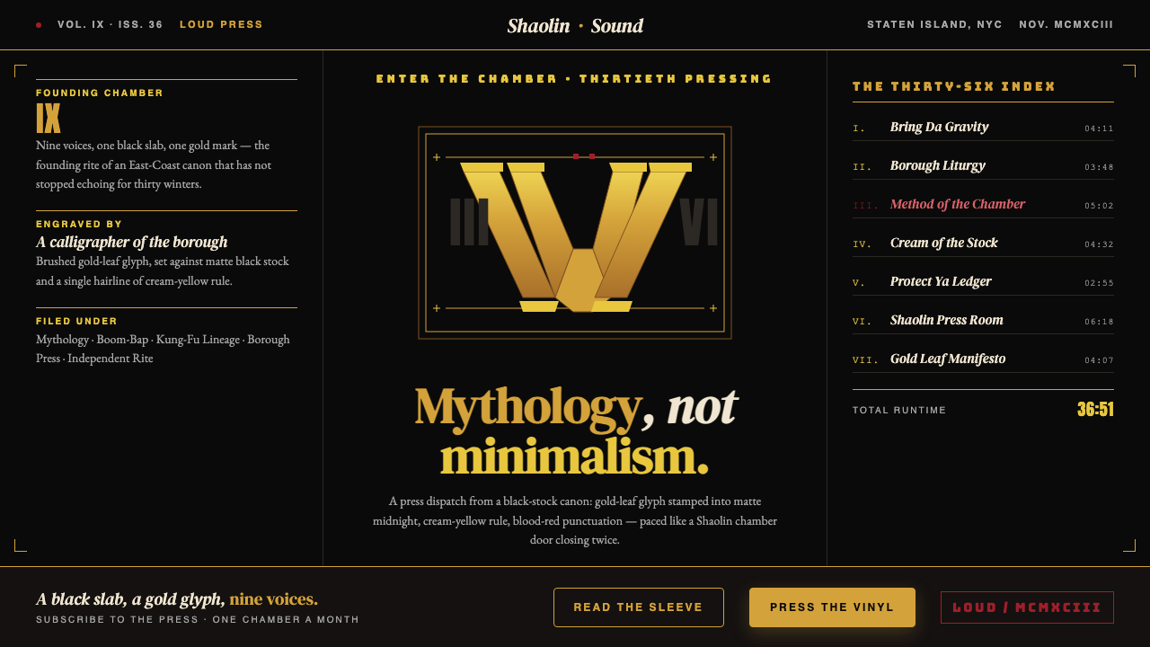 Wu-Tang Clan — 36 ChambersMythology, not minimalism. Gold-leaf glyph on matte black, cream-yellow rule,…神话感而非极简:纯黑底色压上金箔字徽,奶油黄细线,血红点睛,少林功夫片的重量。
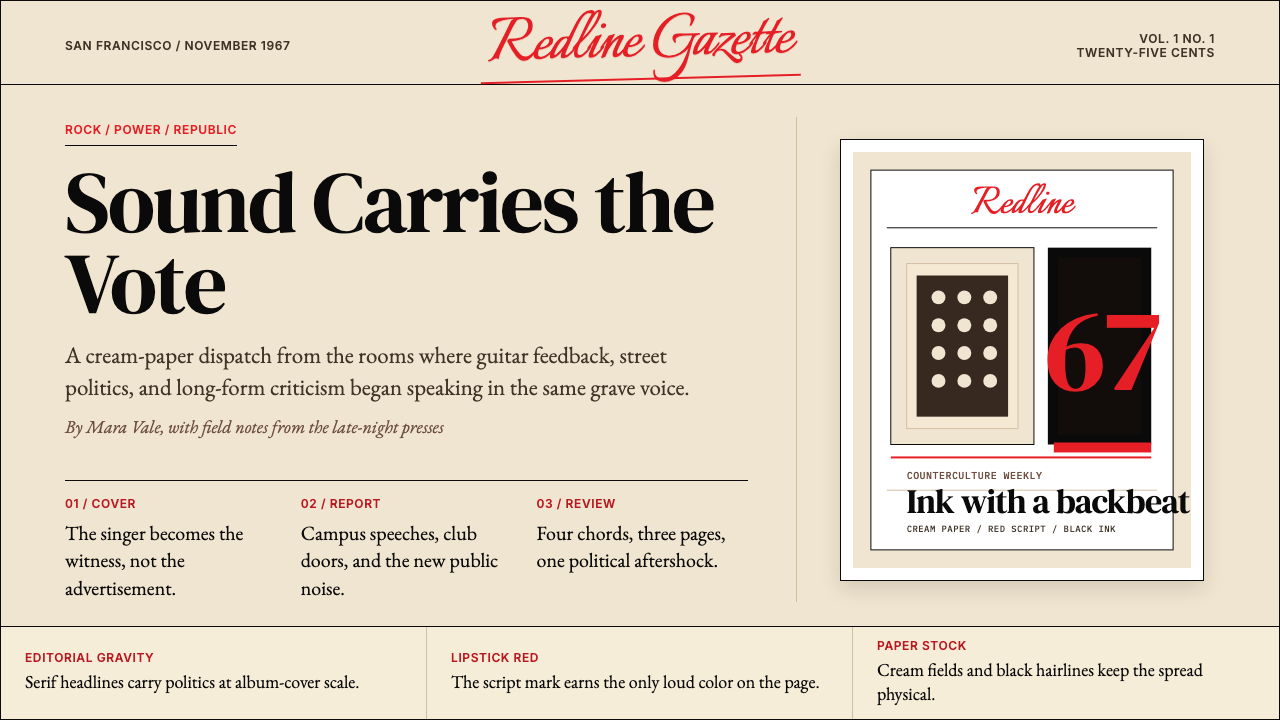 Rolling Stone MagazineCounterculture gets editorial weight. Cream paper, lipstick red script, serif…反主流文化有编辑重量:奶油纸、口红红手写体与粗衬线标题。
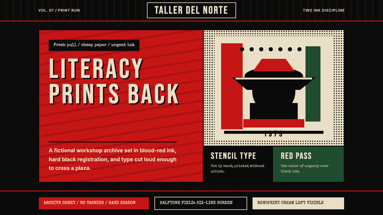 Nicaraguan Sandinista FSLN 1979Urgency in two inks. Blood red, jet black, halftone dots, and cut-stencil typ…双色油墨里的紧迫感:血红与漆黑、半色调网点、模板字。
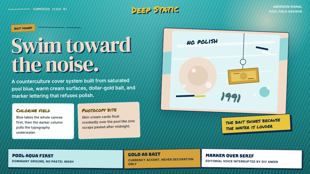 Nirvana — NevermindAnti-pop in pool blue. Cream cards, dollar-gold accents, and marker type roug…泳池蓝里的反主流:乳白卡片、美元金点缀与马克笔字打乱网格。
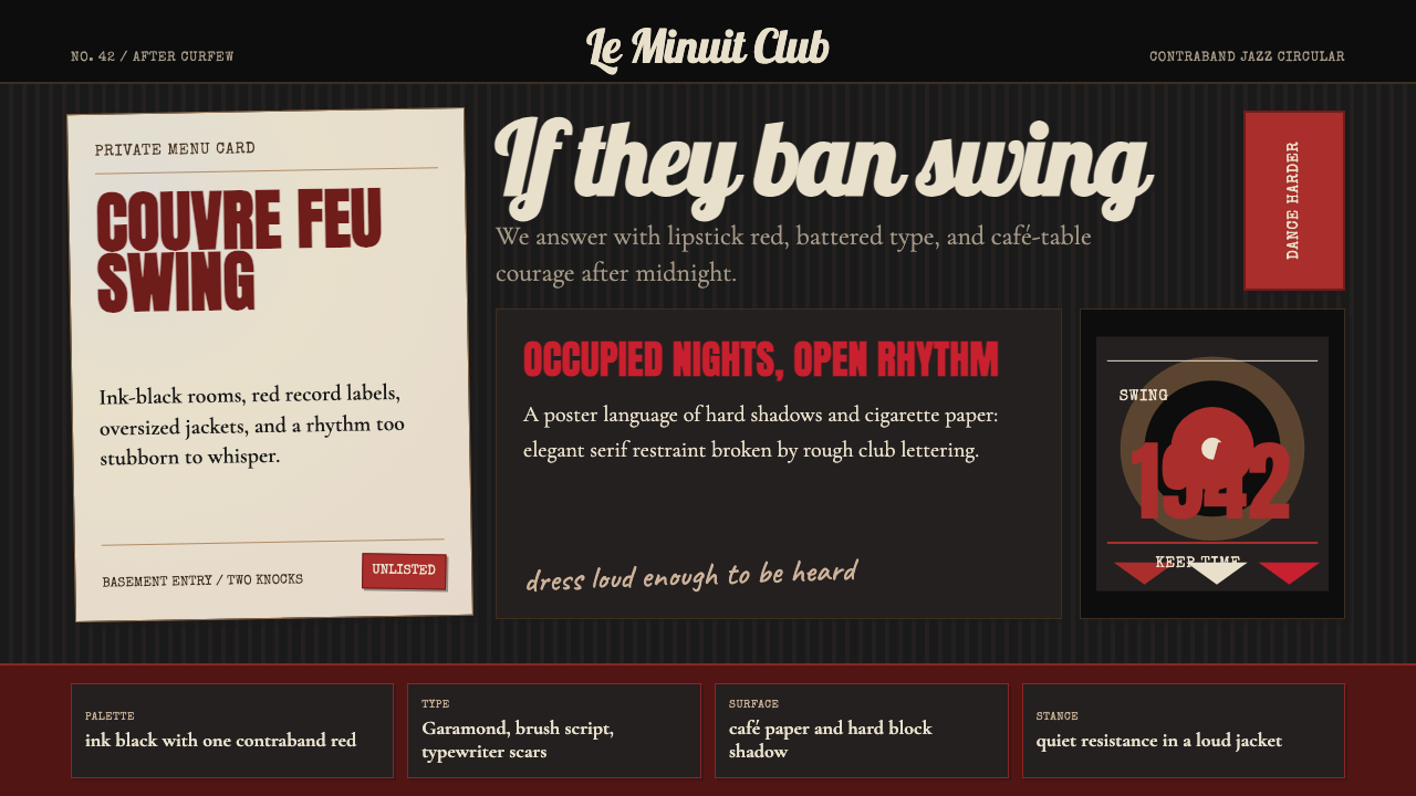 Parisian Zazou (1942)Defiance swings in the dark. Ink black, record-sleeve red, and battered typew…黑暗里摇摆反抗:墨黑、唱片红与破旧打字机节奏。
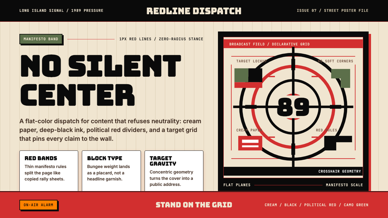 Public Enemy — Fight the PowerTakes a side loudly. Red bands, black ink, and target geometry hit like a ral…立场响亮:红色分栏、黑墨与准星几何像集会海报。