Design style guide设计风格指南
What is Parisian Zazou (1942)?什么是 Parisian Zazou (1942)?
The Zazous answered Nazi occupation with swing jazz and zoot suits — turning banned American music and flamboyant dress into an act of daily defiance that looks, six decades later, like the most stylish resistance movement ever photographed.扎祖族用摇摆爵士和阔肩西装回击纳粹占领——把被禁的美国音乐和夸张装束变成每日的无声抗议,六十年后回望,这是有史以来最有型的地下抵抗运动。
Parisian Zazou (1942) in briefParisian Zazou (1942) 速览
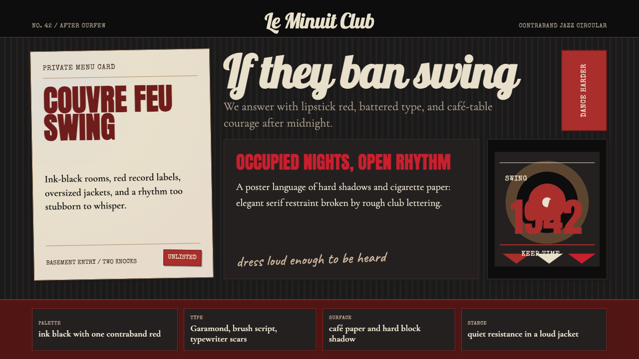
The Parisian Zazou style is a design language rooted in the visual world of occupied Paris, 1942 — specifically in the clandestine cafés, contraband jazz concerts, and hand-lettered underground culture of a youth movement that defied the Vichy regime through aesthetic excess. The system distills that world into its essential visual grammar: ink-black interiors, record-sleeve reds, cigarette-stained paper tones, hand-painted lettering, and a typographic rhythm that feels like a typewriter left out in the rain.巴黎扎祖风格是一套根植于1942年占领时期巴黎视觉世界的设计语言——具体而言,源自维希政权统治下那些地下咖啡馆、走私爵士音乐会和手绘地下文化,那是一个用审美过剩来抵制独裁的青年运动。这套系统将那个世界提炼为本质的视觉语法:墨黑内景、唱片封套红、烟渍纸张色调、手绘字体,以及一种仿佛打字机淋过雨的排版节奏。
Where most historical design styles draw from institutional sources — schools, studios, government commissions — the Zazou aesthetic emerges from the street. It is deliberately rough, deliberately loud, deliberately wrong by the standards of Vichy propriety. Oversized proportions, clashing weights, text that presses against its margins: everything about the visual language communicates refusal. It does not persuade; it announces.大多数历史设计风格源于机构——学校、工作室、政府委托——而扎祖美学却生于街头。它刻意粗粝、刻意嘈杂、刻意违背维希道德标准的「正确」。夸张的比例、相互冲撞的字重、文字顶着版边生长:视觉语言的每一处都在传递拒绝。它不是在说服,而是在宣告。
The style is dark-ground by conviction. Black is not a dramatic choice here — it is the literal color of a curfew city, of jazz bars lit only enough to see the band, of mimeographed sheets passed hand to hand. Against that near-total darkness, saturated red and tobacco-stained cream carry the full communicative load. The result is a palette that feels simultaneously vintage and confrontational, as comfortable on a film noir poster as on a contemporary brand that wants to signal genuine irreverence.这种风格出于信念选择深色底面。黑色在这里不是戏剧性抉择——它是宵禁城市的字面颜色,是灯光昏暗到仅够看见乐手的爵士酒吧的颜色,是辗转相传的油印传单的颜色。在这近乎彻底的黑暗之上,饱和的红色和烟草色奶油承载着全部的传达任务。由此得到的色板感觉同时古老而具有对抗性,放在黑色电影海报上与放在希望传达真实叛逆气质的当代品牌上,都一样自在。
See the Parisian Zazou (1942) design system →查看 Parisian Zazou (1942) 完整设计系统 →
Where does Parisian Zazou (1942) come from?Parisian Zazou (1942) 从何而来?
The Zazous emerged in Paris between 1940 and 1944, with their most visible and politically charged moment arriving in the summer of 1942, when the Vichy government — under German pressure — escalated its crackdown on what it called moral degeneracy. The name itself is disputed in origin: some trace it to the lyrics of a Cab Calloway song heard on contraband recordings; others link it to the French slang for someone nonsensical or absurd. Either etymology suits a movement that wore its ridiculousness as armor.扎祖族于1940至1944年间在巴黎兴起,最为显眼、政治色彩最浓的时刻出现在1942年夏天——维希政府在德国压力下升级了对所谓「道德堕落」的打压。这个名字本身来源众说纷纭:有人追溯到从走私录音中听来的卡布·卡洛韦歌词;也有人将其与法语俚语中「荒谬之人」的意涵相连。无论哪种词源都适合这个把荒诞当铠甲的运动。
The cultural context was the Hot Club de France, founded in 1932 by jazz enthusiasts including guitarist Django Reinhardt and violinist Stéphane Grappelli. Their Quintet du Hot Club de France had, before the occupation, made Paris a world capital of jazz — the city where American swing met Romani guitar and emerged as something entirely its own. When the Nazis banned jazz as degenerate art (Entartete Musik) and American culture more broadly, the Hot Club went underground. Its visual culture — the record sleeve graphics, the hand-lettered concert bills, the cabaret typography — became the design vernacular of the resistance.文化背景是「法国热爵士俱乐部」(Hot Club de France)——由包括吉他手Django Reinhardt和小提琴手Stéphane Grappelli在内的爵士爱好者于1932年创立。他们的「热爵士俱乐部五重奏」在占领前已使巴黎成为世界爵士乐之都,那里是美国摇摆乐与罗姆人吉他相遇、催生出全新风格的地方。当纳粹将爵士乐列为「颓废艺术」(Entartete Musik)、全面禁绝美国文化时,热爵士俱乐部转入地下。它的视觉文化——唱片封套设计、手绘音乐会海报、卡巴莱排版风格——成为地下抵抗运动的设计方言。
The Zazous dressed in deliberate violation of wartime austerity codes: long jackets with heavily padded shoulders (the French equivalent of the American zoot suit), tight pegged trousers or pleated skirts, enormous quantities of hair grease forming elaborate quiffs, thick-soled shoes, and — for women — exaggerated lipstick and nail varnish in deep reds. Vichy newspapers ran cartoons depicting Zazous as parasites and traitors. The collaborationist youth group Jeunes Populaires Français organized Zazou hunts, forcibly cropping the distinctive quiffs. The Zazous responded by wearing yellow stars — not legally required of them — in solidarity with Jewish Parisians being deported.扎祖族的穿着刻意违反战时物资紧缺管制:长款阔肩西装(法国版的美式宽松套装zoot suit)、紧腿长裤或褶裥裙、用大量发油梳成的精致高油头、厚底皮鞋——女性则涂着夸张的深红口红和指甲油。维希报纸刊登漫画,将扎祖族描绘为寄生虫和叛徒;亲纳粹青年组织「人民青年法国人」组织「扎祖猎捕」,强行剃掉那些标志性的高发髻。扎祖族的回应是主动佩戴黄色星星——他们并无此法律义务——以声援正在遭受驱逐的巴黎犹太人。
After the Liberation in 1944, the Zazous dissolved into the broader existentialist scene of Saint-Germain-des-Prés. Many became the first generation of French bebop enthusiasts and later the audience for Boris Vian's writing and jazz performance at the Club Saint-Germain. The visual culture they left behind — black café walls, red on black typography, hand-lettered excess — fed directly into the graphic language of French New Wave cinema posters, the album art of the 1950s Paris jazz scene, and the aesthetic of contemporary brands that want to evoke authentic Parisian cool without its tourist-facing prettiness.1944年巴黎解放后,扎祖族融入了圣日耳曼德佩区更广泛的存在主义场景。许多人成为法国第一代比波普爱好者,后来又成为Boris Vian在圣日耳曼俱乐部的写作与爵士演出的忠实听众。他们留下的视觉文化——黑色咖啡馆墙面、黑底红字排版、手绘字体的过剩感——直接滋养了法国新浪潮电影海报的视觉语言、1950年代巴黎爵士场景的唱片封面美学,以及当代那些希望召唤真实巴黎酷感(而非面向游客的精致)的品牌。
What defines the Parisian Zazou (1942) look?Parisian Zazou (1942) 的视觉特征是什么?
Color色彩
The palette is built on three anchors: near-total black as the dominant ground, a deep saturated red — the red of Hot Club record sleeves and hand-stamped concert bills — as the primary accent, and a tobacco-stained cream that reads as warmth against the darkness. White, when it appears, is always aged rather than pristine. Olive and charcoal appear as secondary neutrals. The overall effect is of a photograph developed in low light: rich, slightly compressed, with no color that reads as cheerful.色板建立在三个支点上:近乎彻底的黑色作为主导底面;深饱和红色——热爵士俱乐部唱片封套和手压式音乐会传单的那种红——作为主要强调色;以及一种在黑暗中透出温度的烟草色奶油。白色一旦出现,永远是陈旧而非洁净的。橄榄色和木炭灰作为次要中性色。整体效果如同在低光条件下冲洗出的照片:饱满、略显收压,没有任何一种颜色让人感到轻快。
Typography字体排印
Type in this system feels hand-made even when it is not. The primary reference is the lettering of wartime jazz concert posters: uneven baselines, letterforms that press together as if the typesetter ran out of leading, capitals mixed with minuscules mid-word for visual drama. Condensed display faces carry the expressive weight; body text, where it appears, uses the tight mechanical rhythm of a manual typewriter — monospaced, slightly worn, with characters that almost touch. Contrast between display and body is extreme rather than graduated.这套系统中的字体即便不是手工绘制,也透着手作感。主要参照是战时爵士音乐会海报的手绘字体:不均匀的基线,字母挤压在一起仿佛排字工用完了行间距,大小写混排于同一单词中制造视觉戏剧感。压缩展示字体承载着表现性的重量;正文(如出现)采用手动打字机的紧凑机械节奏——等宽、略显磨损、字符几乎相触。展示字体与正文之间的对比是急剧的,而非渐进的。
Texture and Surface质感与肌理
Unlike design systems that celebrate pristine surfaces, the Zazou aesthetic requires visible aging. Paper shows grain; ink bleeds slightly at its edges; halftone dots are coarse enough to be seen individually. These are not decorative affectations — they are the honest marks of mimeograph machines, rubber stamps, and underfunded printing presses. Any digital reproduction of this style must simulate imperfection deliberately, because the texture is inseparable from the meaning.与崇尚完美表面的设计系统不同,扎祖美学需要可见的老化感。纸张显露纹理;墨水在边缘略微晕染;半调网点粗糙到足以逐个辨认。这些不是装饰性的人为做旧——它们是油印机、橡皮印章和资金匮乏的印刷机留下的真实痕迹。这种风格的任何数字再现都必须刻意模拟不完美,因为质感与意义不可分割。
Composition构图
Layouts are dense and clamorous rather than airy. Elements crowd toward the center or toward a dominant axis; margins are treated as wasted space. Concert poster logic prevails: performer name largest, venue and date compressed below, decorative rule lines used to separate tiers of information rather than to create breathing room. The eye is given no single resting point — everything competes, which is the point. Quietude would be a political concession.版面密集而嘈杂,而非通透开阔。元素向中心或主导轴线聚集;边距被视为浪费的空间。音乐会海报的逻辑主导:表演者姓名最大,场地和日期压缩于下方,装饰性直线规则用于分隔信息层级,而非制造呼吸空间。视线找不到单一的静息点——一切都在竞争,而这正是目的所在。安静将是一种政治妥协。
Ornament装饰
Ornament here is not Bauhaus-style absence — it is specifically the ornament of café culture: cigarette burns rendered as graphic motifs, watch chain patterns, the curl of a clarinet bell converted into a decorative border element. Where Bauhaus rejects ornament on principle, Zazou deploys it as cultural signal. The decoration announces membership: only someone who knew the scene would recognize what the motifs meant.这里的装饰并非包豪斯式的缺席——而是专属于咖啡馆文化的装饰:烟灼痕迹化为图形母题,怀表链纹样,单簧管喇叭口的弧线转化为装饰性边框元素。包豪斯基于原则拒绝装饰,而扎祖则将其作为文化信号部署。这些装饰宣告着归属:只有熟知那个场景的人才能读懂这些母题的意义。
Darkness and Contrast黑暗与对比
The system's contrast ratios are extreme. Text that reads as cream on black, or red on black, operates at the maximum distance the palette allows. There are no midtone transitions: elements are either fully present or absorbed into the dark ground. This is not a dark mode in the contemporary sense — it is the visual logic of a room lit by a single overhead bulb, where anything not directly illuminated disappears entirely.这套系统的对比幅度是极端的。奶油色文字置于黑底上,或红色文字置于黑底上,运作在色板所允许的最大距离处。没有中间调过渡:元素要么完全呈现,要么被黑暗底面吸收。这不是当代意义上的深色模式——而是一个只有单盏顶灯的房间的视觉逻辑,任何未被直接照亮的事物都将彻底消失。
Attitude态度
More than any other quality, the Zazou aesthetic communicates defiance. This is not the cool disdain of mid-century modernism or the ironic detachment of postmodernism — it is the specific heat of people who were being arrested for dancing. Every design choice in this system should feel like it could get someone in trouble: too loud, too dark, too much. Restraint is the one thing this style explicitly refuses.比任何其他特质都更重要的是,扎祖美学传达出一种反抗。这不是二十世纪中叶现代主义那种冷静的蔑视,也不是后现代主义的反讽式疏离——而是那些因跳舞而被逮捕的人所特有的温度。这套系统中的每一个设计选择都应该让人感到可能带来麻烦:太响、太暗、太过分。克制是这种风格明确拒绝的唯一事物。
See the Parisian Zazou (1942) design system →查看 Parisian Zazou (1942) 完整设计系统 →
Who shaped Parisian Zazou (1942)?谁塑造了 Parisian Zazou (1942)?
The Belgian-born Romani guitarist is the central figure of French swing jazz and, by extension, of the Zazou visual world. His Quintet du Hot Club de France — formed with Stéphane Grappelli — created the sound that defined underground Parisian café culture during the occupation. Reinhardt continued to perform in Paris throughout the German occupation, navigating the contradiction of being both a celebrated musician and a member of a group the Nazis were actively deporting. His record sleeves and concert bills — printed in the distinctive black-and-red typography of the Hot Club — are the direct visual ancestors of the Zazou design system.这位出生于比利时的罗姆人吉他手是法国摇摆爵士乐的核心人物,也因此成为扎祖视觉世界的核心。他与Stéphane Grappelli共同组建的「热爵士俱乐部五重奏」创造了定义占领时期巴黎地下咖啡馆文化的声音。Reinhardt在德国占领期间持续在巴黎演出,游走于一种矛盾之中——既是备受推崇的音乐家,又是纳粹正在积极驱逐的族群成员。他的唱片封套和音乐会海报——以热爵士俱乐部标志性的黑红排版印刷——是扎祖设计系统最直接的视觉祖先。
Grappelli's role in the Hot Club's visual and musical identity is inseparable from Reinhardt's. As co-founder of the Quintet, his name appeared on every concert bill and record sleeve that shaped the Zazou visual language. Grappelli was in London when the occupation began and remained there for its duration — a detail that gave the Hot Club's Paris operation its particular underground quality, with Reinhardt leading the Paris sessions while Grappelli continued recording in Britain. The physical artifacts of this split operation — letters, printed programs, album covers — are among the richest documentary sources for the Zazou graphic sensibility.Grappelli在热爵士俱乐部视觉与音乐身份中的角色与Reinhardt不可分割。作为五重奏共同创始人,他的名字出现在塑造了扎祖视觉语言的每一张音乐会海报和唱片封套上。占领开始时Grappelli身在伦敦,并在整个占领期间留守英国——这一细节赋予了热爵士俱乐部巴黎活动特殊的地下性质:Reinhardt主持巴黎录音,Grappelli则在英国继续录制。这种分裂运作留下的实物——信件、印刷节目单、唱片封面——是扎祖视觉感性最丰富的文献来源之一。
The French novelist, jazz trumpeter, and polymath Boris Vian became the literary and visual conscience of the post-Zazou generation, bridging the occupation's underground culture with the existentialist scene of Saint-Germain-des-Prés. His writing and performances at the Club Saint-Germain in the late 1940s gave the Zazou aesthetic its intellectual framework, arguing that jazz and the visual culture surrounding it were forms of moral and political seriousness, not mere escapism. Vian's album cover collaborations and poster work established the graphic conventions — dark grounds, condensed lettering, red accents — that carried Zazou visual DNA into the French jazz poster tradition of the 1950s.法国小说家、爵士小号手、多才多艺者Boris Vian成为后扎祖一代的文学与视觉良心,将占领时期的地下文化与圣日耳曼德佩区的存在主义场景相连。他在1940年代末于圣日耳曼俱乐部的写作与演出为扎祖美学提供了知识框架,主张爵士乐及其周围的视觉文化是严肃的道德与政治行为,而非单纯的逃避现实。Vian的唱片封面合作与海报作品确立了视觉惯例——深色底面、压缩字体、红色强调——将扎祖视觉基因延续进1950年代法国爵士海报传统。
The French singer-songwriter Trenet occupied a fascinating ambiguous position in the Zazou cultural landscape: a mainstream popular artist whose visual presentation — the tilted hat, the animated performance style, the collusion between formal dress and improvised energy — shared the Zazou spirit even while his commercial success kept him above the underground. His concert posters and record packaging from the occupation period represent the Zazou aesthetic at its most widely distributed, blending the hand-lettered graphic tradition with the production values of the French music industry. Trenet is the evidence that the Zazou visual language was not confined to samizdat; it was the dominant aesthetic of wartime Parisian popular culture.法国创作歌手Trenet在扎祖文化版图中占据着一个迷人的模糊位置:一位主流流行艺术家,其视觉形象——歪戴的帽子、充满活力的表演风格、正式着装与即兴能量之间的张力——共享着扎祖精神,即便其商业成功使他游离于地下圈子之上。他在占领期间的音乐会海报和唱片包装代表了扎祖美学传播最广的形态,将手绘字体传统与法国音乐工业的制作水准融为一体。Trenet证明了扎祖视觉语言并不局限于自费出版物——它是战时巴黎流行文化的主导美学。
No single name can be attached to the majority of Zazou visual production, because most of it was made in haste, without credit, and under conditions that made self-identification dangerous. The hand-lettered concert bills, the mimeographed pamphlets, the chalked notices on café blackboards — these were collaborative, anonymous, and produced by necessity rather than ambition. Acknowledging this namelessness is essential to understanding the style: the Zazou aesthetic is not the vision of a master designer but the accumulated improvisation of hundreds of people who needed to communicate quickly under surveillance. Its roughness is not a failure of execution; it is the direct trace of those conditions.大多数扎祖视觉产品无法归于任何单一名字,因为其中大部分是在匆忙中制作的,无署名,且在使自我识别变得危险的条件下完成。手绘音乐会海报、油印传单、咖啡馆黑板上的粉笔告示——这些都是集体的、匿名的,由必要性而非抱负驱动。承认这种无名性对于理解这种风格至关重要:扎祖美学不是某位大师设计师的愿景,而是数百个需要在监视下迅速传达信息的人的集体即兴积累。它的粗粝不是执行上的失败,而是那些处境的直接印迹。
How do you use Parisian Zazou (1942) today?今天怎么用 Parisian Zazou (1942)?
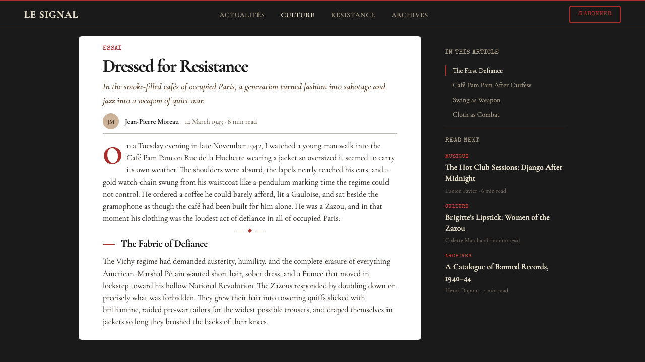
Parisian Zazou is a high-commitment style best applied to contexts where defiance, authenticity, and cultural specificity are genuine brand values rather than decorative claims. It performs exceptionally well in music and entertainment contexts — concert posters, album covers, event branding, festival identities — where the dark-ground, hand-lettered aesthetic is both historically resonant and viscerally effective. It also suits editorial contexts that want to position themselves as serious and counter-cultural rather than mass-market: independent magazines, literary publications, arts journalism that wants its visual identity to argue for something.巴黎扎祖是一种高投入风格,最适合应用于反叛、真实性和文化特殊性是真正品牌价值而非装饰性声索的场景。它在音乐与娱乐场景中表现尤为出色——音乐会海报、唱片封面、活动品牌、节庆视觉识别——深色底面、手绘字体的美学在这些场景中既具历史共鸣又产生直接的感官效果。它也适合那些希望将自身定位为严肃与反主流文化而非大众市场的编辑场景:独立杂志、文学出版物、希望以视觉身份表达某种立场的艺术新闻。
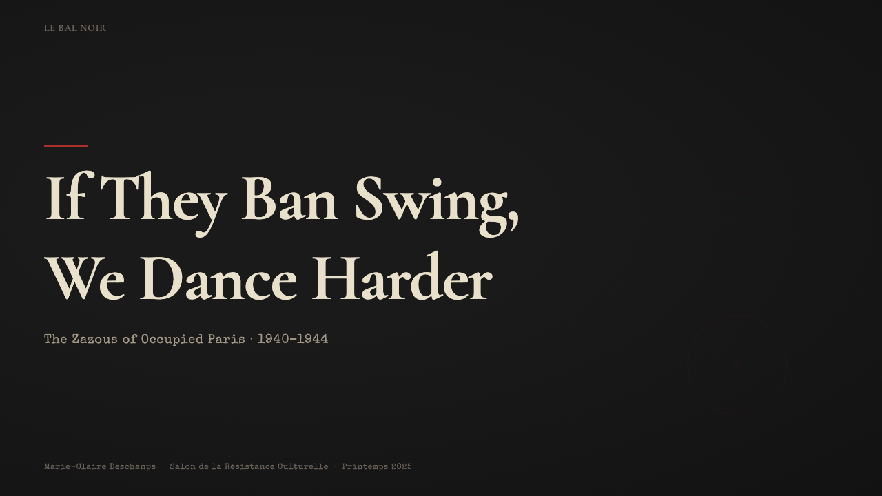
For presentation slides, the style requires a different approach than most historical design systems. Cover slides work as concert bills: a single dominant event or proposition in condensed display type, date and context in a compressed secondary tier, everything against a near-black ground with a single red accent. Content slides should resist the temptation to lighten the background for legibility — instead, use cream or aged-white type on the dark ground, and reserve the black-white reversal for data or comparison moments where contrast hierarchy needs to shift. Data visualizations take on the quality of printed newspaper infographics from the period: bar charts rendered as solid blocks of red or cream against the dark field, with axis labels in tight condensed type.在演示文稿中,这种风格需要与大多数历史设计系统不同的处理方式。封面页作为音乐会海报运作:单一的主导事件或主张以压缩展示字体呈现,日期和背景信息压缩于次级层级,所有内容置于近黑色底面,配以单一红色强调。内容页应抵制为提高可读性而减淡背景的诱惑——取而代之地,在深色底面上使用奶油色或陈旧白色的文字,将黑白反转保留给需要转换对比层级的数据或比较时刻。数据可视化具有那个时期印刷报纸信息图形的质感:柱状图以红色或奶油色实心色块呈现于深色底面,轴标签使用紧凑压缩字体。
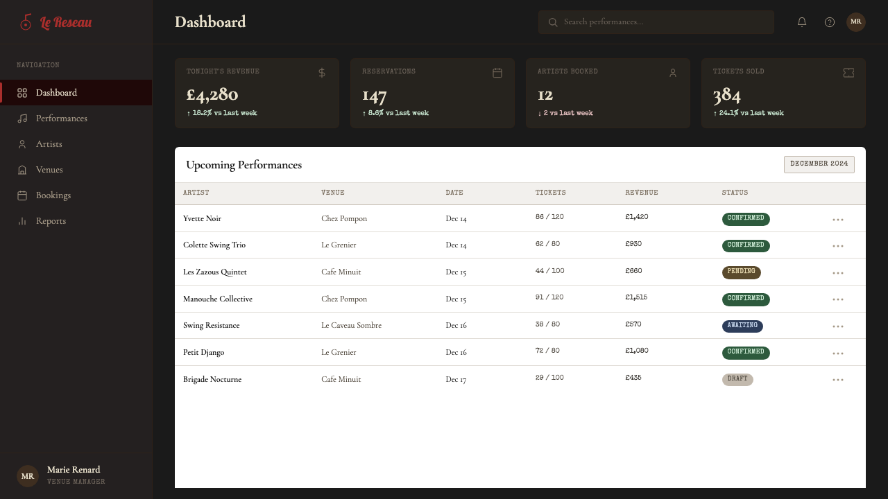
For web interfaces, Zazou is well-suited to dark-mode dashboards, music platforms, and editorial sites where the reading experience is meant to feel immersive rather than efficient. The approach: a near-black background across the full viewport, cream or light-warm type for body text, red restricted to interactive elements and critical alerts only. Navigation should be typographic and dense — no icons, no generous spacing. Card components should carry visible texture in their background treatment rather than relying on soft shadows against a white ground. The common mistake is applying the dark ground and assuming the rest of the system follows; without the specific warmth of the cream tones and the deliberate roughness of the typographic treatment, a dark-background site simply looks like a generic dark mode rather than something with cultural specificity.对于网页界面,扎祖适合深色模式仪表板、音乐平台和希望阅读体验感觉沉浸而非高效的编辑网站。做法如下:在整个视口使用近黑色背景,奶油色或浅暖色文字用于正文,红色仅限于交互元素和关键警示。导航应当是字体性的且密集——无图标,无宽松间距。卡片组件应在背景处理中带有可见质感,而非依赖白色底面上的柔和阴影。常见错误是应用了深色底面却以为其余系统会自然跟随;若缺少奶油色调的特定温度和排版处理刻意的粗粝感,深色背景网站只是看起来像通用深色模式,而非具有文化特殊性的东西。
For editorial and marketing work, the style excels at announcing rather than persuading. A Zazou-derived marketing page operates on the logic of a concert announcement: hierarchy is extreme, the primary message is stated once at maximum scale, and supporting information is compressed into secondary tiers with visible separators. Full-bleed dark sections alternate with moments of inverted contrast — cream ground, black type, red accent — to create rhythm without reducing the overall darkness of the visual experience. Photography, when used, should be treated as if it were a period photograph: high-contrast, slightly underexposed, cropped to isolate faces or hands rather than showing full scenes.对于编辑和营销内容,这种风格擅长宣告而非说服。扎祖衍生的营销页面按照音乐会公告的逻辑运作:层级极端,主要信息以最大尺度一次性陈述,辅助信息压缩进带有可见分隔符的次级层级。全出血深色区块与对比反转时刻交替——奶油底面、黑色文字、红色强调——在不减弱整体视觉体验黑暗感的前提下制造节奏。摄影图像(若使用)应作为历史照片处理:高对比度、略微曝光不足、裁切以隔离面部或双手而非展示完整场景。
A common mistake when applying this style is mistaking darkness for grimness. The Zazou aesthetic is dark but not austere — it is the darkness of a room full of people doing something that feels urgent and alive, not the darkness of emptiness. The red accent must earn its place: one strong red element per composition is transformative; two or three reds competing reduce the system to generic noir. Similarly, the hand-made quality should feel like authenticity rather than sloppiness. If the texture and imperfection read as production error rather than intentional register, the cultural specificity collapses and you are left with something that merely looks old.应用这种风格时最常见的错误是将黑暗误解为阴郁。扎祖美学是黑暗的,但不是严酷的——它是一个挤满了做着紧迫而鲜活之事的人的房间的黑暗,而非空旷的黑暗。红色强调必须配得上它的位置:每个构图中一处强烈的红色元素是蜕变性的;两三处红色相互竞争则会将系统降格为通用黑色电影风格。同样,手作质感应该感觉像真实性而非草率。如果质感和不完美被读解为生产错误而非刻意的调性,文化特殊性就会崩溃,留下的不过是某种看起来陈旧的东西。
See the Parisian Zazou (1942) design system →查看 Parisian Zazou (1942) 完整设计系统 →
Parisian Zazou (1942) — FAQParisian Zazou (1942) · 常见问题
Is this style appropriate for brands that have no connection to jazz or French culture?这种风格适合与爵士乐或法国文化毫无关联的品牌吗?
Appropriateness depends less on literal connection than on whether the underlying values match. The Zazou aesthetic communicates defiance, underground credibility, and the refusal to conform to dominant aesthetic norms. A technology company that genuinely operates against the grain of its industry, a publication that exists to challenge mainstream narratives, or a music platform built on independent artists — these contexts make the visual language feel earned rather than borrowed. A brand that simply wants to look cool without the underlying substance will find that the style exposes rather than hides the absence of conviction. The roughness and darkness read as authenticity claims, and audiences test those claims.适合与否与字面连接关系不大,更取决于底层价值观是否匹配。扎祖美学传达反叛、地下可信度以及拒绝遵从主流审美规范。一家真正在行业中逆流而行的科技公司、一份致力于挑战主流叙事的出版物、一个建立在独立艺术家基础上的音乐平台——这些场景使视觉语言感觉是赚来的而非借来的。一个只是想看起来酷但缺乏底层实质的品牌会发现这种风格暴露而非掩盖了信念的缺失。粗粝与黑暗被读解为真实性声索,而受众会检验这些声索。
How do you maintain legibility with such extreme contrast and dark grounds?在如此极端的对比和深色底面下,如何保持可读性?
Legibility in the Zazou system comes from restricting the palette rigorously. Cream and aged-white on deep black — or the reverse — are the system's two primary text combinations, both of which are highly legible when type is set at appropriate sizes. Red should never be used for body text: at small sizes against a dark ground, saturated red loses contrast and fails accessibility standards. The typographic roughness should be applied at the display level only; body text benefits from a clean, readable face even within the overall aesthetic. Where the style demands density, use tighter leading rather than smaller type — compressed vertical space maintains the crowded energy without sacrificing readability.扎祖系统的可读性来自对色板的严格限制。深黑底面上的奶油色和陈旧白色——或反之——是系统的两种主要文字组合,在字体尺寸适当的情况下,两者都具有高度可读性。红色绝不应用于正文:在深色底面上的小字号处,饱和红色失去对比度,无法满足无障碍标准。排版粗粝感应仅在展示层级应用;正文即便在整体美学框架内也受益于清晰可读的字形。当风格要求密集时,使用更紧的行间距而非更小的字号——压缩的垂直空间维持了拥挤的能量而不牺牲可读性。
How does Zazou differ from generic noir or dark-mode design?扎祖风格与通用黑色电影风格或深色模式设计有何不同?
Generic noir and contemporary dark-mode design share the dark ground but differ in almost every other respect. Noir's darkness is cinematic and atmospheric — it uses soft vignetting, gradient light sources, and high-gloss surfaces. Contemporary dark mode is utilitarian — neutral dark backgrounds, system fonts, soft glow effects for depth. Zazou's darkness is neither cinematic nor utilitarian: it is the darkness of cheap reproduction, of paper gone black with overprinting, of a room lit only by necessity. The distinguishing features are the warm cream accents (not cool white), the visible texture (not smooth digital surfaces), the hand-lettered typographic register (not system fonts), and the specific hot red (not the cool gray or blue accents of standard dark-mode design). Remove any one of these and the style collapses into something more generic.通用黑色电影风格和当代深色模式设计共享深色底面,但在几乎所有其他方面都有所不同。黑色电影的黑暗是电影式的、氛围性的——它使用柔和的晕影、渐变光源和高光泽表面。当代深色模式是实用主义的——中性深色背景、系统字体、用于表现深度的柔和发光效果。扎祖的黑暗既非电影式也非实用主义:它是廉价复制的黑暗,是纸张因过度印刷而变黑的黑暗,是仅因必要而点灯的房间的黑暗。区分特征是:暖调奶油色强调(非冷调白色)、可见质感(非光滑数字表面)、手绘字体调性(非系统字体),以及特定的热红色(非标准深色模式设计中的冷灰或蓝色强调)。去掉其中任何一项,风格就会坍缩为更通用的东西。
Can this style work for digital products, or is it too tied to print?这种风格能用于数字产品吗,还是说它过于依附于印刷品?
The Zazou aesthetic translates to digital contexts more naturally than many print-derived styles because its defining qualities — extreme contrast, typographic density, texture — are achievable on screen without the compromises that, say, embossing or letterpress require. Music streaming platforms, ticketing applications, editorial websites, and portfolio sites in music or arts have applied the visual register successfully. The translation requires discipline: texture should be applied at the surface level (background grain, subtle paper overlay) without compromising tap targets or interactive affordances. The typographic density that works on a static poster becomes a usability problem if applied indiscriminately to navigation and interface copy. The solution is to use the full Zazou register for hero and editorial sections, and to moderate it — more space, cleaner type — for functional interface areas.扎祖美学比许多源自印刷品的风格更自然地转化为数字场景,因为其定义性特质——极端对比、排版密度、质感——在屏幕上可以实现,而不需要像凹凸压印或活版印刷那样的妥协。音乐流媒体平台、票务应用、编辑网站,以及音乐或艺术领域的作品集网站都成功地应用了这种视觉调性。转化需要自律:质感应在表面层级应用(背景纹理、微妙的纸张叠加),而不影响点击目标或交互可见性。在静态海报上有效的排版密集感,若不加区分地应用于导航和界面文案,则会成为可用性问题。解决方案是:在英雄区和编辑区使用完整的扎祖调性,在功能性界面区域则加以节制——更多空间、更清晰的字体。
What is the risk of this style reading as costume rather than conviction?这种风格被读解为华服而非信念的风险是什么?
It is the central risk of applying any style with strong cultural origins. The Zazou aesthetic carries the weight of a specific historical moment — people who faced real consequences for their choices — and deploying it as purely decorative surface risks a kind of trivialization. The safeguard is not avoiding the style but using it with awareness of what it claims. Every design choice should be defensible as a necessary one rather than a borrowed one: the darkness is earned by the content's seriousness, the roughness by the urgency of what is being communicated, the red by what it marks as important. Brands and designers that use the visual language well tend to have something they genuinely believe in; the style amplifies conviction rather than simulating it.这是应用任何具有强烈文化根源的风格时的核心风险。扎祖美学承载着一个特定历史时刻的重量——那些为自己的选择承受了真实后果的人——将其作为纯装饰性表面部署,有将其平庸化的风险。保障不是回避这种风格,而是带着对其所声索之物的意识使用它。每一个设计选择都应该是可以作为必要性而非借用性来为其辩护的:黑暗由内容的严肃性获得,粗粝感由所传达之物的紧迫性获得,红色由其所标记的重要性获得。善用这套视觉语言的品牌和设计师往往真正相信某些事物;这种风格放大信念而非模拟它。
Related design styles相关设计风格
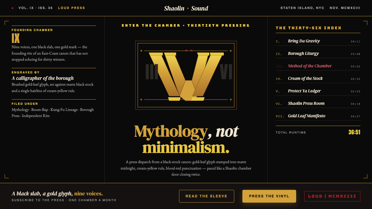 Wu-Tang Clan — 36 ChambersMythology, not minimalism. Gold-leaf glyph on matte black, cream-yellow rule,…神话感而非极简:纯黑底色压上金箔字徽,奶油黄细线,血红点睛,少林功夫片的重量。
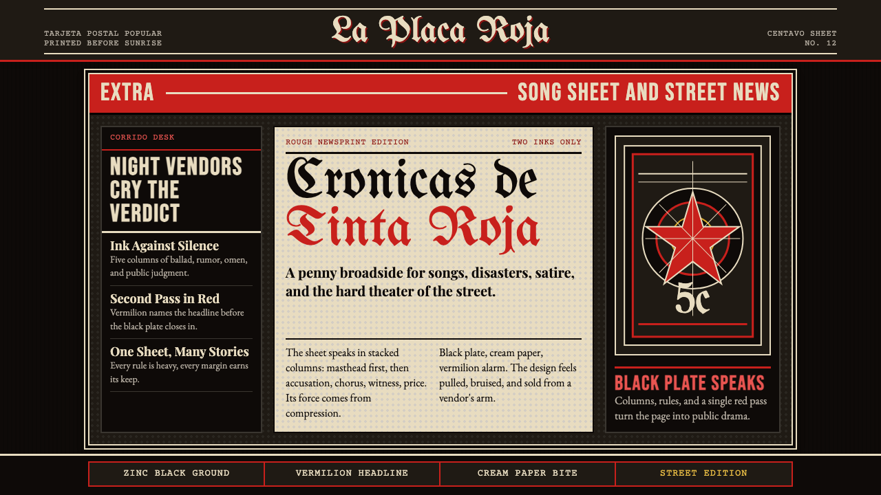 Mexican Tarjeta Postal (Posada Engraving 1900)Tabloid drama in two inks. Fraktur mastheads, vermilion rules, and cream news…双色小报式戏剧:哥特报头、朱红分隔线与粗粝新闻纸。
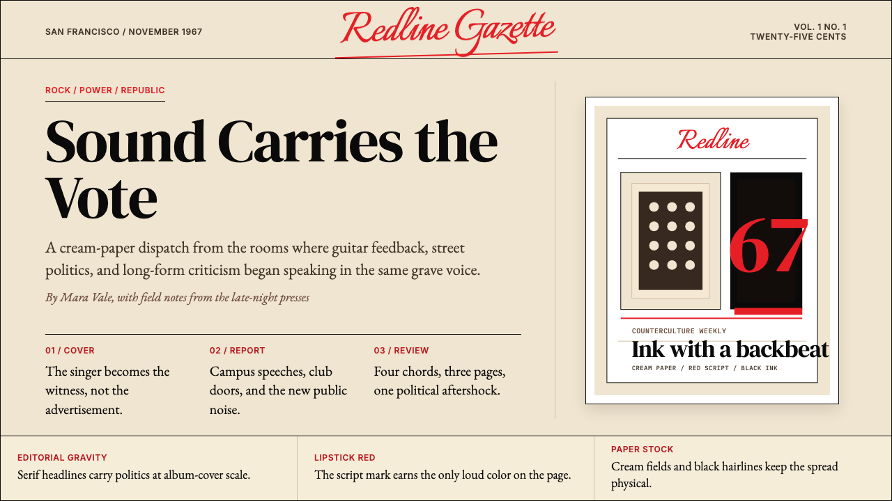 Rolling Stone MagazineCounterculture gets editorial weight. Cream paper, lipstick red script, serif…反主流文化有编辑重量:奶油纸、口红红手写体与粗衬线标题。
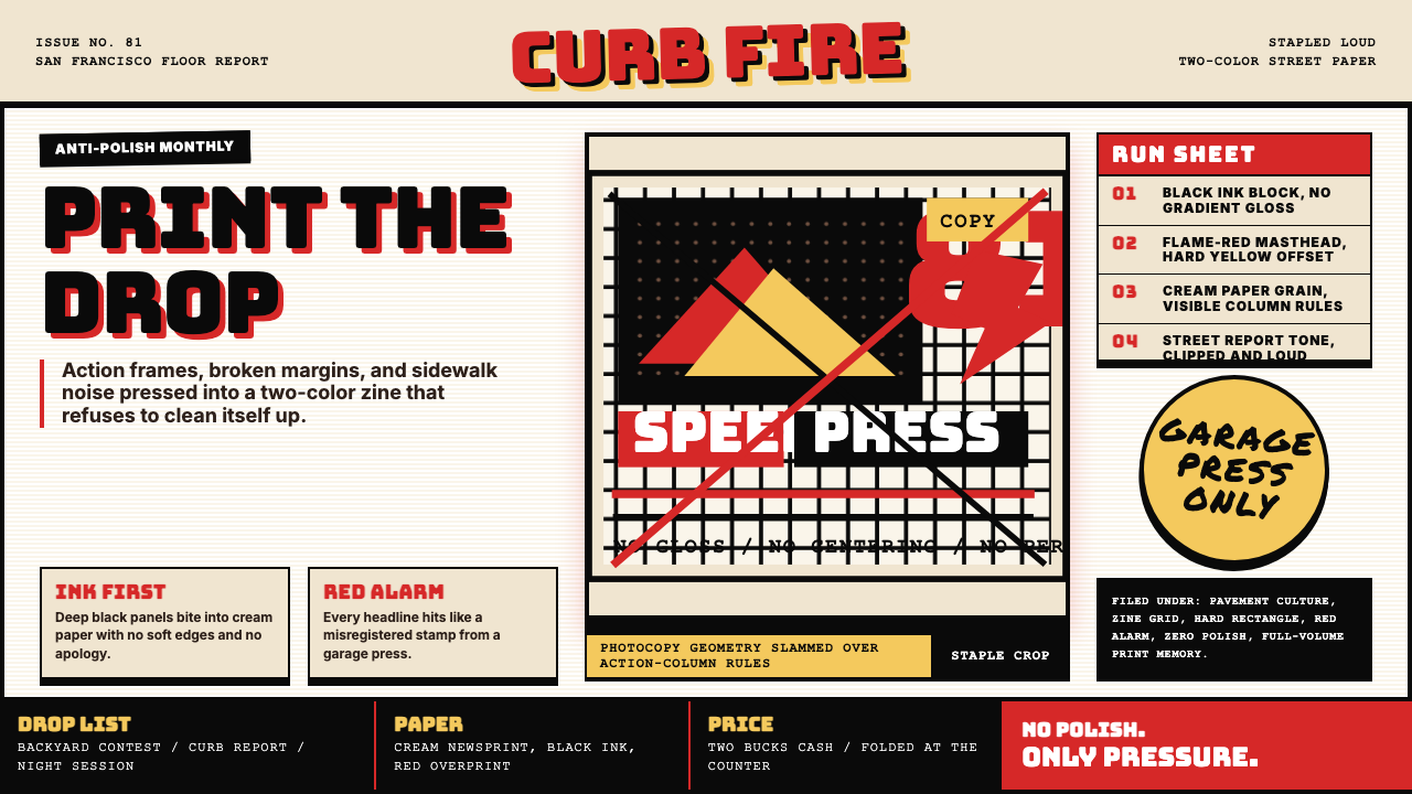 Thrasher Skate Zine (1981)Loud without polish. Flame red type, black ink blocks, and cream zine grids h…粗粝而响亮:火焰红大字、黑墨块与米色小报网格重击页面。
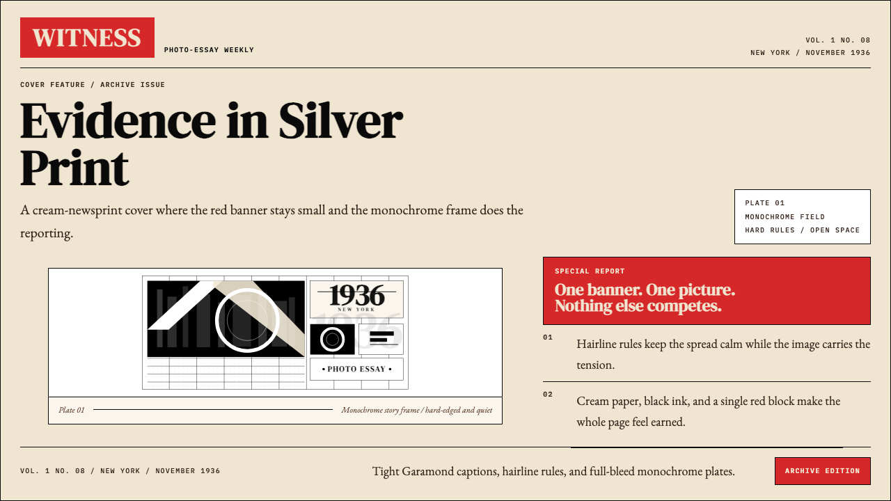 LIFE Magazine (Red-Banner)Photojournalism stripped bare. One red banner, cream newsprint, stark black p…摄影报道被剥到最简。红横幅、米色纸底与黑白版面。
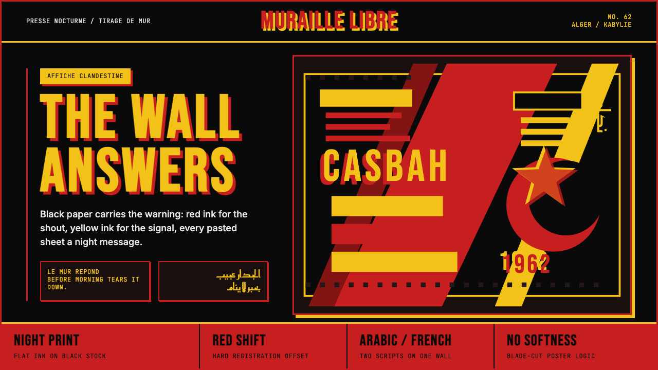 Algerian Casbah Poster (1954–1962)Every surface is a manifesto. Blood red, warning yellow, and stencil type hit…每个表面都是宣言:血红、警示黄与模板字撞上黑色新闻纸。