What is Wu-Tang Clan — 36 Chambers?什么是 Wu-Tang Clan — 36 Chambers?
Nine MCs from Staten Island stamped a gold W onto pure black and rewrote the visual grammar of East-Coast hip-hop forever.九名来自史泰登岛的说唱者将一枚金色「W」钉上纯黑底色,从此永久改写了东岸嘻哈的视觉语言。
Wu-Tang Clan — 36 Chambers in briefWu-Tang Clan — 36 Chambers 速览
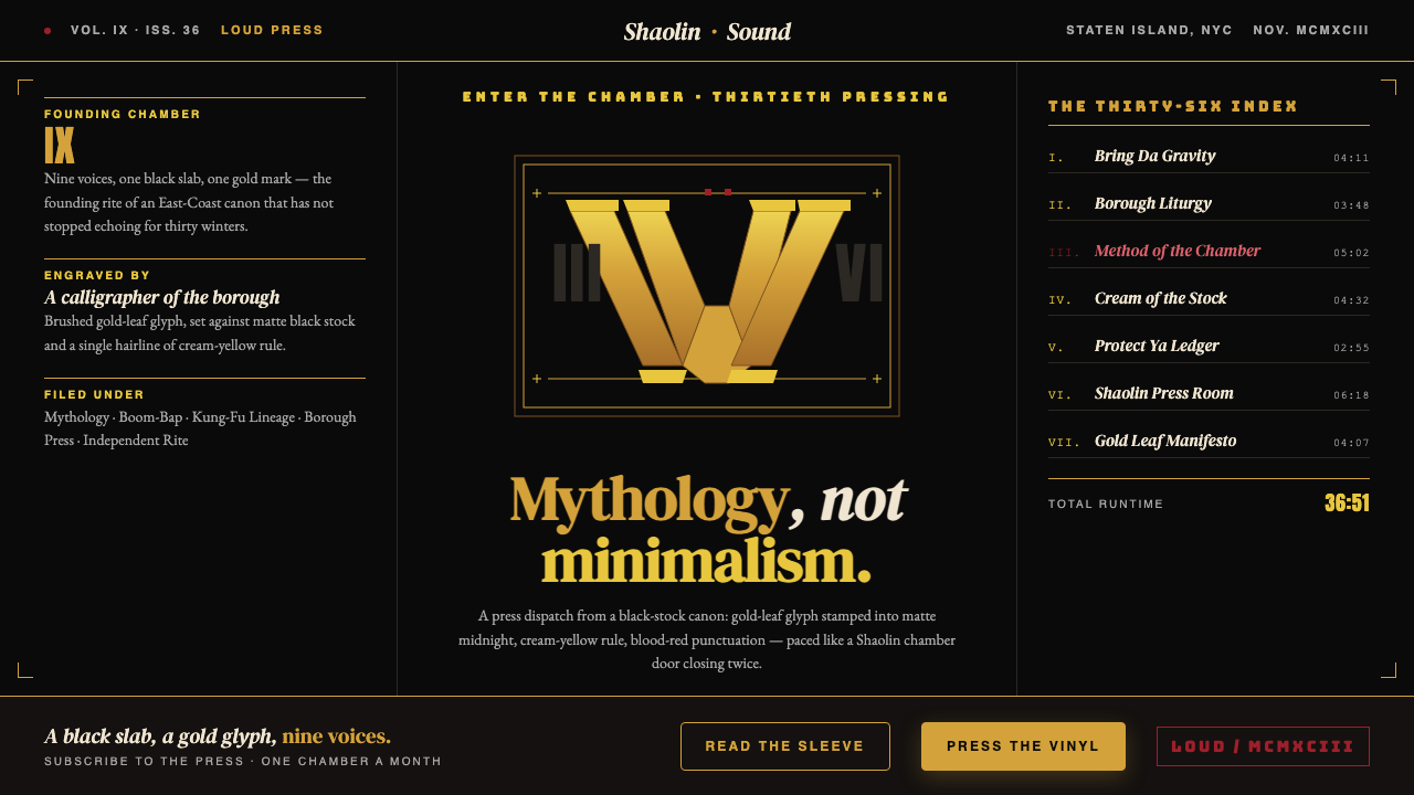
Wu-Tang Clan — 36 Chambers is the visual design language born from the 1993 debut album 'Enter the Wu-Tang (36 Chambers)' on Loud Records. Its defining features are a palette of four irreducible elements — deep matte black, saturated gold, cream-yellow, and blood-red — combined with calligraphic mark-making, sharp editorial serifs, and a graphic weight borrowed from Shaolin kung-fu film posters and New York City underground tape culture. It is a mythology-building aesthetic, not a minimalist one.「武当帮——三十六房」是诞生于1993年同名首张专辑《Enter the Wu-Tang (36 Chambers)》(Loud Records出版)的视觉设计语言。其定义性特征在于四种不可再约的色彩元素——哑光深黑、饱和金、奶油黄与血红——与书法徽标、锐利编辑感衬线字体,以及源自少林功夫片海报和纽约地下磁带文化的视觉厚重感相结合。这是一套构建神话的美学,而非极简主义。
The system's emotional register is one of sovereign authority and subterranean menace. Where most hip-hop visual design of the early 1990s sought brightness and immediacy, Wu-Tang deliberately chose darkness, density, and oblique cultural reference. The shadowed group portrait on the original sleeve, the gold W stamped like a royal seal, the kung-fu film credits typography — all of these choices signal that the work is its own self-contained world, governed by its own codes.这套系统的情绪基调是帝王般的权威与地底的威慑。1990年代初期多数嘻哈视觉设计追求明亮与直接,武当帮却有意选择黑暗、密度与迂回的文化引用。原版封面上的暗调群像、如王印般钤盖的金色「W」、功夫片片头字幕风格的字体处理——所有这些选择都在宣告:这件作品是自成体系的世界,有其自身的密码。
What makes the aesthetic remarkably durable is its coherence. Every element — the color, the mark, the type treatment, the mythological imagery — serves the same underlying proposition: that this collective from a borough overlooked by mainstream culture had constructed something of permanent, monumental value. The visual language does not decorate that claim; it enacts it.这套美学具有非凡持久性,原因在于它的内在一致性。每一个元素——色彩、徽标、文字处理、神话意象——都服务于同一个底层命题:这个来自被主流文化忽视的行政区的集体,创造了具有永恒纪念性价值的事物。视觉语言不是在装点这一宣称,而是在实施它。
See the Wu-Tang Clan — 36 Chambers design system查看 Wu-Tang Clan — 36 Chambers 完整设计系统
Where does Wu-Tang Clan — 36 Chambers come from?Wu-Tang Clan — 36 Chambers 从何而来?
The story begins not in a studio but in the movie theaters and video stores of Staten Island's North Shore, where RZA, GZA, and their extended crew grew up watching Shaw Brothers kung-fu films imported from Hong Kong. Films like 'The 36th Chamber of Shaolin' (1978) were not merely entertainment — they provided a mythology of discipline, brotherhood, and esoteric mastery that the group would consciously transpose onto their creative identity. The album's title is a direct citation of that film. The visual language carries the same reference: heavy, shadowed, ceremonial.故事的起点不在录音棚,而在史泰登岛北岸的电影院和录像出租店——RZA、GZA与他们的伙伴们在那里看着从香港引进的邵氏功夫片长大。《少林三十六房》(1978年)之类的影片不仅仅是娱乐,它们提供了一套关于纪律、兄弟情谊与秘传精通的神话体系,这个团体将有意识地将其移植到自己的创作身份上。专辑名称直接引用自那部电影;视觉语言承载着同样的引用:厚重、阴暗、仪式感十足。
The graphic anchor of the aesthetic is the Wu-Tang 'W' logotype, designed by rapper and graphic artist Mathematics (Allah Mathematics). The W is not a conventional corporate letterform — it is a calligraphic weapon, its strokes thick and aggressive, suggesting both a flying crane and a set of blades. Mathematics conceived it as a seal of authenticity, something that could be stamped on any surface and immediately convey membership in a self-governing order. It became one of the most recognized marks in popular culture without ever being licensed to a major branding agency.这套美学的图形锚点是由说唱歌手兼平面艺术家Mathematics(真名Allah Mathematics)设计的武当「W」字徽。这个W不是常规的企业字形——它是一件书法武器,笔画粗重而富侵略性,既像展翅的仙鹤,又像一组利刃。Mathematics将其构想为真实性的印鉴,一个可以钤盖于任何表面、立即传递自治秩序成员身份的符号。它成为流行文化中最具辨识度的标志之一,却从未被授权给任何主流品牌机构。
Photographer Daniel Hastings shot the original group portrait that appeared on the inner sleeve and in promotional materials. His approach was deliberately anti-commercial: low light, close framing, heavy shadow, nine faces barely resolved out of the dark. This was a calculated refusal of the brightly lit, aspirationally glossy photography that dominated hip-hop visual culture in the early 1990s. The shadowed portrait said, in effect, that this group did not need to be legible to outsiders — it was sufficient to be recognized by those who already knew.摄影师Daniel Hastings拍摄了出现在内封和宣传物料上的原版群像。他的方式刻意反商业化:低光、近景裁切、大面积阴影,九张面孔几乎从黑暗中难以辨认地浮现。这是对1990年代初期嘻哈视觉文化中主导性的明亮、光鲜照片的有意拒绝。暗调群像传达的信息是:这个团体不需要让局外人读懂——被知道它的人认出,已经足够。
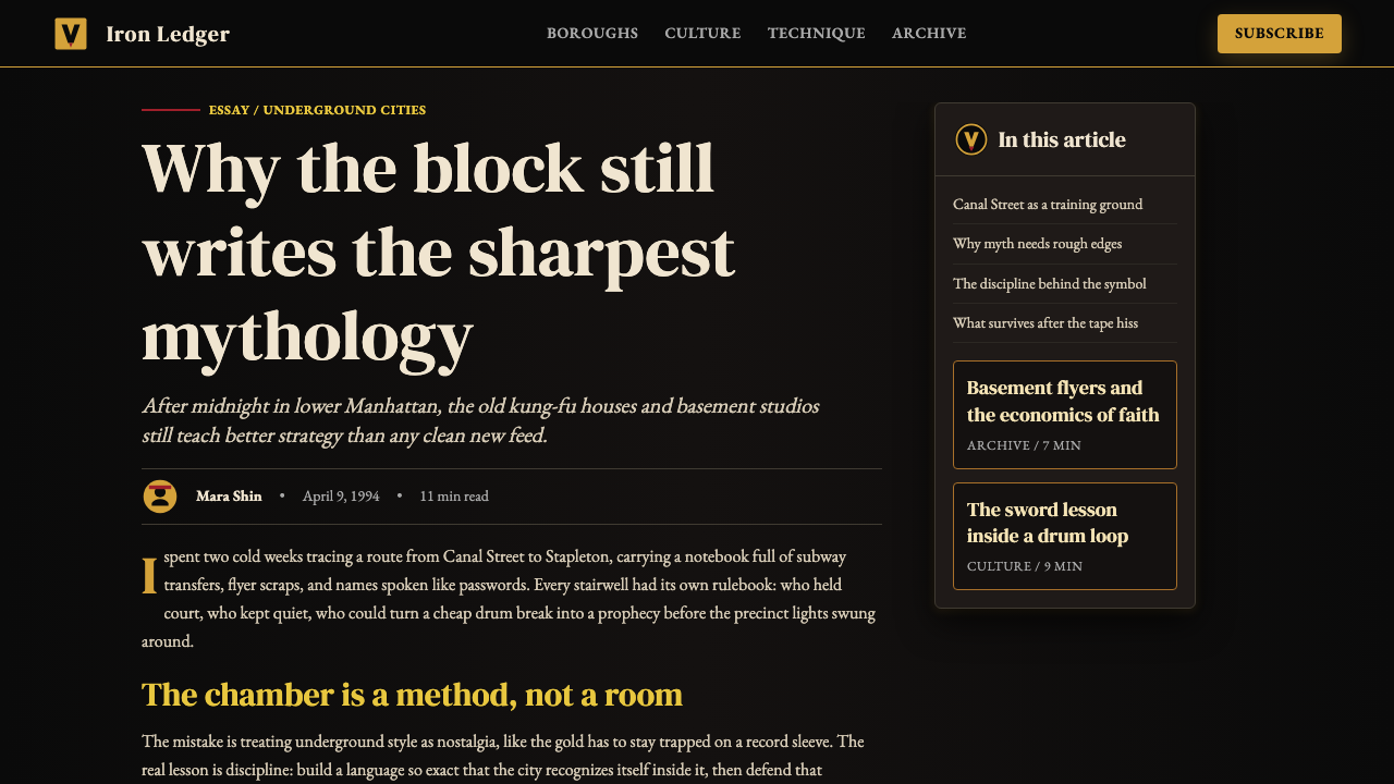
The typographic layer drew from two contradictory traditions: the editorial serif fonts used in newspaper mastheads and academic texts (lending gravitas and permanence) and the chunky, hand-lettered display type of urban signage and bootleg tape covers (lending street-level rawness). This collision of high and low was intentional and precise — the same tension that animated the group's lyrical approach, which wove Five-Percenter theology, chess metaphors, and block-level vernacular into a single dense fabric.排版层面汇聚了两种截然对立的传统:报纸报头与学术文本中的编辑感衬线字体(赋予庄重感与永久性),以及城市标牌和盗版磁带封面上厚墩墩的手写显示字体(赋予街头层面的粗粝感)。这种高与低的碰撞是刻意而精确的——与该团体歌词方法中同样的张力如出一辙:他们将五道神学、棋局隐喻与街区日常俚语编织进同一密实的织物。
What defines the Wu-Tang Clan — 36 Chambers look?Wu-Tang Clan — 36 Chambers 的视觉特征是什么?
Color Palette色彩体系
The palette consists of four fixed elements held in strict hierarchy. Deep matte black functions as the universal ground — not a neutral background but an active presence that gives the other colors their weight. Saturated gold operates as the primary mark and accent, associated with value, ceremony, and the divine in Five-Percenter symbolism. Cream-yellow serves as the typographic field, warm rather than clinical, recalling aged paper and lamplight. Blood-red appears sparingly as punctuation — a single rule, a drop, a highlight — carrying maximum charge precisely because it is rationed. No other colors belong to this system.色彩体系由四个固定元素构成,保持严格的层级秩序。哑光深黑是普遍的底色——不是中性背景,而是给其他颜色赋予重量的主动存在。饱和金是主要标志与强调色,在五道神学象征体系中与价值、仪式和神圣相关联。奶油黄是排版底色,温暖而非冰冷,让人联想到泛黄纸张和灯光。血红极少出现,用作标点——一条细线、一滴、一处高光——正因为被节制,才承载最大的张力。这套系统中没有其他颜色的位置。
The Calligraphic Mark书法徽标
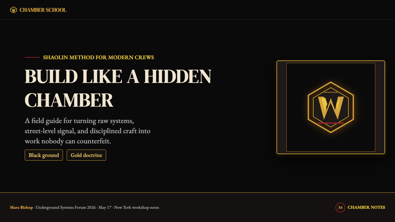
The Wu-Tang W is the aesthetic's structural center of gravity. Its calligraphic construction — rendered with the weight and assertiveness of a brushstroke rather than the precision of a geometric letterform — means it carries energy that a corporate logotype does not. The mark functions simultaneously as initial, seal, emblem, and weapon. Its reproduction across surfaces both flat and dimensional (sleeves, merchandise, tattoos, graffiti) proved that the mark was powerful enough to survive radical changes in context and scale without losing its charge.武当「W」是这套美学结构上的重心所在。其书法构造——以笔触的力量感与主张性呈现,而非几何字形的精确性——意味着它承载着企业标志所不具备的能量。这枚标志同时作为首字母、印鉴、徽章与武器发挥作用。它在平面与立体表面的广泛复制(封面、周边、纹身、涂鸦)证明了:这枚标志足够强大,能在语境与尺度的剧烈变化中保持自身的张力而不失色。
Typography字体排印
The type system operates through deliberate collision rather than harmonic consistency. Formal editorial serifs — the kind historically used in newspaper mastheads and academic publishing — coexist with heavy, condensed display lettering drawn from urban signage and bootleg tape culture. The contrast in weight, style, and cultural register is not accidental; it embodies the same high-low synthesis at work throughout the group's music. Text is often set tightly, with minimal leading, creating a dense block that occupies space with authority.字体系统通过刻意的碰撞而非和谐的一致性发挥作用。正式的编辑感衬线字体——历史上用于报纸报头与学术出版的那种——与源自城市标牌及盗版磁带文化的粗重窄体显示字体共存。字重、风格与文化基调上的反差并非偶然;它体现了这个团体音乐中始终运作着的同一套高低综合。文字常以紧密排布、极小行距呈现,形成占据空间、自带权威的密实文字块。
Shadow and Chiaroscuro阴影与明暗对比
Shadow is not used as a depth simulation or a soft UI effect — it is used as drama. The photographic tradition within the aesthetic draws on the extreme contrast of noir and kung-fu film cinematography, where figures emerge from near-total darkness and background detail is suppressed in favor of silhouette and gesture. In graphic applications, drop shadows on type and marks are heavy and offset, functioning as structural elements that anchor text to the ground plane rather than lift it into an illusion of space. Light is always implied to come from a single, strong, directional source.阴影在这里不用作深度模拟或柔和的界面效果——它用于制造戏剧性。这套美学中的摄影传统借鉴了黑色电影和功夫片摄影的极端对比:人物从近乎纯粹的黑暗中浮现,背景细节被压制,让位于轮廓与姿势。在平面应用中,文字与标志上的投影厚重而大幅偏移,作为将文字锚定于底面的结构性元素,而非将其托举进空间幻觉之中。光线始终被暗示为来自单一、强烈、有方向的光源。
Mythological Density神话密度
Unlike most design systems that seek clarity and immediate legibility, 36 Chambers aesthetics reward sustained attention. Imagery and text reference the 36 chambers of Shaolin kung-fu lore, Five-Percenter Supreme Mathematics, chess strategy, and street-level New York City geography simultaneously. This layering creates a surface that reads quickly as powerful and opaque but rewards deeper reading with a coherent internal mythology. The visual density is intentional: it communicates that there is more here than can be absorbed in a single encounter.与大多数寻求清晰度与即时可读性的设计系统不同,三十六房美学奖励持续的注意力。图像与文字同时引用少林功夫秘法的三十六房、五道者的至高数学、棋局策略以及纽约市街头层面的地理。这种分层制造了一个表面——初读强有力而不透明,深读则揭示出一套连贯的内部神话。视觉密度是刻意的:它传递的是这里有远超一次相遇所能吸收之物的信号。
Grid and Asymmetric Tension网格与非对称张力
Layouts within this system favor asymmetric compositions that feel inhabited and charged rather than balanced or neutral. The gold W or key imagery is often positioned off-center, creating a visual tension that the eye must resolve. Type blocks and graphical elements occupy different quadrants with deliberate irregularity. This is not chaotic — there is underlying structure — but the structure serves drama rather than order. The compositions feel like they are in motion, arrested at a moment of maximum tension.这套系统中的版面偏爱非对称构图,使画面感觉充实而充满张力,而非平衡或中性。金色「W」或关键图像常偏离中心放置,制造出眼睛必须自行化解的视觉张力。文字块与图形元素以刻意的不规则性占据不同象限。这不是混乱——有潜在的结构存在——但这种结构服务于戏剧性而非秩序。构图感觉像在运动中,被定格于最大张力的一瞬。
Material and Tactile Implication质感与触觉暗示
The aesthetic implies physical weight through its visual choices, even in flat reproduction. Gold carries the cultural memory of leaf gilding, precious metal, and ceremonial object. Matte black suggests pressed vinyl, suede, and anechoic chamber — surfaces that absorb rather than reflect. The cream-yellow of type fields evokes aged paper and warm incandescent light rather than the cold brightness of digital screens. This material richness operates at the level of connotation: the surfaces are described, not simulated, but the description is specific enough to be felt.这套美学即便在平面复制中也通过视觉选择暗示实体重量。金色承载着金箔、贵金属与仪式性物件的文化记忆。哑光黑令人联想到压制黑胶、绒面革与消音室——那些吸收而非反射的表面。文字底色的奶油黄唤起泛黄的纸张与温暖的白炽灯光,而非数字屏幕的冷白亮度。这种质感丰富性在内涵层面运作:表面是被描述的,而非被模拟的,但这种描述足够具体,足以被感知。

See the Wu-Tang Clan — 36 Chambers design system查看 Wu-Tang Clan — 36 Chambers 完整设计系统
Who shaped Wu-Tang Clan — 36 Chambers?谁塑造了 Wu-Tang Clan — 36 Chambers?
Robert Fitzgerald Diggs, known as RZA, served as the Wu-Tang Clan's chief architect in every sense — musical producer, conceptual director, and the primary author of the group's mythological framework. It was RZA who synthesized Five-Percenter theology, Shaolin kung-fu lore, chess metaphor, and Staten Island street experience into a single coherent worldview, and who insisted that this worldview be expressed with total consistency across sound, language, and image. His five-year production deal he negotiated for each member allowed the collective to maintain creative sovereignty, a principle that directly informed the aesthetic's refusal to accommodate commercial softening.Robert Fitzgerald Diggs,即RZA,在每一个意义上都是武当帮的首席建筑师——音乐制作人、概念总监,以及这个团体神话框架的主要作者。正是RZA将五道神学、少林功夫秘法、棋局隐喻与史泰登岛的街头经验综合为单一连贯的世界观,并坚持这一世界观必须在声音、语言与图像上保持绝对一致的表达。他为每位成员谈判的五年独立制作协议使这个集体保持了创作主权——这一原则直接影响了这套美学对商业软化的拒绝。
Allah Mathematics, born Ronald Maurice Bean, is the graphic artist and DJ most directly responsible for the visual system's defining element: the Wu-Tang W logotype. A practicing Five-Percenter, Mathematics brought the movement's philosophical framework — Supreme Mathematics, the Supreme Alphabet — into the graphic vocabulary of the collective. His calligraphic W was not designed through any formal academic process; it emerged from the same improvisational, self-taught creative culture that produced the music. He has continued to serve as the group's primary visual steward for over three decades.Allah Mathematics,本名Ronald Maurice Bean,是最直接负责这套视觉系统核心元素——武当「W」字徽——的平面艺术家兼DJ。作为五道者的践行者,Mathematics将这一运动的哲学框架——至高数学、至高字母——带入了集体的图形词汇。他的书法体W不是通过任何正式学术流程设计的;它诞生于产生那些音乐的同一套即兴、自学的创作文化。此后三十余年,他持续担任这个团体的主要视觉守护人。
Photographer Daniel Hastings was responsible for the original group portraiture that established the aesthetic's photographic register. His deliberate choice to shoot in low light with heavy shadow, suppressing the kind of aspirational brightness common in early-1990s hip-hop photography, was a radical act of visual positioning. The portraits he produced said that this group existed on its own terms, in its own light, and did not require the conventions of commercial photography to legitimate itself. His approach became a template for subsequent Wu-Tang visual materials.摄影师Daniel Hastings负责了奠定这套美学摄影基调的原版群像。他刻意选择在低光条件下拍摄并运用大面积阴影,压制1990年代初期嘻哈摄影中常见的那种充满期望感的明亮,这是一个激进的视觉定位行为。他拍摄的肖像宣告:这个团体以自己的方式、在自己的光线中存在,不需要商业摄影的惯例来为自己背书。他的方式成为后续武当视觉物料的模板。
Gary Grice, known as GZA or the Genius, was among the founding members whose lyrical and conceptual contributions most shaped the aesthetic's intellectual register. His album 'Liquid Swords' (1995) — whose cover features a chess-playing samurai and deep black ground — extended the 36 Chambers visual vocabulary into its fullest expression. GZA's work demonstrated that the aesthetic was scalable: it could support solo projects that maintained the collective's visual identity while introducing new symbolic layers, confirming the system's coherence and flexibility.Gary Grice,即GZA(天才),是创始成员中歌词与概念贡献最深刻地塑造了这套美学知识分子气质的人。他的专辑《Liquid Swords》(1995年)——封面描绘一名在棋局中沉思的武士,以深黑为底——将三十六房的视觉词汇延伸至最充分的表达。GZA的作品证明了这套美学具有可扩展性:它能够支撑保持集体视觉身份的个人项目,同时引入新的象征层次,从而确认了这套系统的连贯性与灵活性。
How do you use Wu-Tang Clan — 36 Chambers today?今天怎么用 Wu-Tang Clan — 36 Chambers?
Applying the Wu-Tang 36 Chambers aesthetic requires understanding that its power comes from restraint within a very specific set of commitments, not from the mere accumulation of its surface features. The palette of black, gold, cream-yellow, and blood-red must be held strictly — introducing other colors, however contextually justified, immediately dissolves the authority the system derives from its refusal. The calligraphic mark, if used, must carry genuine weight; a thin or geometric substitute reads as a brand parody rather than a design system.运用武当帮三十六房美学,需要理解其力量来自于在一套非常具体的承诺范围内的节制,而不是来自于其表面特征的堆叠。黑色、金色、奶油黄与血红的色彩体系必须严格保持——引入其他颜色,无论语境上多么合理,都会立即消解这套系统凭借其拒绝姿态所获得的权威。书法徽标若被使用,必须承载真实的重量;纤细或几何化的替代品读起来像品牌戏仿,而非设计系统。
For presentation slides, the aesthetic works most powerfully on cover and transition slides where mythology and authority are the desired impression. A cover composed of pure black ground, a gold logotype or mark centered or slightly off-center, and a title set in a heavy editorial serif in cream-yellow achieves the aesthetic's essential effect: weight, ceremony, arrival. Content slides should reduce to the minimum — black ground, cream-yellow body text at generous size, blood-red used for a single key figure or data point per slide, and no decorative elements whatsoever. Data visualizations should be treated as objects of ceremony: bar charts in gold on black, axes in cream, a single red marker for the most critical value.在演示文稿中,这套美学在封面页和过渡页上最为有力——当神话感与权威感是期望印象时。纯黑底色、居中或微微偏离中心的金色标志或徽标、以奶油黄色重磅编辑感衬线字体呈现的标题——这样的封面实现了这套美学的核心效果:重量感、仪式感、到达感。内容页应减至最少:黑色底色,大字号奶油黄正文,每张幻灯片血红色仅用于单一关键数字或数据点,无任何装饰性元素。数据可视化应被当作仪式性对象处理:黑底金色柱形图,奶油色坐标轴,单一红色标记用于最关键的数值。
For web interfaces, this system applies most naturally to landing pages, product hero sections, and membership or access-gating contexts where the experience of encountering the brand should feel like being admitted to something. A dark-mode dashboard built in this vocabulary uses the deep black as the application background, gold for primary interactive elements and active states, cream-yellow for all body and label text, and blood-red strictly for alerts and critical state indicators. Navigation is typographic — heavy serif or slab wordmarks, not icon-led. Card components use hard shadow offsets rather than soft glows, reinforcing the aesthetic's commitment to solid, non-ambient depth.在网页界面中,这套系统最自然地适用于落地页、产品主视觉区块,以及会员或访问门控场景——在这些场景中,与品牌相遇的体验应当有一种被接纳进某种事物的感觉。以这套词汇构建的深色模式仪表板,以哑光深黑为应用背景,金色用于主要交互元素与激活状态,奶油黄用于全部正文与标签文字,血红严格限于警告与临界状态指示器。导航是排印性的——粗重衬线或板衬线字标,而非图标主导。卡片组件使用硬边投影偏移,而非柔和发光,强化这套美学对实体、非环境性深度的承诺。
For editorial and marketing materials, the system's poster lineage makes it naturally suited to full-bleed, high-impact layouts. A marketing page built in this vocabulary uses alternating full-width sections of deep black and near-black (never white or light grounds — this is a dark-native system), with gold as the primary headline color and cream-yellow for body text. Photography, where used, should be treated as Hastings treated his portraits: high-contrast, close-cropped, with background detail suppressed into darkness. The only exception to the dark ground is a deliberate cream or aged-paper texture used to introduce a single section of maximum typographic contrast.对于编辑与营销材料,这套系统的海报渊源使其自然适合出血式、高冲击力的版面。以这套词汇构建的营销页面,使用深黑与近黑的全宽交替区块(永不使用白色或浅色底——这是一套以深色为原生的系统),以金色作为主要标题色,奶油黄用于正文。摄影图像若使用,应以Hastings处理其肖像的方式对待:高对比度、近景裁切、背景细节压入黑暗。深色底面的唯一例外,是刻意使用的奶油色或仿旧纸张纹理,用于引入单一段落的最大排版对比。
The most common mistake when applying this aesthetic is treating gold as a general accent color rather than as a mark of singular authority. Gold should appear at most in two or three places per composition — as the primary logotype or mark, as a single headline, or as the key data point — and nowhere else. Distributing gold generously across a layout produces the opposite of the intended effect: instead of commanding attention, it becomes ambient decoration that the eye learns to ignore. A second common error is using any form of soft shadow, gradient, or bloom effect — these import a warmth and approachability that is fundamentally at odds with the aesthetic's deliberate severity.应用这套美学时最常见的错误,是将金色当作一种普通强调色而非单一权威的标志来使用。金色每张构图中最多应出现在两至三处——作为主要标志或徽标、单一标题,或关键数据点——仅此而已。在版面上慷慨分布金色会产生与预期相反的效果:金色不再命令注意力,而是变成眼睛习以为常、渐渐忽视的环境性装饰。第二个常见错误是使用任何形式的柔和阴影、渐变或发光效果——这些元素引入了一种温暖感与亲切感,与这套美学刻意的严峻性从根本上相悖。
See the Wu-Tang Clan — 36 Chambers design system查看 Wu-Tang Clan — 36 Chambers 完整设计系统
Wu-Tang Clan — 36 Chambers — FAQWu-Tang Clan — 36 Chambers · 常见问题
Can this aesthetic work in a light-background context?这套美学能在浅色背景的语境中使用吗?
Rarely, and only with significant constraint. The 36 Chambers system is fundamentally dark-native — its authority derives in large part from the depth and absorption of the black ground. A cream or aged-paper background can work in specific editorial contexts, particularly for a single section that needs to contrast against the dominant dark ground, but it reads as an inversion of the system rather than its natural state. A fully light-mode execution risks becoming a generic gold-and-sepia treatment that loses the menace and ceremony that distinguish the original. If a light treatment is required by context, limit it to cream — never clinical white — and maintain the gold and blood-red palette without softening either into pastels.很少见,且只有在相当大的约束条件下才可行。三十六房系统本质上是以深色为原生的——其权威感在很大程度上来自黑色底面的深度与吸收性。奶油色或仿旧纸张背景在特定编辑语境中可以使用,尤其是作为与主导的深色底面形成对比的单一区块,但这读起来像是系统的反转,而非其自然状态。完全浅色模式的执行有变成泛化的金色加土褐色处理的风险,失去区分原作的威慑感与仪式感。若语境要求浅色处理,限于奶油色——绝不使用临床般的纯白——并保持金色与血红色板,两者均不软化为粉彩。
How does this aesthetic differ from generic luxury or premium design?这套美学与泛化的奢侈品或高端设计有何不同?
Generic luxury design typically uses gold as an indicator of refinement and approachability — it is warm, inviting, and decorative. The 36 Chambers aesthetic uses gold as a seal of authority and sovereign identity — it is assertive, ceremonial, and exclusive in the sense of belonging to a defined order, not merely to a price tier. The difference is most visible in the type treatment: luxury design tends toward thin, elegant, widely spaced letterforms; this system uses heavy, condensed, densely packed type that occupies space rather than floating above it. The black ground in luxury design is often accompanied by soft shadow and warm ambient light; in this system, the black is unrelenting and the shadows are hard. The overall impression should be power, not comfort.泛化的奢侈品设计通常将金色用作精致感与亲切感的指示符——温暖、诱人、装饰性的。三十六房美学则将金色用作权威与主权身份的印鉴——主张性的、仪式性的,以及专属于一个确定秩序(而非仅仅某个价格层级)的意义上的排他性。差异在字体处理上最为明显:奢侈品设计倾向于纤细、优雅、宽间距的字形;这套系统使用粗重、紧凑、密集排列的字体,占据空间而非飘浮于其上。奢侈品设计中的黑色底面常伴随柔和阴影与温暖环境光;在这套系统中,黑色是毫不妥协的,阴影是硬边的。整体印象应当是力量,而非舒适。
Is the Wu-Tang W logotype required, or can the aesthetic stand without it?武当「W」字徽是必须的吗,还是这套美学可以脱离它独立存在?
The W is not required, but its absence must be compensated. The calligraphic mark does enormous structural work in the system — it provides the focal center, anchors the composition, and delivers the mythology in concentrated form. Without it, the aesthetic risks becoming a palette exercise: black, gold, and cream-yellow without the mark can easily read as generic dark luxury rather than as a specific visual system with a defined cultural location. A strong typographic substitution — a heavily weighted display serif used as a monogram or symbolic device — can partially fill this structural role. Alternatively, a distinct custom mark developed specifically for the application serves better than no mark at all. What cannot be absent is something that plays the mark's role: a single, concentrated element of gold on black that anchors everything else.「W」不是必须的,但它的缺席必须得到补偿。这枚书法标志在系统中承担着巨大的结构性工作——它提供焦点中心、锚定构图、以高度浓缩的形式传递神话。没有它,这套美学有沦为色彩练习的风险:没有标志的黑色、金色与奶油黄,很容易被读作泛化的暗调奢华,而非具有确定文化定位的特定视觉系统。一个强有力的排印替代品——以极粗重的显示衬线字体用作字母徽标或象征性装置——可以部分填补这一结构性角色。或者,专门为具体应用开发的独特定制标志,比完全没有标志效果更好。不能缺席的是发挥标志角色的某种东西:一个单一的、浓缩的黑底金色元素,将其他所有东西锚定在一起。
How should photography be treated within this system?在这套系统中摄影图像应如何处理?
Photography within this aesthetic should be treated as Daniel Hastings treated the original group portraits: high contrast, suppressed background, figures emerging from or partially consumed by shadow. Color photography almost never belongs — images should be converted to near-monochrome or treated with a duotone using black and a warm gold-brown, preserving the palette's coherence. Cropping should be assertive and close: cut to the gesture, the face, the object, and let the black ground absorb everything peripheral. Wide, establishing, or environmental shots work against the system's density and claustrophobic authority. If a portrait subject must be lit, the light source should be single, strong, and directional — never soft-box or ring-lit.这套美学中的摄影应以Daniel Hastings处理原版群像的方式对待:高对比度、压制背景、人物从阴影中浮现或被阴影部分吞噬。彩色摄影几乎永远不适合——图像应转换为近乎单色,或以黑色与暖金褐色进行双色调处理,保持色彩体系的连贯性。裁切应果断而近景:切到姿势、面孔、物件,让黑色底面吸收一切边缘性内容。宽幅、定场或环境镜头会破坏这套系统的密度与幽闭性权威。若必须为被摄对象打光,光源应当是单一的、强烈的、有方向的——绝不使用柔光箱或环形灯。
What contexts is this aesthetic poorly suited for?这套美学不适合哪些语境?
This aesthetic is poorly suited to any context where warmth, accessibility, and approachability are primary values. Consumer wellness products, children's education platforms, community-facing nonprofits, food and hospitality brands, and any product whose core promise is nurturing or gentle are all contexts where the 36 Chambers aesthetic will work against the product's values rather than for them. The severity and opacity that constitute the system's strength become liabilities in contexts that depend on the user feeling welcomed, comfortable, and immediately understood. Similarly, the system is unsuitable for contexts requiring extensive use of data-dense information design: the dark ground and limited palette reduce the number of available visual channels below what many analytical tools require. Use it where authority, exclusivity, and mythological depth are genuine product values — not as a style transplant onto an otherwise warm or approachable product.这套美学不适合任何以温暖感、亲和力与易近性为首要价值观的语境。消费级健康产品、儿童教育平台、面向社区的非营利机构、餐饮与酒店品牌,以及任何核心承诺是关怀性或温柔性的产品——这些都是三十六房美学会对抗产品价值观而非服务于它的语境。构成这套系统力量的严峻性与不透明性,在依赖用户感到被欢迎、舒适、被即时理解的语境中变成了负担。同样,这套系统不适合需要大量使用高密度信息设计的语境:暗色底面与有限色板将可用视觉通道的数量压缩至低于许多分析工具所需的水平。在权威性、排他性与神话深度是真正产品价值观的地方使用它——而不是将其作为风格移植到一个本质上温暖或亲切的产品上。
Related design styles相关设计风格
 Thrasher Skate Zine (1981)Loud without polish. Flame red type, black ink blocks, and cream zine grids h…粗粝而响亮:火焰红大字、黑墨块与米色小报网格重击页面。
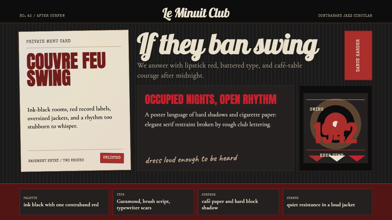 Parisian Zazou (1942)Defiance swings in the dark. Ink black, record-sleeve red, and battered typew…黑暗里摇摆反抗:墨黑、唱片红与破旧打字机节奏。
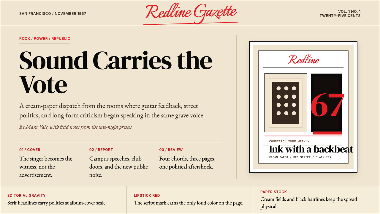 Rolling Stone MagazineCounterculture gets editorial weight. Cream paper, lipstick red script, serif…反主流文化有编辑重量:奶油纸、口红红手写体与粗衬线标题。
 Cartoon Network 90s BlocksKids-cable noise, squared. Black-white checkerboards crash into hot-yellow Bu…方块化的儿童有线电视噪音:黑白棋盘撞上热黄 Bungee 字块。
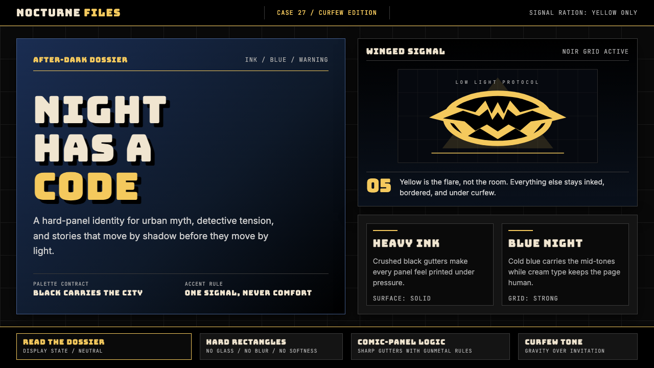 DC Comics Batman NoirGravity, not cheer. Black panels, Gotham blue, and one bat-yellow signal cut…重力而非欢愉:黑色分镜、哥谭蓝与一束蝙蝠黄切开夜色。
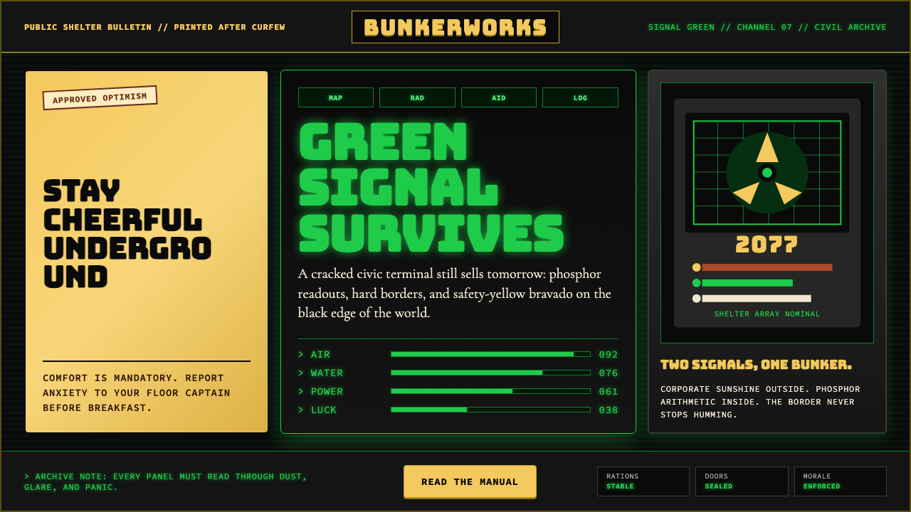 Fallout Vault-Tec Pip-BoyIrradiated optimism. Vault yellow and CRT green lock into a bordered bunker g…辐照乐观主义:避难所黄与CRT绿嵌入硬边地堡网格。