What is Nirvana — Nevermind?什么是 Nirvana — Nevermind?
A chlorinated pool, a dollar on a fishhook, and a baby that made grunge the sound — and the look — of a generation.泳池、鱼钩上的美元,还有一个让垃圾摇滚成为整整一代人声音与面孔的婴儿。
Nirvana — Nevermind in briefNirvana — Nevermind 速览
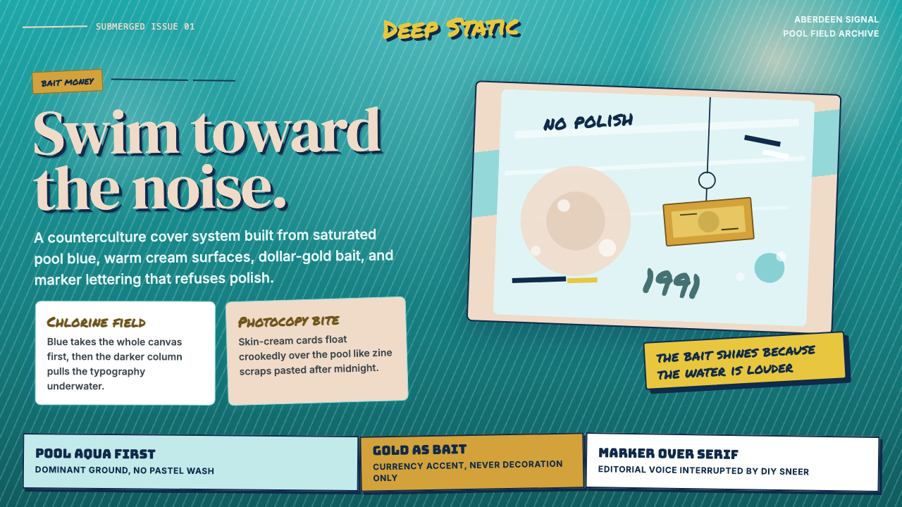
Nirvana — Nevermind is a design system derived from one of the most recognized album covers in recorded music history: the 1991 art-directed photograph of an underwater infant reaching toward a dollar bill suspended on a fishhook. The visual system extracts the exact contrast that made that image iconic — saturated aqua water, warm cream skin, gold-dollar accent, and renegade hand-lettered type — and translates it into a coherent set of design decisions for contemporary use.Nirvana — Nevermind 是一套衍生自录音史上最具辨识度的专辑封面的设计系统:1991年那张艺术指导的水下照片,赤裸婴儿伸手去抓一张挂在鱼钩上的美元钞票。这套视觉系统抽取了使那幅图像成为标志的精确对比——饱和的泳池水蓝、温暖的乳白肤色、美元金点缀,以及用手写涂鸦体反叛主流商业设计精致惯例的字迹——并将它们转化为一组连贯的当代设计决策。
The palette carries the emotional weight of the original: pool-aqua blue as the dominant ground, cream as warmth and counterbalance, dollar-gold as a charged accent that implies both desire and irony, and rough marker-style letterforms that push back against the polished conventions of mainstream commercial design. This is not a nostalgia project. The tension encoded in that original image — innocence reaching for money, purity in an artificial pool — still reads with full force as a visual statement about ambition, co-optation, and counterculture.这套色板承载着原始影像的情感重量:泳池水蓝作为主导底色,乳白作为温度与平衡,美元金作为充满张力的点缀——同时暗示渴望与讽刺——粗粝的马克笔风格字形则对抗着主流商业设计的精致惯例。这不是一个怀旧项目。那幅原始图像中编码的张力——纯真伸手触碰金钱,在人工泳池中的纯洁——作为一种关于野心、收编与亚文化的视觉声明,至今依然力道全开。
As a design system, Nirvana — Nevermind works best where a brand needs to signal independence, rawness, or a deliberately unpolished authenticity. It is grunge in the original sense: texturally honest, anti-decorative, and visually loud in the way that a guitar amp at full distortion is loud — not chaotic, but intentionally saturated.作为一套设计系统,Nirvana — Nevermind 最适合那些需要传递独立性、原始感或刻意未打磨之真实感的品牌。这是原始意义上的垃圾:质感诚实、反装饰,视觉上的响亮方式就像一台推到最大失真的吉他音箱——不是混乱,而是有意为之的饱和。
See the Nirvana — Nevermind design system查看 Nirvana — Nevermind 完整设计系统
Where does Nirvana — Nevermind come from?Nirvana — Nevermind 从何而来?
Nirvana formed in Aberdeen, Washington, in 1987, when Kurt Cobain and Krist Novoselic began playing together in the Pacific Northwest's interconnected network of basement shows and independent venues. Their debut album, Bleach, was released in 1989 on Sub Pop Records for a recording budget of approximately six hundred dollars. The aesthetic of that era — photocopied flyers, hand-lettered show posters, grainy black-and-white photography — was born of necessity, but it codified an entire visual language for the underground music scene that would persist long after necessity ceased to be a constraint.Nirvana 于 1987 年在华盛顿州阿伯丁组建,彼时 Kurt Cobain 与 Krist Novoselic 开始在太平洋西北部密布的地下室演出与独立场馆网络中合作演奏。他们的首张专辑《Bleach》于 1989 年由 Sub Pop 唱片发行,录音预算约六百美元。那个时代的美学——复印传单、手写演出海报、粗粒黑白摄影——起初出于生存必要,却为整个地下音乐场景编纂出一套完整的视觉语言,这套语言在必要性不再是约束条件之后,依然长久延续。
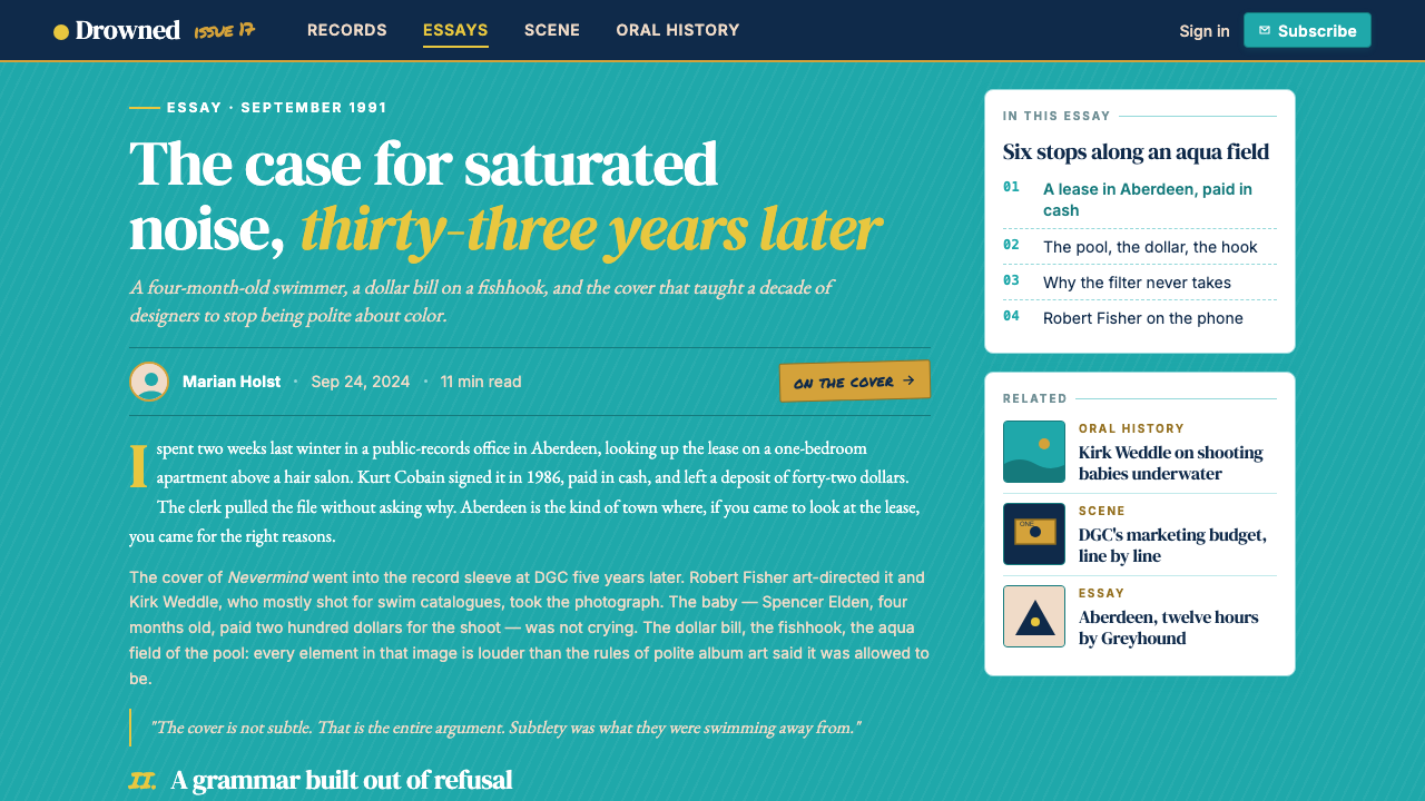
When DGC Records signed Nirvana and released Nevermind in September 1991, the album's cover image was conceived by Cobain, who wanted a water-birth photograph and then refined the concept to include the dollar-bill lure. Photographer Kirk Weddle shot the underwater sequence at a public pool in Pasadena, California, using a four-month-old infant named Spencer Elden. Art director Robert Fisher at DGC assembled the final composition: the near-fluorescent aqua of the chlorinated water, the warmth of Spencer's skin against the cool blue, and the gold dollar bill as the sole focused object in the frame's foreground. The baby reaches; the hook is hidden. The metaphor was impossible to miss.当 DGC 唱片签下 Nirvana 并于 1991 年 9 月发行《Nevermind》时,封面图像的概念由 Cobain 构思——他最初想要一张水中分娩的照片,后来将概念精炼为包含美元钞票诱饵的水下场景。摄影师 Kirk Weddle 在加利福尼亚州帕萨迪纳市的一座公共泳池拍摄了水下系列,主角是一名四个月大的婴儿 Spencer Elden。DGC 的艺术总监 Robert Fisher 完成了最终画面的编排:含氯池水近乎荧光的水蓝,Spencer 皮肤的温度对抗着清冷的蓝,金色美元钞票是画面前景中唯一清晰聚焦的物体。婴儿伸出手;鱼钩被隐藏。隐喻无从错过。
The album sold over thirty million copies worldwide, making it one of the best-selling records ever released. More relevantly for design history, it forced the visual language of the Pacific Northwest underground into global mass circulation. The photocopied grunge aesthetic that had lived on show posters and zine covers was suddenly on billboards and MTV. The collision of counterculture rawness with massive commercial scale created a productive friction: the style was legible at both intimate and monumental scales, and it retained its anti-establishment charge even when deployed by a major label.这张专辑在全球售出逾三千万张,跻身有史以来最畅销的唱片之列。对于设计史而言更关键的是,它将太平洋西北地下音乐圈的视觉语言强行推入全球大众流通。那套曾经活在演出海报与自印杂志封面上的复印垃圾美学,突然出现在广告牌与 MTV 上。亚文化原始感与大规模商业体量的碰撞制造了一种富于张力的摩擦:这套风格在亲密尺度与宏大尺度上同样清晰可读,即使由主流唱片公司部署,也依然保留着反建制的锋芒。
The cultural context of the early 1990s was central to the system's staying power. The preceding decade had been dominated by the slick, high-production aesthetics of arena rock and top-forty pop — chrome gradients, neon glows, airbrushed surfaces. Grunge was the deliberate refusal of all of that. The aqua, cream, and gold of the Nevermind cover were not aspirationally luxurious — they were the accidental colors of a public swimming pool and a piece of printed currency, recombined into something that managed to be both deadpan and visually arresting. That quality — accidental richness — remains the system's defining characteristic.1990 年代初的文化语境是这套系统持久生命力的核心。此前十年被竞技摇滚与四十强流行的光滑高制作美学所主宰——金属渐变、霓虹光晕、气刷修饰的表面。垃圾摇滚是对这一切的刻意拒绝。《Nevermind》封面的水蓝、乳白与金色,并非出于对奢华的向往——它们不过是一座公共泳池与一张印刷货币的偶然色彩,被重新组合成某种既冷静又令人目光难移的东西。这种品质——偶然的丰富性——至今仍是这套系统最决定性的特征。
What defines the Nirvana — Nevermind look?Nirvana — Nevermind 的视觉特征是什么?
Color: Aqua, Cream, and Gold色彩:水蓝、乳白与金
The palette is derived directly from the Nevermind photograph: the saturated blue-green of chlorinated pool water as the dominant field, a warm cream standing in for human skin tone and providing visual warmth against the cool aqua, and a muted dollar-gold used sparingly as accent. The three colors exist in a precise hierarchy — aqua grounds everything, cream provides breathing room and warmth, gold punctuates and implies value. No fourth color is needed. The combination reads as simultaneously clinical and vital, artificial and organic, which mirrors the original image's own ambiguity.色板直接取自《Nevermind》照片:含氯泳池水的饱和蓝绿作为主导底色,温暖的乳白代替人体肤色、在清冷的水蓝中提供视觉温度,克制的美元金极少量地用作点缀。三色存在精确的层级关系——水蓝托住一切,乳白提供呼吸空间与暖意,金色进行强调并暗示价值。不需要第四种颜色。这种组合同时具有临床感与生命力、人工感与有机感,折射出原始图像本身的双重性。
Typography: Grunge Hand-Lettering字体排印:垃圾手写体
The typographic voice of this system is the rough marker letterform — irregular stroke weight, uneven baseline, the deliberate imprecision of something scrawled rather than set. This does not mean illegibility; grunge type is always readable, but it refuses the smoothness of mechanical typesetting. Headlines carry this texture loudly, while body text can step back to a cleaner, more neutral sans-serif to manage reading comfort at length. The contrast between the rough display type and a clean secondary face creates the same productive friction that the album cover itself embodies.这套系统的字体声音是粗粝的马克笔字形——不规则的笔画粗细、不平整的基线、涂写而非排印的刻意不精确。这并不意味着难以辨认;垃圾字体始终可读,只是拒绝机械排版的光滑。标题大声携带这种质感,而正文则可以退至更干净、更中性的无衬线字体,以管理长篇阅读的舒适度。粗粝展示字体与干净次级字体之间的对比,制造出与专辑封面本身所体现的完全相同的生产性摩擦。
Composition: The Unpolished Grid构图:未经打磨的网格
Layout in this system acknowledges the grid but does not obey it rigidly. Elements are allowed to break margins, captions can sit at angles, and white space is distributed unevenly to create tension rather than balance. This is not chaos — the underlying structure is always present — but the grid is treated as a substrate to push against rather than a cage to inhabit. The visual effect echoes the DIY show poster: organized enough to communicate clearly, raw enough to signal that the designer chose rawness deliberately.这套系统的版面承认网格的存在,却不严格服从它。元素被允许突破边距,图注可以倾斜放置,留白被不均匀分布以制造张力而非平衡。这不是混乱——底层结构始终存在——但网格被视为一个可以反抗的基底,而非一个供居住的笼子。视觉效果呼应 DIY 演出海报:足够有组织地清晰传达,又足够原始地表明设计师刻意选择了原始。
Texture and Grain质感与颗粒
Smooth vector cleanliness is refused in favor of deliberate texture. Backgrounds carry a subtle grain, as though printed on newsprint or photocopied one generation too many. Image treatments lean toward high-contrast and slightly washed-out rather than crisp and saturated. This textural quality is what separates authentic grunge-derived design from aqua-and-cream layouts that are merely retro in color but smooth in execution. The grain is the signal: it says the thing was made, not generated.光滑的矢量干净感被拒绝,取而代之的是刻意的质感。背景携带细微的颗粒,仿佛印在新闻纸上或多复印了一代。图像处理倾向于高对比度、略微褪色,而非清晰饱和。这种质感品质是真正源自垃圾的设计与那些色调复古但执行光滑的水蓝乳白版面之间的分野。颗粒是信号:它在说这个东西是被制造出来的,而非生成的。
Irony as Visual Principle反讽作为视觉原则
The original image is built on irony: a baby in a pristine pool, money on a hook, innocence as bait. The design system inherits this structure. Gold is used not to signal luxury but to signal the lure of luxury — a knowing wink rather than an aspiration. Scale juxtapositions can be deliberately uncomfortable. The system rewards designers who understand that the style's power comes from what it refuses to smooth over, not from how pretty it looks when cleaned up.原始图像建立在反讽之上:洁净泳池中的婴儿,钩上的金钱,纯真作为诱饵。设计系统继承了这一结构。金色的使用不是为了传递奢华,而是为了传递对奢华诱惑的感知——是一种心知肚明的眨眼,而非一种向往。尺度并置可以刻意制造不适。这套系统奖励那些理解其力量来自它拒绝平滑掉的东西、而非来自被清理干净后有多好看的设计师。
Photography: Underwater and Against the Grain摄影:水下与逆粒
When photography is used in this system, it carries the visual DNA of Kirk Weddle's original: high-contrast, slightly dreamlike, shot from an unusual angle or with an unusual subject relationship. Underwater or submerged aesthetics translate naturally. Above water, the preferred treatment is high-contrast black-and-white or a strongly color-graded single hue, avoiding the neutral editorial look. Photography should feel like evidence of something real rather than a styled production shot.当摄影在这套系统中被使用时,它携带 Kirk Weddle 原作的视觉 DNA:高对比度、略带梦境感、以不寻常的角度或不寻常的主体关系拍摄。水下或沉浸式美学自然转化。水面之上,首选处理方式是高对比度黑白或强烈色调分级的单色,回避中性的编辑图片风格。摄影应该感觉像某种真实事物的证据,而非一张经过造型的商业图片。
Scale Contrast and Visual Loudness尺度对比与视觉响亮
Nirvana — Nevermind is not a quiet system. Type is set at dramatic scale contrasts — a headline might be several times larger than supporting text not to signal hierarchy alone but to create a visual shout. Negative space is used selectively, concentrated in some areas and nearly absent in others, creating pressure and release. This visual loudness is disciplined, not undisciplined: it comes from deliberate decisions about where to push and where to hold back, mirroring the dynamic range of the music itself.Nirvana — Nevermind 不是一套安静的系统。字体以戏剧性的尺度对比排列——标题可能比辅助文字大出数倍,不仅仅是为了传达层级,而是为了制造视觉上的呐喊。负空间被选择性地使用:在某些区域集中,在另一些区域几乎缺席,制造压力与释放。这种视觉响亮是有纪律的,而非缺乏纪律:它来自关于何处推进、何处收敛的刻意决定,折射音乐本身的动态范围。
See the Nirvana — Nevermind design system查看 Nirvana — Nevermind 完整设计系统
Who shaped Nirvana — Nevermind?谁塑造了 Nirvana — Nevermind?
Cobain was the creative director of his own band's visual identity as much as its songwriter and frontman. He conceived the Nevermind cover concept, insisting on the dollar-bill lure over label resistance, and oversaw the visual tone of the band's promotional materials throughout their career. His aesthetic instincts — authentic material over polished presentation, confrontational imagery over aspirational flattery — define the entire design philosophy the system inherits. His 1991 Vanity Fair interview quote, 'We're so mainstream now it's sickening,' captures the productive tension between counterculture authenticity and commercial reach that underpins the visual system.Cobain 既是乐队的词曲作者与主唱,也是乐队视觉形象的创意总监。他构思了《Nevermind》封面的概念,在唱片公司的阻力下坚持保留美元钩饵,并在整个职业生涯中把控乐队宣传材料的视觉基调。他的美学直觉——真实素材优先于精致呈现,对抗性图像优先于向往性奉承——定义了这套系统所继承的全部设计哲学。他在 1991 年《名利场》采访中的一句话「我们现在已经主流到令人作呕了」,精准捕捉了亚文化真实性与商业触达之间的生产性张力,而这正是这套视觉系统的底层逻辑。
Fisher was the art director at DGC Records who assembled the final Nevermind cover composition. Working with Cobain's concept and Weddle's photographs, Fisher made the key decisions about framing, the relationship between the baby and the dollar bill, and the typographic treatment of the band and album names. His choices — particularly the decision to let the aqua field dominate overwhelmingly with the figure relatively small and centered — created the cover's sense of scale and environmental immersion that distinguishes it from a simple portrait. Fisher's work on Nevermind stands as one of the most influential single design decisions in recorded music history.Fisher 是 DGC 唱片的艺术总监,负责组装《Nevermind》封面的最终构图。在 Cobain 的概念与 Weddle 的照片基础上,Fisher 做出了关于取景、婴儿与美元钞票关系,以及乐队与专辑名称排版处理的关键决定。他的选择——尤其是让水蓝底色以压倒性姿态主导画面、人物相对渺小并居中的决定——制造了封面的尺度感与环境沉浸感,使其区别于一张简单的人物摄影。Fisher 在《Nevermind》上的工作是录音史上最具影响力的单一设计决策之一。
Weddle was the underwater photographer who shot the infant sequences for the Nevermind cover. His technical achievement — capturing a four-month-old infant underwater in conditions that required precise lighting and rapid shooting — was as much an act of documentary instinct as commercial photography. The particular quality of his image, the way the chlorinated water creates a color field that is simultaneously beautiful and slightly uncanny, is the direct source of the system's dominant hue. Weddle's work belongs to a tradition of underwater photography that treats the submerged state as a metaphor for altered consciousness, vulnerability, and the boundary between breath and drowning.Weddle 是拍摄《Nevermind》封面婴儿水下序列的水下摄影师。他的技术成就——在需要精确布光与快速拍摄的条件下捕捉一名四个月大婴儿的水下画面——既是商业摄影,也是一种纪录本能的行为。他图像的特定品质,那种含氯池水同时既美丽又略带诡异的色调场,是这套系统主导色彩的直接来源。Weddle 的工作属于一种水下摄影传统,这种传统将沉浸状态视为意识改变、脆弱性以及呼吸与溺水之间边界的隐喻。
Grohl joined Nirvana in 1990 as drummer, completing the trio that recorded Nevermind. Beyond his musical contribution, Grohl represents the collaborative and relatively democratic creative culture within the band — the sense that the visual and sonic identity of Nirvana was a collective output rather than a solo auteur project. After Cobain's death in 1994, Grohl went on to found Foo Fighters, carrying grunge's visual DNA into subsequent decades and demonstrating how the raw-but-structured aesthetic could adapt across changing mainstream contexts while retaining its essential character.Grohl 于 1990 年以鼓手身份加入 Nirvana,完成了录制《Nevermind》的三人阵容。超越音乐贡献之外,Grohl 代表着乐队内部的合作与相对民主的创作文化——Nirvana 的视觉与声音身份是集体产出,而非单一作者项目的感觉。1994 年 Cobain 去世后,Grohl 创立了 Foo Fighters,将垃圾摇滚的视觉 DNA 带入此后数十年,展示了这套原始而结构化的美学如何在不断变化的主流语境中适应演化,同时保持其本质特征。
Sub Pop, the Seattle independent label that released Nirvana's debut, was as responsible for the visual language of Pacific Northwest grunge as the bands it signed. The label's house aesthetic — deliberately lo-fi photography, photocopied promotional materials, hand-lettered or rough-set type, a consistent brown-and-cream-and-black palette in early releases — established the vocabulary that Nevermind then translated into mainstream visibility. Sub Pop co-founders Bruce Pavitt and Jonathan Poneman understood that the visual aesthetic was inseparable from the musical and subcultural identity they were building, and their art direction choices became the foundation of an entire regional design vernacular.Sub Pop 是发行 Nirvana 首张专辑的西雅图独立厂牌,对太平洋西北部垃圾摇滚视觉语言的贡献不亚于其旗下的乐队。厂牌的内部美学——刻意低保真的摄影、复印宣传材料、手写或粗粝排版,以及早期发行物一贯的棕、乳白与黑色调——建立了《Nevermind》随后将其转化为主流可见度的视觉词汇。Sub Pop 联合创始人 Bruce Pavitt 与 Jonathan Poneman 理解,视觉美学与他们正在构建的音乐和亚文化身份不可分割,他们的艺术总监决策成为整个地区设计方言的基础。
How do you use Nirvana — Nevermind today?今天怎么用 Nirvana — Nevermind?
Nirvana — Nevermind works best in contexts where a brand needs to signal counterculture credibility, independent spirit, or a deliberately anti-corporate identity. Music platforms, independent record labels, documentary streaming services, arts and culture publications, streetwear and alternative fashion, and any product targeting audiences who value authenticity over polish are natural homes for this system. The key is that the rawness must be intentional and controlled — grunge deployed carelessly reads as neglect rather than attitude.Nirvana — Nevermind 最适合那些需要传递亚文化公信力、独立精神或刻意反企业形象的品牌语境。音乐平台、独立唱片公司、纪录片流媒体服务、艺术文化出版物、街头服饰与另类时尚,以及任何面向重视真实性胜于精致感的受众的产品,都是这套系统的天然归宿。关键在于:原始感必须是有意且受控的——随意部署的垃圾美学读起来像疏忽,而非态度。
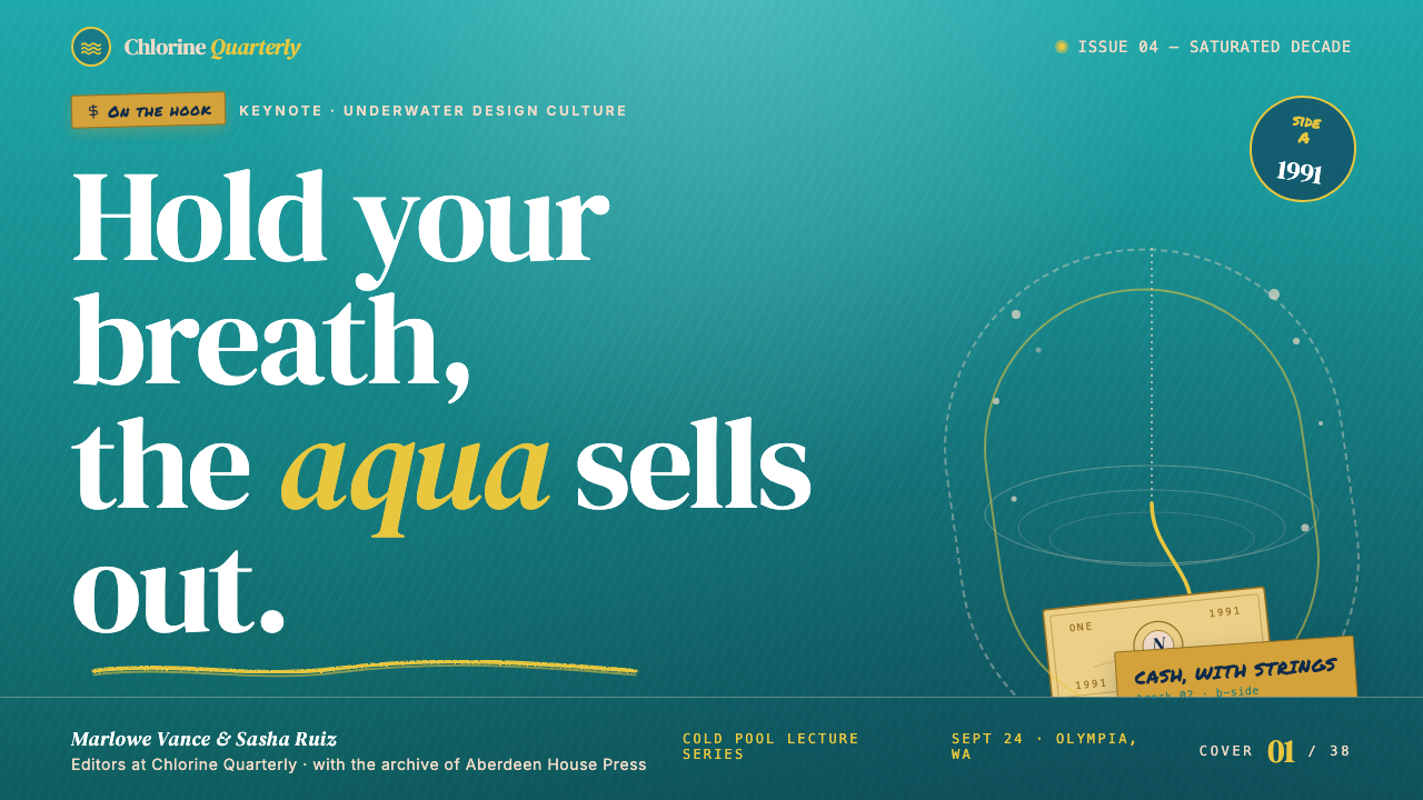
For presentation slides, the system's cover page should lead with the dominant aqua field, with the title set in rough display type at a scale that commands attention. The cover benefits from a single strong image — preferably photographic, high-contrast, shot from an unusual angle — positioned so that it creates tension with the type rather than sitting politely beside it. Content slides should use the cream field as the primary background, reserving the aqua for section dividers or key callout blocks. Data slides work well in this system when charts are treated as graphic objects: bars and areas rendered in the primary palette without gradients or rounded corners, with annotation set in a contrasting weight that reads as handwritten rather than mechanically placed.在演示文稿中,封面页应以水蓝主色调引领,标题以粗粝展示字体排版至足以命令注意力的尺度。封面适合以单张强有力的图像——最好是摄影作品、高对比度、以不寻常的角度拍摄——与文字形成张力,而非礼貌地并排。内容页应以乳白色作为主要背景,将水蓝保留给分节块或关键引用块。数据页在这套系统中,适合将图表当作图形对象处理:条形图与面积图以主色板渲染,无渐变,无圆角,注释以一种对比字重排版,读起来像手写而非机械排布。
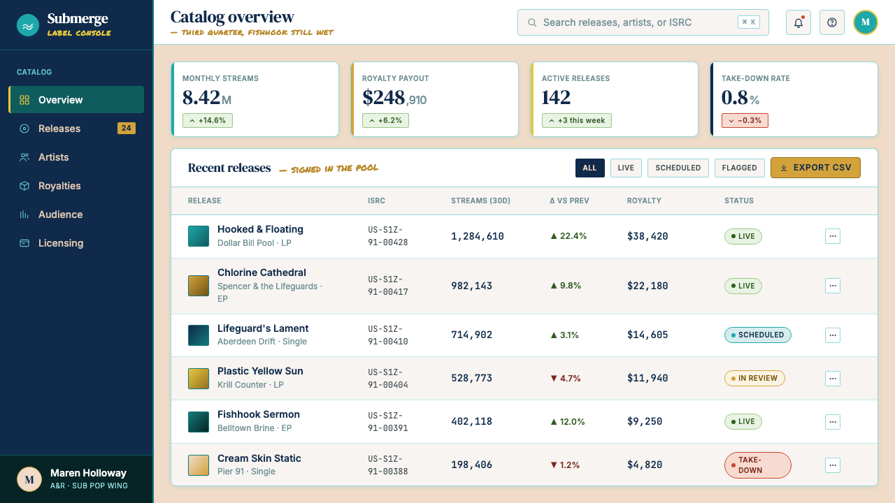
For web interfaces, the system is well-suited to artist portfolios, music and culture dashboards, editorial platforms, and pricing pages where an alternative or indie brand positioning is the goal. A dashboard built in this system uses the aqua as the primary brand color in the navigation and key metric displays, cream as the card and panel background, and the rough typographic treatment for section headers. Interactive states and calls to action use the gold accent. The overall effect should feel like a fanzine designed by someone who also knows grid systems — not accidental roughness, but roughness as intention.对于网页界面,这套系统尤其适合艺术家作品集、音乐文化仪表板、编辑平台,以及以另类或独立品牌定位为目标的定价页面。以这套系统构建的仪表板,在导航与核心指标展示中使用水蓝作为主品牌色,乳白作为卡片与面板背景,节标题使用粗粝排版处理。交互状态与行动号召使用金色点缀。整体效果应该像是由同时懂得网格系统的人设计的粉丝杂志——不是偶然的粗粝,而是作为意图的粗粝。
For editorial and marketing work, the system supports long-form layouts where the texture adds reading interest rather than friction. A Nirvana — Nevermind editorial page uses wide margins for marginalia and pull quotes set at angles, with section breaks marked by a thick horizontal rule or a raw ink-texture element rather than a clean line. Marketing materials — event posters, social cards, campaign headers — should lean into the poster heritage of the style: full-bleed aqua or cream backgrounds, type at confrontational scale, gold used as a single flash of accent rather than distributed decoration. The style's poster-DNA means it scales from phone screen to billboard without losing coherence.对于编辑与营销内容,这套系统支持质感为阅读增添趣味而非摩擦的长篇版面。Nirvana — Nevermind 编辑页面在宽阔边距中放置倾斜的旁注与引用语,以粗水平线或原始墨水质感元素而非干净线条标记段落分隔。营销材料——活动海报、社交卡片、活动横幅——应深入这种风格的海报传统:满版水蓝或乳白背景,文字以对抗性尺度排版,金色作为单次点缀闪光而非分散装饰。这种风格的海报 DNA 意味着它从手机屏幕到广告牌均不失连贯性。
The most common mistake when applying this system is confusing distressed aesthetics with lack of craft. Authentic grunge-derived design is always controlled: the roughness is a decision, the grain is applied at a specific density, the type choice is deliberate even when it looks impulsive. A second common error is using the aqua-cream-gold palette on a layout that is otherwise pristine and smooth — the color alone does not make the system. If the grid is tight, the type is clean, and the surfaces are smooth, the palette will read as an aqua-tinted corporate deck rather than as Nevermind. The texture, the type treatment, and the composition must all carry the same DNA for the system to cohere.应用这套系统时最常见的错误,是将做旧美学与缺乏工艺混为一谈。真正源自垃圾的设计始终是受控的:粗粝是一个决定,颗粒以特定密度施加,字体选择是刻意的,即使看起来是冲动的。第二个常见错误是将水蓝乳白金的色板用于一个在其他方面无可挑剔且光滑的版面——仅凭色彩并不构成这套系统。如果网格是严密的,字体是干净的,表面是光滑的,那套色板将被读作一个水蓝调的企业幻灯片,而非《Nevermind》。质感、字体处理与构图必须全部携带相同的 DNA,这套系统才能保持连贯。
See the Nirvana — Nevermind design system查看 Nirvana — Nevermind 完整设计系统
Nirvana — Nevermind — FAQNirvana — Nevermind · 常见问题
Is this style appropriate for corporate or enterprise clients?这种风格适合企业或大客户吗?
It depends entirely on what the enterprise client wants to signal. A conventional financial services firm or healthcare provider will find the raw, anti-polish quality of this system at odds with their need to project stability and trustworthiness — the grain and grunge type will undermine rather than support their brand values. However, a tech company positioning itself as a challenger brand, a streaming service targeting independent creators, or an enterprise client in the music or entertainment industry can use the system effectively. The question to ask is not 'is the client big or small?' but 'does the client want to be perceived as part of the establishment or as pushing against it?'这完全取决于企业客户想要传达什么信号。传统金融服务公司或医疗机构会发现这套系统的原始反精致品质与它们投射稳定性与可信度的需求相悖——颗粒与垃圾字体会削弱而非支撑它们的品牌价值。然而,一家将自身定位为挑战者品牌的科技公司、一家面向独立创作者的流媒体服务,或一家音乐或娱乐行业的企业客户,都可以有效地使用这套系统。需要问的问题不是「客户大还是小?」而是「客户想被视为体制的一部分,还是体制的反叛者?」
How do you use the gold accent without it reading as luxury or premium branding?如何使用金色点缀,同时避免它被读作奢华或高端品牌?
The key is context and quantity. In the Nevermind cover, the dollar bill's gold is not aspirationally luxurious — it is the bait on a hook, and the image makes that function clear. In a design system, you maintain that ironic distance by using gold sparingly, pairing it with rough type and textured surfaces rather than with smooth gradients and clean geometry, and ensuring it appears in contexts that reference value ironically rather than earnestly. A gold highlight on a price point in a rough-textured card reads very differently from the same gold on a glossy, precision-set pricing table. The roughness of the surrounding system contains the gold's associations.关键在于语境与用量。在《Nevermind》封面中,美元钞票的金色并非出于对奢华的向往——它是鱼钩上的诱饵,图像使这一功能清晰可见。在设计系统中,通过以下方式维持那种反讽距离:少量使用金色,将它与粗粝字体和质感表面配对而非与光滑渐变和干净几何配对,并确保它出现在以反讽而非认真的方式指涉价值的语境中。粗粝质感卡片上的价格点金色高亮,与同样的金色出现在光滑精准排版的定价表上,读起来截然不同。周围系统的粗粝包含了金色的联想。
Can this system work in a light mode / dark mode toggle?这套系统可以支持浅色模式与深色模式切换吗?
Yes, with care. The light mode is the canonical form: aqua ground, cream panels, dark type. A dark inversion replaces the aqua with a very deep teal or near-black with a blue-green cast, uses cream type against it, and keeps the gold accent. What must be preserved in both modes is the textural quality — the grain, the rough type treatment, the uneven composition. A dark mode that is smooth and glossy will abandon the system's identity entirely. The safest approach is to design the light mode first, then derive the dark mode by shifting the ground to dark and the type to cream, rather than adding dark mode as an afterthought.可以,但需要谨慎。浅色模式是这套系统的标准形态:水蓝底色、乳白面板、深色字体。深色反转将水蓝替换为非常深的蓝绿或带蓝绿色调的近黑,以乳白字体反衬,并保留金色点缀。两种模式下必须保留的是质感品质——颗粒、粗粝的字体处理、不均匀的构图。光滑而有光泽的深色模式会彻底放弃这套系统的身份。最安全的方法是先设计浅色模式,然后通过将底色移至深色、字体移至乳白来派生深色模式,而非将深色模式作为事后补丁添加。
How does this system relate to other 1990s aesthetic revivals like Y2K or vaporwave?这套系统与 Y2K 或蒸汽波等其他 1990 年代美学复兴有何关联?
They share a decade of origin but very different cultural DNA. Y2K aesthetics celebrate the optimistic techno-utopianism of late-1990s digital culture — chrome surfaces, lens flares, the sheen of a future that was supposed to arrive at midnight on January 1, 2000. Vaporwave is an ironic hypercommodification of early-internet and mall-culture aesthetics, bathed in pastel purples and pinks. Nirvana — Nevermind belongs to neither of these. It is pre-digital in feeling, rooted in analog print culture, and hostile to the optimism that both Y2K and vaporwave — even ironically — celebrate. The shared 1990s time frame is misleading; the visual values are nearly opposite.它们共享一个十年的起点,但文化 DNA 截然不同。Y2K 美学歌颂 1990 年代末数字文化的乐观技术乌托邦主义——铬表面、镜头光晕、那个本该在 2000 年 1 月 1 日午夜到来的未来的光泽。蒸汽波是对早期互联网和购物中心文化美学的反讽式超商品化,沐浴在粉紫与粉红之中。Nirvana — Nevermind 不属于其中任何一种。它在感觉上是前数字的,根植于模拟印刷文化,并且对 Y2K 和蒸汽波——即使是以反讽方式——所歌颂的乐观主义持敌对态度。共享的 1990 年代时间框架具有误导性;视觉价值观几乎截然相反。
What kinds of brands or products should avoid this system?哪些品牌或产品应该避开这套系统?
Any context requiring warmth, accessibility, and organic softness should avoid this system: children's products, wellness and mental health applications, food and beverage brands emphasizing naturalness, financial products targeting risk-averse consumers, and healthcare services. The system's deliberate loudness and confrontational quality, combined with the ironic edge of its color relationships, can read as aggressive or alienating in these contexts. Similarly, brands that require the perception of precision and premium craft — luxury goods, high-end real estate, precision engineering — will find that the grain and rough typography undermine the quality signals they need. The test is simple: if the brand's core promise is comfort, safety, or luxury, this is not the right system.任何需要温暖感、亲和力与有机柔软感的语境都应避开这套系统:儿童产品、健康与心理健康应用、强调自然性的食品饮料品牌、面向风险厌恶型消费者的金融产品,以及医疗服务。这套系统刻意的响亮感与对抗性品质,加上其色彩关系的反讽锋芒,在这些语境中可能被读作攻击性或疏离感。同样,需要传递精准与高端工艺感知的品牌——奢侈品、高端房地产、精密工程——会发现颗粒与粗粝字体破坏了它们所需要的品质信号。测试很简单:如果品牌的核心承诺是舒适、安全或奢华,这就不是合适的系统。
Related design styles相关设计风格
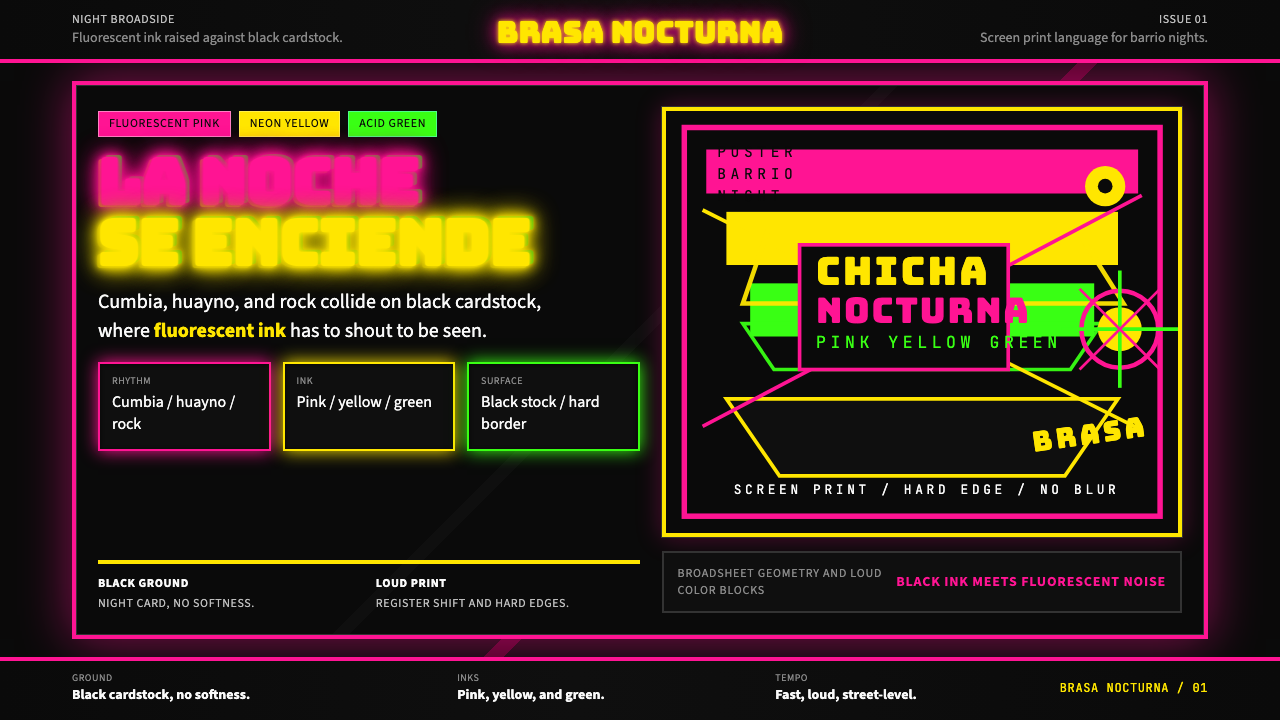 Peruvian Chicha Fluorescent PosterStreet-night fury. Pink, yellow, and green stack on black cardstock in hard b…夜街怒吼。粉黄绿硬边叠在黑卡纸上。
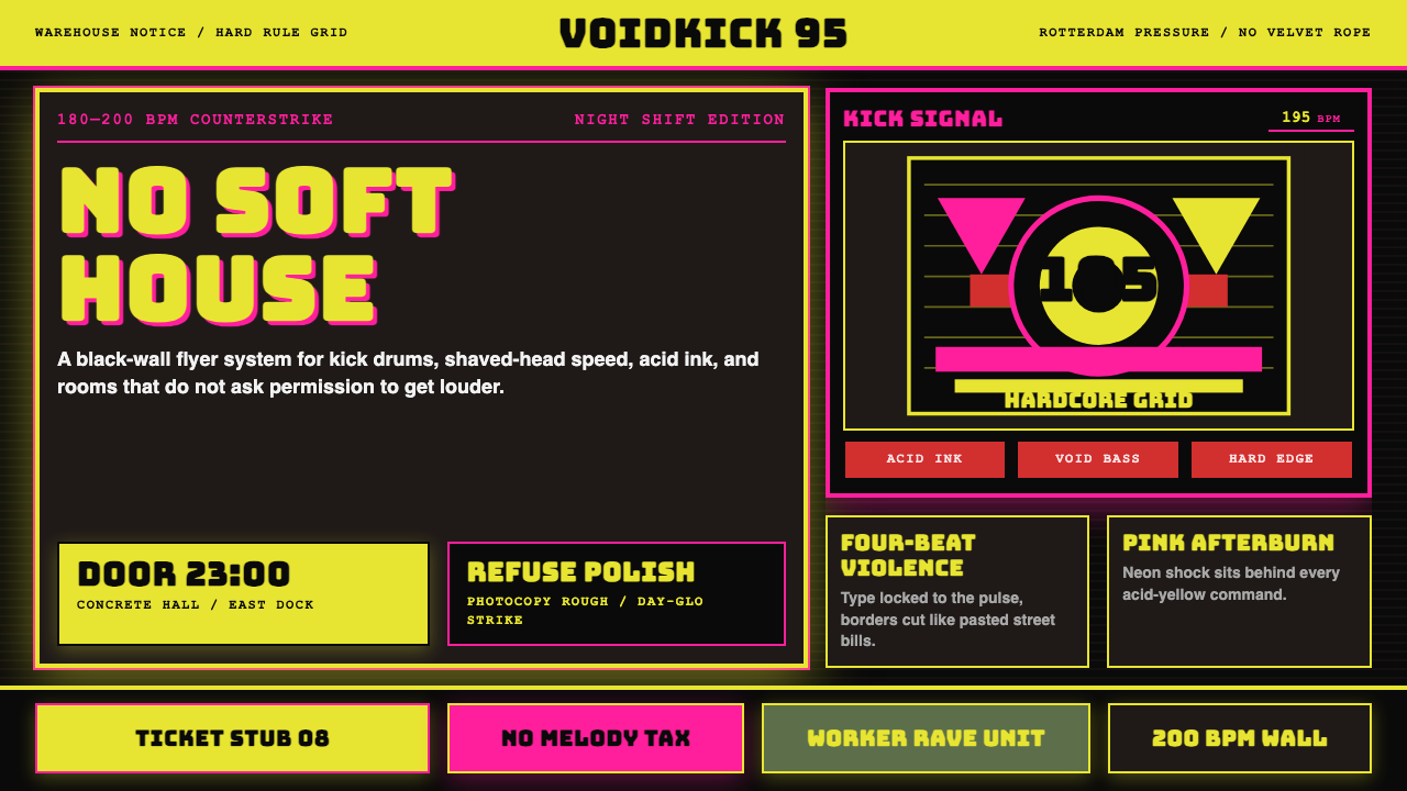 Rotterdam Gabber HardcoreHardcore refuses polish. Acid yellow, neon pink, black grid, and brutal Bunge…硬核拒绝精致:酸黄、霓虹粉与黑色网格,让粗暴 Bungee 字体像传单砸来。
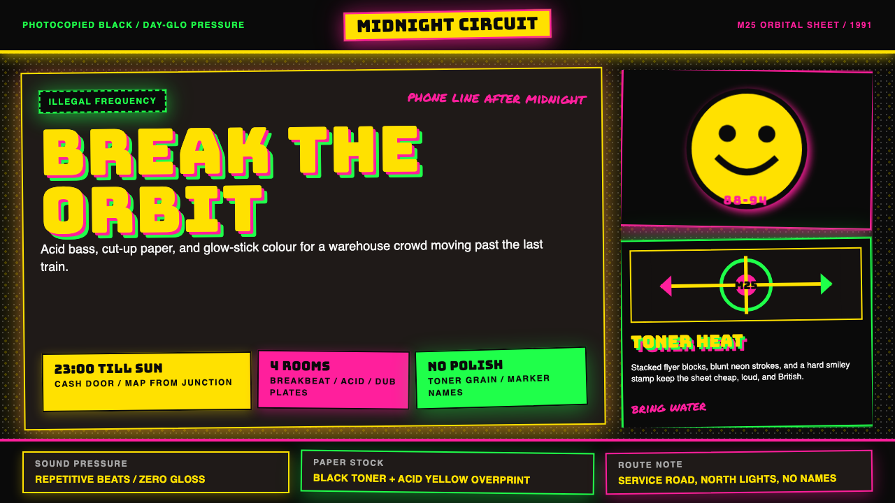 UK Rave Glow-Stick FlyerIllicit euphoria. Acid yellow, rave pink, and laser green slam into photocopi…非法狂喜。荧光黄、粉、绿撞上复印黑。
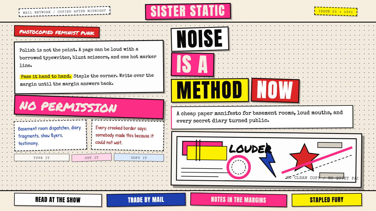 Riot Grrrl Zine (1991)DIY fury, unpolished. Cream Xerox grain, black toner type, hot-pink marker co…DIY怒火,拒绝精致。米色复印颗粒、黑碳粉字与荧光粉拼贴。
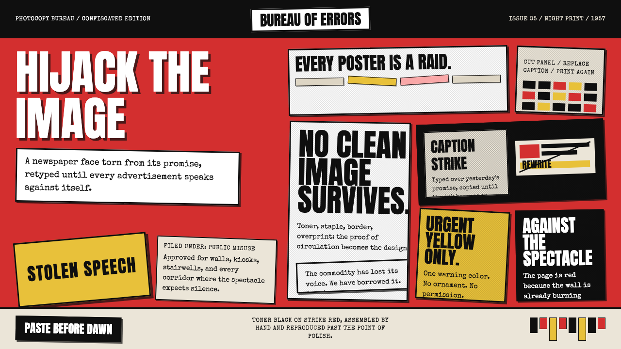 Situationist Détournement (1957)Contraband urgency. Strike red, toner black, and jagged comic panels make the…违禁般急迫:罢工红、碳粉黑与粗剪漫画格,让理论像偷印传单。
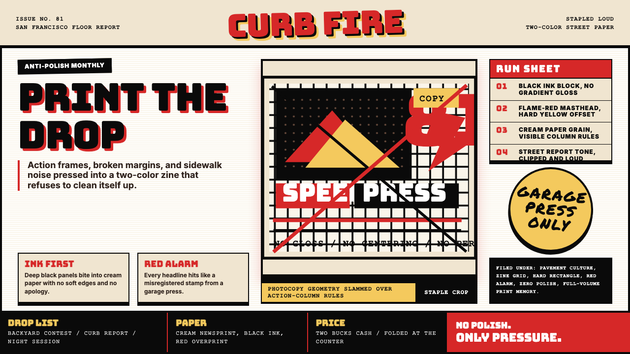 Thrasher Skate Zine (1981)Loud without polish. Flame red type, black ink blocks, and cream zine grids h…粗粝而响亮:火焰红大字、黑墨块与米色小报网格重击页面。