What is Peruvian Chicha Fluorescent Poster?什么是 Peruvian Chicha Fluorescent Poster?
Lima's chicha poster tradition turns night-black cardstock into a fluorescent battlefield — screaming pink, acid green, and neon yellow fighting for every eye on the city street.利马奇恰海报传统将漆黑卡纸变为荧光战场——刺眼的粉红、酸性绿和霓虹黄在城市街头争夺每一双眼睛。
Peruvian Chicha Fluorescent Poster in briefPeruvian Chicha Fluorescent Poster 速览
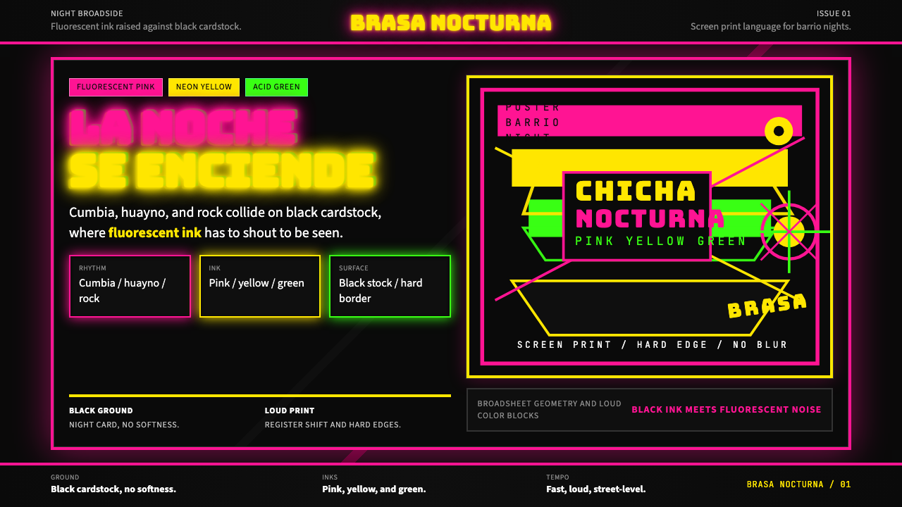
The Peruvian chicha fluorescent poster is a vernacular graphic tradition born in the working-class barrios of Lima, Peru. It is defined by maximum-saturation fluorescent inks — electric pink, acid green, neon yellow — layered directly onto night-black cardstock, with hand-painted dimensional lettering, deliberate overprint registration shifts, and a compositional logic that treats every centimeter of surface as a declaration of presence. The style takes its name from chicha, the Andean fermented drink, but more directly from chicha music — a fusion of Andean huayno melody, cumbia rhythm, and electric guitar energy that became the soundtrack of Peru's internal urban migration in the 1970s and 1980s.秘鲁奇恰荧光海报是一种诞生于利马工人阶级社区的本土平面传统。其定义性特征是极度饱和的荧光油墨——电光粉、酸性绿、霓虹黄——直接叠印在漆黑的卡纸底面上,辅以手绘立体字母、刻意错位的套印叠加,以及一种将每一平方厘米版面都视为存在宣言的构图逻辑。这种风格以奇恰命名——奇恰既是安第斯传统发酵饮料,更直接指向奇恰音乐:安第斯瓦伊诺旋律、库姆比亚节奏与电吉他能量的融合,这种融合成为秘鲁1970至80年代内部城市移民潮的主题音乐。
Where most graphic traditions work by organizing space, the chicha poster works by saturating it. There is no negative space in the conventional sense, no breath between elements, no hierarchy built on restraint. Instead, every layer competes with every other: a title in raised three-dimensional lettering fights a starburst background fights a bordered announcement panel fights a fluorescent color field. The effect is not chaos but a kind of maximum-volume visual music — the poster equivalent of a cumbia band playing at full power in an open courtyard.大多数平面传统通过组织空间来运作,奇恰海报则通过饱和空间来运作。这里没有传统意义上的留白,元素之间没有喘息,层级不依靠克制来建立。取而代之的,是每一层都在与其他层竞争:立体浮雕标题对抗星爆放射背景,对抗有边框的公告栏,对抗荧光色块。效果并非混乱,而是一种最大音量的视觉音乐——相当于一支库姆比亚乐队在露天庭院里以全力演奏。
The tradition operates within a specific material and social context. Posters were printed quickly and cheaply for immediate public posting — announcing weekend concerts, dances, and festivals in districts like El Agustino, Comas, and Villa El Salvador on the outskirts of Lima. The fluorescent inks were chosen not for aesthetic sophistication but for raw visibility: these posters had to be legible at night, at distance, in competition with every other surface on a dense urban block. The design choices that now read as style were originally solutions to the problem of being seen.这一传统在特定的物质与社会语境中运作。海报被快速、廉价地印制,用于即时张贴——宣布在利马郊区阿古斯蒂诺区、科马斯区、萨尔瓦多别墅区等地举行的周末音乐会、舞会和节庆。荧光油墨的选择并非出于美学上的精妙,而是为了生存意义上的可见性:这些海报必须在夜间、在远处、在密集城市街区的每一个竞争表面中清晰可辨。那些如今被解读为风格的设计选择,最初不过是解决「被看见」这一问题的方案。
See the Peruvian Chicha Fluorescent Poster design system查看 Peruvian Chicha Fluorescent Poster 完整设计系统
Where does Peruvian Chicha Fluorescent Poster come from?Peruvian Chicha Fluorescent Poster 从何而来?
The chicha poster tradition emerged in the 1970s alongside the music it announced. Peru was undergoing one of the most dramatic urban migrations in Latin American history: millions of rural Andeans, primarily from the Sierra and the Amazon basin, moved to Lima seeking economic opportunity. By 1980, Lima's population had more than doubled within a generation. The migrants brought their music with them — huayno, the Andean modal folk tradition — and found it colliding and fusing with the Colombian cumbia rhythms circulating through Lima's coastal districts. The result was chicha music: a genuinely hybrid urban-Andean sound that belonged to neither the traditional highland nor the established coastal elite, but to the new working-class barrio.奇恰海报传统在1970年代随它所宣传的音乐一同涌现。秘鲁正经历拉丁美洲历史上最剧烈的城市化移民浪潮之一:数百万来自安第斯高原和亚马逊流域的农村人口涌入利马寻求经济机会。到1980年,利马人口在一代人之内翻了一番有余。移民们带来了自己的音乐——瓦伊诺,安第斯高原的调式民谣传统——并发现它与流通于利马沿海社区的哥伦比亚库姆比亚节奏碰撞融合。结果是奇恰音乐的诞生:一种真正混血的城市安第斯声音,既不属于传统高原,也不属于既有的沿海精英,而是属于新兴工人阶级社区。
The posters that announced chicha concerts were made by anonymous screen-printers working in small operations scattered across Lima's peripheral districts. These printers worked from hand-cut stencils and mixed their own inks, often combining standard printing colors with fluorescent pigments imported from industrial supply chains. The dimensional lettering — letters that appear raised, beveled, or extruded — was developed as a technique to make type readable from greater distances and at night, when flat lettering would be lost against a dark background. Registration shifts, where two or more ink passes are intentionally misaligned to create a shadow or halo effect, were partly a production artifact and partly a deliberate compositional choice that added visible energy to the surface.宣传奇恰音乐会的海报由散布在利马郊区的小型丝网印刷工坊的匿名印刷工制作。这些印刷工使用手工裁切的模版,自行调配油墨,常将标准印刷色与从工业供应链进口的荧光颜料混合。立体字母——看起来被凸起、倒角或挤出的字形——是为在更远距离和夜间条件下使文字可读而开发的技术;平面字母在暗色背景下将会消失。套印偏移——两次或多次油墨印刷有意错位以制造阴影或光晕效果——部分是生产工艺的自然产物,部分是为版面增添可见能量的刻意构图选择。
The tradition remained largely anonymous until the 2000s, when graphic design scholarship began documenting chicha culture as a significant vernacular tradition. The decisive figure in the transition from anonymous craft to recognized art form was Elliot Tupac, a Lima-born designer who began working in the chicha poster tradition around 2006. Tupac's contribution was not to modernize or sanitize the style but to understand and amplify its internal logic — scaling the posters to monumental sizes, refining the dimensional lettering technique, and engaging international art and design institutions without abandoning the tradition's working-class roots. His collaborations with international brands and cultural institutions from the mid-2000s onward brought global attention to a tradition that had been visible on Lima's walls for three decades but largely invisible to the design establishment.这一传统在2000年代以前基本处于匿名状态,直至平面设计学术界开始将奇恰文化记录为重要的本土传统。在从匿名工艺向公认艺术形式转变的过程中,决定性人物是利马出生的设计师埃利奥特·图帕克,他约于2006年开始深入奇恰海报传统的工作。图帕克的贡献不是将这种风格现代化或净化,而是理解并放大它的内在逻辑——将海报放大至纪念碑尺寸,精炼立体字母技术,同时在与国际艺术和设计机构合作时不放弃这一传统的工人阶级根基。他从2000年代中期开始与国际品牌和文化机构的合作,为一个在利马街墙上可见了三十年却对设计界几乎不可见的传统带来了全球关注。
The geographic spread of the style reflects the geography of Andean migration. While Lima — and particularly its northeastern cone districts — is the tradition's center, significant poster-making cultures developed in Iquitos (the Amazonian capital, accessible only by river or air), Pucallpa (a river port city in the Ucayali region), and Trujillo (the northern coastal city with its own cumbia traditions). Each regional variant has subtle inflections: Amazonian posters tend toward even denser layering and a stronger presence of organic and zoomorphic imagery; northern coastal variants show more influence from international cumbia graphics. But the shared DNA — black ground, fluorescent primaries, dimensional type, maximum saturation — is consistent across the tradition.这种风格的地理扩散反映了安第斯移民的地理轨迹。虽然利马——尤其是其东北角区——是这一传统的中心,但在伊基托斯(仅可经水路或空路抵达的亚马逊首府)、普卡尔帕(乌卡亚利地区的河港城市)和特鲁希略(拥有自身库姆比亚传统的北部沿海城市)也发展出了显著的海报制作文化。每个地区的变体都有细微差异:亚马逊海报倾向于更密集的分层和更强烈的有机及动物形象存在;北部沿海变体则显示出更多国际库姆比亚图形的影响。但共同的基因——黑色底面、荧光原色、立体字体、最大饱和度——在整个传统中保持一致。
What defines the Peruvian Chicha Fluorescent Poster look?Peruvian Chicha Fluorescent Poster 的视觉特征是什么?
Fluorescent Color on Black黑底荧光色
The defining chromatic move is fluorescent ink applied directly to night-black cardstock. The colors — electric pink, acid green, neon yellow, occasionally blazing orange — are not chosen to harmonize with one another but to maximize individual luminosity against the darkest possible ground. On a black surface, fluorescent pigments appear to emit their own light. The result is a color system that operates by contrast intensity rather than by hue relationships: each color is fighting the darkness, not relating to its neighbors.最具定义性的色彩手法是将荧光油墨直接施于漆黑卡纸。电光粉、酸性绿、霓虹黄、偶尔出现的炽橙——这些颜色的选择并非为了相互和谐,而是为了在最暗的底面上最大化各自的发光强度。在黑色表面上,荧光颜料看起来像在自发光。结果是一套依靠对比强度而非色相关系运作的色彩系统:每种颜色都在与黑暗搏斗,而非与邻色对话。
Dimensional Hand-Painted Lettering手绘立体字母
Typography in the chicha tradition is not set from a typeface but built by hand — each letterform constructed with beveled edges, cast shadows, inner highlights, and a sense of physical mass. Letters appear extruded from the surface rather than printed onto it. This three-dimensional quality was developed originally for legibility at distance and in low light, but it became the style's most distinctive graphic signature. The letterforms are thick, condensed, and tightly packed, with internal color fills that shift from one fluorescent to another within a single word.奇恰传统中的字体排印不是从现有字型设置,而是逐字手工构建——每个字形都有倒角边缘、投射阴影、内部高光和实体质感。字母看起来是从版面挤出来的,而非印在上面的。这种立体感最初是为了在远距离和低光环境下保证可读性而开发的,但它成为这种风格最具辨识度的图形标志。字形粗重、紧缩、密集排列,内部色彩填充在单个词语中从一种荧光色转换至另一种。
Registration-Shift Overprinting套印偏移叠加
Multiple ink passes are printed with deliberate or semi-deliberate misalignment, creating halos, echoes, and shadow outlines around letterforms and graphic elements. Where two fluorescent colors overlap in a shift, they produce a third color — green and pink produce a warm yellow-orange; yellow and pink create an almost white flare. These overprint zones are not errors to be corrected but active compositional elements that add visual vibration and depth to what is otherwise a flat surface.多次油墨印刷以刻意或半刻意的错位进行,在字形和图形元素周围产生光晕、回声和阴影轮廓。当两种荧光色在偏移中叠加时,它们产生第三种颜色——绿色与粉红产生暖黄橙色;黄色与粉红制造出近乎白色的耀斑。这些叠印区域不是需要纠正的错误,而是积极的构图元素,为本质上平面的表面添加视觉振动和深度。
Maximum Surface Density最大版面密度
The chicha poster rejects negative space as a compositional tool. Every zone of the surface carries information or color or both. Backgrounds are not passive fields but active starburst patterns, radiating lines, geometric fills, or repeated motifs. Announcement panels are stacked vertically in bands. The resulting density is not the result of poor design judgment but of a specific visual philosophy: visibility requires occupation. A surface that is empty is a surface that loses.奇恰海报拒绝留白作为构图工具。版面的每一个区域都承载着信息或色彩,或两者兼有。背景不是消极的底面,而是活跃的星爆图案、放射线条、几何填充或重复母题。公告栏以横带形式垂直叠加。由此产生的密度不是拙劣设计判断的结果,而是特定视觉哲学的体现:可见性需要占领。空白的表面就是失败的表面。
Starburst and Radial Geometry星爆与放射几何
Among the most recognizable recurring motifs in the chicha vocabulary is the starburst or sunburst — radiating rays emanating from a central point, covering the background behind a title or filling the corners of a composition. These radial forms serve multiple functions: they direct attention toward the center, they create contrast zones that make overlaid text legible, and they carry a festive energy inherited from carnival and street-fair visual traditions. Stars, sunbursts, and geometric ray patterns appear in almost every classic chicha poster.在奇恰词汇中最具辨识度的反复母题之一是星爆或旭日——从中心点向外放射的光线,覆盖标题后方的背景或填充构图的角落。这些放射形式具有多重功能:将注意力引向中心,制造使叠加文字清晰可读的对比区域,并承载从嘉年华和街头集市视觉传统继承而来的节庆能量。星形、旭日和几何光线图案几乎出现在每一张经典奇恰海报上。
Festive Illustrative Borders节庆装饰边框
Rather than the clean ruled lines of European modernism, the chicha poster uses elaborate borders built from repeated geometric units, wave patterns, stepped Andean textile motifs, and star clusters. These borders delineate announcement zones and separate bands of information. They are functional as dividers but simultaneously ornamental as surface decoration, drawing on both pre-Columbian Andean textile geometry and twentieth-century commercial print convention. The border is never an afterthought — it is a designed element as intentional as the headline.与欧洲现代主义的清洁直线不同,奇恰海报使用由重复几何单元、波浪图案、阶梯状安第斯纺织母题和星团构成的精心边框。这些边框划定公告区域,分隔信息横带。它们作为分隔线具有功能性,同时作为表面装饰具有观赏性,既借鉴前哥伦布时期安第斯纺织品几何图案,也借鉴二十世纪商业印刷惯例。边框从不是事后的补充——它是与标题一样刻意设计的元素。
Cultural Hybridity文化混血性
The visual language of the chicha poster is itself a reflection of its cultural origins — a fusion of Andean indigenous geometry, Spanish colonial baroque ornament, twentieth-century commercial print techniques, and the kinetic energy of Latin American popular festivity. No single source dominates. Pre-Columbian stepped patterns and zoomorphic motifs coexist with Catholic saint iconography and generic commercial starburst patterns. This layered hybridity is not eclectic confusion but a genuine visual record of Andean-mestizo urban identity in formation.奇恰海报的视觉语言本身就是其文化起源的映射——安第斯原住民几何图案、西班牙殖民巴洛克装饰、二十世纪商业印刷技术和拉丁美洲民间庆典动感能量的融合。没有单一来源占主导。前哥伦布时期阶梯图案和动物母题与天主教圣徒图像和通用商业星爆图案共存。这种分层的混血性不是折中主义的混乱,而是安第斯-混血城市身份形成过程中真实的视觉记录。
See the Peruvian Chicha Fluorescent Poster design system查看 Peruvian Chicha Fluorescent Poster 完整设计系统
Who shaped Peruvian Chicha Fluorescent Poster?谁塑造了 Peruvian Chicha Fluorescent Poster?
Elliot Tupac is the designer most responsible for transforming the chicha poster from an anonymous street-print tradition into a recognized art form with international presence. Born and raised in Lima's peripheral districts where chicha culture was embedded in daily life, Tupac began working with the poster format around 2006. His method was amplification rather than modernization: he scaled the posters to monumental dimensions, refined the dimensional lettering into a more controlled but still fundamentally hand-crafted technique, and engaged international brands, museums, and art institutions without abandoning the tradition's working-class DNA. His collaborations have included commissions from global cultural institutions and appearances at design festivals across Europe and the Americas, introducing chicha aesthetics to audiences who had never encountered a Lima barrio.埃利奥特·图帕克是最重要的推动者,将奇恰海报从匿名街头印刷传统转变为具有国际影响力的公认艺术形式。他在利马郊区长大——那里的奇恰文化深嵌于日常生活——约于2006年开始认真研究海报形式。他的方法是放大而非现代化:将海报放大至纪念碑尺寸,将立体字母精炼为更加可控但仍然根本上手工制作的技术,并在与国际品牌、博物馆和艺术机构合作的同时不放弃这一传统的工人阶级基因。他的合作包括来自全球文化机构的委托,以及在欧洲和美洲各地设计节的亮相,将奇恰美学带给了从未接触过利马社区的观众。
Lorenzo Palacios Quispe, known as Chacalon, was the defining musical voice of chicha in the 1980s and the figure whose concerts generated some of the tradition's most celebrated posters. His enormous popularity in Lima's migrant communities meant that his concert announcements were posted across entire districts, creating a visual saturation that gave chicha posters their public presence. Chacalon's image — his face, his name in dimensional lettering — became one of the most reproduced elements in the tradition. His death in 1994 elevated him to near-legendary status, and his name continued to appear on memorial posters and tribute concerts for decades afterward.洛伦索·帕拉西奥斯·基斯佩,艺名查卡龙,是1980年代奇恰音乐最具代表性的声音,也是其音乐会产生了该传统中最著名海报的人物。他在利马移民社区中的巨大人气意味着他的音乐会公告被张贴在整个街区,形成了赋予奇恰海报公共存在感的视觉饱和度。查卡龙的形象——他的面孔、以立体字母呈现的名字——成为该传统中被复制最多的元素之一。他于1994年去世,几乎被奉为传奇,此后数十年间他的名字继续出现在纪念海报和致敬音乐会上。
Los Shapis, formed in the early 1980s, were the group that brought chicha music to its broadest urban audience and helped establish the concert poster as the tradition's primary visual medium. Their prolific touring schedule throughout Lima's districts and provincial cities meant a continuous demand for poster production, which in turn drove the development of faster, bolder printing techniques. The group's visual identity — often featuring the band members in their characteristic stage costumes against fluorescent backgrounds — helped codify the conventions that subsequent chicha poster makers would work within and against.洛斯沙皮斯成立于1980年代初,是将奇恰音乐带给最广泛城市受众的乐队,也帮助确立了音乐会海报作为该传统主要视觉媒介的地位。他们在利马各区及省级城市频繁的巡演日程意味着对海报制作的持续需求,这反过来推动了更快速、更大胆印刷技术的发展。乐队的视觉形象——通常以荧光背景衬托穿着标志性舞台服装的乐队成员——帮助固化了后续奇恰海报制作者将在其中工作或对其进行突破的惯例。
Pedro Tolomeo represents the generation of anonymous craftsmen whose screen-printing expertise created the visual vocabulary that Elliot Tupac and others later recognized and built upon. Working in Lima's northern cone districts from the 1970s onward, Tolomeo and practitioners like him developed the techniques of fluorescent ink mixing, dimensional lettering construction, and starburst background filling that define the tradition. Their work was functional — made fast, made cheap, made to last a weekend on a street wall — but it accumulated into a visual language of remarkable consistency and power. Tolomeo's practice illustrates how the tradition was built not by trained graphic designers but by skilled artisans solving immediate commercial problems.佩德罗·托洛梅奥代表了那一代匿名工匠,他们的丝网印刷专业知识创造了埃利奥特·图帕克等人后来认可并在其基础上发展的视觉词汇。从1970年代起在利马北部圆锥区工作的托洛梅奥及其同行,发展出了荧光油墨调配、立体字母构建和星爆背景填充等定义了这一传统的技术。他们的作品是功能性的——快速制作、廉价制作、设计为在街墙上存活一个周末——但它们积累成了一种具有显著一致性和力量的视觉语言。托洛梅奥的实践说明了这一传统是如何由技艺精湛的工匠解决即时商业问题而非由受过训练的平面设计师构建的。
How do you use Peruvian Chicha Fluorescent Poster today?今天怎么用 Peruvian Chicha Fluorescent Poster?
The chicha fluorescent poster style is among the most kinetic and high-energy historical traditions available to contemporary designers, but applying it successfully requires understanding why it works — not just copying what it looks like. The style is built on a set of coherent decisions: dark ground for maximum luminosity, fluorescent color for night visibility, dimensional type for distance legibility, maximum surface density for competitive visibility. When these decisions are replaced by surface mimicry, the result is decoration rather than design.奇恰荧光海报风格是当代设计师可用的最富动感和高能量的历史传统之一,但成功应用它需要理解它为何有效——而不仅仅是复制它的外观。这种风格建立在一套连贯的决策之上:深色底面以获得最大发光度,荧光色彩用于夜间可见性,立体字体用于远距离可读性,最大版面密度用于竞争性可见性。当这些决策被表面模仿所取代时,结果是装饰而非设计。
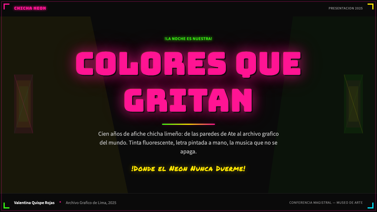
For presentation slides, the chicha system is most effective when used with genuine commitment to its energy. A cover slide benefits from treating the entire background as an active field: a starburst or radial pattern in one fluorescent color against black, with the title set in dimensional or thick-outlined lettering that sits on top. Content slides should use horizontal color bands to separate sections — a narrow fluorescent band above a text zone creates clear hierarchy without requiring complex layout. Data slides take on their most powerful form when chart elements themselves are rendered in fluorescent tones against a dark ground, with labels set in the same bold, slightly condensed letterform style as the poster tradition. The key is committing to the dark background throughout the deck rather than reverting to light slides for content.对于演示文稿,奇恰系统在真正投入其能量时最为有效。封面幻灯片适合将整个背景视为活跃的视觉场:一种荧光色的星爆或放射图案对抗黑色,标题以立体或粗边轮廓字体设置在上方。内容页应使用水平色带分隔章节——在文本区域上方一条窄荧光带,无需复杂布局即可建立清晰层级。当图表元素本身在深色底面上以荧光色调呈现,标签以与海报传统相同的粗重、略微紧缩字体设置时,数据页达到最有力的形态。关键是在整个演示中坚持使用深色背景,而不是在内容页上退回到浅色。
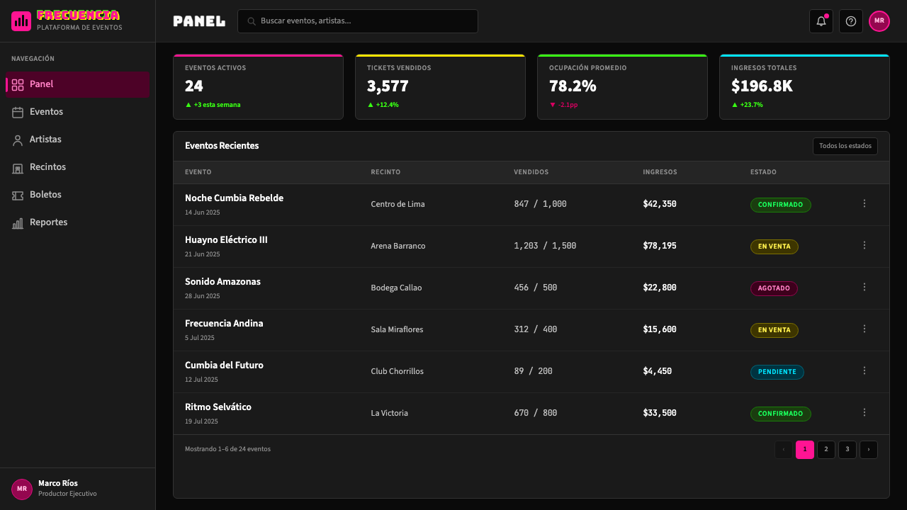
For web interfaces, the style is best suited to event-focused pages, landing pages for music or festival brands, and any context where high-energy visual impact is a primary goal. Dashboard and data applications can use the chicha vocabulary selectively: fluorescent accent colors applied to key metrics or status indicators against a near-black background can borrow the tradition's legibility logic without overwhelming the interface. Pricing pages work well with the band-stacking logic — each tier rendered as a distinct horizontal zone with a different fluorescent accent, creating immediate visual differentiation. Navigation and controls should be set in bold, clean lettering that echoes the poster's typographic density without attempting a full dimensional treatment.对于网页界面,这种风格最适合活动聚焦页面、音乐或节庆品牌的落地页,以及任何高能量视觉冲击是主要目标的场景。仪表板和数据应用可以选择性地使用奇恰词汇:将荧光强调色应用于深色近黑背景上的关键指标或状态指示器,可以借鉴这一传统的可读性逻辑而不会淹没界面。定价页面适合横带堆叠逻辑——每个等级呈现为具有不同荧光强调色的独立水平区域,创造即时的视觉区分。导航和控件应以粗重、干净的字体设置,呼应海报的排版密度,但不必尝试完整的立体处理。
For editorial and marketing work, the style supports an entirely different register than European modernist traditions: where Bauhaus or Swiss design signal rationality and authority, chicha signals energy, popular festivity, and cultural specificity. An editorial spread using chicha vocabulary might use a full-bleed black background with a fluorescent headline in dimensional or outlined lettering, pull-quotes rendered in a contrasting fluorescent, and body text set in a clean bold weight to maintain legibility against the dark field. Marketing campaigns benefit from the tradition's poster logic: a single strong announcement with maximum visual weight, stripped of supporting information, commanding attention rather than explaining itself.对于编辑和营销内容,这种风格支持与欧洲现代主义传统完全不同的语域:包豪斯或瑞士设计传递理性与权威,奇恰传递能量、民间节庆和文化特殊性。使用奇恰词汇的编辑版面可能使用满版黑色背景,配以立体或轮廓字体的荧光大标题,引用语以对比荧光色呈现,正文以干净的粗字重设置以保持在深色底面上的可读性。营销活动受益于这一传统的海报逻辑:单一强力公告以最大视觉重量呈现,去除辅助信息,命令注意力而非解释自身。
A common mistake when applying the chicha style is treating fluorescent color as merely a palette choice while retaining the compositional logic of conventional layout — light background, generous negative space, restrained type scale. The result reads as a hesitant pastiche rather than a genuine application. The tradition's power comes from the combination of dark ground, fluorescent ink, dimensional type, and maximum surface density working together. Pulling one element out of context while retaining conventional surroundings creates visual dissonance. Another frequent error is using multiple fluorescent colors at equal weight simultaneously: in the source tradition, one color tends to dominate a poster's zone or band, with others used as accent or overprint. Giving every element equal fluorescent intensity produces visual noise rather than the structured intensity of the original.应用奇恰风格时最常见的错误,是将荧光色彩仅仅视为调色板选择,同时保留常规版面的构图逻辑——浅色背景、充裕留白、克制的字体比例。结果读起来像犹豫不决的模仿而非真正的应用。这一传统的力量来自深色底面、荧光油墨、立体字体和最大版面密度的协同作用。将一个元素从语境中抽离同时保留常规的周边环境,会产生视觉不协调。另一个常见错误是同时以相等权重使用多种荧光色:在源传统中,一张海报的某个区域或横带倾向于由一种颜色主导,其他颜色作为强调或叠印使用。给每个元素同等的荧光强度产生的是视觉噪音,而非原作的结构性强度。
See the Peruvian Chicha Fluorescent Poster design system查看 Peruvian Chicha Fluorescent Poster 完整设计系统
Peruvian Chicha Fluorescent Poster — FAQPeruvian Chicha Fluorescent Poster · 常见问题
Is chicha poster style the same as lo-fi or retro aesthetics?奇恰海报风格与低保真或复古美学是同一回事吗?
No, and confusing them produces work that misses the point of both. Lo-fi and retro aesthetics celebrate the degraded, the worn, and the nostalgically imperfect — they are about the passage of time and the charm of imperfection. The chicha poster is not nostalgic; it is immediate. Its fluorescent colors are chosen for maximum present-tense visibility, not for period atmosphere. Its dimensional lettering is a legibility solution, not a vintage affectation. Applying lo-fi filters, film grain, or faded tones to a chicha composition fundamentally contradicts the tradition's values: the original posters were trying to be as vivid and visible as possible, not charmingly worn.不是,混淆两者会产生两者都失去要义的作品。低保真和复古美学颂扬降解、磨损和怀旧意义上的不完美——它们关于时间的流逝和不完美的魅力。奇恰海报不是怀旧的,它是即时的。其荧光色彩是为了最大化当下时刻的可见性而选择,而非为了营造时代氛围。其立体字母是可读性解决方案,而非复古的情感。将低保真滤镜、胶片颗粒或褪色调应用于奇恰构图,从根本上违背了该传统的价值观:原版海报努力尽可能生动可见,而不是显得迷人地陈旧。
Can the style work in a light-background context, or does it require a dark ground?这种风格能在浅色背景语境中使用吗,还是必须有深色底面?
The tradition is built on the dark ground — black cardstock is not incidental but structural to how fluorescent colors function. Fluorescent pigments reach their maximum apparent luminosity against the darkest possible background; on white or cream, they become merely bright colors without the glow effect that defines the style. A light-ground version can borrow elements — dimensional lettering, band structures, starburst motifs, dense surface composition — but it loses the tradition's core visual effect. If a dark background is genuinely impossible in a given context, treat the adaptation as a structural borrowing rather than a full application of the style, and acknowledge that the result will have less of the fluorescent intensity that distinguishes chicha from other vibrant traditions.这一传统建立在深色底面上——黑色卡纸不是偶然的,而是荧光色如何发挥作用的结构性前提。荧光颜料在最暗的背景下达到最大表观发光强度;在白色或奶油色上,它们仅仅是明亮的颜色,没有定义这种风格的发光效果。浅色底面版本可以借用元素——立体字母、横带结构、星爆母题、密集版面构成——但会失去这一传统的核心视觉效果。如果在特定语境中真正无法使用深色背景,应将这种改编视为结构性借鉴而非完整应用,并承认结果将缺少使奇恰有别于其他鲜艳传统的荧光强度。
How does chicha relate to other Latin American graphic traditions like lucha libre or Mexican lotería?奇恰与墨西哥摔角或彩票牌等其他拉丁美洲平面传统有何关联?
They share a family resemblance as popular commercial print traditions that developed outside the academy, in direct response to specific community needs, and were later recognized by design institutions after their vernacular functions were already established. But they are distinct in specific ways. Lucha libre graphics — Mexican wrestling promotion material — share the bold lettering and high energy but work primarily in a daylight context with different chromatic logic. Mexican lotería imagery is illustrative and symbolic rather than typographic and color-saturated. The chicha tradition is unique in its combination of Andean cultural specificity, fluorescent ink on black cardstock, dimensional type as primary element, and the direct connection to a hybrid musical form. Understanding each tradition on its own terms produces better design than treating them as interchangeable sources of 'Latin energy'.它们作为在学院之外发展起来的大众商业印刷传统,有着家族相似性——直接回应特定社区需求,其本土功能确立之后才被设计机构认可。但它们在具体方面是截然不同的。墨西哥摔角图形——墨西哥摔角推广材料——分享了粗重字母和高能量,但主要在日光语境中以不同的色彩逻辑运作。墨西哥彩票牌图像是插图式和象征性的,而非字体性和色彩饱和的。奇恰传统在安第斯文化特殊性、黑色卡纸上的荧光油墨、作为主要元素的立体字体,以及与混血音乐形式的直接连接的组合上是独一无二的。在各自条件下理解每种传统,比将它们视为可互换的「拉丁能量」来源能产生更好的设计。
Is there a risk of cultural appropriation when using this style outside its original Peruvian context?在秘鲁原始语境之外使用这种风格,是否存在文化挪用的风险?
The question deserves genuine engagement rather than dismissal or false reassurance. The chicha poster tradition was created by and for Peru's internal migrants — a community with a specific history of social marginalization and cultural invisibility. Using the style's surface aesthetics as mere decoration, stripped of any acknowledgment of that history, risks reducing a living cultural practice to a visual novelty. The more considered approach is to engage with the tradition's actual origins — understanding who made it, why, and for whom — and to let that understanding inform how and where you deploy it. Crediting the tradition and its key figures, using it in contexts where its energy is genuinely relevant rather than ironic or exotic, and avoiding applications that mock or trivialize its working-class roots are practical expressions of that engagement. The tradition is not closed to outside reference, but it deserves to be treated as a specific cultural practice rather than a generic visual resource.这个问题值得真诚对待,而非轻率驳回或给予虚假保证。奇恰海报传统由秘鲁内部移民创造,也为他们服务——这个群体有着具体的社会边缘化和文化不可见性历史。仅仅将这种风格的表面美学用作装饰,剥离对这段历史的任何承认,有将活生生的文化实践简化为视觉新奇物的风险。更审慎的方式是真正了解这一传统的起源——理解谁创造了它、为何创造、为谁创造——并让这种理解指导你在何处以何种方式运用它。注明传统及其关键人物,在其能量真正相关而非带有讽刺或异国情调意味的语境中使用它,避免嘲弄或轻视其工人阶级根源的应用——这些是真正参与的实践表达。这一传统并非对外部参考封闭,但它值得被视为特定文化实践,而非通用视觉资源。
How do I keep text legible when everything in a chicha layout is competing for attention?当奇恰版面中的所有元素都在争夺注意力时,如何保持文字的可读性?
Legibility in the chicha tradition is achieved through contrast management rather than through restraint. The tradition solves the legibility problem in several specific ways that contemporary applications can adopt. First, dimensional or outlined lettering creates a visible separation between the text and its background regardless of color — the shadow or outline acts as a built-in separator. Second, color zone discipline: while the poster is dense overall, individual text elements typically sit within a color field that contrasts with the surrounding zone rather than competing with it at the same saturation level. Third, the tradition uses ruled borders and decorative frames to delineate text zones, giving the eye a clear boundary to follow. Applying these techniques — outline or drop-shadow on key text, local color field contrast, and framed zones for critical information — allows a dense chicha-style composition to maintain readable hierarchy without reducing its overall intensity.奇恰传统中的可读性通过对比度管理而非克制来实现。这一传统通过几种当代应用可以借鉴的具体方式解决可读性问题。首先,立体或轮廓字母在文字与背景之间创造可见的分离,无论颜色如何——阴影或轮廓充当内置的分隔符。其次,色彩区域纪律:虽然整体海报是密集的,但单个文字元素通常坐落在与周围区域形成对比的色彩场中,而非以相同饱和度与之竞争。第三,这一传统使用直线边框和装饰框架来划定文字区域,给视线提供清晰的边界可以追随。将这些技术应用于当代设计——关键文字的轮廓或投影、局部色彩场对比、关键信息的框架区域——允许密集的奇恰风格构图在不降低整体强度的情况下保持可读的层级。
Related design styles相关设计风格
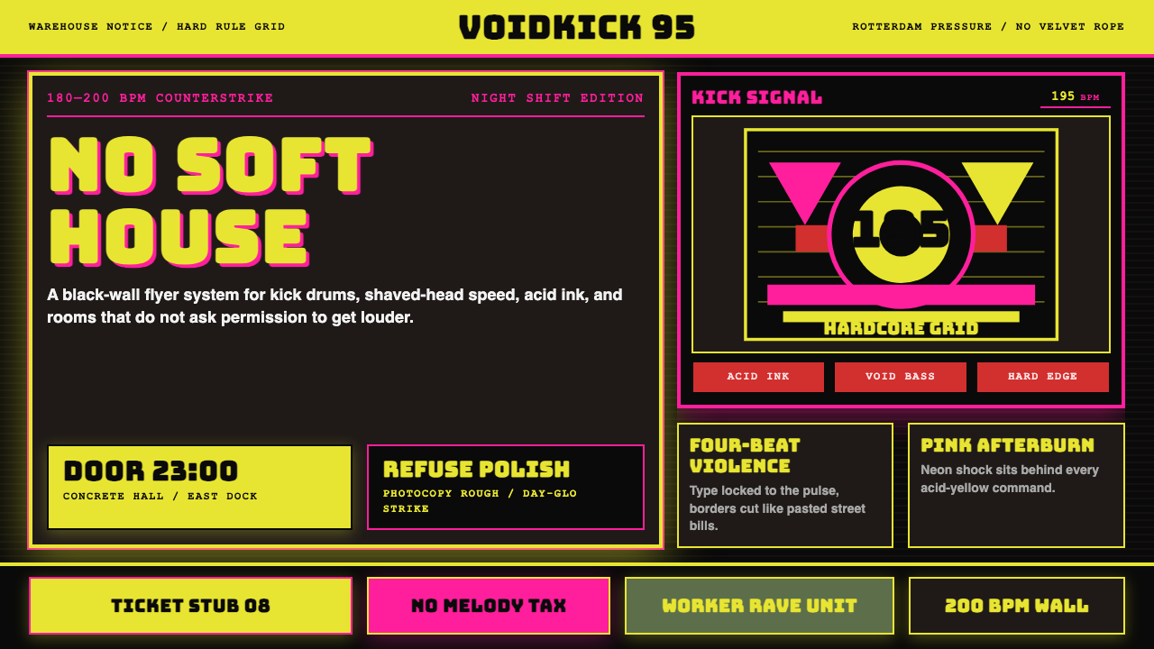 Rotterdam Gabber HardcoreHardcore refuses polish. Acid yellow, neon pink, black grid, and brutal Bunge…硬核拒绝精致:酸黄、霓虹粉与黑色网格,让粗暴 Bungee 字体像传单砸来。
 UK Rave Glow-Stick FlyerIllicit euphoria. Acid yellow, rave pink, and laser green slam into photocopi…非法狂喜。荧光黄、粉、绿撞上复印黑。
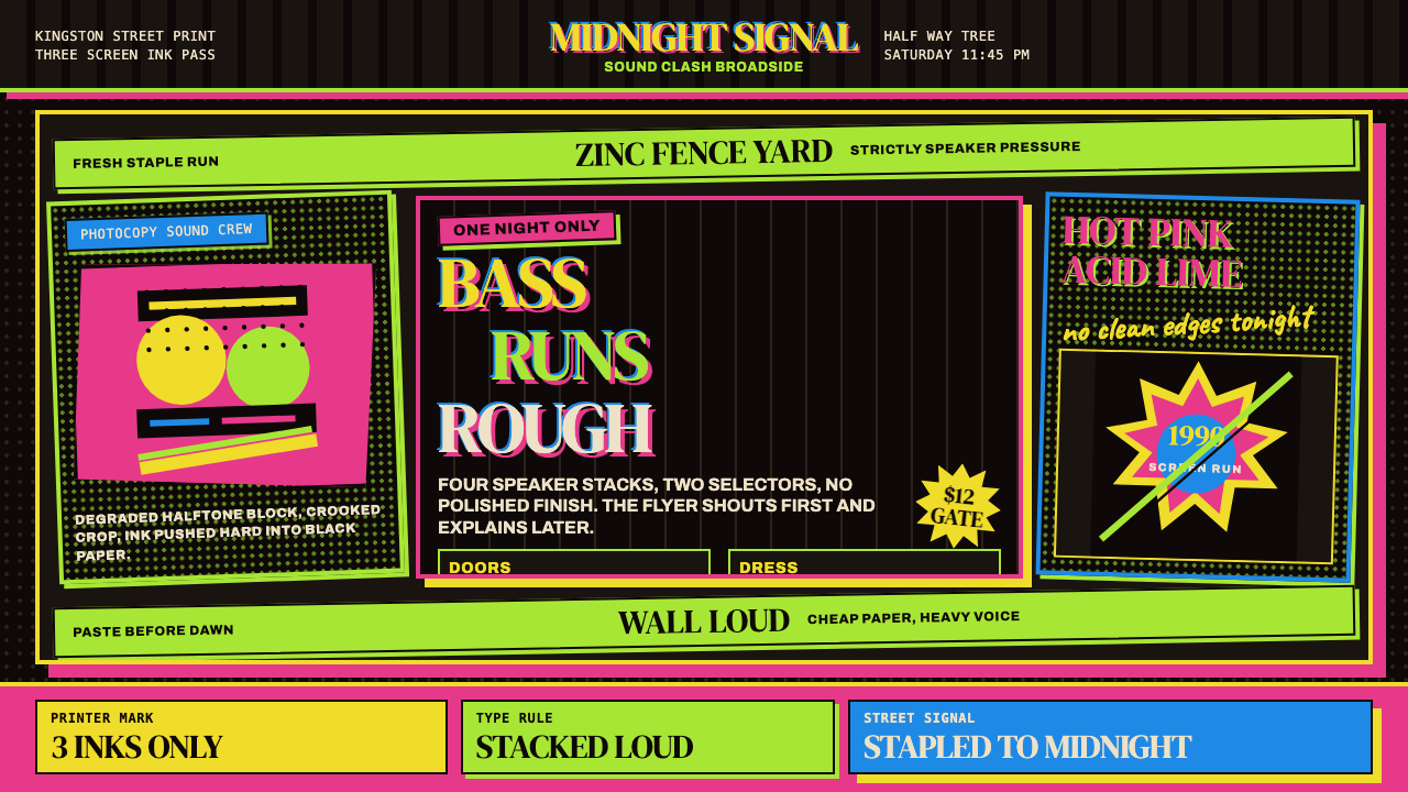 Jamaican Dancehall 1990 PosterMidnight volume. Acid lime and hot pink type stack like screenprint ink on bl…午夜音量:酸绿与热粉粗字叠在黑新闻纸上,如丝印错位。
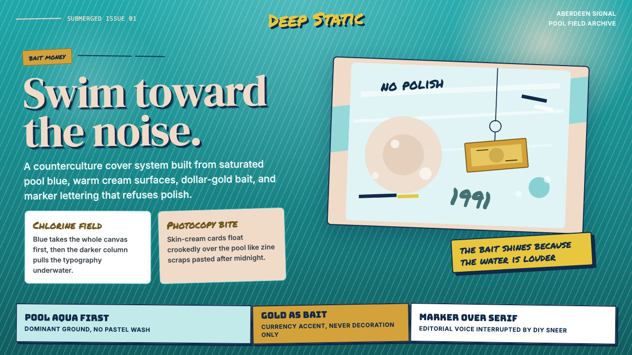 Nirvana — NevermindAnti-pop in pool blue. Cream cards, dollar-gold accents, and marker type roug…泳池蓝里的反主流:乳白卡片、美元金点缀与马克笔字打乱网格。
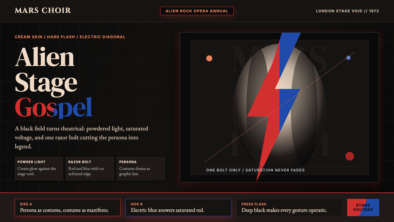 Bowie — Ziggy StardustTheater at full voltage. Cream-on-black portrait cut by one red and electric-…满电压的剧场感:黑底奶油肖像,被红与电蓝闪电劈开。
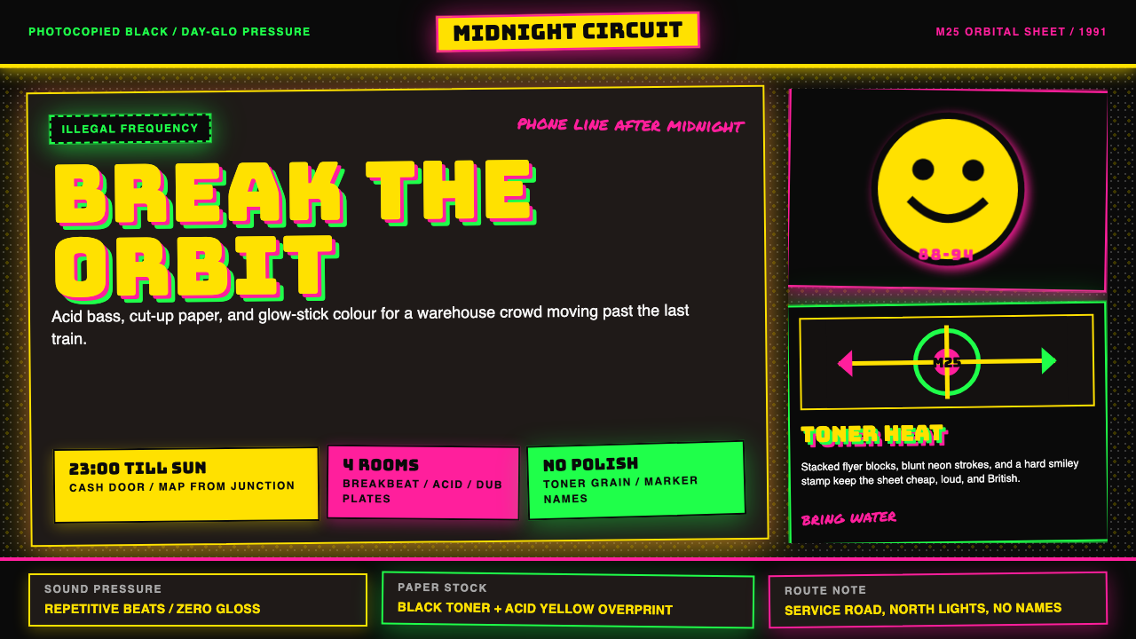
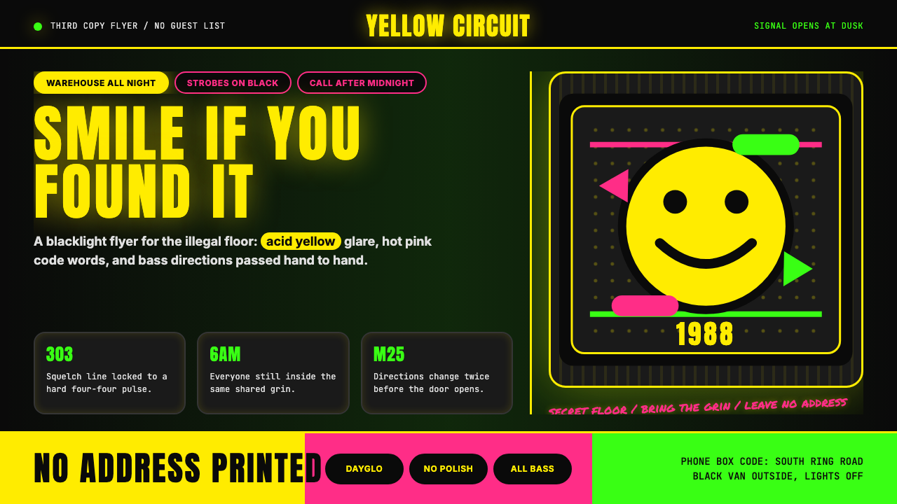 Acid House Smiley (1988)Rave energy hits first. Acid yellow on black, Anton caps, smiley glow.锐舞能量先撞上来。黑底酸黄、Anton大写与笑脸辉光。