Design style guide设计风格指南
What is Jamaican Dancehall 1990 Poster?什么是 Jamaican Dancehall 1990 Poster?
Kingston's midnight streets ran on fluorescent ink — dancehall poster culture of the late 1980s and early 1990s turned cheap newsprint and three screaming colors into the most urgent graphic language Jamaica ever produced.金斯敦的午夜街头靠荧光油墨运转——1980至90年代的舞厅海报文化,用廉价新闻纸和三种嘶吼的颜色,造就了牙买加有史以来最紧迫的视觉语言。
Jamaican Dancehall 1990 Poster in briefJamaican Dancehall 1990 Poster 速览
Jamaican Dancehall 1990 Poster is a graphic style rooted in the hand-printed event flyers that plastered Kingston's telephone poles, zinc fences, and bus-stop walls between roughly 1985 and 1995. Sign painters and screenprinters working in neighborhoods like Half Way Tree, Greenwich Farm, and Trench Town produced hundreds of these flyers each week using the cheapest available materials — low-grade newsprint, fluorescent inks mixed in three-color separations, and hand-cut stencils — to announce selector nights, sound-system clashes, and dancehall concerts headlined by artists like Beenie Man.牙买加舞厅1990海报是一种根植于手工印刷活动传单的平面风格,这类传单在约1985至1995年间铺满了金斯敦的电线杆、锌板围栏和公交站墙壁。在半途树、格林威治农场、战壕镇等街区作业的招牌画师和丝网印刷师,每周用最廉价的材料生产数百张这样的传单——低级新闻纸、三色分版混合的荧光油墨、手工裁切的模版——宣告选歌之夜、音响系统对决,以及比尼·曼等艺人担纲的舞厅演出。
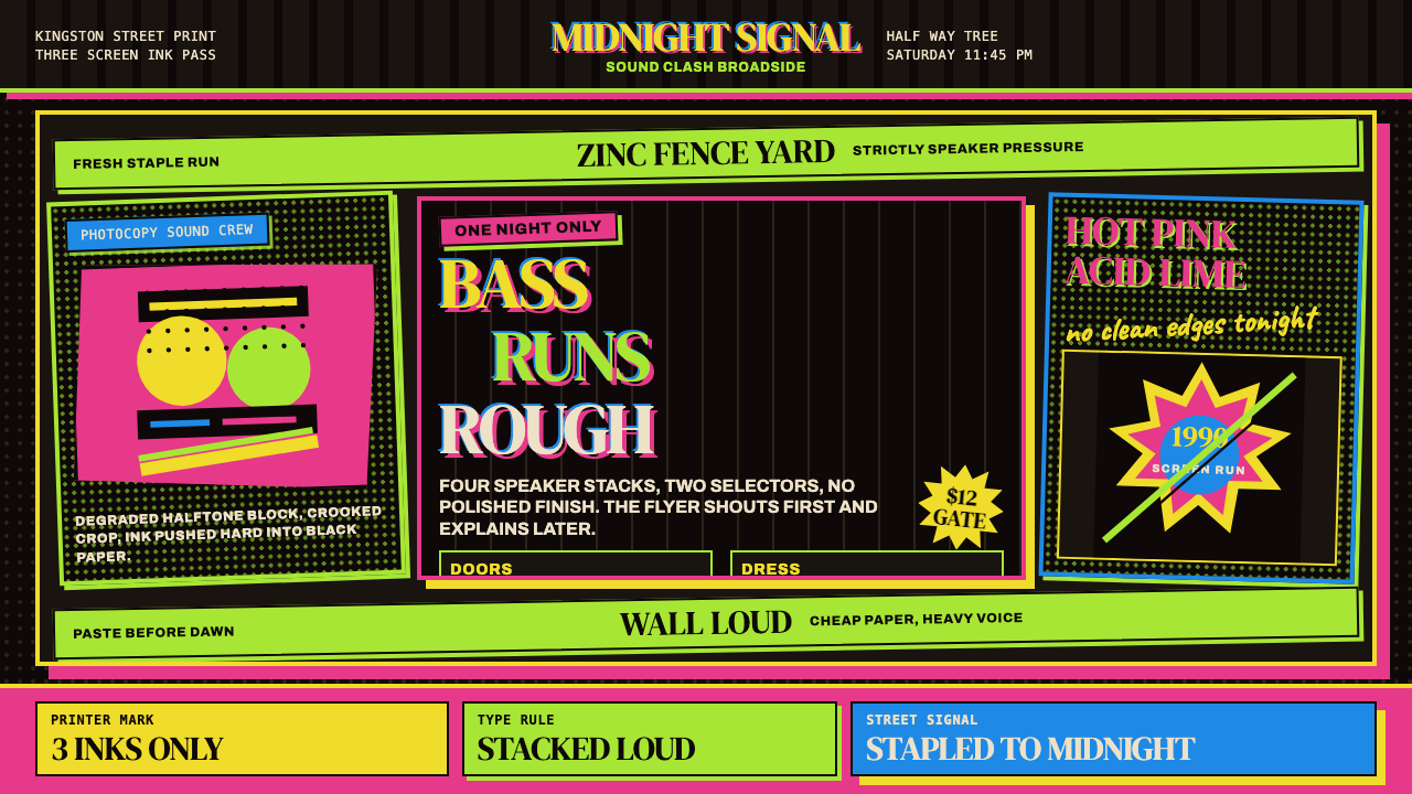
The visual logic of this style is confrontational by necessity. A flyer had to do its job from twenty feet away, on a cluttered wall, at night, competing with dozens of identical-sized sheets nailed beside it. That competition produced a specific set of solutions: type stacked in heavy wedge-serif letterforms at sizes that seem almost cartoonish by print standards, color combinations of acid lime against hot pink against electric blue against black, and portrait photographs of performers reproduced through photocopiers so many times that they dissolve into high-contrast ghostly shapes — half recognizable face, half halftone dot field.这种风格的视觉逻辑出于必要而带有对抗性。一张传单必须在二十英尺开外、杂乱的墙面上、夜晚光线下完成它的使命,还要从钉在它旁边的数十张同等大小的纸张中脱颖而出。这种竞争催生了一套特定解法:以几乎漫画般夸张的尺寸堆叠粗重楔形衬线字体;酸性青柠、荧光粉、电光蓝与黑色构成的色彩组合;艺人肖像经复印机反复复制,直至溶解成高对比度的幽灵形象——半是可辨认的面孔,半是半色调网点的汪洋。
What distinguishes this style from generic retro pastiche is its structural honesty. Every visual decision traces back to a production constraint: the limited ink colors reflect three-pass screenprint economics, the heavy type is legible at distance on degraded paper stock, the halftone dots are artifacts of cheap reproduction rather than decorative choices. The aesthetic is the process made visible. Contemporary applications that capture this authentically preserve that sense of material pressure — things look like they were made fast, printed cheap, and stapled to something real.将这种风格与一般复古拼贴区别开来的,是它结构上的诚实。每一个视觉决定都能追溯至某个生产约束:有限的油墨颜色源于三次丝网印刷的经济逻辑,粗重字体是为了在降质纸张上保持远距可读性,半色调网点是廉价复制的痕迹而非装饰性选择。美学就是被显形的制作过程。当代应用若要真实地捕捉这种精神,就必须保留那种材料压力的感觉——东西看起来是快速制作、廉价印刷、钉在真实物体上的。
See the Jamaican Dancehall 1990 Poster design system →查看 Jamaican Dancehall 1990 Poster 完整设计系统 →
Where does Jamaican Dancehall 1990 Poster come from?Jamaican Dancehall 1990 Poster 从何而来?
The roots of Jamaican dancehall poster culture lie in the sound-system tradition that had shaped Kingston's street life since the 1950s. Rival sound systems — mobile discotheques run by selectors who sourced exclusive imported records — competed for audiences at outdoor parties called lawn dances or yard sessions. Promoting these events required visible, immediate announcement, and by the 1970s a loosely organized craft of sign-painting and poster-printing had grown up around the dancehall economy to serve that need.牙买加舞厅海报文化的根源在于音响系统传统——这一传统自1950年代起就塑造着金斯敦的街头生活。相互竞争的音响系统——由选歌师经营的移动迪斯科,他们从海外搜寻独家唱片——在被称为草坪舞会或庭院派对的露天活动中争夺观众。宣传这些活动需要醒目、即时的公告,到1970年代,一套围绕舞厅经济运转的招牌绘制与海报印刷的松散手工艺体系已经成形。
The golden era of the poster form coincided with the rise of dancehall as a distinct musical genre in the mid-1980s. Dancehall's split from roots reggae was partly ideological — faster rhythms, deejays toasting over pre-recorded riddims rather than live bands, and lyrics that addressed the immediate experience of Kingston's inner-city youth — and partly economic, driven by the cassette culture and sound-system sound-clash circuit that made the music intensely local and competitive. The poster culture matched that energy: Jeff Cassell, operating out of the Half Way Tree area, and Sangie Burchell, associated with the Greenwich Farm scene, became known for fluorescent work that could be read across a darkened lot.海报形式的黄金时代恰逢舞厅作为独立音乐类型在1980年代中期崛起。舞厅与根源雷鬼的分裂一半出于意识形态——更快的节奏、DJ在预录节拍上即兴喊麦而非现场乐队伴奏、歌词聚焦金斯敦内城青年的即时生活体验——一半出于经济驱动,磁带文化和音响系统对决赛路让这种音乐极度本土化且充满竞争性。海报文化与这种能量相互匹配:在半途树地区作业的杰夫·卡塞尔,以及与格林威治农场场景相关联的桑吉·伯切尔,因其在黑暗场地上仍可远眺辨认的荧光作品而声名大噪。
The visual vocabulary that emerged drew on multiple practical sources. Jamaican sign-painting had its own tradition of heavy lettering and bold color, inherited partly from the hand-lettered shop fronts and church announcement boards that had lined Kingston's commercial streets for generations. The shift to screenprinting allowed larger runs at lower cost but imposed the three-color constraint that became a defining feature. Promotional photographs of performers — artists like Maxine Walters, who bridged the older lovers rock scene into dancehall — were sourced from whatever prints were available and reproduced on the cheapest office photocopiers, a process that stripped highlight detail and created the characteristic degraded halftone texture.由此形成的视觉词汇汲取自多个实用来源。牙买加招牌绘制有其自身的粗重字体与大胆色彩传统,部分继承自几代人以来排列在金斯敦商业街道上的手书店面招牌和教堂公告板。转向丝网印刷降低了成本并扩大了印量,但也带来了三色限制——这一限制成为定义性特征。艺人的宣传照片——比如横跨老派爱人雷鬼与舞厅两个时代的麦克辛·沃尔特斯——取自任何手边的印刷品,在最廉价的办公室复印机上翻印,这一过程抹去了高光细节,创造出标志性的退化半色调纹理。
The style's lifespan was bounded by economic shifts. By the mid-1990s, digital desktop publishing had reached Kingston's print shops, and the hand-produced fluorescent poster began giving way to computer-set type and inkjet color. The production constraints that had shaped the aesthetic dissolved, and with them went some of the raw visual pressure that had made the earlier work so forceful. What remained was a defined period of approximately a decade — the post-Yellowman era through the early dancehall mainstream — whose graphic output has since become recognized internationally as a coherent and historically significant design moment.这种风格的生命期受制于经济转变。到1990年代中期,数字桌面出版技术已进入金斯敦的印刷店,手工制作的荧光海报开始让位于计算机排版和喷墨彩色印刷。塑造了这种美学的生产约束消解了,与之一同消逝的,是让早期作品如此有力的那种原始视觉压力。留存下来的,是大约十年的明确时期——后「黄人」时代到舞厅早期主流——其平面产出此后在国际上被认定为一个连贯且历史意义重大的设计时刻。
What defines the Jamaican Dancehall 1990 Poster look?Jamaican Dancehall 1990 Poster 的视觉特征是什么?
Color Palette色彩搭配
The palette is built from the maximum contrast available in fluorescent screenprint inks: acid lime green, hot magenta pink, and electric cyan blue deployed against a black or very dark ground. A fourth presence — the unprinted newsprint stock itself, showing through as a warm off-white — acts as a passive neutral. These colors do not harmonize; they compete. Their relationship is adversarial rather than complementary, and that tension is the point. The darkness of the ground makes each fluorescent color vibrate with an intensity impossible to achieve on white stock.色板建立在荧光丝网印刷油墨所能提供的最大对比度之上:酸性青柠绿、炽热品红粉和电光青蓝,铺设于黑色或极深的底面。第四种存在——未印刷的新闻纸本身,透过来呈现温暖的米白——充当被动的中性色。这些颜色不是在和谐共处,而是在相互竞争。它们的关系是对抗性的而非互补性的,这种张力正是关键所在。深色底面让每种荧光色产生在白色纸张上无法实现的振动强度。
Typography字体排印
Type is the loudest element on the page, and it is meant to be. Wedge-serif letterforms — condensed, with triangular bracketed serifs that thicken toward the terminals — dominate, set at sizes that fill the upper half of the sheet. Text is stacked vertically in tight blocks with almost no leading between lines, creating dense typographic masses rather than readable columns. The stacking is often deliberately imperfect: slight angle shifts, inconsistent spacing, and mixed weights within a single headline give the impression of letters assembled by hand in urgent conditions rather than set by machine.字体是页面上最响亮的元素,也本该如此。楔形衬线字形——压缩的,带有向末端加粗的三角形托脚衬线——占据主导,字号大到充满纸张的上半部分。文字被紧密堆叠成几乎没有行距的竖向区块,形成密集的字体团块而非可读的文字列。这种堆叠常常是故意不完美的:轻微的角度偏移、不一致的间距,以及同一标题行内混用不同字重,给人一种字母在紧急情况下手工拼排而非机器排版的印象。
Photographic Degradation照片退化纹理
Portrait photographs of performers are central to the composition but are never reproduced cleanly. Multiple generations of photocopying strip away the midtone information and leave behind a binary field of near-black and near-white, with visible halftone dot patterns at the transitions. The faces that emerge are simultaneously recognizable and ghostlike — iconic enough to identify an artist, degraded enough to carry the energy of something reproduced too many times. This quality of worn reproduction is structural, not incidental: it signals urgency, underground economics, and the raw texture of street communication.艺人的肖像照片是构图的核心,但从不以清晰的方式呈现。经过多代复印,中间调信息被剥离,留下近乎黑与近乎白的二值化区域,过渡地带可见半色调网点图案。浮现出来的面孔同时具有辨认性与幽灵感——足以识别艺人身份,却又退化得足以携带一种被过度复制之物的能量。这种磨损复制的质感是结构性的,而非偶然:它传递了紧迫性、地下经济逻辑,以及街头传播的原始纹理。
Hard Shadow硬边投影
Shadows, where they appear on type or on framing elements, are hard-edged offset duplicates of the source shape — typically cast in a contrasting fluorescent color rather than black. A hot-pink headline might carry a lime-green shadow offset at a steep diagonal; an electric-blue border might sit on a magenta duplicate. This treatment has practical roots in multi-pass screenprinting where registration shifts between plates produce unintended but striking misalignment effects. The aesthetic borrowed and exaggerated those accidents into a deliberate compositional device.投影——若出现在字体或框架元素上——是源形状的硬边偏移复制,通常用对比性荧光色而非黑色投射。一个热粉标题可能携带一个以陡峭斜角偏移的青柠绿投影;电光蓝边框可能坐落在品红色的复制体上。这种处理有其实用根源——多次丝网印刷中,套版偏差会在印版之间产生意外但醒目的错位效果。这种美学借用并夸大了那些偶然事故,将其转化为刻意的构图手法。
Stacked Information Architecture堆叠式信息架构
The flyer format demands that multiple layers of information — headline act, supporting selectors, venue, date, time, ticket price — be communicated at different scales on a single sheet. The solution is hierarchical stacking: the most important information runs largest across the top, each subsequent tier drops in scale but not in visual weight. Dividing lines between tiers are heavy rules or repeated asterisk patterns rather than white space. This dense, layer-cake approach to information layout is one of the style's most immediately recognizable features and its most directly useful quality for contemporary design applications.传单形式要求在单张纸面上以不同尺度传达多层信息——头牌艺人、支持选歌师、场地、日期、时间、票价。解决方案是层级式堆叠:最重要的信息在顶部以最大字号横贯版面,每个后续层级缩减尺寸但不减轻视觉分量。各层级之间的分隔是粗重的间隔线或重复的星号图案,而非留白。这种密集的、层叠蛋糕式的信息布局方式,是这种风格最直接可辨认的特征之一,也是它对当代设计应用最直接有用的品质之一。
Border and Frame Energy边框与框架能量
The edges of the composition are rarely left quiet. Heavy border rules, often doubled or tripled, frame the sheet and reinforce the sense that this object has been produced as a complete, self-contained announcement. Within the border, subsidiary frames — boxes, panels, and ruled separators — organize the information tiers. These frames are often drawn at slightly imperfect alignments, and their thickness varies in ways that suggest hand-production. The overall effect is of a sheet that is densely packed to the very edge, with no wasted margin.构图的边缘很少被留得安静。粗重的边框线——常常双重或三重排列——框住整张纸,强化了这件物品是作为完整、自足公告而制作的感觉。边框内,辅助性框架——方框、面板和间隔线——组织各信息层级。这些框架常常以轻微不完美的对齐方式绘制,粗细变化以一种暗示手工制作的方式呈现。整体效果是一张被塞到边缘、没有浪费任何边距的纸张。
Material Authenticity材料真实性
The style carries the memory of its substrate. Even when applied digitally, authentic-feeling dancehall poster design references the texture of newsprint — a faint grain or slight warmth in unprinted areas — and the slight bleed and spread of ink on an absorbent surface. These qualities are not decoration; they are evidence of process. Stripped of them, the work becomes graphic exercise rather than lived document. The distinction matters practically: when the material texture is present, the boldness reads as urgent; when it is absent, the same composition can read as merely loud.这种风格携带着它的承载介质的记忆。即使以数字方式应用,真实感强的舞厅海报设计也会参照新闻纸的纹理——未印刷区域轻微的纸纹或温暖感——以及油墨在吸水表面上轻微的渗透与扩散。这些品质不是装饰;它们是过程的证据。剥离了它们,作品就成了平面练习而非真实文件。这一区别在实践中至关重要:当材料纹理存在时,大胆感读来是紧迫的;当它缺席时,同样的构图可能只是读来嘈杂而已。
See the Jamaican Dancehall 1990 Poster design system →查看 Jamaican Dancehall 1990 Poster 完整设计系统 →
Who shaped Jamaican Dancehall 1990 Poster?谁塑造了 Jamaican Dancehall 1990 Poster?
Cassell was among the most prolific of the Half Way Tree-area printers who defined the visual standard for Kingston dancehall promotion during the late 1980s and early 1990s. Working with the three-color fluorescent screenprint format that had become the lingua franca of the scene, he produced flyers that set a high bar for typographic boldness and compositional density. His output is often cited as the clearest surviving example of the style at the height of its commercial function — not art produced for exhibition but communication produced under real conditions for a real audience.卡塞尔是半途树地区最多产的印刷师之一,他们在1980至90年代末确立了金斯敦舞厅宣传的视觉标准。使用已成为该场景通用语言的三色荧光丝网印刷格式,他制作的传单在字体大胆感和构图密度方面确立了高标准。他的作品常被引用为这种风格在其商业功能巅峰时期保存最为完整的例证——不是为展览而制作的艺术,而是在真实条件下为真实观众制作的传播物。
Associated primarily with the Greenwich Farm and related Kingston neighborhoods, Burchell represented a slightly different regional inflection of the same poster tradition — one that some observers describe as even more aggressively compressed in its typographic approach. The geographical diversity of Kingston's dancehall poster makers is itself historically significant: the style was not produced by a single studio or workshop but emerged from a distributed craft community spread across the city's working-class neighborhoods, each with its own clients and its own subtle variations on the shared vocabulary.伯切尔主要与格林威治农场及周边金斯敦街区相关联,代表了同一海报传统略有不同的地区变体——一些观察者形容其字体处理方式甚至更为激进地压缩。金斯敦舞厅海报制作者的地域多样性本身具有历史意义:这种风格不是由单一工作室或车间生产的,而是从遍布城市工人阶级街区的分散手工艺社群中涌现出来,各有其客户,也各有对共享视觉词汇的细微变奏。
As one of the dominant performing artists of the dancehall era, Beenie Man's image appeared across hundreds of promotional flyers throughout the late 1980s and into the 1990s. His presence on these materials illustrates how the poster system functioned as a visual identity infrastructure for the music itself: the graphic treatment applied to an artist's promotional photograph — the degree of photocopy degradation, the color of the hard shadow applied to the name, the hierarchical placement within the stacked composition — communicated status and scale of event in a shared visual language that Kingston audiences could read instantly.作为舞厅时代最具主导地位的表演艺人之一,比尼·曼的形象在整个1980年代末至90年代出现在数百张宣传传单上。他在这些材料上的存在说明了海报系统如何作为音乐本身的视觉身份基础设施运作:应用于艺人宣传照片的平面处理——复印退化的程度、应用于名字的硬边投影颜色、在堆叠构图中的层级位置——用金斯敦观众能即刻读懂的共同视觉语言传达了地位与活动规模。
Walters occupies an interesting transitional position in the visual record of Kingston's dancehall poster culture: she was prominent enough during the period that bridges lovers rock and the early dancehall mainstream that her promotional materials span two graphic eras, showing how the poster style evolved as the music itself shifted. Her inclusion on flyers alongside the new generation of deejay performers illustrates the collaborative and competitive nature of the dancehall promotion circuit, where a bill might include both established names with strong visual equity and newcomers whose identity was still being established through the graphic treatment applied to their images.沃尔特斯在金斯敦舞厅海报文化的视觉记录中占据一个有趣的过渡位置:她在横跨爱人雷鬼与早期舞厅主流的那段时期足够显赫,使得她的宣传材料跨越了两个平面时代,展示了海报风格随着音乐本身转变而演化的轨迹。她与新一代DJ表演者出现在同一张传单上,说明了舞厅宣传巡回的合作与竞争本质——一张节目单可能同时包括拥有强大视觉积累的成熟艺名和仍在通过图像平面处理来建立身份认同的新人。
How do you use Jamaican Dancehall 1990 Poster today?今天怎么用 Jamaican Dancehall 1990 Poster?
The Jamaican Dancehall 1990 Poster style is one of the most energetically specific historical aesthetics available to contemporary designers — which is both its strength and its limitation. It works exceptionally well when the content has inherent urgency, event-character, or street-level rawness, and it flatly refuses to cooperate with content that needs to project calm authority or institutional trust. Knowing which is which before reaching for the style is the first practical requirement.牙买加舞厅1990海报是当代设计师可以调用的历史美学中能量特征最为鲜明的风格之一——这既是它的优势,也是它的局限。它在内容本身具有内在紧迫性、活动特质或街头原生感时表现出色;而对于需要传递沉稳权威或机构信任感的内容,它则彻底拒绝配合。在调用这种风格之前先辨别这一边界,是第一个实际要求。
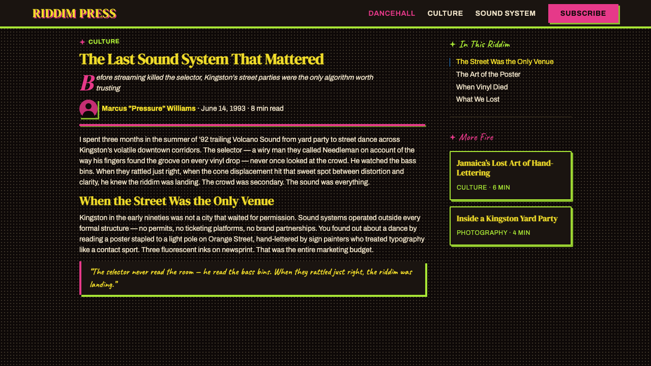
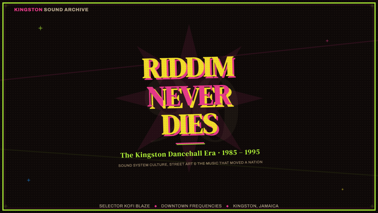
For presentation slides, the style is strongest on covers and section openers where bold announcement is appropriate. A cover built in this register might dedicate the upper two-thirds to a stacked title in oversized compressed type, with the presenter's name or event details occupying a smaller-scale block below — separated by a heavy rule rather than white space. The background should sit very dark, the type should arrive in one fluorescent color, and a second fluorescent color should provide a hard-offset shadow on the most important line. Internal content slides are harder: the style's extreme visual weight makes it difficult to sustain across dense informational layouts. The most successful approach treats each content slide as a poster of its own — one headline, one supporting detail — and accepts that information density will be lower than in a neutral style.在演示文稿中,这种风格在大胆宣告合适的封面和章节开场页上最为强劲。以这种语调制作的封面可以将上方三分之二分配给超大压缩字体堆叠的标题,演讲者姓名或活动详情占据下方较小字号的区块——以粗重间隔线而非留白分隔。背景应当非常暗,字体以一种荧光色出现,第二种荧光色为最重要的一行提供硬边偏移投影。内容页则更难处理:这种风格极端的视觉分量使其难以在密集信息布局中持续贯穿。最成功的做法是将每张内容页视为一张独立海报——一个标题,一个支撑细节——并接受信息密度将低于中性风格的现实。
For web interfaces, the appropriate contexts are event-driven and announcement-heavy: landing pages for product launches, countdown pages, limited-release pages, and any situation where the page has a single overriding message that the user should receive before anything else. Dashboard and analytics environments are generally incompatible — the constant visual intensity makes sustained data reading exhausting. If the interface must sustain this style across multiple pages, the approach should be to reserve the full fluorescent intensity for hero and announcement zones, then pull back to a much quieter dark-ground treatment for navigation and utility areas.对于网页界面,适合的场景是活动驱动和公告密集型的:产品发布落地页、倒计时页面、限量发售页面,以及任何页面有单一压倒性信息需要在一切之前传达给用户的情况。仪表板和数据分析环境通常不相容——持续的高视觉强度会让持续的数据阅读变得令人疲惫。如果界面必须在多个页面维持这种风格,做法应当是将完整的荧光强度保留给英雄区和公告区,然后在导航和功能区拉回到安静得多的深色底面处理。
For editorial and marketing applications, the style has a specific sweet spot in music, fashion, and cultural event promotion — contexts where the visual language has an authentic historical relationship with the audience. Applied to a music festival campaign, a streetwear brand, or a nightlife editorial, it can feel grounded and referential rather than appropriated. Applied to a software product, a financial service, or a healthcare context, it loses its rootedness and becomes surface styling. Marketing uses should also consider the reproduction chain: the style was designed for a very specific printing technology, and its particular qualities — the fluorescent color relationships, the halftone grain, the material texture — are most legible in contexts where the final output can carry them, whether digital screen or physical print that references newsprint's weight and absorbency.对于编辑与营销应用,这种风格在音乐、时尚和文化活动推广中有特定的甜蜜区——这些场景中视觉语言与受众有真实的历史关联。应用于音乐节活动、街头潮牌或夜生活编辑,它可以显得有根基、有参照而非挪用。应用于软件产品、金融服务或医疗场景,它就失去了根植性,沦为表面造型。营销使用还应考虑复制链条:这种风格是为特定印刷技术设计的,它的特殊品质——荧光色彩关系、半色调颗粒、材料纹理——在最终输出能够承载它们的场景中最为清晰,无论是数字屏幕还是参照新闻纸重量与吸墨性的实体印刷品。
A common and costly mistake is attempting to use the full poster palette — all three fluorescent colors at maximum saturation — simultaneously across an entire composition. The historical originals used this kind of total saturation for maximum competition-level urgency; sustained across a web page or a slide deck, it produces not urgency but exhaustion. The more functional contemporary approach is to select one fluorescent as the dominant, use the second as accent at reduced visual weight, and keep the third in reserve for a single highest-priority element. The dark ground is non-negotiable: this style does not translate to a white or light-gray background without losing most of its structural logic. And the halftone texture, where used, should feel earned — present in photographic elements and in areas of genuine tonal complexity, not scattered decoratively across flat color fields.一个常见且代价高昂的错误是试图在整个构图中同时以最高饱和度使用完整的三色荧光色板。历史原作在最高竞争烈度的紧迫场景下使用这种全面饱和;若延续到一个网页或幻灯片组中,产生的不是紧迫感而是疲惫感。更有效的当代做法是选取一种荧光色作为主导,以降低视觉分量的方式将第二种作为强调,将第三种保留给单一最高优先级的元素。深色底面是不可协商的:这种风格不能在白色或浅灰色背景上转译而不失去大部分结构逻辑。半色调纹理若被使用,应当感觉是挣来的——存在于摄影元素和真正有色调复杂性的区域,而非作为装饰散布在平整色块上。
See the Jamaican Dancehall 1990 Poster design system →查看 Jamaican Dancehall 1990 Poster 完整设计系统 →
Jamaican Dancehall 1990 Poster — FAQJamaican Dancehall 1990 Poster · 常见问题
Is this style appropriate for brands that have no connection to Jamaican culture?这种风格适合与牙买加文化毫无关联的品牌使用吗?
It depends on the distance and depth of the application. The Jamaican Dancehall 1990 Poster style carries clear cultural specificity — it emerged from a particular community, economy, and musical tradition. Applying it superficially to unrelated brands risks coming across as appropriative or at minimum tone-deaf. However, design history has always involved styles traveling beyond their origins, and the key variable is intentionality and depth. A brand that references the style explicitly, understands its origins, and applies it with genuine engagement is in a different position from one that simply deploys fluorescent type on black without any such awareness. The question to ask honestly is: does the application honor the context that produced the style, or does it strip out that context entirely to borrow only the visual surface?这取决于应用的距离与深度。牙买加舞厅1990海报风格承载着清晰的文化特殊性——它从特定的社群、经济和音乐传统中涌现。将其表面性地应用于无关品牌,可能被视为文化挪用,或至少是对背景的无感。然而,设计史上风格总是超越其起源而传播,关键变量在于意图与深度。一个明确参照这种风格、理解其起源并以真诚介入方式应用它的品牌,与一个仅仅在黑底上部署荧光字体而毫无此类自觉的品牌处于截然不同的位置。需要诚实地问自己:这种应用是在尊重产生这种风格的背景,还是完全剥除了那个背景,只借用视觉表面?
How do you achieve the photocopy-degraded texture digitally without it looking like a cheap filter?如何在数字环境中实现复印退化质感,而不让它看起来像廉价滤镜?
The difference between authentic-feeling degradation and filter-effect pastiche comes down to specificity and restraint. Real photocopier degradation has a particular character: it eliminates midtones selectively, leaving bright highlights and deep shadows but collapsing the transitional zones into noise. It also introduces a specific kind of grain that is coarser than film grain and slightly directional, as though the image has been physically dragged across a platen. To achieve this digitally, the approach is to start with high-contrast source imagery, apply a threshold treatment that collapses the tonal range before adding texture, and then introduce grain that is coarser and less uniform than typical photographic noise. The result should feel like the texture is intrinsic to the image, not painted on top of it. Restraint matters too: the effect should be applied most heavily to photographic content and much more lightly, or not at all, to type and flat graphic elements.真实感强的退化效果与滤镜式仿作之间的差别,在于特殊性与克制。真实的复印机退化有其特定性质:它选择性地消除中间调,留下明亮高光和深重阴影,但将过渡区间折叠成噪点。它还引入一种特定的颗粒感——比胶片颗粒更粗糙,略带方向性,仿佛图像被物理地拖过了扫描平台。要在数字环境中实现这一点,做法是从高对比度源图像开始,在添加纹理之前施加压缩色调范围的阈值处理,然后引入比典型摄影噪点更粗糙、更不均匀的颗粒。结果应该让纹理感觉是图像内在的,而非涂抹在上面的。克制同样重要:这种效果应该在摄影内容上最重,在字体和平面图形元素上则要轻得多,甚至不用。
Can this style work for a dark-mode digital product, or is it too specific?这种风格能用于深色模式数字产品吗,还是说它太过特定?
The dark ground is actually one of the style's most transferable qualities into dark-mode digital design, since the historical originals were already built on near-black backgrounds. What transfers well: the high-contrast type hierarchy, the limited fluorescent accent palette, the hard-shadow component treatment, and the dense information stacking when content calls for it. What does not transfer cleanly: the photocopy texture (which reads as a defect in polished UI contexts rather than an aesthetic choice), the deliberate type irregularity (which signals broken rendering in a digital product), and the full-bleed border-to-border density (which works as a poster but creates a claustrophobic UI). A dark-mode product that borrows from this lineage selectively — taking the color logic, the type boldness, and the hard-shadow components while smoothing out the material roughness — can produce something that feels energetic and specific without the associations of a literal dancehall flyer.深色底面实际上是这种风格在深色模式数字设计中最具可移植性的品质之一,因为历史原作本就建立在近乎黑色的背景上。可以良好移植的:高对比度字体层级、有限的荧光强调色板、硬边投影组件处理方式,以及内容需要时的密集信息堆叠。不能干净移植的:复印纹理(在精致的界面环境中读来像缺陷而非美学选择)、刻意的字体不规则性(在数字产品中传递的是渲染出错而非风格),以及边到边的全密度(作为海报有效,作为界面则产生幽闭感)。一个有选择地从这一谱系借鉴的深色模式产品——取用色彩逻辑、字体大胆感和硬边投影组件,同时平滑材料粗糙感——可以产出感觉有活力、有特征的结果,而不带有字面舞厅传单的联想。
What is the relationship between this style and broader reggae or Rastafarian visual culture?这种风格与更广泛的雷鬼或拉斯塔法里视觉文化之间是什么关系?
They are related but emphatically distinct. Roots reggae visual culture — associated with Rastafarian iconography, the red-gold-green palette, and the imagery of Marcus Garvey-era Pan-Africanism — developed through the 1970s alongside the music of artists like Bob Marley and Burning Spear. Dancehall, which emerged in the mid-1980s as a deliberate generational break from roots reggae, produced a correspondingly different visual language. Where roots design tends toward natural materials, earthy warmth, and spiritual symbolism, dancehall poster culture is urban, synthetic, and intensely secular — fluorescent inks rather than earthy pigments, electric blue rather than Rastafarian gold, photocopied celebrity portraits rather than hand-painted spiritual imagery. Using the two interchangeably would be a significant misreading of Jamaican cultural history.两者相关,但明确有别。根源雷鬼视觉文化——与拉斯塔法里图像、红金绿色板,以及马库斯·加维时代泛非主义意象相关联——在1970年代随鲍勃·马利和燃烧的矛等艺人的音乐一同发展。1980年代中期作为与根源雷鬼刻意的世代断裂而出现的舞厅,产生了相应不同的视觉语言。根源设计倾向于自然材料、泥土般的温暖和精神象征,而舞厅海报文化是城市的、合成的、强烈世俗的——荧光油墨而非泥土颜料,电光蓝而非拉斯塔法里金,复印机复制的名人肖像而非手绘精神图像。将两者互换使用将是对牙买加文化史的重大误读。
How does the deliberate imperfection in this style differ from Swiss grid-based precision, and when would you choose one over the other?这种风格中的刻意不完美与瑞士网格精准性有何不同,什么时候选哪个?
Swiss grid design and Jamaican Dancehall 1990 Poster are almost perfect aesthetic opposites, and that clarity makes the choice relatively simple. Swiss design communicates rationality, institutional confidence, and information mastered and organized. Dancehall poster design communicates urgency, raw energy, and information that needs to be seen right now before the moment passes. The choice is fundamentally a question of what relationship you want the design to establish with its reader. A product that is asking for sustained trust — a financial tool, a professional services firm, a long-form educational resource — benefits from the clarity and authority of a grid-based system. A product that is asking for immediate engagement — a music release, a limited-time offer, an event announcement — can use the urgency and visual intensity that the dancehall poster vocabulary delivers at its most effective. Mixing elements of both in the same composition is possible but requires careful calibration: the two systems' underlying assumptions about what design is supposed to do are genuinely incompatible, and naive blending typically produces work that achieves neither precision nor energy.瑞士网格设计与牙买加舞厅1990海报在美学上几乎是完美的对立面,这种清晰性使选择相对简单。瑞士设计传递理性、机构自信,以及被掌控和组织的信息。舞厅海报设计传递紧迫感、原始能量,以及需要在此刻消逝之前立即被看见的信息。这一选择从根本上是一个问题:你希望设计与读者建立什么样的关系。一个需要持续信任的产品——金融工具、专业服务公司、长篇教育资源——受益于基于网格系统的清晰感和权威性。一个需要即时参与的产品——音乐发行、限时优惠、活动公告——可以使用舞厅海报词汇在最有效时所传递的紧迫性与视觉强度。在同一构图中混合两者的元素是可能的,但需要仔细校准:两套系统对设计应该做什么的基本假设是真实不相容的,幼稚的混合通常产出既无精准也无能量的作品。
Related design styles相关设计风格
 Cartoon Network 90s BlocksKids-cable noise, squared. Black-white checkerboards crash into hot-yellow Bu…方块化的儿童有线电视噪音:黑白棋盘撞上热黄 Bungee 字块。
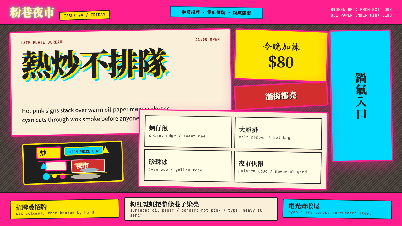 Taipei Shilin Night Market NeonLoud by design. Hot pink, neon yellow, and stacked TC serif signs break the g…張揚就是秩序。夜市粉、霓虹黃與繁體宋招牌打破格線。
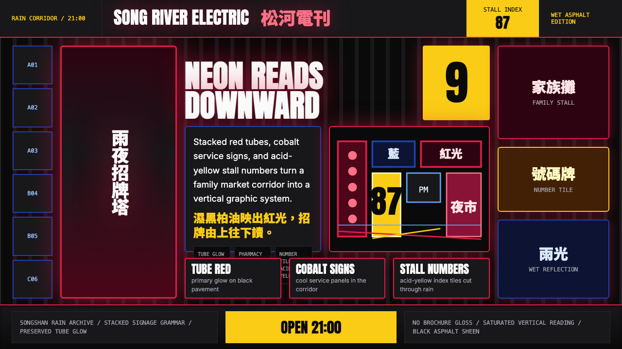 Taiwanese Raohe Night Market NeonTaipei night reads vertically. Neon red, cobalt panels, and acid-yellow numbe…台北夜色垂直閱讀:霓虹紅、鈷藍看板與酸黃號碼疊在濕黑地面。
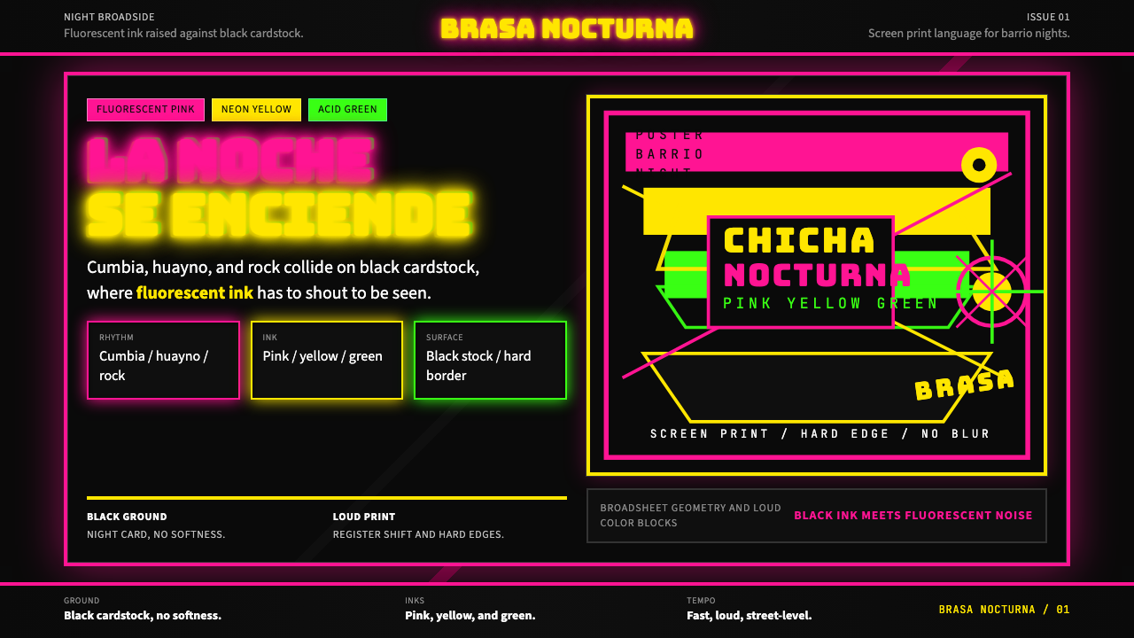 Peruvian Chicha Fluorescent PosterStreet-night fury. Pink, yellow, and green stack on black cardstock in hard b…夜街怒吼。粉黄绿硬边叠在黑卡纸上。
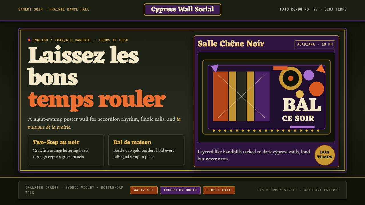 Cajun Louisiana Bayou Fais Do-DoSaturday darkness dances. Crawfish orange and Mardi Gras violet stack on bayo…周六夜在跳舞:小龙虾橙与狂欢紫层叠在沼泽黑上。
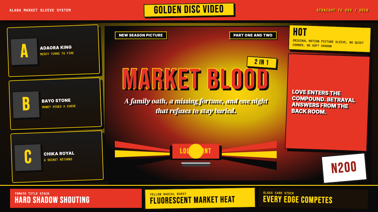 Nigerian Nollywood DVD Poster (2010)Market-stall cinema shouts. Tomato red type and yellow burst collide on jet b…市场摊位式电影在喊:番茄红大字与黄色爆裂撞上黑底。