Design style guide设计风格指南
What is Taipei Shilin Night Market Neon?什么是 Taipei Shilin Night Market Neon?
Taipei's Shilin Night Market is the loudest visual argument in East Asia — a wall-to-wall collision of hot pink, electric cyan, and hand-painted Traditional Chinese characters where every surface competes to outshout the one beside it.台北士林夜市是東亞最張揚的視覺宣言——粉紅、電光青與手繪繁體字鋪天蓋地,每一面招牌都在跟旁邊的搶嗓子。
Taipei Shilin Night Market Neon in briefTaipei Shilin Night Market Neon 速览
Taipei Shilin Night Market Neon is a design system rooted in the unfiltered visual language of Taiwan's most famous street market. It captures the aesthetic of an actual place operating at full intensity on a Friday night — stalls packed shoulder to shoulder, neon tubes buzzing in colors that have no polite equivalent in a Pantone swatch book, Traditional Chinese display type stacked in weights and angles that professional typographers are trained to avoid. The system is not a nostalgic reconstruction; it is a direct translation of a living, daily commercial vernacular.士林夜市霓虹是一套植根於台灣最知名市集真實視覺語言的設計系統。它捕捉的是一個真實地方以全功率運轉時的美學狀態——週五晚間,攤位肩貼肩,霓虹管在那種任何 Pantone 色票都找不到對應的顏色中嗡嗡作響,繁體字招牌用職業排版師被訓練要避免的字重與角度層層疊疊。這套系統不是懷舊重建;它是一套仍在日常生活中運轉的商業俚語的直接翻譯。
The organizing principle — if it can be called that — is productive chaos. Nothing aligns because the stalls themselves never aligned. Signs were painted by whoever was cheapest and fastest that week, light sources are wherever the extension cord reached, and the price tag covers half the product name without apology. Within this apparent disorder, there is a logic: attention hierarchy is established entirely by brightness, scale, and color temperature. The hottest pink wins. The largest character wins. The sign hanging closest to eye level wins. This is not accidental; it is the result of decades of informal A/B testing by hundreds of independent vendors.它的組織原則——如果可以這樣稱呼的話——是富有生產力的混亂。沒有什麼對齊,因為攤位本來就從不對齊。招牌是由那週最便宜最快的人畫的,燈光接在延長線能到的地方,價目表遮住了商品名的一半,毫不致歉。在這表面的無序之中,有一種邏輯:注意力層級完全由亮度、尺寸和色溫決定。最熱的粉紅色贏。最大的字贏。掛在最靠近視線高度的招牌贏。這不是偶然;這是幾百個獨立攤販數十年非正式 A/B 測試的結果。
As a design system, Taipei Shilin Night Market Neon embraces what restrained design movements fear most: density, contradiction, and the refusal to whisper. It is the counterargument to Swiss minimalism, the antidote to Silicon Valley neutral gray. For designers working on projects where energy, immediacy, and cultural specificity are virtues rather than liabilities, this system offers a coherent framework drawn from one of the most visually alive environments in the world.作為設計系統,士林夜市霓虹擁抱了所有克制的設計運動最害怕的東西:密度、矛盾,以及拒絕低語。它是瑞士極簡主義的反論,是矽谷中性灰的解毒劑。對於在能量感、即時性與文化特殊性都是優點而非負擔的項目上工作的設計師,這套系統提供了一個來自世界上視覺最鮮活的環境之一的連貫框架。
See the Taipei Shilin Night Market Neon design system →查看 Taipei Shilin Night Market Neon 完整设计系统 →
Where does Taipei Shilin Night Market Neon come from?Taipei Shilin Night Market Neon 从何而来?
Shilin Night Market was founded in 1899 during the Japanese colonial period, originally as a small trading post near what is now the Jiantan MRT station in the Shilin District of Taipei. Like most of Taiwan's historic markets, it began as a practical infrastructure for a neighborhood — a place where residents could buy produce, prepared food, and everyday goods after working hours. The colonial government periodically attempted to regulate or relocate it, but the market had the resilience of something that fills a genuine need: it persisted, grew, and eventually became the largest and most-visited night market in Taiwan.士林夜市創立於1899年日本殖民時期,最初是台北士林區劍潭捷運站附近一個小型交易場所。如同台灣大多數歷史悠久的市集,它始於服務社區的實際需求——讓居民能在工作時間後購買蔬果、熟食與日常用品。殖民政府曾多次嘗試規範或遷移它,但市集有一種填補真實需求之物所特有的韌性:它堅持下來,成長,最終成為台灣規模最大、參觀人數最多的夜市。
The visual language that now defines the Shilin aesthetic did not emerge until the postwar decades. The Japanese occupation ended in 1945, and Taiwan's subsequent political isolation under the Republic of China government — and particularly the economic pressures of the following decades — created the conditions for a highly localized commercial visual culture. Vendors could not afford professional signage, which meant signs were typically hand-lettered by local artisans using whatever paints were available and whatever display weights caught the eye. Traditional Chinese characters in their full-form complexity became the dominant letterform, used in sizes and weights that reflected the competitive urgency of the stall environment rather than any typographic convention.如今定義士林美學的視覺語言,要到戰後數十年才逐漸成形。日本占領於1945年結束,此後台灣在中華民國政府統治下的政治孤立——以及隨之而來的數十年經濟壓力——創造了高度在地化商業視覺文化的條件。攤販負擔不起專業招牌,因此招牌通常由在地工匠手繪,用任何買得到的顏料、任何能引人注目的展示字體。全字形的繁體漢字成為主導字形,以反映攤位競爭急迫性而非任何排版慣例的尺寸與字重被大量使用。
The full visual intensity that the system captures — the wall of neon, the overlapping illuminated signs, the hot pink and cyan that have become iconic — emerged primarily in the 1990s, as Taiwan's manufacturing economy brought affordable LED and neon tubing into mass commercial circulation. By the end of that decade, the aesthetic was fully formed: a layered environment of competing light sources and hand-painted characters that photographers and designers began documenting as a subject in its own right. The post-1990 Taiwan localism aesthetic, which the market exemplifies, represents a conscious pride in vernacular commercial culture at a time when global homogenization threatened to dissolve it.這套系統所捕捉的完整視覺強度——整面霓虹牆、層疊的發光招牌、已成標誌的熱粉紅與電光青——主要在1990年代浮現,彼時台灣製造業經濟讓平價 LED 與霓虹管進入大規模商業流通。到那個十年末,這種美學已完全成形:一個由競爭光源與手繪文字構成的層疊環境,攝影師和設計師開始將其作為獨立主題加以記錄。市場所代表的1990年後台灣本土主義美學,是在全球同質化威脅將其消解之際,對俚俗商業文化的有意識驕傲。
Contemporary figures such as baker Wu Pao-chun, designer Chen Wei, and artist Lin Sheng-Wen have drawn explicitly on this visual tradition in their work, helping to establish Shilin-style density and chromatic intensity as a legitimate aesthetic register within Taiwanese creative culture rather than something to be overcome in favor of international modernism. Their influence — along with a broader wave of Taiwanese cultural pride in the 2010s and 2020s — has accelerated the transformation of the night market visual language from pure commercial vernacular into a designed system consciously employed to signal local identity, energy, and authenticity.麵包師傅吳寶春、設計師陳威和藝術家林聖文等當代人物,在各自的創作中明確援引這一視覺傳統,協助將士林式的密度與色彩強度確立為台灣創意文化中合法的美學語域,而非需要以國際現代主義加以克服的東西。他們的影響——加上2010至2020年代更廣泛的台灣文化自信浪潮——加速了夜市視覺語言從純粹商業俚俗走向被有意識運用以傳達在地認同、能量與真實感的設計系統的轉化。
What defines the Taipei Shilin Night Market Neon look?Taipei Shilin Night Market Neon 的视觉特征是什么?
Color Temperature and Intensity色溫與強度
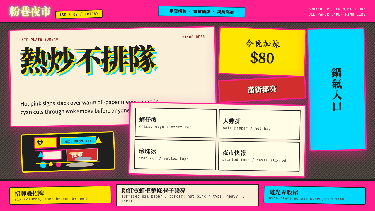
The palette is built on extreme warmth: a hot pink that sits closer to magenta than to rose, an electric cyan that cuts through the warmth like a cold edge, and a neon yellow that functions as a price-tag signal rather than a compositional accent. These are not subtle, graduated hues — they are colors that behave the way actual neon tubing behaves, which is to say they bleed at their edges, they overpower what is next to them, and they read from the end of a crowded street. The overall temperature of the system is warm-dominant, cooled by cyan intrusions at key moments of contrast.色板建立在極致暖調之上:一種比玫瑰更接近品紅的熱粉紅,一種像冷刃切入暖色中的電光青,以及一種作為價目標誌而非構圖強調色發揮作用的霓虹黃。這些不是微妙、漸層的色調——它們就像真實霓虹管的表現方式,也就是說它們在邊緣暈開,壓制旁邊的一切,在擁擠街道盡頭也能被看到。整套系統的色溫以暖調為主導,在關鍵對比時刻由電光青的侵入加以降溫。
Typography as Structure字體即結構
Traditional Chinese characters in bold display weights are not decorative elements in this system — they are the primary structural material. The stroke complexity of full-form characters means that a single large character occupies visual space the way a photograph might in a Western layout. When multiple characters appear at large scale, they create a texture of interlocking geometric density that needs no additional graphic support. Body text, where it appears, is set in a contrasting upright sans-serif that registers as quieter precisely because the display characters are so dominant.粗體展示字重的繁體漢字在這套系統中不是裝飾元素——它們是主要結構材料。全字形漢字的筆畫複雜度意味著一個大尺寸的單字所占的視覺空間,相當於西方版面中的一張照片。當多個漢字以大尺寸並置時,它們創造出相互咬合的幾何密度肌理,無需任何額外圖形支撐。內文(在出現的地方)採用對比鮮明的直立無襯線字體排版,正因展示文字如此強勢,內文顯得相對安靜。
Anti-Grid Composition反格線構圖
Where Bauhaus and Swiss International Style impose the grid as an organizing discipline, this system treats the grid as something to violate. Signs are layered at slight angles. Price tags appear in the corners of other signs rather than in designated information zones. Text wraps around objects and other text. The composition logic is cumulative and additive — each element is placed where it will best compete for attention given what is already there — rather than organized top-down from a master structure. The result is visual density that reads as authentic energy rather than designed chaos.包豪斯和瑞士國際主義風格將格線作為組織紀律加以施行,這套系統則把格線視為需要違反的東西。招牌以輕微的角度層疊。價目表出現在其他招牌的角落而非指定的信息區。文字環繞物品和其他文字排列。構圖邏輯是累積式和疊加式的——每個元素放置在考慮到已有內容後最能競爭注意力的地方——而非從主結構自上而下地組織。結果是讓人讀出真實能量而非刻意混亂的視覺密度。
Illumination as Hierarchy發光即層級
In physical night markets, light itself establishes hierarchy: the brightest stall draws the first glance. The design system translates this into digital and print contexts through the use of glowing, high-saturation colors against dark grounds — a simulated luminance that replicates the felt experience of neon without requiring actual tubing. The hierarchy is simple: things that glow outrank things that do not. This makes the system unusual among historical commercial styles in that luminosity, not size or position, is the primary organizational tool.在真實夜市中,光本身建立層級:最亮的攤位獲得第一眼。這套設計系統通過在深色底面上使用高飽和度的發光色彩,將這一邏輯轉化到數位與印刷語境中——一種模擬亮度,在不需要真實霓虹管的情況下複製霓虹燈的體感。層級很簡單:發光的事物優先於不發光的事物。這讓這套系統在歷史商業風格中顯得不同尋常——是發光度而非尺寸或位置,成為主要的組織工具。
Surface Layering表面疊加
The defining textural quality of the Shilin aesthetic is the palimpsest — surfaces on which new signs overlay old ones, where tape and paper add to printed surfaces, where nothing is ever entirely removed because removal costs money and the new layer works just as well. In design terms, this means composition is built vertically as much as horizontally: foreground, midground, and background are all active zones, each contributing information. Transparency, overlap, and partial occlusion are tools rather than errors.士林美學的定義性肌理品質是疊寫——新招牌覆蓋舊招牌、膠帶和紙張疊加在印刷面上、沒有任何東西會被完全移除因為移除要花錢而新的一層效果一樣好。在設計層面,這意味著構圖在垂直方向上與水平方向上同樣活躍:前景、中景與背景都是活躍區域,各自貢獻信息。透明度、疊加和局部遮擋是工具而非錯誤。
Vernacular Type Scale俚俗字體尺度
In professional typography, scale relationships are deliberate: a headline might be twice the size of body text, with intervening levels for subheadings and captions. In night-market vernacular, scale is determined by what fits and what is most urgent. The result is a system where scale jumps are extreme — a character three times the expected size sitting next to one at expected size — and where the contrast between scales is itself expressive. The largest element shouts; the smallest element mutters. The gap between them is not a failure of hierarchy but the hierarchy itself.在專業排版中,尺度關係是刻意設計的:標題可能是內文的兩倍,中間還有子標題和說明文字的層次。在夜市俚俗中,尺度由什麼放得下、什麼最緊迫決定。結果是一套尺度跳躍極為劇烈的系統——一個是預期尺寸三倍的字緊貼著一個正常尺寸的字——尺度之間的對比本身就是表現力。最大的元素在呼喊;最小的元素在嘟囔。兩者之間的落差不是層級的失敗,而是層級本身。
Chromatic Contradiction色彩矛盾
Where most design systems seek color harmony — palette members that sit comfortably together — this system is built on controlled discomfort. Hot pink and cyan are not harmonious; they vibrate when placed next to each other, creating the perceptual buzz associated with neon juxtaposition. Neon yellow against pink creates a slightly acrid visual tension. These tensions are not bugs to be resolved; they are the mechanism by which the system signals urgency and energy. A harmonized version of this palette would lose precisely what makes it characteristic.大多數設計系統追求色彩和諧——色板成員彼此舒適地共存——這套系統卻建立在有節制的不適之上。熱粉紅與電光青並不和諧;並置時它們會振動,產生與霓虹對比相關的感知嗡鳴。霓虹黃對熱粉紅則製造一種略帶刺激的視覺張力。這些張力不是需要解決的問題;它們是這套系統傳達緊迫感與能量的機制。將這個色板和諧化,恰恰會失去讓它成為它自身的東西。
See the Taipei Shilin Night Market Neon design system →查看 Taipei Shilin Night Market Neon 完整设计系统 →
Who shaped Taipei Shilin Night Market Neon?谁塑造了 Taipei Shilin Night Market Neon?
Wu Pao-chun is Taiwan's most celebrated artisan baker, whose work bridges street-food vernacular and high craft. His visual brand draws explicitly on the warm, dense, hand-crafted aesthetic of Taiwan's market culture — hot-colored packaging, hand-lettered elements, materials that suggest physical warmth and immediate appetite. His success in international competitions while maintaining a distinctly Taiwanese commercial visual language helped legitimate the idea that vernacular market aesthetics were not something to grow out of but a genuine design tradition worth developing.吳寶春是台灣最具聲望的工藝麵包師,其作品架接了街頭食物俚俗與精湛工藝。他的視覺品牌明確援引台灣市集文化溫暖、濃密、手工製作的美學——高飽和度的包裝、手寫元素、暗示身體溫暖與即時食欲的材質。他在保持鮮明台灣商業視覺語言的同時在國際競賽中獲得成功,協助確立了俚俗市集美學不是需要超越的東西、而是值得發展的真實設計傳統這一觀念。
Chen Wei is a Taiwanese designer and visual artist whose work has engaged directly with the chromatic intensity and layered density of Taiwan's commercial street environments. Working across branding, print, and installation, Chen has helped formalize the vocabulary of Taiwanese street vernacular — bright saturated colors, dense typographic layering, a refusal of the compositional restraint associated with mainland Chinese or Japanese contemporary design — as a consciously chosen aesthetic position rather than an untrained default.陳威是台灣設計師與視覺藝術家,其作品直接參與台灣商業街頭環境的色彩強度與層疊密度。跨越品牌、印刷與裝置領域,陳威協助將台灣街頭俚俗的詞彙——高飽和顏色、濃密字體層疊、拒絕與中國大陸或日本當代設計相關的構圖克制——正式化為有意識選擇的美學立場而非未受訓練的預設值。
Lin Sheng-Wen represents the generation of Taiwanese artists and designers who came of age during the post-1990 localism movement and built their practice on the materials and visual logic of Taiwan's street and market culture. Working at the intersection of fine art and commercial visual culture, Lin's engagement with neon, hand-painted signage, and the specific color language of Taiwanese night markets helped position these elements as subjects of serious aesthetic inquiry rather than merely background to be documented.林聖文代表了在1990年代後本土主義運動中成長、在台灣街頭與市集文化的材料和視覺邏輯上建立創作實踐的台灣藝術家與設計師世代。在純藝術與商業視覺文化的交叉地帶工作,林聖文對霓虹、手繪招牌以及台灣夜市特定色彩語言的介入,協助將這些元素定位為嚴肅美學探索的主題,而非僅僅是待記錄的背景。
No single figure codified the Shilin night-market aesthetic — it was developed collectively and anonymously by the itinerant sign painters who worked the markets across Taiwan from the 1950s through the 1990s. These craftspeople painted in Traditional Chinese characters using techniques inherited from prewar commercial calligraphy, adapting weight, color, and scale to the specific conditions of each stall: available light, sign dimensions, the vendor's budget, and the competition from the stall next door. Their accumulated decisions constitute the visual grammar of the system.沒有任何單一人物整理出士林夜市美學——它是由1950至1990年代在台灣各市集工作的流動招牌畫師集體而匿名地發展出來的。這些工匠用繼承自戰前商業書法的技法書寫繁體漢字,根據每個攤位的具體條件調整字重、顏色與尺寸:現有光線、招牌尺寸、攤主預算,以及來自鄰攤的競爭。他們累積的決定構成了這套系統的視覺語法。
The broader movement of Taiwanese designers, writers, and cultural figures who embraced localism after 1990 provided the intellectual framework that allowed the Shilin aesthetic to be understood as a designed system rather than commercial noise. By reframing Taiwanese commercial vernacular as a form of cultural heritage rather than a sign of underdevelopment, this generation created the critical vocabulary — rooted in pride in local visual culture — that made the night-market aesthetic legible as a conscious design tradition worth learning from and building upon.1990年後擁抱本土主義的更廣泛台灣設計師、作家與文化人物運動,提供了讓士林美學得以被理解為設計系統而非商業噪音的知識框架。藉由將台灣商業俚俗重新定位為文化遺產的一種形式而非欠發展的徵象,這一世代創造了批評詞彙——植根於對在地視覺文化的驕傲——讓夜市美學得以被解讀為值得學習和建構的有意識設計傳統。
How do you use Taipei Shilin Night Market Neon today?今天怎么用 Taipei Shilin Night Market Neon?
Taipei Shilin Night Market Neon is a high-commitment style: it does not sit quietly in the background and it does not work at half-intensity. Before applying it, a designer needs to ask whether the project genuinely calls for energy, density, and cultural specificity, or whether the client is drawn to the aesthetic without fully understanding what it demands of a layout. Used correctly, it is among the most immediately recognizable and emotionally direct visual languages available. Used incorrectly, it reads as visual clutter that signals effort without communicating content.士林夜市霓虹是一種高度投入的風格:它不會安靜地退居背景,也無法以半強度運作。應用它之前,設計師需要問自己:這個項目是否真正需要能量、密度和文化特殊性,還是客戶被這種美學吸引卻未充分理解它對版面的要求?用對了,它是現有視覺語言中辨識度最高、情感最直接的之一。用錯了,它被解讀為傳遞努力感卻未能傳達內容的視覺混亂。
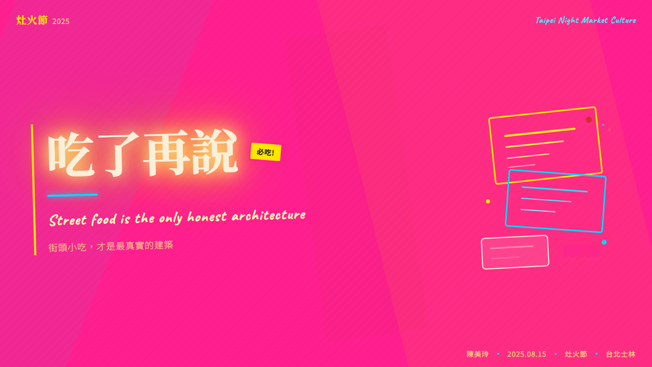
For presentation slides, the system works best on covers and divider pages where full-intensity color and typographic density can be deployed without compromising legibility of detailed content. A cover built on this system might use a hot pink or deep midnight ground, stack two or three large Traditional Chinese characters at an angle, and layer English text in a contrasting weight and color at a different scale. Content slides, by contrast, should pull back significantly — treating the night-market palette as an accent used at headers, divider bars, and data highlight moments rather than wallpapering every slide. The contrast between high-density cover pages and relatively quieter content pages mirrors the actual experience of walking into a night market from the outside: maximum impact at the threshold, navigable within.在演示文稿中,這套系統最適合封面與分隔頁——在那裡可以部署全強度色彩與字體密度而不損害詳細內容的可讀性。以這套系統建構的封面可以使用熱粉紅或深夜黑底面,以一定角度疊放兩三個大尺寸繁體漢字,並以不同尺寸在對比字重和顏色中疊加英文文字。相比之下,內容頁應顯著收斂——將夜市色板作為強調色使用在標題、分隔條和數據高亮時刻,而非把每一頁都鋪滿。高密度封面頁與相對安靜的內容頁之間的對比,映照了從外面走進夜市的真實體驗:入口處最大衝擊,內部可以導航。
For web interfaces and digital product design, the system suits contexts where energy, immediacy, and local cultural identity are primary values: event landing pages, food and beverage brands, entertainment platforms, cultural tourism sites, and any digital product positioned as the antithesis of corporate restraint. Dashboard and analytical interfaces are generally a poor fit — the chromatic intensity makes data discrimination difficult, and the anti-grid composition conflicts with the information architecture demands of complex data products. Where it does appear in interface design, it should be used in high-visibility moments: hero sections, calls to action, category navigation — with quieter zones reserved for actual content.對於網頁介面與數位產品設計,這套系統適合能量感、即時性和在地文化認同是主要價值的場景:活動登陸頁、餐飲品牌、娛樂平台、文化旅遊網站,以及任何定位為企業克制之反面的數位產品。儀表板和分析介面通常不是好的選擇——色彩強度使數據辨識困難,反格線構圖與複雜數據產品的信息架構需求相衝突。在介面設計中出現時,應用於高能見度時刻:主視覺區、行動呼籲、分類導航——把較安靜的區域保留給實際內容。
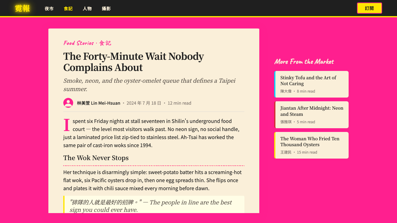
For editorial and marketing work, the system has a natural home in food writing, cultural journalism, travel editorial, and any content that aims to communicate the felt experience of a place rather than just its facts. A spread built on this system might anchor on a large-scale Traditional Chinese character that bleeds off the page, use a hot-pink pull quote at a scale that competes with the headline, and allow photographs of the actual night market environment to blend with typographic elements rather than sitting in clean designated image zones. Marketing pages for food brands, cultural events, and entertainment venues can use the style's poster-quality boldness to great effect, particularly when the brand is specifically Taiwanese or positioning itself within East Asian street culture.對於編輯與行銷工作,這套系統在美食寫作、文化新聞、旅遊編輯以及任何旨在傳達地方體感而非僅僅陳述事實的內容中有天然歸宿。以這套系統建構的跨頁可以以一個出血的大尺寸繁體漢字為錨點,使用在尺度上與標題競爭的熱粉紅引言,讓真實夜市環境的照片與字體元素融合而非放在乾淨的指定圖像區。餐飲品牌、文化活動和娛樂場所的行銷頁面可以大效果地使用這種風格的海報質感大膽感,尤其當品牌明確是台灣的或在東亞街頭文化中定位自身時。
The most common mistake when applying this system is treating it as a color palette choice rather than a compositional philosophy. Designers often take the hot pink, electric cyan, and neon yellow but apply them within a conventional grid structure, with standard type hierarchies, at moderate densities — the result is a confused visual that has the colors but not the character. The second most common mistake is using the palette at full intensity across every element simultaneously, which produces the opposite problem: an undifferentiated field of competing stimuli with no navigable hierarchy. The system requires both commitment to density at key moments and strategic restraint in supporting zones — precisely the balance that the actual stall operators of Shilin have been negotiating for over a century.應用這套系統最常見的錯誤,是把它當成色彩選擇而非構圖哲學。設計師經常取用熱粉紅、電光青和霓虹黃,卻在傳統格線結構內、以標準字體層級、以適中密度應用它們——結果是一個有顏色卻沒有性格的困惑視覺。第二常見的錯誤是在所有元素上同時以全強度使用色板,產生相反的問題:一片沒有可導航層級的競爭刺激不分之地。這套系統需要在關鍵時刻對密度的投入,以及在支撐區域的策略性克制——恰恰是士林真實攤主協商了一個多世紀的那種平衡。
See the Taipei Shilin Night Market Neon design system →查看 Taipei Shilin Night Market Neon 完整设计系统 →
Taipei Shilin Night Market Neon — FAQTaipei Shilin Night Market Neon · 常见问题
Is this style only appropriate for Taiwanese or East Asian brands?這種風格只適合台灣或東亞品牌嗎?
Not necessarily, but cultural context matters. The system draws on a very specific visual tradition rooted in the commercial street culture of Taipei's night markets. When used by a brand with a genuine connection to that tradition — a Taiwanese food company, a cultural tourism platform, a Taiwan-based creative agency — it carries authentic weight. When used by a brand with no connection to that context, it risks reading as cultural appropriation or as a decorative borrowing that has not earned the density it borrows. The question is not whether a non-Taiwanese brand can use it, but whether the project's narrative earns the cultural reference.不一定,但文化脈絡很重要。這套系統援引植根於台北夜市商業街頭文化的非常特定的視覺傳統。當由與該傳統有真實聯繫的品牌使用——台灣食品公司、文化旅遊平台、台灣創意機構——它承載真實重量。當由與該脈絡無聯繫的品牌使用,它有被解讀為文化挪用或未能贏得其所借用之密度的裝飾性借用的風險。問題不是非台灣品牌能否使用它,而是這個項目的敘事是否贏得了這個文化引用。
How do I use Traditional Chinese characters in this system if my content is in English?如果我的內容是英文,我該如何在這套系統中使用繁體漢字?
There are two honest approaches. The first is to use Traditional Chinese characters as pure structural and visual elements — a large character as a section marker, an evocative word or phrase as a hero element — with the understanding that the character's visual complexity is doing compositional work that does not depend on the reader parsing its meaning. The second is to use the system's color language, compositional logic, and typographic density without importing the Chinese characters at all, leaning instead on the anti-grid composition, the chromatic intensity, and the layered visual density as the primary carriers of the aesthetic. Avoid using Chinese characters as inauthentic decoration — a character whose meaning is unknown to both the designer and the intended audience is a risk worth evaluating.有兩種誠實的方式。第一種是將繁體漢字純粹作為結構與視覺元素使用——一個大字作為分節標記,一個有意涵的詞或短語作為主視覺元素——理解其視覺複雜性在做構圖工作,不依賴讀者理解其含義。第二種是完全不引入漢字地使用這套系統的色彩語言、構圖邏輯和字體密度,轉而以反格線構圖、色彩強度和層疊視覺密度作為美學的主要載體。避免將漢字用作非真實的裝飾——一個設計師和目標受眾都不知道其含義的字,是值得評估的風險。
Can this style work at small scale — business cards, icons, app icons?這種風格能在小尺寸上運作嗎——名片、圖示、App 圖示?
At small scale, the system's complexity becomes a liability. The layered, overlapping density that reads as energetic vitality at poster or screen scale becomes unreadable noise at business card or icon dimensions. The chromatic intensity, however, scales down well: a small icon or badge using the hot pink and cyan against a dark ground retains the night-market energy signature even when the typographic layering must be eliminated. The practical advice for small-scale applications is to extract the color language and the luminosity principle — the idea that certain elements should appear to glow — while simplifying everything else to a level appropriate for the format.在小尺寸上,這套系統的複雜性成為負擔。在海報或螢幕尺寸上被解讀為充滿活力的層疊、重疊密度,在名片或圖示尺寸上變成無法閱讀的噪音。然而,色彩強度縮小後表現良好:一個在深色底面上使用熱粉紅和電光青的小圖示或徽章,即使必須取消字體層疊,也保留了夜市能量特徵。小尺寸應用的實用建議是提取色彩語言和發光原則——某些元素應顯得在發光的概念——同時將其他一切簡化到適合格式的程度。
How does this system relate to other East Asian commercial aesthetics — Japanese advertising, Korean street style?這套系統與其他東亞商業美學的關係是什麼——日本廣告、韓國街頭風格?
The three traditions share some surface features — high-saturation colors, dense typographic environments, layered commercial signage — but their underlying logics are distinct. Japanese commercial advertising in its dominant postwar form tends toward high production value, carefully controlled composition, and a tension between kawaii softness and precise technical execution; it rarely permits the kind of unresolved visual conflict that defines the Shilin aesthetic. Korean street design in the contemporary sense has been heavily influenced by K-pop visual culture and favors a sleek, high-tech chromatic range — neon, yes, but ordered and branded rather than chaotic and vernacular. The Shilin system is distinctive precisely in its embrace of genuine commercial disorder: the signs were not designed to coexist with each other, and that non-designed coexistence is what the system attempts to capture and formalize.三種傳統共享一些表面特徵——高飽和色彩、濃密字體環境、層疊商業標誌——但它們的底層邏輯截然不同。日本戰後主流商業廣告傾向高製作價值、精心控制的構圖,以及可愛柔軟與精確技術執行之間的張力;它極少允許定義士林美學的那種未解決的視覺衝突。當代意義上的韓國街頭設計受 K-pop 視覺文化深刻影響,偏好光滑、高科技的色彩范疇——霓虹,是的,但是有序而品牌化的而非混亂而俚俗的。士林系統的獨特性正在於它對真實商業混亂的擁抱:這些招牌並非被設計為彼此共存,而那種非設計的共存正是這套系統試圖捕捉和正式化的。
What is the right way to handle the dark ground that appears in so many night-market images?正確處理在許多夜市圖像中出現的深色底面的方式是什麼?
The night sky and the dark gaps between illuminated signs are as much part of the night-market aesthetic as the lights themselves — they are what make the lit elements appear to glow rather than simply sit. In design terms, a near-black or very deep midnight ground is not merely a background choice but a structural requirement of the system: without the darkness, the chromatic intensity of the hot pink and cyan cannot reach its full effect, because there is no contrast deep enough to make them appear luminous. For projects where a dark ground is not appropriate for other reasons — client branding, category convention, reading environment — the system can be adapted to lighter grounds, but the designer should expect to compensate by increasing the saturation and scale of the colored elements to recover some of the lost luminosity contrast.夜空和發光招牌之間的暗色空隙與燈光本身一樣是夜市美學的組成部分——正是它們讓被點亮的元素顯得在發光而非僅僅存在。在設計層面,近黑色或非常深的夜色底面不僅僅是背景選擇,而是這套系統的結構要求:沒有黑暗,熱粉紅和電光青的色彩強度就無法達到全效,因為沒有足夠深的對比讓它們顯得發光。對於深色底面因其他原因不適合的項目——客戶品牌、品類慣例、閱讀環境——這套系統可以調整到較淺的底面,但設計師應預期需要通過增加彩色元素的飽和度和尺寸來彌補失去的發光對比。
Related design styles相关设计风格
 Cartoon Network 90s BlocksKids-cable noise, squared. Black-white checkerboards crash into hot-yellow Bu…方块化的儿童有线电视噪音:黑白棋盘撞上热黄 Bungee 字块。
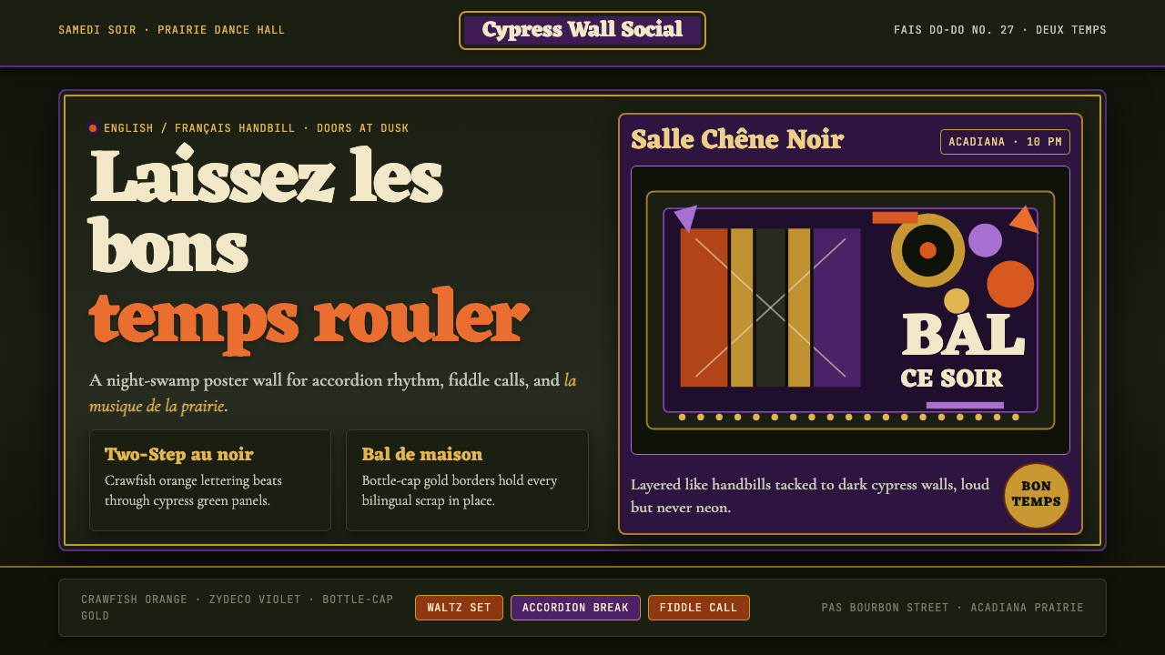 Cajun Louisiana Bayou Fais Do-DoSaturday darkness dances. Crawfish orange and Mardi Gras violet stack on bayo…周六夜在跳舞:小龙虾橙与狂欢紫层叠在沼泽黑上。
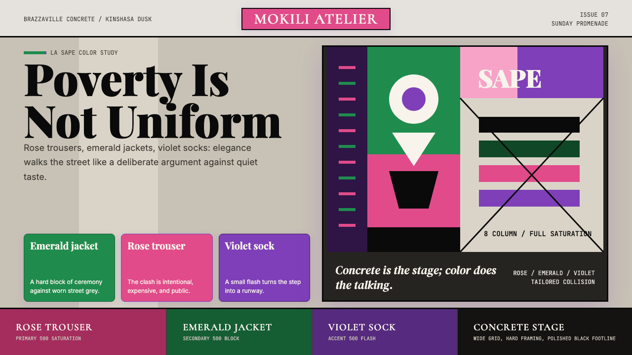 Congolese Sapeur (Kinshasa Suit)Defiant elegance. Rose, emerald, and violet clash on concrete in an asymmetri…优雅即反抗:玫瑰粉、翡翠绿与紫罗兰在水泥灰网格中碰撞。
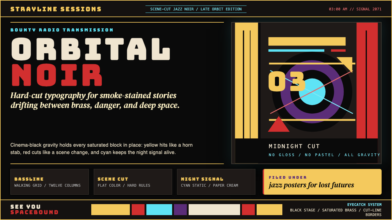 Cowboy Bebop Jazz-NoirCool at 3 AM. Bungee type, jazz yellow, red cuts, and cyan rules hit deep bla…凌晨三点的酷:黑底上 Bungee 字、爵士黄、红切线与青色规则。
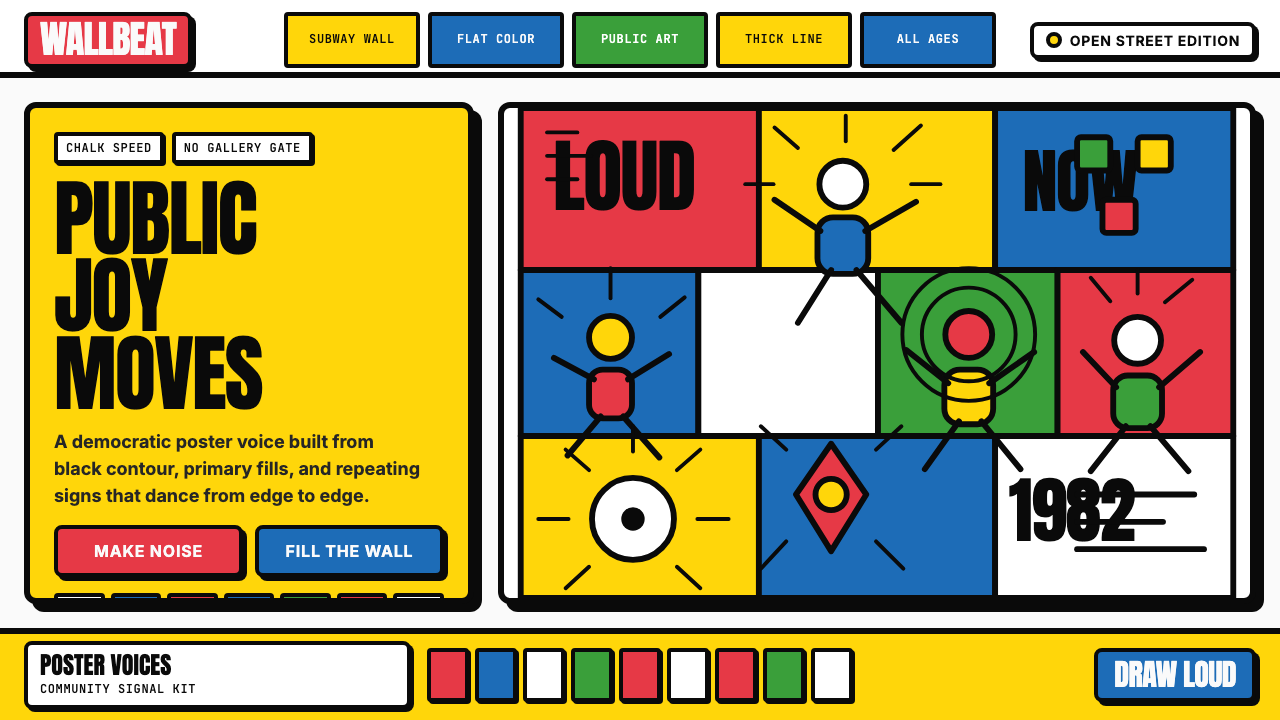 Keith Haring PopJoy refuses the gallery. Thick black contours pack primary color into a danci…快乐拒绝画廊:粗黑轮廓把原色塞进跳动墙面网格。
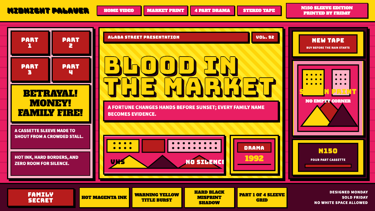 Nollywood VHS CoversEvery inch shouts. Magenta, warning yellow, hard shadows, and part stamps pac…每寸都在叫卖:洋红、警示黄、硬黑投影和分集印章塞满画面。