What is Keith Haring Pop?什么是 Keith Haring Pop?
Keith Haring turned New York's blank subway panels into a democratic gallery — thick black contours, dancing figures, and shouting primary colors that refused to stay on the wall.凯斯·哈林把纽约地铁的空白广告版变成了民主画廊——粗黑轮廓、舞动人形与呼喊着的原色,拒绝被禁锢在画框之内。
Keith Haring Pop in briefKeith Haring Pop 速览
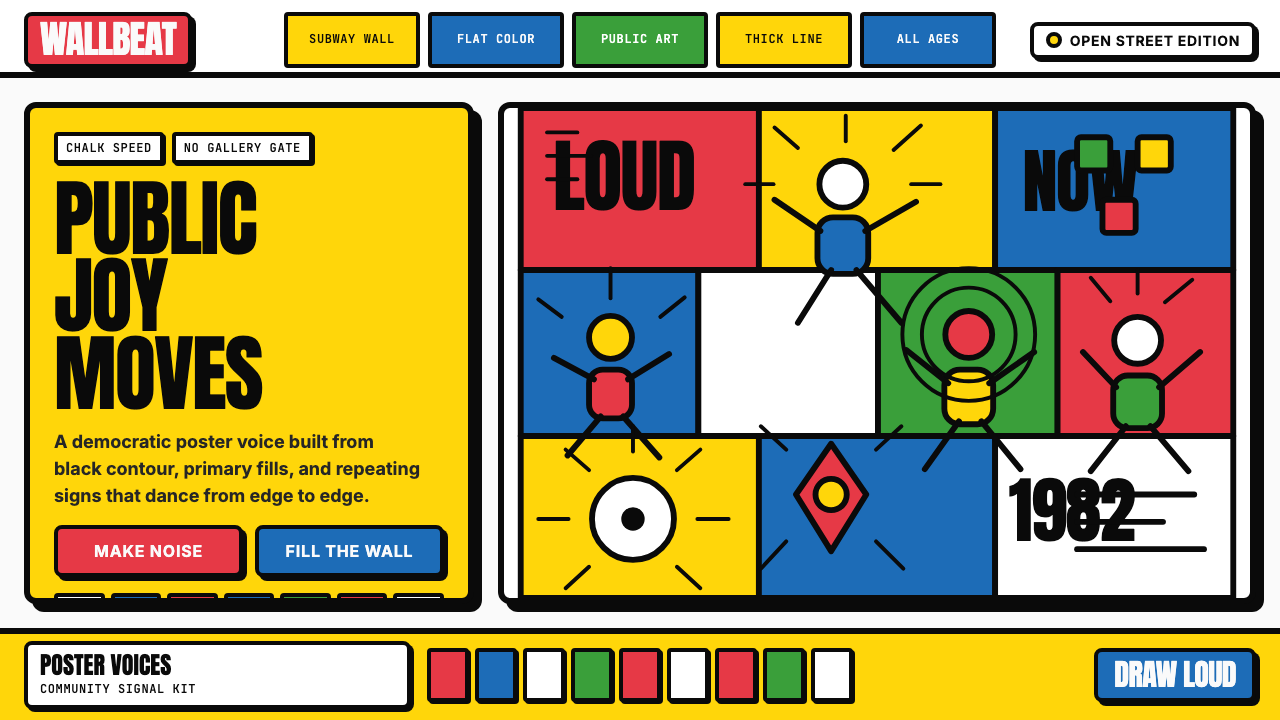
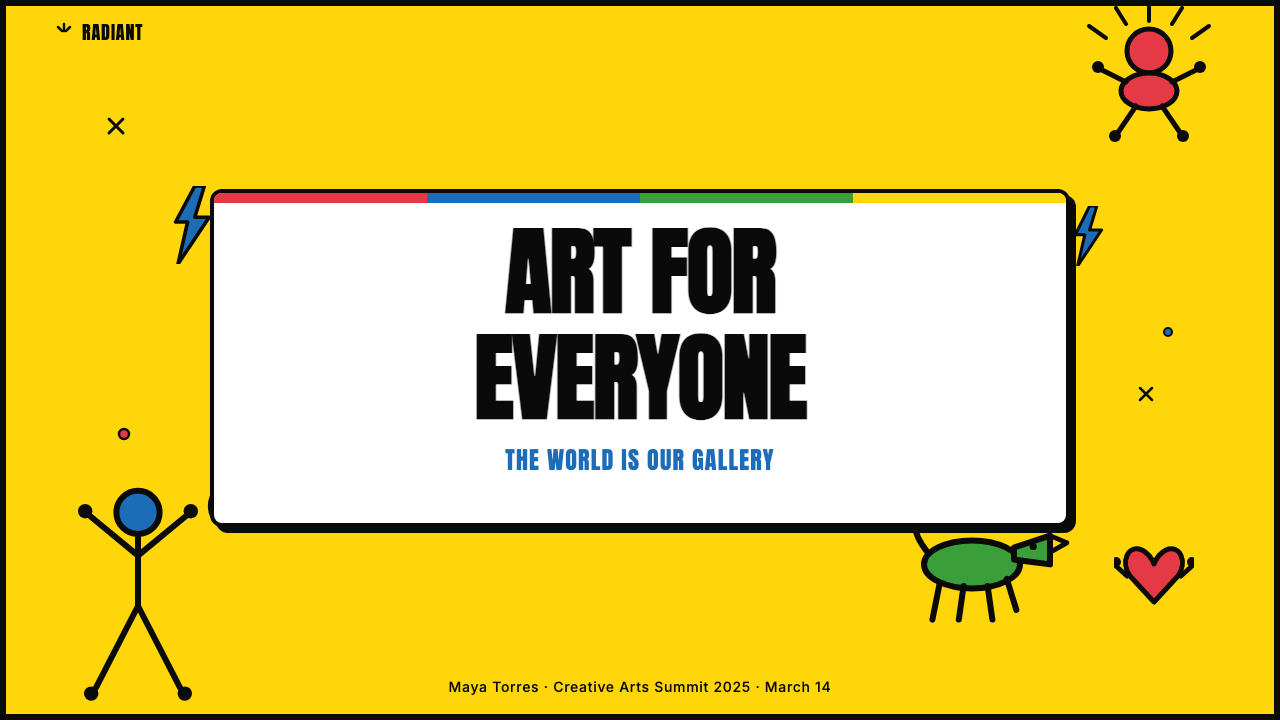
Keith Haring Pop is the visual language born in the New York City subway system in the early 1980s and carried forward through murals, T-shirts, nightclub interiors, and hospital wards worldwide. Its defining characteristics are inseparable from its origin: chalk on black paper, drawn fast, in public, for everyone. Thick black contour lines enclose flat, solid color — cadmium red, cobalt blue, chrome yellow, Kelly green — with no shading, no gradient, and no perspective. Every figure radiates movement lines. Every composition fills the frame edge to edge.凯斯·哈林流行风格是一套视觉语言,1980年代初诞生于纽约地铁系统,随后蔓延至全球的壁画、T恤、夜店内饰与医院病房。它的核心特征与其起源密不可分:在黑色纸面上用粉笔快速绘就,暴露在公共空间里,面向所有人。粗黑轮廓线包裹着平涂的实色区域——镉红、钴蓝、铬黄、凯利绿——没有明暗过渡,没有渐变,没有透视。每个人形都散发着运动线条,每幅构图都铺满画面直至边缘。
The visual system operates through repetition and rhythm. A single dancing figure becomes a crowd. A barking dog becomes a warning. A radiant baby becomes an icon of pure joy. Because each element is built from the same thick stroke weight and the same restricted palette, the system is infinitely scalable — from a dime-sized badge to a ten-story mural — without losing legibility or energy. This scalability was not an accident; it was a consequence of designing in the subway, where a drawing had to read from across a platform at a glance.这套视觉系统通过重复与节奏运作:一个舞动的人形可以增殖为人群,一只吠叫的狗可以成为警示,一个发光的婴儿可以成为纯粹喜悦的图标。由于每个元素都由相同的粗笔触和受限色板构建,整个系统可以无限缩放——从硬币大小的徽章到十层楼高的壁画——而不失可读性或能量感。这种可扩展性并非偶然,而是在地铁中创作的必然结果:画面必须能在站台对面一眼看懂。
What separates Keith Haring Pop from generic cartoon or illustration styles is its structural integrity. The thick outline is not decoration — it is the load-bearing element. Remove it and the color fields collapse. The flat fills are not laziness — they are a political commitment to democratic legibility over technical virtuosity. The whole system is built to be understood immediately, by anyone, regardless of education or cultural background. That is the design intention, not a side effect.将凯斯·哈林流行风格与普通卡通或插画风格区分开来的,是它的结构完整性。粗轮廓不是装饰,而是承重元素——移除它,色块就会崩塌。平涂填充不是偷懒,而是一种政治承诺:将民主可读性置于技术炫技之上。整个系统被设计为能被任何人立刻理解,无论其教育程度或文化背景。这是设计意图,而非副产品。
See the Keith Haring Pop design system查看 Keith Haring Pop 完整设计系统
Where does Keith Haring Pop come from?Keith Haring Pop 从何而来?
Keith Haring arrived in New York City in 1978 from Kutztown, Pennsylvania, enrolling at the School of Visual Arts after a brief stint at the Ivy School of Professional Art in Pittsburgh. The city he entered was in fiscal crisis, physically deteriorating, and artistically incandescent. The East Village was a collision zone of punk, hip-hop, graffiti writing, and neo-expressionist painting. Haring absorbed all of it while developing something distinct: a graphic vocabulary simple enough to draw at speed on the curved black paper panels that the MTA placed over expired subway advertisements.凯斯·哈林于1978年从宾夕法尼亚州的库茨敦来到纽约,在短暂就读匹兹堡艾维专业艺术学院后,进入视觉艺术学院就读。彼时的纽约正经历财政危机,城市物理上趋于破败,艺术上却灿烂夺目。东村是朋克、嘻哈、涂鸦写作与新表现主义绘画激烈碰撞的地带。哈林吸收了这一切,同时发展出某种独特的东西:一套图形词汇,简单到足以快速画在纽约大都会运输署(MTA)贴于过期广告位上的弧形黑色纸面板上。
Between 1980 and 1985, Haring made thousands of these subway drawings — sometimes dozens in a single day — always in white chalk on black paper, always unsigned, always illegal. The subway context was fundamental. The drawings were ephemeral by design: transit workers would remove them, and Haring would return to draw more. The practice trained a visual language that was fast, scalable, immediately communicative, and structurally dependent on the contrast between the thick chalk line and the dark ground. When he moved his work to canvas and then to mural scale, the formal decisions were already fully formed.1980年至1985年间,哈林创作了数千幅这样的地铁画——有时一天就画数十幅——始终用白色粉笔画在黑色纸面上,始终不署名,始终是违规之举。地铁的语境至关重要:这些画作在设计上就是短暂的,工人会将其清除,哈林则回来再画。这种实践训练出一套视觉语言——快速、可缩放、即时传达,并在结构上依赖粗粉笔线与深色底面之间的对比。当他将作品转移到画布乃至壁画尺度时,这些形式上的决策已然完全成熟。
The East Village art scene provided the social infrastructure. Tony Shafrazi, the gallerist who had once spray-painted Picasso's Guernica as a protest action, became Haring's primary commercial dealer and helped translate his subway currency into the international art market without sacrificing the style's democratic energy. Andy Warhol, whom Haring met in the early 1980s, recognized in his younger colleague the same commitment to mass-reproducibility and cultural accessibility that had driven Warhol's own Pop Art project. The two became close friends and mutual influences. Jenny Holzer, whose text-based street art also occupied public space as political intervention, was another peer whose example reinforced Haring's conviction that the street was a more honest gallery than any white cube.东村艺术圈提供了社会基础设施。画商托尼·沙弗拉兹——那位曾以抗议行动在毕加索《格尔尼卡》上喷涂文字的人——成为哈林的主要商业代理人,帮助他将地铁中积累的文化资本转化为国际艺术市场的认可,同时未曾牺牲这种风格的民主能量。1980年代初,哈林结识了安迪·沃霍尔。沃霍尔在这位年轻同行身上认出了驱动自己波普艺术实践的同一种承诺:大规模可复制性与文化可及性。两人成为挚友,相互影响。珍妮·霍尔泽以文字为基础的街头艺术同样将公共空间作为政治干预的场域,她的榜样强化了哈林的信念:街道比任何白盒子画廊都更为诚实。
The AIDS crisis, which devastated the communities Haring belonged to and eventually took his own life in 1990, gave the work an urgency and a political dimension that sharpened its visual language rather than softening it. Haring created public health murals, collaborated with AIDS activist organizations, and used his visual system — already built for instant comprehension — as a tool for outreach to populations who were simultaneously stigmatized and underinformed. The icons he developed for this work, including figures of support and solidarity, became some of the most recognized graphic symbols of 1980s activist visual culture. His Pop Shop, opened in New York in 1986 and in Tokyo in 1988, made his imagery available on affordable merchandise, deliberately undercutting the gallery market and extending the democratic logic of the subway drawings into commercial space.AIDS危机席卷了哈林所属的社群,并最终于1990年夺走了他的生命。这场危机赋予其作品一种紧迫感和政治维度,非但没有软化其视觉语言,反而使其更为锋利。哈林创作了公共健康壁画,与AIDS活动组织合作,将他那套已被设计为即时可读的视觉系统,作为触达同时遭受污名化与信息匮乏群体的工具。他为此创作的图标——包括支持与团结的人形——成为1980年代活动主义视觉文化中最具辨识度的图形符号之一。他的流行商店(Pop Shop)于1986年在纽约开业,1988年在东京开设分店,以平价商品的形式让他的图像触手可及,有意打压画廊市场,将地铁画的民主逻辑延伸进商业空间。
What defines the Keith Haring Pop look?Keith Haring Pop 的视觉特征是什么?
Thick Contour Line粗轮廓线
The single most defining formal element is the heavy, even-weight black outline that encloses every shape. This line does not thin or taper — it maintains consistent weight around curves, corners, and interior details alike. It reads clearly at any scale, from a button badge to a building facade, because its visual weight is calibrated to the contrast it creates against the color fill inside and the background outside. The outline is structural, not decorative: without it, the system loses its coherence entirely.最具定义性的单一形式元素,是包裹每个形状的厚重、等宽黑色轮廓线。这条线不收细、不渐变——无论绕过弯角、转角还是内部细节,始终保持一致的线条粗细。由于其视觉重量是根据它与内侧色块及外侧背景所创造的对比度校准的,它在任何尺度下都清晰可读,从小小的徽章到整栋建筑的外墙皆如此。这条轮廓线具有结构功能,而非装饰性的——没有它,整个系统会彻底失去连贯性。
Flat Saturated Color平涂饱和色
Color fills are applied as uniform, unmodulated fields — no shading, no highlight, no internal texture. The palette draws from a concentrated set of primary and near-primary hues: red, blue, yellow, green, with occasional orange, all at high saturation. These are joyful, assertive colors that announce themselves without apology. Color functions to distinguish figure from figure and figure from ground; it does not model light or suggest three-dimensional form. The flatness is a feature, not a limitation — it is what allows the compositions to remain legible at a distance and in motion.色彩以均匀、无调制的色块形式填充——没有明暗,没有高光,没有内部纹理。色板取自一组集中的原色及近原色色调:红、蓝、黄、绿,偶尔有橙,全部保持高饱和度。这些颜色充满喜悦感,毫无歉意地自我宣告。色彩的功能是将人形与人形区分开来,将人形与背景区分开来;它不模拟光线,不暗示三维立体感。这种平涂性是一种特性,而非局限——正是它使构图在远距离和运动中依然保持可读性。
Radiant Movement Lines辐射式运动线条
Haring codified a visual language of motion through short, energetic lines radiating outward from figures and objects — what became his signature glyph for excitement, emanation, and life. A figure running radiates lines from its heels. A baby glowing with health radiates lines from its whole body. A barking dog radiates lines from its open mouth. These are not naturalistic speed lines borrowed from comics but a consistent symbolic vocabulary: more lines mean more energy. The device transforms what might be static icons into kinetic presences.哈林通过从人形和物体向外辐射的短促有力线条,编纂出一套运动的视觉语言——这成为他标志性的象形符号,代表兴奋、散发与生命力。奔跑的人形从脚踝处辐射线条,健康发光的婴儿从全身辐射线条,吠叫的狗从张开的嘴里辐射线条。这些不是借自漫画的自然主义速度线,而是一套一致的象征词汇:线条越多,能量越大。这一手法将原本可能静止的图标转化为充满动感的存在。
Edge-to-Edge Composition铺满画面的构图
Haring rarely left significant empty space. Compositions fill the available field completely, with figures and pattern elements pressed to the edges. When multiple figures appear — and they often do, in crowds, in chains, in stacked grids — they interlock and overlap in ways that create dense, rhythmic surface patterns rather than isolated characters in open space. This density was partly a product of the subway context (a single blank panel had to hold attention as a commuter walked past) and partly a philosophical stance: every inch of a public surface that can carry meaning should carry meaning.哈林很少留下大面积空白。构图将整个可用画面填满,人形与图案元素一直延伸至边缘。当多个人形出现时——这经常发生,以人群、链条、叠加网格的方式——它们相互嵌套、叠压,形成密集的节奏性表面图案,而非开阔空间中的孤立角色。这种密度一部分源于地铁的语境(单张空白面板必须在通勤者经过时抓住注意力),一部分则是一种哲学立场:公共表面上每一寸能够承载意义的地方,都应当承载意义。
Symbolic Icon System象征性图标体系
Over time, Haring developed a consistent set of recurring symbols — the radiant baby, the barking dog, the crawling figure, the TV set with devil horns, the flying saucer, the dolphin, the angel — each with a specific emotional register and deployable in combination to produce narrative meaning. This is not illustration but iconography: a visual language with grammar. The icons are legible cross-culturally because they are built from universal gestural forms rather than culturally specific references. A figure with arms raised reads as joy or surrender or celebration in almost any context.随着时间推移,哈林发展出一套持续出现的固定符号——发光的婴儿、吠叫的狗、爬行的人形、长着魔鬼角的电视机、飞碟、海豚、天使——每种都有特定的情感色调,可以组合使用以产生叙事意义。这不是插画,而是图像志:一套具有语法的视觉语言。这些图标具有跨文化的可读性,因为它们建立在普遍的姿态形式之上,而非特定文化的参照。双臂高举的人形在几乎任何语境中都能被解读为喜悦、臣服或庆祝。
Comic-Book Shadow Offset漫画式偏移阴影
Where shadow appears in Haring-derived work, it is a hard, solid-color block offset at a consistent diagonal — a technique borrowed from comic book production and street signage rather than from fine art painting. The shadow is the same uniform density as the fill color, simply shifted a fixed distance in one direction. This produces a pop-out effect that gives flat elements a sense of presence without introducing any gradient or blur. It emphasizes the printed, graphic nature of the work: this is a designed artifact, not a rendering of the physical world.在哈林风格衍生作品中,阴影表现为以固定对角线偏移的硬边实色块——这一技法借自漫画出版和街头标识,而非精英绘画传统。阴影与填充色保持相同的均匀密度,只是沿一个方向移动了固定距离。这产生了一种弹出效果,赋予平面元素一种存在感,同时不引入任何渐变或模糊。它强调了作品印刷、图形化的本质:这是一件被设计出来的物件,而非对物理世界的渲染。
Democratic Accessibility民主可及性
Unlike many historical art styles, Keith Haring Pop is defined as much by its values as by its formal properties. The visual decisions — simple forms, bold colors, thick outlines, no technical complexity — are not stylistic preferences but deliberate commitments to reach the widest possible audience without requiring art literacy. This means the style is inherently anti-elitist: it refuses visual vocabulary that signals sophistication or insider knowledge. When applied in contemporary design, this principle translates to maximizing legibility, minimizing assumed knowledge, and treating every viewer as equally capable of receiving the message.与许多历史艺术风格不同,凯斯·哈林流行风格同样由其价值观定义,就像由其形式属性定义一样。那些视觉决策——简单的形式、大胆的色彩、粗重的轮廓、无技术复杂性——不是风格偏好,而是经过深思熟虑的承诺:在不需要艺术素养的前提下触达尽可能广泛的受众。这意味着这种风格本质上是反精英主义的:它拒绝任何暗示高雅品位或圈内知识的视觉词汇。当应用于当代设计时,这一原则转化为:最大化可读性,最小化默认知识,将每位观看者都视为同等有能力接收信息的人。

See the Keith Haring Pop design system查看 Keith Haring Pop 完整设计系统
Who shaped Keith Haring Pop?谁塑造了 Keith Haring Pop?
Haring (1958–1990) arrived in New York in 1978 from Pennsylvania and spent the first years of his career making unsanctioned chalk drawings on the blank black panels the MTA placed over expired subway advertisements. By the early 1980s he had become one of the most recognizable visual artists working in public space anywhere in the world. He created major murals in New York, Berlin, Melbourne, Amsterdam, and dozens of other cities, often in direct response to political events — a mural in West Berlin painted in 1986 ran directly along the Berlin Wall. His Pop Shop, opened in 1986, made his imagery available on affordable objects as a deliberate challenge to the gallery economy. Haring died of AIDS-related complications in 1990 at the age of thirty-one. The Keith Haring Foundation, established before his death, continues to support AIDS-related and children's causes.哈林(1958—1990年)于1978年从宾夕法尼亚来到纽约,职业生涯初期在大都会运输署贴于过期广告位上的空白黑色面板上创作未经授权的粉笔画。1980年代初,他已成为全球最具辨识度的公共空间视觉艺术家之一。他在纽约、柏林、墨尔本、阿姆斯特丹及数十个其他城市创作了重要壁画,往往是对政治事件的直接回应——1986年在西柏林画的一幅壁画紧贴柏林墙而作。他于1986年开设的流行商店以平价物品的形式传播其图像,刻意挑战画廊经济。哈林于1990年因AIDS并发症去世,年仅三十一岁。他在生前创立的凯斯·哈林基金会持续支持与AIDS相关的及儿童相关的事业。
Warhol (1928–1987) was the dominant figure of American Pop Art and, by the time Haring arrived in New York, the central social hub of the city's art world. Haring and Warhol became close friends in the early 1980s, collaborating on paintings and sharing a commitment to the idea that high art and popular culture were not opposites but partners. Warhol's example — the Factory, the celebrity portraits, the Campbell's Soup Cans — demonstrated that an artist could engage directly with mass-market imagery and commercial reproduction without surrendering artistic seriousness. Haring absorbed and extended this lesson, applying it to a visual language that was even more graphic and accessible than Warhol's screenprint aesthetic.沃霍尔(1928—1987年)是美国波普艺术的核心人物,当哈林抵达纽约时,他已是这座城市艺术界的社交枢纽。哈林与沃霍尔在1980年代初成为挚友,共同创作绘画,分享同一种信念:高雅艺术与大众文化并非对立,而是伙伴。沃霍尔的先例——工厂、名人肖像、坎贝尔汤罐头——证明了艺术家可以直接与大众市场图像和商业复制打交道,而不必放弃艺术的严肃性。哈林吸收并延伸了这一课,将其应用于一套比沃霍尔丝网印刷美学更具图形感和可及性的视觉语言。
Shafrazi became Keith Haring's primary commercial dealer and the gallerist most responsible for translating Haring's street credibility into sustained art-market success. Shafrazi himself was not a conventional gallery figure — he was known for having spray-painted 'KILL LIES ALL' on Picasso's Guernica at MoMA in 1974 as a Vietnam War protest, an act that positioned him firmly within the tradition of art-as-political-intervention. His gallery on Mercer Street in SoHo became the institutional home for much of the East Village art scene in the early 1980s, representing Haring alongside Jean-Michel Basquiat and other artists who shared the same commitment to rawness, scale, and cultural urgency.沙弗拉兹成为凯斯·哈林的主要商业代理人,也是将哈林街头公信力转化为持续艺术市场成功的最关键画商。沙弗拉兹本人并非传统的画廊人物——他以1974年在MoMA毕加索《格尔尼卡》上喷涂「KILL LIES ALL」抗议越战而著称,这一行为将他牢固置于艺术即政治干预的传统中。他在苏荷区默瑟街的画廊成为1980年代初东村艺术圈的机构大本营,代理哈林及让-米歇尔·巴斯奎亚特等同样致力于粗犷感、大尺度与文化紧迫性的艺术家。
Holzer is a New York-based conceptual artist whose text-based interventions in public space — printed on posters, LED signs, and electronic billboards — share with Haring's subway drawings the foundational conviction that public space is a legitimate and important site of artistic and political communication. Where Haring used image, Holzer used language, but the tactical logic was identical: occupying the infrastructure of mass communication to deliver messages outside the conventional gallery circuit. Holzer and Haring were part of the same East Village community and the same moment of rethinking what public art could do. Her work reinforced the idea, crucial to Haring's legacy, that art could be simultaneous with everyday life rather than cordoned off from it.霍尔泽是纽约概念艺术家,她在公共空间中以文字为基础的干预——印于海报、LED标识和电子广告牌上——与哈林的地铁画共享一个根本信念:公共空间是艺术与政治表达的合法且重要的场域。哈林用图像,霍尔泽用语言,但战术逻辑完全相同:占用大众传播的基础设施,在常规画廊回路之外传递信息。霍尔泽与哈林同属东村社群,同处重新思考公共艺术可以做什么的那个历史时刻。她的工作强化了对哈林遗产至关重要的理念:艺术可以与日常生活同步共存,而不是被从中隔离出去。
Basquiat (1960–1988) was Haring's closest peer in the early 1980s East Village scene and, like Haring, a figure who moved from unsanctioned street art to gallery recognition in a very short period. Where Haring's visual language was built on simplified graphic form and legibility, Basquiat's was dense, text-heavy, and deliberately difficult — but both operated from the same premise that the street and the gallery were equally valid sites of production. Their mutual influence and friendship embodied the productive tension of the moment: the question of whether the art market could absorb work that came from communities it had historically excluded, and what would be gained and lost in that absorption.巴斯奎亚特(1960—1988年)是哈林在1980年代初东村场景中最亲近的同辈,同样在极短时间内从无授权街头艺术走向画廊认可。哈林的视觉语言建立在简化图形形式与可读性之上,巴斯奎亚特的则密集、文字繁多、故意制造阅读难度——但两者都从同一前提出发:街道与画廊都是同等有效的创作场域。他们之间的相互影响与友谊体现了那个时刻富有张力的核心问题:艺术市场是否能够吸纳来自它历史上排斥的社群的作品,以及这种吸纳中会得到和失去什么。
How do you use Keith Haring Pop today?今天怎么用 Keith Haring Pop?
Keith Haring Pop is one of the most immediately legible historical styles available to contemporary designers, but its apparent simplicity is a trap. The system's power comes from the consistency of its structural commitments — uniform line weight, unreduced color saturation, edge-to-edge density, kinetic energy in every figure. Applying it correctly means understanding those commitments, not just borrowing the visual surface. A design that uses thick outlines and primary colors but breaks the compositional density or introduces gradient fills is not Keith Haring Pop — it is a pastiche that loses the energy while keeping the palette.凯斯·哈林流行风格是当代设计师可用的最即时可读的历史风格之一,但其表面上的简单是一个陷阱。这套系统的力量来自其结构承诺的一致性——均匀的线条粗细、未减弱的色彩饱和度、铺满画面的密度、每个人形中的动感能量。正确应用它意味着理解这些承诺,而不仅仅是借用视觉表面。一个使用了粗轮廓和原色、但打破了构图密度或引入了渐变填充的设计,不是凯斯·哈林流行风格——那是一种拟仿,保留了色板却丧失了能量。
For presentation slides, the style works powerfully on cover pages and section dividers. A cover built on this system should feel like a mural panel: bold figure or icon at large scale, background field saturated with a single strong color, title in a solid sans-serif at high contrast. The figures or icons can suggest the theme of the presentation without illustrating it literally. For content slides, the approach requires discipline: one or two figures used as visual anchors, text set in a clean sans-serif without decorative treatment, data visualized as flat geometric shapes colored within the primary palette. The style does not suit dense text slides — it demands visual breathing room balanced against visual boldness.对于演示文稿,这种风格在封面和章节分隔页上最为有力。建立在这套系统上的封面应该感觉像一块壁画面板:大尺度的大胆人形或图标,单一强色饱和背景,标题以高对比度实心无衬线字体呈现。人形或图标可以暗示演示主题,而无需字面图解。对于内容页,方法需要约束:一两个人形作为视觉锚点,文字以干净无衬线字体呈现而无装饰处理,数据可视化为原色板内着色的平面几何形。这种风格不适合密集文字页——它需要视觉呼吸空间与视觉大胆感之间的平衡。
For web UI and digital dashboards, Keith Haring Pop works best as a framing language rather than a full system. A dashboard that applies the style wholesale will feel overwhelming; one that uses it for hero sections, onboarding flows, empty states, and celebration moments will feel energetic and purposeful. Pricing and feature pages benefit from the style's poster-like boldness: a full-width banner with a large Haring-style icon and a saturated background reads as confident and accessible simultaneously. Navigation and body text should remain in a clean, neutral register — the Haring energy as accent, not as ambient noise.对于网页界面和数字仪表板,凯斯·哈林流行风格最适合作为框架语言,而非完整系统。全面套用这种风格的仪表板会让人感到压迫;将其用于主视觉区域、引导流程、空状态和庆祝时刻的仪表板则会感到充满活力且目的明确。定价页和功能页受益于这种风格的海报式大胆感:带有大型哈林式图标和饱和背景的全宽横幅,同时传达出自信与可及性。导航和正文应保持干净、中性的基调——哈林能量作为点缀,而非背景噪音。
For editorial and marketing work, the style is exceptionally strong at communicating joy, urgency, and democratic values. A campaign built on this visual system signals: we are for everyone, we are not precious, we want to be understood. Social media graphics, event posters, newsletter headers, and advocacy materials all benefit from the high contrast, the strong iconic forms, and the sense of movement. The common mistake is using the style decoratively — adding a thick-outlined cartoon figure to an otherwise conventional layout — without committing to the structural principles that give the style its coherence. If the composition still follows conventional hierarchy rules (centered, symmetrical, lots of white space), the Haring elements will look pasted on rather than integrated.对于编辑和营销工作,这种风格在传达喜悦、紧迫感和民主价值观方面异常有力。建立在这套视觉系统上的营销活动传递的信号是:我们属于所有人,我们不矫揉造作,我们希望被理解。社交媒体图形、活动海报、电子报页眉和倡导材料都受益于高对比度、强劲的图标形式和运动感。常见错误是装饰性地使用这种风格——在一个其他方面都是传统版面的设计上添加一个粗轮廓的卡通人形——而不致力于赋予这种风格连贯性的结构原则。如果构图仍然遵循传统层级规则(居中、对称、大量留白),哈林元素看起来会像是粘贴上去的,而非整合进去的。
A persistent error when applying this style is mistaking variety for energy. Haring's compositions feel alive because every element within them is consistently built and consistently energetic — not because they contain many different kinds of things. Using too many different icon styles, mixing the Haring vocabulary with unrelated illustrative approaches, or applying the thick outline to some elements but not others will produce visual incoherence rather than the joyful density the style is capable of. Commit fully to the system — uniform line weight everywhere, color fills with no gradient anywhere, figures that radiate movement rather than sit still — and the energy will follow.应用这种风格时一个持续存在的错误是将多样性误认为能量。哈林的构图感觉充满生命,是因为其中每个元素都被一致地构建、一致地充满活力——而不是因为它们包含许多不同种类的事物。使用过多不同的图标风格,将哈林词汇与不相关的插画手法混合,或对某些元素应用粗轮廓而对其他元素不应用,都会产生视觉不连贯,而不是这种风格所能带来的愉悦密度。全面致力于这套系统——处处均匀的线条粗细,任何地方的色块填充都无渐变,散发运动感而非静止的人形——能量自然会随之而来。
See the Keith Haring Pop design system查看 Keith Haring Pop 完整设计系统
Keith Haring Pop — FAQKeith Haring Pop · 常见问题
Is Keith Haring Pop the same as graffiti or street art?凯斯·哈林流行风格与涂鸦或街头艺术是同一回事吗?
Not exactly. Keith Haring Pop shares with graffiti the premise that public space is a valid site for visual communication, and Haring's early subway drawings were technically illegal. But the formal vocabulary is distinct: graffiti writing developed from lettering traditions and emphasizes stylized text, territorial marking, and insider coding. Haring's work is fully image-based, built for immediate cross-cultural legibility rather than community recognition. It also differs from most street art in its structural consistency — the same handful of icons, the same line weight, the same restricted palette — which gives it the coherence of a designed system rather than the improvised quality of much street work. Think of it as public art with a graphic design logic rather than as graffiti with refined technique.并不完全是。凯斯·哈林流行风格与涂鸦共享一个前提:公共空间是视觉传达的合法场域,哈林早期的地铁画在技术上也是违规的。但形式词汇截然不同:涂鸦写作从字母书写传统发展而来,强调风格化文字、领地标记和圈内编码。哈林的作品完全以图像为基础,为跨文化的即时可读性而构建,而非为社群内部识别而设计。它与大多数街头艺术的不同还在于其结构一致性——相同的少量图标、相同的线条粗细、相同的受限色板——这赋予它被设计系统的连贯性,而非大多数街头作品的即兴品质。可以将其理解为具有平面设计逻辑的公共艺术,而非具有精炼技巧的涂鸦。
Can this style work for serious or solemn subject matter, or is it inherently joyful?这种风格能用于严肃或庄重的主题吗?还是说它本质上只适合表达喜悦?
Haring himself used the visual system for urgent and tragic subject matter — AIDS awareness campaigns, anti-apartheid murals, anti-nuclear imagery — without abandoning its formal properties. The thick contour line, the flat color, and the radiating movement lines are formally neutral: they do not require joyful content. What the style communicates inherently is energy, directness, and democratic access — not exclusively happiness. The challenge is that saturated primary colors and dancing figures carry cultural associations with cheerfulness, so applying the style to somber subjects requires intentional choices about which elements to foreground. A muted color palette within the system's structural logic, or figures depicted in postures of grief or solidarity rather than celebration, can shift the emotional register substantially while preserving the system's legibility.哈林本人就将这套视觉系统用于紧迫而悲剧性的主题——AIDS意识倡导、反种族隔离壁画、反核影像——而没有放弃其形式属性。粗轮廓线、平涂色彩和辐射运动线条在形式上是中性的:它们不要求内容是欢乐的。这种风格本质上传达的是能量、直接性和民主可及性——而不仅仅是快乐。挑战在于,饱和原色和舞动人形带有与欢快感相关的文化联想,因此将这种风格应用于沉重主题需要有意识地选择突出哪些元素。在系统结构逻辑内使用低饱和色板,或将人形描绘为悲伤或团结而非庆祝的姿态,可以在保留系统可读性的同时,显著转换情感基调。
How do you use this style without it looking like a cheap imitation of Haring's actual work?如何使用这种风格而不让它看起来像是对哈林原作的廉价模仿?
The distinction lies in applying the structural principles rather than copying the specific icons. Haring's radiant baby, his barking dog, his crawling figure — these are his intellectual property and cultural property simultaneously. Using them directly in commercial design work is ethically and legally problematic, and it also produces work that looks derivative rather than inspired. The correct approach is to develop original iconography that follows the same structural grammar: built from simple closed shapes, enclosed in heavy even-weight outlines, filled with flat saturated color, and animated with radiating movement lines. An original icon designed according to these rules will feel like it belongs to the system without replicating any specific Haring image. The formal logic is transferable; the specific images are not.区别在于应用结构原则,而非复制具体图标。哈林的发光婴儿、吠叫的狗、爬行的人形——这些同时是他的知识产权和文化财产。在商业设计中直接使用它们,在伦理和法律上都存在问题,而且也会产生看起来像是抄袭而非受启发的作品。正确的做法是开发遵循相同结构语法的原创图像志:由简单封闭形状构成,被厚重均匀的轮廓线包裹,填充平涂饱和色,并以辐射运动线条赋予动感。按照这些规则设计的原创图标会让人感觉属于这套系统,同时不复制任何具体的哈林图像。形式逻辑是可转移的;具体图像则不然。
Does the style translate well to dark-background layouts?这种风格适合用在深色背景版面上吗?
Yes, with adjustments. Haring's own subway drawings were white chalk on black paper — technically a dark background — so the dark inversion is historically grounded, not a contemporary invention. On a dark ground, the white or light-colored outline becomes the primary structural element instead of the black line, and the color fills read differently: yellows and oranges tend to advance strongly against dark backgrounds, while blues and greens recede more than they would on white. The key adjustment is choosing a color to anchor the composition — one dominant hue per panel or section — rather than distributing multiple saturated colors equally across the dark field. Dark-background versions of the style often work best as contrast sections within a primarily light-ground design, rather than as the dominant mode throughout an entire piece.可以,但需要调整。哈林自己的地铁画就是黑色纸面上的白色粉笔——从技术上说是深色背景——因此深色反转有历史依据,并非当代发明。在深色底面上,白色或浅色轮廓线成为主要结构元素,而非黑线,色块填充的效果也有所不同:黄色和橙色在深色背景上往往强烈前进,而蓝色和绿色比在白色背景上更容易后退。关键调整是选择一种色彩锚定构图——每个面板或区域一种主导色调——而非将多种饱和色均匀分布在深色底面上。深色背景版本的这种风格通常作为以浅色为主的设计中的对比区段最有效果,而非整件作品自始至终的主导模式。
What kinds of products or brands are a poor fit for this style?哪些类型的产品或品牌不适合使用这种风格?
The style signals energy, accessibility, playfulness, and democratic values. It struggles in contexts where the desired brand signals are authority, exclusivity, precision, or understated luxury. A private wealth management firm, a pharmaceutical brand emphasizing clinical precision, a high-fashion label, or a professional services firm positioning on experience and discretion would all find the Haring visual vocabulary actively working against their intended positioning. The style is also a poor fit for contexts requiring visual complexity or information density — it is built for immediacy, not for nuanced multi-layered communication. Finally, it requires a certain cultural awareness: the style carries specific associations with 1980s New York, AIDS activism, and urban public art, and applying it in contexts that are ignorant of or disrespectful to that history risks producing work that feels exploitative rather than inspired.这种风格传递能量、可及性、趣味性和民主价值观。在期望的品牌信号是权威、排他性、精确性或低调奢华的语境中,它会遭遇阻力。私人财富管理公司、强调临床精确性的制药品牌、高端时装品牌,或以经验和审慎为定位的专业服务公司,都会发现哈林视觉词汇在积极地对抗其预期定位。这种风格也不适合需要视觉复杂性或信息密度的场景——它为即时性而生,而非为细腻的多层次传达。最后,它需要一定的文化自觉:这种风格带有与1980年代纽约、AIDS活动主义和城市公共艺术相关的特定联想,在对这段历史无知或不尊重的语境中应用它,有产生剥削感而非受启发感的风险。
Related design styles相关设计风格
 Basquiat Neo-ExpressionismExplodes off raw linen. Cadmium red, cobalt blue, Anton blocks, and struck ma…原生亚麻上爆裂:镉红、钴蓝、Anton 字块与划掉的手写字相撞。
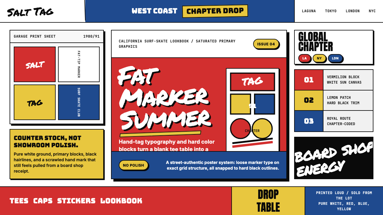 Stüssy StreetwearStreetwear starts rough. Vermilion blocks, marker script, and black hairlines…街头从粗粝开始。朱红色块、马克笔字与黑细线撞上纯白。
 Cartoon Network 90s BlocksKids-cable noise, squared. Black-white checkerboards crash into hot-yellow Bu…方块化的儿童有线电视噪音:黑白棋盘撞上热黄 Bungee 字块。
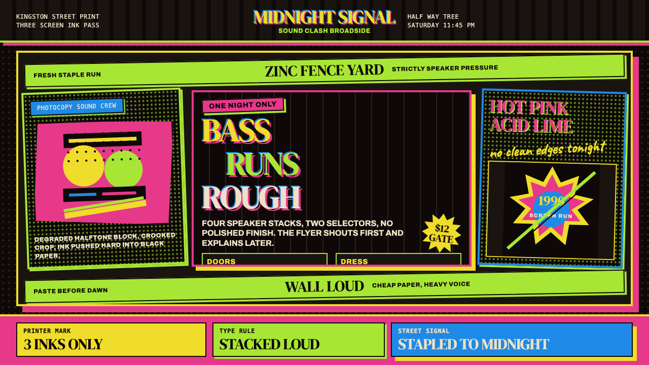 Jamaican Dancehall 1990 PosterMidnight volume. Acid lime and hot pink type stack like screenprint ink on bl…午夜音量:酸绿与热粉粗字叠在黑新闻纸上,如丝印错位。
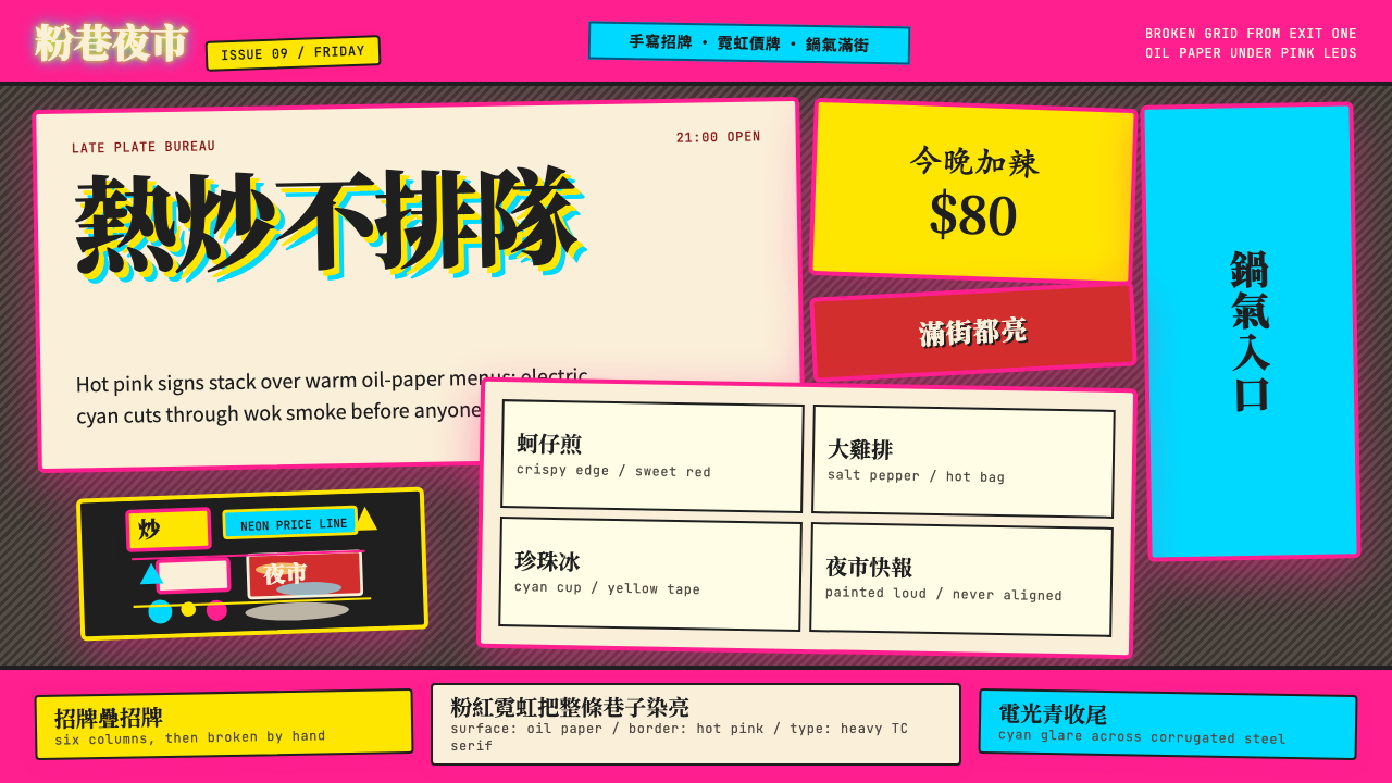 Taipei Shilin Night Market NeonLoud by design. Hot pink, neon yellow, and stacked TC serif signs break the g…張揚就是秩序。夜市粉、霓虹黃與繁體宋招牌打破格線。
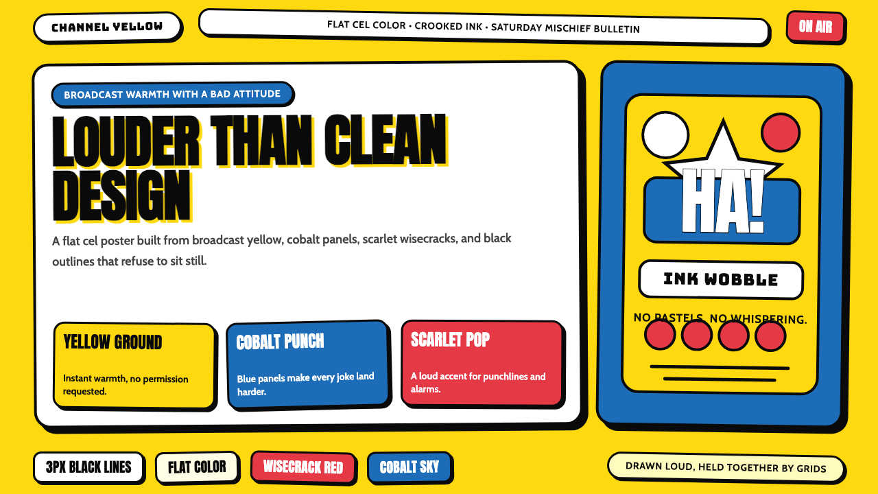 The Simpsons YellowCartoon warmth misbehaves. Yellow ground, cobalt panels, thick wobbly black l…卡通暖意在捣乱:黄色底、钴蓝面板和粗黑抖线。