What is Stüssy Streetwear?什么是 Stüssy Streetwear?
Streetwear was born the moment a Laguna Beach surfboard shaper scrawled his own graffiti tag onto a T-shirt and accidentally invented a global counterculture.街头文化诞生于那个拉古纳海滩冲浪板匠人把自己的涂鸦签名潦草地印上 T 恤的瞬间——一场意外的全球反文化革命就此开幕。
Stüssy Streetwear in briefStüssy Streetwear 速览
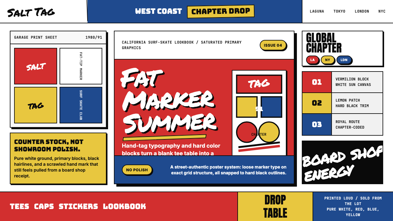
Stüssy Streetwear is the foundational visual language of California street culture, developed from 1980 onward by Laguna Beach surfboard shaper Shawn Stüssy. Its defining markers are a hand-graffiti signature logo rendered in thick, irregular marker strokes; saturated blocks of vermilion red and royal blue placed against stark white; and the relaxed, unpolished energy of surf and skate photography. Nothing about the aesthetic reaches for refinement or luxury — it carries the swagger of the street, deliberately rough-hewn and self-assured.Stüssy 街头风格是加州街头文化最基础的视觉语言,由拉古纳海滩冲浪板匠人 Shawn Stüssy 自 1980 年起逐步建立。它的标志性元素包括:以粗犷、不规则马克笔笔触呈现的手写涂鸦签名 Logo;朱红与皇家蓝的饱和色块在纯白底面上的强势对撞;以及冲浪、滑板街拍所特有的随性、未经修饰的能量感。这套美学从不追求精致或奢华——它带着街头特有的自信气场,刻意粗粝,浑然天成。
The visual system draws from three overlapping worlds: the hand-painted signage of California surf shops, the tag culture of urban graffiti, and the saturated primary graphics of skateboard deck art. These sources give the style its characteristic tension — it feels simultaneously handmade and graphic, casual and boldly composed. Color is used in broad, confident strokes rather than as delicate accent; type leans into imperfection rather than away from it; and negative space is occupied by attitude rather than by careful grid logic.这套视觉体系汲取自三个相互交叠的世界:加州冲浪店的手绘招牌、城市涂鸦的签名文化,以及滑板板面艺术的饱和原色图形。正是这三重来源赋予了这种风格独特的内在张力——它既像手工制作又像图形设计,既随性又构图大胆。色彩以宽阔自信的笔触铺陈,而非精细点缀;字体向不完美倾靠,而非回避;留白被态度填满,而非被网格逻辑精算。
Stüssy aesthetics stand in direct opposition to the polished minimalism that dominated fashion and design in the same era. Where contemporaries sought sleekness, Stüssy embraced rawness. Where luxury brands refined their marks to geometric precision, the Stüssy signature retained every wobble of the original marker stroke. This deliberate retention of human imperfection became not a flaw but the brand's most powerful signal: authentic street credibility cannot be manufactured by committee.Stüssy 的美学与同时代流行的精致极简主义形成直接对立。当其他品牌追求光洁时,Stüssy 拥抱粗粝;当奢侈品牌把标志打磨到几何精度时,Stüssy 的签名保留了原始马克笔笔迹里的每一处抖动。这种对人工痕迹的刻意保留,不是缺陷,而是品牌最有力的信号:真实的街头可信度,无法被委员会制造出来。
See the Stüssy Streetwear design system查看 Stüssy Streetwear 完整设计系统
Where does Stüssy Streetwear come from?Stüssy Streetwear 从何而来?
The story begins on the beaches of Laguna Beach, California, in 1980. Shawn Stüssy was earning a living shaping custom surfboards, a craft that required both artistic sensibility and physical skill. As a promotional gesture, he began signing his boards with the same loose, graffiti-influenced signature he used on everything — a looping, marker-weight scrawl that owed more to New York subway tags than to corporate logowork. He then transferred that signature to printed T-shirts and shorts to sell alongside his boards. The shirt business quickly eclipsed the boards.故事始于1980年的加州拉古纳海滩。Shawn Stüssy 以手工定制冲浪板为生,这门手艺既需要艺术感知,也需要身体技能。作为一种推广姿态,他开始在自己的冲浪板上签上那个随性的涂鸦风格签名——一个笔触厚重、线条飘逸的潦草手迹,更接近纽约地铁涂鸦的签名文化,而非企业 Logo 设计。随后,他把这个签名印到 T 恤和短裤上,与冲浪板一起出售。T 恤生意很快盖过了冲浪板。
By the mid-1980s, Stüssy had partnered with Frank Sinatra Jr. — not the singer's son, but a businessman from New York who brought distribution acumen and an understanding of urban markets. Together they formalized the brand and expanded from surf shops into the broader streetwear distribution network that was emerging around skateboard culture and hip-hop. This move bridged two coasts: the laid-back California surf identity and the harder-edged energy of New York street culture. The visual language absorbed both, producing something neither purely coastal nor purely urban.1980年代中期,Stüssy 与 Frank Sinatra Jr.(并非歌手之子,而是一位来自纽约的商人)合伙,后者带来了销售眼光和对城市市场的深刻理解。两人将品牌正式化,并从冲浪店拓展进入围绕滑板文化和嘻哈音乐涌现的更广泛街头服饰分销网络。这一转型打通了两个海岸:加州冲浪的慵懒自在与纽约街头文化的硬朗锐利。视觉语言吸纳了两者,产生了一种既非纯海岸、又非纯城市的全新气质。
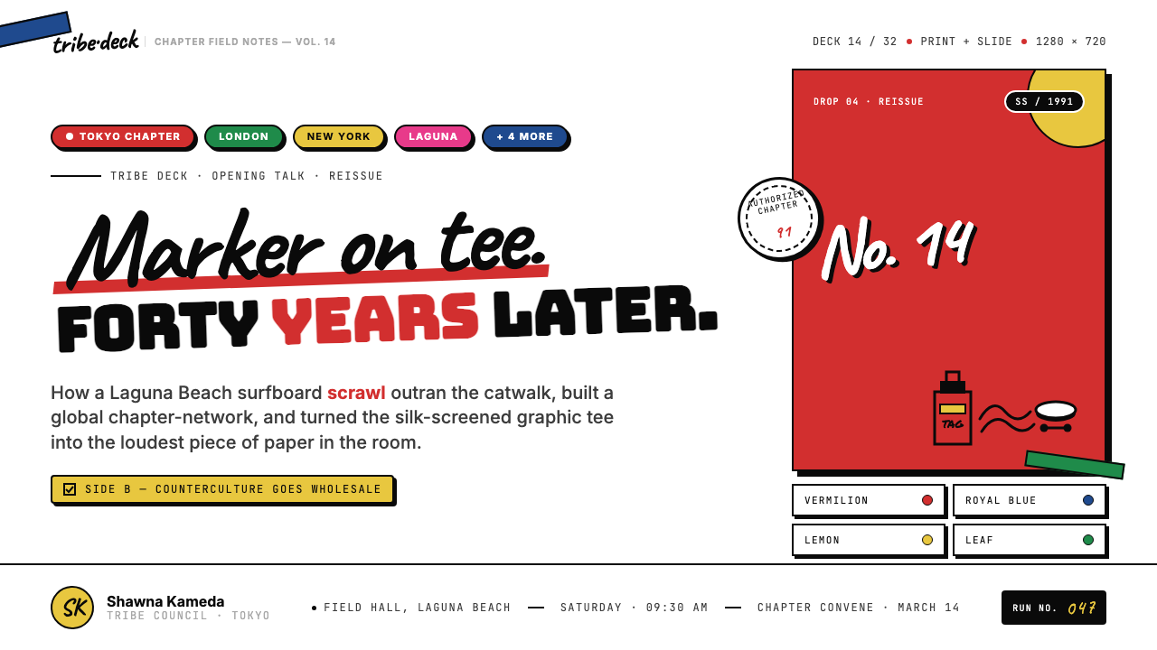
The brand's cultural apex came in the late 1980s and through the 1990s, when Shawn Stüssy assembled what became known as the International Stüssy Tribe — an informal global network of creatives, DJs, skaters, and tastemakers in cities from Tokyo to London to New York to Los Angeles. Each chapter had its own local flavor, but the visual DNA remained consistent: the hand-tag signature, the bold color blocking, the no-apologies street attitude. The Tribe model predated and directly influenced the way Supreme and other second-generation streetwear brands built community-as-brand-equity.品牌文化影响力的顶点出现在1980年代末至整个1990年代。Shawn Stüssy 建立起后来被称为「International Stüssy Tribe」的组织——一个横跨东京、伦敦、纽约、洛杉矶等城市的非正式全球创意人网络,成员涵盖 DJ、滑手和潮流引领者。每个城市分会各有本地色彩,但视觉基因始终如一:手写涂鸦签名、大胆色块、毫不道歉的街头态度。这种「部落」模式早于 Supreme 等第二代街头品牌,也直接影响了后者将社群转化为品牌资产的方式。
Shawn Stüssy stepped back from day-to-day involvement in the company in 1996, but the visual language he established had already become the blueprint for streetwear as a category. The brand's influence can be traced through the entire lineage of streetwear-turned-luxury: from Supreme's box logo logic, to Palace's irreverent graphic sensibility, to the broader streetwear-as-high-fashion moment of the 2010s and 2020s. The original Stüssy aesthetic — raw, signature-centric, primary-color saturated — remains the ur-text of the genre.1996年,Shawn Stüssy 退出品牌日常运营,但他所建立的视觉语言已经成为整个街头服饰品类的蓝图。Stüssy 的影响贯穿整条街头转奢侈的血脉:从 Supreme 方框 Logo 的逻辑,到 Palace 不羁的图形感性,再到2010至2020年代街头服饰正式进入高级时装殿堂的更大浪潮。Stüssy 的原始美学——粗粝、以签名为核心、饱和原色——始终是这一品类最初的母文本。
What defines the Stüssy Streetwear look?Stüssy Streetwear 的视觉特征是什么?
Hand-Graffiti Signature手写涂鸦签名
The Stüssy wordmark is not a constructed logotype — it is a direct transcription of Shawn Stüssy's personal marker signature, with all the weight variation, irregular baseline, and looping energy that implies. The thick strokes swell and taper in a way no geometric type would allow. This handmade quality is the style's most irreducible element: it signals authenticity in a way that any cleaned-up or digitally regularized version would immediately destroy. When applying this aesthetic, type choices should lean toward script or brush letterforms that retain visible human gesture rather than toward engineered precision.Stüssy 字标并非一个被构建出来的 Logo——它是 Shawn Stüssy 个人马克笔签名的直接转录,保留了笔触的粗细变化、不规则基线与飘逸的连笔能量。粗笔画以任何几何字体都无法实现的方式膨胀、收细。这种手工质感是这种风格最不可化约的元素:它以一种任何清理或数字规整版本都会立刻摧毁的方式传递真实性。运用这套美学时,字体选择应偏向保留可见人工手势的书法体或毛笔体,而非工程化的精准字形。
Saturated Primary Color Blocking饱和原色色块
Stüssy's palette is built on maximum-saturation primaries: a hot vermilion red and a deep royal blue are the two dominant anchors, deployed as solid rectangular blocks against pure white. The colors do not blend or gradient — they collide. This approach comes directly from the visual language of surf and skateboard graphics, where screen-printed inks had to read clearly from a distance and in motion. The boldness is functional as much as expressive: these are colors that claim space and assert presence.Stüssy 的色板建立在最高饱和度的原色之上:热烈的朱红与深邃的皇家蓝是两个主导色锚,以实心矩形色块的形式铺设于纯白底面。颜色不融合、不渐变——它们碰撞。这种处理方式直接来自冲浪与滑板图形的视觉语言,彼时丝网印刷油墨必须能在远距离和运动状态下清晰识读。这种大胆感既是表达性的,也是功能性的:这些颜色主张空间,声张存在。
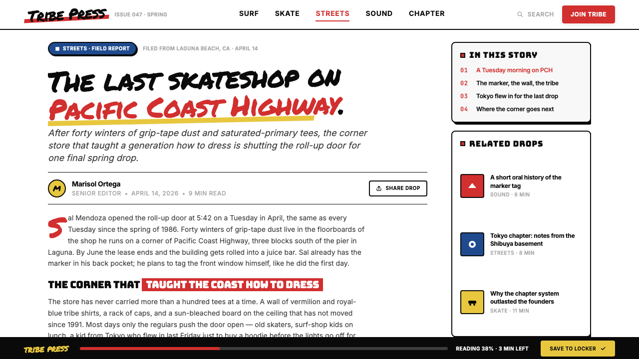
Relaxed Street Photography随性街头摄影
Product imagery in the Stüssy tradition is never aspirational in the luxury sense. Models are often friends, skaters, or members of the Tribe — photographed in natural light on real streets, at actual skate spots, or in the casual environments where the clothes actually live. The photography is documentary in spirit: slightly grainy, candidly composed, with visible evidence of real activity. This is the visual opposite of studio-lit fashion photography, and the contrast is intentional — it argues that the clothes belong to real life, not to a brand's fantasy of it.Stüssy 传统中的产品图像从不以奢侈品的方式制造憧憬感。模特往往是朋友、滑手或部落成员——在真实街道、真实滑板场地或衣服实际存在的日常环境中,以自然光拍摄。摄影在精神上是纪录性的:略带颗粒感,抓拍式构图,带有真实活动的可见痕迹。这与棚拍时尚摄影在视觉上构成直接对立,而这种对立是刻意的——它在说:这些衣服属于真实生活,而非品牌对生活的幻想。
Thick Outlines and Bold Graphic Marks粗线条与大胆图形标记
Supporting graphics in the Stüssy visual system — beyond the signature itself — share a common structural logic: thick black outlines, flat fills, and a deliberate visual weight that prevents anything from appearing fragile or tentative. This graphic sensibility is inherited from the screen-printing constraints of early skate and surf deck art, where fine lines were impractical and bold marks were the only reliable language. Even when applied digitally, the style should preserve this sense of physical weight.Stüssy 视觉系统中,签名以外的辅助图形共享同一套结构逻辑:粗黑轮廓线、平涂填色,以及一种刻意的视觉重量感,使任何元素都不显脆弱或犹疑。这种图形感性承袭自早期滑板与冲浪板面艺术的丝网印刷限制——细线不切实际,大胆笔触是唯一可靠的语言。即便用于数字设计,这种风格也应保留这种物理重量感。
Anti-Refinement Attitude反精致态度
Where most design systems move toward polish and precision over time, the Stüssy aesthetic treats roughness as a feature, not a bug. Intentional irregularity — the slightly uneven letterform, the ink that bleeds a little at the edge, the composition that feels assembled rather than constructed — carries the cultural signal that this is street-made, not boardroom-approved. This does not mean careless execution; it means that the signs of human making are preserved rather than engineered away. In application, this principle argues against over-kerning, over-aligning, and over-systematizing.当大多数设计体系随时间推移趋向精细与精准时,Stüssy 美学将粗粝视为特质,而非缺陷。刻意的不规则性——略微不均匀的字形、边缘稍有溢出的油墨、感觉是拼凑而非搭建的构图——传递出一个文化信号:这是从街头生长出来的,不是在会议室里被批准的。这并不意味着马虎了事;它意味着人工制作的痕迹被保留,而非被工程化地抹除。在实际应用中,这一原则反对过度调整字距、过度对齐与过度系统化。
Cross-Cultural Tribe Identity跨文化部落身份
The International Stüssy Tribe model introduced a visual concept that was novel in the early 1990s: a single graphic identity that could absorb local cultural inflection while remaining recognizably itself. Tokyo chapters had a different energy from London or New York chapters, but all flew the same signature. This gave the aesthetic a globalist dimension that preceded globalized streetwear by a decade. Design applications informed by this principle allow for local color or typographic variation within a stable core identity — the signature stays constant while the surrounding context adapts.International Stüssy Tribe 的模式引入了一个在1990年代初颇为新颖的视觉概念:一个单一图形身份,能够吸纳本地文化色彩,同时保持清晰辨识度。东京分会与伦敦或纽约分会气质各异,但都悬挂同一个签名。这赋予了这套美学一种领先全球化街头服饰整整十年的世界主义维度。受此原则启发的设计应用,允许在稳定的核心身份内进行本地化色彩或字体变体——签名保持不变,周围语境随之适应。
White as Active Ground白色作为主动底面
Pure white is not neutral in the Stüssy visual system — it is an active structural element. The generous white space around color blocks and the signature is what gives those elements their visual pressure. A crowded layout would dissipate the energy; the white amplifies it by giving the bold marks room to resonate. This is white as backdrop for collision, not white as breathing room or minimalist restraint. The distinction matters: adding more elements to fill the white space is the fastest way to undermine the style.在 Stüssy 视觉体系中,纯白并非中性——它是一个主动的结构性元素。色块与签名周围慷慨的留白,正是赋予这些元素视觉压力的来源。拥挤的版面会消散能量;白色通过给大胆图形以共鸣空间来放大它。这是作为碰撞背景的白色,而非呼吸空间或极简克制意义上的白色。这一区别至关重要:用更多元素填充白色空间,是破坏这种风格最快的方式。
See the Stüssy Streetwear design system查看 Stüssy Streetwear 完整设计系统
Who shaped Stüssy Streetwear?谁塑造了 Stüssy Streetwear?
The founder and originating creative force behind the brand, Shawn Stüssy began his career as a surfboard shaper in Laguna Beach and brought that craft background directly into his approach to apparel graphics. His personal signature, applied to boards and then to garments, became one of the most recognized marks in global streetwear. He built the International Stüssy Tribe network in the late 1980s and 1990s, creating a template for community-led brand-building that influenced virtually every major streetwear brand that followed. He stepped back from day-to-day operations in 1996, leaving the visual system he created to carry the brand forward.品牌创始人与原始创意核心,Shawn Stüssy 的职业生涯始于拉古纳海滩的冲浪板工匠,并将这种手工艺背景直接带入他对服装图形的处理方式中。他的个人签名,先印在冲浪板上,后转移到服装上,成为全球街头服饰中最具辨识度的标志之一。他在1980年代末至1990年代建立了 International Stüssy Tribe 网络,为以社群为核心的品牌建设提供了一个模版,影响了此后几乎所有重要的街头服饰品牌。1996年,他从日常运营中退出,将他所创造的视觉体系留给品牌继续前行。
Not the famous singer's son, but a New York-based businessman who partnered with Shawn Stüssy in the mid-1980s to formalize and scale the brand. Sinatra brought an understanding of East Coast urban markets and the distribution networks connecting surf, skate, and hip-hop retail. His partnership was instrumental in transforming Stüssy from a local California operation into a nationally and then internationally distributed brand. The cross-coastal collaboration he enabled gave the visual language its dual identity — surf-origin Californian swagger combined with New York street credibility.并非那位著名歌手之子,而是一位纽约商人,于1980年代中期与 Shawn Stüssy 合伙,将品牌正规化并扩大规模。Sinatra 带来了对东海岸城市市场和连接冲浪、滑板与嘻哈零售渠道分销网络的深刻理解。他的合伙关系对于将 Stüssy 从加州本地业务转变为全国乃至国际分销品牌起到了关键作用。他所促成的跨海岸合作,赋予了这套视觉语言双重身份——冲浪起源的加州自信气场与纽约街头可信度的结合。
Less a single person than a collective identity, the International Stüssy Tribe was an informal global network of creatives — DJs, artists, skaters, photographers, and cultural tastemakers — assembled by Shawn Stüssy across cities including Tokyo, London, New York, and Los Angeles. Each city chapter contributed local cultural energy while operating under the common visual flag of the Stüssy signature. The Tribe model proved that a brand could maintain visual coherence across radically different cultural contexts without homogenizing them. It is the direct ancestor of the collaborative, community-rooted brand-building approach that defines contemporary streetwear.与其说是一个人,不如说是一种集体身份。International Stüssy Tribe 是由 Shawn Stüssy 在东京、伦敦、纽约、洛杉矶等城市集结起来的非正式全球创意人网络,成员涵盖 DJ、艺术家、滑手、摄影师与文化引领者。每个城市分会贡献本地文化能量,同时在 Stüssy 签名这面共同旗帜下运作。部落模式证明了一个品牌可以在截然不同的文化语境中保持视觉一致性,而不将其同质化。它是当代街头服饰所定义的那种协作式、社群根植式品牌建设方式的直接先祖。
Founded in New York in 1994 by James Jebbia, Supreme built its entire visual and cultural model on foundations that Stüssy had established. The box logo logic — a single wordmark, maximum contrast, no ornamentation — is a direct descendant of the Stüssy signature principle. Supreme's limited-release community strategy mirrors the Tribe model. Tracing Supreme's visual DNA back to Stüssy is not speculation but industry history: Jebbia worked in retail environments shaped by Stüssy, and early Supreme product photography and layout sensibility show the direct influence clearly. Supreme's eventual luxury-market valuation proved that what Stüssy started was not a subcultural moment but a structural shift in how fashion brands are built.1994年由 James Jebbia 在纽约创立的 Supreme,其整套视觉与文化模式建立在 Stüssy 所奠定的基础之上。方框 Logo 的逻辑——单一字标、最大对比度、零装饰——是 Stüssy 签名原则的直接后代。Supreme 的限量发售社群策略也与部落模式一脉相承。将 Supreme 的视觉 DNA 追溯至 Stüssy 并非推测,而是行业史实:Jebbia 在受 Stüssy 塑造的零售环境中工作成长,Supreme 早期产品摄影与版式感性清晰地显示了这种直接影响。Supreme 最终的奢侈品市场估值证明,Stüssy 所开启的并非一个亚文化时刻,而是时尚品牌建构方式的结构性转变。
How do you use Stüssy Streetwear today?今天怎么用 Stüssy Streetwear?
Stüssy streetwear aesthetics translate most naturally to design contexts where authenticity, boldness, and subcultural credibility are the target values. The style is well-suited to brand identity work, event collateral, limited-edition merchandise, and any visual communication that wants to signal street origin without the studied formality of a designed brand system. Applying it correctly means understanding that the roughness is the point — every instinct to clean up, regularize, or systematize should be interrogated before acting.Stüssy 街头美学最自然地适用于以真实性、大胆感与亚文化可信度为目标价值的设计场景。这种风格非常适合品牌视觉识别、活动物料、限量版周边,以及任何希望传递街头出身信号却不愿落入精心设计品牌系统之正式感的视觉传播。正确应用它,意味着理解粗粝感本身就是要点——每一个想要整理、规范化或系统化的冲动,都应在行动前被审视。
For presentation slides, the Stüssy visual language works best for cover moments and section dividers rather than dense information layouts. A cover built in this style leads with a single bold color block — vermilion or royal blue — occupying a substantial portion of the slide, with the presentation title set in a thick script or brush-weight typeface against the contrasting white field. Section dividers can mirror this logic at smaller scale. Body slides should pull back: use clean sans-serif type for legibility, reserve the bold color and heavy marks for the one element on each slide that needs to command attention. Data slides work when chart elements are given the same bold, flat, high-saturation treatment as the brand marks — bars become color blocks, and labels use the same weighted typographic approach.在演示文稿中,Stüssy 视觉语言最适合封面时刻与章节分隔页,而非信息密集的内容版面。以这种风格制作的封面,以一块醒目的色块为主导——朱红或皇家蓝——占据幻灯片的大部分面积,标题以粗体书法或毛刷字重的字体设置在对比鲜明的白色区域上。章节分隔页可以在更小尺度上沿用同一逻辑。正文页应退出主位:用简洁无衬线字体保证可读性,将粗色块与重笔触保留给每张幻灯片上需要支配注意力的那一个元素。数据页在图表元素获得与品牌标记同样大胆、平涂、高饱和处理时效果出色——柱条成为色块,标签采用同样有分量的字体处理方式。
For web interfaces, the style is most effective for brand-forward contexts: landing pages for streetwear or culture brands, event microsites, artist or musician portfolio pages, and editorial platforms targeting younger audiences. The implementation approach starts with a white or near-white base, introduces large color-block sections in the primary palette, and uses heavy typefaces with visible weight and character. Navigation and interactive elements should feel typographic rather than icon-driven. The temptation to add hover animations, transitions, and micro-interactions that smooth everything out should be resisted — the aesthetic belongs to a more direct, physical-feeling web language. Dashboards and utility interfaces are generally a poor match for this style; its expressiveness works against the neutrality those contexts require.对于网页界面,这种风格在品牌主导型场景中最为有效:街头服饰或文化品牌的落地页、活动专题页、艺术家或音乐人作品集页面,以及面向年轻受众的编辑平台。实现思路从白色或近白色基底出发,引入原色系大面积色块区域,使用可见字重与个性的粗体字。导航与交互元素应偏向字体驱动,而非图标驱动。应当抵制添加悬停动画、过渡效果与微交互以使一切平滑化的诱惑——这套美学属于一种更直接、更具物理感的网页语言。仪表板与功能性界面通常与这种风格不匹配;其表达性与这些场景所需的中立性相悖。
For editorial and marketing work, the Stüssy aesthetic supports strong, poster-like visual hierarchy. Feature spreads benefit from the color-block approach: a full-bleed vermilion or blue field behind a headline, with photography treated either as a full-bleed image or as a hard-edge crop against white. Pull quotes and callouts can use the heavy typeface treatment at large scale. Marketing materials — social cards, campaign posters, event announcements — are where this style performs at its highest, because the visual language was literally born in the format of printed T-shirts and analog event flyers. Keep the layout elements few and the color choices decisive.对于编辑与营销内容,Stüssy 美学支持强烈的海报式视觉层级。专题版面适合采用色块处理:在标题背后铺设满版的朱红或蓝色底面,摄影图片要么作为满版图像,要么以硬边裁切的形式置于白底之上。引用语与标注可以在大尺寸下使用粗体字处理。营销物料——社交卡片、活动海报、活动通知——是这种风格表现最佳的地方,因为这套视觉语言本就诞生于印制 T 恤和模拟活动传单的格式中。保持版面元素少而精,色彩选择坚决果断。
A common mistake when applying this aesthetic is mistaking surface markers for the underlying logic. Designers often add a graffiti-style typeface, some red blocks, and consider the job done — but the result reads as costume rather than character. The actual logic of Stüssy aesthetics is about conviction: every element that appears on the page should have earned its presence, and the white space between those elements should feel charged rather than empty. A second frequent error is over-complicating the color story: the style depends on the violence of a single dominant color meeting white, and introducing a third or fourth color immediately dissolves the tension that gives the system its energy.应用这套美学时,一个常见错误是把表面标记误认为底层逻辑。设计师往往加一种涂鸦风格字体、几块红色色块,就认为大功告成——但结果读起来像在穿戏服,而非展现真实性格。Stüssy 美学真正的逻辑是关于信念的:页面上出现的每个元素都应该赢得自己的存在,而这些元素之间的白色空间应该感觉是充盈的,而非空洞的。第二个常见错误是过度复杂化色彩叙事:这种风格依赖于一种主导色与白色之间的强烈对撞,引入第三或第四种颜色会立即消解赋予这套体系能量的张力。
See the Stüssy Streetwear design system查看 Stüssy Streetwear 完整设计系统
Stüssy Streetwear — FAQStüssy Streetwear · 常见问题
What makes Stüssy aesthetics different from other streetwear visual languages?Stüssy 美学与其他街头服饰视觉语言有何不同?
Stüssy is specifically a signature-centric aesthetic — the entire visual system derives its authority from a single handmade mark rather than from a constructed logomark or graphic system. This gives it a different character from brands like Supreme (which uses typographic geometry), Palace (which uses irreverent illustration), or Off-White (which uses industrial marking conventions). The Stüssy visual language is more personal and more explicitly craft-origin; it reads like something made by a specific human being rather than by a brand team. That distinction is what makes it authentic rather than merely stylish.Stüssy 是一种以签名为核心的美学——整套视觉体系的权威性来自一个单一的手工标记,而非一个被构建出的 Logo 或图形系统。这使它与 Supreme(使用字体几何学)、Palace(使用不羁插图)或 Off-White(使用工业标记惯例)等品牌呈现出截然不同的性格。Stüssy 的视觉语言更个人化,手工艺起源也更外显;它读起来像一个具体的人做出来的东西,而非一个品牌团队的产品。正是这种区别使它真实,而非仅仅时髦。
Can the Stüssy aesthetic work for luxury or premium positioning, or does it belong strictly to street contexts?Stüssy 美学能用于奢侈品或高端定位吗,还是它严格属于街头语境?
The aesthetic can operate at a premium level when the premium is communicated through scarcity and cultural cachet rather than through material refinement. The Tribe model and the limited-drop mentality that Stüssy pioneered are exactly the mechanisms by which Supreme achieved luxury valuations while maintaining a deliberately unrefined visual language. The key insight is that for this aesthetic, rarity and community belonging are the luxury signals — not polish, not restraint, not quiet sophistication. A premium application of this style should have fewer elements, more decisive color choices, and better-quality physical production values, but it should never become cleaner or more geometric. The roughness is the value.这套美学可以在高端层面运作,前提是高端感通过稀缺性与文化资本来传递,而非通过材料精致感。Stüssy 所开创的部落模式与限量发售心态,正是 Supreme 在保持刻意未精细化视觉语言的同时实现奢侈品估值的机制。关键洞察在于:对于这套美学,稀缺性与社群归属感才是奢侈品信号——而非精致、克制或低调的精英感。这种风格的高端应用应当包含更少的元素、更果断的色彩选择和更高质量的物理生产水准,但它永远不应变得更整洁或更几何化。粗粝感本身就是价值所在。
How should photography be handled when working with the Stüssy visual language?在使用 Stüssy 视觉语言时,应如何处理摄影图像?
Photography in the Stüssy tradition should feel documentary rather than produced. The ideal is imagery that looks like it could have been shot by a participant rather than a hired photographer: natural or available light, real locations, subjects who are clearly comfortable in the space rather than posed. Technical perfection is not a goal — in fact, a slight grain or evidence of real conditions is an asset. In layout, photography works best either full-bleed (where the image takes the whole field) or as a hard-edge crop set directly against white or a color block, with no drop shadows, no vignettes, and no soft masking. The image should feel placed, not floated.Stüssy 传统中的摄影图像应有纪录片感,而非制作感。理想状态是那种看起来像参与者而非受雇摄影师拍摄的图像:自然光或现有光线,真实场地,画面中的人明显融入所在空间而非摆拍。技术上的完美不是目标——事实上,轻微的颗粒感或真实环境的痕迹是一种资产。在版面中,摄影图像最好要么满版(图像占据整个区域),要么以硬边裁切的形式直接置于白底或色块上,不带投影、无晕影、无柔边遮罩。图像应该感觉是被放置在那里的,而非漂浮其上。
Is this aesthetic appropriate for digital-only contexts, or does it need print to feel right?这套美学适合纯数字场景吗,还是需要印刷才能呈现出对的感觉?
The Stüssy aesthetic was born in physical print — screen-printed garments, photocopied flyers, offset-printed lookbooks — and that origin gives it a particular physical quality that requires deliberate translation to digital contexts. On screen, the risk is that the bold marks become too clean: vectors are too perfect, screens are too smooth. The solution is to preserve the psychological quality of the print origin rather than trying to simulate it with filters. This means choosing typefaces with visible ink-on-paper character, using hard edges rather than anti-aliased softness where possible, and treating interactive elements as physical objects — buttons that feel pressed, not hovered. Digital applications of this aesthetic work best on mobile, where the screen size and touch interaction mirror the scale and physicality of the original printed garment.Stüssy 美学诞生于实体印刷——丝网印刷服装、复印传单、胶版印刷 lookbook——这种起源赋予了它一种特殊的物理质感,需要刻意转化才能在数字场景中呈现。在屏幕上,风险在于大胆标记变得过于整洁:矢量图形过于完美,屏幕过于光滑。解决方案是保留印刷起源的心理品质,而非试图用滤镜模拟它。这意味着选择具有可见油墨质感的字体,在可能的情况下使用硬边而非抗锯齿的柔和感,并将交互元素视为实体对象——按钮感觉是被按下的,而非被悬停的。这套美学的数字应用在移动端效果最佳,因为屏幕尺寸和触控交互与原始印制服装的物理尺度和触感相呼应。
How does the Stüssy aesthetic age, and does it risk looking dated?Stüssy 美学如何随时间演变,它会有过时的风险吗?
The aesthetic has proven remarkably durable precisely because it was never chasing contemporary design trends — it was expressing a subculture with its own self-referential visual logic. Elements that appear to date a design are usually borrowed from mainstream design trends of a specific era; elements rooted in a consistent subculture tend to read as timeless within that subculture's context. Stüssy's visual markers have been in continuous circulation since the early 1980s and have survived multiple cycles of fashion history. The risk of appearing dated is highest when the style is applied superficially — when it is used as period costuming for the early 1990s rather than as a living aesthetic logic. Applied with understanding of its underlying principles rather than its surface signatures, the aesthetic remains as vital as the street culture it emerged from.这套美学被证明具有非凡的持久力,恰恰是因为它从不追逐当代设计潮流——它在表达一种拥有自我指涉视觉逻辑的亚文化。让设计显得过时的元素,通常是借来的某个特定时代的主流设计趋势;根植于一致亚文化的元素,往往在该亚文化语境中读起来是永恒的。Stüssy 的视觉标记自1980年代初起持续流通,历经时尚史的多轮循环而长存。显得过时的风险,在这种风格被表面化应用时最高——当它被用作1990年代初的时代戏服,而非一套活着的美学逻辑时。若以理解其底层原则而非表面标记的方式应用,这套美学与它所诞生的街头文化一样,始终充满生命力。
Related design styles相关设计风格
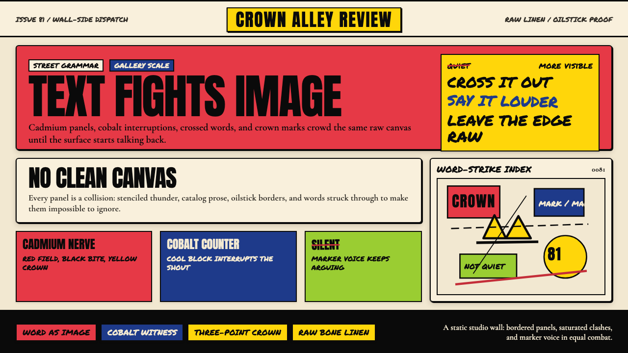 Basquiat Neo-ExpressionismExplodes off raw linen. Cadmium red, cobalt blue, Anton blocks, and struck ma…原生亚麻上爆裂:镉红、钴蓝、Anton 字块与划掉的手写字相撞。
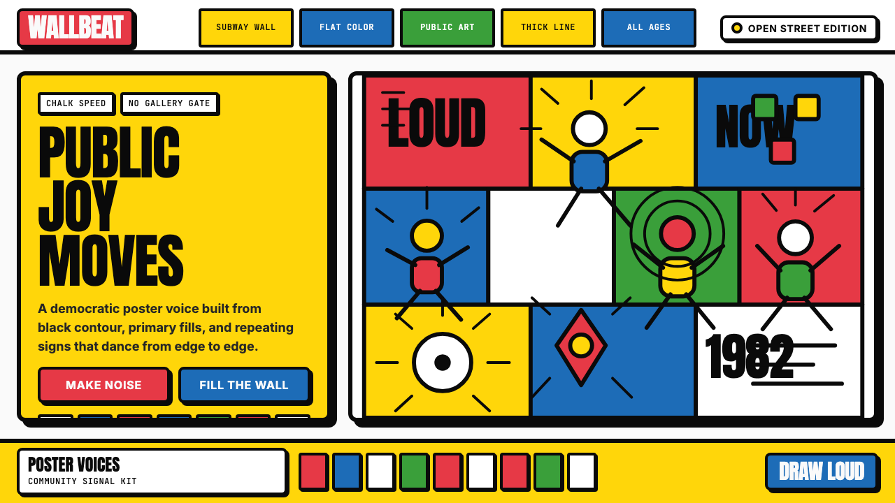 Keith Haring PopJoy refuses the gallery. Thick black contours pack primary color into a danci…快乐拒绝画廊:粗黑轮廓把原色塞进跳动墙面网格。
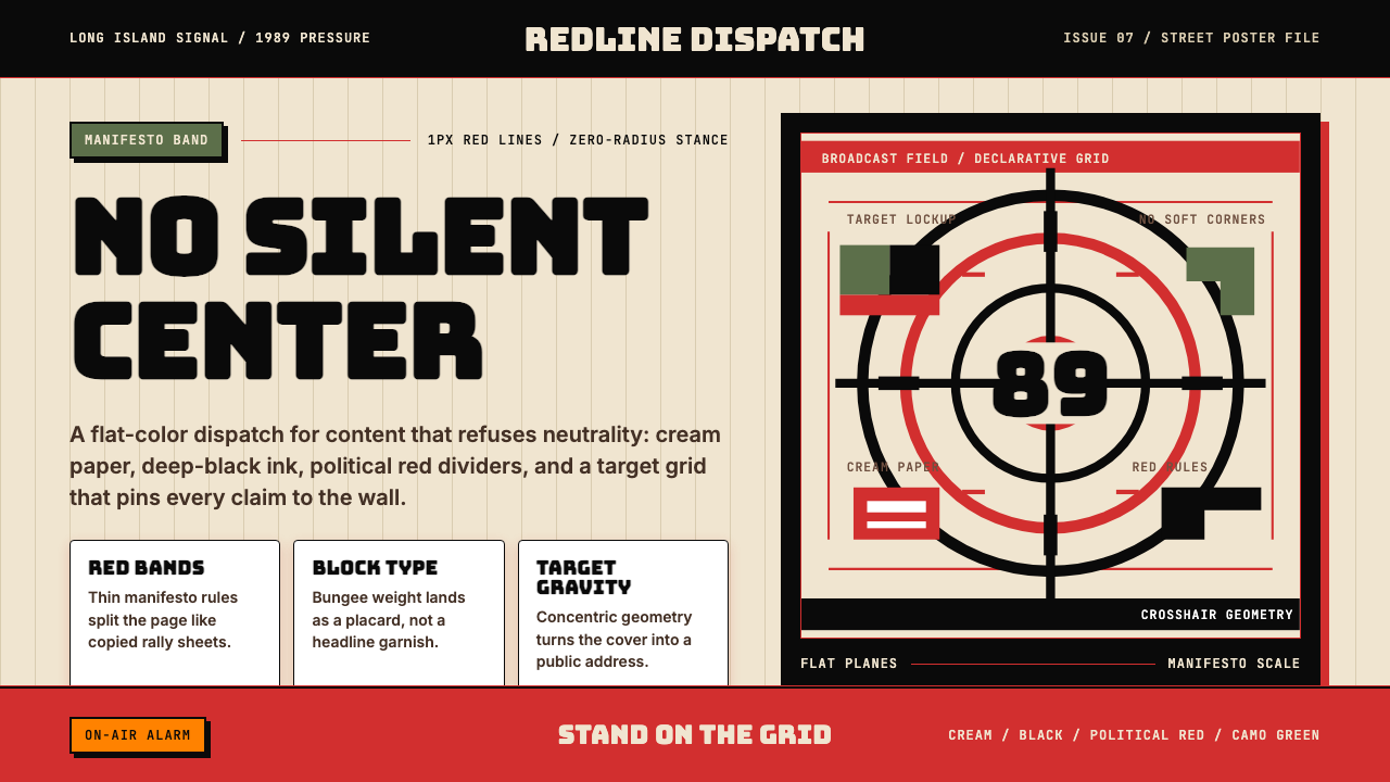 Public Enemy — Fight the PowerTakes a side loudly. Red bands, black ink, and target geometry hit like a ral…立场响亮:红色分栏、黑墨与准星几何像集会海报。
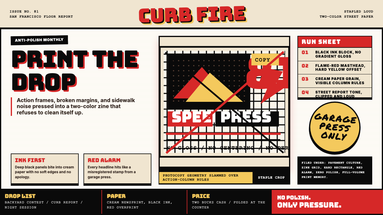 Thrasher Skate Zine (1981)Loud without polish. Flame red type, black ink blocks, and cream zine grids h…粗粝而响亮:火焰红大字、黑墨块与米色小报网格重击页面。
 Cartoon Network 90s BlocksKids-cable noise, squared. Black-white checkerboards crash into hot-yellow Bu…方块化的儿童有线电视噪音:黑白棋盘撞上热黄 Bungee 字块。
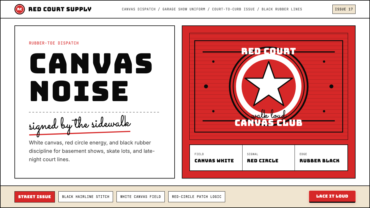 Converse Chuck TaylorPopulist and loud. Saturated red circles, Bungee type, black stitch lines on…平民而响亮:饱和红圆、Bungee 粗字、白帆布上的黑色缝线。