What is Basquiat Neo-Expressionism?什么是 Basquiat Neo-Expressionism?
Basquiat's canvases detonate graffiti urgency and gallery ambition in the same breath — oilstick crowns, struck-through words, and anatomical diagrams colliding on raw linen at full voltage.巴斯奎特的画布同时引爆街头涂鸦的紧迫感与画廊的野心——油画棒皇冠、被划掉的文字、解剖图谱在未经处理的亚麻上以全功率碰撞。
Basquiat Neo-Expressionism in briefBasquiat Neo-Expressionism 速览
Basquiat Neo-Expressionism is the visual language drawn from Jean-Michel Basquiat's studio practice between roughly 1981 and 1988 — the years in which he moved from anonymous SAMO© graffiti on Lower Manhattan walls to internationally exhibited large-scale paintings. The style fuses the handmade rawness of street mark-making with the compositional ambition of gallery-scale painting: unstretched or raw-stretched canvas, oilstick and acrylic applied in dense overlapping strata, text and image granted exactly equal authority on the picture plane.巴斯奎特新表现主义是从让-米歇尔·巴斯奎特大约1981至1988年间的创作实践中提炼出来的视觉语言——那些年间,他从匿名在曼哈顿下城墙面留下SAMO©涂鸦,走向了在国际画廊展出的大幅绘画。这种风格将街头痕迹制作的手工粗糙感与画廊级绘画的构图野心融为一体:未拉伸或粗拉伸的画布,油画棒与丙烯以密集叠层涂抹,文字与图像在画面空间中被赋予完全平等的地位。
What distinguishes this aesthetic from broader Neo-Expressionism is its structural relationship between word and image. Basquiat did not illustrate text or caption images — he treated lettering as mark and figure as glyph, collapsing the boundary between reading and seeing. Crowns, copyright symbols, repeated words, and struck-through anatomical labels function as visual objects that carry simultaneous graphic and semantic weight. Erasure and overpainting are not corrections but compositional events; the history of making remains visible on the surface.将这种美学与更广泛的新表现主义区分开来的,是文字与图像之间的结构性关系。巴斯奎特并不为文字配图,也不为图像加说明——他将字母当作痕迹,将人物当作字符,彻底瓦解了阅读与观看之间的边界。皇冠、版权符号、反复出现的词语、被划掉的解剖标注——这些元素作为视觉对象运作,同时承载图形与语义的双重重量。涂抹与覆盖并非修正,而是构图事件;制作的历史留存于表面,清晰可见。
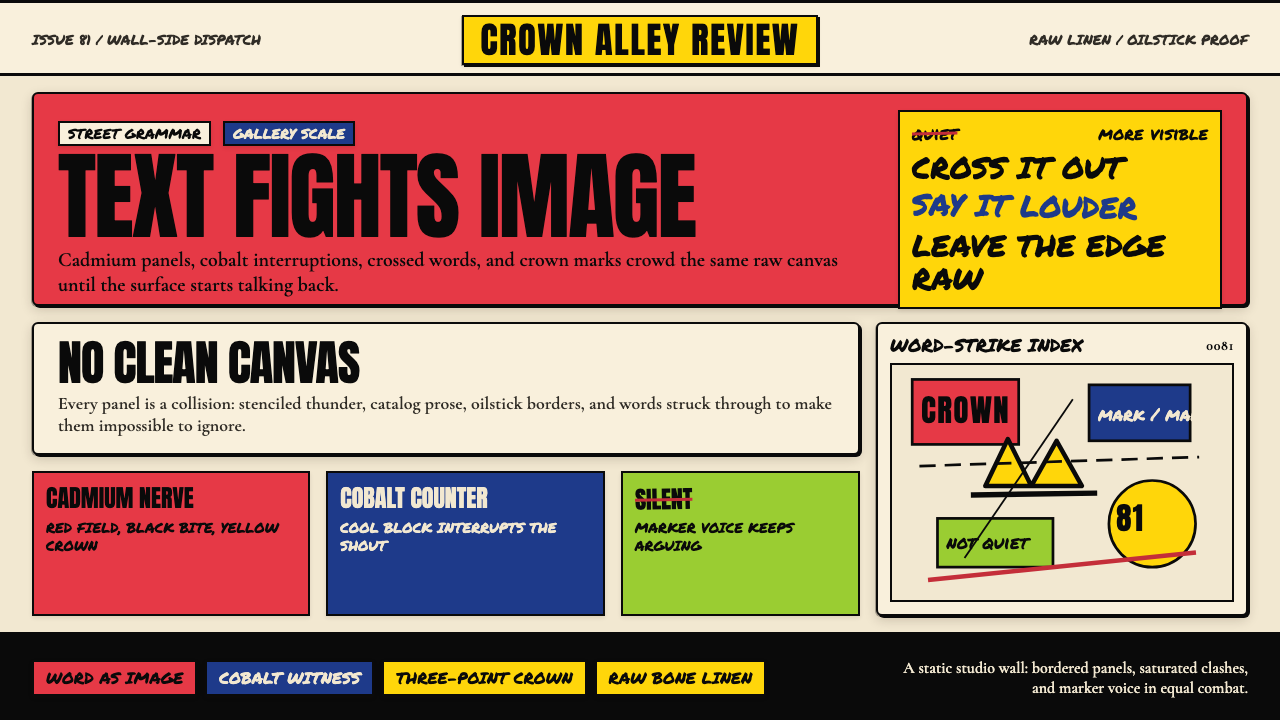
Tonally, the work refuses refinement. Saturated cadmium reds and yellows sit against cobalt or Prussian blue on bone-cream linen grounds. Marks are quick, angular, and gestural. Stenciled headline-weight text crowds hand-scrawled fragments. Nothing is resolved or polished; the surface vibrates with arrested energy, as though the painting caught a moment of thought mid-collision.在格调上,这件作品拒绝精致。饱和的镉红与镉黄在骨白亚麻底面上对抗钴蓝或普鲁士蓝。笔触快速、棱角分明、姿态鲜明。模板喷涂的标题级文字与手写涂鸦并肩拥挤。没有任何东西是被解决或被打磨过的;画面表面振动着被捕捉的能量,仿佛这幅画抓住了一个思想在碰撞中途的瞬间。
See the Basquiat Neo-Expressionism design system查看 Basquiat Neo-Expressionism 完整设计系统
Where does Basquiat Neo-Expressionism come from?Basquiat Neo-Expressionism 从何而来?
Jean-Michel Basquiat was born in Brooklyn in 1960 to a Haitian father and a Puerto Rican mother of Haitian descent. He grew up between Brooklyn and Puerto Rico, spoke three languages, and was introduced to anatomy by his mother after he was struck by a car at age seven — a formative episode that seeded his lifelong preoccupation with the body, its internal diagrams, and the violence visited upon it. He dropped out of City-As-School at seventeen, left home, and began sleeping on cardboard in Tompkins Square Park while moving through the nascent downtown arts scene.让-米歇尔·巴斯奎特1960年出生于布鲁克林,父亲是海地人,母亲是海地裔波多黎各人。他在布鲁克林和波多黎各之间的生活中长大,会说三门语言。七岁时,他被一辆汽车撞倒,母亲随后带他了解解剖学知识——这段奠基性的经历在他心中种下了对身体、身体内部图谱以及施于其上的暴力的终身迷恋。十七岁时,他从城市即学校中途退学,离开家门,开始睡在汤普金斯广场公园的纸板上,同时穿行于新兴的市中心艺术圈。
Between 1977 and 1980, Basquiat and his collaborator Al Diaz tagged walls throughout Lower Manhattan and Brooklyn under the pseudonym SAMO© — an abbreviation variously glossed as 'same old shit' — with cryptic poetic phrases that circulated among artists and critics before anyone knew who was making them. The SAMO tags were not simple vandalism; they were positioned precisely on walls near galleries, art schools, and lofts where the downtown scene congregated, functioning as interventions in an existing art-world conversation. By 1980, Basquiat had declared SAMO© dead by tagging 'SAMO© IS DEAD' across SoHo, and he began showing paintings.1977至1980年间,巴斯奎特与合作者阿尔·迪亚兹以假名SAMO©——这个缩写被各种解读,最常见的版本是「老一套的废话」——在曼哈顿下城和布鲁克林的墙面上留下标记,写下神秘的诗意短语,这些短语在艺术家和评论家之间流传,但无人知晓作者是谁。SAMO标记并非简单的破坏行为;它们被精确地喷涂在画廊、艺术学校和市中心圈子聚集的阁楼附近的墙上,作为对既有艺术世界对话的干预。到1980年,巴斯奎特在苏荷区各处喷上「SAMO©已死」,宣告SAMO©的终结,随即开始展出绘画。
His breakthrough came in 1981 through the group show 'New York/New Wave' at P.S.1, where his work was seen alongside Keith Haring and Kenny Scharf. The Italian art dealer Emilio Mazzoli and the New York gallerist Annina Nosei each gave him exhibition opportunities that rapidly internationalized his profile. Nosei famously offered him studio space in the basement of her Prince Street gallery — a circumstance Basquiat found both generative and constraining. By 1982 he was showing at documenta 7 in Kassel alongside Georg Baselitz, Anselm Kiefer, and Cy Twombly, cementing his position within the global Neo-Expressionist moment.1981年,他通过P.S.1的群展「纽约/新浪潮」迎来突破,他的作品与基思·哈林和肯尼·沙夫的作品并列展出。意大利艺术商埃米利奥·马佐利和纽约画廊主安尼娜·诺塞各自给予他展览机会,迅速使他的名声国际化。诺塞提出让他在其王子街画廊的地下室使用工作室——这个情况对巴斯奎特既充满创造力,又令他感到束缚。到1982年,他已在卡塞尔的第七届文献展上与格奥尔格·巴塞利兹、安塞尔姆·基弗和赛·托姆布利同场展出,巩固了他在全球新表现主义运动中的地位。
The friendship and collaboration with Andy Warhol, beginning in 1982 and lasting until Warhol's death in 1987, was as complex as it was consequential. Warhol introduced Basquiat to his brand of celebrity social machinery and to silkscreen-scale repetition; Basquiat reintroduced urgency and corporeality into Warhol's cooler register. Their joint paintings of 1984 to 1985 were initially dismissed by critics but have since been reassessed as a genuine dialogue between two artists at the intersection of commercial and avant-garde art worlds. The peak production years — 1981 to 1985 — generated hundreds of works across painting, drawing, and collage. Basquiat died in August 1988 at twenty-seven, of a heroin overdose.从1982年开始、持续至1987年沃霍尔去世的友谊与合作关系,其复杂程度与其影响力同等深远。沃霍尔将巴斯奎特引入他那套名人社交机制,以及丝网印刷规模的重复手法;巴斯奎特则将紧迫感与肉身性重新注入沃霍尔更为冷静的调性。他们1984至1985年的联合绘画最初遭到评论界的否定,但此后已被重新评价为两位艺术家在商业与先锋艺术世界交汇处展开的真实对话。创作高峰年——1981至1985年——产生了数百件绘画、素描和拼贴作品。巴斯奎特于1988年8月因海洛因过量去世,年仅二十七岁。
What defines the Basquiat Neo-Expressionism look?Basquiat Neo-Expressionism 的视觉特征是什么?
Palette色彩
The palette is built around intense warm primaries — cadmium reds and yellows at full saturation — set against cobalt or Prussian blues and anchored by the off-white of raw, unprimed linen. Black, applied in thick oilstick strokes or heavy acrylic, functions as both line and ground. Color is never decorative; it carries urgency, temperature, and at times the visual weight of a shout. Secondary mixing is incidental — the result of one layer bleeding through another — rather than planned.色板以强烈的暖色原色为核心——镉红和镉黄以全饱和度出现——与钴蓝或普鲁士蓝形成对峙,并由未经处理的亚麻原布的米白色加以锚定。黑色以粗重的油画棒笔触或厚重的丙烯涂抹,同时作为线条与底色运作。色彩从不装饰性存在;它承载着紧迫感、温度,有时还有呐喊的视觉重量。间色的出现是附带性的——是一个层次渗透另一个层次的结果——而非刻意计划。
Text and Mark Collision文字与痕迹的碰撞
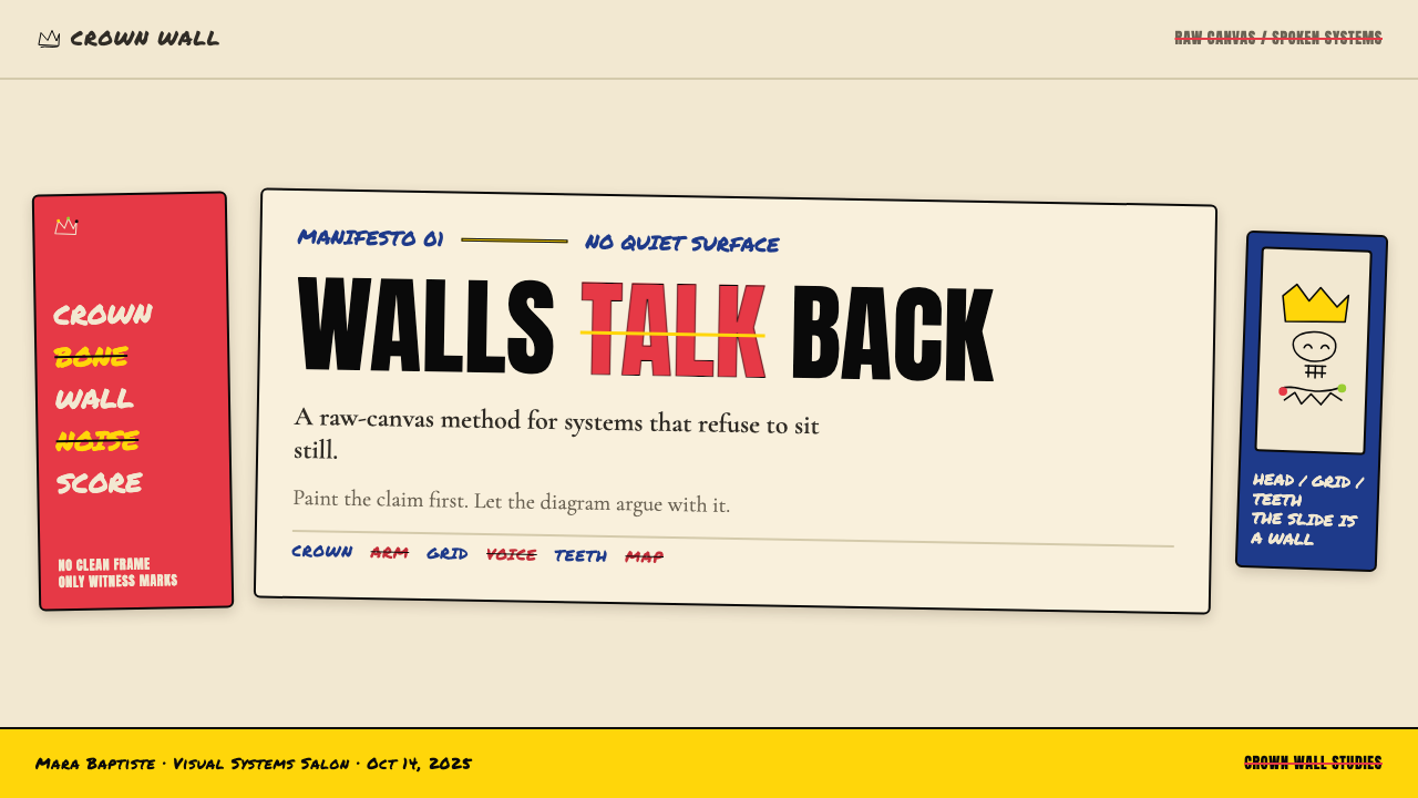
The style's most defining characteristic is the equal standing of word and image. Stenciled block letters, hand-scrawled words, repeated names, and struck-through annotations occupy the same compositional tier as painted figures and diagrams. Crossing out a word does not remove it — the erasure itself becomes a mark, a kind of visible thinking. The surface reads simultaneously as writing and as painting, and neither mode subordinates the other.这种风格最具决定性的特征是文字与图像的平等地位。模板喷涂的块状字母、手写潦草的词语、反复出现的名字、被划掉的标注,与绘制的人物和图表占据同一构图层级。划掉一个词并不等于删除它——抹除行为本身变成了一个痕迹,一种可见的思考过程。画面表面同时作为书写和绘画被阅读,两种模式互不从属。
Raw Surface原始表面
Raw, unprimed linen or canvas — rather than gessoed white surfaces — is the characteristic ground. The fabric's own texture and warm cream tone become part of the composition; areas of bare ground are not voids but active visual fields. This approach to surface communicates material honesty and a refusal of finish. Paint is applied in dense, layered patches rather than smooth fields, and the edges of shapes are ragged, smeared, or otherwise unresolved.未经处理、未涂底料的亚麻或画布——而非涂了石膏底的白色表面——是其典型底材。织物本身的纹理和温暖的米白色调成为构图的一部分;裸露的底材区域不是空洞,而是活跃的视觉场域。这种对表面的处理传达了材料诚实感和对精致完成度的拒绝。颜料以厚重、叠层的块状涂抹,而非平滑的色域,形状的边缘是粗糙的、涂抹的,或以其他方式呈现未解决状态。
Anatomical and Diagrammatic Imagery解剖与图解式图像
Skeletal figures, exposed organs, muscle diagrams, and medical illustrations appear throughout — drawn from memory, from anatomy textbooks, and from Basquiat's own childhood introduction to the subject after his accident. These images function as both personal mythology and social critique: the body made transparent, mapped, and labeled carries the history of scientific examination of Black bodies and the vulnerability of flesh to systemic violence. The imagery is never clinical; it is always emotionally charged by its context.骷髅形象、裸露的器官、肌肉图和医学插图贯穿始终——来源于记忆、解剖教科书,以及巴斯奎特童年事故后对这一主题的亲身接触。这些图像既作为个人神话,也作为社会批评而运作:被透明化、被标绘、被标注的身体承载着对黑人身体进行科学审视的历史,以及肉身面对系统性暴力的脆弱性。这种图像从不临床化;它始终因其语境而充满情感张力。
Gestural Urgency姿态性紧迫感
Marks are made quickly and confidently, with no aspiration toward technical perfection. Lines are angular rather than fluid, shapes are blocked rather than modeled, and the overall surface communicates speed of execution. This gestural quality is not carelessness — it is a deliberate register that aligns the painted surface with the energy of street mark-making, refusing the distancing effect of polished studio craft. Drips, smears, and over-application of paint are compositional choices, not accidents.痕迹被快速、自信地制作,不追求技术上的完美。线条是棱角分明而非流动的,形状是块状而非塑造出来的,整体表面传达出执行的速度感。这种姿态性品质并非粗心大意——它是一种刻意的调性,使画面表面与街头痕迹制作的能量对齐,拒绝精致工作室技艺所带来的疏离效果。滴流、涂抹和颜料的过度叠加是构图选择,而非意外。
Symbolic Iconography象征性图像志
A recurring set of symbols — the three-pointed crown, the copyright mark, the halo, the specific names of Black historical figures — operates as a personal lexicon that accumulates meaning across works rather than within any single piece. The crown asserts sovereignty and dignity; the copyright mark signals ownership and appropriation; the halo confers sanctity on subjects whom history has denied it. These symbols are never illustrative; they are argumentative, marking territory on the picture plane as Basquiat's SAMO tags once marked territory on walls.一套反复出现的符号——三角皇冠、版权标记、光环、特定的黑人历史人物名字——作为个人词汇库运作,在作品与作品之间积累意义,而非在任何单一作品内部完成意义。皇冠宣示主权与尊严;版权标记标志所有权与挪用;光环赋予那些被历史剥夺神圣性的主体以圣洁。这些符号从不具有插图功能;它们是论辩性的,在画面空间上标记领土,正如巴斯奎特的SAMO标记曾在墙面上标记领土。
Layered Opacity叠层不透明度
Compositions are built through successive layers of paint, text, and drawn marks, with earlier layers remaining partially visible beneath later ones. Nothing is fully covered; the painting's history is part of its present surface. This layering creates a sense of excavation — the viewer reads through the surface rather than simply at it, encountering buried words, overdrawn figures, and smeared grounds that give the work its characteristic density and visual weight.构图通过颜料、文字和绘制痕迹的连续叠加构建,早期层次在后续层次之下保持部分可见。没有任何东西被完全覆盖;绘画的历史是其当前表面的一部分。这种叠层制造了一种挖掘感——观者穿透表面阅读而非简单地停留于表面,遭遇埋藏的词语、被覆绘的人物和涂抹的底层,赋予作品其典型的密度与视觉重量。

See the Basquiat Neo-Expressionism design system查看 Basquiat Neo-Expressionism 完整设计系统
Who shaped Basquiat Neo-Expressionism?谁塑造了 Basquiat Neo-Expressionism?
Basquiat remains the movement's irreducible center. Born in Brooklyn in 1960, he moved from SAMO© street tags to internationally exhibited large-scale paintings in under three years — one of the most compressed trajectories in twentieth-century art history. His work synthesized African and Afro-Diasporic visual traditions, American commercial signage, medical illustration, jazz and hip-hop culture, and the gestural ambitions of Abstract Expressionism into a visual language that was entirely his own. He died in 1988 at twenty-seven; his paintings now routinely achieve prices that rank him among the highest-valued artists of the postwar era.巴斯奎特始终是这一运动无可化约的核心。1960年生于布鲁克林的他,在不到三年的时间内从SAMO©街头标记走向国际展出的大型绘画——这是二十世纪艺术史上最为压缩的轨迹之一。他的作品将非洲与非洲离散视觉传统、美国商业标识、医学插图、爵士乐与嘻哈文化以及抽象表现主义的姿态抱负综合成一种完全属于他自己的视觉语言。他于1988年以二十七岁英年早逝;他的绘画如今定期创下令他跻身战后时代最高估值艺术家之列的价格。
Al Diaz was Basquiat's original collaborator on the SAMO© project, co-authoring the cryptic wall texts that established the sensibility — resistant, poetic, addressed to the art world from its margins — that Basquiat would carry into painting. Diaz's contribution to the project's origin is often underplayed in accounts focused on Basquiat's subsequent solo career, but SAMO©'s distinctive mode of engagement with public space was a genuinely shared invention. Diaz continued working as an artist after the partnership dissolved.阿尔·迪亚兹是巴斯奎特SAMO©项目最初的合作者,两人共同创作了那些神秘的墙面文本,建立了一种感性——抵抗性的、诗意的、从边缘向艺术世界发出声音——巴斯奎特后来将这种感性带入绘画。在聚焦于巴斯奎特后续个人事业的叙述中,迪亚兹对这一项目起源的贡献往往被低估,但SAMO©与公共空间独特的接触方式是一项真正共同的发明。合作关系解散后,迪亚兹以艺术家身份继续创作。
Warhol met Basquiat in 1982, when Basquiat reportedly sold him a postcard on the street. Their friendship evolved into a sustained collaboration: joint paintings made between 1984 and 1985 combined Warhol's silkscreen imagery with Basquiat's drawn and painted overpaints. The relationship was commercially strategic for both — Warhol provided access to collectors and institutional networks; Basquiat provided critical currency at a moment when Warhol's relevance was being questioned. Critics initially dismissed the collaboration as mutual exploitation, but the joint works are now understood as substantive dialogues about authorship, commerce, and race in the American art world.沃霍尔于1982年与巴斯奎特相识——据说巴斯奎特当时在街上向他售卖了一张明信片。他们的友谊发展为持续的合作:1984至1985年间共同创作的绘画将沃霍尔的丝网印刷图像与巴斯奎特的绘制和绘画覆层相结合。这段关系对双方都具有商业策略意义——沃霍尔提供了进入收藏家和机构网络的渠道;巴斯奎特则在沃霍尔相关性受到质疑的时刻提供了批评上的货币。批评界最初将这段合作视为相互利用,但这批联合作品如今被理解为关于美国艺术世界中作者身份、商业和种族的实质性对话。
Annina Nosei was one of the first gallerists to offer Basquiat a formal exhibition context, giving him both a show and studio space in the basement of her Prince Street gallery in SoHo around 1981 to 1982. Her support — which connected him to Italian collectors and the international Neo-Expressionist market — was critical in transforming Basquiat from a downtown art-scene figure into an internationally known painter. The gallerist-as-patron relationship was not without tension; Basquiat later described the arrangement as limiting and moved to other representation, but Nosei's early institutional commitment shaped the conditions under which his market and reputation first consolidated.安尼娜·诺塞是最早为巴斯奎特提供正式展览语境的画廊主之一,大约在1981至1982年间,她在苏荷区王子街画廊的地下室为他提供了展览和工作室空间。她的支持——将他与意大利收藏家及国际新表现主义市场连接起来——对于将巴斯奎特从市中心艺术圈人物转变为国际知名画家至关重要。画廊主兼赞助人的关系并非没有张力;巴斯奎特后来将这一安排描述为具有局限性,并转向其他代理,但诺塞早期的机构承诺塑造了他的市场和声誉最初得以确立的条件。
How do you use Basquiat Neo-Expressionism today?今天怎么用 Basquiat Neo-Expressionism?
Applying Basquiat Neo-Expressionism to designed outputs is not a matter of simply overlaying distressed textures or handwritten fonts onto an otherwise conventional layout. The style's coherence depends on understanding its underlying logic: text and image must be compositionally equal, the surface must read as constructed rather than rendered, and every mark — including erasures — must function as a deliberate visual event. When these principles are honored, the style produces work that feels genuinely urgent rather than artificially roughened.将巴斯奎特新表现主义应用于设计输出,并不是简单地在常规版面上叠加做旧纹理或手写字体。这种风格的连贯性依赖于理解其内在逻辑:文字与图像必须在构图上平等,表面必须读起来像是被构建的而非被渲染的,每一个痕迹——包括涂抹——都必须作为蓄意的视觉事件运作。当这些原则被尊重时,这种风格产生的作品会感觉真正紧迫,而非人为粗糙。
For presentation slides, the style works most effectively when cover pages commit fully to the collision aesthetic: a large painted or drawn figure occupies one side of the composition while stencil-weight text crowds the opposite field, with overlapping elements creating visual tension rather than tidy separation. Content slides should resist the temptation to tidy the system into conventional grids; instead, use irregular text placement, visible layering, and deliberate misalignment as organizational tools. Data slides take on the quality of Basquiat's anatomical diagrams — charts and graphs treated as drawn objects, annotated with struck-through labels or repeated values, making the data feel like something being actively thought through rather than passively displayed.对于演示文稿,当封面页完全投入碰撞美学时,这种风格最为有效:一个大型的绘制或描画的形象占据构图的一侧,而模板重量级文字拥挤在对面的区域,叠加的元素制造视觉张力而非整洁的分隔。内容页应当抵制将系统整理成常规网格的诱惑;取而代之,使用不规则的文字布置、可见的叠层和刻意的错位作为组织工具。数据页呈现出巴斯奎特解剖图的品质——图表和图形被当作绘制的对象处理,用被划掉的标注或重复的数值加以注释,使数据感觉像是正在被主动思考,而非被动展示。
For web interfaces, the aesthetic is best applied selectively rather than as a total system. A dashboard or portfolio landing page that uses the style's raw palette, gestural type treatments, and rough-edged containers for key feature sections can carry authentic expressive charge without making functional elements — navigation, inputs, data tables — unreadable. Pricing pages benefit from the style's visual hierarchy: a hero section in full Basquiat intensity, with progressively more restrained treatment as the page moves into detail. The style's confrontational quality can be an asset for brands positioning themselves as countercultural, creative, or anti-corporate.对于网页界面,美学最好作为选择性应用而非完整系统。一个仪表板或作品集落地页,在关键功能区块使用这种风格的原始色板、姿态性字体处理和粗糙边缘容器,可以承载真实的表达张力,同时不使功能性元素——导航、输入框、数据表格——变得不可读。定价页面受益于这种风格的视觉层级:英雄区块以全强度的巴斯奎特美学呈现,随着页面进入细节部分,处理方式逐渐趋于克制。这种风格的对抗性品质对于将自身定位为反文化、创意或反企业的品牌而言可以成为资产。
In editorial and marketing contexts, the style is particularly effective for cultural, music, fashion, and arts coverage where its historical and aesthetic associations are legible to the audience. A magazine feature that uses raw-canvas-toned backgrounds, oilstick-weight type for pull quotes, and hand-drawn decorative elements alongside photographic content can achieve a sense of documentary urgency. Marketing campaigns for creative industries or artist collectives can use the full collision aesthetic — text overpainting imagery, symbols recurring across touchpoints, raw backgrounds — with greater coherence than consumer product campaigns, where the roughness may read as unpolished rather than intentional.在编辑与营销语境中,这种风格对文化、音乐、时尚和艺术报道特别有效,因为在这些领域,其历史与美学关联对受众是可辨读的。一篇使用原始画布色调背景、油画棒重量级字体用于引用语、手绘装饰元素与摄影内容并置的杂志专题,可以实现一种纪录片式的紧迫感。创意产业或艺术家集体的营销活动可以以更高的连贯性使用完整的碰撞美学——文字覆绘图像、符号在各个接触点反复出现、原始背景——相比消费产品活动,在那些语境中粗糙感可能被解读为不够精致而非有意为之。
The most common mistake when applying this aesthetic is reducing it to surface texture — adding grain overlays, distressed brush strokes, and hand-lettered fonts without engaging the style's structural commitment to the equality of text and image. A layout that uses a conventional type hierarchy with decorative roughness applied on top is a pastiche; a layout in which type is treated as mark-making that competes with and interrupts image is the genuine system. A related error is treating the palette as simply expressive rather than structural — using warm reds and yellows to signal energy without anchoring them against the cool blues and cream grounds that give the warm tones their charge. The style demands internal logic, not just visual attitude.应用这种美学时最常见的错误是将其简化为表面质感——添加颗粒叠层、做旧笔触和手写字体,却不涉入这种风格对文字与图像平等性的结构性承诺。一个使用常规字体层级、表面叠加装饰性粗糙感的版面是仿制品;一个将字体作为与图像竞争和打断图像的痕迹制作来处理的版面,才是真正的系统。相关的错误是将色板视为纯粹表达性的而非结构性的——使用暖红和暖黄来表达能量,却不将它们锚定在赋予暖色调力量的冷蓝和奶白底色之上。这种风格要求内在逻辑,而不只是视觉态度。
See the Basquiat Neo-Expressionism design system查看 Basquiat Neo-Expressionism 完整设计系统
Basquiat Neo-Expressionism — FAQBasquiat Neo-Expressionism · 常见问题
Is this style appropriate for corporate or enterprise products?这种风格适合企业或商业产品吗?
Rarely in its full form. The confrontational rawness and political charge embedded in the aesthetic carry associations that are fundamentally at odds with the values most corporate brands want to project — stability, authority, and institutional trust. However, selective elements can be borrowed without adopting the full system: a palette drawn from cadmium reds and warm off-whites, or gestural type treatments for campaign headlines, can add expressive energy within an otherwise conventional corporate identity. The rule is that the more institutional the brand's positioning, the more selectively the style should be applied.完整形式下极少适合。这种美学中蕴含的对抗性粗糙感和政治张力所携带的联想,从根本上与大多数企业品牌希望传达的价值观——稳定性、权威感和机构信任——背道而驰。然而,可以在不采用完整系统的情况下借用特定元素:源自镉红和温暖米白的色板,或用于活动标题的姿态性字体处理,可以在其他方面常规的企业视觉识别中增添表达活力。规则是:品牌定位越机构化,应用这种风格就应越有选择性。
How does this style differ from generic graffiti or street-art aesthetics?这种风格与通用涂鸦或街头艺术美学有何不同?
Basquiat Neo-Expressionism is distinct from generic graffiti aesthetics in its compositional seriousness and its intellectual content. Generic street-art influenced design tends to use wildstyle lettering, spray-can textures, and urban imagery as surface decoration. The Basquiat system is compositionally structured around the collision of text and image as conceptual equals, uses a specific palette rooted in painting tradition rather than spray-can color, and carries a weight of art-historical and political reference that generic street-art pastiche does not. Applied work in this style should feel closer to a painting reproduced at scale than to a tagged wall photographed and filtered.巴斯奎特新表现主义与通用涂鸦美学的不同在于其构图的严肃性和智识内容。通用街头艺术影响的设计倾向于使用野生字体、喷漆罐纹理和城市图像作为表面装饰。巴斯奎特系统在构图上围绕文字与图像作为概念等价物的碰撞构建,使用根植于绘画传统而非喷漆颜色的特定色板,并携带着通用街头艺术仿制品所不具备的艺术史与政治参照的重量。这种风格下的应用作品应当感觉更接近于以大幅尺度复制的绘画,而非被拍摄和过滤的标记墙面。
Can the style work on light backgrounds, or does it require raw linen tones?这种风格能在浅色背景上使用,还是必须使用亚麻原色调?
Light backgrounds work, but the specific warmth of raw linen — not pure white, but a slightly creamy, textured off-white — is load-bearing in the system. Pure white grounds make the palette's warm reds and yellows appear cooler and more graphic, which pulls the result toward illustration rather than painting. A slightly warm, slightly degraded off-white background preserves the sense that the surface has material presence. Dark grounds are possible and have precedent in Basquiat's own work, but they require committing to a narrower palette — typically one dominant warm tone against the dark — to prevent the composition from becoming illegible.浅色背景可以使用,但亚麻原布的特定温暖感——不是纯白,而是略带奶油质感的、带有纹理的米白——在这个系统中是承重性的。纯白底面使色板中的暖红和暖黄显得更冷更图形化,将结果拉向插图而非绘画。略微温暖、略微褪色的米白背景保留了表面具有材料存在感的感觉。深色底面是可能的,并且在巴斯奎特自身的作品中有先例,但它们要求投入更窄的色板——通常是一种主导暖色调对抗深色——以防止构图变得不可读。
How do you handle typography without making it look like decorative grunge?如何处理字体排印而不使其看起来像装饰性的颓废风格?
The distinction lies in function. In the Basquiat system, text is not styled to look rough — it is applied as a mark, with the same directness as a drawn line or a painted shape. This means committing to actual gestural application when the context allows it, or choosing typefaces whose forms are architecturally simple and can bear being set at unconventional scales, weights, and angles without becoming decorative. The test is whether the text element is doing compositional work — anchoring a zone, creating tension with an adjacent image, asserting a weight — or whether it is simply dressed up. Decorative grunge adds roughness to text that is otherwise laid out conventionally. The Basquiat approach uses text placement and scale as primary compositional decisions.区别在于功能。在巴斯奎特系统中,文字并非被设计成看起来粗糙——它作为一个痕迹被施用,具有与绘制线条或绘画形状相同的直接性。这意味着在语境允许时承诺实际的姿态性施用,或者选择形式上具有建筑简洁性的字体,这些字体能够在非常规的尺度、字重和角度下被设定而不变成装饰性的。检验标准是文字元素是否在做构图工作——锚定一个区域、与相邻图像制造张力、主张一种重量——还是仅仅是被装扮起来。装饰性颓废风格为在其他方面常规布置的文字增添粗糙感。巴斯奎特方法将文字的位置和尺度作为主要的构图决定。
What contexts is this style genuinely wrong for?这种风格真正不适合哪些场景?
The style is wrong for any context where visual refinement, calm, or institutional neutrality is the required register: healthcare and wellness products, financial services, children's education platforms, and luxury goods brands all depend on visual languages that signal care, precision, or status through different means. The style is also a poor fit for products whose primary audience is unfamiliar with Basquiat's work and where the aesthetic's rawness will register as low production value rather than artistic intention. In these contexts, the style's confrontational energy becomes a liability rather than an asset. Knowing when not to apply a style is as much a part of design judgment as knowing how to apply it.这种风格不适合任何需要视觉精致感、平静感或机构中立感的场景:医疗健康产品、金融服务、儿童教育平台和奢侈品品牌都依赖以不同方式传达关怀、精确或地位的视觉语言。这种风格也不适合主要受众不熟悉巴斯奎特作品的产品——在这些情况下,美学的粗糙感会被解读为低制作价值而非艺术意图。在这些语境中,这种风格的对抗性能量成为负担而非资产。知道何时不应用某种风格,与知道如何应用它,同等程度地属于设计判断力的一部分。
Related design styles相关设计风格
 Keith Haring PopJoy refuses the gallery. Thick black contours pack primary color into a danci…快乐拒绝画廊:粗黑轮廓把原色塞进跳动墙面网格。
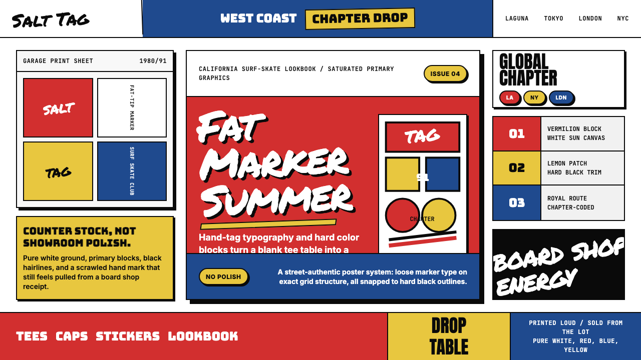 Stüssy StreetwearStreetwear starts rough. Vermilion blocks, marker script, and black hairlines…街头从粗粝开始。朱红色块、马克笔字与黑细线撞上纯白。
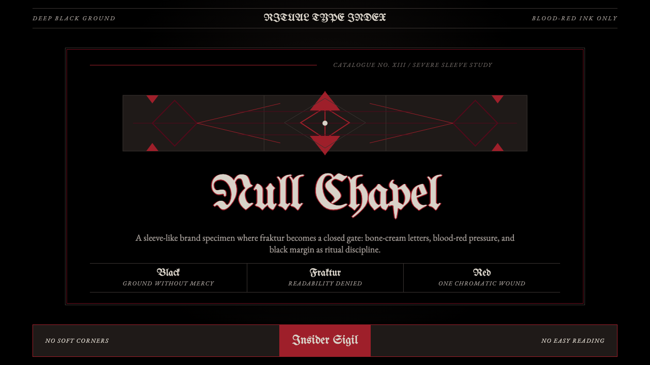 Death Metal BlackletterUnreadable by design. Bone fraktur on black, cut by one blood-red geometric s…以难读划界:黑底骨色哥特字,被一道血红几何符印切开。
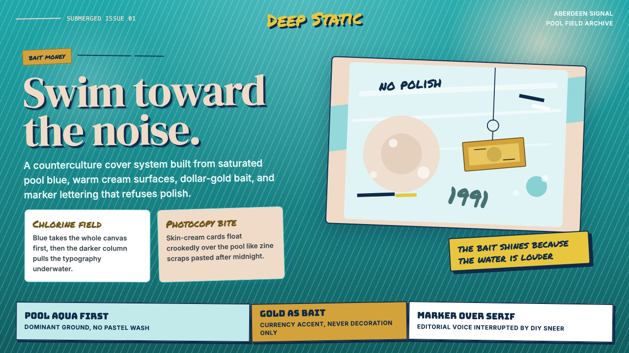 Nirvana — NevermindAnti-pop in pool blue. Cream cards, dollar-gold accents, and marker type roug…泳池蓝里的反主流:乳白卡片、美元金点缀与马克笔字打乱网格。
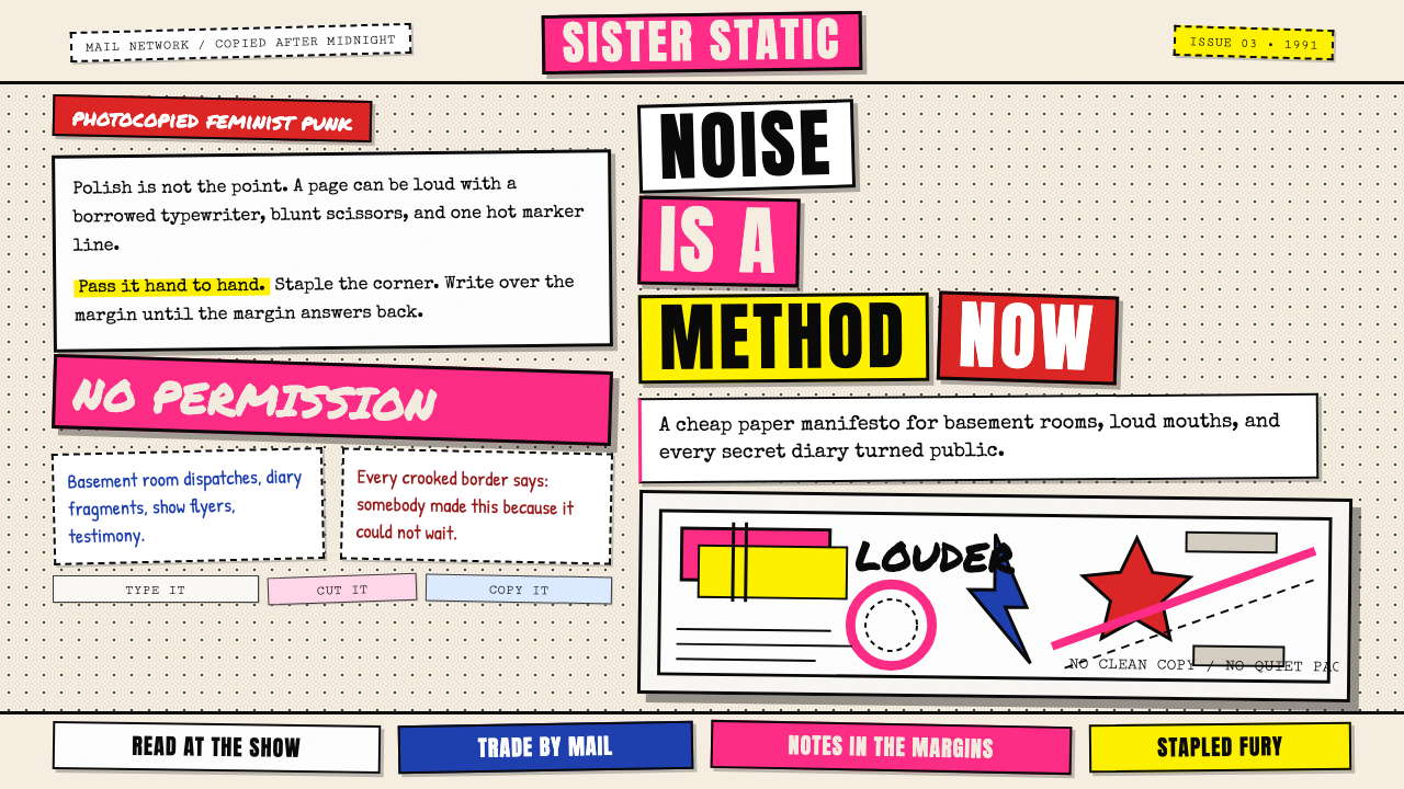 Riot Grrrl Zine (1991)DIY fury, unpolished. Cream Xerox grain, black toner type, hot-pink marker co…DIY怒火,拒绝精致。米色复印颗粒、黑碳粉字与荧光粉拼贴。
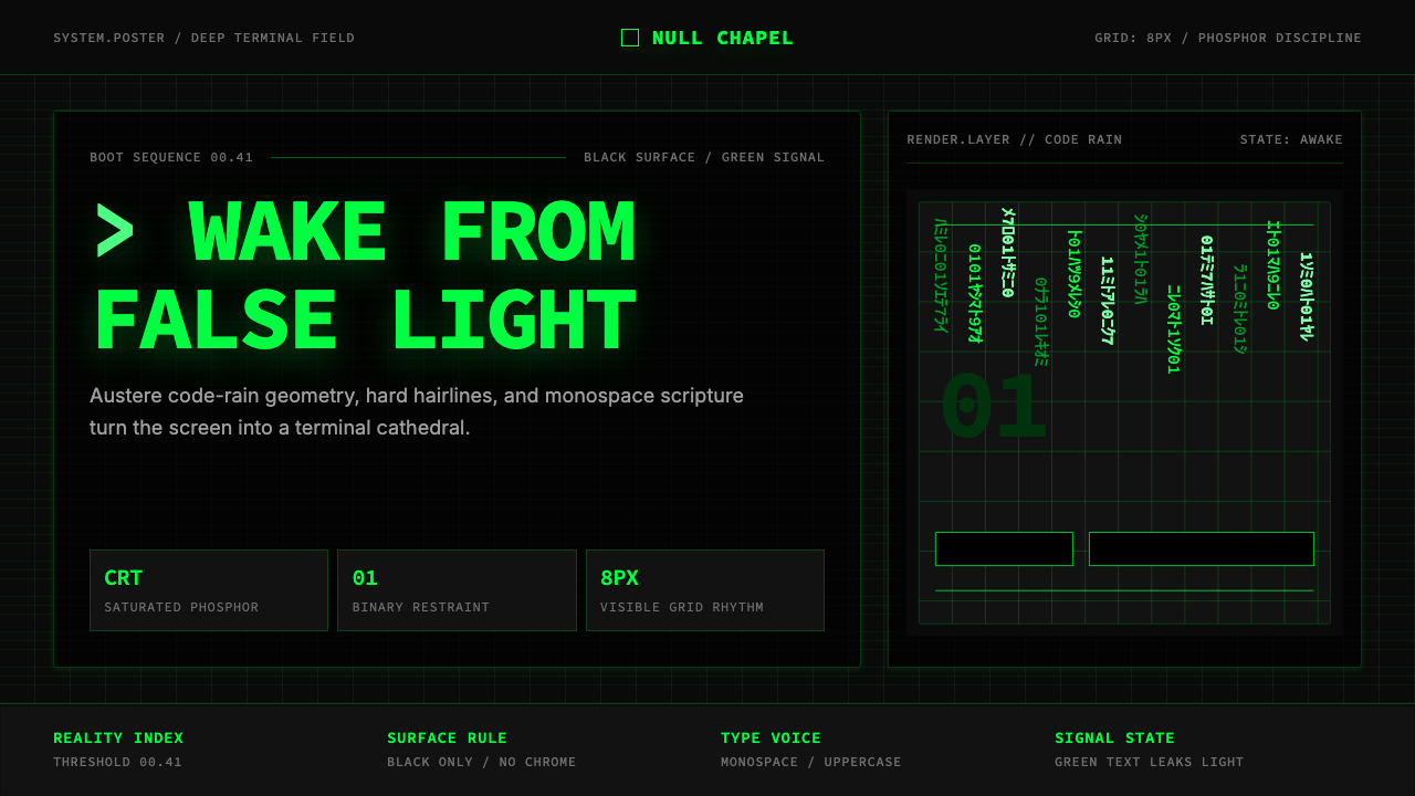 The Matrix (Green-Code)Terminal myth, disciplined. CRT green code rain, black grid, monospace script…终端神话,冷峻克制。CRT 绿代码雨、黑色网格与等宽字成形。