What is Riot Grrrl Zine (1991)?什么是 Riot Grrrl Zine (1991)?
Riot Grrrl zines weaponized the photocopier — turning cheap cream paper, toner smears, and Sharpie fury into the most urgent feminist visual language of the 1990s.Riot Grrrl 手工杂志把复印机变成武器——用廉价的米色纸张、碳粉痕迹与记号笔怒火,铸成1990年代最紧迫的女权视觉语言。
Riot Grrrl Zine (1991) in briefRiot Grrrl Zine (1991) 速览
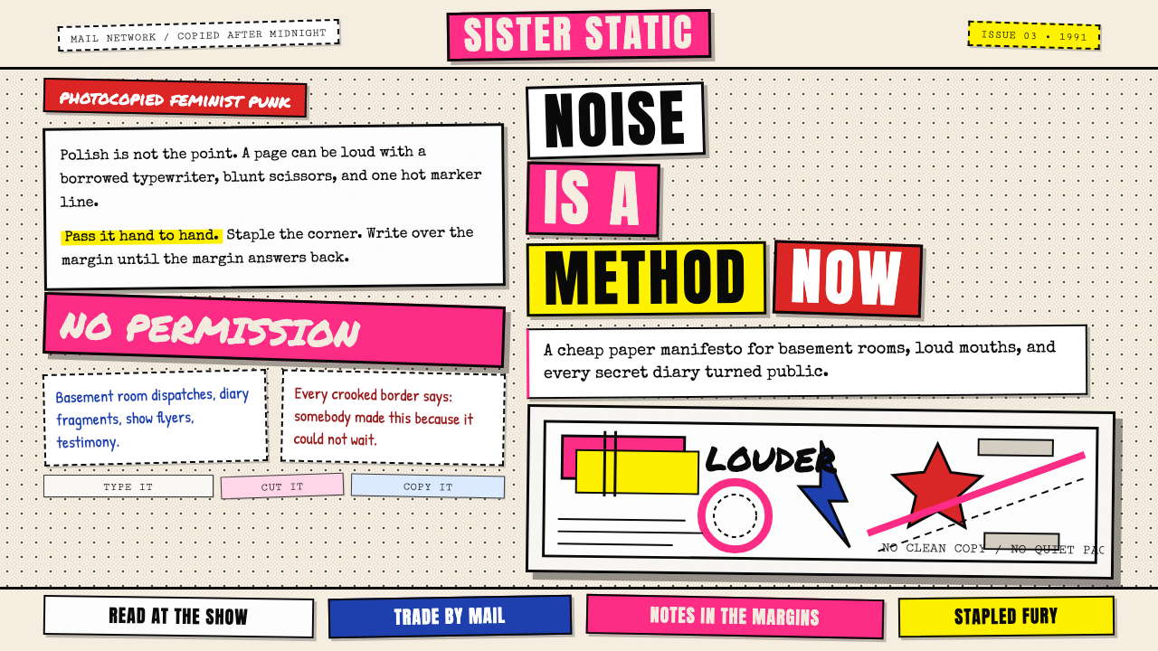
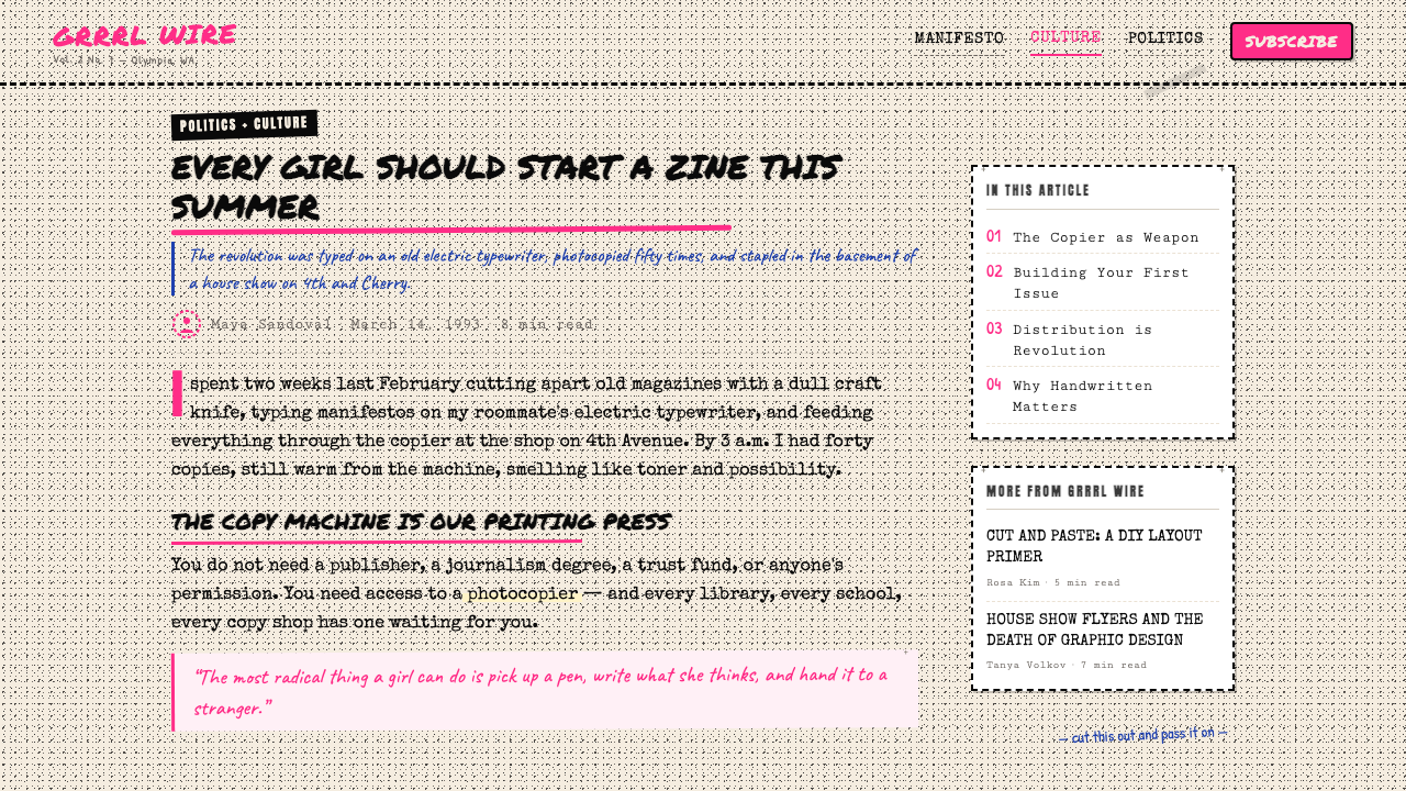
Riot Grrrl zines are hand-assembled photocopied booklets that served as the visual and editorial voice of early-1990s feminist punk. Produced on borrowed or stolen photocopier time, assembled with rubber cement and staples, and distributed for free or for cost at shows and through mail networks, they rejected every convention of professional print design in favor of something rawer and more immediate: typewriter text crowding the margins, hand-lettered headlines colliding with magazine clippings, photocopier grain coating every surface like a second skin.Riot Grrrl 手工杂志是手工拼装的复印小册子,是1990年代初期女权朋克运动的视觉与编辑之声。它们在借来或偷来的复印机上制作,用橡皮胶水和订书钉装订,在演出现场免费发放或通过邮购网络流传。它们拒绝专业印刷设计的一切惯例,转而呈现更粗粝、更即时的东西:打字机文字拥挤在页边,手写标题与杂志剪报相互碰撞,复印颗粒如第二层皮肤覆盖每一寸表面。
The aesthetic is deliberately anti-professional. Wobbling borders, misregistered collage elements, marker ink bleeding into the photocopy screen, cut-and-pasted ransom-note lettering, and corrections made by hand rather than reprinting — these are not signs of incompetence but of a principled refusal. The message is that access to expensive design tools, formal training, and institutional approval are not prerequisites for political speech. A Xerox machine and something urgent to say are enough.这种美学是刻意的反专业。摇摆的边框、错位的拼贴元素、渗入复印网纹的记号笔墨水、剪贴的勒索信式字母拼贴、以及用手工涂改代替重印的校正痕迹——这些不是无能的表现,而是有原则的拒绝。它传达的信息是:昂贵的设计工具、正规培训与机构认可,都不是政治言说的先决条件。一台复印机加上一件迫切想说的事,就已足够。
As a design system, Riot Grrrl zine style is defined by its materials and the constraints they impose: the cream or buff tone of cheap copy paper as the ground, pitch-black toner as the dominant mark-making medium, and hot-pink marker highlight as the only color intervention. Everything else — texture, distortion, emphasis, hierarchy — is achieved through pressure, repetition, misalignment, and the honest imperfection of analog duplication.作为一套设计体系,Riot Grrrl 手工杂志风格由其材料及材料带来的限制所定义:廉价复印纸的米色或浅黄褐色作为底面,浓黑的碳粉作为主要的笔迹媒介,荧光粉红记号笔高亮作为唯一的色彩介入。其他一切——质感、变形、强调、层级——都通过压力、重复、错位,以及模拟复制天然的不完美来实现。
See the Riot Grrrl Zine (1991) design system查看 Riot Grrrl Zine (1991) 完整设计系统
Where does Riot Grrrl Zine (1991) come from?Riot Grrrl Zine (1991) 从何而来?
The movement crystallized in 1991 simultaneously in Olympia, Washington, and Washington D.C., driven by the overlapping punk and feminist communities centered around the independent music scene and college radio. Olympia was home to Bikini Kill — Kathleen Hanna, Tobi Vail, Kathi Wilcox, and Billy Karren — who in 1991 produced their founding manifesto zine, also titled Bikini Kill, which combined hand-typed manifestos, diary fragments, and collaged imagery into a document that was as much art object as political statement. In D.C., Allison Wolfe and Molly Neuman of Bratmobile produced Riot Grrrl, the zine that gave the movement its name. These publications spread laterally through a postal network — readers would write in, receive a copy, and begin producing their own.这场运动于1991年同时在华盛顿州奥林匹亚与华盛顿特区结晶成形,由围绕独立音乐场景和大学电台的朋克与女权社群共同推动。奥林匹亚是 Bikini Kill 的大本营——凯思琳·汉纳、托比·维尔、卡西·威尔科克斯和比利·卡伦——她们于1991年制作了创刊宣言手工杂志《Bikini Kill》,将手打宣言、日记片段与拼贴图像融合成一份既是艺术对象又是政治声明的文件。在华盛顿特区,Bratmobile 的艾莉森·沃尔夫和莫利·纽曼制作了《Riot Grrrl》,这本手工杂志赋予了整个运动名字。这些出版物通过邮政网络横向传播——读者写信索取,收到一份后开始制作自己的杂志。
The zine form itself had roots going back through punk's DIY culture of the late 1970s — British punk zines like Sniffin' Glue (1976) and American counterparts like Search and Destroy had established the photocopied booklet as the appropriate medium for underground dissent. What Riot Grrrl added was an explicitly gendered politics. The zines did not merely report on a subculture; they constituted a counter-public, a space in which girls and women could speak without the mediation of record labels, music press gatekeepers, or the male-dominated punk scene that frequently silenced or sexualized them.手工杂志形式本身的根源可以追溯到1970年代末朋克的DIY文化——英国朋克杂志如《Sniffin' Glue》(1976年)及美国对应刊物《Search and Destroy》已将复印小册子确立为地下异见的恰当媒介。Riot Grrrl 的增量是一种明确的性别政治。这些杂志不仅仅是报道某种亚文化;它们构成了一个反公共领域——一个女孩与女性可以不经唱片公司、音乐媒体把关人或常常压制乃至物化她们的男性主导朋克圈的中介而直接发言的空间。
The visual language was shaped by material access. These were young people without money, without professional equipment, without institutional backing. The Xerox machine at the library or the copy shop — the same machine used for flyers and academic papers — became the printing press. Its inherent qualities: the slight graininess of toner on uncoated paper, the tendency to blow out fine detail, the ability to enlarge or reduce, the capacity to reproduce at flat tonal fidelity — all became formal properties of the aesthetic. Hot-pink Sharpies, available at any drugstore, provided the only color available without increasing reproduction costs.视觉语言由材料的可及性塑造。这些年轻人没有钱,没有专业设备,没有机构支持。图书馆或复印店的复印机——同一台用来印传单和学术论文的机器——成为了印刷机。它的固有特质:碳粉在非涂布纸上的轻微颗粒感、将精细细节炸平的倾向、放大或缩小的能力、以平面色调保真度复制图像的特性——全部成为这种美学的形式属性。任何药店都能买到的荧光粉红马克笔,提供了在不增加印刷成本的前提下唯一可用的颜色。
By 1992 and 1993, the movement had spawned hundreds of zines across the United States, Canada, and Britain — Girl Germs, Jigsaw, I (heart) Amy Carter, Fantastic Fanzine, and dozens of one-issue personal publications. The visual conventions had stabilized into a recognizable genre: the cream ground, the black type layered with marker and collage, the urgent hand lettering, the unashamed inclusion of personal handwriting and drawing, the refusal of white space as luxury. When the mainstream music press began covering Riot Grrrl in 1992, the movement's founders declared a media blackout — refusing interviews as a form of protecting the zine network as the primary channel for communication. This decision underscored that the aesthetic was inseparable from the politics: the zine was not promotion, it was the thing itself.到1992至1993年间,这场运动在美国、加拿大和英国催生了数百种手工杂志——《Girl Germs》、《Jigsaw》、《I ♥ Amy Carter》、《Fantastic Fanzine》以及数十种一期个人出版物。视觉惯例已稳定成一种可辨认的类型:米色底面、黑色文字叠加记号笔与拼贴、急迫的手写标题、毫不羞耻地纳入个人笔迹与绘画、拒绝将留白视为一种奢侈。当主流音乐媒体于1992年开始报道 Riot Grrrl 时,运动的创始人宣布了一项媒体封锁——拒绝接受采访,以此保护手工杂志网络作为主要传播渠道。这一决定强调了美学与政治的不可分割:手工杂志不是推广,它本身就是目的。
What defines the Riot Grrrl Zine (1991) look?Riot Grrrl Zine (1991) 的视觉特征是什么?
Ground and Paper Tone底面与纸张色调
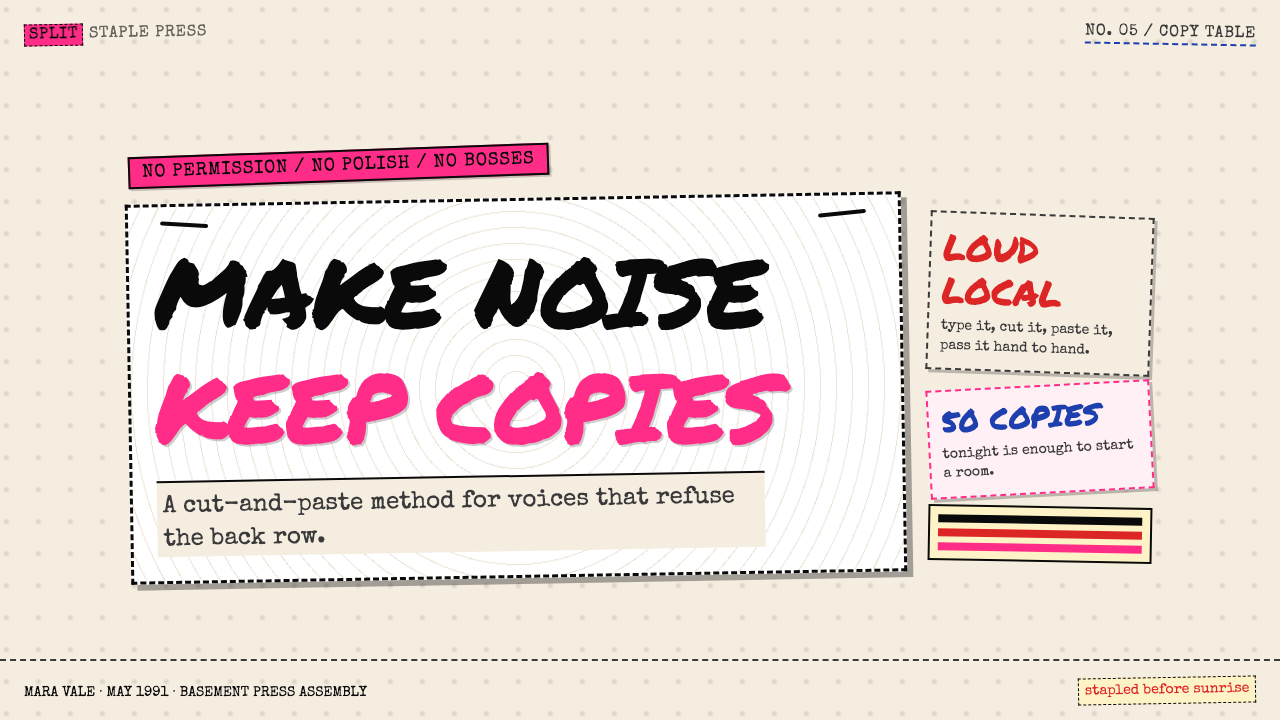
The foundational surface is always the natural color of inexpensive uncoated copy paper — a warm cream or buff rather than bright white. This is not a stylistic choice so much as a material truth: cheap paper is slightly warm, slightly rough, and slightly translucent. Every design decision layers on top of this given. The cream ground unifies all elements and signals immediately that what you are looking at is reproduced rather than printed, copied rather than designed.基础底面始终是廉价非涂布复印纸的自然色——温暖的米色或浅黄褐色,而非明亮的白色。这与其说是风格选择,不如说是材料事实:廉价纸张略带暖意、略有粗糙感、略显半透明。所有设计决定都叠加在这个既成条件之上。米色底面统一了所有元素,并立即传达出一个信息:你所看到的是复制品而非印刷品,是誊抄而非设计。
Toner Type and Handwriting Collision碳粉字迹与手写的碰撞
Text appears in two modes that coexist on the same page without hierarchy: typewriter-produced body copy — evenly spaced, slightly mechanical, carrying the particular rhythm of manual keystroke — and handwriting, which might annotate, contradict, or simply add urgency to the typed text. Neither mode is subordinate. The typewriter's monospaced regularity reads as impersonal and urgent simultaneously; the handwriting reads as intimate and confrontational. The collision of the two produces a page that feels simultaneously like a legal document and a diary entry.文字以两种模式出现,在同一页面上共存而无明确层级:打字机打出的正文——等距排列、略带机械感、带着手动击键的特殊节律——以及手写,后者可能是注释、反驳,或仅仅是为打印文字增添紧迫感。两种模式互不从属。打字机的等宽规律既显得非个人化又传递出紧迫感;手写则显得既私密又对抗性十足。两者的碰撞使页面同时具有法律文件和日记条目的气质。
Collage and Cut-Out Headline拼贴与剪切标题
Headlines are frequently assembled from letters or words clipped from magazines and newspapers — the ransom-note tradition adapted to feminist politics. The sources are often deliberately legible: a fashion magazine masthead, a news headline, a product advertisement. By recontextualizing these found letterforms, the zines perform a kind of visual judo — turning the media's own typography against the culture that produced it. Clippings are pasted at slight angles, overlapping, with no attempt to conceal the cut edges.标题经常由从杂志和报纸上剪下的字母或单词拼凑而成——这是将勒索信传统改造为女权政治的做法。来源往往是刻意可辨认的:时尚杂志的刊头、新闻标题、产品广告。通过对这些现成字形的再语境化,手工杂志进行了一种视觉柔道——用媒体自身的排版方式对抗产生这种文化的体制。剪报以轻微倾斜的角度粘贴,相互叠压,对切割边缘毫不遮掩。
Hot-Pink Marker Accent荧光粉红记号笔强调
Hot pink — specifically the synthetic, nearly fluorescent tone produced by a broad-tipped permanent marker — is the single color accent in an otherwise black-and-cream composition. It appears as underlines, circles, arrows, highlights over type, hand-drawn stars or brackets, or fields of solid color laid behind a section of text. The pink is never subtle; it punches through the monochrome ground with the visual force of a shout. Its presence is always emphatic rather than decorative — it marks the thing that cannot be missed.荧光粉红——特指宽头永久记号笔产生的那种合成的、近乎荧光的色调——是黑白米色构图中唯一的彩色点缀。它以下划线、圆圈、箭头、文字高亮、手绘星形或括号,或铺在文字段落背后的纯色色块的形式出现。这种粉红从不微妙;它以嘶喊的视觉力度穿透单色底面。它的存在始终是强调性而非装饰性的——它标记那些不能被错过的事物。
Photocopier Grain and Distortion复印颗粒与失真
The photocopy process introduces a characteristic grain — a slight fuzziness at edges, a tonal compression that flattens detail into high-contrast areas of dense black and washed-out near-white. This grain is not cleaned up or compensated for; it is embraced. Second-generation and third-generation copies — copies of copies — increase the distortion, and some pages are clearly produced this way deliberately: type that has thickened, images that have gone to silhouette, halftones that have blown out to solid black. The grain is both a truth about the process and a visual texture that unifies the page.复印过程引入了特有的颗粒感——边缘的轻微模糊、把细节压缩为浓黑的密实区域与接近白色的过曝区域的色调压缩。这种颗粒感不被清理或补偿;它被拥抱。二代和三代复印——复印的复印——加剧了失真,有些页面显然是刻意如此制作的:字体变粗、图像变成剪影、网点过曝成实心黑色。颗粒感既是对过程的如实呈现,也是统一页面的视觉肌理。
Anti-Layout and Overcrowding反版式与过度充填
Conventional graphic design uses white space as a compositional value — room around elements lets them breathe and establishes hierarchy. Riot Grrrl zines refuse this. Pages are filled to their edges. Text runs up to the margin, is sometimes cut off, loops around images, is layered over other text. This overcrowding is not accidental or unskilled — it is a political statement about the inadequacy of polished, airy design for communicating urgency. There is no white space because there is no time for white space.传统平面设计将留白视为构图价值——元素周围的空间让它们得以呼吸并建立层级。Riot Grrrl 手工杂志拒绝这一点。页面被填充至边缘。文字延伸至页边,有时被切断,绕着图像弯曲,叠加在其他文字上面。这种过度充填不是偶然或缺乏技巧——它是一个政治声明:精致、通透的设计不足以传达紧迫感。没有留白,因为没有留白的时间。
Personal Mark and Imperfection个人痕迹与不完美
The individual hand is never erased from a Riot Grrrl zine. Rulers are used inconsistently if at all; lines wobble; paste-ups shift; ink smears; correction fluid leaves visible ghosts. These imperfections are not tolerated — they are celebrated as proof of human presence. The maker is not pretending to be a machine. In an era when desktop publishing was beginning to make amateur design look professional, Riot Grrrl zines moved in the opposite direction: insisting on the visibility of the making, the evidence of effort, the trace of the person behind the page.制作者的个人痕迹从不从 Riot Grrrl 手工杂志中被抹去。直尺的使用时断时续,甚至根本不用;线条摇摆;贴纸位移;墨水晕染;修正液留下可见的幽灵痕迹。这些不完美不是被容忍的——它们被颂扬为人类存在的证明。制作者不假装自己是一台机器。在桌面出版开始让业余设计看起来专业的时代,Riot Grrrl 手工杂志走向了相反的方向:坚持制作过程的可见性、努力的证据、页面背后那个人的踪迹。
See the Riot Grrrl Zine (1991) design system查看 Riot Grrrl Zine (1991) 完整设计系统
Who shaped Riot Grrrl Zine (1991)?谁塑造了 Riot Grrrl Zine (1991)?
Frontwoman of Bikini Kill and the most visible figure of the Riot Grrrl movement, Hanna co-produced the Bikini Kill zine in 1991, which served as the founding document of the movement's visual and political language. Her background in visual art — she studied photography at Evergreen State College — shaped the zine's sophisticated approach to image-text collision. The 1991 Bikini Kill zine included hand-typed manifestos, personal diary excerpts, and collaged photographs in a format that deliberately rejected the polish of even the most credible underground publishing. Hanna later fronted Le Tigre, continuing to use zine-derived visual aesthetics in music video and merchandise design.Bikini Kill 的主唱,也是 Riot Grrrl 运动最具代表性的人物。汉纳于1991年联合制作了《Bikini Kill》手工杂志,这份文件成为该运动视觉与政治语言的奠基文献。她在视觉艺术方面的背景——曾在常青州立学院学习摄影——塑造了该杂志对图像与文字碰撞的成熟处理。1991年的《Bikini Kill》手工杂志包含手打宣言、个人日记摘录与拼贴照片,其形式刻意拒绝了即便是最具公信力的地下出版物所拥有的精致感。汉纳后来组建了 Le Tigre 乐队,继续在音乐视频和周边产品设计中运用源自手工杂志的视觉美学。
Drummer of Bikini Kill and editor of the zine Jigsaw, Vail was a central theorist of the zine's approach to combining personal narrative with political analysis. Her writing introduced the concept of the 'girl scene' as a self-organizing cultural space — a framework that gave the zine format its justification as a medium of community building rather than mere publishing. Vail's visual approach to Jigsaw — heavy on photocopied imagery, hand annotation, and deliberately non-hierarchical layout — became one of the most influential formal templates for the genre.Bikini Kill 的鼓手,也是《Jigsaw》手工杂志的编辑。维尔是该杂志将个人叙事与政治分析相结合之方式的核心理论家。她的写作引入了「女孩场景」作为自我组织的文化空间这一概念——这一框架赋予了手工杂志格式作为社区建构媒介而非单纯出版物的正当性。维尔对《Jigsaw》的视觉处理方式——大量使用复印图像、手工注释和刻意非层级化的版式——成为该类型最具影响力的形式模板之一。
Co-founder of Bratmobile and co-editor of the original Riot Grrrl zine produced in Washington D.C. in 1991, Wolfe was instrumental in giving the movement both its name and its geographic anchor on the East Coast. The D.C. Riot Grrrl zine had a rawer visual character than the Olympia publications — more newsprint in sensibility, with text blocks that ran wall-to-wall across the page. Wolfe's background in feminist activism through her time at the University of Oregon shaped the zine's integration of political theory with personal experience, a combination that became the genre's signature editorial structure.Bratmobile 的联合创始人,也是1991年在华盛顿特区制作的原版《Riot Grrrl》手工杂志的联合编辑。沃尔夫在赋予这场运动名称和东海岸地理锚点方面发挥了关键作用。华盛顿特区版《Riot Grrrl》手工杂志的视觉气质比奥林匹亚出版物更为粗粝——更接近新闻纸的感觉,文字块从页面一端铺满另一端。沃尔夫在俄勒冈大学期间形成的女权主义行动主义背景,塑造了该杂志将政治理论与个人经验融合的做法——这一结合成为该类型标志性的编辑结构。
Frontwoman of Heavens to Betsy and later Sleater-Kinney, Tucker produced zines and contributed to the Olympia network in the early 1990s. Her contribution to the zine aesthetic lies particularly in the integration of songwriting with visual layout — song lyrics appeared in zines formatted as poems or manifesto fragments, blurring the line between music publication and personal journal. This cross-pollination between the sonic and the printed was characteristic of the Olympia scene's approach to zine production as part of a broader creative practice rather than a standalone medium.Heavens to Betsy 以及后来的 Sleater-Kinney 的主唱。塔克在1990年代初期制作手工杂志并为奥林匹亚网络做出贡献。她对手工杂志美学的贡献尤其体现在将歌词创作与视觉版式融合——歌词以诗歌或宣言片段的格式出现在手工杂志中,模糊了音乐出版物与个人日记之间的界限。这种声音与印刷之间的交叉授粉,是奥林匹亚场景将手工杂志制作视为更广泛创作实践一部分而非独立媒介这一方式的典型体现。
How do you use Riot Grrrl Zine (1991) today?今天怎么用 Riot Grrrl Zine (1991)?
Riot Grrrl zine style is a high-specificity aesthetic — it carries strong cultural memory of feminist punk, underground publishing, and early-1990s political urgency. Applied correctly, it produces work that feels authentically urgent, personal, and subversive. Applied carelessly, it reads as costume. The distinction lies in understanding what the visual system is actually communicating: not 'this is edgy' but 'this was made by a person, for a reason, right now.' Every application should ask whether it earns that claim.Riot Grrrl 手工杂志风格是一种高特异性美学——它承载着关于女权朋克、地下出版与1990年代初期政治紧迫性的强烈文化记忆。应用得当,它产生出真实感觉紧迫、私密与颠覆性的作品。应用草率,它读起来像是服装扮演。区别在于理解这套视觉系统实际上在传达什么:不是「这很前卫」,而是「这是某人出于某种原因刚刚做的」。每一次应用都应该自问它是否配得上这个主张。
For presentation slides, the style is most effective on cover and section-divider pages where impact matters more than legibility over time. A cover built in this aesthetic uses the cream ground as the default, fills the space with collaged black-and-white imagery treated to high contrast, and places a headline in a combination of bold typewriter-weight letterforms and hand-lettered or cut-and-paste type. Hot-pink marker lines or circles as accent are applied sparingly and by hand if possible — or simulated with a slight wobble if digital. Content slides should pull back from the full aesthetic, using the cream ground and monospace or slab-serif body type to maintain legibility while retaining the character of the style. Data slides in this aesthetic treat charts as cut-out objects — presented without grid lines, in two tones (black and the cream ground), with hot-pink accents marking the most important data point.在演示文稿中,这种风格在封面页和章节分隔页上最为有效——在这些地方冲击力比长期易读性更重要。以这种美学构建的封面使用米色底面作为默认,用高对比度处理的黑白拼贴图像填满空间,并以粗打字机字重字形与手写或剪贴字体的组合放置标题。荧光粉红记号笔线条或圆圈作为强调元素,应节制使用且尽可能手工涂抹——若是数字制作则以轻微的摇摆感模拟。内容页应从完整美学中退一步,使用米色底面和等宽或板衬线体正文字体,在保持风格特色的同时维持可读性。这种美学下的数据页将图表视为剪切的对象——不带网格线呈现,以两种色调(黑色与米色底面)表现,用荧光粉红强调最重要的数据点。
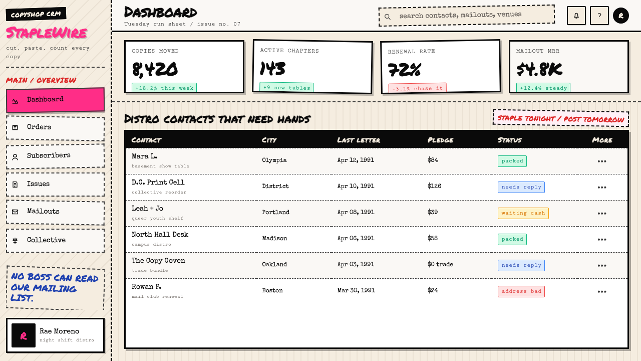
For web interfaces, the style is best applied to editorial-led contexts: independent media, activist organizations, music venues, cultural institutions, and brands whose authenticity proposition depends on a history of genuine subcultural participation. Dashboard and pricing-page applications are possible but require careful restraint — the aesthetic's deliberate overcrowding and anti-hierarchy must be translated into a web context that still functions. The approach: use a cream or warm off-white background across all surfaces, set all body type in a monospace or typewriter-style face at generous size, reserve hot pink strictly for interactive highlights and error states, and allow generous border-box UI elements with slightly imperfect, hand-feel corner radii. Navigation should feel typographic rather than iconographic.对于网页界面,这种风格最适合用于以编辑内容为主导的场景:独立媒体、倡导组织、音乐演出场所、文化机构,以及其真实性主张依赖于地下亚文化真实参与历史的品牌。仪表板和定价页面的应用是可能的,但需要谨慎克制——美学中刻意的过度充填与反层级必须被转化为仍能正常使用的网页语境。方法如下:在所有界面使用米色或温暖的近白背景,以等宽或打字机风格字体设置所有正文,字号适度放大;将荧光粉红严格保留给交互高亮和错误状态;允许略带边框盒子风格的界面元素,圆角带有轻微的手工感不规则度。导航应感觉像文字而非图标。
For editorial and marketing work, the style offers a strong voice for brands and publications that need to distinguish themselves from polished, corporate visual communication. An editorial layout in this aesthetic uses justified or ragged-right typewriter body copy in a relatively narrow column, with hand-annotation style callouts in the margin. Section breaks are marked by a thick black rule or a hand-drawn line rather than decorative ornament. Marketing pages can use the style's poster-quality boldness: a single full-bleed photocopy-treated image behind large cut-and-paste type, with the hot-pink accent used once, decisively, for the primary call to action. Merchandise, packaging, and event collateral are natural homes for this aesthetic — anywhere a physical artifact can show evidence of having been made.对于编辑与营销内容,这种风格为需要将自己与精致、企业化视觉传播区别开来的品牌和出版物提供了强劲的声音。这种美学下的编辑版面在相对窄的列宽中使用两端对齐或右边不齐的打字机正文,页边留白处以手写注释风格的引文作点缀。段落分隔以粗黑线条或手绘线标记,而非装饰性元素。营销页面可以利用这种风格的海报品质大胆感:一张全出血复印处理图像置于大幅剪贴字体之后,荧光粉红强调色只用一次,果断地用于主要行动号召。周边商品、包装和活动周边是这种美学的天然归宿——任何能展示制作痕迹的实体物件都适合。
The most common mistake when applying this style is using it as pure surface treatment — taking the visual markers (grain filter, typewriter font, pink accent) without the underlying logic of urgency, density, and anti-professionalism. A zine aesthetic applied to a luxury brand or a highly polished product experience creates cognitive dissonance that reads as irony rather than authenticity. The second common mistake is over-digitizing: using perfectly circular circles, perfectly straight hand-drawn lines, uniformly applied grain filters, and symmetrically placed collage elements. The style's power comes from evidence of imperfect human making. Any digital application must find ways to reintroduce genuine irregularity — physically made elements scanned in, actual marker marks digitized, real paper textures used as overlays — or the result will look like a theme rather than a language.应用这种风格时最常见的错误是将它纯粹作为表面处理使用——只取视觉标记(颗粒滤镜、打字机字体、粉红强调)而不要底层的紧迫感、密度和反专业主义逻辑。将手工杂志美学应用于奢侈品牌或高度精致的产品体验,会产生认知失调,读起来像讽刺而非真实。第二种常见错误是过度数字化:使用完美圆形的圆圈、完美笔直的手绘线条、均匀施加的颗粒滤镜和对称放置的拼贴元素。这种风格的力量来自不完美人工制作的证据。任何数字应用都必须找到重新引入真实不规则性的方式——实体制作的元素扫描进来、真实记号笔痕迹数字化、真实纸张纹理用作叠加层——否则结果看起来像主题而非语言。
See the Riot Grrrl Zine (1991) design system查看 Riot Grrrl Zine (1991) 完整设计系统
Riot Grrrl Zine (1991) — FAQRiot Grrrl Zine (1991) · 常见问题
Is this style appropriate for professional or corporate contexts?这种风格适合专业或企业环境吗?
Rarely, and only when the corporate context deliberately wants to signal opposition to corporate culture. The style was built as a counter-voice to mainstream professional design, and that origin is always present in the aesthetic. It works for brands, cultural institutions, or campaigns that want to claim authentic grassroots credibility — independent music labels, activist-adjacent consumer brands, editorial outlets that position themselves against legacy media. It is almost never appropriate for financial services, healthcare, enterprise software, or any context where institutional trust and legibility are primary values.很少,且只在企业语境刻意想要表达对企业文化的对抗时才适用。这种风格是作为主流专业设计的反声音而建立的,这个起源始终存在于美学之中。它适用于想要声称真实草根公信力的品牌、文化机构或运动——独立音乐厂牌、与倡导议题相邻的消费品牌、将自身定位为对抗遗产媒体的编辑刊物。它几乎从不适合金融服务、医疗保健、企业软件,或任何以机构信任和易读性为主要价值的场景。
How is this style different from general punk or DIY aesthetics?这种风格与一般朋克或DIY美学有何不同?
Punk design broadly encompasses a range of approaches from the cut-and-paste ransom-note style of late-1970s British punk to the hard-edged black-and-white graphics of hardcore. Riot Grrrl zine style is specifically distinguished by three things: the cream paper ground rather than white or newsprint, the hot-pink marker as the sole color intervention rather than primary color or red-and-black, and the explicit presence of personal handwriting, diary fragments, and intimate first-person text. General punk aesthetics tend toward aggression and anonymity; Riot Grrrl aesthetics tend toward intimacy and individual voice within a collective political frame.朋克设计广泛涵盖从1970年代末英国朋克的剪贴勒索信风格到硬核的硬边黑白图形等一系列方式。Riot Grrrl 手工杂志风格的特殊性体现在三点:底面是米色纸而非白色或新闻纸;荧光粉红记号笔是唯一的色彩介入,而非主色或红黑配色;以及个人手写、日记片段与第一人称私密文本的明确存在。一般朋克美学倾向于攻击性和匿名性;Riot Grrrl 美学则在集体政治框架内倾向于亲密性和个人声音。
Can this style work in a digital-only context, or does it require physical production?这种风格能在纯数字环境中使用吗?还是它需要实体制作?
It can work digitally, but the better the digital execution, the more it risks looking like a style rather than a practice. The key is introducing genuine irregularity at some point in the production process — scanning real handwriting, using physically made textures, photographing actual paper, digitizing marker marks made on paper. A fully vector-produced simulation of the aesthetic — grain applied as a uniform filter, circles drawn with the ellipse tool, lines kept perfectly straight — will read as pastiche to anyone familiar with the original. The most successful digital applications of this style are hybrid: some elements made physically, some made digitally, the seams visible.它可以在数字环境中使用,但数字执行越精良,它就越有变成一种风格而非一种实践的风险。关键在于在制作过程中某个环节引入真实的不规则性——扫描真实手写,使用实体制作的纹理,拍摄真实纸张,将纸上的记号笔痕迹数字化。完全用矢量制作的美学模拟——颗粒作为均匀滤镜应用、圆形用椭圆工具绘制、线条保持完全笔直——对于任何熟悉原作的人来说都会被读作仿制品。这种风格最成功的数字应用是混合的:部分元素实体制作,部分数字制作,接缝可见。
What is the right way to handle photography within this style?在这种风格中处理摄影图像的正确方式是什么?
Photography should be treated as it would be on a photocopier: converted to high-contrast black and white, with midtones either crushed to black or blown out to the cream ground. Detail is a secondary concern — silhouette and presence are primary. Images work best when cropped hard, placed at a slight angle, with visible cut edges rather than feathered or blended borders. Photographs of people should feel like they were found in a personal collection rather than shot for the purpose — candid, close, direct. Stock photography, lifestyle imagery, and professionally lit product shots are almost always wrong for this aesthetic.摄影应被视为放在复印机上处理的东西:转换为高对比度黑白,中间调要么被压成黑色,要么被过曝为米色底面。细节是次要考虑——剪影和存在感是首要的。图像在被硬裁剪、以轻微角度放置、带有可见切割边缘而非羽化或混合边框时效果最佳。人物照片应感觉像是从个人收藏中找到的,而非为此目的拍摄的——随意、贴近、直接。库存摄影、生活方式图像和专业打光的产品拍摄几乎总是与这种美学格格不入。
How do you establish hierarchy in a style that deliberately resists hierarchy?在一种刻意抵制层级的风格中,如何建立层级?
Through emphasis rather than order. Riot Grrrl zines do not establish hierarchy through consistent sizing systems, typographic scales, or grid alignment — these are exactly the professional conventions the style refuses. Instead, hierarchy is created through emphasis: something is underlined, circled in pink marker, written larger, written in all capitals, pasted at an angle, boxed with a hand-drawn border. Any one of these emphatic moves says 'this matters most right now.' The designer's challenge is to apply these emphatic moves selectively enough that the page has a clear anchor, while still preserving the sense that everything on the page is urgent. Resist the temptation to over-order — a page that is too well-organized loses the authentic feeling of urgency.通过强调而非秩序来建立。Riot Grrrl 手工杂志不通过一致的尺寸体系、字体层级或网格对齐来建立层级——这些恰恰是这种风格拒绝的专业惯例。相反,层级通过强调来创造:某样东西被下划线标注、被粉红记号笔圈起来、写得更大、全部大写、以角度粘贴、用手绘边框框起来。这些强调动作中的任何一个都在说「这是此刻最重要的事」。设计师的挑战是有选择地运用这些强调动作,使页面有一个清晰的锚点,同时仍然保留页面上一切都紧迫的感觉。抵制过度整理的诱惑——一个组织得太好的页面会失去紧迫感的真实气质。
Related design styles相关设计风格
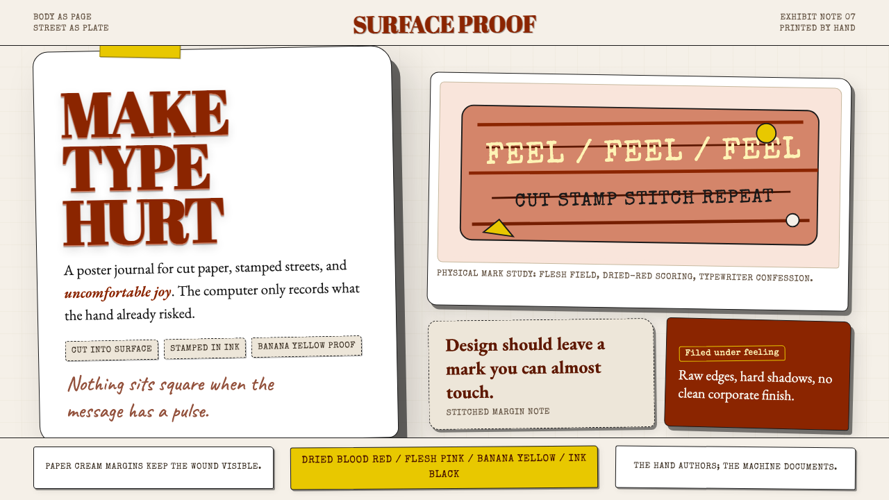 Stefan SagmeisterPain becomes typography. Flesh pink, dried blood red, banana yellow; broken p…痛感变成字体:肉粉、血红与香蕉黄堆成破格纸面。
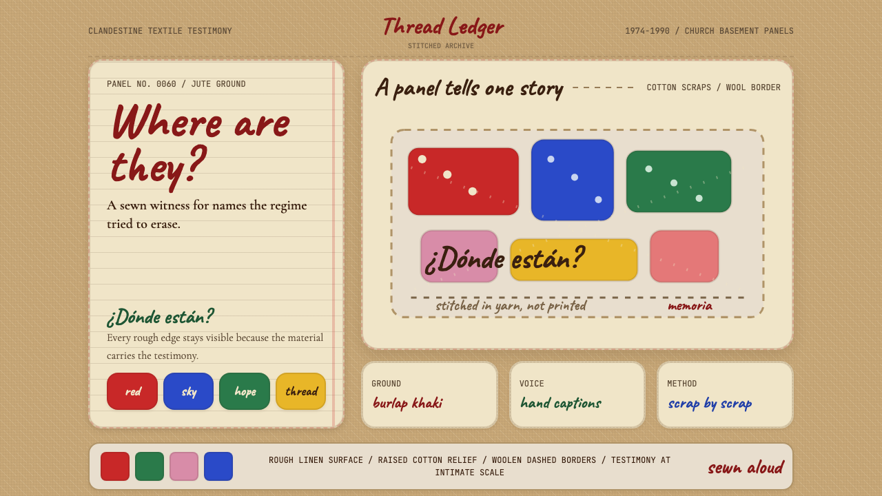 Chilean Arpillera (Pinochet Resistance)Witness sewn, not spoken. Burlap khaki, Caveat captions, and red cotton block…见证被缝上布面。麻布卡其、手写标题与红色棉布块承载控诉。
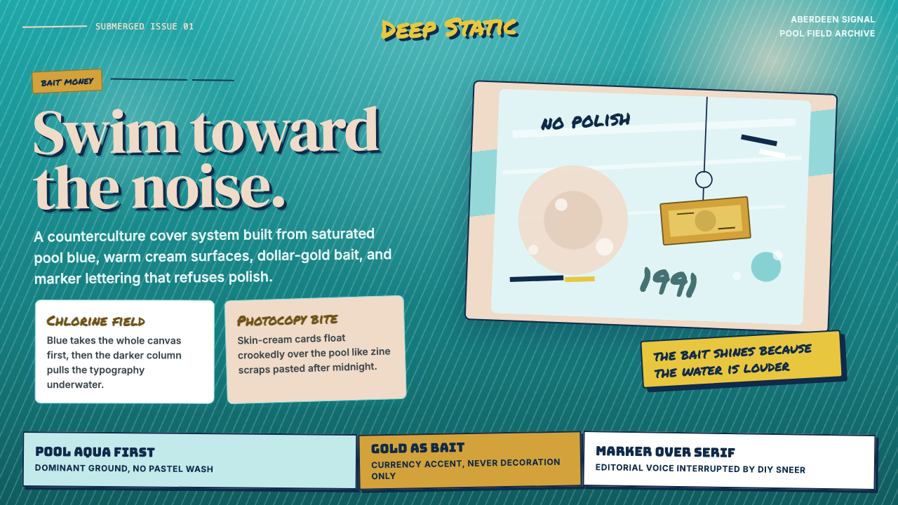 Nirvana — NevermindAnti-pop in pool blue. Cream cards, dollar-gold accents, and marker type roug…泳池蓝里的反主流:乳白卡片、美元金点缀与马克笔字打乱网格。
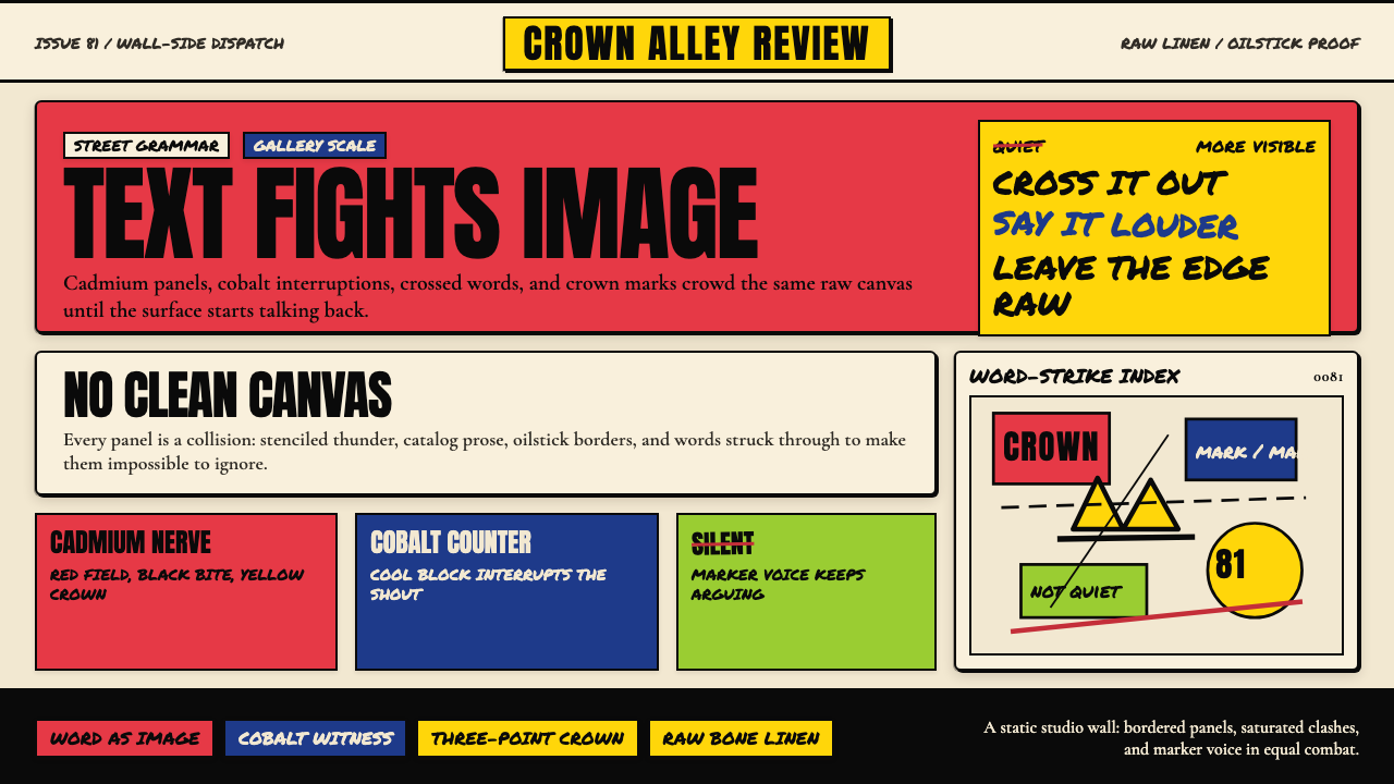 Basquiat Neo-ExpressionismExplodes off raw linen. Cadmium red, cobalt blue, Anton blocks, and struck ma…原生亚麻上爆裂:镉红、钴蓝、Anton 字块与划掉的手写字相撞。
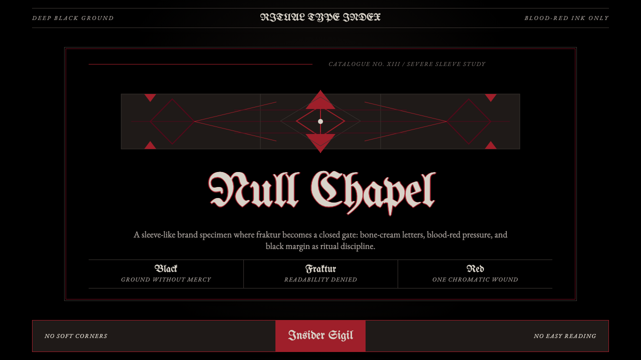 Death Metal BlackletterUnreadable by design. Bone fraktur on black, cut by one blood-red geometric s…以难读划界:黑底骨色哥特字,被一道血红几何符印切开。
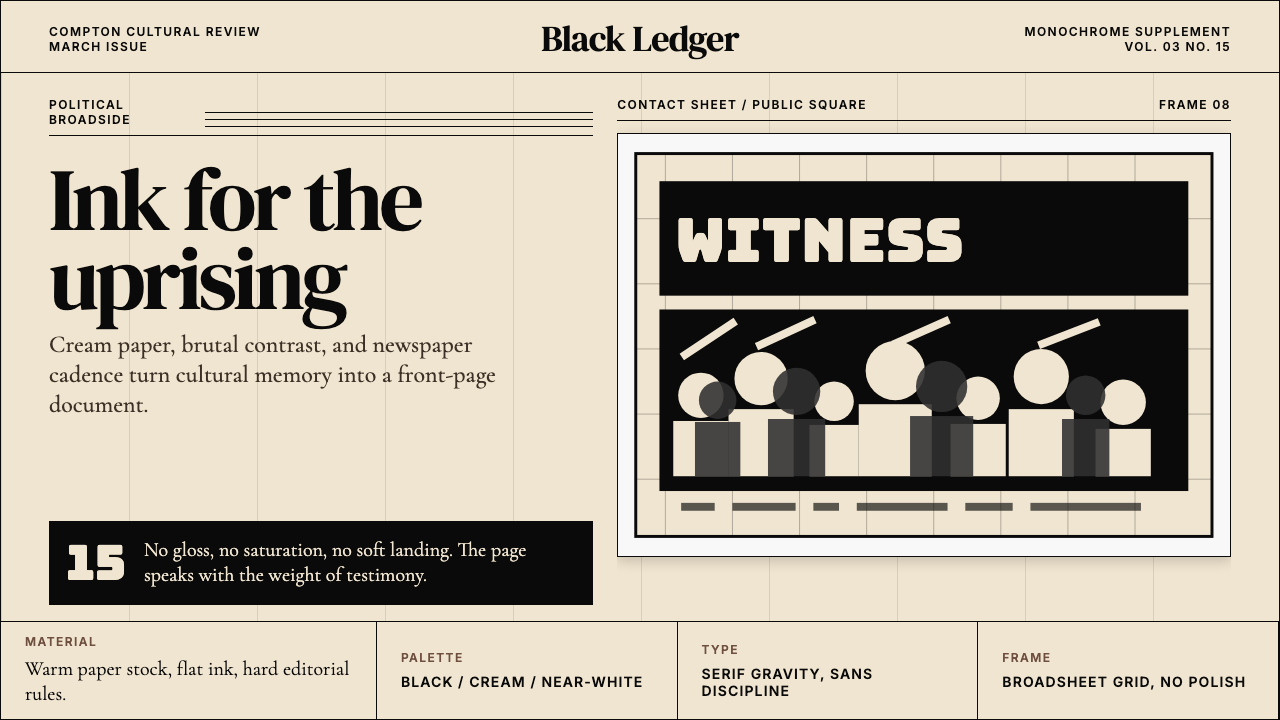 Kendrick — To Pimp a ButterflyPolitical weight, printed cold. Cream paper, hard serif type, monochrome crow…政治重量冷静落纸。米黄纸、硬衬线与黑白群像几何。