Design style guide设计风格指南
What is Chilean Arpillera (Pinochet Resistance)?什么是 Chilean Arpillera (Pinochet Resistance)?
Arpilleras turned coarse burlap and cotton scraps into the most dangerous documents in Pinochet's Chile — handmade panels that carried testimony the dictatorship could not censor.在皮诺切特统治下,缝绣布画将粗麻布与棉布碎片变成了最危险的文件——这些手工布画承载着独裁政权无法审查的控诉。
Chilean Arpillera (Pinochet Resistance) in briefChilean Arpillera (Pinochet Resistance) 速览
Chilean arpillera is a textile art form — and a design system — born from political necessity in the 1970s. Small panels of burlap are layered with appliquéd cotton figures, woolen embroidery, and hand-stitched captions to create dense, narrative compositions. Each piece is simultaneously a folk textile, a political document, and a visual record of life under authoritarian repression.智利缝绣布画(arpillera)是一种织物艺术形式,也是一套设计体系,诞生于1970年代的政治压迫之中。粗麻布底面上层叠着棉布贴绣人形、毛线刺绣与手缝文字,构成密集的叙事性构图。每一幅作品同时是民间纺织品、政治文献,也是独裁压迫下日常生活的视觉记录。
The visual language of arpilleras is built from contrast: rough jute grounds against bright fabric scraps, flat naive figures against textured woolen yarn, small domestic scenes against vast political realities. The palette centers on earthen, sandy khaki from the burlap itself, punctuated by saturated primary reds, blues, and yellows cut from salvaged cotton cloth. The overall effect is deliberately humble — these are not objects made to impress but to testify.缝绣布画的视觉语言建立在对比之上:粗粝的黄麻底面与鲜亮的布料碎片,平面朴拙的人形与纹理丰富的毛线,细小的家庭场景与庞大的政治现实。色板以麻布本身呈现的土黄、沙质卡其色为基底,被从废旧棉布上剪下的饱和红色、蓝色和黄色色块点缀打断。整体效果是刻意谦逊的——这些作品并非为了取悦,而是为了作证。
As a contemporary design aesthetic, arpillera translates into a system organized around handmade imperfection, narrative asymmetry, and material warmth. Page grounds carry the quality of undyed fiber — warm, slightly uneven. Color arrives in solid, flat blocks that read like cut fabric. Letterforms suggest needle and yarn rather than digital precision. The governing principle is that every visual element should feel chosen and placed with intention, as if cut from a limited supply of cloth.作为当代设计美学,缝绣布画转化为一套以手工不完美性、叙事性不对称和材料温度为核心的设计体系。页面底色具有未染色纤维的质感——温暖、略显不均匀。色彩以实心平面色块的形式出现,读感如同剪切的布料。字形暗示针线而非数字精度。这套体系的根本原则是:每一个视觉元素都应感觉经过了有意识的选择与放置,仿佛从一批有限的布料中裁切而来。
Where does Chilean Arpillera (Pinochet Resistance) come from?Chilean Arpillera (Pinochet Resistance) 从何而来?
The arpillera tradition in Chile did not begin with politics. Simple burlap panels decorated with appliquéd scenes were a rural folk craft practiced across the Andean region long before the 1970s. The Chilean textile artist Violeta Parra, best known for her songs, also created large-format arpilleras in the early 1960s that brought the form into the realm of fine art. But the specific tradition that shaped this design system — the clandestine workshops of Santiago — was born in the immediate aftermath of the military coup of September 11, 1973.智利的缝绣布画传统并非起源于政治。在1970年代之前,用棉布贴绣图案装饰粗麻布面板已是安第斯山脉地区悠久的农村民间手艺。智利纺织艺术家维奥莱塔·帕拉以歌曲闻名,但她也在1960年代初创作了大幅缝绣布画,将这一形式带入了纯艺术的领域。然而,塑造了这套设计体系的那个具体传统——圣地亚哥的地下工坊——诞生于1973年9月11日军事政变之后的直接冲击之中。
After General Augusto Pinochet seized power, thousands of Chileans were killed, tortured, or disappeared by the regime. The wives, mothers, and daughters of the disappeared — the women who became known as arpilleristas — gathered in Santiago under the protection of the Catholic Church's Vicaría de la Solidaridad, founded in 1976 by Cardinal Raúl Silva Henríquez. In church basements and courtyards, these women created the arpilleras that would become one of the most significant bodies of political textile art in the twentieth century. The workshops served simultaneously as trauma support networks and covert production centers.奥古斯托·皮诺切特将军夺取政权后,数千名智利人遭到政权的杀害、酷刑或失踪。失踪者的妻子、母亲和女儿——那些后来被称为“缝绣布画女工”(arpilleristas)的女性——在天主教会团结主教代理处的庇护下聚集于圣地亚哥。该机构由红衣主教劳尔·席尔瓦·恩里克斯于1976年创立。在教堂地下室和庭院中,这些女性创作了缝绣布画,成为二十世纪最重要的政治织物艺术作品群之一。工坊同时作为心理创伤支持网络和秘密生产中心而运作。
The imagery the women chose was direct and irreducible. They stitched soup kitchens where families lined up with empty bowls. They stitched detention centers with barred windows and armed guards reduced to simple silhouettes. They stitched women holding photographs of missing husbands and sons — a visual motif that would recur across hundreds of panels made by different hands. The captions, embroidered in uneven woolen yarn, posed questions that the regime refused to answer: ¿Dónde están? — Where are they? The panels were then smuggled out of Chile through diplomatic and church networks, sold in Europe and North America, with proceeds returning to support the workshops and the families.她们选择的图像是直接而不可化约的:她们缝出了家庭排队领空碗的施粥站,缝出了铁窗后持枪守卫被简化为剪影的拘留中心,缝出了手持失踪丈夫和儿子照片的女性——这一视觉母题在不同人手中缝制的数百幅布画中反复出现。用粗毛线绣出的不均匀标题提出了政权拒绝回答的问题:¿Dónde están?——他们在哪里?布画随后经由外交和教会网络秘密走私出智利,在欧洲和北美出售,所得收入返回支持工坊和家庭。
After the end of the Pinochet dictatorship in 1990, arpillera-making did not cease. The tradition shifted from clandestine testimony to public memorialization. Contemporary arpilleristas and artists influenced by the tradition continue to produce work addressing historical memory, women's rights, and social justice more broadly. The form has also been taken up in other countries — Northern Ireland, Colombia, South Africa — as a template for community-based textile activism, expanding the design language far beyond its Chilean origins while preserving its core grammar of narrative appliqué and material witness.1990年皮诺切特独裁政权结束后,缝绣布画的制作并未停止,传统从秘密控诉转向公开的历史纪念。受这一传统影响的当代艺术家继续创作涉及历史记忆、女性权利和更广泛社会正义议题的作品。这一形式也被其他国家采用——北爱尔兰、哥伦比亚、南非——作为社区纺织行动主义的模板,将设计语言拓展至智利源头之外,同时保留了其叙事贴绣与材料见证的核心语法。
The key figures who shaped or documented the tradition include Cardinal Raúl Silva Henríquez, whose Vicaría de la Solidaridad provided the organizational shelter without which the workshops could not have existed; scholar and poet Marjorie Agosín, whose research and translations brought arpilleras to international academic and artistic attention; Roberta Bacic, the Northern Irish human rights researcher who built the most significant international archive of arpilleras and who has worked to connect the Chilean tradition with parallel textile-resistance practices in other conflict zones; and Valentina Bonne, an arpillerista whose work exemplifies the combination of formal inventiveness and documentary urgency that defines the tradition at its strongest.
What defines the Chilean Arpillera (Pinochet Resistance) look?Chilean Arpillera (Pinochet Resistance) 的视觉特征是什么?
Ground and Texture底面与质感
The foundational surface is coarse burlap or jute sacking, and in design terms this translates to warm, slightly irregular sandy and khaki grounds that carry an unmistakably fiber-like quality. The ground is never smooth or neutral in the way that digital white is neutral — it has presence and weight. Any contemporary design system drawing on arpillera should replicate this textured groundedness rather than defaulting to a clean white or flat beige. The imperfection is not a flaw but the system's first statement of material honesty.基础底面是粗麻布或黄麻袋布,在设计上转化为温暖、略显不均匀的沙质和卡其色底面,带有无可误认的纤维质感。这种底面绝不像数字白色那样光滑和中性——它有自己的存在感和重量。任何借鉴缝绣布画的当代设计体系都应复制这种有质感的扎实感,而非默认干净白色或平面米色。不完美不是缺陷,而是这套体系对材料诚实性的第一个声明。
Color as Cut Fabric色彩如同裁切的布料
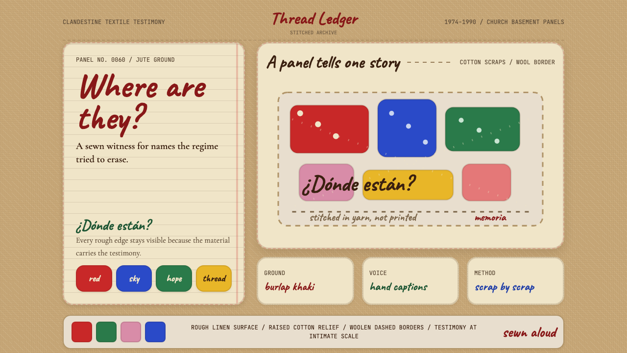
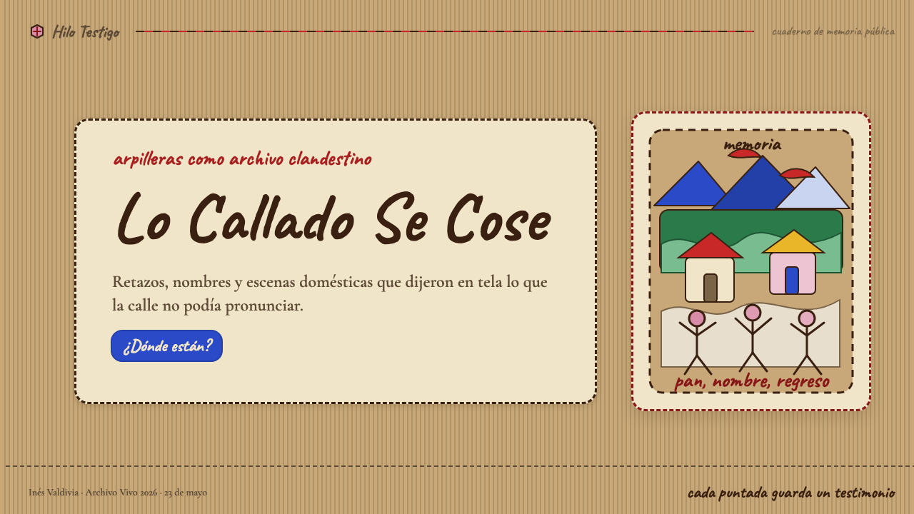
Color in arpillera arrives as flat, solid, saturated blocks — the direct result of cutting pieces of cotton cloth and laying them against the burlap ground. There are no gradients, no color transitions, and no tints or shades derived by mixing. The primary vocabulary is earthy khaki from the ground, vivid red, bright blue, warm yellow, and occasional white or black from salvaged scraps. Each color is used as a discrete element: a red house, a blue figure, a yellow sun. Color identifies and separates rather than shading or blending.缝绣布画中的色彩以平面、实心、饱和的色块形式出现——这是将棉布碎片剪切后贴附于麻布底面的直接结果。没有渐变,没有色彩过渡,没有通过混合得到的色调。主要色彩词汇是来自底面的土质卡其色、鲜亮的红色、明快的蓝色、温暖的黄色,以及偶尔来自废旧布料的白色或黑色。每种颜色作为独立元素使用:一座红色房屋、一个蓝色人形、一个黄色太阳。色彩用于识别和分隔,而非阴影处理或融合渐变。
Naive Figuration朴拙的具象造型
Human figures in arpilleras are deliberately simplified — cut from cloth without technical drawing skill as a prerequisite, which produces a consistent visual register that art historians describe as naïf or folk. Arms extend outward, figures stand in profile or full-face, hands are raised or clasped. Anatomy is subordinated to legibility: the important thing is that you can read the action — a figure holding a sign, a figure standing before a fence, a figure carrying a child. In design terms, this translates to illustration and iconography that is expressive and slightly irregular rather than geometrically perfect, where the hand-cut edge is visible and valued.缝绣布画中的人形是刻意简化的——从布料上剪切出来,不以绘画技术为前提,由此产生出艺术史学家描述为“朴拙”或“民间”的一贯视觉格调。手臂向外伸展,人形正面或侧面站立,双手抬起或相握。解剖准确性服从于可读性:重要的是你能读出动作——一个举着标语的人形,一个站在铁栅栏前的人形,一个抱着孩子的人形。在设计上,这转化为具有表现力且略显不规则的插图与图标——而非几何完美——手工裁切的边缘是可见的,也是被珍视的。
Woolen Line and Embroidery毛线线条与刺绣
In the original panels, woolen yarn serves multiple functions: it outlines appliquéd figures, stitches borders around scene-panels, and forms the text captions that name and accuse. The yarn line is thicker and more irregular than any mechanical rule — it has warmth and visible handwork. In a design system, this quality suggests that linear elements (dividers, borders, captions, decorative framing) should have a hand-drawn or softly irregular quality rather than pixel-perfect uniformity. A border that wavers slightly reads as made, not generated.在原版布画中,毛线承担多重功能:勾勒贴绣人形的轮廓,在场景面板四周缝制边框,并形成指名道姓、提出控诉的文字标题。毛线线条比任何机械尺线都更粗重、更不规整——它有温度,有可见的手工痕迹。在设计体系中,这种品质暗示:线性元素(分隔线、边框、标题、装饰框架)应当具有手绘感或柔和不规则的特质,而非像素级的精确一致。略微颤动的边框读感是“制作的”,而非“生成的”。
Asymmetric Narrative Composition不对称叙事构图
Arpillera panels are composed narrative scenes, not abstract arrangements. Each panel tells one story, and composition serves that story rather than decorative balance. The horizon line divides earth from sky at approximately two-thirds height; figures and objects cluster around the central action; borders contain and frame the scene like a stage. Notably, the composition reads left-to-right or radiates from a central figure — driven by the story being told, not by formal symmetry. This asymmetric, narrative-first composition distinguishes arpillera from decorative folk textiles with similar techniques.缝绣布画面板是具有构图的叙事场景,而非抽象排列。每块布画讲述一个故事,构图服务于这个故事而非装饰性平衡。地平线大约在三分之二高度处划分天空与地面;人形和物体围绕中心动作聚集;边框包容并框定场景,如同舞台。值得注意的是,构图从左向右展开,或从中心人形向外辐射——由所讲述的故事驱动,而非形式对称。这种叙事优先的不对称构图将缝绣布画与使用相似技术的装饰性民间纺织品区分开来。
Material Layering and Depth材料层叠与深度
Unlike painted surfaces, arpilleras achieve depth through physical layering: the burlap ground, then flat cotton appliqué pieces, then woolen embroidery on top, then sometimes three-dimensional stuffed figures or pocket pouches sewn onto the surface. Each layer is materially distinct and visually legible. This layered depth is not about creating illusion — the layers remain plainly visible as separate materials — but about giving the composition literal and metaphorical weight. In digital design, the equivalent is achieved through deliberate, restrained use of shadow and overlap that clearly reads as stacking, not rendering.与绘画表面不同,缝绣布画通过物理层叠获得深度:麻布底面,然后是平面棉布贴绣片,然后是其上的毛线刺绣,有时还有缝附于表面的三维填充人形或口袋。每一层在材料上都是独特的,在视觉上也是清晰可读的。这种层叠深度不是为了制造幻觉——各层始终清晰可见地作为独立材料存在——而是为了赋予构图字面意义和隐喻意义上的重量。在数字设计中,通过刻意而克制地使用投影和叠压可以实现等效效果,使其清晰读作“堆叠”而非“渲染”。
Text as Testimony文字作为证词
The captions in arpilleras are not decorative labels — they are demands, accusations, and questions directed at a power that refuses to answer. Letterforms are uneven, sized for legibility over elegance, and sewn with the urgency of someone who does not have time to worry about refinement. In design, this tradition argues for type that carries weight and intentionality: hand-lettered or hand-lettered-influenced styles for accent text, a clear hierarchy that keeps the message legible even at small sizes, and an absolute avoidance of type-as-texture or decorative lettering that has been emptied of meaning.缝绣布画中的文字标题不是装饰性标签——它们是指向拒绝回答的权力的要求、控诉和质问。字形参差不齐,以清晰可读而非优雅为尺度,以一种没有时间顾及精致的急迫感缝制而成。在设计中,这一传统主张文字应当承载重量与意图:强调文字使用手写体或受手写影响的字体风格,清晰的层级确保信息即便在小尺寸下也清晰可读,以及彻底避免将文字作为纹理或已被掏空意义的装饰性字母使用。
Who shaped Chilean Arpillera (Pinochet Resistance)?谁塑造了 Chilean Arpillera (Pinochet Resistance)?
The Archbishop of Santiago and founder of the Vicaría de la Solidaridad in 1976, Silva Henríquez provided the institutional protection that made the arpillera workshops possible. Without the moral and physical shelter of the Catholic Church during the Pinochet years, the arpilleristas would have had no safe space in which to gather, create, or organize. His decision to open church facilities to families of the disappeared was among the most consequential acts of institutional resistance to the regime, and its effects extended far beyond the workshops themselves into the broader fabric of Chilean civil society.圣地亚哥大主教,1976年创立团结主教代理处。席尔瓦·恩里克斯提供了使缝绣布画工坊得以存在的制度性保护。若非皮诺切特统治期间天主教会的道义与实体庇护,缝绣布画女工们就没有安全空间聚集、创作和组织。他向失踪者家属开放教堂设施的决定,是对政权最具影响力的制度性抵抗行动之一,其效应远远超出了工坊本身,渗透进智利公民社会的更广泛肌理之中。
The Chilean-American poet and scholar is responsible more than almost anyone else for bringing arpilleras to international academic and literary attention. Her books — including a collection that pairs photographs of arpilleras with original poems — interpreted the panels not only as political documents but as a sophisticated form of women's visual testimony. Agosín's translations and essays established the critical framework through which the arpillera tradition came to be understood outside Chile, and her work continues to shape how scholars and designers encounter and interpret the form.这位智利裔美国诗人和学者在将缝绣布画带入国际学术和文学视野方面贡献卓著。她的著作——包括一部将缝绣布画照片与原创诗歌并置的文集——将这些布画不仅解读为政治文献,更视为女性视觉证词的复杂形式。阿戈辛的翻译与文章确立了缝绣布画传统在智利以外被理解的批评框架,她的工作持续影响着学者和设计师接触并诠释这一形式的方式。
A Northern Irish human rights researcher and curator, Bacic built one of the most significant international archives of Chilean arpilleras and has spent decades connecting the tradition with parallel textile-resistance practices in other conflict zones — Northern Ireland, Colombia, Bosnia. Her comparative work reveals arpillera not as a uniquely Chilean form but as one instance of a broader human impulse to use textile-making as a means of testimony when other channels are closed. Through her archival and exhibition work, the visual language of arpillera became available to designers and artists in contexts far removed from its origin.北爱尔兰人权研究者和策展人,巴西克建立了最重要的智利缝绣布画国际档案之一,数十年来致力于将这一传统与其他冲突地区的平行纺织抵抗实践联结——北爱尔兰、哥伦比亚、波斯尼亚。她的比较研究揭示出,缝绣布画不是独一无二的智利形式,而是当其他渠道被封堵时人类以织物制作作为证词手段这一更广泛冲动的一个实例。通过她的档案整理与展览工作,缝绣布画的视觉语言得以在远离其起源的场景中被设计师和艺术家所用。
The legendary Chilean singer and folklorist created large-format arpilleras in the early 1960s, decades before the form became associated with political resistance under Pinochet. Parra's textile works — some exhibited at the Louvre in 1964 in what was reportedly the first solo exhibition by a Latin American artist at that institution — established that the burlap-and-appliqué form could carry serious artistic ambition. Her precedent gave the resistance arpilleristas a formal tradition with international legitimacy, and her visual sensibility — rooted in Chilean folk culture but reaching toward expressive complexity — remains a touchstone for understanding what the form can achieve.这位传奇智利歌手和民俗学者在1960年代初创作了大幅缝绣布画,比这一形式与皮诺切特时期政治抵抗相关联早了数十年。帕拉的纺织作品——据报道其中一些于1964年在卢浮宫展出,那是拉丁美洲艺术家在该机构的首次个展——确立了麻布贴绣这一形式能够承载严肃艺术抱负的地位。她的先例赋予了抵抗运动缝绣布画女工们一个具有国际合法性的形式传统,而她根植于智利民间文化却指向表达复杂性的视觉感性,至今仍是理解这一形式所能达到高度的重要参照。
How do you use Chilean Arpillera (Pinochet Resistance) today?今天怎么用 Chilean Arpillera (Pinochet Resistance)?
Arpillera as a design reference is unusual because its power comes not from formal elegance but from moral weight. Applying it well requires understanding that the visual system is fundamentally about material presence, narrative directness, and the deliberate rejection of polish in favor of authenticity. Used carelessly, the style reads as craft-fair decoration. Used with awareness of what it is, it becomes one of the most distinctive and emotionally resonant design languages available to contemporary practitioners.缝绣布画作为设计参照是不寻常的,因为它的力量不来自形式的优雅,而来自道义的重量。正确应用它需要理解:这套视觉体系从根本上关乎材料的存在感、叙事的直接性,以及刻意放弃精致以换取真实性。使用不当,这种风格读起来像手工集市的装饰;带着对其本质的理解去使用,它成为当代设计师可以运用的最具辨识度和情感共鸣的设计语言之一。
For presentation slides, arpillera works best when the content itself has a clear narrative arc — when each slide is genuinely advancing a story rather than displaying data for its own sake. A cover slide in this mode might place a single central image or figure — textile-like in its flat, saturated quality — against a warm burlap-toned ground, with a title in a hand-influenced letterform that reads as written, not set. Content slides should lean into the system's narrative density: fewer slides with more per slide, layered visual and textual information that rewards sustained attention. Data slides are more challenging in this style and should be simplified to the most essential comparison — the kind of clear, simple opposition (here versus there, then versus now) that arpillera imagery itself favors.对于演示文稿,缝绣布画风格在内容本身具有清晰叙事弧线时效果最佳——当每张幻灯片真正在推进一个故事,而非仅仅为了展示数据。这种模式下的封面页可以将一个中心图像或人形——以其平面、饱和的织物感——置于温暖的麻布色调底面上,标题使用具有手写影响的字体,读感是“书写的”而非“排版的”。内容页应当拥抱这套体系的叙事密度:更少的幻灯片,每张承载更多内容,分层的视觉与文字信息需要持续关注才能完全领会。数据页在这种风格中更具挑战性,应简化至最核心的对比——缝绣布画图像本身所偏爱的那种清晰、简单的对置(这里对比那里,过去对比现在)。
For web interfaces, the style suits platforms and products where story, mission, and human stakes are central to the value proposition: nonprofit organizations, advocacy platforms, cultural institutions, artisan marketplaces, and brands whose identity is built around craft and provenance. Dashboard and data-heavy interfaces are not a natural fit — the warmth and material weight of the style resist the clinical clarity those contexts demand. Where the style does work for digital products, it works through consistent textured grounds, flat saturated color blocks for status and emphasis, and typography that has expressive variation in weight without sliding into decorative complexity.对于网页界面,这种风格适合故事、使命和人文关怀是核心价值主张的平台和产品:非营利组织、倡导平台、文化机构、手工艺品市集,以及身份建立在工艺与出处之上的品牌。仪表板和数据密集型界面并不自然契合——这种风格的温度和材料重量抵制这些场景所需要的临床式清晰度。在数字产品中这种风格确实奏效的地方,它通过一致的纹理底面、用于状态和强调的平面饱和色块,以及在字重上有表达性变化而不滑入装饰复杂性的排版来实现效果。
For editorial and marketing work, arpillera is well-suited to contexts where the subject matter carries genuine human weight — annual reports for social-sector organizations, campaign materials for human rights and environmental causes, long-form feature design for stories about community, memory, or justice. The full-bleed textured ground with primary-color accent blocks creates immediate visual impact without the gloss that would undercut the content's seriousness. Marketing pages and campaign sites benefit from the style's poster-like directness: large type, a single bold visual element, and a clear call to action that reads as urgent rather than persuasive.对于编辑和营销内容,缝绣布画风格非常适合主题内容承载真实人文重量的场景——社会部门组织的年度报告、人权和环境事业的活动材料、关于社区、记忆或正义故事的长篇专题设计。带有原色调强调色块的满版纹理底面创造出即时的视觉冲击力,而不带会削弱内容严肃性的光泽感。营销页面和活动网站受益于这种风格的海报式直接感:大号文字、单一醒目的视觉元素,以及读感是“紧迫的”而非“说服性的”行动号召。
A common mistake when applying arpillera aesthetics is treating the textile references as surface decoration — layering rough textures over an otherwise conventional digital layout without understanding the system underneath. Authentic arpillera design is not rough texture applied to a clean grid; it is a compositional system in which the ground, the color blocks, and the figures operate as a unified whole. Another error is combining the style's warmth with ironic or cool-toned content — the arpillera aesthetic carries a specific moral seriousness, and it reads as inappropriate when applied to products or messaging that are primarily humorous, aspirational, or commercially driven without social purpose.应用缝绣布画美学时最常见的错误,是将纺织品参照视为表面装饰——在一个其他方面完全常规的数字版面上叠加粗糙纹理,而不理解其背后的体系。真实的缝绣布画设计不是将粗糙纹理施加于干净网格之上,而是一套底面、色块和人形作为统一整体运作的构图体系。另一个错误是将这种风格的温暖与讽刺性或冷调内容结合——缝绣布画美学承载着特定的道义严肃性,当被应用于主要是幽默的、追求上进感的,或没有社会目的的商业驱动产品或信息时,会产生不适切的读感。
Chilean Arpillera (Pinochet Resistance) — FAQChilean Arpillera (Pinochet Resistance) · 常见问题
How is arpillera different from other folk textile styles like Guatemalan weaving or Mexican embroidery?缝绣布画与危地马拉编织或墨西哥刺绣等其他民间纺织风格有何不同?
Arpillera shares with those traditions a foundation in community-based textile production and a preference for saturated color and figurative imagery. The key differences are compositional intent and material hierarchy. Guatemalan weaving and Mexican embroidery are primarily decorative — beautiful, culturally encoded, but made to adorn. Chilean resistance arpilleras are primarily narrative — each panel is a scene with a specific meaning, a beginning, middle, and end. The burlap ground is also distinctive: coarser and less refined than the cotton or silk grounds of most decorative textile traditions, it signals the arpillera's deliberate poverty and urgency. And unlike woven traditions where the pattern is integral to the fabric, arpillera appliqué is additive — figures are placed onto the ground, giving the composition a layered, staged quality.缝绣布画与那些传统共享以社区为基础的纺织生产,以及对饱和色彩和具象图像的偏好。关键区别在于构图意图和材料层级。危地马拉编织和墨西哥刺绣主要是装饰性的——美丽、具有文化编码,但目的是装饰。智利抵抗缝绣布画主要是叙事性的——每块布画是一个具有特定意义的场景,有开头、中间和结尾。麻布底面也是独特的:比大多数装饰性纺织传统的棉或丝底面更粗粝、更不精致,它传递出缝绣布画刻意的贫朴感和紧迫性。而且与图案与织物融为一体的编织传统不同,缝绣布画的贴绣是附加性的——人形被放置在底面之上,赋予构图以层叠的、舞台化的品质。
Can arpillera work for dark-background or digital-dark-mode layouts?缝绣布画风格能用于深色背景或数字暗模式版面吗?
With significant caution. The arpillera aesthetic is fundamentally grounded in the warm, light-reflective quality of natural burlap and daylight cotton — it is a daytime, outdoor, light-saturated visual language. A dark-background inversion tends to strip away the material warmth that gives the style its distinctive quality, leaving only the saturated color blocks and naive figuration, which can read as generic folk illustration without the contextualizing ground. If a dark mode is required, the most effective approach is to shift from a pure black background to a very dark warm brown or charcoal that retains some of the ground's earthen character, use primary colors at their full saturation to prevent them from appearing dull, and treat the overall composition as lit rather than inverted.需要相当谨慎。缝绣布画美学从根本上植根于天然麻布和日光棉布的温暖反光质感——它是一种白昼的、户外的、光线充足的视觉语言。深色背景反转往往会剥去赋予这种风格独特品质的材料温度,只留下饱和色块和朴拙人形,而这些在没有底面语境的情况下可能读作普通的民间插图。若必须使用深色模式,最有效的做法是从纯黑背景转向非常深的暖棕或木炭色,以保留底面某些泥土性格;使用主色全饱和度以防其显得暗淡;并将整体构图视为“被照亮的”而非“被反转的”。
Is it appropriate to use arpillera aesthetics for commercial products without a social mission?将缝绣布画美学用于没有社会使命的商业产品是否适当?
This is a genuine question the design community continues to debate, and there is no universal answer. The arpillera aesthetic carries specific historical weight — it was literally made by women whose families were tortured and murdered. Using its surface qualities (rough texture, saturated color, naive figuration) without any acknowledgment of that history in a commercial context risks the same kind of aesthetic extraction that has stripped meaning from many other folk and resistance traditions. That said, the visual system itself — narrative composition, material warmth, direct testimony — is not exclusive property, and designers have adapted folk traditions for centuries. The most defensible position is transparency: if you use arpillera aesthetics for a commercial product, understand what you are drawing from and, where appropriate, acknowledge it.这是设计界持续争论的真实问题,没有普遍答案。缝绣布画美学承载着特定的历史重量——它字面意义上是由家人遭受酷刑和杀害的女性制作的。在商业语境中使用其表面特质(粗糙纹理、饱和色彩、朴拙人形)而不承认这段历史,有陷入同一类型美学提取的风险——这种提取已从许多其他民间和抵抗传统中剥去了意义。话虽如此,这套视觉体系本身——叙事构图、材料温度、直接证词——并非专有财产,设计师数百年来一直在改编民间传统。最站得住脚的立场是透明:若你将缝绣布画美学用于商业产品,请理解你在借鉴什么,并在适当时候承认这一点。
How does arpillera handle typography, given that the original panels used embroidered text?鉴于原版布画使用刺绣文字,缝绣布画风格如何处理字体排印?
The embroidered letterforms in arpilleras are their own typographic tradition: irregular, slightly uneven, sized for legibility rather than elegance, and carrying the visible marks of handwork. In digital design, this does not mean using literal embroidery simulation fonts — those tend toward novelty rather than authority. Instead, it suggests type choices that lean toward handwritten or drawn influences, with slightly varying stroke weights and a warmth that machine-precision type lacks. For headlines and accent text, a brush-influenced or hand-lettered style amplifies the visual system's authenticity. For body text, a humanist typeface — one whose letterforms show the traces of the calligraphic pen — suits the system better than a geometric or technical sans-serif. The key quality to seek is type that looks chosen and placed, as if by hand, rather than type that looks generated.缝绣布画中的刺绣字形是其自身的排印传统:不规则、略显不均匀、以清晰可读而非优雅为尺度,并带有可见的手工痕迹。在数字设计中,这并不意味着使用字面意义上的刺绣模拟字体——那类字体往往流于新奇而非权威感。相反,它暗示倾向于手写或手绘影响的字体选择,具有略微变化的笔画粗细和机器精度字体所缺乏的温度。对于标题和强调文字,受毛笔或手写影响的风格放大了视觉体系的真实性。对于正文,人文主义字体——字形显示出书法笔触痕迹的字体——比几何或技术性无衬线字体更适合这套体系。需要寻找的关键品质是:看起来经过选择和放置的文字,仿佛出于手工,而非看起来是生成出来的文字。
What distinguishes a design that is genuinely informed by arpillera from one that is simply rustic or craft-themed?真正受缝绣布画启发的设计与单纯具有乡村感或手工艺主题的设计有何区别?
The distinction is compositional intent. Rustic and craft-themed design typically uses rough textures, earthy palettes, and hand-drawn elements as atmosphere — as a way of communicating warmth and artisanal character without necessarily telling any specific story. Arpillera-informed design does the same things in service of narrative: each element exists to advance a scene, a statement, or an argument. The ground is not rough for aesthetic effect but because that roughness is the material from which the composition is built. The figures are not naive for charm but because naive figuration is the clearest vehicle for the story being told. If you strip away the narrative intention, you remove the system's organizing principle, and what remains is surface texture without structure — which is exactly the rustic-crafts aesthetic. The test is simple: can you read what the design is about from the visual arrangement alone, without the copy?区别在于构图意图。乡村感和手工艺主题的设计通常将粗糙纹理、土质色板和手绘元素用作氛围——作为传递温度和手工匠心感的方式,不一定要讲述任何具体的故事。受缝绣布画启发的设计以同样的手法服务于叙事:每个元素的存在是为了推进一个场景、一个陈述或一个论点。底面的粗粝不是为了美学效果,而是因为那种粗粝正是构图由此构建的材料。人形的朴拙不是为了可爱,而是因为朴拙的具象造型是讲述该故事最清晰的载体。若剥去叙事意图,就移除了这套体系的组织原则,剩下的是没有结构的表面纹理——那正是乡村手工艺美学。检验方式很简单:仅凭视觉排列,不看文案,你能读出这个设计在讲什么吗?
Related design styles相关设计风格
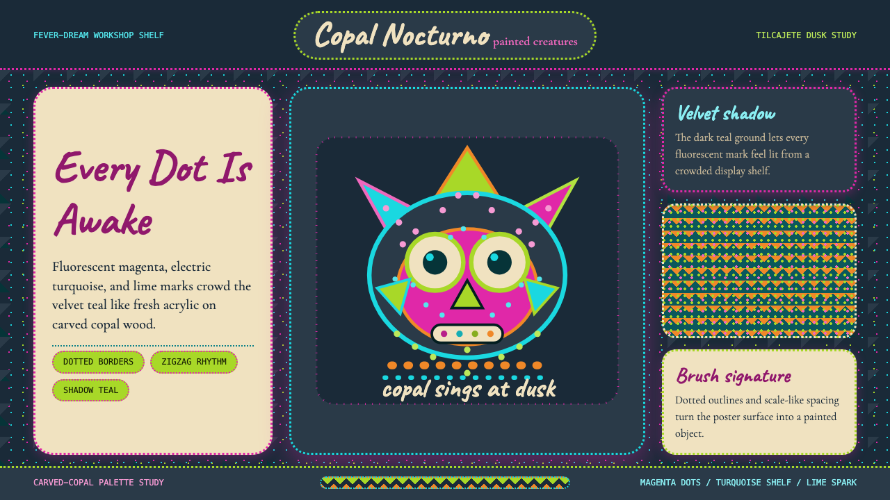 Mexican Alebrije Oaxaca (Linares 1936)Fever craft glows. Velvet teal carries magenta dots, turquoise zigzags, and C…幻梦手作在发光:暗青底承托洋红点纹、蓝绿锯齿与手写字。
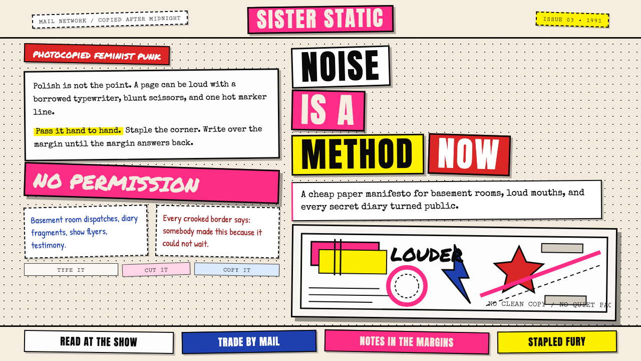 Riot Grrrl Zine (1991)DIY fury, unpolished. Cream Xerox grain, black toner type, hot-pink marker co…DIY怒火,拒绝精致。米色复印颗粒、黑碳粉字与荧光粉拼贴。
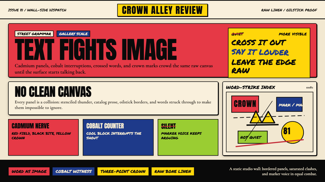 Basquiat Neo-ExpressionismExplodes off raw linen. Cadmium red, cobalt blue, Anton blocks, and struck ma…原生亚麻上爆裂:镉红、钴蓝、Anton 字块与划掉的手写字相撞。
 Belizean Garifuna PuntaNight rhythm burns. Indigo fields, flame-orange serif type, and flag stripes…深夜节奏燃起:靛蓝场、火焰橙衬线字与旗纹推进鼓点。
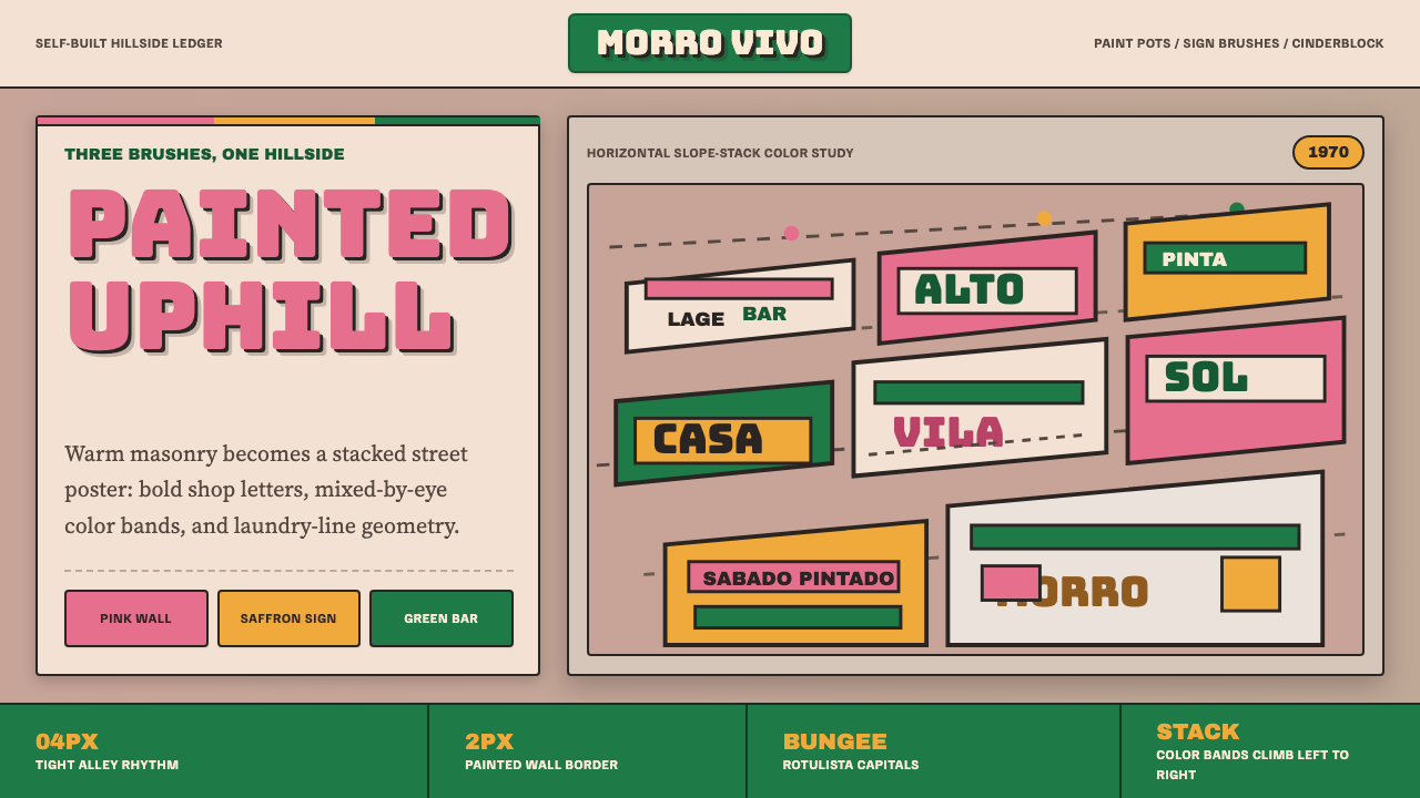 Brazilian Favela Rocinha 1970sHand-built warmth. Pink, saffron and green stripes climb cinderblock in rotul…手建的温热:粉红、藏红花黄与绿色条带沿空心砖攀升,配招牌字。
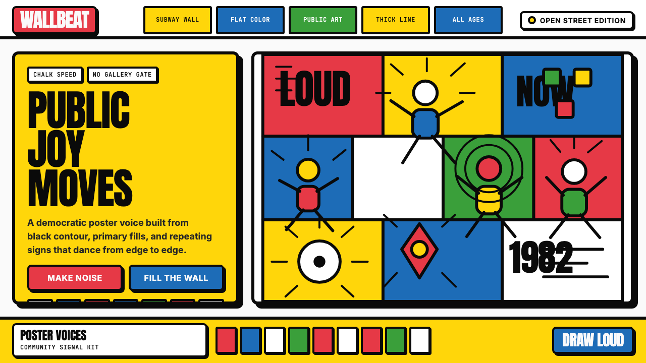 Keith Haring PopJoy refuses the gallery. Thick black contours pack primary color into a danci…快乐拒绝画廊:粗黑轮廓把原色塞进跳动墙面网格。