Design style guide设计风格指南
What is Brazilian Favela Rocinha 1970s?什么是 Brazilian Favela Rocinha 1970s?
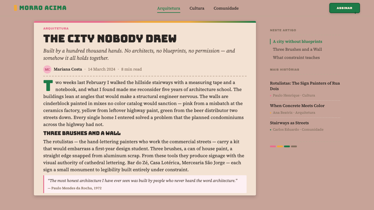
Rocinha's hillside became one of the most vivid design environments in the world — not through architecture school or city planning, but through paint buckets, bold brushwork, and a community's instinct to make its walls sing.罗西尼亚的山坡成为世界上最鲜活的设计环境之一——不靠建筑学院,不靠城市规划,只靠油漆桶、粗犷笔触,以及一个社区让墙壁开口歌唱的本能。
Brazilian Favela Rocinha 1970s in briefBrazilian Favela Rocinha 1970s 速览
Brazilian Favela Rocinha 1970s is a design aesthetic rooted in the self-built visual culture of Rio de Janeiro's largest favela during its most densely populated and visually exuberant decade. It draws on the colors, textures, and hand-lettered signage of a community that constructed its own environment from the ground up — cinderblock by cinderblock, paint stroke by paint stroke — without the intervention of professional designers or urban planners.巴西贫民窟罗西尼亚1970年代风格,是一种根植于里约热内卢最大贫民窟自建视觉文化的设计美学,诞生于其人口最密集、视觉最奔放的十年。它从一个完全自力更生的社区中汲取色彩、肌理与手绘招牌——那个社区一块空心砖、一道油漆笔触地建造了自己的环境,没有职业设计师,没有城市规划者介入。
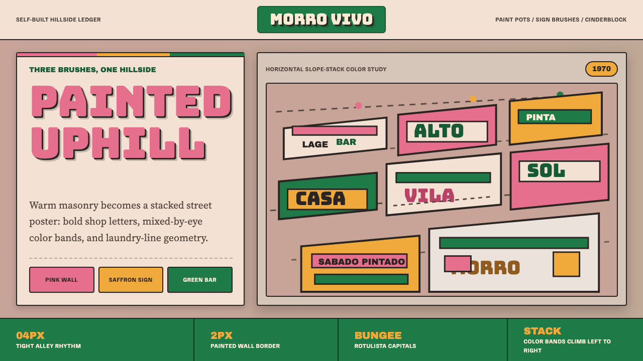
The aesthetic is characterized by raw masonry warmth as the dominant ground tone, against which hand-painted exterior stripes in sun-bleached pinks, saffron yellows, and the deep green associated with the Antarctica beer brand read as bold, joyful declarations. Hand-lettered signage — produced by specialist artisans called rotulistas who painted bars, clubs, and shops with thick brushes and oil-based enamels — gave every facade a typographic personality that no digital font could replicate.这种美学的主导底色是空心砖的暖灰质感,在此之上,被阳光漂白的粉红、藏红花黄,以及与Antarctica啤酒品牌相关联的深绿,以粗犷的手刷外墙条纹呈现,像欢快的宣言一样跃然墙面。手绘招牌由被称为rotulista的专业工匠操刀——他们用粗刷蘸着油基搪瓷漆,为酒吧、俱乐部和商店绘制字体——赋予每面墙一种任何数字字体都无法复制的排版个性。
What distinguishes this style from other folk-vernacular or outsider aesthetics is its internal coherence. The palette emerged organically from what was commercially available and affordable in Brazilian hardware stores of the 1970s, yet the combinations achieved across thousands of independent walls read today as an extraordinarily resolved visual system — warm, honest, and alive with human presence.将这种风格与其他民间或自发性美学区别开来的,是它内在的一致性。这套色彩体系从1970年代巴西五金店中商业上可得且价格低廉的涂料中自然生长出来,然而数千面独立外墙在彼此无需协商的情况下叠加出的组合,在今天读来却是一套异常成熟的视觉系统——温暖、坦诚,充满人的气息。
See the Brazilian Favela Rocinha 1970s design system →查看 Brazilian Favela Rocinha 1970s 完整设计系统 →
Where does Brazilian Favela Rocinha 1970s come from?Brazilian Favela Rocinha 1970s 从何而来?
Rocinha began as a squatter settlement on the steep hillside between the affluent neighborhoods of São Conrado and Gávea in the 1930s, when rural migrants fleeing the drought-stricken Northeast of Brazil arrived in Rio de Janeiro in large numbers. The name — from the Portuguese word for a small farm or market garden — echoes the agricultural origins of its first settlers, who initially grew produce on the slopes before the informal housing density overwhelmed any remaining cultivated land.罗西尼亚最初是1930年代在圣孔拉多与加韦阿两个富裕街区之间陡峭山坡上形成的棚户聚居地,当时大批逃离巴西东北旱灾的农村移民涌入里约热内卢。这个名字——源自葡萄牙语中“小农场”或“菜地”一词——折射出首批定居者的农耕背景,他们最初在山坡上种植蔬菜,直到非正式住宅的密度最终淹没了所有剩余的耕地。
The practice known as autoconstrução — self-construction — was the engine of Rocinha's physical growth. Families built on weekends, pooling labor with neighbors and relatives, expanding upward and outward as finances and materials allowed. The building material of choice was the cinderblock, cheap and widely available, whose rough gray surface became the literal and aesthetic foundation of the community's built environment. Paint was applied not to conceal this rawness but to celebrate it: stripes, panels, and full-facade color-washes turned each building into a declaration of occupancy and pride.被称为autoconstrução(自力建造)的实践,是罗西尼亚物理生长的引擎。家庭在周末动工,与邻居和亲属合力劳动,随着资金和材料允许,不断向上向外扩建。首选建材是空心砖——价廉且易得——其粗糙灰色的表面成为社区建筑环境的字面与美学基础。涂料的施用不是为了掩盖这种粗粝,而是为了颂扬它:条纹、色块和整墙涂色将每座建筑变成一则入住与骄傲的宣言。
The rotulista trade emerged as a crucial cultural institution within this self-built world. These itinerant sign painters were trained not in art schools but through apprenticeship, inheriting hand-lettering techniques that blended Portuguese commercial tradition with the exuberant flourishes of Brazilian popular culture. A skilled rotulista could render legible, bold letterforms freehand on an irregular wall surface, calibrating weight and spacing by eye alone. Their tools were few — a handful of brushes, a palette of oil-based enamels, a steady hand — and their output was the visual voice of commerce and community in the favela.招牌画师(rotulista)行当作为这个自建世界中举足轻重的文化机构而兴起。这些走街串巷的招牌画师并非受训于艺术学校,而是通过学徒制传承技艺,融汇葡萄牙商业传统与巴西民俗文化奔放装饰手法的手写字体技巧。一位技艺精湛的招牌画师能在凹凸不平的墙面上徒手绘制出清晰有力的字形,仅凭眼力校准笔画轻重与字距。他们的工具简陋——几把刷子、一盘油基搪瓷漆、一双稳健的手——而他们的产出,正是贫民窟商业与社区生活的视觉声音。
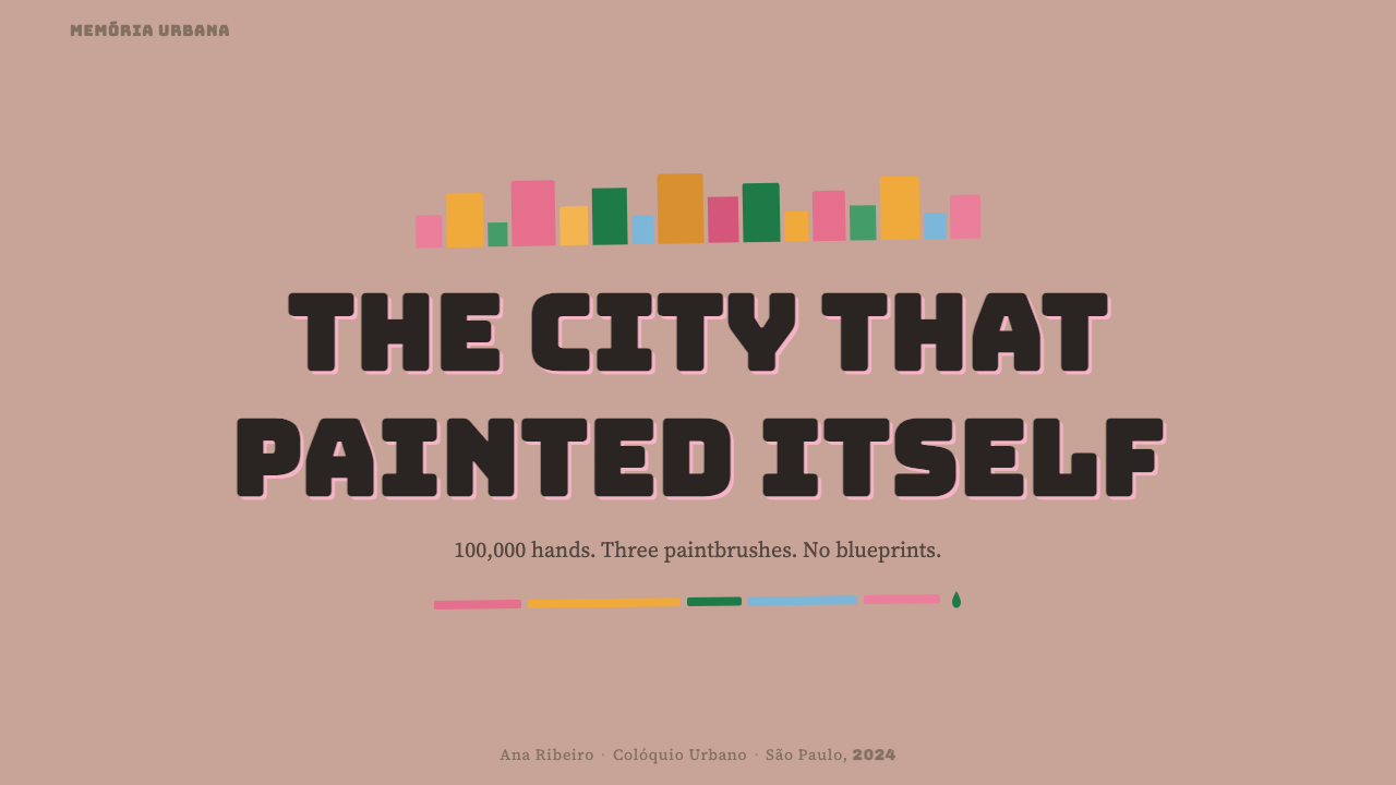
The 1970s represented a visual peak for Rocinha, coinciding with Brazil's period of rapid economic growth and urbanization. The community's population swelled toward one hundred thousand residents. The density of building meant that the hillside, viewed from the luxury beachfront below, presented a shimmering vertical tapestry of color — an accidental but coherent cityscape that documentary photographers, sociologists, and eventually designers would recognize as something singular. Carlos Nelson Ferreira dos Santos, an architect and urban planner who spent years studying Rocinha, documented this period and argued that the community's spatial intelligence and aesthetic vitality deserved acknowledgment on par with any formally designed urban environment. Sociologist Janice Perlman's fieldwork from the same era reached similar conclusions, pushing back against the dominant narrative that favelas were simply problems to be solved rather than communities with their own complex cultures.1970年代是罗西尼亚视觉上的巅峰期,与巴西经济高速增长和城市化进程相互叠加。社区人口逼近十万。建筑的高密度使得从山下豪华海滩仰望时,整片山坡呈现出一幅色彩斑斓的垂直锦缎——一座意外而连贯的城市风景,纪录片摄影师、社会学家,乃至后来的设计师,都将从中辨认出某种独一无二的东西。建筑师兼城市规划师卡洛斯·纳尔逊·费雷拉·多斯·桑托斯在罗西尼亚深耕多年,记录了这一时期,并主张这个社区的空间智慧与美学活力理应获得与任何正式规划的城市环境同等的承认。同时代社会学家贾尼斯·珀尔曼的田野调查得出了类似结论,有力反驳了将贫民窟简单视为亟待解决之问题的主流叙事,还其作为拥有复杂文化的社区之本来面目。
What defines the Brazilian Favela Rocinha 1970s look?Brazilian Favela Rocinha 1970s 的视觉特征是什么?
Palette色彩
The colors are warm, sun-modified, and mixed by eye rather than matched to any standard. Pink ranges from near-coral to faded dusty rose; saffron yellow is rich but softened by tropical light; green leans deep and bottle-like, anchored to the cultural memory of the Antarctica beer brand. These three hues work against the raw cinderblock gray, which serves as both literal building material and neutral anchor. The overall impression is of warmth and density — many colors coexisting without discord, because each is softened by heat, age, and the bleaching effect of the Rio sun.这套色彩是温暖的、被阳光改造过的、凭眼力调制而非对照任何色标。粉红的区间从近珊瑚色延伸到褪色的灰玫瑰;藏红花黄浓郁而被热带光线柔化;绿色偏深沉,如老式玻璃瓶,锚定在Antarctica啤酒品牌的文化记忆里。这三种色调作用于未经粉饰的空心砖灰色——那既是字面上的建材,也是视觉上的中性锚点。整体印象是温暖而密集的——众多颜色共处而不失和谐,因为每一种都被热度、岁月与里约阳光的漂白效果所柔化。
Surface Texture表面肌理
Cinderblock is never smoothed over or concealed — it is the ground. Even when paint is applied thickly, the block's grid of joints and the slight irregularities of the surface remain visible beneath. This honest material presence means that every color sits in a field of gentle texture rather than on a flat ground, giving the palette a depth and warmth that no flat digital reproduction fully captures. Translating the aesthetic into digital contexts means accepting that perfect flatness is not the goal — a slight grain or warm-toned ground brings the work closer to its source.空心砖从不被抹平或遮盖——它就是底色。即使油漆刷得很厚,砖缝的网格与表面轻微的凹凸依然透过涂层隐约可见。这种材料的诚实存在意味着每种颜色都浮于一片细腻肌理之上,而非平整底面,赋予整个色彩体系一种平整数字复制永远无法完全捕捉的深度与温度。将这种美学转化为数字语境,意味着接受完美平整并非目标——轻微颗粒感或带暖色调的底面,能让作品更贴近它的源头。
Stripe Structure条纹结构
Horizontal and vertical stripes are the primary organizing device on building facades, dividing walls into color panels that mark floors, owners, or simply aesthetic preference. These stripes are rarely precise — hand-painted with a wide brush, they carry slight wobbles and varying edge quality that read as human rather than mechanical. The composition that results is hierarchical without being rigid: a bold stripe at lintel height anchors the eye, a lighter wash above opens the plane, a contrasting color on a neighboring wall creates rhythm across the whole block.水平与垂直条纹是建筑外墙最主要的组织手段,将墙面划分为标示楼层、业主或纯粹审美偏好的色块。这些条纹极少精准——用宽刷手绘而成,带着轻微的波动与参差的边缘,读来是人的而非机械的。由此产生的构图有层级而不僵硬:门楣高度的粗犷条纹锚定视线,上方较浅的色洗打开平面,相邻墙壁上的对比色则在整个街区制造韵律。
Rotulista Typography招牌画师字体
The hand-lettering tradition of the rotulista is defined by weight, confidence, and a complete absence of digital precision. Letters are wide, boldly weighted, and painted directly onto irregular surfaces with oil-based enamel — the slight wobble of an uncertain surface absorbed into the letterform rather than corrected. The resulting typefaces are not any single style but a family of related approaches: a blocky serif for a botequim name, an outlined grotesque for a price announcement, a fluid script for a personal greeting. What unites them is a willingness to occupy space fully and a visible human hand in every stroke.招牌画师的手写字体传统,以笔画的分量、自信与对数字精准的完全漠视为特征。字母宽阔、粗犷有力,直接用油基搪瓷漆涂绘于凹凸不平的表面——不规则底面带来的轻微抖动被字形吸收,而非被修正。由此产生的字体不属于任何单一风格,而是一系列相关手法的家族:为酒馆名称而生的块状衬线体,为价格告示而生的轮廓线无衬线体,为个人致意而生的流动草书。将它们统一的,是充分占据空间的意愿,以及每一笔触中可见的人手痕迹。
Compositional Density构图密度
The favela aesthetic is not about breathing room — it is about fullness. Every surface carries information: paint color, club insignia, lettered sign, draped laundry, potted plant on a ledge. Translated into design practice, this means a tolerance for visual density that Western minimalism discourages. Elements can be close together without becoming chaotic, because each is rooted in a clear local logic — a function, a pride, a message. The challenge in using this style is maintaining that local logic while scaling to a designed artifact rather than sliding into decorative noise.贫民窟美学不追求留白——它追求充盈。每一面表面都承载信息:涂料的颜色、俱乐部的队徽、手写的招牌、悬挂的洗涤物、窗台上的盆栽。转化为设计实践,这意味着对视觉密度的容忍——一种西方极简主义所不鼓励的容忍。元素可以紧密共存而不陷入混乱,因为每一个都植根于清晰的局部逻辑——一种功能、一种骄傲、一条信息。使用这种风格的挑战在于:在将其扩展为设计产物的过程中,如何保留那种局部逻辑,而不滑入纯粹的装饰噪音。
Cultural Insignia文化徽记
Soccer club shields, samba school colors, and beer brand greens are not background decoration in this aesthetic — they are its primary symbolic vocabulary. These insignia carry the allegiances and identities of the community, appearing on building facades with the same weight given to structural architectural elements. Any design work drawing on this style should treat symbols and emblems as structural objects rather than decorative additions: they organize space, signal belonging, and create the sense that the environment means something beyond its surface appearance.足球俱乐部的队徽、桑巴学校的色彩、啤酒品牌的绿色,在这套美学中并非背景装饰——它们是最主要的象征词汇。这些徽记承载着社区的归属感与身份认同,出现在建筑外墙上时与结构性建筑元素具有同等分量。任何借鉴这种风格的设计,都应将符号与徽章视为结构性对象而非装饰性添加:它们组织空间,传递归属,赋予环境超越表面外观的意义。
Vernacular Warmth方言式温度
The Rocinha aesthetic is, fundamentally, warm. Not in the precise color-temperature sense, but in the experiential sense: it feels inhabited, touched by human hands, made for and by specific people rather than for an anonymous market. The irregularities are not errors; they are evidence of presence. This quality — vernacular warmth — is the hardest to translate into designed artifacts, because it cannot be produced by rule or formula. It emerges from authentic engagement with the source culture and a willingness to let imperfection remain.罗西尼亚美学,从根本上是温暖的。不是精确色温意义上的温暖,而是体验意义上的:它感觉被人居住过、被人手触碰过,是为特定的人而非为匿名市场而制造的。那些不规则之处不是错误,而是存在的证据。这种品质——方言式温度——是最难转化为设计产物的,因为它无法由规则或公式生产。它从对源头文化的真诚介入,以及允许不完美留存的意愿中生长出来。
See the Brazilian Favela Rocinha 1970s design system →查看 Brazilian Favela Rocinha 1970s 完整设计系统 →
Who shaped Brazilian Favela Rocinha 1970s?谁塑造了 Brazilian Favela Rocinha 1970s?
One of the prominent rotulistas associated with Rocinha's commercial signage culture, Genival represents the professional lineage of hand-letterers who gave the favela's walls their typographic character. Rotulistas like him trained through apprenticeship rather than formal schooling, inheriting a practice that predated digital typography and maintained its relevance through craft excellence and deep community embeddedness. Their work was not art in the gallery sense but a skilled trade — one that happened to produce some of the most characterful lettering in twentieth-century Brazilian visual culture.赫纳瓦尔是与罗西尼亚商业招牌文化相关联的著名招牌画师之一,代表着赋予贫民窟外墙排版个性的手写字体传承脉络。像他这样的招牌画师通过学徒制而非正规学校习得技艺,继承了一种先于数字排版存在的实践,并以精湛的手艺和对社区的深度融入保持其持久价值。他们的工作不是画廊意义上的艺术,而是一门技艺——一门碰巧产出了二十世纪巴西视觉文化中最具个性文字的技艺。
An architect and urban planner who became one of the most important advocates for taking favela communities seriously as designed environments rather than problems to be solved. His fieldwork in Rocinha during the 1970s and beyond challenged the prevailing view in Brazilian planning circles that informal settlements were temporary aberrations to be cleared. He documented the spatial intelligence, aesthetic vitality, and social coherence of the community and argued that its self-built fabric had lessons to teach formal urban design — not least about how identity and aesthetics emerge from need, labor, and collective action.一位建筑师兼城市规划师,成为将贫民窟社区作为设计环境而非待解决问题认真对待的最重要倡导者之一。他在1970年代及此后对罗西尼亚的田野调查,挑战了巴西规划界主流观点——即非正式聚居地是有待清除的暂时性异常。他记录了这个社区的空间智慧、美学活力与社会凝聚力,并主张其自建肌理对正式城市设计有所教益——尤其是关于身份认同与美学如何从需求、劳动与集体行动中生长而来。
A community leader whose long engagement with Rocinha's cultural institutions — including samba schools and neighborhood associations — helped sustain the social fabric within which the favela's visual culture flourished. Figures like Tião demonstrate that the aesthetic vitality of a place like Rocinha is never separable from its social organization: the bold colors on the walls and the shields on the facades were expressions of communities held together by real bonds of loyalty, festivity, and mutual support. Without that organizational substrate, the aesthetic becomes merely decorative.一位社区领袖,长期深度参与罗西尼亚的文化机构——包括桑巴学校和街区协会——有助于维系贫民窟视觉文化得以繁荣的社会肌理。像迪昂这样的人物证明:像罗西尼亚这样的地方,其美学活力永远无法与其社会组织相分离——墙面上的鲜艳色彩和外墙上的队徽,是由忠诚、节庆与互助的真实纽带凝聚在一起的社区的表达。没有那个组织基底,这套美学便仅仅是装饰。
An American sociologist whose landmark 1976 study The Myth of Marginality challenged the Brazilian government's characterization of favela residents as marginal, dangerous, and outside the social mainstream. Perlman's fieldwork, conducted partly in Rocinha, demonstrated that favela communities had rich internal social lives, strong work ethics, and aspirations entirely consistent with mainstream Brazilian values — and that the communities' physical environments, far from being simply chaotic, had their own spatial logics and aesthetic coherence. Her work gave academic legitimacy to what architects like Carlos Nelson were arguing from a design perspective.美国社会学家,其1976年里程碑式研究《边缘化的神话》挑战了巴西政府将贫民窟居民描绘为边缘化、危险且游离于社会主流之外的定性。珀尔曼部分在罗西尼亚展开的田野调查证明,贫民窟社区拥有丰富的内部社会生活、强烈的劳动伦理以及与巴西主流价值观完全一致的人生期待——而这些社区的物质环境,远非简单的混乱,有其自身的空间逻辑与美学连贯性。她的研究赋予了卡洛斯·纳尔逊等建筑师从设计角度所主张之事以学术合法性。
How do you use Brazilian Favela Rocinha 1970s today?今天怎么用 Brazilian Favela Rocinha 1970s?
The Rocinha 1970s aesthetic is most effective when used to communicate warmth, human presence, and a specific kind of lived authenticity — qualities that corporate minimalism and polished digital design often deliberately suppress. It works against brands, events, and communities that want to signal accessibility, vitality, and a connection to real human experience rather than idealized consumer aspirations.罗西尼亚1970年代美学在传达温度、人的存在感,以及一种特定的生活真实感时最为有效——这些品质恰恰是企业极简主义和精致数字设计往往刻意压抑的。它适用于希望传递亲切感、活力,以及与真实人类经验而非理想化消费愿景相连接的品牌、活动和社区。
For presentation slides, the style works powerfully as a cover treatment: a warm cinderblock-gray ground with a bold horizontal stripe in saffron or deep green, and a title set in a heavy, wide letterform that echoes the rotulista tradition. Section dividers can use the stripe motif — a thick painted band in one of the palette's key colors — rather than typographic rules or decorative ornaments. Content slides should respect the aesthetic's density without replicating its chaos: keep the warm ground tone, allow text and image to sit closer together than minimalist grids would permit, and use the palette's saturated hues as section-coding devices.对于演示文稿,这种风格作为封面处理具有强烈的视觉力量:空心砖暖灰色底面,藏红花黄或深绿的粗犷水平条纹,以及以粗重宽阔字形呼应招牌画师传统的标题字体。章节分隔可以用条纹母题——某个主色调的厚涂色带——而非字体线条或装饰元素。内容页应在尊重这种美学的密度感的同时避免复制其混乱:保持暖色调底面,允许文字与图像比极简网格更紧密地共处,用色板中的饱和色调作为章节编码手段。
For web interfaces and dashboards, this style suits platforms where personality and community are more important than clinical precision — event discovery tools, neighborhood apps, cultural institution websites, food and drink platforms, music streaming interfaces. The approach: warm off-white or pale warm-gray backgrounds, bold typographic headlines in wide, weighted letterforms, accent color drawn from the saffron-pink-green palette, and card components with visible texture or warm-toned backgrounds rather than clean white.对于网页界面和仪表板,这种风格适合个性与社区感比临床精确更重要的平台——活动发现工具、街区应用、文化机构网站、餐饮平台、音乐流媒体界面。做法:暖白色或浅暖灰色背景,以宽阔粗犷字形设置的大标题,从藏红花黄-粉红-深绿色板中取色作为强调,卡片组件带有可见质感或暖色调背景而非纯白底面。
For editorial and marketing work, the aesthetic gives full-page feature spreads and event posters a festive, handmade quality that professional polish cannot replicate. A double-page layout using the stripe structure as a compositional skeleton — a bold color band across the top quarter, the main image inhabiting the cinderblock-warm middle field, a rotulista-inspired pull quote running large at the base — creates a visual rhythm that feels both designed and inhabited. Marketing campaigns drawing on the style benefit from commissioning actual lettering artists rather than simulating the hand-painted quality digitally.对于编辑与营销内容,这套美学赋予整版特写和活动海报一种职业精致感无法复制的节日感与手工质感。一个双页版面以条纹结构作为构图骨架——顶部四分之一处的粗色带,温暖的空心砖色调中部区域承载主图,底部大字号的招牌画师式引言——创造出一种既有设计感又有人居感的视觉节奏。以这种风格为基础的营销活动,委托真实的字体艺术家创作,优于在数字端模拟手绘质感。
A common mistake is reducing the aesthetic to its most superficial markers — slapping a bright pink stripe on a white background and calling it favela-inspired. Authentic application requires engaging with the warmth and density of the source: the colors need the cinderblock ground to sit against, the lettering needs weight and human irregularity, and the overall composition needs to feel full rather than airy. Equally, designers must approach this cultural source with genuine respect — the visual language of Rocinha emerged from real community life and economic constraint, not as a style choice, and treating it as mere surface decoration risks a superficiality that the source itself would recognize and reject.最常见的错误是将这套美学简化为其最表面的标志——在白色背景上拍一条亮粉色带就声称是贫民窟风格的灵感。真实的应用需要深入接触源头的温度与密度:色彩需要空心砖底色作为依托,字体需要重量感与人手的不规则,整体构图需要充盈而非轻盈。同样,设计师必须以真诚的尊重接近这个文化源头——罗西尼亚的视觉语言从真实的社区生活与经济约束中生长出来,而非作为风格选择而存在,将其视为纯粹的表面装饰,是一种这套美学的源头自身便会辨认并拒绝的肤浅。
See the Brazilian Favela Rocinha 1970s design system →查看 Brazilian Favela Rocinha 1970s 完整设计系统 →
Brazilian Favela Rocinha 1970s — FAQBrazilian Favela Rocinha 1970s · 常见问题
Is it appropriate to use favela aesthetics in commercial design work?在商业设计中使用贫民窟美学是否恰当?
It can be, with care. The visual culture of Rocinha is a genuine aesthetic tradition developed by a community over decades — it is not a protected ethnicity or religion, and visual traditions naturally cross cultural boundaries. The key distinction is between engagement and extraction. Design work that acknowledges its sources, brings genuine understanding of the aesthetic's origins, and uses the style with depth and respect is different from work that simply borrows surface markers for shock or novelty value. When in doubt, collaborating with Brazilian designers or commissioning artists from the tradition itself adds both authenticity and reciprocity.可以,但需谨慎。罗西尼亚的视觉文化是一个社区数十年发展出的真实美学传统——它不是受保护的民族或宗教,视觉传统自然会跨越文化边界流通。关键的区别在于:是介入还是攫取。承认其来源、对美学起源有真正理解、以深度与尊重使用这种风格的设计,不同于仅仅借用表面标志以求新奇效果的设计。如有疑虑,与巴西设计师合作或委托来自这一传统的艺术家创作,既增添真实性,也建立了相互性。
How does this style differ from other Brazilian visual traditions?这种风格与其他巴西视觉传统有何不同?
Brazil has several distinct visual traditions that are sometimes conflated. The Rio de Janeiro Carnival aesthetic is more theatrical, feathered, and sequined — spectacular in a different register. The modernist tradition associated with Lúcio Costa and Oscar Niemeyer is internationally oriented, abstract, and architecturally ambitious in the formal sense. The Bahian visual culture, rooted in Candomblé and African diaspora traditions, uses a different color logic and symbolic vocabulary. The Rocinha aesthetic is specifically the product of informal urban settlement in Rio's South Zone — its warmth is literal (cinderblock and paint) and its vernacular is commercial (botequim signs, club shields) rather than ceremonial or monumental.巴西有几种截然不同却有时被混淆的视觉传统。里约热内卢嘉年华美学更具剧场感——羽毛、亮片,以另一种方式的奇观。与卢西奥·科斯塔和奥斯卡·尼迈耶相关联的现代主义传统是国际化的、抽象的,在正式意义上具有建筑抱负。根植于坎东布雷和非洲离散传统的巴伊亚视觉文化,使用不同的色彩逻辑与象征词汇。罗西尼亚美学特指里约南区非正式城市聚居的产物——它的温度是字面上的(空心砖与涂料),其方言是商业性的(酒馆招牌、俱乐部队徽),而非仪式性或纪念碑式的。
Can this style work for digital-first products or does it require physical texture?这种风格能用于纯数字产品吗,还是必须依赖物理质感?
It works in digital contexts, but requires deliberate adaptation. The style's warmth in its original form comes partly from physical imperfection — the grain of cinderblock, the slight unevenness of hand-applied paint — that flat digital screens cannot reproduce exactly. The solution is not to abandon the style but to find its digital equivalent: warm-toned background colors rather than pure white, typography with some visible irregularity or softness rather than machine-perfect rendering, and color palettes that read warm and saturated rather than cold and corporate. The result will be a reinterpretation rather than a literal translation, which is appropriate — the source aesthetic itself was always a reinterpretation of available materials rather than a fixed canon.可以用于数字语境,但需要有意识地适配。这种风格的温度在其原始形态中部分来自物理上的不完美——空心砖的颗粒感、手刷涂料轻微的不均匀——平整的数字屏幕无法精确复现。解决方案不是放弃这种风格,而是找到其数字等价物:用带暖调的背景色替代纯白,用略带可见不规则或柔和感的字体替代机器完美的渲染,用读来温暖饱和而非冷峻企业化的色板。结果将是一种再诠释而非字面翻译——这是恰当的——源头美学本身也始终是对可得材料的再诠释,而非固定的经典。
What is autoconstrução and why does it matter for understanding this aesthetic?什么是autoconstrução,为什么它对理解这种美学很重要?
Autoconstrução is the Portuguese term for self-construction — the practice by which favela residents built their own homes incrementally, using their own labor and whatever materials they could acquire. Understanding this practice is essential to understanding why the aesthetic looks the way it does. The visual system was not designed by anyone: it emerged from thousands of independent decisions about which paint to buy, which colors to use, how to divide a facade. The coherence of the result is not the product of coordination but of shared material conditions and cultural norms. This gives the aesthetic its specific quality — genuine rather than simulated, varied rather than uniform, deeply rooted in actual human decision-making rather than in abstract design principle.Autoconstrução是葡萄牙语“自力建造”的意思——贫民窟居民用自己的劳动和能够获取的任何材料,逐步建造自己家园的实践。理解这种实践,是理解这套美学为何呈现如此面貌的关键。这套视觉系统并非由任何人设计:它从数千个关于买哪种油漆、用什么颜色、如何划分外墙的独立决定中涌现。结果所呈现的连贯性,不是协调的产物,而是共同的物质条件与文化规范的产物。这赋予了这套美学其特定的品质——真实而非模拟,多样而非统一,深深植根于真实的人类决策而非抽象的设计原则。
What makes the rotulista tradition different from modern hand-lettering?招牌画师传统与现代手写字体有何不同?
Modern hand-lettering — as practiced by contemporary calligraphers and lettering artists — is typically a deliberate aesthetic choice made by trained designers working in a context of abundant alternatives. The rotulista tradition was a skilled trade that arose from necessity: signs had to be painted because there was no affordable alternative, and the people who did it developed deep expertise through constant practice across many surfaces and contexts. The result has a directness and functional confidence that aestheticized contemporary hand-lettering often lacks — it was made to be read quickly from across a street, not to be admired closely on a screen. That directness, and the specific mark-making vocabulary it produces, is what makes the tradition a genuine design resource rather than simply a nostalgic reference.当代手写字体——由当代书法家和字体艺术家实践——通常是受过训练的设计师在拥有丰富选择的语境中做出的刻意美学选择。招牌画师传统是一门从必要性中生长出来的技艺:招牌必须手绘,因为没有负担得起的替代选项,而从事这行的人通过在众多表面和场合中持续实践,发展出了深厚的专业能力。结果具有一种当代审美化手写字体常常欠缺的直接性与功能自信——它是为了从街对面快速辨认而制作的,而非为了在屏幕上近距离欣赏。这种直接性,以及它产生的特定笔触词汇,正是使这一传统成为真正的设计资源而非单纯怀旧参照的原因。
Related design styles相关设计风格
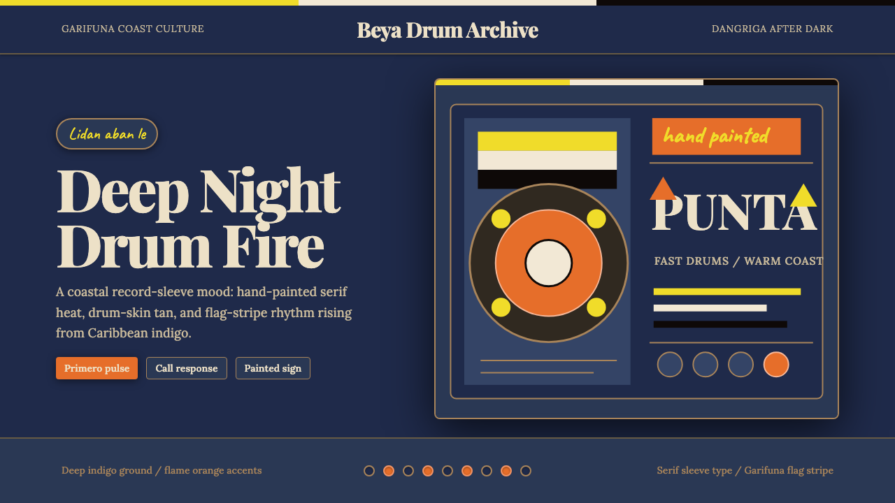 Belizean Garifuna PuntaNight rhythm burns. Indigo fields, flame-orange serif type, and flag stripes…深夜节奏燃起:靛蓝场、火焰橙衬线字与旗纹推进鼓点。
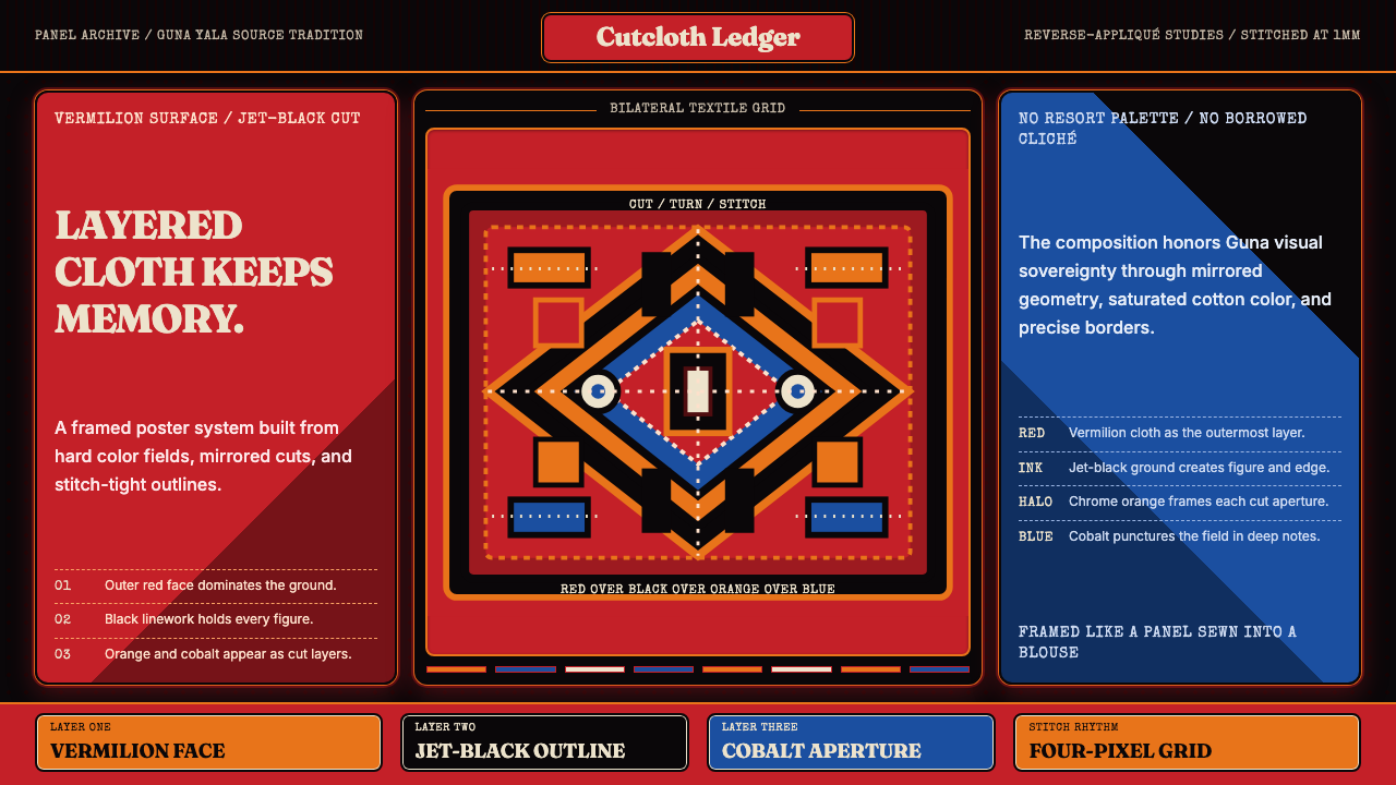 Panamanian Mola Kuna AppliquéSewn sovereignty. Vermilion panels reveal black, orange, and cobalt stitch-gr…缝出的主权。朱红面板切开黑、橙、钴蓝层与针脚网格。
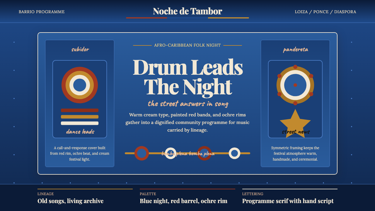 Puerto Rican Bomba & PlenaNight festival dignity. Drum-red stripes and cream Playfair type on deep trop…夜祭般庄重:深蓝底、鼓红条纹与暖白 Playfair 字体。
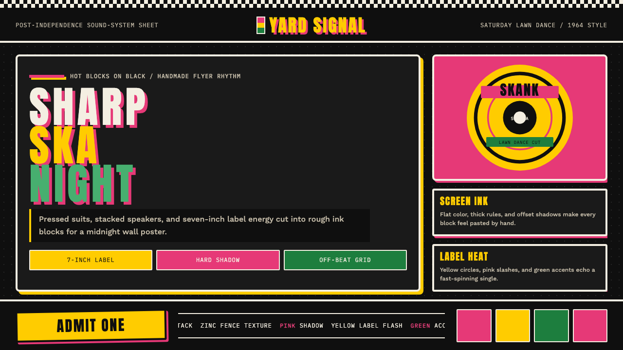 Rude Boy Jamaica Ska (1960)Street swagger hits hard. Hot pink and yellow blocks, checker trim, chunky ty…街头锋芒很硬。黑底热粉与黄块、棋盘边和粗体字。
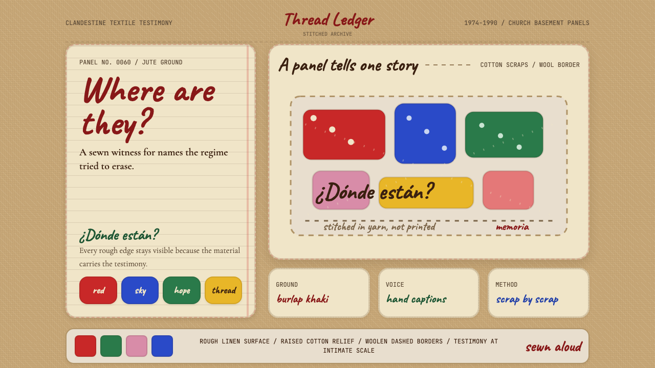 Chilean Arpillera (Pinochet Resistance)Witness sewn, not spoken. Burlap khaki, Caveat captions, and red cotton block…见证被缝上布面。麻布卡其、手写标题与红色棉布块承载控诉。
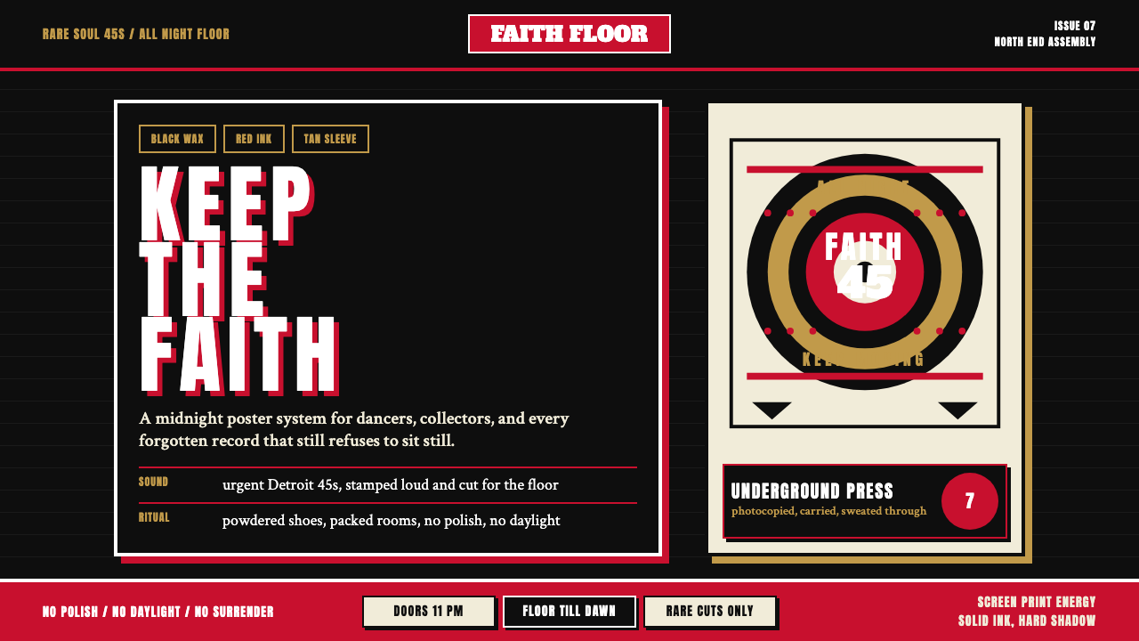 Northern Soul Wigan (1970)Underground urgency. Black ground, fist-red type, and tan vinyl rings hit lik…地下舞池的急迫感。黑底、拳红大字与唱片棕圆环像凌晨海报。