Design style guide设计风格指南
What is Northern Soul Wigan (1970)?什么是 Northern Soul Wigan (1970)?
Northern Soul is the design language of the all-nighter — black as a 4am dancefloor, fist-red type that won't let you sleep, and the devotional urgency of a rare record still spinning at dawn.北方灵魂乐是通宵舞会的视觉语言——黑得像凌晨四点的舞池,拳红大字让人无法入眠,犹如一张稀有唱片旋转至破晓的虔诚急迫。
Northern Soul Wigan (1970) in briefNorthern Soul Wigan (1970) 速览
Northern Soul is a visual design system rooted in the underground dancefloor culture that emerged in the working-class towns of Northern England during the 1970s. Its aesthetic draws directly from the graphic vernacular of that scene: monochrome screen-printed posters, hand-painted club flyers, vinyl label reproductions, and the clenched-fist emblem that became the movement's universal badge. The result is a dark, urgent, obsessively specific graphic language — one that treats black not as background but as presence, and red not as accent but as conviction.北方灵魂乐是一套植根于地下舞池文化的视觉设计体系,这一文化在 1970 年代英格兰北部工人阶级城镇中兴起。其美学直接汲取自那个场景的民间图形语言:单色丝网印刷海报、手绘俱乐部传单、黑胶唱片标签的复制图案,以及成为这场运动普世徽章的握拳标志。最终呈现出一套黑暗、急迫、执念深重的图形语言——它将黑色视为存在而非背景,将红色视为信念而非点缀。
Where many historical design systems derive their visual logic from fine art or architectural theory, Northern Soul derives its logic from devotion. Participants in the scene were collectors and true believers — people who traveled hundreds of miles to hear a single rare 45rpm record played at full volume. That fanaticism is encoded in the design aesthetic: nothing is casual, nothing is decorative for its own sake. Every element carries the weight of something that matters deeply. The type is heavy and confrontational; the palette is stripped to essentials; the composition is immediate.许多历史设计体系从纯艺术或建筑理论中提炼视觉逻辑,北方灵魂乐却从虔诚中提炼逻辑。这个场景的参与者是收藏家,也是真正的信徒——有人驱车数百英里,只为在人群中亲耳听到一张稀有的四十五转唱片以最大音量播放。这种狂热被编码进美学之中:没有任何随意之处,没有任何为装饰而装饰的元素。每个元素都承载着某种深重要紧之物的分量。字体粗重而具对抗性;色板剥去一切冗余;构图直接,无需铺垫。
The darkness at the center of the aesthetic is not nihilistic but protective. The all-nighter happened in the hours when the mainstream world was asleep — a deliberate retreat into a closed community of shared passion. The black ground of the Northern Soul visual system carries this sense of enclosure: it is the dark room where something rare and irreplaceable is happening, visible only to those who know where to look.这套美学核心处的黑暗并非虚无主义,而是一种庇护。通宵舞会发生在主流世界沉睡的时刻——一次刻意隐入共同激情构成的封闭社群的撤退。北方灵魂乐视觉体系的黑色底面承载着这种封闭感:那是黑暗的房间,某种稀有而无可替代的事物正在其中发生,只有知道往何处寻的人才能看见。
See the Northern Soul Wigan (1970) design system →查看 Northern Soul Wigan (1970) 完整设计系统 →
Where does Northern Soul Wigan (1970) come from?Northern Soul Wigan (1970) 从何而来?
The Northern Soul scene grew from the ashes of British Mod culture. When Mod's fixation on American rhythm and blues intensified through the mid-1960s, a subset of enthusiasts began seeking out the obscurer records — the ones that had flopped commercially in Detroit or Chicago but whose driving, uptempo rhythms were ideal for the athletic, acrobatic dancing style that evolved in Northern England's clubs. The Twisted Wheel in Manchester, active from 1963 to 1971, is widely acknowledged as the birthplace of the all-nighter format and the early crucible of the aesthetic. Dancers and DJs arrived late and stayed until morning, sustained by rare records and communal intensity.北方灵魂乐场景从英国摩德文化(Mod)的余烬中生长出来。当摩德对美国节奏布鲁斯的迷恋在 1960 年代中期愈演愈烈,一部分狂热者开始寻找更生僻的唱片——那些在底特律或芝加哥商业上惨败,却因快速、动感的节拍完美契合英格兰北部俱乐部里那种体育性、杂技式舞蹈风格的作品。曼彻斯特的扭轮俱乐部从 1963 年活跃至 1971 年,被公认为通宵舞会形式与早期美学的发源地。舞者和 DJ 深夜赶到,留守至天明,靠着稀有唱片与集体激情维持。
The term 'Northern Soul' was coined by the record dealer and journalist Dave Godin in 1970, writing for Blues and Soul magazine. Godin needed a label to distinguish the music being played in Northern clubs — obscure American soul from the 1960s — from the contemporary soul music being promoted to London's more fashion-conscious audiences. The name stuck. It also gave the scene a geography and a pride: Northern England, so often cast as industrial and peripheral in British cultural imagination, became the definitive custodian of something the mainstream had overlooked and discarded.「Northern Soul」这个名称由唱片经销商兼记者戴夫·戈丁(Dave Godin)于 1970 年创造,刊于《蓝调与灵魂》杂志。戈丁需要一个标签,用以区分北部俱乐部播放的那种音乐——1960 年代的美国冷门灵魂乐——与被推销给伦敦更注重时尚的观众的当代灵魂乐。这个名字留下来了。它同时赋予了这个场景一种地理认同与自豪感:英格兰北部——在英国文化想象中长期被塑造为工业化的、边缘性的——成为某种被主流忽视和丢弃之物的决定性守护者。
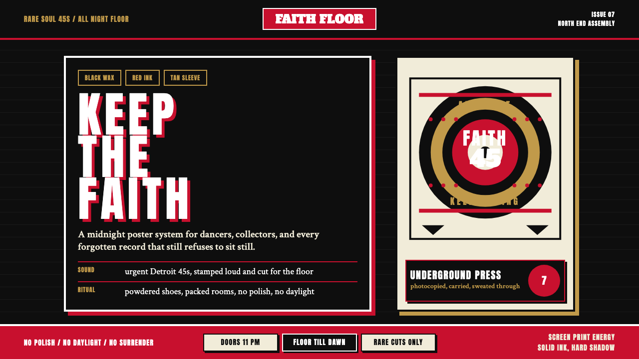
Wigan Casino, which opened as a Northern Soul all-nighter venue in September 1973, became the scene's defining institution. Under the residency of DJs Russ Winstanley and Richard Searling, the Casino hosted weekly all-nighters that drew thousands of dancers from across Britain. The BBC awarded it the title of 'Best Disco in the World' in 1978. The visual culture of the Casino years — the screen-printed posters advertising rare records, the cloth patches bearing the clenched fist and the phrase 'Keep the Faith,' the hand-drawn flyers passed between scene members — established the Northern Soul graphic vernacular that this design system inherits.威根赌场(Wigan Casino)于 1973 年 9 月作为北方灵魂乐通宵场馆开幕,随即成为这个场景的定义性机构。在 DJ 鲁斯·温斯坦利(Russ Winstanley)和理查德·瑟林(Richard Searling)的驻场下,赌场每周举办吸引全英数千名舞者的通宵舞会。1978 年英国广播公司将其评为「全球最佳迪斯科」。赌场岁月的视觉文化——宣传稀有唱片的丝网印刷海报、绣有握拳标志与「Keep the Faith」字样的布片徽章、在场景成员间传递的手绘传单——确立了北方灵魂乐的图形惯例,这套设计体系正是从中继承。
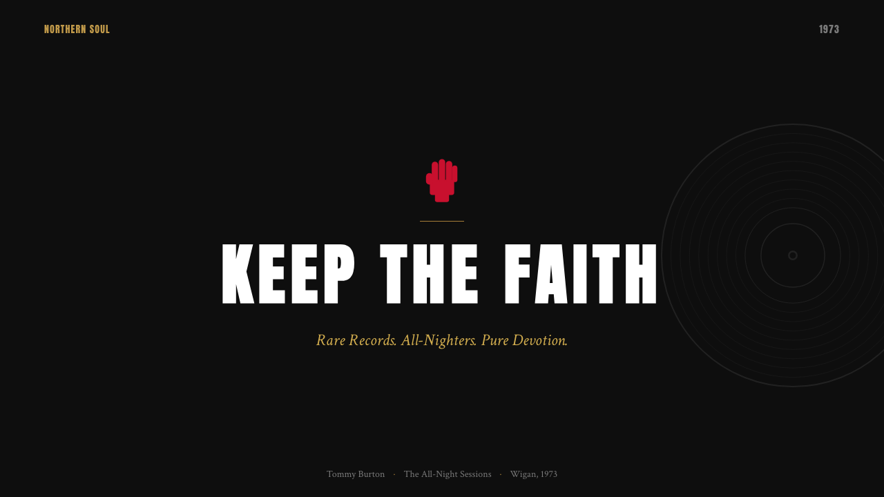
The clenched fist, borrowed from broader working-class and civil rights symbolism, became the scene's most potent emblem. On Northern Soul patches and posters it carried a specific meaning: loyalty to the music, the dancefloor, and the community against all commercial pressure. The scene was defined in part by its hostility to commercial success — a record that crossed over to mainstream chart success was viewed with suspicion, even contempt. 'Keep the Faith' was the declaration of that devotion, and the fist was its visual form. The design system carries this graphic inheritance: bold, direct, rooted in the conviction that some things matter too much for compromise.握拳图案借自更广泛的工人阶级与民权运动象征,成为这个场景最有力的徽记。在北方灵魂乐的徽章与海报上,它承载着特定含义:面对一切商业压力,对音乐、舞池与社群的忠诚。这个场景在相当程度上以对商业成功的敌视为自我定义——一张唱片一旦进入主流排行榜,就会被以怀疑乃至蔑视的眼光看待。「Keep the Faith」是那种虔诚的宣言,握拳是它的视觉形态。这套设计体系承载着这份图形遗产:粗粝、直接、根植于某些事物重要到无从妥协的信念。
What defines the Northern Soul Wigan (1970) look?Northern Soul Wigan (1970) 的视觉特征是什么?
Color Palette色彩体系
The foundational palette is extreme in its restraint: deep black as the dominant ground, a fist-red that reads as both blood and urgency, and a warm soul-tan drawn from the buff and amber tones of vintage vinyl record labels. Against this triad, white appears only for maximum contrast — a label reproduction, a band of tight reversed type, the edge of a fist. Nothing is softened; no tint, no intermediate neutral. The palette communicates before the type is even read.基础色板在克制上达到极致:深黑色作为主导底面,一种兼具血液与紧迫感的拳红,以及从老式黑胶唱片标签的亚麻与琥珀色调中提炼的灵魂棕。在这三色之上,白色仅用于最强对比——唱片标签的复现、一行紧凑的反白字、握拳的边缘轮廓。没有任何柔化处理,没有色调,没有中间灰度。在字体被阅读之前,色板已完成传达。
Typography字体排印
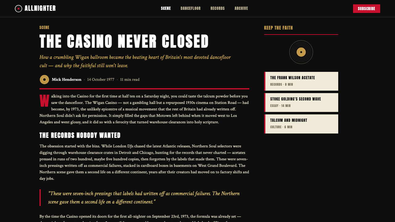
Type is the muscle of the Northern Soul aesthetic. Display lettering favors chunky, high-contrast forms — the kind of condensed, heavily weighted letterforms that print clearly from a hand-cut screen at speed, that read across a dark room at distance. Headlines are set tight, often in all capitals, with minimal letterspacing. Body copy, where it appears, is treated as a secondary system entirely subordinate to the headline impulse. The feeling is not refined — it is insistent.字体是北方灵魂乐美学的肌肉。展示性字母偏好粗壮、高对比度的形态——那种密排、字重沉重的字形,能从手工刻制的丝网上快速清晰印出,能在黑暗的房间里从远处一眼识别。标题排得紧凑,常为全大写,字距极小。正文(若出现)被视为完全从属于标题冲动的次要系统。整体感受不是精致,而是坚持不懈。
Offset Shadow and Block Construction偏移投影与色块构成
The defining decorative technique is the offset block shadow: a shape or letterform reproduced at a slight displacement in a second color, creating the impression of depth without any gradient or softness. This effect is a direct artifact of screen printing, where a second pass of ink at a shifted registration produces exactly this kind of hard-edged doubling. In the Northern Soul system, it reads as urgency — the visual equivalent of a sound starting a fraction before you expect it.这套体系的核心装饰技法是偏移色块阴影:将形状或字母以略微错位的方式用第二种颜色再现,制造出无渐变、无柔化的深度错觉。这种效果是丝网印刷的直接产物——油墨第二遍印刷时套版略微偏移,恰好产生这种硬边的重影。在北方灵魂乐体系中,它传递出一种急迫感——如同一个声音在你预期的时刻之前分毫爆发。
Vinyl and Circular Motifs黑胶与圆形母题
The seven-inch vinyl record — the physical object that the entire scene revolved around — contributes a recurring circular visual motif. Concentric rings, label reproductions, and disc silhouettes appear as compositional anchors, providing a warmth and specificity that counterpoints the severity of the type and palette. These circular forms are never decorative in the conventional sense; they carry documentary weight, referencing actual objects of devotion. A circle in this system is not an abstract form — it is a specific thing held in a specific hand.整个场景围绕旋转的七寸黑胶唱片——这个实体对象——贡献了一个反复出现的圆形视觉母题。同心圆环、唱片标签的再现、碟片剪影作为构图锚点出现,为字体与色板的严苛提供对位的温度与具体性。这些圆形从不是传统意义上的装饰;它们承载着记录性的分量,指涉真实存在的崇拜对象。在这套体系中,圆形不是抽象的形态——它是某只手握持的某个具体之物。
Poster and Print Vernacular海报与印刷民间语言
The entire aesthetic is built around the logic of hand-made print production: limited ink passes, registration imprecision accepted as character rather than error, large flat areas of solid color, and type that can be set fast and read under low light. This is design made under conditions of scarcity and speed, and those conditions are honored rather than smoothed over. Where contemporary design trends often fake analog imperfection as a stylistic device, Northern Soul's roughness is structural — it is the style's reason for being.整套美学围绕手工印刷生产的逻辑构建:油墨过墨次数有限,套版不准确被视为个性而非错误,大面积实色平涂,字体设置迅速、在昏暗灯光下可读。这是在匮乏与速度条件下完成的设计,那些条件被如实呈现而非抹平。当代设计潮流常常将模拟缺陷作为风格手法刻意制造,北方灵魂乐的粗粝则是结构性的——那是这种风格存在的理由。
Emblematic Imagery徽记图像
The clenched fist is the scene's heraldic mark, appearing on posters, patches, and flyers with the consistency of a logo system. In the design vocabulary, it functions as a focal anchor — a human gesture rendered in flat silhouette, concentrating the ideology of the scene into a single image. Supporting emblems include stars, crowns, and shield forms, borrowed from a wider tradition of badge-making and subcultural heraldry. The imagery is bold enough to read at a glance and carry weight at any scale.握拳图案是这个场景的纹章标志,以近乎商标体系的一致性出现在海报、徽章与传单上。在设计词汇中,它充当焦点锚——一种人类姿态以平面剪影呈现,将场景意识形态浓缩为单一图像。配套徽记包括星形、王冠与盾牌形态,借自更广泛的徽章制作与亚文化纹章传统。这些图像足够粗犷,可在一瞥间被识别,并在任何尺寸下都保持分量。
Darkness as Ideology黑暗作为意识形态
Black is not merely a background color in this system — it is a statement. The all-nighter happened after midnight and lasted until morning; the dark ground of Northern Soul design is the literal context of the culture. Beyond the practical, it carries ideological weight: black grounds mark the work as belonging to an underground, to a scene that defined itself against the lit-up, commercially viable mainstream. Against that darkness, every colored element reads as something hard-won and worth defending.在这套体系中,黑色不仅仅是背景色——它是一种宣言。通宵舞会在午夜之后开始,延续至天亮;北方灵魂乐设计的深黑底面是这种文化的字面处境。超越实际功能之外,它承载着意识形态的分量:黑色底面标记着这件作品属于地下,属于一个以对抗光亮、商业可行的主流来定义自身的场景。在那种黑暗中,每一个有色元素都像是经过艰苦争取、值得捍卫之物。
See the Northern Soul Wigan (1970) design system →查看 Northern Soul Wigan (1970) 完整设计系统 →
Who shaped Northern Soul Wigan (1970)?谁塑造了 Northern Soul Wigan (1970)?
Godin was a record dealer, journalist, and scene theorist who coined the term 'Northern Soul' in 1970. His writing in Blues and Soul magazine gave the scene a language and a self-consciousness that proved essential to its identity. He was also a passionate advocate for the music on its own terms — not as nostalgia, but as a living devotional practice. His critical framing of Northern Soul as a deliberate rejection of commercial soul music established the ideological seriousness that the scene's design aesthetic reflects.戈丁是唱片商、记者与场景理论家,于 1970 年创造了「Northern Soul」这个名称。他在《蓝调与灵魂》杂志上的写作赋予了这个场景一套语言与自我意识,对其身份认同至关重要。他也是这种音乐的热情倡导者,将其视为活生生的虔诚实践,而非怀旧之物。他将北方灵魂乐界定为对商业灵魂乐的刻意拒绝的批评性框架,确立了这个场景设计美学所反映的意识形态严肃性。
Winstanley was the founding DJ and co-promoter of the Wigan Casino all-nighters, which ran from 1973 to 1981. His programming shaped the sonic and ultimately the graphic identity of the Casino years — the records he chose to champion, the sequences he constructed, and the atmosphere he cultivated in the room created the reference point against which all subsequent Northern Soul events were measured. The Casino's distinctive visual material — its posters, flyers, and merchandise — was produced under his tenure and remains the definitive document of the aesthetic.温斯坦利是威根赌场通宵舞会(1973—1981 年)的创始 DJ 兼联合主办人。他的节目编排塑造了赌场年代的声音乃至图形身份——他选择力挺的唱片、构建的播放序列、在场内营造的氛围,成为此后所有北方灵魂乐活动的参照基准。赌场独特的视觉材料——海报、传单与周边产品——在他的任期内制作完成,至今仍是这套美学的权威文献。
Levine was a DJ and record collector who became one of the most important figures in shaping the Northern Soul canon. Resident at the Blackpool Mecca Highland Room from the early 1970s, he was known for unearthing obscure American soul records that had never had commercial distribution in Britain, and for championing a faster, more dance-floor-oriented sound than some purists preferred. His work represents the scene's relentless forward momentum — the insistence on the new find, the undiscovered record, the rare groove not yet played.莱文是 DJ 兼唱片收藏家,成为塑造北方灵魂乐经典曲目的最重要人物之一。1970 年代初起常驻布莱克浦麦加高地厅,他以挖掘从未在英国商业发行的美国冷门灵魂乐唱片而著称,并倡导一种比某些纯粹主义者偏好的更快速、更以舞池为导向的声音。他的工作代表了这个场景的不懈前进动力——对新发现、未探索唱片、尚未播放的稀有律动的坚持。
Searling was a DJ and radio presenter whose work at the Wigan Casino alongside Winstanley helped define the sound of the scene's peak years. He was also a prolific advocate for Northern Soul in print and on air, contributing to the scene's documentation and to its public image beyond the dancefloor. His longevity in the scene — spanning from the early Wigan years through decades of revivalism — makes him a living continuity between the culture's original moment and its ongoing afterlife.瑟林是 DJ 兼电台主持人,他与温斯坦利在威根赌场的合作共同定义了这个场景巅峰年代的声音。他也是北方灵魂乐在印刷媒体与广播中的多产倡导者,为场景的记录与舞池之外的公众形象做出贡献。他在场景中的持久活跃——从威根早年延续数十年的复兴运动——使他成为这种文化原初时刻与其持续余生之间活生生的延续线。
How do you use Northern Soul Wigan (1970) today?今天怎么用 Northern Soul Wigan (1970)?
Northern Soul is among the most viscerally distinctive historical styles available to contemporary designers, but its power depends entirely on restraint. The system is built on darkness, weight, and conviction — applied without those qualities, it becomes costume rather than character. Before reaching for the palette and the heavy type, establish whether the project's values genuinely align with what the aesthetic communicates: urgency, devotion, authenticity, and a deliberate rejection of the polished mainstream. Brand work for a specialist, community-driven, or counter-cultural product will find natural resonance; luxury, corporate, or broadly accessible products will fight the style rather than be served by it.北方灵魂乐是当代设计师可用的历史风格中感官辨识度最强的一种,但其力量完全依赖克制。这套体系建立在黑暗、厚重与信念之上——若缺少这些品质,它便沦为戏服而非性格。在动用色板与沉重字体之前,先确认项目的价值观是否真正与这套美学所传递的内容对齐:紧迫、虔诚、真实,以及对精致主流的刻意拒绝。专注于特定领域、以社群驱动或具有反文化倾向的品牌工作会找到天然的共鸣;奢侈、企业化或面向广泛受众的产品则会与这种风格相互抗拒,而非被其服务。
For presentation slides, the Northern Soul visual language is most powerful on high-stakes, statement-level decks rather than informational slide-by-slide narratives. A cover using a full black ground, a single large display headline in the characteristic heavy type, and the offset block shadow technique immediately signals that what follows is not ordinary. Section dividers can carry vinyl-inspired circular motifs or fist emblems as compositional anchors. Data slides require care: on a dark ground, charts and graphs must use the warm soul-tan or red as the primary data color, with white reserved for axis labels and values. Avoid introducing pale grays or blues that would dilute the palette's conviction.在演示文稿方面,北方灵魂乐视觉语言在高风险、陈述性的演讲甲板上最为有力,而非逐页信息化的叙事结构。一张使用全黑底面、以标志性粗重字体呈现单一大标题、并运用偏移色块阴影技法的封面,会立刻传达出接下来所呈现的内容并非平凡之事。章节分割页可以使用黑胶启发的圆形母题或握拳图案作为构图锚点。数据页面需要谨慎处理:在深色底面上,图表必须使用温暖的灵魂棕或红色作为主数据色,白色保留给坐标轴标签与数值。避免引入会稀释色板信念感的浅灰或蓝色。
For web interfaces and dashboards, the style suits products where the user base has strong in-group identity and values authenticity over polish. A music discovery platform, a specialist community tool, or a product that explicitly positions itself as an alternative to mainstream options can use the dark ground, heavy type hierarchy, and circular vinyl motifs to signal alignment with those values. Navigation should be typographic and unapologetically bold — no gradient pill buttons, no soft hover states. Interactive elements use the red or soul-tan for active states; inactive states remain in the near-black or deep-charcoal range.对于网页界面与仪表板,这种风格适合用户群体具有强烈内部认同感、将真实性置于精致感之上的产品。一个音乐发现平台、专业社群工具,或明确将自身定位为主流替代品的产品,可以借助深色底面、沉重的字体层级与圆形黑胶母题来传达价值对齐。导航应当是字体性的,毫不妥协地粗犷——不用渐变胶囊按钮,不用柔和的悬停状态。交互元素以红色或灵魂棕呈现激活状态;非激活状态保持在接近黑色或深炭灰的范围内。
For editorial and marketing work, the style functions as a high-contrast attention device. Event promotional materials, limited-edition product launches, and campaigns with a counter-cultural or community-first positioning can deploy the poster vernacular directly — full-bleed black, oversized display type, the fist or circular motif as a compositional anchor. Marketing copy should be short, declarative, and free of hedging. The aesthetic has no room for bullet-pointed benefits lists or soft persuasion language; it assumes an audience that is already predisposed to care deeply about the subject.对于编辑与营销内容,这种风格作为高对比度的注意力装置发挥作用。活动宣传材料、限量版产品发布,以及具有反文化或社群优先定位的营销活动,可以直接部署海报惯用语——满版黑底、超大展示字体、握拳或圆形母题作为构图锚点。营销文案应当简短、断言式、不带任何回旋余地。这套美学没有容纳项目符号收益列表或柔性说服语言的空间;它预设的受众是已经倾向于对主题深切在乎的人。
The most common mistake when applying this style is treating the black ground as a mood rather than a structural commitment. Designers who use the dark palette but then populate it with soft gradients, light-touch typography, and gentle transitions end up with something that looks like generic dark-mode UI rather than Northern Soul. The style requires the hard offset shadow, the genuinely heavy type, the limited palette used without dilution, and the compositional boldness that comes from placing elements with conviction rather than caution. A second frequent error is reaching for nostalgia — using the style to signal pastness rather than urgency. Northern Soul was never about looking backward; it was about finding something old and insisting it was the most important thing in the room right now.应用这种风格时最常见的错误,是将黑色底面视为一种情绪而非结构性承诺。使用深色色板却填充柔和渐变、轻触式排版与温和过渡效果的设计师,最终得到的是通用深色模式 UI,而非北方灵魂乐。这种风格需要真正的硬边偏移投影、真正厚重的字体、不加稀释地使用的有限色板,以及那种从信念而非谨慎出发去放置元素所带来的构图大胆感。第二个常见错误是陷入怀旧——将这种风格用于传达过去感而非紧迫感。北方灵魂乐从未是关于回望;它关乎找到某样古老之物,并坚持认为它此时此刻是房间里最重要的东西。
See the Northern Soul Wigan (1970) design system →查看 Northern Soul Wigan (1970) 完整设计系统 →
Northern Soul Wigan (1970) — FAQNorthern Soul Wigan (1970) · 常见问题
Is Northern Soul design the same as general retro or vintage style?北方灵魂乐设计与一般复古或年代风格是一回事吗?
No — and the distinction matters. General retro and vintage design borrow visual cues from past decades as a form of nostalgia or stylistic play. Northern Soul design is not nostalgic in that way: it is the direct continuation of a living visual vernacular that has remained consistent since the 1970s precisely because the scene never stopped. The roughness, the dark ground, the heavy type, and the fist emblem are not period costume — they are an ongoing graphic identity that has never been updated because it has never needed to be. Applying these elements as pastiche rather than as a coherent system will produce work that reads as generic vintage rather than as something that carries genuine conviction.不是——这个区别很重要。一般的复古与年代风格是以怀旧或风格游戏的方式借用过去年代的视觉线索。北方灵魂乐设计并非以那种方式怀旧:它是一种活态民间视觉语言的直接延续,自 1970 年代以来始终保持一致,恰恰因为这个场景从未停止。粗粝感、深色底面、沉重字体与握拳标志并非年代戏服——它们是一套持续的图形身份,从未被更新,因为从未需要更新。以拼贴而非连贯体系的方式运用这些元素,产出的作品会被读解为通用复古风,而非承载真正信念之物。
Can this style work on a light or white background?这种风格能用在浅色或白色背景上吗?
It can, but with significant trade-offs. The dark ground is structural to the style's meaning — it is the 4am dancefloor, the enclosed community, the deliberate retreat from the bright mainstream. A light inversion replaces the darkness with legibility but sacrifices the ideological weight that makes the aesthetic more than just a type-and-color choice. If a light ground is required by context (a long-form editorial piece, a corporate document), the style can survive through the typography and the restricted palette — the heavy display type, the red-and-tan color accent, the offset shadow on key elements — but it becomes a tonal reference rather than a full system. Reserve the full dark treatment for materials where the context genuinely supports it.可以,但代价显著。深色底面对于这种风格的意义是结构性的——它是凌晨四点的舞池、封闭的社群、对光亮主流的刻意撤退。浅色反转以易读性替代了黑暗,却牺牲了使这套美学不仅仅是字体与色彩选择的意识形态重量。若语境要求浅色底面(长篇编辑文章、企业文件),这种风格可以通过排版与受限色板生存下来——沉重的展示字体、红色与棕色的色彩强调、关键元素上的偏移投影——但它变成了一种调性参照而非完整体系。将完整深色处理保留给语境真正支撑它的材料。
How does this style differ from other dark, underground-rooted aesthetics like punk or goth?这种风格与朋克、哥特等其他黑暗地下根源美学有何不同?
All three share the dark ground and a countercultural stance, but they diverge sharply in their underlying emotional register and visual grammar. Punk is aggressively deconstructive — ransom-note type, deliberately torn layouts, rejection of skill itself as a value. Goth is romantic and atmospheric, gravitating toward ornament, decay, and melancholy. Northern Soul is neither deconstructive nor melancholic: it is devotional and urgent. The type is heavy but controlled, not torn. The composition is bold but organized, not fractured. The emotional keynote is not despair or rebellion but loyalty — the specific loyalty of a community that found something rare and refused to let the mainstream take it away.三者共享深色底面与反文化立场,但在底层情感基调与视觉语法上存在尖锐分歧。朋克是攻击性解构的——剪报式字体、刻意撕裂的版面、将技艺本身作为价值加以拒绝。哥特是浪漫而氛围浓重的,倾向于装饰、腐败感与忧郁。北方灵魂乐既非解构,也非忧郁:它是虔诚的,是急迫的。字体沉重却受控,并非撕裂。构图大胆却有序,并非支离。情感基调不是绝望或反叛,而是忠诚——一个发现了稀有之物并拒绝让主流将其夺走的社群的特定忠诚。
What kinds of projects are a poor fit for this style?哪类项目不适合这种风格?
The style struggles in contexts that require warmth, accessibility, or softness as primary values. Children's products, healthcare interfaces, food and beverage brands, wellness platforms, and any product that depends on projecting approachability or comfort will work against the aesthetic's inherent severity. Corporate materials that require institutional legibility — annual reports, compliance documents, investor presentations — will also resist the style's confrontational directness. The test is simple: if the product's core value proposition involves making people feel comfortable, reassured, or welcomed, Northern Soul is working against the brief. The style earns its power by excluding as much as it includes.在以温暖、易达性或柔软为核心价值的语境中,这种风格会显得力不从心。儿童产品、医疗保健界面、食品与饮料品牌、健康平台,以及任何依赖投射亲和力或舒适感的产品,都会与这套美学固有的严峻感相互抗拒。需要机构性可读性的企业材料——年度报告、合规文件、投资者演示——也会排斥这种风格的对抗性直接。测试很简单:如果产品的核心价值主张涉及让人感到舒适、安心或受欢迎,北方灵魂乐正在与这份创意简报对着干。这种风格的力量正来自它与其包容同等分量的排除。
Is 'Keep the Faith' a phrase I should use literally in design work?「Keep the Faith」是我应该在设计工作中直接使用的短语吗?
Used without context, it reads as generic motivational copy and loses all its specificity. Within the Northern Soul design system, the phrase carries the full weight of the scene's history: the loyalty to rare music against commercial pressure, the devotion maintained over decades, the community that kept something alive that the mainstream had discarded. If you use it, it should appear in a context where that weight is legible — where the audience either knows the reference or where the surrounding design signals clearly enough what kind of devotion is being named. Used carelessly, it is a cliché; used precisely, it is a thesis statement for everything the aesthetic stands for.在缺乏语境的情况下使用,它会被读解为通用励志文案,失去所有具体性。在北方灵魂乐设计体系内部,这个短语承载着场景历史的全部重量:面对商业压力对稀有音乐的忠诚、跨越数十年维系的虔诚、让某样被主流遗弃之物延续存活的社群。如果你使用它,它应当出现在那种重量可被辨读的语境中——观众要么知晓这个出处,要么周围的设计足够清晰地传达了所指名的是何种虔诚。粗心用之,是陈词滥调;精确用之,是这套美学所代表的一切的论点陈述。
Related design styles相关设计风格
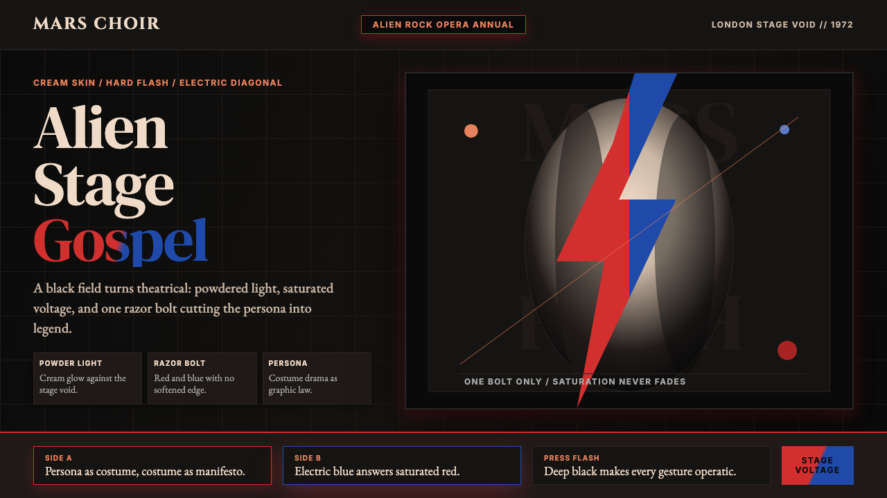 Bowie — Ziggy StardustTheater at full voltage. Cream-on-black portrait cut by one red and electric-…满电压的剧场感:黑底奶油肖像,被红与电蓝闪电劈开。
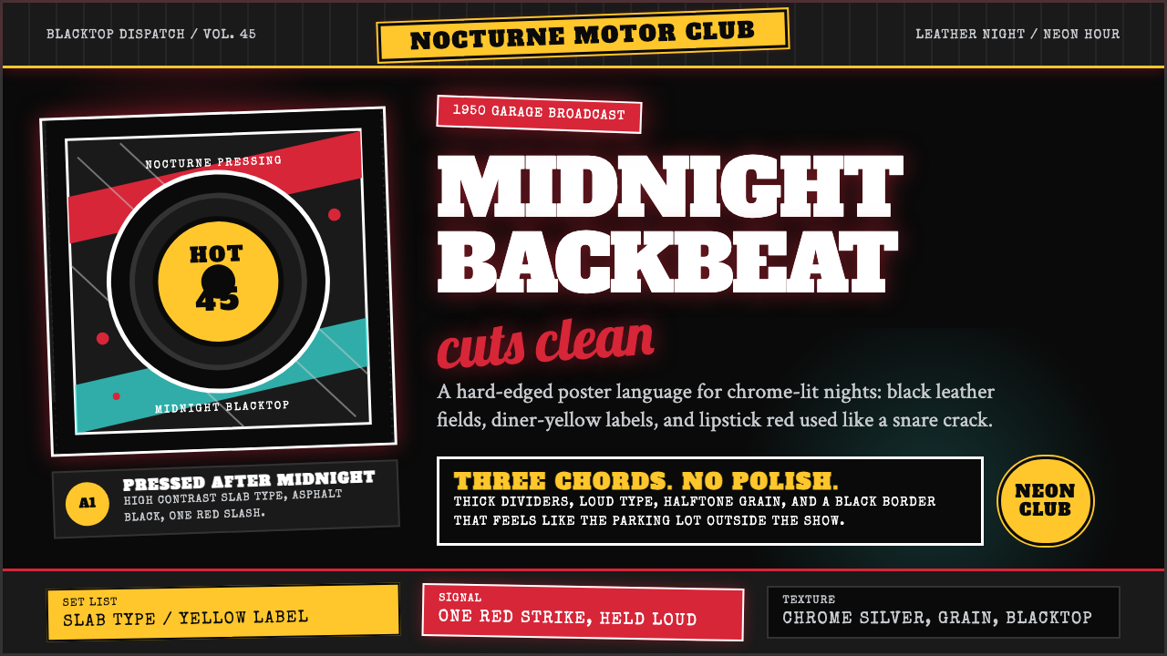 Rockabilly Greaser (1950)Loud after midnight. Asphalt black, chrome-yellow circles, and one lipstick-r…午夜后更响:沥青黑、铬黄圆标与一记唇膏红。
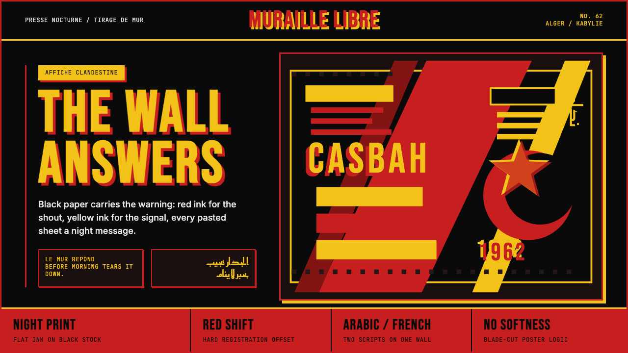 Algerian Casbah Poster (1954–1962)Every surface is a manifesto. Blood red, warning yellow, and stencil type hit…每个表面都是宣言:血红、警示黄与模板字撞上黑色新闻纸。
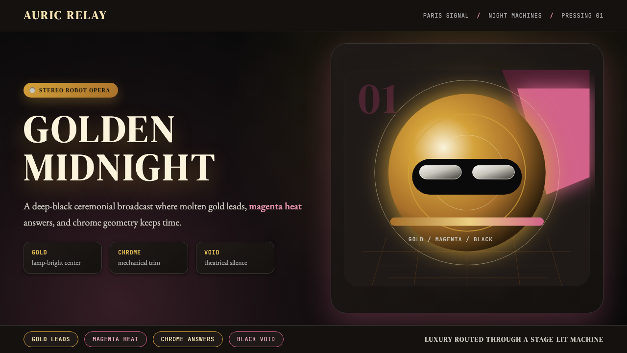 Daft Punk Discovery (Gold-Helmet)Warm sci-fi disco. Gold serif caps orbit a magenta void with chrome-disc geom…温热科幻迪斯科:金色衬线大字环绕品红虚空与铬色圆盘。
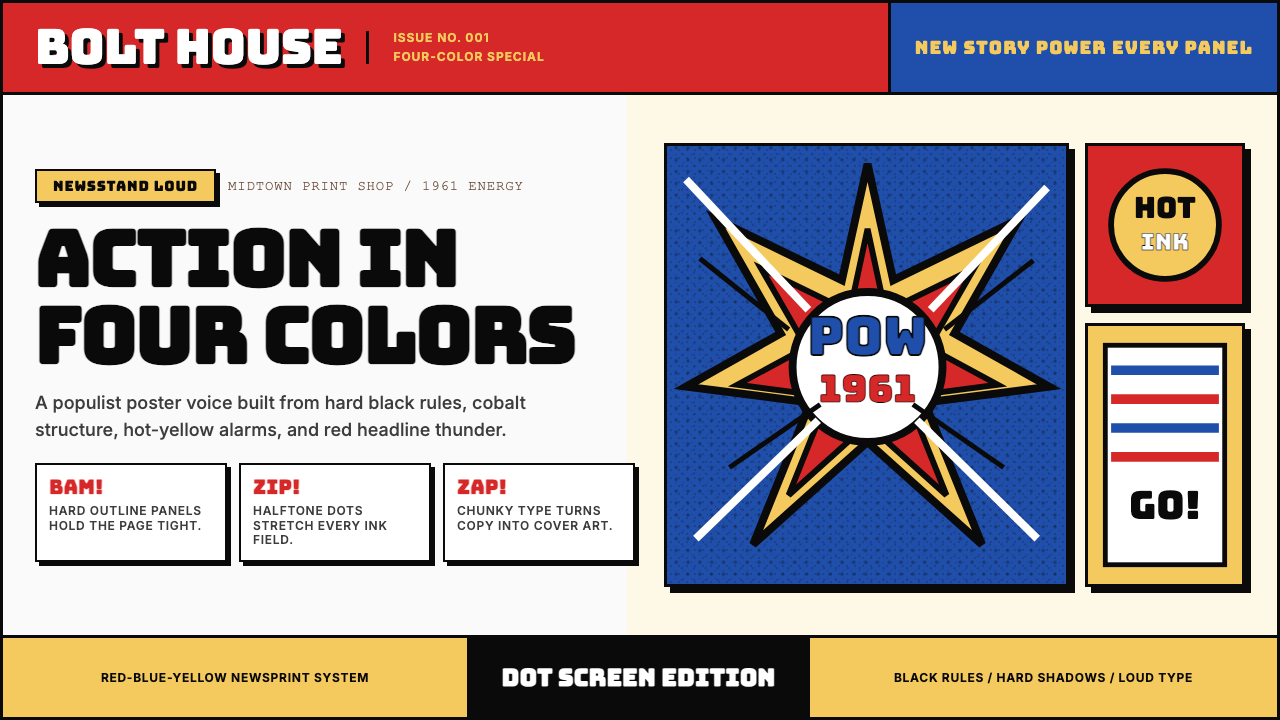 Marvel Comics (Kirby Era)Populist color hits hard. Red-blue-yellow panels, black rules, and halftone d…大众色彩直击眼球。红蓝黄画格、黑墨线与半调网点。
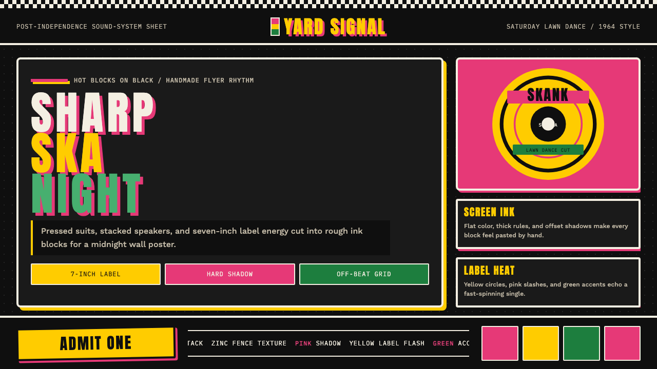 Rude Boy Jamaica Ska (1960)Street swagger hits hard. Hot pink and yellow blocks, checker trim, chunky ty…街头锋芒很硬。黑底热粉与黄块、棋盘边和粗体字。