Design style guide设计风格指南
What is Rockabilly Greaser (1950)?什么是 Rockabilly Greaser (1950)?
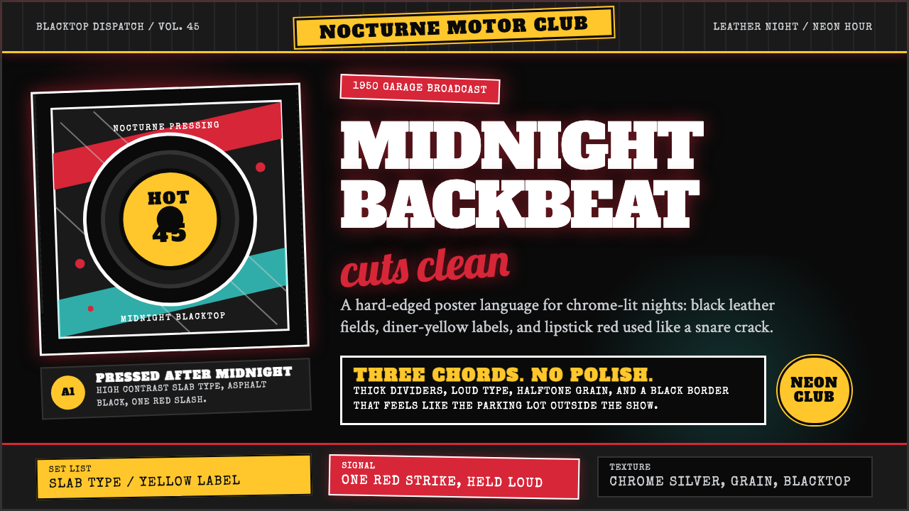
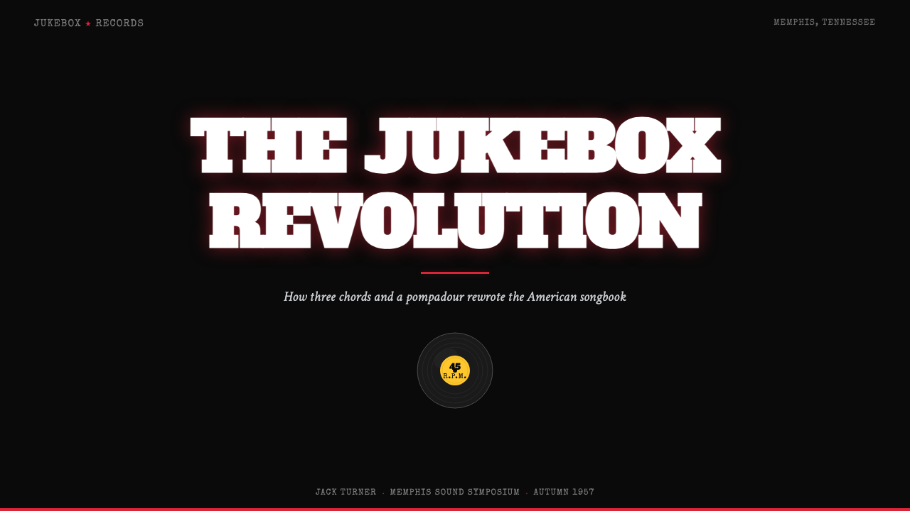
Rockabilly is the sound of a snare crack turned into a color palette — pure black, chrome yellow, and one slash of lipstick red that hit American culture like a lightning bolt in the summer of 1954.摇滚乡村是军鼓击打化成色彩的那一刻——纯黑、铬黄与一抹唇膏红,在1954年的夏天如闪电击穿了美国文化。
Rockabilly Greaser (1950) in briefRockabilly Greaser (1950) 速览
Rockabilly Greaser is the visual identity of America's first youth subculture — the aesthetic that erupted around Sun Records in Memphis when country music fused with rhythm and blues to create rock and roll. The look is built on maximum contrast: a midnight-black ground, a single red accent as sharp as a snare hit, flashes of chrome yellow lifted directly from the Sun label's own signature color, and slab-serif type that belongs on a roadside diner or drive-in marquee.摇滚乡村油头(Rockabilly Greaser)是美国第一个青年亚文化的视觉身份——1954年孟菲斯太阳唱片周围爆发出的那种美学,当乡村音乐与节奏布鲁斯融合,摇滚乐就此诞生。这种外观建立在极致对比之上:午夜般的纯黑底色、一个像军鼓击打一样锐利的红色强调、直接从太阳唱片标签借来的铬黄闪光,以及属于公路餐厅或汽车电影院招牌的粗衬线字体。
Everything in this aesthetic is loud and unashamed. There is no subtlety in a leather jacket under a neon sign, no timidity in a two-tone Mercury parked outside a jukebox joint. The visual language channels that same refusal to whisper: high-contrast blocks, bold graphic shapes, lettering drawn with the confidence of someone who knows exactly what they want and is not asking permission.这种美学里的一切都是响亮的、毫不遮掩的。霓虹灯下的皮夹克没有半点含蓄,停在点唱机酒吧外的双色Mercury没有丝毫怯懦。这套视觉语言传递着同样的拒绝低语:高对比度色块、粗犷图形形态、用「我知道自己要什么、不需要任何人批准」的自信写出的字体。
The style carries the imprint of its twin cultural roots — country music's Southern directness and blues music's emotional intensity — translated into a graphic register that feels simultaneously dangerous and joyful. It is dark where other 1950s American design was pastel and cheerful, raw where mainstream advertising was polished, and personal where commercial culture was anonymous.这种风格承载着它双重文化根源的印记——乡村音乐南方式的直接与蓝调音乐情感上的强烈——转译成一种既危险又充满喜悦的图形语言。它在其他1950年代美国设计一片柔和粉彩的时候选择了黑暗,在主流广告光鲜亮丽的时候保持了粗粝,在商业文化千篇一律的时候坚持了个性。
See the Rockabilly Greaser (1950) design system →查看 Rockabilly Greaser (1950) 完整设计系统 →
Where does Rockabilly Greaser (1950) come from?Rockabilly Greaser (1950) 从何而来?
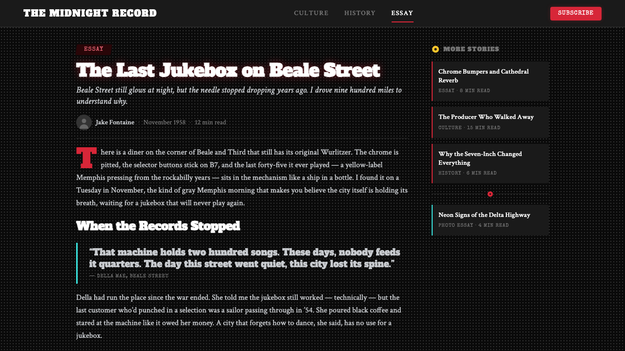
The story begins at 706 Union Avenue, Memphis, Tennessee — Sun Studio, where producer Sam Phillips had been recording blues and country artists since 1950. Phillips had a theory: if he could find a white singer who could deliver the emotional authenticity of Black music, he would have something the mainstream would devour. On July 5, 1954, Elvis Presley, a nineteen-year-old truck driver from Tupelo, Mississippi, walked into that studio and began improvising on Arthur Crudup's blues song 'That's All Right.' The sound that emerged — country structure with a blues backbeat, delivered with a barely suppressed wildness — was rockabilly.故事从田纳西州孟菲斯联合大道706号开始——太阳录音室。制作人山姆·菲利普斯自1950年起在这里录制蓝调与乡村音乐艺人。他有一个理论:如果能找到一位白人歌手,能传递出黑人音乐的那种情感真实性,他就拥有了能被主流社会疯狂吞噬的东西。1954年7月5日,来自密西西比州图珀洛的十九岁卡车司机猫王艾维斯·普雷斯利走进那间录音室,开始即兴演唱亚瑟·克鲁达普的蓝调歌曲《That's All Right》。由此诞生的声音——乡村曲式与蓝调节拍,以一种压抑不住的野性传递——就是摇滚乡村。
The music spread through the American South via 45rpm singles released on Sun's signature yellow-and-black label, played on regional radio stations, and heard at roadhouses and drive-in theaters. The visual world grew up around the sound organically: the performers dressed in whatever combined working-class practicality with rebellious flair — denim, leather, bowling shirts, two-tone shoes. The pompadour hairstyle, slicked high and swept back with pomade, became the movement's most recognizable symbol. These were working-class kids claiming glamour on their own terms.这种音乐通过太阳唱片标志性黄底黑字的45转单曲在美国南方传播,在地区广播电台播出,在公路酒吧和汽车电影院里被人听到。视觉世界随着声音有机地生长出来:表演者穿着一切能把工人阶级实用性与叛逆光彩结合起来的东西——牛仔布、皮革、保龄球衬衫、双色皮鞋。用发油梳得高高向后甩的飞机头发型,成为这场运动最易辨认的符号。这些工人阶级的孩子在用自己的方式主张魅力。
The greaser identity — a term used both by the subculture itself and by outsiders — merged the rockabilly sound with motorcycle and hot-rod culture from the American coasts, producing a unified aesthetic of speed, rebellion, and hand-built cool. Chrome details on customized cars translated directly into the visual language: the gleam of polished metal, the curve of a fender, the glow of a dashboard gauge at night. This wasn't borrowed glamour — it was made by people who worked with their hands and displayed that work with pride.「油头佬」(greaser)的身份认同——这个词既被亚文化自身使用,也被外界用来称呼他们——将摇滚乡村音乐与来自美国海岸的摩托车和热棒文化合并,产生了一套统一的速度、叛逆与手工酷感美学。改装汽车上的铬合金细节直接转译为视觉语言:抛光金属的光泽、挡泥板的弧线、夜晚仪表盘指针的微光。这不是借来的魅力——它由用双手工作的人创造,并以骄傲的方式展示那份工作。
The original moment was brief. By the early 1960s, the music industry had smoothed rockabilly's edges into the softer pop of teen idols. But the aesthetic proved extraordinarily durable. In the 1980s, the Stray Cats — led by Brian Setzer — brought a revivalist rockabilly to international audiences, and the visual language returned with them. Since then, rockabilly aesthetics have cycled through fashion, tattoo culture, graphic design, and advertising as a reliable signal for authenticity, rebellion, and an idealized vision of mid-century American working-class style.最初的时刻是短暂的。到1960年代初期,音乐工业已将摇滚乡村的棱角磨平,变成了青少年偶像的柔和流行。但这种美学被证明具有异常的持久力。1980年代,由布莱恩·塞泽领衔的流浪猫乐队(Stray Cats)将复兴版摇滚乡村带给国际观众,视觉语言随之归来。此后,摇滚乡村美学在时尚、纹身文化、平面设计与广告中循环出现,作为真实性、叛逆性以及对二十世纪中期美国工人阶级风格的理想化想象的可靠信号。
What defines the Rockabilly Greaser (1950) look?Rockabilly Greaser (1950) 的视觉特征是什么?
Color色彩
The palette is built on pure black as the dominant ground — not charcoal or near-black, but the absolute dark of asphalt at midnight. Against this, a single lipstick red functions as the primary accent, used sparingly and with maximum impact: a stripe, a logo field, a call-to-action zone. Chrome yellow appears as a secondary flash, referencing the Sun Records label itself. White is reserved for type only, rarely used as a background field. The overall effect is high-contrast to the point of visual aggression — the entire composition is designed to be read at a glance from across a parking lot.色板以纯黑为主导底色——不是炭灰或接近黑,而是午夜沥青的绝对黑暗。在此之上,唇膏红作为主要强调色发挥作用,克制使用但冲击力最大化:一条色带、一块标志区域、一个行动召唤区。铬黄以次要闪光形式出现,直接引用太阳唱片标签本身。白色仅保留给文字,极少用作背景区域。整体效果是高对比度到具有视觉攻击性的程度——整个构图被设计成能从停车场对面一眼读懂。
Typography字体排印
Slab serif — the thick, bracketed serifs that belong on American diner signage and circus posters — is the defining typeface category. The serifs are not elegant; they are blunt, heavy, and designed to carry at distance. Letterforms have the weight of carved wood or stamped metal. Headlines are set at extreme sizes, often with very tight leading, creating a compressed wall of text that reads more as image than as prose. Script lettering — the kind derived from neon-sign cursives and tattoo flash — appears in a supporting role, softening the slab-serif authority with a handmade quality.粗衬线(Slab serif)——属于美国餐厅招牌和马戏团海报的厚实带托衬线——是定义性的字体类别。这些衬线并不优雅;它们是钝的、沉重的,被设计成能在远距离传递的形态。字形具有雕刻木头或冲压金属的重量感。标题以极大字号排版,行距常常极度紧凑,形成一堵压缩的文字墙,更像图像而非散文。书写体字母——那种从霓虹灯招牌草书和纹身闪图中衍生出来的——以辅助角色出现,以手工质感柔化粗衬线的权威感。
Contrast and Tone对比与调性
The entire visual system is calibrated for maximum tonal contrast. There are no midtones, no gentle transitions — elements are either fully on or fully off. This binary approach to contrast is both an aesthetic choice and a practical one: rockabilly graphics were originally designed for quick reproduction in single-color or two-color print, on newsprint, and on small-format labels. The high-contrast clarity that made them legible on a spinning 45 at arm's length translates directly into digital contexts where immediate legibility is required.整套视觉系统被校准到最大色调对比度。没有中间调,没有柔和过渡——元素要么完全开启,要么完全关闭。这种二元对比方式既是美学选择也是实用选择:摇滚乡村图形最初被设计用于单色或双色印刷的快速复制,印在新闻纸上,印在小格式标签上。使它们在臂长距离旋转的45转唱片上清晰可辨的高对比清晰度,直接转译到需要即时可读性的数字语境。
Shape and Motif形态与母题
Flames, lightning bolts, stars, and rocket shapes appear as decorative motifs — but used with restraint, as punctuation rather than wallpaper. Circular badge forms reference the 45rpm label directly: a circle with concentric rings, a central hole, text arranged around the perimeter. Pinstriping lines — thin, flowing, hand-drawn curves borrowed from hot-rod custom work — add a sense of speed and craft. These motifs are never ironic or distanced; they are used straight, with the same conviction that a greaser would have about his pompadour.火焰、闪电、星形与火箭造型作为装饰母题出现——但使用克制,作为标点而非壁纸。圆形徽章形态直接引用45转唱片标签:同心圆环的圆形、中心孔洞、文字环绕边缘排列。细线描边——从热棒改装工艺借来的纤细流动手绘曲线——增添速度感与工艺感。这些母题从不带有反讽或疏离;它们被直接使用,带着油头佬对自己飞机头那同样的确信。
Texture and Grain质感与颗粒
Where other 1950s design styles celebrated the pristine and machine-perfect, rockabilly aesthetics embrace evidence of the hand and the press. A slight roughness at the edge of a letterform, the texture of heavily inked newsprint, the grain of a worn vinyl label — these imperfections are part of the vocabulary. In digital applications, this quality is achieved through deliberate aging: subtle halftone patterns, slight ink spread at stroke edges, the visual noise of a photographic grain overlay. The goal is to make something that looks like it has already lived a little.当其他1950年代设计风格颂扬纯净与机械完美时,摇滚乡村美学欣然接受手工与印刷的痕迹。字形边缘轻微的粗糙感,重墨新闻纸的质地,磨损黑胶唱片标签的颗粒感——这些不完美是词汇的一部分。在数字应用中,这种品质通过刻意做旧来实现:细微的网版半调图案、笔画边缘轻微的墨水扩散、摄影颗粒叠加层的视觉噪点。目标是让某样东西看起来已经历过一些生活。
Layout and Hierarchy版面与层级
Compositions are typically centered or strongly weighted to a single axis, in contrast to the asymmetric dynamism of contemporaneous modernist design. The poster tradition — everything converging toward a single focal point — governs the layout logic. Headlines dominate; supporting text is secondary in both size and color weight. Negative space is used generously around the main graphic element but compressed within text blocks. The overall impression is of something designed to be seen all at once, not read top to bottom.构图通常是居中的或强烈偏向单一轴线,与同时代现代主义设计的非对称动感形成对比。海报传统——一切向单一焦点汇聚——支配着版面逻辑。标题占主导地位;辅助文字在尺寸和色彩重量上都处于次要位置。主图形元素周围留白充裕,但文字块内部则压缩紧凑。整体印象是被设计成一眼全览的东西,而不是从上往下阅读的。
Light and Glow光与发光
Neon is the defining light source of the rockabilly world — not the clean digital glow of contemporary UI, but the warm, slightly buzzing light of a glass tube charged with gas. This translates visually as color edges that appear slightly luminous against the black ground, as if the red and yellow are generating their own light rather than reflecting it. The effect stops well short of a true glow or blur — it is more the memory of neon than neon itself, present as a heightened vividness rather than a soft halo.霓虹灯是摇滚乡村世界的定义性光源——不是当代界面的那种清洁数字发光,而是充气玻璃管温暖的、略带嗡嗡声的光。这在视觉上转化为色彩边缘在黑色底面上呈现出的轻微发光感,仿佛红色和黄色在自行发光而非反射光。这种效果远不到真正的辉光或模糊——更像是霓虹的记忆而非霓虹本身,以一种提升的鲜活感呈现,而非柔和的光晕。
See the Rockabilly Greaser (1950) design system →查看 Rockabilly Greaser (1950) 完整设计系统 →
Who shaped Rockabilly Greaser (1950)?谁塑造了 Rockabilly Greaser (1950)?
Phillips founded Sun Studio in 1950 and Sun Records in 1952, creating the institutional home of rockabilly. His production philosophy — capturing a performance in a single room with minimal intervention, preserving the spontaneity of first takes — shaped both the sound and the ethos of the movement. His visual instincts were equally formative: the yellow-and-black Sun label design, with its rooster crowing at sunrise and its bold circular typography, became one of the most recognized record label designs in history and the direct visual ancestor of the rockabilly aesthetic.菲利普斯于1950年创立太阳录音室,1952年创立太阳唱片,为摇滚乡村提供了制度性家园。他的制作哲学——在单一房间以最少干预捕捉表演,保留第一遍录音的自发性——塑造了这场运动的声音与精神。他的视觉直觉同样具有奠基性:太阳唱片黄底黑字的标签设计,雄鸡在日出时啼鸣、大胆的圆形排版,成为历史上最受认可的唱片标签设计之一,也是摇滚乡村美学的直接视觉祖先。
Presley was not just the defining performer of rockabilly — he was its most powerful visual symbol. The pompadour, the sneer, the gold lamé suit, the black-and-white television performances that introduced the style to the entire country: Presley's image became the template from which every subsequent greaser aesthetic was derived. His early Sun-era photographs — leather jacket, eyes challenging the camera — remain the canonical reference point for the rockabilly visual identity.普雷斯利不仅是摇滚乡村的定义性表演者——他也是这场运动最有力的视觉符号。飞机头、轻蔑的神情、金色镶边演出服、将这种风格介绍给全国的黑白电视表演:普雷斯利的形象成为此后所有油头佬美学派生的模板。他早期太阳唱片时代的照片——皮夹克、眼神向镜头挑战——至今仍是摇滚乡村视觉身份的经典参照点。
Perkins wrote and recorded 'Blue Suede Shoes' in 1955 — the song that made rockabilly's obsession with clothing and personal style into an explicit cultural statement. His guitar style, his combination of country picking technique with blues feeling, and his working-class Tennessee background made him the most representative figure of the movement's roots. While Elvis's fame eclipsed his, Perkins's influence on the rockabilly visual and musical vocabulary — particularly the integration of clothing as identity statement — proved equally lasting.珀金斯于1955年创作并录制了《Blue Suede Shoes》——那首将摇滚乡村对服装与个人风格的痴迷变成明确文化宣言的歌曲。他的吉他风格、乡村拨弦技巧与蓝调情感的结合、以及他田纳西州工人阶级的背景,使他成为这场运动根源最具代表性的人物。尽管猫王的名声遮蔽了他,珀金斯对摇滚乡村视觉与音乐词汇的影响——尤其是将服装整合为身份认同宣言——被证明同样持久。
As the guitarist and frontman of the Stray Cats, Setzer led the most successful rockabilly revival of the 1980s, bringing the aesthetic to a new generation of international audiences. His own image — the extreme pompadour, the vintage clothing, the upright bass on stage — was a meticulous reconstruction of the original greaser look, executed with a degree of style consciousness that transformed nostalgia into influence. The Stray Cats made rockabilly aesthetics available to graphic designers, fashion houses, and tattoo artists who had no direct connection to the 1950s original.作为流浪猫乐队的吉他手和主唱,塞泽领衔了1980年代最成功的摇滚乡村复兴,将这种美学带给新一代国际观众。他自己的形象——夸张的飞机头、复古服装、舞台上的直立低音提琴——是对原始油头佬外观的精心重建,以一种将怀旧转化为影响力的风格意识来执行。流浪猫乐队使摇滚乡村美学得以为与1950年代原作没有直接联系的平面设计师、时装公司和纹身艺术家所用。
Cash's visual identity — the relentless commitment to black clothing that earned him the nickname 'The Man in Black' — contributed a different dimension to the rockabilly aesthetic: gravity and severity. Where Elvis represented the movement's glamour and Carl Perkins its roots, Cash represented its darkness. His visual austerity, adopted as both personal statement and performance persona, made black not merely a neutral ground but a moral and emotional position. This depth of meaning in the color black is part of what distinguishes rockabilly aesthetics from more lighthearted 1950s styles.卡什的视觉身份——对黑色服装近乎执拗的坚持,为他赢得了「黑衣人」的绰号——为摇滚乡村美学贡献了另一个维度:庄重与严峻。如果说猫王代表这场运动的魅力,卡尔·珀金斯代表它的根源,那么卡什代表的是它的黑暗。他的视觉简朴——既是个人宣言也是表演人格——使黑色不只是中性底色,而成为一种道德与情感立场。黑色中这种意义的深度,是区别摇滚乡村美学与其他更轻快的1950年代风格的部分原因。
How do you use Rockabilly Greaser (1950) today?今天怎么用 Rockabilly Greaser (1950)?
Rockabilly aesthetics are among the most immediately legible historical styles available to contemporary designers — the visual shorthand is widely understood, emotionally charged, and carries strong associations with authenticity, rebellion, and craft. Applying it well requires committing to its logic fully rather than borrowing selectively: the style reads as confident when it is used with conviction and as costume when it is used tentatively.摇滚乡村美学是当代设计师可用的最即时可辨识的历史风格之一——视觉速记被广泛理解,情感充沛,并与真实性、叛逆性和工艺感有强烈关联。正确应用它需要完全投入其逻辑,而非选择性借用:当带着确信使用时,这种风格读来自信;当犹豫使用时,则读来像舞台服装。
For presentation slides, the style is most effective for cover pages and section dividers rather than dense content slides. A cover built on a pure black ground with a single large typographic element in slab-serif, accented by a red or yellow badge shape, reads as a bold statement before a word is spoken. Content slides should be treated more sparingly — the high-contrast palette can overwhelm data and secondary information. Use the black ground for visual impact on key moments; pull back to a white or near-white ground for content-heavy slides, maintaining the color accents as navigational markers. Data visualizations benefit from the two-accent approach: use red for the primary data series and yellow for the secondary, letting the black ground provide neutral context.对于演示文稿,这种风格对封面页和章节分割页最有效,而非内容密集的幻灯片。在纯黑底面上用粗衬线字体建构的封面,以红色或黄色徽章形状点缀,在一个字被说出之前就已经做出了大胆的宣言。内容幻灯片应当更克制地处理——高对比度色板可能压倒数据和次要信息。在关键时刻用黑色底面制造视觉冲击;在内容密集的幻灯片上退到白色或近白色底面,保留色彩强调作为导航标记。数据可视化受益于双强调方法:用红色处理主数据系列,黄色处理次要系列,让黑色底面提供中性语境。
For web interfaces, rockabilly is well-suited to landing pages, event pages, and product pages for brands that want to signal independence and authenticity. The approach: commit to a black ground as the page base, use the red accent for primary calls to action and the yellow for secondary highlights or hover states. Navigation should be typographic and direct — no soft shadows, no subtle borders, no rounded corners that would undermine the aesthetic's hardness. Card components work best with flat, hard-edged borders rather than shadows; the color palette provides all the depth the layout needs. The style is poorly suited to dense content interfaces, dashboards, or applications where a user needs to process a lot of information — the visual intensity that makes it effective for short-form communication becomes exhausting over long sessions.对于网页界面,摇滚乡村非常适合希望传递独立性和真实性的品牌的落地页、活动页和产品页。方法:以黑色底面作为页面基础,用红色强调主要行动召唤,用黄色处理次要高亮或悬停状态。导航应当是字体性的、直接的——没有柔和阴影,没有微妙边框,没有会破坏美学硬度的圆角。卡片组件用硬边平面边框比投影效果更好;色彩色板为版面提供了所有所需的深度感。这种风格不适合内容密集的界面、仪表板或用户需要处理大量信息的应用——使其在短格式传播中有效的视觉强度在长时间使用中会变得令人疲惫。
For editorial and marketing work, the style's poster heritage is its greatest strength. Full-width feature blocks on a black ground, typographic hierarchy achieved through scale and weight rather than color variation, and the occasional badge or flame motif used as punctuation — this is the register where rockabilly aesthetics perform at their peak. Music and entertainment brands, independent retail, craft food and beverage, and events where attitude matters more than polish are natural homes for the style. Marketing campaigns benefit from the style's built-in sense of urgency: the high contrast and bold typography create a visual temperature that suggests something happening right now, not in the carefully considered future.对于编辑与营销内容,这种风格的海报传承是其最大优势。黑色底面上的全宽特性区块,通过尺度和字重而非色彩变化实现的排版层级,以及偶尔作为标点使用的徽章或火焰母题——这是摇滚乡村美学表现达到巅峰的语境。音乐与娱乐品牌、独立零售、精酿食品与饮品,以及态度比精致更重要的活动,是这种风格的自然家园。营销活动受益于这种风格内建的紧迫感:高对比度和粗犷排版创造了一种视觉温度,暗示着现在正在发生的事情,而非经过深思熟虑的未来。
A common mistake when applying rockabilly aesthetics is treating the three-color palette as decoration rather than structure. The black is not merely a background — it is the dominant value from which the red and yellow are carved. Adding a fourth color, introducing soft gradients, or using the red and yellow at low saturation or large areas simultaneously will collapse the system's contrast logic and produce something that looks like a vague gesture toward the style rather than a commitment to it. The other typical failure is choosing a display typeface that is ornate rather than direct — rockabilly lettering is heavy and confident, not decorative. Elaborate script or delicate serif choices are incompatible with the aesthetic's character.应用摇滚乡村美学时最常见的错误是将三色色板当作装饰而非结构。黑色不只是背景——它是从中雕刻出红色和黄色的主导值。添加第四种颜色、引入柔和渐变、或同时大面积低饱和度使用红色和黄色,都会瓦解系统的对比逻辑,产生一种像是对这种风格的模糊手势而非真正投入的东西。另一个典型失败是选择华丽而非直接的展示字体——摇滚乡村字体是厚重而自信的,不是装饰性的。精巧的书写体或纤细的衬线字体选择与这种美学的性格不相容。
See the Rockabilly Greaser (1950) design system →查看 Rockabilly Greaser (1950) 完整设计系统 →
Rockabilly Greaser (1950) — FAQRockabilly Greaser (1950) · 常见问题
Is rockabilly aesthetics limited to music and entertainment contexts?摇滚乡村美学只适用于音乐和娱乐语境吗?
Not at all, though that remains its most natural home. The style has been successfully applied to craft food and beverage brands (artisan burger joints, small-batch whiskeys, specialty coffee roasters), independent retail with a strong point of view, automotive and motorcycle adjacent products, and any brand that wants to signal handmade quality and a refusal to follow trends. The key question is whether the brand's values — independence, directness, confidence, a certain proud roughness — align with what the aesthetic communicates. When they do, the style works across categories. When they don't, it reads as borrowed attitude, which is worse than no attitude at all.完全不局限,尽管那仍是它最自然的家园。这种风格已被成功应用于精酿食品与饮品品牌(手工汉堡店、小批量威士忌、精品咖啡烘焙商)、有强烈主张的独立零售、汽车与摩托车相关产品,以及任何希望传递手工质量和拒绝追随潮流信号的品牌。关键问题是品牌的价值观——独立性、直接性、自信心、某种骄傲的粗粝感——是否与这种美学所传递的内容对齐。当它们对齐时,这种风格跨品类都有效。当它们不对齐时,看起来像借来的态度,这比没有态度更糟糕。
How does rockabilly differ visually from other 1950s American design styles?摇滚乡村在视觉上与其他1950年代美国设计风格有何不同?
Most mainstream 1950s American commercial design was optimistic, pastel, and aspirational — the visual world of new appliances, suburban homes, and consumer prosperity. Rockabilly aesthetics came from a different America: working-class, Southern, Black and white musical cross-pollination, the parking lots and roadhouses rather than the living rooms. Where mainstream 1950s design used soft pinks, mint greens, and warm yellows on white grounds, rockabilly used absolute black, blood red, and chrome yellow. Where mainstream design was rounded and friendly, rockabilly was hard-edged and confrontational. The two aesthetics are roughly contemporaneous but emotionally opposed.1950年代大多数美国主流商业设计是乐观的、柔和的、充满向往的——新家电、郊区住宅和消费繁荣的视觉世界。摇滚乡村美学来自另一个美国:工人阶级的、南方的、黑白音乐交叉融合的,停车场和公路酒吧而非客厅的。在主流1950年代设计使用柔和粉红、薄荷绿和暖黄铺在白色底面上时,摇滚乡村使用绝对的黑色、血红和铬黄。在主流设计是圆润而友好的时候,摇滚乡村是硬边的、对抗性的。这两种美学大致同时代,但在情感上相互对立。
Can the style work with a light background instead of black?这种风格能用浅色背景而非黑色吗?
A light-ground variant is possible but requires significant recalibration. The rockabilly palette was built around black as a structural dominant — the red and yellow derive their intensity from the black ground they sit against. On a white or cream ground, both the red and the yellow lose much of their charge; they read as colors rather than as light against dark. If a light ground is required, the most effective approach is to treat it as a day version of the system: keep the red as the primary accent at full saturation, reduce the yellow to a secondary supporting role, and use black typography at a heavier weight than would normally be comfortable. The slab-serif character and the poster-like hierarchy can survive the ground change, but the dramatic high-contrast effect of the dark-ground version cannot.浅色底面的变体是可能的,但需要大幅重新校准。摇滚乡村色板是围绕黑色作为结构主导构建的——红色和黄色从它们所衬托的黑色底面中获得强度。在白色或奶油色底面上,红色和黄色都会失去大部分电荷;它们读来像颜色,而非黑暗中的光。如果必须使用浅色底面,最有效的方法是将其视为系统的日间版本:以全饱和度保留红色作为主要强调色,将黄色降为次要辅助角色,并使用比通常舒适程度更重的黑色字体。粗衬线字体的特征和海报式层级能够在底色改变后存活,但深色底面版本的戏剧性高对比度效果则无法保留。
What is the right way to use texture and aging effects without making a design look gimmicky?如何正确使用质感和做旧效果而不让设计看起来像噱头?
Restraint is the key. Aging effects — grain, halftone, ink roughness at letterform edges — should enhance the design's overall texture without becoming the central visual event. The test is simple: if the aging effect were removed, would the design still hold? If yes, the effect is contributing correctly. If no — if the design depends on the aging to look interesting — it is a substitute for substance rather than an enhancement of it. Grain overlays should be subtle enough to be felt rather than seen. Letterform edge roughness should read as a quality of the type rather than as a filter applied on top. The goal is a design that looks like it was made by someone who has been doing this for thirty years, not a design that has been run through a vintage preset.克制是关键。做旧效果——颗粒、网版半调、字形边缘的墨水粗糙感——应当增强设计整体的质感,而不是成为核心视觉事件。测试很简单:如果移除做旧效果,设计依然成立吗?如果是,效果就在正确地贡献。如果不是——如果设计依赖做旧效果才显得有趣——那它是实质的替代品而非增强。颗粒叠加应当足够微妙,让人感受到而非看见。字形边缘粗糙感应当读来是字体本身的品质,而非施加在上面的滤镜。目标是一个看起来像是某个做了三十年的人创作的设计,而不是一个被过了复古预设的设计。
How does the rockabilly revival of the 1980s differ aesthetically from the 1950s original?1980年代的摇滚乡村复兴在美学上与1950年代的原作有何不同?
The 1980s revival was more self-conscious and more polished than the original. The greaser aesthetic of the 1950s developed organically from practical circumstances — performers wore what they could afford and what expressed their identity; the visual design of labels and posters was produced quickly and cheaply under commercial constraints. The 1980s revival had access to the original as a reference point, which meant it could reproduce specific elements with deliberate precision — the right pompadour height, the right trouser cut, the exact typography of a Sun Records ad. This knowledge made the revival more visually accurate in detail but slightly more curated in overall effect. Contemporary applications inherit this self-consciousness: they are quoting the aesthetic rather than living inside it, which is fine so long as the quotation is accurate and confident rather than ironic or tentative.1980年代的复兴比原作更具自我意识、也更为精致。1950年代油头佬美学有机地从实际环境中发展而来——表演者穿着他们负担得起的、能表达身份的东西;标签和海报的视觉设计是在商业约束下快速而廉价地制作的。1980年代的复兴以原作作为参考点,这意味着它能以刻意的精确度重现特定元素——正确的飞机头高度、正确的裤型剪裁、太阳唱片广告的精确排版。这种知识使复兴在细节上更为视觉准确,但整体效果略显策展化。当代应用继承了这种自我意识:它们在引用这种美学而非生活在其中——只要引用准确而自信而非反讽或犹豫,这是没问题的。
Related design styles相关设计风格
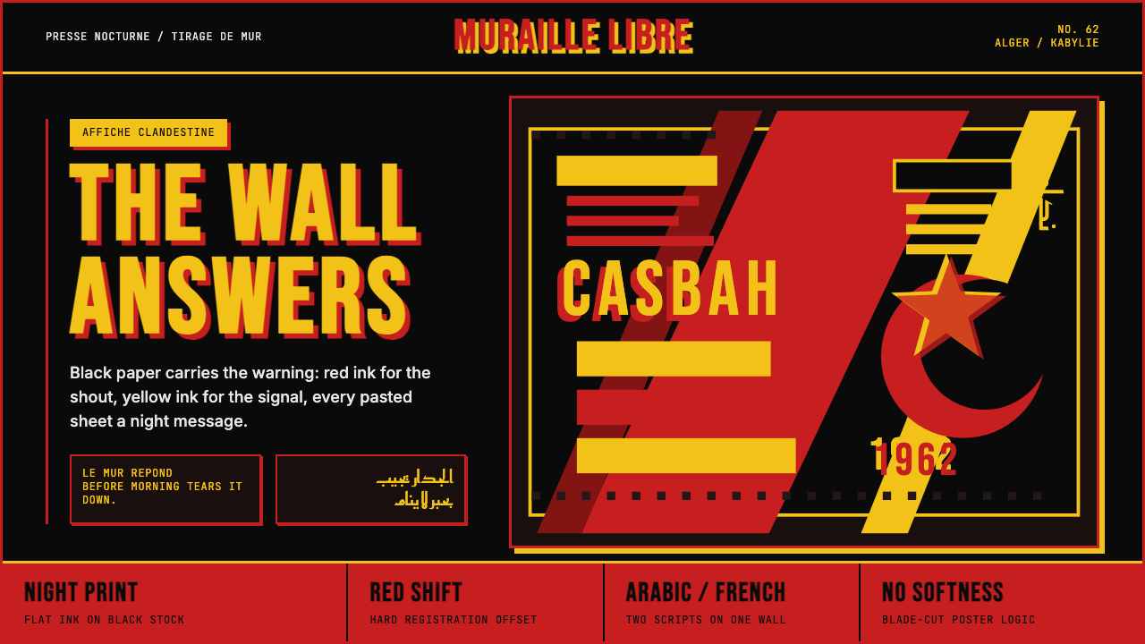 Algerian Casbah Poster (1954–1962)Every surface is a manifesto. Blood red, warning yellow, and stencil type hit…每个表面都是宣言:血红、警示黄与模板字撞上黑色新闻纸。
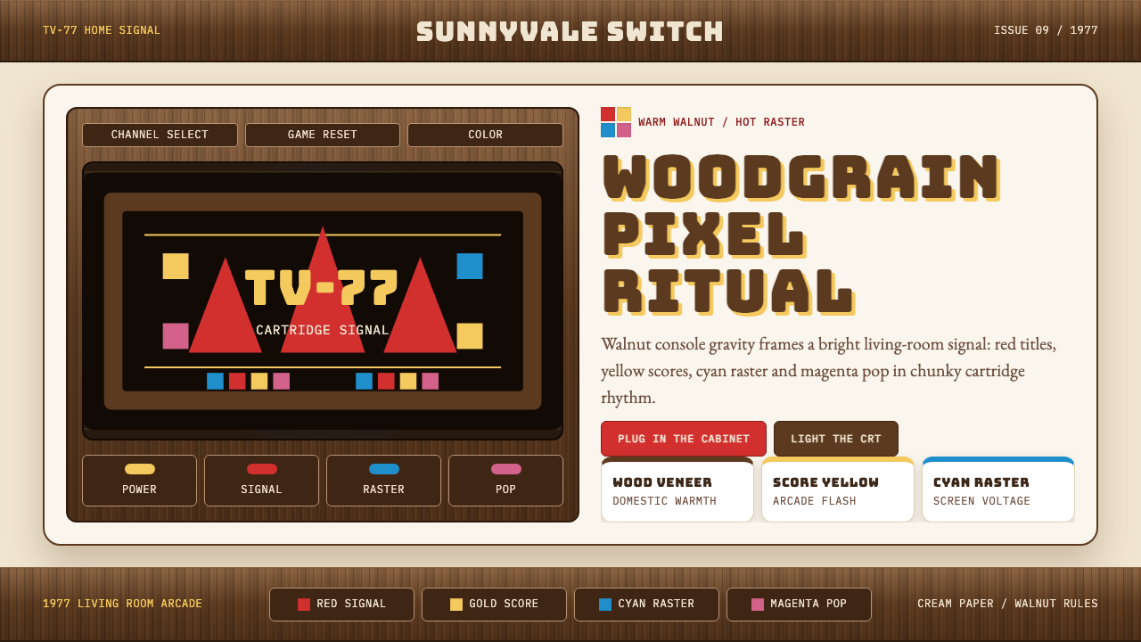 Atari 2600 (Woodgrain)Woodgrain meets raw pixels. Walnut panels frame Bungee type and CMYK raster b…木纹遇上生猛像素:胡桃木面板包裹Bungee字与CMYK色块。
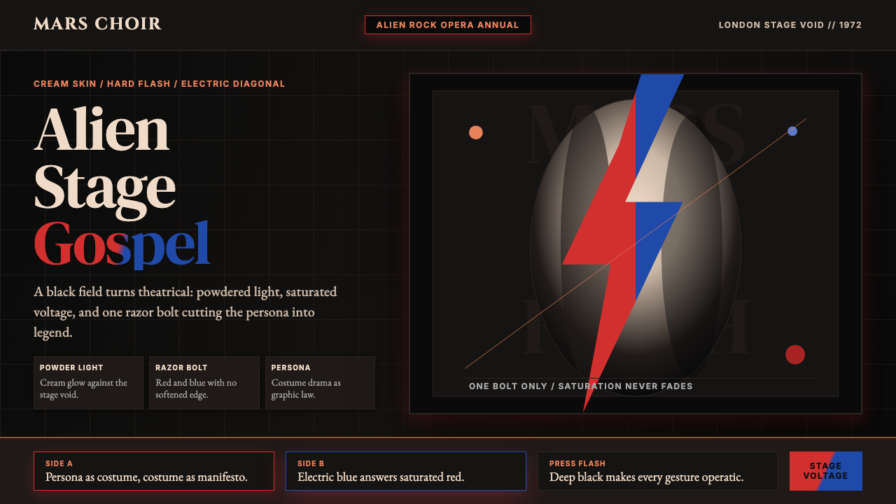 Bowie — Ziggy StardustTheater at full voltage. Cream-on-black portrait cut by one red and electric-…满电压的剧场感:黑底奶油肖像,被红与电蓝闪电劈开。
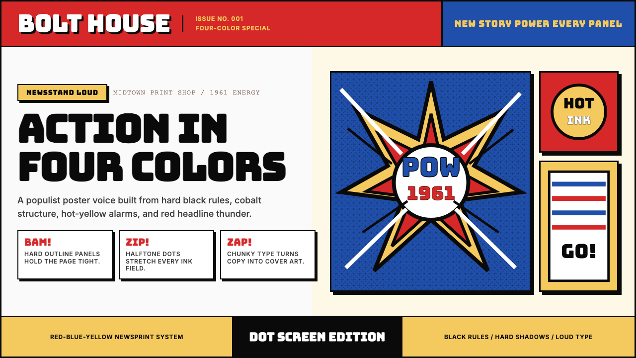 Marvel Comics (Kirby Era)Populist color hits hard. Red-blue-yellow panels, black rules, and halftone d…大众色彩直击眼球。红蓝黄画格、黑墨线与半调网点。
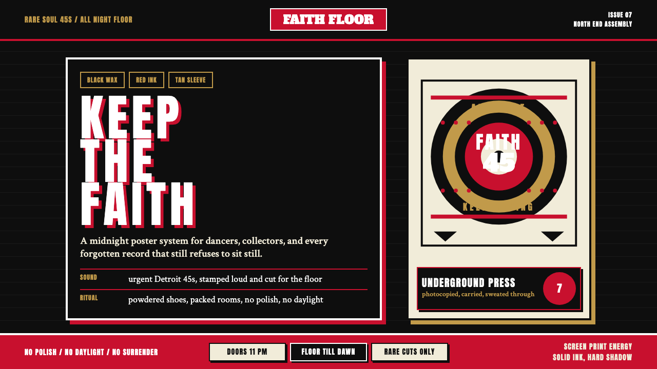 Northern Soul Wigan (1970)Underground urgency. Black ground, fist-red type, and tan vinyl rings hit lik…地下舞池的急迫感。黑底、拳红大字与唱片棕圆环像凌晨海报。
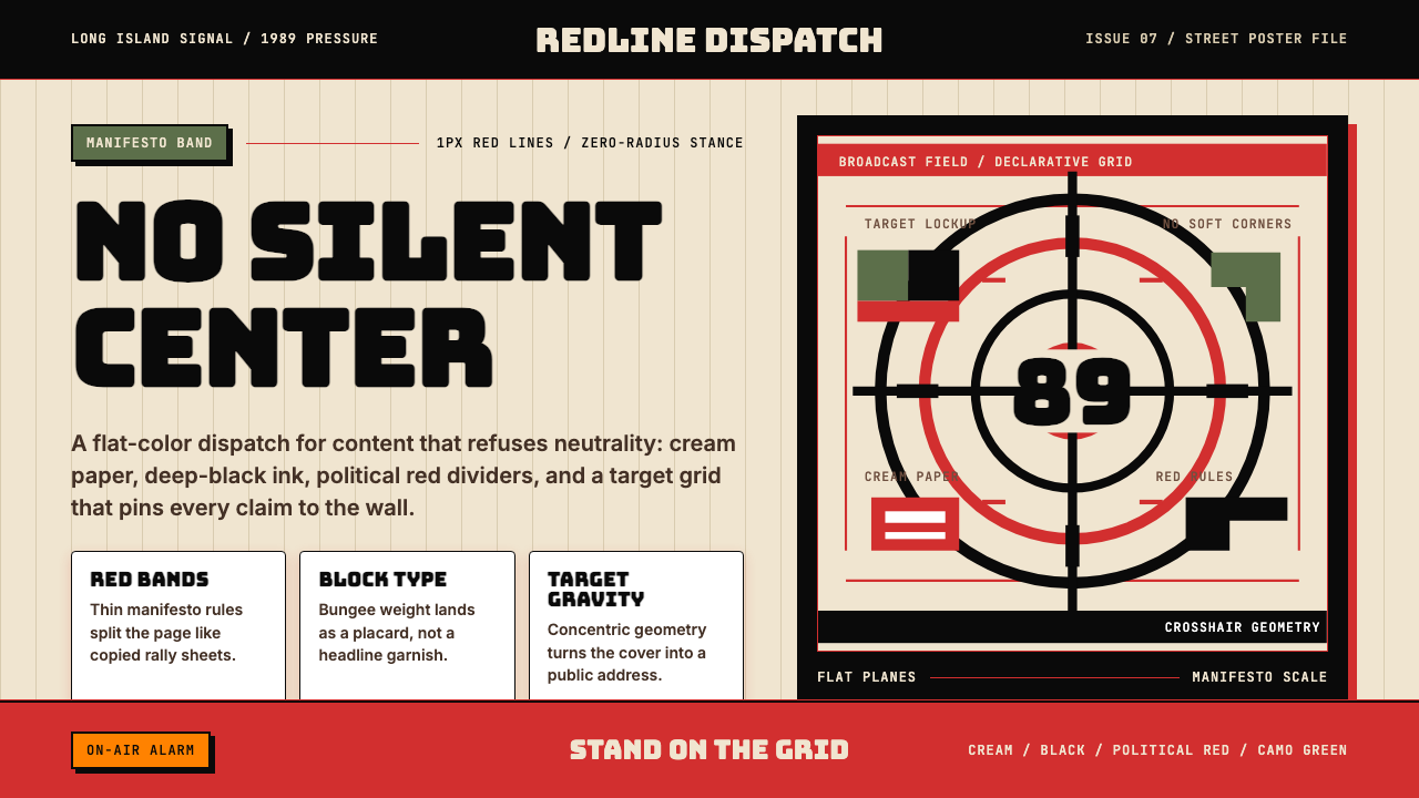 Public Enemy — Fight the PowerTakes a side loudly. Red bands, black ink, and target geometry hit like a ral…立场响亮:红色分栏、黑墨与准星几何像集会海报。