What is Atari 2600 (Woodgrain)?什么是 Atari 2600 (Woodgrain)?
Woodgrain and wild pixels: the Atari 2600 fused living-room warmth with the raw, saturated shock of early home video games.木纹与野性像素的相遇:雅达利 2600 将客厅的温暖质感,与早期家用电子游戏那种生猛、饱和的视觉冲击融为一体。
Atari 2600 (Woodgrain) in briefAtari 2600 (Woodgrain) 速览
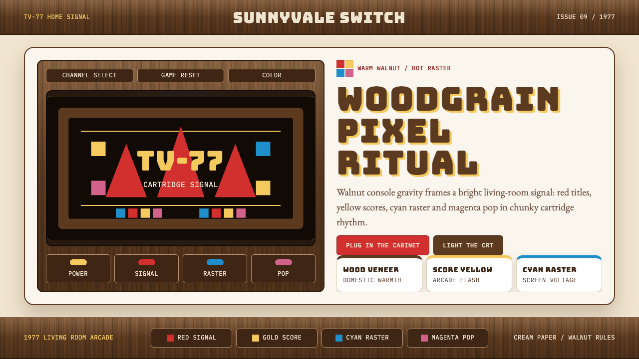
The Atari 2600 design aesthetic is a collision between two worlds that had no business touching each other in 1977. On one side: the warm, domesticated look of hi-fi stereo equipment — woodgrain veneer, muted earth tones, the visual language of the family living room. On the other: the violent, CRT-bright palette that a chip with barely enough memory to fill a screen could produce — screaming reds, electric yellows, punchy cyans, and saturated magentas that no furniture catalog would ever feature.雅达利 2600 的设计美学,是两个本不该在 1977 年相遇的世界之间的猛烈碰撞。一边是高保真音响设备的温暖居家外观——木纹贴面、静谧的大地色调、属于家庭客厅的视觉语言。另一边是显像管亮度下那种暴烈的色彩:一块勉强能填满屏幕的芯片所能喷射出来的刺眼红、电光黄、扎眼青与饱和品红,任何一本家居目录册都不会收录的颜色。
What makes the style distinctive is not one or the other impulse, but the unapologetic coexistence of both. The walnut brown of the console's fascia does not soften the pixel colors — it makes them louder by contrast. The chunky, blunt display type used for game labels and brand marks carries the same energy as those color blocks: nothing tapered, nothing polished, everything confrontational in the best possible sense. The Fuji-mountain logo — that stacked, symmetrical mountain shape — anchors the whole system as a kind of pop-cultural totem, equally at home on a woodgrain panel and a neon arcade cabinet.让这种风格与众不同的,不是其中任何一方的冲动,而是两者毫不妥协的共存。主机面板的胡桃木棕并没有柔化像素色——恰恰相反,它通过对比使那些颜色更响亮。游戏标签与品牌标志上使用的那种粗笨、直白的展示字体,与那些色块携带着相同的能量:没有收细的笔画,没有打磨的圆角,一切都以最好的方式直接对抗你的视线。富士山形商标——那个层叠、对称的山形轮廓——将整套系统锚定为某种流行文化的图腾,无论放在木纹面板上还是霓虹游戏厅机箱上,都同样自然。
As a design system, Atari 2600 style reads as warm retro-CMYK Americana. It belongs to a moment when consumer electronics were designed to live on the same shelf as the record player and the bookshelf speakers — when technology was expected to look domestic rather than clinical. Reviving it today means honoring that layered contradiction: earthy ground tones, primary-register pixel color, and bold typographic confidence working together without apology.作为一套设计系统,雅达利 2600 风格读起来是温暖的复古 CMYK 美国风。它属于一个消费电子产品被设计成与唱片机和书架音箱并排摆放的时代——那时技术产品被期望看起来像家居用品,而非实验室仪器。今天重新唤醒它,意味着尊重那种层叠的矛盾:大地底色、主色调像素用色与粗粝的排印自信,毫不道歉地协同工作。
See the Atari 2600 (Woodgrain) design system查看 Atari 2600 (Woodgrain) 完整设计系统
Where does Atari 2600 (Woodgrain) come from?Atari 2600 (Woodgrain) 从何而来?
Atari was founded in 1972 in Sunnyvale, California, by Nolan Bushnell and Ted Dabney, the same minds behind Pong — the coin-operated table tennis game that defined the arcade's first commercial moment. The 2600, originally sold as the Atari VCS (Video Computer System), launched in September 1977 and went on to sell approximately thirty million units over its commercial lifetime. It was not the first home console, but it was the first to achieve mass cultural penetration, transforming video games from arcade novelties into household objects.雅达利由诺兰·布什内尔与泰德·达布尼于 1972 年在加利福尼亚州森尼维尔创立,二人正是街机乒乓游戏《Pong》的幕后推手——那款定义了街机第一个商业时刻的游戏。2600 最初以「雅达利 VCS」(视频计算机系统)之名上市,于 1977 年 9 月发售,在其商业生命周期内累计售出约三千万台。它不是第一款家用游戏机,但它是第一款实现大众文化渗透的游戏机,将电子游戏从街机奇物转变为家庭器物。
The woodgrain veneer was a deliberate market-positioning decision. Consumer electronics in the mid-1970s were dominated by high-fidelity audio equipment — receivers, turntables, reel-to-reel decks — and that category had converged on a house aesthetic of warm wood panels, brushed metal accents, and dark earth tones. Atari's designers, working under the leadership of engineers including Jay Miner (who would later design the Amiga chipset), understood that a device intended to sit beneath the family television had to speak the same visual language as the furniture around it. The woodgrain said: this belongs here. It is not a toy.木纹饰板是一个经过深思熟虑的市场定位决策。1970 年代中期的消费电子市场由高保真音响设备主导——功放、转盘、盘式磁带机——而这个品类已经汇聚出一套共同的居家美学:温暖的木质面板、拉丝金属点缀与深沉的大地色调。雅达利的设计师们——包括后来设计出 Amiga 芯片组的工程师杰伊·迈纳——深知,一台注定要摆放在家庭电视机下方的设备,必须说出与周围家具相同的视觉语言。木纹在说:这台机器属于这里。它不是玩具。
George Opperman, Atari's in-house graphic designer during the company's most influential years, developed the visual identity that defined the brand's print and packaging output. The Fuji logo — named internally for its resemblance to Mount Fuji — was designed to be bold enough to read at arcade scale and warm enough to belong on a living-room box. Opperman's game-label artwork established the chromatic conventions of the style: saturated CMYK-register colors deployed in flat, graphic blocks rather than painterly gradations, with type that was heavy and direct rather than refined.乔治·奥珀曼是雅达利在公司最具影响力年代的内部平面设计师,他建立了定义品牌印刷品与包装产出的视觉识别系统。富士山形商标——内部以其与富士山外形的相似性命名——被设计得足够醒目,能在街机尺度下清晰辨认,同时又足够温暖,适合出现在客厅包装盒上。奥珀曼的游戏标签插图确立了这种风格的色彩惯例:以 CMYK 色域的饱和色彩铺设于平面、图形化的色块中,而非写实性的渐变,配以粗重直接而非精致的字体。
The CRT technology of the era was itself a design constraint that became an aesthetic. The television sets on which the 2600 was played could not render subtle color distinctions — they demanded bold, high-saturation primaries and secondaries that would survive the bloom and scan-line distortion of an analog tube. The palette that emerged from this technical limitation — roaring red, hot yellow, punchy cyan, raw magenta, against earthy woodgrain brown — was not a choice so much as a negotiation between what the hardware could produce and what the eye could parse on a phosphor screen. That negotiation produced one of the most recognizable chromatic signatures of twentieth-century consumer culture.那个时代的显像管技术本身是一种设计约束,却演变成了一种美学。用来运行 2600 游戏的电视机无法呈现细腻的色彩区分——它们需要粗犷、高饱和度的原色与间色,才能在模拟显像管的泛光与扫描线失真中幸存下来。从这种技术限制中浮现出来的色板——咆哮的红、炽热的黄、有力的青、原始的品红,衬托在木纹棕的底色上——与其说是一种选择,不如说是硬件能力与眼睛在磷光屏幕上所能解读的内容之间的一次协商。那次协商产生了二十世纪消费文化中最具辨识度的色彩签名之一。
What defines the Atari 2600 (Woodgrain) look?Atari 2600 (Woodgrain) 的视觉特征是什么?
Woodgrain Ground Tone木纹底色
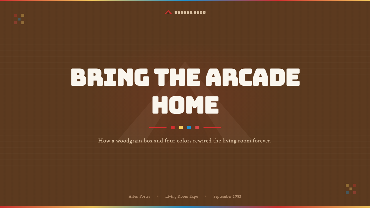
The foundational color of the system is a warm, medium walnut brown — the hue of mid-century hi-fi cabinetry. It functions as both background and anchor, giving the louder pixel colors something domesticated to push against. The brown is never cold or gray-shifted; it reads as organic and tactile even in a flat digital context. Using it at large scale, as a dominant field rather than an accent, is essential to achieving the right tonal balance.这套系统的基础色是温暖的中性胡桃木棕——二十世纪中叶高保真音响柜的色调。它同时充当背景与锚点,为那些更喧嚣的像素色提供一个有家居感的对立面。这种棕色绝不偏冷,也不带灰调;即便在数字平面环境中,它读起来也依然有机、有质感。以大面积铺设、作为主色调而非点缀色来使用,是实现正确调性平衡的关键。
Retro-CMYK Pixel Palette复古 CMYK 像素色板
The accent colors are drawn from the four corners of the CMYK model — a red with nothing softened about it, a yellow that vibrates at the warmest end of the spectrum, a cyan that pops with electric clarity, and a magenta that owes nothing to pastels. These are not muted or aged; they are used at full force, the way early game cartridge labels deployed them: in flat, bounded blocks of color that refuse to blend or fade. Against the woodgrain brown, each one ignites.强调色来自 CMYK 色彩模型的四个极点——一种毫不柔化的红,一种在色谱最温暖端振动的黄,一种以电光清晰度跳脱出来的青,以及一种与柔和色毫无瓜葛的品红。这些颜色不经过沉化或做旧处理;它们以全力登场,如同早期游戏卡带标签上的使用方式:平面、有边界的色块,拒绝混合或消散。在木纹棕的衬托下,每一种都被点燃。
Chunky Display Type粗壮展示字体
Headlines and brand marks in the Atari 2600 style use letterforms that are heavy, wide, and uncompromising — the visual equivalent of a fist rather than a brushstroke. The weight is extreme enough that counters shrink, spacing tightens, and the type mass begins to read almost as a texture block. There is no refinement of serifs or fine strokes; what exists is structural and load-bearing. The chunky type energy belongs equally to the era's arcade signage and to the product packaging that sat in the toy aisle.雅达利 2600 风格中的标题与品牌标志字体,使用的是粗重、宽阔、毫不妥协的字形——视觉上更接近拳头而非笔触。字重之重使字腔收窄、字距收紧,字体的质量感开始读起来几乎像一块纹理色块。没有衬线或细笔画的精致处理;存在的一切都是结构性的、承重性的。这种粗壮字体的气质,同等属于那个时代的街机招牌,以及摆放在玩具货架上的产品包装。
Flat Graphic Color Blocks平面图形色块
Color in this system is applied in solid, bounded regions — there are no gradients, no soft transitions between hues, no atmospheric blending. Each color occupies its territory as a flat field, the way a screen of limited color-depth was forced to render it. Shapes are filled entirely or left empty; the boundary between color regions is always crisp. This flatness is not a minimalist preference but a technical inheritance, and it gives the style its graphic, almost silkscreen-printed quality.这套系统中的色彩以实心、有边界的区域填充——没有渐变,没有色相之间的柔和过渡,没有大气混合。每种颜色占据着自己的领地,如同色彩深度有限的屏幕被迫呈现出来的那样。形状要么被完整填充,要么保持空白;色彩区域之间的边界始终清晰。这种平面感不是极简主义的偏好,而是技术的遗产,它赋予这种风格一种图形化的、几乎像丝网印刷的品质。
The Fuji Mountain Mark富士山形标志
The Atari logo — three stacked vertical bars tapering outward, evoking a mountain silhouette — is a masterclass in geometric brand economy. It is symmetrical, immediately reproducible at any scale, and bold enough to hold its own against competing visual noise. In the 2600 system, the mark functions as a modular compositional anchor: it can appear in any of the palette colors on any ground, and it retains identity through sheer geometry. Its presence signals the entire system without needing to announce itself through color or weight.雅达利商标——三条垂直线向外渐宽叠放,唤起山形轮廓——是几何品牌经济学的典范。它对称、可在任何尺寸下即刻复现,且足够醒目,能在竞争性视觉噪音中独树一帜。在 2600 设计系统中,这个标志充当模块化的构图锚点:它可以在任何底色上以任何色板颜色呈现,并通过纯粹的几何形保持身份辨识度。它的出现就能召唤整套系统,而无需借助色彩或字重来自我宣告。
Serif Body Counterpoint衬线正文的对位
Against the blunt display type, a classical serif typeface in body-copy weight introduces unexpected gravity and readability. The contrast between the heavy, blocky headline register and the refined, proportioned serif below it creates typographic tension that reads as historically layered — the warmth of mid-century print culture meeting the bluntness of early digital display. The serif does not compete with the display type; it provides a resting point, the eye's relief after the collision of wood and neon.在粗壮的展示字体旁边,一种正文字重的经典衬线字体引入了意料之外的庄重感与可读性。沉重、块状的标题级与其下方精致、匀称的衬线字之间的对比,制造出一种历史层叠感的排印张力——二十世纪中叶印刷文化的温暖,与早期数字显示的直白相遇。衬线字体不与展示字体竞争;它提供一个栖息点,是眼睛在木纹与霓虹的碰撞之后的喘息之处。
Domestic-Scale Composition居家尺度的构图
Layouts in this style are confident and frontal, organized around a strong central axis or a bold asymmetric block composition. There is nothing tentative about the arrangement: elements are placed as if they belong exactly where they are, in the same way that a console sits with authority beneath a television set. Margins are generous rather than cramped; the visual field breathes. The overall impression is of something designed to be read from across the room, on a shelf, in a living space — not squinted at on a desk.这种风格的版面构图自信而正面,围绕强烈的中心轴线或粗粝的非对称色块构图展开。布置上没有任何犹豫:元素被摆放得仿佛它们天生就该在那里,正如游戏机以主人的姿态坐在电视机下方。边距宽松而非逼仄;视觉场域有呼吸感。整体印象是一种为从房间对面、书架上、生活空间中被看见而设计的东西——而非在书桌前眯眼细看的东西。
See the Atari 2600 (Woodgrain) design system查看 Atari 2600 (Woodgrain) 完整设计系统
Who shaped Atari 2600 (Woodgrain)?谁塑造了 Atari 2600 (Woodgrain)?
Bushnell co-founded Atari in 1972 and drove the company's early strategic vision, including the push to bring video games from arcades into living rooms. His decision to pursue the consumer home-console market — at a time when the very concept was commercially unproven — established the product category that the 2600 would define. The choice to position the device as a hi-fi-adjacent home entertainment product, complete with woodgrain styling, was consistent with Bushnell's instinct for making technology feel approachable rather than intimidating.布什内尔于 1972 年联合创立雅达利,并推动了公司的早期战略愿景,包括将电子游戏从街机厅带入客厅的努力。在家用游戏机这一概念在商业上尚未得到验证的时候,他力主进军消费家用机市场——这一决定定义了 2600 将要确立的产品品类。将这台设备定位为与高保真音响并列的家庭娱乐产品、以木纹造型呈现的选择,契合了布什内尔让技术产品显得亲切而非令人生畏的直觉。
Miner was the lead chip designer behind the Atari 2600's Television Interface Adaptor (TIA), the hardware component responsible for generating the console's graphics and sound output. The TIA's technical constraints — its limited color registers, its requirement for the CPU to manually feed it scanline by scanline — directly produced the aesthetic vocabulary of the era. Miner later left Atari to design the Amiga chipset, which offered a dramatically expanded color palette, but the visual culture seeded by his earlier work remained a defining reference for pixel-era aesthetics.迈纳是雅达利 2600 电视接口适配器(TIA)的首席芯片设计师,该硬件组件负责生成游戏机的图像与声音输出。TIA 的技术限制——有限的色彩寄存器数量、需要 CPU 逐扫描线手动馈送数据——直接催生了那个时代的视觉美学词汇。迈纳后来离开雅达利去设计提供了极大扩展色彩能力的 Amiga 芯片组,但他早期工作所播种的视觉文化,仍然是像素时代美学最具定义性的参照。
Opperman served as Atari's primary in-house graphic designer during the company's most culturally potent years, and his work defined the visual language audiences associate with the brand. He designed the Fuji mountain logo that became one of the most recognized marks in gaming history, and developed the chromatic and typographic conventions of Atari's game packaging and promotional materials. Opperman's instinct for bold, flat, high-saturation imagery — practical given the printing limitations of the era — produced a house style that proved durable enough to survive decades of cultural revision.奥珀曼在雅达利最具文化影响力的年代担任主要内部平面设计师,他的工作定义了观众与这个品牌相关联的视觉语言。他设计了富士山形商标——那个成为游戏史上最具辨识度标志之一的图案——并建立了雅达利游戏包装与宣传材料的色彩和排印惯例。奥珀曼对粗犷、平面、高饱和度图像的直觉——在那个时代的印刷限制下具有实际意义——产生了一种被证明足够耐久、能够经受数十年文化修订的品牌风格。
Miller was one of Atari's most prolific early game programmers and later a co-founder of Activision, the first third-party game developer for the 2600. The founding of Activision in 1979 opened the platform to independent visual creativity and led to a rapid expansion of the cartridge-label aesthetic — Activision's packaging introduced richer illustrative imagery alongside the flat color conventions Opperman had established, further developing the visual culture of the platform beyond Atari's own in-house work.米勒是雅达利最多产的早期游戏程序员之一,后来成为 Activision 的联合创始人——这是第一家为 2600 开发游戏的第三方游戏商。1979 年 Activision 的成立向这个平台开放了独立视觉创意,并导致卡带标签美学的快速扩展:Activision 的包装在奥珀曼确立的平面色彩惯例之外引入了更丰富的插图图像,进一步在雅达利自己的内部工作之外发展了这个平台的视觉文化。
How do you use Atari 2600 (Woodgrain) today?今天怎么用 Atari 2600 (Woodgrain)?
Applying Atari 2600 style successfully requires understanding what it is actually doing structurally: it is a collision system, not a harmony system. The woodgrain warmth and the pixel colors are in productive tension, not blended agreement. Every application decision should preserve and amplify that tension rather than resolve it. If the layout starts to feel decorative or nostalgic in a soft way, the tension has been lost — one register has surrendered to the other.成功应用雅达利 2600 风格,需要理解它在结构上实际做的事:它是一套碰撞系统,而非和谐系统。木纹的温暖与像素色彩处于富有成效的张力之中,而非融合的共识之中。每一个应用决策都应该保留并放大这种张力,而非化解它。如果版面开始以某种柔和的方式感觉装饰性或怀旧,那么张力已经丢失——某一方的声部已经向另一方妥协了。
For presentation slides, the style delivers strong results on both cover and content pages when its scale hierarchy is respected. A cover slide works best as a near-full-bleed woodgrain brown field with the title in heavy display type — white or the palette's most aggressive accent color — and the Fuji mark or a geometric silhouette anchoring a corner. Content slides should treat each page as a bounded color block: section headers in chunky type on a single accent color bar, body text in a classical serif below, data or bullets in contained regions with color used to assign meaning rather than decoration.在演示文稿中,当这种风格的尺度层级被尊重时,它在封面页和内容页上都能取得强劲效果。封面幻灯片最适合以接近满版出血的木纹棕色场为底,标题使用粗重展示字体——白色或色板中最具攻击性的强调色——并以富士山形标志或几何剪影锚定某个角落。内容幻灯片应将每一页视为一个有边界的色块:节标题以粗壮字体印在单一强调色横条上,正文以经典衬线字体置于其下,数据或要点置于有边界的区域中,用色彩来指定含义而非装饰。
For web interfaces, the system excels on surfaces where confident hierarchy and strong brand presence matter more than neutrality. Dashboard pages, pricing tables, and product landing pages benefit from the style's frontal compositional energy. The approach: a walnut-brown hero section with white or accent-colored type, transitioning to near-white content areas where flat color-block components replace shadowed cards. Interactive states — hover, selected, active — are distinguished by switching between palette colors rather than lightening or darkening a single hue. Navigation is typographic and direct, with no gradient backgrounds or ambient shadow effects.对于网页界面,这套系统在自信的层级感与强烈的品牌存在感比中立性更重要的界面上表现卓越。仪表板页面、定价表格与产品落地页受益于这种风格正面的构图能量。方法如下:以胡桃木棕为主色调的英雄区,配以白色或强调色字体,过渡到近白色的内容区——在那里平面色块组件替代有阴影的卡片。交互状态——悬停、选中、激活——通过在色板颜色之间切换来区分,而非对单一色调进行提亮或压暗。导航以字体排印方式呈现,直接明了,不使用渐变背景或环境阴影效果。
For editorial and marketing work, the style performs exceptionally in contexts calling for bold cultural presence — event posters, campaign key visuals, brand identity treatments where the product wants to signal warmth and analog confidence without nostalgia cliche. An editorial spread using this language places chunky headline type over a woodgrain-brown band at full column width, drops into serif body text at comfortable reading size, and uses isolated flat color blocks — not full-width washes — to mark structural section changes. Marketing applications work well with the constraint of one dominant accent color per execution, with the others appearing only in functional roles.对于编辑与营销作品,这种风格在需要强烈文化存在感的场景中表现出色——活动海报、活动主视觉、品牌识别处理,这些场合下产品希望传达温暖感与模拟质感的自信,而非怀旧陈腔。使用这种语言的编辑跨页,在全列宽处将粗壮标题字体置于木纹棕色横带上,向下过渡到舒适阅读尺寸的衬线正文,并使用孤立的平面色块——而非全宽色洗——来标记结构性段落转换。营销应用适合使用每次执行一种主导强调色的约束,其余颜色仅在功能性角色中出现。
The most common mistake when applying this style is treating it as mere retro-gaming pastiche — adding scan-line textures, pixel-grid overlays, or heavily distressed treatments that signal nostalgia rather than authority. Authentic Atari 2600 design was not trying to look vintage; it was trying to look contemporary and premium by the standards of its moment. The correct frame is confidence, not irony. A second common error is using the pixel accent colors at equal weight and frequency, which produces visual competition rather than the purposeful hierarchy the system requires. Choose one accent as the dominant, deploy a second sparingly for contrast or emphasis, and let the woodgrain brown carry the majority of the visual field.应用这种风格时最常见的错误,是将其视为单纯的复古游戏风格——添加扫描线纹理、像素网格叠加层或大量做旧处理,这些都在传递怀旧感而非权威感。真正的雅达利 2600 设计并不试图显得复古;它是在以其所处时代的标准,试图显得当代与高级。正确的框架是自信,而非反讽。另一个常见错误是以相同的分量和频率使用所有像素强调色,这会产生视觉竞争而非系统所需的有目的层级感。选定一种强调色作为主导,极少量地部署第二种以形成对比或强调,让木纹棕承载视觉场域的大部分面积。
See the Atari 2600 (Woodgrain) design system查看 Atari 2600 (Woodgrain) 完整设计系统
Atari 2600 (Woodgrain) — FAQAtari 2600 (Woodgrain) · 常见问题
Is this a dark or light style?这是深色风格还是浅色风格?
It is neither in the conventional sense. The dominant field color is a medium walnut brown — warmer and more saturated than a neutral gray, but not dark enough to function as a true dark-mode equivalent. On this ground, both light type and vivid accent colors read clearly. Contemporary applications most commonly invert to a near-white field for extended reading sections, using the walnut brown as a banding or accent block color rather than a continuous background. A true dark variant is possible but should use deep charcoal or near-black rather than trying to darken the brown itself, which tends to become muddy.在传统意义上两者都不是。主色调场域色是中性的胡桃木棕——比中性灰更温暖、更饱和,但又不够暗,无法作为真正的深色模式等效物。在这个底色上,浅色字体与鲜艳的强调色都能清晰呈现。当代应用最常见的做法是将延伸阅读区域反转为近白色场域,以胡桃木棕作为横带或强调色块而非连续背景。真正的深色变体是可行的,但应使用深炭灰或近黑色,而非尝试将棕色本身压暗——后者往往会变得浑浊。
Can this style work for a SaaS product, or does it read too much as gaming or nostalgia?这种风格能用于 SaaS 产品吗,还是读起来太像游戏或怀旧?
It works well for SaaS products that want to signal warmth, personality, and a counterintuitive premium feel — developer tools, creative platforms, productivity applications that want to distance themselves from the cold minimalism of enterprise software. The gaming and nostalgia readings are real risks, and they are mitigated primarily by typographic restraint and compositional seriousness. If the display type is chosen for weight and authority rather than pixel-era novelty, and if the layout is structured rather than playful, the woodgrain-and-color combination reads as distinctive and confident rather than retro. The risk increases when scan-line filters, pixel-art illustrations, or arcade references are added to the mix.它适用于希望传递温暖感、个性与反直觉高级感的 SaaS 产品——开发者工具、创意平台、希望与企业软件冷漠极简主义保持距离的生产力应用。游戏感和怀旧感是真实存在的风险,主要通过排版的克制与构图的严肃性来缓解。如果展示字体是因其分量感和权威感而被选择,而非因其像素时代的新奇性;如果版面是结构性的而非嬉戏性的,那么木纹与色彩的组合读起来就是独特而自信的,而非复古的。当扫描线滤镜、像素画插图或街机风格元素被加入其中时,风险随之上升。
How do you avoid the layout looking like a video game box from the 1980s?如何避免版面看起来像 1980 年代的游戏盒?
The main levers are typography and spatial rhythm. Video game packaging of the era was necessarily dense — it had to communicate product identity, feature claims, rating information, and brand marks in a very constrained physical space. Contemporary applications of this style have the luxury of generous margins and breathing room that the original packaging did not. Prioritize open field areas of walnut brown with one or two large typographic elements over cluttered multi-element compositions. Use the serif body text to introduce reading-oriented calm, and resist the temptation to fill every region with a different accent color. The distinction between a designed composition and a packaged product often comes down to how much the designer was willing to leave empty.主要的调节杠杆是排版和空间节奏。那个时代的游戏包装必然是密集的——它需要在非常有限的物理空间内传达产品识别、功能声称、评级信息和品牌标志。这种风格的当代应用拥有原始包装所没有的奢侈品:宽松的边距与呼吸空间。优先选择以一两个大型排印元素点缀的开阔胡桃木棕场域,而非拥挤的多元素构图。使用衬线正文字体来引入阅读导向的平静,并抵制用不同强调色填满每个区域的诱惑。一个设计构图与一个包装产品之间的区别,往往取决于设计师愿意留空多少。
Does the Atari 2600 style suit editorial long-form content, or is it mainly for hero and marketing surfaces?雅达利 2600 风格适合长篇编辑内容吗,还是主要适用于英雄区和营销界面?
The style is strong on marketing and hero surfaces where the tension between the brown ground and the accent colors can work at full scale. In long-form editorial contexts, it requires more careful handling: the woodgrain brown should recede to the background of section headers and pull-quotes rather than dominating the reading surface, which should stay near-white for sustained readability. The serif body text carries the style's warmth into long reading without the visual noise of the pixel palette. Think of it as a style that frames the reading experience from the outside — establishing character in the masthead, section breakers, and running heads — rather than one that saturates the reading field itself.这种风格在营销和英雄区界面上表现强劲,在那里棕色底与强调色之间的张力能以全尺度运作。在长篇编辑内容场景中,它需要更谨慎的处理:木纹棕应该退居节标题和引语提拉块的背景,而非主导阅读界面——阅读界面应保持近白色以维持持续的可读性。衬线正文字体将这种风格的温暖带入长篇阅读,而不引入像素色板的视觉噪音。将其视为一种从外部框定阅读体验的风格——在报头、段落分割符和页眉中建立个性——而非一种饱和阅读场域本身的风格。
Is the woodgrain element literal — should it use a texture — or is it purely about color?木纹元素是字面意思的——应该使用纹理——还是纯粹关于颜色?
Both approaches are historically grounded and contextually valid. The original Atari 2600 used a photographic woodgrain vinyl — a literal material texture. In print and digital contexts, working with a flat walnut brown color field, without any simulated woodgrain texture, is entirely appropriate and often cleaner: it preserves the color identity and warmth without introducing a surface detail that competes with the type or color blocks. A subtle, low-contrast woodgrain texture can be added for physical print applications — posters, packaging, merchandise — where the tactile reference feels earned. For digital screens, the flat color is typically more resolved and avoids the dated quality that overly literal texture effects tend to carry.两种方式都有历史依据,在不同语境下都成立。原始的雅达利 2600 使用的是摄影木纹贴膜——一种字面意义上的材料纹理。在印刷和数字语境中,使用平面的胡桃木棕色场——不带任何模拟木纹纹理——是完全恰当的,而且通常更清爽:它保留了色彩的识别性与温暖感,而不引入会与文字或色块竞争的表面细节。可以为实体印刷应用——海报、包装、周边商品——添加低对比度的细微木纹纹理,在那里触感参照感觉是值得的。对于数字屏幕,平面色通常更为完整,也能避免过于字面化的纹理效果所倾向于携带的过时感。
Related design styles相关设计风格
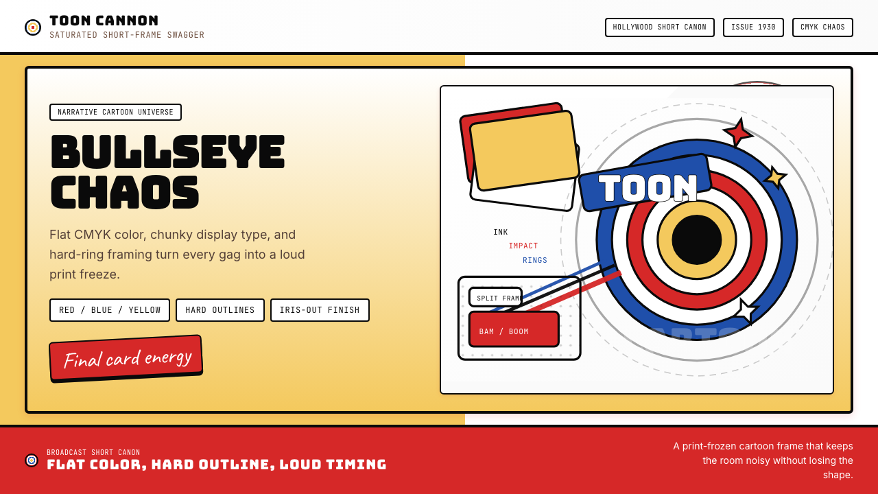 Looney Tunes (Warner Bros.)Pure cartoon chaos. Bull's-eye rings, Bungee type, and red-blue-yellow blocks.纯卡通混乱。牛眼环、粗壮标题字与红蓝黄块面。
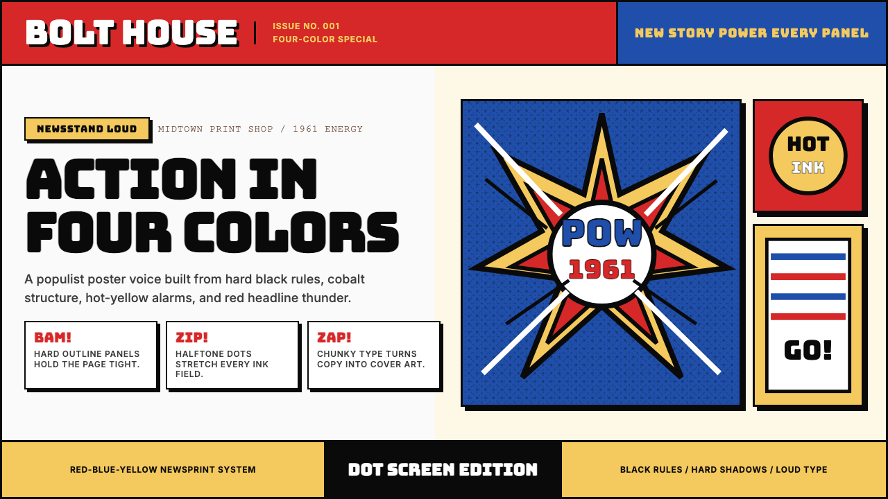 Marvel Comics (Kirby Era)Populist color hits hard. Red-blue-yellow panels, black rules, and halftone d…大众色彩直击眼球。红蓝黄画格、黑墨线与半调网点。
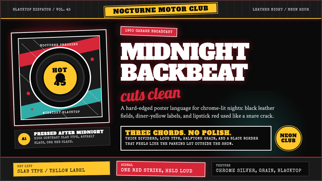 Rockabilly Greaser (1950)Loud after midnight. Asphalt black, chrome-yellow circles, and one lipstick-r…午夜后更响:沥青黑、铬黄圆标与一记唇膏红。
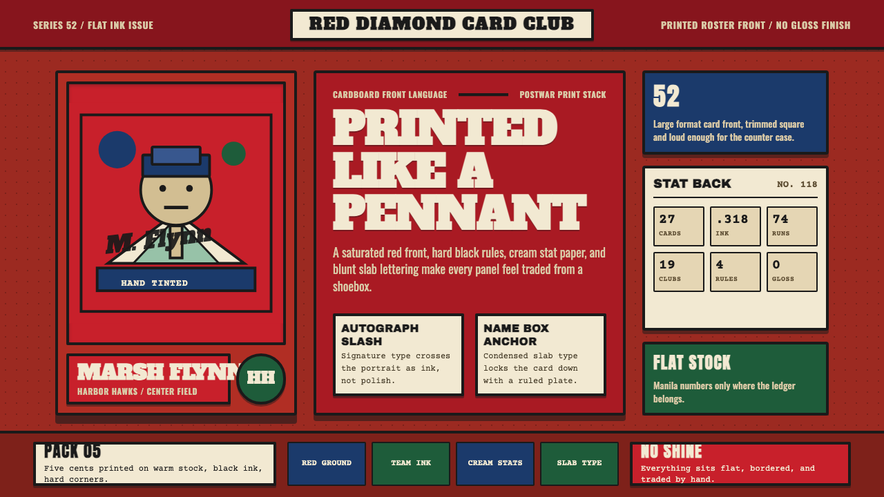 Topps Baseball CardCardboard heat. Brick-red slab panels, cream stats, and condensed type feel p…纸卡热度:砖红板块、米黄数据与压缩粗体,像平版印刷。
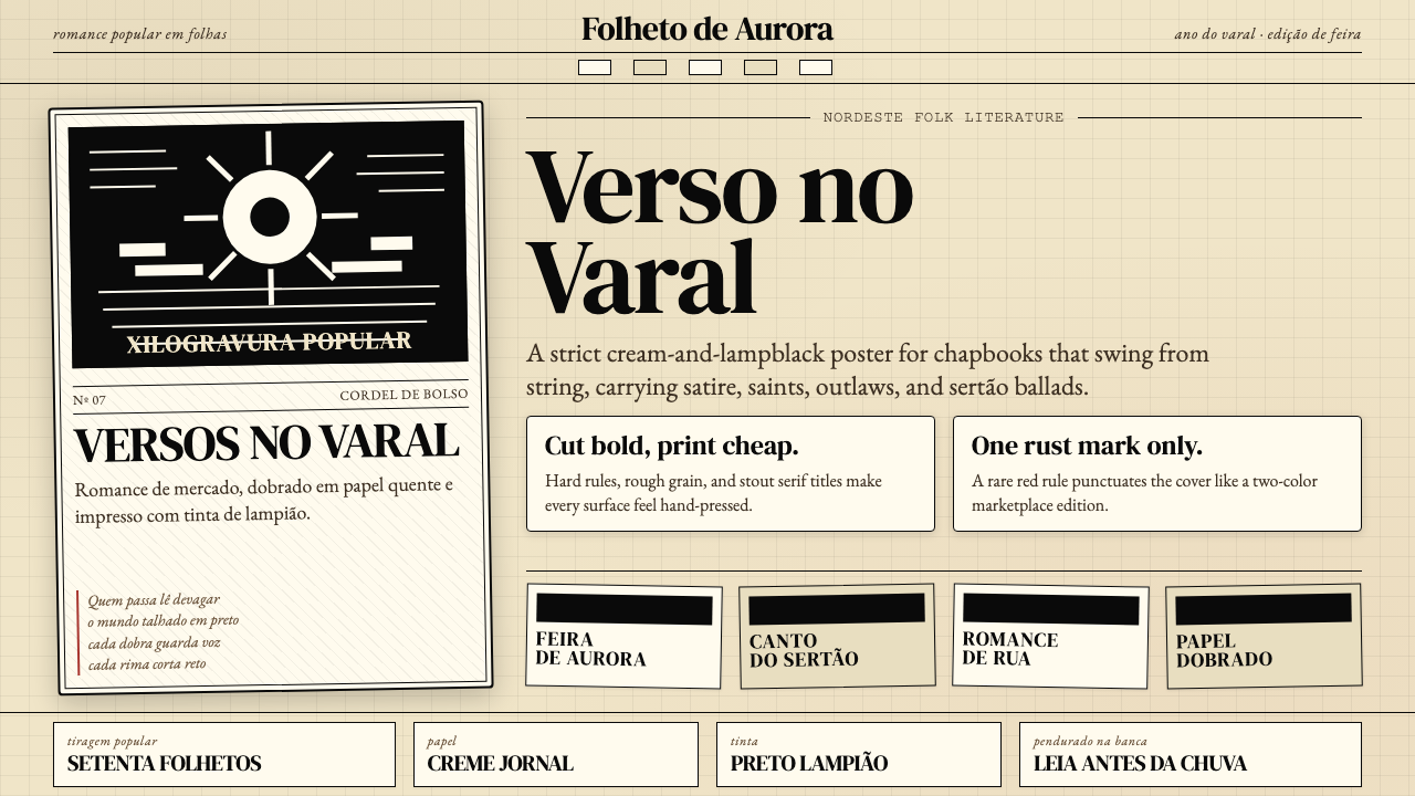 Brazilian Cordel (Northeast Folk Literature)Folk poetry, cut in lampblack. Cream newsprint, bordered chapbooks, one rust-…民间诗被灯黑刻出:奶油新闻纸、黑框小册与一笔锈红。
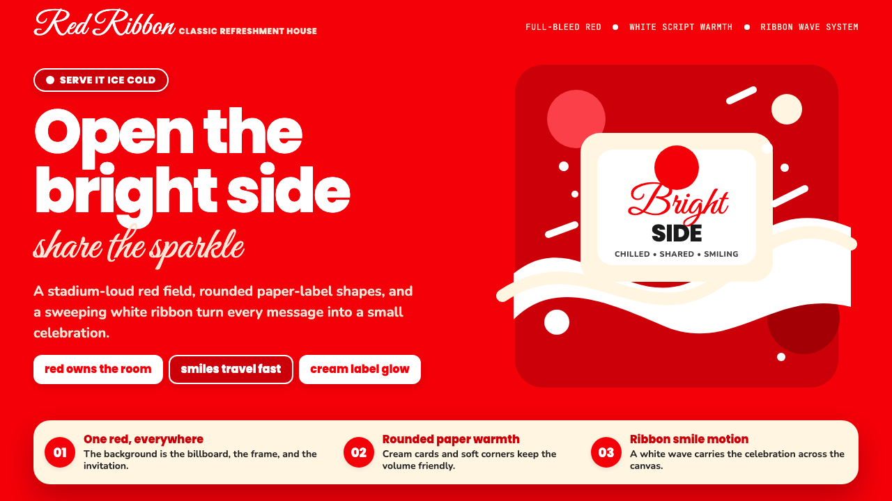 Coca-Cola ClassicHappiness goes full-bleed. Signature red, white ribbon waves, and warm rounde…快乐铺满全屏:标志性红、白色缎带波浪与圆润字体。