What is Coca-Cola Classic?什么是 Coca-Cola Classic?
For over a century, a single shade of red and a looping script have made Coca-Cola the most emotionally charged brand identity on earth.一个多世纪以来,一种红与一笔连体字,让可口可乐成为地球上情感张力最强的品牌视觉体系。
Coca-Cola Classic in briefCoca-Cola Classic 速览
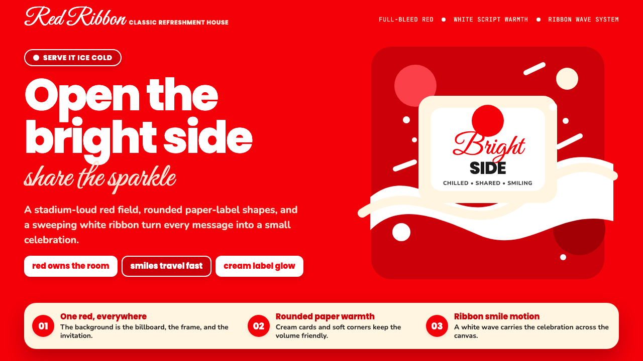
Coca-Cola Classic is not merely a brand identity — it is one of the most studied cases of how consistent visual language can fuse with collective memory to become culturally load-bearing. The system is built on three interlocking pillars: an unmodernized Spencerian script logo, a single dominant red that saturates every surface it touches, and a set of curvilinear supporting motifs — the ribbon wave, the contour bottle silhouette, and a grammar of roundness — that soften the red's intensity into something celebratory rather than aggressive.可口可乐经典视觉体系不只是一套品牌识别——它是研究视觉语言如何与集体记忆融合、进而成为文化承重柱的最重要案例之一。这套体系建立在三根互锁的支柱之上:从未被现代化的Spencerian花体字logo、将每一寸触及的表面都染透的单一主红,以及一套曲线辅助母题——缎带波浪线、弧形玻璃瓶轮廓、以及将圆润贯穿始终的视觉语法——将红色的强度柔化为庆典感而非攻击性。
The aesthetic is warm, unapologetically saturated, and deliberately populist. Nothing about it is neutral. Where minimalist systems withdraw to let the product speak, the Coca-Cola visual language advances — it floods the frame, it cheers, it performs happiness at full volume. The script logo is never simplified into a sans-serif; the red is never muted into a blush or a coral; the ribbon dividers are never replaced with flat rules. Every element is a committed choice, held stable across decades as a declaration that the brand's emotional promise does not need updating.这套美学是温暖的、毫不掩饰的高饱和度的、刻意大众化的。它没有任何中立之处。极简体系选择退场,让产品自己说话;可口可乐的视觉语言则选择前进——它淹没画框,它欢呼,它用全音量表演快乐。花体logo从不被简化为无衬线字体;红色从不被调柔为粉色或珊瑚色;缎带分割线从不被替换为平直线条。每一个元素都是经过承诺的选择,历经数十年保持稳定,宣告着这个品牌的情感承诺不需要更新。
Understanding this system means recognizing that its apparent simplicity is the result of extreme discipline, not the absence of design decisions. Every curve, every wave, every degree of roundness in the supporting type has been tested against the core belief that warmth and global recognition are inseparable. The Coca-Cola Classic style is, in this sense, the anti-Bauhaus: where Bauhaus refines toward structural logic, Coca-Cola refines toward emotional resonance.理解这套体系,意味着认识到它表面上的简洁是极度克制的结果,而非设计决策的缺席。每一条曲线、每一道波浪、辅助字体的每一分圆润,都经过了对核心信念的检验:温暖与全球辨识度是不可分割的。从这个意义上说,可口可乐经典风格是反包豪斯的——包豪斯向结构逻辑精炼,可口可乐向情感共鸣精炼。
See the Coca-Cola Classic design system查看 Coca-Cola Classic 完整设计系统
Where does Coca-Cola Classic come from?Coca-Cola Classic 从何而来?
The Coca-Cola visual system has its roots in a single act of penmanship. In 1887, Frank Mason Robinson — bookkeeper and business partner of the drink's inventor, John Stith Pemberton — wrote the name 'Coca-Cola' in the ornate, looping Spencerian script that was then the prestige hand of American commercial correspondence. Robinson's choice was not arbitrary: Spencerian script signaled professionalism and aspiration in the era of hand-written ledgers and calling cards. What Robinson could not have known was that the script he put to paper that year would remain essentially unchanged for more than thirteen decades, becoming one of the most reproduced letterforms in human history.可口可乐的视觉体系根植于一次书写行为。1887年,Frank Mason Robinson——这位饮料发明者John Stith Pemberton的簿记员兼商业伙伴——用当时美国商业信函中最具声望的手写字体Spencerian花体,写下了「Coca-Cola」这个名字。Robinson的选择并非随意:在手写账本与名片的年代,Spencerian花体代表着专业与抱负。他无从预知的是,那一年落笔的字形在此后超过一百三十年里几乎未经改动,成为人类历史上被复制次数最多的字形之一。
The red that now defines the brand arrived gradually. Early Coca-Cola advertising used a range of colors — greens, yellows, and oranges all appeared in nineteenth-century promotional materials. Red consolidated its dominance in the early twentieth century, in part because red signs were permitted on the sides of barns and buildings when other colors were not, giving the brand disproportionate outdoor presence. By the time the mid-century advertising boom arrived, red was inseparable from Coca-Cola in consumer perception, and the company systematized it accordingly. The contour bottle — the hourglass-shaped glass vessel designed in 1915 by the Root Glass Company in Terre Haute, Indiana, in response to a Coca-Cola brief requesting a bottle so distinctive it could be recognized in the dark — provided the system's defining three-dimensional form, and its silhouette entered the flat graphic language as a recurring motif.如今定义这个品牌的红色是逐渐确立的。早期可口可乐广告使用过多种颜色——绿色、黄色和橙色都曾出现在十九世纪的宣传物料中。红色在二十世纪初逐步确立主导地位,部分原因在于:当其他颜色的广告牌受到限制时,红色标牌仍被允许刷在谷仓和建筑墙面上,这赋予了这个品牌不成比例的户外曝光优势。到了世纪中期的广告繁荣时代,消费者认知中红色已与可口可乐不可分割,公司随之将其系统化。1915年,印第安纳州特雷霍特市的Root玻璃公司按照可口可乐的要求——设计一款在黑暗中也能被认出的瓶子——设计出了沙漏形弧形玻璃瓶;这个瓶型为整套体系提供了决定性的三维形态,其轮廓随后以反复出现的母题形式进入平面视觉语言。
The most consequential single creative contribution to the modern Coca-Cola identity was not made by a graphic designer but by an illustrator. Beginning in 1931, the American artist Haddon Sundblom produced a series of holiday advertisements for Coca-Cola depicting Santa Claus — round, red-suited, warm-faced — drinking the product in domestic interiors. Sundblom painted the campaign for thirty-three years, and his version of Santa, which drew on the earlier work of Thomas Nast but amplified its warmth and commercial appeal, became the globally dominant image of the figure. The Sundblom Santa did not merely sell a seasonal beverage; it demonstrated that the Coca-Cola visual system could take a pre-existing cultural icon and absorb it into its own emotional register so completely that the two became permanently identified with each other.对现代可口可乐视觉识别最具决定性意义的单一创意贡献,来自一位插画家而非平面设计师。从1931年起,美国艺术家Haddon Sundblom为可口可乐绘制了一系列节日广告,描绘着圆脸红衣、面容温暖的圣诞老人在家庭室内饮用这款产品。Sundblom坚持创作这个系列长达三十三年,他笔下的圣诞老人形象——以Thomas Nast的早期作品为基础,但将温暖感与商业吸引力放大——成为这一形象的全球主流版本。Sundblom的圣诞老人不只是在卖一款季节性饮料;他证明了可口可乐的视觉体系有能力将一个既有的文化图腾完全吸收进自己的情感频道,以至于两者永久相互锚定。
The identity reached its most refined and systematized form in 1969, when the design consultancy Lippincott and Margulies codified the 'Dynamic Ribbon Device' — the flowing wave element that appears beneath the logo and on packaging — establishing it as a permanent structural element of the system. This refinement introduced the disciplined relationship between the script wordmark, the ribbon, and the red field that contemporary designers recognize as canonical Coca-Cola. The system has been maintained and evolved by successive design programs through the early twenty-first century, each iteration preserving the Spencerian script, the red dominance, and the curvilinear warmth as non-negotiable constants.这套品牌识别在1969年达到最精炼和系统化的形态——设计咨询公司Lippincott & Margulies将出现在logo下方和包装上的流动波浪元素正式命名为「动态缎带装置」(Dynamic Ribbon Device),并将其确立为体系的永久结构性元素。这次精炼确立了花体字标、缎带与红色底场之间的克制关系,也是当代设计师所认知的经典可口可乐形式。这套体系在二十一世纪初历经多次设计迭代的维护与演进,每一次更新都将Spencerian花体字、红色主导地位与曲线温暖感作为不可妥协的常量保留至今。
What defines the Coca-Cola Classic look?Coca-Cola Classic 的视觉特征是什么?
Red Dominance红色主导
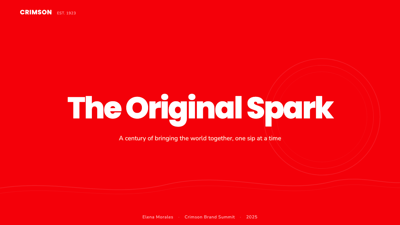
The defining chromatic principle of the system is that red is not an accent — it is the ground. Surfaces bleed red from edge to edge; white and black appear as relief, not as the base. The red in question is a warm, slightly orange-leaning red — energetic and celebratory rather than aggressive or cautionary. When the system uses white, it is typically for the wordmark or typographic elements set against the red field, creating maximum contrast. The relationship is always red-first: any other color is a visitor in a red world.这套体系的核心色彩原则是:红色不是强调色,而是底色。画面的每一寸都被红色浸透;白色与黑色以点缀形式出现,而非作为基底。这种红是偏暖、略微倾向橙调的红——充满活力与庆典感,而非攻击性或警示性。当体系使用白色时,通常是为了在红色底场上呈现字标或文字元素,制造最大对比度。关系永远是红色优先:其他任何颜色都是红色世界里的访客。
Spencerian ScriptSpencerian花体字
The wordmark is the system's most protected element. The Spencerian script — an ornate, looping cursive style popular in nineteenth-century American business correspondence — has remained essentially unchanged since Frank Mason Robinson wrote it in 1887. Its loops and swashes carry historical weight and warm associations, and the brand has consistently resisted any impulse to rationalize or modernize it into a cleaner form. The script is not merely a logo; it is a time capsule that anchors the brand in a pre-industrial notion of handcraft and personal warmth, even as the product is manufactured at industrial scale worldwide.字标是这套体系中保护最严密的元素。Spencerian花体字——一种在十九世纪美国商业信函中流行的华丽连体书写风格——自Frank Mason Robinson于1887年写下以来几乎未经改动。它的圆弧与花饰承载着历史分量与温暖联想,而品牌始终抵制任何将其合理化或现代化为更简洁形式的冲动。这个花体字不仅仅是一个logo;它是一枚时间胶囊,将品牌锚定在一种前工业化的手工艺与个人温度的想象中,即便产品本身在全球以工业规模生产。
Ribbon Wave缎带波浪线
The Dynamic Ribbon Device — formalized in 1969 — is the system's primary structural divider and decorative motif. It appears as a flowing, two-tailed wave that sweeps across the lower portion of the composition, separating the main red field from complementary zones. The ribbon is always rendered in white against red, or in red against a lighter field, and its curvature echoes the contour bottle's hourglass profile. More than a decorative element, the ribbon performs a structural function: it anchors the wordmark, creates compositional movement, and introduces a sense of fluidity and warmth that a straight rule could never achieve.「动态缎带装置」——于1969年正式确立——是这套体系主要的结构性分割线与装饰母题。它以一道双尾流动波浪的形式扫过构图的下半部分,将主红色底场与辅助区域分开。缎带永远以白色呈现于红色之上,或以红色呈现于浅色底场之上,其曲率与弧形玻璃瓶的沙漏轮廓相互呼应。缎带不仅仅是装饰元素,它承担着结构功能:锚定字标、制造构图动势、引入一种流动感与温暖感——这是直线规所永远无法实现的。
Roundness and Warmth圆润与温度
Where angular systems use sharpness to signal precision or authority, the Coca-Cola system uses curves to signal welcome. Supporting type, when used beyond the main wordmark, tends toward rounded letterforms rather than geometric sans-serifs. Layout shapes — panels, buttons, callout containers — favor curves over hard corners. The contour bottle, reproduced as a graphic element, reinforces this bias toward organic, body-adjacent curves. The overall effect is that the visual system feels held rather than commanded — an environment that embraces rather than instructs.棱角分明的体系用锐利传递精准或权威,而可口可乐体系用曲线传递欢迎。在主字标之外使用辅助字体时,倾向于圆润字形而非几何感强的无衬线字体。版面形状——面板、按钮、引用容器——偏好曲线而非硬角。弧形玻璃瓶作为图形元素被反复使用,强化了这种对有机曲线、贴近身体感的偏爱。整体效果是:这套视觉体系让人感到被托举,而非被命令——是拥抱的环境,而非指令的环境。
Populist Celebration大众化的庆典感
The emotional register of the system is unambiguously celebratory, and this register is democratic by design. Coca-Cola advertising has historically avoided any imagery or tone that reads as exclusive, elite, or rarefied. The visual language of smiles, full-bleed red, and sweeping ribbon forms is expansive and inclusive by nature — it is designed to signal that the pleasure it represents is available to everyone. This populist warmth is as deliberate as any color choice: the system is engineered to feel neither luxury nor budget, but universally human.这套体系的情感基调是毫不含糊的庆典感,而这种基调在设计上是民主的。可口可乐的广告历史上始终回避任何令人感觉排他、精英或稀缺的图像或语调。笑容、铺满全画面的红色与流动缎带形态,在本质上是宽阔的、包容的——它被设计为传递这样一种信号:它所代表的快乐人人皆可获得。这种大众化的温暖与任何色彩选择一样经过深思熟虑:这套体系被设计为既不像奢侈品也不像廉价品,而是普世的人类情感。
Symmetry and Centering对称与居中
Unlike asymmetric modernist systems, Coca-Cola Classic compositions tend toward centering and bilateral balance. The wordmark sits centrally, the ribbon extends symmetrically, and the overall framing is frontal and welcoming rather than directional and dynamic. This symmetry is not a formal principle in the Bauhaus sense — it is an emotional one. Centered compositions feel inclusive and addressed to the viewer directly, without the implicit direction of asymmetric layouts. The choice to center is a choice to make every viewer feel they are the intended audience.与非对称现代主义体系不同,可口可乐经典构图倾向于居中和双侧平衡。字标置于正中,缎带对称延展,整体取景是正面而热情的,而非方向性的和动感的。这种对称并非包豪斯意义上的形式原则,而是情感原则。居中的构图令人感到包容,直接面向观者,而不携带非对称版面隐含的方向感。居中的选择,是让每一位观者都感到自己正是预期受众的选择。
Heritage Constancy传承的恒定性
Perhaps the most unusual characteristic of the Coca-Cola visual system is its deliberate resistance to design trend cycles. While nearly every major brand identity has undergone significant visual evolution over the past century — rationalized logos, flattened color palettes, condensed typefaces — Coca-Cola has maintained the essential elements of its 1887 script and its mid-century color system with remarkable fidelity. This constancy is itself a design choice, and a powerful one: it signals that the brand's value is not contingent on contemporary taste, and that consistency over time has become the visual system's most distinctive quality.可口可乐视觉体系最不寻常的特征,或许是它对设计趋势周期的刻意抗拒。在过去一个世纪里,几乎每一个主要品牌识别都经历了显著的视觉演变——logo被合理化、色板被扁平化、字体被压缩——而可口可乐却以罕见的忠诚保持了1887年花体字的核心元素与世纪中期的色彩体系。这种恒定性本身就是一种设计选择,且是强有力的选择:它传递的信号是,这个品牌的价值不依赖于当代品味,而历经时间的一致性本身已成为这套视觉体系最鲜明的品质。
See the Coca-Cola Classic design system查看 Coca-Cola Classic 完整设计系统
Who shaped Coca-Cola Classic?谁塑造了 Coca-Cola Classic?
Robinson was the bookkeeper and business partner of Coca-Cola's inventor, John Stith Pemberton, and is credited with both naming the beverage and writing its original logo in Spencerian script in 1887. His choice of penmanship style was strategic — Spencerian script was the prestige hand of American commercial correspondence in the era before typewriters, and its use positioned the new drink as aspirational and professionally legitimate. Robinson's wordmark, produced as a functional business decision rather than an act of artistic vision, has outlasted virtually every other piece of commercial typography from its era.Robinson是可口可乐发明者John Stith Pemberton的簿记员兼商业伙伴,被认为同时完成了两件事:为这款饮料命名,以及在1887年用Spencerian花体字写下最初的logo。他对书写风格的选择是有策略的——在打字机出现之前,Spencerian花体字是美国商业信函中最具声望的手写字体,使用它将这款新饮料定位为有抱负、有专业公信力的产品。Robinson的字标作为一个务实的商业决定而非艺术创作被写下,却比那个时代几乎所有其他商业字体都活得更久。
Sundblom was an American commercial illustrator who, beginning in 1931, painted the series of holiday advertisements for Coca-Cola featuring Santa Claus that defined the modern visual conception of the figure. Over thirty-three years of painting the campaign, Sundblom developed a Santa whose physical warmth — rosy cheeks, laughing eyes, generous proportions, and a preference for Coca-Cola — became the globally recognized archetype. The campaign demonstrated that the Coca-Cola visual system's emotional logic extended beyond its graphic elements to encompass any imagery it chose to adopt. Sundblom's Santa became inseparable from the brand, and the brand became inseparable from Christmas.Sundblom是一位美国商业插画家,从1931年起为可口可乐绘制了以圣诞老人为主角的系列节日广告,由此定义了这一形象的现代视觉形态。在长达三十三年的创作中,Sundblom塑造了一位满溢肉体温度的圣诞老人——红润的脸颊、含笑的双眼、慷慨的身形,以及对可口可乐的偏爱——这一形象成为举世公认的原型。这个系列证明了可口可乐视觉体系的情感逻辑超越了它的图形元素本身,能够延伸并吸纳它所选择采用的任何图像。Sundblom的圣诞老人与这个品牌无从分割,而这个品牌也与圣诞节无从分割。
Loewy, the Franco-American industrial designer who shaped the visual landscape of twentieth-century American commerce, contributed to the Coca-Cola visual system through his work on packaging and promotional materials. His design philosophy — that everyday objects should aspire to elegance and that commercial forms could be carriers of genuine aesthetic value — aligned naturally with Coca-Cola's ambition to make the ordinary feel extraordinary. Loewy's broader influence on American commercial aesthetics established the cultural context in which Coca-Cola's system of warmth and roundness was received as aspirational rather than merely popular.Loewy,这位塑造了二十世纪美国商业视觉版图的法裔美国工业设计师,通过对包装与推广物料的贡献参与了可口可乐的视觉体系建设。他的设计哲学——日常物品应该追求优雅,商业形态可以成为真正审美价值的载体——与可口可乐将平凡变得非凡的抱负自然契合。Loewy对美国商业美学的更广泛影响,建立了可口可乐温暖与圆润体系得以被视为有抱负而非仅仅大众化的文化语境。
The New York design consultancy Lippincott and Margulies codified the modern Coca-Cola identity system in 1969, formalizing the Dynamic Ribbon Device and establishing the disciplined relationship between the Spencerian wordmark, the ribbon wave, and the red ground that has defined the brand's visual language ever since. Their systematization transformed what had been an organically evolved set of visual conventions into a deliberately engineered identity that could be applied consistently across global markets and all media. This work represents one of the earliest and most influential examples of what is now called brand systems design.纽约设计咨询公司Lippincott & Margulies于1969年将现代可口可乐识别体系编纂成文,正式确立了「动态缎带装置」,并建立了Spencerian字标、缎带波浪线与红色底场之间的克制关系——这一关系此后定义了这个品牌的视觉语言。他们的系统化工作将一套有机演化而来的视觉惯例,转化为一套经过刻意设计、可在全球市场和所有媒介中一致应用的识别体系。这项工作是如今所称的「品牌体系设计」最早也最具影响力的案例之一。
How do you use Coca-Cola Classic today?今天怎么用 Coca-Cola Classic?
The Coca-Cola Classic style is one of the most immediately recognizable visual languages on earth, which means applying it in design work requires a clear purpose: you are not evoking a color palette, you are invoking a specific emotional register of warmth, celebration, and populist optimism. Before applying this style, establish that these associations serve the project — a food and beverage context, a consumer-facing celebration, a culturally warm campaign. The style struggles in contexts demanding neutrality, precision, or premium exclusivity.可口可乐经典风格是地球上辨识度最高的视觉语言之一,这意味着在设计工作中应用它需要明确的目的:你召唤的不只是一个色板,而是一种特定的情感频道——温暖、庆典与大众化的乐观主义。在应用这种风格之前,先确认这些联想是否服务于项目——食品饮料语境、面向消费者的庆典、文化温度高的活动。这种风格在需要中立性、精准性或高端排他性的场景中会力不从心。
For presentation slides, the style translates best when used boldly and without apology. A cover slide works well with a full-bleed red field, the main title set in large, rounded letterforms against it, and the ribbon wave device used as a compositional anchor at the bottom third. Avoid placing too many competing elements on a red ground — the system rewards restraint in the number of elements and exuberance in their treatment. Content slides are better served by a white or near-white ground with a red accent band or ribbon at the top or bottom, keeping the dominant red reserved for structural signal. Data slides can use red as the primary data color for the key metric or category, with supporting data rendered in a more neutral tone to preserve hierarchy without visual overload.在演示文稿中,这种风格在被大胆而毫不迟疑地应用时效果最好。封面幻灯片适合使用铺满全画面的红色底场,主标题以大号圆润字形置于其上,缎带波浪装置用作下三分之一处的构图锚点。避免在红色底场上叠加过多竞争性元素——这套体系奖励元素数量的克制与每个元素处理的大气。内容幻灯片更适合使用白色或近白底场,顶部或底部配以红色强调带或缎带,将主红保留用于结构信号。数据幻灯片可以将红色用于核心指标或类别的数据色,支撑数据以更中性的色调呈现,在不造成视觉过载的前提下维护层级。
For web interfaces and digital dashboards, the Coca-Cola Classic system is most appropriate for consumer-facing product pages, promotional landing pages, and seasonal campaign microsites where emotional impact outweighs information density. The approach: use red as the hero background for primary sections, white for content areas, and the ribbon device as a section transition. Rounded button shapes and container borders reinforce the system's warmth. Navigation should be clean and typographically driven — the red environment is already doing significant emotional work, so interface chrome should not compete. Pricing pages can use red to draw attention to the recommended tier, but should transition quickly to more neutral zones for detailed plan comparisons.在网页界面和数字仪表板中,可口可乐经典体系最适合面向消费者的产品页面、促销落地页,以及情感冲击力优于信息密度的季节性活动微站。方法是:用红色作为主要区块的主角背景,白色用于内容区域,缎带装置用作区块过渡。圆角按钮和容器边框强化体系的温暖感。导航应保持简洁、以字体为主导——红色环境本身已经在做大量情感工作,界面框架不应与之竞争。定价页面可以用红色吸引对推荐套餐的注意,但应在详细方案对比区域迅速过渡到更中性的视觉区域。
For editorial and marketing applications, the style excels in contexts where the goal is emotional immediacy rather than sustained reading. Full-bleed red spreads with centered white type, ribbon dividers separating thematic sections, and illustrations or photography treated with high warmth and saturation all extend the system naturally. Marketing materials — posters, social cards, outdoor advertising — benefit from the system's poster-like boldness: single dominant message, centered composition, red field, white script. The style supports very little body copy; if extended text is required, it should be introduced on white sections adjacent to the red, not on the red itself.在编辑和营销应用中,这种风格在目标是情感即时性而非持续阅读的场景中最为出色。铺满全画面的红色展开页配以居中白色字体、分隔主题区块的缎带分割线、以高温暖度和高饱和度处理的插画或摄影,都能自然延伸这套体系。营销物料——海报、社交卡片、户外广告——受益于这套体系的海报式大胆感:单一主导信息、居中构图、红色底场、白色花体字。这种风格几乎不支持大量正文;如果需要延伸文字,应在紧邻红色区域的白色区块中呈现,而不是直接置于红色之上。
The most common mistake when applying the Coca-Cola Classic style is confusing saturation with accuracy. The system is not simply about using a lot of red — it is about using one specific emotional quality of red, consistently, in a composition where every other element reinforces rather than competes with it. Adding gradient effects to the red, introducing multiple accent colors, or applying the ribbon device on a non-red field all undermine the system's logic. Similarly, using angular or geometric sans-serif type in place of rounded, warm letterforms misreads the system's character: the roundness of the supporting typography is not decorative, it is structural to the emotional message. Authenticity requires reading the system as a complete emotional argument, not as a collection of separable visual assets.应用可口可乐经典风格时最常见的错误,是将饱和度与准确性混为一谈。这套体系不是简单地使用大量红色——而是在一个每个其他元素都在强化而非竞争的构图中,一致地使用一种特定情感品质的红色。为红色添加渐变效果、引入多种强调色,或将缎带装置应用在非红色底场上,都会破坏这套体系的内在逻辑。同样,用棱角分明的几何感无衬线字体取代圆润、温暖的字形,也是对这套体系性格的误读:辅助字体的圆润不是装饰性的,而是对情感信息结构性的支撑。真实的应用需要将这套体系理解为一个完整的情感论点,而非一组可分离的视觉资产。
See the Coca-Cola Classic design system查看 Coca-Cola Classic 完整设计系统
Coca-Cola Classic — FAQCoca-Cola Classic · 常见问题
Is Coca-Cola Classic style suitable for luxury or premium product design?可口可乐经典风格适合奢侈品或高端产品设计吗?
Generally not. The Coca-Cola system is fundamentally populist — it is designed to signal warmth, accessibility, and shared pleasure rather than exclusivity or rarity. Luxury design systems typically use restraint, negative space, refined neutrals, and subtle detailing to communicate premium positioning. The Coca-Cola system's saturated red, bold script, and celebratory tone read as democratic rather than exclusive. Attempts to reconcile the two often produce something that communicates neither premium nor warmth convincingly. If warmth is the goal but the brand requires some sense of premium, consider using the curvilinear logic and warmth register of the Coca-Cola system while significantly reducing the red saturation and increasing visual breathing room.通常不适合。可口可乐体系在根本上是大众化的——它被设计为传递温暖、可及性与共同快乐,而非排他性或稀缺性。奢侈品设计体系通常使用克制、负空间、精炼的中性色与细腻的细节来传递高端定位。可口可乐体系的高饱和红色、粗犷花体字与庆典基调,传递的是民主感而非排他感。试图调和两者的尝试往往最终两者都无法令人信服。如果温暖是目标但品牌又需要一定的高端感,可以考虑保留可口可乐体系的曲线逻辑与温暖基调,同时显著降低红色饱和度并增加视觉呼吸空间。
How does the Coca-Cola Classic style differ from other warm, red-dominant brand systems?可口可乐经典风格与其他温暖的、以红色为主的品牌体系有何不同?
The key distinguishing features are the Spencerian script wordmark and the ribbon wave device. Other red-dominant brand systems — whether in food, entertainment, or retail — typically use contemporary typefaces and geometric supporting elements. Coca-Cola's system is unique in its insistence on a nineteenth-century handwritten script that has never been rationalized, and in the fluidity of the ribbon device, which introduces a calligraphic quality into what might otherwise be a flat graphic system. These two elements — historical script plus flowing ribbon — produce a warmth that feels earned through time rather than designed for effect. Without both of them, you may have a red design system, but you do not have Coca-Cola.关键区分特征是Spencerian花体字标与缎带波浪装置。其他以红色为主的品牌体系——无论是食品、娱乐还是零售——通常使用当代字体和几何辅助元素。可口可乐体系的独特之处在于它对一种十九世纪手写花体字的坚持(这种字体从未被合理化),以及缎带装置的流动性——它为原本可能是扁平图形体系的东西引入了一种书法气质。这两个元素——历史花体字加流动缎带——产生的温暖感来自时间的积累,而非效果的设计。如果缺少其中任一,你可能拥有一套红色设计体系,但那不是可口可乐。
Can the Coca-Cola Classic visual language work effectively in digital dark-mode environments?可口可乐经典视觉语言能在数字深色模式环境中有效发挥作用吗?
With care. The canonical system is built on a light ground — white elements appear on red, red appears on white, and there is no concept of a dark neutral ground in the classic vocabulary. A dark adaptation is possible, but it requires recalibration: on a very dark ground, the saturated red tends to appear neon-like rather than warm and celebratory. The ribbon device and script wordmark can hold in white or in a lighter warm tone against a dark field, but the dominant red panels need to be replaced rather than darkened, lest the warmth of the system convert entirely to visual aggression. Dark-mode versions of the system work best when they borrow the curvilinear warmth and the script, but use a deep warm brown or a very dark warm neutral as the ground rather than attempting to maintain red dominance.需要谨慎处理。经典体系建立在浅色底场之上——白色元素出现在红色之上,红色出现在白色之上,经典词汇中没有深色中性底场的概念。深色适配版本是可行的,但需要重新校准:在非常深的底场上,高饱和红色往往呈现出霓虹感而非温暖的庆典感。缎带装置与花体字标可以在深色底场上以白色或浅暖调呈现,但主红色面板需要被替换而非简单加深,否则体系的温暖感会完全转化为视觉攻击性。深色模式版本最好保留曲线温暖感与花体字,但使用深暖棕色或非常深的暖中性色作为底场,而非试图在深色环境中维持红色主导。
What is the right relationship between the script logo and supporting typography in this system?在这套体系中,花体字标与辅助字体之间的正确关系是什么?
The Spencerian script is sacred and must not be modified, stretched, redrawn, or replaced. Everything else in the typographic hierarchy — headlines, subheadings, body copy, labels — should defer to it rather than compete with it. Supporting type works best when it is clearly subordinate in scale and weight relative to the wordmark, uses rounded letterforms that echo the script's warmth without imitating its style, and avoids sharp, geometric, or heavily condensed forms that would create visual dissonance. The supporting type's job is to be legible and warm, not to be interesting. Keeping the typographic supporting cast quiet and rounded allows the Spencerian script to remain the dominant and most distinctive visual element in the system, which is where all the emotional recognition lives.Spencerian花体字是神圣的,不得被修改、拉伸、重绘或替换。字体层级中的其他一切——标题、副标题、正文、标签——都应向它谦让而非与之竞争。辅助字体在以下情况下效果最佳:在尺度和字重上明显从属于字标,使用呼应花体字温暖感但不模仿其风格的圆润字形,避免与花体字造成视觉不和谐的锐利、几何或高度压缩的字形。辅助字体的任务是清晰易读且温暖,而不是有趣。保持辅助字体的低调与圆润,让Spencerian花体字保持为整套体系中最主导、最具辨识力的视觉元素——所有情感认同都居住在那里。
Is there a risk of the Coca-Cola Classic style reading as pastiche or parody rather than sincere homage?可口可乐经典风格是否有被解读为戏仿或模拟而非真诚致敬的风险?
Yes, and this is one of the most important practical considerations when deploying the style. Because the Coca-Cola identity is so universally recognized, applications that land too close to the original can read as mockery or unauthorized borrowing rather than design influence. The way to avoid this is to apply the system's principles — curvilinear warmth, red dominance, celebratory tone, script-like lettering — rather than its literal elements. Avoid reproducing the specific wordmark proportions or ribbon curvature too precisely; instead, internalize the emotional logic of the system and express it through original visual decisions. The Coca-Cola system is powerful precisely because it is a set of emotional commitments, not a set of copiable assets. The copies that age well are those that understood the feeling, not those that traced the curves.是的,这是部署这种风格时最重要的实践考量之一。正是因为可口可乐识别如此举世皆知,过于贴近原作的应用可能被解读为嘲弄或未经授权的借用,而非设计影响。避免这一问题的方法是应用这套体系的原则——曲线温暖感、红色主导、庆典基调、书法感字体——而非其字面元素。避免过于精确地复现特定的字标比例或缎带曲率;转而将这套体系的情感逻辑内化,通过原创的视觉决策表达出来。可口可乐体系之所以强大,恰恰因为它是一组情感承诺,而非一组可复制的资产。那些经久不衰的致敬,是理解了那种感觉的,而非描摹了那些曲线的。
Related design styles相关设计风格
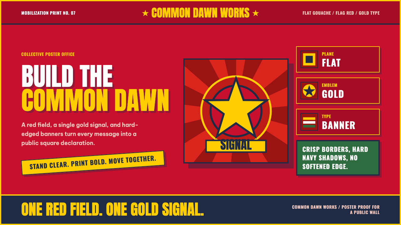 Vietnamese PropagandaFlat color commands. Flag-red fields, gold star rays, and Anton slogans hit a…平涂色块发号召:旗红、金星射线与粗体标语形成海报级冲击。
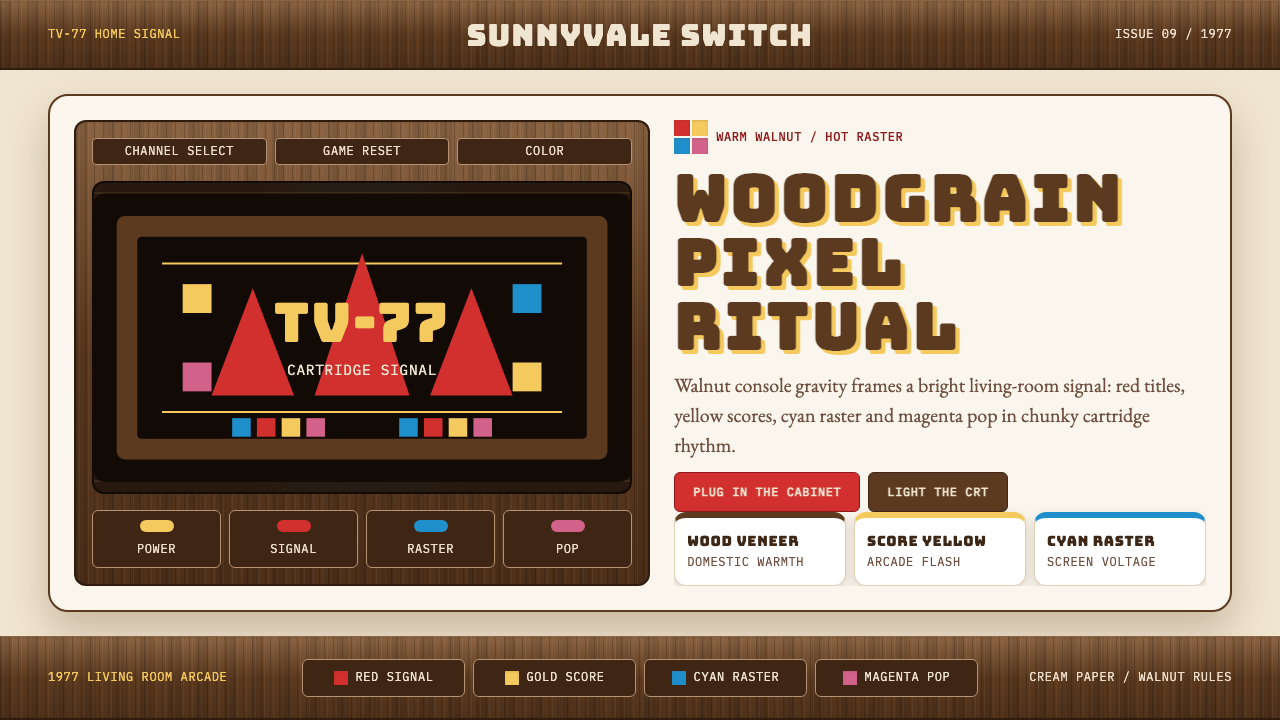 Atari 2600 (Woodgrain)Woodgrain meets raw pixels. Walnut panels frame Bungee type and CMYK raster b…木纹遇上生猛像素:胡桃木面板包裹Bungee字与CMYK色块。
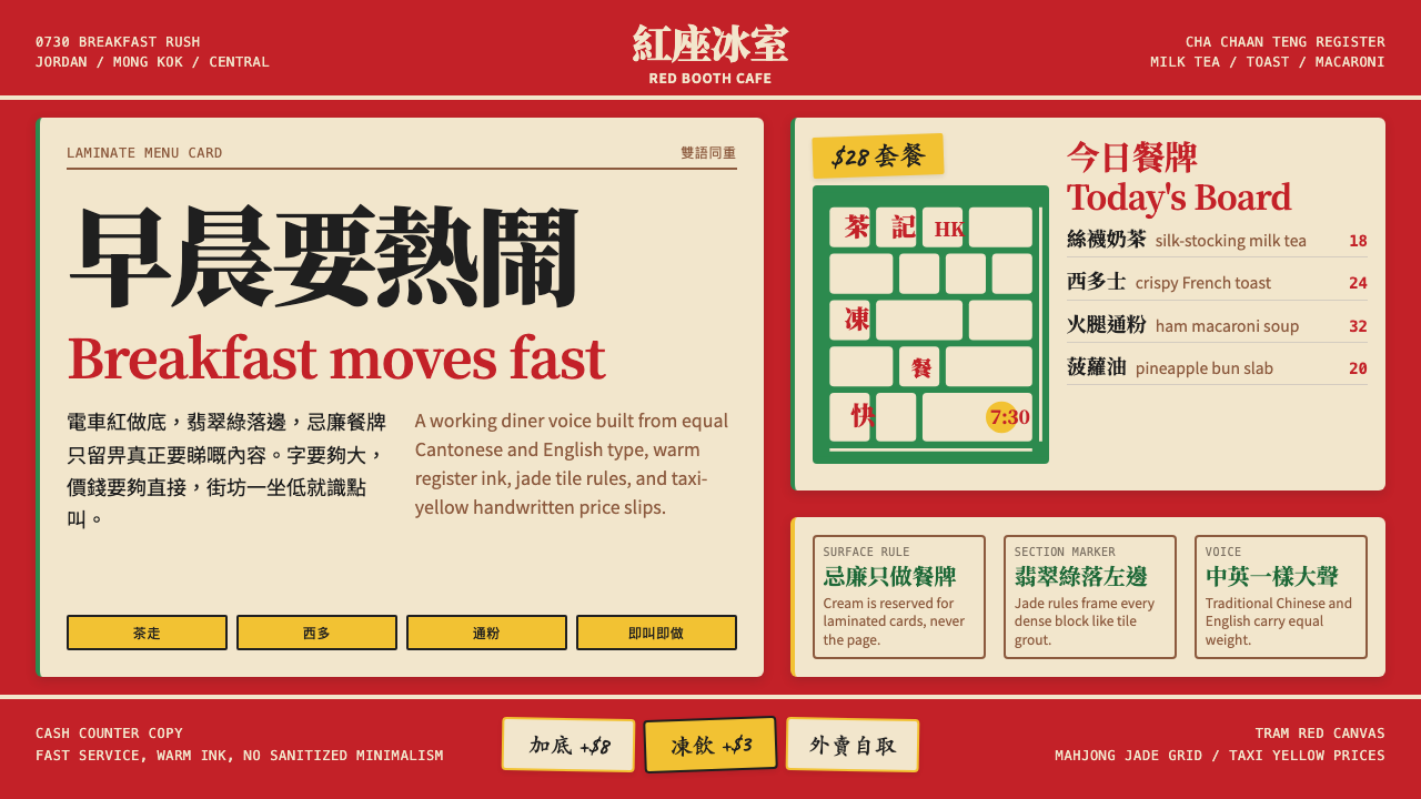 Hong Kong Cha Chaan TengDemocratic diner warmth. Tram red, jade rules, cream menu cards, equal Canton…街坊飯堂的熱度:電車紅、翡翠綠線、忌廉餐牌,中英並重。
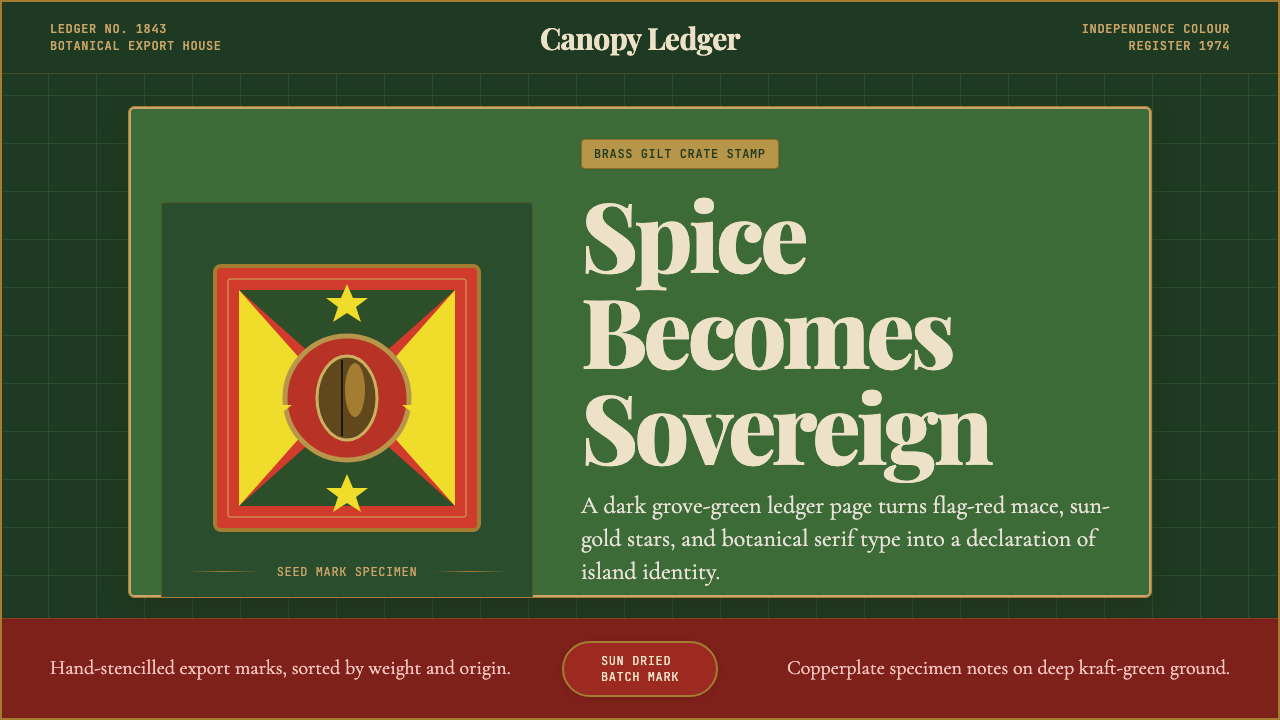 Grenadian Spice & Nutmeg FlagSpice becomes sovereign. Grove green, flag red, brass borders, and serif ledg…香料成为主权宣言:林冠绿、旗红、黄铜边框与账本衬线。
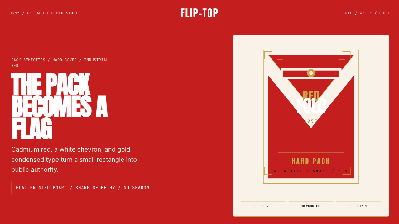 Marlboro Red Flip-Top (1955)Authority in one fold. Cadmium red, white chevron, and gold type read like a…一折成旗。镉红、白人字与金字排出强硬权威。
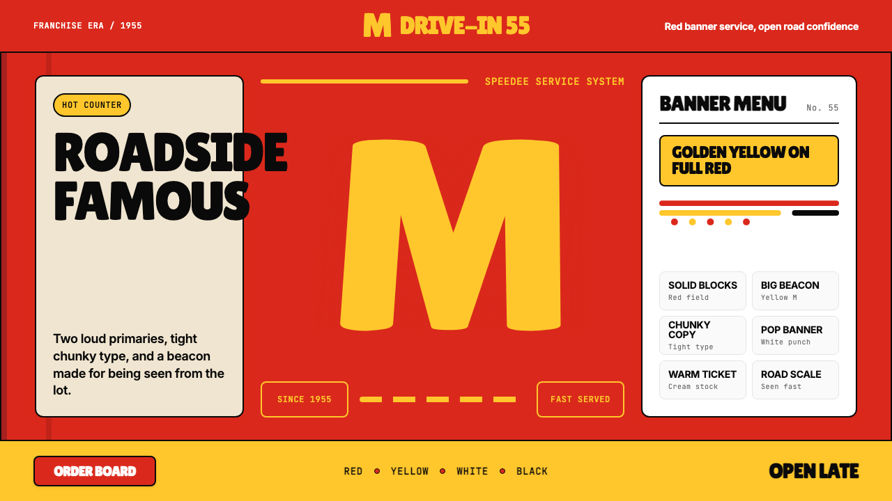 McDonald's Golden ArchesRoadside famous. Saturated red, hot yellow, and chunky type shout from 1955.路边即识别:饱和红、热黄与厚重字体喊出1955。