What is Hong Kong Cha Chaan Teng?什么是 Hong Kong Cha Chaan Teng?
Hong Kong's cha chaan teng is democracy on a laminated menu — tram red, jade green, and bilingual type that treats Cantonese and English as equals at the linoleum table.香港茶餐廳是過膠餐牌上的民主——電車紅、翡翠綠、中英並重的雙語排字,在膠地板桌前一視同仁。
Hong Kong Cha Chaan Teng in briefHong Kong Cha Chaan Teng 速览
Hong Kong Cha Chaan Teng is a visual design style distilled from the vernacular energy of Hong Kong's iconic local diners — establishments that emerged in the 1950s as a working-class hybrid of British colonial café and Cantonese food stall. The style is defined by a bold chromatic signature: tram-route red as the anchoring structural color, mahjong-tile jade green for section markers and accents, and cream reserved strictly for menu-card surfaces. Against these, bilingual Traditional Chinese and English typography is set at equal visual weight — neither language subordinated to the other.香港茶餐廳風格是從香港標誌性本地食肆的草根氣場中提煉出來的視覺設計體系——這些食肆於二十世紀五十年代誕生,是英殖咖啡室與廣東大排檔的勞工階層混血。這套風格由鮮明的色彩特徵定義:港式電車紅作為錨定結構色,麻雀牌翡翠綠用於段落標記與點綴,忌廉色嚴格保留給餐牌卡面。在這些底色之上,繁體中文與英文雙語排版以同等視覺分量並列——兩種語言互不從屬。
What distinguishes this system from mere nostalgia pastiche is its structural seriousness. The color choices are not arbitrary period references; each hue carries a specific functional role derived from its original vernacular context — the red of HK tram livery and neon signage, the jade of painted partition tiles and enamel chopstick rests, the cream of laminated menu boards rather than bare walls. The type treatment reflects the genuinely bilingual culture of mid-century Hong Kong, where handwritten Chinese characters and roman-alphabet prices coexisted on the same card without hierarchy.令這套系統有別於單純懷舊仿制的,是其結構上的嚴肅性。色彩的選擇並非隨意的年代引用,每一個色相在其原始草根語境中都承擔著特定的功能角色——港鐵電車塗裝與霓虹招牌的紅,瓷磚隔斷與琺瑯筷子架的翡翠綠,過膠餐牌板面的忌廉色而非牆身底色。排版處理則反映了二十世紀中葉香港真實的雙語文化——手寫漢字與羅馬字母價格在同一張餐牌上並存,不分主次。
Since roughly 2015, a generation of Hong Kong-based and diaspora designers has codified this vernacular into a disciplined, transferable design language. The resulting system is warm without being kitsch, historically grounded without being antiquarian. It honors working-class Cantonese material culture without sanitizing it into decorative surface — and therein lies its visual authority.大約自2015年起,一批立足香港及身處海外的設計師將這種草根美學整理為嚴謹、可移植的設計語言。由此形成的系統溫暖而不俗氣,根植歷史而不泥古守舊。它向廣東勞動階層的物質文化致敬,而非將其消毒成裝飾表面——這正是其視覺權威的來源。
See the Hong Kong Cha Chaan Teng design system查看 Hong Kong Cha Chaan Teng 完整设计系统
Where does Hong Kong Cha Chaan Teng come from?Hong Kong Cha Chaan Teng 从何而来?
The cha chaan teng — literally 'tea restaurant' — emerged in post-war Hong Kong during the 1950s as a pragmatic response to economic necessity. British colonial Hong Kong had imported Western café culture in the form of upscale dairy restaurants serving coffee, toast, and light meals. Working-class Cantonese residents could not afford these establishments and had little access to the full repertoire of Western foods they sold. The cha chaan teng was the vernacular answer: a cheaper, noisier, faster imitation that translated Western café staples into a hybrid Cantonese idiom. Silk-stocking milk tea — brewed strong through a cloth strainer — stood in for drip coffee. French toast fried in lard replaced continental pastry. Macaroni soup with luncheon meat became breakfast. The fusion was genuine rather than ironic: Hongkongers absorbed Western food culture and remixed it on their own terms.茶餐廳——字面意思是「茶的餐廳」——於二十世紀五十年代在戰後香港因現實需要而誕生。英屬殖民地香港引進了西式咖啡室文化,以高檔奶品餐廳的形式供應咖啡、多士和輕食。廣東勞工階層消費不起這些場所,也幾乎接觸不到那裏出售的完整西式食品。茶餐廳是草根的回應:一種更廉宜、更嘈吵、更快速的仿制,將西式咖啡室招牌食品轉化為廣東混血語言。用布袋濃釀的絲襪奶茶取代滴漏咖啡,豬油煎的法蘭西多士取代歐陸糕點,火腿通粉湯成了早餐。這種融合是真實的而非諷刺的:香港人吸收了西式飲食文化,按自己的條件加以重組。
The physical environment of the classic cha chaan teng established the aesthetic vocabulary that designers would later codify. Red or yellow tram-route numbers and livery saturated Kowloon and HK Island streets; jade-green ceramic tiles lined the interior walls and partition screens of the diners themselves; laminated cream menu boards — handwritten in both Chinese characters and English letters — hung above cramped Formica counters. The interiors were deliberately dense: tables packed close, orders shouted across the room, condensation beading on glasses of iced milk tea. This compression was not a failure of design — it was an expression of democratic energy, a space where factory workers and clerks and students occupied the same linoleum floor.經典茶餐廳的物理環境建立了設計師後來整理成體系的美學詞彙。紅色或黃色的電車路線號碼與車身塗裝充斥九龍和港島街道;翡翠綠的瓷磚鋪滿食肆內壁和隔斷屏風;過膠的忌廼色餐牌——用漢字和英文字母手寫——懸掛在逼仄的露寶卡枱面上方。室內刻意密集:桌子緊挨,點單跨室叫喊,凍奶茶杯壁凝露。這種壓縮不是設計的失敗——它是民主活力的表達,工廠工人、文員和學生在同一塊膠地板上共處。
The cultural weight of the cha chaan teng deepened considerably after the Handover of 1997. As Hong Kong's political relationship with mainland China grew more complex through the early 2000s, the local diner became a powerful symbol of a distinctly Cantonese, distinctly local identity. The Tea Restaurant Act of 2008 in Hong Kong formalized certain protections for these establishments, recognizing their status as living cultural heritage. Wong Kar-wai's films — particularly the rain-slicked neon of Chungking Express and In the Mood for Love — had already brought the visual grammar of Hong Kong street culture to international art-house audiences from the mid-1990s onward.1997年回歸之後,茶餐廳的文化分量顯著加重。隨著香港與中國內地的政治關係在二十一世紀初變得日益複雜,本地食肆成了一種鮮明廣東身份與本土認同的有力象徵。2008年香港立法機關通過的相關條例對這類食肆給予了一定保護,確認了其活態文化遺產的地位。王家衛的電影——尤其是《重慶森林》與《花樣年華》中雨濕霓虹的視覺語法——自九十年代中期起已將香港街頭文化的視覺文法帶到了國際文藝院線觀衆面前。
The designer-revival phase began around 2015, driven partly by anxiety about cultural preservation and partly by a broader international appetite for vernacular design systems. Designers including Stanley Wong — known for his documentary-style graphic work under the alias anothermountainman — and Michael Lau, whose collectible toy figures drew on Hong Kong street culture, had established a framework for treating working-class Hong Kong aesthetics seriously rather than sentimentally. Lam Mui-kwun's documentation of cha chaan teng interiors and signage systems provided the archival foundation that graphic designers subsequently built upon. The resulting visual language reached a new generation through brand identity projects, packaging design, editorial work, and digital UI applications — carrying the energy of Jordan at seven-thirty in the morning into contexts its originators could not have imagined.設計師主導的復興階段大約始於2015年,一方面源於對文化保育的憂慮,另一方面則源於國際社會對草根設計系統日益旺盛的興趣。黃炳培(以「又一山人」之名從事紀錄片式平面創作)和劉建文(其收藏玩偶汲取香港街頭文化)等設計師已建立起一套以嚴肅而非感傷的態度對待香港勞工美學的框架。林梅坤對茶餐廳室內陳設與招牌系統的文獻整理,為平面設計師此後的創作奠定了檔案基礎。由此形成的視覺語言通過品牌識別項目、包裝設計、編輯內容及數字UI應用,傳遞至新一代——將佐敦清晨七時半的氣場帶入了其創始者未曾想象的場景。
What defines the Hong Kong Cha Chaan Teng look?Hong Kong Cha Chaan Teng 的视觉特征是什么?
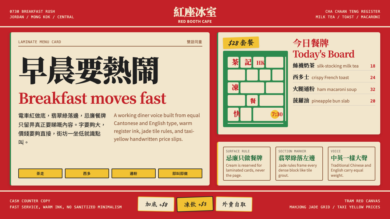
Tram Red as Structural Anchor電車紅作結構錨色
The dominant hue in this system is a saturated, warm red derived from Hong Kong tram livery and the neon hoarding culture of mid-century Kowloon. It is not a soft or muted heritage red — it is assertive, close to signal intensity, and used to anchor the primary structural elements of any layout: the header band, the primary call-to-action surface, the border framing the most important content block. Every page has this color present; it is never purely decorative. Its function is identical to the tram's function on Nathan Road: a bold, unmistakable routing signal cutting through visual noise.這套系統的主導色是一種飽和、暖調的紅,源自香港電車塗裝和二十世紀中葉九龍的霓虹招牌文化。它不是柔和或低調的懷舊紅——它強勢,接近信號強度,用於錨定任何版面的主要結構元素:頁首橫幅、主要行動呼籲面、框住最重要內容塊的邊線。每一頁都有這個顏色的存在,從不純粹作裝飾。它的功能等同電車在彌敦道上的功能:一個粗壯、清晰的路線信號,穿透視覺噪音。
Jade Green as Section Marker翡翠綠作段落標記
The secondary accent is a mid-depth jade green that reads simultaneously as traditional and contemporary — drawn from the painted ceramic tiles and enamel ware ubiquitous in cha chaan teng interiors. In layout application, jade green marks transitions: section dividers, category labels, sub-navigation indicators, and the ruled lines separating one content zone from another. It does not compete with tram red for attention; instead it operates at a slightly lower visual volume, guiding the eye through structure after red has established the page hierarchy. Used sparingly, it carries the weight of the tiled wall without visually overwhelming the surface.次要點綴色是一種中深度翡翠綠,同時散發傳統與當代的氣息——取自茶餐廳室內隨處可見的彩釉瓷磚和琺瑯器皿。在版面應用中,翡翠綠標記過渡:段落分隔線、類別標籤、次導航指示符,以及分隔不同內容區域的橫線。它不與電車紅競爭注意力,而是以略低的視覺音量運作,在紅色建立頁面層級之後引領視線穿越結構。克制使用時,它承載瓷磚牆的分量,而不在視覺上壓倒畫面。
Cream for Menu-Card Surfaces Only忌廼色僅用於餐牌卡面
Cream — the warm off-white of a laminated paper menu card — appears in this system as a contained surface applied to specific elements: content cards, text panels set apart from the primary background, quote blocks, and callout boxes. It is never used as the overall page background; that role belongs to a near-neutral light ground, or to tram red itself. Cream functions as the system's warm highlight, the visual equivalent of the menu board lifted from the diner wall and placed on the table — intimate rather than expansive. This discipline is the most commonly violated rule when designers attempt this style, and its violation immediately produces a reading of old-fashioned fussiness rather than considered warmth.忌廼色——過膠紙餐牌的暖調米白——在這套系統中作為局部底色出現,應用於特定元素:內容卡片、從主背景中獨立出來的文字面板、引文塊和標注框。它從不用作整體頁面背景,那個角色屬於近中性的淺色底,或電車紅本身。忌廼色在系統中充當暖調高光,視覺上等同於從食肆牆上取下、放到桌面的那塊餐牌——親密而非宏闊。這條規則是設計師嘗試這種風格時最常違反的一條,一旦違反,立即產生陳舊繁縟而非從容溫暖的觀感。
Bilingual Typography at Equal Weight雙語排版等重並列
Perhaps the most culturally specific characteristic of this system is its treatment of Traditional Chinese and English as typographic equals. In historical cha chaan teng signage and menus, Chinese characters and English lettering shared space without either language taking typographic precedence — both appeared at comparable sizes, in comparable positions, with comparable visual confidence. The revival design system preserves this principle: headline treatments set the Chinese and English lines at the same optical scale, neither subordinated as a caption or translation. This bilingual parity is not just aesthetic; it encodes the genuinely hybrid cultural identity of mid-century Hong Kong, where Cantonese and colonial English coexisted as functional equals in commercial life.這套系統最具文化特殊性的特徵,或許是對繁體中文與英文作為排版等位元素的處理。在歷史茶餐廳招牌和餐牌上,中文字符與英文字母共享空間,任一語言都不佔排版主導——兩者以相近的字號、相近的位置、相近的視覺自信出現。復興設計系統保留了這一原則:標題處理將中英兩行設定在相同的視覺尺度,任一方都不被降格為說明或譯文。這種雙語對等不僅是美學上的,它編碼了二十世紀中葉香港真實的混血文化身份——廣東話與英語殖民地英文在商業生活中以功能等位並存。
Dense Composition, Democratic Space密集構成,民主空間
Unlike Bauhaus or Swiss International Style, cha chaan teng design does not celebrate open negative space as a virtue in itself. The historical diners were deliberately packed environments — physical compression was evidence of popularity, not poor planning. The design system reflects this by allowing layouts to be information-dense rather than airy, with multiple content zones in close proximity. However, this density is organized rather than chaotic: strong color banding, ruled horizontal lines, and the red-green-cream tricolor signal system create readable structure even at high information density. The absence of generous white space is intentional; it creates an energy of busy-ness that is welcoming rather than overwhelming.與包豪斯或瑞士國際主義風格不同,茶餐廳設計不以寬闊留白本身為美德。歷史食肆是刻意擁擠的環境——物理上的壓縮是人氣的證明,而非規劃不善。設計系統反映了這一點,允許版面信息密集而非通透,多個內容區域近距並置。然而,這種密集是有組織的而非混亂的:強烈的色帶、水平橫線,以及紅綠忌廼三色信號系統,即便在高信息密度下也能建立清晰結構。缺少充裕留白是刻意為之;它製造一種繁忙的能量,令人感到歡迎而非壓迫。
Handcrafted Texture Without Grunge手工質感,非破敗風格
The original cha chaan teng aesthetic included genuinely imperfect, handmade elements: hand-brushed signage with visible stroke energy, laminated cards with slight misalignment, angled price stickers applied at speed. The contemporary design revival references this quality without reproducing actual degradation. The approach is to use display typefaces with visible calligraphic construction, allow slight irregularity in decorative ruled borders, and embrace angular rather than mathematically perfect text placement on certain graphic elements. The goal is the feeling of a sign painted by a skilled craftsperson rather than output from a laser printer — warm imprecision as character, not as flaw.原版茶餐廳美學包含真實不完美的手製元素:可見筆觸能量的手刷招牌、略有錯位的過膠卡紙、急速張貼的斜角價格貼紙。當代設計復興借鑒這種質感,但不重現真實的磨損。具體做法是使用帶有可見書法構造的展示字體,允許裝飾橫線邊框存在輕微的不規則,並在某些圖形元素上採用有角度而非數學完美的文字排置。目標是技藝熟練的匠人手繪招牌的感覺,而非激光打印機的輸出——溫暖的不精確是個性,而非缺陷。
Neon Influence Without Literal Glow霓虹影響,非字面發光
The neon hoarding culture of Mong Kok and Causeway Bay — at its peak from the 1960s through the 1990s — cast a specific chromatic logic onto Hong Kong's visual identity: high-saturation color against darkness, type as illuminated object, the street as a competition of brightness. The cha chaan teng design system absorbs this influence without resorting to literal glowing effects, gradients, or soft halos. Instead, neon logic appears as high-contrast color blocking, bold type set at sizes that feel almost sign-like in their scale, and an overall willingness to let strong color dominate rather than recede. The suggestion of neon energy is achieved through boldness and saturation, not through imitation of the physical medium.旺角和銅鑼灣的霓虹招牌文化——在二十世紀六十至九十年代達到頂峰——為香港的視覺身份投射了一種特定的色彩邏輯:黑暗中的高飽和色,作為發光體的文字,街道作為亮度的競技場。茶餐廳設計系統吸收了這種影響,但不訴諸字面上的發光效果、漸變或柔和光暈。霓虹邏輯以高對比度色塊、以招牌尺度感設定的粗體排字、以及整體上讓強烈色彩主導而非退縮的意願呈現。霓虹能量的暗示通過大膽與飽和度實現,而非對物理媒介的模仿。
See the Hong Kong Cha Chaan Teng design system查看 Hong Kong Cha Chaan Teng 完整设计系统
Who shaped Hong Kong Cha Chaan Teng?谁塑造了 Hong Kong Cha Chaan Teng?
A documentary photographer and cultural preservationist whose systematic recording of cha chaan teng interiors, signage, menus, and material culture across Hong Kong's older districts — particularly in Sham Shui Po and Jordan — provided the visual archive from which the contemporary design revival draws. Her work treated the laminated menu board, the tile partition screen, and the hand-painted shop sign as objects worthy of the same serious attention given to fine art, and established a framework for reading working-class Hong Kong material culture as a coherent aesthetic system rather than incidental background.一位紀錄片攝影師與文化保育者,系統性地記錄了香港舊城區——尤其是深水埗和佐敦——茶餐廳的室內陳設、招牌、餐牌及物質文化。她的工作將過膠餐牌、瓷磚隔斷屏風和手繪店招視為值得與藝術品同等嚴肅對待的對象,建立了將香港勞工階層物質文化作為一套連貫美學系統而非偶然背景加以解讀的框架,成為當代設計復興運動汲取靈感的視覺檔案基礎。
The filmmaker whose visual sensibility — shot through his longtime collaboration with cinematographer Christopher Doyle — internationalized the aesthetic grammar of Hong Kong street life. Films including Chungking Express (1994) and In the Mood for Love (2000) brought the rain-slicked neon reflections, the Formica counter surfaces, the condensation-beaded tea glasses, and the bilingual signage of Kowloon's dense commercial streets to global art-house audiences. For designers working with the cha chaan teng visual system after 2000, Wong Kar-wai's films functioned as a widely shared visual reference point that validated the aesthetic's emotional richness and made it legible to international clients and collaborators.王家衛是以其視覺感性——通過與攝影師杜可風的長期合作得以呈現——將香港街頭生活的美學語法帶向國際的電影導演。《重慶森林》(1994)和《花樣年華》(2000)等電影,將九龍密集商業街道上雨濕霓虹的倒影、露寶卡枱面、凝露奶茶杯和雙語招牌帶到了全球文藝院線觀衆面前。對於2000年後使用茶餐廳視覺系統的設計師而言,王家衛的電影作為廣為共享的視覺參照,驗證了這種美學的情感豐富性,並使其對國際客户和合作夥伴變得可讀可解。
Operating under the alias anothermountainman, Stanley Wong is one of Hong Kong's most respected graphic designers and conceptual artists. His practice, which combines documentary rigor with graphic precision, has consistently engaged with questions of Hong Kong cultural identity and the preservation of vernacular visual culture. His series examining found text, everyday signage, and mass-produced objects from Hong Kong street life demonstrated that the aesthetic raw material of the cha chaan teng environment could sustain serious graphic design inquiry. His influence on the generation of designers who formalized the cha chaan teng revival style from 2015 onward was foundational.黃炳培以「又一山人」之名活動,是香港最受尊重的平面設計師與觀念藝術家之一。他的創作將紀錄片式的嚴謹與平面設計的精確相結合,持續回應香港文化身份與草根視覺文化保育的議題。他研究香港街頭生活中現成文字、日常招牌和量產物件的系列作品,證明了茶餐廳環境的美學原材料能夠支撐嚴肅的平面設計探究。他對2015年起正式整理茶餐廳復興風格的那一代設計師的影響,具有奠基性意義。
A Hong Kong-based artist and designer whose collectible vinyl toy figures — particularly the Gardener series launched in 1999 — brought the visual language of Hong Kong street culture, including cha chaan teng typography and material references, into the global art toy and streetwear markets. Lau's work demonstrated that the specific visual codes of working-class Hong Kong could travel internationally without losing their cultural legibility, and his commercial success provided an early proof of concept for the broader designer-revival movement that followed in subsequent decades.劉建文是一位立足香港的藝術家和設計師,其可收藏軟膠玩偶——尤其是1999年推出的「Gardener」系列——將香港街頭文化的視覺語言(包括茶餐廳的排版和物質引用)帶入了全球藝術玩具和街頭服裝市場。劉建文的工作證明了香港勞工階層的特定視覺符碼能夠在不失文化可讀性的情況下走向國際,其商業成功為此後數十年更廣泛的設計師復興運動提供了早期的可行性驗證。
Not a designer but an institution — the Australia Dairy Company in Jordan, founded in the 1970s, is among the most internationally recognized exemplars of the authentic cha chaan teng experience. Its operational style — standing queues, shouted orders, three-minute service times, and the specific visual density of its interior — has been documented in design, food, and travel media worldwide. For designers working with the cha chaan teng visual system, it serves as a primary reference environment: the spatial compression, the bilingual signage hierarchy, the color density of the interior, and the material qualities of the service ware are all verifiable against this living example.澳洲牛奶公司不是設計師,而是一個機構——位於佐敦的澳洲牛奶公司創立於七十年代,是國際上最廣為人知的正宗茶餐廳體驗範本之一。其運營方式——排隊等候、叫單喊價、三分鐘上菜,以及其室內特有的視覺密度——已被全球設計、飲食和旅遊媒體廣泛記錄。對使用茶餐廳視覺系統的設計師而言,它是主要的參照環境:空間壓縮、雙語招牌層級、室內色彩密度,以及餐具的物質質感,都可以對照這個活態範本加以核驗。
How do you use Hong Kong Cha Chaan Teng today?今天怎么用 Hong Kong Cha Chaan Teng?
The cha chaan teng visual system is one of the most immediately recognizable regional design languages in contemporary practice, and its transferability depends on understanding the functional role of each of its components rather than borrowing surface features. Tram red must anchor structural hierarchy, not decorate; jade green must mark transitions, not fill space; cream must surface specific content panels, not wash the whole layout. When these roles are respected, the system reads as confident and culturally grounded. When they are confused, it collapses into period costume.茶餐廳視覺系統是當代設計實踐中辨識度最高的地域設計語言之一,其可移植性取決於理解每個構成元素的功能角色,而非借用表面特徵。電車紅必須錨定結構層級,而非用於裝飾;翡翠綠必須標記過渡,而非填充空間;忌廼色必須呈現特定內容面板,而非覆蓋整個版面。當這些角色得到尊重時,系統讀來自信而根植文化。當角色被混淆時,它便塌縮為年代服裝。
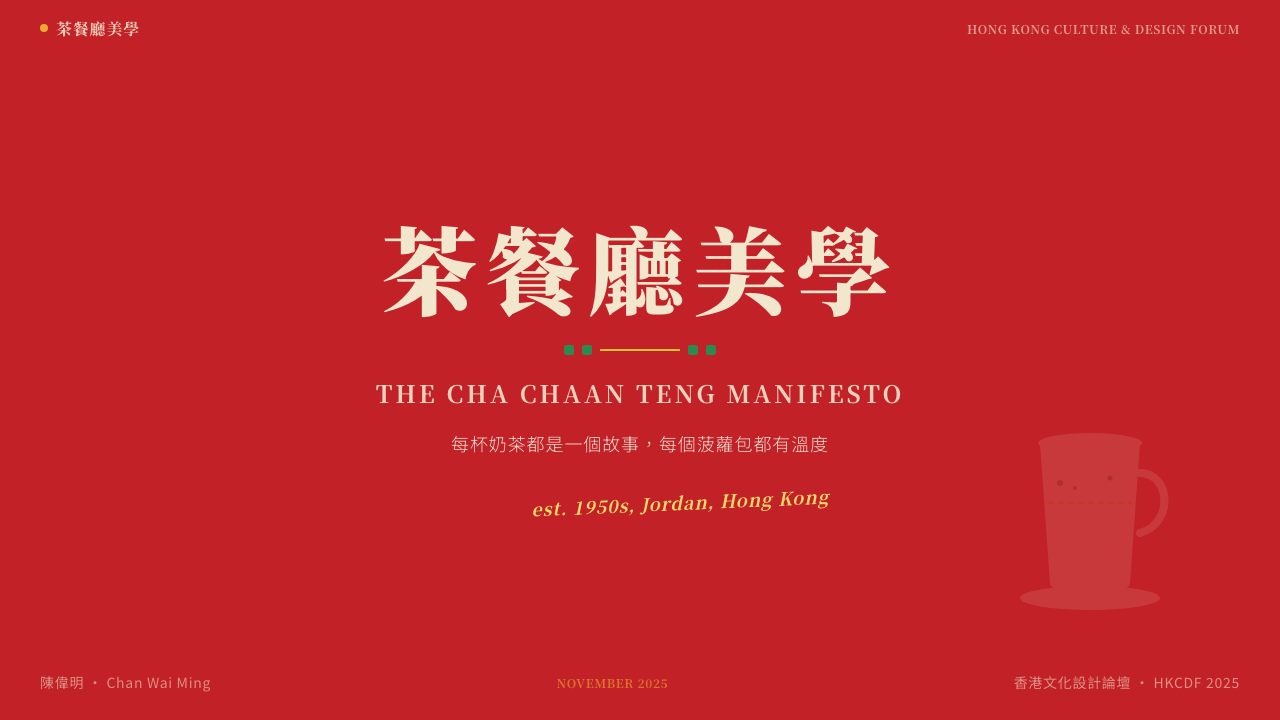
For presentation slides, the system produces strong results on both cover and content pages. A cover should commit to a tram-red primary surface with the title set in large bilingual type — Chinese and English at equal optical scale — against a cream or near-white content panel inset within the red ground. Content slides work best with a narrow left or right band of red or jade green as a section indicator, body content in clear sans-serif on a light background, and data visualizations using the tricolor palette to assign categorical meaning. Avoid crowding all three colors onto a single slide; on data slides, assign tram red to the primary data series and jade to secondary, reserving cream for neutral or background reference values.對於演示文稿,這套系統在封面和內容頁都能產生強效果。封面應以電車紅作主底色,標題以大號雙語排版——中英文以相同視覺尺度並列——嵌入紅色底面內的忌廼色或近白色內容面板上。內容頁最適合以左側或右側一條窄窄的紅色或翡翠綠帶作段落指示,正文內容以清晰無衬線字排在淺色底面上,數據可視化使用三色調色板指派類別意義。避免將三種顏色同時擁擠在一張幻燈片上;在數據頁,將電車紅分配給主要數據系列,翡翠綠分配給次要系列,忌廼色保留給中性或背景參考值。
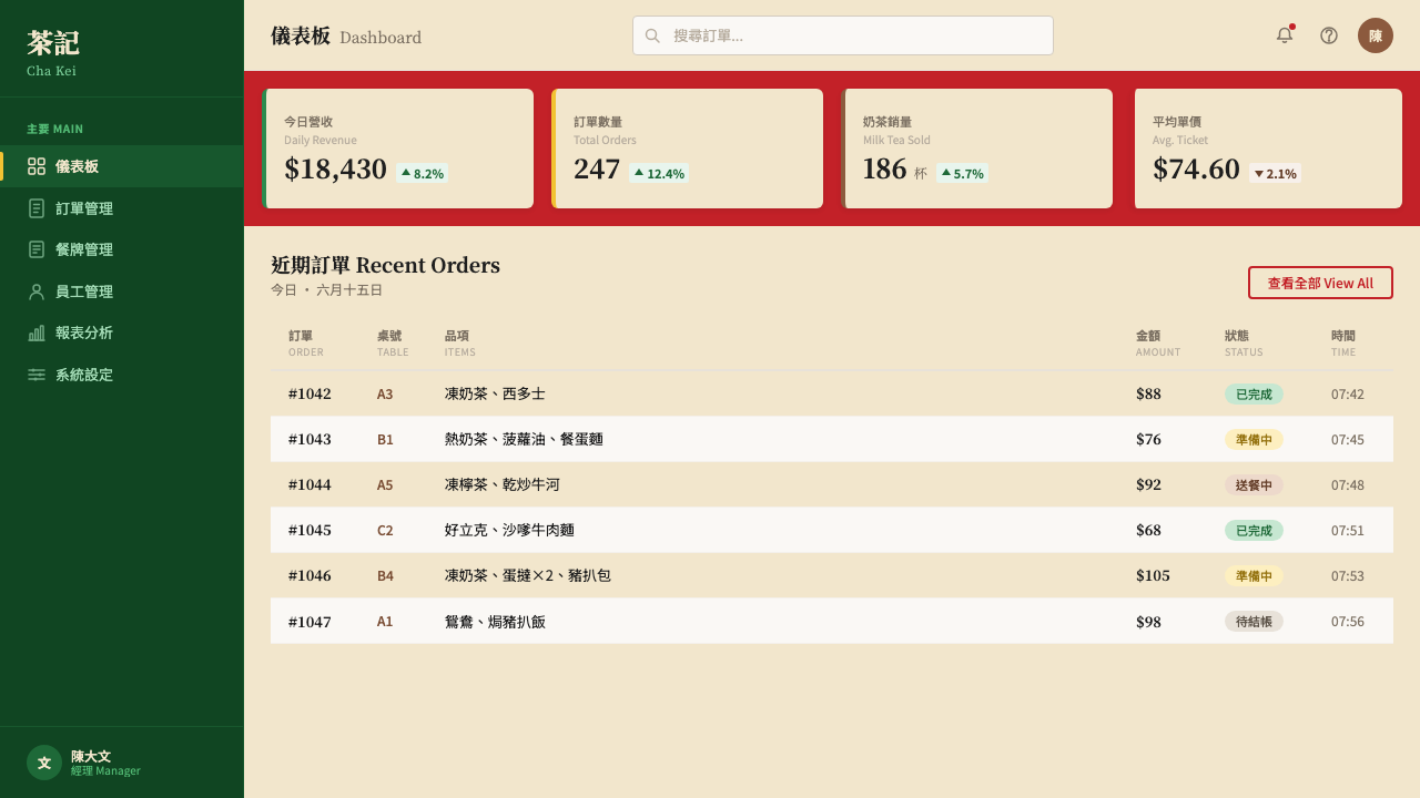
For web interfaces and dashboards, the style is well-suited to applications where warmth and specificity are strategic advantages — food and beverage brand sites, cultural institution platforms, Hong Kong or Cantonese diaspora community products, and any context positioning itself as approachable rather than corporate. Apply tram red to the top navigation bar and primary interactive elements; use jade green for secondary navigation, tags, and status indicators; reserve cream for card backgrounds and content panels that need visual warmth distinct from the page ground. Pricing pages benefit from the system's natural three-tier color logic: one tier in red, one in jade, one in neutral — each color carrying the hierarchy without requiring additional decorative differentiation.對於網頁界面和儀表板,這種風格適合溫暖感和特殊性是戰略優勢的應用場景——餐飲品牌網站、文化機構平台、香港或廣東離散社群產品,以及任何定位自身為親切而非企業化的場景。將電車紅應用於頂部導航欄和主要交互元素;翡翠綠用於次導航、標籤和狀態指示符;忌廼色保留給需要與頁面底色形成視覺溫差的卡片背景和內容面板。定價頁受益於這套系統天然的三層色彩邏輯:一個層級用紅,一個用翡翠綠,一個用中性色——每種顏色自然承載層級,無需額外的裝飾區分。
For editorial and marketing work, the bilingual typographic system is the most powerful tool available. A hero section with a bold Chinese headline and its English equivalent at the same visual weight immediately signals a cultural positioning that is specific and intentional. Section breaks work well with a full-width red or jade band rather than decorative rules. Marketing sequences — email campaigns, social cards, promotional tiles — should maintain strict color discipline across the set: one color assigned to one type of information throughout, so the tricolor system functions as a navigational grammar rather than decoration. The style's density tolerance also means information-heavy marketing formats like feature comparison grids and pricing tables can be executed without feeling sparse or over-designed.對於編輯和市場推廣內容,雙語排版系統是最有力的工具。一個以粗體中文標題及同等視覺分量的英文對應文字構成的主視覺區,立即傳遞出一種具體而刻意的文化定位。段落分隔適合用全寬紅色或翡翠綠色帶,而非裝飾性橫線。市場推廣系列——電郵推廣、社群卡片、促銷貼圖——應在整套中維持嚴格的色彩紀律:一種顏色全程對應一種類型的信息,使三色系統作為導航語法而非裝飾發揮功能。這種風格的密集容忍度也意味着信息量大的市場推廣格式(如功能對比表和定價表)可以在不顯空洞或過度設計的情況下執行。
The most common mistake when applying this system is using all three colors simultaneously at full saturation, turning the palette into fairground decoration rather than structural signal. Authentic applications lead decisively with tram red and use jade green and cream as supporting voices. A second frequent error is applying cream as the overall page background — cream is a panel color, not a ground color, and this distinction is non-negotiable. A third mistake is romanticizing the aesthetic into something precious: the cha chaan teng was energetic, fast, and slightly rough around the edges. Layouts that are overly refined or symmetrical betray the source material. Leave room for the visual equivalent of a slightly askew price sticker.應用此系統時最常見的錯誤,是將三種顏色同時以全飽和度使用,使調色板從結構信號退化為遊樂場裝飾。真實的應用以電車紅為決定性主導,翡翠綠和忌廼色作配角。第二個常見錯誤是將忌廼色作為整體頁面背景——忌廼色是面板色而非底色,這一區別不可商量。第三個錯誤是將這種美學浪漫化為矯飾之物:茶餐廳充滿能量、節奏快速、邊緣略顯粗糙。過度精緻或過度對稱的版面背叛了源材料。留出餘地,讓視覺上等同於一張略斜貼上的價格貼紙的東西存在。
See the Hong Kong Cha Chaan Teng design system查看 Hong Kong Cha Chaan Teng 完整设计系统
Hong Kong Cha Chaan Teng — FAQHong Kong Cha Chaan Teng · 常见问题
Is this style appropriate only for Hong Kong-related brands, or can it be used more broadly?這種風格只適合香港相關品牌,還是可以更廣泛應用?
The cha chaan teng system carries a specific cultural signature that should be acknowledged rather than ignored. It is most powerful when deployed by brands and projects with genuine connection to Hong Kong, Cantonese, or broader East Asian working-class culture — food and beverage, hospitality, community platforms, cultural institutions, diaspora media. Used in these contexts, it reads as authentic and grounded. Used by brands with no cultural connection to the source material, it risks reading as costume or appropriation. That said, the underlying structural logic — bold color hierarchy, bilingual typographic equality, information density with organized structure — can inform design thinking beyond the specific cultural context, as long as the application does not claim cultural authenticity it does not possess.茶餐廳系統帶有特定的文化印記,應當被承認而非忽視。它在與香港、廣東或更廣泛的東亞勞工文化有真實聯繫的品牌和項目中最具力量——餐飲、款待、社群平台、文化機構、離散媒體。在這些語境中使用,讀來真實而根植。由與源材料毫無文化聯繫的品牌使用,則有淪為服裝或挪用的風險。話雖如此,其底層結構邏輯——粗壯的色彩層級、雙語排版平等、有組織結構的信息密集——可以在特定文化語境之外啟發設計思維,只要應用不聲索其並不擁有的文化真實性。
How does cha chaan teng differ from other Hong Kong design styles like Cantopop or wuxia aesthetics?茶餐廳風格與粵語流行或武俠美學等其他香港設計風格有何不同?
The distinction is primarily one of class register and chromatic logic. Cantopop aesthetics — associated with the 1980s and 1990s Cantonese pop music industry — tend toward jewel tones, high-gloss finish, star portraiture, and a kind of aspirational glamour rooted in celebrity culture. Wuxia aesthetics draw on inky atmospheric landscape painting, muted earthy tones, dramatic lighting, and literati calligraphic tradition. Cha chaan teng is resolutely working-class in its register: primary colors rather than jewel tones, flat graphic treatment rather than atmospheric depth, bilingual commercial signage rather than artistic calligraphy, and energy that is communal and fast rather than contemplative or aspirational. The three aesthetics can coexist within Hong Kong visual culture broadly, but they serve different emotional registers and should not be mixed without care.區別主要在於階層語域和色彩邏輯。粵語流行美學——與二十世紀八九十年代廣東流行音樂工業相關——傾向於寶石色調、高光澤度、明星肖像,以及根植於明星文化的渴望式魅力。武俠美學汲取水墨大氣山水畫、沉靜土系色調、戲劇性光線和文人書法傳統。茶餐廳在語域上是徹底勞工階層的:三原色調而非寶石色,平面圖形處理而非大氣深度,雙語商業招牌而非藝術書法,能量上是共同性與快速感而非沉思或渴望。三種美學在廣義的香港視覺文化中可以共存,但服務於不同的情感語域,不應不加審慎地混用。
Can this style work in dark-mode or dark-background applications?這種風格能用於深色模式或深色背景的應用嗎?
A dark inversion is viable but requires careful recalibration. The original cha chaan teng environment was not a dark space — fluorescent-lit interiors with cream and jade surfaces are its natural register. Inverting to a dark background — charcoal or near-black — works best when tram red is used sparingly as a structural accent rather than a dominant surface, and jade green is elevated to the primary contrast color for body elements. Cream should shift to a warmer, slightly luminous off-white for text on dark grounds. Avoid the temptation to add neon-glow effects; the neon energy of the style is achieved through bold flat color, not through simulated luminescence. A dark version reads best as a night-mode variant rather than the primary expression of the system.深色反轉是可行的,但需要仔細重新校準。原版茶餐廳環境並非暗色空間——熒光燈照明配合忌廼色和翡翠綠表面是其自然語域。反轉為深色背景——炭色或近黑色——最適合的做法是將電車紅克制地用作結構點綴而非主導面色,翡翠綠提升為正文元素的主要對比色。忌廼色應轉向更暖、略帶光感的米白色用於深色底面上的文字。避免添加霓虹發光效果的誘惑;這種風格的霓虹能量通過大膽的平面色塊實現,而非通過模擬發光效果。深色版本最好作為夜間模式變體,而非系統的主要表達。
What is the right approach to photography and imagery within this design system?在這套設計系統中,攝影和圖像應如何處理?
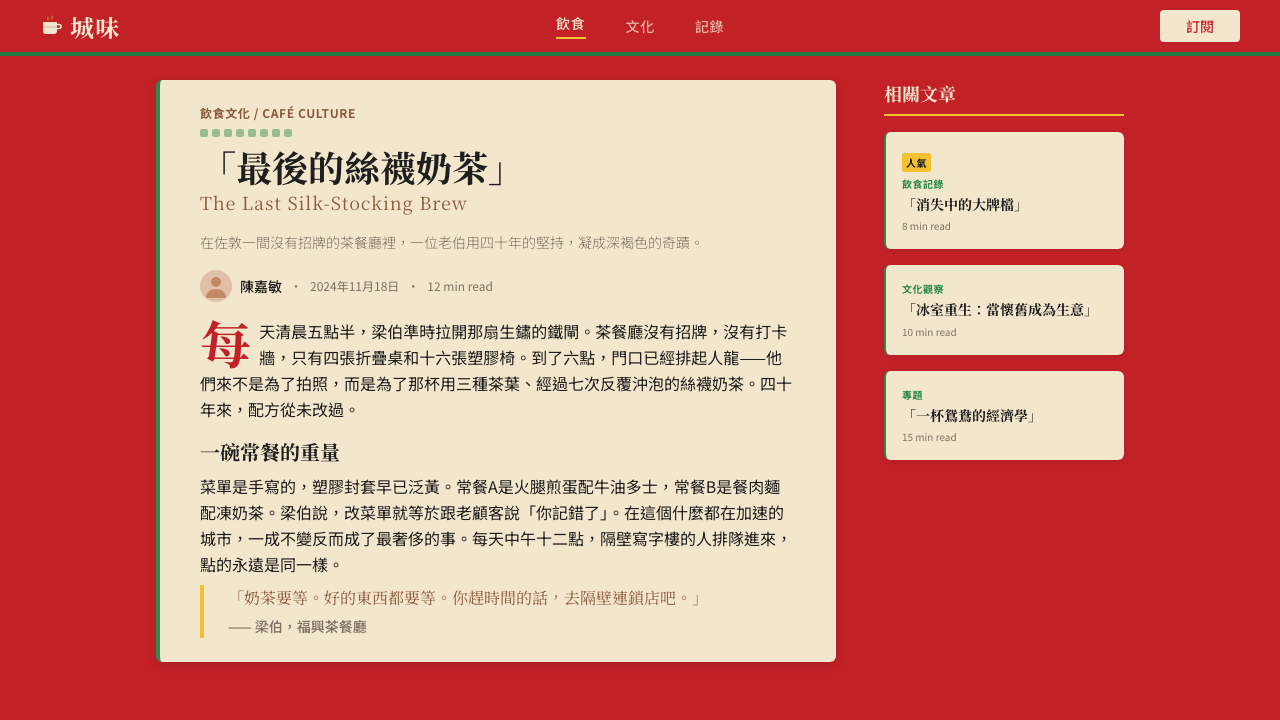
Photography works best in this system when it reinforces the documentary quality of the source culture rather than aspiring to polished lifestyle imagery. High-contrast, close-up photography of food, people, and interior details — shot in available or fluorescent light with no artificial softening — reads as authentic. Lifestyle photography with studio lighting, color grading, and shallow depth of field pulls against the system's vernacular energy. When photography must be adapted to fit the system, a warm-toned, slightly desaturated treatment or a high-contrast duotone using tram red and cream can bring ambient photography into alignment with the tricolor palette. Illustration, when used, should reference the flat, graphic quality of hand-painted signage rather than contemporary digital illustration styles.在這套系統中,攝影最有效的做法是強化源文化的紀錄品質,而非追求精緻的生活方式圖像。高對比度、特寫的食物、人物和室內細節攝影——在自然光或熒光燈下拍攝,不作人工柔化——讀來真實。使用影棚燈光、色彩調級和淺景深的生活方式攝影,會與系統的草根能量產生拉扯。當攝影必須適應這套系統時,暖調、略微降飽和的處理,或使用電車紅與忌廼色的高對比度雙色調,可以使環境攝影與三色調色板對齊。插畫(若使用)應參照手繪招牌的平面圖形質感,而非當代數字插畫風格。
Does this style conflict with accessibility requirements for color contrast?這種風格會與色彩對比度的無障礙要求產生衝突嗎?
The tram red and jade green used in this system can present contrast challenges for body text if used directly as text color on light grounds, or as light-text backgrounds. The system's original solution — which also happens to be the accessible solution — is to use these colors as surface and structural colors rather than text colors. Body text should remain black or very dark on light grounds, and white or near-white on red or jade grounds. Cream panels used for highlighted content present no contrast issue when dark text is applied to them. Where colored type is used for headlines or labels, the large scale of display type compensates for reduced contrast ratios. The bilingual typographic system adds a layer of consideration: ensure both the Chinese and English lines meet contrast requirements at their respective sizes, since Chinese characters at equivalent point sizes often carry more visual weight than equivalent Latin characters.若直接將電車紅和翡翠綠用作淺色底面上的文字顏色,或作為淺色文字的背景色,這套系統的這兩個色相可能在正文文字對比度上產生挑戰。系統的原版解決方案——同時也是符合無障礙標準的解決方案——是將這些顏色用作表面色和結構色,而非文字色。正文文字在淺色底面上應保持黑色或深色,在紅色或翡翠綠底面上應保持白色或近白色。忌廼色面板用於強調內容時,只要應用深色文字,不存在對比度問題。當彩色文字用於標題或標籤時,展示文字的大尺寸可補償降低的對比度比值。雙語排版系統增加了一層考量:確保中英文兩行在各自的字號下都達到對比度要求,因為相同字號的中文字符通常比等量拉丁字符承載更多視覺分量。
Related design styles相关设计风格
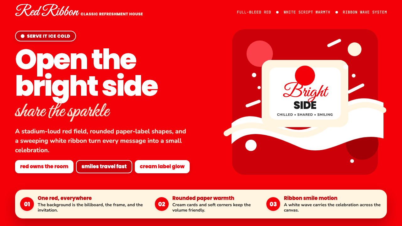 Coca-Cola ClassicHappiness goes full-bleed. Signature red, white ribbon waves, and warm rounde…快乐铺满全屏:标志性红、白色缎带波浪与圆润字体。
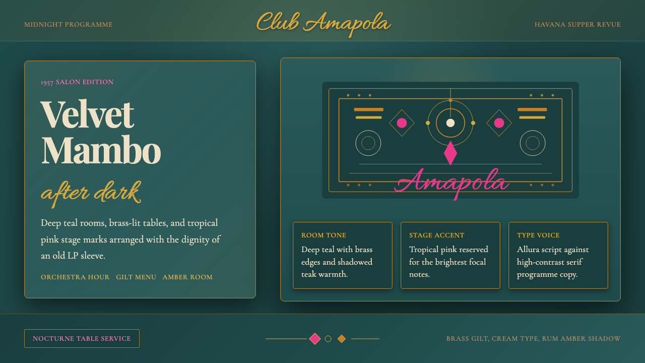 Cuban Salsa Cabaret (1950)Nightlife with dignity. Deep teal, brass gilt, and Allura script stage the ro…尊贵夜色:深青底、黄铜鎏金与Allura手写体搭台。
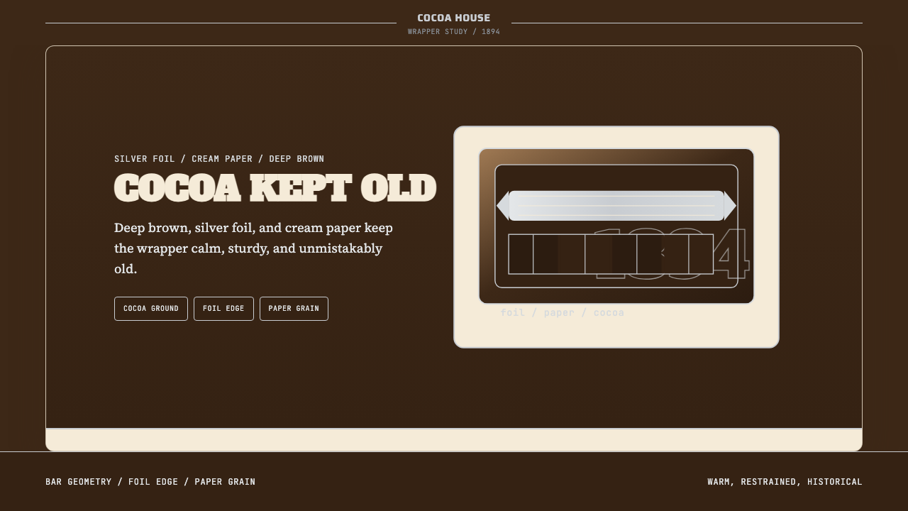 Hershey's Chocolate Brown (1894)Plain, enduring, warm. Cocoa brown meets silver foil on cream paper.朴素而耐久:可可棕配银箔与奶油纸面,克制百年不变。
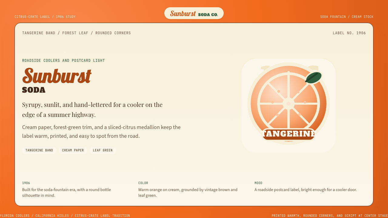 Orange Crush Soda (1906)Syrupy nostalgia. Tangerine, cream, and script make it a postcard label.糖浆般怀旧。橘红、奶油纸与手写体把标签变成明信片。
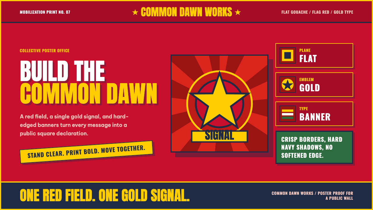 Vietnamese PropagandaFlat color commands. Flag-red fields, gold star rays, and Anton slogans hit a…平涂色块发号召:旗红、金星射线与粗体标语形成海报级冲击。
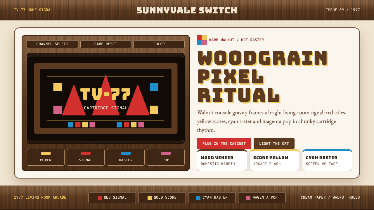 Atari 2600 (Woodgrain)Woodgrain meets raw pixels. Walnut panels frame Bungee type and CMYK raster b…木纹遇上生猛像素:胡桃木面板包裹Bungee字与CMYK色块。