Design style guide设计风格指南
What is Cuban Salsa Cabaret (1950)?什么是 Cuban Salsa Cabaret (1950)?
Havana's golden-age cabarets — Tropicana, Sans Souci, Cabaret Parisién — staged an era of deep teal rooms, warm amber light, and handwritten gilt script that the world has never quite forgotten.哈瓦那黄金年代的夜总会——热带花园、无忧宫、巴黎人歌厅——以深青色厅堂、暖琥珀灯光与手写鎏金字体,演绎出一个令世人难以忘怀的时代。
Cuban Salsa Cabaret (1950) in briefCuban Salsa Cabaret (1950) 速览
Cuban Salsa Cabaret (1950) is a design style rooted in the visual language of pre-revolution Havana nightlife at its most extravagant and dignified. It draws from the theatrical interiors of the great Caribbean cabarets — open-air arcades, crystal chandeliers, teak wall paneling, hand-painted menu cards — and translates that atmosphere into a graphic and digital vocabulary defined by depth, warmth, and ceremony.古巴萨尔萨歌厅(1950)是一种植根于革命前哈瓦那夜生活视觉语言的设计风格,取材自加勒比海伟大夜总会的戏剧性室内陈设——露天拱廊、水晶吊灯、柚木墙板与手绘菜单卡——并将那种氛围转化为以深度、温度与仪式感为核心的图形与数字词汇。
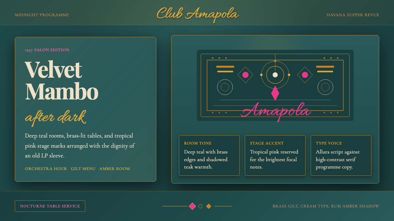
The palette is built around a rich, saturated teal that anchors compositions the way velvet drapes frame a stage, paired with warm amber and brass tones that evoke the glow of chandeliers and polished fixtures. Against this deep ground, accents of tropical pink and ivory appear like spotlights cutting through a darkened room. Gold, treated not as gaudy decoration but as embossed script on fine menu cards, provides the defining typographic texture.调色板以一种浓郁饱和的深青色为基调,以幕帷框台口的方式锚定构图,配以暖琥珀与黄铜色调,唤起水晶灯与抛光装置的光泽感。在这片深色底面上,热带粉红与象牙白如同切穿暗场的追光灯一般点亮画面。金色并非俗气的装饰,而是浮雕于精美菜单卡上的手写字体质感,构成这套风格最具辨识力的排印特征。
Where many dark or glamorous styles risk visual noise, the Cuban Salsa Cabaret aesthetic maintains a sense of composed elegance — the dignity of a dining room that happens to contain a seventeen-piece orchestra. Everything is intentional: the script lettering suggests handcraft and hospitality; the layered warmth of the color palette suggests candlelight without imitating it literally; even the textural references to leopard upholstery and gilded surfaces are absorbed into a system that stays controlled and purposeful.许多深色或华丽风格容易陷入视觉噪音,古巴萨尔萨歌厅美学却保持着一种从容的典雅——那是一间恰好容纳了十七人大乐队的正式餐厅所具有的尊贵气质。一切都是经过推敲的:草书字体暗示手工艺与待客之道;调色板层叠的暖意在不刻意模仿烛光的前提下传递了烛光的感觉;就连对豹纹软垫与鎏金表面的质感参照,也被吸纳进一套始终保持克制与目的性的体系之中。
See the Cuban Salsa Cabaret (1950) design system →查看 Cuban Salsa Cabaret (1950) 完整设计系统 →
Where does Cuban Salsa Cabaret (1950) come from?Cuban Salsa Cabaret (1950) 从何而来?
The Cuban cabaret circuit took shape in the late 1930s when Havana was positioning itself as the playground of the Americas. The Tropicana opened in Marianao in 1939, originally as a small social club before expanding into an open-air theatrical venue that would become the most famous nightclub in Latin American history. Sans Souci, Cabaret Parisién at the Hotel Nacional, and the Montmartre followed, each competing to offer the most sophisticated staging of Caribbean music and dance for an international audience that included Hollywood celebrities, Latin American statesmen, and wealthy tourists from the United States and Europe.古巴夜总会演出网络在1930年代末逐渐成形,彼时哈瓦那正将自身定位为美洲的欢乐场所。热带花园于1939年在马里亚瑙区开业,最初只是一家小型社交俱乐部,后来扩展为露天剧场式场馆,成为拉丁美洲历史上最负盛名的夜总会。无忧宫、国家饭店内的巴黎人歌厅以及蒙马特夜总会相继开业,彼此竞相为好莱坞明星、拉美政要以及来自美国和欧洲的富裕游客提供最精致的加勒比音乐与舞蹈演出。
The visual culture of these venues was defined by an unusual collision of influences. European Art Deco, which had arrived in Cuba through architecture and graphic design in the 1930s, provided the structural vocabulary: arched ceilings, geometric ironwork, monumental lettering. Afro-Cuban artistic traditions contributed vitality and color warmth — the tropical palette was not a European imposition but a genuine synthesis. American jazz and big-band aesthetics, arriving via radio broadcasts and LP sleeve design, shaped the typographic sensibility of advertising and programs. The result was neither European nor purely Caribbean but a genuinely creole visual language.这些场所的视觉文化由一种不寻常的影响碰撞所定义。1930年代已经通过建筑与平面设计抵达古巴的欧洲装饰艺术提供了结构性词汇:拱形穹顶、几何铁艺、纪念碑式字体。非洲-古巴艺术传统贡献了活力与色彩温度——热带调色板并非欧洲强加,而是一种真实的混血综合。经由广播与黑胶唱片封套抵达的美国爵士乐与大乐队美学,则塑造了广告与节目册的排印感性。结果既非欧洲式、也非纯粹加勒比式,而是一种真正的克里奥尔视觉语言。
The decade between 1948 and 1958 — often called the Golden Age of the Cuban cabaret — coincided with the height of the mambo craze and the global spread of Cuban music. Choreographer and designer Roderico Neyra, known as Rodney, transformed the Tropicana's stage spectacle into an internationally recognized art form, dressing performers in elaborate tropical costumes and staging shows that were as visually complex as any Broadway production. The graphic materials produced during this period — program covers, advertising posters, LP sleeve artwork, cocktail menus — represent some of the most distinctive visual design ever produced in the Caribbean region.1948年至1958年间——通常被称为古巴夜总会的黄金十年——与曼波热潮的顶峰及古巴音乐的全球传播同步发生。编舞家兼舞台设计师罗德里科·内拉(艺名罗德尼)将热带花园的舞台奇观打造成一种国际公认的艺术形式,为表演者设计精心制作的热带服装,呈现出与百老汇同等视觉复杂度的演出。这一时期产生的印刷品——节目册封面、广告海报、黑胶唱片封套、鸡尾酒菜单——代表了加勒比地区有史以来最具辨识力的视觉设计成果之一。
The Cuban Revolution of 1959 ended the Golden Age abruptly. The great cabarets closed or were nationalized; the international clientele vanished; the flood of American tourism that had sustained the circuit dried up overnight. Tropicana survived under state management and continues to operate, but the particular cultural and commercial energy that produced the style was gone. The aesthetic resurfaced in the 1990s as Cuba reopened to international tourism, with nostalgic reproductions appearing in hotels, restaurants, and the global salsa revival. Contemporary designers encounter it chiefly through vintage LP covers, surviving cabaret programs, and the architecture of Havana's Vedado and Marianao districts — preserved less by intention than by the relative absence of development over the intervening decades.1959年的古巴革命骤然终结了黄金时代。大型夜总会相继关闭或被国有化,国际客群消失,支撑整个演出网络的美国旅游业一夜之间断流。热带花园在国家管理下存续至今仍在运营,但孕育这套风格的特定文化与商业能量已经消散。这种美学在1990年代随古巴重新向国际旅游开放而复现,以怀旧复制品的形式出现于酒店、餐厅与全球萨尔萨复兴运动之中。当代设计师主要通过复古黑胶唱片封套、留存的夜总会节目册以及哈瓦那韦达多区与马里亚瑙区的建筑遗迹来接触这套美学——它们的保存与其说出于刻意,不如说源于此后数十年间相对缺失的开发活动。
What defines the Cuban Salsa Cabaret (1950) look?Cuban Salsa Cabaret (1950) 的视觉特征是什么?
Color色彩
The palette is built on a deep, jewel-toned teal that functions as both background field and primary identity color — saturated enough to read as luxurious, dark enough to absorb ambient warmth without becoming muddy. Against this ground, brass and amber tones provide the central warmth, evoking gilded metal rather than raw gold. Tropical pink appears as an accent that feels unexpected yet inevitable — the color of bougainvillea visible beyond a terrace railing. Ivory and off-white reserve the brightest points of the composition for typography and fine-line ornament. The system reads as rich and layered without becoming heavy because the warmth is distributed across a narrow, purposeful range.调色板以一种深邃的宝石色调深青色为核心,兼具背景底色与主视觉标识色的双重功能——饱和度足以传递奢华感,深度足以吸纳环境暖意而不致浑浊。在这片底色上,黄铜与琥珀色调提供了核心的暖意,唤起镀金金属而非生金的质感。热带粉红作为点缀色出现,有一种出人意料却又必然的感觉——如同在露台栏杆外可见的三角梅颜色。象牙白与米白保留了构图中最明亮的焦点,用于字体与细线装饰。整套体系呈现出丰富的层次感,却不显沉重,因为暖意被分布在一个狭窄而有目的的色域范围之内。
Typography字体排印
Script and handwritten letterforms occupy the expressive center of the style, recalling the hand-painted gilt signage and calligraphed menu cards of the cabarets themselves. These fluid, looping forms convey hospitality, ceremony, and a sense that someone took time and care with the communication. They are paired with the kind of condensed, elegant serif letterforms associated with 1950s entertainment advertising — proportions that read as refined rather than theatrical. Headlines feel like stage announcements; supporting text feels like fine-print program notes. The interplay between the flowing script and the upright serif creates the dual register of the style: intimate and grand simultaneously.草书与手写字形占据了这套风格表达性的核心,令人联想到夜总会本身手绘的鎏金招牌与手书菜单卡。这些流动、蜿蜒的字形传递出待客之道、仪式感,以及一种有人花费时间与心思进行传达的感觉。它们与1950年代娱乐广告风格的紧缩优雅衬线字形相配合——这种比例呈现出精炼而非戏剧化的气质。标题像舞台报幕,辅助文字像精印节目册注释。流动草书与竖直衬线之间的互动,制造出这套风格的双重音域:同时私密而宏大。
Texture and Surface质感与表面
The style carries a persistent sense of material richness without relying on literal photographic surface reproduction. Velvet, brass, teak, and leopard-print upholstery are the reference materials — but in the designed system they translate into tonal depth, embossing-like effects in type treatment, and a slight organic irregularity that prevents the palette from reading as flat or digital. This is a style that should feel as if it has physical weight: like a menu card you can hold, not a screen you scroll through. That physical quality is achieved through the strategic deployment of texture-suggesting elements rather than literal material simulation.这套风格始终散发出一种材质丰富感,但并不依赖字面上的摄影表面还原。天鹅绒、黄铜、柚木与豹纹软垫是参照材质——但在设计系统中,它们转化为色调深度、字体处理中类浮雕的效果,以及轻微的有机不规则感,使整个调色板不至于显得平面化或数字感过强。这套风格应该让人感受到实体的重量:像一张可以握在手中的菜单卡,而非一个用来滑动的屏幕。这种物理质感是通过策略性运用暗示质感的元素而非字面材质模拟来实现的。
Composition and Drama构图与戏剧性
Layouts in this style are theatrical in their staging — elements are placed with the deliberateness of objects arranged on a stage set. Large, centrally weighted compositions suit ceremonial contexts: an event announcement, a cover, a hero section. Asymmetry is used carefully rather than as a default, since the style's historical sources favored the balanced formality of a restaurant menu or a concert program. When asymmetry appears, it mirrors the asymmetry of a performance: an orchestra positioned to one side, a spotlight trained on the other. White space is used sparingly; the style tolerates a richer density than most contemporary idioms.这套风格的版面在舞台调度上具有戏剧性——元素的摆放像舞台布景上精心安排的道具,带有审慎的目的性。大型居中构图适合仪式性语境:活动公告、封面、主视觉区域。非对称被谨慎使用而非作为默认选项,因为这套风格的历史源头偏好餐厅菜单或音乐会节目册式的平衡正式感。当非对称出现时,它映射的是演出的非对称:乐队居于一侧,追光打向另一侧。留白被节制地使用;相较于当代大多数设计语汇,这套风格容许更为丰富的密度。
Ornament and Restraint装饰与克制
Unlike modernist styles that reject ornament entirely, the Cuban Salsa Cabaret style treats decoration as functional — it signals occasion and register in the way that a chandelier signals the formality of a room. Fine-line flourishes around titles, subtle border frames, and embossed-effect text treatments are permitted and expected. But the ornament never overwhelms the information hierarchy; it frames rather than fills. The test is whether a decorative element contributes to the sense of occasion or merely clutters the surface. Restraint here means knowing which ornaments to include, not whether to include any at all.与彻底拒绝装饰的现代主义风格不同,古巴萨尔萨歌厅风格将装饰视为功能性的——它标示场合与调性,正如吊灯标示一个房间的正式程度。标题周围的细线花饰、微妙的边框,以及具有浮雕效果的字体处理,都是被允许且被期待的。但装饰永远不会压倒信息层级;它的作用是框架而非填充。检验标准是:某个装饰性元素是否有助于营造场合感,还是仅仅使表面变得杂乱。这里的克制意味着知道该纳入哪些装饰,而非是否要纳入装饰。
Dark Ground and Light暗底与光感
The style is defined by its dark-ground orientation — compositions are built on deep, richly saturated backgrounds rather than white or cream fields. This inversion from most print traditions is intentional and historically grounded: the cabarets themselves were dark rooms punctuated by pools of warm light, not bright, evenly lit spaces. The design language replicates that experience by treating lighter elements as sources of illumination rather than as the default ground. This requires a different compositional logic: the hierarchy is built by adding light rather than by adding color to white.这套风格以其暗底取向为核心——构图建立在深邃、饱和的背景上,而非白色或奶油色的底面。这种对大多数印刷传统的反转是有意为之且有历史依据的:夜总会本身就是被温暖光池点亮的黑暗房间,而非明亮均匀的照明空间。这套设计语言通过将较浅的元素处理为光源而非默认底色来复现那种体验。这需要一种不同的构图逻辑:层级是通过增添光亮而非向白色底面添加色彩来建立的。
Musical Energy音乐能量
At its best, the style carries a sense of contained rhythmic energy — the visual equivalent of a mambo arrangement building to a clave pattern. This does not mean layouts should be busy or syncopated in a literal sense, but that there should be a sense of organized momentum: a deliberate flow from one element to the next, sections that feel like movements in a suite. The script letterforms embody this quality most directly; their fluid strokes suggest motion even in stillness. The style resists the purely static and the purely decorative in equal measure, arriving instead at something between composition and choreography.在最佳状态下,这套风格携带着一种有所克制的律动能量——仿佛一首曼波编曲推进至克拉维节奏高潮的视觉对应。这并不意味着版面应当繁忙或在字面意义上切分,而是说应当有一种有组织的动势:从一个元素到下一个元素有刻意的流动感,各段落感觉像组曲中的不同乐章。草书字形最直接地体现这种特质;即使静止,其流畅的笔划也暗示着运动。这套风格在等量抵制纯粹静态与纯粹装饰的同时,抵达了某种介于构图与编舞之间的存在。
See the Cuban Salsa Cabaret (1950) design system →查看 Cuban Salsa Cabaret (1950) 完整设计系统 →
Who shaped Cuban Salsa Cabaret (1950)?谁塑造了 Cuban Salsa Cabaret (1950)?
Known as El Bárbaro del Ritmo — the Barbarian of Rhythm — Beny Moré was the defining vocalist and bandleader of the Cuban cabaret golden age. His ability to move between son, mambo, bolero, and guaracha within a single performance made him the human embodiment of the style's synthesis: formal and spontaneous, refined and exuberant, in equal measure. His stage presence — white linen suit, cane, a commanding physical authority — translated directly into the visual iconography of the era's promotional materials and LP artwork.以「节奏野人」(El Bárbaro del Ritmo)之名为世人所知,贝尼·莫雷是古巴夜总会黄金时代最具代表性的歌手与乐队领班。他能够在一场演出中游走于颂乐、曼波、波莱罗与瓜拉恰之间,成为这套风格综合体的人格化体现:正式与即兴、精炼与热烈,等量并存。他的舞台形象——白色亚麻西装、手杖与掌控一切的肢体气场——直接转化为那个时代宣传材料与黑胶封套的视觉图腾。
Celia Cruz began her international career performing in the cabarets and clubs of Havana before the revolution, and the visual extravagance she brought to her costumes and stage presentation became inseparable from the style's visual identity. Her instinct for theatrical color — layered, saturated, always in conversation with her performers — mirrors exactly the palette logic of the design system: nothing timid, nothing accidental, everything calibrated for maximum warmth under stage light. After leaving Cuba following the revolution, she became the global ambassador for the sound and visual culture of that era.塞利亚·克鲁斯在革命前便开始了她在哈瓦那夜总会与俱乐部的演艺生涯,她为服装与舞台呈现带来的视觉奢华感,与这套风格的视觉身份密不可分。她对戏剧性色彩的本能感知——层叠、饱和、始终与表演者形成对话——精确映射了这套设计体系的调色板逻辑:没有胆怯,没有偶然,一切都经过校准以在舞台灯光下达到最大的暖度。革命后离开古巴,她成为那个时代音乐与视觉文化的全球使者。
Pérez Prado was the architect of mambo as an international phenomenon, transforming a Cuban dance music idiom into a global craze through a combination of musical showmanship and visual spectacle. His recording covers and concert promotional materials — often featuring bold lettering, tropical color washes, and silhouetted figures mid-movement — are among the most direct antecedents of the design style. As a bandleader who understood that the visual package of music mattered as much as the sound, Prado helped define what the aesthetic of Cuban entertainment should look like in print and on record.佩雷斯·普拉多是将曼波打造为国际现象的建筑师,通过音乐表演才能与视觉奇观的结合,将古巴舞曲语汇转化为一场全球热潮。他的唱片封套与演唱会宣传材料——通常以粗犷字体、热带色彩晕染与舞动中的剪影人物为特色——是这套设计风格最直接的先行者之一。作为一位深刻理解音乐视觉包装与声音本身同等重要的乐队领班,普拉多帮助界定了古巴娱乐美学在印刷品与唱片上应有的面貌。
As the chief choreographer and artistic director of the Tropicana from the late 1940s through the 1950s, Rodney was responsible for the visual total production — costume design, staging, lighting, and the integration of performance into the architectural space of the outdoor venue. He approached the cabaret show as a unified visual event, not simply a musical performance with costumes attached, and in doing so established the theatrical grammar that defines how the style uses space and spectacle. His work demonstrates that the style's visual extravagance was not incidental excess but the result of deliberate artistic direction.作为1940年代末至1950年代热带花园的首席编舞兼艺术总监,罗德尼负责整台演出的全方位视觉统筹——服装设计、舞台调度、灯光布置,以及表演与露天场馆建筑空间的融合。他将夜总会演出视为一场统一的视觉事件,而非仅仅是附有服装的音乐表演,由此建立了界定这套风格如何运用空间与奇观的戏剧性语法。他的工作表明,这套风格的视觉奢华并非偶然的过剩,而是有意识的艺术指导的成果。
As an institution rather than an individual, the Tropicana is the single most important material source for the design style. Founded in 1939 in the Marianao district of Havana, its open-air performance space — the Arcos de Cristal (Crystal Arches) hall designed by architect Max Borges Recio in 1951 — combined modernist structure with tropical excess in a way that has never been replicated. The visual documents produced for and by Tropicana over two decades of operation constitute the richest surviving archive of the Cuban cabaret aesthetic: programs, posters, menu cards, and publicity photographs that remain the primary reference for anyone working in this style today.作为一家机构而非个人,热带花园是这套设计风格最重要的单一物质来源。1939年创立于哈瓦那马里亚瑙区,其露天演出空间——由建筑师马克斯·博尔赫斯·雷西奥于1951年设计的「水晶拱廊」大厅——以一种从未被复制的方式将现代主义结构与热带奢华融为一体。热带花园在二十年运营期间产生和留存的视觉文献,构成了古巴夜总会美学最丰富的现存档案:节目册、海报、菜单卡与宣传照片,至今仍是所有在这套风格框架内工作的设计师的首要参照。
How do you use Cuban Salsa Cabaret (1950) today?今天怎么用 Cuban Salsa Cabaret (1950)?
The Cuban Salsa Cabaret aesthetic is among the more demanding historical styles to apply well precisely because its richness is so seductive. The temptation is to pile on the teal, the gold script, the tropical pink, and the textural references simultaneously — resulting in something that feels costume-like rather than designed. Correct application requires treating the palette as a system of roles rather than a set of ingredients: the deep teal is the room, the amber warmth is the lighting, the script is the signage, and the tropical accents are the flowers in the arrangement. Each element has a function; none is simply decorative.古巴萨尔萨歌厅美学是历史风格中应用难度较高的一种,恰恰因为它的丰富感如此诱人。最大的诱惑是同时堆砌深青色、金色草书、热带粉红与各种质感参照,结果做出来的东西像戏服而非设计。正确的应用方式是将调色板视为一套角色分配体系,而非一组食材:深青色是房间,琥珀暖意是灯光,草书是招牌,热带点缀色是插花。每个元素都有功能;没有一个仅仅是装饰。
For presentation slides, this style works exceptionally well in contexts that call for ceremony and occasion: a creative agency pitch, a cultural institution's annual report, an event proposal for a hospitality brand. Cover slides should lean into the theatrical composition — large script headline centered against the deep teal ground, a horizontal rule in brass tone, a subtle textural field suggesting velvet or embossed card. Content slides require more discipline: reduce the palette to the teal ground with amber and ivory type, keep the script to headlines only, and maintain generous spacing so the richness of the background does not overwhelm the information being presented.在演示文稿中,这套风格在需要仪式感与场合感的语境下表现出色:创意公司的方案提案、文化机构的年度报告、酒店品牌的活动策划书。封面幻灯片应充分运用戏剧性构图——大号草书标题居中置于深青底色上,一条黄铜色调的水平线,以及暗示天鹅绒或浮雕卡纸的微妙质感。内容页则需要更强的节制:将调色板收缩至深青底面配琥珀与象牙色文字,草书仅用于标题,并保持宽裕的间距,以免背景的丰富感压倒正在呈现的信息。
For web interfaces, this style is best suited to landing pages, event pages, and brand narrative sections rather than functional application UI. The dark ground and ornate typography create a strong sense of place and occasion that works well when the goal is to establish atmosphere — a premium cocktail brand, a music event platform, a cultural tourism site. Navigation and functional UI should be simplified significantly within this context: the style's richness is most effective as a hero or feature block, with cleaner, more neutral zones reserved for form inputs, data, and user action areas.对于网页界面,这套风格最适合落地页、活动页与品牌叙事区,而非功能性应用界面。暗色底面与精致排版营造出强烈的场所感与场合感,在目标是建立氛围时表现最佳——高端鸡尾酒品牌、音乐活动平台、文化旅游网站。在此语境中,导航与功能性界面应当显著简化:这套风格的丰富感作为主视觉区或特色区块最为有效,更简洁、更中性的区域则留给表单输入、数据展示与用户操作区域。
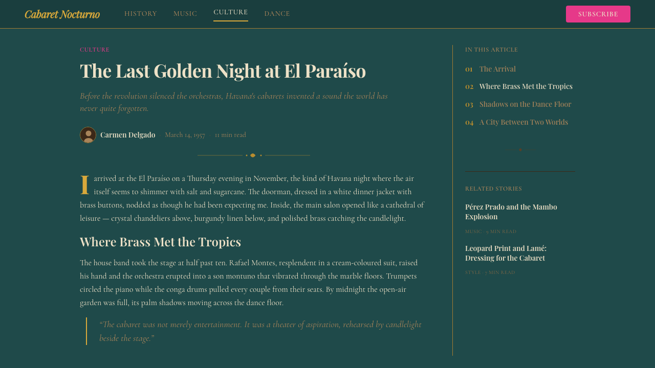
For editorial and marketing work, the Cuban Salsa Cabaret style excels at establishing a premium, culturally specific sense of occasion. A print or digital editorial spread using this visual language should treat the page like a stage: the typography enters from the top or one side, the visual elements are placed with deliberate asymmetric balance, and whitespace — when it appears — has the quality of silence between musical phrases rather than generic breathing room. Marketing campaigns in this style work well for any product associated with music, travel, hospitality, or cultural heritage, provided the brand has the confidence to commit to the aesthetic fully rather than applying it superficially.对于编辑与营销内容,古巴萨尔萨歌厅风格在建立高品质、具有文化特异性的场合感方面表现卓越。使用这套视觉语言的印刷或数字版面编排应将页面视为舞台:字体从顶部或一侧登场,视觉元素以刻意的非对称平衡放置,而留白——当它出现时——具有乐句间静默的质量,而非通用的呼吸空间。这套风格的营销活动适合任何与音乐、旅行、酒店业或文化遗产相关的产品,前提是品牌有足够的信心完全投入这套美学,而非表面化地应用它。
The most common mistake when working with this style is treating the script typography as the only reference and neglecting the compositional and tonal sophistication that makes it work. Script letterforms applied over an ordinary dark background with generic layout produce pastiche. The style requires that color, texture, composition, and typography all operate together as parts of a single theatrical production. A secondary common error is over-brightening: on dark grounds, even small areas of high-saturation tropical pink or bright ivory can overwhelm the composition. The warmth should feel like candlelight — present and inviting — not like a spotlight aimed directly at the viewer.使用这套风格时最常见的错误,是将草书排印当作唯一的参照,而忽视使其成立的构图与色调层面的精致。将草书字形叠加在普通深色背景上配以通用版式,只能产生模仿品。这套风格需要色彩、质感、构图与排印作为同一台戏剧演出的各个部分协同运作。另一个常见错误是过度提亮:在暗色底面上,即使是小面积的高饱和热带粉红或亮象牙色也会使构图失衡。暖意应当像烛光——存在而诱人——而非一盏直射观者的聚光灯。

See the Cuban Salsa Cabaret (1950) design system →查看 Cuban Salsa Cabaret (1950) 完整设计系统 →
Cuban Salsa Cabaret (1950) — FAQCuban Salsa Cabaret (1950) · 常见问题
How is this style different from Art Deco?这套风格与装饰艺术风格有何不同?
Art Deco, as it developed in Europe and the United States in the 1920s and 1930s, tends toward cooler metallics — silver, chrome, platinum — geometric precision, and a certain machine-age austerity beneath its glamour. The Cuban Salsa Cabaret style shares Art Deco's commitment to ornament and theatrical presentation, but diverges decisively in warmth and sensory register. Where Deco is cool, this style is warm. Where Deco tends toward symmetry and geometric order, this style tolerates the asymmetry of musical performance and the organic curves of tropical flora. The dominant visual metaphor is not the ocean liner or the skyscraper but the open-air stage under a Havana sky.装饰艺术风格在1920至30年代的欧美发展中,倾向于更冷调的金属色——银色、铬色、白金色——以及几何精确性,以及其华丽之下某种机器时代的克制。古巴萨尔萨歌厅风格与装饰艺术对装饰与戏剧性呈现的承诺有共通之处,但在温度与感官调性上存在决定性的分歧。装饰艺术是冷的,这套风格是暖的。装饰艺术倾向于对称与几何秩序,这套风格则容许音乐表演的非对称性与热带植物的有机曲线。主导视觉隐喻不是远洋邮轮或摩天楼,而是哈瓦那天空下的露天舞台。
Can this style work effectively in a light-background context?这套风格能在浅色背景语境中有效运用吗?
The style was built for dark grounds, and its most characteristic effect — the sense of pools of warm light in a deep space — depends on that dark orientation. A light-background inversion is possible but requires careful rethinking rather than a simple palette swap. On a cream or ivory ground, the deep teal shifts roles from background to accent; the brass tones become primary structural color; the script lettering in dark teal on cream evokes the handwritten programs of the era without the theatrical depth. The result is closer to a refined Caribbean daytime aesthetic — appropriate for hospitality menus, cultural event programs, or editorial layouts — than to the cabaret atmosphere itself. It works, but it is a different emotional register.这套风格是为暗色底面而生的,其最具特征性的效果——深邃空间中温暖光池的感觉——依赖于那种暗色取向。浅色背景的反转版本是可行的,但需要仔细地重新思考,而非简单地交换调色板。在奶油色或象牙色底面上,深青色从背景色转变为点缀色;黄铜色调成为主要结构色;奶油底色上的深青草书字体,在没有戏剧性深度的前提下唤起那个时代的手写节目册意象。结果更接近于精炼的加勒比白日美学——适合酒店菜单、文化活动节目册或编辑版面——而非夜总会氛围本身。它是有效的,但属于不同的情感调性。
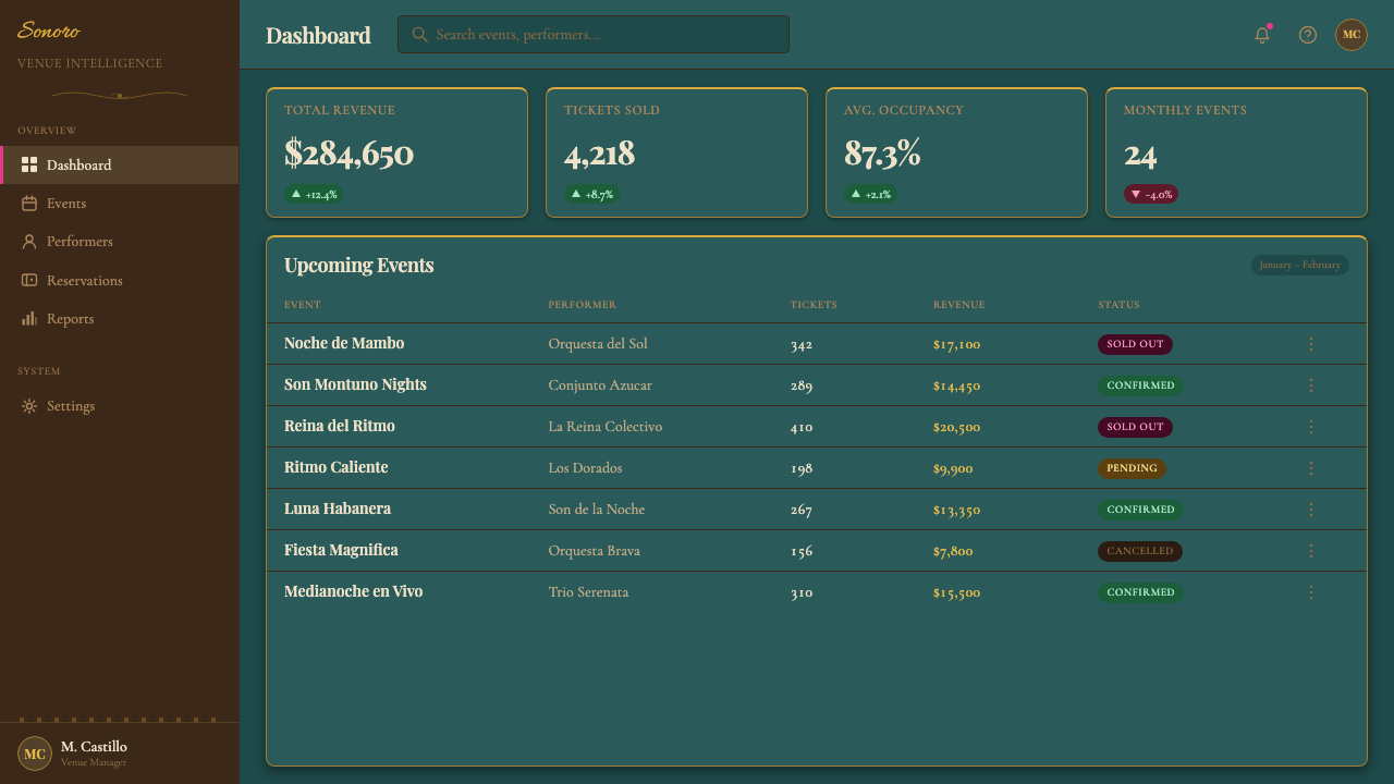
Is this style appropriate for digital product interfaces, or is it primarily suited to print and brand contexts?这套风格适合数字产品界面,还是主要适用于印刷与品牌语境?
The style's richness and ceremony make it best suited to contexts where atmosphere and brand identity are the primary goals rather than functional efficiency. For full application software — navigation-heavy interfaces, data tables, form-dense workflows — the ornate typography and deep palette would create friction rather than clarity. The sweet spot is content-led digital experiences: a music streaming service's promotional layer, a cultural venue's landing page, a luxury hospitality brand's digital marketing. In these contexts, the style functions as a front door rather than a working interior — establishing the emotional register before the user moves into more neutral functional zones.这套风格的丰富感与仪式感,使其最适合氛围与品牌身份是首要目标、而非功能效率的语境。对于完整的应用软件——导航密集的界面、数据表格、表单繁多的工作流——精致的排印与深色调色板会制造摩擦而非清晰。最佳适用点是内容主导的数字体验:音乐流媒体服务的促销层、文化场馆的落地页、高端酒店品牌的数字营销。在这些语境中,这套风格像一扇大门而非工作室内部——在用户进入更中性的功能区域之前,先建立情感调性。
How should this style handle photography and image content?这套风格应如何处理摄影与图像内容?
Photography in this context should be treated as a tonal element rather than a documentary one. High-contrast images, particularly those with warm practical lighting — candlelight, stage lighting, amber-gelled fixtures — integrate naturally into the palette. Images should be cropped to serve the composition rather than to convey complete visual information; a close detail of a brass instrument bell, the arc of a dancer's arm, the pattern of a beaded dress — these work better than full-scene establishing shots. Period photography from the Havana cabaret era has a distinctive quality of warm grain and high contrast that complements the style; contemporary photography used in this context should be processed to share those qualities without literal grain simulation.这套风格中的摄影应被视为色调性元素而非纪实性元素。高对比度图像,尤其是带有暖色实物光源的——烛光、舞台灯光、琥珀色光罩灯具——能够自然融入调色板。图像应当依照构图需要而裁切,而非为了传递完整的视觉信息;黄铜乐器喇叭口的近景细节、舞者手臂的弧线、串珠礼裙的图案——这些比全景建立性镜头更为有效。来自哈瓦那夜总会时代的原版照片具有独特的暖色颗粒感与高对比度,与这套风格相得益彰;在此语境中使用的当代摄影,应当经过处理以呈现那些特质,但无需字面上的颗粒感模拟。
What is the relationship between this style and contemporary salsa or Latin music branding?这套风格与当代萨尔萨或拉丁音乐品牌形象有何关系?
Contemporary salsa and Latin music branding often draws on the iconography of the golden age — the deep teals, the brass script, the tropical accents — but usually in a more compressed and commercially legible form. The Cuban Salsa Cabaret style is the historical source, not a contemporary genre aesthetic; working from the original rather than its contemporary derivatives produces richer and more authentic results. The distinction matters most in typography and ornament: contemporary Latin music branding tends toward bold, high-contrast display type and reduced ornamentation for legibility at small digital sizes, while the historical style sustains more intricate letterforms and layered decoration. Knowing which register you are working in — historical fidelity or contemporary reference — determines which design decisions are correct.当代萨尔萨与拉丁音乐品牌形象通常借鉴黄金时代的图腾——深青色、黄铜草书、热带点缀——但通常以更为压缩、商业可读性更高的形式呈现。古巴萨尔萨歌厅风格是历史源头,而非当代类型美学;从原版出发而非从其当代衍生品出发,能产生更为丰富与真实的结果。这种区别在排印与装饰层面最为关键:当代拉丁音乐品牌倾向于为数字小尺寸可读性而采用粗犷、高对比度的展示字体与简化装饰,而历史风格维持着更为精细的字形与层叠装饰。明确自己工作的是哪种调性——历史忠实还是当代参照——决定了哪些设计决策是正确的。
Related design styles相关设计风格
 Hong Kong Cha Chaan TengDemocratic diner warmth. Tram red, jade rules, cream menu cards, equal Canton…街坊飯堂的熱度:電車紅、翡翠綠線、忌廉餐牌,中英並重。
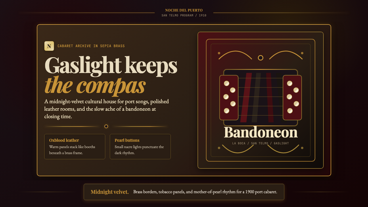 Argentine Bandoneón 1900 (Tango)Gaslit tango luxury. Midnight velvet, brass fileteado, and pearl-button geome…煤气灯下的探戈奢华:午夜绒底、黄铜卷草与珍珠琴键。
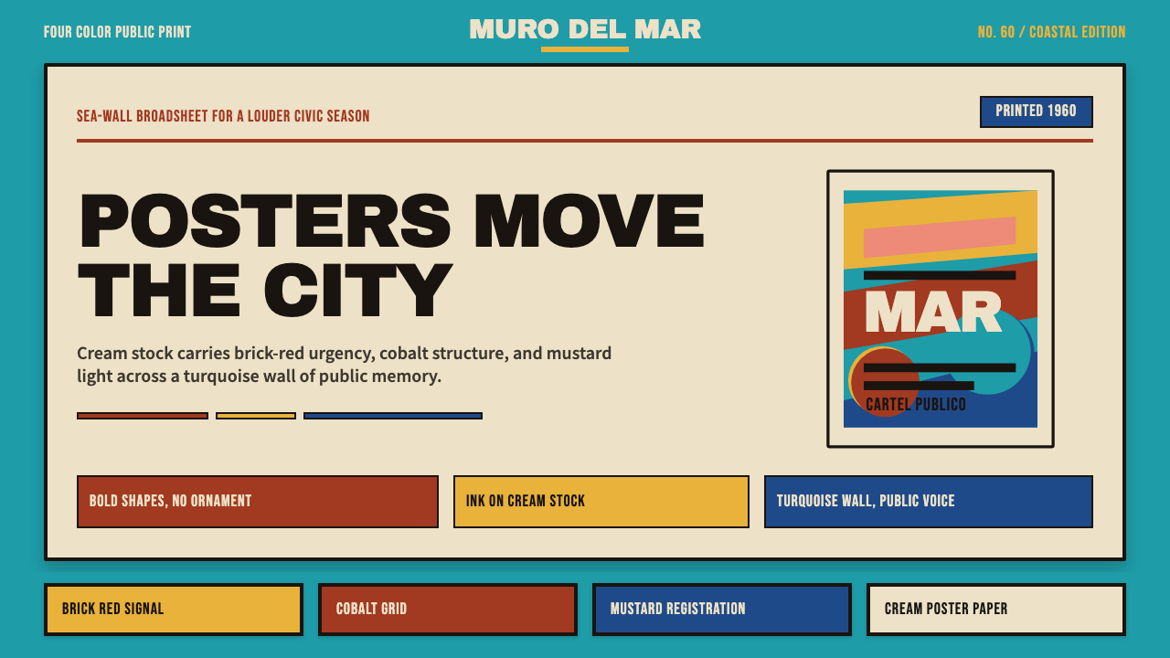 Cuban Malecón 1960 PosterPublic voice in flat ink. Turquoise wall, cream stock, brick red and cobalt b…平面油墨的公共之声:绿松石墙、奶油纸、砖红与钴蓝色条。
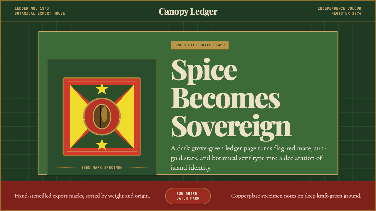 Grenadian Spice & Nutmeg FlagSpice becomes sovereign. Grove green, flag red, brass borders, and serif ledg…香料成为主权宣言:林冠绿、旗红、黄铜边框与账本衬线。
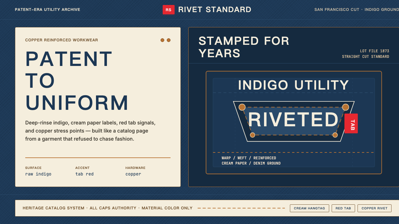 Levi's 501Utility becomes permanent. Indigo ground, cream hangtag panels, red tab and c…实用成为恒久。靛蓝底、奶油吊牌、红标与铜铆钉。
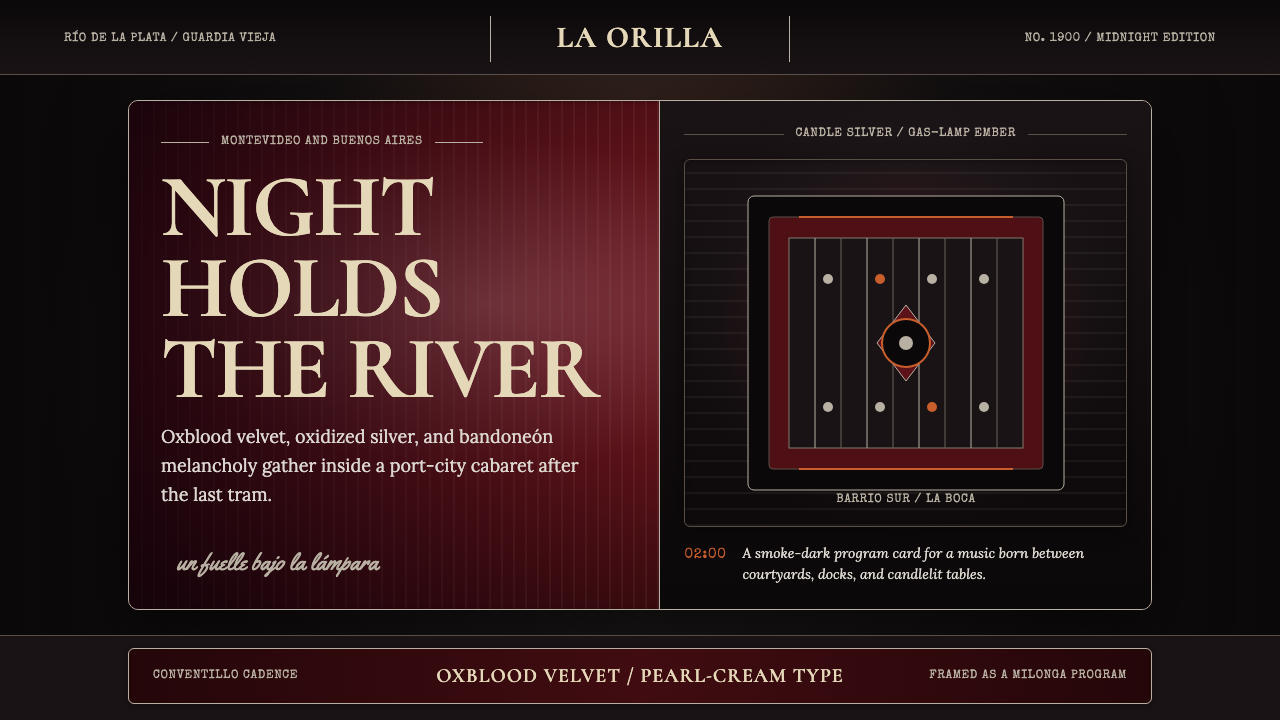 Uruguayan Tango Rioplatense 1900Cabaret melancholy. Oxblood velvet, candle silver, and framed type hold the d…歌厅式忧郁。牛血红天鹅绒、烛银细框与排版托住暗夜。