Design style guide设计风格指南
What is Uruguayan Tango Rioplatense 1900?什么是 Uruguayan Tango Rioplatense 1900?
Born in the smoke-stained tenement halls of Montevideo and Buenos Aires, tango rioplatense turned melancholy, velvet darkness, and candlelit silver into a visual language that still aches with longing.诞生于蒙得维的亚与布宜诺斯艾利斯烟渍斑斑的集体公寓,拉普拉塔探戈将忧郁、天鹅绒暗影与烛光银器化为一套至今仍令人心痛的视觉语言。
Uruguayan Tango Rioplatense 1900 in briefUruguayan Tango Rioplatense 1900 速览
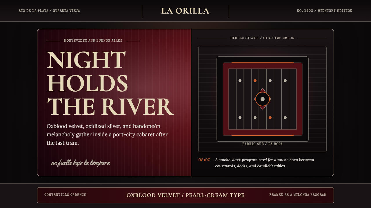
Uruguayan Tango Rioplatense 1900 is a design aesthetic rooted in the visual world of the Guardia Vieja era — the late nineteenth and early twentieth century period when tango first emerged from the conventillos, or tenement courtyards, of the Río de la Plata region. Its mood is one of intimate darkness: oxblood velvet, smoke-stained silver, the amber glow of gas lamps, and the deep shadow of a booth at a late-night café.乌拉圭探戈里奥普拉坦斯1900是一套植根于“老卫队”时代视觉世界的设计美学——那是十九世纪末二十世纪初,探戈从拉普拉塔河流域的conventillo(集体公寓庭院)中破土而出的年代。其氛围是私密的黑暗:牛血红天鹅绒、烟渍银器、煤气灯的琥珀光晕,以及深夜咖啡馆卡座里浓重的阴影。
The style draws on several overlapping visual traditions: the hand-painted enamel signage of the barrio streets, the elaborate scroll-and-flourish ornamentation of fileteado porteño (the decorative painting tradition unique to Buenos Aires and Montevideo), and the graphic language of early tango sheet music covers, which combined portrait lithography with ornate typographic framing. The result is a visual system that is simultaneously lush and melancholic — rich in surface texture, but organized around a palette of deep, light-absorbing tones rather than brightness.这种风格汇聚了数个相互交叠的视觉传统:街巷间的手绘搪瓷招牌、菲莱特彩绘(fileteado porteño,布宜诺斯艾利斯与蒙得维的亚独有的装饰绘画传统)繁复的卷草与花饰,以及早期探戈乐谱封面的图形语言——那些封面将石版肖像画与华美的字体框架融为一体。其结果是一套既丰饶又忧郁的视觉体系——表面肌理丰富,却以深沉、吸光的色调为组织核心,而非以明亮取胜。
As a design language, tango rioplatense occupies a particular emotional register: it signals intimacy, nocturnal sophistication, and a kind of bittersweet nostalgia. It is not the nostalgia of cheerful heritage branding, but the longing of abrazo — the tango embrace — where connection and loss exist in the same moment. This quality makes it unusually resonant for cultural products, hospitality, and any context that wants to evoke depth, authenticity, and the sensory richness of a specific place and time.作为设计语言,探戈里奥普拉坦斯占据着一个特殊的情感频段:它传递私密感、夜间的精致气质,以及一种苦乐交织的怀旧。这不是欢快的遗产品牌那种怀旧,而是探戈“abrazo”(拥抱)式的渴望——连结与失去共存于同一时刻。这种品质使它在文化产品、待客业,以及任何希望唤起特定地域与时代的深度、真实感与感官丰富性的语境中,都具有异乎寻常的共鸣。
See the Uruguayan Tango Rioplatense 1900 design system →查看 Uruguayan Tango Rioplatense 1900 完整设计系统 →
Where does Uruguayan Tango Rioplatense 1900 come from?Uruguayan Tango Rioplatense 1900 从何而来?
Tango emerged in the 1880s from the conventillos of Montevideo's Barrio Sur and Buenos Aires's La Boca — overcrowded tenement houses where recent immigrants from Italy, Spain, and West Africa lived alongside Afro-Uruguayan and Afro-Argentine communities. The music fused Afro-Uruguayan candombe rhythms, the Cuban habanera, European polka and mazurka, and the milonga — a fast-paced dance already popular in the Río de la Plata. Out of this fusion came something that no single community could claim entirely: a form that expressed collective longing, displacement, and desire.探戈于1880年代从蒙得维的亚南区(Barrio Sur)与布宜诺斯艾利斯博卡区的conventillo中破土而出——那些拥挤的集体公寓里,来自意大利、西班牙与西非的新移民,与非裔乌拉圭和非裔阿根廷社区的居民比邻而居。这种音乐融合了非裔乌拉圭坎东贝(candombe)节奏、古巴哈巴涅拉、欧洲波尔卡与玛祖卡,以及米隆加——一种在拉普拉塔流域已广受欢迎的快节奏舞蹈。从这场融合中诞生的东西,没有哪个单一社群可以完全认领:一种表达集体渴望、流离失所与欲望的形式。
The Guardia Vieja period — roughly 1880 to 1920 — was tango's foundational era. During these decades, the music and dance moved from the conventillos and arrabales (outer neighborhoods) into the cafés and academias (dance halls) of the city centers. The visual world that surrounded it was equally hybrid: street signs lettered in Italian and Spanish, fileteado decorative painting on carts and storefronts, kerosene and gas-lamp illumination, the velvet and mirror interiors of the cabarets that began to absorb tango as the century turned. Ángel Villoldo composed some of the earliest canonical tango pieces in Buenos Aires, while Roberto Firpo was already recording for early phonograph labels by 1912.“老卫队”时期(大约1880年至1920年)是探戈的奠基时代。在这数十年间,音乐与舞蹈从conventillo和arrabal(城郊街区)走进了市中心的咖啡馆与academia(舞厅)。围绕着它的视觉世界同样是混血的:用意大利语与西班牙语书写的街道招牌、手推车与店铺门面上的菲莱特装饰画、煤油灯与煤气灯的照明,以及随着世纪转折开始接纳探戈的歌厅内那些天鹅绒与镜子装饰的室内空间。安赫尔·比约尔多在布宜诺斯艾利斯创作了最早的一批经典探戈曲目,而罗伯托·菲尔波已于1912年为早期留声机厂牌录制唱片。
The international breakthrough came in 1913, when tango arrived in Paris and sparked an immediate sensation. Parisian ballrooms adopted the dance; fashion houses incorporated its dramatic silhouettes into their collections; the word tango entered the European vocabulary as a color — a deep, saturated orange-red, associated with the passion the dance was perceived to embody. This Parisian moment brought tango back to the Río de la Plata with a new legitimacy: what had been considered a low, popular form was now a cosmopolitan export. Gerardo Matos Rodríguez composed 'La Cumparsita' in Montevideo in 1917, and the piece became the most recorded tango in history, its melancholic descending melody encoding the emotional core of the style.1913年是探戈走向国际的突破时刻,它抵达巴黎,立即引发轰动。巴黎舞厅采纳了这种舞蹈;时装屋将其戏剧性的轮廓线融入设计系列;“探戈”一词进入欧洲词汇,成为一种颜色的名称——一种深沉、饱和的橙红色,与这种舞蹈所被感知到的热情联系在一起。这一巴黎时刻带着新的合法性将探戈送回拉普拉塔:原本被视为低俗民间形式的东西,如今成了一种都市出口品。赫拉多·马托斯·罗德里格斯于1917年在蒙得维的亚创作了《拉·孔帕西塔》,这首曲子成为史上录制次数最多的探戈,其忧郁的下行旋律将这种风格的情感核心编码其中。
Carlos Gardel, born in Toulouse and raised in Buenos Aires, became the defining face and voice of tango in the 1920s and 1930s. His recordings for the Odeón label brought tango to international radio audiences; his film appearances gave the style a physical image — the slicked-back hair, the pinstriped suit, the tilted fedora, the slightly pained expression of a man who carries feeling he cannot quite express. Gardel's death in an airplane crash in 1935 transformed him immediately into legend, and the visual iconography of his era — the dark-lit cabaret, the couple in close embrace, the silver-and-oxblood color world — became the enduring aesthetic shorthand for tango rioplatense.出生于图卢兹、成长于布宜诺斯艾利斯的卡洛斯·加德尔,成为1920至30年代探戈最具代表性的面孔与声音。他为奥地恩(Odeón)厂牌录制的唱片将探戈带给国际广播听众;他的电影形象赋予了这种风格一个具体的视觉图像——向后梳理的发型、细条纹西装、歪戴的软呢帽,以及略带痛苦的神情,那是一个承载着无法完全言说的情感的男人。1935年加德尔在飞机失事中骤然离世,令他立刻化为传奇,而他所在时代的视觉图像学——灯光昏暗的歌厅、紧密相拥的舞伴、银色与牛血红的色彩世界——成为探戈里奥普拉坦斯永恒的美学符号。
What defines the Uruguayan Tango Rioplatense 1900 look?Uruguayan Tango Rioplatense 1900 的视觉特征是什么?
Color Palette色彩调色板
The palette is anchored by deep, light-absorbing tones: oxblood — a dark, slightly brownish red suggesting aged velvet — sits alongside oxidized silver, a tone closer to tarnished pewter than bright chrome. A warm amber, the color of a gas lamp seen through smoke-stained glass, serves as the primary light source within the composition. Near-black grounds, closer to very dark charcoal than true black, give the system its characteristic depth. Accents of ivory and pale cream appear only as highlights — the gleam on a glass, the cuff of a shirt — never as background fields. The overall effect is that of a room lit from within rather than illuminated from above.这套色板以深沉、吸光的色调为基础:牛血红——一种深沉、略带棕意的红,令人联想到岁月磨损的天鹅绒——与氧化银并置,后者更接近失去光泽的白蜡而非明亮的铬。温暖的琥珀色,宛如透过烟渍玻璃看到的煤气灯光,在构图中充当主要的光源色。接近极深炭色而非纯黑的近黑底面,赋予这套体系其标志性的深度。象牙与淡奶油仅作为高光出现——玻璃上的反光、衬衫的袖口——从不作为背景底色铺开。整体效果是一个由内部光源照亮、而非从上方照明的房间。
Ornamental Typography装饰性字体排印
Display lettering in this style carries visible weight and elaboration: serifs are bracketed and full, stroke contrast is pronounced, and characters often bear subtle swash extensions or inline detailing. This is not the restrained elegance of fine typography but the theatrical confidence of hand-lettered cabaret signage, where legibility at a distance mattered as much as decorative impact. Body text, by contrast, is set in a compact, close-leaded manner that suggests a newspaper or playbill from the era — economical with space but dense with information. The interplay between ornate display and dense body creates a clear typographic hierarchy that feels of its moment.这种风格的展示性字体承载着可见的分量与繁复:衬线饱满而带括号,笔画粗细对比明显,字符常带有微妙的花饰延伸或嵌线细节。这不是精细排版的克制优雅,而是手绘歌厅招牌的戏剧性自信——在那里,远距离可读性与装饰冲击力同等重要。正文则以紧凑、行距收窄的方式排设,令人联想起那个时代的报纸或节目单——空间节省,但信息密度高。华美展示字与紧凑正文之间的相互作用,建立了一套鲜明的字体层级,让人感受到那个时代特有的气息。
Fileteado Flourish菲莱特卷草纹饰
Fileteado porteño — the decorative painting tradition that originated on the horse-drawn carts of Buenos Aires and Montevideo in the late nineteenth century — contributes the style's most distinctive ornamental vocabulary. Asymmetric scrollwork, acanthus-leaf flourishes, banderoles, and stylized flowers rendered in oxblood, gold-tinged silver, and deep green frame the primary content like an illuminated manuscript border. In a design context, these flourishes function as structural frames rather than scattered decoration: they define edges, signal corners, and create a sense of enclosure around content that emphasizes intimacy over openness.菲莱特彩绘(fileteado porteño)——这种装饰绘画传统起源于十九世纪末布宜诺斯艾利斯与蒙得维的亚的马车彩绘——贡献了这种风格最具辨识度的装饰词汇。非对称卷草纹、莨苕叶花饰、绶带,以及以牛血红、金调银色与深绿描绘的程式化花卉,如同泥金手抄本的边框一般将主要内容框起。在设计语境中,这些花饰作为结构性边框而非随意点缀发挥作用:它们界定边缘、标示角落,并在内容周围营造出一种封闭感,强调私密而非开放。
Tactile Texture触感质感
Every surface in this visual language implies physical material: velvet carries a nap that absorbs light at one angle and reflects it at another; silver oxidizes into a surface that is simultaneously dull and luminous; the paper of an early twentieth-century printed piece is thick, slightly uneven, and warm-toned rather than bright white. In practice, this translates to layered visual texture — subtle grain, pressed-ink effects, the slight imperfection of a surface that has been touched and used. The aesthetic deliberately avoids the clinical smoothness of contemporary digital surfaces, instead seeking a quality of lived-in warmth.这套视觉语言的每一个表面都暗示着具体的物质材料:天鹅绒的绒毛在不同角度下吸收光线又反射光线;银器在氧化后形成一种既黯淡又发光的表面;二十世纪初印刷品的纸张厚实、略带不均,色调温暖而非亮白。在实践中,这体现为叠加的视觉质感——细腻的颗粒感、油墨压印效果,以及一个被触摸和使用过的表面所特有的轻微不完美。这种美学刻意回避当代数字表面的临床光滑感,转而追求一种“有人居住”的温暖品质。
Compositional Intimacy构图的私密性
Layouts in this style favor enclosed, centered compositions over expansive, asymmetric ones. Content is framed rather than floated — surrounded by ornamental borders, set within ruled panels, or anchored by heavy typographic frames. Negative space is used sparingly and tends to be dark rather than light, so that elements seem to emerge from shadow rather than sit on an open field. This approach creates a sense that the viewer is looking into something — a cabinet of curiosities, a stage set, a locket — rather than at something spread across a page. The resulting compositions feel intimate, curated, and slightly theatrical.这种风格的版面倾向于封闭的、居中的构图,而非开放的非对称布局。内容被框架包围而非自由悬浮——被装饰边框环绕、置于线条划定的面板内,或以沉重的字体框架锚定。留白用得节省,且倾向于以暗色而非亮色呈现,使元素看起来是从阴影中浮现而来,而非置于开阔的底面之上。这种处理方式营造出一种观看者在向某物内部凝视的感觉——一个珍奇柜、一个舞台布景、一枚小圆盒——而非俯视摊开于纸页上的事物。由此形成的构图感觉私密、精心策展,略带戏剧性。
Gas-Lamp Luminosity煤气灯式发光感
Lighting within this visual system is always directional and warm, never ambient or cool. The imagined light source is a gas lamp or a candle — something small, warm, and insufficient to fully illuminate the room, so that deep shadow is always present alongside the glow. In practice this means tonal compositions where the lightest areas are cream or warm silver, mid-tones dissolve into dark amber, and the darkest areas approach near-black without losing all texture. Highlights are treated as precious and deliberate: a single point of light on a glass, a gleam along the top edge of a frame, the shimmer of a sequined fabric caught by an evening lamp.这套视觉体系中的光线始终是有方向性的、温暖的,从不漫射或偏冷。想象中的光源是煤气灯或蜡烛——某种细小、温暖而不足以充分照亮房间的东西,使得深沉的阴影总是与光晕并存。在实践中,这意味着色调构图中最亮的区域是奶油色或暖银色,中间调溶入深琥珀,最暗的区域趋近近黑却不失质感。高光被当作珍贵而刻意的元素处理:玻璃上的一个光点、边框顶缘的一抹反光、一块亮片织物被夜间灯光捕捉到的微光。
Emotional Register情感基调
The dominant emotional register of this style is melancholic longing — not grief, but the particular sadness of something beautiful that cannot be held. Tango's lyrics and choreography articulate the same paradox: the abrazo (close embrace) between dancing partners is both connection and farewell. Visually, this translates to a system that is lush but never celebratory, rich but never gaudy, intimate but never warm in a domestic sense. The aesthetic keeps the viewer at a precise emotional distance — close enough to feel the texture and depth, far enough that the experience remains one of longing rather than possession.这种风格的主导情感基调是忧郁的渴望——不是悲伤,而是面对美好事物却无法将其握住时特有的那种哀愁。探戈的歌词与编舞表达着同样的悖论:舞伴之间的abrazo(紧密相拥)既是连结也是告别。在视觉上,这转化为一套丰饶却从不欢庆、富足却从不俗艳、私密却并无家常温暖的体系。这种美学将观者置于一种精准的情感距离——近到足以感受质感与深度,远到足以使这种体验停留于渴望而非占有。
See the Uruguayan Tango Rioplatense 1900 design system →查看 Uruguayan Tango Rioplatense 1900 完整设计系统 →
Who shaped Uruguayan Tango Rioplatense 1900?谁塑造了 Uruguayan Tango Rioplatense 1900?
Gardel is the defining figure of the tango canon — the singer whose recordings for the Odeón label in the 1920s and early 1930s brought tango to international radio audiences and established its visual iconography. His personal style — slicked-back hair, pinstripe suit, tilted fedora, an expression of handsome melancholy — became the template for how tango was imagined and pictured. His death in a 1935 plane crash at the height of his fame transformed him instantly into a mythological figure. The visual universe of Uruguayan Tango Rioplatense 1900 draws extensively on the graphic language of his era: cabaret programs, phonograph sleeves, sheet music covers, and early film stills.加德尔是探戈经典的核心人物——他于1920至30年代初为奥地恩厂牌录制的唱片将探戈带给国际广播听众,并确立了其视觉图像学。他的个人风格——向后梳理的发型、细条纹西装、歪戴的软呢帽、一副俊美而忧郁的神情——成为探戈被想象和被描绘的模板。他于1935年在飞机失事中骤然离世,在声誉顶峰的骤逝立刻将他化为神话式人物。乌拉圭探戈里奥普拉坦斯1900的视觉世界,大量借鉴了他所在时代的图形语言:歌厅节目单、留声机唱片袋、乐谱封面与早期电影剧照。
Matos Rodríguez composed 'La Cumparsita' in Montevideo in 1917 — the piece that became not only the most recorded tango in history but something close to the official anthem of the form. Composed by a Uruguayan student barely out of his teens, the piece's descending, melancholic melody encapsulates the emotional character of tango rioplatense with an economy that made it immediately memorable. The sheet music cover art for early printings of 'La Cumparsita' exemplifies the visual language of the Guardia Vieja period: ornate framing, high-contrast portraiture, and the oxblood-and-silver palette that defines this design system.马托斯·罗德里格斯于1917年在蒙得维的亚创作了《拉·孔帕西塔》——这首曲子不仅成为史上录制次数最多的探戈,更近乎成为这种音乐形式的官方颂歌。这首由一位刚刚走出青少年的乌拉圭学生创作的作品,其下行、忧郁的旋律以令人过目不忘的简练,将探戈里奥普拉坦斯的情感特质高度凝练。《拉·孔帕西塔》早期印刷版本的乐谱封面,是老卫队时期视觉语言的典范:华美的边框、高对比度的肖像,以及定义本设计体系的牛血红与银色调色板。
Villoldo was among the earliest figures to formalize tango as a musical genre, composing and performing in Buenos Aires from the 1890s onward. His pieces — including 'El Choclo,' which remains one of the most widely recognized tangos — helped establish the structural conventions of the Guardia Vieja period. As a performer who also recorded for early phonograph labels, Villoldo contributed to the material visual culture of early tango: the graphic design of his phonograph cylinders and discs, and the advertising imagery produced for his performances, reflect the emerging visual vocabulary of the style in its first decades.比约尔多是最早将探戈规范化为一种音乐体裁的人物之一,从1890年代起便在布宜诺斯艾利斯创作与演出。他的作品——包括至今仍是最广为人知的探戈之一的《玉米棒》(El Choclo)——帮助确立了老卫队时期的结构性惯例。作为同时为早期留声机厂牌录制唱片的表演者,比约尔多为早期探戈的物质视觉文化做出了贡献:他的留声机蜡筒与唱片的平面设计,以及为他的演出制作的广告图像,反映了这种风格在最初数十年间正在成形的视觉词汇。
Firpo was a pianist, bandleader, and arranger whose work helped define the sound and ceremonial character of tango in the early recording era. His arrangements for early phonograph labels from around 1912 onward documented the Guardia Vieja sound for posterity and introduced it to audiences far beyond the Río de la Plata. The promotional materials produced for Firpo and his orquesta típica — the standard ensemble of tango — are among the most visually characteristic artifacts of the period, combining elaborate typographic display with early photographic portraiture in the distinctive graphic idiom of the genre.菲尔波是一位钢琴家、乐队指挥与编曲家,他的工作帮助确立了早期录音时代探戈的音响面貌与仪式性特征。他从约1912年起为早期留声机厂牌制作的编曲,将老卫队的声音留存下来,并将其介绍给远在拉普拉塔以外的听众。为菲尔波及其orquesta típica(探戈的标准乐队编制)制作的宣传材料,是这一时期视觉上最具代表性的文物之一,将华美的字体展示与早期摄影肖像结合在这种体裁独特的图形语汇中。
Not a single figure but a collective tradition: the fileteadores were the craftsmen who practiced fileteado porteño, the decorative painting style that applied elaborate scrollwork, acanthus flourishes, banderoles, and nationalistic imagery to horse-drawn carts, later trucks, and eventually shop fronts across Buenos Aires and Montevideo. The tradition emerged in the 1890s and reached its peak in the 1920s and 1930s. Its visual vocabulary — asymmetric flourish frames, oxblood and silver and deep green, tightly scrolled organic ornament — is the primary decorative source for the Uruguayan Tango Rioplatense 1900 design system, giving it the distinctively hybrid quality of something both popular and elaborately beautiful.这不是单一人物,而是一种集体传统:菲莱特画师们是那些实践菲莱特彩绘(fileteado porteño)的工匠——这种装饰绘画风格在布宜诺斯艾利斯与蒙得维的亚的马车、后来的卡车,乃至商店门面上施以繁复的卷草纹、莨苕花饰、绶带与民族主义图像。这一传统兴起于1890年代,在1920至30年代达到顶峰。其视觉词汇——非对称的花饰边框、牛血红与银色及深绿、紧密盘绕的有机装饰纹样——是乌拉圭探戈里奥普拉坦斯1900设计体系的主要装饰来源,赋予其一种既具民间性又精美繁复的独特混血气质。
How do you use Uruguayan Tango Rioplatense 1900 today?今天怎么用 Uruguayan Tango Rioplatense 1900?
Uruguayan Tango Rioplatense 1900 is a style that rewards commitment: it achieves its full power only when all its elements — the deep palette, the ornamental typography, the texture, the tight compositional framing — are deployed together rather than borrowed piecemeal. Applying one element in isolation (adding an oxblood accent to an otherwise modern layout, for instance) tends to read as vintage decoration rather than genuine aesthetic coherence. The style is most successful when the entire visual environment is controlled.乌拉圭探戈里奥普拉坦斯1900是一种需要全情投入的风格:只有当其所有元素——深沉的色板、装饰性字体、质感、紧凑的构图框架——共同部署而非零散借用时,才能发挥完整的力量。单独孤立地使用某一元素(例如在一个本质上现代的版面上添加一抹牛血红强调色),往往只会读作复古装饰,而非真正的美学连贯性。这种风格在整体视觉环境都受到控制时最为成功。
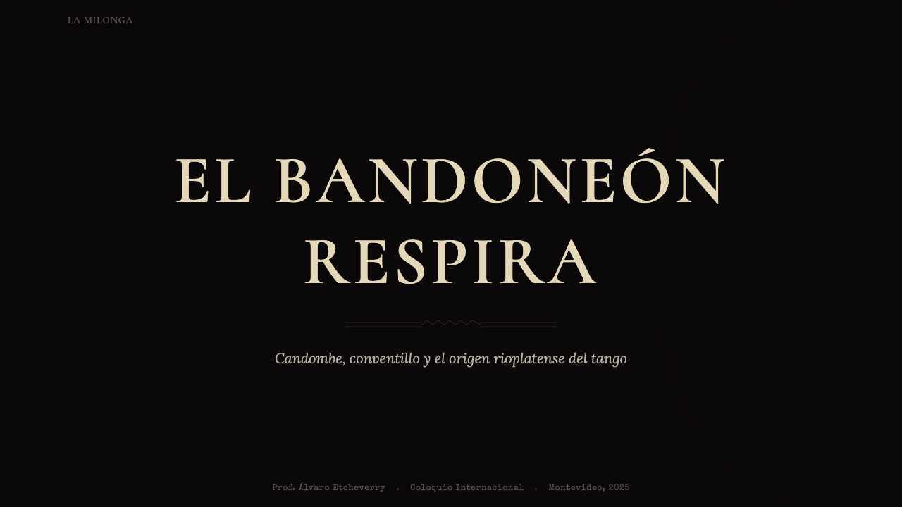
For presentation slides, the style works best as an event or cultural program aesthetic — for performances, retrospectives, film festivals, exhibitions, or any context with an explicitly nocturnal, theatrical, or historical character. Cover slides benefit from the full ornamental treatment: a centered composition within a fileteado-style border frame, deep oxblood or near-black ground, display type in a full-serif face with visible stroke contrast, and a single gas-lamp amber accent for the event name or date. Content slides should simplify the ornament without abandoning it — ruled panels and typographic framing replace the elaborate scrollwork of the cover, maintaining the enclosed, intimate quality without overwhelming the information.对于演示文稿,这种风格最适合作为活动或文化项目的美学——演出、回顾展、电影节、展览,或任何明确带有夜间性、戏剧性或历史性特征的语境。封面幻灯片适合完整的装饰性处理:居中构图置于菲莱特风格的边框内,牛血红或近黑底面,笔画对比明显的全衬线展示字体,以及用于活动名称或日期的单一煤气灯琥珀色强调。内容页应在不放弃装饰感的前提下简化装饰——线条划定的面板与字体框架取代封面页的繁复卷草纹,在不压倒信息内容的同时保持封闭的、私密的品质。
For web interfaces and digital products, the style translates well to contexts where atmospheric immersion is a product value rather than an obstacle: streaming platforms for Latin music or film, hospitality and restaurant websites for venues with a tango or late-night cultural identity, event ticketing pages, or cultural institution microsites. The primary implementation challenge is managing dark-ground legibility: text on deep oxblood or near-black fields requires careful attention to contrast, and the warm amber and cream tones that serve as highlights must be weighted correctly to provide readable foreground without appearing to glow unnaturally. Navigation and interface chrome should remain typographic and minimal, reserving the ornamental vocabulary for hero sections, section breaks, and modal or overlay contexts.对于网页界面与数字产品,这种风格能很好地应用于氛围沉浸是产品价值而非障碍的语境:拉丁音乐或电影的流媒体平台、带有探戈或深夜文化身份的餐厅与酒店网站、活动购票页面,或文化机构的微型网站。主要的实施挑战是管理深色底面的可读性:深牛血红或近黑色背景上的文字需要对对比度给予细心关注,用作高光的温暖琥珀色与奶油色必须权重适当,以提供可读的前景色而不显得发光异常。导航与界面骨架应保持字体性与简洁性,将装饰性词汇保留给主视觉区、段落分隔,以及模态框或覆层语境。
For editorial and marketing work, the style suits longform cultural journalism, music retrospectives, and heritage brand campaigns where historical depth is a genuine value proposition. A spread using this aesthetic might pair a large portrait photograph — treated with high-contrast, warm-toned processing — against a column of close-set type in an ornamental frame, with a fileteado-style border marking the page edge. The effect is more cabinet display than magazine layout, and should feel slightly precious: this is a style for content that claims to be worth lingering over. Marketing campaigns benefit from the style's strong poster-language heritage — a single central image, bold ornate type, and a restricted palette creates high visual impact with few elements.对于编辑与营销内容,这种风格适合长篇文化新闻、音乐回顾展,以及历史深度是真正价值主张的遗产品牌战役。使用这种美学的跨页设计,可以将一张大幅肖像照片(以高对比度、暖色调的方式处理)与装饰性边框内的一列紧凑正文相配,并以菲莱特风格的边框标记页面边缘。效果更接近展柜陈列而非杂志版面,应给人以略显珍贵的感觉:这是一种为值得细细品味的内容而生的风格。营销战役得益于这种风格浓厚的海报语言传承——单一中心图像、粗重华美的字体与有限色板,以少量元素创造强大的视觉冲击。
A common mistake when working with this style is pushing the ornamentation toward Halloween or Gothic rather than tango. The palette — deep red, black, silver — overlaps with those traditions, and without the specific referents (the cabaret program aesthetic, the South American graphic heritage, the warmth of the amber accent) the result can slide into a generic dark-decorative register that loses the style's specific emotional character. The correction is straightforwardness: lean into the amber warmth, use the velvet textures deliberately rather than atmospherically, and ensure that at least one typographic element carries the elaborate display character of period sheet music or fileteado signage rather than generic gothic lettering.使用这种风格时最常见的错误,是将装饰感推向万圣节或哥特风,而非探戈风格。色板——深红、黑色、银色——与这两种传统有所重叠,若缺乏特定的参照物(歌厅节目单的美学、南美图形遗产、琥珀色强调的温暖),结果可能滑向一种通用的深色装饰风格,失去这种风格特有的情感特性。纠正方法是直接而明确:倚重琥珀色的温暖感,刻意而非仅仅氛围化地使用天鹅绒质感,并确保至少有一个字体元素承载着时期乐谱或菲莱特招牌那种繁复的展示性特征,而非通用的哥特字体。
See the Uruguayan Tango Rioplatense 1900 design system →查看 Uruguayan Tango Rioplatense 1900 完整设计系统 →
Uruguayan Tango Rioplatense 1900 — FAQUruguayan Tango Rioplatense 1900 · 常见问题
What distinguishes tango rioplatense aesthetics from other Latin American vintage styles?探戈里奥普拉坦斯美学与其他拉丁美洲复古风格有何区别?
The key distinguishing qualities are the palette and the emotional register. Where Mexican vintage aesthetics (Day of the Dead graphics, pulquería painting) tend toward bright saturated colors and celebratory energy, and Cuban vintage graphics often favor tropical warmth and bold primary contrasts, tango rioplatense is defined by its darkness and its melancholy. Oxblood, oxidized silver, and near-black with warm amber accents are specific to the Río de la Plata visual tradition; they reflect not the tropical sunshine of the Caribbean but the grey winters and immigrant nostalgia of the Uruguayan and Argentine capital cities. Fileteado ornament is also geographically specific — it developed in Buenos Aires and Montevideo and is not shared by other Latin American decorative traditions.关键的区别在于色板与情感基调。墨西哥复古美学(亡灵节图形、普克里亚酒馆彩绘)倾向于明亮饱和的色彩与欢庆能量,古巴复古图形往往偏好热带温暖与大胆的主色对比,而探戈里奥普拉坦斯则以其黑暗与忧郁为定义。牛血红、氧化银、带有温暖琥珀色强调的近黑色,是拉普拉塔视觉传统所特有的——它们反映的不是加勒比海的热带阳光,而是乌拉圭与阿根廷首都城市阴郁的冬天与移民的乡愁。菲莱特装饰在地理上也是特有的——它发展于布宜诺斯艾利斯与蒙得维的亚,并非其他拉丁美洲装饰传统所共享。
Is this style suitable for digital interfaces, or is it primarily a print aesthetic?这种风格适合数字界面吗,还是它主要是一种印刷美学?
It translates to digital contexts, but requires deliberate adaptation. The original visual references — hand-painted signage, gas-lamp lit interiors, printed sheet music — are all physical media with properties (warmth, texture, slight imperfection) that screens render differently. The adaptation challenge is avoiding two failure modes: the style becoming too polished and losing its worn, intimate quality, or the dark grounds becoming oppressive rather than atmospheric. Successful digital implementations treat texture as a design element in its own right — subtle grain, paper-like surface treatments — and use the amber-warm accent colors generously enough to prevent the dark palette from reading as simply gloomy. Loading states and transitions benefit from deliberately unhurried timing, reinforcing the nocturnal, leisurely emotional register.它可以应用于数字语境,但需要刻意的转化适应。原始视觉参照——手绘招牌、煤气灯照明的室内、印刷乐谱——都是拥有特定属性(温暖感、质感、轻微的不完美)的实体媒介,而屏幕对这些属性的呈现方式不同。适应的挑战在于避免两种失败模式:风格变得过于精致而失去磨损的、私密的品质,或深色底面变得压抑而非氛围感强。成功的数字实现将质感视为独立的设计元素——细腻的颗粒感、类纸张的表面处理——并足够慷慨地使用琥珀暖色强调色,防止深色调色板被简单地读作阴沉。加载状态与过渡动效受益于刻意不急促的时间节奏,强化夜间的、悠然的情感基调。
How does the Uruguayan claim on tango differ from the Argentine one, and does it affect the design system?乌拉圭对探戈的历史主张与阿根廷的主张有何不同?这影响了设计体系吗?
Both Uruguay and Argentina have historically contested the birthplace of tango, and UNESCO's 2009 recognition named 'tango' as an intangible cultural heritage of both nations jointly. The Río de la Plata region — the estuary shared by Uruguay and Argentina — is the genuine shared origin, with Montevideo's Barrio Sur and Buenos Aires's La Boca playing equally formative roles in the music's development. The design system reflects this shared geography: it draws on visual traditions common to both cities (fileteado, conventillo culture, the Odeón record label's graphic language) rather than privileging one side of the river over the other. The naming 'Uruguayan' acknowledges that Gerardo Matos Rodríguez, composer of the genre's most iconic piece, was Uruguayan, and that Montevideo's Barrio Sur is one of the earliest documented homes of the form.乌拉圭与阿根廷历史上都主张探戈的诞生地归属本国,联合国教科文组织2009年认定“探戈”为两国共同的非物质文化遗产。拉普拉塔地区——乌拉圭与阿根廷共享的河口——是真正的共同起源地,蒙得维的亚南区与布宜诺斯艾利斯博卡区在这种音乐的发展中扮演了同等重要的角色。这套设计体系反映了这一共享的地理:它汲取了两座城市共有的视觉传统(菲莱特彩绘、conventillo文化、奥地恩唱片厂牌的图形语言),而非偏袒河的某一侧。“乌拉圭”的命名承认了《拉·孔帕西塔》的创作者赫拉多·马托斯·罗德里格斯是乌拉圭人,以及蒙得维的亚南区是这种音乐形式最早有文献记载的发源地之一。
How do you prevent this style from reading as simply dark or gothic rather than tango-specific?如何防止这种风格仅仅被读作黑暗或哥特风,而非探戈所特有的美学?
The amber and the ornament are the primary differentiators. Generic dark aesthetics — gothic, noir, horror-adjacent — tend toward cool or neutral dark tones (blue-black, cool grey, true black) and either minimal decoration or spiky, angular ornament. Tango rioplatense is distinguished by its warmth within darkness: the amber gas-lamp glow is always present as a reminder that the setting is intimate and inhabited, not abandoned or menacing. The fileteado ornamental vocabulary — scrollwork, acanthus leaves, banderoles, stylized flowers — is specifically South American and visually distinct from both European gothic ornament and contemporary dark aesthetics. Ensuring that at least one central typographic element carries the elaborate, full-seriffed display character of period tango sheet music (rather than condensed gothic or angular blackletter) is usually sufficient to ground the visual register in the right cultural context.琥珀色与装饰纹样是主要的区分要素。通用的黑暗美学——哥特风、黑色电影风、接近恐怖的风格——往往偏向冷色或中性暗色调(蓝黑、冷灰、纯黑),装饰要么极简,要么是尖锐、棱角分明的样式。探戈里奥普拉坦斯的区别在于黑暗中的温暖:琥珀色的煤气灯光晕始终存在,提示着这个场景是私密的、有人居住的,而非废弃的或令人不安的。菲莱特装饰词汇——卷草纹、莨苕叶、绶带、程式化花卉——具有南美特色,在视觉上有别于欧洲哥特装饰与当代黑暗美学。确保至少有一个核心字体元素承载着时期探戈乐谱那种繁复、全衬线的展示性特征(而非压缩哥特或棱角分明的黑字体),通常足以将视觉基调锚定在正确的文化语境中。
Is there a contemporary design context where this style has genuinely succeeded, or is it primarily historical reference?这种风格在当代设计语境中是否有真正成功的应用,还是它主要是一种历史参照?
Contemporary applications exist and are most successful when the cultural specificity is genuine rather than cosmetic. Boutique hotels in Montevideo's Ciudad Vieja and Buenos Aires's San Telmo neighborhoods have produced visual identities that draw on this aesthetic with real authority — because the environment they are branding actually contains the architecture, the lighting, and the cultural associations the style expresses. Film festival identities for events focused on South American or Argentine/Uruguayan cinema have similarly used the style with credibility. Where it tends to fail is in contexts where the tango reference is purely decorative — a restaurant that serves no South American food, a fashion campaign with no real connection to the Río de la Plata — because the specificity of the style's references becomes a kind of cultural imposture rather than genuine resonance. The style rewards honesty about its sources.当代应用确实存在,在文化特殊性是真实的而非表面性时最为成功。蒙得维的亚老城区(Ciudad Vieja)与布宜诺斯艾利斯圣特尔莫区的精品酒店,已经制作出真正具有权威性的、汲取这种美学的视觉识别——因为他们所品牌化的环境实际上包含了这种风格所表达的建筑、光线与文化联想。专注于南美或阿根廷/乌拉圭电影的电影节视觉识别,同样以可信度使用了这种风格。它倾向于失败的地方,是探戈参照完全是装饰性的语境——一家不提供南美食物的餐厅、一个与拉普拉塔地区无真实联系的时装战役——因为这种风格参照的特殊性会变成一种文化僭用,而非真正的共鸣。这种风格回馈那些对其来源诚实的应用。
Related design styles相关设计风格
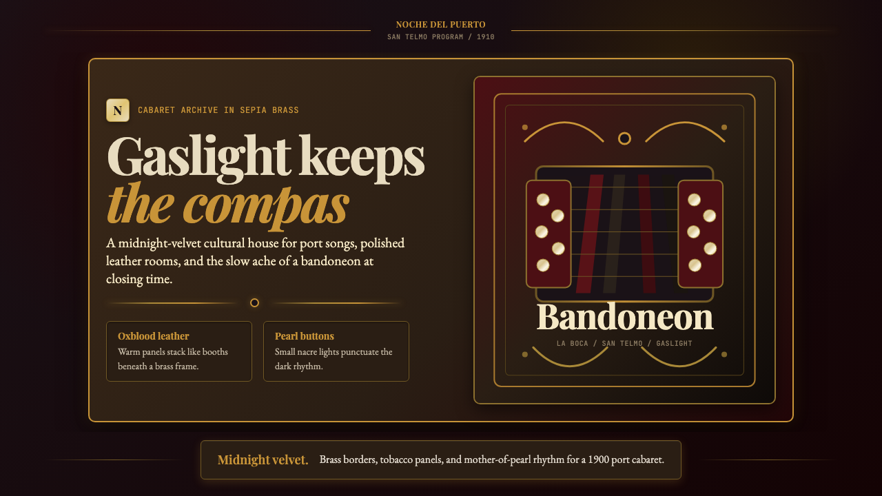 Argentine Bandoneón 1900 (Tango)Gaslit tango luxury. Midnight velvet, brass fileteado, and pearl-button geome…煤气灯下的探戈奢华:午夜绒底、黄铜卷草与珍珠琴键。
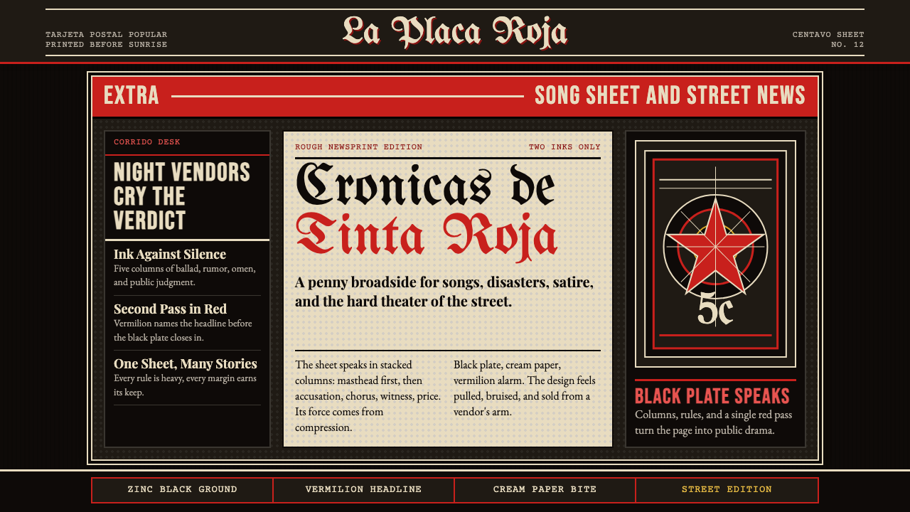 Mexican Tarjeta Postal (Posada Engraving 1900)Tabloid drama in two inks. Fraktur mastheads, vermilion rules, and cream news…双色小报式戏剧:哥特报头、朱红分隔线与粗粝新闻纸。
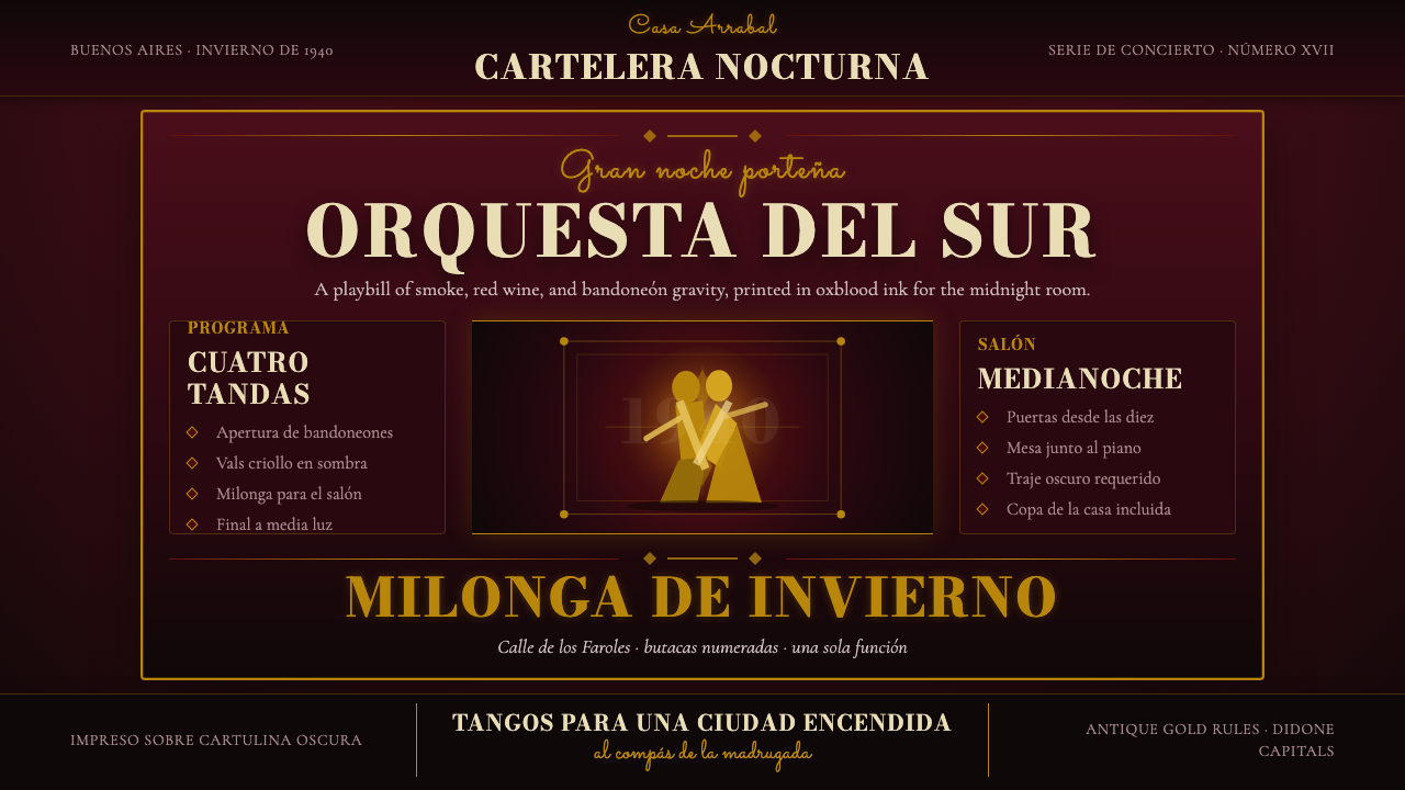 Argentine Tango Poster (1940)Nocturnal drama in ink. Oxblood ground, antique gold rules, Bodoni capitals.暗夜戏剧感:氧血红底、古金线框与Bodoni大写。
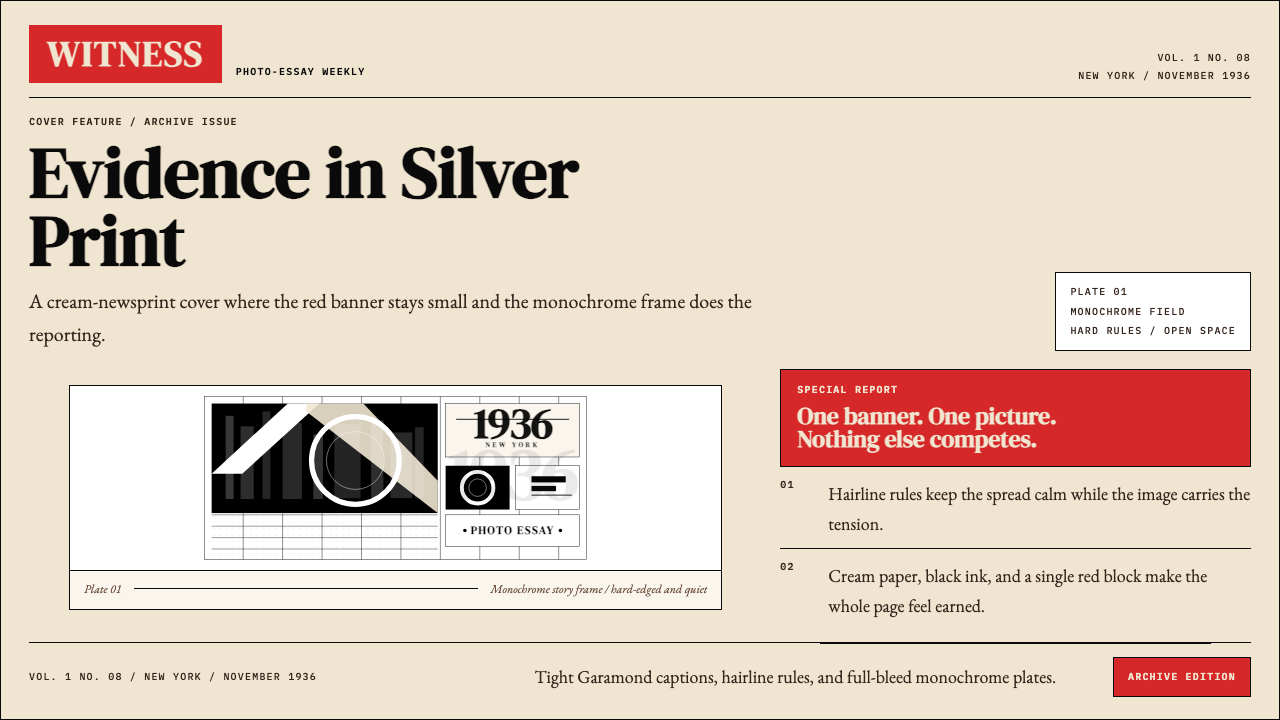 LIFE Magazine (Red-Banner)Photojournalism stripped bare. One red banner, cream newsprint, stark black p…摄影报道被剥到最简。红横幅、米色纸底与黑白版面。
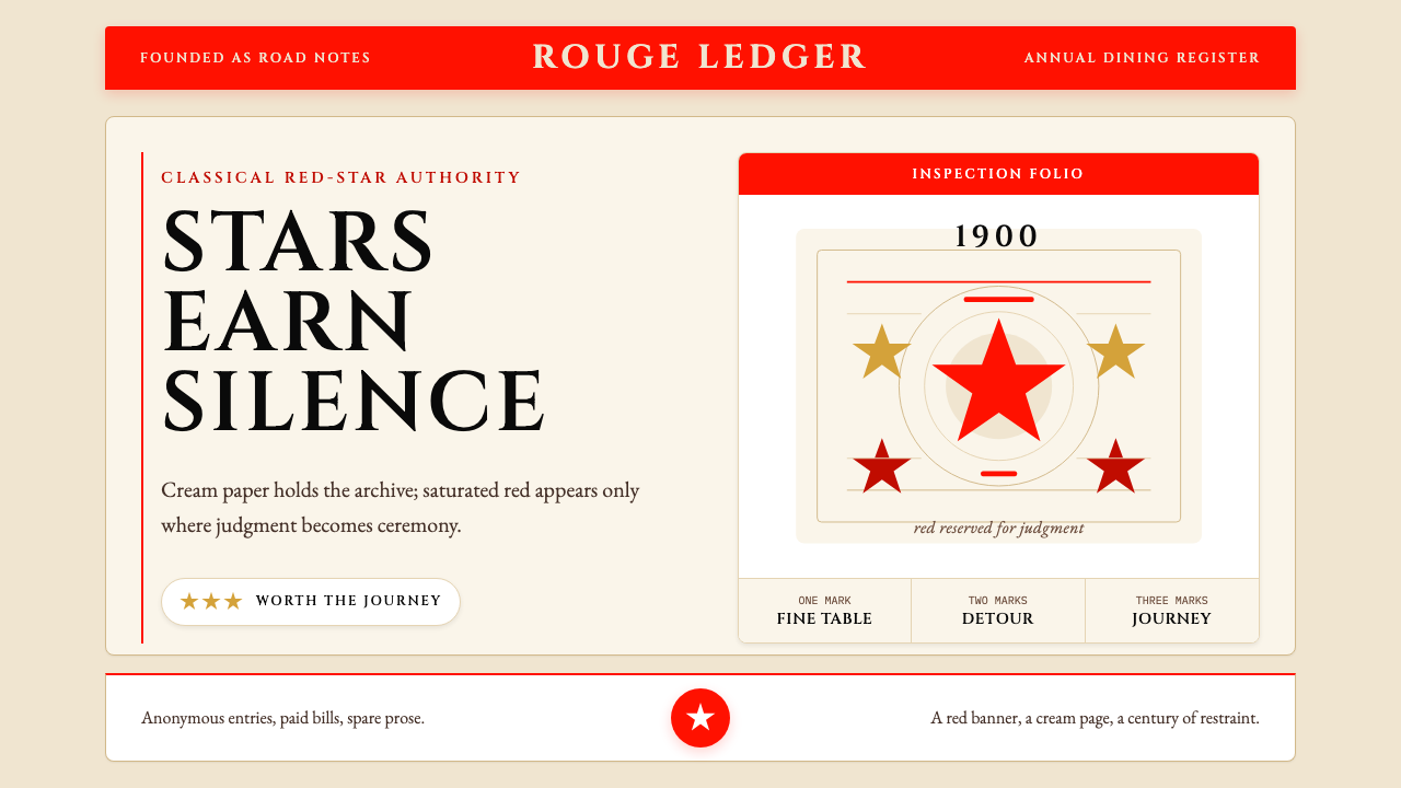 Michelin Guide Red-StarsRed is earned, not spread. Cream paper, Cinzel spacing, and sparse stars carr…红色只留给勋章:奶油纸、Cinzel字距与稀疏星标显出权威。
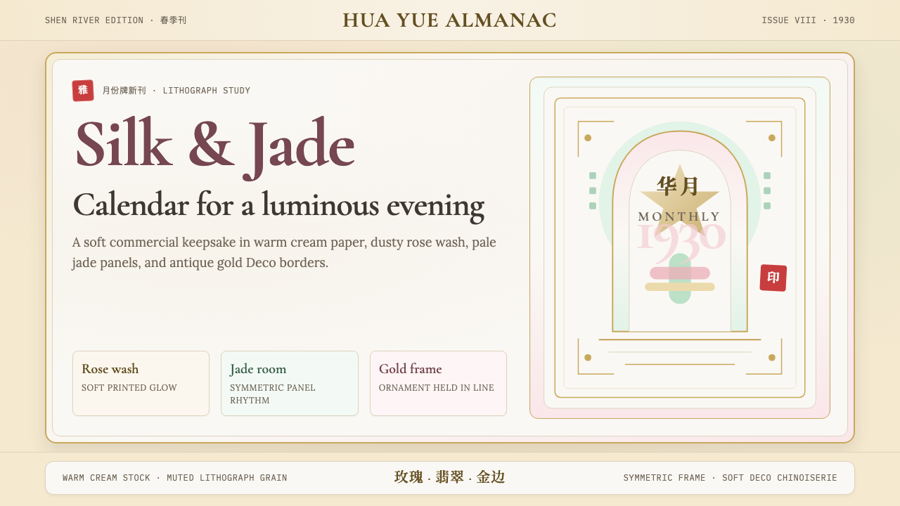 Shanghai Calendar 1930Old Shanghai glows softly. Cream paper, dusty rose, jade panels, and gold Dec…老上海柔光复现:奶油纸、玫瑰粉、翡翠绿与金色装饰框。