What is Argentine Tango Poster (1940)?什么是 Argentine Tango Poster (1940)?
A Buenos Aires concert hall announces tonight's orquesta típica through ink-black grounds, oxblood shadows, and gold letterforms cut with the precision of a copperplate engraver's burin.布宜诺斯艾利斯的音乐厅以墨黑底色、血红阴影与铜版雕刻般精准的金色字形,宣告今夜典型乐团的演出。
Argentine Tango Poster (1940) in briefArgentine Tango Poster (1940) 速览
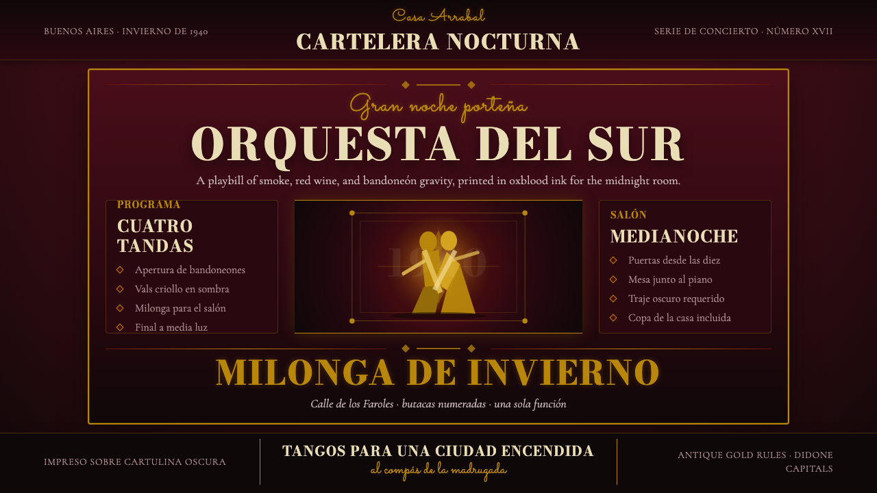
The Argentine Tango Poster of the 1940s is the visual system of tango's Golden Age — a design language built from deep oxblood grounds, antique gold ornament, Didone display type, and dancer silhouettes that seem to move even in stillness. Concert posters pasted outside the milongas and confiterías of Buenos Aires used every tool of the commercial lithographer to communicate drama, elegance, and the promise of a night that would not be forgotten.1940年代的阿根廷探戈海报,是探戈黄金时代的视觉系统——这套设计语言以深邃的氧血红为底色,辅以古金色装饰、Didone 展示字体与即便静止也似乎在舞动的舞者剪影。张贴于布宜诺斯艾利斯米隆加舞厅与咖啡厅外墙的音乐会海报,将商业石版印刷的全部技艺投入其中,传达戏剧感、优雅气质,以及一个令人难忘的夜晚的预告。
At the centre of this aesthetic is a deliberate tension between darkness and luminance. The ground is never simply black — it carries the warmth of aged wine, of candlelit rooms, of leather and lacquer. Against that depth, gold rules and ornamental frames glow with the authority of a jewelry craftsman's work. Letterforms in the Didone tradition — fine hairlines contrasting with swelling strokes — push that tension further, declaring the name of the bandleader with the gravity of an opera playbill.这套美学的核心,是明与暗之间刻意营造的张力。底色从不是单纯的黑——它携带着陈年葡萄酒的温度、烛光房间的气息、皮革与漆面的质感。在那层深邃之上,金色线框与装饰边纹以珠宝工匠般的权威发光。Didone 传统的字体——纤细发丝笔画与丰腴主笔的强烈对比——将这种张力推向极致,以歌剧节目单般的庄重宣告乐团领队的名字。
This design system is not Art Deco, though it borrows from that vocabulary. It is something more specifically porteño: denser, more theatrical, more willing to crowd the frame with curling flourishes and layered typographic hierarchies. Where European posters of the same era were tending toward austerity, Buenos Aires tango posters embraced abundance — because the milonga itself was about abundance, about the density of bodies, music, and emotion in a single room.这套设计系统不是装饰艺术(Art Deco),尽管它借鉴了那个词汇库。它是更具波特尼奥(porteño)特色的存在:更浓密、更戏剧化、更愿意在画框中塞满卷曲花饰与层叠的字体层级。当同时代欧洲海报走向简约时,布宜诺斯艾利斯的探戈海报拥抱的是丰盛——因为米隆加本身就是关于丰盛的:关于同一个房间里身体、音乐与情感的密度。
See the Argentine Tango Poster (1940) design system查看 Argentine Tango Poster (1940) 完整设计系统
Where does Argentine Tango Poster (1940) come from?Argentine Tango Poster (1940) 从何而来?
Tango's Golden Age — roughly 1935 to 1950 — was a cultural phenomenon with few parallels in twentieth-century popular music. The orquestas típicas that filled the vast dance halls of Buenos Aires were large, sophisticated ensembles: orchestras of ten to fifteen musicians performing complex arrangements for thousands of dancers every weekend. Their concert posters were correspondingly ambitious. These were not handbills — they were announcements of events that carried genuine civic significance, and they were designed to stop a pedestrian in mid-stride.探戈黄金时代——大约从1935年延续至1950年——是二十世纪流行音乐史上罕有可比的文化现象。填满布宜诺斯艾利斯大型舞厅的典型乐团是大型、成熟的组合:由十到十五位乐手组成的乐队,每个周末为数千名舞者演奏复杂的编曲。他们的音乐会海报同样雄心勃勃。这些不是普通的传单——它们是宣告真正具有市民意义的活动的公告,被设计来让路人在半步之间驻足凝视。
The visual tradition the posters drew from was equally rich. Buenos Aires had developed a mature lithographic printing industry by the 1880s, producing labels, packaging, and commercial graphics that absorbed European influences — particularly the ornamental traditions of French and Italian commercial printing — and reinterpreted them through local taste. By the 1930s, local print workshops were capable of producing multi-color lithographs of exceptional quality. The Didone typefaces (sometimes called Modern style serifs) that dominate tango poster typography were well-established in the Buenos Aires type specimen books of the era, favored for their combination of formal elegance and high legibility at large display sizes.海报所借鉴的视觉传统同样丰厚。布宜诺斯艾利斯在1880年代便已发展出成熟的石版印刷工业,生产吸收欧洲影响——尤其是法国和意大利商业印刷的装饰传统——并经由本地趣味重新诠释的标签、包装与商业图形。到1930年代,本地印刷工坊已能生产品质卓越的多色石版画。主导探戈海报字体排印的 Didone 字体(有时被称为现代风格衬线体)在那个时代布宜诺斯艾利斯的字体样本册中已有牢固地位,因其形式上的优雅与大型展示尺寸下的高可读性的结合而备受青睐。
The oxblood and deep-crimson color palette has a dual origin. Practically, it reflected the ink and pigment traditions of Buenos Aires commercial printing, where warm dark grounds were achievable and fashionable for theatrical announcements. Culturally, these colors resonated with the visual world of tango itself — the red of passion, the darkness of desire, the gold of aspiration. The palette was also well-suited to the candlelit and lamp-lit environments where the posters would be read: dark grounds with luminous gold details are extraordinarily legible in low-light conditions, which is exactly the environment of a Buenos Aires street at night outside a milonga.氧血红与深绯红色调的调色板有双重起源。从实用角度看,它反映了布宜诺斯艾利斯商业印刷的油墨与颜料传统,温暖的深色底面在戏剧性公告中既可实现又颇为时髦。从文化角度看,这些颜色与探戈本身的视觉世界产生共鸣——激情的红色、欲望的暗色、渴望的金色。这套色调也非常适合海报将被阅读的环境:烛光与灯光下,深色底面搭配发光金色细节在低光条件下具有非凡的可读性,而这恰恰是夜晚米隆加门外布宜诺斯艾利斯街头的环境。
The key artistic figures whose music these posters announced — Carlos Gardel, Aníbal Troilo, Osvaldo Pugliese, Edmundo Rivero — were not graphic designers, but their musical aesthetics shaped what the posters communicated. Gardel's romantic melancholy, Troilo's emotional depth, Pugliese's drama and complexity: these were the qualities that the visual language had to convey. The poster designers of Buenos Aires rose to that challenge by making every element of the composition feel saturated, intentional, and alive with suppressed energy. The Buenos Aires lithography tradition, meeting the European Art Deco sensibility filtered through a specifically Argentine emotional register, produced something that could not have emerged anywhere else.这些海报所宣告的关键艺术人物——卡洛斯·加德尔、阿尼瓦尔·特罗伊洛、奥斯瓦尔多·普格列塞、埃德蒙多·里维罗——并非平面设计师,但他们的音乐美学塑造了海报所传达的内容。加德尔的浪漫忧郁、特罗伊洛的情感深度、普格列塞的戏剧性与复杂性:这些是视觉语言必须传达的品质。布宜诺斯艾利斯的海报设计师接受了这一挑战,让构图的每个元素都感觉饱和、刻意,并充满压抑的能量。布宜诺斯艾利斯石版传统,与经由特定阿根廷情感底色过滤的欧洲装饰艺术感性相遇,产生了一种不可能在任何其他地方诞生的东西。
What defines the Argentine Tango Poster (1940) look?Argentine Tango Poster (1940) 的视觉特征是什么?
Ground and Atmosphere底色与氛围
The foundation of this design system is the dark ground — not a flat black but a deep, warm oxblood or dark-crimson that reads as the interior of a Buenos Aires milonga at midnight. This ground is never neutral; it is already emotionally saturated before a single letter or ornament is placed on it. All other elements must fight to assert themselves against it, which is why the accent values — gold, ivory, pale gold — must be used at maximum luminance. The ground is the drama; everything else is the cast.这套设计系统的基础是深色底面——不是平面的黑色,而是深沉温暖的氧血红或深绯红,让人联想到布宜诺斯艾利斯午夜米隆加的室内。这种底色从不中性;在任何一个字母或装饰元素被置于其上之前,它已经情感饱和。所有其他元素都必须努力在它面前彰显自身,这就是为何强调色值——金色、象牙色、淡金色——必须以最高亮度使用。底色是戏剧;其他一切是演员。
Gold Ornament and Rule Lines金色装饰与线框
Ornamental rule lines, corner brackets, and curvilinear flourishes in antique gold define the poster's architecture. These are not decorative afterthoughts — they are the structural skeleton that holds the typographic content in place and signals the formality and prestige of the event being announced. The quality of the gold matters: it should read as hammered metal or aged gilding, not as a flat color fill. Corner ornaments draw from copperplate engraving traditions, with their precise, tapered lines and symmetrical curlicues.古金色的装饰线框、角隅括弧与曲线花饰定义了海报的结构框架。这些不是事后添加的装饰——它们是承托排版内容的结构骨架,也是所宣告活动之正式性与声望的信号。金色的质量至关重要:它应当读来如同锤制的金属或年代久远的镀金,而非平面的色块填充。角隅装饰源自铜版雕刻传统,拥有其精准的渐细线条与对称的卷曲纹样。
Didone TypographyDidone 字体排印
Didone letterforms — the high-contrast serif tradition that includes Bodoni and its related families — are the typographic voice of tango posters. The extreme contrast between hairline strokes and swelling main strokes creates a visual tension that mirrors the tension between stillness and explosive movement in the dance itself. Headline type is set large, tightly, and with great deliberateness; secondary information in smaller, lighter weights creates a strict hierarchy. Italics are used for performer names and as a gesture toward the flowing, cursive quality of tango's physical movement.Didone 字体——包含 Bodoni 及其相关字体家族的高对比度衬线传统——是探戈海报的字体声音。发丝笔画与丰腴主笔之间的极端对比制造了一种视觉张力,与舞蹈本身在静止与爆发性运动之间的张力相互映照。标题文字以大字号、紧排、精心蓄意的方式呈现;较小、较轻字重的次级信息创造严格的层级关系。斜体用于表演者姓名,也是向探戈身体动作的流动、草书品质的致意。
Dancer Silhouettes舞者剪影
The paired dancer silhouette — typically a man and woman caught mid-figure in the close embrace of the milonga hold — functions as both pictographic content and compositional anchor. These silhouettes are rendered in gold or ivory against the dark ground, with enough detail to convey the specific elegance of the embrace but without photographic literalism. The silhouette form was practical for lithographic reproduction and aesthetically powerful: reduction to outline transforms two human bodies into an almost heraldic emblem, timeless and iconic.成对的舞者剪影——通常是男女两人处于米隆加紧贴式拥抱的某一动作瞬间——既是象形性的内容,也是构图的锚点。这些剪影以金色或象牙色呈现在深色底面上,细节足以传达拥抱姿态特有的优雅,但不带摄影式的字面写实性。剪影形式在石版印刷复制中具有实用性,美学上也极为有力:简化为轮廓线将两个人体转化为近乎纹章式的图徽,超越时间、具有标志性。
Typographic Hierarchy and Drama字体层级与戏剧张力
Tango posters typically present three to five distinct typographic hierarchies: the name of the orquesta or bandleader at maximum scale, the venue name in a secondary weight, the date and time in a smaller tertiary weight, supporting performers in the smallest size, and sometimes a decorative subtitle or tagline in italic script. These hierarchies are not arranged as a reading list — they are composed as a visual drama, with the most important element claiming the largest territory and the supporting elements arrayed around it in diminishing intensity.探戈海报通常呈现三到五个不同的字体层级:乐团或乐团领队的名称以最大尺寸出现,演出场地名称以次级字重呈现,日期与时间以更小的三级字重显示,参演乐手以最小尺寸排列,有时还有以斜体草书呈现的装饰性副标题或标语。这些层级并非作为阅读清单来排列——它们被作为视觉戏剧来构图,最重要的元素占据最大的版面领地,辅助元素以递减的强度环绕其周围。
Border and Frame Architecture边框与框架结构
The outer border of a tango poster is never a simple line — it is a system of nested frames, each with its own character: a thick outer rule, a narrow inner hairline, and between them an ornamental band of repeated geometric or floral motifs drawn from the copperplate tradition. This framing system performs a cultural function as much as a visual one: it declares that what is contained within is not ordinary commerce but an event of cultural significance, worthy of the formality associated with opera programs and luxury printing.探戈海报的外边框从不是一条简单的线——它是一套嵌套框架系统,每层各有其特征:一条粗厚的外框线、一条细窄的内发丝线,以及介于两者之间的一条由铜版传统中重复几何或花卉母题构成的装饰带。这种框架系统执行的是文化功能,与视觉功能同等重要:它宣告其中所容纳的不是普通的商业事务,而是值得与歌剧节目单和奢华印刷品相关联的那种正式性的文化盛事。
Density and Saturation密度与饱和度
Unlike European poster traditions of the same era that were moving toward whitespace and reduction, tango poster design in its authentic form is dense. The frame is filled; every tier of hierarchy occupies its territory; the ornament is present in multiple registers simultaneously. This density is not a failure of restraint — it is a deliberate mirror of the milonga itself, where the floor is crowded, the music is layered, and the emotional atmosphere is thick. Applied today, this density should be controlled but not avoided: a tango-derived design that breathes too freely loses its essential character.与同时代走向留白与简化的欧洲海报传统不同,探戈海报设计在其真实形态中是密集的。画框被填满;每个层级的层次都占据其领地;装饰在多个层次上同时存在。这种密度不是克制的失败——它是对米隆加本身的刻意映照,那里舞池拥挤、音乐层叠、情感氛围浓稠。在今日的应用中,这种密度应当被控制,但不应被回避:一个呼吸过于自由的探戈衍生设计,将失去其本质特征。
See the Argentine Tango Poster (1940) design system查看 Argentine Tango Poster (1940) 完整设计系统
Who shaped Argentine Tango Poster (1940)?谁塑造了 Argentine Tango Poster (1940)?
Gardel (1890–1935) was the defining voice of tango before the Golden Age, and his image — the slicked hair, the white scarf, the smile that seemed to contain everything — became so deeply embedded in tango's visual culture that it continued to shape poster aesthetics for decades after his death in a 1935 plane crash. His recordings established the emotional vocabulary of the genre: romantic longing, urban melancholy, masculine elegance. Poster designers invoked his legacy through a visual register of theatrical restraint — formal, grave, and luminous against darkness — that Gardel himself would have recognized as the correct register for the music he sang.加德尔(1890—1935年)是黄金时代之前探戈的标志性声音,他的形象——油光发型、白色围巾、似乎包含了一切的微笑——深深嵌入探戈的视觉文化,以至于在他1935年于一场空难中离世之后数十年,仍持续塑造着海报的美学。他的录音确立了这一音乐类型的情感词汇:浪漫的渴望、都市的忧郁、男性的优雅。海报设计师通过一种戏剧性的克制视觉语调召唤他的遗产——在黑暗中正式、庄重而发光——加德尔本人会将这种语调认定为他所演唱的音乐的正确语域。
Known as 'Pichuco,' Troilo (1914–1975) led one of the most beloved orquestas típicas of the Golden Age, playing bandoneon with a lyrical depth that made his performances events of emotional consequence. His concerts were among the most heavily advertised in Buenos Aires, and the posters announcing his appearances at venues like the Gran Rex and the Club Armenonville set a standard for visual grandeur. The Troilo aesthetic — intimate despite its scale, emotional despite its formality — is the quality that tango poster design at its best aspires to replicate: something that looks like an institution but feels like a confession.绰号「皮丘科」的特罗伊洛(1914—1975年)领导着黄金时代最受喜爱的典型乐团之一,以抒情深度演奏班多钮琴,使他的演出成为情感意义重大的事件。他的音乐会是布宜诺斯艾利斯宣传最广的演出之一,宣告他在格兰雷克斯剧院和亚美尼亚诺维尔俱乐部演出的海报,为视觉宏大感树立了标准。特罗伊洛的美学——在规模之中的亲密感,在形式之中的情感——正是探戈海报设计在最佳状态下所渴望复制的品质:某种看起来像一个机构、感觉却像一次告白的东西。
Pugliese (1905–1995) represented the dramatic, complex pole of Golden Age tango — his arrangements were dense, rhythmically intricate, and filled with a theatricality that demanded visual equivalents. His political commitments (he was an openly Communist musician in an era of political repression, and a red carnation on his piano became a symbol of solidarity when he was detained) gave his persona an additional layer of gravity and resistance. The visual language of tango posters, with their dark grounds and luminous gold, is perhaps best calibrated to announce a Pugliese concert: heavy, serious, full of suppressed drama, and unmistakably on the side of the night.普格列塞(1905—1995年)代表了黄金时代探戈的戏剧性、复杂性一极——他的编曲密集、节奏错综、充满要求视觉对等物的戏剧性。他的政治立场(他是一位在政治压迫时代公开的共产主义音乐家,被拘留期间钢琴上的一朵红色康乃馨成为声援的象征)赋予他的个人形象额外的庄重感与抵抗意味。探戈海报的视觉语言——深色底面与发光的金色——或许最适合用来宣告一场普格列塞的音乐会:沉重、严肃、充满压抑的戏剧感,毫无疑问站在夜晚的一边。
Rivero (1911–1986) was a singer whose bass voice carried the Buenos Aires underworld — the arrabal, the compadrito, the city's rougher and more nocturnal margins — into the concert halls of the Golden Age. His persona drew on the lunfardo argot and the darker, more dangerous imagery of tango's origins in the immigrant neighborhoods of the Río de la Plata. Posters for Rivero's performances were often the most visually confrontational of the era: deeper grounds, heavier type, less ornamental filigree and more raw graphic power. He represents the element in tango poster design that resists prettification — the dark thing at the center that the gold ornament is simultaneously announcing and barely containing.里维罗(1911—1986年)是一位男低音歌手,其声音将布宜诺斯艾利斯的下层世界——近郊贫民区、街头浪子、城市更粗粝更夜间性的边缘地带——带入了黄金时代的音乐厅。他的人物形象借鉴了卢法尔多俚语以及探戈起源于拉普拉塔河移民社区的更阴暗、更危险的意象。里维罗演出的海报往往是那个时代视觉上最具对抗性的:更深的底色、更重的字体、更少的装饰细工、更多的原始图形力量。他代表了探戈海报设计中抵抗美化的那个元素——金色装饰同时宣告并勉强压制的、位于中心的黑暗事物。
The anonymous craftsmen of the Buenos Aires commercial printing workshops — the lithographers, typesetters, and ornament compositors who produced Golden Age tango posters — deserve recognition as a collective creative force. Working under commercial deadlines and within the technical constraints of multi-stone lithography, they developed a visual language of remarkable consistency and refinement. The craft traditions they drew on included Spanish chromolithography, Italian operatic poster design, and the ornamental typeface culture of French commercial printing. Their synthesis produced a specifically Argentine visual identity that was neither European imitation nor naive folk art, but something genuinely hybrid and genuinely powerful.布宜诺斯艾利斯商业印刷工坊的匿名工匠们——制作黄金时代探戈海报的石版印刷工、排字工和装饰拼合工——作为一股集体创造力理应获得认可。在商业截止期限与多石石版印刷的技术限制下工作,他们发展出一套具有非凡一致性与精炼度的视觉语言。他们所借鉴的工艺传统包括西班牙彩色石版印刷、意大利歌剧海报设计,以及法国商业印刷的装饰字体文化。他们的综合产出了一种特定的阿根廷视觉身份认同——既非欧洲模仿,亦非朴素民间艺术,而是真正混合的、真正有力的东西。
How do you use Argentine Tango Poster (1940) today?今天怎么用 Argentine Tango Poster (1940)?
Argentine Tango Poster style is one of the richest historical design systems to apply to contemporary work precisely because its core aesthetic — dark ground, gold accent, high-contrast type, ornamental framing — translates across media without losing its essential character. Applying it correctly requires understanding the logic of the original: this is a system built on drama, and drama requires contrast, hierarchy, and deliberateness. Every element must be intentional; nothing can drift into casualness.阿根廷探戈海报风格是最适合应用于当代作品的历史设计系统之一,恰恰因为其核心美学——深色底面、金色强调、高对比度字体、装饰性框架——能够跨媒介转化而不失其本质特征。正确应用它,需要理解原作的逻辑:这是一套建立在戏剧感之上的系统,而戏剧感需要对比、层级与刻意为之。每个元素都必须是有意的;没有什么可以漂向随意。
For presentation slides, the style works powerfully on cover pages and section dividers. A cover slide uses the deep oxblood or near-black ground as its entire background; the title is set in a large Didone-style display face in gold or ivory, with a double-rule border framing the composition. Section dividers can carry a dancer silhouette or a single ornamental element to signal transition. Content slides, by contrast, should lighten significantly — cream or pale warm ground, dark type, with gold used sparingly for pull-quotes, data labels, or section indicators. Keeping the full dark register only for structural moments gives the content slides breathing room and makes the dramatic moments feel genuinely dramatic. Data visualizations work best in a warm-tinted version of the palette: bars and lines in gold, ivory, and a muted crimson against a dark or warm-neutral ground.在演示文稿中,这种风格在封面页与章节分隔页上具有强大的表现力。封面幻灯片将深沉的氧血红或近黑色作为整体背景;标题以大型 Didone 风格展示字体呈现,以金色或象牙色显示,双线边框界定构图。章节分隔页可以承载舞者剪影或单一装饰元素来示意过渡。内容页则相反,应当显著减轻——以奶油色或浅暖色为底面,深色文字,金色仅用于引用文字、数据标签或章节指示。将完整的深色语调保留给结构性时刻,给内容页以呼吸空间,让戏剧性时刻真正感觉有戏剧性。数据可视化在调色板的暖调版本中效果最佳:金色、象牙色与哑光绯红的条形图和折线图,衬托在深色或暖中性底面上。
For web interfaces, the style suits event promotion pages, cultural institution homepages, music and entertainment platforms, and any product where the promise of an experience — rather than a utility — is being sold. The approach: commit to a dark mode as the default, using the deep warm ground as the primary background; reserve gold and ivory for headlines, calls to action, and key UI elements; use Didone or high-contrast serif type for display and a legible humanist serif or transitional serif for body text. Navigation benefits from ornamental rule lines as section dividers rather than generic hairlines. Pricing or tier comparison pages can use the framing system — bordered cards with ornamental corner details — to give each tier a sense of formality and significance.对于网页界面,这种风格适合活动推广页面、文化机构主页、音乐与娱乐平台,以及任何销售的是一种体验的承诺——而非实用工具——的产品。方法如下:以深色模式为默认,将深暖色底面作为主要背景;将金色与象牙色保留给标题、行动号召与关键界面元素;展示文字使用 Didone 或高对比度衬线字体,正文使用可读的人文主义衬线或过渡型衬线字体。导航以装饰性线框作为章节分割,而非普通发丝线。定价或等级对比页面可以使用框架系统——带装饰角隅细节的边框卡片——赋予每个等级一种正式感与重要感。
For editorial and marketing work, the style creates an immediately distinctive visual identity that communicates cultural seriousness and sensory richness. A magazine spread in this register uses full-bleed dark grounds for feature openers, with the article title in large Didone display set in gold or ivory; body text moves to a lighter ground for legibility. Marketing campaign assets — social graphics, event banners, email headers — benefit from the poster-like boldness of the system: a single strong typographic statement in high contrast, a dancer silhouette or ornamental element, and the event or product name in the most formal type treatment the medium allows. The style is particularly well-suited to event promotion, cultural sponsorship announcements, luxury product launches, and any context where an atmosphere of glamour and theatrical gravity is a genuine asset.对于编辑与营销工作,这种风格创造出一种立即具有辨识度的视觉身份,传达文化严肃性与感官丰富性。采用这种语调的杂志跨版对开页,在特稿开篇使用全出血深色底面,文章标题以大型 Didone 展示字体呈现,以金色或象牙色显示;正文移至较浅的底面以保证可读性。营销活动素材——社交图形、活动横幅、邮件标题——受益于这套系统的海报式大胆感:一个在高对比度下的强烈字体陈述、一个舞者剪影或装饰元素,以及媒介所允许的最正式字体处理的活动或产品名称。这种风格特别适合活动推广、文化赞助公告、奢侈品发布,以及任何魅力感与戏剧性庄重感是真正资产的场景。
A common and damaging mistake when applying this style is reducing it to decoration: adding gold rules and Didone type to an otherwise conventional layout and assuming the aesthetic has been achieved. The authentic logic of the tango poster is atmospheric and holistic — the dark ground must be committed to, the ornament must be structural, and the typographic hierarchy must carry genuine weight. A second common error is reaching for too many accent colors: the palette has its power precisely because it is restricted to the near-black ground, the gold or ivory accent, and at most one additional warm hue. Introducing cool colors, bright saturated accents, or a crowded palette immediately breaks the spell. Finally, the density of the original tradition should be respected: this is not a style for sparse, airy layouts. If the composition feels too empty, the solution is to invest in the typographic hierarchy and ornamental structure — not to add white space.应用这种风格时,一个常见且有害的错误是将其简化为装饰:在一个否则常规的版面上添加金色线框和 Didone 字体,便以为美学已经实现。探戈海报的真实逻辑是氛围性的、整体性的——深色底面必须全力投入,装饰必须是结构性的,字体层级必须承载真正的分量。第二个常见错误是触及过多的强调色:这套色调的力量恰恰来自其限制——近黑色的底面、金色或象牙色的强调,以及至多一种附加的暖调色。引入冷色、明亮的饱和强调色或拥挤的调色板,会立即打破魔咒。最后,原始传统的密度应当得到尊重:这不是适合稀疏、通透版面的风格。如果构图感觉过于空旷,解决方案是在字体层级与装饰结构上投入——而不是增加留白。
See the Argentine Tango Poster (1940) design system查看 Argentine Tango Poster (1940) 完整设计系统
Argentine Tango Poster (1940) — FAQArgentine Tango Poster (1940) · 常见问题
How is this style different from European Art Deco?这种风格与欧洲装饰艺术(Art Deco)有何不同?
Art Deco and Argentine Tango Poster design share a common ancestry in the early twentieth-century European decorative tradition, but they diverge significantly in character. Art Deco — as expressed in Parisian fashion plates, American skyscraper ornament, and the graphic design of the 1925 Exposition — tends toward streamlined geometry, stepped forms, stylized sunburst motifs, and a palette that balances black with gold, silver, and cool jewel tones. Argentine Tango Poster design is warmer, denser, more operatic, and more willing to embrace curvilinear ornament derived from copperplate engraving rather than industrial geometry. The emotional register is different too: Art Deco projects confidence, modernity, and luxury; tango poster design projects desire, nocturnal drama, and the weight of feeling. Both are sophisticated, but they are sophisticated in different directions.装饰艺术(Art Deco)与阿根廷探戈海报设计共享二十世纪初欧洲装饰传统的共同渊源,但在特征上存在显著分歧。装饰艺术——如巴黎时装图版、美国摩天大楼装饰以及1925年博览会的平面设计所呈现的——倾向于流线型几何、阶梯状形态、程式化的旭日放射纹,以及将黑色与金色、银色和冷调宝石色相互平衡的色板。阿根廷探戈海报设计则更温暖、更密集、更具歌剧性,更愿意接受源自铜版雕刻而非工业几何的曲线装饰。情感语调也不同:装饰艺术投射的是自信、现代感与奢华;探戈海报设计投射的是欲望、夜晚的戏剧感与情感的重量。两者都是精致的,但精致的方向不同。
Can this style work in light mode, or is the dark ground essential?这种风格能用在浅色模式吗,还是深色底面是必不可少的?
The dark ground is deeply essential to the style's identity — the drama of gold against darkness is not a surface choice but a structural one. A genuine light-mode inversion loses the atmospheric core of the system. That said, a restrained light-mode variant is possible: a warm ivory or aged-paper ground, dark espresso-brown or near-black type, antique gold as the primary accent, and ornamental elements drawn from the same copperplate tradition. The effect is closer to a formal printed menu or a luxury event program than to a milonga poster, but it retains the typographic and ornamental DNA of the style. What should never be done is simply inverting colors and calling it the same system — the pale equivalent needs its own careful tonal calibration to preserve any authentic feeling.深色底面对于这种风格的身份认同至关重要——金色映衬黑暗的戏剧感不是表面选择,而是结构性的。真正的浅色模式反转失去了系统的氛围核心。话虽如此,一种克制的浅色模式变体是可能的:温暖的象牙色或陈纸感的底面、深浓缩咖啡棕或近黑色的文字、古金色作为主要强调色,以及源自同一铜版传统的装饰元素。效果更接近于一份正式印刷菜单或奢华活动节目单,而非米隆加海报,但它保留了这种风格的字体与装饰基因。绝不应做的是简单地反转颜色然后称之为同一系统——浅色版本需要其自身细心的色调校准,以保留任何真实的感觉。
Is this style appropriate for digital products, or is it too rooted in print?这种风格适合数字产品吗,还是它太植根于印刷?
The style is rooted in print but translates well to digital contexts with thoughtful adaptation. The core elements — dark grounds, high-contrast type, gold accents, ornamental borders — are all renderable in digital interfaces without loss of fidelity. The challenge is the ornamental density: tango posters work at a scale and a level of visual complexity that can overwhelm smaller screen sizes or component-level interface design. The solution is to treat the style as a register rather than a literal template: apply the color system, the typographic hierarchy, and the framing architecture to your digital components, but simplify the ornamental detail to what reads clearly at the actual display size. Full ornamental complexity is best reserved for large-format moments — hero sections, modal overlays, full-screen event cards — where the viewer has room to encounter it properly.这种风格植根于印刷,但经过深思熟虑的适配,能够很好地转化到数字场景。核心元素——深色底面、高对比度字体、金色强调色、装饰性边框——都可以在数字界面中忠实呈现。挑战在于装饰的密度:探戈海报在一种规模和视觉复杂度上运作,可能会压倒较小的屏幕尺寸或组件级别的界面设计。解决方案是将这种风格作为一种语调而非字面模板:将色彩系统、字体层级和框架结构应用于数字组件,但将装饰细节简化到在实际显示尺寸下清晰可读的程度。完整的装饰复杂性最好保留给大格式时刻——英雄区块、模态弹出层、全屏活动卡片——观看者在那里有足够的空间来正确地与之相遇。
What kinds of projects are a poor fit for this style?哪类项目不适合这种风格?
Argentine Tango Poster style is a poor fit for any context that depends on neutrality, clinical precision, or approachability. Healthcare interfaces, children's educational products, civic information systems, or enterprise software dashboards where cognitive load is already high would be poorly served by the style's atmospheric density and dramatic color register. It is also unsuitable for contexts where the product or brand promise is built on transparency, lightness, or simplicity — the style carries too much visual weight and too strong an emotional charge to recede into the background when the content needs to lead. Minimal-lifestyle brands, clean-tech products, and anything positioning itself against excess would find the tango poster register working against their message.阿根廷探戈海报风格不适合任何依赖中性、临床精确性或亲近感的场景。医疗保健界面、儿童教育产品、公民信息系统,或者认知负荷已经很高的企业软件仪表板,都无法从这种风格的氛围密度和戏剧性色彩语调中获益。它也不适合产品或品牌承诺建立在透明度、轻盈感或简洁性之上的场景——当内容需要主导时,这种风格携带着太多的视觉重量和太强的情感电荷,无法退入背景。极简生活方式品牌、清洁技术产品,以及任何将自身定位为对抗过度的产品,都会发现探戈海报的语调在对抗其信息传达。
How do you achieve the gold effect without actual metallic ink in digital work?在数字作品中,如何在没有真实金属油墨的情况下实现金色效果?
In the original Buenos Aires posters, the gold was achieved through metallic letterpress or lithographic inks that had genuine reflective properties — a quality no digital display can exactly replicate. In contemporary digital work, the goal is to achieve the perceptual impression of antique gold rather than to simulate the physics of metallic reflection. The key is tonal calibration against the dark ground: gold against a deep warm dark needs to be warmer and slightly more amber than it would need to be against a neutral dark, because the warm ground absorbs some of the cool yellow wavelengths. The effect of aged gold — as opposed to bright gold — comes from slightly desaturating the hue and adding warmth. Gradient effects that suggest a highlight on a curved metallic surface quickly become gaudy; the flat, tonal approach is more faithful to the lithographic original and more refined in digital contexts.在布宜诺斯艾利斯原版海报中,金色是通过具有真实反射特性的金属活版或石版油墨实现的——这种品质是数字显示屏无法精确复制的。在当代数字作品中,目标是实现古金色的感知印象,而非模拟金属反射的物理特性。关键是针对深色底面的色调校准:金色映衬深暖色需要比映衬中性深色时更温暖、更略带琥珀色,因为暖色底面会吸收一些冷黄波长。陈旧金色的效果——相对于明亮金色——来自于略微降低色相的饱和度并增加暖度。暗示弯曲金属表面高光的渐变效果很快变得俗气;平面的、色调性的处理方式对石版印刷原作更为忠实,在数字场景中也更为精炼。
Related design styles相关设计风格
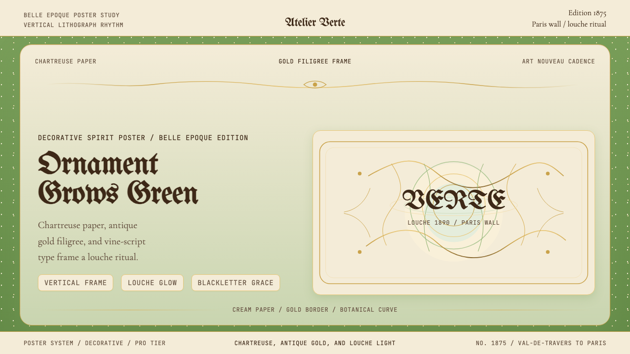 Absinthe Art Nouveau Green (1875)Ornate and verdant. Chartreuse field, gold filigree, vine-script type, and lo…华丽而青绿。黄绿色底、金丝花边与藤蔓字体托出浑浊光。
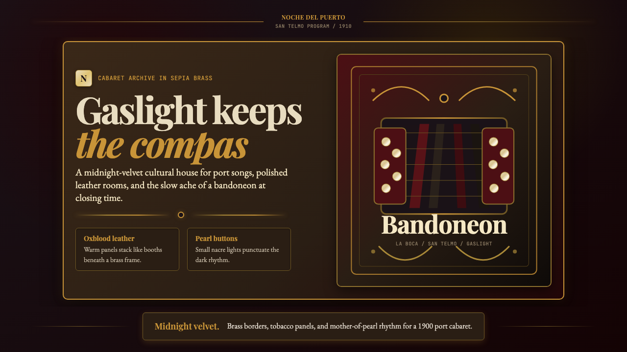 Argentine Bandoneón 1900 (Tango)Gaslit tango luxury. Midnight velvet, brass fileteado, and pearl-button geome…煤气灯下的探戈奢华:午夜绒底、黄铜卷草与珍珠琴键。
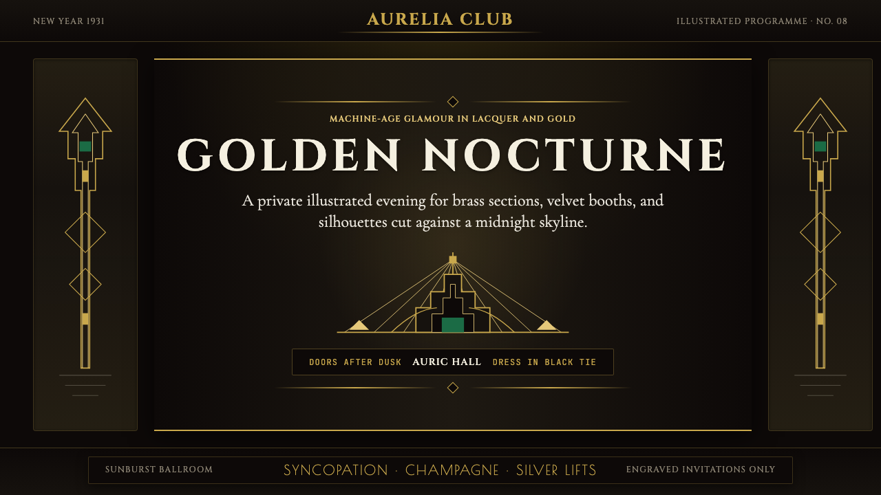 Art Deco Jazz AgeJazz Age glamour. Sunburst rays, stepped ziggurats, gold on black — Chrysler…爵士时代的流光奢华:太阳光芒、阶梯几何、金色撞黑底——克莱斯勒大厦门厅的 CS…
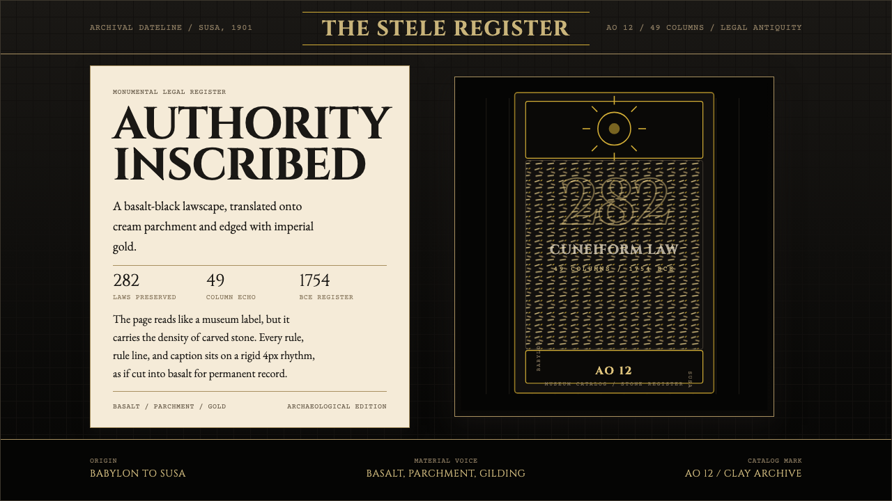 Babylonian Hammurabi SteleAuthority carved in stone. Basalt-black grids, parchment panels, and imperial…权威刻于石上。玄武岩黑底、羊皮纸面板、帝王金点缀。
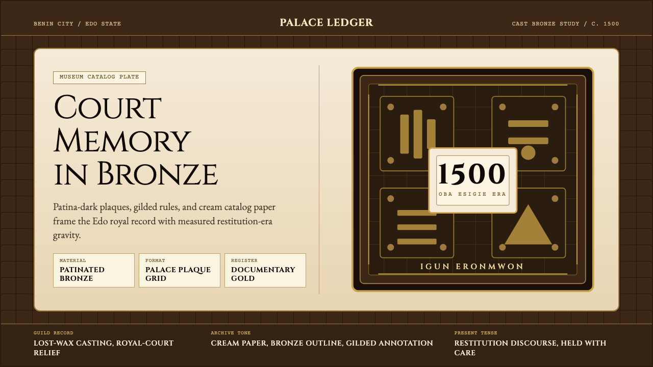 Benin Bronze (Edo, 1500)Royal memory, cast in bronze. Cream plaques and gilded lines carry museum gra…王权记忆铸于青铜。奶油牌板与鎏金线条带出图录庄重。
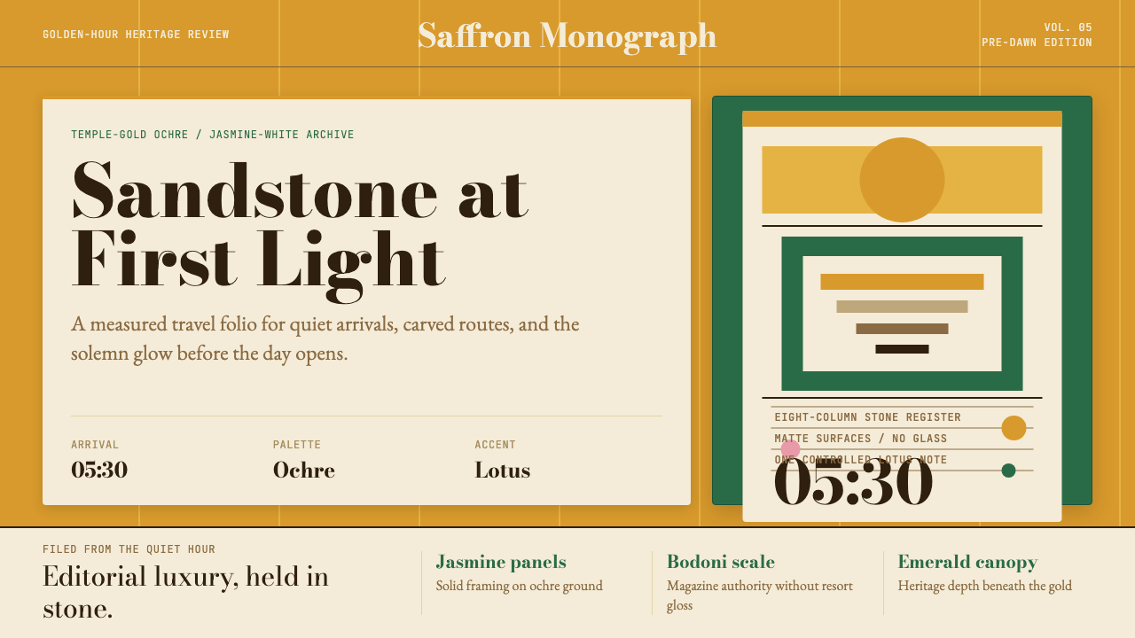 Cambodian Angkor Tourism ModernQuiet authority at dawn. Ochre ground, Bodoni serif, jasmine panels, one lotu…黎明般安静有力:赭金底、Bodoni衬线、茉莉白面板与一笔莲粉。