What is Art Deco Jazz Age?什么是 Art Deco Jazz Age?
Art Deco is the visual grammar of the Jazz Age — a gilded collision of machine-age geometry and ancient ornament that turned the 1920s and 1930s into the most glamorous decade in the history of designed objects.装饰艺术是爵士时代的视觉语法——机械时代的几何造型与古老纹饰的镀金碰撞,将1920至30年代打造成设计史上最光彩夺目的年代。
Art Deco Jazz Age in briefArt Deco Jazz Age 速览
Art Deco is a design movement that flourished between roughly 1920 and 1939, characterized by bold geometric symmetry, rich metallic palettes, and an unapologetic love of luxury. Unlike the reform movements that preceded it — Arts and Crafts, Jugendstil, Wiener Werkstätte — Deco did not position itself against the machine. It embraced industrial production and used it to manufacture opulence at scale: the Chrysler Building's stainless-steel crown, Cassandre's lithographed ocean liner posters, and the lacquered ebony dashboard of a Bugatti could all be considered expressions of the same aesthetic ambition.装饰艺术是一场大约活跃于1920至1939年间的设计运动,以大胆的几何对称、丰富的金属色系以及对奢华毫无保留的热爱为标志。与此前的改革运动——工艺美术、新艺术、维也纳工坊——不同,装饰艺术并不反对机械。它拥抱工业生产,并利用它规模化地制造奢华:克莱斯勒大厦的不锈钢冠顶、卡桑德尔的石版印刷邮轮海报、布加迪的漆面仪表板,都可以被视为同一审美抱负的不同表达。
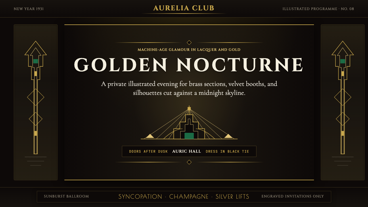
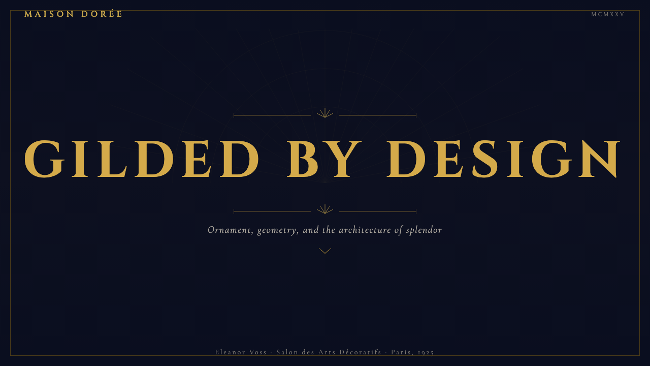
Visually, Art Deco is instantly legible. Its signatures are sunburst rays radiating outward from a central point, stepped pyramid silhouettes borrowed from Mesoamerican and Egyptian architecture, chevron zigzag borders, and bilateral symmetry so precise it feels ceremonial. Color is unapologetically theatrical: warm gold against near-black grounds, jade green, oxblood red, and ivory — the palette of a Manhattan hotel lobby at midnight. Type is tall, geometric, and serif, set with wide letter-spacing and frequent uppercase transforms that give even ordinary labels the weight of engraved inscription.装饰艺术在视觉上极易辨认。它的标志是从中心点向外辐射的太阳光芒、借自中美洲和埃及建筑的阶梯金字塔轮廓、人字形锯齿边框,以及精确到近乎仪式感的左右对称构图。色彩毫不掩饰地具有戏剧性:暖金色衬在近黑底色上,翡翠绿、牛血红与象牙白——这是曼哈顿酒店大堂午夜时分的色板。字体高挑、几何、带有衬线,配以宽大的字距和频繁的全大写,让普通标签也拥有了雕刻铭文般的分量。
The movement's fundamental tension — between handcraft glamour and machine production, between historical reference and modernist aspiration — is precisely what gives it its distinctive richness. Art Deco did not choose between the ancient and the new; it layered them. A Deco skyscraper might borrow the massing of an Egyptian ziggurat and finish it in machine-rolled stainless steel. That audacious synthesis, not any single motif, is the movement's deepest character.这个运动最根本的张力——手工奢华与机械生产之间、历史引用与现代主义抱负之间——恰恰赋予了它独特的丰富性。装饰艺术不在古老与崭新之间做出选择;它将两者叠加在一起。一座装饰艺术摩天楼可能借用埃及金字塔的体量,再以机器轧制的不锈钢作为饰面。那种胆大妄为的综合,而非任何单一母题,才是这场运动最深层的特质。
See the Art Deco Jazz Age design system查看 Art Deco Jazz Age 完整设计系统
Where does Art Deco Jazz Age come from?Art Deco Jazz Age 从何而来?
The name Art Deco is a twentieth-century coinage, derived from the full title of the landmark 1925 exhibition in Paris: the Exposition Internationale des Arts Décoratifs et Industriels Modernes. But the style had been gestating for years before the exposition gave it a name. From around 1910, Parisian designers were already synthesizing the bold color palettes of Fauvism, the fractured geometric planes of Cubism, and the crisp silhouettes of the Ballets Russes costumes designed by Léon Bakst into something more decorative, more accessible, and more commercially viable than any of those avant-garde sources.「装饰艺术」这个名称是二十世纪的造词,源自1925年巴黎那场标志性展览的完整名称:国际现代装饰艺术与工业博览会。但这种风格早在这场博览会为其命名之前便已孕育多年。大约从1910年起,巴黎的设计师们已经开始将野兽派的大胆色板、立体派的碎裂几何平面,以及莱昂·巴克斯特为俄罗斯芭蕾舞团设计的戏服所呈现的干净轮廓,融合成某种比上述任何先锋来源都更具装饰性、更易接近、也更具商业可行性的东西。
The 1922 opening of Tutankhamun's tomb by Howard Carter ignited an Egyptomania that ran through Deco's visual vocabulary for the rest of the decade: lotus-capital columns, scarab motifs, the stepped ziggurat form that appears everywhere from cigarette cases to skyscraper crowns. Alongside Egypt, designers drew on Aztec and Mayan pyramidal geometry, the symmetrical patterns of ancient Mesopotamia, and the lacquerwork of East Asian craft traditions. Deco was never a purist movement; it was an omnivorous synthesis that felt entirely of its moment precisely because the 1920s — with their jazz clubs, transatlantic airships, and Hollywood movie palaces — were themselves a culture of flamboyant collage.1922年霍华德·卡特开启图坦卡蒙陵墓,点燃了一场贯穿整个十年的埃及热潮,渗透进装饰艺术的视觉语汇:莲花柱头、圣甲虫图案、从香烟盒到摩天楼冠顶随处可见的阶梯金字塔造型。除了埃及,设计师们还汲取阿兹特克和玛雅的锥体几何、古代美索不达米亚的对称纹样,以及东亚漆器工艺传统。装饰艺术从不是一场纯粹主义运动;它是一种杂食性综合,而它之所以完全属于自己的时代,恰恰因为1920年代本身——爵士俱乐部、跨大西洋飞艇、好莱坞电影宫——就是一种华美拼贴的文化。
The movement crossed the Atlantic with remarkable speed. By the late 1920s, New York had become as significant a center as Paris. The skyscraper race gave Deco its most monumental expression: William Van Alen's Chrysler Building (1930), with its seven radiating arches of stainless steel, was the movement's most photographed monument; the Empire State Building, Radio City Music Hall, and the lobbies of dozens of mid-Manhattan office towers completed the picture. Miami's South Beach district, developed intensively in the 1930s, applied the vocabulary to a gentler domestic scale — pastel-tinted apartment blocks with porthole windows and eyebrow moldings that softened the style's more imperial tendencies.这场运动以惊人的速度跨越大西洋。到1920年代末,纽约已与巴黎并列成为同等重要的中心。摩天楼竞赛赋予了装饰艺术最宏伟的表达:威廉·范阿伦设计的克莱斯勒大厦(1930年),以七圈辐射的不锈钢拱形为冠顶,成为这场运动被拍摄最多的纪念碑;帝国大厦、无线电城音乐厅,以及曼哈顿中城数十座办公楼的门厅,共同构成了完整的图景。迈阿密的南海滩区在1930年代密集开发,将这套语汇运用于更为温柔的住宅尺度——粉彩色调的公寓楼、舷窗式圆孔窗与眉形线脚,软化了这种风格较为帝国式的面貌。
The Depression did not kill Art Deco immediately; it refined it. The streamlining movement of the early 1930s — led by industrial designers Raymond Loewy, Norman Bel Geddes, and Henry Dreyfuss — shaved away the more elaborate surface ornament and extended Deco's logic into product and transportation design. The bullet-shaped locomotives, aerodynamic radio cabinets, and chrome-trimmed domestic appliances of the mid-1930s represent a late Deco synthesis that remained dominant in American commercial design until the Second World War decisively reordered industrial priorities.经济大萧条并未立即终结装饰艺术;它精炼了它。1930年代初的流线型运动——由工业设计师雷蒙德·罗维、诺曼·贝尔·盖兹和亨利·德雷福斯领导——削去了较为繁复的表面装饰,将装饰艺术的逻辑延伸至产品与交通工具设计。子弹形机车、空气动力学收音机柜,以及1930年代中期饰以镀铬的家用电器,代表了装饰艺术晚期的综合形态,这种形态在美国商业设计中保持主导地位,直至第二次世界大战彻底重组了工业优先次序。
What defines the Art Deco Jazz Age look?Art Deco Jazz Age 的视觉特征是什么?
Color色彩
The canonical Deco palette is built around metallic warmth against extreme dark grounds. Warm gold — the color of gilded elevator doors and engraved cigarette cases — anchors the system as its sole commanding accent. Deep, near-black backgrounds (not cool blue-black, but the warm black of lacquered ebony) give the gold maximum contrast and theatrical presence. Jade green, oxblood red, and ivory appear as secondary accents, evoking the jewel tones of vintage accessories: a green jade cufflink, the red enamel on a cocktail shaker. Pastels and earth tones are categorically absent — Deco's palette is metallic, jewel-like, and deliberate.装饰艺术的标准色板建立在金属暖色调与极深底色之间的对比关系上。暖金色——镀金电梯门与雕花香烟盒的颜色——作为唯一的统领性强调色锚定整套系统。深邃的近黑色底色(不是冷蓝黑,而是漆面乌木般的暖黑)赋予金色最大的对比度与戏剧性存在感。翡翠绿、牛血红与象牙色作为次要强调色出现,令人联想到古典配饰的宝石色调:绿玉袖扣、调酒器上的红色珐琅。粉彩色与土色系一概缺席——装饰艺术的色板是金属质感的、宝石般的、经过精心选择的。
Typography字体排印
Deco typography treats the letterform as an architectural element. Display typefaces are tall geometric serifs with high contrast between thick strokes and hairline thins — the visual DNA of inscriptional Roman capitals filtered through Art Deco's love of precision and grandeur. Headlines are set wide, in uppercase, with generous letter-spacing that makes each title feel like a marquee or a carved fascia board. Body text, when it appears, is set in high-contrast old-style or Didone serifs that supply elegance without fussiness. The underlying logic is monumental: type should feel permanent, weighty, and worthy of the gold that surrounds it.装饰艺术的字体排印将字母形态视为建筑构件。展示字体是高对比度的高挑几何衬线体——粗笔画与发丝细笔画之间的强烈反差,正是罗马铭文大写字母经由装饰艺术对精准与宏大的热爱过滤后的视觉基因。大标题采用大写、宽字距设置,让每个标题都如同剧院广告牌或雕刻楣板。正文(若出现)以高对比度的旧式体或现代衬线体排版,在不失雅致的前提下提供精致感。其内在逻辑是纪念碑式的:字体应当感觉永久、有分量,并配得上环绕它的金色。
Geometry and Symmetry几何与对称
Where Bauhaus used asymmetric tension to create dynamic balance, Art Deco insists on bilateral symmetry and vertical emphasis. Compositions are centered, formal, and ceremonial — the left side mirrors the right with the precision of a stage set. The dominant geometric motifs are the sunburst fan (radiating lines expanding outward from a central point), the stepped ziggurat (a form that reads simultaneously as pyramid, skyscraper silhouette, and crown), and the chevron zigzag (a pattern that implies movement and speed). These are not decorative afterthoughts; they are structural elements that organize space and signal luxury.包豪斯用非对称张力创造动态平衡,而装饰艺术坚持左右对称与垂直强调。构图是居中的、正式的、仪式感的——左侧以舞台布景般的精确度镜像右侧。主导性的几何母题是太阳扇(从中心点向外辐射的线条)、阶梯金字塔(一种同时被读作金字塔、摩天楼轮廓与冠顶的形态),以及人字形锯齿(一种暗示运动与速度的图案)。这些不是事后补充的装饰;它们是组织空间、传递奢华感的结构性元素。
Materials and Surface材料与表面
In the physical world, Art Deco is defined by its material palette: stainless steel, polished brass, lacquered ebony, Bakelite, terrazzo, and veined marble. Every surface is either highly polished or precisely matte — nothing is rough, organic, or ambiguous. In digital translation, this materialness becomes a contrast of layered opaque surfaces: near-black grounds with warm-charcoal card panels, separated by gold hairline borders. The visual metaphor is a Manhattan elevator interior — obsidian and brushed gold, hard reflective edges, no soft textures, no gradients. Depth is expressed through surface stacking rather than through shadow diffusion.在物质世界,装饰艺术由其材料色板来定义:不锈钢、抛光黄铜、漆面乌木、电木、水磨石与带纹路的大理石。每一个表面要么高度抛光,要么精确无光泽——没有粗糙、有机或模糊的东西。在数字化转译中,这种物质性成为叠加不透明表面之间的对比:近黑底色与暖炭色卡片面板,以金色发丝细线分隔。其视觉隐喻是曼哈顿电梯内部——黑曜石与拉丝金,坚硬反光的边缘,无柔软质感,无渐变。深度通过表面叠加而非阴影漫射来表达。
Motifs and Ornament纹饰与装饰
Art Deco is the only major twentieth-century style that fully embraced ornament as a structural — not merely decorative — component of design. Its ornamental vocabulary is precise and codified: sunburst ceiling rosettes, stepped-pyramid column capitals, chevron-bordered panels, fan-shaped balustrades, and stylized animal forms (leaping gazelles, coiled serpents, exotic birds) rendered in geometric silhouette. These motifs are used at multiple scales simultaneously — a chevron pattern might appear as a border on a poster, a tile arrangement on a lobby floor, and a metal grille on an elevator door in the same building. Deco's ornamental density is never chaotic because it is always governed by the same geometric logic.装饰艺术是二十世纪唯一将纹饰完全视为设计的结构性——而非仅仅是装饰性——组成部分的主流风格。它的纹饰语汇精确而成体系:太阳放射形天花玫瑰花饰、阶梯金字塔柱头、人字纹镶边面板、扇形栏杆,以及以几何剪影呈现的程式化动物形态(跃起的羚羊、盘绕的蛇、异域鸟类)。这些母题同时出现在多个尺度上——人字纹可能作为海报上的边框,同一栋建筑大厅地面的瓷砖排列,以及电梯门上的金属格栅。装饰艺术的纹饰密度从不显得混乱,因为它始终受制于同一套几何逻辑。
Proportion and Verticality比例与垂直感
Art Deco inherited the skyscraper's proportional logic and applied it everywhere. Elements are stretched vertically: letterforms are tall and narrow, column spacings are deep, and panels are portrait-oriented. This verticality is not merely compositional preference — it communicates aspiration, authority, and the forward momentum of the machine age. Even horizontal elements, like Cassandre's ocean liner posters, often use converging perspective lines that drive the eye toward a vanishing point on the horizon, creating a sense of upward or forward surge. Nothing in Art Deco sits comfortably at rest; everything leans into the future.装饰艺术继承了摩天楼的比例逻辑,并将其运用于一切事物。元素在垂直方向上被拉伸:字形高挑而窄细,柱距深远,面板采用竖版方向。这种垂直感不仅仅是构图偏好——它传达了抱负、权威,以及机械时代向前的动量。即便是水平向的元素,如卡桑德尔的邮轮海报,也常常使用汇聚的透视线将视线引向地平线上的消失点,制造出向上或向前的冲劲。装饰艺术中没有什么东西是安然静止的;一切都朝向未来倾斜。
Light and Metallic Sheen光泽与金属感
Deco's defining atmospheric quality is the warm, focused luminescence of metal in low light — gold leaf, polished brass, chrome — against a dark, absorptive ground. This is not the cool reflectivity of glass or the soft glow of ambient lighting; it is the hard, warm gleam of a surface that has been polished to a precise finish. In digital environments, this translates to a gold accent color used for focus rings, borders, active states, and hover effects — elements that 'catch light' against a near-black field. The interaction model should feel like running a finger along a gilded railing: immediate, physical, and just slightly warm.装饰艺术最具定义性的氛围品质,是金属在低光环境下发出的温暖而聚焦的光泽——金箔、抛光黄铜、镀铬——衬托在深沉、吸光的底色之上。这不是玻璃的冷反光,也不是环境光的柔和光晕;而是一个被打磨至精确光洁度的表面发出的坚硬而温暖的闪光。在数字环境中,这转化为用于焦点环、边框、激活状态与悬停效果的金色强调色——这些元素在近黑色底面上「捕获光线」。交互模型应当让人感觉像沿着镀金栏杆滑过手指:即时、触觉性、带有一丝温度。

See the Art Deco Jazz Age design system查看 Art Deco Jazz Age 完整设计系统
Who shaped Art Deco Jazz Age?谁塑造了 Art Deco Jazz Age?
The Ukrainian-born French poster artist Cassandre produced the movement's most iconic two-dimensional works between the late 1920s and mid-1930s. His ocean liner posters — Normandie (1935), L'Atlantique (1931), and others — compressed vast machines into bold geometric silhouettes viewed from extreme perspective, making speed and scale viscerally present on a flat surface. His design method was to identify the single most powerful visual truth about a subject and render it at maximum graphic intensity. As a typographer, Cassandre later designed the Bifur, Acier Noir, and Peignot typefaces, each extending Deco's geometric aesthetic into letterform.出生于乌克兰的法国海报艺术家卡桑德尔,在1920年代末至30年代中期创作了这场运动最具标志性的二维作品。他的邮轮系列海报——《诺曼底号》(1935年)、《大西洋号》(1931年)及其他作品——将庞大的机器压缩为以极端透视观察的大胆几何剪影,使速度与尺度在平面上获得了直觉性的存在感。他的设计方法是:找出关于一个主题最有力的单一视觉真相,以最大图形强度呈现它。作为字体设计师,卡桑德尔后来设计了Bifur、Acier Noir和Peignot字体,将装饰艺术的几何美学延伸至字母形态。
The Polish-born painter Tamara de Lempicka became the movement's defining figurative artist, creating a body of portraiture that fused Post-Cubist geometry with an atmosphere of psychological cool and erotic intensity. Her figures — typically women in metallic fabrics, gloves, and sports cars — are painted with the same precision and surface quality as machine parts: smooth, hard-edged, and powerfully contoured. De Lempicka's work demonstrates that Art Deco was not merely a surface style but could carry genuine psychological weight. Her most celebrated painting, Auto-Portrait (Tamara in the Green Bugatti, 1929), remains the movement's most reproduced image.波兰出生的画家塔玛拉·德·蓝碧嘉成为这场运动最具定义性的具象艺术家,创作了一批将后立体主义几何与冷峻心理气氛及情欲强度相融合的肖像作品。她笔下的人物——通常是穿着金属质地衣物、戴着手套、坐在跑车中的女性——以与机械零件相同的精确度和表面质感描绘:光滑、硬边、轮廓有力。德·蓝碧嘉的作品证明,装饰艺术不仅仅是一种表面风格,它同样能承载真实的心理重量。她最著名的画作《自画像(绿色布加迪中的塔玛拉)》(1929年)至今仍是这场运动被复制最多的图像。
As the architect of the Chrysler Building (completed 1930), William Van Alen gave Art Deco its most enduring three-dimensional monument. The building's crown — seven radiating arches of stainless steel, each punctuated by eagle gargoyles and triangular windows — was assembled in secret inside the building and raised in a single day to surpass the Bank of Manhattan's height and briefly claim the title of world's tallest structure. The gesture was Deco in spirit as well as form: theatrical, precisely engineered, and fundamentally about the drama of the reveal. The lobby, with its amber onyx walls, marble floors, and gilded murals, extends the exterior vocabulary into an interior of sustained luxury.作为克莱斯勒大厦(1930年竣工)的建筑师,威廉·范阿伦为装饰艺术留下了最持久的三维纪念碑。大厦的冠顶——七圈辐射的不锈钢拱形,每圈点缀着鹰形滴水嘴和三角形窗——在楼内秘密组装后于单日内升起,超越曼哈顿银行大厦的高度,短暂夺得世界最高建筑的称号。这个姿态在精神上与形式上都是纯正的装饰艺术:戏剧性的、精确工程的,本质上是关于揭幕一刻的戏剧感。大堂以琥珀色缟玛瑙墙面、大理石地板和镀金壁画,将外观语汇延伸为一个持续的奢华内部空间。
The Russian-born fashion illustrator and designer Erté defined the visual language of Jazz Age glamour through decades of Harper's Bazaar covers and stage costume designs that translated Art Deco's geometric vocabulary into the human figure. His characteristic style — elongated silhouettes, precise outlines, fan-shaped headdresses, and the use of negative space as an active compositional element — influenced not only fashion illustration but the broader visual grammar of Deco ornament. Erté's work represents the movement's most refined application of bilateral symmetry at a human scale.俄国出生的时装插画家与设计师埃尔泰,通过数十年的《时尚芭莎》封面与舞台服装设计,将装饰艺术的几何语汇转化为人体形态,从而定义了爵士时代魅力的视觉语言。他的标志性风格——拉长的轮廓、精确的线条、扇形头饰,以及将负空间作为主动构图元素加以运用——影响了不仅是时装插画,还有装饰艺术纹饰更宏观的视觉语法。埃尔泰的作品代表了这场运动在人体尺度上对左右对称最精致的运用。
The French-born American industrial designer Raymond Loewy represents the movement's evolution into streamlined modernity. Working through the 1930s and beyond, Loewy applied Deco's formal logic — symmetry, metallic surfaces, precise geometric profiling — to trains, automobiles, refrigerators, and corporate identities, extending the style's visual authority from architecture and fashion into the everyday industrial landscape. His Pennsylvania Railroad GG1 locomotive (1934) and Coldspot refrigerator are exemplary Deco-derived objects that demonstrate how the movement's glamour could be made functional and mass-producible without losing its essential character.法裔美国工业设计师雷蒙德·罗维代表了这场运动向流线型现代性的演进。在整个1930年代及之后,罗维将装饰艺术的形式逻辑——对称、金属表面、精确的几何轮廓——运用于火车、汽车、冰箱与企业形象,将这种风格的视觉权威从建筑与时装延伸至日常工业景观。他为宾夕法尼亚铁路设计的GG1机车(1934年)与冷点冰箱是装饰艺术衍生物的典范,它们证明了这场运动的魅力可以在不失其本质特征的前提下变得功能化、可量产。
How do you use Art Deco Jazz Age today?今天怎么用 Art Deco Jazz Age?
Art Deco translates into contemporary design work with unusual fidelity, because its visual rules are explicit and structural rather than merely atmospheric. The core commitment — gold on near-black, bilateral symmetry, geometric serif type, stepped ornamental motifs — produces recognizable results even when applied to formats that did not exist in the 1920s. The key is to treat it as a coherent system rather than a grab-bag of vintage motifs.装饰艺术以异乎寻常的忠实度转化进当代设计实践,因为它的视觉规则是明确且结构性的,而非仅仅是氛围性的。核心承诺——金色衬近黑底、左右对称、几何衬线字体、阶梯式装饰母题——即便运用于1920年代尚不存在的媒介形式,也能产生可识别的结果。关键是将它作为一套连贯的系统来对待,而非一袋复古母题的杂货铺。
For presentation slides, Art Deco rewards a strong two-phase approach: the cover and section-title slides carry the full ornamental weight, while content slides work as clean dark-ground grids that let the gold accent do the work. A Deco cover should be centered, symmetrical, and typographically monumental — headline in a tall geometric serif, set large, uppercase, with wide letter-spacing. A thin gold hairline rule above and below the title is enough ornament for a content slide. For data slides, use the gold accent color for the active or highlighted series in charts, and keep all axes, gridlines, and supporting text in a muted warm gray. The result reads as purposefully theatrical without overwhelming the data.对于演示文稿,装饰艺术在强烈的两阶段处理中表现最佳:封面与章节标题页承载全部纹饰重量,内容页则作为干净的深色底面网格,让金色强调色来做工作。装饰艺术的封面应当是居中的、对称的、字体上具有纪念碑感的——大号几何衬线体标题,全大写,宽字距。标题上下各一条细金色发丝线,对内容页来说已是足够的装饰。数据页面中,将金色强调色用于图表中的激活或高亮数据系列,所有坐标轴、网格线与辅助文字保持静默的暖灰色。结果看起来是有意为之的戏剧性,而不会淹没数据。
For web UI — dashboards, pricing pages, and marketing landing pages — Deco's deep-black ground with gold accents creates an immediate premium signal. The practical approach: set the page background to a very dark warm black (not a flat neutral black — something with a slight brown undertone), use gold for primary buttons, focus rings, active navigation states, and decorative border accents, and set all body text in an ivory near-white. Cards and panels should be slightly warmer than the page ground — layered opaque surfaces rather than frosted glass. Avoid drop shadows with colored tint; use deep, diffuse neutral shadows that suggest depth without introducing color contamination. Pricing tiers benefit from a centered layout with stepped visual hierarchy: the recommended tier slightly larger, flanked by two equally-sized alternatives.对于网页界面——仪表板、定价页面与营销落地页——装饰艺术深黑底色加金色点缀的组合立即传递出高端信号。实际操作:将页面背景设置为非常深的暖黑(不要平淡的中性黑——需要带有一丝棕色底调的颜色),将金色用于主要按钮、焦点环、激活导航状态与装饰性边框点缀,正文全部使用象牙色近白。卡片与面板应略比页面底色更暖——叠加的不透明表面,而非磨砂玻璃效果。避免带有色调的投影;使用深沉、漫射的中性阴影来暗示深度,不引入颜色污染。定价档位适合居中布局与阶梯式视觉层级:推荐档位略大,两侧等大的备选方案对称分列。
For editorial and marketing work — printed or digital — Deco justifies a heavier hand with ornament than most contemporary styles permit. Section dividers can use gold horizontal rules flanked by small diamond or chevron accents. Pull quotes benefit from being framed by stepped geometric borders. Cover imagery and feature photography should be treated with high contrast and warm color grading, emphasizing sharp contours and suppressing mid-tone softness. The underlying grid should be strong and symmetrical; a centered single column for body text, with wider margins for metadata or captions, produces Deco's characteristic proportional gravity.对于编辑与营销内容——印刷或数字——装饰艺术允许比大多数当代风格更重的纹饰运用。段落分隔符可以使用两侧点缀小菱形或人字纹的金色水平线。引言文字适合以阶梯几何边框来框定。封面图像与特写摄影应以高对比度和暖色调处理,强调清晰轮廓,压制中间调的柔软感。底层网格应当强健而对称;正文居中单列,为元数据或注释保留更宽的页边距,产生装饰艺术特有的比例重力感。
The most common mistake when applying Art Deco is confusing ornamental richness with ornamental quantity. Authentic Deco work is dense but disciplined: every motif is geometrically precise, consistently scaled, and placed according to a clear structural logic. The failure mode is decorative chaos — chevrons, sunbursts, and gold lines scattered without organizational intent, producing an effect closer to a Halloween party than a Manhattan lobby. A second common error is temperature drift: using a cold, blue-tinted black rather than a warm near-black, or choosing a bright lemon gold rather than a warm amber gold. The entire palette depends on warmth; a single cool element can dissolve the period atmosphere entirely.应用装饰艺术时最常见的错误,是将纹饰的丰富性与纹饰的数量混为一谈。真实的装饰艺术作品密集但有纪律:每一个母题都在几何上精确,比例一致,根据清晰的结构逻辑放置。失败的模式是装饰性的混乱——人字纹、太阳光芒与金线毫无组织意图地散落,产生的效果更接近万圣节派对而非曼哈顿大堂。另一个常见错误是色温漂移:使用冷蓝调的黑色而非暖近黑,或选择明亮柠檬黄的金色而非暖琥珀金色。整套色板依赖于温暖感;单一的冷色元素可以彻底瓦解那个时代的氛围。
See the Art Deco Jazz Age design system查看 Art Deco Jazz Age 完整设计系统
Art Deco Jazz Age — FAQArt Deco Jazz Age · 常见问题
What is the difference between Art Deco and Art Nouveau?装饰艺术与新艺术运动有什么区别?
Art Nouveau (roughly 1890–1910) and Art Deco (roughly 1920–1939) are often confused because they are sequential decorative movements that both drew on historical and exotic sources. But their formal values are nearly opposite. Art Nouveau is characterized by sinuous, organic curves derived from plant and animal forms — tendrils, lily petals, dragonfly wings — and a soft, flowing line quality. Art Deco is rectilinear, geometric, and hard-edged, with ornament derived from machine forms, ancient architecture, and crystalline structure rather than nature. Art Nouveau looked backward to a craft ideal; Art Deco looked sideways at the machine and forward toward modernity. When you see a curved, flowing decorative border, that is Art Nouveau. When you see a stepped ziggurat or a sunburst of straight radiating lines, that is Art Deco.新艺术运动(约1890—1910年)与装饰艺术(约1920—1939年)常被混淆,因为它们是两个相继出现的装饰运动,且都借鉴了历史与异域资源。但它们的形式价值几乎截然相反。新艺术运动以源自植物与动物形态的蜿蜒有机曲线为特征——卷须、百合花瓣、蜻蜓翅膀——以及柔软流动的线条质量。装饰艺术则是直线的、几何的、硬边的,其纹饰源自机械形态、古代建筑与晶体结构,而非自然。新艺术运动向后看向工艺理想;装饰艺术向侧看向机器,向前看向现代性。当你看到弯曲流动的装饰边框,那是新艺术运动。当你看到阶梯金字塔或直线辐射的太阳光芒,那是装饰艺术。
Can Art Deco work in a light-background digital design?装饰艺术风格能用于浅色背景的数字设计吗?
Yes, but with significant adjustments. The canonical Deco palette is dark-ground because the movement's material language — polished metal against lacquered ebony — depends on the contrast of luminous metal against a dark absorptive surface. On a light ground, gold reads as brown or mustard rather than as metal, which undermines the whole atmospheric premise. A viable light-ground Deco variant works best with a warm ivory or aged-parchment background (never pure white), black or very dark brown as the structural color, and gold used only at borders, dividers, and emphasis points rather than as a broad fill. The ornamental vocabulary — sunbursts, stepped motifs, chevrons — transfers well regardless of ground color, and geometric serif type retains its Deco character in any palette.可以,但需要做出较大调整。装饰艺术的标准色板是深色底面,因为这场运动的材料语言——抛光金属衬漆面乌木——依赖发光金属与深沉吸光表面之间的对比。在浅色底面上,金色会被读作棕色或芥末色而非金属色,从而破坏整个氛围前提。可行的浅色底面装饰艺术变体,最好以暖象牙色或旧羊皮纸色(绝不使用纯白)作为背景,以黑色或极深的棕色作为结构色,金色仅用于边框、分隔符与强调点,而非作为宽泛的填充色。装饰性语汇——太阳光芒、阶梯母题、人字纹——无论底色如何都能良好转移,几何衬线字体在任何色板中都保留其装饰艺术特质。
How should I handle gold in digital design — which format is most faithful?数字设计中该如何处理金色——哪种形式最接近原版效果?
Screens cannot reproduce the reflective warmth of physical gold leaf or polished brass, but they can approximate it. The key is warmth and saturation: a desaturated or too-bright gold reads as yellow, while a too-dark gold reads as brown. A hue in the amber-gold range — roughly 40–45° on the HSL wheel, saturation 50–60%, lightness 50–60% — reads credibly as gold on a dark background. Avoid pure lemon yellow and its relatives, which skew too bright and modern. CSS gradients can simulate the directional luminescence of metal: a subtle linear gradient from a slightly lighter gold tone at the top to a slightly darker one at the bottom on a button or card border will read as more physically present than a flat fill. Gold-tinted box shadows and focus rings — a soft glow in a translucent warm amber — are the digital equivalent of a warm highlight catching the edge of a brass fitting.屏幕无法再现真实金箔或抛光黄铜的反光温度,但可以近似模拟。关键在于色温与饱和度:不够饱和或过于明亮的金色会被读作黄色,过深的金色会被读作棕色。色相在琥珀金范围内——在HSL色轮上大约40—45度,饱和度50—60%,亮度50—60%——在深色背景上能被可信地读作金色。避免纯柠檬黄及其近似色,它们显得过于明亮而现代。CSS渐变可以模拟金属的方向性光泽:按钮或卡片边框上,从顶部略亮的金色调到底部略深的金色调的细微线性渐变,比纯色填充看起来更具物质存在感。金色调的阴影与焦点环——半透明暖琥珀色的柔和光晕——是数字版本的暖色高光,好比黄铜配件边缘捕获的那一道光。
Is Art Deco appropriate for digital products outside luxury branding?装饰艺术是否适用于奢侈品牌之外的数字产品?
The style is most naturally at home in contexts where the audience expects a sense of occasion: luxury e-commerce, hospitality and events, entertainment and nightlife, editorial publishing, and portfolios for architects, jewelers, and fashion designers. But it can work outside those categories when the intention is clear. A fintech app targeting high-net-worth users can deploy a restrained Deco vocabulary — dark ground, gold accents, geometric serif numerals — to signal premium positioning without pastiche. A music streaming service focused on jazz or classic Hollywood could use Deco consistently as an identity system. Where the style tends to fail is in mass-market consumer products, children's applications, wellness and health contexts, and anywhere that the user experience requires warmth, softness, and approachability. Art Deco is magnificent but it is not warm, and that limit is as much an asset as a liability.这种风格在受众期望仪式感的场景中最为得体:奢侈品电商、酒店与活动策划、娱乐与夜生活、编辑出版,以及建筑师、珠宝商与时装设计师的作品集。但当意图清晰时,它也能在这些类别之外发挥作用。一款面向高净值用户的金融科技应用,可以运用克制的装饰艺术语汇——深色底面、金色强调色、几何衬线数字——来传递高端定位而不流于仿古。一个专注于爵士乐或经典好莱坞的音乐流媒体服务,可以将装饰艺术一致地作为品牌识别系统使用。这种风格容易失败的地方是大众消费品、儿童应用、健康与养生场景,以及任何用户体验需要温暖、柔软与亲和力的地方。装饰艺术是壮丽的,但它并不温暖,而这个局限与其优势同样值得铭记。
What distinguishes authentic Art Deco from a nostalgic pastiche?真正的装饰艺术风格与怀旧仿古之间的区别是什么?
The difference lies in structural commitment versus surface decoration. Pastiche borrows the ornamental vocabulary — zigzags, sunbursts, gold trim — and applies it to a layout that has no underlying Deco logic: an asymmetric web layout with rounded cards, soft shadows, and a pastel palette with a gold border stuck on top. Authentic Deco design is governed by the system first: the bilateral symmetry, the vertical emphasis, the dark metallic ground, and the spare geometric type precede the ornament and give it meaning. The sunburst over a Deco doorway is not decoration applied to a building; it is the expression of the building's proportional logic at a human scale. When in doubt, strip the ornament away and ask whether the underlying composition, palette, and type still read as Deco. If they do not, the ornament is carrying too much weight.区别在于结构性承诺与表面装饰之间的不同。仿古之作借用装饰语汇——锯齿纹、太阳光芒、金边——将其施加于一个没有底层装饰艺术逻辑的版面:非对称的网页布局,圆角卡片,柔和阴影,粉彩色板,外加一个贴上去的金色边框。真正的装饰艺术设计首先受系统支配:左右对称、垂直强调、深色金属底面,以及简洁的几何字体——这些都先于纹饰存在,并赋予纹饰意义。装饰艺术门廊上方的太阳光芒不是施加于建筑上的装饰;它是建筑比例逻辑在人体尺度上的表达。如有疑问,剥去纹饰,问问自己底层的构图、色板与字体是否仍然能被读作装饰艺术。如果不能,那么纹饰承载了太多本不该由它承担的重量。
Related design styles相关设计风格
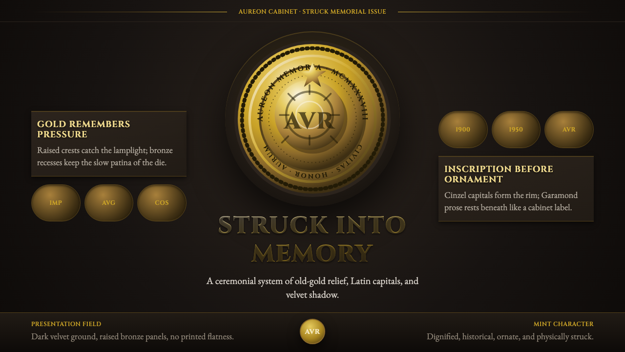 Commemorative CoinAuthority struck in metal. Old-gold relief, denticled rims, and Cinzel capita…权威如金属铸成:旧金浮雕、齿纹币缘与天鹅绒暗场。
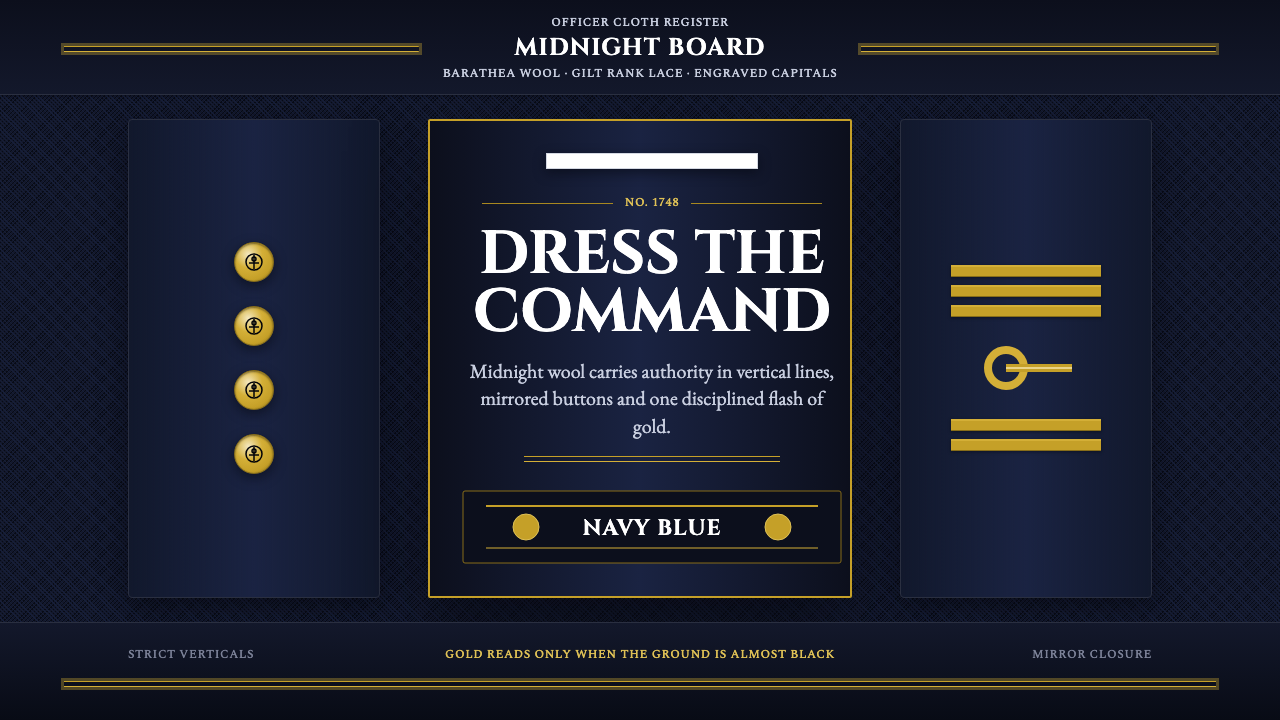 Naval Dress UniformAuthority in midnight wool. Cinzel capitals, gold lace and button symmetry ho…午夜羊毛写下权威:Cinzel 大写、金线与对称纽扣定住军阶。
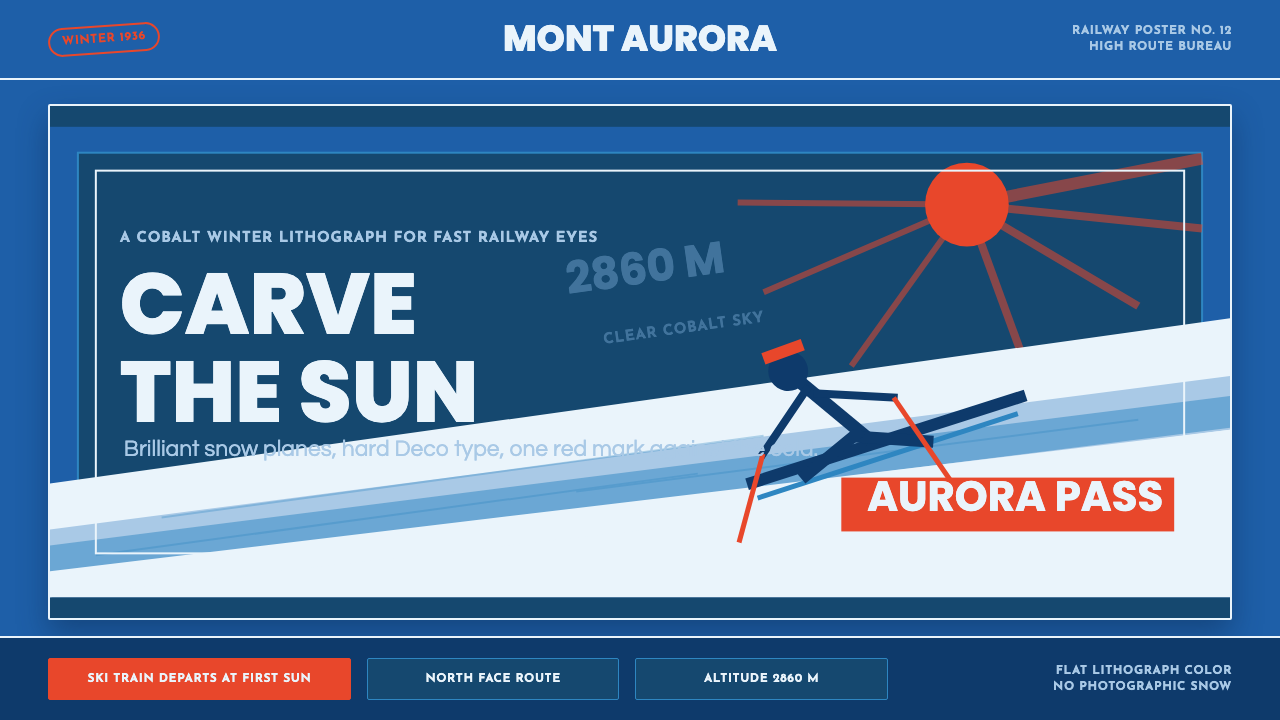 Alpine Ski PosterCold speed sells winter. Cobalt sky, snow planes, sun rays, and one resort-re…冷峻速度贩卖冬日:钴蓝天空、雪白斜坡与一抹度假红。
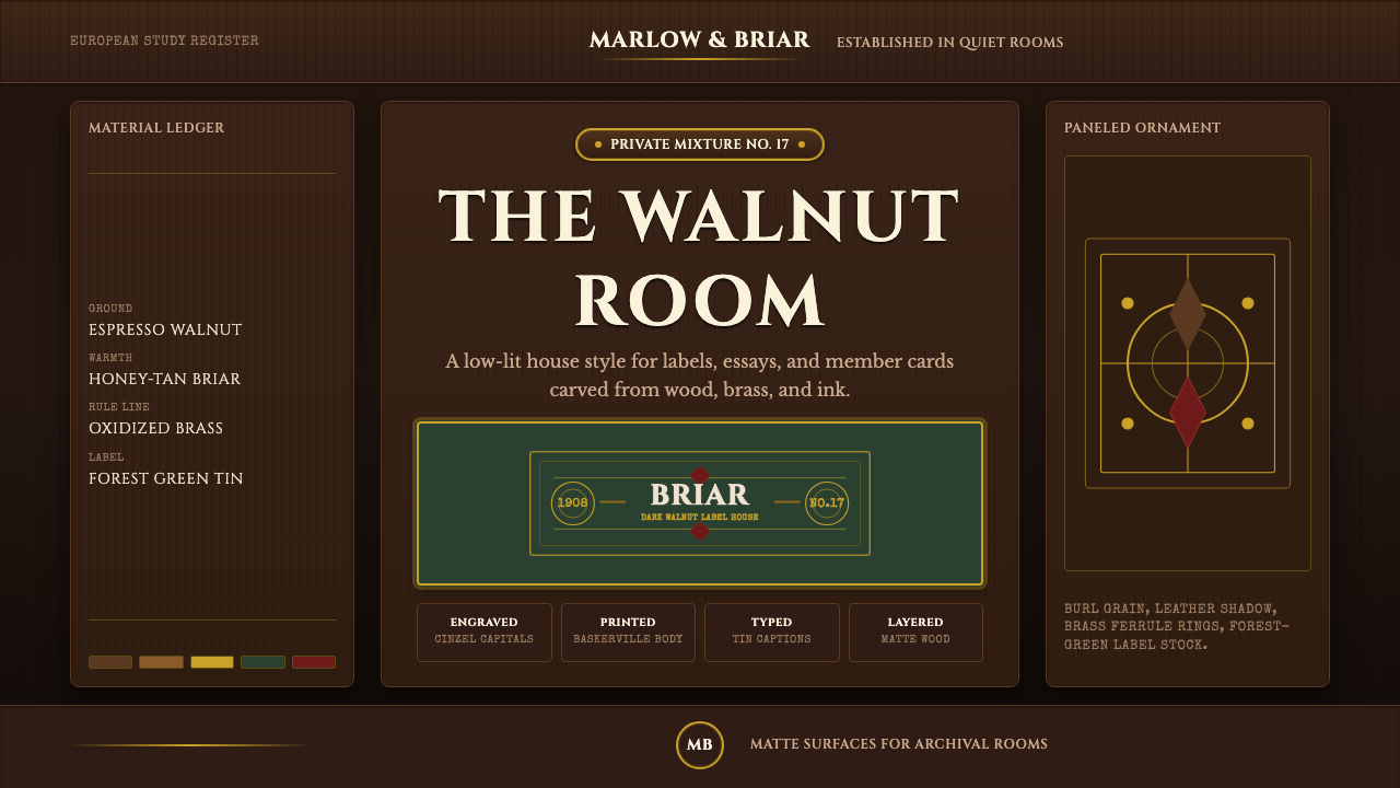 Briar Pipe & TobaccoWarm gloom, precisely aged. Brass rules and Cinzel capitals sit on espresso w…温暖幽暗而考究:黄铜细线与Cinzel大写落在浓咖胡桃木上。
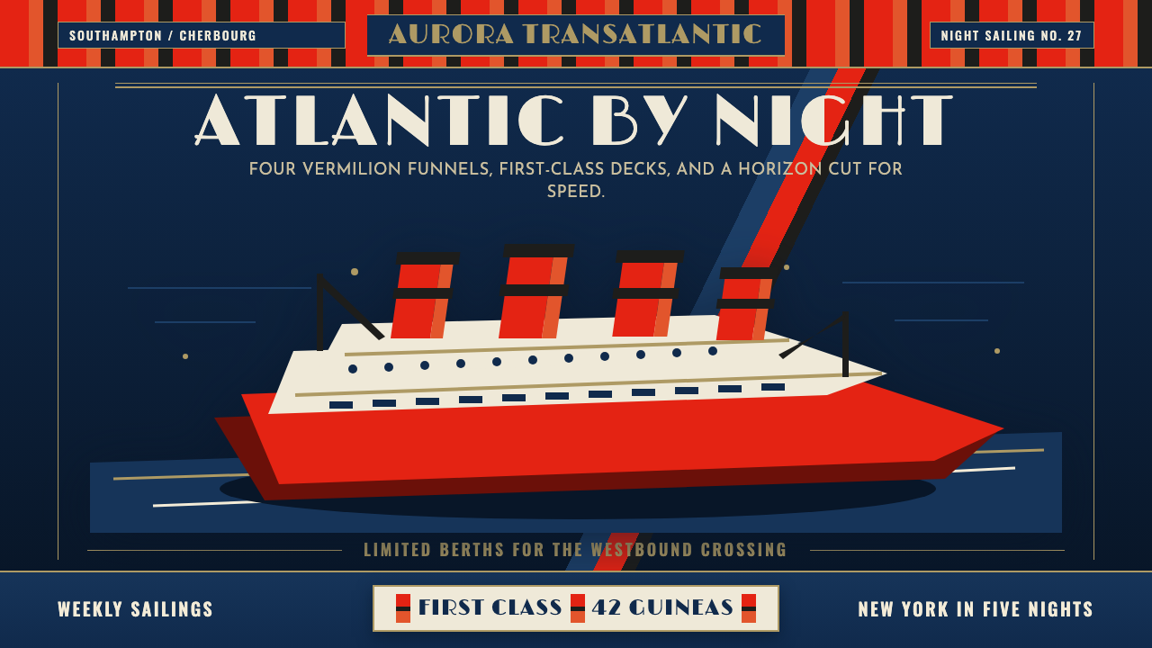 Cunard Liner PosterOceanic grandeur. Vermilion funnels, teak-gold caps, and a marine-blue poster…远洋盛景。朱红烟囱、柚木金大字与深海蓝海报网格。
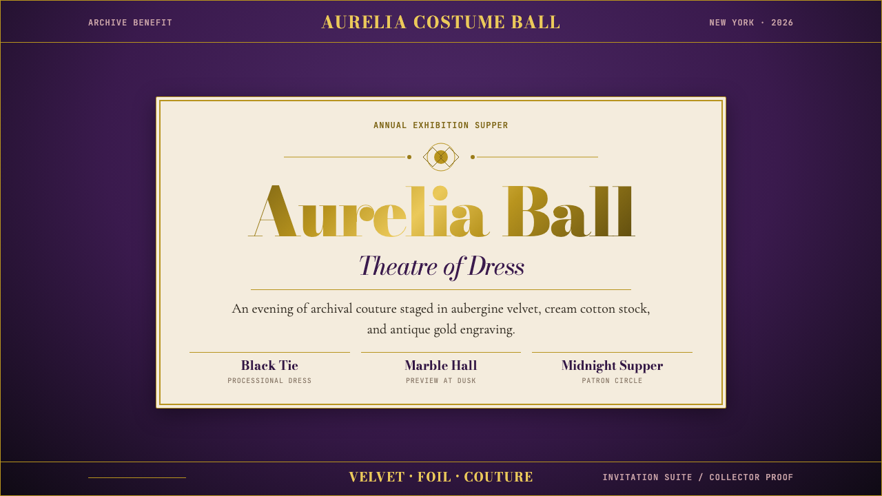 Met GalaTheatrical reverence. Aubergine velvet, cream stock, and Bodoni gold foil fra…戏剧化的敬意:茄紫天鹅绒、奶油纸与金箔 Bodoni 围合仪式感。