What is Met Gala?什么是 Met Gala?
The Met Gala dresses fashion in the authority of a museum — deep velvet backdrops, gold-foil ceremony, and couture photography treated like canonical art.Met Gala 用博物馆的权威为时尚加冕——深色天鹅绒背景、烫金仪式感,以及被当作经典艺术品对待的高定摄影。
Met Gala in briefMet Gala 速览
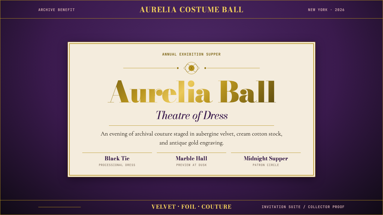
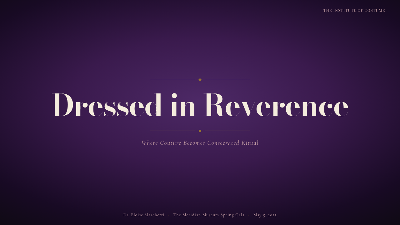
The Met Gala design language is what happens when haute-couture editorial collides with museum exhibition catalog sensibility. Its visual identity is built on a foundation of deep, saturated jewel tones — aubergine, midnight, and richly darkened gold — combined with the typographic formality of high-contrast Didone serifs. The result is a style that reads simultaneously as archival and theatrical: reverential enough to belong in a glass case, dramatic enough to stop a red carpet cold.Met Gala 的设计语言,是高级定制时装编辑感与博物馆展览图录气质碰撞后的产物。其视觉身份建立在深邃饱和的宝石色调之上——茄紫、午夜蓝,以及被深化处理的浓金——并以高对比度 Didone 衬线字体的排版庄重感作为支撑。呈现出的结果,是一种既像档案又像戏剧的风格:庄重到可以被置于玻璃展柜之中,戏剧性强到足以让整条红毯为之屏息。
At its core, the aesthetic operates on ceremonial contrast. Dark, heavy backgrounds assert gravitas; against them, gold foil, cream paper stock, and full-bleed couture imagery gain extraordinary luminosity. Text is set in centered, symmetrical compositions that echo the traditions of official proclamations and exhibition placards. Every layout decision communicates that what is being shown belongs to the category of the important — that the viewer is in the presence of something consecrated.从本质上看,这套美学运转于仪式性对比之中。深沉厚重的背景建立威严感;在其衬托下,烫金、奶油纸张与全幅高定图像获得了非凡的光辉。文字以居中对称的构图排列,呼应着官方公告和展览标牌的传统。每一个版面决策都在传达同一信息:所呈现之物属于「重要」的范畴——观者正在与某种被神圣化的事物同场。
Unlike streetwear or tech-forward design languages that court informality, the Met Gala aesthetic actively cultivates distance. It does not invite the eye to linger casually; it commands attendance. This makes it one of the few contemporary design registers that draws equally from nineteenth-century engraving traditions and the controlled spectacle of twenty-first-century luxury fashion photography.与街头风格或追求非正式感的科技驱动设计语言不同,Met Gala 美学主动培育距离感。它不邀请眼睛漫不经心地流连;它命令凝视。这使它成为少数能同时从十九世纪雕版印刷传统和二十一世纪奢侈品时装摄影的受控奇观中汲取养分的当代设计语域。
Where does Met Gala come from?Met Gala 从何而来?
The Metropolitan Museum of Art's Costume Institute Benefit — commonly known as the Met Gala — was founded in 1948 by fashion publicist Eleanor Lambert, the same figure who created the International Best Dressed List. Lambert's original event was a modest midnight supper designed to raise funds for what was then a struggling department of the museum. The visual identity of these early decades was understated and conventional, reflecting the philanthropic formality typical of mid-century New York society fundraisers rather than any distinct aesthetic ambition.大都会艺术博物馆服装学院慈善晚宴——通称 Met Gala——由时尚公关人埃莉诺·兰伯特(Eleanor Lambert)于1948年创立,她同时也是国际最佳着装榜单的创始人。兰伯特最初的活动是一场简朴的午夜晚宴,旨在为博物馆当时资金匮乏的服装部门筹款。早期数十年的视觉形象朴素而传统,反映的是二十世纪中叶纽约社会慈善晚宴的惯常庄重格调,而非任何鲜明的美学追求。
The transformation of the event into a genuine visual spectacle began gradually during the 1970s and accelerated when Vogue editor-in-chief Anna Wintour assumed the chairmanship in 1995. Wintour brought with her the full apparatus of Vogue's editorial and production apparatus: the relationships with couture houses, the authority to shape the guest list as a deliberate aesthetic statement, and — crucially — the understanding that a gala's visual identity extends far beyond the evening itself into the photographic record it produces. Under her direction, the event's graphic identity began to borrow from exhibition catalog design, developing the characteristic language of Didone serifs, symmetrical centered compositions, and gold-foil printing that now defines the Met Gala look.这一活动向真正视觉奇观的转变,始于1970年代并逐步加速,直至《Vogue》主编安娜·温图尔于1995年出任主席后显著提速。温图尔带来了《Vogue》编辑与制作体系的全部资源:与高定品牌的深厚关系、将宾客名单塑造为刻意美学声明的权威,以及——至关重要的——对一场晚宴的视觉身份延伸至其产生的摄影记录的深刻理解。在她的主导下,活动的图形形象开始借鉴展览图录设计,逐步发展出以 Didone 衬线字体、对称居中构图和烫金印刷为标志的 Met Gala 视觉语言。
The Costume Institute's exhibition themes have played a central role in shaping the design language over time. Each year, the gala's visual materials — invitations, programs, backdrop treatments, press photography environments — are designed to serve as an extension of the accompanying exhibition. Landmark exhibitions such as 'China: Through the Looking Glass' (2015), 'Heavenly Bodies: Fashion and the Catholic Imagination' (2018), and 'In America: A Lexicon of Fashion' (2021) generated distinct visual treatments that nevertheless adhered to the same ceremonial grammar: dark ground, gold accent, museum authority, couture scale.服装学院的展览主题在塑造设计语言方面发挥了核心作用。每一年,晚宴的视觉材料——邀请函、节目册、背景处理、新闻摄影环境——都被设计为配套展览的延伸。重要展览如「中国:镜花水月」(2015年)、「圣体:时尚与天主教想象」(2018年)和「美国:时尚词典」(2021年),各自产生了独特的视觉处理,但都遵守同一套仪式性语法:深色底面、金色点缀、博物馆权威、高定尺度。
The visual figures most responsible for shaping the contemporary Met Gala identity include Costume Institute curator Andrew Bolton, whose scholarly exhibition concepts define the thematic frame each year; makeup artist Pat McGrath, whose work on the models and celebrities photographed in Met Gala editorial contexts has established a visual register of extreme, sculptural beauty that the style's photography must contain; and photographer Sølve Sundsbø, among others who have contributed to the high-contrast, dramatically lit couture imagery that the event's press materials rely upon. Together, these collaborators have produced a visual standard that individual years' design executions must aspire to meet.在塑造当代 Met Gala 视觉身份方面贡献最大的人物,包括:服装学院策展人安德鲁·博尔顿(Andrew Bolton),他的学术性展览构思每年定义主题框架;化妆艺术家帕特·麦格拉斯(Pat McGrath),她为 Met Gala 编辑语境中拍摄的模特与名人所做的妆容,建立了一套极致雕塑化美感的视觉基准,这一风格的摄影必须能够承载;以及摄影师 Sølve Sundsbø 等人,他们贡献了活动新闻材料所依赖的高对比度、戏剧性布光高定图像。这些合作者共同建立了一套视觉标准,使得每一年的设计执行都必须以此为参照。
What defines the Met Gala look?Met Gala 的视觉特征是什么?
Color Palette色彩体系
The Met Gala palette is anchored in deep jewel tones that signal luxury and institutional weight. Aubergine — a dark, blue-leaning purple with the richness of velvet — functions as the signature ground color. Against it, antique gold operates not as a bright accent but as a warm, burnished presence reminiscent of metal type and engraved invitations. Cream appears in text fields and paper-stock evocations, providing the sole lightness in an otherwise heavily saturated palette. This combination creates the impression of a formal document issued under candlelight — precious, weighted, and deliberate.Met Gala 的色彩体系以深邃宝石色调为锚点,传递奢华与机构权重。茄紫——一种带有蓝调、富有天鹅绒质感的深紫色——充当标志性的底色。在其衬托下,仿古金并非明亮的强调色,而是一种温暖、磨砂般的存在,令人联想到金属活字与雕版邀请函。奶油色出现于文字区域和对纸张质感的唤起之中,在一个高度饱和的色板中提供唯一的轻盈感。这种组合创造出一种在烛光下颁发的正式文书的印象——珍贵、厚重而刻意。
Typography字体排印
High-contrast Didone serifs — characterized by an extreme difference between thick vertical strokes and almost hairline-thin horizontal ones — are the typographic backbone of the Met Gala visual identity. These letterforms carry centuries of associations with proclamations, title pages, and the formal apparatus of European cultural institutions. Type is set in centered arrangements with generous letter-spacing that slows the eye and forces deliberate reading. Capitals used at headline scale suggest monumental inscriptions; smaller text in tightly set lines evokes the captions and footnotes of scholarly catalogs. Italic variants appear sparingly and with great effect, as though marking an exception to a rule.高对比度 Didone 衬线字体——以竖笔画极粗与横笔画近乎纤细之间的极端反差为特征——是 Met Gala 视觉身份的排版支柱。这些字形承载着数百年来与公告、扉页及欧洲文化机构正式形制的关联。文字以居中排列,字距宽松,使视线放缓,迫使阅读变得审慎。以标题尺度使用的大写字母令人联想到纪念碑铭文;以紧密行距排列的小号文字则唤起学术图录的注释与脚注。斜体极为克制地出现,效果鲜明,仿佛是对某条规则的特例标注。
Composition and Symmetry构图与对称
Where Bauhaus embraced asymmetric tension, the Met Gala aesthetic reaches for classical, centered symmetry. Compositions are organized along a central vertical axis: headline above image above caption, or image flanked by equal margins of ground color. This symmetry is not the static equality of indifference but the deliberate balance of ceremony — the way a triumphal arch or a stage is arranged to frame what passes through it. Even full-bleed couture photography, when integrated into the layout system, is anchored to this central gravitational pull.包豪斯拥抱非对称张力,Met Gala 美学则追求古典的居中对称。构图沿中央垂直轴组织:标题在上,图像居中,说明文字在下;或图像两侧由等宽的底色留白环绕。这种对称不是漠然的等量平分,而是仪式性的刻意平衡——如同凯旋门或舞台的构架方式,为穿越其中的事物提供框架。即便是全幅高定摄影,在融入版面体系时,也服从这种居中的引力。
Photography Treatment摄影处理
Couture photography within the Met Gala aesthetic is treated with museum-wall reverence: single images given extraordinary scale, framed by substantial borders of dark ground color, lit with theatrical directional light that separates subject from background. The photographic subjects — garments, details of construction, portraits of wearers — are rendered with the same degree of attention given to documentary photographs of sculpture or painting. Close-cropped details of embroidery, beading, or structural construction appear as their own compositions, valued for their formal properties as much as their fashion content.在 Met Gala 美学框架内,高定摄影被以博物馆陈列的方式对待:单幅图像获得超凡的尺度,以大面积深色底边作为框架,以戏剧性方向光使主体从背景中分离。摄影主体——服装、制作细节、穿着者肖像——被赋予与雕塑或绘画纪实摄影同等程度的关注。刺绣、珠饰或结构构造的特写裁切作为独立构图出现,因其形式属性而被珍视,不亚于其时尚内容。
Gold and Foil Accent金色与烫金点缀
Gold in the Met Gala aesthetic is never the bright, clean gold of contemporary luxury branding — it is antique, burnished, and slightly muted, the color of old metal type or the gilded capitals in an illuminated manuscript. It appears on invitations as literal foil embossing, in layouts as decorative rules and frames, and in editorial photography as the metallic surfaces of garments and accessories. This particular quality of gold functions as a historical signal: it connects the contemporary event to the long tradition of official ceremony and European courtly elegance that the Costume Institute's exhibitions frequently excavate.在 Met Gala 美学中,金色绝非当代奢侈品牌惯用的明亮洁净之金——它是仿古的、磨砂的、略带沉郁的,如同旧金属活字或泥金手抄本中鎏金大写字母的色调。它以字面意义的烫金压印出现在邀请函上,以装饰性线条和边框出现在版面中,以服装和配饰金属表面出现在编辑摄影里。这种特质的金色作为一种历史信号运作:它将当代活动与服装学院展览频繁发掘的官方仪式和欧洲宫廷优雅的悠久传统相连接。
Scale and Gravitas尺度与庄重感
The Met Gala aesthetic consistently operates at a scale larger than comfortable reading distance implies — invitations feel weighty in the hand, printed programs have the heft of art catalogs, backdrops dwarf their subjects. This insistence on physical scale is not incidental; it is a legible argument that the occasion is of historic consequence. In digital and print layouts, this translates to generous white space (or dark space) around key elements, type that is never crowded, and a layout rhythm that breathes slowly rather than rapidly scanning.Met Gala 美学始终在大于舒适阅读距离所暗示的尺度上运作——邀请函拿在手中有分量感,印刷节目册有艺术图录的厚重感,背景板使主体相形见绌。这种对物理尺度的坚持并非偶然;它是一个清晰可辨的论点:这场活动具有历史重要性。在数字和印刷版面中,这转化为关键元素周围慷慨的留白(或暗空),文字从不拥挤,版面节奏缓慢呼吸,而非快速扫描。
Ceremonial Restraint仪式性克制
Despite the theatrical intensity of the event itself, the graphic identity is conspicuously restrained. There are no gradients, no busy patterns competing with imagery, no playful illustration that undercuts the seriousness of tone. Decorative elements, when present — thin ruled lines, simple geometric frames, engraved ornamental borders — are drawn from the vocabulary of formal print culture rather than contemporary graphic design trends. This restraint is itself a form of communication: it signals that the subject matter is serious enough to require no embellishment.尽管活动本身具有戏剧性的强烈感,其图形形象却显著克制。没有渐变,没有与图像竞争的繁复图案,没有削弱严肃基调的趣味插图。装饰性元素——细线条、简单几何边框、雕版装饰边——若出现,均取自正式印刷文化的词汇,而非当代平面设计趋势。这种克制本身就是一种传达:它暗示主题内容严肃到无需任何修饰。
Who shaped Met Gala?谁塑造了 Met Gala?
As chairwoman of the Met Gala since 1995, Wintour has been the single most consequential figure in shaping the event's contemporary visual identity and cultural authority. Her background as editor-in-chief of American Vogue brought the full editorial and production infrastructure of fashion's most influential publication to bear on the gala's execution. Under her direction, the guest list became as deliberate a design decision as the invitation's typography, and the event's photographic output — distributed globally through Vogue's channels — established the visual standard that the design language must serve. Wintour's collaboration with the Metropolitan Museum's curatorial team transformed a philanthropy dinner into an annual exhibition of what the Costume Institute's themes could generate as lived, dressed spectacle.作为自1995年起担任 Met Gala 主席的人物,温图尔是塑造这一活动当代视觉身份与文化权威的最具决定性的力量。她担任《美国 Vogue》主编的背景,将时尚界最具影响力刊物的全部编辑与制作资源注入晚宴的执行之中。在她的主导下,宾客名单成为与邀请函排版同等刻意的设计决策,而活动产生的摄影图像——通过《Vogue》渠道向全球分发——确立了设计语言必须服务的视觉标准。温图尔与大都会博物馆策展团队的合作,将一场慈善晚宴转变为服装学院展览主题所能生成的以着装呈现的年度奇观。
As curator in chief of the Costume Institute since 2006, Bolton is the scholarly intelligence behind each year's exhibition concept and, by extension, each year's visual theme. His exhibitions — which have ranged from China's influence on Western fashion to Alexander McQueen's savage beauty to the complex relationship between fashion and religious iconography — consistently frame clothing as a subject worthy of the same curatorial depth applied to painting or sculpture. Bolton's influence on the Met Gala design language is structural: he defines the intellectual territory the visual identity must inhabit, ensuring that the aesthetic registers as genuine scholarship rather than styled spectacle.作为自2006年起担任服装学院首席策展人的人物,博尔顿是每年展览构思背后的学术智慧,进而也是每年视觉主题的思想来源。他的展览——涵盖中国对西方时尚的影响、亚历山大·麦昆的野性之美,以及时尚与宗教图像学之间的复杂关系——始终将服装框定为值得以适用于绘画或雕塑的同等策展深度加以对待的主题。博尔顿对 Met Gala 设计语言的影响是结构性的:他定义了视觉身份必须栖居其中的智识领地,确保这套美学被解读为真正的学术研究,而非刻意布置的奇观。
McGrath's work as a makeup artist — most visibly in editorial and runway contexts that feed directly into the Met Gala's visual ecosystem — has established a particular register of beauty that the event's aesthetic now requires: monumental, sculptural, color-saturated, and operating at a scale legible in a full-page photograph. Her collaborations with nearly every significant fashion house, combined with her role in defining the beauty looks that accompany each year's theme, make her as much a contributor to the event's visual grammar as any graphic designer. McGrath's work insists that the human face and body are design surfaces as consequential as any typographic choice.麦格拉斯作为化妆艺术家的工作——最直接体现在直接流入 Met Gala 视觉生态系统的编辑与秀场语境中——建立了一种活动美学现在需要的特定美感基准:纪念碑般的、雕塑性的、色彩饱和的,并在全页摄影中清晰可辨的尺度上运作。她与几乎所有重要时装屋的合作,加上她在定义每年主题所配套的美妆形象方面的角色,使她成为活动视觉语法的贡献者,与任何平面设计师同等重要。麦格拉斯的工作坚持认为,人类的面孔与身体是与任何排版选择同等重要的设计表面。
The Norwegian fashion photographer Sundsbø has contributed substantially to the high-contrast, dramatically lit visual vocabulary that the Met Gala's editorial output relies upon. His work is characterized by extreme control of light, a preference for black or very dark grounds, and the transformation of garments into almost sculptural presences through lighting choices that flatten texture while emphasizing form. Sundsbø's images — appearing regularly in Vogue and aligned publications in the context of Met Gala coverage — have helped cement the photographic conventions that the event's graphic identity both reflects and reinforces.挪威时装摄影师 Sundsbø 对 Met Gala 编辑产出所依赖的高对比度、戏剧性布光视觉词汇做出了重要贡献。他的作品以对光线的极致控制、偏好黑色或极深底面,以及通过令纹理平面化同时强调形态的光线选择将服装转化为近乎雕塑般存在为特征。Sundsbø 的图像——在 Met Gala 报道语境中定期出现于《Vogue》及旗下刊物——帮助巩固了活动图形形象既反映又强化的摄影惯例。
Lambert founded the event in 1948 and served as its guiding force for several decades before Wintour's assumption of the chairmanship. As the publicist who also created the International Best Dressed List and co-founded New York Fashion Week, Lambert understood fashion as a system that required its own institutional infrastructure and its own formal occasions. Her founding of the Costume Institute Benefit established the template — a dinner that doubles as a cultural statement — that Wintour would later amplify into a global visual event. Lambert's instinct that fashion deserved the ceremonial gravitas typically reserved for fine art created the conceptual ground on which the entire Met Gala aesthetic rests.兰伯特于1948年创立了这一活动,并在温图尔接任主席之前的数十年间担任其引领力量。作为同时创立了国际最佳着装榜单并共同创办纽约时装周的公关人,兰伯特将时尚理解为一个需要自身机构基础设施和正式场合的体系。她创立服装学院慈善晚宴所确立的模板——一场兼具文化声明的晚宴——被温图尔后来放大为全球性的视觉事件。兰伯特认为时尚值得获得通常为纯艺术保留的仪式性庄重感的直觉,创造了整套 Met Gala 美学赖以建立的概念基础。
How do you use Met Gala today?今天怎么用 Met Gala?
The Met Gala aesthetic is one of the most legible signals available to designers working on projects that must communicate luxury, cultural authority, and ceremonial significance. Its visual grammar — dark grounds, antique gold, Didone serifs, centered symmetry, high-contrast couture photography — translates cleanly to both print and digital contexts when the underlying design values are understood rather than merely borrowed. Applying it correctly means understanding what the system communicates: that the content is important, that the occasion is formal, and that the viewer is expected to attend with deliberate attention.Met Gala 美学是设计师在需要传达奢华、文化权威和仪式意义的项目中可调用的最清晰信号之一。其视觉语法——深色底面、仿古金、Didone 衬线、居中对称、高对比度高定摄影——在理解而非仅仅借用其内在设计价值的前提下,能够清晰转译至印刷与数字语境。正确应用它意味着理解这套系统传达的信息:内容是重要的,场合是正式的,观者被期待以审慎的注意力出席。
For presentation slides, the Met Gala aesthetic excels in contexts where the presentation is itself an event — a keynote for a luxury or cultural institution, a creative brief for a fashion or editorial client, or a pitch document that must establish authority before a single word is spoken. A cover slide benefits from a dark, jewel-toned ground with a large-scale centered title in a high-contrast serif, flanked by thin ruled lines or a simple rectangular frame. Content slides work best when they resist the temptation to crowd information: one key idea per slide, generously spaced, with any supporting photography treated at large scale and given meaningful dark-ground borders. Data slides should translate charts and tables into compositions that feel as considered as the rest of the deck — use the gold accent for emphasis sparingly, reserve the aubergine ground for aggregate or summary views, and avoid decorative chart elements that compete with the information's own visual weight.对于演示文稿,Met Gala 美学在演示本身就是一个事件的语境中表现出色——奢侈品或文化机构的主题演讲、时装或编辑客户的创意简报、或必须在任何文字被言说之前先确立权威感的提案文件。封面页受益于以宝石色调为底面、居中大号高对比度衬线字体为标题、以细线条或简单矩形边框作为装饰框架的设计。内容页最有效的做法是抵制堆砌信息的诱惑:每页一个核心观点,间距慷慨,任何配套摄影以大尺度呈现,并赋予有意义的深色底边框。数据页应将图表和表格转化为与整套文件同等考究的构图——节制地用金色强调色标注重点,将茄紫底面保留给汇总或总结性视图,避免与信息自身视觉重量竞争的装饰性图表元素。
For web interfaces, the Met Gala style is best suited to landing pages, event microsites, and editorial-style product pages for high-end fashion, jewelry, or cultural institution platforms. A dark ground with gold and cream type establishes immediate authority; the layout should feel spacious rather than information-dense, with navigation elements kept to a typographic minimum. Full-bleed hero photography, when used, should occupy genuine visual scale rather than being cropped into a standard card or banner format. Dashboard and pricing applications are less natural fits for the style — its ceremonial gravity resists the utilitarian clarity those contexts require — but premium tier differentiations within a pricing structure can borrow the gold accent and Didone serif for their highest tier labels.对于网页界面,Met Gala 风格最适合落地页、活动专题站,以及高端时装、珠宝或文化机构平台的编辑风格产品页面。深色底面配以金色和奶油色文字即可建立即时权威感;版面应给人宽敞而非信息密集的感受,导航元素保持在字体排印的最低限度。全幅主视觉摄影若使用,应占据真实的视觉尺度,而非被裁切进标准卡片或横幅格式。仪表板和定价应用对这种风格而言适配性较弱——其仪式性庄重感抵触这些语境所需的实用性清晰度——但定价结构中的高端等级区分可以为其最高等级标签借用金色强调色和 Didone 衬线字体。
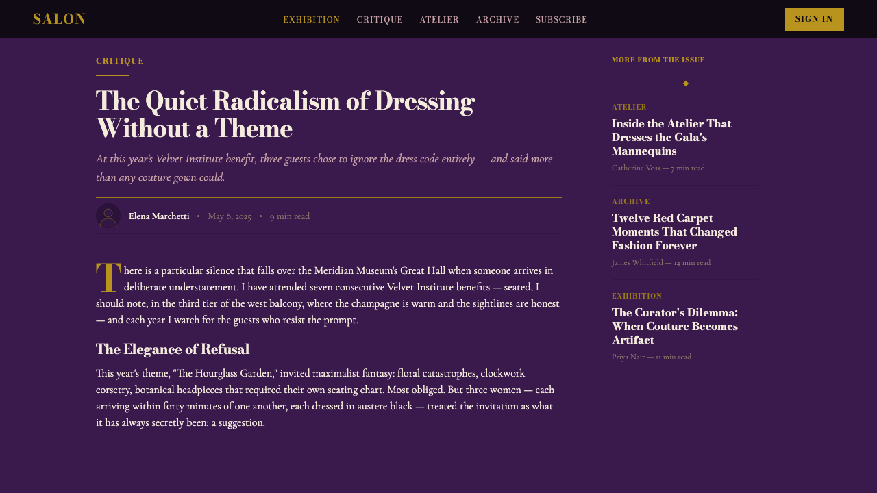
For editorial and marketing work, the Met Gala style supports content that positions itself as culturally significant rather than merely commercially available. A print editorial layout in this register uses wide margins, a single carefully chosen image per spread, and typography that insists on being read rather than scanned. Marketing campaigns for fashion houses, cultural institutions, and luxury lifestyle brands translate the style into environmental and digital contexts by maintaining the dark-ground, gold-accent ratio and resisting the addition of any element that would read as casual or approachable. Invitations, event programs, and press materials are perhaps the most natural home for the style: the physical weight of the paper, the foil finish, and the engraving-evocative typography combine into an object that communicates value before its content is read.对于编辑与营销内容,Met Gala 风格支持将自身定位为具有文化意义而非仅具商业可及性的内容。这一语域的印刷编辑版面使用宽阔留白、每跨页单幅精心选择的图像,以及坚持被阅读而非被扫描的排版。时装屋、文化机构和奢侈生活品牌的营销活动,通过维持深色底面与金色强调的比例关系,并抵制添加任何会被读解为随意或亲和的元素,将这种风格转译至环境与数字语境。邀请函、活动节目册和新闻材料或许是这种风格最自然的归宿:纸张的物理重量、烫金表面处理,以及唤起雕版感的排版,共同构成一个在内容被阅读之前就传达价值的物件。
The most common mistake when applying the Met Gala aesthetic is treating it as a dark-mode luxury template — simply inverting a standard layout to a dark background and adding a gold color — rather than as a system built on specific relationships between typographic formality, photographic scale, and ceremonial composition. Applied without understanding, the result often feels heavy without feeling authoritative, theatrical without feeling considered. A second common error is distributing the gold accent too liberally: in authentic applications, gold is used at the same restraint as a museum label — it marks, it does not decorate. A third pitfall is using contemporary sans-serif typefaces, which break the historical continuity that the Didone serif provides; the formal register of the style depends on type that carries institutional memory, not type that signals modernity.应用 Met Gala 美学时最常见的错误,是将其视为一套深色模式奢侈品模板——简单地将标准版面反转为深色背景并添加金色——而非理解它是建立在排版庄重感、摄影尺度与仪式性构图之间特定关系上的完整系统。缺乏理解地应用,结果往往给人沉重之感却无权威,戏剧化之感却不审慎。第二个常见错误是过于宽泛地分布金色强调色:在真实应用中,金色以与博物馆标签相同的克制使用——它标注,而非装饰。第三个陷阱是使用当代无衬线字体,这会打断 Didone 衬线字体所提供的历史连续性;这种风格的正式语域依赖承载机构记忆的字体,而非传递现代感的字体。
Met Gala — FAQMet Gala · 常见问题
Is the Met Gala aesthetic appropriate for tech or startup products?Met Gala 美学适合科技或创业公司产品吗?
Rarely, and only in very specific contexts. The Met Gala visual language communicates institutional age, ceremonial formality, and cultural authority — values that work against the expectations of most technology products, which signal accessibility, speed, and forward momentum. The exception is in luxury or high-end positioning within technology: a fintech product targeting ultra-high-net-worth users, a heritage fashion platform, or a cultural institution's digital experience might borrow elements of the language selectively. In those cases, the dark ground and Didone serif can establish premium differentiation, but the full ceremonial grammar — centered composition, restricted palette, gold-foil restraint — should be applied with care, since it may communicate exclusivity at the expense of usability clarity.很少,且仅在非常具体的语境中适用。Met Gala 视觉语言传达机构历史感、仪式性庄重感和文化权威感——这些价值观与大多数科技产品的期望相悖,后者传递的是可及性、速度和前向动能。例外情形存在于科技领域内的奢侈品或高端定位中:面向超高净值用户的金融科技产品、传承型时装平台,或文化机构的数字体验,可能选择性地借用这套语言的某些元素。在这些情形下,深色底面和 Didone 衬线字体可以建立高端差异化,但完整的仪式性语法——居中构图、受限色板、烫金克制——应谨慎应用,因为它可能以牺牲可用性清晰度为代价传达排他性。
How do you maintain the Met Gala aesthetic in a light or white-ground version?如何在浅色或白色底面版本中维持 Met Gala 美学?
A light-ground version of the Met Gala aesthetic is possible but requires deliberate inversion. The cream or ivory ground — rather than pure white — preserves the warmth that the style depends on; pure white can feel clinical and undermine the archival quality. On a light ground, the Didone serif in deep charcoal or black retains its typographic authority, and gold transitions from a luminous accent against darkness to a more literal metallic presence — appearing in decorative rules, frames, and the occasional display headline. Aubergine can function as a deep accent in this version. The critical requirement is that the typography and composition remain formally centered and deliberate; it is the typographic structure, not only the dark ground, that communicates the style's ceremonial intention.Met Gala 美学的浅色底面版本是可能的,但需要刻意的反转处理。奶油色或象牙色底面——而非纯白——保留了这种风格所依赖的温暖感;纯白可能显得临床化并破坏档案感。在浅色底面上,深炭色或黑色的 Didone 衬线字体保有其排版权威感,金色则从在黑暗中发光的强调色过渡为更字面意义上的金属存在——出现在装饰性线条、边框和偶尔的展示性标题之中。茄紫色在这一版本中可作为深色强调色。关键要求是排版与构图保持正式的居中与审慎感;传达这种风格仪式性意图的是排版结构,而不仅仅是深色底面。
What distinguishes the Met Gala aesthetic from general luxury branding?Met Gala 美学与一般奢侈品牌视觉有何区别?
General luxury branding tends toward minimalism — light grounds, generous white space, restrained sans-serif or geometric serif typefaces, and the communication of quality through absence and refinement. The Met Gala aesthetic is luxury operating in a different register: it is theatrical and institutional rather than quietly confident. Where luxury branding whispers, the Met Gala style announces. The deep, saturated ground colors, the high-contrast Didone typography, the gold-foil formalism, and the centered ceremonial composition are all signals of cultural authority rather than commercial exclusivity. A useful distinction: the Met Gala aesthetic would look at home in a museum catalog; contemporary luxury branding would look at home in an architect's monograph. Both communicate quality, but through fundamentally different vocabularies.一般奢侈品牌视觉倾向于极简主义——浅色底面、慷慨留白、克制的无衬线或几何衬线字体,以及通过缺席与精炼传达品质。Met Gala 美学是在不同语域运作的奢华:它是戏剧性和机构性的,而非低调自信的。若说奢侈品牌低声耳语,Met Gala 风格则宣告昭示。深邃饱和的底色、高对比度 Didone 排版、烫金形式主义,以及居中的仪式性构图,全都是文化权威而非商业排他性的信号。一个有用的区分:Met Gala 美学放在博物馆图录中会显得理所当然;当代奢侈品牌视觉放在建筑师专著中会显得理所当然。两者都传达品质,但通过根本不同的词汇体系。
Can the Met Gala aesthetic accommodate playful or thematic variations without losing its identity?Met Gala 美学能否在不失去身份认同的情况下容纳趣味性或主题性变体?
Yes, and this is precisely what the annual theme structure demonstrates. Each year, the visual materials serve a different exhibition theme — from maximalist Chinese embroidery to stark American denim to elaborate Catholic iconography — while maintaining the same foundational grammar of dark grounds, formal typography, and gold-foil ceremony. The lesson for designers is that the style's identity resides in its structural commitments, not in any single palette or imagery choice. A playful or culturally specific variation can be introduced through the imagery, the choice of accent color within the dark-jewel-tone register, or the specific decorative vocabulary of the borders and frames — but the typographic formality, the centered composition, and the ceremonial scale must remain intact. When those structural elements are compromised, the result is thematic variation without identity.可以,这正是年度主题结构所展示的。每年,视觉材料服务于不同的展览主题——从极繁主义的中国刺绣,到严峻的美国牛仔布,到繁复的天主教图像学——同时维持着深色底面、正式排版和烫金仪式感的同一基础语法。对设计师的启示是:这种风格的身份认同存在于其结构性承诺之中,而非任何单一色板或图像选择。趣味性或文化特定性的变体可以通过图像、在深宝石色调域内的强调色选择,或边框与框架的特定装饰词汇来引入——但排版庄重感、居中构图和仪式性尺度必须保持完整。当这些结构性元素被妥协,结果就是有主题变化而无身份认同。
How does the Met Gala aesthetic handle motion and animation?Met Gala 美学如何处理动效与动画?
Motion within the Met Gala aesthetic should be slow, deliberate, and gravitational — matching the ceremonial cadence of the static style. Appropriate motion treatments include slow reveals where dark grounds part to disclose couture imagery (as though a curtain opening or a vitrine being illuminated), type that appears letter-by-letter at a pace that insists on being watched rather than skimmed, and gold-accent elements that emerge with a brief, controlled shimmer suggesting foil catching light. What the style resists is kinetic energy for its own sake: rapid transitions, bouncy easings, scroll-triggered animations that prioritize engagement metrics over ceremonial intention. The guiding test for any motion decision is whether it would look at home in the opening sequence of a museum documentary — considered, unhurried, and aware of its own gravity.在 Met Gala 美学框架内,动效应是缓慢的、审慎的、具有引力感的——与静态风格的仪式性节奏相匹配。适合的动效处理包括:深色底面缓慢分开以显现高定图像的慢速揭示(如同幕布开启或展柜被照亮);文字以坚持被注视而非被扫描的节奏逐字显现;以及金色强调元素以短暂、受控的微光浮现,仿佛烫金捕捉光线。这种风格所抵制的是为其自身目的服务的动能:快速转场、弹跳缓动、以参与度指标而非仪式性意图为优先的滚动触发动画。任何动效决策的指导性测试标准是:它是否在博物馆纪录片的开场序列中显得自然——审慎的、从容的,并清醒地意识到自身的庄重。
Related design styles相关设计风格
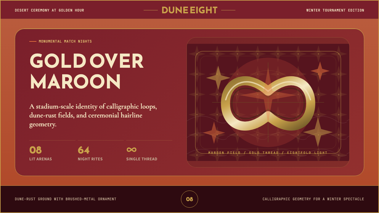 Qatar World Cup 2022Desert spectacle in gold. Maroon fields, Reem Kufi scale, and eightfold star…金色沙漠盛典。栗色场域、Reem Kufi巨字与八角星几何。
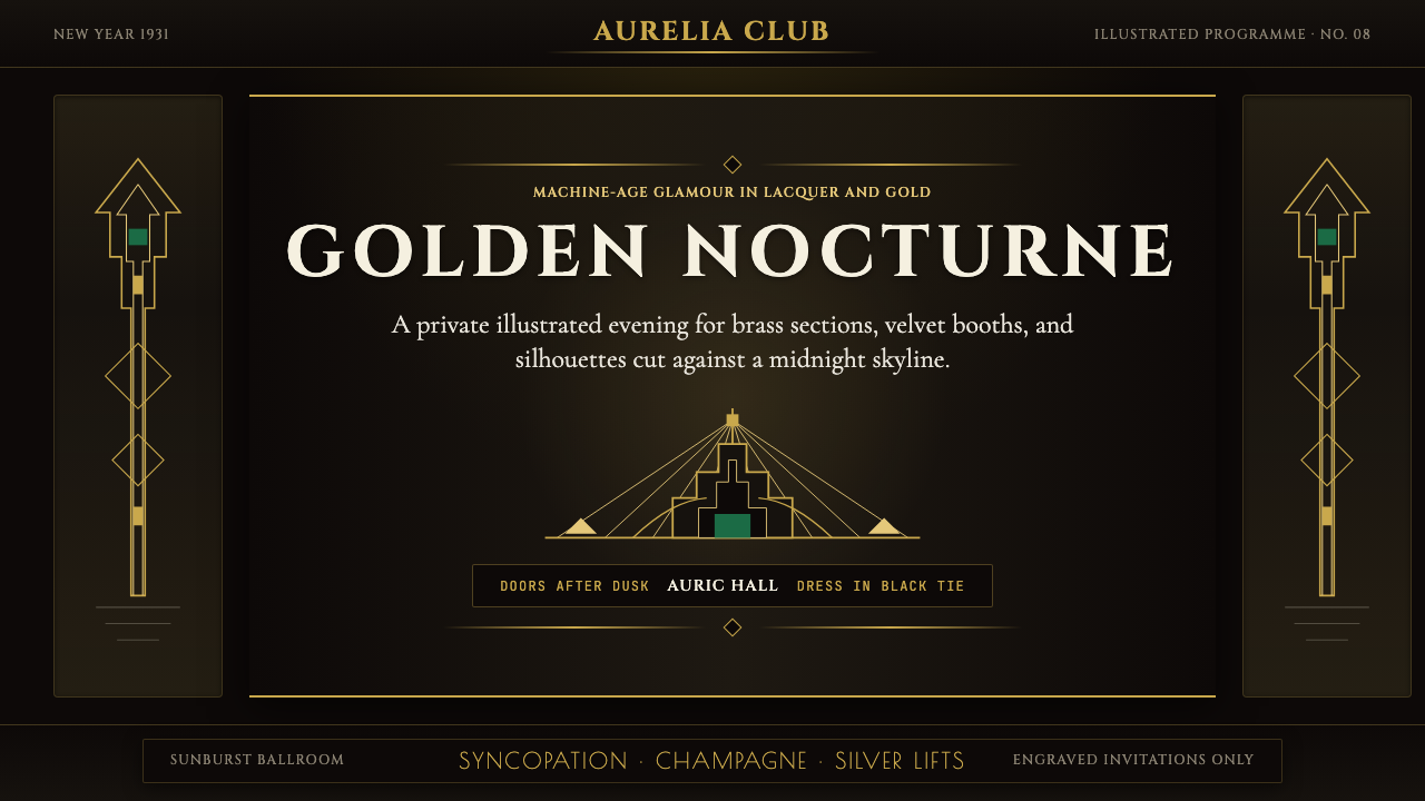 Art Deco Jazz AgeJazz Age glamour. Sunburst rays, stepped ziggurats, gold on black — Chrysler…爵士时代的流光奢华:太阳光芒、阶梯几何、金色撞黑底——克莱斯勒大厦门厅的 CS…
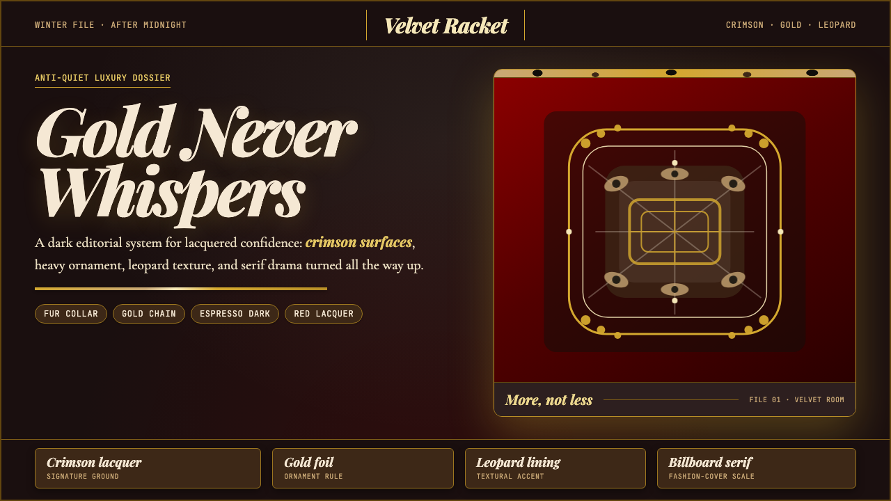 Mob Wife AestheticGlamour refuses restraint. Crimson lacquer, gold foil, leopard texture, billb…奢华拒绝克制:酒红漆面、金箔、豹纹与巨幅 Didone。
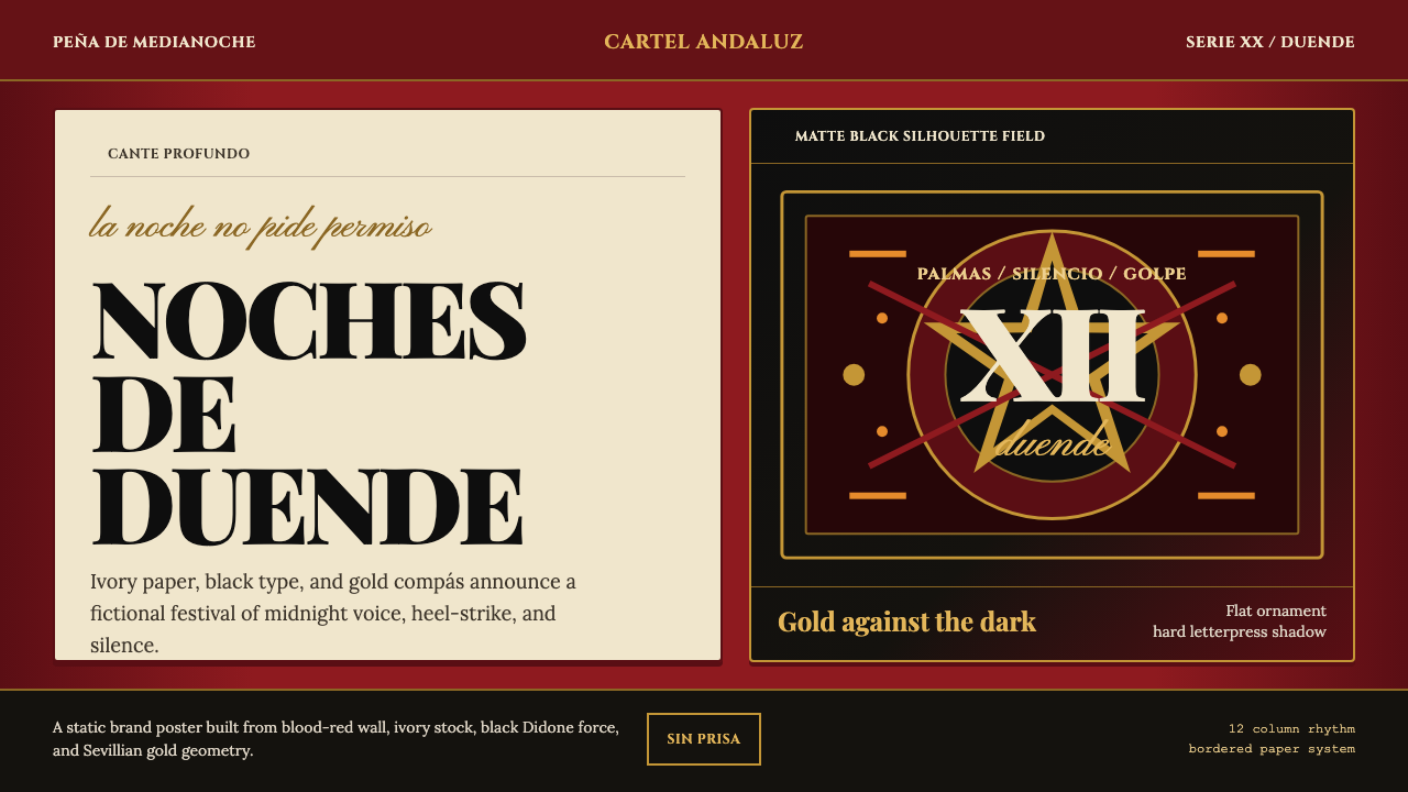 Spanish Flamenco PosterPassion printed as ritual. Blood red, ivory paper, Didone type, and flat gold…激情如仪式印成:血红墙、象牙纸、Didone字与金色节拍。
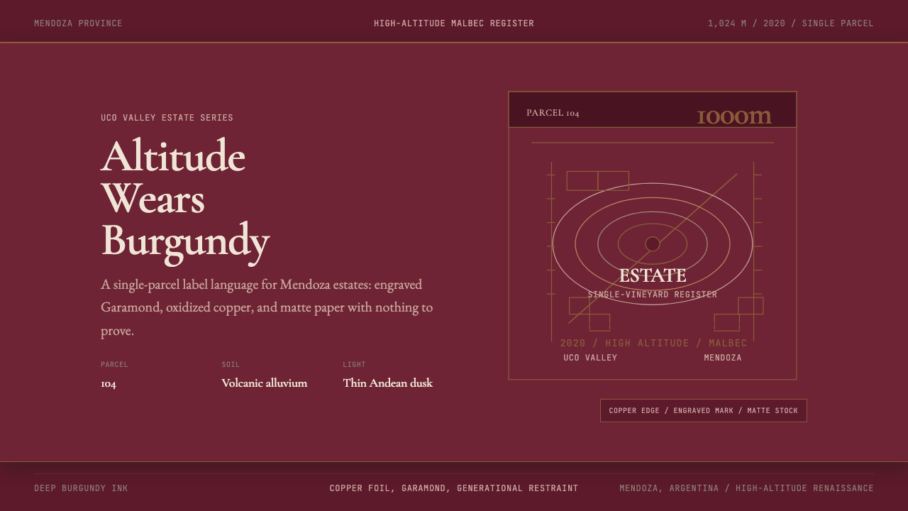 Argentine Malbec WineAltitude turned austere. Burgundy panels, engraved Garamond, oxidized copper.高海拔变得克制。酒红面板、雕刻衬线与氧化铜。
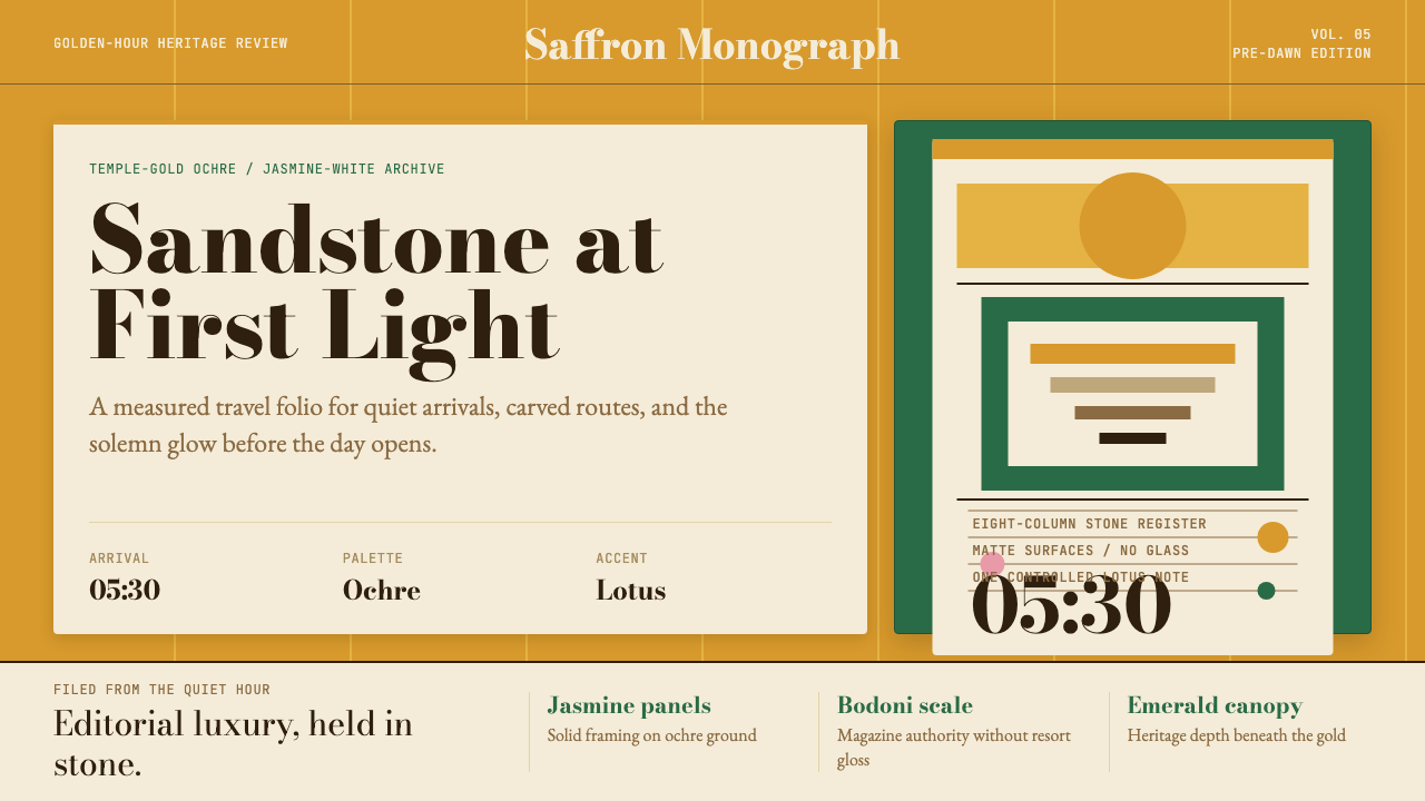 Cambodian Angkor Tourism ModernQuiet authority at dawn. Ochre ground, Bodoni serif, jasmine panels, one lotu…黎明般安静有力:赭金底、Bodoni衬线、茉莉白面板与一笔莲粉。