Design style guide设计风格指南
What is Spanish Flamenco Poster?什么是 Spanish Flamenco Poster?
Spanish Flamenco Poster distills a century of Andalusian festival graphics into a visual language of raw passion — blood-red walls, matte silhouettes, ivory letterpress paper, and the electric tension of duende made visible.西班牙弗拉门戈海报将安达卢西亚百年节庆版画浓缩成一套充满原始激情的视觉语言——深红色墙壁、哑光剪影、象牙色凸版纸张,以及「灵魂之力」转化为可见形态的电光张力。
Spanish Flamenco Poster in briefSpanish Flamenco Poster 速览
Spanish Flamenco Poster is a design system rooted in the visual culture of Andalusian festival promotion — the printed matter that has announced cante jondo performances, Semana Santa processions, and the world-famous Bienal de Sevilla from the late nineteenth century through the present. It is not a single designer's invention but a collective visual tradition refined over generations of festival printers, bullfighting promoters, and flamenco impresarios working in Seville, Jerez de la Frontera, Madrid, and Granada.西班牙弗拉门戈海报是一套根植于安达卢西亚节庆宣传视觉文化的设计系统——这些印刷品自十九世纪末至今,持续为深歌演出、圣周游行以及举世闻名的塞维利亚双年展宣告到来。它并非某位设计师的单独发明,而是数代节庆印刷匠、斗牛宣传者和弗拉门戈演出经纪人在塞维利亚、赫雷斯、马德里与格拉纳达共同打磨出的集体视觉传统。
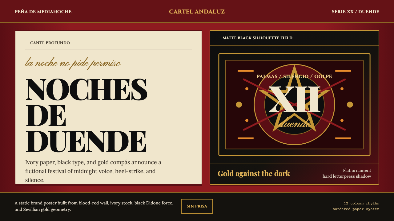
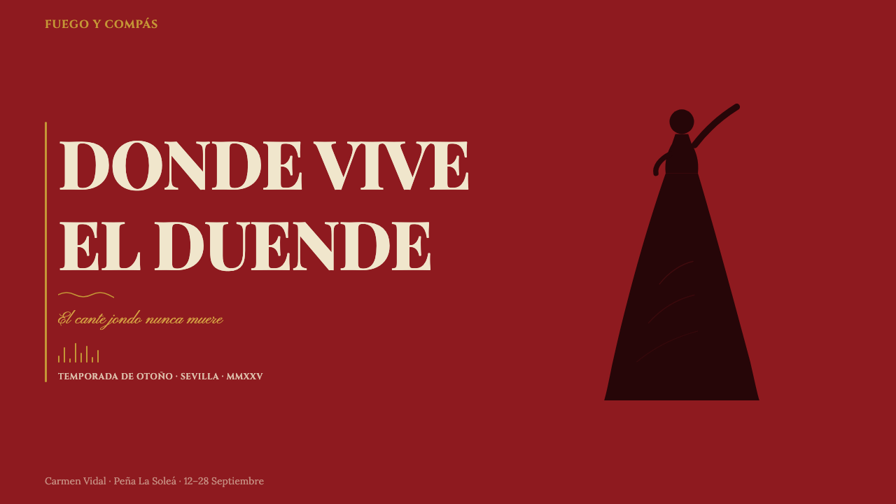
The aesthetic is built around several irreducible contrasts. A deep blood-red — the color of Andalusian plaster walls, of corrida capes, of passion itself — anchors the composition against ivory or cream stock that speaks of aged letterpress paper and candlelit peña walls. Against this ground, dense black silhouettes of dancers, guitarists, and cantaores assert themselves with the flat, graphic authority of woodcut prints. Gold accents — derived from the gilded balcony ironwork and altar ornament of Andalusian baroque architecture — provide the only warmth in an otherwise confrontational palette.这套美学建立于几组不可化约的对比之上。深沉的血红色——安达卢西亚灰泥墙的颜色,斗牛场斗篷的颜色,激情本身的颜色——将构图锚定在象牙或奶油色纸面上;那纸面诉说着陈年凸版印刷的质感与烛光照耀的佩尼亚酒馆墙壁的记忆。在这底面上,舞者、吉他手和歌者的浓黑剪影以木刻版画式的平面图形力量自我彰显。金色点缀——源自安达卢西亚巴洛克建筑的镀金阳台铁艺与祭坛装饰——在这套对抗性色板中提供了唯一的温暖。
The system carries the spirit of Federico García Lorca's concept of duende: that mysterious force, half ecstasy and half anguish, which distinguishes a performance that merely happens from one that truly lives. In design terms, duende translates to controlled tension — the feeling that the composition is barely containing its own energy, that the typeface is cracking under the weight of the announcement it must carry, that the silhouette is caught in the exact fraction of a second before the dance tips into stillness or frenzy.这套系统承载着费德里科·加西亚·洛尔卡所说的「灵魂之力」(duende)的精神:那种神秘的力量,半是狂喜半是痛苦,将一场只是发生了的演出与一场真正活着的演出区分开来。转化为设计语言,「灵魂之力」意味着受控的张力——那种感觉,仿佛构图正在竭力压制自身的能量,仿佛字体正在被其必须承载的公告重量所撑裂,仿佛剪影被捕捉在舞蹈坠入静止或狂乱之前的那个精确瞬间。
See the Spanish Flamenco Poster design system →查看 Spanish Flamenco Poster 完整设计系统 →
Where does Spanish Flamenco Poster come from?Spanish Flamenco Poster 从何而来?
The roots of Spanish flamenco poster graphics reach back to the café cantante culture of the 1880s and 1890s, when flamenco first became a commercial performance art rather than a private social ritual. The cafés cantantes of Seville and Cadiz — intimate venues where cante jondo singers, bailaoras, and guitarists performed for paying audiences — required printed announcements. These early posters borrowed from the Spanish theatrical broadside tradition: bold display type, stark contrast, and a format legible at distance even in dim street lighting. The woodcut-derived aesthetic of dense black on pale stock was already established here.西班牙弗拉门戈海报图形的根源可追溯至1880至1890年代的「歌唱咖啡馆」(café cantante)文化——弗拉门戈正是在那时从私人社交仪式转变为商业演出艺术。塞维利亚与加迪斯的歌唱咖啡馆——深歌歌手、女舞者与吉他手向付费观众演出的亲密场所——需要印刷宣传品。这些早期海报借鉴了西班牙戏剧单页广告的传统:粗重展示字体、强烈对比,以及在昏暗街灯下远距离也能辨读的版面格式。浓黑压在浅色纸面上的木刻派生美学,在此已然成形。
The late nineteenth and early twentieth centuries brought lithographic printing to Andalusian festival promotion, allowing for broader color ranges and the introduction of photographic portraiture. By the 1920s and 1930s, flamenco posters had absorbed elements of Art Nouveau floral ornament while retaining their essential confrontational energy — the decorative curves of modernismo sat uneasily beside the raw directness that flamenco itself demanded. The tension between the refined international style of the period and the vernacular urgency of the art form produced a hybrid that was neither fully cosmopolitan nor fully folk.十九世纪末至二十世纪初,平版印刷技术进入安达卢西亚节庆宣传领域,带来了更宽广的色彩范围与摄影肖像的引入。到了1920至1930年代,弗拉门戈海报已吸收了新艺术运动花卉装饰的元素,同时保留了其本质性的对抗能量——现代主义的装饰曲线与弗拉门戈自身所要求的原始直接性之间产生了不自在的并置。那个时代精炼的国际风格与这门艺术形式的民间紧迫性之间的张力,催生了一种既非完全世界主义也非完全民俗的混合物。
The modern form of the system crystallized around the founding of the Bienal de Sevilla in 1980. The biennial, which quickly became the most prestigious flamenco festival in the world, commissioned graphic designers to produce annual promotional materials at a level of ambition previously unknown in the genre. These commissions — many executed by designers trained in the rigorous graphic traditions of Spain's design schools — pushed flamenco poster aesthetics toward a more self-conscious formal language while insisting on the retention of the tradition's emotional core. Blood red, ivory ground, Didone headline type, and flat black silhouette became canonical elements.这套系统的现代形态随着1980年塞维利亚双年展的创立而结晶成形。双年展迅速成为世界上最负盛名的弗拉门戈节,委托平面设计师以前所未有的雄心创作年度宣传材料。这些委托——许多由接受过西班牙设计学院严格训练的设计师执行——将弗拉门戈海报美学推向更具自觉性的形式语言,同时坚持保留这一传统的情感核心。血红色、象牙色底面、Didone体标题字与平面黑色剪影成为经典元素。
The Festival de Jerez, founded in 1995, and dozens of smaller regional festivals in Granada, Cordoba, and Madrid reinforced this visual language through repetition and variation. By the 2010s, the flamenco poster tradition had achieved global recognition as a distinctive Spanish graphic idiom — instantly legible from Tokyo to New York as signifying Andalusian culture, passion, and craft. Contemporary designers working in this tradition since 2020 engage it with full awareness of its history, often pushing its conventions into digital contexts while preserving the essential emotional vocabulary.1995年创立的赫雷斯艺术节,以及格拉纳达、科尔多巴和马德里数十个规模较小的地区节庆,通过重复与变奏强化了这套视觉语言。到2010年代,弗拉门戈海报传统已作为独特的西班牙图形习语获得全球认可——从东京到纽约,一眼即可辨认其所承载的安达卢西亚文化、激情与工艺。自2020年以来,在这一传统中工作的当代设计师以充分的历史自觉参与其中,常常将其惯例推入数字语境,同时保留这套情感词汇的本质。
What defines the Spanish Flamenco Poster look?Spanish Flamenco Poster 的视觉特征是什么?
Color色彩
The palette is anchored by a deep blood-red — not the bright vermilion of commercial printing but the dark, matte crimson of Andalusian plaster walls — set against ivory or aged-cream grounds. Black is used for silhouettes and primary type, never for background. Gold appears as accent: in ornamental rules, in border elements, in the gilded treatment of performer names that signals both expense and reverence. The overall effect is of restrained intensity — three colors that should not work together at this saturation but do, because each occupies a distinct role in a hierarchy of heat.色板以深沉的血红色为锚点——不是商业印刷的明亮朱砂红,而是安达卢西亚灰泥墙那种深沉哑光的绛红——铺设于象牙或陈年奶油色纸面上。黑色用于剪影和主要字体,从不用作背景。金色作为点缀出现:在装饰分隔线、边框元素,以及演出者姓名的镀金处理中——这种处理同时传递出奢华与敬意。整体效果是压制的强烈感——三种在这一饱和度下本不应该和谐共处的颜色却做到了,因为每种颜色在热度层级中占据了截然不同的角色。
Silhouette and Figure剪影与人物
The defining visual motif is the flat black silhouette — a dancer caught mid-turn, a guitarist bent over his instrument, a cantaor with head thrown back. These figures derive from the woodcut tradition but carry a photographic immediacy: they are specific, gestural, and charged with motion. The silhouette is never soft-edged or gradated; it asserts itself as a graphic decision, not a rendering. The figure's posture is always at a point of maximum expressive tension — the moment before the heel strikes the floor, the breath held before the cry.最具决定性的视觉母题是平面黑色剪影——旋转中的舞者、俯身于乐器上的吉他手、仰首高歌的歌者。这些人物源自木刻版画传统,却带有摄影般的直接性:它们是具体的、姿态性的、充满动感的。剪影的边缘从不柔和,从不渐变;它以图形决策的方式自我彰显,而非作为一种渲染。人物的姿态始终处于最大表现张力的时刻——脚跟击打地板之前的那一秒,高叫之前屏住的那口气。
Typography字体排印
Headline type in this tradition is Didone in character — letterforms with extreme contrast between thick and thin strokes, delicate hairline serifs, and a vertical stress that gives the page an almost architectural quality. The type is set large, densely packed, and with intentional tightness in spacing that creates a feeling of compressed urgency. Secondary information — venue, date, supporting performers — appears in a condensed or narrow roman face, maintaining hierarchy while fitting the density of names that festival billing demands. Type is never playful or casual; even in its decorative moments, it maintains a formal gravity appropriate to an announcement of cultural importance.这一传统中的标题字体具有Didone体的特征——粗细笔画之间极端对比、精致的细衬线、垂直轴线,赋予页面一种近乎建筑的品质。字体排印面积大、密度高,字间距刻意紧凑,制造出一种被压缩的紧迫感。次要信息——场地、日期、助演人员——以压缩或窄体罗马字出现,在维持层级的同时适应节庆演出名单所要求的信息密度。字体从不轻佻或随意;即便在其装饰性时刻,也保持着与文化大事宣告相称的正式庄严。
Ornament and Rule装饰与分隔线
Unlike modernist design systems that eliminate ornament entirely, flamenco poster tradition uses it with deliberate excess — but only certain kinds of ornament. Typographic rules, borders, and decorative bands are drawn from the vocabulary of Spanish baroque: Moorish geometric interlace, wrought-iron scrollwork, floral dividers derived from Mudéjar tile patterns. These ornaments frame and contain the composition without filling the interior space. They function as the architectural border of a stage — the proscenium that defines where the performance happens — rather than as surface decoration competing with the content.与完全消除装饰的现代主义设计系统不同,弗拉门戈海报传统以刻意的丰盛使用装饰——但仅限于特定种类的装饰。字体分隔线、边框和装饰带取材于西班牙巴洛克词汇:摩尔式几何交织纹样、锻铁卷叶纹样、源自穆德哈尔瓷砖图案的花卉分隔线。这些装饰框住并包容构图,而不填充内部空间。它们起到舞台建筑边框的功能——定义演出发生之处的镜框式舞台——而非作为与内容竞争的表面装饰。
Paper and Texture纸张与质感
The material culture of flamenco poster printing is inseparable from its visual identity. Historically printed on heavy uncoated or matte-coated stock in warm ivory or cream tones, the poster carried the physical evidence of its craft: slight ink impression, subtle texture, and the sense that it had been made by hand and meant to be touched. In contemporary digital applications of the system, this quality is evoked through textured backgrounds, deliberately uneven ink coverage, and a studied imperfection that signals authenticity. The print artifact's warmth and weight are aspirational qualities — the system insists on feeling crafted even when it is not.弗拉门戈海报印刷的物质文化与其视觉身份不可分割。历史上印于温暖象牙或奶油色调的厚重无涂层或哑光涂层纸上,海报承载着其工艺的物理证据:略微的油墨压痕、微妙的纸面质感,以及那种被手工制作、有待触摸的感觉。在这套系统的当代数字应用中,这种品质通过纹理背景、刻意不均匀的油墨覆盖,以及传达真实性的研究过的不完美来唤起。印刷品的温暖与重量是令人向往的品质——这套系统坚持于即便并非手工制作时也要有被精心制作的感觉。
Composition and Tension构图与张力
Flamenco poster compositions are typically vertical — a format inherited from theatrical broadside printing — and organized around a central focal axis that the silhouette figure dominates. But the organization is never static or symmetrical. The figure leans, reaches, or spins off-center. Type is stacked asymmetrically to one side or forced into narrow vertical columns that echo the dancer's vertical thrust. Negative space is used sparingly and deliberately: the white or cream ground only appears where the composition has earned its pause, lending those areas an intensity proportional to their rarity.弗拉门戈海报构图通常是垂直的——这一格式继承自戏剧单页广告印刷——并围绕剪影人物主导的中央焦点轴线组织。但这种组织从不静止或对称。人物倾斜、伸展或偏离中心地旋转。字体被不对称地堆叠于一侧,或被强制压入窄竖排列,与舞者的垂直冲劲形成呼应。留白被谨慎而刻意地使用:白色或奶油色底面只在构图赢得其停顿之处出现,赋予那些区域与其稀少性成正比的强度。
Gold and Ceremony金色与仪式感
Gold in the flamenco poster tradition is never casual or decorative in a light sense — it carries the weight of religious and civic ceremony. Andalusian culture is saturated with gold: the gilded retablos of baroque churches, the gold-embroidered shawls of festival dress, the trophy cups presented at peñas. In the poster, gold appears as the most elevated typographic treatment — reserved for the headliner's name or the festival title — and as the material of ornamental frames and dividers. Its warmth against red and black reads simultaneously as luxurious and solemn, the aesthetic correlate of a world where celebration and mourning are never far apart.弗拉门戈海报传统中的金色从不随意,也非轻松意义上的装饰性——它承载着宗教和市民仪式的分量。安达卢西亚文化浸透了金色:巴洛克教堂镀金祭坛屏、节庆服饰金绣披肩、佩尼亚颁发的奖杯。在海报中,金色作为最高等级的字体处理出现——专属于头牌演出者的名字或节庆标题——以及作为装饰框架与分隔线的材质。它在红色与黑色衬托下的温暖,同时被解读为奢华与庄严,这是一个欢庆与哀愁从不相距甚远的世界的美学对应物。
See the Spanish Flamenco Poster design system →查看 Spanish Flamenco Poster 完整设计系统 →
Who shaped Spanish Flamenco Poster?谁塑造了 Spanish Flamenco Poster?
Lorca was the poet and playwright who gave the flamenco aesthetic its most articulate theoretical framework. His 1933 lecture 'Play and Theory of the Duende' defined duende as the spirit of authentic artistic inspiration — a dark, earthy force that distinguishes genuine artistic expression from mere technical accomplishment. Lorca argued that true flamenco, true art of any kind, required the presence of death as a creative catalyst. This philosophy permeates the visual tradition of flamenco poster design: the compression, the darkness, the controlled urgency, the sense that something is at stake. Lorca was killed in 1936 at the outset of the Spanish Civil War, becoming himself a figure of the duende he described.洛尔卡是赋予弗拉门戈美学最清晰理论框架的诗人与剧作家。他1933年的演讲《灵魂之力的游戏与理论》将「duende」定义为真实艺术灵感的精神——一种黑暗的、大地般的力量,将真正的艺术表达与单纯的技术成就区分开来。洛尔卡认为,真正的弗拉门戈、任何形式的真正艺术,都需要死亡作为创造性催化剂的在场。这一哲学渗透于弗拉门戈海报设计的视觉传统:那种压缩、那种黑暗、那种受控的紧迫感,以及某种正在被拼命守护的感觉。洛尔卡于1936年西班牙内战初期遭到杀害,自身也成为他所描述的「灵魂之力」的象征人物。
Carmen Amaya was the most celebrated female flamenco dancer of the twentieth century, whose ferocious footwork and transgressive stage presence transformed what audiences expected of the form. Born in the Barcelona gypsy quarter of Somorrostro around 1913, she rose to international fame and performed across Europe and the Americas. Her image — the dramatic silhouette of her in traje de gitana or, more startlingly, in trousers — appeared on posters and publicity materials that helped define the visual language of flamenco promotion. Her physical intensity and the stark drama of her performances provided a living model for what the graphic tradition sought to capture.卡门·阿玛亚是二十世纪最负盛名的女性弗拉门戈舞者,其凶猛的踢踏步法与颠覆传统的舞台存在感彻底改变了观众对这一艺术形式的期待。她约于1913年出生于巴塞罗那的吉普赛人聚居区索莫罗斯特罗,后来赢得国际声誉,足迹遍及欧洲与美洲。她的形象——身着吉普赛裙装,或更令人惊奇地穿着裤装的戏剧性剪影——出现在帮助定义弗拉门戈宣传视觉语言的海报与宣传材料上。她的肢体强度以及表演的鲜明戏剧性,为图形传统所寻求捕捉的东西提供了活生生的范本。
Camarón de la Isla — born José Monje Cruz in 1950 in the gypsy quarter of San Fernando, Cádiz — is widely regarded as the greatest flamenco singer of the modern era. His partnership with guitarist Paco de Lucía in the 1970s produced recordings that redefined the emotional and technical boundaries of cante jondo. Camarón's face and voice became cultural icons of Andalusia: his image appeared on posters, murals, and album covers with the graphic intensity of a religious icon. The visual conventions that festivals used to represent him — stark contrast, minimal color, a quality of almost unbearable expressiveness — fed directly back into the poster tradition.卡马龙·德拉伊斯拉——1950年生于加迪斯圣费尔南多的吉普赛人聚居区,本名何塞·孟赫·克鲁斯——被普遍认为是现代最伟大的弗拉门戈歌手。他在1970年代与吉他手帕科·德卢西亚的合作产生了重新定义深歌情感与技术边界的录音。卡马龙的面容与声音成为安达卢西亚的文化图腾:他的形象以宗教图像般的图形强度出现在海报、壁画和专辑封面上。各节庆用于呈现他的视觉惯例——强烈对比、极简色彩、几乎令人无法承受的表现力——直接反哺了海报传统。
Paco de Lucía, born Francisco Sánchez Gómez in 1947 in Algeciras, was the guitarist who modernized flamenco and brought it to global audiences without sacrificing its Andalusian roots. His technical innovations on the flamenco guitar — exploring new rhythmic structures, incorporating jazz harmony, and demanding a level of virtuosity that redefined what the instrument could do — paralleled the formal ambitions of the graphic designers who worked on festival promotion during the same decades. His partnership with Camarón produced some of flamenco's most celebrated recordings, and his own concert appearances generated poster commissions that represent high points of the modern tradition.帕科·德卢西亚,1947年生于阿尔赫西拉斯,本名弗朗西斯科·桑切斯·戈麦斯,是在不牺牲安达卢西亚根源的前提下使弗拉门戈现代化并带向全球观众的吉他手。他在弗拉门戈吉他上的技术革新——探索新的节奏结构、融入爵士和声、要求一种重新定义乐器可能性的演奏境界——与同一年代在节庆宣传上工作的平面设计师的形式抱负相互映照。他与卡马龙的合作产生了弗拉门戈最受赞誉的部分录音,而他自己的演出宣传所委托创作的海报,代表了现代传统的高峰时刻。
How do you use Spanish Flamenco Poster today?今天怎么用 Spanish Flamenco Poster?
Spanish Flamenco Poster is among the most emotionally specific design systems available for contemporary applications — which means it is both powerfully evocative and potentially limiting. Applying it correctly demands understanding the emotional register it commands: gravity, passion, craft, and the compressed energy of something performed rather than merely produced. It suits contexts where those values align with the product's or event's identity.西班牙弗拉门戈海报是当代应用中情感特异性最强的设计系统之一——这意味着它既极具召唤力,也可能带来局限。正确应用它,需要理解它所指挥的情感音域:庄重、激情、工艺,以及被表演而非被制造的事物所特有的压缩能量。它适合那些上述价值观与产品或活动身份相契合的语境。
For presentation slides and event materials, the system works exceptionally well for anything requiring dramatic impact: keynote covers, cultural event programs, promotional materials for festivals, performing arts organizations, or premium consumer brands with roots in craft tradition. A cover slide benefits from the full visual vocabulary — deep red ground, centered or slightly off-center silhouette figure, headline type set at compressed scale in a Didone-character face, and a thin gold rule or ornamental border to frame the composition. Content slides should strip back to essentials: ivory or cream ground, dense black type in a narrow-set serif, and red used only for the most critical hierarchy marker. Data slides take their cue from the tradition's graphic authority — charts and diagrams rendered in the system's palette read as deliberate and confident rather than decorative.对于演示文稿和活动材料,这套系统对任何需要戏剧性冲击力的场合都表现出色:主题演讲封面、文化活动节目册、节庆宣传材料、表演艺术机构,或根植于工艺传统的高端消费品牌。封面幻灯片受益于完整的视觉词汇——深红色底面、居中或略偏中心的剪影人物、以Didone体特征字面紧缩排版的标题,以及细金分隔线或装饰边框为构图收口。内容幻灯片应当回到本质:象牙或奶油色底面、窄字距衬线体的密集黑色字体,红色仅用于最关键的层级标记。数据幻灯片从这一传统的图形权威中汲取灵感——以这套系统色板呈现的图表和示意图,读来是深思熟虑和自信的,而非装饰性的。
For web interfaces, the system is best suited to contexts with a clear cultural or artisanal identity: wine brands, luxury hospitality, performing arts booking platforms, cultural institutions, and heritage fashion. A homepage or landing page built in this register should use a full-bleed deep red section for the primary hero, with a large silhouette or photographic figure in high-contrast treatment against it. Navigation and supporting text should sit on ivory or near-white, using the system's typographic hierarchy. Gold accents work well for interactive elements — hover states, active indicators, selected states — where they carry the same ceremonial weight they carry in the print tradition. Dashboards and data-heavy interfaces are not natural territory for this system; the visual density and emotional intensity that make it powerful in promotional contexts create friction in contexts requiring calm and continuous scanning.对于网页界面,这套系统最适合具有明确文化或工艺身份的语境:葡萄酒品牌、奢华酒店、表演艺术订票平台、文化机构,以及传承时装。以这套风格构建的主页或落地页,应当将深红色全出血区块用于主要英雄区,配以高对比度处理的大型剪影或摄影人物。导航与辅助文字应置于象牙或近白底面上,运用系统的字体层级。金色点缀在交互元素上效果出众——悬停状态、活动指示符、选中状态——在那些位置,它们承载着与印刷传统中相同的仪式分量。仪表板和数据密集型界面并非这套系统的自然领域;使其在宣传语境中富有力量的视觉密度与情感强度,在需要平静与持续扫描的语境中会制造摩擦。
For editorial and marketing work, the system is a natural fit for cultural journalism, arts coverage, festival guides, and brand identities in the premium artisanal sector. A feature article layout in this register uses the red as a section-defining color — pull quotes in red, section openers with a red band behind white type — while the body sits on white or cream. Marketing campaigns benefit from the system's poster-like boldness: a single image reduced to high-contrast black on red, a performer name treated as a typographic object in itself, and supporting information subordinated to a hierarchy that insists on what matters most.对于编辑和营销内容,这套系统天然适合文化新闻、艺术报道、节庆指南,以及高端工艺品类的品牌识别。以这套风格排版的特写文章,将红色用作章节定义色——引用文字以红色呈现,章节开篇以红色色带衬托白色字体——正文则置于白色或奶油色底面。营销活动受益于这套系统的海报式大胆感:一张被简化为红底高对比黑色的单图,一个演出者名字本身被作为字体对象处理,辅助信息被从属于一种坚持最重要内容的层级体系。
A common mistake when applying this system is confusing passion with excess. The flamenco poster tradition achieves its intensity through discipline, not accumulation: one strong silhouette, not a crowd; one dominant color, with gold as measured accent; type that commands rather than fills the space. Applying every element simultaneously — heavy ornament, multiple silhouettes, all three colors at full saturation, elaborate borders — produces visual noise rather than duende. The system's power lies in what it withholds. Similarly, softening the palette by moving the red toward orange or the black toward dark grey dissolves the tradition's emotional specificity and produces something that reads as vaguely Mediterranean rather than specifically Andalusian.应用这套系统时最常见的错误,是将激情与过度混为一谈。弗拉门戈海报传统通过纪律而非堆砌来实现其强度:一个有力的剪影,而非一群人;一种主导色,金色作为克制点缀;命令式的字体,而非填满空间的字体。同时运用所有元素——厚重装饰、多个剪影、三种颜色全饱和度、繁复边框——产生的是视觉噪音,而非「灵魂之力」。这套系统的力量在于它的克制。同样,将红色向橙色偏移或将黑色向深灰软化,会溶解这一传统的情感特异性,产生的结果读来是模糊的地中海风格,而非具体的安达卢西亚风格。
See the Spanish Flamenco Poster design system →查看 Spanish Flamenco Poster 完整设计系统 →
Spanish Flamenco Poster — FAQSpanish Flamenco Poster · 常见问题
How does Spanish Flamenco Poster differ from other Iberian graphic traditions?西班牙弗拉门戈海报与其他伊比利亚图形传统有何不同?
Spain has several distinct regional graphic traditions — the modernisme of Catalan Art Nouveau, the cool rationalism of Basque and Castilian institutional design, and the exuberant folk graphics of various regional festivals. Flamenco poster tradition is specifically Andalusian: it draws on the cultural synthesis of Christian, Moorish, and Romani influences that characterize the deep south. Its palette and ornamental vocabulary are noticeably warmer and more theatrical than northern Spanish graphic traditions, and its connection to live performance gives it a quality of urgency that institutional design lacks. It should not be confused with generic 'Spanish' style — treating a sangria label as stylistically equivalent to a Bienal de Sevilla poster would be a significant cultural misread.西班牙有几种截然不同的地区图形传统——加泰罗尼亚新艺术运动的现代主义、巴斯克和卡斯蒂利亚机构设计的冷静理性主义,以及各地区节庆的欢腾民间图形。弗拉门戈海报传统是特定的安达卢西亚产物:它汲取了深度南方所特有的基督教、摩尔和罗姆人影响的文化综合。它的色板和装饰词汇明显比西班牙北方的图形传统更温暖、更具戏剧性,而它与现场演出的联系赋予它一种机构设计所缺乏的紧迫感。它不应与泛泛的「西班牙」风格相混淆——把一张桑格利亚酒标当作与塞维利亚双年展海报风格等价,将是严重的文化误读。
Can this system work for digital interfaces, or is it inherently a print tradition?这套系统能用于数字界面吗,还是它本质上属于印刷传统?
The system translates well to digital contexts when certain adaptations are made. The most important is handling the texture and material quality that printed stock provides — in digital work, this requires deliberate textural treatments in backgrounds and a willingness to allow slight imperfection rather than perfect vector crispness. The palette transitions well: deep red and near-black read powerfully on screens. The typographic conventions require some adjustment, since the very tight spacing and compressed scale that works in poster format can create readability problems at body-text scale on screen. For web and app interfaces, the best approach is to use the system's vocabulary for major compositional moments — hero sections, section headers, calls to action — while keeping supporting text in a more neutral register.在做出某些适配的情况下,这套系统能够良好地迁移到数字语境。最重要的适配是处理印刷纸张所提供的质感与材质品质——在数字作品中,这需要对背景做刻意的纹理处理,并愿意容许轻微的不完美,而非追求完美的矢量清晰度。色板迁移顺畅:深红色与近黑色在屏幕上读来富有张力。排版惯例需要一些调整,因为在海报格式中有效的极紧字间距和压缩尺度,在屏幕正文字号上会产生可读性问题。对于网页和应用界面,最佳方式是将这套系统的词汇用于重要的构图时刻——英雄区、章节标题、行动号召——同时将辅助文字保持在更中性的风格中。
What is duende, and how does it inform the design system?「灵魂之力」是什么,它如何影响这套设计系统?
Duende is a concept articulated most famously by Federico García Lorca in his 1933 lecture as the dark, authentic force that makes art genuinely move its audience — as opposed to mere technical mastery or prettiness. Lorca associated it with a confrontation with mortality, an earthy directness that cannot be faked or learned. In design terms, duende is the quality that prevents a composition from feeling merely competent: the tension that makes you feel something is at stake, that the figure might break free of the frame, that the announcement carries urgency beyond its literal meaning. The design system pursues this through controlled visual tension — compressed space, high contrast, a palette that provides no comfort, and typography that commands rather than invites.「灵魂之力」是费德里科·加西亚·洛尔卡在其1933年演讲中最著名阐述的一个概念,指的是使艺术真正感动观众的那种黑暗、真实的力量——与单纯的技术掌握或美丽相对。洛尔卡将其与对死亡的正面交锋联系在一起,一种无法被伪造或习得的大地般的直接性。转化为设计语言,「灵魂之力」是防止一件构图仅仅显得称职的那种品质:让你感到某种东西岌岌可危的张力,人物可能冲破画框的感觉,公告所承载的紧迫感超越其字面意义。这套设计系统通过受控的视觉张力追求这一品质——压缩的空间、高对比度、提供零舒适感的色板,以及命令式而非邀请式的字体排印。
Is it appropriate to use this system for non-flamenco contexts?将这套系统用于非弗拉门戈语境是否合适?
The system's visual vocabulary is specific enough that using it indiscriminately for unrelated contexts risks a kind of cultural appropriation that reduces a living tradition to surface decoration. That said, the emotional register it commands — gravity, passion, craft, the weight of something genuinely performed — is applicable to any context where those values are authentic. A brand with deep roots in Spanish culture, a premium artisanal food producer, a performing arts organization, or a cultural institution working with Andalusian heritage can deploy the full system with integrity. A technology startup using blood-red and Didone type for no reason grounded in the product's actual values would be borrowing style without substance — producing something that feels unearned and potentially hollow.这套系统的视觉词汇足够特殊,以至于不加辨别地用于无关语境有将一个仍然活着的传统简化为表面装饰的风险——这可能构成一种文化挪用。尽管如此,它所指挥的情感音域——庄重、激情、工艺、真正被表演的事物所具有的分量——适用于那些上述价值观是真实的任何语境。一个深植于西班牙文化的品牌、一个高端工艺食品生产商、一个表演艺术机构,或一个与安达卢西亚遗产合作的文化机构,可以完整地、有诚信地部署这套系统。一个科技创业公司毫无理由地——不植根于产品真实价值——使用血红色和Didone体,将是在借用风格而无实质内容——产生的东西感觉是不劳而获的,可能是空洞的。
How should this system handle light mode versus dark mode contexts?这套系统应该如何处理浅色模式与深色模式的语境?
The canonical form of the flamenco poster tradition is light-ground — ivory or cream stock with black type and red accent — not dark. A full dark-mode inversion requires careful recalibration. On a black ground, the deep red risks losing the distinction between itself and the background, becoming muddy rather than intense. Ivory type on black with red as accent works better than attempting to replicate the full palette inverted. The gold element translates well to dark contexts, where it reads as genuinely warm against the near-black. The ornamental elements — rules, borders, Moorish interlace — retain their effectiveness in dark contexts because they operate as structural elements rather than surface color. For interfaces that must support both modes, treat the dark version as a formal evening register of the same system rather than a mechanical inversion.弗拉门戈海报传统的经典形态是浅色底面——象牙或奶油色纸面配黑色字体和红色点缀——而非深色。完全的深色模式反转需要仔细重新校准。在黑色底面上,深红色有失去自身与背景之间区分的风险,变得浑浊而非强烈。黑底象牙字配红色点缀,比尝试复制全色板反转的效果要好。金色元素在深色语境中迁移顺畅,在近黑底面上读来是真正温暖的。装饰元素——分隔线、边框、摩尔式交织纹样——在深色语境中保留其效力,因为它们作为结构性元素而非表面色彩发挥作用。对于必须同时支持两种模式的界面,将深色版本视为同一系统的正式夜间风格,而非机械反转。
Related design styles相关设计风格
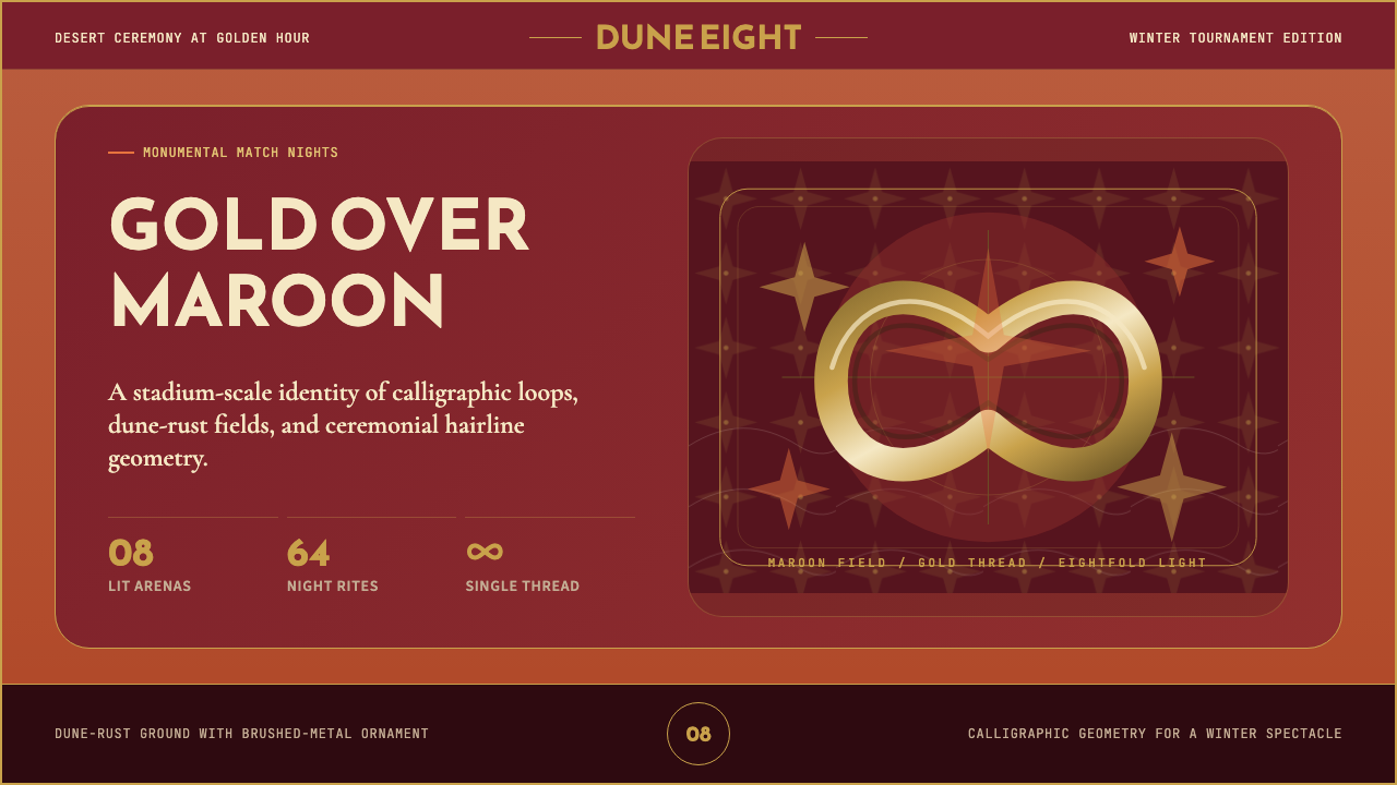 Qatar World Cup 2022Desert spectacle in gold. Maroon fields, Reem Kufi scale, and eightfold star…金色沙漠盛典。栗色场域、Reem Kufi巨字与八角星几何。
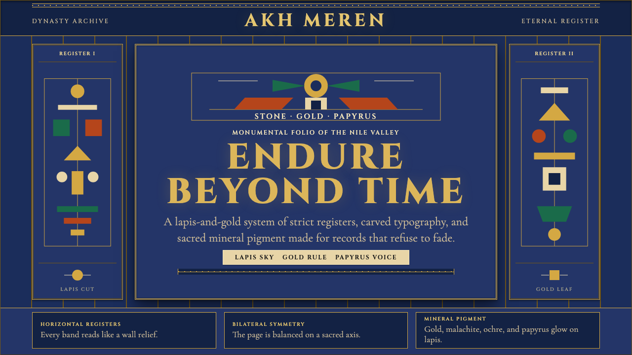 Egyptian PharaonicRegal permanence. Gold rules and Cinzel capitals carve papyrus registers into…庄严即永恒。金色分栏与Cinzel碑文字,在青金石底上刻出莎草纸秩序。
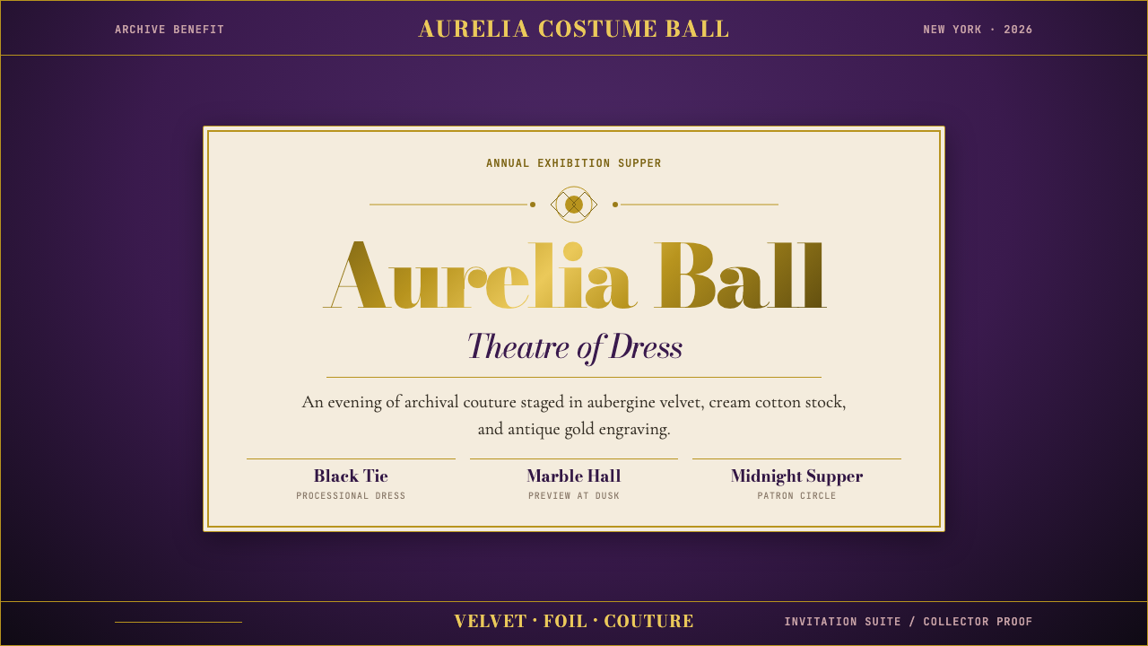 Met GalaTheatrical reverence. Aubergine velvet, cream stock, and Bodoni gold foil fra…戏剧化的敬意:茄紫天鹅绒、奶油纸与金箔 Bodoni 围合仪式感。
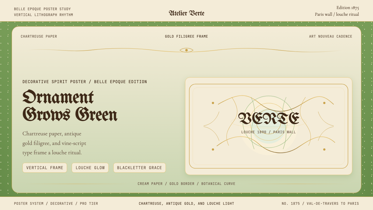 Absinthe Art Nouveau Green (1875)Ornate and verdant. Chartreuse field, gold filigree, vine-script type, and lo…华丽而青绿。黄绿色底、金丝花边与藤蔓字体托出浑浊光。
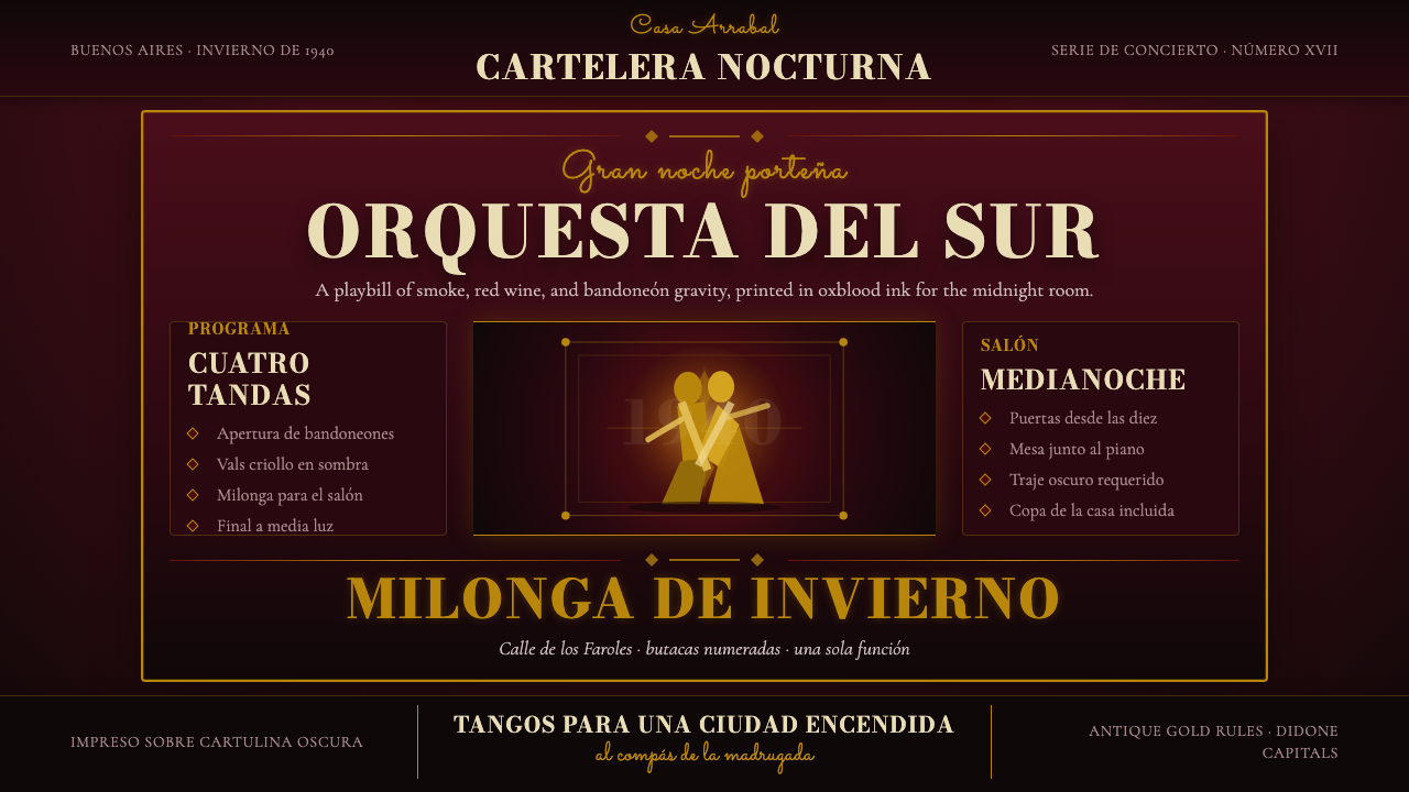 Argentine Tango Poster (1940)Nocturnal drama in ink. Oxblood ground, antique gold rules, Bodoni capitals.暗夜戏剧感:氧血红底、古金线框与Bodoni大写。
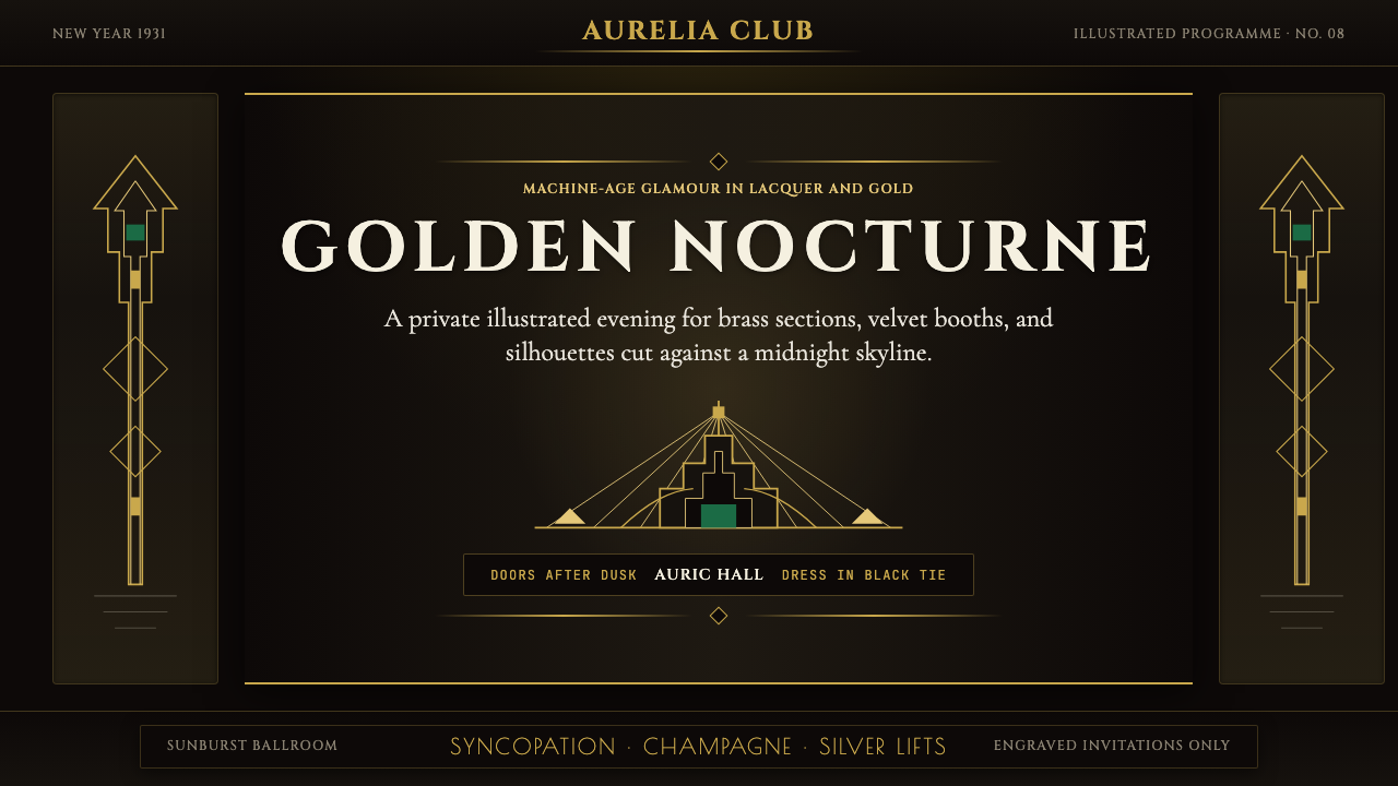 Art Deco Jazz AgeJazz Age glamour. Sunburst rays, stepped ziggurats, gold on black — Chrysler…爵士时代的流光奢华:太阳光芒、阶梯几何、金色撞黑底——克莱斯勒大厦门厅的 CS…