What is Egyptian Pharaonic?什么是 Egyptian Pharaonic?
Egyptian Pharaonic design is the visual language of permanence — three thousand years of hieroglyphs, gold, lapis lazuli, and stone-carved symmetry that still commands authority on any surface.埃及法老风格是永恒的视觉语言——三千年的象形文字、黄金、青金石与石刻对称,至今在任何平面上依然具有不可撼动的威严。
Egyptian Pharaonic in briefEgyptian Pharaonic 速览
Egyptian Pharaonic design is the visual language of the oldest monumental civilization on record. It encompasses hieroglyphs carved into temple walls, golden sarcophagi, lapis lazuli inlays, and human figures rendered eternally in profile — a system of representation so coherent and so deliberately maintained that it persisted with near-total visual consistency for roughly three millennia, from the early dynastic period through the Ptolemaic era.埃及法老风格是有史以来最古老的纪念性文明的视觉语言。它涵盖凿刻于神庙墙壁的象形文字、黄金面具、青金石镶嵌,以及永远以侧面姿态行进的人像——一套如此严密、如此刻意维持的表现体系,从早期王朝时期到托勒密时代,以几乎未经中断的视觉一致性延续了近三千年。
The temperament of the style is regal, not macabre. It is a design language oriented entirely toward permanence and authority. Everything in it — strict horizontal registers dividing a composition into narrative bands, bilateral symmetry anchoring major elements, bold outlines containing flat fields of mineral color, letterforms that combine pictorial legibility with architectural weight — communicates a single overriding idea: this will endure beyond time itself.这种风格的气质是庄严而非阴森的。它是一套完全指向永恒与权威的视觉语言。其中的一切——将构图分隔为叙事带状区域的严格水平分层、锚定主要元素的左右对称、以粗轮廓包裹矿物色平涂的形态、兼具图像可读性与建筑厚重感的字形——都在传递同一个压倒性的信念:这将超越时间而长存。
As a contemporary design system, Egyptian Pharaonic draws on that visual vocabulary to project power, solemnity, and institutional confidence. Its palette centers on deep gold against a ground of midnight blue or dense black, with accents of warm terracotta and the specific vivid blue-green of Egyptian faience. Its compositional logic favors symmetry, horizontal banding, and the kind of dense, ordered complexity that rewards close reading rather than quick scanning. It is a style suited to occasions that demand gravitas.作为当代设计系统,埃及法老风格借鉴上述视觉词汇,用以投射权力、庄重与机构自信。其色板以深邃的金色为核心,铺设于午夜蓝或浓黑的底面之上,以暖赭红与埃及彩釉特有的明艳蓝绿色作为点缀。其构图逻辑偏好对称、水平分带,以及那种层叠有序、经得起细读而非快速扫视的繁密复杂性。这是一种为需要庄重感的场合而生的风格。
See the Egyptian Pharaonic design system查看 Egyptian Pharaonic 完整设计系统
Where does Egyptian Pharaonic come from?Egyptian Pharaonic 从何而来?
The visual tradition we call Egyptian Pharaonic design emerged in the Nile Valley around 3100 BCE with the unification of Upper and Lower Egypt under the first pharaohs. The administrative center at Memphis — where the court, temple workshops, and scribal schools converged — became the birthplace of a unified representational canon. Artists and craftsmen working under royal patronage developed consistent rules for depicting the human figure, organizing a composition, and inscribing hieroglyphic text that would remain binding for century after century. This was not artistic stagnation; it was a deliberate policy of visual continuity meant to reinforce the eternal legitimacy of the divine kingship.我们今天称为埃及法老风格的视觉传统,约于公元前3100年随着上下埃及的统一而在尼罗河谷诞生。位于孟菲斯的行政中心——王廷、神庙作坊与书吏学校在此汇聚——成为统一表现规范的发源地。在王室庇护下工作的艺术家与工匠们制定了一套描绘人体、组织构图、铭刻象形文字的一致规则,这套规则将被一代又一代地遵守。这并非艺术的停滞,而是一种刻意的视觉连续性政策,意在强化神权王权的永恒合法性。
The Old Kingdom period (roughly 2700–2200 BCE) established the monumental scale and compositional grammar that defines the style. The great pyramid complexes at Giza, built under the Fourth Dynasty pharaohs including Khufu and Khafre, demonstrated what the culture could accomplish when visual ambition, administrative organization, and material resources were aligned. The pyramid itself — a perfect geometric solid pointing toward the sky — became the defining architectural emblem of the tradition. Alongside it, the relief carvings and painted tomb chambers of the Old Kingdom fixed the conventions of horizontal register, frontal-eye-in-profile-body figure drawing, and color symbolism that later periods would inherit.古王国时期(约公元前2700—2200年)确立了定义这一风格的纪念性规模与构图语法。在包括胡夫与哈夫拉在内的第四王朝法老统治下建造的吉萨金字塔群,展示了当视觉抱负、行政组织与物质资源协同对齐时,这一文明能够成就什么。金字塔本身——一个指向天空的完美几何体——成为这一传统最具代表性的建筑标志。与之并列,古王国的浮雕刻绘与彩绘墓室确立了水平叙事带、正面眼睛与侧面身体相结合的人物画法、以及后世将继承的色彩象征体系。
Imhotep, the polymath vizier and architect credited with designing the Step Pyramid complex at Saqqara for Pharaoh Djoser around 2650 BCE, represents the earliest named designer in the tradition. His innovation — stacking mastaba tomb forms into a stepped pyramid — introduced a formal vocabulary that would evolve over centuries. Imhotep was later deified, a rare honor that reflects how deeply ancient Egyptian culture identified great acts of design and construction with divine authority. The tradition he inaugurated reached its fullest expression in the New Kingdom period (1550–1070 BCE), when the Valley of the Kings near Thebes became the burial ground for pharaohs whose tomb chambers were covered floor to ceiling with painted hieroglyphic programs of extraordinary density and color.印和阗——被公认为约在公元前2650年为法老左塞尔设计萨卡拉阶梯金字塔群的博学宰相与建筑师——是这一传统中最早有名有姓的设计师。他的创新——将马斯塔巴墓葬形式叠加为阶梯式金字塔——引入了一套将在数百年间持续演进的形式词汇。印和阗后来被神化,这一罕见的荣誉反映出古埃及文化在何种程度上将伟大的设计与建造行为等同于神圣权威。他所开创的传统在新王国时期(公元前1550—1070年)达到最完整的表达——底比斯附近的帝王谷成为众多法老的葬地,其墓室从地面到天花板布满密度与色彩均令人震惊的彩绘象形文字程序。
The style's influence did not end with the pharaohs. When Egypt fell to Alexander the Great in 332 BCE and the Ptolemaic dynasty subsequently ruled from Alexandria, Egyptian visual conventions were absorbed into a hybrid Hellenistic-Egyptian aesthetic that carried the essential vocabulary — gold, hieroglyphs, the profile figure, the registers — into a new cultural context. The Roman conquest of 30 BCE ended the pharaonic state, but Egyptian imagery had by then so thoroughly fascinated the ancient world that it spread across the Mediterranean through trade, war, and cultural exchange. The nineteenth-century European fascination with Egypt — crystallized by Napoleon's 1798 Egyptian campaign, the subsequent publication of the Description de l'Égypte, and the discovery of Tutankhamun's tomb by Howard Carter in 1922 — translated the ancient visual language into the Egyptian Revival movement, which seeded Pharaonic motifs into Neoclassical architecture, Art Deco design, and ultimately the contemporary design vocabulary that the style draws on today.这一风格的影响并未随法老王朝的终结而消散。公元前332年埃及向亚历山大大帝臣服、托勒密王朝随后以亚历山大港为中心统治埃及时,埃及视觉规范被融入一种希腊化-埃及混合美学,将核心词汇——黄金、象形文字、侧面人像、分带构图——带入全新的文化语境。公元前30年的罗马征服终结了法老国家,但埃及图像彼时已如此深刻地迷住了古代世界,并经由贸易、战争与文化交流播散至整个地中海区域。十九世纪欧洲对埃及的痴迷——以拿破仑1798年的埃及远征、随后出版的《埃及志》以及霍华德·卡特1922年发现图坦卡蒙墓为标志性节点——将这套古代视觉语言转化为埃及复兴运动,将法老母题植入新古典主义建筑、装饰艺术风格,并最终进入这一风格今天所借鉴的当代设计词汇。
What defines the Egyptian Pharaonic look?Egyptian Pharaonic 的视觉特征是什么?
Color色彩
The palette is built on a foundation of deep, saturated contrasts: gold against midnight blue or dense black, warm terracotta against cream, and the distinctive vivid blue-green of Egyptian faience — a color unlike any European pigment — used as a precise accent. These are mineral colors derived from lapis lazuli, malachite, ochre, and gold leaf, and they carry specific symbolic weight in the original tradition. Gold signifies divine radiance and immortality; blue-black grounds represent the primordial void; terracotta and ochre refer to the earth and skin. In contemporary application, the palette reads as simultaneously archaic and commanding — it projects authority without softness.色板建立在深邃、饱满的对比之上:金色对抗午夜蓝或浓黑,暖赭红对抗奶油色,埃及彩釉特有的明艳蓝绿——一种迥异于任何欧洲颜料的色彩——作为精准的点缀。这些都是源自青金石、孔雀石、赭石与金箔的矿物色彩,在原始传统中各有明确的象征重量:金色象征神圣光辉与不朽;蓝黑底色代表原始虚空;赭红与土黄指涉大地与皮肤。在当代应用中,这套色板同时散发出古老感与威权感——它投射出不带柔和的权威。
Symmetry and Register对称与叙事带
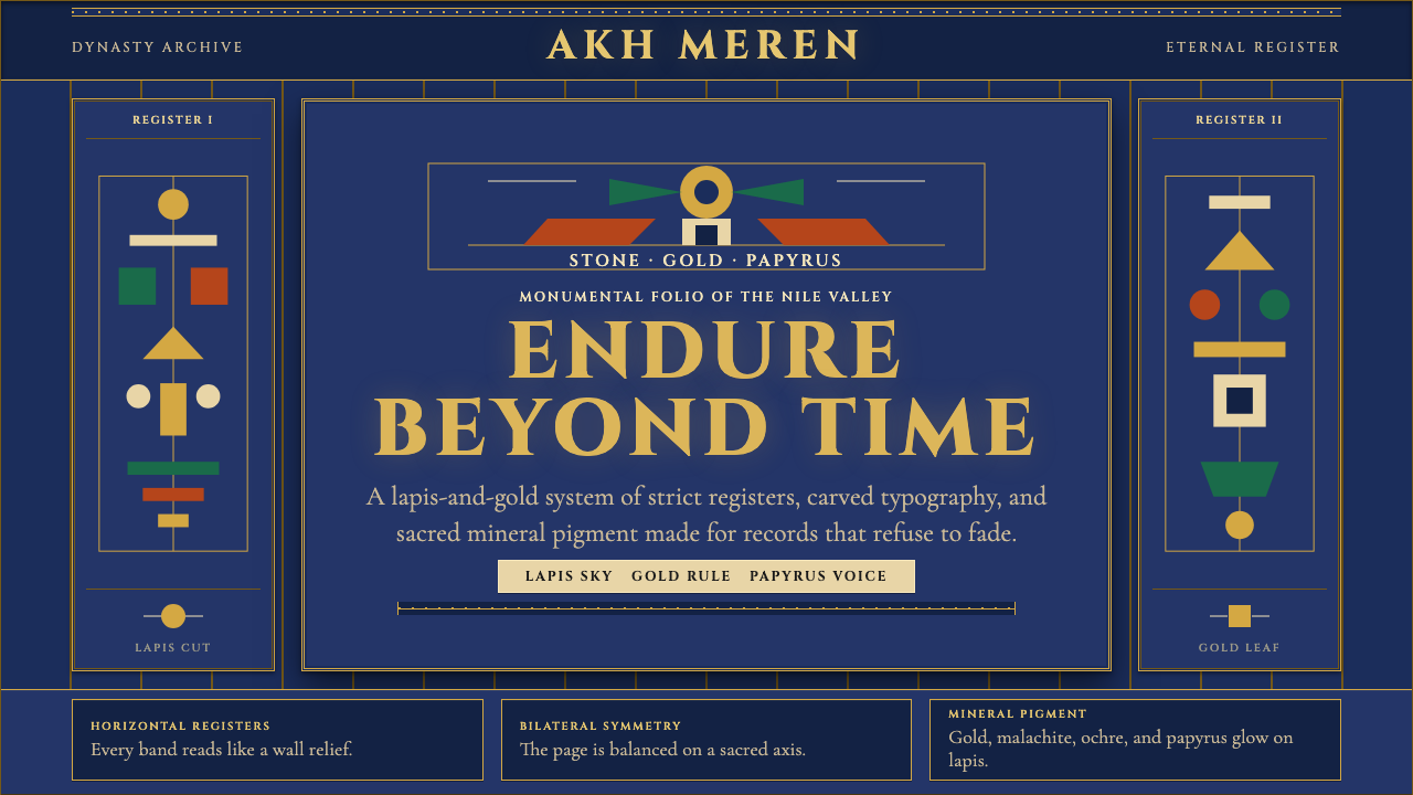
Egyptian compositions are organized by two dominant structural principles operating simultaneously: bilateral symmetry anchoring the central axis, and horizontal registers dividing the picture plane into parallel narrative bands stacked one above another. The registers are as important as the symmetry — they impose a reading order (typically top to bottom), separate scenes or text blocks from each other, and give the composition its characteristic quality of ordered density. Dividing lines between registers are thin but absolute; they function like ruled stone courses in a temple wall. This banded structure is the single most transferable compositional device the style offers.埃及构图由两个同时运作的主导结构原则组织:锚定中轴的左右对称,与将画面分割为并排叠加的水平叙事带。叙事带与对称同等重要——它们强制规定阅读顺序(通常从上至下),将不同场景或文字块相互分隔,并赋予构图那种有序繁密的典型品质。叙事带之间的分隔线细而绝对,犹如神庙墙体中经过规整的石层。这种分带结构是这一风格提供的最具可移植性的单一构图手段。
Typography and Hieroglyphic Weight字形与象形文字质感
Egyptian type sensibility is monumental and lapidary — it looks carved rather than printed. Letterforms appropriate to the style have high contrast between thick and thin strokes, strong serifs with architectural weight, and an overall impression of having been cut into a hard surface rather than drawn on a soft one. Display text benefits from wide letterspacing that reinforces the register-and-column grid. Where actual hieroglyphic elements are introduced, they function as visual texture and symbolic density rather than readable script — the eye reads them as pattern before it reads them as language.埃及字体感知是纪念碑式与石刻式的——它看起来是凿刻而非印刷的。适合这一风格的字形具有粗细笔画之间的高对比、带有建筑厚重感的强衬线,以及总体上被切入坚硬表面而非描绘于柔软基底的印象。展示性文字受益于加宽的字距,这强化了叙事带与竖列网格。当真实象形文字元素被引入时,它们作为视觉肌理与象征密度而发挥作用,而非可读的文字——眼睛先把它们读作图案,再读作语言。
Figure and Profile人像与侧面法则
The Egyptian convention of showing the human figure with head and legs in profile but chest and eye facing forward is not an anatomical error — it is a deliberate compositional decision to show each part of the body from its most legible angle simultaneously. This creates a figure that is both immediately readable and fundamentally schematic: a visual shorthand so refined over millennia that it reads as dignified authority rather than stylized distortion. In contemporary design applications, the profile figure serves as a powerful motif for representing human presence without photographic realism.埃及人物表现惯例——头部与双腿以侧面呈现,但胸部与眼睛朝向正前方——并非解剖学上的错误,而是一种刻意的构图决定:同时从最清晰的角度呈现身体的每个部分。这创造出一种既即刻可读又根本上图示化的人像:一套经过数千年精炼的视觉速记,读来是庄严的权威而非程式化的变形。在当代设计应用中,侧面人像是在不依赖摄影写实主义的情况下表现人的存在的强力母题。
Gold and Material Opulence黄金与物质丰盛
Gold is the organizing material of Egyptian Pharaonic design — not as mere decoration but as the literal substance of divinity. In ancient Egypt, the gods were believed to have golden skin; pharaohs were divine by nature, and their golden regalia embodied that status. In the design system, gold functions as the primary accent tone, the outline color for major elements, and the highlight treatment for the most important typographic elements. It should feel weighty and specific rather than generic or metallic-by-default. The distinction matters: gold applied lavishly reads as kitsch; gold applied as a structural choice reads as gravitas.黄金是埃及法老风格的组织性材料——不是作为单纯装饰,而是作为神性的字面物质。在古埃及,众神被认为有黄金色的皮肤;法老本质上是神圣的,其黄金礼器体现了这一地位。在设计系统中,黄金作为主要点缀色调、主要元素的轮廓色,以及最重要排版元素的高光处理。它应该感觉厚重而特定,而非泛泛的金属感。区别至关重要:大量堆砌的金色读来是俗丽;作为结构选择的金色读来是庄重。
Outline and Flat Fill轮廓与平涂
Egyptian painting and relief work uses a consistent technique: a strong, even outline defines the boundary of each element, and the interior is filled with a flat, unmodulated field of color. There is no shading, no cast shadow within the form, no gradation from light to dark. Depth is communicated by overlapping figures and by vertical position in the register — elements higher in the register are understood as more distant — rather than by any atmospheric or tonal illusion. This flat-fill-within-outline technique gives the style its characteristic quality of confident, declarative flatness.埃及绘画与浮雕作品使用一贯的技法:强劲均匀的轮廓线界定每个元素的边界,内部填充平整、无调制的色域。没有阴影,没有形体内的投影,没有从亮到暗的渐变。深度通过人物重叠和叙事带内的垂直位置来传达——叙事带中位置更高的元素被理解为更远——而非通过任何大气或色调幻觉。这种轮廓内平涂的技法赋予这一风格其典型的自信、宣告性平面感。
Ordered Density有序繁密
Unlike minimalist design systems that achieve clarity through reduction, Egyptian Pharaonic design achieves clarity through meticulous organization of abundance. A fully realized Egyptian composition is dense with hieroglyphs, figures, borders, registers, and symbolic objects — yet it reads as ordered rather than chaotic because every element occupies a precisely assigned position in a grid-like structure. Empty space is not a goal; it is a resource deployed only where the visual program requires a pause. This principle of ordered density distinguishes authentic applications of the style from underworked interpretations that deploy only the color palette and miss the compositional richness.与通过简化来实现清晰的极简设计系统不同,埃及法老风格通过对丰盛内容的精细组织来实现清晰。一个完整实现的埃及构图密布象形文字、人像、边框、叙事带与象征物件——但读来是有序而非混乱的,因为每个元素都在网格式结构中占据精确指定的位置。留白不是目标,而是一种仅在视觉程序需要停顿时才动用的资源。这种有序繁密的原则,将风格的真实应用与那些仅使用色板而遗漏构图丰富性的粗疏诠释区别开来。

See the Egyptian Pharaonic design system查看 Egyptian Pharaonic 完整设计系统
Who shaped Egyptian Pharaonic?谁塑造了 Egyptian Pharaonic?
Imhotep served as vizier and chief architect to Pharaoh Djoser of the Third Dynasty, and is credited with designing the Step Pyramid complex at Saqqara around 2650 BCE — the world's oldest surviving large-scale stone structure. His genius lay in translating forms previously executed in perishable materials (mud brick, bundled reeds, wood) into cut limestone, creating a permanent architectural vocabulary that would define Egyptian monumental design for the next two millennia. He was later worshipped as a god of medicine and wisdom, one of only a handful of non-royal Egyptians to be deified, a measure of how profoundly his contributions were recognized.印和阗曾任第三王朝法老左塞尔的宰相与首席建筑师,被公认为约在公元前2650年设计了萨卡拉阶梯金字塔群——世界上现存最古老的大型石构建筑。他的天才在于将此前以易朽材料(泥砖、芦苇束、木材)实现的形式转化为切割石灰岩,创造出一套将在此后两千年间定义埃及纪念性设计的永久建筑词汇。他后来被作为医学与智慧之神崇拜,是为数不多被神化的非王室埃及人之一,这是对其贡献得到深刻认可的明证。
Tutankhamun reigned as pharaoh during the Eighteenth Dynasty (around 1332–1323 BCE) and died young, likely at eighteen or nineteen years of age. His historical significance would be modest were it not for the extraordinary circumstance that his tomb in the Valley of the Kings was left largely undisturbed for over three thousand years. The contents discovered by Howard Carter in 1922 — golden death mask, nested sarcophagi, funerary furniture, jewelry, chariots — constitute the most complete surviving snapshot of New Kingdom royal material culture. The aesthetic of those objects, circulated worldwide through photographs, exhibitions, and the Egyptian Revival they helped ignite, is the primary source from which most contemporary designers draw when working in this style.图坦卡蒙是第十八王朝的法老(约公元前1332—1323年在位),英年早逝,享年可能仅十八或十九岁。如果不是他在帝王谷的陵墓在超过三千年间几乎未受打扰,他的历史意义本会相当有限。霍华德·卡特于1922年发现的陵墓内容——黄金面具、套叠棺椁、随葬家具、珠宝、战车——构成了保存最完整的新王国时期王室物质文化快照。这些器物的美学,通过照片、展览与它们所点燃的埃及复兴运动而在全球流传,是大多数当代设计师从事这一风格时首要的灵感来源。
Howard Carter was the British archaeologist who, after years of methodical searching supported by patron Lord Carnarvon, discovered the sealed entrance to Tutankhamun's tomb in the Valley of the Kings on November 4, 1922. His subsequent meticulous excavation — which took nearly a decade to complete — documented and preserved the tomb's contents with a scientific rigor unprecedented in Egyptian archaeology. The global media coverage of the discovery triggered an Egyptian Revival across decorative arts, architecture, fashion, and graphic design throughout the 1920s and 1930s, embedding Pharaonic visual motifs directly into the Art Deco movement. Carter thus stands as the conduit through whom ancient Egyptian design entered modern visual culture.霍华德·卡特是英国考古学家,在赞助人卡那封勋爵的支持下经过多年系统性搜寻,于1922年11月4日在帝王谷发现了图坦卡蒙墓的密封入口。他随后进行的精细发掘工作——历时近十年——以前所未有的科学严谨性记录并保存了陵墓内容。这一发现引发的全球媒体报道,在整个1920至30年代席卷装饰艺术、建筑、时装与平面设计,将法老视觉母题直接植入装饰艺术运动。卡特因此成为古埃及设计进入现代视觉文化的媒介。
Queen Nefertiti, chief consort of Pharaoh Akhenaten during the Eighteenth Dynasty (around 1370–1330 BCE), is represented in the painted limestone bust discovered at Amarna in 1912 — now in the Neues Museum in Berlin — that has become one of the most recognized faces in art history. The bust demonstrates the Egyptian tradition at its most refined: the bilateral symmetry of the composition, the precise containment of flat color fields within strong outlines, and the combination of formal idealization with individual specificity. Nefertiti's reign coincided with the Amarna period, a brief artistic interlude of unusual naturalism that softened the canonical rigidity of Egyptian representation, and the tension between that naturalism and the prevailing monumental style is legible in the surviving work.王后奈费尔提蒂是第十八王朝法老阿肯纳顿的首席王后(约公元前1370—1330年),以1912年在阿玛纳发现的彩绘石灰岩半身像而广为人知——该像现藏于柏林新博物馆——已成为艺术史上最广为人知的面孔之一。这尊半身像展示了埃及传统最精炼的一面:构图的左右对称、强轮廓线内平涂色域的精确限定,以及形式理想化与个体特殊性的结合。奈费尔提蒂在位期间恰逢阿玛纳时期——一段短暂的异常写实主义艺术插曲,软化了埃及表现的规范刚性——而这种写实主义与主流纪念性风格之间的张力,在留存作品中清晰可辨。
Ramesses II, who ruled Egypt for approximately sixty-six years during the Nineteenth Dynasty (1279–1213 BCE), is the pharaoh most responsible for the monumental scale at which Egyptian visual design operated at its peak. His building program — including the temples at Abu Simbel, the hypostyle hall at Karnak, and the Ramesseum at Thebes — produced some of the largest stone structures ever constructed, covered with relief carvings and hieroglyphic inscriptions of extraordinary density. The visual system he deployed in these buildings — colossal scale, rigorous symmetry, saturated color on carved surfaces, the consistent use of his own image as a compositional anchor — represents Egyptian Pharaonic design at its most maximally realized and most politically self-conscious.拉美西斯二世在第十九王朝统治埃及约六十六年(公元前1279—1213年在位),是使埃及视觉设计在鼎盛时期以纪念性规模运作的法老中贡献最大者。他的建设计划——包括阿布辛贝神庙、卡尔纳克神庙的多柱大厅以及底比斯的拉美西姆——产生了有史以来最大的部分石构建筑,上面布满密度非凡的浮雕刻绘与象形文字铭文。他在这些建筑中部署的视觉系统——巨大的规模、严格的对称、凿刻表面上的饱和色彩、将自身形象作为构图锚点的一贯运用——代表了埃及法老风格在最大化实现与最具政治自我意识状态下的面貌。
How do you use Egyptian Pharaonic today?今天怎么用 Egyptian Pharaonic?
Egyptian Pharaonic is a high-commitment style that rewards precision and punishes approximation. Applying it correctly requires understanding what the visual system is doing structurally — using bilateral symmetry and horizontal registers to impose order, using gold as a functional hierarchy marker rather than a decorative coating, using flat outlined forms to achieve a quality of carved permanence — rather than simply overlaying a gold-and-dark-blue palette on a standard layout template.埃及法老风格是一种高承诺度的风格,精确会得到回报,近似会被惩罚。正确应用它,需要理解这套视觉系统在结构上做什么——以左右对称与水平叙事带施加秩序,以黄金作为功能性层级标记而非装饰涂层,以平涂轮廓形式实现凿刻般的永恒感——而不仅仅是在标准版面模板上叠加金色与深蓝色板。
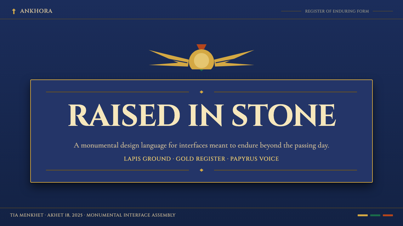
For presentation slides, Egyptian Pharaonic works most powerfully on cover and section divider pages where the full compositional logic can be deployed. A cover benefits from strict bilateral symmetry: a central title in lapidary, high-contrast display type, flanked by symmetrical ornamental registers or thin horizontal rules, set against a ground of midnight blue or near-black with gold used sparingly for the most important words or a central emblem. Content slides should simplify the register principle to a practical level — a strong horizontal rule dividing the header zone from the body zone, body text in a clear secondary typeface with generous line spacing, and data elements treated as contained objects within ruled borders. Full Pharaonic density on every content slide risks overwhelming the information hierarchy.在演示文稿中,埃及法老风格在封面与分节页上最为有力,因为这些地方可以部署完整的构图逻辑。封面适合严格的左右对称:以石刻感、高对比度展示字体呈现的居中标题,两侧以对称装饰带或细水平线框定,铺设于午夜蓝或近黑的底面上,黄金仅用于最重要的文字或中央徽章。内容页应将叙事带原则简化至实用层级——将标题区与正文区分隔的强水平线、使用清晰辅助字体并保持充裕行距的正文、以及在规整边框内作为受限对象处理的数据元素。在每张内容幻灯片上施加完整的法老式繁密,有压倒信息层级的风险。
For web interfaces and dashboards, the style suits applications that need to communicate institutional authority and precision — financial platforms, analytics tools, archival systems, or premium tier experiences. The approach: a very dark ground approaching black, a header and navigation zone treated as a distinct register with a fine gold dividing line, card components with explicit ruled borders rather than soft shadows, and gold accents used exclusively for primary calls to action and critical status indicators. Typography should rely on strong contrasts between a monumental display face and a functional, highly legible body face. Avoid applying the full density of ornament to interactive states — reserve the visual richness for structural chrome, not per-element decoration.对于网页界面与仪表板,这一风格适合需要传达机构权威与精确感的应用——金融平台、分析工具、档案系统,或高级会员体验。方法如下:接近纯黑的极深底色,以细金色分隔线区分标题与导航区,使用明确边框而非软阴影的卡片组件,黄金点缀仅用于主要行动号召与关键状态指示。排版应依赖纪念性展示字体与功能性、高可读性正文字体之间的强烈对比。避免将完整的装饰密度应用于交互状态——将视觉丰富性保留给结构性装饰层,而非每个元素的点缀。
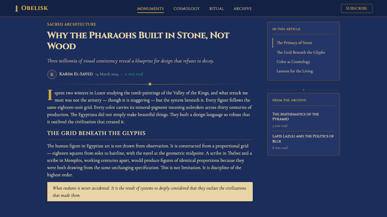
For editorial and marketing work, the style supports a specific register of brand voice: commanding, culturally referential, and unhurried. A feature layout in this style might use a full-bleed dark ground with a single centered headline in wide-tracked gold capitals, body text in cream at a comfortable measure, and visual punctuation provided by thin horizontal rules rather than imagery. Marketing pieces work well structured as triptych or symmetric multi-panel compositions — the pharaonic register principle translates naturally into alternating content bands. The style is appropriate for luxury goods, cultural institutions, financial services, and any context where the association with enduring value serves the brand argument.对于编辑与营销内容,这一风格支持特定的品牌声调:权威、具有文化指涉性、不疾不徐。这种风格的专题版面可以是:满幅深色底面上,一行宽字距金色大写标题居中,奶油色正文保持舒适行宽,以细水平线而非图像作为视觉标点。营销内容以三联画或对称多面板构图组织效果最好——法老式叙事带原则自然地转化为交替的内容带。这种风格适合奢侈品、文化机构、金融服务,以及任何与经久价值的关联服务于品牌论点的场合。
A common mistake when applying Egyptian Pharaonic design is treating it as a texture theme — adding gold color, a few hieroglyphic decorative elements, and a dark background without internalizing the compositional logic. The result reads as costume rather than system. The second common mistake is using gold at too high a proportion of the total surface area; gold reads as authoritative when it is selective and reads as gaudy when it is abundant. A third pitfall is failing to commit to the flatness principle — introducing soft shadows, gradients, or glows in a misguided attempt to modernize the style actually destroys its essential character. The style's power comes from its absolute refusal of atmospheric illusion, not despite it.应用埃及法老设计时最常见的错误是将其作为纹理主题处理——添加金色、几个象形文字装饰元素和深色背景,却没有内化构图逻辑。结果读来是戏服而非系统。第二个常见错误是以过高比例使用黄金;黄金在选择性使用时读来是权威,在大量使用时读来是俗丽。第三个陷阱是未能坚持平面性原则——引入柔和阴影、渐变或光晕,以误导性的方式试图使风格现代化,实际上摧毁了其本质特征。这种风格的力量恰恰来自于它对大气幻觉的绝对拒绝,而非尽管如此仍然有力。
See the Egyptian Pharaonic design system查看 Egyptian Pharaonic 完整设计系统
Egyptian Pharaonic — FAQEgyptian Pharaonic · 常见问题
Is Egyptian Pharaonic design the same as Egyptian Revival style?埃及法老风格与埃及复兴风格是同一回事吗?
They are related but distinct. Egyptian Pharaonic refers to the original visual language of ancient Egypt itself — hieroglyphs, registers, bilateral symmetry, mineral palette, the profile figure convention — developed over three millennia in the Nile Valley. Egyptian Revival is the nineteenth and early twentieth century European and American response to that language: architects, decorators, and graphic designers appropriating Egyptian motifs and incorporating them into the Neoclassical and Art Deco movements. Egyptian Revival tends to be lighter, more eclectic, and filtered through a European sensibility; authentic Pharaonic design is denser, more structurally committed, and more demanding of the compositional logic that makes the style coherent rather than merely decorative.两者相关但不同。埃及法老风格指的是古埃及本身的原始视觉语言——象形文字、叙事带、左右对称、矿物色板、侧面人像惯例——在尼罗河谷历经三千年发展而成。埃及复兴风格则是十九世纪至二十世纪初欧美对这套语言的回应:建筑师、装饰师与平面设计师挪用埃及母题,将其融入新古典主义与装饰艺术运动。埃及复兴风格往往更轻盈、更折中,并经由欧洲感性过滤;真实的法老风格更繁密、结构承诺更强,对使风格连贯而非仅具装饰性的构图逻辑要求更高。
Can Egyptian Pharaonic design work on a light background?埃及法老风格能用在浅色背景上吗?
It can, but requires careful handling. The canonical Pharaonic ground is dark — lapis blue, near-black, or deep terracotta — because the mineral pigments of ancient Egyptian painting were luminous against a dark stone or plaster surface, and because the gold accents read with far greater authority against darkness than against light. A light-ground variant is possible, and some contexts call for it: a cream or warm white ground with black outline forms and gold used for select highlights can work well for editorial applications where heavy dark grounds would be oppressive over long reading sessions. However, a light-ground Pharaonic layout loses the quality of solemnity that is the style's primary asset, and risks reading as merely decorative rather than architecturally organized.可以,但需要谨慎处理。标准法老底色是深色的——青金石蓝、近黑或深赭红——因为古埃及绘画的矿物颜料在深色石材或灰泥表面上是发光的,而且金色点缀在黑暗背景上呈现的权威感远超浅色背景。浅色底面的变体是可能的,某些情境也有此需求:奶油色或暖白底面搭配黑色轮廓形与选择性金色高光,在沉重深色底面会令长时间阅读感到压抑的编辑应用中可以奏效。然而,浅色底面的法老布局会失去庄重感——这正是这一风格的主要资产——并有被解读为单纯装饰而非建筑性组织的风险。
How does Egyptian Pharaonic handle photography and realistic imagery?埃及法老风格如何处理摄影与写实图像?
With deliberate tension. The ancient Egyptian visual system had no photography and no interest in naturalistic representation — everything was schematic and symbolic. Contemporary applications face a choice: avoid photography entirely and commit to the flat illustrated world of the style, or use photography in a way that subjects it to the style's visual logic rather than allowing it to import photographic naturalism. The second path works when photography is heavily treated — extreme contrast with no midtones, duotoned with one palette color as the highlight and near-black as the shadow, cropped aggressively into a geometric shape and contained within a ruled border. Soft-lit, full-color, naturalistic photography placed against a Pharaonic layout is a compositional contradiction; it will read as an error rather than an intentional juxtaposition.带有刻意张力地处理。古埃及视觉系统没有摄影,也对写实表现毫无兴趣——一切都是图示化与象征性的。当代应用面临一个选择:完全回避摄影,全然委身于这一风格的平涂图示世界;或以使摄影服从于风格视觉逻辑的方式使用它,而非让其引入摄影写实主义。第二条路径在摄影被重度处理时有效——极端对比度(无中间调)、以一种色板色作为高光、以近黑作为阴影进行双色调处理、激进裁剪为几何形状并置于边框内。将柔光、全彩、写实的摄影放置在法老布局中是一种构图矛盾;它会被读作错误而非刻意的并置。
What kinds of brands or products suit this style, and where does it fail?哪些品牌或产品适合这种风格?在哪些地方它会失效?
Egyptian Pharaonic works best when the brand or product genuinely benefits from associations with permanence, authority, institutional depth, and cultural significance. Strong fits include luxury goods, financial institutions, cultural organizations, premium software platforms, archival or research tools, and any context where the user needs to trust that the thing in front of them has been built to last. It struggles in contexts that require warmth, approachability, playfulness, or organic texture — children's products, food and wellness brands, community platforms, and any experience where the user's emotional state needs to be lightened rather than awed. The style's severity can also read as exclusionary if deployed carelessly in consumer contexts; its power comes with a cost in accessibility of tone.埃及法老风格在品牌或产品真正受益于与永恒、权威、机构深度与文化意涵相关联时效果最好。高度契合的场景包括奢侈品、金融机构、文化组织、高级软件平台、档案或研究工具,以及任何用户需要相信眼前事物是为持久而建的场合。它在需要温暖感、亲和力、趣味性或有机质感的场景中力不从心——儿童产品、食品与健康品牌、社群平台,以及任何需要减轻而非敬畏用户情绪状态的体验。如果在消费场景中部署不当,这种风格的严肃性也可能被读作排他性;其力量伴随着语调可及性的代价。
How do I avoid making Egyptian Pharaonic look like a Halloween or kitsch aesthetic?如何避免埃及法老风格看起来像万圣节或俗丽的装饰?
The kitsch reading happens when designers use only the thematic surface of the style — mummy imagery, cartouche clip-art, scarab icons, pyramid silhouettes used as mere decoration — without committing to the compositional logic that makes ancient Egyptian design coherent. The solution is to work structurally: establish the bilateral symmetry and register structure first, apply the color palette second, and introduce specific Pharaonic motifs last and sparingly, only where they are structural rather than decorative. Gold must be reserved rather than abundant. Typography must be monumental rather than novelty. The compositional grid must be as rigorous as the ornament. When the structure is right, even a single Egyptian-derived motif reads as a meaningful citation of an ancient tradition rather than a costume element.俗丽的解读发生在设计师只使用了风格的主题表面——木乃伊图像、装饰性王名框剪贴画、圣甲虫图标、作为单纯装饰物的金字塔剪影——而没有承诺使古埃及设计连贯的构图逻辑时。解决方案是从结构入手:先建立左右对称与叙事带结构,再应用色板,最后才是节制地引入特定法老母题——仅在它们是结构性而非装饰性的地方。黄金必须是保留性的而非丰盛的。排版必须是纪念碑式的而非新奇体式的。构图网格必须与装饰一样严格。当结构正确时,即使是单个埃及衍生母题也会被读作对古老传统有意义的引用,而非戏服元素。
Related design styles相关设计风格
 Khmer Aksar MulCeremony held in gold. Moul type glows on black lacquer with panel-by-panel g…金箔即庄严。Moul 圆体在黑漆上发光,经折金线缓缓分屏。
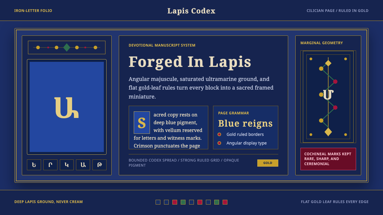 Armenian ErkatʿagirDevotional lapis reigns. Gold rules and angular serif glyphs frame a sacred g…虔敬青金石主宰:金色线框与棱角字形围合神圣网格。
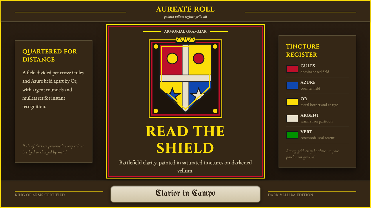 Heraldic BlazonCommand at a glance. Gules, Azure and Or quartering lock into a gilt shield o…一眼即权威。深羊皮纸上,红蓝金分割锁成镀金盾徽。
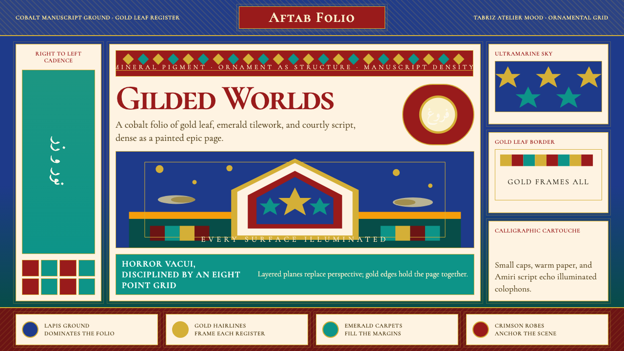 Persian Miniature (Shahnameh era)Manuscript luxury turns maximal. Cobalt ground, gold borders, and Cormorant S…手稿奢华走向极繁。钴蓝底、金边框与Cormorant SC填满每寸。
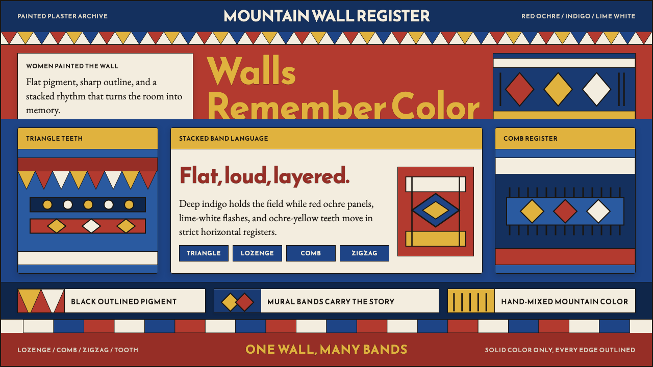 Saudi Asiri Qatt Wall PaintingPainted walls speak loudly. Indigo bands, red triangles, ochre teeth, black o…墙面大声说话。靛蓝横带、赤红三角、赭黄齿纹由黑线收束。
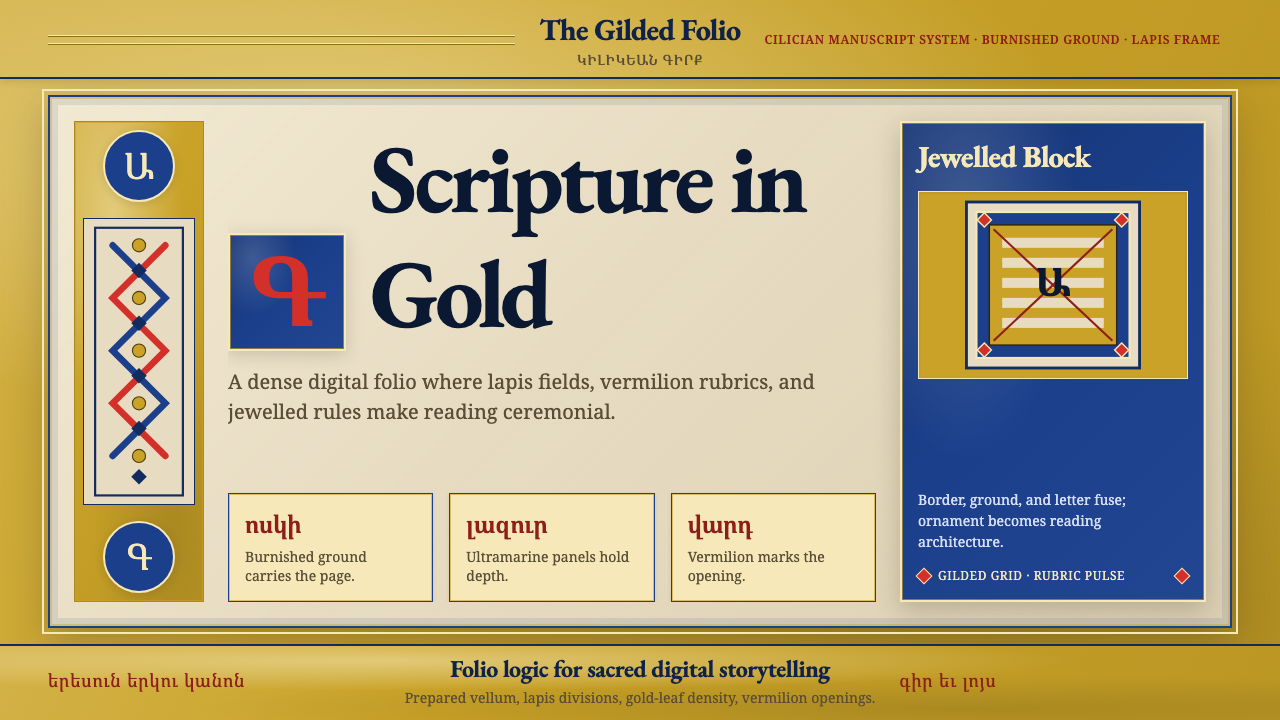 Armenian Illuminated ManuscriptGilded maximalism. Burnished gold, lapis frames, and vermilion initials build…鎏金极繁。金箔底、青金框与朱砂首字构成密实书页。