What is Heraldic Blazon?
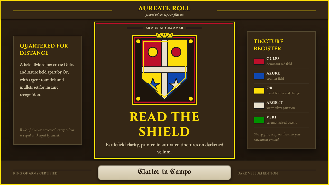
Heraldic Blazon is the battlefield-born grammar of the coat of arms — bold color, rigid geometry, and a rule of contrast so strict it was designed to be read at a gallop.
Heraldic Blazon in brief
Heraldic Blazon is the formal visual system of the coat of arms, as recorded by heralds in armorial rolls across Western Europe before 1900. It renders a shield as a set of hard-edged geometric partitions — divided, quartered, or banded — each panel charged with a stylized creature or object, most famously a rampant lion or a displayed eagle, drawn not from life but from a fixed, symbolic vocabulary passed down through generations of painters.
The system exists to solve a single practical problem: identification at a distance, under stress, often in the middle of a battle. A knight's face was hidden behind a helm; his shield was not. Every visual choice in blazon — palette, shapes, placement of charges — serves legibility first and decoration a distant second.
The authentic reference point is a hand-painted armorial roll on aged, darkened vellum, its pigments still saturated but its ground gone amber and brown with age — never a clean printed page on white stock. Above the shield sits a helm and crest; below it curls a ribbon-like motto scroll. The whole assembly reads as an emblem of record, formally registered and legally defended, not a piece of decorative art made for its own sake.
Where does Heraldic Blazon come from?
Heraldry emerged in the twelfth century out of a wholly practical need. As plate and mail armor grew heavier and helms enclosed the entire face, commanders on a crowded battlefield lost the ability to recognize allies by feature or voice. Painting a distinctive, high-contrast design onto a shield solved the problem cheaply and permanently: a device could be recognized from horseback, at speed, across a field of similarly armored men. What began as a battlefield expedient hardened, within a few generations, into a formal system of hereditary identity.
As arms passed from father to son and became bound up with land, marriage, and lineage, disputes over who had the right to bear which design became a matter for royal authority to settle. Kings of Arms — officers of the crown tasked with regulating and recording armorial bearings — emerged across England, France, and the German lands to adjudicate these claims and maintain official rolls. A coat of arms was no longer just a battlefield marker; it was legal property, granted, inherited, and occasionally revoked.
This regulatory function is what gave heraldry its famous rigidity. Heralds needed a system precise enough to describe any design in words alone, so a written grant of arms could be reproduced accurately by any painter, in any country, without ambiguity. The result was blazon: a compact technical language — part French, part Latin, part English — for specifying tinctures, divisions, and charges in a standardized order. The rule of tincture (metal must not touch metal, colour must not touch colour) grew out of this same demand for legibility; it is as much an engineering constraint as an aesthetic one.
Heraldry's golden period ran through the medieval and early-modern centuries, spreading from the battlefield into church windows, tombs, seals, and civic architecture, before its practical function faded with the decline of plate armor and the rise of the nation-state. What survived was the visual language itself, still governed today by official Colleges of Arms and — in the internet era — cataloged by projects like WappenWiki, which digitized centuries of armorial rolls into searchable, standardized records.
What defines the Heraldic Blazon look?
Tincture (Color)
The palette is a fixed, closed set: two metals (a bright gold-yellow and a silvery white) and a handful of saturated colours — a deep true red, a strong blue, black, green, and purple, used far more rarely. Every tincture is applied as flat, unmodulated color with no shading, no gradient, no attempt at naturalistic light. A red field is uniformly red from edge to edge; a charge is one solid tincture, occasionally outlined, never rendered with volume.
The Rule of Tincture
The single governing law of the entire system: metal must never sit directly on metal, and colour must never sit directly on colour. A gold charge needs a colour field beneath it (or vice versa); two colours never touch without a metal boundary between them. This is not a stylistic preference — it is the mechanism that guarantees contrast survives at a distance, in bad light, and even in black-and-white reproduction. Any design that violates the rule loses the crisp, high-contrast quality that makes blazon instantly legible.
Partition and Division
The shield's field is organized through a small vocabulary of geometric divisions — split down the middle, quartered into four, cut diagonally, banded into stripes. These partitions are drawn as hard, ruled lines with no softening; they exist to carve the field into distinct color zones so combined arms (from marriage, inheritance, or alliance) read as clearly delineated units rather than a blended composite.
Charges and Creatures
Figures placed on the field — charges — are drawn from a fixed repertoire: rampant lions rearing on hind legs, eagles displayed with wings fully spread, crosses, stars, fleurs-de-lis. These are never naturalistic renderings; they are stylized to the point of being near-abstract symbols, posed in a limited set of canonical attitudes (rampant, passant, displayed) that were themselves standardized so a blazon description could specify a pose in a single word.
Helm, Crest, and Mantling
A full achievement of arms is more than the shield alone. Above it sits a helm, its style and orientation itself a coded signal of rank; above the helm, a crest — a three-dimensional emblem, often a repeated or related motif from the shield. Flowing from the helm is mantling, a stylized drape rendered as sharp, angular folds rather than soft cloth, echoing the field's tinctures. These elements frame the shield the way a title frames a document — formal, hierarchical, never casual.
The Motto Scroll
Below or around the full achievement, a ribbon-like scroll curls and folds to carry a short Latin or vernacular motto. The scroll itself is drawn with the same hard-edged, faceted logic as the mantling — it twists in space but never softens into naturalistic cloth. The motto text sits within it in a restrained, formal lettering style, treated as an inscription rather than a display headline.
Ground and Patina
Authentic blazon is never presented on clean white paper. Its native surface is aged vellum or parchment, darkened to amber, umber, or deep brown by centuries of handling and light exposure. This aged ground sits behind the shield's saturated tinctures, creating a deliberate contrast between a bright, legible emblem and a dark, weathered field — a visual signal of age, authority, and archival permanence rather than fresh production.

Who shaped Heraldic Blazon?
Kings of Arms were the senior officers of a royal heraldic authority, tasked with granting new coats of arms, adjudicating disputes over who had the right to bear a given design, and maintaining the official rolls that recorded a kingdom's armorial bearings. Their rulings gave heraldry legal force — a coat of arms was property, and a King of Arms was effectively its registrar and its court. This administrative rigor is why blazon developed such an exacting vocabulary: a ruling had to be reproducible, generations later, by a herald who had never seen the original grant.
The anonymous craftsmen who physically painted coats of arms into armorial rolls were responsible for translating a written blazon into a consistent visual object, shield after shield, page after page. Their discipline is what gives authentic heraldic art its characteristic flatness and precision — working from a written formula rather than personal interpretation subordinated individual style to the fidelity of the record. Their surviving rolls are the primary visual evidence for what the style is understood to look like today.
Blazon scribes were the specialists who authored the written descriptions — the blazon text itself — that legally defined a coat of arms independent of any single painted rendering. Their compact technical language, part French, part Latin, part English, allowed an armorial grant to be specified once in words and then reproduced accurately by any painter in any country. This separation of description from image is the conceptual foundation of the entire system: the words are the authority, and the painting is merely one faithful execution of them.
In the digital era, the volunteer editors and archivists behind projects like WappenWiki have taken on a modernized version of the herald's original task: cataloging centuries of scattered armorial rolls into a single, cross-referenced, searchable standard. Their work has made it possible to verify and compare historical blazons at a scale no single medieval herald could have managed, effectively continuing the same standardization impulse that created the rule of tincture in the first place, now applied to a global digital archive.
How do you use Heraldic Blazon today?
Heraldic Blazon transfers well into contemporary design precisely because its logic was never decorative to begin with — it was built to be read instantly, under pressure, at a distance. Applying it well means preserving that legibility-first discipline: hard partitions, closed palette, disciplined contrast between metal and colour tinctures, rather than simply scattering shield motifs and gold trim across a layout.
For presentation slides, the style is strongest on cover pages and section dividers rather than dense content slides. A cover works well built as a shield-like partition — the deck title occupying one bold color zone, a supporting line in the contrasting metal tone, with the aged, dark vellum ground standing in for a background rather than plain white. Content and data slides should borrow the rule of tincture as an information-hierarchy device: each data category gets one tincture, arranged so no two adjacent categories share a color family, which keeps a dense chart legible the same way the original system kept a shield legible on a battlefield.
For web UI, the style suits dashboards and pricing pages that want to project authority and permanence rather than lightness. On a dashboard, treat each panel almost like a quartered shield — clean geometric division, one dominant tincture per section, with the gold metal tone reserved for the single most important number or call to action. On a pricing page, the rule of tincture becomes a genuinely useful constraint: it forces each tier to read as visually distinct without extra ornament, and the dark, aged ground gives even a software pricing table an unexpected sense of weight.
For editorial and marketing work, the style's natural home is anything invoking legacy, craft, or institutional authority — heritage brand storytelling, awards and certificates, formal announcements, luxury or bespoke goods. A marketing page can use the shield-and-partition logic as a literal layout device: a hero section divided into hard geometric zones the way a field is quartered, each zone holding one idea in one tincture, with a motto-scroll-like ribbon reserved for a single memorable tagline rather than for body copy.
The most common mistake is treating heraldry as a costume rather than a system — pasting a decorative shield icon or a faux-medieval script font onto an otherwise ordinary layout and calling it done. That approach borrows the imagery but discards the discipline (the closed palette, the rule of tincture, the hard partitions) that makes the style legible and authoritative. A second common error is rendering the ground as clean bright white instead of aged, dark vellum — without that darkened field, the saturated tinctures lose the contrast that gives the system its visual authority.
Heraldic Blazon — FAQ
What is the difference between heraldry and blazon?
Heraldry is the overall system — the institution of coats of arms, the offices that regulate them, and the culture around hereditary emblems. Blazon specifically refers to the technical written language used to describe a coat of arms unambiguously: a compact formula, part French and part English, that specifies the field's tincture, its partitions, and its charges in a fixed order. Heraldry is the whole discipline; blazon is closer to its formal spec sheet — which is why the style described here is named after that precise, rule-bound language rather than the broader institution.
Why can metal and colour never touch in heraldic design?
The rule exists to guarantee contrast under difficult viewing conditions — across a battlefield, in poor light, or reproduced in monochrome. Two saturated colours placed directly against each other (say, red against blue) can read as roughly equal in tonal value at a distance, blurring the boundary between them. A metal placed between two colours, or a colour between two metals, guarantees a consistent value jump at every boundary. It is best understood as a built-in legibility rule centuries before that term existed — it exists to keep shapes readable, not to look attractive.
Can heraldic design work with a light or white background instead of the aged vellum look?
It is technically possible but works against the style's core signal. The dark, weathered ground is what separates authentic blazon from a generic 'medieval fantasy' aesthetic — it communicates age, formal registration, and archival permanence. On a clean white background the saturated tinctures still read clearly, but the piece loses the institutional gravity that makes heraldic design feel authoritative rather than merely colorful. If a lighter treatment is required, a deep cream or muted parchment tone preserves more of that gravity than pure white.
How should heraldic charges like lions and eagles be drawn in a modern application?
They should stay stylized rather than naturalistic. Authentic charges are drawn as flat, symbolic silhouettes in a small set of canonical poses (a lion rearing on its hind legs, an eagle with wings fully spread), rendered in a single solid tincture with at most a simple outline — never with fur texture, feather detail, or realistic shading. A modern application should treat a charge as the original system did: a recognizable icon meant to be identified instantly, not an illustration meant to be admired up close.
Is Heraldic Blazon suitable for every kind of brand, or does it have limits?
It is a strong fit for brands that want to project heritage, formality, or institutional trust — universities, law firms, private members' clubs, heritage goods, premium financial products. It struggles for brands that need to feel casual or contemporary, since its entire visual vocabulary (rigid geometric partition, closed historical palette, formal motto scrolls) actively signals tradition and gravity. Used on a product that wants to feel light or approachable, the same elements that create authority elsewhere will instead read as stiff.
Related design styles
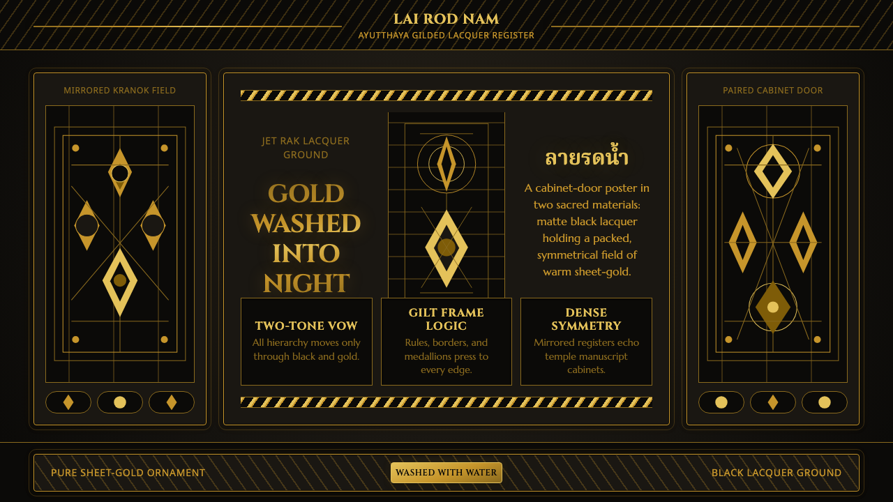 Thai Lai Rod Nam Gold-Black LacquerGold leaves no silence. Warm leaf gradients and mirrored borders pack a black…
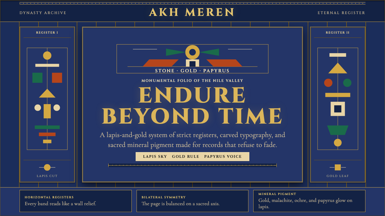 Egyptian PharaonicRegal permanence. Gold rules and Cinzel capitals carve papyrus registers into…
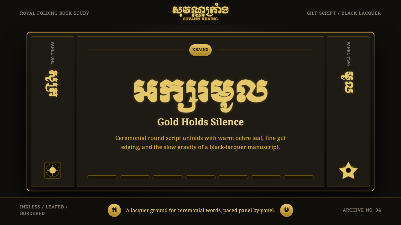 Khmer Aksar MulCeremony held in gold. Moul type glows on black lacquer with panel-by-panel g…
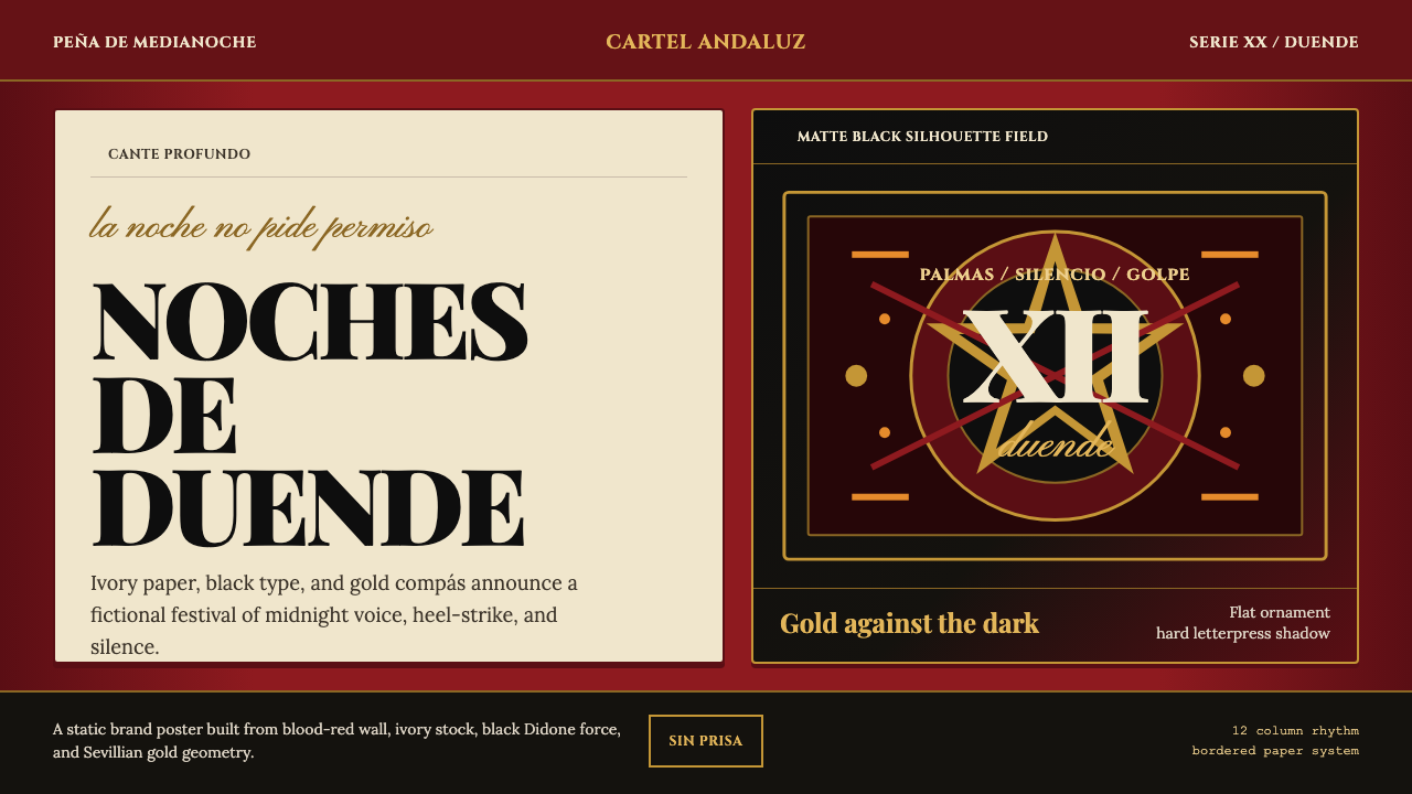 Spanish Flamenco PosterPassion printed as ritual. Blood red, ivory paper, Didone type, and flat gold…
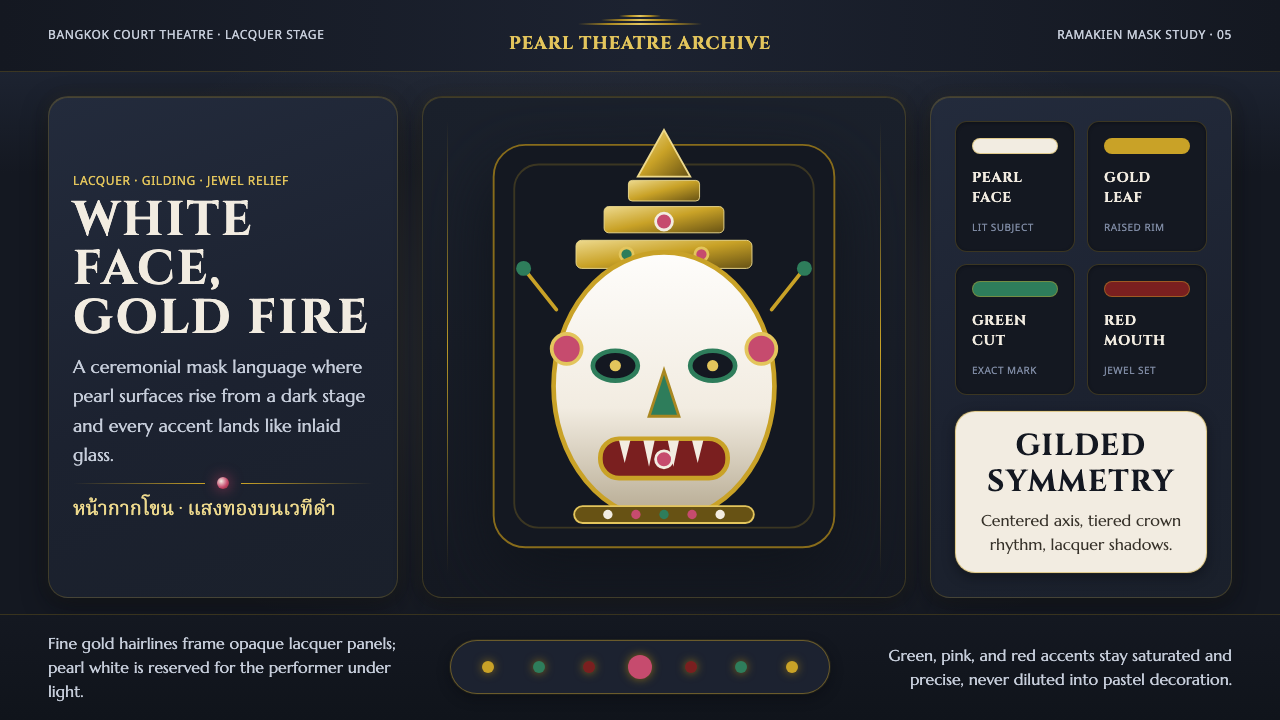 Thai Khon Hanuman MaskThai court theatre, digitized. A pearl-white mask and gilt coronet rise from…
 Book of Kells Celtic (800)Sacred and precise. Vellum cream, lapis, vermilion, and gold knotwork.