What is Liturgical Advent Violet?
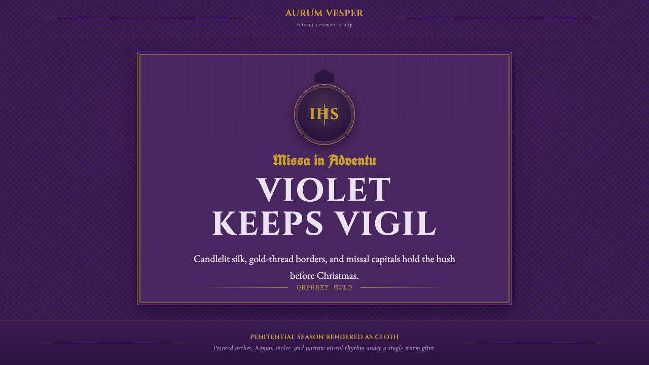
Liturgical Advent Violet takes its palette and posture from the penitential vestments of the Roman rite — deep violet silk lit by candle flame, framed by pointed Gothic arches, and inscribed with gold-thread symbols meant to be read from a distance in near-darkness.
Liturgical Advent Violet in brief
Liturgical Advent Violet is a sacred-textile aesthetic drawn from the vestments worn by Roman Catholic clergy during Advent and Lent — the Church's two penitential seasons. Where most liturgical color coding is loud (the gold of Christmas, the red of Pentecost and martyrdom, the white of Easter), violet is the color of waiting: subdued, interior, and disciplined. The visual system built around it inherits that same character. It is dark-ground by default, built on muted candlelit purples rather than bright ones, and organized around symbols and letterforms that were designed centuries ago to be legible by torchlight across the length of a nave, not read up close on a screen.
The style pairs three distinct historical vocabularies that rarely appear together outside ecclesiastical contexts. Roman capitals — the monumental letterforms carved into imperial architecture and later revived for inscriptions and title pages — carry the authority and permanence of the Church's institutional voice. Blackletter, the dense Gothic script used in missals and psalters since the high medieval period, carries its liturgical and devotional weight. And embroidered gold-thread emblems — the orphrey cross, the IHS monogram — carry the material craft of vestment-making itself, where ornament was applied by hand in metal thread onto woven silk. None of these elements is decorative in the idle sense; each was developed to serve a specific function in worship, and the style borrows that seriousness along with the look.
Because the source material is vestment and manuscript rather than printed matter, the aesthetic reads as textile and candlelit rather than paper and daylit. Surfaces imply the sheen and drape of damask silk rather than the flatness of card stock; light behaves like flame catching metal thread rather than an even studio wash. The overall effect is solemn without being funereal — the mood is anticipation held under discipline, which is precisely what Advent asks of its observers.
Where does Liturgical Advent Violet come from?
The use of violet as a penitential liturgical color predates any single documented origin point; by the time the Roman rite's color sequence was formally codified — a process that solidified across the medieval period and was affirmed in later centuries of Roman liturgical legislation — violet (sometimes described historically as a blue-black or dark purple rather than the brighter violet familiar today) was already established as the color of Advent and Lent, the two seasons of preparation and penance that bracket the Church's great feasts. The logic was chromatic and symbolic at once: violet sits at the somber end of the palette available to dyers and weavers, distinct from the triumphant white of Easter, the fire-red of Pentecost and martyr feasts, and the gold used for high solemnities. Wearing it signaled, to a congregation that could not read, exactly what kind of season the Church was in.
The vestments themselves — chasubles, stoles, dalmatics — were the product of a long European tradition of ecclesiastical textile craft, in which monastery and cathedral workshops, and later specialized lay vestment-makers, wove damask silk and applied orphrey: bands of embroidery, often gold thread on a contrasting ground, sewn onto the vestment to carry crosses, monograms, and figural scenes. This was slow, expensive handwork, and it concentrated the visual richness of the garment into embroidered bands rather than spreading pattern across the whole cloth — a design logic of restraint punctuated by concentrated ornament that the style still follows.
The typographic half of the aesthetic draws on two separate revivals the Church preserved and used side by side. Blackletter emerged in northern Europe in the twelfth and thirteenth centuries as book-hands grew denser and more angular, becoming the standard script of missals and psalters for centuries — its heavy, interlocking strokes were partly a practical response to the cost of parchment and partly an aesthetic of gravity suited to sacred text. Roman capitals, by contrast, descend from imperial Roman monumental inscriptions and were revived repeatedly in Western art whenever an institution wanted to borrow Rome's authority — the Church used them for title pages and dedications alongside its Gothic manuscript hand.
Gothic pointed-arch architecture, the fourth pillar of the style, entered the vocabulary because it was the architecture the vestments were worn inside of. The pointed arch and verticality of Gothic cathedral design, developed in France and spreading through Western Europe from the twelfth century onward, shaped the physical space in which these garments moved and their gold thread caught candlelight. The style borrows the arch as a framing device because, historically, the arch is where the vestment was seen.
What defines the Liturgical Advent Violet look?
Color
The palette is dark-ground and violet-led: muted, candlelit purples that lean toward blue-black in shadow and warm faintly where gold catches them, rather than the bright, saturated violet of contemporary branding. Gold appears only as accent — thread, hairline, or monogram — never as a field color. There is no bright white; where a light value is needed, it is closer to aged parchment or warm ivory than to paper white. The contrast is built to feel like candlelight against dark cloth, not like screen backlight against a bright canvas.
Typography
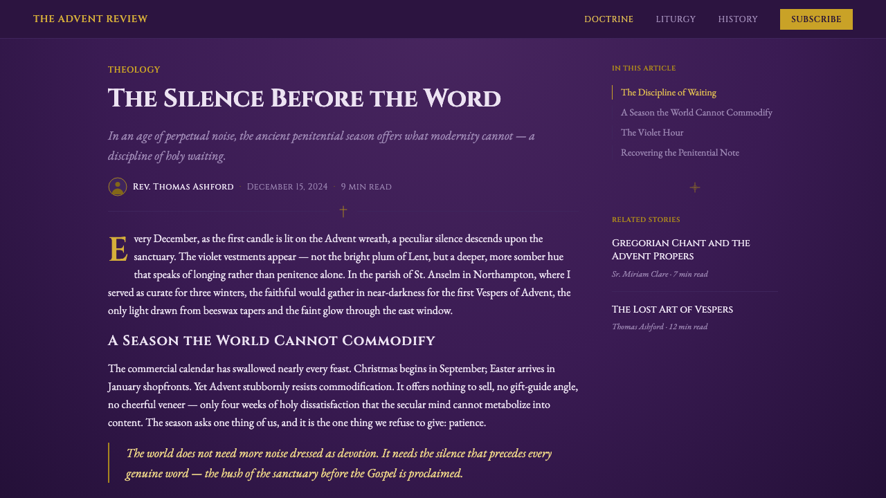
Two registers of letterform coexist deliberately rather than competing. Roman capital forms — upright, monumental, evenly weighted — carry titles, dedications, and anything meant to read as institutional or permanent. Blackletter forms — dense, angular, heavily fractured — carry headings that want to evoke the missal and the manuscript page directly. The two are never blended into a single word; each is assigned its own role, the way a medieval scribe would use one hand for a rubric and another for the body text. Illuminated drop-caps, oversized and set off from the running text, mark the opening of a major section the way they mark the opening of a chapter in an illuminated manuscript.
Symbol and Emblem
Ornament in this style is concentrated rather than distributed — it borrows the orphrey logic of embroidering a small number of dense, meaningful bands rather than covering a whole surface in pattern. The orphrey cross and the IHS monogram (the traditional monogram of Christ's name) are the two recurring emblems, always rendered in gold against the dark ground and always placed with the deliberateness of an inscription rather than scattered as texture. A page or screen built in this style typically carries one or two such emblems at points of emphasis, never many.
Framing and Arch
The pointed Gothic arch functions as the style's structural framing device, echoing the way cathedral architecture literally framed the vestments it describes. A panel, card, or section break rendered in this system favors a tall, narrow proportion with a pointed rather than rounded top, evoking a chapel niche or window rather than a rectangular card. Verticality is preferred over horizontal sprawl; the eye is meant to travel upward, the way it does inside a Gothic nave.
Surface and Texture
Where a surface must read as material rather than flat color, it should suggest woven damask silk — a subtle self-pattern with directional sheen, not a busy print. Light plays across it the way candle flame plays across silk in a dim nave: soft, warm highlights rather than hard reflective glints, and never the crisp specular highlight of a lacquered or glass surface. This is a texture of drape and weight, not of gloss.
Hierarchy and Solemnity
Emphasis is built through scale, isolation, and gold accent rather than through brightness or saturation. The most important element on a page is typically the largest, most isolated, and the one nearest to gold — never the one rendered in the loudest color, because there is no loud color in this palette to begin with. This produces a visual hierarchy that feels earned and ceremonial rather than promotional, closer to how importance is signaled inside a rite than how it is signaled on a retail banner.
Restraint of Ornament
Every ornamental element in an authentic reading of this style traces back to a functional liturgical object — a cross, a monogram, a border derived from an orphrey band, an arch derived from a chapel opening. Nothing is decorative in the sense of being invented purely to fill space. This gives the style a discipline that resembles Bauhaus's zero-ornament principle in structure, even though the two traditions could not be further apart in feeling: both refuse ornament that cannot justify itself, one through industrial rationalism, the other through sacred purpose.
Who shaped Liturgical Advent Violet?
The color sequence that assigns violet to Advent and Lent is not the invention of a single designer but the accumulated practice of the Roman rite, formalized over centuries of liturgical legislation into a system where color itself communicates the character of a season to a congregation. This anonymous, institutional authorship is itself notable: the style did not originate as a personal aesthetic statement but as a functional signaling system that happened to produce a coherent, enduring visual language.
The craftspeople — historically monastic workshops, later specialized lay ateliers — who wove the damask silk and applied gold-thread orphrey to chasubles and stoles are the direct material authors of this aesthetic. Their working logic, concentrating ornament into embroidered bands rather than spreading pattern across a whole garment, is the same restraint-punctuated-by-emphasis principle the style still follows today. Their craft was slow and expensive by necessity, which is part of why the resulting emblems read as considered rather than casual.
The anonymous scribes who developed and refined blackletter across the medieval period, and the illuminators who accompanied them with gold-leafed drop-caps and marginal decoration, established the manuscript register this style draws its typographic gravity from. Their dense, angular hand was shaped as much by the economics of parchment as by devotional intent, a practical origin that nonetheless produced one of the most recognizable text textures in Western visual history.
The classical tradition of carving capital letterforms into imperial architecture and inscriptions long predates the Church, but successive revivals — including the Church's own repeated use of Roman capitals for dedications and title pages — kept the form alive as a shorthand for institutional permanence. When this style deploys Roman capitals alongside blackletter, it is directly continuing that revival lineage rather than inventing a new pairing.
How do you use Liturgical Advent Violet today?
Liturgical Advent Violet is a high-solemnity, low-frequency style: it works best where a product genuinely wants to communicate gravity, tradition, or ceremony, and it should be reached for deliberately rather than applied as a generic 'dark elegant' skin. Applying it well means preserving the logic of concentrated ornament against a restrained dark ground, not simply recoloring an existing layout violet and adding a cross.
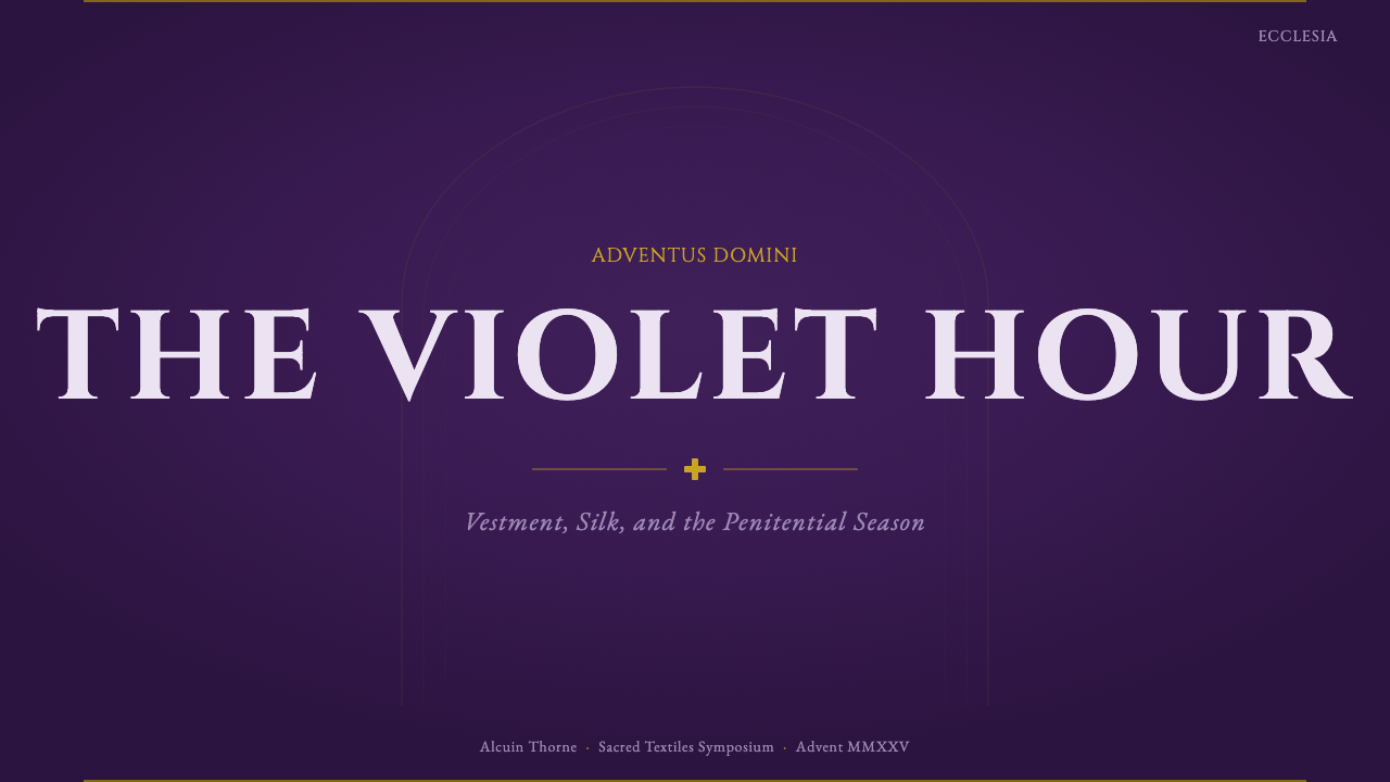
For presentation cover slides, the style produces an unusually strong opening moment: a tall, arch-framed title panel in candlelit violet, the title itself set in Roman capitals, with a single gold emblem placed at a point of emphasis rather than repeated as a pattern. Content and data slides should keep the dark violet ground and reserve gold strictly for the numbers or labels that matter most — a single highlighted data point in gold reads as significant precisely because nothing else on the slide competes with it. Bullet hierarchies work well when the top level borrows the weight of blackletter-inspired display type and lower levels drop to a plainer, quieter face, echoing the rubric-versus-body-text logic of a missal.
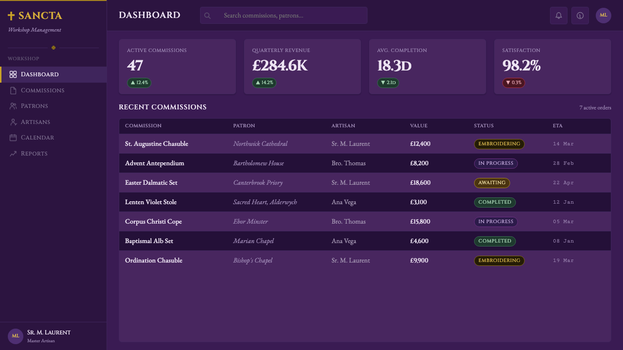
For web interfaces, the style is a strong match for dashboards and pricing pages that want to read as premium, established, or trustworthy rather than energetic — the dark violet ground with gold accents on key numbers or the recommended pricing tier produces exactly the kind of hierarchy-through-restraint the style is built for. Navigation and structural chrome should stay close to plain, legible letterforms; the Roman-capital and blackletter registers are for moments of emphasis (a plan name, a section header, a hero statement), not for body copy or interface labels, where they would quickly become illegible and exhausting.
For editorial and marketing work, the style suits long-form content that wants gravity — anniversary features, heritage storytelling, seasonal campaigns tied to winter or year-end reflection. A pointed-arch frame around a pull quote, an illuminated drop-cap opening a feature article, and a gold rule separating sections all read as considered rather than kitsch, provided they are used sparingly. Marketing pages built for a single seasonal campaign (a holiday launch, a year-in-review) can lean harder into the full vocabulary than an evergreen product page should.
The most common mistake is treating this as a generic 'dark mode plus purple' theme and scattering gold everywhere for decoration — once gold stops being reserved for genuinely significant emblems and numbers, the entire hierarchy the style depends on collapses, and the result reads as costume rather than craft. A second common mistake is mixing the Roman-capital and blackletter registers within the same word or sentence instead of assigning each its own distinct role; historically these two hands were never merged, and blending them undercuts the specific gravity each one carries on its own.
Liturgical Advent Violet — FAQ
Is Liturgical Advent Violet a religious theme, or a design style that can be used in secular contexts?
It is a design style derived from religious material, and it can be applied in secular contexts the same way Gothic architecture, illuminated manuscripts, or Baroque ornament are routinely drawn on in design without requiring the viewer or the brand to share the underlying faith. The style is best suited to contexts where its actual qualities — gravity, restraint, ceremony, a sense of tradition — are genuinely wanted, such as heritage branding, premium positioning, or winter and year-end campaigns. It is poorly suited to playful, youthful, or high-energy contexts, not because it is off-limits but because the mood would clash with the aesthetic's core character.
Why is gold used so sparingly instead of as a general accent color?
Because in the source material, gold thread was expensive hand-embroidery reserved for specific symbols — crosses, monograms — not a color applied broadly across the cloth. The style inherits that economy of use. If gold is scattered across many elements, none of them reads as special, and the hierarchy the style depends on collapses; used sparingly, on one emblem or one key number, it reads as significant precisely because everything else on the dark violet ground stays quiet around it.
How does this style differ from a generic 'royal purple' or 'gothic dark mode' theme?
A generic royal-purple theme typically uses a brighter, more saturated violet meant to signal luxury in a contemporary retail sense, and a generic gothic dark mode often reaches for horror-adjacent or heavy-metal visual cues. Liturgical Advent Violet is neither: its violet is muted and candlelit rather than saturated, its typography is drawn specifically from missals and Roman inscriptions rather than horror-film lettering, and its ornament is symbol-specific (cross, monogram) rather than generic gothic flourish (skulls, thorns, dripping textures). The mood is reverent anticipation, not luxury or menace.
Can this style be adapted for a light background instead of dark?
It is possible but works against the style's core logic. The dark ground is not an arbitrary choice — it directly represents candlelight against dark violet cloth in a dim nave, and it is what makes the gold accents read as luminous rather than merely colored. On a light ground, the same gold reads as flat mustard rather than glowing metal, and the Roman-capital and blackletter typography loses the sense of being lit from within the dark that gives it ceremonial weight. If a lighter variant is required, it is safer to lighten the violet itself slightly while keeping the overall value contrast dark-dominant, rather than inverting to a white or cream ground.
What kinds of products or brands should avoid this style?
Products aiming for speed, casualness, approachability, or youth energy will find the style actively works against them — its entire visual grammar is built to slow the eye down and induce a reverent, unhurried mood, which reads as heavy or pretentious in a context that wants to feel quick and friendly. It is also a poor fit for brands with no genuine connection to tradition, heritage, or ceremony, since the style's gravity only lands when the content underneath it can support the weight; applied to a lightweight consumer app or a casual social feature, the effect is closer to costume than craft.
Related design styles
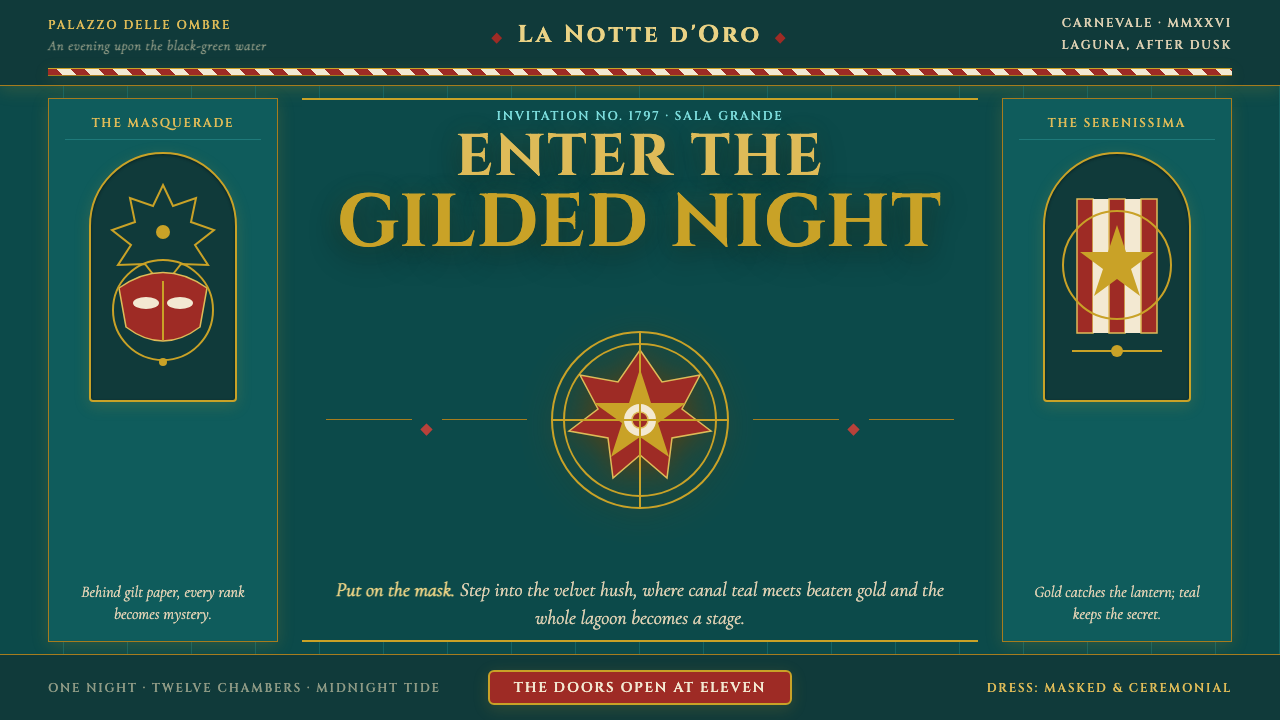 Venice Carnival GondolaThe lagoon becomes a stage. Canal teal, beaten gold and heraldic symmetry con…
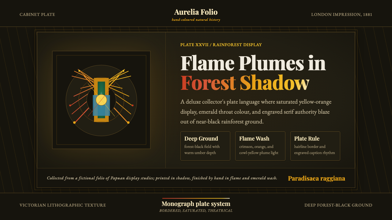 Bird of Paradise MonographTheatrical plate-book darkness. Flame plumes blaze from a bordered forest-bla…
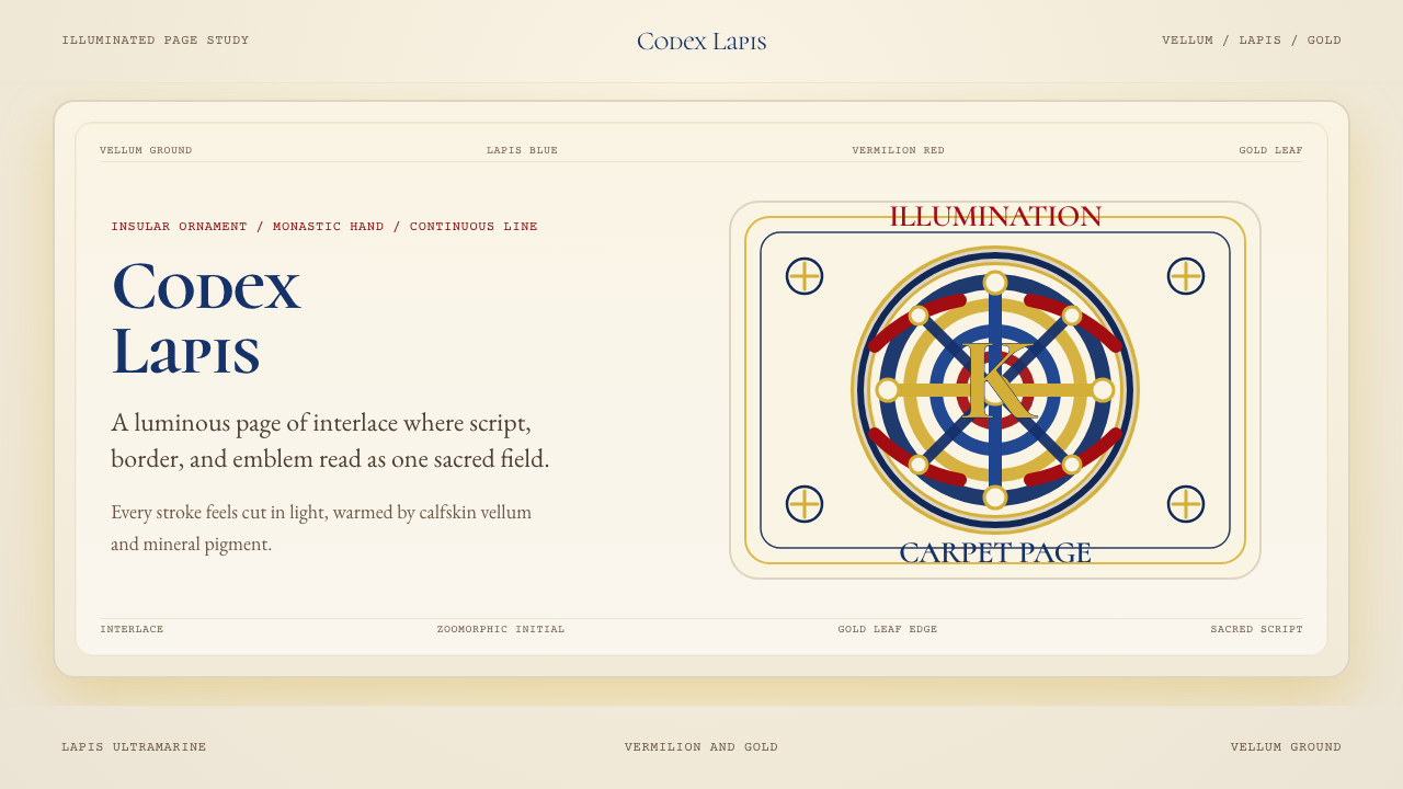 Book of Kells Celtic (800)Sacred and precise. Vellum cream, lapis, vermilion, and gold knotwork.
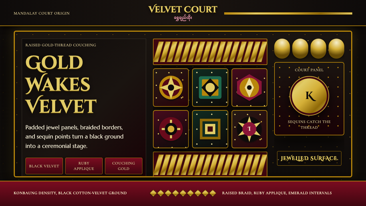 Burmese Kalaga TapestryVelvet becomes theater. Black ground, gold-thread borders, ruby and emerald p…
 Cellarius Celestial AtlasCelestial luxury on lapis. Gilt serif type, star fields, and concentric chart…
 Greek Vase Attic (500 BC)Archaeological severity. Jet-black glaze, terracotta bands, and meander borde…