What is Khmer Aksar Mul?
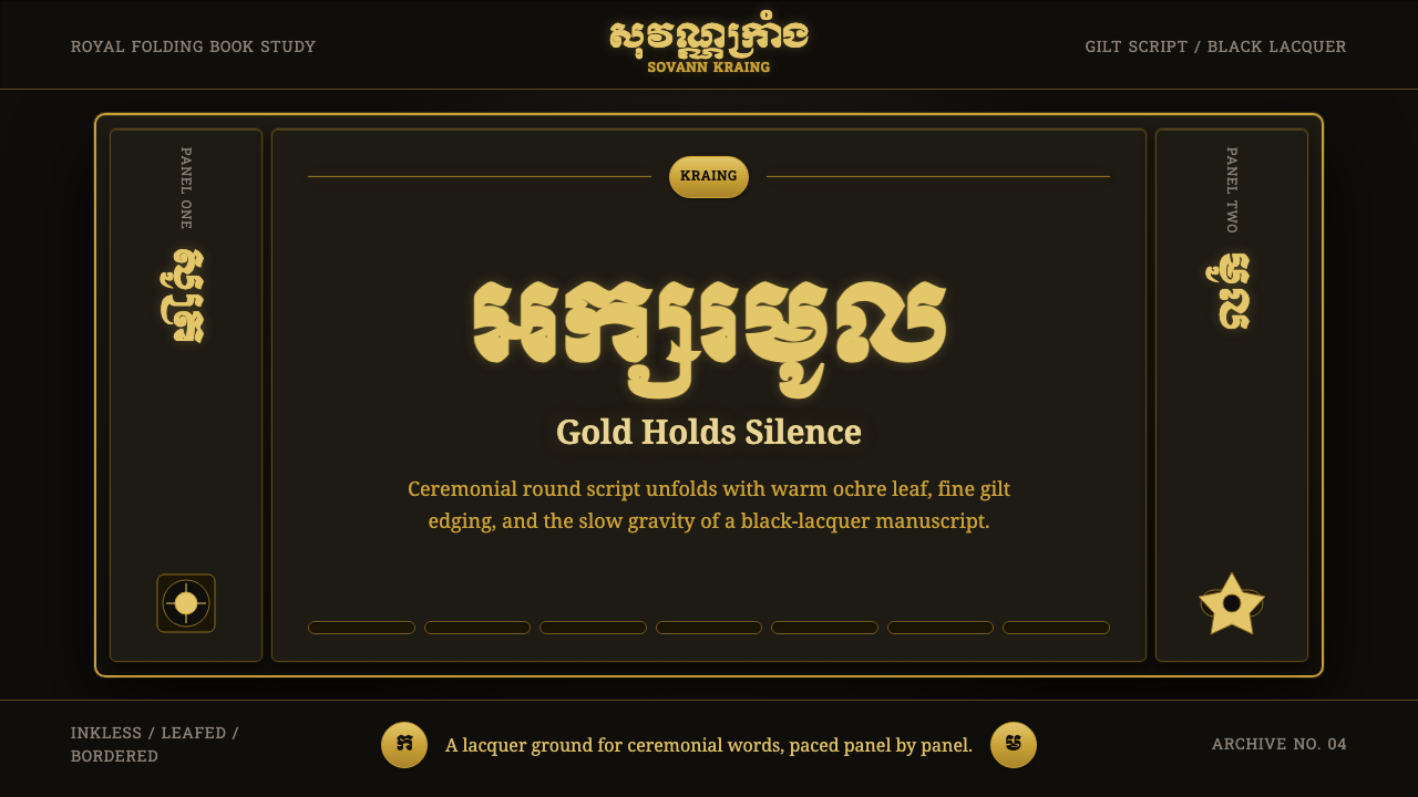
Khmer Aksar Mul renders the round, ceremonial script of Cambodian temple inscriptions in gold leaf on black lacquer — a system built for reverence, not for speed.
Khmer Aksar Mul in brief
Khmer Aksar Mul is a design system drawn from the Aksar Mul tradition — literally the "round script" or "head letters" — a heavier, more ornamental register of Khmer writing reserved historically for temple inscriptions, royal titles, and Buddhist scripture. Unlike the slanted, quick-moving everyday Khmer hand (Aksar Chrieng), Mul letterforms are upright, thick-stroked, and built from deliberate curves that were meant to be carved into stone or painted onto sacred objects, not dashed off in daily correspondence.
The visual world this system draws from is the Cambodian samut kraing — folding palm-leaf or paper manuscripts of the royal and monastic tradition — where warm gold characters sit on a ground of deep black lacquer. Every surface in the system inherits that pairing: near-black grounds, ochre-gold ink, and the fine gilt edging that traditionally bordered a manuscript panel. The result reads as ceremonial and interior rather than public-facing — closer to a reliquary than a signboard.
Structurally, the system is also shaped by how a samut kraing is read: not as a single continuous sheet but as a sequence of discrete panels, unfolded one at a time and framed by their own gilt borders. That panel-by-panel rhythm — pause, frame, reveal, pause again — becomes the system's approach to pacing and division, standing in for the grid logic that a more secular, faster style would use instead.
Where does Khmer Aksar Mul come from?
Aksar Mul belongs to a much older lineage than any single manuscript that survives. Khmer writing itself descends from Southern Brahmi script, brought to the region through centuries of contact with South Asian trade and religious networks, and adapted over time to record the Khmer language. Out of that lineage, a rounder, more monumental letterform tradition developed for uses that demanded permanence and status: royal edicts, temple dedications, and stone stelae recording the deeds of kings — the epigraphic record that still lines the galleries of Angkorian and post-Angkorian temple sites.
That epigraphic register survived long after the Angkorian empire's political center dissolved, carried forward by royal scribes and by the Buddhist monastic institutions that became the primary custodians of Khmer literacy in the centuries that followed. Sacred and administrative texts — chronicles, legal codes, Jataka tales, canonical scripture — were copied using Mul-style letterforms for the parts of a text meant to command the most attention: titles, invocations, the opening of a sutra. The everyday cursive hand handled the bulk of ordinary transcription; Mul was reserved for what the text itself treated as important.
The physical object most associated with this tradition is the samut kraing — an accordion-folded manuscript, its panels prepared with black lacquer and its script laid on afterward in gold leaf or gold paint, sometimes accompanied by red or other pigments for accents and illustration. Producing one of these was a specialized craft in its own right, distinct from the scribal work of composing the text: lacquer artisans prepared the ground, gilders applied the leaf, and only then did the ornamental script go down, panel by panel, under temple or palace patronage.
Because this tradition lived inside royal and monastic institutions rather than commercial print culture, it never went through the kind of standardization or mass mechanization that reshaped so many other scripts in the nineteenth and twentieth centuries. Aksar Mul survives today largely as a ceremonial register — used on temple signage, in ordination certificates, on royal decorations, and in the opening pages of religious texts — a living reminder that in the Khmer tradition, some words are still written differently because of what they are for.
What defines the Khmer Aksar Mul look?
Color
The palette is built on a single, deliberate contrast: warm ochre-gold against a ground so dark it reads as near-black. There is no competing hue system — no secondary or tertiary colors doing structural work. Gold is reserved for what deserves the eye's attention (titles, key characters, framing rules); the dark ground does nothing but recede and hold, the way lacquer holds a manuscript page steady under gilt script.
Typography
Letterforms take their character from Mul script itself: upright rather than slanted, thick and rounded rather than thin and angular, with elaborate stacked subscript consonants beneath the main line — a feature of Khmer script generally, but rendered here with the extra weight and formality the ceremonial register demands. Where Latin type must stand in, it should carry that same unhurried, deliberate weight rather than a brisk contemporary sans — nothing about this system's type should look dashed off.
Gilt Edging
Fine gold rules trace the border of every panel, echoing the gilt edging that traditionally framed a manuscript page. These lines are not decorative flourishes added after the fact — they mark where one ceremonial unit ends and the next begins, functioning as the system's primary structural device in place of a conventional grid or divider.
Panel Rhythm
The system paces content the way a samut kraing unfolds: panel by panel, each one a self-contained, gilt-bordered unit rather than a continuous scroll of information. Movement from one panel to the next should feel unhurried and deliberate — a reveal, not a scroll — echoing the physical act of unfolding an accordion manuscript one fold at a time.
Ground and Depth
The dark lacquer ground is treated as a physical surface with subtle depth and sheen, not a flat digital black. Light should seem to catch the gold characters the way it would catch actual gold leaf under lamplight — a soft glow rather than a hard digital glint — while the ground itself stays matte and receding.
Density and Restraint
Because Mul letterforms are already heavy and ornamental, the system compensates with generous surrounding space — a page dense with gilt script would tip into illegibility and lose the sense of reverence the register depends on. Openness around each panel is what allows the weight of the script itself to read as dignity rather than clutter.
Material Honesty
Every surface in the system should behave the way lacquer and gold leaf actually behave: gold is thin, applied, and catches light unevenly; lacquer is smooth, dark, and slightly reflective at a raking angle. Flat, uniform metallic fills or generic gradient golds break the illusion and read as costume rather than craft.
Who shaped Khmer Aksar Mul?
The scribes attached to royal courts and monastic scriptoria were the custodians of Aksar Mul, using it specifically for the passages a text wanted to elevate — titles, invocations, dedications — while everyday cursive script carried the rest. Their discipline is why the ceremonial register survived essentially unchanged for centuries: it was practiced continuously inside institutions built to preserve it, rather than left to drift the way informal handwriting does.
Producing a samut kraing required a craft entirely separate from writing: artisans who prepared the black lacquer ground, applied gold leaf or gold paint, and sometimes added accent pigments before the script itself was laid down. Their work is why the gold-on-black pairing at the heart of this system reads as a material fact rather than a color choice — it was, quite literally, built up in physical layers by specialists whose only job was the surface itself.
The stone inscriptions carved across Angkor and its successor sites established the monumental register from which Mul script descends, recording royal genealogies, temple endowments, and religious dedications in letterforms meant to outlast their carvers by centuries. That epigraphic ambition — writing built to endure rather than to be read quickly — is the deepest root of the system's unhurried, weighty character.
How do you use Khmer Aksar Mul today?
Khmer Aksar Mul is a niche-but-powerful choice, best suited to contexts that want to borrow the weight of ceremony rather than to any general-purpose interface. Applying it well means treating gold-on-black and panel-by-panel pacing as the load-bearing ideas, not simply darkening a background and adding a gold accent color.
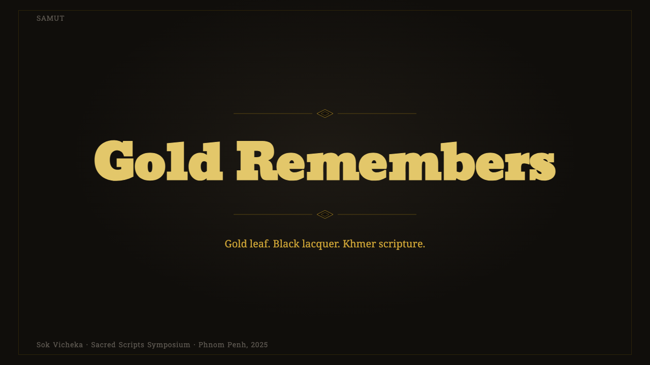
For presentation slides, the system is strongest on cover slides and section-opening slides, where a single title can be given the full ceremonial treatment: heavy gold lettering, generous dark space around it, and a fine gilt border framing the whole panel like a manuscript page. Content and data slides should preserve the one-panel-at-a-time feeling — resist the urge to cram multiple data points onto a single dense slide. A single large gold numeral on a dark ground, framed by a gilt rule, does more for this style than any conventional chart; when charts are unavoidable, keep them sparse and let gold mark only the values that matter most.
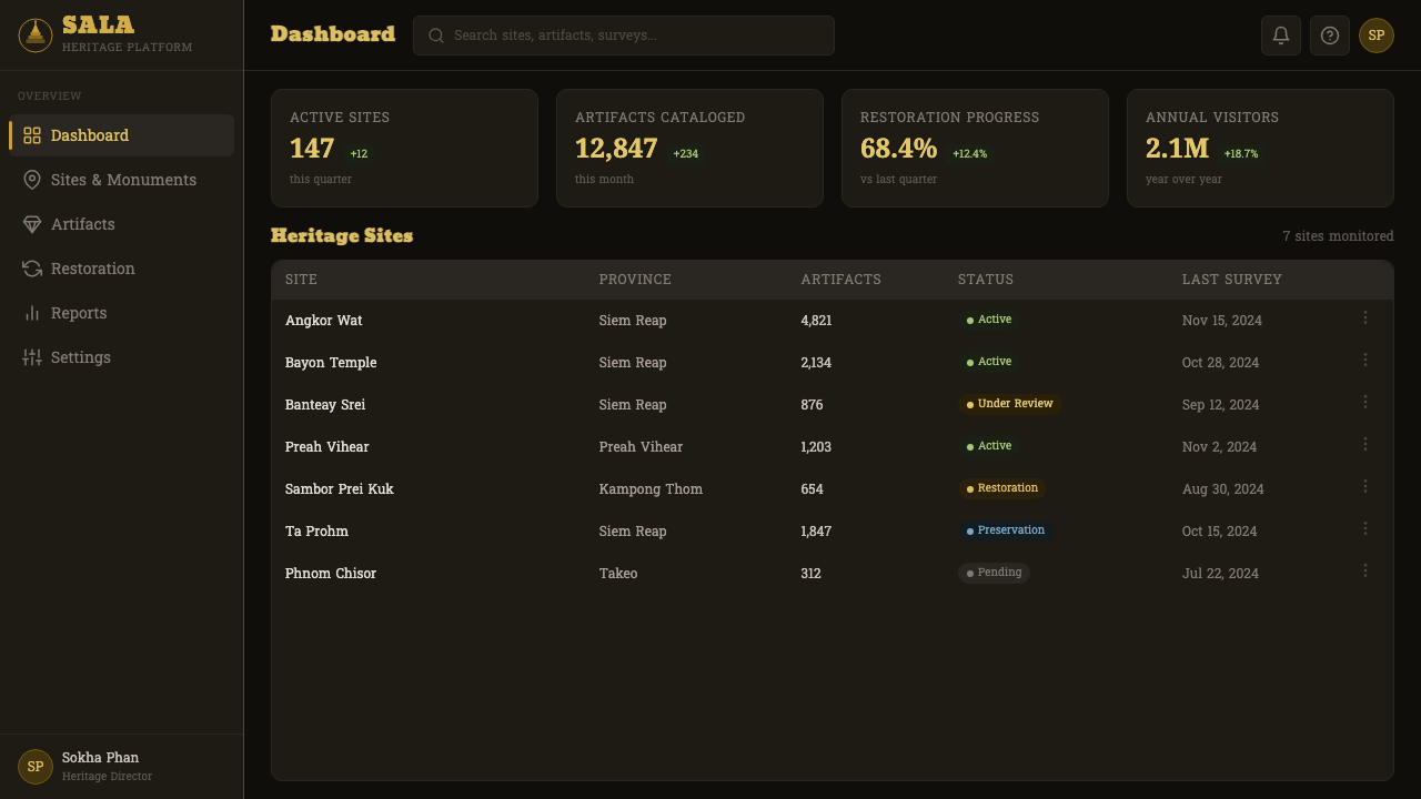
For web interfaces, this register is a poor fit for dense, high-frequency-interaction surfaces like standard dashboards, but it can work for premium or ceremonial framing moments within a product — an onboarding welcome screen, a certificate or achievement display, a pricing page for a top-tier plan positioned as prestige rather than utility. Keep interactive chrome (buttons, form fields, everyday navigation) visually quiet and let the gold-on-lacquer treatment appear only where the product wants to signal that something matters more than usual.
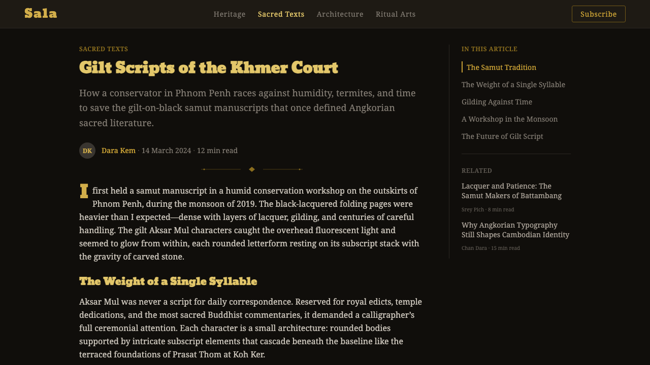
For editorial and marketing work, the style suits long-form storytelling about heritage, craft, or luxury — travel writing on Angkor and Cambodian temple culture, brand storytelling for a maker rooted in Southeast Asian craft traditions, or invitations and certificates that want to feel bestowed rather than issued. A marketing page built around this system should read like a sequence of unfolding panels rather than an infinite-scroll feed, with generous pauses between sections rather than a dense continuous composition.
A common mistake is applying only the surface colors — a dark background with some gold text — without the panel discipline, the gilt framing, or the restraint the register depends on. Gold-on-black alone reads as generic luxury branding; what makes this system specifically Khmer Aksar Mul is the ceremonial pacing, the manuscript-page framing, and letterforms that carry real weight rather than a thin decorative gold accent bolted onto an otherwise ordinary layout.
Khmer Aksar Mul — FAQ
Is Khmer Aksar Mul the same as everyday Khmer handwriting?
No. Khmer has multiple registers of script, and Aksar Mul ("round" or "head" letters) is the heavier, more upright, more ornamental one, historically reserved for temple inscriptions, royal titles, and the most important passages of Buddhist scripture. Everyday cursive Khmer writing (Aksar Chrieng) is slanted, quicker to write, and used for ordinary transcription and correspondence. This design system deliberately draws on the ceremonial register, not the everyday one — which is why it carries such a formal, unhurried character rather than a casual one.
Why gold on black specifically, rather than gold on a lighter ground?
The pairing comes directly from the samut kraing tradition, where manuscript panels were prepared with black lacquer before gold leaf or gold paint was applied for the script. Black lacquer was the durable, workable surface available to artisans producing royal and monastic manuscripts, and gold was reserved — literally and symbolically — for what the text wanted to elevate. Swapping in a lighter ground would lose that material history and read as a generic gold accent rather than a reference to an actual manuscript craft.
Can this system be used for anything beyond heritage or cultural content?
Yes, though it works best where the underlying idea — something being elevated, honored, or bestowed — genuinely applies. Certificates, awards, premium-tier product framing, and invitations all share that underlying logic even outside a Cambodian cultural context. It works less well as a general UI skin for everyday, high-frequency tasks, where the weight and slowness of the register will feel like friction rather than reverence.
What role do the stacked subscript consonants play visually?
Khmer script generally stacks certain consonant clusters vertically rather than writing them side by side, and Aksar Mul renders this feature with extra formality and weight. Visually, these stacks add vertical density and intricacy to individual words, which is part of why the system needs generous surrounding space — the letterforms themselves are already doing a great deal of visual work, and crowding them together would tip the balance from dignified into illegible.
How does this system differ from other gold-and-dark luxury design styles in the Curio library?
Other gold-on-dark systems might draw from Art Deco skyscraper ornament, European royal heraldry, or generic contemporary luxury branding — each with its own geometry and history. Khmer Aksar Mul is specifically anchored in Cambodian temple epigraphy and the samut kraing manuscript craft: its letterforms, its panel-by-panel pacing, and its gilt-edged framing all derive from that one specific tradition rather than a generalized idea of "gold means luxury." Applying it well means keeping that specificity intact rather than treating it as an interchangeable gold-and-black skin.
Related design styles
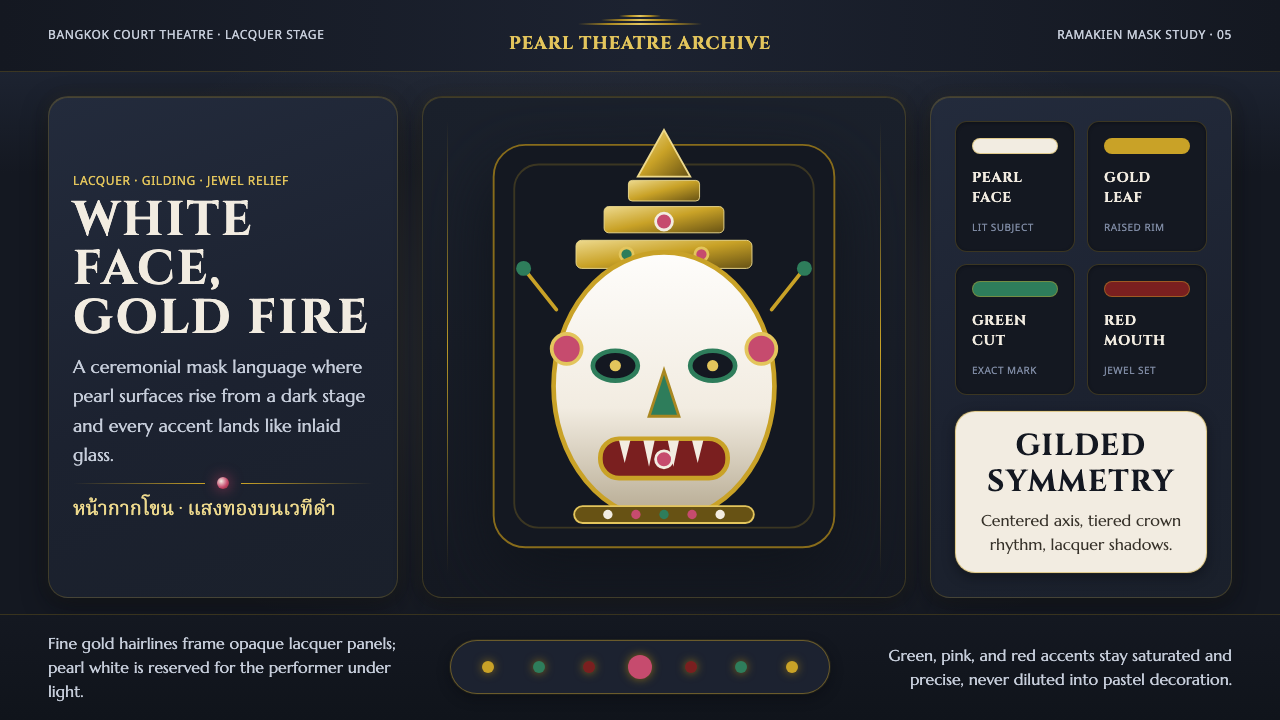 Thai Khon Hanuman MaskThai court theatre, digitized. A pearl-white mask and gilt coronet rise from…
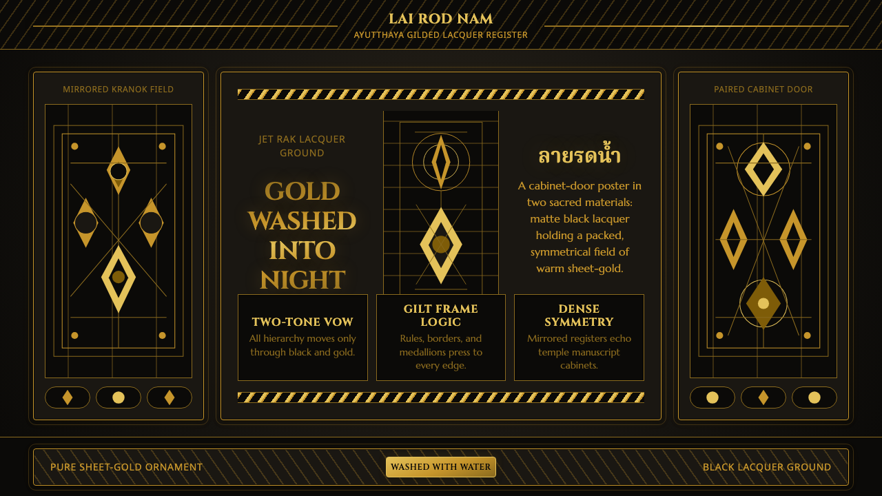 Thai Lai Rod Nam Gold-Black LacquerGold leaves no silence. Warm leaf gradients and mirrored borders pack a black…
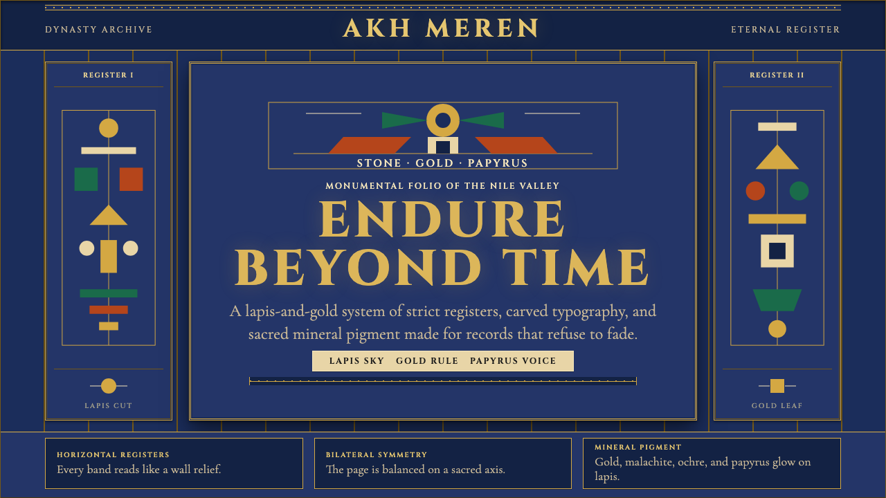 Egyptian PharaonicRegal permanence. Gold rules and Cinzel capitals carve papyrus registers into…
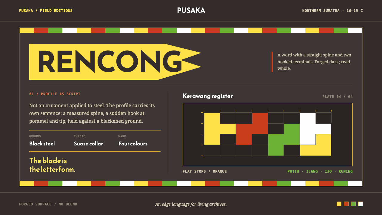 Acehnese Rencong MotifA blade that reads as a word. Flat kerawang red, white, green and yellow lock…
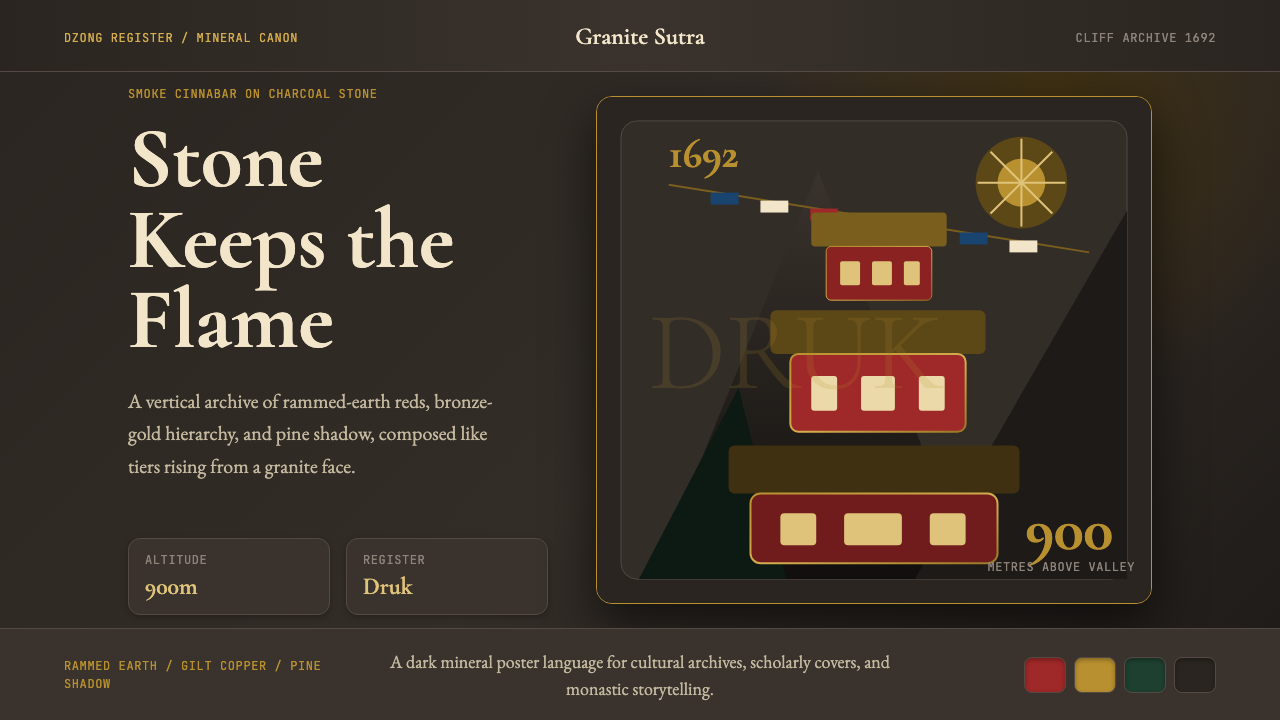 Bhutanese Tiger's Nest Cliff MonasterySacred altitude, mineral-dark. Cinnabar tiers and bronze rules climb charcoal…
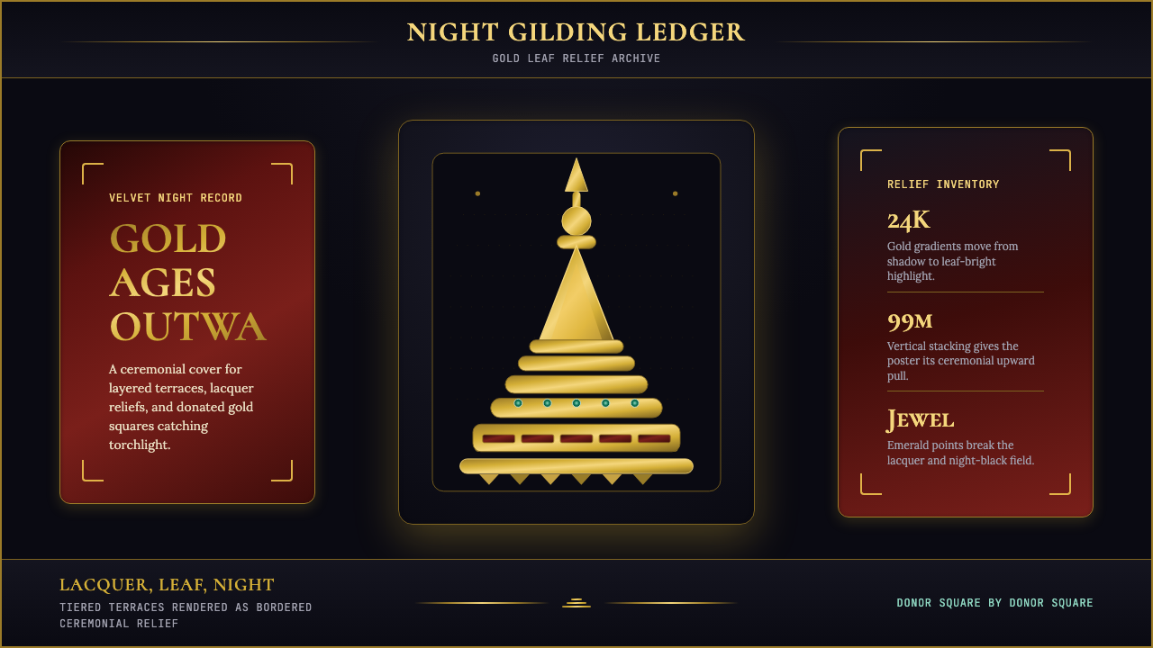 Burmese Shwedagon Stupa ReliefGold refuses restraint. Velvet black, teak-red lacquer, and tiered gradients…