What is Absinthe Art Nouveau Green (1875)?什么是 Absinthe Art Nouveau Green (1875)?
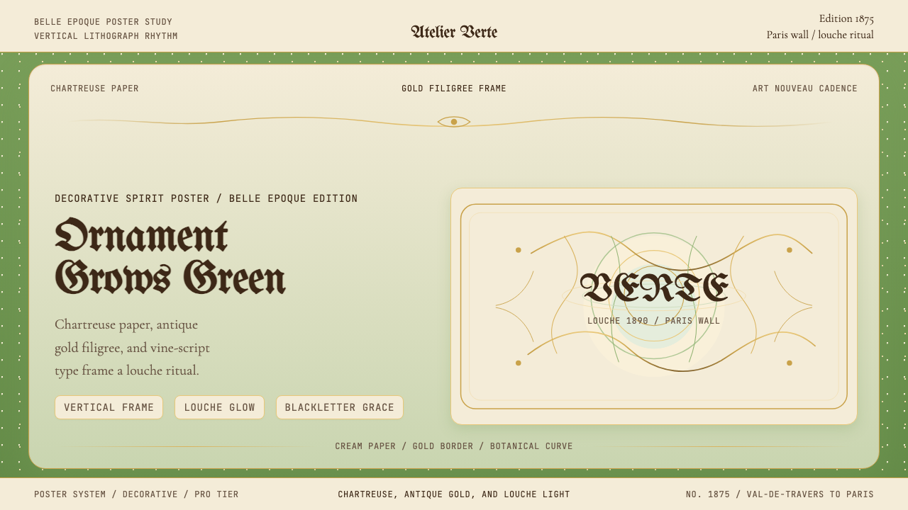
La Fée Verte's world in print — sinuous botanical curves, chartreuse vitality, and antique gold filigree turned every Belle Époque café poster into an intoxicating Art Nouveau altar.绿仙子的印刷世界——蜿蜒的植物曲线、充满生机的黄绿色与古金花丝,将美好年代每一张咖啡馆海报化为令人沉醉的新艺术祭坛。
Absinthe Art Nouveau Green (1875) in briefAbsinthe Art Nouveau Green (1875) 速览
Absinthe Art Nouveau Green is the visual language born from the commercial poster culture surrounding La Fée Verte — the Green Fairy — the legendary wormwood spirit that dominated European café culture from the 1870s through the first decade of the twentieth century. It is at once a period style and a living design system: chartreuse as a botanical, breathing color anchors every composition, while sinuous curves drawn from vine, tendril, and female silhouette replace straight lines and hard angles entirely.苦艾酒新艺术绿是围绕「绿仙子」——传奇苦艾烈酒——的商业海报文化所诞生的视觉语言。从1870年代直至二十世纪初,这款以苦艾草为基底的烈酒主宰了欧洲咖啡馆文化。它既是一种历史风格,也是一套鲜活的设计系统:黄绿色如植物般呼吸,锚定每一幅构图;取自藤蔓、卷须与女性轮廓的蜿蜒曲线,将直线与硬角彻底取而代之。
Where most historical styles organize space through geometry or grid, this system organizes through organic flow. Borders are not ruled lines but winding botanical frames; letterforms are not typeset characters but hand-drawn vines that bloom into serifs. The palette draws on the spirit itself — the luminous, slightly acidic green of absinthe in the glass, the warm amber of aged wood and anise, the creamy opacity of the louche as water meets the spirit, and the cold filigree gold of the distillery label.大多数历史风格通过几何或网格来组织空间,而这套系统以有机流动来组织。边框不是直线,而是蜿蜒的植物框架;字形不是排印字符,而是手绘藤蔓,在衬线处盛开成花。色板直接取材于烈酒本身——苦艾酒在杯中的那种明亮而略带酸涩的绿,陈年木材与茴香的暖琥珀色,苦艾酒遇水时乳白色的「浑浊」乳化,以及酒标上冷金花丝的光泽。
The resulting aesthetic is simultaneously opulent and herbaceous: richly detailed in ornament yet rooted in the natural world rather than the imperial or the ecclesiastical. It is a style that perfumes rather than commands, that curves rather than corners, that glows rather than blazes — making it one of the most distinctive and atmospheric design languages the nineteenth century produced.由此形成的美学既奢华又草本:装饰繁复而精细,却扎根于自然世界,而非帝国或教会的宏大叙事。这是一种熏香而非命令、弯曲而非转角、流光而非燃烧的风格——使它成为十九世纪所产生的最具辨识度、最富氛围感的设计语言之一。
See the Absinthe Art Nouveau Green (1875) design system查看 Absinthe Art Nouveau Green (1875) 完整设计系统
Where does Absinthe Art Nouveau Green (1875) come from?Absinthe Art Nouveau Green (1875) 从何而来?
Absinthe itself was distilled in the Val-de-Travers region of Switzerland from at least the 1790s, but the spirit's cultural ascendancy began when Pernod Fils established industrial-scale production in Pontarlier, France, around 1805. By mid-century, the five o'clock ritual of l'heure verte — the green hour — had become embedded in Parisian café life from the grands boulevards to the artists' studios of Montmartre. Soldiers returning from Algeria had developed a taste for absinthe issued as a quinine substitute, and a series of vine-killing phylloxera epidemics in the 1860s and 1870s devastated French wine production, pushing consumers toward the affordable, potent spirit. By 1900, France was consuming over thirty-six million liters annually.苦艾酒至少从1790年代起便在瑞士瓦尔德特拉韦尔地区酿制,但这款烈酒真正的文化崛起始于保乐父子公司约1805年在法国蓬塔利耶建立工业规模生产线之后。到世纪中叶,每日五点钟的「绿色时光」(l'heure verte)仪式已深深嵌入巴黎咖啡馆生活,从林荫大道到蒙马特的艺术家工作室皆然。从阿尔及利亚归来的士兵们已养成了对苦艾酒的嗜好——它曾被当作奎宁替代品发放;1860至1870年代一系列毁灭葡萄藤的根瘤蚜瘟疫重创了法国葡萄酒产业,将消费者推向这款廉价而烈性的烈酒。到1900年,法国的年消费量已超过三千六百万升。
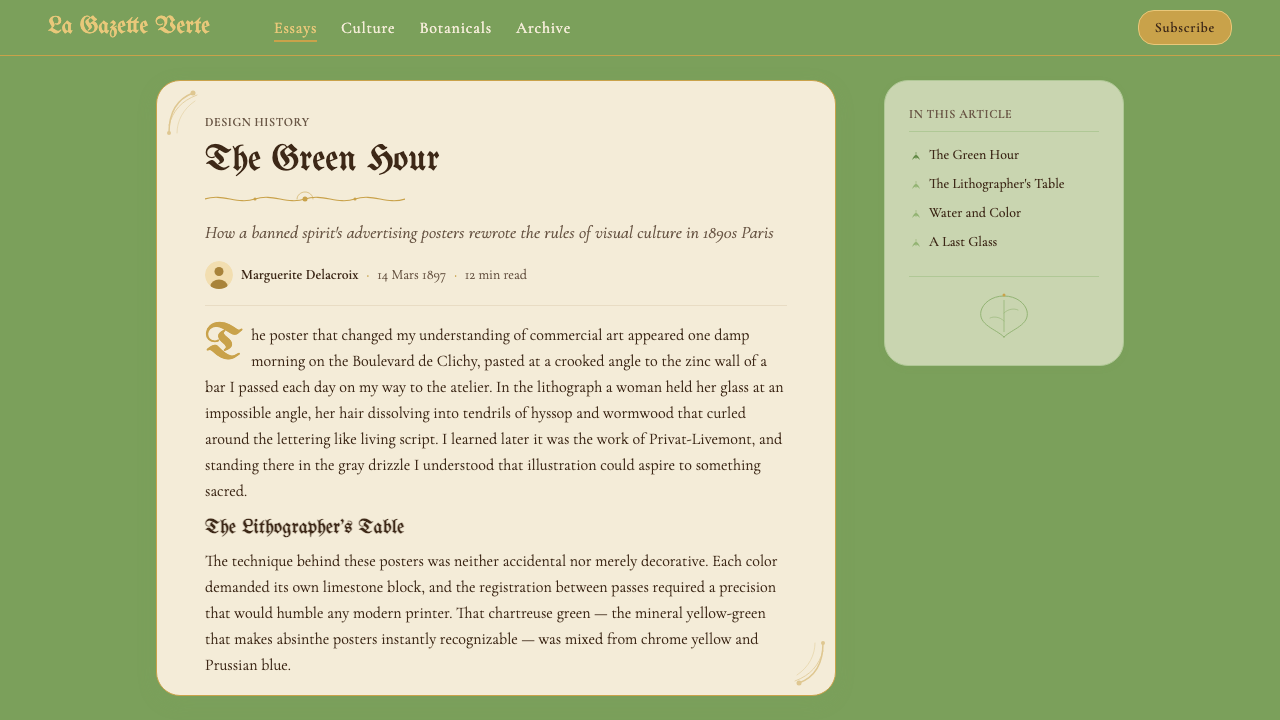
This mass market created an extraordinary demand for advertising imagery at precisely the moment when Art Nouveau — the style of the curved line, the organic form, the woman dissolved into flowering plant — was achieving its peak expression in Paris and Brussels. Jules Chéret had already established the large-format color lithographic poster as an art form in its own right during the 1870s and 1880s. When absinthe brands needed to advertise, they commissioned artists working in this fully developed visual idiom. Privat-Livemont, working in Brussels, produced some of the most celebrated absinthe posters of the era, including the 1896 Absinthe Robette, in which a nude female figure holds aloft a glowing glass of absinthe, her body dissolving into decorative smoke. Toulouse-Lautrec and Mucha contributed their own visions of the spirit to the visual culture of the Belle Époque.这一庞大市场在恰当的时机创造了对广告图像的非凡需求——彼时,新艺术运动正在巴黎与布鲁塞尔达到其表达的顶峰:曲线的风格、有机的形态、消融于盛放植物中的女性。儒勒·谢雷已在1870至80年代将大幅彩色石版海报确立为独立的艺术形式。当苦艾酒品牌需要广告时,他们委托正在这套成熟视觉语言中工作的艺术家。在布鲁塞尔创作的普里瓦-利弗蒙留下了那个时代最著名的苦艾酒海报,包括1896年的《苦艾酒罗贝特》——画中一位裸体女性高举发光的苦艾酒杯,身体消融于装饰性烟雾之中。图卢兹-劳特雷克与慕夏也为美好年代的视觉文化贡献了各自对这款烈酒的诠释。
The Art Nouveau movement that framed these images was itself a deliberate reaction against both academic historicism and the brutalizing visual effects of industrialization. Its practitioners — working in Paris, Brussels, Vienna, Barcelona, and Glasgow — drew on Japanese woodblock prints for their flat planes of color and elimination of perspective, on the Pre-Raphaelites for their idealized female figures, and on the Arts and Crafts movement for their insistence that applied arts deserved the same creative seriousness as fine art. The result was a style that could be applied to a building facade, a piece of jewelry, a typeface, or a poster with equal conviction.框定这些图像的新艺术运动本身,是对学院派历史主义和工业化粗暴视觉效果的蓄意反抗。其实践者——活跃于巴黎、布鲁塞尔、维也纳、巴塞罗那与格拉斯哥——从日本木刻版画中汲取平面色块与消除透视的手法,从拉斐尔前派汲取理想化的女性形象,从工艺美术运动汲取应用艺术应与纯艺术享有同等创作严肃性的坚持。结果是一种可以同等信念施用于建筑立面、珠宝首饰、字体或海报的风格。
Absinthe was banned across most of Europe and the United States between 1905 and 1915, as prohibitionist movements successfully linked the spirit to moral degeneracy and working-class disorder. The banning of absinthe coincided almost exactly with Art Nouveau's own decline, displaced by the geometric clarity of Art Deco in the 1910s and 1920s. The two disappearances — one legal, one aesthetic — left the Absinthe Art Nouveau visual system in a kind of suspended preservation, its imagery surviving in museum print collections and vintage poster archives, its vocabulary not widely revisited until late-twentieth-century revival interest in both absinthe (legalized in the European Union from 1988 and the United States from 2007) and fin-de-siècle visual culture brought it back to contemporary consciousness.苦艾酒在1905至1915年间陆续在欧洲大部分地区和美国被禁,禁酒运动成功地将这款烈酒与道德堕落和工人阶级失序联系在一起。苦艾酒的禁令与新艺术运动自身的衰退几乎同步发生——后者在1910至20年代被装饰艺术的几何清晰所取代。两者的消失——一是法律意义上的,一是美学意义上的——使苦艾酒新艺术视觉系统进入了一种悬置保存状态,其图像留存于博物馆版画馆藏与复古海报档案中。直到二十世纪末,苦艾酒(在欧盟于1988年、美国于2007年相继重新合法化)与世纪末视觉文化的复兴兴趣同时兴起,才将这套视觉词汇重新带回当代意识。
What defines the Absinthe Art Nouveau Green (1875) look?Absinthe Art Nouveau Green (1875) 的视觉特征是什么?
Color色彩
Chartreuse — the living, slightly acidic yellow-green of the distilled spirit — serves as the dominant ground color, carrying associations of botanical life, slight danger, and sensory pleasure simultaneously. Against this field, antique gold establishes the filigree framework of borders, rule lines, and label ornament. Creamy off-white provides mid-tonal breathing space, evoking both the louche opacity of water meeting absinthe and the aged paper of Belle Époque print. Deep forest green appears in shadow areas and secondary botanical elements, ensuring the palette reads as verdant without becoming monochromatic. Touches of warm amber and tawny coral appear in figural elements — skin, glass reflections, flower centers — keeping the composition from reading as purely cold or vegetable.黄绿色——蒸馏烈酒那种充满生机、略带酸涩的黄绿——作为主导底色,同时承载植物生命、轻微危险与感官愉悦三重联想。在这一底色之上,古金色建立起边框、线条与标签装饰的花丝框架。奶油色的米白提供中间调的呼吸空间,既唤起苦艾酒遇水时浑浊乳化的不透明感,也让人联想到美好年代印刷品的泛黄纸张。深森林绿出现在阴影区域和次要植物元素中,确保整体色调呈现葱郁感而不流于单色。人物元素中——皮肤、玻璃反光、花心——点缀着温暖的琥珀色与棕珊瑚色,使构图不至于显得纯粹冷冽或植物性。
Line and Curve线条与曲线
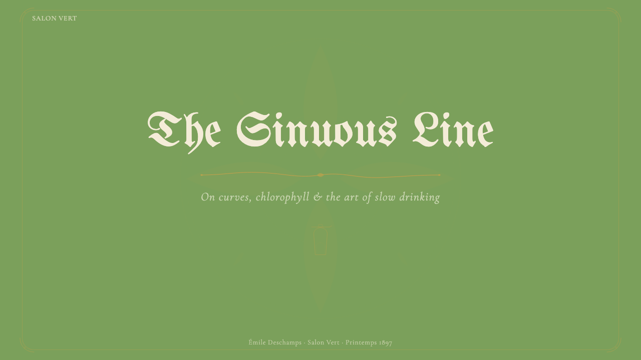
The defining mark of this system is the whiplash curve — a line that begins slowly, accelerates through a tight arc, and releases into a trailing tendril. Every structural element, from the border of a frame to the stem of a letterform, employs this organic tension rather than the straight line or right angle. Curves double back on themselves, interlock, and dissolve into botanical silhouettes. The overall effect is one of contained energy: the composition appears to be growing rather than laid out, breathing rather than constructed.这套系统最具定义性的标记是「鞭击曲线」——一条缓慢起始、在紧绷弧线中加速、最终释放为拖曳卷须的线。每一个结构元素,从边框到字形笔画,都采用这种有机张力,而非直线或直角。曲线折返自身、相互咬合,消融于植物剪影之中。整体效果是一种被收束的能量:构图看起来像是在生长而非被布置,像是在呼吸而非被建构。
Typography字体排印
Type in this system is inseparable from illustration. Letterforms are drawn rather than set: serifs bloom into leaves, ascenders spiral into tendrils, and baseline strokes curl at their terminals like unfurling ferns. Display lettering adopts a deliberately hand-crafted quality, with slight irregularities in stroke weight that emphasize the botanical, living character of the letterform. Where secondary text appears at smaller scale, it typically sits within a cartouche or botanical frame, making even body copy feel curated and precious rather than informational.这套系统中的文字与插图不可分割。字形是被描绘出来的,而非排印出来的:衬线绽放成叶片,上伸笔画螺旋成卷须,基线笔画在末端卷曲如舒展的蕨叶。展示性字体刻意呈现手工制作的质感,笔画粗细有轻微不规则变化,强调字形的植物性与生命感。较小尺寸的辅助文字通常置于涡旋纹饰或植物边框之内,使正文也显得精心策划而珍贵,而非纯粹信息性。
Composition and Format构图与版式
The canonical format is vertical — the tall poster ratio of 1890s Paris café walls, designed to be read at a distance while standing. Within this vertical field, the composition is organized around a central figural element, typically a female form rendered in sinuous profile, surrounded by botanical motifs that frame and echo her silhouette. Text occupies the upper and lower registers, separated from the central figure by ornamental rules or botanical dividers. Negative space is a rarity: every surface area is enriched by pattern, texture, or decorative detail, producing a density of visual information that rewards sustained attention.标准版式是竖幅——1890年代巴黎咖啡馆墙面上那种高比例海报,设计用于站立时远距阅读。在这个竖幅画面中,构图围绕中央人物元素组织,通常是以蜿蜒侧面描绘的女性形象,周围环绕着框定并呼应其轮廓的植物母题。文字占据上下两栏,通过装饰线或植物分隔元素与中央人物隔开。留白是稀缺之物:每一处表面都以图案、肌理或装饰细节加以丰富,产生的视觉信息密度能够回报持续的凝视。
Ornament and Filigree装饰与花丝
Ornament is not applied to this system — it is structural to it. Gold filigree borders serve the same function as the grid in a modernist layout: they establish the hierarchy of zones, distinguish foreground from background, and provide visual rhythm across the surface. The filigree draws from multiple traditions — Gothic tracery, Japanese decorative metalwork, the engraved label traditions of French wine and spirit bottles — and synthesizes them into a distinctly Belle Époque syntax. Secondary ornamental elements include botanical vignettes, medallion frames, stylized wormwood sprigs, and the absinthe glass itself treated as a decorative motif.装饰在这套系统中不是附加的——它是结构性的。金色花丝边框与现代主义版面中的网格具有相同功能:划定区域层级,区分前景与背景,并在整个表面提供视觉节奏。这些花丝汇聚了多种传统——哥特式花窗格、日本装饰金工、法国葡萄酒与烈酒瓶标的雕版传统——综合成一种distinctly美好年代的句法。次要装饰元素包括植物小插图、奖章式边框、程式化的苦艾草小枝,以及被当作装饰母题处理的苦艾酒杯本身。
Figuration人物形象
The female figure is central to this visual language — not as a portrait subject but as an idealized, partially abstracted form whose body merges with the botanical environment surrounding it. Hair becomes foliage, robes become petals, hands dissolve into tendrils. This figural treatment draws on the Art Nouveau conviction that the boundary between the human and the natural world was a matter of convention rather than fact, and that the role of art was to dissolve that convention. The figure is always shown in a state of reverie or sensory absorption — eyes half-closed, posture inclined — reinforcing the association between the spirit, altered perception, and aesthetic experience.女性形象是这套视觉语言的核心——不是作为肖像主题,而是作为一种理想化、部分抽象化的形态,其身体与周围的植物环境相互融合。头发变为叶丛,袍裾变为花瓣,双手消融于卷须之中。这种人物处理方式源自新艺术运动的信念:人与自然世界之间的边界不过是一种约定俗成,而艺术的职责正是消解这种约定。人物始终呈现出沉思或感官沉浸的状态——眼帘半垂,姿态前倾——强化了烈酒、改变的感知与审美体验之间的关联。
Texture and Surface肌理与表面
The system employs layered surface effects drawn from both lithographic printing technique and the material culture of the Belle Époque: the slightly rough tooth of quality poster paper, the transparency effects of oil-based lithographic inks layered in multiple passes, the embossed quality of gold label printing. In contemporary application, these translate to subtle paper-texture overlays, warm-tinted vignettes at composition edges, and the suggestion of ink transparency in areas where colors overlap. The result is a surface that feels material and hand-produced rather than digitally flat — a quality that distinguishes authentic application of this system from mere imitation.这套系统采用层叠的表面效果,来源于石版印刷技法与美好年代物质文化两个层面:优质海报纸轻微的纸纹齿感、多道叠印的油性石版墨透明效果、金色标签印刷的凹凸质感。在当代应用中,这些转化为微妙的纸张肌理叠加、构图边缘的暖色晕染,以及色彩叠压区域的墨水透明感暗示。结果是一种感觉有材料感和手工制作感的表面,而非数字化的平整——这种品质将这套系统的真实应用与单纯模仿区别开来。

See the Absinthe Art Nouveau Green (1875) design system查看 Absinthe Art Nouveau Green (1875) 完整设计系统
Who shaped Absinthe Art Nouveau Green (1875)?谁塑造了 Absinthe Art Nouveau Green (1875)?
The Belgian artist Henri Privat-Livemont is the most directly associated figure with the Absinthe Art Nouveau visual vocabulary. Working from his studio in Schaerbeek outside Brussels, he produced poster commissions for absinthe brands including Robette and Terminus that became defining examples of the genre. His 1896 Absinthe Robette — depicting a nude female figure dissolving into smoke above a glowing absinthe glass, surrounded by sinuous botanical ornament — is arguably the single most reproduced image of the Belle Époque absinthe poster tradition. Livemont's handling of the female figure, his color mastery in the chartreuse-to-gold range, and his integration of Art Nouveau organic line with commercial lithographic constraints make him the essential reference for this style.比利时艺术家亨利·普里瓦-利弗蒙是与苦艾酒新艺术视觉词汇最直接相关的人物。他在布鲁塞尔郊外沙尔贝克的工作室创作了罗贝特、特尔米努斯等苦艾酒品牌的海报委托作品,成为这一类型的定义性范例。他1896年的《苦艾酒罗贝特》——描绘一位裸体女性消融于发光苦艾酒杯上方的烟雾中,周围环绕蜿蜒植物装饰——可谓美好年代苦艾酒海报传统中被复制最广的单一图像。利弗蒙对女性形象的处理、他在黄绿到金色区间的色彩驾驭,以及他将新艺术有机线条与商业石版印刷约束融合的能力,使他成为这种风格不可或缺的参照。
Jules Chéret is the father of the modern poster and the technical and aesthetic foundation upon which the entire Belle Époque absinthe poster tradition rests. Working from his Paris print studio from the 1860s onward, Chéret pioneered the use of large-format three-color lithography for commercial advertising, developing the joyful, whirling female figure — the Chérette — that became the visual emblem of Parisian popular culture. Though Chéret's work predates the full flowering of Art Nouveau, his compositional approach, his mastery of lithographic color, and his establishment of the vertical poster as the dominant commercial format created the platform on which subsequent Art Nouveau absinthe imagery was built.儒勒·谢雷是现代海报之父,也是整个美好年代苦艾酒海报传统的技术与美学基础。从1860年代起在巴黎印刷工作室工作,谢雷率先将大幅三色石版印刷用于商业广告,发展出欢快旋转的女性形象——「谢雷女郎」——成为巴黎大众文化的视觉标志。尽管谢雷的作品早于新艺术运动的全面盛开,他的构图方式、对石版色彩的掌控,以及他将竖幅海报确立为主流商业版式,为后续新艺术苦艾酒图像的发展奠定了平台。
Though Mucha is most celebrated for his Sarah Bernhardt theatrical posters and his series of decorative panels on the seasons and arts, his visual language is inseparable from the absinthe advertising milieu of Belle Époque Paris. Mucha's characteristic devices — the mandorla halo of botanical ornament surrounding a central female figure, the integration of decorative lettering into the architectural frame of the composition, the translucent layering of warm and cool color — became so influential that they defined the international reception of Art Nouveau as a style. His approach demonstrates that the Absinthe Art Nouveau visual system is not a niche or eccentric variant but the mainstream expression of the movement at its height.尽管慕夏最为人称道的是为萨拉·伯恩哈特创作的剧场海报及其关于四季与艺术的装饰系列,他的视觉语言与美好年代巴黎的苦艾酒广告环境密不可分。慕夏的标志性手法——围绕中央女性人物的植物装饰杏仁形光环、装饰字体与构图建筑框架的融合、暖色与冷色的半透明叠层——影响力极为深远,以至于定义了国际社会对新艺术运动这一风格的整体接受方式。他的方式证明,苦艾酒新艺术视觉系统并非一种小众或偏僻的变体,而是这场运动在其巅峰时期的主流表达。
Toulouse-Lautrec occupies a distinctive position in the absinthe poster tradition: where Privat-Livemont and Mucha created idealized, decorative visions of the spirit, Lautrec brought an unflinching documentary eye to the café culture in which absinthe was consumed. His depictions of absinthe drinkers — most famously the 1887 painting A Montrouge: Rosa la Rouge, and his sketches of the habitués of the Moulin Rouge and surrounding cabarets — document the other side of the Green Fairy's world: the solitary drinker, the glazed stare, the absinthe glass as companion to isolation. His poster work for various Paris entertainments brought the same raw energy and psychological acuity to the commercial format, making him an essential foil to the more purely decorative Art Nouveau tradition.图卢兹-劳特雷克在苦艾酒海报传统中占据独特位置:普里瓦-利弗蒙与慕夏为这款烈酒创造了理想化、装饰性的愿景,劳特雷克则以毫不退缩的纪实眼光审视苦艾酒被消费其中的咖啡馆文化。他对苦艾酒饮者的描绘——最著名的是1887年的画作《蒙鲁日的罗莎:红发罗莎》,以及他对红磨坊与周边歌舞厅常客的素描——记录了绿仙子世界的另一面:独坐的饮者、茫然的凝视、作为孤独伴侣的苦艾酒杯。他为巴黎各种娱乐场所创作的海报将同样的原始能量与心理敏锐带入商业版式,使他成为纯粹装饰性新艺术传统不可或缺的对照。
The Swiss-born, Paris-based designer and illustrator Eugène Grasset was instrumental in theorizing and teaching Art Nouveau as a coherent design system rather than merely a decorative fashion. His 1905 treatise La Plante et ses applications ornementales systematically catalogued the transformation of botanical forms — leaves, stems, roots, flowers — into design elements, providing working designers with a grammar for the organic ornament that defines the Absinthe Art Nouveau visual world. Grasset's approach demonstrated that the botanical vocabulary of this style was not arbitrary fantasy but a disciplined language with its own syntactic rules, and his influence extended to a generation of commercial artists working across poster design, book illustration, and decorative arts.出生于瑞士、定居巴黎的设计师兼插画家欧仁·格拉塞在将新艺术运动理论化并作为一套连贯设计系统——而非单纯装饰时尚——加以传授方面发挥了重要作用。他1905年的论著《植物及其装饰应用》系统地梳理了植物形态——叶、茎、根、花——向设计元素的转化,为一代职业设计师提供了构成苦艾酒新艺术视觉世界的有机装饰语法。格拉塞的方法证明,这种风格的植物词汇并非任意的幻想,而是有其自身句法规则的严格语言。他的影响延伸至跨越海报设计、书籍插图与装饰艺术工作的整整一代商业艺术家。
How do you use Absinthe Art Nouveau Green (1875) today?今天怎么用 Absinthe Art Nouveau Green (1875)?
Absinthe Art Nouveau Green rewards designers who treat it as a complete atmospheric system rather than a palette borrowed from a vintage poster. Applying it well requires committing to the full vocabulary: the sinuous curve, the botanical ornament, the filigree framework, the layered surface texture, and the specific color relationships between chartreuse, antique gold, and creamy off-white. Used selectively — taking only the color, or only the typographic style — the system reads as costume rather than coherent design language.苦艾酒新艺术绿奖励那些将其视为完整氛围系统而非借自复古海报的色板的设计师。良好应用这套系统,需要对完整词汇的承诺:蜿蜒曲线、植物装饰、花丝框架、分层表面肌理,以及黄绿色、古金色与奶油米白之间的具体色彩关系。若有选择性地使用——仅取其色彩,或仅取其字体风格——这套系统会呈现为戏服感而非连贯的设计语言。
For presentation slides, this system is most powerful on cover and divider slides where atmospheric impact matters more than information density. A cover built in this idiom uses the full vertical field: a central botanical frame in antique gold on chartreuse occupies most of the slide area, with the presentation title rendered in a drawn, vine-like display treatment inside the central cartouche. Divider slides can use detail crops of botanical ornament — a single unfolding tendril, a medallion border — as background elements. Content slides should pull back from the full ornamental density: a gold rule at top and bottom, a discreet botanical corner ornament, and clean readable type in the body area let the system breathe without losing its character. Data slides work best when charts and graphs are contained within ornamental frames, transforming information displays into the visual equivalent of an illuminated manuscript page.对于演示文稿,这套系统在封面与分割页上最为有力,彼时氛围冲击力比信息密度更为重要。以这种语言构建的封面使用完整的竖向画面:古金色植物框架在黄绿底面上占据大部分幻灯片区域,演示标题以手绘藤蔓式展示字体呈现于中央涡旋纹饰内。分割页可以将植物装饰的细节裁切——单根舒展的卷须、一个奖章式边框——用作背景元素。内容页则应从完整的装饰密度中后退:顶部与底部的金色线条、低调的植物角饰,以及正文区域清晰可读的文字,让系统在不失个性的情况下呼吸。数据页最适合将图表包含于装饰框架内,将信息展示转化为彩绘手稿页面的视觉等价物。
For web user interfaces, this system suits landing pages, editorial sites, and brand identity pages more than functional dashboards or data-heavy applications. A pricing page in this system uses chartreuse as the hero background for a featured tier, with gold filigree details on card borders and botanical dividers between sections. Navigation can employ the cartouche treatment — each primary navigation item enclosed in a subtle ornamental frame — reinforcing the overall decorative coherence without overwhelming usability. The system struggles in high-information-density contexts: the ornamental richness that makes it beautiful on a poster becomes visual noise when competing with tables, form fields, and notification states.对于网页用户界面,这套系统比功能性仪表板或数据密集型应用更适合落地页、编辑类网站和品牌形象页面。这套系统中的定价页面以黄绿色作为特色套餐的主背景,卡片边框有金色花丝细节,各部分之间有植物分隔元素。导航可以采用涡旋纹饰处理——每个主要导航项被包裹在精巧的装饰框架中——在不影响易用性的前提下强化整体装饰一致性。这套系统在高信息密度场景中举步维艰:使一张海报美丽的装饰丰富性,在与表格、表单字段和通知状态竞争时会变成视觉噪音。
For editorial and marketing applications, Absinthe Art Nouveau Green excels in contexts where the audience expects sensory richness and historical depth: spirits branding, fine dining, luxury hospitality, beauty and wellness brands, cultural institutions, and any product positioned at the intersection of pleasure and sophistication. Magazine spreads and editorial features benefit from the system's portrait orientation bias — the tall, narrow layout with ornamental top and bottom registers, a central figural or product image, and botanically framed body text creates a reading experience that feels closer to an antique label or a belle époque catalogue page than to a contemporary digital grid.对于编辑与营销应用,苦艾酒新艺术绿在受众期待感官丰富性与历史深度的场景中表现卓越:烈酒品牌、精致餐饮、豪华酒店、美容健康品牌、文化机构,以及任何定位于愉悦与精致交汇处的产品。杂志跨页与编辑专题受益于这套系统偏向竖幅的构图倾向——高而窄的版面,顶底有装饰栏,中央有人物或产品图像,正文被植物边框框定——创造出一种更接近古典标签或美好年代目录页而非当代数字网格的阅读体验。
A common mistake when applying this system is to treat the chartreuse-and-gold combination as sufficient on its own, without committing to the organic line quality that makes the system coherent. Digital applications that use the color palette but employ geometric shapes, rigid grids, and clean sans-serif typography produce a jarring hybrid — the eye recognizes the historical color association but the structural language contradicts it. A second common error is over-saturating the chartreuse: the authentic color is more nuanced and slightly muted than a pure digital yellow-green, carrying a quality of botanical age and patina rather than flat digital brightness. When the color reads as neon rather than herbal, the historical resonance is lost.应用这套系统时常见的错误,是将黄绿色与金色的组合视为充分条件,而不承诺于使系统连贯的有机线条质量。使用这套色板却采用几何形、刚性网格和清晰无衬线字体的数字应用,会产生令人不适的混搭——眼睛识别出历史色彩联想,但结构语言却与之矛盾。第二个常见错误是将黄绿色过度饱和:真实的颜色比纯粹的数字黄绿色更微妙、略微沉敛,承载着植物岁月感与铜绿感,而非平板的数字明亮。当色彩读起来像霓虹灯而非草药时,历史共鸣便消失殆尽。
See the Absinthe Art Nouveau Green (1875) design system查看 Absinthe Art Nouveau Green (1875) 完整设计系统
Absinthe Art Nouveau Green (1875) — FAQAbsinthe Art Nouveau Green (1875) · 常见问题
How is Absinthe Art Nouveau different from Art Nouveau generally?苦艾酒新艺术与新艺术运动整体有何区别?
Art Nouveau as a movement encompassed a wide range of sub-styles — from the more geometric Viennese Secession to the architecturally integrated Glasgow Style to the fluid, nature-immersed Paris and Brussels variant. Absinthe Art Nouveau Green is specifically the commercial poster variant of the Paris-Brussels tradition: poster-format and color-lithography-constrained, organized around a central female figure immersed in botanical ornament, and calibrated to the specific chartreuse-gold-cream palette associated with the spirit itself. It is more sensory, more figural, and more explicitly connected to pleasure and altered states than the broader Art Nouveau vocabulary, which could also produce the rigorous architectural ornament of Victor Horta or the clean geometric symbolism of Josef Hoffmann.新艺术运动作为一场运动涵盖了广泛的子风格——从维也纳分离派较为几何化的语言,到建筑整合度极高的格拉斯哥风格,再到流动、沉浸于自然的巴黎-布鲁塞尔变体。苦艾酒新艺术绿特指巴黎-布鲁塞尔传统的商业海报变体:受制于海报版式与彩色石版印刷,围绕沉浸于植物装饰中的中央女性人物组织,并以与烈酒本身相关联的黄绿-金-奶油色板为准。它比更宽泛的新艺术词汇更具感官性、更重人物形象、与愉悦和感知改变的联系更为明确——而宽泛的新艺术词汇同样能产生维克多·奥尔塔严谨的建筑装饰或约瑟夫·霍夫曼简洁的几何象征主义。
Can this system work in a light, minimal context, or does it always require ornamental density?这套系统能在轻盈、简约的场景中使用,还是始终需要装饰密度?
A restrained variant is possible but requires conscious calibration. The system's signature elements — the botanical curve, the gold filigree detail, the chartreuse-and-cream palette — can be used at low density as accent elements within an otherwise clean layout. A product page might use a single gold botanical border around the hero image, chartreuse as the call-to-action color, and a vine-drawn headline typeface, leaving the rest of the page in clean white. This approach reads as Art Nouveau-inflected rather than fully immersive, which suits brands that want historical depth without visual weight. The risk is that at low density, the ornamental elements read as decorative rather than structural, which is precisely the opposite of how they function in the authentic system.一种克制的变体是可行的,但需要有意识的校准。系统的标志性元素——植物曲线、金色花丝细节、黄绿与奶油色板——可以在低密度下作为装饰重点元素融入其他方面简洁的版面。一个产品页面可以在主图周围使用单一金色植物边框,以黄绿色作为行动号召色,并采用藤蔓手绘风格的标题字体,将页面其余部分保持为干净的白色。这种方式呈现出新艺术风格的倾向,而非完全沉浸,适合希望获得历史深度而不承受视觉重量的品牌。风险在于,在低密度下,装饰元素读起来像是装饰性的而非结构性的——这恰恰与它们在真实系统中的功能相反。
Does the absinthe association limit the system to alcohol brands?苦艾酒的联想是否将这套系统局限于酒精品牌?
The historical origin is absinthe, but the visual vocabulary has long since escaped that context. What the system carries forward is a set of associations — botanical vitality, sensory richness, fin-de-siècle sophistication, the pleasure of unhurried attention — that apply across many categories: specialty tea and botanical beverage brands, artisan perfumery, luxury hospitality, high-end cosmetics, cultural institutions with a Belle Époque heritage, and literary or artistic publishing. The connection to absinthe can be made explicit or left implicit; in most contemporary applications, audiences read the visual language as generally Art Nouveau and historically sophisticated rather than specifically absinthe-related. The system's dark side — the associations with prohibition, moral panic, and altered consciousness — can itself be a brand asset in categories where transgression and edge are desirable.历史起源是苦艾酒,但这套视觉词汇早已逃脱了那个具体语境。这套系统所承载的是一组联想——植物活力、感官丰富、世纪末的精致感、从容注意力的愉悦——这些联想跨越许多品类皆能适用:特色茶与植物饮料品牌、手工香水、豪华酒店、高端化妆品、拥有美好年代传承的文化机构,以及文学或艺术出版。与苦艾酒的联系可以明确表达,也可以保持隐含;在大多数当代应用中,受众将这套视觉语言读作整体上的新艺术风格与历史精致感,而非具体的苦艾酒相关性。这套系统的阴暗面——与禁酒、道德恐慌和感知改变相关的联想——在越轨与边缘感是理想品牌资产的品类中,本身也可以成为一种品牌优势。
How do you apply the louche effect — the opalescent haze — in contemporary design?如何在当代设计中应用「浑浊效果」——那种乳白色朦胧感?
The louche — the opalescent cloudiness that forms when water is added to absinthe — is one of the most distinctive atmospheric qualities of this visual system and one of the most misunderstood. It is not a blur, a bokeh, or a soft-focus effect. It is a specific quality of translucent layering: a warm creamy haze that sits between foreground elements and the chartreuse ground, creating a sense of depth without perspective and warmth without softness. In practice, this translates to a mid-toned warm-white layer at reduced opacity overlaying the background color in zones where foreground elements emerge, creating the impression that the illustrated figure or product is materializing from within the color field rather than sitting on top of it. The effect should feel like mist rising from liquid, not like a Gaussian blur applied to an image.「浑浊」——向苦艾酒中加水时形成的乳白色云状物——是这套视觉系统最具特色的氛围品质之一,也是最容易被误解的。它不是模糊,不是虚化,不是柔焦效果。它是一种特定的半透明叠加质量:一层温暖的奶白色朦胧,置于前景元素与黄绿色底面之间,创造出无透视感的深度与无柔软感的温暖。在实践中,这转化为:在前景元素浮现的区域,以降低不透明度的中调暖白层叠加于背景色之上,造成插图人物或产品似乎从色彩场内部浮现、而非平放于其上的印象。这种效果应该像液体升腾的薄雾,而不是施加于图像的高斯模糊。
Is it appropriate to mix this system with contemporary sans-serif type for readability?是否适合将这套系统与当代无衬线字体混合以提升可读性?
Mixing is common in contemporary applications and can be done successfully if the hierarchy is clear: drawn or historically-referencing display type for headlines, decorative elements, and brand touchpoints, paired with a clean, neutral typeface for body copy, captions, and interface labels. The key is to treat the drawn display type as the system's voice and the clean body type as its substrate — the illustrated element and the utilitarian element should not compete for the same role. Where the hybrid tends to fail is when the clean type is given decorative treatment (bold weights, tight tracking, unconventional sizing) that makes it compete with the ornamental display elements for visual energy, fragmenting the atmospheric coherence that makes the system effective.混合在当代应用中很常见,若层级清晰则可以成功:手绘或参照历史的展示字体用于标题、装饰元素与品牌触点,搭配干净中性的字体用于正文、图注与界面标签。关键是将手绘展示字体视为系统的声音,将干净的正文字体视为其基底——插图性元素与实用性元素不应争夺同一角色。混合往往失败之处,是当干净字体被赋予装饰性处理(粗字重、紧字距、非常规尺寸)时,使其与装饰性展示元素争夺视觉能量,瓦解了使这套系统有效的氛围一致性。
Related design styles相关设计风格
 Tiffany Stained GlassJewel light, framed in bronze. Emerald and peacock panes glow on parchment cr…宝石般发光:祖母绿与孔雀蓝玻璃嵌入青铜框,映在羊皮奶油底上。
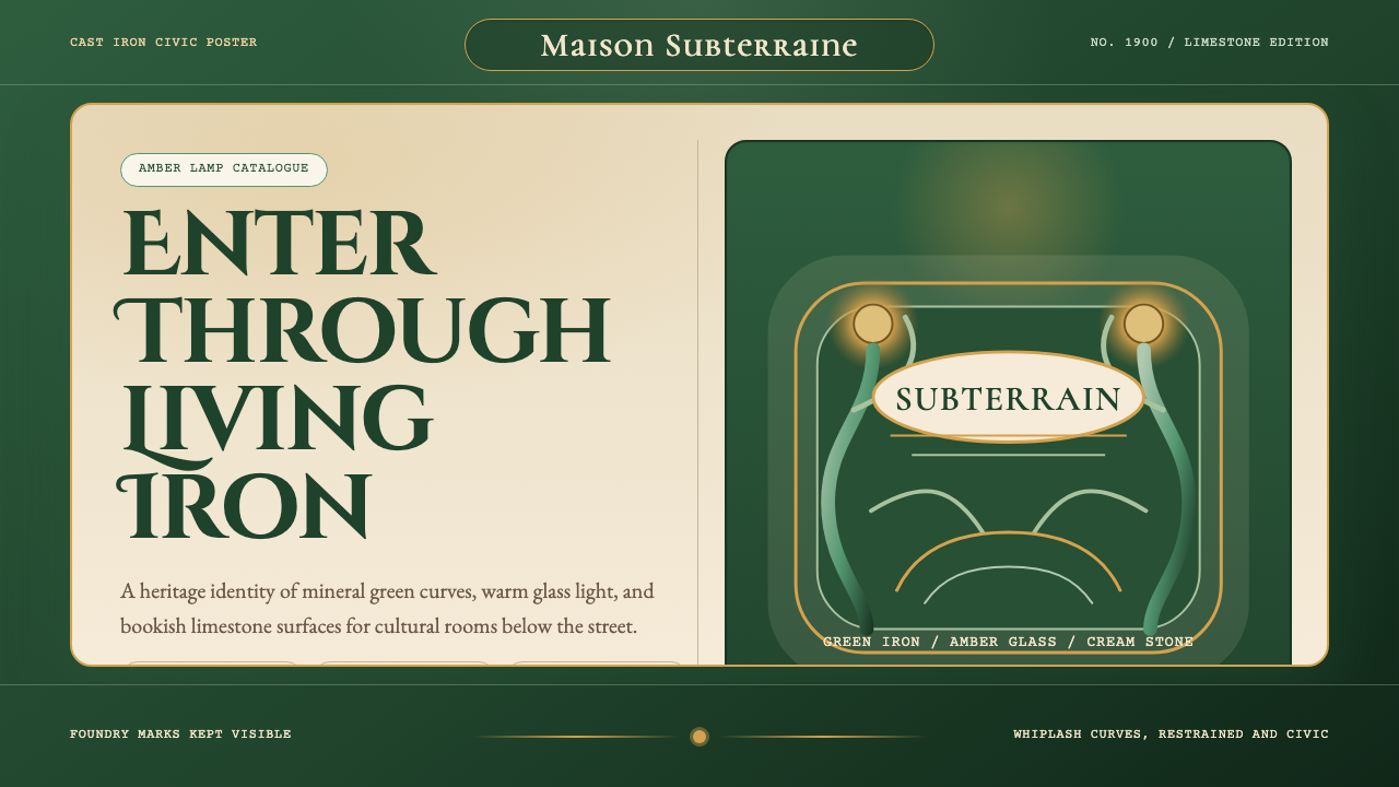 Paris Metro Guimard (1900)Civic sculpture, softly lit. Metro green ironwork frames amber glow and limes…公共雕塑般温暖:地铁绿铁线框住琥珀光与石灰岩字体。
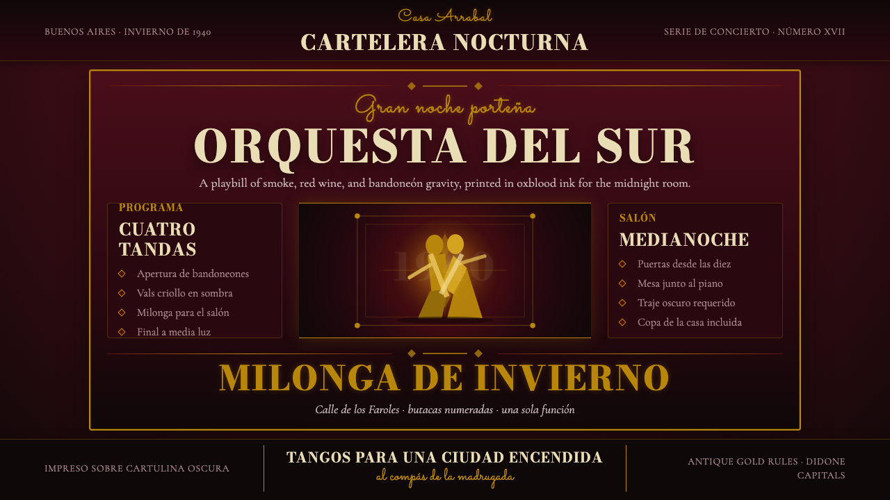 Argentine Tango Poster (1940)Nocturnal drama in ink. Oxblood ground, antique gold rules, Bodoni capitals.暗夜戏剧感:氧血红底、古金线框与Bodoni大写。
 Art Nouveau (Mucha)Mucha's whiplash arabesques. Botanical halos, muted lithograph palette, no ma…穆夏的鞭线式有机曲线:植物光环、柔和石版印刷色、奶油纸底——拒绝机械刻意的边缘。
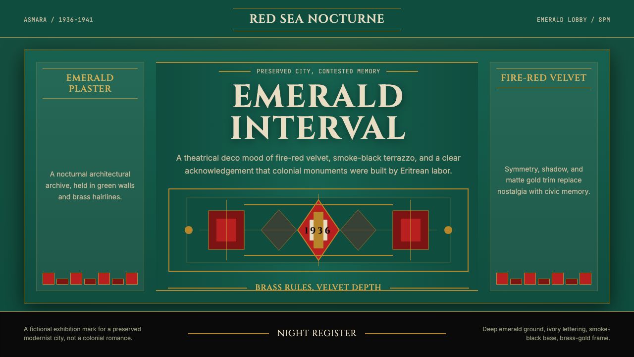 Eritrean Asmara Art Deco Cinema (1936)Nocturnal deco, critically lit. Emerald walls, fire red velvet, and brass rul…夜色装饰艺术保持克制:翡翠墙、火红绒面与黄铜线框住历史。
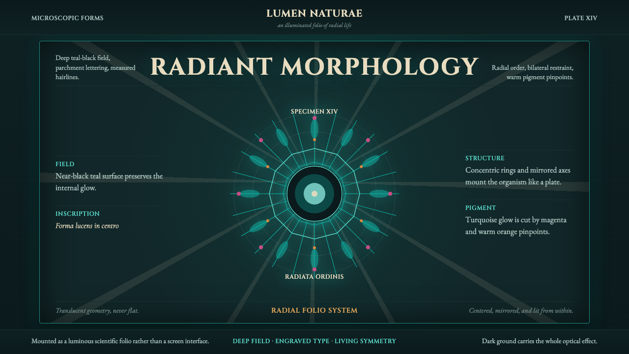 Haeckel KunstformenLuminous symmetry. Teal-black ground, Cinzel capitals, and radial turquoise s…发光的对称性。深青黑底、Cinzel 罗马大写和放射状青绿标本。