What is Tiffany Stained Glass?什么是 Tiffany Stained Glass?
Jewel-saturated glass set in bronze: Tiffany's studios transformed American interiors with color that seems to generate its own light.宝石般饱和的色彩嵌于青铜之中——蒂凡尼工作室以仿佛自身发光的色彩,重塑了美国室内装饰的整个语言。
Tiffany Stained Glass in briefTiffany Stained Glass 速览
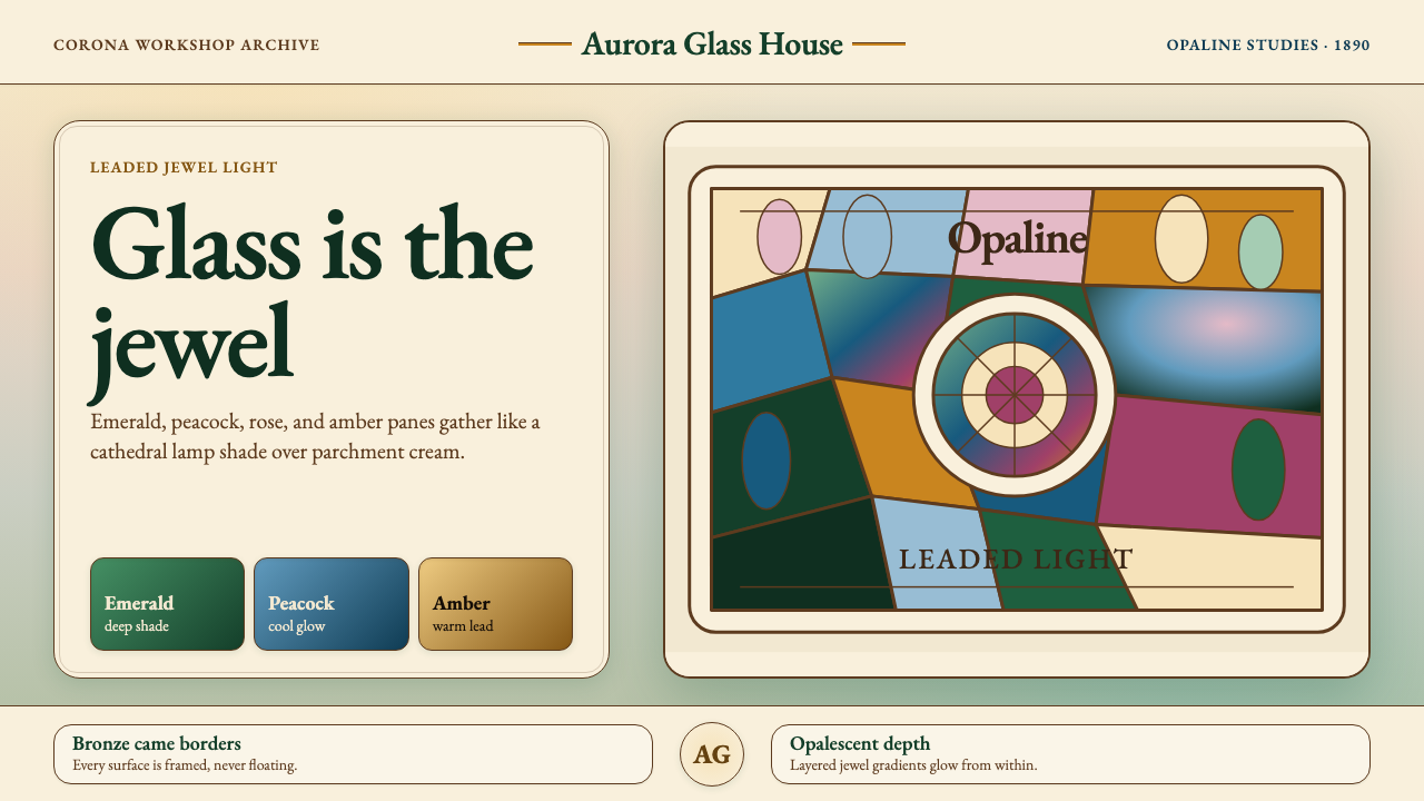
Tiffany Stained Glass describes the visual language that emerged from Louis Comfort Tiffany's New York studios between the 1880s and 1920s — a system of jewel-saturated color, sinuous organic line, and iridescent surface that became the definitive American expression of Art Nouveau. The style is immediately recognizable: deep emerald greens, peacock blues, amber golds, and rose-violet tones arranged in irregular, nature-derived compositions framed by delicate bronze lead-came borders, all set against a ground of warm parchment cream.蒂凡尼彩绘玻璃风格,源自路易斯·康福特·蒂凡尼(Louis Comfort Tiffany)在十九世纪八十年代至二十世纪二十年代间于纽约主持的工作室群落——一套以宝石般饱和的色彩、蜿蜒有机的线条与虹彩表面为核心的视觉语言,成为美国新艺术运动(Art Nouveau)最具代表性的表达。其视觉特征极易辨认:深翠祖母绿、孔雀蓝、琥珀金与玫瑰紫罗兰,排列于源自自然形态的不规则构图之中,以精巧的青铜铅条勾勒边界,整体铺陈于温暖的羊皮奶油底色之上。
What makes the style distinctive is not simply its palette but the quality of light it implies. Tiffany's Favrile glass — named from the archaic English word for 'handmade' — was manufactured by introducing metallic oxides directly into molten glass, producing an iridescent, opalescent surface that shifts in response to changing light. In two-dimensional design, this luminous materiality is evoked through layered translucent tones and a sense of color emanating from within rather than sitting on top. The effect is warmth without harshness: rich color that reads as organic, not saturated.令这种风格独树一帜的,不仅是调色板本身,更是它所暗示的光的品质。蒂凡尼的「费弗里尔」(Favrile)玻璃——命名来自英语古词「手工制作」——在制造过程中将金属氧化物直接旋入熔融玻璃胎体,使成品呈现出随光线变化而流转的虹彩乳光效果。在二维设计中,这种发光的材料质感通过层叠的半透明色调来唤起:色彩仿佛从内部涌出,而非停留于表面之上。效果是温暖而不刺眼的——丰富的色彩读来有机,而非生硬饱和。
The design vocabulary draws from botanical and entomological observation: wisteria blossoms, dragonfly wings, peacock feathers, lily pads, and peony blooms are recurring motifs, rendered not as literal illustration but as abstracted organic geometry. Outlines are fluid rather than hard, and compositions tend toward radial or bilateral symmetry while retaining a handcrafted irregularity. Together these qualities produce a style that is simultaneously decorative and structural — ornament is not applied to a surface but is inseparable from the object's form.蒂凡尼的设计词汇源自对植物与昆虫世界的细致观察:紫藤花串、蜻蜓翅翼、孔雀羽毛、睡莲叶面与牡丹花冠反复出现,却并非字面意义上的具象插图,而是被提炼为抽象的有机几何。轮廓流动而非硬朗,构图趋向放射状或双侧对称,同时保留了手工制作特有的不规则感。这些品质共同塑造了一种同时具备装饰性与结构性的风格——装饰并非附着于表面之上,而是与器物形态本身浑然一体。
See the Tiffany Stained Glass design system查看 Tiffany Stained Glass 完整设计系统
Where does Tiffany Stained Glass come from?Tiffany Stained Glass 从何而来?
The story of Tiffany Stained Glass begins not with a single workshop but with a confluence of cultural pressures unique to Gilded Age America. By the 1870s, the newly wealthy merchant and industrial families of New York, Boston, and Chicago were building mansions that needed to communicate status through interior decoration, yet American craft traditions capable of producing the elaborate decorative programs of European aristocratic interiors barely existed. Louis Comfort Tiffany — son of Charles Lewis Tiffany, founder of the eponymous jewelry house — recognized this vacuum. Trained as a painter and deeply influenced by travels in North Africa and Europe, he turned to decorative arts with the conviction that the applied arts could be elevated to the condition of fine art.蒂凡尼彩绘玻璃风格的起源,并非单一工坊的诞生,而是美国镀金年代特有的多重文化压力的汇聚。十九世纪七十年代,纽约、波士顿与芝加哥新兴的商业与工业富裕家族,正在建造需要以室内装饰来彰显地位的豪宅——然而彼时,能够复现欧洲贵族府邸繁复装饰程式的美国工艺传统几乎不存在。路易斯·康福特·蒂凡尼——蒂凡尼珠宝屋创始人查尔斯·刘易斯·蒂凡尼之子——敏锐地察觉了这一空缺。他曾受训为画家,游历北非与欧洲期间深受启发,转而投身装饰艺术,坚信应用艺术完全可以被提升至纯艺术的高度。
Tiffany founded Tiffany Glass and Decorating Company in 1885, consolidating earlier ventures, and established manufacturing operations at Corona, Long Island, where glassblowers and cutters could produce the iridescent Favrile glass that became the studio's signature material. The Corona workshop was staffed largely by immigrant craftspeople whose European guild knowledge of glassmaking was absorbed and redirected toward the studio's aesthetic ambitions. Early commissions included ecclesiastical windows for Episcopal and Presbyterian churches, as well as interior design projects for prominent clients. The 1893 World's Columbian Exposition in Chicago provided a transformative moment of public exposure: Tiffany's Byzantine chapel installation, featuring a complete interior environment of mosaic and leaded glass, was seen by millions and established the studio's international reputation.1885年,蒂凡尼创立蒂凡尼玻璃与装饰公司,整合了此前的多项事业,并在长岛科罗娜(Corona)建立制造工坊,在那里,吹制工与切割工得以生产出成为工作室标志性材料的虹彩费弗里尔玻璃。科罗娜工坊的工人主要来自欧洲移民,他们带来的欧洲行会玻璃制造传统被吸收并重新导向工作室的美学抱负。早期委托项目包括圣公会与长老会的教堂彩窗,以及为知名客户承接的室内设计项目。1893年芝加哥世界哥伦布博览会是一个决定性的公众曝光时刻:蒂凡尼的拜占庭小教堂装置——以马赛克与铅条彩绘玻璃营造的完整室内环境——被数百万人参观,从而确立了工作室的国际声誉。
Central to the studio's creative identity — though long obscured by the Tiffany name — was Clara Driscoll, who joined as a designer in 1888 and eventually led the women's design department. Driscoll was responsible for many of the studio's most celebrated lamp designs, including the wisteria, dragonfly, peony, and poppy bases. The so-called 'Tiffany Girls' — the female designers and cutters at Corona — brought botanical precision and delicate chromatic judgment to the translation of Louis Tiffany's broader design intentions into executed glass. Letters discovered at the New York Historical Society in the early 2000s confirmed Driscoll's authorship of designs long attributed solely to Louis Tiffany, prompting a significant reassessment of the studio's creative history.长期被「蒂凡尼」之名所遮蔽的,是工作室创意身份的核心人物——克拉拉·德里斯科尔(Clara Driscoll)。她于1888年作为设计师加入工作室,后来主持女性设计部门。工作室最负盛名的许多台灯设计——包括紫藤灯、蜻蜓灯、牡丹灯与罂粟灯——均出自德里斯科尔之手。被称为「蒂凡尼女孩」的科罗娜女性设计师与切割师们,将植物学的精确与细腻的色彩判断带入了将路易斯·蒂凡尼宏观设计意图转化为实际玻璃作品的过程。二十一世纪初在纽约历史学会发现的书信确认了德里斯科尔对许多长期被归于路易斯·蒂凡尼本人名下的设计的著作权,由此引发了对工作室创作史的重大重新评估。
Other significant figures include Frederick Wilson, who designed many of the studio's largest ecclesiastical windows, and Agnes Northrop, a botanist-trained designer whose landscape windows — panoramic compositions of trees, meadows, and skies — were among the most technically demanding works the studio produced. The studio's peak years ran roughly from 1893 to 1920, coinciding with the height of the Aesthetic Movement's influence in America. After the First World War, changing tastes — particularly the rising influence of Art Deco and stripped Modernism — eroded the market for elaborate decorative glass. Tiffany Studios filed for bankruptcy in 1933, and Louis Comfort Tiffany died the same year, closing the original chapter of this visual tradition.其他重要人物包括弗雷德里克·威尔逊(Frederick Wilson)——他为工作室设计了众多最大型的教堂彩窗——以及受过植物学训练的设计师艾格尼丝·诺斯罗普(Agnes Northrop),其景观窗作品——以树木、草地与天空为主题的全景构图——是工作室出产的技术难度最高的作品之列。工作室的鼎盛期大约从1893年延续至1920年,与唯美运动在美国影响力的巅峰期高度重合。第一次世界大战之后,趣味的转变——尤其是装饰艺术(Art Deco)与简化现代主义风格的崛起——蚕食了对精细装饰玻璃的市场需求。蒂凡尼工作室于1933年申请破产,路易斯·康福特·蒂凡尼同年辞世,这一视觉传统的原始篇章就此画上句点。
What defines the Tiffany Stained Glass look?Tiffany Stained Glass 的视觉特征是什么?
Color and Light色彩与光
The palette centers on jewel tones that evoke the quality of transmitted rather than reflected light: emerald green, peacock blue, amber gold, rose violet, and deep ruby, all set against a warm parchment cream or ivory ground. These hues are layered and modulated rather than used flat — the visual impression is of color glowing from within, shifting subtly across a composition as light conditions change. Iridescent and opalescent passages recall the lustrous surface of Favrile glass, where metallic shimmer mingles with translucent depth.调色板以宝石色调为核心,唤起透射光而非反射光的视觉质量:祖母绿、孔雀蓝、琥珀金、玫瑰紫罗兰与深宝石红,统一铺陈于温暖的羊皮奶油或象牙底色之上。这些色调以层叠与调制的方式运用,而非平铺单色——视觉印象是色彩从内部发光,随光线条件在构图中产生微妙流转。虹彩与乳光段落令人联想到费弗里尔玻璃的光泽表面,金属微光与半透明深度相互交融。
Organic Line and Form有机线条与形态
Contours in Tiffany-derived work are sinuous and botanically informed rather than geometric or angular. Stems curve and branch, petals overlap in irregular sequences, and wing-veins trace asymmetric paths across panels. The lead-came tradition that physically separates panes of glass in a window becomes, in two-dimensional design, a network of delicate dark outlines that both define and connect individual color areas. These lines are never mechanical — they vary in width and carry the expressive weight of hand-drawing.蒂凡尼风格作品的轮廓是蜿蜒流动、源自植物学观察的,而非几何性或棱角分明的。茎干弯曲分叉,花瓣以不规则次序相互叠压,翅膀的脉络以不对称路径穿越画面。在实物彩窗中将各块玻璃物理分隔的铅条传统,在二维设计中转化为一张精巧深色轮廓线的网络,既界定又连接各个色彩区域。这些线条从不机械——它们在宽窄上有所变化,承载手绘特有的表现力与重量感。
Nature Motifs as Structure自然母题作为结构
Botanical and entomological subjects — wisteria, dragonflies, water lilies, peonies, peacock feathers — are not decorative additions to an otherwise abstract composition but the primary structural vocabulary. Wisteria cascades define a radial grid; dragonfly wings become geometric panels; peacock-tail ocelli serve as focal points. The motifs are abstracted to their essential geometry — a lily pad is a near-circle, a wisteria cluster is a dense vertical mass — without losing their organic identity.植物与昆虫题材——紫藤、蜻蜓、睡莲、牡丹、孔雀羽毛——不是附加于抽象构图之上的装饰元素,而是首要的结构性词汇。紫藤花串界定出放射状网格;蜻蜓翅翼演变为几何面板;孔雀尾羽的眼斑充当构图焦点。这些母题被提炼至其本质几何——睡莲叶近乎圆形,紫藤花簇是一个密集的垂直体量——却从未失去其有机形态的身份认同。
Bronze Lead-Came Borders青铜铅条边框
One of the most immediately identifiable features of the style is the use of bronze-toned linear borders as both structural and decorative elements. In stained glass, lead came physically holds panes together; in the derived design language, analogous dark metallic lines frame panels, separate content zones, and delineate decorative cartouches. These borders are not uniform rules — they swell at joints, taper along straight runs, and gather into knots at intersections, preserving the hand-worked quality of the original craft.这种风格最直观可辨的特征之一,是以青铜色调线性边框同时充当结构性与装饰性元素。在实体彩绘玻璃中,铅条在物理层面固定各块玻璃;在衍生的设计语言中,类似的深色金属感线条框定面板、分隔内容区域,并勾勒出装饰性卡托什(cartouche)。这些边框并非均匀的直线规则——它们在接合处鼓胀,沿直线段收细,并在交叉点汇聚成结,保留了原始工艺手工制作的品质感。
Layered Translucency层叠半透明感
The signature luminosity of Favrile glass — the sense that color inhabits depth rather than coating a surface — is achieved in two-dimensional work through layered, semi-transparent color passages that build gradually toward richer hues. Highlight areas are not simply lighter versions of a base color but carry a distinct warm or cool cast, evoking the way light shifts as it passes through varying glass densities. Shadows within compositions are warm rather than neutral or cold, often tending toward amber or deep violet.费弗里尔玻璃标志性的发光质感——色彩栖居于深度之中而非涂覆于表面之上的感觉——在二维作品中通过层叠的半透明色彩段落来实现,这些段落逐渐叠加,趋向更丰富的色调。高光区域并非仅仅是基础色的浅化版本,而是携带独特的暖调或冷调倾向,唤起光线穿透不同密度玻璃时发生变化的方式。构图中的阴影是暖调而非中性或冷调的,往往偏向琥珀色或深紫罗兰。
Asymmetric Radial Composition非对称放射状构图
Tiffany compositions are rarely rigidly symmetrical — even in the large circular lamp shades where radial geometry is inherent, individual panels introduce controlled variation that keeps the overall effect handcrafted rather than mechanical. A wisteria canopy distributes its blossoms unevenly; a dragonfly grouping staggers its figures across a curved field. This productive asymmetry within a broadly symmetric or radial frame is one of the style's most distinctive structural qualities, giving compositions a sense of organic growth rather than manufactured repetition.蒂凡尼的构图极少呈现刚性对称——即便是在放射几何本已内在的大型圆形灯罩上,各个面板也引入有节制的变化,使整体效果保持手工制作的气质而非机械复制的感觉。紫藤花盖将花串不均匀地分布;蜻蜓组合将各只蜻蜓错落地散布于弧形画面。这种在宽泛对称或放射框架之内的有益不对称,是这种风格最鲜明的结构品质之一,赋予构图有机生长之感,而非制造性重复。
Crafted Materiality工艺材料感
The Tiffany visual tradition is grounded in admiration for materials and the marks of their making. Texture is not simulated but suggested: the irregular surface of handblown glass, the grain of patinated bronze, the variation in color saturation across a single pane of glass. In applied design, this translates to a deliberate avoidance of machine-perfect uniformity — slight variations in line weight, tonal passages that shift gradually across a field, and decorative elements that are visibly shaped by hand. The style values warmth, depth, and the evidence of skilled making.蒂凡尼视觉传统根植于对材料及其制作痕迹的欣赏。质感并非被模拟,而是被暗示:手吹玻璃不规则的表面、青铜铜绿的纹理、单块玻璃之上色彩饱和度的变化。在应用设计中,这转化为对机器式完美统一的刻意规避——线条粗细的细微变化、色调段落在画面中的渐进流转,以及可见地由手工塑造的装饰元素。这种风格珍视温暖、深度与精湛技艺留下的痕迹。
See the Tiffany Stained Glass design system查看 Tiffany Stained Glass 完整设计系统
Who shaped Tiffany Stained Glass?谁塑造了 Tiffany Stained Glass?
The son of Charles Lewis Tiffany, Louis Comfort Tiffany trained as a painter before turning to the decorative arts in the early 1870s. Travels in Morocco, Egypt, and Venice convinced him that color and materiality were the primary media of artistic experience, and he brought this conviction to his glass work. His most significant technical contribution was the development, with glassblower Arthur Nash, of Favrile glass — iridescent, variegated, and internally colored through metallic oxide fusion. As the studio's creative director and public face, he received the design credits for work that was substantially realized by his team, and his singular artistic vision nonetheless gave the studio a coherent aesthetic identity that made Tiffany synonymous with American decorative luxury.查尔斯·刘易斯·蒂凡尼之子,路易斯·康福特·蒂凡尼在十九世纪七十年代初转向装饰艺术之前曾接受绘画训练。在摩洛哥、埃及与威尼斯的旅行使他确信,色彩与材料性是艺术体验的首要媒介,而他将这一信念带入了玻璃工作。他最重要的技术贡献,是与吹制工阿瑟·纳什合作开发了费弗里尔玻璃——通过金属氧化物熔合在内部着色,呈现出虹彩与色彩变化的效果。作为工作室的创意总监与公众形象,他获得了大量由团队实质实现的设计的署名权;尽管如此,他独特的艺术视野赋予了工作室连贯的美学身份,使「蒂凡尼」成为美国装饰奢华的代名词。
Clara Driscoll joined Tiffany's design studio in 1888 and served as head of the women's glass-cutting department at Corona. Letters discovered in 2005 at the New York Historical Society established that she was the primary designer behind some of the studio's most celebrated works, including the wisteria lamp, the dragonfly lamp, and the peony lamp. Driscoll worked within a studio system that assigned public credit to Louis Tiffany while her own contributions went largely unattributed during her lifetime. Her botanical precision and sensitivity to color modulation were foundational to the studio's reputation for naturalistic richness, and the reassessment of her role has substantially reshaped how design historians understand the creative process behind Tiffany's glass.克拉拉·德里斯科尔于1888年加入蒂凡尼设计工作室,担任科罗娜女性玻璃切割部门的主管。2005年在纽约历史学会发现的书信证实,她是工作室若干最负盛名作品——包括紫藤灯、蜻蜓灯与牡丹灯——的主要设计者。德里斯科尔在一个将公众署名权归于路易斯·蒂凡尼的工作室制度内工作,她自己的贡献在其有生之年几乎未获承认。她的植物学精准度与对色彩调制的敏感,是工作室以自然主义丰富性著称的基础;对她角色的重新评估,已从根本上改变了设计史学家理解蒂凡尼玻璃创作过程的方式。
Agnes Northrop was a designer at Tiffany Studios whose training in botany gave her an unusually systematic approach to the depiction of plant forms and natural landscapes. She is best known for the studio's large landscape windows — panoramic compositions of trees, meadows, water, and sky that brought the traditions of Hudson River School painting into the medium of leaded glass. These windows required extraordinary technical control over color gradation and tonal transition across dozens of individual glass panes. Northrop's work represents the studio's highest level of pictorial ambition and demonstrates that the Tiffany visual language extended well beyond the decorative lamp into architectural integration at the scale of ecclesiastical and memorial commissions.艾格尼丝·诺斯罗普是蒂凡尼工作室的设计师,受过植物学训练,这使她对植物形态与自然景观的描绘拥有异常系统化的方式。她以工作室的大型景观彩窗最为人称道——以树木、草地、水面与天空构成全景式构图,将哈德逊河派绘画的传统带入铅条彩玻璃这一媒介。这些窗作要求对跨越数十块单独玻璃的色彩层级与色调过渡实施超凡的技术控制。诺斯罗普的工作代表了工作室在图像雄心上的最高层次,并证明蒂凡尼视觉语言远远超越装饰性台灯,延伸至教堂与纪念性委托规模的建筑整合之中。
Frederick Wilson served as the principal designer of Tiffany Studios' large ecclesiastical windows throughout the studio's peak period. His commissions included monumental memorial windows for major American churches and universities, works that required integrating figurative subjects — angels, saints, biblical narratives — into the studio's signature jewel-toned glass vocabulary. Wilson's contribution was essentially that of a bridge between traditional European stained-glass iconography and the American Art Nouveau aesthetic that Tiffany had developed: his windows are recognizably Tiffany in their color and materiality while remaining legible as devotional images within established religious traditions.弗雷德里克·威尔逊在工作室鼎盛期全程担任蒂凡尼工作室大型教堂彩窗的首席设计师。他的委托项目包括为美国主要教堂与大学制作的纪念性巨型彩窗,这些作品要求将具象题材——天使、圣徒、圣经叙事——整合进工作室标志性的宝石色调玻璃语汇。威尔逊的贡献本质上是在欧洲传统彩绘玻璃圣像志与蒂凡尼所发展的美国新艺术美学之间架设桥梁:他的彩窗在色彩与材料感上可辨认为典型的蒂凡尼风格,同时在既定宗教传统内保持作为祈祷性图像的可读性。
How do you use Tiffany Stained Glass today?今天怎么用 Tiffany Stained Glass?
Tiffany Stained Glass translates most naturally to contexts where richness, warmth, and a sense of careful craftsmanship are primary values — luxury product presentations, cultural institutions, editorial design with a heritage or botanical dimension, and any setting where the audience is expected to dwell on visual detail rather than scan for information rapidly. The style demands slow looking, which makes it poorly suited to high-velocity information environments and well suited to contexts designed for contemplative engagement.蒂凡尼彩绘玻璃风格最自然地转化于那些将丰富感、温暖感与精心工艺感视为首要价值的场景——奢侈品展示、文化机构、具有遗产或植物学维度的编辑设计,以及任何期望受众驻足细品视觉细节而非快速扫描信息的场合。这种风格需要缓慢的凝视,这使它不适合高速信息环境,而十分适合为沉思性互动所设计的场合。
For presentation slides, the style works powerfully as a cover aesthetic: a jewel-toned botanical motif occupying a large portion of the field, a parchment cream ground, and serif type in bronze or deep teal establishes an atmosphere of refined materiality before any content appears. Content slides should exercise restraint relative to the cover — a single tonal accent color, generous spacing, and type set in a classical serif at comfortable sizes. Data visualizations in this style work best when chart elements adopt the jewel-tone palette and are bounded by thin bronze-inflected lines rather than the hard grid rules of more analytical styles. The visual narrative should feel hand-assembled, not templated.对于演示文稿,这种风格作为封面美学效果极为有力:宝石色调的植物母题占据画面的大部分区域,羊皮奶油底色,青铜色或深青绿色的衬线字体,在任何内容出现之前就已建立起精致材料感的氛围。正文页面应相对封面保持克制——以单一色调强调色、充裕的间距以及以舒适尺寸排设的古典衬线字体为原则。这种风格下的数据可视化最有效的做法,是让图表元素采用宝石色调调色板,并以细腻的青铜色感线条而非更具分析性风格中的硬边网格线来界定边界。视觉叙事应给人一种手工拼合的感觉,而非模板化的感觉。
For web interfaces, the Tiffany palette is most at home on pricing pages, feature showcases, or brand landing pages for luxury goods, cultural venues, and artisan products. A useful approach is to use the parchment cream as a dominant background tone, introduce emerald or peacock blue as the primary interactive color, and reserve amber gold for calls to action or premium-tier markers. Navigation and body text should remain in warm near-black rather than pure black, which reads as too stark against the warm background. Card components benefit from thin border treatments rather than shadows; any shadow that does appear should be warm-toned and soft rather than the hard-edged offset shadows of starker styles.对于网页界面,蒂凡尼调色板最适合奢侈品、文化场馆与手工匠人产品的定价页面、功能展示区或品牌落地页。一种有效的方法是以羊皮奶油为主导背景色调,引入祖母绿或孔雀蓝作为主要交互色,将琥珀金保留给行动号召按钮或高阶层级标识。导航与正文应保持在温暖的近黑色而非纯黑,后者在温暖底色上显得过于生硬。卡片组件适合采用细边框处理而非阴影;如果出现阴影,应是暖调且柔和的,而非那些更简洁风格中的硬边偏移阴影。
For editorial and marketing work, the style accommodates long-form reading layouts well, since the parchment ground and warm typography create a reading experience that is comfortable over extended periods. Section dividers built from botanical ornament or bronze-ruled lines replace the stark horizontal rules of more geometric styles. Pull quotes and annotations can adopt teal or deep violet as accent colors, reinforcing the jewel-tone range without overwhelming body text. For marketing one-pagers or event programs, full-bleed botanical illustrations at reduced opacity provide rich visual texture as backgrounds without competing with foreground content.对于编辑与营销内容,这种风格能很好地适应长文阅读版式,因为羊皮底色与温暖的字体创造了一种可长时间舒适阅读的体验。由植物装饰元素或青铜色划线构成的段落分隔符,替代了更几何化风格中的冷峻水平线。引用语与注释可以采用青绿色或深紫罗兰作为强调色,在不压制正文的前提下强化宝石色调的色域范围。对于营销单页或活动节目册,以降低不透明度的满幅植物插图作为背景,可在不与前景内容竞争的前提下提供丰富的视觉质感。
A common mistake when applying this style is treating all jewel tones as equally available throughout a composition. In authentic Tiffany glass, each panel operates within a localized color logic — areas of the composition are cool or warm, luminous or shadowed, but the entire surface does not carry every color simultaneously at full intensity. Applied design should select one or two tones as dominant and use the others as subordinate accents, allowing the composition to breathe and creating the sense of tonal variation that is central to the style's luminous quality. Overloading a layout with multiple saturated jewel tones simultaneously produces visual noise rather than the jeweled glow the style promises.应用这种风格时最常见的错误,是将所有宝石色调视为在构图中处处同等可用的元素。在真实的蒂凡尼彩绘玻璃中,每块面板在局部色彩逻辑内运作——构图的某些区域偏冷或偏暖,明亮或处于阴影之中,但整个画面并不会同时将每种色彩以完全强度呈现。应用设计应选择一两种色调作为主导,其余作为附属强调色,让构图得以呼吸,并营造出色调变化的感觉——这是这种风格发光品质的核心所在。将多种饱和宝石色调同时叠加于一个版面,只会产生视觉噪音,而非这种风格所承诺的宝石般光芒。
See the Tiffany Stained Glass design system查看 Tiffany Stained Glass 完整设计系统
Tiffany Stained Glass — FAQTiffany Stained Glass · 常见问题
Is Tiffany Stained Glass the same as Art Nouveau?蒂凡尼彩绘玻璃与新艺术运动是同一回事吗?
Tiffany Stained Glass is a specific American expression of Art Nouveau — it shares the movement's commitment to organic form, nature-derived motifs, and the elevation of applied crafts to fine-art status, but it has a distinct material identity rooted in glass, light, and bronze that sets it apart from European Art Nouveau traditions. French Art Nouveau, as practiced by designers like Hector Guimard or Émile Gallé, tends toward more sinuous architectural line and a broader palette of organic materials. Tiffany's version is more luminous, more color-saturated, and more distinctly American in its scale and ambition — the studio produced lamp shades for domestic interiors and monumental windows for cathedrals in the same idiom, a breadth that has no close European parallel.蒂凡尼彩绘玻璃是新艺术运动在美国的一种特定表达——它与这一运动共享对有机形态、自然衍生母题以及将应用工艺提升至纯艺术地位的承诺,但它拥有根植于玻璃、光线与青铜的独特材料身份,使其有别于欧洲新艺术传统。法国新艺术运动,如赫克托·吉马尔(Hector Guimard)或埃米尔·盖勒(Émile Gallé)等设计师的实践,往往倾向于更具流动感的建筑线条与更宽泛的有机材料组合。蒂凡尼的版本更具发光性、色彩饱和度更高,在尺度与抱负上更具鲜明的美国特色——工作室以同一风格语汇为家居室内制作台灯,也为大教堂制作纪念性彩窗,这种广度在欧洲没有可以直接对应的案例。
Can this style work in dark-mode or dark-background layouts?这种风格能用于深色模式或深色背景版面吗?
The canonical Tiffany palette is light-ground — the parchment cream or ivory background is integral to the style's warmth and the illusion of transmitted light. A dark inversion is possible but requires care. Against a very deep background, jewel tones can work as luminous accents rather than dominant fields, and the effect can evoke the way stained glass appears at night when viewed from outside — color as pure light against darkness. However, the bronze lead-came borders and the layered tonal complexity that create the style's characteristic depth tend to collapse in dark-mode rendering, reducing the composition to flatter, higher-contrast color spots. Dark-ground Tiffany-derived work functions best when it treats the style as an illuminated detail rather than a comprehensive environment.经典的蒂凡尼调色板以浅色底面为基础——羊皮奶油或象牙色背景是这种风格温暖感以及透射光幻觉不可分割的组成部分。深色反转版本是可行的,但需要谨慎处理。在极深的背景上,宝石色调可以作为发光强调元素而非主导色域来运用,效果可以唤起从室外观看夜间彩绘玻璃的感觉——在黑暗中作为纯粹光芒的色彩。然而,创造这种风格标志性深度的青铜铅条边框与层叠的色调复杂性,在深色模式渲染中往往会趋于平板,将构图简化为更扁平、对比度更高的色彩斑块。以深色底面运用蒂凡尼衍生风格,最有效的做法是将其视为一个发光细节,而非一个完整的环境。
How does Tiffany Stained Glass differ from other Victorian decorative styles?蒂凡尼彩绘玻璃与其他维多利亚时代装饰风格有何区别?
Victorian decorative styles are broad and varied — they include Gothic Revival, Rococo Revival, Renaissance Revival, the Aesthetic Movement, and many others. Tiffany sits within the Aesthetic Movement strand, which valued art for art's sake and drew heavily from Japanese and Near Eastern design. What distinguishes the Tiffany style specifically is its material particularity: the look is inseparable from glass and its optical properties. Where other Victorian decorative styles used pattern, textile, and surface ornament, Tiffany's language is built on color transmitted through a semi-transparent medium. The result is warmer, more luminous, and less pattern-dependent than most Victorian alternatives. It also lacks the historical-revival character of many Victorian styles — Tiffany was inventing a new visual vocabulary, not restoring a historical one.维多利亚时代的装饰风格是宽泛而多元的——包括哥特式复兴、洛可可复兴、文艺复兴复兴、唯美运动等众多流派。蒂凡尼属于唯美运动这一脉络,该运动重视为艺术本身的艺术,并大量借鉴日本与近东设计。蒂凡尼风格的独特性在于其材料特殊性:这种外观与玻璃及其光学特性密不可分。其他维多利亚装饰风格依赖图案、织物与表面装饰,而蒂凡尼的语言建立在透过半透明介质传递的色彩之上。其结果比大多数维多利亚替代风格更温暖、更具发光性,对图案的依赖也更少。它同样缺乏许多维多利亚风格的历史复兴特征——蒂凡尼是在发明一套新的视觉词汇,而非恢复一套历史性的词汇。
What kinds of typography pair well with this style?哪些字体与这种风格搭配最为相宜?
The style pairs best with typefaces that carry visible calligraphic heritage — high-contrast serifs where thick and thin strokes alternate fluidly, or display serifs with delicate bracketed feet that echo the tapered quality of the bronze lead lines. Display settings work well when letterforms are set generously, with ample spacing between characters, evoking the unhurried quality of the style's craft origins. Heavy geometric sans-serifs and blunt slab-serifs tend to clash with the organic warmth of the palette and motifs. Script faces can be appropriate for accent use — short titles, pull quotes, event names — but should be used sparingly. Body text is best set in a readable transitional or old-style serif at a warm near-black, maintaining legibility without competing with the decorative richness of surrounding visual elements.这种风格最适合与具有可见书法传承的字体搭配——粗细笔画流畅交替的高对比度衬线体,或带有精巧括弧形衬脚的展示衬线体,后者呼应青铜铅条线条的收细特质。展示性排版在字形设置宽松、字符间距充裕时效果最佳,唤起这种风格工艺起源所具有的从容气质。粗重的几何无衬线体与钝重的埃及体往往与调色板和母题的有机温暖形成冲突。手写体适合作为强调元素使用——短标题、引用语、活动名称——但应节制使用。正文最好以可读性强的过渡期或古典风格衬线体排设,颜色为温暖的近黑色,保持易读性的同时不与周围视觉元素的装饰丰富性相竞争。
Is this style appropriate for digital products, or is it primarily suited to print?这种风格适合数字产品吗,还是主要适用于印刷品?
The style is fully applicable to digital contexts, though it requires different calibration than it does in print. On screen, the parchment cream background may need to be slightly lighter to compensate for the additive nature of screen illumination — what reads as warm and creamy on a backlit display would appear yellowed in print. The jewel tones, which are rich but not maximally saturated in print, may benefit from slight desaturation on high-gamut displays to preserve the sense of depth and warmth rather than reading as garish. Interactive states — hover, active, focus — can be expressed through subtle luminance shifts rather than high-contrast color changes, preserving the style's atmosphere. The style is particularly well suited to editorial web experiences, cultural institution sites, and luxury brand digital touchpoints where dwell time is high and visual richness is a virtue rather than a liability.这种风格完全可以应用于数字场景,尽管相比印刷品需要不同的校准方式。在屏幕上,羊皮奶油色背景可能需要略微提亮,以补偿屏幕发光的加色性质——在背光显示器上读来温暖奶油的色调,在印刷品上可能显得发黄。宝石色调在印刷品中丰富但不是最大饱和度,在高色域显示器上可能需要略微降低饱和度,以保持深度与温暖感,而非显得俗艳。交互状态——悬停、激活、聚焦——可以通过细腻的亮度变化而非高对比度的色彩切换来表达,以保持这种风格的氛围。这种风格特别适合编辑类网页体验、文化机构网站以及奢侈品牌数字触点——这些场合的用户停留时间较长,视觉丰富性是优势而非负担。
Related design styles相关设计风格
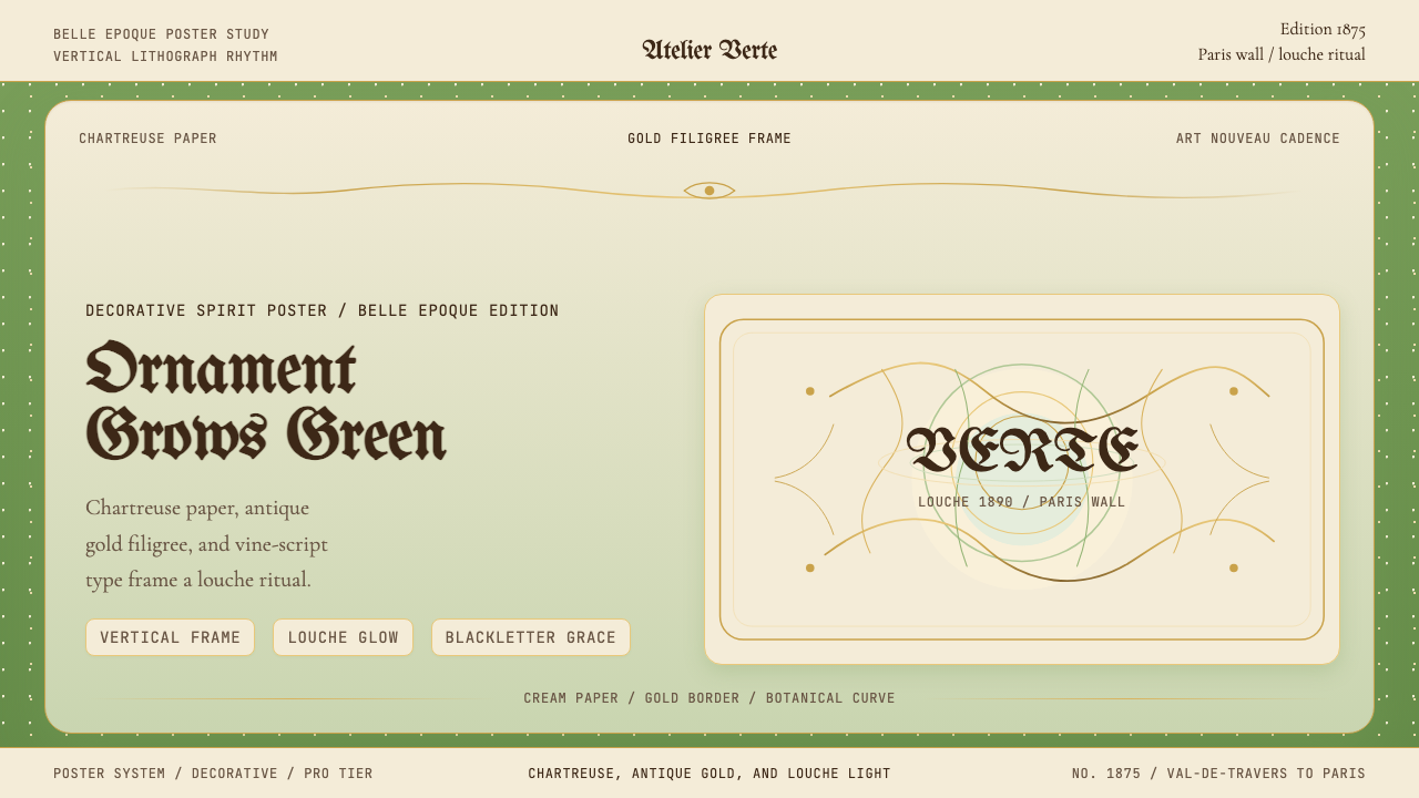 Absinthe Art Nouveau Green (1875)Ornate and verdant. Chartreuse field, gold filigree, vine-script type, and lo…华丽而青绿。黄绿色底、金丝花边与藤蔓字体托出浑浊光。
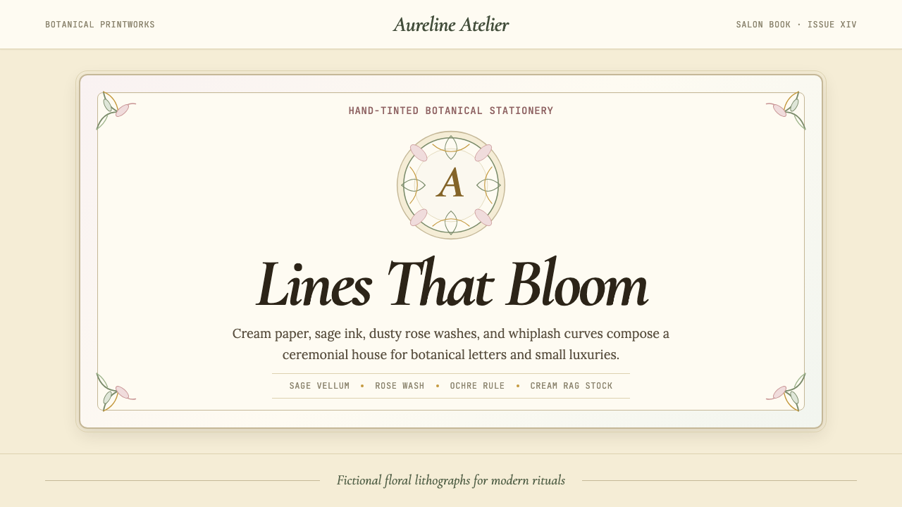 Art Nouveau (Mucha)Mucha's whiplash arabesques. Botanical halos, muted lithograph palette, no ma…穆夏的鞭线式有机曲线:植物光环、柔和石版印刷色、奶油纸底——拒绝机械刻意的边缘。
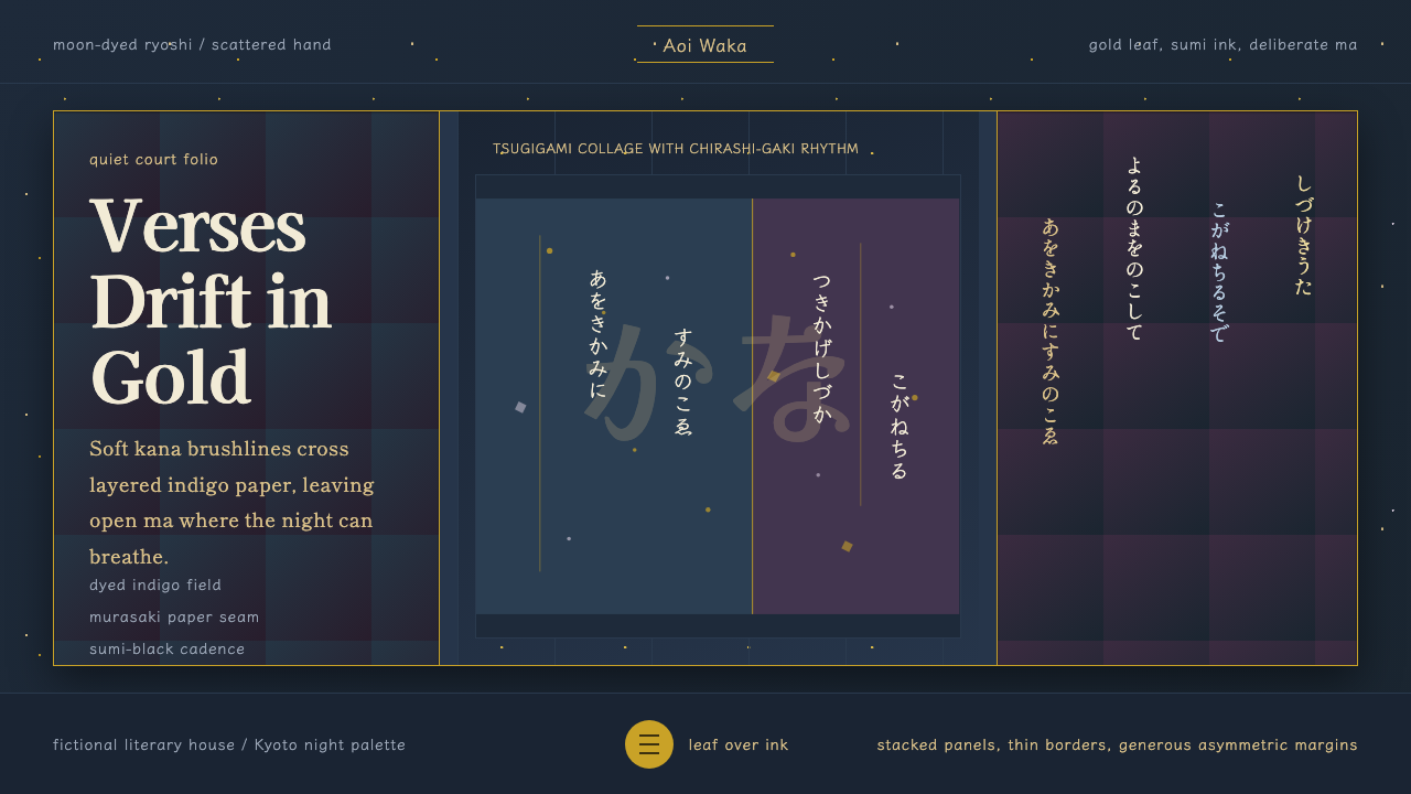 Kana Waka CalligraphyQuiet luxury in ink. Indigo ryoshi, Kaisei serif, scattered kana, and gold fl…墨色写出静奢:靛蓝料纸、Kaisei 字体、散假名与金箔。
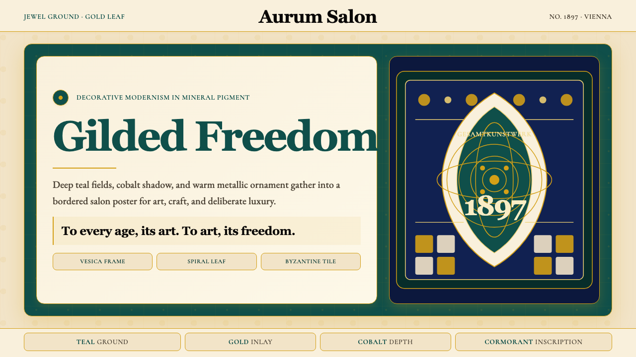 Wiener Secession (Klimt)Opulence made modern. Teal grounds, gold inlay, vesica frames and Cormorant d…奢华被现代化:深翠绿底、金箔嵌线、杏仁框与Cormorant标题。
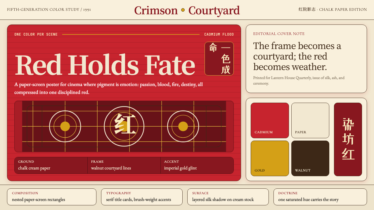 Zhang Yimou Cinema RedRed carries fate. Cadmium flood, chalk paper, walnut grids make cinema feel c…红色承载命运:镉红铺满宣纸底,胡桃木格栅让影像成仪式。
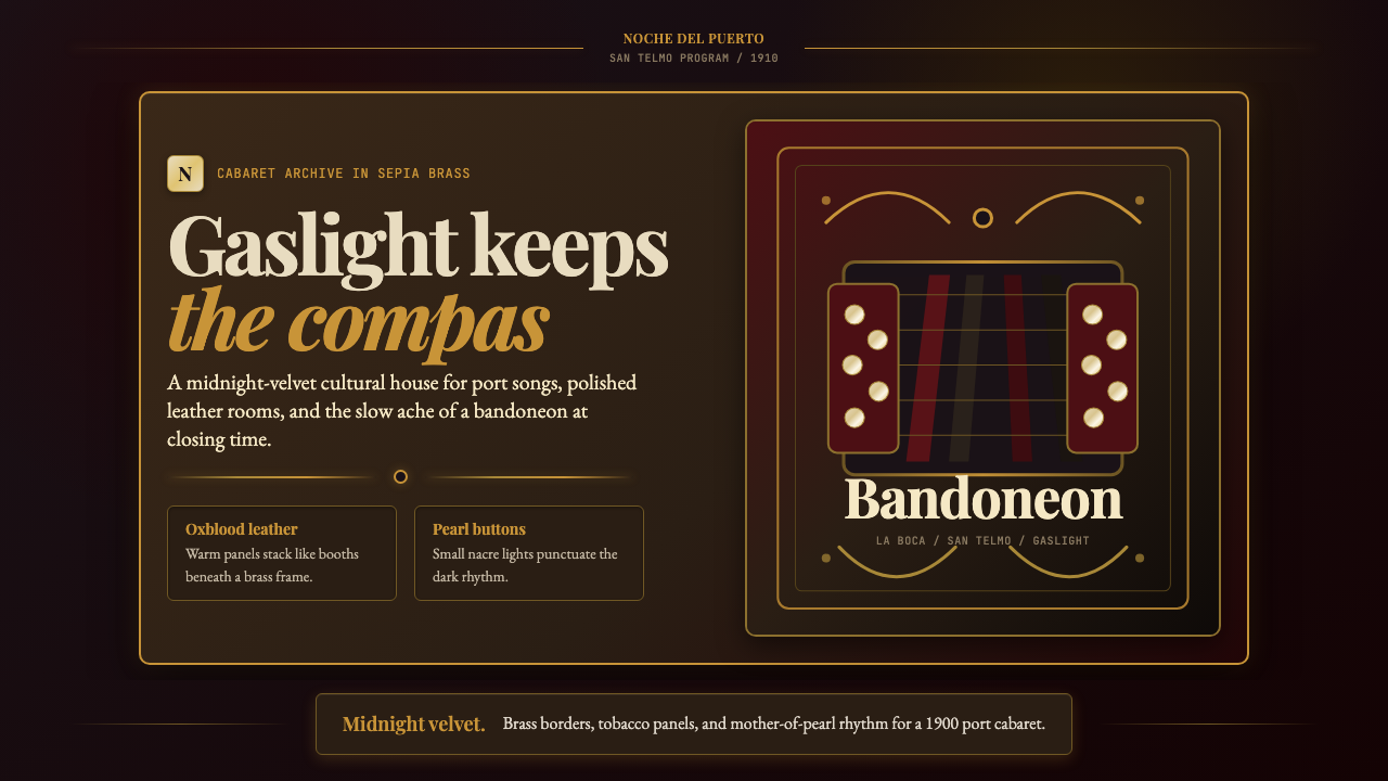 Argentine Bandoneón 1900 (Tango)Gaslit tango luxury. Midnight velvet, brass fileteado, and pearl-button geome…煤气灯下的探戈奢华:午夜绒底、黄铜卷草与珍珠琴键。