What is Kana Waka Calligraphy?
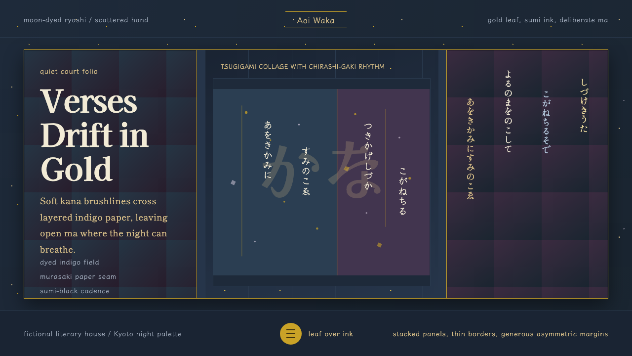
Heian kana calligraphy turned handwriting itself into the artwork — scattered cursive verse, gold-flecked paper, and asymmetric silence standing in for every ornament a Western page would add.
Kana Waka Calligraphy in brief
Kana Waka Calligraphy is a design language drawn from the courtly manuscript culture of Heian-period Japan, most famously preserved in the Sanjurokunin-kashu (the 'Anthology of Thirty-Six Poets'), an album of decorated poetry books compiled around 1112 and now held at Nishi Hongan-ji temple. It is not a typeface or a color palette borrowed from a single object — it is a full compositional system built around dyed and collaged paper, metallic leaf, and flowing cursive script, in which the writing and the surface it sits on are designed together as one image.
The defining move of the style is that text is never placed on plain white ground and never confined to a grid. Waka poems — Japan's classical 31-syllable verse form — are brushed in hiragana that connects letter to letter in unbroken, drifting lines, then scattered across the page in irregular columns of varying length, a technique called chirashi-gaki, or 'scattered writing'. The page is treated less like a container for information and more like a landscape the poem wanders through.
Underneath that writing sits ryoshi — paper that has been dyed in soft, saturated colors, torn and pieced together in collage (tsugigami), and dusted or flecked with gold and silver leaf. The overall effect is quiet rather than loud: richness delivered through material and restraint rather than through contrast or symmetry. Where a modern grid system organizes through repetition, this system organizes through balance between dense ink, decorated color, and large, deliberate emptiness.
Where does Kana Waka Calligraphy come from?
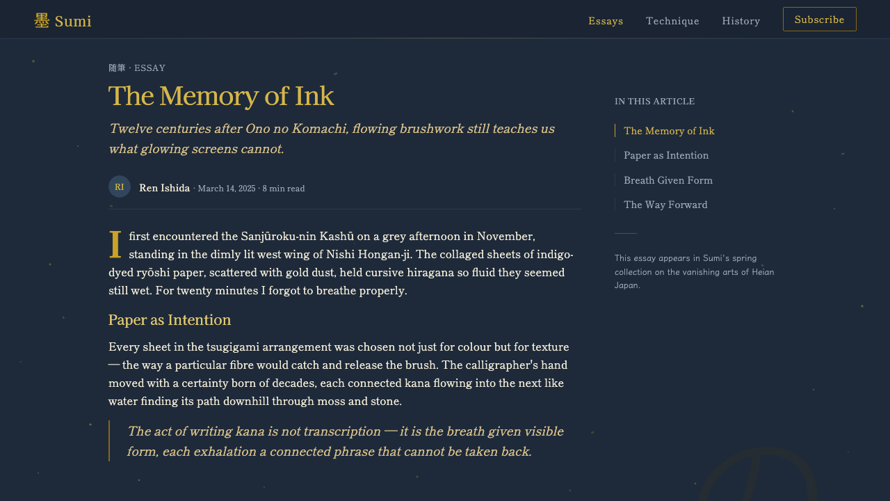
The Heian period (794–1185) was Japan's classical courtly age, centered on the capital of Heian-kyo, present-day Kyoto. It was an era in which the aristocracy prized refinement above almost everything else — a well-turned poem, a correctly layered robe, or a beautifully brushed letter could make or unmake a courtier's reputation. Calligraphy was not a peripheral craft in this world; it was a primary vehicle of status, courtship, and emotional expression, practiced by the same nobles who composed the poetry it recorded.
Waka poetry — the native 31-syllable form, as opposed to Chinese-style verse — became the vehicle through which court culture expressed romantic longing, seasonal melancholy, and social wit. Poets such as Ki no Tsurayuki, who helped compile the earlier imperial anthology Kokin Wakashu, and figures like Ono no Komachi and Ariwara no Narihira, celebrated as two of Japan's 'Six Poetic Geniuses,' became the literary canon that later calligraphers would return to again and again as source text. Writing out their verses beautifully was itself an act of homage and connoisseurship.
The apex of this fusion of poem and paper arrived in the early twelfth century with the Sanjurokunin-kashu, commissioned as a lavish gift and compiled under the taste of court figures connected to Fujiwara no Kinto, the great arbiter of Heian poetic and aesthetic judgment. Each booklet in the set paired a different poet's verses with its own combination of dyed papers, collage patterns, and metallic decoration, making the anthology as much a display of paper craft and calligraphic range as of poetry itself.
This tradition belongs to a broader native lineage the Japanese call wayo — 'Japanese style' calligraphy, distinguished from the more angular, Chinese-derived kanji-based writing favored in earlier centuries. Wayo calligraphy embraced the newly matured hiragana script, developed from cursive simplifications of Chinese characters, as an expressive medium in its own right — one supple enough to carry the emotional cadences of vernacular Japanese poetry in a way that borrowed Chinese forms never quite could.
What defines the Kana Waka Calligraphy look?
Color
The palette runs through deep, saturated dyed tones — indigo blues, muted purples, warm ochres, soft rose — rather than bright or primary hues. These colors appear as fields of dyed paper rather than as flat digital swatches, so they read as material rather than as applied color: a deep indigo ground looks dyed, not painted. Black ink for the calligraphy and warm metallic gold and silver for leaf and dust are the two constants against which every dyed ground is judged.
Script and Line
The calligraphic line is the system's true typeface: connected cursive hiragana, brushed so that strokes flow into one another across several characters before lifting. Line weight varies continuously within a single stroke — thick where the brush presses, hair-thin where it lifts — producing a rhythm closer to music than to fixed-width lettering. Any digital rendering of this style should treat linework as gestural and variable, never as a uniform-weight font dressed up to look handwritten.
Layout and Scatter
Composition follows chirashi-gaki logic: text runs in vertical columns of uneven length and irregular horizontal spacing, drifting diagonally across the page rather than sitting in even rows or a fixed grid. Columns may start high and trail low, or cluster toward one corner while another remains almost empty. This is a controlled asymmetry — every scattered line is placed with intention, but the intention is to evoke wind, drift, and the passage of a season rather than to align to a module.
Negative Space (Ma)
Empty paper is treated as an active compositional element, not leftover background. The Japanese concept of ma — a charged, deliberate pause or interval — governs how much of the page is left undecorated between passages of text and color. A composition that filled every inch with ink or gold would be considered unrefined; the emptiness is what lets the scattered writing breathe and gives the eye somewhere to rest between phrases.
Metallic Ornament
Gold and silver appear in two distinct forms: sunago, a fine powdered dust scattered like haze across the paper, and kirikane, cut flakes or foil applied as small deliberate accents. Both are used sparingly and unevenly rather than as a uniform metallic sheen — the gold should look drifted and settled, denser in some passages and near-absent in others, echoing the same scattered logic as the text itself.
Paper as Collage
The ground itself is built from tsugigami — torn or cut pieces of differently dyed paper pieced together into a single sheet, sometimes with a deliberately visible seam between colors. This gives the background a patchwork quality that reads as handcrafted rather than printed: a single page might shift from indigo to a paler violet across an irregular diagonal edge, with the calligraphy running across the seam as if unaware of it.
Restraint and Quiet Luxury
Despite the presence of gold, dyed color, and flowing script, the overall register is hushed rather than opulent. Nothing is symmetrical, nothing is centered, and no single element shouts for attention — the luxury is legible only to a viewer willing to look closely at material and gesture. This is the opposite of maximalism: richness is real but distributed thinly, so the composition as a whole stays composed and contemplative.

Who shaped Kana Waka Calligraphy?
A leading poet and critic of the early tenth century, Tsurayuki helped compile the Kokin Wakashu, the imperial anthology that established waka as the central literary form of the Heian court and set the aesthetic standards later calligraphers would draw on. His writings on poetic theory helped cement the idea that verse and its physical presentation were inseparable concerns, laying groundwork for the later marriage of text and decorated paper.
Celebrated as one of the Six Poetic Geniuses of the Heian court, Komachi's waka on transient beauty and unrequited longing became some of the most frequently transcribed verses in later calligraphic albums, including the Sanjurokunin-kashu. Her poems' emotional intimacy made them ideal subjects for the scattered, gestural writing style, where the drift of the brush could echo the drift of feeling described in the verse.
A poet and courtier whose romantic exploits and elegant verse made him a legendary figure of the Heian imagination, later fictionalized as the protagonist of the Tales of Ise. His waka, prized for their emotional directness within the form's strict syllable count, were another staple text for calligraphers seeking verses that rewarded close, sensitive brushwork.
The most influential arbiter of poetic and aesthetic taste in the mid-Heian court, Kinto's critical judgments shaped which poets and poems were considered canonical. His taste is closely associated with the compilation of the Sanjurokunin-kashu itself, and his broader influence on what counted as refined expression extended from poetry selection into the visual presentation those poems were given on the page.
How do you use Kana Waka Calligraphy today?
Kana Waka Calligraphy is a demanding style to translate into contemporary work because its entire logic runs against the grain of modern design conventions: no grid, no symmetry, no uniform typographic weight. Applying it well means treating scatter and negative space as the organizing principle rather than an occasional flourish layered onto a conventional layout.
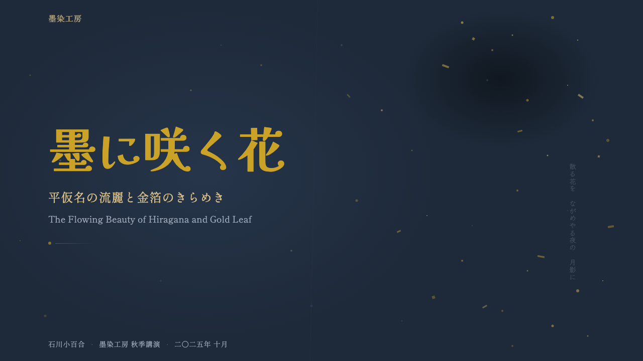
For presentation cover slides, the style rewards a single dyed-color field — deep indigo, muted plum, warm ochre — occupying most of the frame, with a title treated as a single gestural mark placed off-center rather than locked to a headline position, and a scattering of fine gold accents concentrated in one region while the rest of the frame stays empty. Content and data slides are the harder case: numeric data wants grid discipline, which this style resists by nature. The workable approach is to reserve the scattered, calligraphic treatment for section dividers and title moments, then let data itself sit in a calm, quiet, high-contrast table or chart against a plain dyed ground — borrowing the palette and restraint of the style without forcing charts into an asymmetric scatter they were never meant for.
For web interfaces such as dashboards and pricing pages, the style's contribution is tonal rather than structural: deep dyed background colors, warm metallic accent tones used sparingly for highlights or active states, and generous asymmetric white space around content blocks instead of even padding. Card components can carry a faint suggestion of the paper collage — a soft seam or gradient between two dyed tones — without literally scattering interface text off its grid, since usability still requires predictable alignment for buttons, forms, and data.
For editorial and marketing work, this is where the style is most at home. A long-form article or a poster-style marketing page can genuinely adopt chirashi-gaki logic: a pull quote set as a single drifting line of type off the main column, generous ragged margins standing in for ma, and a title treated as calligraphic gesture rather than a locked headline block. Marketing pages for products associated with craft, heritage, or quiet luxury benefit especially from the style's hushed, materials-first register.
The most common mistake is treating this style as 'gold plus black ink on white' — flattening it into a color scheme rather than honoring its structure. Authentic use requires dyed, non-white grounds; scattered rather than gridded layout; a calligraphic, gesturally weighted line rather than a uniform-weight font pretending to be handwritten; and, above all, real restraint in how much gold appears. A composition that is symmetrical, evenly lit, or covered edge-to-edge in ornament has missed the point of the style entirely.
Kana Waka Calligraphy — FAQ
Is Kana Waka Calligraphy the same as general 'Japanese calligraphy' or shodo?
They overlap but are not identical. Shodo, or Japanese calligraphy broadly, includes many schools and eras, including bold kanji-based ink work with roots in Chinese tradition. Kana Waka Calligraphy refers specifically to the Heian-period courtly tradition of writing native Japanese poetry in flowing hiragana on decorated paper — a gentler, more cursive, more explicitly feminine and courtly register than the more austere kanji calligraphy associated with Zen or later samurai-era practice. It is one historical branch of shodo, distinguished by its script, its subject matter, and its inseparability from decorated paper craft.
Why is negative space treated as so important in this style?
Because the composition is understood as a balance between presence and absence rather than as a surface to be filled. The concept of ma treats an interval of emptiness as carrying its own meaning and weight, comparable to a rest in music — it is not unused space waiting for content, it is content in its own right. In this style, removing gold, ink, or color from a passage of the page is as deliberate a decision as adding it, and a composition that fills every area equally is considered to have failed to compose at all.
Can this style be adapted for a bright, high-contrast digital product, or does it require a dark background?
The historical palette leans toward deep, saturated dyed tones — indigo, plum, ochre — which naturally push most authentic applications toward a dark or richly colored ground rather than a bright white one. A lighter adaptation is possible if it keeps the same dyed, non-white quality — a warm cream or pale rose ground rather than a pure white or neutral gray one — and preserves the asymmetric scatter and restrained metallic accents. What breaks the style is not lightness itself but flattening the ground into a neutral, evenly-lit interface color that reads as generic rather than dyed.
How should typography and UI text be handled, since this style is built around brushed script rather than fonts?
For decorative and title moments, the closest honest translation is a flowing script treatment that varies in weight along its strokes, evoking brush movement rather than a fixed-width typeface dressed up with serifs to look calligraphic. For functional UI text — body copy, labels, data — the style should not force a script font onto content that needs to stay legible and accessible; instead, a quiet, restrained serif or plain typeface carries the tone through spacing and color alone, reserving the calligraphic gesture for headlines, dividers, and decorative moments where legibility is not the primary requirement.
What kinds of products or brands does this style suit, and where does it struggle?
It suits products and brands built around heritage, craft, poetry, quiet luxury, or cultural specificity tied to Japanese aesthetics — publishing, tea and beverage brands, hospitality, art and museum platforms, or premium products that want to signal patience and refinement rather than speed. It struggles in contexts that demand high information density, rapid scanning, or strict data grids, since its entire logic resists uniform structure; it also risks feeling like costume rather than design if applied only as a surface color scheme without the asymmetric layout and restrained materials that give it meaning.
Related design styles
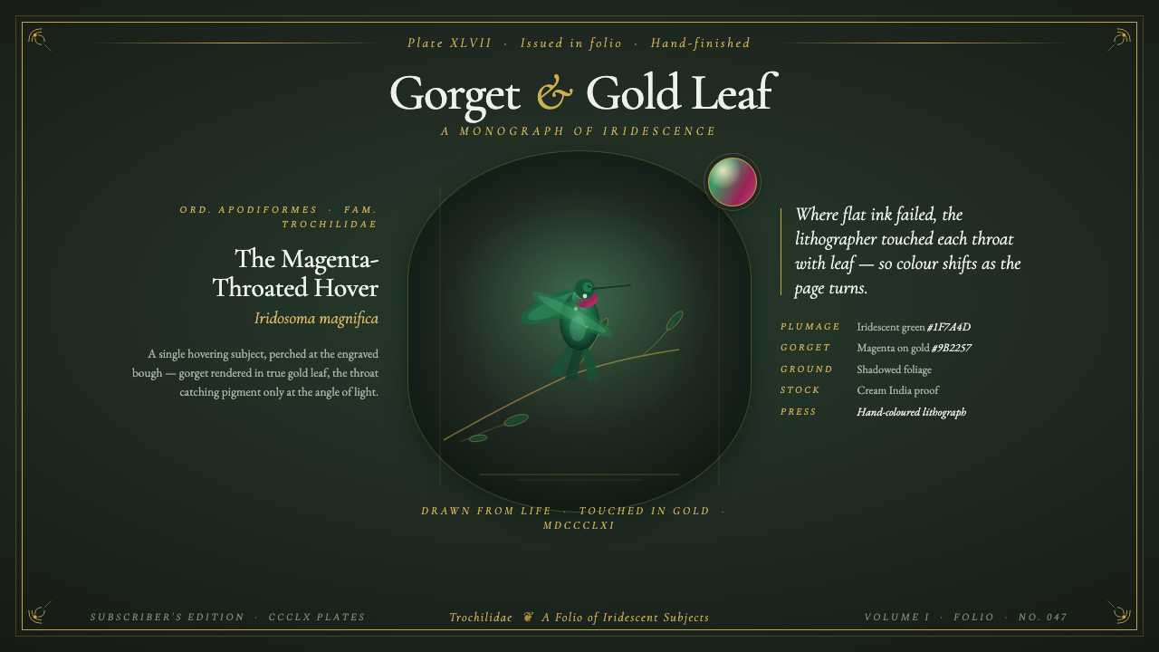 Gould Hummingbird PlateVictorian ornithology, jewel-grade. Green plumage on shadowed foliage, gorget…
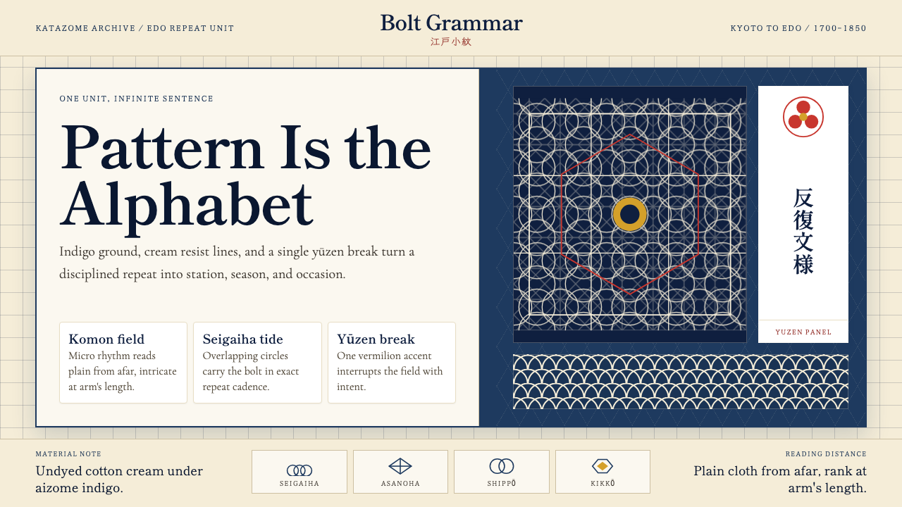 Edo Kimono TextilePattern becomes language. Indigo repeats, cream resist lines, one vermilion p…
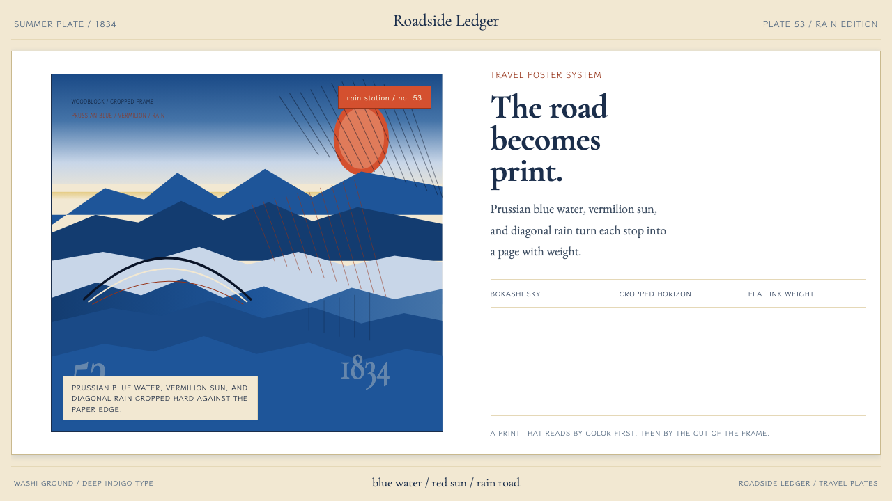 Hiroshige — Tokaido RoadA road print in motion. Prussian blue blocks, vermilion cartouches, diagonal…
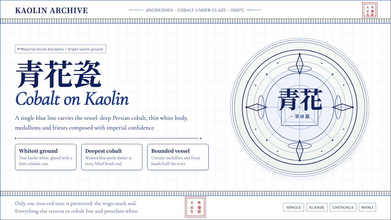 Ming Blue-and-White PorcelainImperial restraint sings. Deep cobalt hairlines circle kaolin white with one…
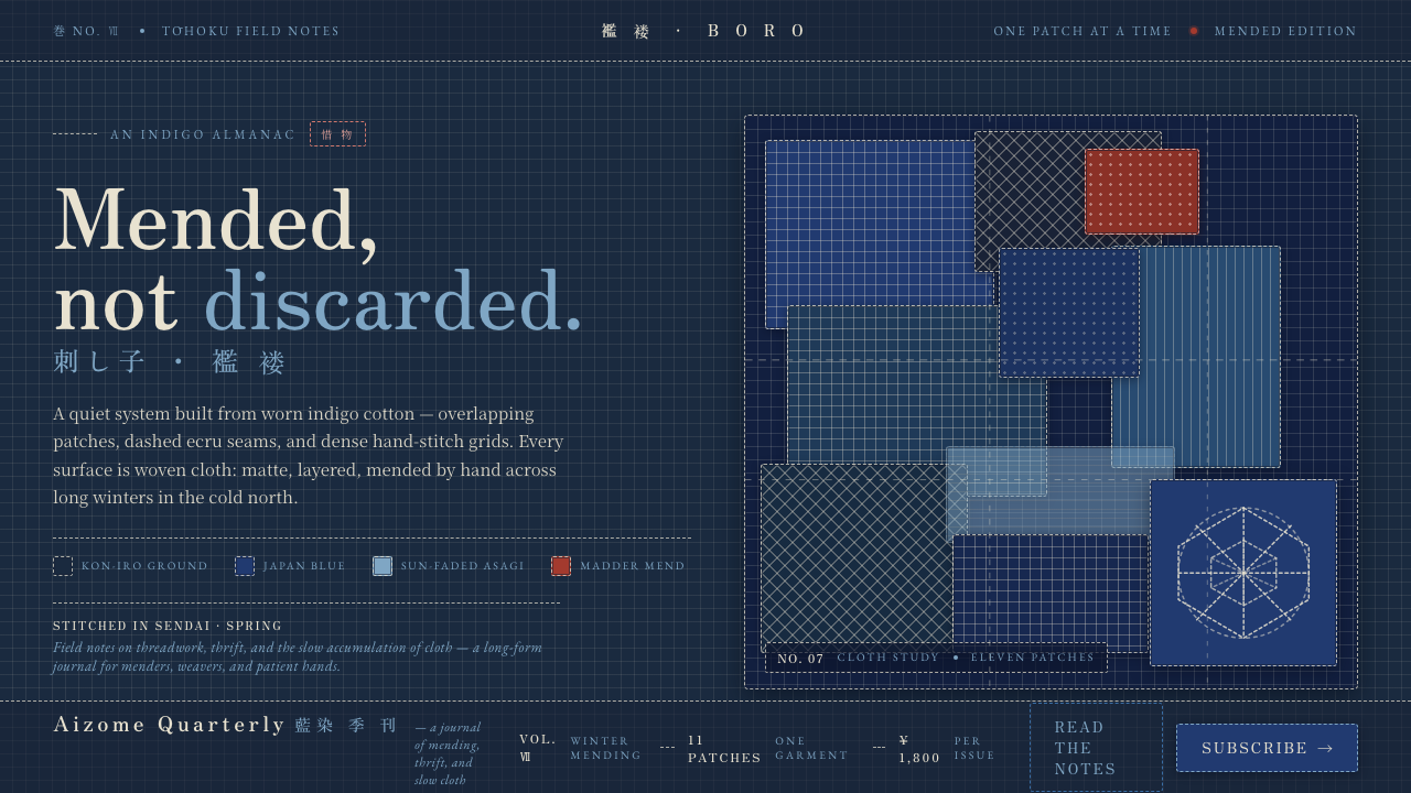 Sashiko BoroMended, not discarded. Deep kon-iro grounds, overlapping patches, dashed ecru…
 Tibetan Thangka Mandala (1500)Cosmic order, burnished dark. Lapis ground, gold borders, vermilion rings.