What is Zhang Yimou Cinema Red?什么是 Zhang Yimou Cinema Red?
Zhang Yimou turned a single red into an entire emotional language — passion, fate, and political destiny compressed into one saturated hue that floods every frame like dye poured into still water.张艺谋将一抹红色化为完整的情感语言——激情、命运与政治象征凝聚于一色,如染料倾入静水,浸透每一帧画面。
Zhang Yimou Cinema Red in briefZhang Yimou Cinema Red 速览
Zhang Yimou Cinema Red is a design aesthetic derived from the chromatic discipline of China's Fifth Generation cinema — the extraordinary burst of filmmaking that emerged from the Beijing Film Academy class of 1982, whose graduates had survived the Cultural Revolution and returned to the countryside as sent-down youth before returning to study. Zhang Yimou, who served as cinematographer on early Fifth Generation films before directing his own, developed an unmistakable visual grammar built on a dominant, ceremonial red set against warm parchment grounds, deep walnut-brown architectural frames, and restrained imperial gold accents.张艺谋电影红是一种源自中国第五代电影色彩纪律的设计美学。第五代电影人来自1982年北京电影学院的毕业生群体——他们曾历经文化大革命,以知青身份下乡,再归来求学,由此形成了迥异于前辈的视觉感知。张艺谋在执导自己的影片之前,曾担任第五代早期电影的摄影师,并由此锤炼出一套辨识度极高的视觉语法:以一抹仪式感十足的浓烈红色为核心,衬以暖调宣纸底、深色胡桃木建筑框架,以及克制的帝王金点缀。
The aesthetic is not about abundance of color. It is about the intensity of one. Where most visual systems balance multiple hues across a composition, Cinema Red concentrates its emotional charge into a single oversaturated field — a courtyard hung with vermilion lanterns, a vat of scarlet dye, a bridal sedan chair lacquered to a blinding sheen. Everything else in the frame — cream paper walls, dark timber lattice, raked earth — exists to make that red feel inevitable. The design system translates this cinematic discipline into interface and layout work: a chalk-cream or warm parchment ground, structural frames in deep walnut brown, one dominant red that commands the primary visual weight of any composition.这套美学并非关于色彩的丰富,而是关于一种颜色的强度。大多数视觉系统在构图中平衡多种色调,而电影红将其情感能量集中于一片过饱和的色域——挂满朱红灯笼的庭院、盛着猩红染料的大缸、漆得耀眼的花轿。画面中的其他一切——宣纸色墙面、深色木格栅、夯土地面——都是为了让那抹红色显得不可避免。这套设计系统将这种电影纪律转化为界面与版面语言:以粉笔白或暖调宣纸色为底,以深胡桃棕构筑结构框架,以一抹主导性的红色统领构图的视觉重心。
What distinguishes this system from generic 'red-and-gold' oriental pastiche is its emotional logic. The red in Zhang Yimou's films is never decorative. It is fate made visible — it signals desire, danger, ritual, and the crushing weight of social expectation. Applied faithfully, Cinema Red produces compositions that feel ceremonial and weighty rather than festive or merely colorful. The atmosphere is closer to incense smoke and lacquered wood than to celebration banners.将这套系统与泛滥的『红金东方』风格区分开来的,是其情感逻辑。张艺谋电影中的红色从不是装饰性的——它是命运的可见形态,是欲望、危险、仪式与社会重压的视觉显现。忠实运用这套语言,所产出的构图会呈现出仪式感与厚重感,而非节庆的喜气或单纯的色彩丰富。它的氛围更接近于香烟与漆木,而非彩旗与喧嚣。
See the Zhang Yimou Cinema Red design system查看 Zhang Yimou Cinema Red 完整设计系统
Where does Zhang Yimou Cinema Red come from?Zhang Yimou Cinema Red 从何而来?
The Fifth Generation of Chinese filmmakers emerged from an almost impossible set of historical circumstances. The Beijing Film Academy, closed during the Cultural Revolution (1966–1976), reopened in 1978 and admitted its first post-revolutionary class — a cohort of students already in their mid-to-late twenties, shaped by years of rural labor, political upheaval, and a hunger for visual art they had been denied. Zhang Yimou, born in 1950 in Xi'an, Shaanxi province, had worked in a cotton mill and later as a farm laborer before gaining admission. He would go on to study cinematography, not directing — and his later films bear the mark of a director who thinks first in images.中国第五代电影人的崛起源于一段几乎不可能发生的历史际遇。北京电影学院在文化大革命(1966—1976年)期间关闭,1978年重新招生,录取了第一批后革命时代的学生——这群人入学时大多已二十六七岁,被多年的农村劳动与政治动荡所塑造,对长期被剥夺的视觉艺术怀有强烈渴望。张艺谋1950年生于陕西西安,曾在棉纺厂做工、此后务农,才获得入学资格,主修摄影而非导演——他日后的电影深深烙印着一位首先以影像思考的导演的特质。
The visual revolution these filmmakers launched was inseparable from the literature they adapted. Zhang Yimou's early films drew on the work of Chinese writers exploring rural life, social tradition, and the weight of history: Mo Yan's novel provided the source for Red Sorghum (1987), Su Tong's novella for Raise the Red Lantern (1991), and Yu Hua's fiction for To Live (1994). These were stories set in village courtyards, dye works, and opera houses — environments saturated with the material culture of pre-modern China. The visual palette was already embedded in the source material; Zhang Yimou and his collaborators made it overwhelming.这批电影人发动的视觉革命,与他们改编的文学作品密不可分。张艺谋早期电影的原著,均出自探索乡村生活、社会传统与历史重量的中国作家之手:莫言的小说《红高粱家族》提供了《红高粱》(1987年)的素材,苏童的中篇小说《妻妾成群》是《大红灯笼高高挂》(1991年)的来源,余华的小说则是《活着》(1994年)的原著。这些故事发生在村落庭院、染坊与戏楼之中——浸透着前现代中国物质文化的空间。视觉色板早已内嵌于原著素材之中;张艺谋与合作者所做的,是将其推至极致。
Red Sorghum (1987) established the template. Cinematographer Gu Changwei and Zhang Yimou flooded the frame with a red that felt biological — the crimson of sorghum wine, of blood spilled in Japanese occupation, of bridal processions crossing open fields. The color was not realistic in the photographic sense; it was heightened, pushed toward the mythological. Ju Dou (1990) transferred this intensity to the interior of a dye works — bolts of crimson-dyed cloth hanging in columns, the dye vat itself a turbulent red field from which characters emerged stained. Raise the Red Lantern (1991) refined the palette toward ritual: lanterns of a specific, repeated red punctuating the grey-blue architecture of a Shanxi merchant compound, their lighting and extinguishing the only event that matters in the lives of the women inside.《红高粱》(1987年)确立了这套模板。摄影师顾长卫与张艺谋将画面浸入一种带有生命质感的红色——高粱酒的深红、日寇占领下流淌的鲜血红、花轿队伍穿越旷野的喜红。这抹颜色并非写实摄影意义上的真实,而是被推向了神话般的高度。《菊豆》(1990年)将这种强度转移至染坊内部——一排排猩红染布悬挂如柱,染缸本身是翻涌的红色液面,人物从中浮现时已被深深染色。《大红灯笼高高挂》(1991年)则将这种色彩纪律升华为仪式:特定色调的红灯笼在山西商人大院灰蓝色建筑群中反复出现,它们的点亮与熄灭,是院中女子生命里唯一重要的事件。
The international reception of these films in the early 1990s — including Oscar nominations, Venice and Berlin festival prizes — brought global attention to their visual style at the exact moment that digital design tools were first enabling designers outside film to work at similar scales of color saturation and compositional control. The aesthetic entered design consciousness as a named reference point: rich, ceremonial, emotionally loaded, and specifically Chinese in its material vocabulary — lacquer, paper, timber, dye — without being stereotypically decorative. Zhang Yimou's later work, including Hero (2002) and House of Flying Daggers (2004), extended the system into wuxia spectacle with even greater chromatic ambition, confirming the style's range and establishing its continued relevance into the early twenty-first century.这批影片在1990年代初期获得的国际认可——奥斯卡提名、威尼斯与柏林电影节奖项——恰逢数字设计工具首次让电影以外的设计师能够实现同等程度的色彩饱和度与构图控制。这种美学以一个具名的参照系进入设计意识:浓烈、仪式感强、情感充沛,且在物质词汇上具有鲜明的中国属性——漆器、宣纸、木材、染料——却并不落入陈腐的装饰性东方主义。张艺谋此后的作品,包括《英雄》(2002年)与《十面埋伏》(2004年),以更宏大的色彩野心将这套系统延伸至武侠奇观,确认了这种风格的宽广射程,并使其在二十一世纪初依然保持鲜活的关联性。
What defines the Zhang Yimou Cinema Red look?Zhang Yimou Cinema Red 的视觉特征是什么?
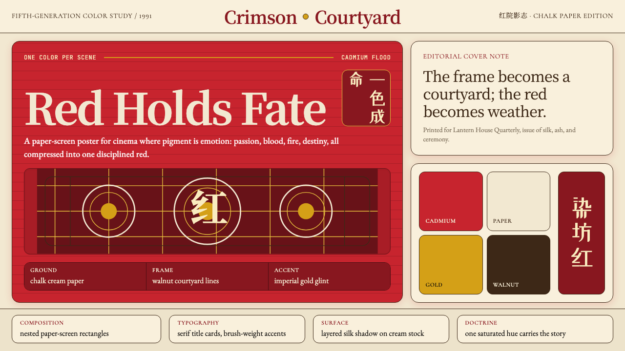
Dominant Red Field主导性红色色域
The defining move of this system is the use of a single, deeply saturated red as the primary organizational weight in a composition. This is not a red used in balance with other colors; it is a red that floods — covering large surface areas, commanding attention before any other element registers. The specific quality of the red is warm and slightly orange-shifted, closer to vermilion or lacquer than to crimson or rose. It reads as physical, material, even ceremonial — the color of dye-vats and lantern silk rather than of alert badges or notification dots.这套系统的核心手法,是以一抹深度饱和的红色作为构图的主导视觉重量。这不是在多种色彩间寻求平衡的红色,而是一种漫溢的红——覆盖大面积画面,在任何其他元素被注意到之前便已夺目。这种红色的质感是偏暖的、略微橙移的,更接近朱砂或漆红,而非深红或玫瑰红。它传递出一种物质感与仪式感——染缸与灯笼绸缎的颜色,而非警告徽章或通知圆点。
Chalk-Cream and Parchment Ground粉笔白与宣纸底
The ground against which Cinema Red operates is never pure white. It is a warm, slightly muted cream — the color of unsized paper, of whitewashed courtyard walls under afternoon light, of handmade cloth before dyeing. This warmth in the background is essential: it gives the dominant red a surface to push against that does not fight it with equal brightness, allowing the red to read as luminous rather than garish. Cool white or grey grounds would undermine the temperature logic entirely.电影红所依托的底色从不是纯白。它是一种温暖、略显沉敛的奶白——无浆宣纸的颜色、午后光线下白灰庭院墙面的颜色、未经染色的手工布料的颜色。底色的这种暖意至关重要:它给主导性的红色提供了一个不以同等亮度抗衡的表面,使红色呈现出发光的质感而非刺眼的喧嚣。冷白或灰色的底面将彻底破坏这套色温逻辑。
Walnut-Brown Structural Frame胡桃棕结构框架
The architectural elements in Zhang Yimou's visual world — courtyard gates, lattice screens, timber beams, carved doorframes — are consistently rendered in a deep, warm brown that reads as walnut, aged teak, or lacquered rosewood. In design application, this tone functions as the structural skeleton: navigation bars, dividers, border elements, and framing devices. It is dark enough to establish hierarchy over the parchment ground but warm enough not to create the cold authority of pure black. The grain and texture of wood are implied, not simulated — the tone carries the reference without requiring a photographic surface.张艺谋视觉世界中的建筑元素——庭院门楼、格栅屏风、木质横梁、雕花门框——始终以一种深沉温润的棕色呈现,令人联想到胡桃木、老柚木或漆红酸枝木。在设计应用中,这一色调充当结构骨架:导航栏、分割线、边框元素与框架构件。它足够深以在宣纸底上建立层级,又足够暖以避免纯黑色带来的冷峻权威感。木纹与质感是被暗示的而非被模拟的——色调本身携带着这种指涉,无需摄影质地的表面。
Imperial Gold as Accent帝王金点缀
Gold in this system is deployed with extreme restraint — a hairline border on a ceremonial element, a single character rendered in gilt, the edge of a lantern frame. It never competes with the dominant red for visual weight; its role is to elevate and formalize. The quality of the gold is warm, slightly muted, and matte rather than metallic-bright — closer to gilt paper or lacquered gold leaf than to polished brass or chrome. When gold appears, it signals that something in the composition is being treated as precious, rare, or ritually significant.这套系统中的金色以极度克制的方式出现——仪式性元素上的细线边框、以鎏金呈现的单个文字、灯笼框架的边缘。它从不与主导性红色竞争视觉重量;其作用是提升与正式化。这种金色的质感是温暖的、略显沉敛的、哑光而非金属光泽的——更接近鎏金宣纸或漆金箔,而非抛光黄铜或镀铬。金色出现之处,意味着构图中的某个事物被赋予了珍贵、稀有或仪式性意义。
Symmetry and Ceremonial Composition对称与仪式性构图
Unlike the asymmetric dynamism of Bauhaus or Swiss International Style, Cinema Red leans into bilateral symmetry as a deliberate compositional choice. Symmetry in Chinese courtyard architecture is not neutral — it is a marker of order, ritual, and hierarchy. A centered composition with a dominant red element at the axis reads as a formal declaration. This does not mean all layouts must be rigidly symmetrical; but when Cinema Red is applied authentically, the organizing logic tends toward centeredness, balance, and the kind of weight that makes a viewer pause rather than scan.与包豪斯或瑞士国际主义风格的非对称动感不同,电影红有意倚重双侧对称作为构图选择。中国庭院建筑中的对称并非中性的——它是秩序、仪式与等级的标志。以主导性红色元素居轴的居中构图,传递出一种正式宣告的气质。这并不意味着所有版面都必须严格对称,但当电影红被忠实运用时,其组织逻辑倾向于居中、均衡,以及那种令观者驻足而非快速扫视的厚重感。
Texture Through Restraint克制中的质感
The textures that matter in this system are not added — they are implied. The warmth of the ground suggests paper or plaster; the depth of the walnut brown suggests grain; the richness of the red suggests dye that has penetrated a surface rather than been painted over it. In practice, this means avoiding high-gloss, high-contrast, or digitally generated texture effects. Surfaces should read as aged and material without requiring photographic rendering. A slight warmth in tonal values, a slight desaturation in supporting tones, does more to evoke the physical world of Zhang Yimou's cinema than any applied texture overlay.在这套系统中,重要的质感不是被添加的——而是被暗示的。底色的暖意暗示纸张或灰泥;胡桃棕的深度暗示木纹;红色的浓郁暗示渗入表面的染料而非涂覆其上的颜料。在实践中,这意味着要避免高光泽、高对比度或数字生成的质感效果。表面应当呈现出岁月感与物质感,而无需摄影级渲染。色调值中轻微的暖意、辅助色调中轻微的去饱和,比任何叠加的纹理滤镜都更能唤起张艺谋电影的物质世界。
Emotional Gravity Over Decoration情感重量优于装饰
The hardest principle to articulate and the easiest to violate: Cinema Red is an emotionally serious aesthetic. Every element in a composition should feel like it carries weight — purpose, history, or consequence. Decorative flourishes, playful micro-animations, gradient washes, or ironic visual references all break the system. This is an aesthetic that takes its own emotional register seriously. A layout built on Cinema Red principles should feel like it is making a statement, not performing one. The test is whether removing an element would leave the composition feeling incomplete, or merely lighter. If lighter, remove it.最难以言说、也最容易被违背的原则:电影红是一种情感上严肃的美学。构图中的每一个元素都应感觉具有分量——目的、历史或后果。装饰性花饰、轻盈的微动画、渐变铺色或反讽的视觉引用,都会破坏这套系统。这是一种认真对待自身情感格调的美学。基于电影红原则建构的版面,应当让人感觉是在作出陈述,而非表演一种陈述。检验标准是:移去一个元素,构图会显得不完整,还是仅仅变得更轻盈?如果是后者,那就移去它。

See the Zhang Yimou Cinema Red design system查看 Zhang Yimou Cinema Red 完整设计系统
Who shaped Zhang Yimou Cinema Red?谁塑造了 Zhang Yimou Cinema Red?
Born in Xi'an in 1950, Zhang Yimou trained as a cinematographer at the Beijing Film Academy — a background that made him one of the most visually deliberate directors of his generation. His first film as director, Red Sorghum (1987), won the Golden Bear at Berlin and announced his chromatic ambitions immediately. Over the following two decades he produced a string of films — Ju Dou, Raise the Red Lantern, The Story of Qiu Ju, To Live, Shanghai Triad, Hero, House of Flying Daggers — that systematically explored what saturated color, architectural space, and ritual could do as a formal vocabulary. He directed the opening and closing ceremonies of the 2008 Beijing Olympics, bringing the same ceremonial color logic to an audience of billions.张艺谋1950年生于西安,在北京电影学院主修摄影——这一学术背景使他成为同代导演中视觉意图最为自觉的一位。他的导演处女作《红高粱》(1987年)摘得柏林金熊奖,立即昭示了他的色彩野心。此后二十年间,他接连拍出《菊豆》《大红灯笼高高挂》《秋菊打官司》《活着》《摇啊摇,摇到外婆桥》《英雄》《十面埋伏》,系统性地探索了饱和色彩、建筑空间与仪式作为形式语汇所能达到的极限。2008年,他担任北京奥运会开闭幕式导演,将同一套仪式性色彩逻辑带到了数十亿人的面前。
Gong Li became the central human presence in Zhang Yimou's chromatic world, appearing in Red Sorghum, Ju Dou, Raise the Red Lantern, The Story of Qiu Ju, To Live, and Shanghai Triad. Her roles consistently placed her in the tension between individual desire and social constraint — the same tension the red-and-parchment palette makes visible at a compositional level. She is not simply an actress associated with the style; her physical presence in the frame shaped decisions about color proportion, light temperature, and compositional weight in ways that influenced how the visual system was developed across multiple productions.巩俐成为张艺谋色彩世界中核心的人物存在,先后出演了《红高粱》《菊豆》《大红灯笼高高挂》《秋菊打官司》《活着》与《摇啊摇,摇到外婆桥》。她所饰演的角色始终置身于个人欲望与社会束缚的张力之间——而红色与宣纸调色板在构图层面所呈现的,正是这同一种张力。她不仅仅是与这种风格相关联的演员;她在画面中的在场,深刻影响了多部作品中关于色彩比例、光线色温与构图重量的决策,并由此参与塑造了这套视觉系统的形成过程。
Mo Yan — born Guan Moye in 1955 in Shandong province, winner of the Nobel Prize in Literature in 2012 — provided Zhang Yimou with the source material for Red Sorghum through his 1986 novel Red Sorghum Clan. Mo Yan's prose is itself deeply chromatic: red appears throughout his Gaomi County fiction as the color of vitality, violence, and historical memory. The novel's sensory density — sorghum wine, blood, red earth, bridal procession — gave Zhang Yimou a literary mandate for the chromatic extremity of the film. Mo Yan's influence on the aesthetic is therefore not merely biographical but structural: the literary source established that red could carry narrative weight across an entire work.莫言——本名管谟业,1955年生于山东,2012年诺贝尔文学奖得主——以其1986年的长篇小说《红高粱家族》为张艺谋提供了《红高粱》的原著素材。莫言的散文本身便具有深度的色彩性:红色贯穿他的高密县系列小说,是生命力、暴力与历史记忆的颜色。小说的感官密度——高粱酒、鲜血、红土地、迎亲队伍——为张艺谋的色彩极端主义提供了文学授权。因此,莫言对这套美学的影响并非仅仅是传记式的,而是结构性的:文学原著确立了红色可以在整部作品中承载叙事重量这一前提。
Su Tong's 1990 novella Wives and Concubines provided the literary source for Raise the Red Lantern, the film in which Zhang Yimou's color system reached its most refined and architecturally integrated expression. Su Tong's story of the rituals of a 1920s merchant household — the lighting of lanterns to signal which concubine would receive the master that evening — gave the visual system its central organizing metaphor: red as the unit of power distribution, red as reward and deprivation, red as the only warmth available in an otherwise grey and cold world. The Shanxi merchant compound setting that director Zhang Yimou selected for the film (the Qiao Family Compound in Qi County) amplified Su Tong's architectural symbolism into something almost diagrammatic.苏童1990年的中篇小说《妻妾成群》为《大红灯笼高高挂》提供了文学来源——正是在这部影片中,张艺谋的色彩系统达到了最为精炼、与建筑融合最为深入的表达。苏童的故事——关于一座1920年代商人大院的仪式,以点亮灯笼来标示当晚哪位姨太太将侍奉老爷——为这套视觉系统赋予了核心的组织隐喻:红色作为权力分配的单位,作为恩宠与剥夺,作为一个灰冷世界中唯一可得的温暖。张艺谋为影片选定的山西商人大院——祁县乔家大院——将苏童的建筑象征主义放大成了一种近乎示意图式的清晰。
Gu Changwei served as director of photography on Red Sorghum (1987) and Ju Dou (1990), and it is largely his eye that translated Zhang Yimou's color intentions into the specific photographic language that defined the aesthetic's early years. Gu later went on to a distinguished directing career of his own (Peacock, 2005; Blind Mountain, 2007). His collaboration with Zhang Yimou in the late 1980s established the precise quality of light — warm, raking, from low angles — that gives the red in these films its material weight. The red in a Gu Changwei-lit frame looks like something you could touch.顾长卫担任《红高粱》(1987年)与《菊豆》(1990年)的摄影指导,这套美学早期视觉语言的形成,在很大程度上是他的眼光将张艺谋的色彩意图转化为具体摄影语言的结果。顾长卫后来开创了自己卓越的导演生涯(《孔雀》2005年;《盲山》2007年)。他与张艺谋在1980年代末的合作确立了光线的精确质感——温暖的、低角度的掠射光——正是这种光线赋予了影片中红色以物质重量。顾长卫打光的画面里,红色看起来像是触手可及之物。
How do you use Zhang Yimou Cinema Red today?今天怎么用 Zhang Yimou Cinema Red?
Cinema Red is one of the most emotionally charged design systems available — which means it is also one of the easiest to misapply. The discipline required is essentially about restraint: letting a single, dominant red carry the full weight of the composition while every other element serves a supporting role. Before applying this system, establish clearly what the red will mean in the context of the product. If the red is going to appear on interactive elements, alerts, and decorative accents simultaneously, the system will collapse into visual noise. Choose one register — ceremonial, structural, or hierarchical — and commit to it throughout.电影红是现有设计系统中情感张力最为强烈的体系之一——这也意味着它同样是最容易被误用的系统之一。这套系统所要求的纪律,本质上是关于克制的:让单一的、主导性的红色承载构图的全部重量,而其他一切元素都服务于支撑角色。在应用这套系统之前,需要清楚地确立红色在产品语境中的含义。如果红色将同时出现在交互元素、警示信号与装饰性点缀上,系统将崩溃为视觉噪音。选择一种格调——仪式性、结构性或层级性——并在整个系统中贯彻到底。
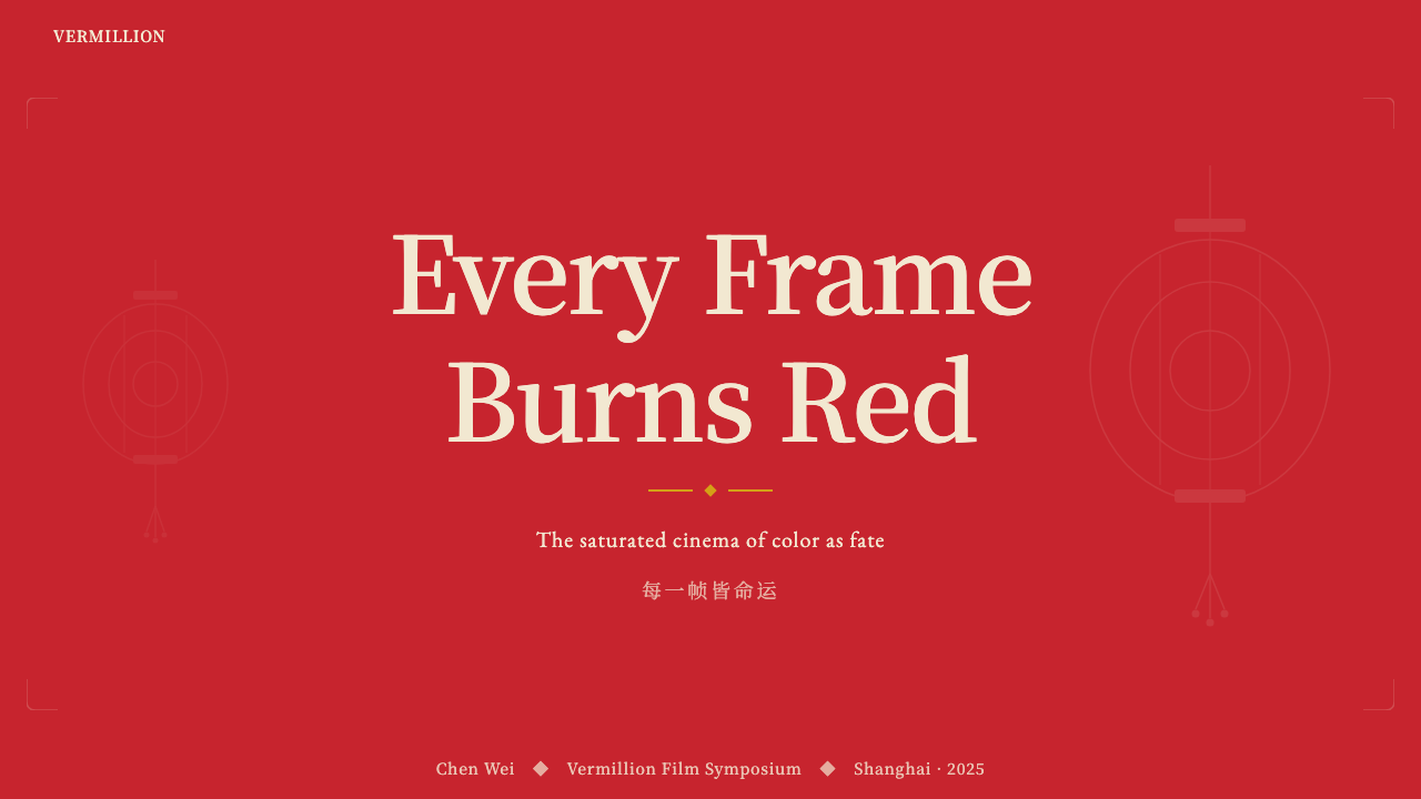
For presentation slides, Cinema Red operates most powerfully when the cover slide is treated as a poster rather than a title card. A large field of the dominant red — occupying more than half the slide area — with a centered title in warm white or parchment, and the thinnest possible gold rule beneath it, creates the declarative quality that the system demands. Content slides should return to the parchment ground with walnut-brown structural elements — section headers, dividers, column rules — and reserve the dominant red for a single focal element per slide: a key statistic, a call-out quote, or a primary chart element. Data visualization in this system works best when the primary data series is rendered in the dominant red and all supporting series in deeply muted earth tones — the data hierarchy becomes legible through the same color logic that structures the rest of the composition.在演示文稿中,当封面被当作海报而非标题页处理时,电影红的力量最为强大。以主导性红色覆盖超过一半的版面面积,居中排布暖白色或宣纸色的标题,在标题下方置以最细的金色分割线,产生这套系统所要求的宣告性质感。内容页应回归宣纸底,以胡桃棕构筑结构元素——章节标题、分割线、分栏线——并将主导性红色保留给每页的单一焦点元素:关键数据、引用语或主要图表元素。在这套系统中,数据可视化的最佳处理方式是以主导性红色呈现主要数据系列,以深度沉敛的大地色系呈现所有辅助数据系列——数据层级通过与构图其余部分相同的色彩逻辑而清晰可读。
For web interfaces, the system is best suited to contexts that benefit from weight and formality: premium product landing pages, cultural institution websites, high-end editorial platforms, and brand identity pages where the product aspires to a sense of history or ceremony. Dashboard and analytical tools can use Cinema Red, but should restrict the dominant red to a single tier of information — the most critical metric, the primary status indicator — rather than using it across multiple data dimensions. Navigation elements work well in deep walnut brown against parchment, with the dominant red reserved for the active state. Pricing pages can use the full red for a featured or recommended tier, creating the same logic of distinction that lantern lighting created in Raise the Red Lantern.在网页界面中,这套系统最适合受益于厚重感与正式感的场景:高端产品落地页、文化机构网站、高品质编辑平台,以及品牌形象页面——尤其是那些产品本身渴望传递历史感或仪式感的场景。仪表板与分析工具可以使用电影红,但应将主导性红色限制于单一的信息层级——最关键的指标、主要的状态指示——而非跨越多个数据维度使用。导航元素在宣纸底上以深胡桃棕处理效果良好,主导性红色保留给激活状态。定价页面可以将完整的红色用于特色或推荐档位,制造出与《大红灯笼高高挂》中点灯逻辑相同的区分感。
For editorial and marketing applications, Cinema Red's poster-like visual gravity makes it especially effective in contexts where a single, strong impression is more valuable than comprehensive information density. A campaign image with a dominant red field and minimal type — a date, a name, a single line — conveys the weight of an announcement rather than the busyness of advertising. Long-form editorial layouts can use the system more subtly: parchment grounds for body text columns, walnut-brown pull-quote borders, and a dominant red reserved for section openers or key featured images. Marketing materials that need to communicate prestige, heritage, or cultural authority will find that Cinema Red does the semantic work of those associations more efficiently than explicit claims in copy.在编辑与营销应用中,电影红海报式的视觉重力使其在单一强烈印象比信息密度更有价值的场景中格外有效。以主导性红色色域搭配极简文字——一个日期、一个姓名、一行文案——的活动图像,传递出公告的分量而非广告的喧嚣。长篇编辑版面可以更为低调地运用这套系统:正文栏以宣纸底呈现,引用语边框以胡桃棕处理,主导性红色保留给章节开篇或关键特色图片。需要传递高端感、历史积淀或文化权威的营销物料,将发现电影红比正文中的显性主张更有效率地完成这些语义联想的工作。
The most common mistake when applying Cinema Red is treating it as a 'red-and-gold' oriental decoration scheme and adding pattern, ornament, or figurative illustration derived from traditional Chinese visual culture — cloud motifs, dragon scales, lattice patterns used as backgrounds. Zhang Yimou's films contain these architectural elements, but they are always subordinated to the color logic, never equal participants in it. The second most common mistake is using too much gold — allowing gold to become a co-equal accent to red rather than a rare, elevating touch. When red and gold compete at similar visual weights, the result looks festive and commercial rather than ceremonial and weighty. A third mistake is failing to commit to the warmth of the ground: using a cool or neutral white instead of the warm parchment destroys the temperature relationships that make the dominant red feel luminous.应用电影红时最常见的错误,是将其当作一套『红金东方』装饰方案,并在其中添加源自中国传统视觉文化的图案、装饰或具象插图——云纹、鳞纹、作为背景的格栅图案。张艺谋的电影中包含这些建筑元素,但它们始终从属于色彩逻辑,从不是与之并列的参与者。第二常见的错误是使用过多金色——让金色成为与红色同等分量的点缀而非稀有的提升触碰。当红色与金色以相近的视觉重量相互竞争时,结果看起来是节庆的、商业的,而非仪式性的、厚重的。第三个错误是未能坚守底色的暖意:以冷白或中性白代替暖调宣纸色,会破坏使主导性红色显得发光的色温关系。
See the Zhang Yimou Cinema Red design system查看 Zhang Yimou Cinema Red 完整设计系统
Zhang Yimou Cinema Red — FAQZhang Yimou Cinema Red · 常见问题
How is Cinema Red different from generic Chinese red or festive red palettes?电影红与泛化的中国红或节庆红有何不同?
Generic Chinese red or festive red palettes typically pair red with bright gold, white, and black in roughly equal proportions, producing a result that reads as celebratory, auspicious, or commercial — New Year cards, restaurant branding, holiday packaging. Cinema Red is emotionally different: the red is dominant to the point of flooding, the gold is a rare and restrained accent rather than an equal partner, the ground is warm parchment rather than white or black, and the overall emotional register is grave and ceremonial rather than joyful. The reference is not festivals or celebrations; it is the slow, fateful rituals of courtyard life — lanterns being lit and extinguished, dye vats turning cloth a permanent color, processions crossing open fields. The weight of history, not the brightness of celebration, is what Cinema Red is designed to communicate.泛化的中国红或节庆红调色板通常将红色与明亮的金色、白色、黑色以大致相等的比例搭配,产生节庆感、吉祥感或商业感——春节贺卡、餐厅品牌、节日包装。电影红在情感上截然不同:红色占主导至漫溢的程度,金色是稀有且克制的点缀而非平等的搭档,底色是暖调宣纸而非白色或黑色,整体情感格调是庄重的、仪式性的而非欢庆的。它的参照系不是节日与庆典,而是庭院生活中缓慢而宿命的仪式——灯笼的点亮与熄灭、染缸将布料永久染色、队伍穿越旷野。历史的重量,而非庆典的明亮,才是电影红被设计来传递的东西。
Can Cinema Red work in a dark or night-mode interface?电影红能在深色或夜间模式界面中使用吗?
A dark-mode variant is possible but requires fundamental restructuring rather than a simple color inversion. The warmth that is essential to Cinema Red — the relationship between the dominant red and the warm parchment ground — does not survive a flip to black backgrounds. On a near-black ground, the same red reads as aggressive and alert-like rather than ceremonial and weighty. The most successful dark-mode adaptation treats the background as a very deep, warm near-black with subtle brown undertones — the color of aged lacquer in shadow — rather than pure black or cool charcoal. Against this warm-dark ground, the dominant red can retain some of its material quality, and walnut-brown elements can be lightened slightly to maintain structural legibility. Gold accents read well against dark grounds and can be allowed slightly more presence than in the light-mode version.深色模式变体是可能的,但需要的是根本性的重构,而非简单的色彩反转。电影红的核心——主导性红色与暖调宣纸底之间的关系——无法在翻转为黑色背景后存活。在近黑色底面上,同样的红色会呈现出攻击性的警示感,而非仪式性的厚重感。最成功的深色模式适配,是将背景处理为极深的、带有微妙棕色底调的暖近黑——阴影中老旧漆器的颜色——而非纯黑或冷炭灰。在这种暖深色底面上,主导性红色可以保留其部分物质质感,胡桃棕元素可以略微提亮以维持结构可读性。金色点缀在深色底面上读起来良好,可以比浅色模式版本获得略多的存在感。
Does the symmetry principle mean every layout must be centered and formal?对称原则是否意味着每个版面都必须居中且正式?
Not rigidly. The principle is that Cinema Red compositions should feel balanced and intentional rather than dynamically asymmetric. A layout that places a dominant red element to one side and balances it with substantial negative space on the other side can work within the system — the key is that the balance feels deliberate and weighty, not casual or reactive. What the system resists is the kind of diagonal, energetic, off-center composition that characterizes more kinetic design languages like Bauhaus or Swiss Style. The test is atmospheric: a Cinema Red layout should feel like you are looking at something that has been arranged, not designed for maximum eye movement. Ceremonial stillness is the goal.并非如此严格。这一原则的含义是,电影红构图应当感觉均衡且有意为之,而非动态的非对称。将主导性红色元素置于一侧、以大面积留白在另一侧取得平衡的版面,可以在这套系统内运作——关键在于平衡感觉是经过深思熟虑的、有分量的,而非随意或应激式的。这套系统所抵抗的,是包豪斯或瑞士风格等更具动感的设计语言所特有的那种对角线式、充满能量、偏离中心的构图。检验标准是氛围:电影红版面应当让人感觉是在凝视一件被郑重陈设的事物,而非被设计来引导眼球最大化运动的作品。仪式性的静止,是其追求的目标。
What kinds of products or brands should avoid Cinema Red?哪类产品或品牌应当避免使用电影红?
Cinema Red struggles wherever the product needs to communicate lightness, playfulness, warmth-in-the-approachable sense, or consumer friendliness. Children's products, food and beverage brands (unless positioned at the very highest luxury tier), fitness and wellness applications, social platforms oriented toward casual connection, and any product that needs to feel low-barrier and accessible will find that Cinema Red's gravity works against them. The system also struggles in contexts where the color red already carries a specific functional meaning — error states, alerts, financial losses — as the dominant use of red for structural and aesthetic purposes will create semantic confusion. Finally, brands that aspire to freshness, novelty, or technological leading-edge positioning will find that Cinema Red's historical weight reads as conservative rather than forward-looking.凡是产品需要传递轻盈感、趣味性、平易近人的温暖感或消费者友好性的场合,电影红都会遭遇困境。儿童产品、食品饮料品牌(除非定位于最顶级的奢华层级)、健身与健康应用、面向轻松社交的社交平台,以及任何需要感觉门槛低且易于接近的产品,都会发现电影红的重力感与其目标背道而驰。在红色本身已承载特定功能含义的场景中——错误状态、警报、财务损失——这套系统同样会遇到困难,因为将红色主导性地用于结构与审美目的,会制造语义混乱。最后,渴望传递新鲜感、创新性或技术前沿定位的品牌,将发现电影红的历史重量被解读为保守而非前瞻。
How should Cinema Red handle photography and illustration?电影红如何处理摄影与插图?
Photography in this system works best when it follows the same color logic as the rest of the composition — images with warm, raking light, substantial areas of shadow, and a dominant warm or red tone in the primary subject. Full-color photography that introduces cool tones, high-key brightness, or chromatic variety will fight the palette rather than support it. The most effective approach is to treat photography as a chromatic element: select or grade images so that they read as extensions of the parchment-red-walnut system rather than interruptions of it. High-contrast, single-color silhouettes against the dominant red can be particularly powerful. Illustration works similarly: flat, warm-toned, with minimal line complexity. Detailed, multi-color illustration — especially anything that introduces greens, blues, or purples — should be avoided. When in doubt, reduce the illustration to its simplest silhouette form and render it in walnut brown or warm near-black against the parchment ground.这套系统中的摄影,在遵循与构图其余部分相同色彩逻辑时效果最佳——暖调的、低角度掠射光的、带有大面积阴影的、主体中含有主导性暖色或红色调的图像。引入冷色调、高调亮度或色彩多样性的全彩摄影,会与调色板产生对抗而非支撑关系。最有效的方法是将摄影当作色彩元素处理:选择或调色图像,使其读起来是宣纸-红色-胡桃棕系统的延伸而非中断。在主导性红色背景上处理高对比度单色剪影,可以产生特别有力量的效果。插图的处理方式类似:平面的、暖色调的、线条复杂度极低的。详细的、多色彩的插图——尤其是任何引入绿色、蓝色或紫色的内容——应当避免。如有疑虑,将插图简化为最简洁的剪影形态,以胡桃棕或暖近黑在宣纸底上呈现。
Related design styles相关设计风格
 Kana Waka CalligraphyQuiet luxury in ink. Indigo ryoshi, Kaisei serif, scattered kana, and gold fl…墨色写出静奢:靛蓝料纸、Kaisei 字体、散假名与金箔。
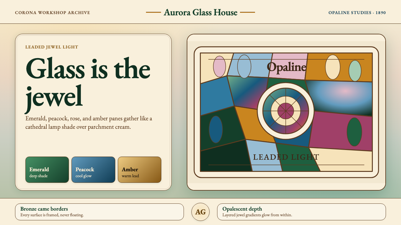 Tiffany Stained GlassJewel light, framed in bronze. Emerald and peacock panes glow on parchment cr…宝石般发光:祖母绿与孔雀蓝玻璃嵌入青铜框,映在羊皮奶油底上。
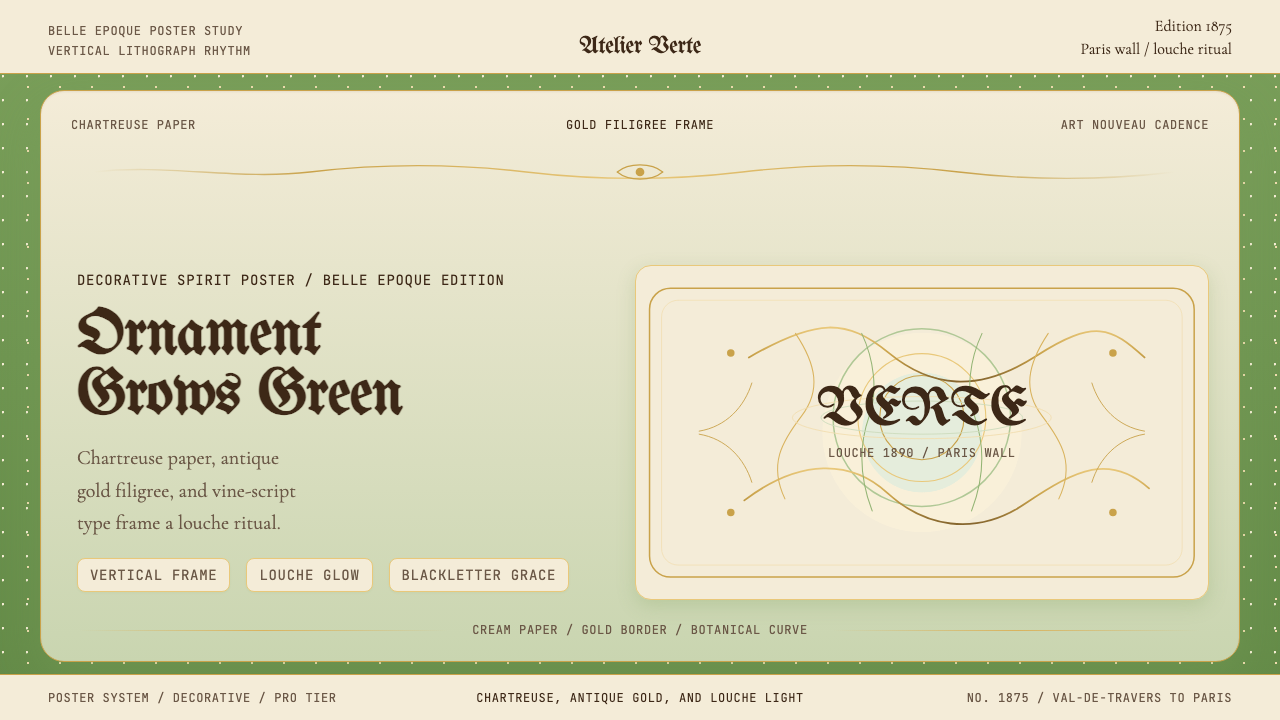 Absinthe Art Nouveau Green (1875)Ornate and verdant. Chartreuse field, gold filigree, vine-script type, and lo…华丽而青绿。黄绿色底、金丝花边与藤蔓字体托出浑浊光。
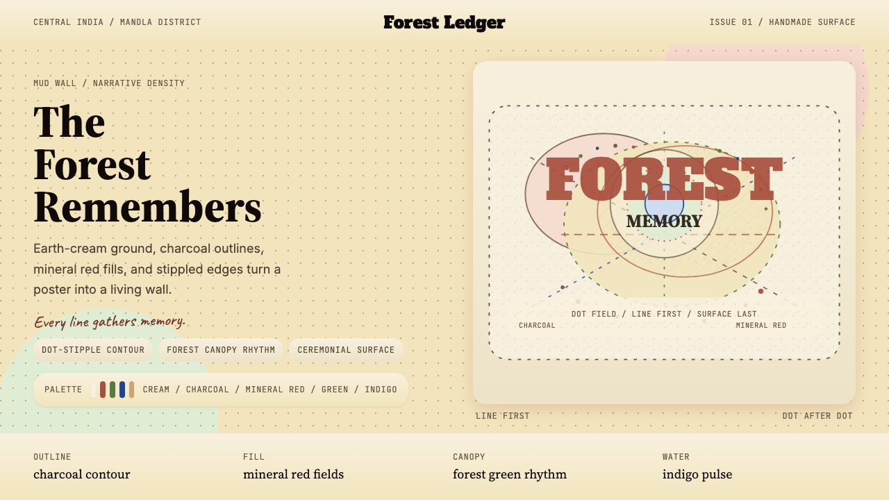 Gond Tribal Art (Madhya Pradesh)The wall becomes a forest. Earth-cream, charcoal, and stippled red make it ce…墙变成森林。土白、炭黑与点刺红让画面像仪式。
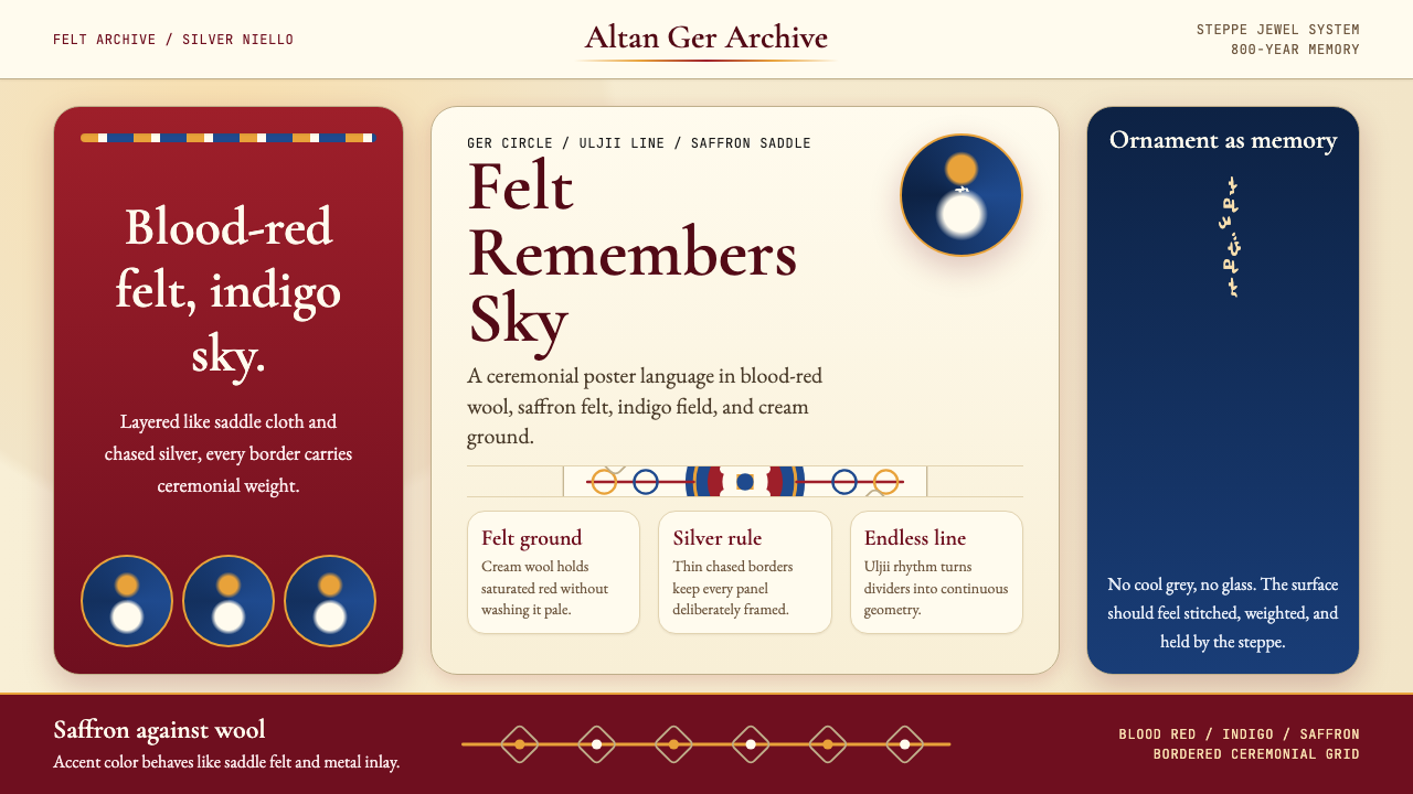 Mongolian Nomadic SteppeSteppe memory in jewel tones. Blood-red felt, saffron, indigo, and bordered u…草原记忆浓烈如宝石:深红毡、藏蓝与番红花色,边框乌力吉几何。
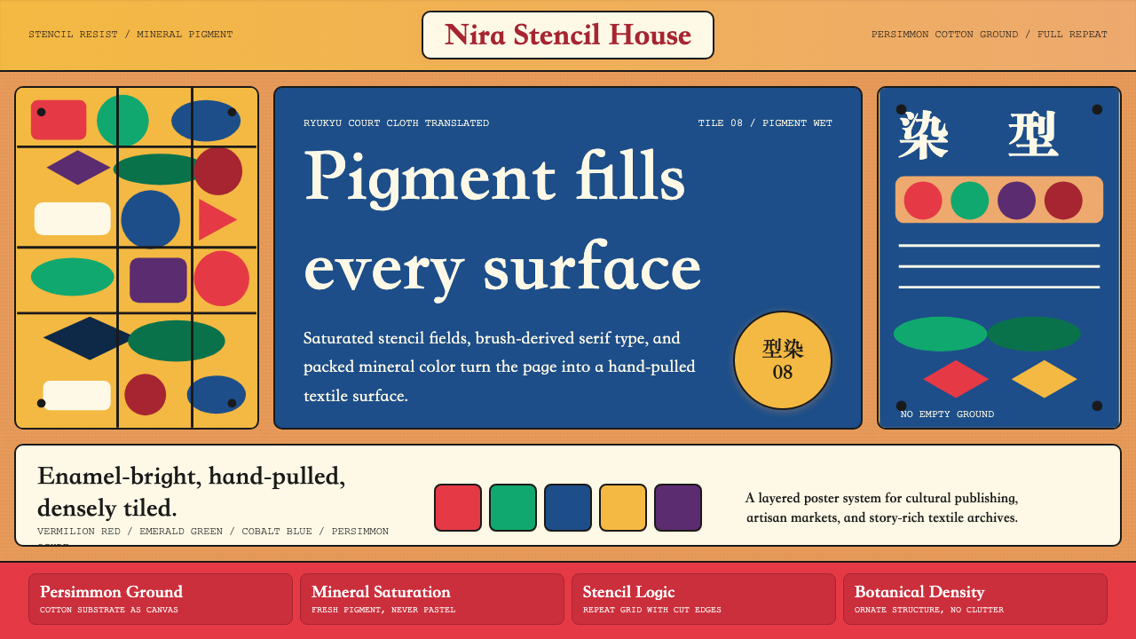 Okinawan Bingata Resist DyeOrnate without clutter. Persimmon ground, vermilion type, emerald-cobalt sten…繁而不乱。柿涩底、朱红字与翠绿钴蓝型染网格。