Design style guide设计风格指南
What is Okinawan Bingata Resist Dye?什么是 Okinawan Bingata Resist Dye?
Bingata is the stencil-resist dyeing tradition of the Ryukyu Kingdom — saturated, botanical, horror vacui — and its visual logic translates into digital interfaces with surprising directness.红型是琉球王国的型染工艺——饱和、植物纹样、密不透风——其视觉逻辑以出人意料的直接性转化为数字界面语言。
Okinawan Bingata Resist Dye in briefOkinawan Bingata Resist Dye 速览
Bingata — the name combines the Okinawan words for 'color' (bin) and 'pattern' (gata) — is a stencil-resist textile dyeing tradition native to the Ryukyu Kingdom, a sovereign archipelago state that flourished between the fifteenth and nineteenth centuries before its annexation into Japan. The technique involves cutting intricate patterns into washi paper or shark skin, applying pigment paste through the stencil, and then selectively removing resist to reveal the ground. Successive layers build a composition of botanical density that fills every square inch of the cloth.红型——名称融合了冲绳语中”颜色”(bin)与”花样”(gata)——是原生于琉球王国的型染工艺。琉球王国是一个自主的群岛国家,鼎盛于十五至十九世纪,后并入日本。这项工艺将复杂纹样刻于和纸或鲨鱼皮上制成型纸,将颜料糊状物透过型纸涂敷,再选择性地去除防染剂,露出底色。层层叠加构筑出植物般浓密的构图,将布料的每一寸表面填满。
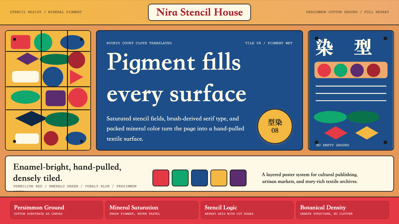
What makes bingata visually distinctive is the relationship between its palette and its composition. The pigments — traditionally ground from mineral sources including malachite, azurite, cinnabar, and iron oxide — produce colors that sit at a particular register: deeply saturated but not garish, warm but never muddy. Against a persimmon-tanned cotton ground, vermilion fish and cobalt waves read as enamel-bright, as though the design were fired rather than dyed. The composition enforces horror vacui: fish, banana leaves, peonies, cranes, and wave forms interlock without gap or hierarchy, every element of equal visual weight.红型在视觉上之所以与众不同,在于色彩与构图之间的关系。传统颜料取自矿物,包括孔雀石、蓝铜矿、朱砂与氧化铁,产生的色彩处于一种特殊的调性:高度饱和却不俗艳,温暖却绝不混浊。在柿涩染的棉底上,朱红鱼纹与钴蓝波涛呈现出珐琅般的鲜亮,仿佛是烧制而成而非染就。构图强制执行密不透风原则:鱼、芭蕉叶、牡丹、白鹤与海波纹样彼此咬合,无空隙,无主次,每个元素视觉分量均等。
As a design system, bingata offers a vocabulary that is simultaneously ornate and disciplined. It is not maximalism in the contemporary sense — it is a specific tropical court aesthetic governed by strict conventions about motif selection, color register, and compositional density. The distinction matters for application: bingata-derived work succeeds when it honors those conventions rather than simply reproducing surface busyness.作为一套设计系统,红型提供了一套既华丽又有纪律的词汇。它不是当代意义上的最大化主义——它是一种特定的热带宫廷美学,受严格规约的纹样选择、色彩调性与构图密度所约束。这一区别在应用中至关重要:红型衍生作品在尊重这些规约时方能成功,而非仅仅复制表面的繁复。
See the Okinawan Bingata Resist Dye design system →查看 Okinawan Bingata Resist Dye 完整设计系统 →
Where does Okinawan Bingata Resist Dye come from?Okinawan Bingata Resist Dye 从何而来?
The Ryukyu Kingdom occupied a strategic position in the maritime trade networks of the fifteenth and sixteenth centuries, serving as an intermediary between China, Japan, Korea, and the island nations of Southeast Asia. This commercial centrality brought both wealth and aesthetic influence. Chinese court textile traditions — particularly the use of mineral pigments and stencil methods — arrived through tribute relationships and merchant contact; they were absorbed and transformed into something distinctly Okinawan over the course of several generations.琉球王国在十五、十六世纪的海上贸易网络中占据战略要地,充当中国、日本、朝鲜与东南亚岛国之间的中介。这一商业中心地位带来了财富与审美影响。中国宫廷纺织传统——尤其是矿物颜料的使用与型染方法——经由朝贡关系与商贸往来传入,在数代人的过程中被吸收并转化为鲜明的冲绳风格。
Bingata emerged as a court textile, produced in Shuri — the royal capital on the western side of the Okinawa main island — primarily for the Ryukyuan aristocracy. The most elaborate robes, with their densest patterns and most vivid colorwork, were restricted to members of the royal family; the colors themselves served as a rank indicator, with particular hues and color combinations reserved by sumptuary law for specific social tiers. This hierarchical function shaped the vocabulary: the most saturated, most complex designs were not aesthetic experiments but social documents.红型作为宫廷织物兴起,产自首里——冲绳本岛西侧的王都——主要供琉球贵族使用。最精细的礼袍,纹样最密、色彩最鲜,仅限王室成员穿着;色彩本身充当等级标志,特定色相与配色组合以禁奢法规保留给特定社会阶层。这一等级功能塑造了词汇:最饱和、最复杂的图案不是美学实验,而是社会文件。
The craft's transmission was disrupted twice by political catastrophe. The first disruption came with the Satsuma Domain's invasion of the Ryukyu Kingdom in 1609, which imposed Japanese feudal authority over the islands while preserving the formal structure of the Ryukyuan court — a political arrangement that ironically helped preserve bingata production, since the court's ceremonial functions continued to demand court textiles. The second and more severe rupture came with the Meiji annexation of 1879 and the abolition of the Ryukyuan royal court. Without royal patronage, the workshops that had produced bingata for generations lost their primary clients and much of their institutional knowledge.这项工艺的传承两度被政治灾难打断。第一次中断源于1609年萨摩藩对琉球王国的入侵——这次入侵将日本封建权威强加于群岛,同时保留了琉球宫廷的形式结构;颇具讽刺意味的是,这一安排反而帮助延续了红型生产,因为宫廷的礼仪功能持续需要宫廷织物。第二次也是更为严重的断裂发生在1879年明治政府吞并琉球、废除琉球王室之时。失去王室赞助,世代生产红型的作坊失去了主要客户与大量机构知识。
The twentieth-century revival of bingata is closely linked to the broader Japanese folk craft (mingei) movement championed by Yanagi Soetsu in the 1920s and 1930s, which drew renewed scholarly and commercial attention to regional craft traditions across Japan, including Okinawa. After the devastation of the Second World War — Okinawa suffered among the heaviest civilian casualties of any theater — the island's reversion to Japanese administration in 1972 triggered a self-conscious effort to recover and document Okinawan cultural heritage, including bingata. Contemporary studios in Shuri, Naha, and Yomitan continue production, adapting traditional stencil vocabularies to new garment forms and, increasingly, to surface design applications well beyond textile.二十世纪红型复兴与柳宗悦在1920、1930年代倡导的日本民艺运动密切相关,该运动重新唤起了学界与商界对日本各地区工艺传统(包括冲绳)的关注。第二次世界大战的浩劫——冲绳承受了各战区中最惨重的平民伤亡之一——之后,1972年冲绳回归日本行政管辖,触发了一场有意识的冲绳文化遗产恢复与记录运动,红型正是其中之一。首里、那霸与读谷的当代工坊持续生产,将传统型纸词汇调适到新的服装形式,以及越来越广泛的纺织之外的表面设计应用。
What defines the Okinawan Bingata Resist Dye look?Okinawan Bingata Resist Dye 的视觉特征是什么?
Color Palette色彩色板
The bingata palette reads as mineral-saturated and tropically warm: persimmon orange grounds, vermilion reds, cobalt and turquoise blues, leaf greens ranging from pale celadon to deep malachite, and accents of egg-yolk yellow. These are not pastel colors, nor are they the flat primaries of Western modernism — they sit at a point of maximum pigment depth while retaining warmth. The ground color itself carries tonal weight, appearing as a fifth element in the composition rather than a neutral support.红型色板呈现出矿物饱和与热带温暖的气质:柿涩橙底、朱红、钴蓝与青绿、从淡青瓷到深孔雀绿的叶绿,以及蛋黄黄的点缀色。这些不是粉彩,也不是西方现代主义的平面原色——它们处于颜料深度的极值点,同时保有温暖感。底色本身承载色调分量,在构图中作为第五要素出现,而非中性支撑。
Horror Vacui Composition密不透风的构图
Bingata composition leaves no negative space. Motifs interlock like puzzle pieces — a fish's tail curves into a wave form, which gives way to a banana leaf, which overlaps a peony, which borders a crane's wing. This total surface coverage is not random accumulation but a structured system in which each element is assigned a specific scale relationship to its neighbors. The result is a composition that reads as dense but never chaotic: every corner is resolved, every transition deliberate.红型构图不留负空间。纹样像拼图般彼此咬合——鱼尾弯入波涛纹,波涛延伸为芭蕉叶,芭蕉叶与牡丹重叠,牡丹毗邻白鹤翅膀。这种全面覆盖并非随机堆积,而是一套结构性系统,每个元素与其邻近元素之间有着特定的尺度关系。结果是构图读来繁密却绝不混乱:每个角落都得到处理,每处过渡都经过考量。
Motif Vocabulary纹样词汇
The bingata repertoire draws on a specific set of motifs with fixed cultural meanings: fish and sea waves (abundance and connection), banana leaves and peonies (tropical vitality), cranes (longevity and nobility), chrysanthemums (royalty, borrowed from Chinese and Japanese court traditions), and geometric lattices used as compositional anchors. Each motif class has an associated scale range and color assignment. Mixing motifs from outside this vocabulary — or deploying canonical motifs at the wrong scale — is the primary error in bingata-derived work.红型的纹样库取自一套具有固定文化含义的特定图案:鱼与海波(丰饶与联结)、芭蕉叶与牡丹(热带生命力)、白鹤(长寿与高贵)、菊花(王室,借鉴自中日宫廷传统),以及用作构图锚点的几何网格。每类纹样都有对应的尺度范围与色彩分配。将词汇表之外的纹样混入,或以错误尺度部署经典纹样,是红型衍生作品中最主要的失误。
Layered Pigment Depth层叠颜料深度
Bingata achieves its characteristic luminosity not from any single vivid pigment but from the layering process: a base resist, a mid-layer pigment application, selective removal, and often a final outlines pass that both defines forms and unifies the surface. In digital application, this translates into a compositional approach where forms are understood as stacked layers of color with distinct outlines rather than flat silhouettes. Shadows within individual motifs are handled with a darker version of the same hue — internal modeling — rather than a neutral gray overlay.红型的特征性光泽不来自任何单一鲜亮颜料,而来自层叠过程:底层防染、中层颜料施敷、选择性揭版,以及通常最后一道同时界定形态并统一表面的轮廓线。在数字应用中,这转化为一种构图方法:将形态理解为具有清晰轮廓线的色彩叠层,而非平面剪影。单个纹样内部的阴影以同色相的更深版本处理——内部建模——而非中性灰叠加。
Stencil Geometry型纸几何
Beneath the botanical imagery, bingata composition is organized by an underlying geometric grid derived from the repeat structure of the stencil. This grid is rarely visible as a line but is felt as a rhythm: the motifs rotate, tile, and mirror in patterns that betray the repeat unit. In some bingata designs, particularly those using geometric ground patterns as fillers between organic motifs, the grid becomes explicit — a lattice of diamonds, hexagons, or wave-scale forms (uroko) that gives the surface a crystalline underlying structure.在植物图案之下,红型构图由型纸重复结构派生出的几何底网组织。这张网格极少以线条形式显现,而是以韵律感呈现:纹样按照暗示重复单元的规律旋转、平铺、镜像。在某些红型图案中,尤其是在有机纹样之间用几何地纹填充的设计里,网格变得清晰可见——菱形、六边形或鱼鳞纹(uroko)的格子,赋予表面一种晶体般的底层结构。
Outline and Contour轮廓线
Every motif in bingata is bounded by a fine outline — drawn in a dark version of the form's own color or in black — that both separates adjacent forms and gives the composition legibility at a distance. This outline is not merely a border; it is the structure that holds the composition together across multiple colors applied at high saturation. In digital work, preserving this outlined quality distinguishes bingata-derived design from flat vector illustration: the line is a distinct layer, not an artifact of shape edges.红型中每个纹样都有细轮廓线框定——以形态本身色相的深色版本或黑色绘制——既分隔相邻形态,也使构图在远处保持可读性。这条轮廓线不仅仅是边框;它是在高饱和度多色施敷时维系构图整体的结构。在数字作品中,保留这种勾线质感将红型衍生设计与平面矢量插图区别开来:线条是独立的层,而非形状边缘的附产物。
Warmth Over Coolness温暖胜于冷静
Despite the presence of cobalt blues and deep greens in the palette, bingata compositions read as warm overall. This is a function of the persimmon ground, the prevalence of vermilion and orange-red in the primary motifs, and the way the mineral pigments interact — blues appear more turquoise than icy, greens more emerald than slate. Any digital interpretation that privileges cool neutrals in the base or background will drift away from the tradition's fundamental warmth, producing something that looks generically tropical rather than specifically bingata.尽管色板中有钴蓝与深绿,红型构图整体读来是温暖的。这取决于柿涩底色、朱红与橙红在主体纹样中的主导地位,以及矿物颜料的相互作用方式——蓝色显得更接近青绿而非冰蓝,绿色更接近祖母绿而非板岩绿。任何在底色或背景中偏向冷灰调的数字诠释都会偏离这一传统的根本温度,产生泛泛的热带感而非特定的红型感。

See the Okinawan Bingata Resist Dye design system →查看 Okinawan Bingata Resist Dye 完整设计系统 →
Who shaped Okinawan Bingata Resist Dye?谁塑造了 Okinawan Bingata Resist Dye?
Shiroma Eiki is one of the most prominent bingata practitioners of the modern era, recognized by the Japanese government as a holder of an important intangible cultural property for his work in maintaining and transmitting the classical Shuri bingata tradition. His studio practice has concentrated on preserving the historical stencil vocabulary and pigment methods of the royal court period while producing works that function as contemporary surface design rather than purely archival reproduction. His approach represents the mainstream of postwar bingata: rigorous traditional technique applied to living craft production.城间荣伊是现代最具代表性的红型工艺师之一,因维护和传承首里红型传统而被日本政府认定为重要无形文化财产持有人。他的工作室实践专注于保存王室时期的历史型纸词汇与颜料工法,同时创作具有当代表面设计功能而非纯粹档案复制性质的作品。他的方法代表了战后红型的主流:将严谨的传统技法应用于活态工艺生产。
Tamanaha Sachiko is among the practitioners who have worked to introduce bingata stencil techniques and palette vocabularies into contemporary fashion and interior textile design, expanding the tradition beyond its original ceremonial context. Her contribution lies not in historical reconstruction but in demonstrating that bingata's compositional and chromatic logic can produce compelling results when applied to new garment forms and surface contexts — a practice that has influenced how younger Okinawan craft designers understand the tradition's transferability.玉那霸幸子是将红型型纸技法与色彩词汇引入当代时装与室内纺织设计的工艺师之一,使这一传统扩展至其原本礼仪语境之外。她的贡献不在于历史复原,而在于证明红型的构图与色彩逻辑在应用于新型服装形式与表面语境时同样能产生令人信服的结果——这一实践影响了年轻一代冲绳工艺设计师对传统可移植性的理解。
Chinen Sachiko has been associated with efforts to document and teach bingata technique during the critical postwar revival period, when the transmission of historical knowledge was particularly vulnerable to disruption. Her pedagogical work helped ensure that the technical specifics of pigment preparation, stencil cutting, and resist application were systematically recorded and passed to new generations of practitioners — a contribution whose significance lies less in visible artworks than in the survival of the craft's underlying methodology.知念幸子与战后复兴关键时期红型技法的记录与传授工作密切相关,在那个年代历史知识的传承尤为脆弱。她的教学工作帮助确保了颜料制备、型纸雕刻与防染施敷的技术细节得到系统记录并传授给新一代工艺师——这一贡献的重要性不在于可见的艺术作品,而在于工艺底层方法论的存续。
Sho En — a member of the Ryukyuan royal family — is credited as an important early patron and practitioner in the formalization of bingata as a royal court textile. The tradition places him in the fifteenth to sixteenth century period when bingata developed its canonical vocabulary of motifs and its associated sumptuary conventions. Whether or not the attributions are historically precise, his name represents the broader entanglement of bingata production with royal patronage that shaped the tradition's fundamental character.尚圆——琉球王室成员——被认定为红型作为宫廷织物正式化过程中的重要早期赞助人与实践者。传统将他置于十五至十六世纪,正是红型确立其经典纹样词汇与禁奢规约的时期。无论这些归属在历史上是否精确,他的名字代表了红型生产与王室赞助之间更广泛的纠缠关系,这一关系塑造了这一传统的根本性格。
Yanagi Soetsu, the philosopher and critic who founded the Japanese folk craft (mingei) movement in the 1920s, did not practice bingata himself but was instrumental in directing national and international attention toward Okinawan craft traditions at a moment when they were in genuine danger of disappearing. His aesthetic framework — which valued craft objects made by anonymous artisans for everyday use over objects made by named artists for elite consumption — was somewhat at odds with bingata's aristocratic origins, but his advocacy helped secure both scholarly documentation and commercial revival for the tradition during a critical period.柳宗悦——1920年代发起日本民艺运动的哲学家与评论家——本人并不从事红型创作,但在冲绳工艺传统真正面临消亡威胁的时刻,对于引导国内外关注起到了关键作用。他的美学框架——重视无名工匠为日常使用制作的工艺品胜于知名艺术家为精英消费创作的物品——与红型的贵族起源在某种程度上相悖,但他的倡导在关键时期帮助确保了这一传统的学术记录与商业复兴。
How do you use Okinawan Bingata Resist Dye today?今天怎么用 Okinawan Bingata Resist Dye?
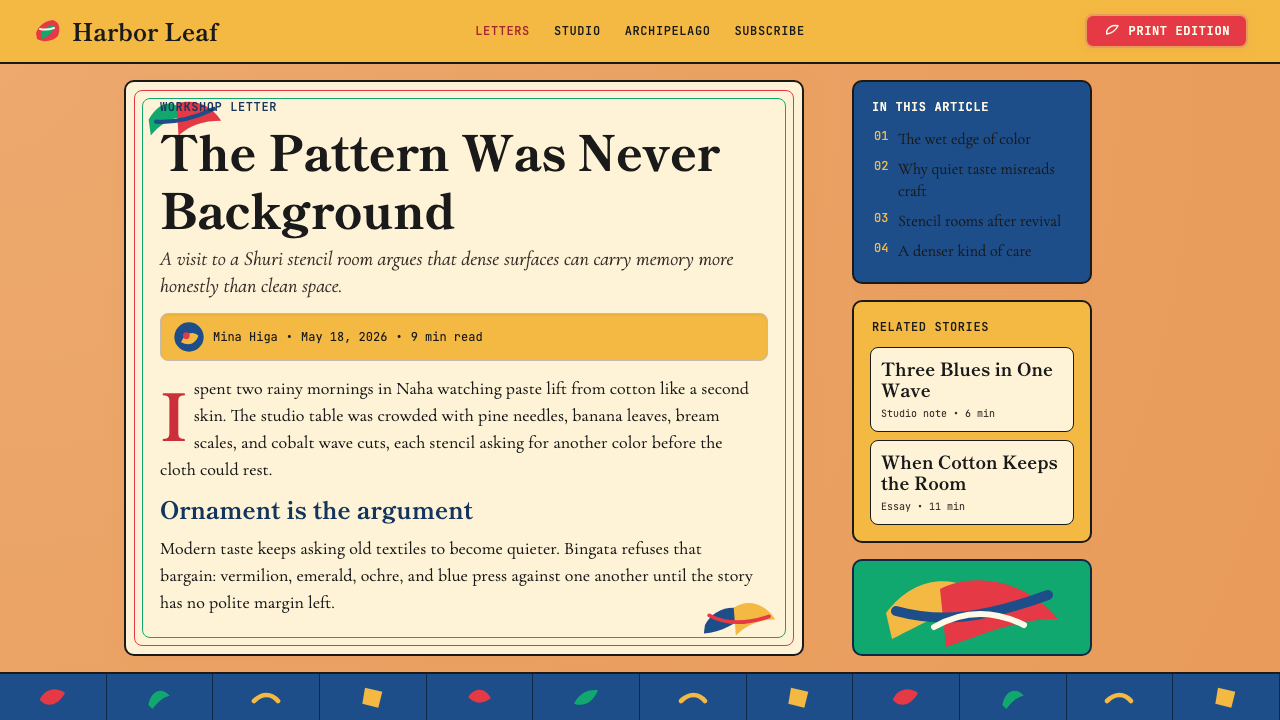
Bingata is one of the richer historical design languages to apply to contemporary digital work, precisely because its logic is compositional and chromatic rather than purely ornamental. Applying it well means understanding what it is actually doing: managing maximum visual density without chaos, using a warm mineral palette as structural signal rather than decoration, and treating every motif as part of an interlocking system rather than a standalone element. Surface borrowing — a fish here, a wave there, against a white background — will produce something that reads as generic tropical illustration, not bingata.红型是应用于当代数字工作中最为丰富的历史设计语言之一,恰恰因为它的逻辑是构图性与色彩性的,而非纯粹装饰性的。善加应用意味着理解它实际上在做什么:在不产生混乱的前提下管理最大视觉密度,将温暖矿物色板作为结构信号而非装饰,以及将每个纹样视为相互咬合系统的组成部分而非独立元素。表面借用——这里一条鱼、那里一道波浪,置于白色背景上——只会产生泛泛的热带插图感,而非红型。
For presentation slides, bingata works most naturally on cover and section-break pages where the full compositional density can be deployed without competing with content. A cover slide using a full-coverage bingata pattern as background — tiled or cropped — with a white or cream text block applied over it achieves a strong identity statement. The key is contrast: the pattern must be rich enough to register as a field, not a distraction. For content slides, a restrained approach works better: pull the palette rather than the pattern density. Use the persimmon-to-vermilion warmth as the primary color family for headers and data highlights, with cobalt accents for secondary elements, and keep the body of the slide white or near-white so the content reads cleanly.在演示文稿中,红型最自然地适用于封面页与节间隔断页,在那里可以完整展开构图密度而不与内容竞争。将完整覆盖的红型图案作为背景(平铺或裁剪),叠加白色或奶油色文字块,能实现强烈的身份陈述。关键在于对比:图案必须足够丰富以构成一个场域,而非干扰。对于内容页,更克制的处理更有效:调取色板而非图案密度。将柿涩到朱红的暖色系作为标题与数据高亮的主要色彩家族,以钴蓝作为次要元素的强调色,保持页面主体为白色或接近白色,使内容清晰可读。
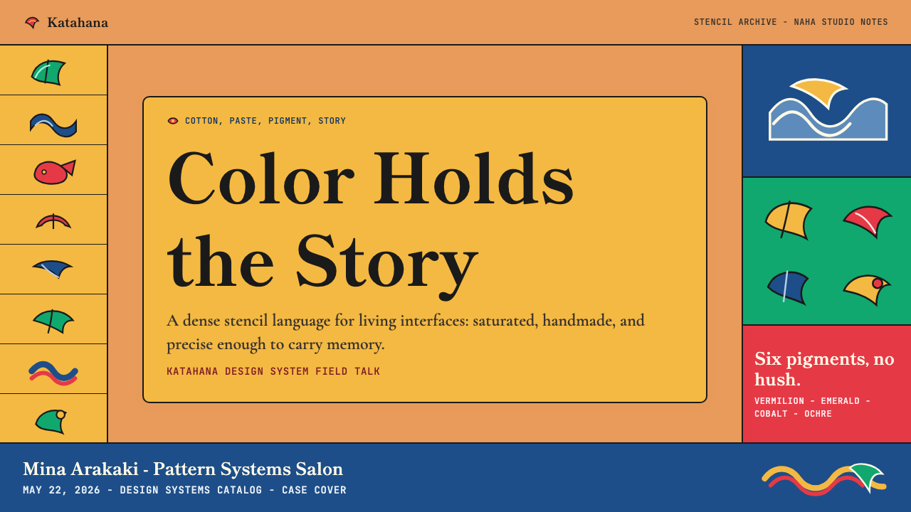
For web interfaces, bingata is best deployed as a surface accent language rather than a structural system. Dashboards benefit from the palette applied to data visualization elements — charts and indicators in the bingata warm spectrum read as confident and culturally specific without the coldness of typical corporate data palettes. Pricing pages can use bingata-pattern backgrounds on feature highlight cards or tier headers, contained within a clean typographic grid that handles the functional hierarchy. The pattern should never compete with interactive controls; reserve it for decorative bands, hero areas, and illustration regions.在网页界面中,红型最好作为表面点缀语言而非结构系统来部署。仪表板中,将红型暖色谱应用于数据可视化元素——图表与指示器——读来自信且具文化特异性,而不具有典型企业数据色板的冷意。定价页可以在功能特性高亮卡片或层级标题上使用红型图案背景,在处理功能层级的简洁排版网格内加以约束。图案绝不应与交互控件竞争;将其保留给装饰色带、英雄区域与插图区域。
For editorial and marketing contexts, bingata is particularly strong in materials where cultural authority and visual richness both matter: travel and hospitality content, cultural institution communications, fashion lookbooks, and premium consumer brand work. The composition's density makes it well suited to hero images and full-bleed spreads, where the pattern becomes environment rather than motif. For marketing materials that need both cultural specificity and functional clarity, the most effective approach is to pair a bingata-pattern zone with generous white space elsewhere — the two regions in contrast, each making the other read more strongly.在编辑与营销语境中,红型在文化权威感与视觉丰富性同样重要的场合表现尤为出色:旅行与款待内容、文化机构传播、时装形象册,以及高端消费品牌作品。构图的密度使其非常适合英雄图与全出血跨页,图案在其中成为环境而非纹样。对于同时需要文化特异性与功能清晰度的营销材料,最有效的方法是将红型图案区域与其他地方的充裕留白搭配——两个区域形成对比,互相使对方读来更为强烈。
A common mistake when applying bingata is treating the palette as a pastel tropical colorway — reducing the saturated mineral pigments to lighter, lower-saturation tints that read as beach resort rather than royal court. A second frequent error is applying the motifs at too large a scale, so that individual fish or leaves become legible as isolated images rather than elements of an interlocking field. Bingata reads correctly when the individual motifs are small enough relative to the total composition that the eye reads the surface texture first and the individual motifs second. If you can immediately name every element without scanning the piece as a whole, the motifs are too large.应用红型时最常见的错误是将色板视为粉彩热带配色——将饱和矿物颜料降低至更浅、更低饱和度的色调,读来像度假村而非王室宫廷。第二个常见错误是以过大的尺度应用纹样,使个别鱼纹或叶片成为可辨识的孤立图像,而非相互咬合场域的元素。红型在纹样相对于总构图足够小——以至于眼睛先读取表面质感、再读取个别纹样——时才能正确呈现。如果无需扫读整体就能立即叫出每个元素,纹样就太大了。
See the Okinawan Bingata Resist Dye design system →查看 Okinawan Bingata Resist Dye 完整设计系统 →
Okinawan Bingata Resist Dye — FAQOkinawan Bingata Resist Dye · 常见问题
What is the difference between bingata and other Japanese stencil dyeing traditions like katazome?红型与其他日本型染传统(如型糊染)有何不同?
Katazome is a stencil dyeing technique practiced across Japan that typically uses a paste-resist method to produce one or two-color repeat patterns on cotton or linen — the ground color and one dyed color. Bingata is distinguished by its use of multiple layered mineral pigments (rather than fiber-reactive dyes), its tropical palette that reflects Ryukyuan rather than Japanese mainland aesthetic conventions, and its horror vacui compositional approach. A katazome cloth often has a clear, airy relationship between motif and ground; a bingata cloth fills every surface. The two traditions share technical method but serve entirely different aesthetic ends and cultural contexts.型糊染是日本各地普遍实践的型染技法,通常以糊防染方法在棉麻布上产生一至两色的重复图案——底色加一种染色。红型的区别在于:使用多层叠加的矿物颜料(而非纤维反应性染料)、反映琉球而非日本本土审美规约的热带色板,以及密不透风的构图方式。型糊染布料通常在纹样与底色之间保持清晰、通透的关系;红型布料则填满每一寸表面。两种传统共享技术方法,但服务于截然不同的美学目标与文化语境。
Can bingata be applied effectively to dark-background interfaces?红型能有效应用于深色背景界面吗?
A dark inversion of bingata is possible but requires careful adjustment. The tradition's canonical form is a warm-toned light ground — persimmon, cream, or pale gold — with darker motifs applied on top. On a dark background, the color relationships reverse: the motifs must become the lighter elements, which tends to push the palette toward tones it does not naturally inhabit. The most successful dark adaptations preserve the warmth of the palette — keeping the blues turquoise rather than navy, the reds vermilion rather than burgundy — and use a very dark warm brown or deep persimmon as the background rather than neutral black. Cold dark backgrounds drain the palette of its distinctive warmth and produce something that reads as generic ornamental rather than bingata.红型的深色反转版本是可行的,但需要仔细调整。这一传统的经典形态是暖调浅底——柿涩、奶油或淡金——深色纹样叠敷其上。在深色背景上,色彩关系倒转:纹样必须成为较浅的元素,这往往将色板推向它并不自然栖居的色调。最成功的深色改编保留了色板的温暖感——使蓝色保持青绿而非海军蓝,红色保持朱红而非酒红——并以极深的暖棕或深柿涩而非中性黑作为背景。冷色深背景会剥夺色板的独特温度,产生泛泛的装饰感而非红型感。
How do I use bingata motifs without the design feeling culturally appropriative?如何使用红型纹样而不使设计产生文化挪用感?
The question of cultural appropriation in design is complex, but there are practical principles that separate thoughtful use from exploitation. First, specificity matters: understanding that bingata is distinctly Okinawan — not generically Japanese, Southeast Asian, or tropical — and signaling that specificity in how you attribute and describe the work is a meaningful act of respect. Second, the tradition has living practitioners who make work and teach; licensing designs from or crediting contemporary bingata artists is more grounded than lifting historical motifs from archives. Third, consider whether the visual system is being engaged at the level of surface pattern (weaker) or compositional and chromatic logic (stronger) — the latter requires deeper understanding and produces work that honors the tradition more substantively than surface quotation.设计中文化挪用的问题是复杂的,但有一些实践原则能将有思考的使用与剥削性使用区分开来。首先,特异性很重要:理解红型是鲜明的冲绳传统——而非泛化的日本、东南亚或热带——并在归属与描述作品方式上体现这一特异性,是有意义的尊重行为。其次,这一传统有在世的工艺师在创作与传授;从当代红型工艺师处获得授权或注明其来源,比从档案中提取历史纹样更有根基。第三,考虑视觉系统是在表面图案层面(较弱)还是构图与色彩逻辑层面(较强)被运用——后者需要更深的理解,产生比表面引用更实质地尊重这一传统的作品。
What modern design contexts have borrowed from bingata, and what went wrong?哪些现代设计语境曾借鉴红型?有什么失误值得注意?
Bingata has appeared in contemporary fashion — most visibly in resort and swimwear collections — and in packaging and branding for Japanese cultural tourism. The most common failure mode is reduction to palette and approximate motif without the compositional logic: designers pick the warm oranges and aquas, place a few fish or leaves at large scale on a white ground, and call the result bingata-inspired. The outcome reads as generic tropical print. The second failure mode is mixing bingata motifs with East Asian visual vocabularies from outside the Ryukyuan tradition — pairing bingata fish with Japanese mon crests or Chinese phoenix forms — which produces a conflationary aesthetic that erases the tradition's cultural specificity. Success cases tend to be those where designers engaged with the compositional density as the primary challenge, treating the full-field, horror vacui approach as the defining design problem to solve.红型出现在当代时装中——最为显眼的是度假与泳装系列——以及日本文化旅游的包装与品牌设计中。最常见的失误模式是在没有构图逻辑的情况下简化为色板与近似纹样:设计师选取暖橙与水蓝色,在白色底面上以较大尺度摆放几条鱼或几片叶子,称之为红型风格。结果读来是泛泛的热带印花。第二种失误模式是将红型纹样与琉球传统之外的东亚视觉词汇混用——将红型鱼纹与日本家纹或中国凤凰纹样搭配——产生抹去了这一传统文化特异性的融合美学。成功案例往往是设计师将构图密度作为主要挑战来应对的——将全面覆盖的密不透风方式视为待解决的核心设计问题。
Is bingata the right choice for a product that needs to communicate warmth and handcraft?对于需要传达温暖感与手工质感的产品,红型是正确的选择吗?
Bingata communicates warmth in a specific register: tropical, court, mineral, ornate. It is warm in the sense of saturated color temperature and the human evidence of the hand-pulled stencil, but it is not cozy or rustic — those qualities belong to other traditions. A product that needs warmth in the sense of approachability, softness, or informal intimacy would be better served by textile traditions with airier compositions and less saturated palettes. Bingata is better suited to products that want to communicate richness, ceremony, cultural authority, and tropical vitality — a premium gift brand, a cultural institution, a hospitality property with a specific sense of place. If the warmth needed is hearth-and-home, bingata will likely overshoot.红型传达的温暖感处于特定调性:热带、宫廷、矿物、华丽。它的温暖体现在饱和的色彩温度与手工拓印的人文痕迹上,但它并不温馨或粗朴——那些品质属于其他传统。需要传达亲切感、柔软感或非正式亲密感的产品,更适合选用构图更通透、色板更低饱和的纺织传统。红型更适合希望传达丰盛感、仪式感、文化权威感与热带生命力的产品——高端礼品品牌、文化机构、具有特定场所感的款待业产品。如果需要的温暖是炉边家居感,红型很可能超出目标。
Related design styles相关设计风格
 Bedouin Desert Textile (Sadu)Woven memory, not ornament. Vermilion-black bands count triangles and diamond…记忆被织成条带:朱砂与黑色在奶油羊毛上数出三角与菱形。
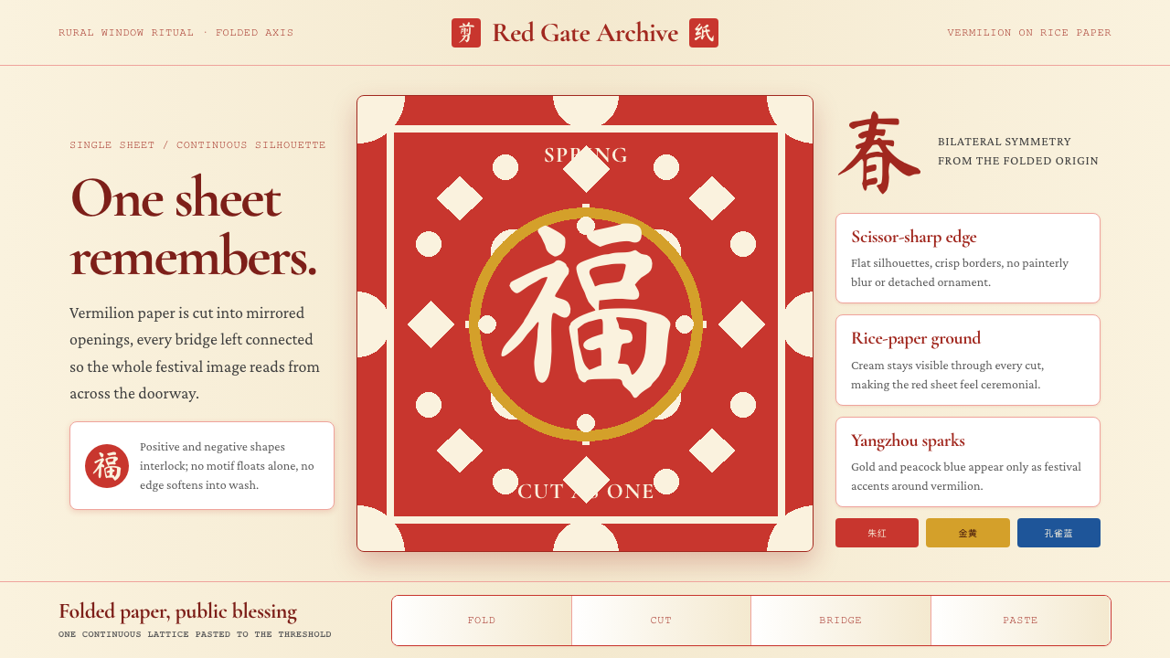 Chinese Jianzhi Paper-CuttingRitual red, cut as one. Vermilion lacework on rice-paper cream locks every sh…仪式性的红,一剪成片。朱红镂空压在米黄纸上,所有形都扣住中轴。
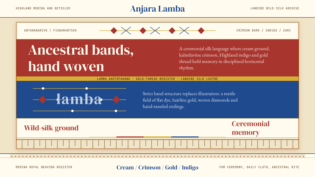 Madagascan Lamba SilkAncestry is woven flat. Crimson, indigo, cream and gold run in strict silk ba…祖灵织进横纹:绯红、靛蓝、奶黄与金线构成严谨丝带。
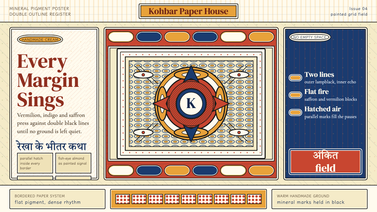 Madhubani (Mithila Folk Painting)No empty ground. Vermilion, indigo and saffron pack double-outlined panels wi…不留空地。朱砂、靛蓝与姜黄铺满双线边框和密集排线。
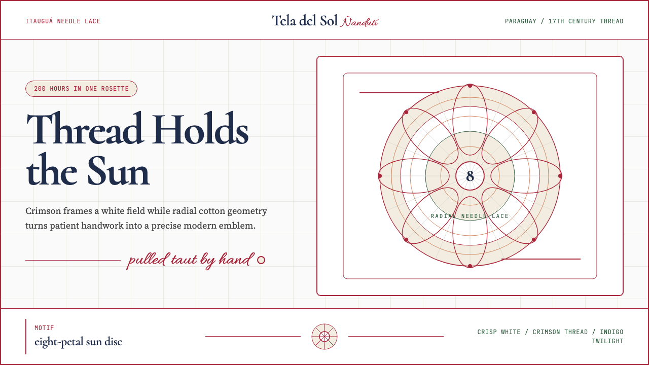 Paraguayan Ñandutí LacePatient craft, modern frame. Crimson lines pin radial lace on crisp white.耐心手艺,现代框架。深红线把放射蕾丝钉在洁白底上。
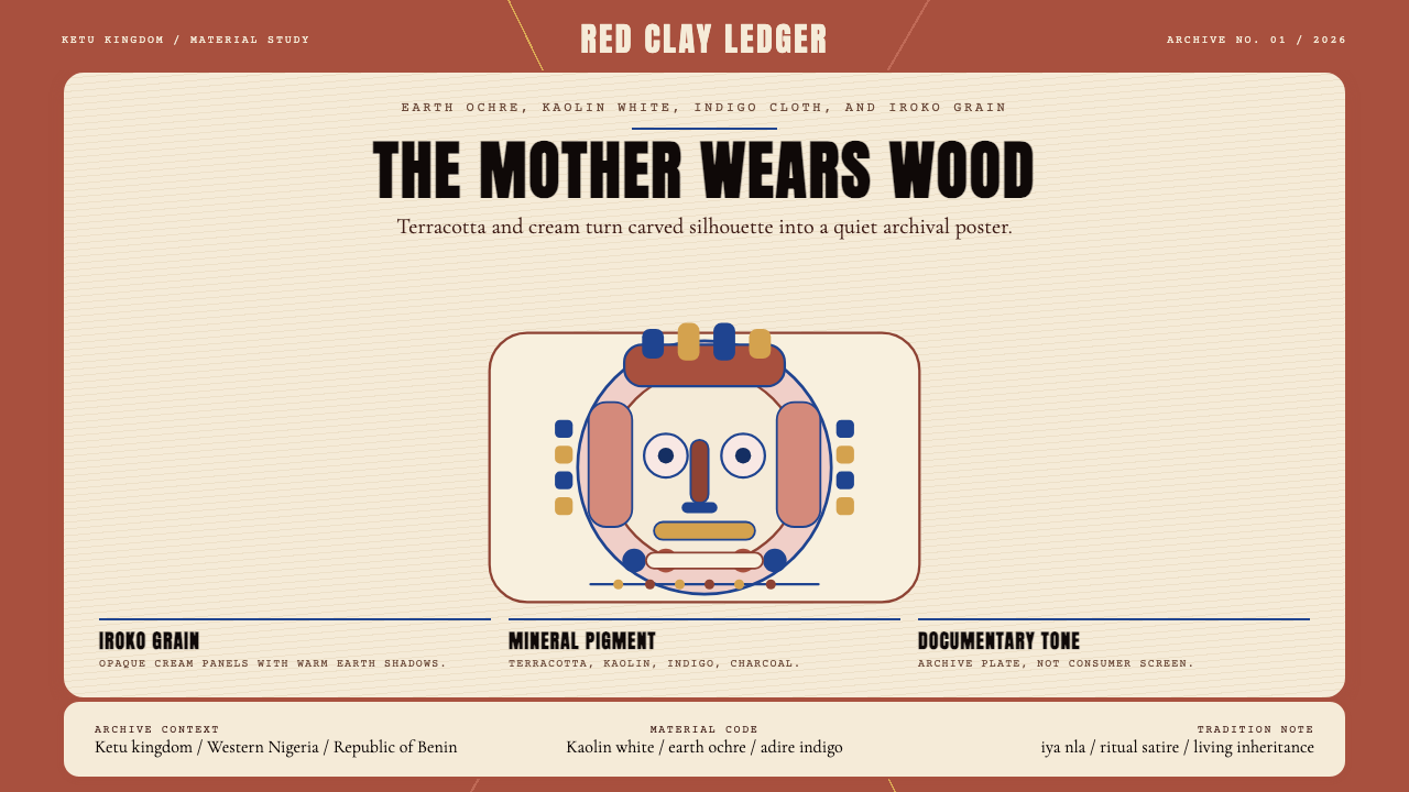 Yoruba Gelede MaskRitual weight, not spectacle. Terracotta, kaolin, and indigo frame a carved-m…庄重而非奇观。赭石、高岭土白与靛蓝构成雕刻面具海报。