What is Chinese Jianzhi Paper-Cutting?什么是 Chinese Jianzhi Paper-Cutting?
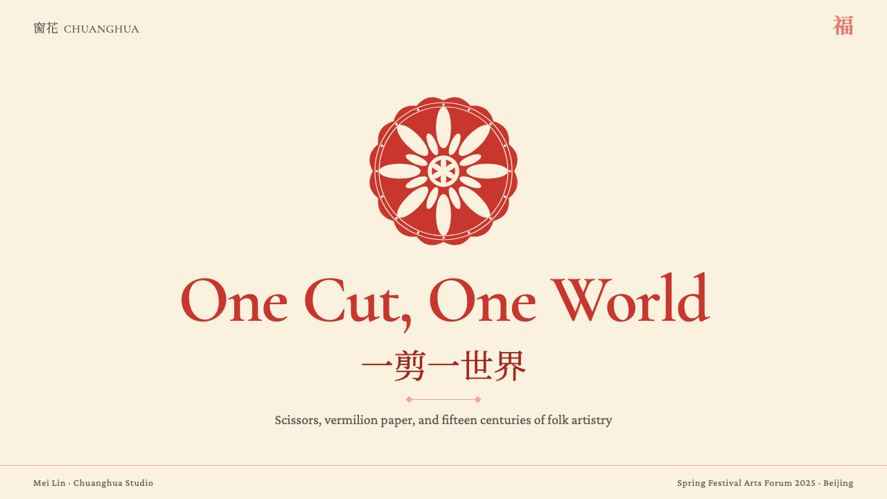
Jianzhi reduces a single sheet of red paper to an intricate lacework silhouette — a visual language forged from the fold, the scissor edge, and twelve hundred years of Spring Festival ritual.剪纸将一张红纸化为繁密的镂空剪影——这门视觉语言由折叠、剪刃与一千二百年春节仪式共同锻造。
Chinese Jianzhi Paper-Cutting in briefChinese Jianzhi Paper-Cutting 速览
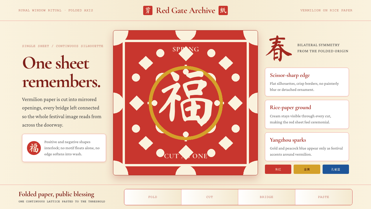
Chinese jianzhi (剪纸, literally 'cut paper') is one of the world's oldest and most concentrated single-color graphic systems. A practitioner folds a sheet of red paper along a central axis, cuts negative space through multiple layers simultaneously, and unfolds the result to reveal a bilaterally symmetrical lacework of fish, lotus, opera characters, or good-fortune ideographs. The entire image is structurally continuous — every petal and tendril physically connected to every other — because any isolated island of paper would fall away from the scissors.中国剪纸是世界上历史最悠久、最精炼的单色图形系统之一。匠人将红纸沿中轴折叠,用剪刀同时穿透多层纸面剪出阴性镂空,展开后呈现出双侧对称的鱼莲、戏曲人物或福寿文字镂空图样。整幅图像在结构上是连续的——每一片花瓣、每一条藤蔓都与其他部分实际相连——因为任何孤立的纸岛都会从剪刀下脱落。
The aesthetic is defined by extreme economy of means. Vermilion or blood-red paper against a rice-paper cream or whitewashed wall surface is the canonical color pairing, carrying ceremonial weight accumulated over centuries of Spring Festival doorway decoration, wedding and funeral ritual, and embroidery-pattern transfer. The Yangzhou school and several Fujian traditions introduce imperial yellow, peacock blue, and jade green in layered multi-color compositions, but even these polychrome variants retain the core logic: positive silhouette and negative void locked into mutual dependency, every edge the trace of a scissor blade, nothing softened or blurred.这门美学以极端的手段经济性著称。朱红或血红的纸面配以米黄窗纸或白墙,是经典的色彩组合,承载着数百年春节门楣装饰、婚丧仪礼与刺绣花样传递所积累的礼仪分量。扬州剪纸流派及福建部分传统在分层的多色构图中引入了明黄、孔雀蓝与翡翠绿,但即便是这些多色变体,也保留了核心逻辑:正形剪影与负形虚空互锁为相互依存的整体,每一道边缘都是剪刃划过的痕迹,没有任何柔化或晕染。
In 2009 UNESCO inscribed jianzhi on the Representative List of the Intangible Cultural Heritage of Humanity, recognizing both its unbroken rural transmission and the precariousness of that transmission as village craft economies changed. The designation accelerated interest from contemporary designers and educators, who recognized in jianzhi a fully articulated visual grammar — symmetry, positive-negative interlock, connective bridging, knife-sharp silhouette — that translates with remarkable fidelity from paper to screen.2009年,联合国教科文组织将剪纸列入人类非物质文化遗产代表作名录,既认可了其绵延不断的乡村传承,也正视了随着村庄手工艺经济变迁而来的传承脆弱性。这一认定加速了当代设计师和教育工作者对剪纸的关注——他们在剪纸中辨认出一套完整的视觉语法:对称、阴阳互锁、连接桥梁、刀刃般锐利的剪影——这套语法从纸张转译到屏幕时,忠实度出乎意料的高。
See the Chinese Jianzhi Paper-Cutting design system查看 Chinese Jianzhi Paper-Cutting 完整设计系统
Where does Chinese Jianzhi Paper-Cutting come from?Chinese Jianzhi Paper-Cutting 从何而来?
The material prehistory of jianzhi extends back before paper itself. Archaeological evidence and literary sources record the practice of cutting decorative silhouettes from thin metal foil — particularly gold and silver leaf — during the Han dynasty (roughly 200 BC to 200 AD), when such objects were placed in tombs as symbolic substitutes for precious goods. The invention of paper, traditionally dated to Cai Lun's refinement of the process around 105 AD, made the medium cheap enough for widespread domestic use, and by the fifth and sixth centuries there are records of cut-paper figures being burned at funerals and displayed at seasonal festivals across northern China.剪纸的材料史前史甚至早于纸张本身。考古证据与文献记载显示,汉代(约公元前200年至公元200年)已有从薄金属箔——尤其是金箔和银箔——上剪刻装饰剪影的习俗,这类器物被放入墓葬,作为贵重物品的象征性替代。造纸术的发明(传统上将蔡伦约公元105年的改良定为节点)使这一媒介的成本低廉到可供家庭日常使用,至五六世纪,北方各地已有文献记录在葬礼上焚烧纸剪人像、在岁时节令陈设剪纸的习俗。
The craft reached its first period of sophisticated regional differentiation during the Tang dynasty (618–907 AD), when trade routes, imperial patronage, and the movement of skilled craftswomen between regional courts spread specific motif vocabularies — the fish-in-lotus, the magpie-on-plum, the paired phoenix — from one provincial tradition to another. Song dynasty (960–1279 AD) commercial cities saw the emergence of professional paper-cutters who sold their work at festival markets, producing a split between the vernacular household tradition and a more refined commercial practice that would characterize jianzhi through its peak period.这门手艺在唐代(618—907年)迎来了第一个区域流派分化的成熟期。丝路贸易、皇室赞助与技艺精湛的女性工匠在各地宫廷间的流动,将特定的纹样词汇——鱼戏莲、喜鹊登梅、双凤朝阳——从一个地方传统传播到另一个地方传统。宋代(960—1279年)的商业城市中出现了在节日集市出售作品的职业剪纸艺人,由此在民间家户传统与更为精致的商业实践之间形成了分野,这一格局将延续至剪纸的鼎盛时期。
The great age of village jianzhi ran roughly from the mid-Ming dynasty through the end of the Qing, spanning the years 1500 to 1900. During this period the craft was primarily transmitted by women: girls learned from mothers and grandmothers, accumulating a personal repertoire of templates folded into small packets and stored in wooden boxes. The motif vocabulary encoded popular Buddhist imagery, Daoist symbols of longevity, Confucian family values, and the practical needs of wedding decoration — the double happiness character, the mandarin duck pair, the pomegranate heavy with seeds. Regional styles crystallized during this period: Shaanxi and Shanxi paper-cutting from the Loess Plateau tended toward bold, rough-edged figures with strong symbolic weight; Hebei and Shandong work was finer and more intricate; Yangzhou developed its distinctive layered multi-color technique; Fujian incorporated imagery from maritime trade and overseas Chinese communities.乡村剪纸的黄金时代大致从明朝中期延续至清朝末年,即1500年至1900年。这一时期,剪纸主要由女性传承:女孩跟随母亲和祖母学习,积累起装入小包折好收进木匣的个人纹样范本。纹样词汇编码了民间佛教图像、道教长寿符号、儒家家庭伦理以及婚庆装饰的实用需求——双喜字、鸳鸯对、籽粒饱满的石榴。各地流派在此时期定型:黄土高原的陕西、山西剪纸倾向于造型粗犷、边缘有力、寓意浑厚;河北、山东作品更为细腻精巧;扬州则发展出独特的分层多色技法;福建剪纸融入了海上贸易与海外华人社群的图像元素。
The twentieth century brought disruption and revival in alternating waves. Republican-era (1912–1949) folklorists, including scholars associated with the Yanjing University folklore movement, began systematic documentation of regional styles, rescuing templates and recording the biographies of master practitioners. The People's Republic period produced a complex dynamic: during the early 1950s, paper-cutting was celebrated as a people's art and given institutional support through cultural centers and arts-and-crafts cooperatives; the Cultural Revolution (1966–1976) suppressed many traditional motifs as feudal remnants while directing the medium toward political imagery; the reform era from 1978 onward brought renewed academic interest, museum collection, and eventually the UNESCO recognition of 2009. Today the practice exists across a wide spectrum, from village grandmothers maintaining purely oral-transmission traditions to urban contemporary artists and designers using laser cutting and digital fabrication to explore the grammar of the form.二十世纪带来了破坏与复兴的交替浪潮。民国时期(1912—1949年),包括与燕京大学民俗运动相关的学者在内的民俗学家开始系统记录各地流派,抢救样本,为大师艺人立传。中华人民共和国成立后形势复杂:1950年代初期,剪纸作为人民艺术受到倡扬,通过文化馆和工艺美术合作社获得体制支持;文化大革命(1966—1976年)将许多传统纹样斥为封建糟粕予以压制,转而将这一媒介导向政治图像;1978年以来的改革开放时期带来了学术界的重新关注、博物馆的系统收藏,并最终促成了2009年的联合国认定。今天,这门技艺横跨宽广的谱系——从维持纯粹口传身教的村庄老人,到借助激光切割与数字加工探索这一形式语法的城市当代艺术家和设计师。
What defines the Chinese Jianzhi Paper-Cutting look?Chinese Jianzhi Paper-Cutting 的视觉特征是什么?
Vermilion-on-Cream Color Logic朱红压米黄的色彩逻辑
The canonical jianzhi palette is a single saturated red — ranging from the warm blood-red of festival paper to the cooler vermilion of lacquerware — against a rice-paper cream or whitewashed surface. This is not minimalism by design philosophy but by material necessity: a single sheet of paper is either cut away (void) or left standing (form), and the ground shows through wherever the scissors have passed. The red carries concentrated ceremonial meaning accumulated over centuries: it is the color of good fortune, of vital energy, of the threshold between inside and outside. The Yangzhou and Fujian polychrome traditions introduce additional hues — imperial yellow, peacock blue, jade green — layered in separate cut sheets, but these always retain the same logic of saturated flat color with no gradient and no tonal modulation.剪纸的标准色板是单一的饱和红色——从节庆用纸的暖血红到漆器般的冷朱红——压在米黄窗纸或白墙之上。这并非设计哲学层面的极简,而是材料本性使然:一张纸要么被剪去(虚),要么保留(实),剪刀所过之处底色透出。这抹红凝聚着数百年积累的礼仪意义:它是好运的颜色,是生命力的颜色,是内与外之间门槛的颜色。扬州和福建的多色传统引入了明黄、孔雀蓝、翡翠绿,以分层剪切的独立纸页叠加,但这些变体始终保持同一逻辑:饱和平涂色彩,无渐变,无色调过渡。
Positive-Negative Interlock阴阳互锁
The defining structural principle of jianzhi is the inseparability of positive form and negative void. Unlike painting or printing, where marks are added to a surface, paper-cutting is entirely subtractive: the image is what remains after material is removed. Every shape is defined by the shape of the space surrounding it, and skilled practitioners design both simultaneously. The result is a visual system in which figure and ground are in constant dialogue — a fish shape reads because the water around it has been articulated, a lotus petal exists because the air between petals has been cut. This mutual dependency gives jianzhi compositions their characteristic density and visual tension.剪纸的核心结构原则是正形与负形的不可分离。与在纸面上添加痕迹的绘画或印刷不同,剪纸是纯粹的减法过程:图像是材料被移除后留下的部分。每一个形状都由包围它的虚空形状来界定,技艺精湛的艺人同时设计两者。其结果是一套正形与底形持续对话的视觉系统——鱼的形状得以被读出,是因为周围的水被清晰刻画出来;莲瓣之所以存在,是因为花瓣之间的空气已被剪去。这种相互依存赋予剪纸构图特有的密度与视觉张力。
Bilateral Symmetry from the Fold折叠生成的双侧对称
Most jianzhi is cut from folded paper, which means bilateral symmetry is not a stylistic choice but a structural consequence of the process. The fold is the axis; whatever is cut on one half is automatically mirrored on the other. Experienced practitioners work with this constraint productively, designing compositions that use the axis as a formal device — a central character flanked by identical floral borders, paired animals facing each other across an implied center line, or repeated geometric units that tile outward from the fold. The symmetry gives jianzhi its iconic quality of completeness: the image feels resolved, contained, ceremonially balanced.大多数剪纸从折叠的纸张上剪出,这意味着双侧对称不是风格选择,而是工艺过程的结构性后果。折叠处就是轴线;在一半上剪出的形状自动在另一半上镜像。经验丰富的艺人将这一约束转化为创作资源,设计以轴线为形式装置的构图——中央文字两侧配以相同花边、成对动物隔着隐含中线对视、几何单元从折叠处向外重复展开。这种对称赋予剪纸标志性的完整感:图像显得收束、自足、在礼仪上平衡。
Connective Bridging连接性桥梁
Because an isolated fragment of cut paper has no support and will fall, every element within a jianzhi composition must be physically connected to every other element by at least one bridge of uncut paper. This connective constraint drives one of the medium's most distinctive formal inventions: the leaf-vein and tendril network that ties fish to lotus, birds to branches, and characters to their decorative borders. These bridges are not decorative additions — they are structural requirements that practitioners have refined into an expressive convention. The thinness of a bridge signals the confidence of the cutter; the patterning of the network reveals the compositional intelligence of the designer.因为一块孤立的剪纸碎片没有支撑会脱落,剪纸构图中的每一个元素都必须通过至少一条未剪断的纸桥与其他所有元素实际相连。这一连接性约束催生了这一媒介最具辨识度的形式发明之一:将鱼与莲、鸟与枝、文字与装饰边框牵连在一起的叶脉和藤蔓网络。这些桥梁不是装饰性添加——它们是结构性需求,被历代艺人精炼成一种表达惯例。桥梁的细薄程度显示剪手的胆识;网络的排布方式揭示设计者的构图智慧。
Scissor-Sharp Edge Quality剪刃般的边缘品质
Every edge in a traditional jianzhi is the exact trace of a scissor or knife blade: crisp, decisive, zero-tolerance for ambiguity. There is no anti-aliasing, no feathering, no soft transition between positive and negative. The edge is either cut or not cut. This quality of absolute binary decision at every boundary gives jianzhi its characteristic graphic impact from a distance — the image reads as a bold silhouette before it resolves into detail — and its intimacy up close, where the precision of thousands of individual cuts becomes visible. The sharpness is also culturally coded: the scissor's clean cut is associated with clarity of intention, the ceremonial preparation of the space for good fortune.传统剪纸中的每一道边缘都是剪刀或刻刀刀刃的精确轨迹:清晰、果断、对模糊零容忍。没有抗锯齿,没有羽化,正形与负形之间没有柔和的过渡。边缘要么被剪,要么未被剪。这种在每一条边界处绝对二元决断的品质,赋予剪纸其标志性的远观图形冲击力——图像先以大胆剪影的方式被读取,随后才分解为细节——以及近观时的亲密感,数千道单独剪切的精确性在此变得可见。这种锐利在文化上也有编码:剪刀的干净利落与意图的清晰、为好运准备空间的仪式预备相互关联。
Motif Vocabulary and Symbolic Density纹样词汇与象征密度
Jianzhi maintains a rich and highly codified iconographic vocabulary in which every element carries layered meaning. Fish (鱼, yú) pun on abundance (余, yú); lotus (莲, lián) on continuous succession (连, lián); the magpie (喜鹊) announces good news; the bat (蝠, fú) sounds like good fortune (福, fú); the pomegranate (石榴) signals many children; the phoenix and dragon pair represent conjugal union. Practitioners learn these associations as part of their training, and literate viewers decode them as readily as text. This symbolic density means that a jianzhi is never purely formal — it is always also a statement, a wish, or a prayer folded into the structure of the cut.剪纸维系着一套丰富而高度编码的图像词汇,其中每个元素都承载多层含义。鱼(yú)谐音富余(余,yú);莲(lián)谐音连续(连,lián);喜鹊报喜;蝠(fú)谐音福(fú);石榴寓意多子;凤凰与龙的组合象征婚配结合。艺人将这些关联作为训练的一部分加以内化,懂行的观者像解读文字一样轻松地破译它们。这种象征密度意味着,一幅剪纸从来不是纯粹形式性的——它同时也是一种陈述、一个愿望或一句祈祷,折叠进剪切的结构之中。
Flatness and Material Honesty平面性与材料诚实
Jianzhi is an entirely flat medium: there is no illusion of depth, no perspective recession, no shading that simulates three-dimensional form. What exists is a single plane of paper with areas present or absent. This flatness is not a limitation to be overcome but the medium's essential character, and skilled practitioners exploit it fully. Overlapping silhouettes suggest spatial relationships without violating the flat plane; scale relationships between figures convey narrative hierarchy without recession into depth. The result anticipates many of the principles that twentieth-century graphic designers would discover independently: the power of flat color, the legibility of silhouette, the compositional force of the unmodulated plane.剪纸是完全平面的媒介:没有深度幻觉,没有透视退缩,没有模拟三维形态的阴影。存在的只有一张纸的单一平面,某些区域在场,某些区域缺席。这种平面性不是有待克服的局限,而是这一媒介的本质特征,技艺精湛的艺人将其充分利用。重叠的剪影在不违背平面的前提下暗示空间关系;人物之间的比例关系传递叙事层级而无需退入纵深。其结果预示了二十世纪平面设计师后来独立发现的许多原则:平涂色彩的力量、剪影的易读性、未经调制的平面的构图张力。
See the Chinese Jianzhi Paper-Cutting design system查看 Chinese Jianzhi Paper-Cutting 完整设计系统
Who shaped Chinese Jianzhi Paper-Cutting?谁塑造了 Chinese Jianzhi Paper-Cutting?
Ku Shulan (1920–2004) of Pucheng County, Shaanxi Province, is among the most celebrated jianzhi artists of the twentieth century and the one most responsible for bringing the northern tradition to international attention. Working from her farmhouse, she developed an exuberant multi-color style — large-scale compositions covering entire walls, combining goddess figures, flowers, animals, and geometric borders in compositions of astonishing chromatic richness. She was designated a National Folk Art Master (中国民间工艺美术大师) and her work entered major museum collections in China and abroad. Ku Shulan's achievement demonstrated that jianzhi was not merely a minor craft tradition but a fully elaborated artistic medium capable of monumental scale and complex iconographic programs.库淑兰(1920—2004),陕西蒲城县人,是二十世纪最受瞩目的剪纸艺人之一,也是将北方剪纸传统带入国际视野的最重要人物。她在自家农舍中发展出一种热烈的多色风格——覆盖整面墙壁的大幅构图,将神祇形象、花卉、动物与几何边饰组合成色彩丰富得令人惊叹的画面。她被授予中国民间工艺美术大师称号,作品进入国内外重要博物馆收藏。库淑兰的成就证明,剪纸绝不仅仅是一门小型手工艺传统,而是一种可以承载纪念碑式尺度和复杂图像方案的完整艺术媒介。
Gao Fenglian (born 1935) of Ansai County, Shaanxi Province, represents the Loess Plateau tradition at its most powerfully archaic. Her work draws on pre-Buddhist imagery — fertility goddesses, animist spirit forms, the frog and fish symbols associated with ancient Yellow River valley cultures — rendered in a bold, roughened style that preserves the gestural vitality of improvised cutting. Gao has been a central figure in academic and curatorial efforts to document Shaanxi jianzhi, and her collaboration with scholars in the 1980s and 1990s helped establish the interpretive framework through which contemporary audiences understand the deep symbolic strata of northern Chinese paper-cutting.高凤莲(1935年生),陕西安塞县人,代表着黄土高原剪纸传统中最具古风力量的一脉。她的作品汲取前佛教图像——生育女神、万物有灵论的精灵形态、与黄河流域古代文化相关联的蛙纹和鱼纹——以粗犷有力的风格呈现,保留了即兴剪切的手势活力。高凤莲是1980至90年代陕西剪纸学术记录与策展工作的核心人物,她与学者的合作帮助建立了当代受众理解北方中国剪纸深层象征层次的诠释框架。
Wang Laoshang (1890–1951) of Wuqiang County, Hebei Province, was the preeminent master of the Hebei woodblock-print and paper-cut tradition and a figure whose influence on subsequent generations of northern Chinese folk artists was comparable to that of a classical calligrapher on later scripts. His compositions — New Year prints, paper-cut designs for embroidery patterns, and standalone pictorial works — were characterized by a refined integration of line and silhouette, drawing on opera costume and theatrical convention to produce figures of extraordinary elegance within the formal constraints of the medium. Wuqiang County today remains one of the most important centers of folk print and paper-cut production in China, and Wang's legacy shapes the aesthetic standard against which local work is still measured.王老赏(1890—1951),河北武强县人,是河北木版年画与剪纸传统中最杰出的大师,其对后世北方民间艺人的影响,堪比一位古典书法家对后世书体的塑造作用。他的构图——年画、刺绣花样剪纸、独立画面作品——以线条与剪影的精妙融合为特征,汲取戏曲服饰与舞台惯例,在媒介的形式约束之内创造出形象的非凡典雅。武强县今日仍是中国最重要的民间版画与剪纸产地之一,王老赏的遗产形塑着当地作品至今仍被援引的审美标准。
Bai Fengying (1933–2018) of Inner Mongolia represented a tradition of paper-cutting that blended the Han Chinese ceremonial vocabulary with visual elements derived from Mongolian textile and felt-craft patterns, producing compositions with a distinctive geometric boldness unusual within the jianzhi canon. Her work demonstrates the degree to which jianzhi is not a monolithic tradition but a family of regional practices that has absorbed influences from neighboring craft cultures throughout its history. Bai was among the practitioners whose documentation in the 1980s reform-era folk arts revival helped establish the breadth and diversity of the jianzhi tradition as a national cultural asset.白凤英(1933—2018),内蒙古人,代表着一种将汉族礼仪图像词汇与蒙古族纺织品和毡绣纹样视觉元素融合的剪纸传统,产生了在剪纸谱系中异乎寻常的几何力量感。她的作品证明,剪纸并非一元的传统,而是一个在历史上持续吸收邻近手工艺文化影响的地域性实践家族。白凤英是1980年代改革开放时期民间艺术复兴记录工作中的重要艺人之一,这些文献工作帮助确立了剪纸传统作为国家文化资产的广度与多样性。
How do you use Chinese Jianzhi Paper-Cutting today?今天怎么用 Chinese Jianzhi Paper-Cutting?
Jianzhi is a highly transferable visual system for contemporary design precisely because its grammar is structural rather than ornamental: symmetry, positive-negative interlock, flat saturated color, scissor-sharp edges, and connective bridging are formal principles that operate just as powerfully on screen as on paper. Applying the style correctly requires internalizing what the visual system is actually doing — not layering red and folk motifs over an existing layout, but rebuilding the compositional logic from the principles outward.剪纸之所以是当代设计中可移植性极强的视觉系统,正因为它的语法是结构性的而非装饰性的:对称、阴阳互锁、平涂饱和色彩、剪刃般的边缘、连接性桥梁——这些形式原则在屏幕上与在纸张上同样有力。正确应用这种风格,需要内化这套视觉系统实际在做什么——不是在现有版面上叠加红色和民间纹样,而是从原则出发重建构图逻辑。
For presentation slides, the jianzhi sensibility works most powerfully on cover and section-divider pages. A cover built on the style uses a single high-saturation red field as the ground, with white or cream silhouette forms — cut-paper figures, floral lattices, or bold ideographic shapes — occupying the center. The bilateral symmetry principle argues for centered, axially organized compositions rather than the asymmetric layouts of Western modernism. Content slides should restrain the palette to the canonical two-tone: red carries structural weight and accent function, cream or white holds body text and supporting information, with negative space doing heavy organizational work. Data visualizations take on a diagrammatic, pattern-like quality when rendered in the flat saturated palette, with chart elements treated as positive silhouette shapes against a light ground.在演示文稿中,剪纸的美学感召力在封面页和章节分隔页上最为强烈。以这种风格构建的封面,使用单一高饱和红色作为底面,以白色或米黄的剪影形态——剪纸人物、花格镂空或大胆的文字形状——占据中心。双侧对称原则主张居中的、沿轴组织的构图,而非西方现代主义的非对称版面。内容页应将色板克制于标准的两色:红色承担结构重量与强调功能,米黄或白色承载正文与辅助信息,负空间承担繁重的组织工作。数据可视化以平涂饱和色板呈现时,呈现出图示化、纹样化的品质,图表元素被当作浅色底面上的正形剪影。
For web user interfaces, jianzhi is best suited to contexts where ceremonial weight, cultural specificity, or festive energy are intended values: landing pages for Spring Festival campaigns, cultural heritage platforms, luxury goods with an Asian market orientation, or any context where the designer wishes to signal both tradition and visual sophistication. Dashboard and functional interfaces can incorporate the language more sparingly — a border motif drawn from jianzhi lattice patterns, a navigation element with a symmetrical cut-paper silhouette, an alert or badge component in the canonical red. Pricing pages work well when tier differentiation is signaled through the color logic: one tier in the full ceremonial red, others in the neutral cream or a muted secondary hue.对于网页用户界面,剪纸最适合那些以仪式感、文化特殊性或节庆氛围为目标价值的场景:春节活动落地页、文化遗产平台、面向亚洲市场的奢侈品,或任何设计师希望同时传递传统与视觉精致度的情境。仪表盘和功能性界面可以更克制地融入这套语言——从剪纸格纹中提取的边饰纹样、带有对称剪纸剪影的导航元素、标准红色的提示或徽章组件。定价页在通过色彩逻辑区分等级时效果良好:一个等级使用完整的礼仪红,其他等级使用中性米黄或较为低调的辅色。
For editorial and marketing work, the style's most direct application is in campaign identities for Chinese cultural events, festivals, or brands with a heritage positioning. A Jianzhi-derived editorial layout uses the positive-negative principle to treat images as silhouettes: photographs are vignetted to hard-edged shapes, illustrations are rendered as cut-paper forms, and text blocks are treated as positive elements within a lattice of negative space. Marketing materials benefit from the style's inherent boldness — a single full-bleed vermilion field with a centered white silhouette reads from distance as confidently as a traditional doorway paper-cut, and carries the same sense of deliberate ceremonial preparation.对于编辑和营销内容,这种风格最直接的应用是中国文化活动、节日或具有传统定位品牌的视觉识别。剪纸衍生的编辑版面将阴阳原则用于处理图像:照片被裁剪为硬边形态,插图以剪纸形式呈现,文字块作为负空间格网中的正形元素。营销物料受益于这种风格内在的大胆感——一块满版朱红底面配以居中的白色剪影,从远处看与传统门楣剪纸一样果断有力,同样传递出那种刻意的、仪式性准备的感觉。
A common mistake when applying jianzhi aesthetics is treating the red as merely a brand color and adding folk motifs as surface decoration while leaving the underlying composition logic unchanged. Authentic application requires adopting the structural principles: bilateral symmetry or strong axial organization, positive-negative reciprocity between figure and ground, connective continuity rather than isolated floating elements, and the absolute flatness of the cut-paper surface with no gradients, soft shadows, or simulated depth. A second frequent error is importing too much polychrome complexity — the multi-color Yangzhou tradition requires the same connective and symmetrical logic as the single-color northern tradition, and applying multiple saturated hues without that structural discipline produces visual chaos rather than jianzhi's characteristic ceremonial density.应用剪纸美学时最常见的错误,是将红色仅仅当作品牌色使用,将民间纹样作为表面装饰叠加,而底层的构图逻辑保持不变。真正的应用要求采纳结构性原则:双侧对称或强烈的轴线组织、图形与底面之间的阴阳互惠、连续性而非孤立的浮动元素,以及剪纸表面的绝对平面性——无渐变、无柔阴影、无模拟深度。第二个常见错误是引入过多多色复杂性——扬州多色传统要求与北方单色传统相同的连接性和对称性逻辑,在没有这种结构纪律的情况下应用多种饱和色,产生的是视觉混乱而非剪纸特有的礼仪密度。
See the Chinese Jianzhi Paper-Cutting design system查看 Chinese Jianzhi Paper-Cutting 完整设计系统
Chinese Jianzhi Paper-Cutting — FAQChinese Jianzhi Paper-Cutting · 常见问题
Is jianzhi always red, or can other colors be used?剪纸一定是红色的吗,还是可以用其他颜色?
The single-color red-on-cream pairing is the canonical and most historically widespread form, but jianzhi encompasses a broad range of color traditions. The Yangzhou school has practiced layered multi-color paper-cutting for centuries, building compositions from separately cut sheets of imperial yellow, peacock blue, jade green, and red. Fujian coastal traditions use a brighter, more varied palette influenced by maritime trade aesthetics. In contemporary and design-oriented applications, the jianzhi grammar — symmetry, positive-negative interlock, flat silhouette, connective bridging — can be expressed in any color palette, including monochromatic black-on-white or white-on-dark schemes. The red carries cultural specificity and ceremonial connotation; when those associations are desired, the canonical palette is irreplaceable. When the formal grammar alone is the goal, the color is a variable.红色压米黄的单色组合是最标准、历史上流传最广的形式,但剪纸涵盖了宽广的色彩传统。扬州流派数百年来一直实践分层多色剪纸,以分别剪切的明黄、孔雀蓝、翡翠绿与红色纸页叠加构图。受海上贸易美学影响,福建沿海传统使用更为明亮、多样的色板。在当代与设计导向的应用中,剪纸语法——对称、阴阳互锁、平面剪影、连接桥梁——可以用任何色板表达,包括黑白单色或深底浅色方案。红色承载文化特殊性与礼仪内涵;当这些联想是设计目标时,标准色板不可替代。当目标仅是形式语法时,颜色是一个变量。
How does jianzhi differ from other Asian paper-cutting traditions such as Japanese kirigami or Polish wycinanki?剪纸与日本切り紙(kirigami)或波兰wycinanki等其他亚欧纸剪传统有何不同?
Jianzhi, kirigami, and wycinanki share the fundamental premise of cutting paper to create decorative forms, but they differ substantially in visual logic and cultural function. Japanese kirigami — used in origami-adjacent paper-folding craft — tends toward geometric snowflake and radial symmetry patterns, with a lighter, more openly lacy structure and little symbolic iconographic content. Polish wycinanki from the Łowicz region uses bold, saturated multi-color layered compositions with folk floral and bird motifs, with a visual richness and chromatic density comparable to Yangzhou jianzhi but within a completely different iconographic vocabulary. Jianzhi is distinguished by the depth and specificity of its symbolic coding, the structural requirement of total connectivity, and its deep integration with Chinese ceremonial life across a continuous tradition spanning over a millennium.剪纸、kirigami与wycinanki共享以剪纸创造装饰形态的基本前提,但在视觉逻辑与文化功能上存在实质差异。日本kirigami——用于折纸相邻的纸工艺——倾向于几何雪花与放射对称图案,结构较轻盈、更为通透镂空,象征图像内容较少。波兰沃维奇地区的wycinanki使用大胆、饱和的多色分层构图,融合民间花卉与鸟类纹样,视觉丰富度和色彩密度与扬州剪纸相当,但图像词汇完全不同。剪纸的独特性在于:象征编码的深度与特殊性,对整体连续性的结构性要求,以及与中国礼仪生活跨越千年不间断传统的深度融合。
Can the jianzhi style work for digital interfaces that need to feel modern rather than traditionally cultural?剪纸风格能用于需要现代感而非传统文化感的数字界面吗?
Yes, with calibration. The jianzhi visual system is modular enough that its formal principles can be separated from its most overtly folkloric motif vocabulary. A digital interface can adopt bilateral symmetry, hard-edged flat silhouettes, the positive-negative interlock principle, and a restrained two-tone palette without incorporating fish, lotus, or traditional ideographic forms. The resulting aesthetic reads as structured, considered, and culturally grounded rather than as costume. Contemporary Chinese technology and luxury brands have successfully used this approach — extracting the grammar while updating the motif vocabulary to geometric abstractions or contemporary iconography. The risk is that excessive abstraction loses the cultural signal entirely and produces a generic flat-design system. The balance point is usually found in the structural principles — symmetry, connectivity, flat color — applied to contemporary content rather than in the traditional iconographic vocabulary.可以,但需要调校。剪纸视觉系统足够模块化,其形式原则可以从最明显的民俗纹样词汇中分离出来。数字界面可以采用双侧对称、硬边平面剪影、阴阳互锁原则以及克制的两色色板,而无需引入鱼、莲或传统文字形态。由此产生的美学读起来是结构化的、经过深思的、有文化根基的,而非服装式的挪用。中国当代科技与奢侈品牌已成功采用这种方式——提取语法的同时将纹样词汇更新为几何抽象或当代图像。风险在于过度抽象会完全失去文化信号,产生一套通用的平面设计系统。平衡点通常在于:将结构性原则——对称、连续性、平涂色彩——应用于当代内容,而非应用于传统图像词汇。
What is the most common mistake designers make when applying jianzhi aesthetics?设计师在应用剪纸美学时最常犯的错误是什么?
The most pervasive mistake is treating jianzhi as a surface-level motif library rather than a structural grammar. Designers take a lotus border, a fish silhouette, or a double-happiness character and overlay these elements on a layout that retains the underlying logic of Western modernism — asymmetric grids, multiple type hierarchies, photographic imagery, soft shadows, gradient backgrounds. The result is a layout that says 'Chinese folk art' as decoration while the actual compositional intelligence of jianzhi — the connective bridging, the positive-negative reciprocity, the axial symmetry — is absent. A related error is using the red at low saturation or mixing it with multiple other hues without the structural discipline that jianzhi's flat-color logic requires. Authentic application means adopting the grammar first and letting the motifs follow naturally from that structural commitment.最普遍的错误是将剪纸当作表面纹样库,而非结构性语法。设计师取一条莲花边饰、一个鱼形剪影或一个双喜字,将这些元素叠加在保留着西方现代主义底层逻辑的版面上——非对称网格、多层级字体、摄影图像、柔阴影、渐变背景。结果是一个以装饰方式说「中国民间艺术」的版面,而剪纸真正的构图智慧——连接桥梁、阴阳互惠、轴线对称——却付之阙如。一个相关错误是低饱和度使用红色,或在没有剪纸平涂色彩逻辑所要求的结构纪律的情况下,将红色与多种其他色彩混合。真正的应用意味着首先采纳语法,让纹样从这种结构性承诺中自然生发。
Is jianzhi appropriate for non-Chinese-cultural contexts, or does it carry too much cultural specificity?剪纸适用于非中国文化语境吗,还是它承载了过多的文化特殊性?
Jianzhi sits at the intersection of a universal formal principle — symmetry, flat silhouette, positive-negative interlock — and a highly specific cultural iconography. The formal principles are genuinely universal and have been independently discovered by paper-cutting traditions worldwide. The iconographic vocabulary — fish, lotus, opera figures, ideographic forms — carries specific cultural coding that, applied in non-Chinese contexts, requires careful consideration of whether the cultural signal is appropriate, desired, and respectful. The safest approach in non-Chinese cultural contexts is to engage with the formal grammar rather than the specific motif vocabulary: use the structural principles of symmetry, flat color, and connective bridging with locally relevant or abstract content. This produces work that is structurally sophisticated without making a claim to cultural identity it does not authentically hold.剪纸处于一种普遍性形式原则——对称、平面剪影、阴阳互锁——与高度特殊化文化图像之间的交汇处。这些形式原则是真正普遍的,世界各地的剪纸传统都曾独立发现它们。图像词汇——鱼、莲、戏曲人物、文字形态——承载特定的文化编码,在非中国文化语境中应用这些词汇,需要仔细考量这种文化信号是否恰当、是否被期望以及是否得到尊重。在非中国文化语境中,最稳妥的做法是与形式语法而非特定纹样词汇接触:将对称、平涂色彩、连接桥梁的结构性原则应用于本地相关或抽象的内容。这样产生的作品在结构上是成熟的,同时不会对一种它并非真正持有的文化身份提出主张。
Related design styles相关设计风格
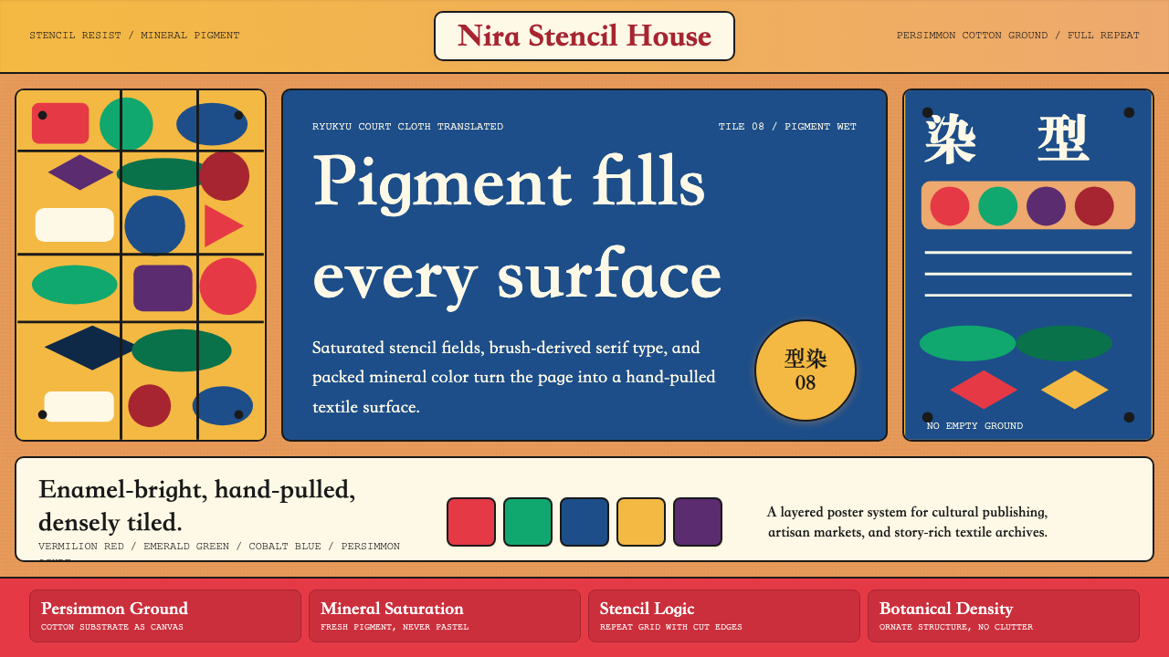 Okinawan Bingata Resist DyeOrnate without clutter. Persimmon ground, vermilion type, emerald-cobalt sten…繁而不乱。柿涩底、朱红字与翠绿钴蓝型染网格。
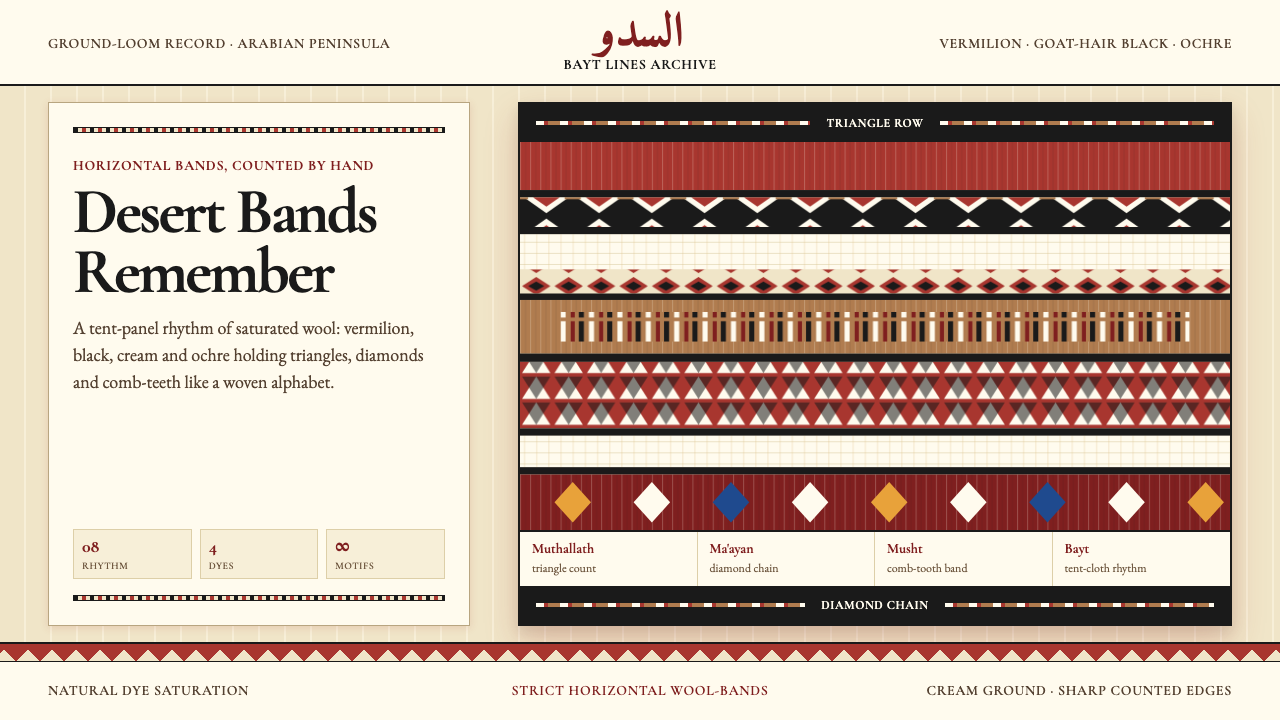 Bedouin Desert Textile (Sadu)Woven memory, not ornament. Vermilion-black bands count triangles and diamond…记忆被织成条带:朱砂与黑色在奶油羊毛上数出三角与菱形。
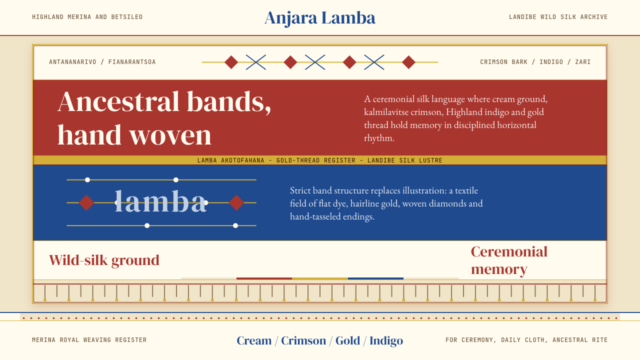 Madagascan Lamba SilkAncestry is woven flat. Crimson, indigo, cream and gold run in strict silk ba…祖灵织进横纹:绯红、靛蓝、奶黄与金线构成严谨丝带。
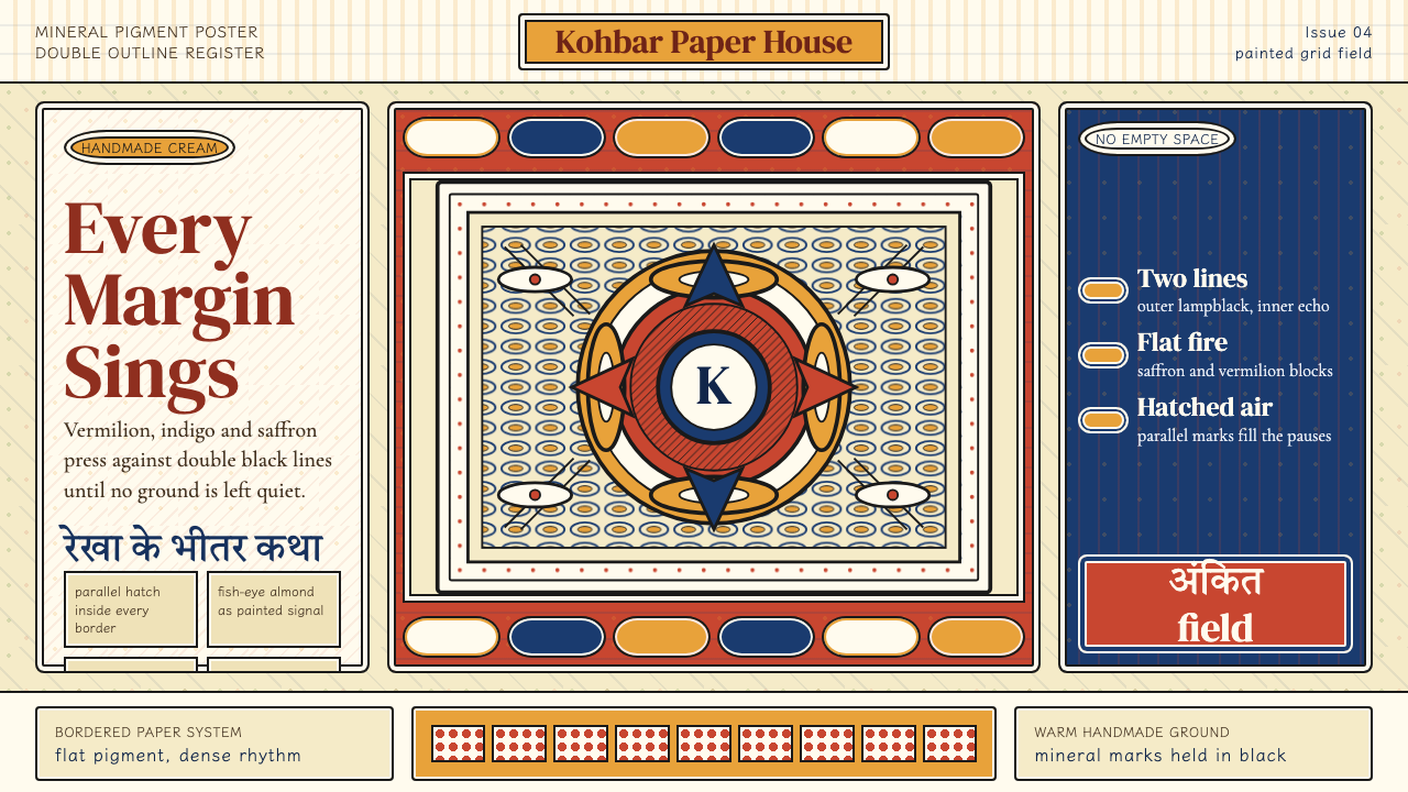 Madhubani (Mithila Folk Painting)No empty ground. Vermilion, indigo and saffron pack double-outlined panels wi…不留空地。朱砂、靛蓝与姜黄铺满双线边框和密集排线。
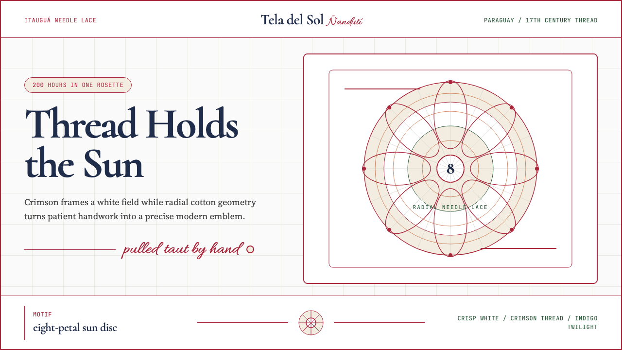 Paraguayan Ñandutí LacePatient craft, modern frame. Crimson lines pin radial lace on crisp white.耐心手艺,现代框架。深红线把放射蕾丝钉在洁白底上。
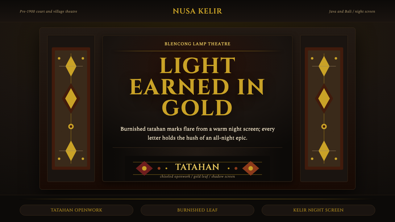 Wayang Kulit ShadowNight makes gold sacred. Cinzel capitals and perforated ochre frames glow lik…夜色让金光神圣:Cinzel大写字与赭金镂空边框如灯下皮影。