What is Paris Metro Guimard (1900)?什么是 Paris Metro Guimard (1900)?
Hector Guimard turned the mouth of the Paris underground into civic sculpture — sinuous iron tendrils, amber lamplight, and the unmistakable green of oxidized metal announcing that utility could be beautiful.埃克托·吉马尔将巴黎地下铁路的入口化为城市雕塑——蜿蜒的铁质藤蔓、琥珀色灯光,以及那标志性的氧化金属绿,宣告实用之物同样可以美丽。
Paris Metro Guimard (1900) in briefParis Metro Guimard (1900) 速览
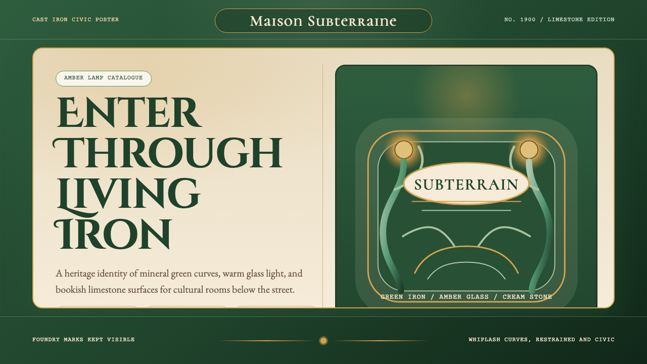
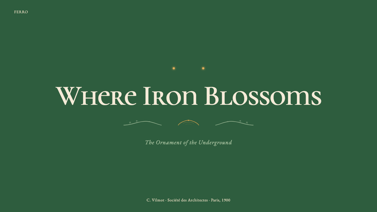
Paris Metro Guimard (1900) is a design language drawn directly from the 167 cast-iron entrance pavilions that architect Hector Guimard created for the Paris Métropolitain between 1900 and 1912. Its palette is anchored in the deep mineral green of patinated ironwork, warmed by amber and honey tones that echo the glass-globe lamps Guimard specified, and grounded in the pale, chalky neutrals of limestone and cream enamel. Against these naturalistic foundations, the style deploys a typography of elongated, organically curved letterforms — serifs that seem to grow rather than be drawn, terminals that taper like leaf tips.巴黎地铁吉马尔风格(1900)是一套直接从建筑师埃克托·吉马尔为巴黎地铁所设计的167座铸铁入口亭提炼而来的设计语言。其色板以铜绿铁件的深矿物绿为基础,以琥珀色与蜂蜜色加以温润——这些色调呼应吉马尔特意设计的玻璃球形灯具——并以石灰岩与奶油色搪瓷的苍白粉质中性色作为底衬。在这些自然主义的基调之上,该风格运用了一套延展而有机弯曲的字体语言——衬线像是生长而非描绘,字端像叶尖般逐渐收细。
The visual logic of this style is the logic of the living world transposed into engineered material. Where most industrial design of 1900 still aspired to classical symmetry and rectilinear order, Guimard chose the grammar of botany: stems that branch and bifurcate, curves that complete themselves the way a tendril spirals toward light, ornamental details that function as structural elements and structural elements that read as ornament. The result is a system of profound coherence — every component, from the overarching canopy frame down to the smallest finial, speaks the same visual language.这种风格的视觉逻辑,是将生命世界的逻辑移植进工程材料之中。1900年前后的大多数工业设计仍追求古典对称与直线秩序,吉马尔却选择了植物学的语法:分叉与延伸的茎干,像卷须向光旋转那样完成自身的曲线,装饰细节充当结构元素,结构元素又被读作装饰。其结果是一套高度内聚的系统——从宏观的顶篷框架到最细小的装饰尖顶,每个组件都讲述同一套视觉语言。
As a digital design system, this aesthetic is best understood as the opposite of modernist reductionism. It does not strip away; it elaborates. It uses richness, organic warmth, and a sense of considered craftsmanship as its primary communicative tools. Projects that need to convey heritage without heaviness, authority without austerity, or warmth without sentimentality will find this vocabulary uniquely suited to those ends.作为数字设计系统,这套美学最好被理解为现代主义简化主义的对立面。它不做减法,它做加法。它以丰富性、有机温度和精心工艺感作为主要的传达工具。需要传递传承感而不显沉重、需要权威性而不失温度、需要亲切感而不落俗套的项目,将会发现这套语汇对上述诉求具有独特的适配性。
See the Paris Metro Guimard (1900) design system查看 Paris Metro Guimard (1900) 完整设计系统
Where does Paris Metro Guimard (1900) come from?Paris Metro Guimard (1900) 从何而来?
The Paris Métro story begins in urgency. The city had debated an underground railway for decades; it was the pressure of hosting the 1900 World's Fair — the Exposition Universelle — that finally forced action. Construction began in 1898, and Line 1 opened on July 19, 1900, just in time for the millions of visitors flooding the capital. The project was managed by the Société du Métropolitain de Paris, which commissioned the infrastructure, the rolling stock, and — crucially — the street-level entrance pavilions that would define the public face of the new system.巴黎地铁的故事始于紧迫。这座城市关于地下铁路的争论已持续数十年,最终迫使行动落地的是举办1900年世界博览会的压力。工程于1898年动工,一号线于1900年7月19日开通,恰好赶上数百万游客涌入首都之时。项目由巴黎大都会铁路公司(Société du Métropolitain de Paris)管理,负责委托基础设施、车辆,以及最关键的——将定义这一新系统公共面貌的地面入口亭建设。
Hector Guimard received the commission in 1899, when he was already known in Paris for the Castel Béranger apartment building (1898), a work that had earned him both admirers and detractors for its extravagant departure from academic convention. Guimard was deeply aligned with the principles of French Art Nouveau — the movement that sought to dissolve the boundary between fine art and applied craft by borrowing structural and decorative vocabulary from the natural world. He was influenced by the theories of Eugène Viollet-le-Duc, who argued that honest structural logic could be beautiful in itself, and by the Belgian architect Victor Horta, whose Hôtel Tassel (1893) demonstrated that iron and glass could be treated with the same sinuous sensitivity as paint on canvas.埃克托·吉马尔于1899年获得委托,彼时他已凭借卡斯泰尔·贝朗热公寓楼(1898年)在巴黎声名大噪——这栋建筑因其对学院惯例的大胆背离而同时赢得了仰慕者与批评者。吉马尔与法国新艺术运动的原则高度契合——这一运动通过借用自然界的结构与装饰语汇,试图消解纯艺术与应用工艺之间的界限。他深受欧仁·维奥莱-勒-杜克理论的影响,后者主张诚实的结构逻辑本身即可美丽;同时也受比利时建筑师维克多·霍塔的启发,后者的塔塞尔宅邸(1893年)证明了铁与玻璃可以被赋予与画布上绘画同等的蜿蜒敏感性。
Guimard's Metro entrances were designed as a unified system of prefabricated cast-iron components that could be assembled in different configurations to suit different site conditions. The components — posts, lamps, railings, canopy ribs, signage panels — were manufactured at foundries and then bolted together on site. This modular logic meant that the visual vocabulary was genuinely systematic: the same curved tendrils and tapered terminals appeared at every entrance, whether grand covered pavilion or simple open balustrade. The distinctive lettering — elongated, with slightly swelling strokes and organic flourishes — was integrated into the cast iron itself, appearing on signs, plaques, and the famous green enamel name boards.吉马尔的地铁入口被设计为一套统一的预制铸铁构件系统,可根据不同场地条件进行不同配置的组合。构件——立柱、灯具、栏杆、顶篷肋骨、标识面板——在铸造厂制造,再于现场用螺栓拼接。这种模块化逻辑意味着视觉语汇是真正系统化的:无论是宏伟的有顶凉亭式入口还是简单的开放式栏杆,同样的弯曲藤蔓与锥形字端出现在每一处入口。那套独特的字体——修长,笔画略有鼓胀,带有有机花饰——被融入铸铁本身,出现在标牌、铭板和著名的绿色搪瓷站名板上。
The reception was immediate and divided. Admirers called the entrances organic, vital, and perfectly suited to a modern democratic city; critics, including prominent voices in the architectural establishment, dismissed them as monstrous — the nickname 'Style Nouille' (noodle style) was used derisively. The tension between the Guimard entrances and the classical Haussmannian fabric of Paris was deliberate: they announced the underground as something categorically new, a rupture in the city's stone surface. Over time, this rupture became heritage. Of the original 167 Guimard entrances, about 86 remain today; two — at Abbesses and Porte Dauphine — retain their original covered pavilion roofs and are classified historical monuments.当时的反响立即而分裂。仰慕者称这些入口有机、充满活力,完美契合一座现代民主城市;批评者,包括建筑界的权威声音,则斥之为怪异——「面条风格」(Style Nouille)这一绰号带着嘲讽被广泛使用。吉马尔入口与巴黎奥斯曼式古典肌理之间的张力是刻意为之的:它们宣告地铁是某种全新的事物,是城市石质表面的一次断裂。随着时间推移,这一断裂成为了遗产。原有167座吉马尔入口中,今日约有86座尚存;其中两座——阿贝塞站与多菲内门站——保留了原始的有顶凉亭屋盖,已被列为历史纪念建筑。
What defines the Paris Metro Guimard (1900) look?Paris Metro Guimard (1900) 的视觉特征是什么?
Color Palette色彩体系
The palette centers on the deep, slightly muted green of oxidized cast iron — not a bright or synthetic green, but the tone of metal weathered outdoors over decades, with quiet blue-gray undertones. Against this structural green, warm amber and golden tones provide luminous contrast, drawn from the glass-globe lamps and the honey-colored enamel inserts. Creamy off-white and pale limestone neutrals serve as background and breathing space, while muted terracotta and warm brown accents anchor the earthier side of the palette. The overall effect is mineral and organic simultaneously — colors that feel dug from the ground rather than mixed from tubes.色板以氧化铸铁的深邃而略显沉郁的绿色为核心——不是鲜艳或合成的绿,而是金属在户外历经数十年风化后的色调,带有沉静的蓝灰底色。与这种结构性绿色相对,琥珀色与金色调提供明亮的对比,来源于玻璃球形灯具与蜂蜜色搪瓷嵌件。奶油色白与石灰岩中性色担当背景与呼吸空间,而柔和的赭色与暖褐色点缀则锚定了色板中更接地气的一侧。整体效果同时兼具矿物质感与有机感——这些色彩像是从土地中挖出来的,而非从颜料管里调出来的。
Organic Curves and Whiplash Lines有机曲线与鞭线
The defining formal quality of this style is the whiplash curve: a line that begins broadly, accelerates through a bend, and tapers to a fine point — the visual motion of a plant stem under stress or a wave breaking. These curves are never arbitrary; they follow the internal logic of growth and tension. In structural elements they suggest forces being elegantly resolved; in decorative elements they echo botanical forms — unfurling fern fronds, lily stems, water reeds. The curves are always fluid and continuous, never jointed or broken, which gives the style its characteristic sense of living momentum.这种风格最具定义性的形式特征是鞭线曲线:一条从宽阔起始,经弯折加速,最终收细至尖点的线——如同受力植物茎干或破浪的视觉动势。这些曲线从不任意为之;它们遵循生长与张力的内在逻辑。在结构性构件中,它们暗示着力量被优雅化解;在装饰性构件中,它们呼应植物形态——展开的蕨叶、百合茎秆、水生芦苇。曲线始终流畅连贯,从不折节或断裂,赋予这种风格特有的生命律动感。
Organic Letterforms有机字形
The typography of the Guimard system is inseparable from its ornamental logic. Letters are elongated and slightly compressed horizontally, with strokes that swell and taper organically rather than following the mechanical uniform-thickness logic of sans-serifs or the mathematical regularity of classical serifs. Terminals — the ends of strokes — are rounded or tapered like plant tips rather than cut flat. The lettering has weight and presence without heaviness; it reads clearly at distance while rewarding close inspection with its surface detail. In digital application, this quality should be sought in typefaces that feel carved or grown rather than drawn or engineered.吉马尔系统的字体排印与其装饰逻辑密不可分。字母修长且略微水平压缩,笔画有机地鼓胀与收细,而非遵循无衬线字体的机械等粗逻辑或古典衬线字体的数学规整性。笔端——笔画的末端——如植物尖端般圆润或渐细,而非平切。字体有分量、有存在感,却不显沉重;远处可清晰辨读,近看则以丰富的表面细节予人回报。在数字化应用中,应在那些感觉像是雕刻或生长出来、而非绘制或工程设计出来的字体中寻找这种品质。
Structural Ornament结构性装饰
One of Guimard's most sophisticated achievements was making ornament load-bearing — or at least making it appear so. The branching iron tendrils that form the canopy supports are simultaneously decorative and structural; the posts that anchor the railings are both functional columns and botanical sculptures. In the digital translation of this aesthetic, this principle manifests as decoration that always serves a compositional purpose: a curved divider that also guides reading direction, a flourish at a corner that simultaneously defines and softens the boundary, an ornamental border that clarifies hierarchy. Nothing decorates purely for its own sake; everything earns its presence.吉马尔最精妙的成就之一是使装饰承担结构功能——或至少使其看起来如此。构成顶篷支撑的分叉铁质藤蔓同时具有装饰性与结构性;锚定栏杆的立柱既是功能性柱体,也是植物雕塑。在这套美学的数字化转译中,这一原则体现为:装饰始终服务于构图目的——一条既引导阅读方向的弧形分割线,一处同时界定并软化边界的角落花饰,一道澄清层级关系的装饰性边框。没有纯粹为自身而存在的装饰;每一处装饰都在赢得自己的位置。
Warm Patina and Surface Texture温暖铜锈与表面质感
The Guimard entrances gain much of their emotional resonance from the quality of their surfaces: cast iron that has been painted and weathered, glass that diffuses rather than transmits light, enamel that has a slight depth and warmth rather than a hard reflective sheen. This is a palette of materials that age well — that look richer and more settled over time rather than worn or shabby. In digital work, this sensibility translates to avoiding perfectly flat, hard-edged surfaces in favor of treatments that suggest slight depth, gentle grain, or the warm diffusion of light through a translucent material. The goal is presence and warmth, not the clinical perfection of pure digital flatness.吉马尔入口的情感共鸣很大程度上来自其表面的质感:被涂装与风化的铸铁,散射而非透射光线的玻璃,略有深度与温度而非硬性反光光泽的搪瓷。这是一套随时间愈显丰富、愈感沉稳——而非磨损或破败——的材料色板。在数字化工作中,这种感受力转化为:避免完全平整、硬边的表面处理,转而倾向于暗示轻微深度、细腻肌理或光线穿过半透明材料时温暖漫射的处理方式。目标是存在感与温度,而非纯数字平面的临床完美。
Symmetry Softened by Nature被自然柔化的对称
Unlike the strict bilateral symmetry of classical architectural ornament, the Guimard system uses a softer, biological kind of balance: roughly symmetrical overall compositions in which individual elements have the slight asymmetries of natural growth — a tendril that extends a little further on one side, a curve that completes with a slightly different emphasis at each end. This near-symmetry reads as crafted rather than manufactured, alive rather than mechanical. In layout terms, it suggests compositions that are centered or mirrored at the macro level but allow individual elements to breathe and vary slightly rather than snapping to a perfectly rigid grid.与古典建筑装饰的严格双边对称不同,吉马尔系统使用一种更柔软的、生物性的平衡:整体构图大致对称,而各个细节元素则带有自然生长的轻微非对称——某一侧延伸稍远的藤蔓,两端以略微不同力度收尾的曲线。这种近似对称读起来像是手工制作而非机械生产,有生命感而非机械感。在版面语言上,这暗示着在宏观层面居中或镜像的构图,但允许各个元素自由呼吸、略有变化,而非严格对齐到一个完全刚性的网格。
Integration of Text and Image文字与图像的融合
In the Guimard system, signage is never applied to a surface as an afterthought — it is cast into the material itself, literally part of the structure. Station names appear in the same green iron as the railings and posts; lettering and ornament are compositionally inseparable. In digital translation, this principle argues against treating typography and imagery as separate layers to be stacked. Instead, type should feel embedded in its compositional context: framed by ornament that responds to its weight and rhythm, scaled in relationship to decorative elements rather than independently, placed so that text and surrounding form are in genuine visual dialogue.在吉马尔系统中,标识从不是事后贴附于表面的——它被铸入材料本身,字面意义上是结构的一部分。站名以与栏杆、立柱相同的绿色铁件呈现;字体与装饰在构图上不可分割。在数字化转译中,这一原则反对将字体排印与图像视为可堆叠的独立图层。相反,文字应感觉嵌入其构图语境之中:被呼应其重量与节奏的装饰所框定,相对于装饰元素而非独立地进行比例缩放,被放置于使文字与周围形态产生真实视觉对话的位置。
See the Paris Metro Guimard (1900) design system查看 Paris Metro Guimard (1900) 完整设计系统
Who shaped Paris Metro Guimard (1900)?谁塑造了 Paris Metro Guimard (1900)?
Guimard (1867–1942) is the singular creative intelligence behind the Metro entrance system and the defining figure of French Art Nouveau as applied to architecture and public works. Trained at the École des Arts Décoratifs and the École des Beaux-Arts in Paris, he rejected the academic historicism of his training in favor of an architecture shaped by natural forces and structural logic. His Castel Béranger apartment building (1898) scandalized the Paris establishment and won him the commission that would define his legacy. After the peak of his influence in the 1900s, Art Nouveau fell rapidly out of fashion, and Guimard spent his later career increasingly marginalized. He emigrated to the United States in 1938 with his wife, the American painter Adeline Oppenheim, and died in New York in 1942. The postwar rediscovery of his Metro entrances — aided by a Museum of Modern Art exhibition in 1970 — rescued his reputation and established him as a canonical figure in the history of design.吉马尔(1867—1942年)是地铁入口系统背后唯一的创造性智识,也是法国新艺术运动应用于建筑与公共工程领域的决定性人物。他就读于巴黎装饰艺术学院与美术学院,却拒绝了训练中的学院历史主义,转而追求一种由自然力量与结构逻辑塑造的建筑语言。他设计的卡斯泰尔·贝朗热公寓楼(1898年)震惊了巴黎建筑界,同时为他赢得了那项定义其遗产的地铁委托。在1900年代达到影响力顶峰之后,新艺术运动迅速退潮,吉马尔在职业生涯后期日益边缘化。1938年,他与妻子——美国画家阿德琳·奥本海姆——移居美国,1942年在纽约辞世。战后对其地铁入口的重新发现——得益于1970年现代艺术博物馆的一场展览——挽救了他的声誉,确立了他在设计史上的经典地位。
A contemporary and sometime collaborator of Guimard's within the Paris Art Nouveau scene, Henri Sauvage (1873–1932) brought a related but distinct sensibility to the same decorative moment. Where Guimard pushed toward the most sinuous and botanically literal expressions of the style, Sauvage was more interested in the integration of ornament with the social function of buildings — his Villa Majorelle in Nancy (1902) and later his setback residential projects in Paris show an Art Nouveau architect thinking seriously about how decorative ambition and urban housing could coexist. Sauvage's work is a useful reference point for understanding the range of approaches that French Art Nouveau encompassed beyond Guimard's most immediately recognizable vocabulary.萨瓦热(1873—1932年)是吉马尔在巴黎新艺术运动圈子中的同代人与偶尔的合作者,他为同一装饰时代带来了相关却独特的感受力。吉马尔追求风格中最蜿蜒、最植物字面化的表达,萨瓦热则更关注装饰与建筑社会功能的融合——他在南锡的马若雷尔别墅(1902年)以及后来在巴黎的退台式住宅项目,展示了一位新艺术运动建筑师对装饰抱负与城市住宅如何共存的认真思考。萨瓦热的作品是理解法国新艺术运动在吉马尔最具辨识度的语汇之外所涵盖的方法论广度的有益参照。
The municipal company that commissioned and oversaw the Metro project was not a passive client; its decisions shaped the Guimard system as much as any individual designer. The company's choice to treat the street-level entrances as a matter of civic identity — rather than merely functional apertures — created the conditions for Guimard's commission. Its requirement that the entrance components be prefabricated and standardized for rapid deployment across the city forced Guimard to develop his design as a true modular system rather than a series of bespoke one-off works. This institutional pressure is partly responsible for the internal coherence that makes the Guimard vocabulary so powerful: the constraints of production systematicity made the design system more rigorous, not less expressive.委托并监督地铁项目的市政公司并非被动的委托方;它的决策塑造吉马尔系统的程度不亚于任何个别设计师。公司选择将地面入口视为城市身份认同的问题——而非仅仅是功能性开口——创造了吉马尔获得委托的条件。其对入口构件进行预制和标准化以便在全市快速部署的要求,迫使吉马尔将设计发展为真正的模块化系统,而非一系列定制的单件作品。这种机构压力是使吉马尔语汇如此强大的内在连贯性的部分成因:生产系统性的约束使设计系统更加严密,而非减损了其表现力。
Though Belgian rather than French, Victor Horta (1861–1947) is an indispensable reference for understanding where Guimard's formal language came from. Horta's Hôtel Tassel in Brussels (1893) is the work most frequently cited as the founding document of architectural Art Nouveau: a residential interior in which exposed iron structural members were treated not as engineering elements to be hidden but as opportunities for sinuous, whiplash ornament. Guimard visited Brussels and studied Horta's work directly; the influence is traceable in the Metro entrances' treatment of iron as both structural support and decorative surface simultaneously. Horta and Guimard represent the two most sophisticated national expressions of the same fundamental impulse — to make the industrial materials of modernity as beautiful as the natural world they were displacing.尽管是比利时人而非法国人,维克多·霍塔(1861—1947年)对于理解吉马尔形式语言的来源不可或缺。霍塔在布鲁塞尔的塔塞尔宅邸(1893年)是最常被引用为建筑新艺术运动奠基文献的作品:一个住宅室内空间,其中裸露的铁质结构构件被视为蜿蜒鞭线装饰的机会,而非需要隐藏的工程要素。吉马尔曾前往布鲁塞尔直接研究霍塔的作品;这一影响可在地铁入口对铁件的处理中追溯——同时作为结构支撑与装饰表面。霍塔与吉马尔代表了同一根本冲动的两种最精湛的民族表达——使现代工业材料与它们正在取代的自然世界同样美丽。
The great nineteenth-century French theorist and restorer Viollet-le-Duc (1814–1879) died two decades before Guimard's Metro commission, yet his intellectual influence runs through the entire project. Viollet-le-Duc argued, most influentially in his Entretiens sur l'Architecture (1858–1872), that beauty in architecture derived not from applied historical ornament but from the honest, visible expression of structural forces and materials. He celebrated Gothic architecture not for its style but for what he saw as its structural rationalism — the way flying buttresses, pointed arches, and ribbed vaults made the logic of load-bearing visible and beautiful. This argument gave Guimard a theoretical justification for his ornamental ironwork: the tendrils and curves were not decoration applied to structure, but structure made ornamental — precisely the fusion Viollet-le-Duc had theorized.十九世纪法国伟大的建筑理论家与修复师维奥莱-勒-杜克(1814—1879年)在吉马尔的地铁委托之前二十年便已辞世,但他的思想影响贯穿于整个项目。维奥莱-勒-杜克在其最具影响力的著作《建筑讲谈录》(1858—1872年)中主张,建筑之美来自结构力量与材料的诚实、可见的表达,而非附加的历史装饰。他推崇哥特建筑不是因为其风格,而是因为他所看到的结构理性主义——飞扶壁、尖拱与肋形穹顶使承重逻辑变得可见而美丽的方式。这一论点为吉马尔的装饰性铁件提供了理论正当性:那些藤蔓与曲线不是附加于结构之上的装饰,而是被赋予装饰性的结构——恰恰是维奥莱-勒-杜克所理论化的那种融合。
How do you use Paris Metro Guimard (1900) today?今天怎么用 Paris Metro Guimard (1900)?
Applying Guimard's vocabulary to contemporary digital work requires understanding what the style is communicating at a deeper level than its surface motifs. The Metro entrances succeeded because they used ornamental richness to signal welcome and civic generosity — the underground, often experienced as threatening or disorienting, was framed as an elaborate gift to the city's inhabitants. In digital work, this translates to using the style's warmth, organic curves, and material richness to communicate trustworthiness, craftsmanship, and considered attention to the user's experience. It is a style for products that want to be memorable and warm, not merely efficient.将吉马尔语汇应用于当代数字化工作,需要在表面母题之下理解这种风格在更深层次上传达的内容。地铁入口之所以成功,是因为它们用装饰性的丰富性来传递欢迎感与公民慷慨——地下空间通常令人感到威胁或迷失,而这些入口却将其框定为对城市居民的精心馈赠。在数字化工作中,这转化为:运用这种风格的温度、有机曲线与材料丰富性来传达可信赖感、工匠精神以及对用户体验的用心关注。这是一种适合那些希望令人难忘且充满温度、而不仅仅是高效的产品的风格。
For presentation slides, the Guimard palette and vocabulary work exceptionally well for covers and section dividers. A cover slide benefits from a composition in which a central ornamental frame — drawn from the vocabulary of curved iron tendrils and organic letterforms — surrounds or anchors the title, against a deep mineral green or warm cream ground. Section dividers can use a single ornamental element — a whiplash curve, a botanical flourish — as a horizontal punctuation mark. Content slides should be treated with more restraint: the organic aesthetic as a subtle frame or background texture, with body text in a clean, slightly warm neutral, and data visualizations that adopt the palette's greens and ambers without introducing excessive decorative complexity. The goal is atmosphere and heritage, not visual noise.对于演示文稿,吉马尔色板与语汇在封面与章节分隔页上效果卓越。封面页受益于这样一种构图:一个中央装饰框架——取材于弯曲铁质藤蔓与有机字形的语汇——在深矿物绿或温暖奶油色底面上围绕或锚定标题。章节分隔页可将单一装饰元素——一条鞭线曲线、一处植物花饰——用作水平标点。内容页应以更多克制处理:以有机美学作为微妙的框架或背景肌理,正文字体使用干净、略带温度的中性色,数据可视化采用色板中的绿色与琥珀色,不引入过度的装饰复杂性。目标是氛围与传承感,而非视觉噪音。
For web interfaces, this style is most effective in contexts where the user is expected to linger and engage rather than scan and exit: boutique e-commerce, cultural institution sites, premium subscription services, editorial platforms, and hospitality brands. Dashboard and pricing page applications are viable but require care — the ornamental richness must be concentrated in structural framing elements (headers, borders, navigational components) while data display areas are kept relatively clean. Buttons and interactive elements work well when they carry a subtle botanical quality — slightly rounded, with a warm green or amber fill and a letterform that feels chosen rather than defaulted. Ghost buttons and flat minimal components are stylistically inconsistent with this vocabulary and should be avoided.对于网页界面,这种风格在用户被期待停留与深度参与、而非快速扫描离开的场景中最为有效:精品电商、文化机构网站、高端订阅服务、编辑平台与酒店品牌。仪表板与定价页面的应用是可行的,但需要谨慎——装饰性丰富感必须集中于结构性框架元素(页眉、边框、导航组件),而数据展示区域保持相对简洁。按钮与交互元素在带有微妙植物质感时效果出色——略为圆润,以温暖绿色或琥珀色填充,字形感觉是经过选择而非默认的。幽灵按钮与平面极简组件在风格上与这套语汇不兼容,应予以回避。
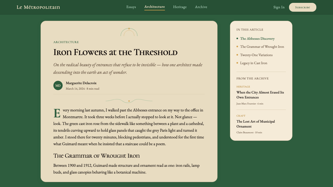
For editorial and marketing work, the Guimard style supports a particular kind of premium narrative: one that invokes history, craft, and cultural specificity rather than abstraction or novelty. Magazine-format editorial layouts benefit from running ornamental borders along margins, using organic drop capitals to open articles, and selecting photography that has warmth and patina — aged surfaces, natural materials, low-contrast tonal ranges — rather than the high-key, saturated imagery associated with contemporary tech marketing. Marketing pages work well with the style's inherent poster quality: a full-width hero section in deep green with cream typography, a section break announced by an ornamental rule, and feature sections that alternate warm cream with the mineral green in a way that feels considered and rhythmic rather than arbitrary.对于编辑与营销内容,吉马尔风格支持一种特定类型的高端叙事:一种唤起历史感、工艺感与文化特殊性的叙事,而非抽象或新奇感。杂志版式的编辑版面受益于沿边距延伸的装饰性边线、以有机首字下沉开启文章,以及选择具有温度与铜锈感的摄影图像——陈旧的表面、天然的材料、低对比度的色调范围——而非与当代科技营销相关的高调、饱和图像。营销页面适合这种风格固有的海报品质:深绿色底配奶油色字的全宽主视觉区,以装饰性线条宣告分节,特性区块以温暖奶油色与矿物绿交替,令人感到经过深思熟虑的节奏,而非随意为之。
The most common mistake when working with this style is reducing it to surface decoration: adding a few botanical motifs to an otherwise unstyled layout and assuming the work is done. The Guimard vocabulary is a coherent system in which color, form, typography, and ornament are mutually reinforcing. Applying the palette without the organic letterforms, or using botanical motifs with a geometric sans-serif typeface, produces a category confusion that reads as costume rather than language. The second common mistake is overloading: the original Metro entrances are densely detailed, but the density is organized by a clear structural hierarchy. In digital work, every ornamental element must earn its place within a composition that has been clearly organized first. Start with structure, add ornament to reinforce it — never the reverse.运用这种风格时最常见的错误是将其简化为表面装饰:在一个其他方面没有风格化的版面上添加几个植物母题,并以为工作到此完成。吉马尔语汇是一套色彩、形态、字体排印与装饰相互强化的连贯系统。在没有有机字形的情况下应用色板,或将植物母题与几何无衬线字体混用,会产生一种类别混乱,读起来像是服装而非语言。第二个常见错误是过度堆砌:原始地铁入口细节密集,但这种密度由清晰的结构层级组织。在数字化工作中,每一个装饰性元素都必须在一个首先被清晰组织的构图中赢得自己的位置。从结构出发,以装饰加以强化——永远不要反其道而行。
See the Paris Metro Guimard (1900) design system查看 Paris Metro Guimard (1900) 完整设计系统
Paris Metro Guimard (1900) — FAQParis Metro Guimard (1900) · 常见问题
Is this style only suitable for French or European cultural contexts?这种风格是否只适合法国或欧洲文化语境?
Not at all, though the association is real and should be considered. The Guimard vocabulary's underlying values — warmth, organic form, craft, the celebration of natural forms in engineered contexts — are not culturally specific in the way that, say, a direct quotation of Haussmannian architecture would be. The style has been successfully adapted for hospitality, luxury goods, perfumery, and cultural institution work across very different regional contexts, because what it primarily communicates is premium craftsmanship and considered beauty rather than French national identity. That said, when the brief requires cultural neutrality or a deliberately non-European reference, this style will read with a specific heritage that other palettes would not carry. The question to ask is whether that heritage serves or complicates the project's positioning.并非如此,尽管这种关联是真实存在的,应当加以考虑。吉马尔语汇的底层价值观——温度、有机形态、工艺、在工程语境中对自然形态的颂扬——并不具有特定的文化专属性,不像直接引用奥斯曼式建筑那样明确地属于某种文化。这种风格已被成功地应用于酒店业、奢侈品、香水与文化机构工作中,横跨截然不同的地区语境,因为它主要传达的是高端工艺感与经过深思熟虑的美感,而非法国民族身份。也就是说,当项目要求文化中立性或刻意的非欧洲参照时,这种风格将携带其他色板所不具备的特定传承色彩。需要问的问题是:这种传承感是服务于还是复杂化了项目的定位。
How does this style relate to other Art Nouveau expressions like Jugendstil or Vienna Secession?这种风格与青年风格派或维也纳分离派等其他新艺术运动表达有何关系?
All three are branches of the broader Art Nouveau movement that flourished across Europe roughly between 1890 and 1910, and all three reject academic historicism in favor of natural forms and the integration of fine and applied arts. But they are quite distinct in character. Guimard's French style is the most botanically literal — it most directly evokes growing, curving plant life and uses warmth and mineral color as its emotional register. German Jugendstil (as expressed in, for instance, the Munich magazine that named the movement) tends to be flatter, more poster-graphic, with stronger use of outline and silhouette. Vienna Secession, associated with Gustav Klimt, Koloman Moser, and Josef Hoffmann, is more geometric and rectilinear — the Secessionist grid and the black-and-white contrast of the Ver Sacrum magazine are very different from Guimard's fluid ironwork. When working with the Guimard system, it is the organic warmth and mineral palette that are defining, not just the general fact of curving lines.三者都是大约在1890年至1910年间在欧洲兴盛的广义新艺术运动的分支,都拒绝学院历史主义,转而支持自然形态与纯艺术和应用艺术的整合。但它们在特质上截然不同。吉马尔的法国风格是最接近植物字面化的——它最直接地唤起生长、弯曲的植物生命,以温度与矿物色彩作为其情感基调。德国青年风格派(例如在命名该运动的慕尼黑杂志中所表达的)倾向于更平面、更接近海报图形,更强调轮廓线与剪影效果。维也纳分离派,与古斯塔夫·克利姆特、科洛曼·莫塞尔和约瑟夫·霍夫曼相关联,则更具几何性与直线性——分离派的网格以及《神圣之春》杂志的黑白对比,与吉马尔流动的铁件截然不同。在使用吉马尔系统时,起定义性作用的是有机温度与矿物色板,而不仅仅是曲线的一般性事实。
Can this style work effectively in a dark or night-mode interface?这种风格能在深色或夜间模式界面中有效运作吗?
Yes, with deliberate adaptation. The original Guimard system already contains a night-mode logic of its own: the entrances were lit by amber glass lamps against the deep green of iron and the darkness of the Parisian street at night. A dark-mode translation works best when it anchors the background in a very deep version of the mineral green — almost black but with unmistakable green undertones — and uses the warm amber and honey tones as the primary light-sources of the composition: headlines, active states, key calls to action. The cream and off-white tones shift to a slightly warmer light gray for body text, and ornamental elements are rendered in a tone-on-tone green rather than high-contrast. The risk to avoid is losing the warmth entirely by moving toward a cold near-black background; the style's emotional logic depends on the sense that there is warmth within the darkness.可以,但需要刻意的适配。原始吉马尔系统本身就包含一套夜间模式逻辑:入口在夜晚的巴黎街道上,以琥珀色玻璃灯映衬深绿铁件与黑暗。深色模式转译最有效的做法是:将背景锚定于矿物绿的极深版本——近乎黑色,但带有不可误认的绿色底色——并将温暖的琥珀色与蜂蜜色作为构图的主要光源:标题、激活状态、关键行动号召。奶油色与米白色调则转换为略带温度的浅灰色用于正文,装饰元素以同色系绿色而非高对比度呈现。需要避免的风险是:因背景趋向冷性近黑色而完全丧失温度;这种风格的情感逻辑依赖于黑暗之中蕴含温度的感受。
How should photography be treated when used alongside this aesthetic?当摄影图像与这套美学并用时,应如何处理?
Photography works best in this context when it shares the palette's tonal qualities rather than fighting against them. Images with warm, slightly desaturated color grading — the tones of aged paper, antique brass, stone, and dappled natural light — integrate naturally with the mineral greens and ambers of the Guimard palette. High-key, saturated, or cooled contemporary photography tends to feel dissonant. When using architecture or interior photography, images of spaces that have genuine patina and material warmth — stone walls, aged wood, wrought iron, frosted glass — will always read as more coherent than images of sleek modern interiors. Photographs should be framed within ornamental borders or given a slight warm toning treatment rather than presented as neutral documentary windows. The relationship between the photograph and its decorative frame should feel integrated, not incidental.在这种语境中,摄影图像在与色板的色调品质共鸣而非对抗时效果最佳。带有温暖、略微降饱和色彩处理的图像——陈旧纸张、古铜、石材与斑驳自然光的色调——与吉马尔色板的矿物绿和琥珀色自然融合。高调、饱和或冷色调的当代摄影往往显得不协调。在使用建筑或室内摄影时,具有真实铜锈感与材质温度的空间图像——石砌墙壁、陈旧木材、锻铁、磨砂玻璃——相比光洁现代室内的图像,始终读起来更为连贯。照片应当被装入装饰性边框,或进行轻微暖色调处理,而非以中性纪录片式窗口呈现。照片与其装饰性框架之间的关系应感觉是融为一体的,而非偶然拼凑的。
Why did Art Nouveau — and the Guimard style specifically — fall out of fashion so quickly after 1910?为何新艺术运动——以及吉马尔风格——在1910年后如此迅速地退出流行?
The decline was rapid and almost total. By the time of the First World War, Art Nouveau was considered embarrassingly overwrought; the stripped, geometric aesthetic of Art Deco and early modernism replaced it almost overnight in fashionable circles. Several forces drove this. First, the style's ornamental extravagance was expensive to produce — every curving tendril required skilled craftsmanship that the emerging machine-production economy could not cheaply replicate. Second, the cultural mood shifted: the war made organic luxuriance feel inappropriate, even decadent, and there was a widespread appetite for clarity, rationality, and a clean break with pre-war visual culture. Third, and perhaps most importantly, the style had been so quickly popularized and commercialized after 1900 that by 1910 it had accumulated enormous quantities of derivative, low-quality imitation work that discredited the originals by association. The recovery of appreciation for Guimard's work specifically had to wait for the distance that time provides — a reminder that the relationship between a style's historical moment and its later reputation is rarely straightforward.衰退是迅速而几乎是彻底的。到第一次世界大战时,新艺术运动已被认为令人尴尬地过于繁复;装饰艺术与早期现代主义的简洁几何美学几乎一夜之间在时尚圈中取而代之。几股力量推动了这一转变。首先,这种风格的装饰奢靡造价昂贵——每一条弯曲藤蔓都需要新兴机器生产经济无法廉价复制的精湛工艺。其次,文化氛围发生了转变:战争使有机的奢华感显得不合时宜,甚至颓废,人们普遍渴望清晰、理性,以及与战前视觉文化的彻底决裂。第三点,也许是最重要的:这种风格在1900年后被如此迅速地普及与商业化,以至于到1910年,大量衍生的、低质量的仿制作品已经积累,并以连带效应败坏了原作的声誉。对吉马尔作品的重新欣赏,必须等待时间所提供的距离——这提醒我们,一种风格的历史时刻与其后世声誉之间的关系鲜少是直截了当的。
Related design styles相关设计风格
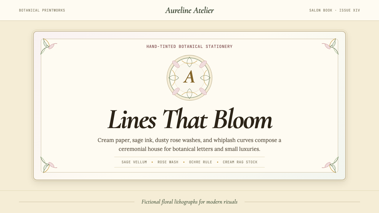 Art Nouveau (Mucha)Mucha's whiplash arabesques. Botanical halos, muted lithograph palette, no ma…穆夏的鞭线式有机曲线:植物光环、柔和石版印刷色、奶油纸底——拒绝机械刻意的边缘。
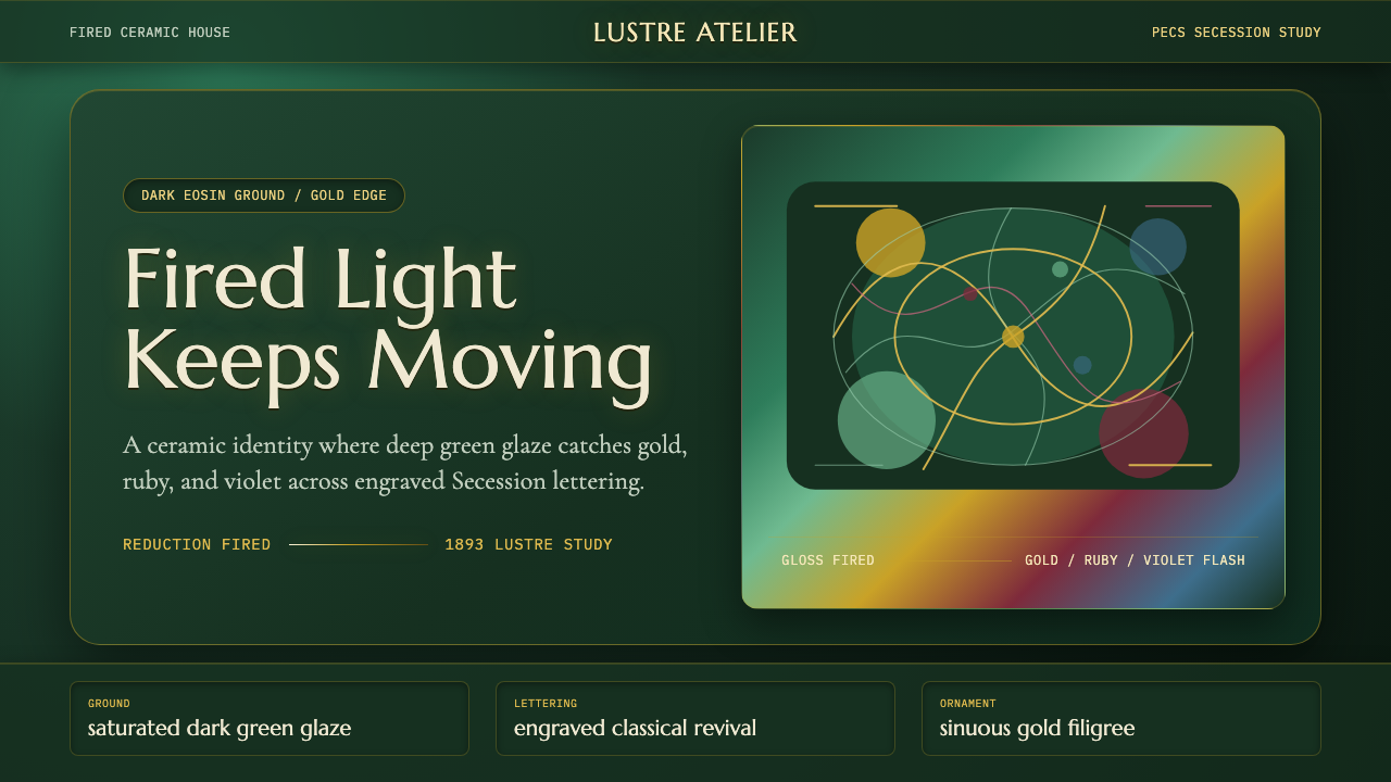 Zsolnay Eosin CeramicsGlaze becomes theater. Dark eosin green flashes gold, ruby, and violet throug…釉色即剧场:深绿釉地在分离派曲线中闪出金、红与紫。
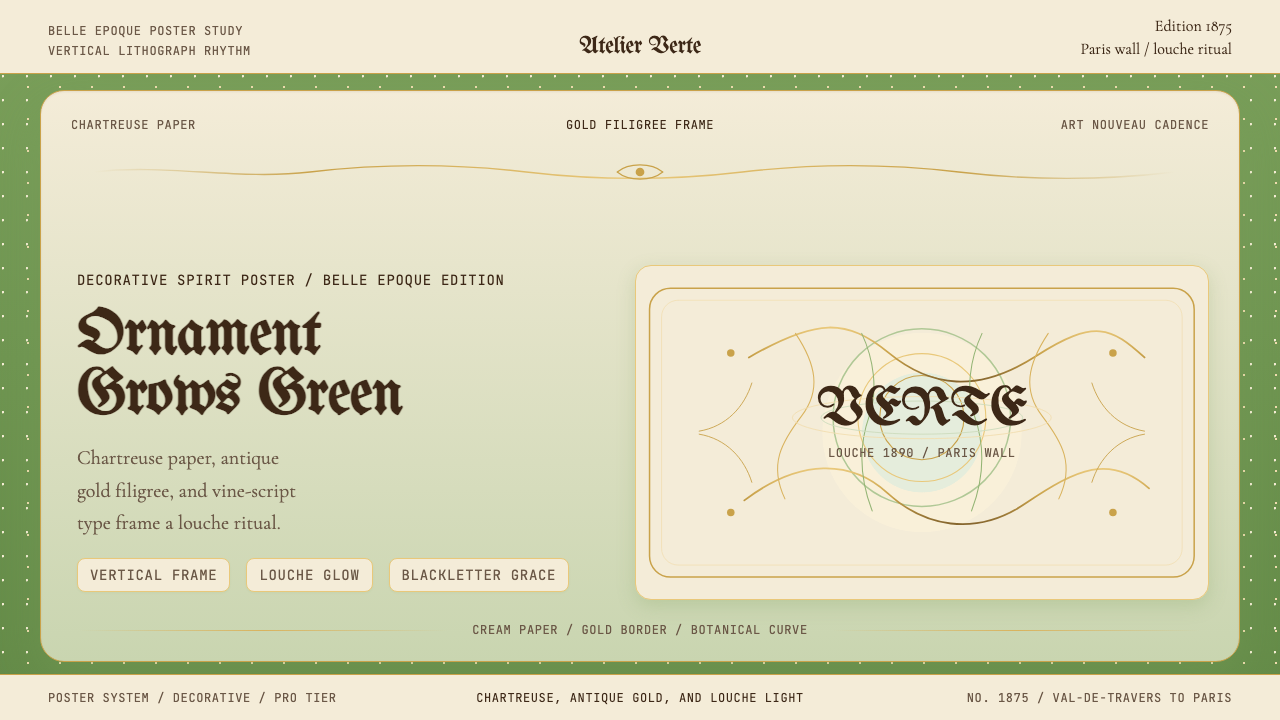 Absinthe Art Nouveau Green (1875)Ornate and verdant. Chartreuse field, gold filigree, vine-script type, and lo…华丽而青绿。黄绿色底、金丝花边与藤蔓字体托出浑浊光。
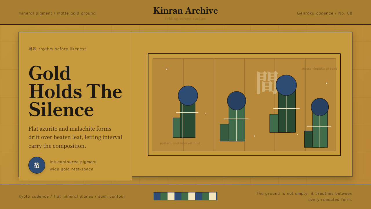 Edo Rinpa (Kōrin)Matte gold breathes. Azurite and malachite repeats float across inked screen…哑金会呼吸:群青与绿青反复漂浮在墨线屏风折面上。
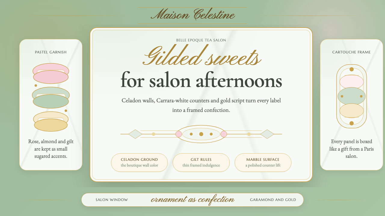 French PâtisserieOrnament is the luxury. Celadon ground, gilt cartouches, Garamond and script…以装饰定义奢华:青瓷绿底、烫金框、加拉蒙与花体字。
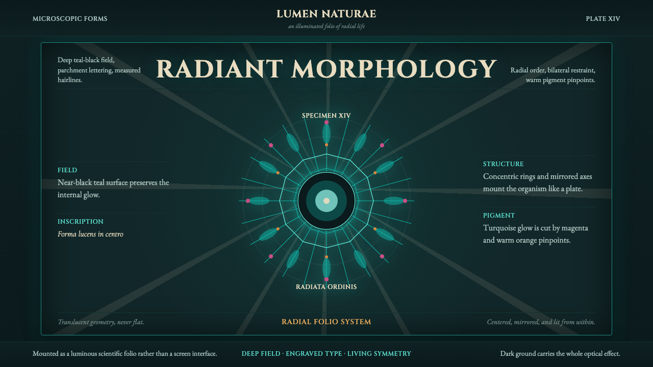 Haeckel KunstformenLuminous symmetry. Teal-black ground, Cinzel capitals, and radial turquoise s…发光的对称性。深青黑底、Cinzel 罗马大写和放射状青绿标本。