What is French Pâtisserie?
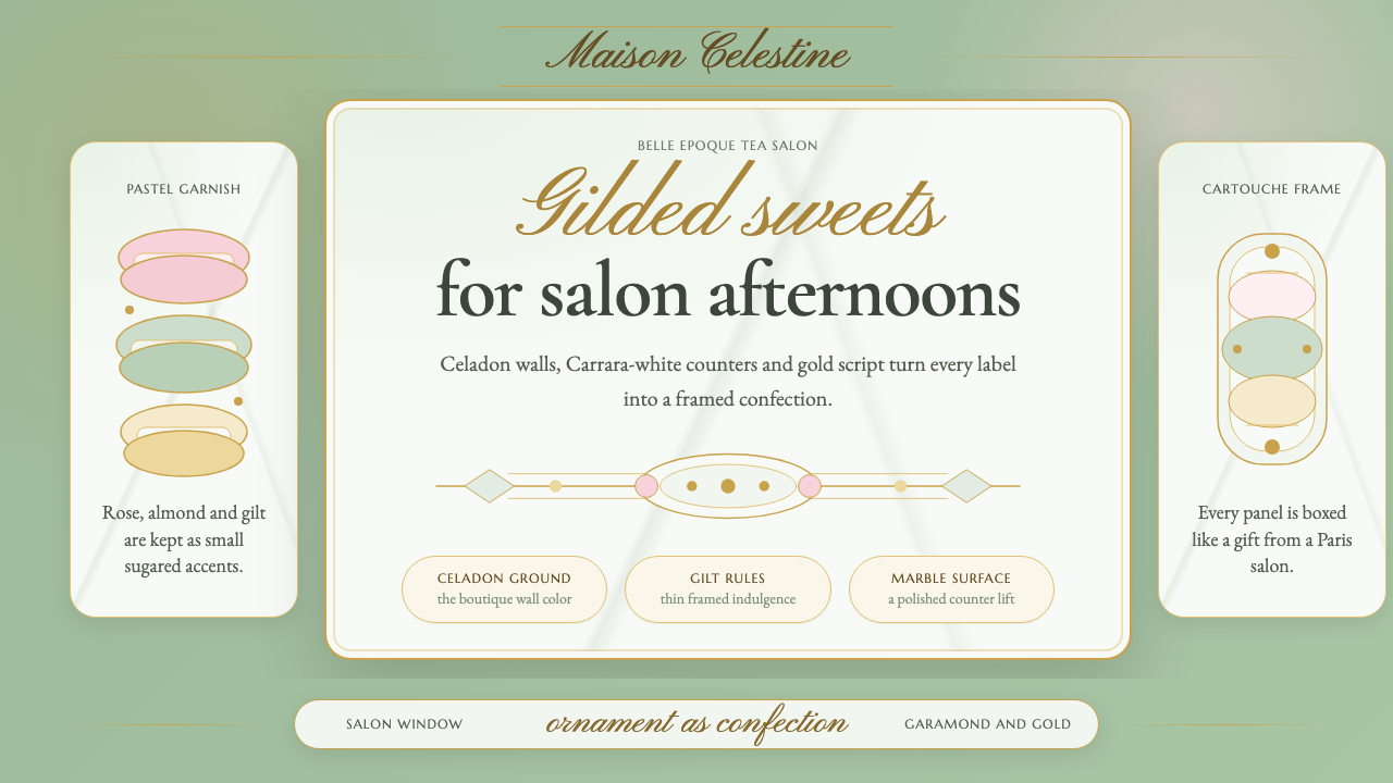
French Pâtisserie turns a Belle Époque candy-shop window into a design language — celadon walls, gilded frames, and a script hand that treats sweetness as a serious luxury.
French Pâtisserie in brief
French Pâtisserie is a design language drawn from the gilded boutique interiors of Parisian macaron houses — the pale green walls, marble counters, and flowing gold signage that turned buying a pastry into a small ceremony. Where many luxury styles pursue restraint, this one pursues abundance: every surface is dressed, framed, and finished, the way a confectioner dresses a window for a holiday display.
The visual system rests on a deliberate contradiction: rigor underneath, ornament on top. Ribbons, scalloped cartouches, and gilt hairlines frame soft pastel fields the way a jeweler's velvet frames a stone. Refined old-style serifs carry the informational weight, while a looser copperplate script supplies the theatrical flourish — the same division of labor a nineteenth-century menu card would use between its price list and its signature dish names.
The effect reads instantly as heritage retail rather than modern tech or editorial minimalism. It signals patience, craft, and an unhurried relationship with quality — a shop that has been doing one thing very well for over a century and sees no reason to modernize the recipe, only to keep polishing the presentation.
Where does French Pâtisserie come from?
The house of Ladurée was founded in Paris in 1862, when Louis Ernest Ladurée opened a bakery on the Rue Royale that was rebuilt as one of the city's first pâtisserie salons after a fire in the 1870s. The rebuild mattered as much as the recipe: Ladurée commissioned ceiling paintings in the manner of the Sistine Chapel for a shop that sold pastries, an act of decorative ambition that set the tone for everything the brand would do afterward. Dessert, in this vision, deserved the same visual seriousness as a cathedral.
The defining move came around the turn of the century, credited to Jeanne Souchard, wife of Ladurée's grandson, who is said to have combined two macaron shells with a ganache filling — inventing the double-decker macaron essentially as it's known today. This coincided with the Belle Époque, the decades bridging roughly 1900 to the First World War, when Paris was awash in Art Nouveau shopfronts, gilt lettering, and a citywide culture of dressing commerce as spectacle. Grand cafés, department stores, and confectioners all competed to out-decorate one another, and pâtisserie display windows became a genuine art form.
The style also draws on French rococo revival and Second Empire interior decoration — the nineteenth-century taste for scrollwork, pastel plasterwork, and gilt-framed mirrors that had itself looked backward to eighteenth-century court aesthetics. A pâtisserie salon borrowing rococo cartouches and Second Empire gilding was not inventing a new decorative vocabulary; it was applying an established grammar of French luxury to a new kind of shop, one built around sugar and butter rather than aristocratic patronage.
What survived into the present-day identity is less any single decade's fashion and more the accumulated habit of treating a pastry shop as a jewel box. Contemporary maisons that trade on this heritage keep the celadon-and-gilt vocabulary alive not as costume-drama nostalgia but as a functioning brand system — recognizable across packaging, signage, and interiors precisely because it never chased passing trends.
What defines the French Pâtisserie look?
Color
The signature ground is a pale, chalky celadon green — cool, slightly gray, closer to the patina of old porcelain than to any bright mint. Against it sit soft pastel accents borrowed directly from the macaron case: dusty rose, buttercream, lavender, pistachio. White marble and cream provide the neutral base. Gold is treated as a color in its own right rather than a metallic accent, appearing in generous, confident amounts rather than as a stingy trim.
Typography
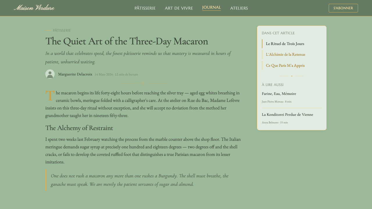
Two typefaces do all the work, and the contrast between them carries the meaning. A refined old-style serif — in the register of Garamond, with its moderate stroke contrast and humanist warmth — handles anything that needs to be read as information: names, descriptions, prices. A flowing copperplate-style script, upright or gently slanted, is reserved for the signature moment: a wordmark, a flourish beneath a heading, a monogram. The script is never used for body copy; its entire value depends on staying rare.
Ornament and Framing
Nothing sits unframed. Scalloped cartouches, oval medallions, and thin gilt hairlines enclose text and imagery the way a picture frame encloses a painting, converting an ordinary label or card into something that feels presented rather than printed. Ribbon motifs — bows, streamers, looping borders — appear at corners and section breaks, echoing the actual ribbon tied around a pastry box. The rule is generosity within order: ornament is abundant, but every flourish sits inside a clearly defined boundary rather than floating free.
Surface and Material
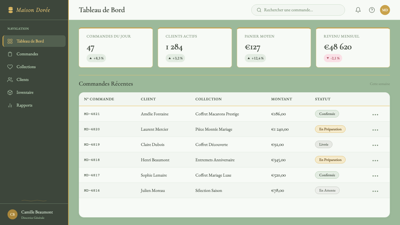
Two materials anchor the physical vocabulary: cool white marble, evoking the counters pastries are displayed on, and warm gold leaf, evoking the gilt mirror frames and shop signage of the era. Marble reads as clean, precise, almost clinical in its whiteness — the discipline beneath the decoration. Gold reads as warmth and celebration. Interfaces and layouts that borrow this style alternate between the two: a marble-white field for structure, a gold accent for anything meant to feel special or ceremonial.
Composition
Layouts favor centered, symmetrical arrangements over the asymmetric grids common to modernist styles — a single item or message sits in the middle of the frame, flanked by matching ornamental elements on either side, the way a cake is set at the center of a display window with garnishes arranged evenly around it. This symmetry is what makes the style feel ceremonial rather than casual: it borrows the visual etiquette of a formal presentation, not the efficiency of a working grid.
Texture and Finish
Every element aims for a finished, polished look rather than a raw or textural one — smooth marble rather than rough stone, glossy ribbon rather than matte fabric, a gilt line that reads as burnished metal rather than a flat yellow rule. This pursuit of finish is part of what separates the style from a generic 'pastel and gold' aesthetic: the underlying material references are consistently upscale, evoking a shop that has been polished daily for over a century.
Motion and Presentation
Where the style is translated into interactive or digital contexts, movement should feel like unwrapping rather than sliding or snapping. Reveals are gentle and deliberate — a fade paired with a slight settle, a ribbon-like line drawing itself into place — never the abrupt, mechanical transitions associated with tech interfaces. The goal is to preserve the sense of a small ceremony: something being presented to you, not something loading.
Who shaped French Pâtisserie?
Ladurée opened the original bakery on the Rue Royale in Paris in 1862 and, after a fire forced a rebuild in the 1870s, transformed it into an ornately decorated pâtisserie salon complete with ceiling paintings in the manner of grand religious frescoes. That decision — to give a pastry shop the visual seriousness of a cathedral — is the founding gesture the entire style still refers back to: the conviction that confectionery deserves theatrical, unapologetic decoration rather than modest presentation.
Souchard, who married into the Ladurée family, is credited around the turn of the twentieth century with sandwiching two macaron shells around a ganache filling — the innovation that produced the modern double-decker macaron. Her contribution matters to the visual style as much as to the recipe: the macaron's rounded, jewel-like form, displayed in rows of coordinated pastel colors, became the literal object the entire color palette and case-display aesthetic was built to showcase.
The broader cast of Belle Époque-era Parisian shop designers and decorators — working across confectioners, grand cafés, and department stores from roughly 1900 through the First World War — established the citywide habit of dressing retail as spectacle. Gilt lettering, Art Nouveau glasswork, and elaborately dressed display windows were competitive tools in this era, and pâtisserie salons borrowed the same visual ambition applied to jewelers and couturiers.
How do you use French Pâtisserie today?
French Pâtisserie is a heritage-luxury style, and applying it well means understanding what it signals: patience, craft, and an established reputation — not speed, disruption, or novelty. It is most convincing when the product or brand behind it can genuinely claim some of that same unhurried quality; used on something that is actually fast-moving or mass-market, the gap between style and substance shows quickly.
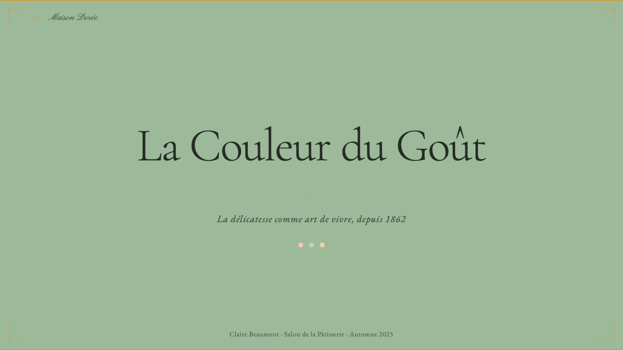
For presentation slides, the style suits cover pages built around a single centered element — a wordmark or hero image framed by a scalloped cartouche or ribbon border on a celadon or marble-white field, with the gold script reserved for the title alone. Content and data slides should keep the ornamental frame at the edges and let the pale, chalky palette carry most of the surface, with the old-style serif handling all body information; a chart or table can sit inside a simple gilt-lined box rather than a heavy decorative border, so the data stays legible while the framing still reads as considered.
For web interfaces, the style translates best to storefronts, boutique dashboards, and pricing pages for premium or artisanal products — anywhere a brand wants to feel curated rather than utilitarian. A pricing page benefits from centered, symmetrical plan cards on a marble-white ground, with the recommended tier marked by a gold hairline frame rather than a bold color block. Restraint in the interactive layer matters here: buttons and form fields should stay in the quiet serif and pastel palette, saving the script and heavy ornament for headers and confirmation moments rather than every piece of UI chrome.
For editorial and marketing work, the style is well suited to product storytelling, gift guides, and anything with a seasonal or ceremonial angle — a limited collection, a holiday menu, an anniversary campaign. A magazine-style layout can center a single product photograph inside an ornamental frame with a caption set in the old-style serif, while the script appears once, as a section title or signature line. Marketing pages benefit from generous whitespace in marble-white or celadon between ornamental blocks, so the decoration reads as considered abundance rather than visual clutter.
A common mistake is treating the script typeface as a body font because it looks elegant in isolation — at length it becomes difficult to read and undermines the entire hierarchy the style depends on. A related mistake is applying gold as a background wash rather than as line work and accents; the style's gold is precise and graphic, closer to leaf and hairline than to a golden gradient fill. Finally, skipping the framing habit — placing text or imagery directly on the celadon ground with no cartouche, ribbon, or hairline border — produces something that merely uses the color palette without the ceremony the style is actually built on.
French Pâtisserie — FAQ
Is French Pâtisserie just 'pastel colors with gold accents'?
No — the color pairing is only the surface. What makes the style cohere is the framing discipline (every element enclosed in a cartouche, ribbon, or hairline border), the deliberate two-typeface hierarchy (a quiet serif for information, a rare script for signature moments), and the symmetrical, ceremonial composition. A layout that uses pastel and gold but skips the framing and symmetry will read as generically 'girly' or seasonal rather than as this specific heritage-boutique language.
Can this style work for a modern tech or SaaS product?
It can, but only for products explicitly positioning themselves around craft, heritage, or premium taste — a boutique commerce platform, a luxury goods marketplace, a curated subscription box. Applied to a generic productivity tool or developer product, the ornamental framing and ceremonial symmetry will conflict with expectations of speed and efficiency. The safest test: if the product's own marketing already uses words like 'curated,' 'artisanal,' or 'atelier,' the style is likely a fit; if it markets on speed or scale, it likely is not.
How much ornament is too much?
The style is deliberately ornament-heavy compared to modernist or minimalist languages, but the ornament still needs hierarchy: a small number of framing motifs (one cartouche shape, one ribbon treatment, one hairline weight) reused consistently reads as considered; a different decorative flourish on every element reads as cluttered. The test is whether a viewer could describe the 'kit of parts' in a sentence or two — if the ornamental vocabulary can't be summarized that simply, it has likely tipped into visual noise.
Does the style require the celadon-green background, or can the palette shift?
Celadon is the signature ground because it is the specific color most associated with the Ladurée boutique heritage, but the underlying logic — a pale, chalky neutral paired with soft pastel accents and confident gold — can shift to other muted grounds (a warm blush, a soft cream) without breaking the style, as long as the palette stays soft and slightly desaturated rather than bright or saturated. What breaks the style is not a different base color so much as high-saturation or high-contrast color choices, which read as playful or modern rather than as heritage luxury.
Related design styles
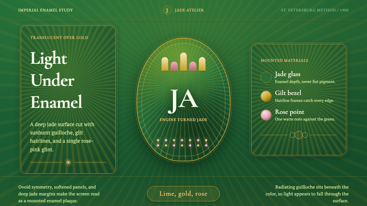 Faberge Guilloche EnamelImperial enamel glows. Jade guilloche, gilt hairlines, rose-pink points.
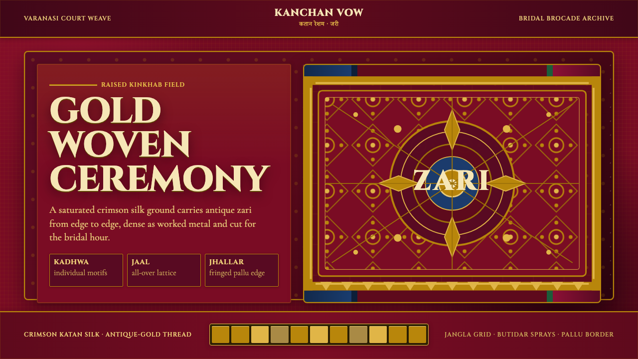 Banarasi Brocade SareeBridal maximalism, woven dense. Crimson silk grid carries raised antique-gold…
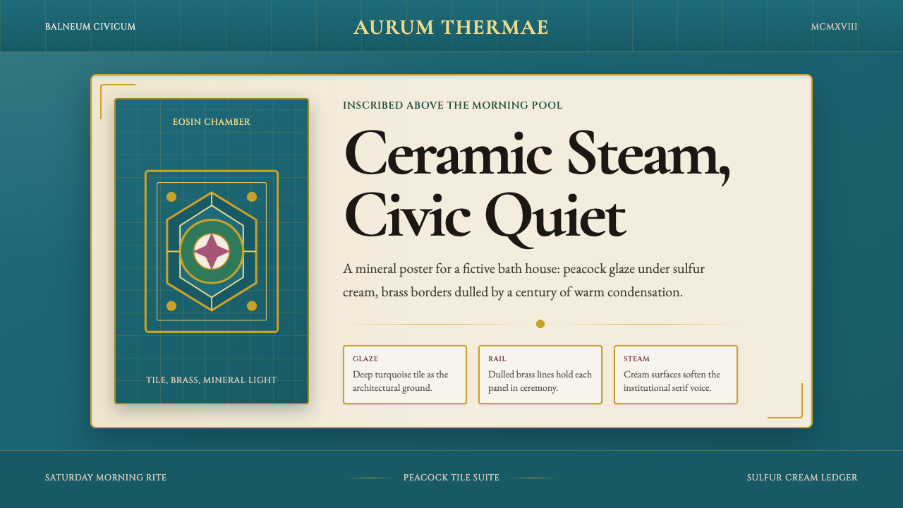 Budapest Thermal Bath Art DecoCivic steam, made ceremonial. Peacock turquoise, brass borders, and Garamond…
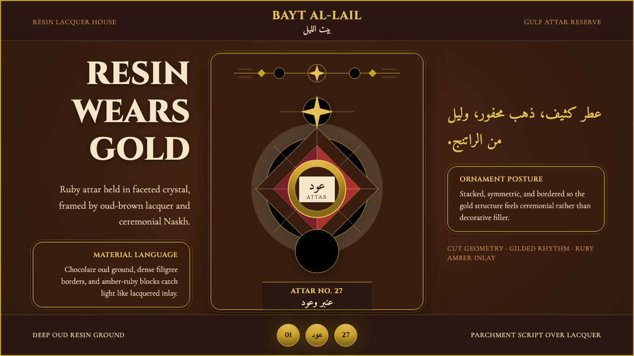 Arabian Oud Attar BottleResinous luxury, gilded. Chocolate oud lacquer frames Cinzel caps and ruby-am…
 English Afternoon TeaOrnament is the ritual. Old-rose porcelain, gilt rims, and script rest on ros…
 Paris Metro Guimard (1900)Civic sculpture, softly lit. Metro green ironwork frames amber glow and limes…