What is Banknote Guilloché?
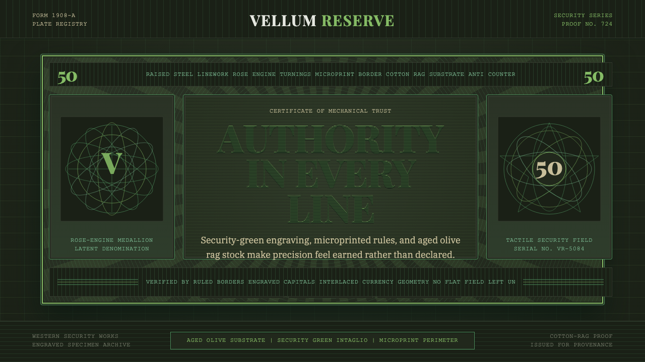
Banknote Guilloché is the aesthetic of trust made visible — raised intaglio lines, engine-turned rosettes, and portrait cartouches pressed into warm cotton-rag paper, all reading against a field aged to olive-tan rather than fresh white. It is the only design tradition whose visual sophistication was literally mandated by governments to be impossible to replicate.
Banknote Guilloché in brief
Banknote Guilloché is the visual system of early-twentieth-century security printing: engraved intaglio plates producing raised, tactile lines; guilloché rosettes and geometric lathe-work forming hypnotic interference patterns; portrait vignettes housed in ornate cartouches; and microprint text so fine it collapses to a ruling line at normal reading distance. All of it lands on cotton-rag stock that ages to a warm olive-tan, so the design is always understood in its toned, well-handled state rather than fresh from the press.
The style's overriding logic is anti-counterfeiting through complexity. Every element — the layered rosettes, the engine-turned wavy borders, the intaglio relief — is not decoration for its own sake but a deliberate barrier to reproduction. This produces an aesthetic paradox: the most ornate surface in all of print design is also the most functionally motivated. Nothing is there for beauty alone; everything is there because it is hard to fake.
Visually, the system is defined by tonal restraint against intricate line density. The ground is muted — olive, tan, aged cream — while the engraved line work reads in security green, a hue specifically chosen for its difficulty to photograph and photocopy faithfully. Portraits are rendered with engraver's hatching rather than continuous tone. Borders are built from concentric, mechanically precise wave forms that shimmer when viewed at an angle. The result is a surface that rewards close looking and resists casual reproduction.
Where does Banknote Guilloché come from?
The guilloché technique — the engine-turned lathe carving of complex overlapping wave patterns into metal or glass — predates security printing by centuries. Rose-engine lathes, capable of producing repeating elliptical and sinusoidal paths under mechanical cam control, were luxury objects of the eighteenth century, used to decorate snuffboxes, watch cases, and aristocratic presentation pieces. The specific intersection of guilloché with banknote printing emerged in the late eighteenth century as governments sought patterns that could be reproduced by their own controlled equipment but not by counterfeiters working without access to the same precision machinery.
Intaglio printing itself — in which ink is held in incised lines on a steel or copper plate and transferred to paper under enormous pressure — was the security method of choice because it produces a slightly raised printed line that can be felt with a fingertip. The feel of genuine currency was a deliberate authentication feature long before readers existed. Master plate engravers, who worked with gravers and roulettes to cut portrait vignettes and ornamental borders into steel, were among the highest-paid skilled craftsmen of the nineteenth century. Their portraits — of monarchs, statesmen, allegorical figures — were feats of cross-hatching that could take months to complete.
The golden age of the system ran roughly from the 1870s through the 1950s, when photomechanical and offset printing began displacing hand-engraved intaglio in lower-security applications. National printing bureaus — the American Bureau of Engraving and Printing, the British De La Rue company, the French Imprimerie nationale, the German Bundesdruckerei — each developed distinctive house styles while sharing the underlying vocabulary of guilloché and intaglio. These institutions trained their own engravers in formal apprenticeships, preserving techniques that had no commercial analog outside security printing.
The cotton-rag substrate was itself a security measure: paper made from cotton and linen rags rather than wood pulp has a distinctive feel, sound when bent, and aging character that wood-pulp paper cannot replicate. As it ages, the cotton-rag stock takes on warmth — yellowing toward olive and tan — while the inked lines retain their depth and the guilloché patterns remain crisp. This is why authentic period banknotes read as aged documents of great visual coherence rather than faded reproductions: the design was built to age gracefully.
What defines the Banknote Guilloché look?
Guilloché Patterning
The defining surface element is the engine-turned guilloché: mechanical lathe patterns that produce overlapping sinusoidal wave forms, creating interference fields that appear to shimmer and shift under raking light. These patterns underlie the design as a ground layer, serving simultaneously as background texture and anti-counterfeiting device. The density of the wave forms — how tightly wound, how many overlapping passes — varies across different regions of the note, creating zones of visual depth without any change in ink color.
Intaglio Relief
All critical imagery is printed in intaglio: engraved lines cut into a steel plate, filled with ink, wiped clean across the surface, then pressed against damp paper under substantial pressure so the paper physically conforms to the incised grooves and picks up a slightly raised, tactile line. Portraits, numerals, the issuing authority's name, and key text elements are all rendered in intaglio, giving them a three-dimensional presence absent from flat-printed elements. This relief is the primary authenticating feature of the entire system.
Portrait Engraving
Figurative portraiture is rendered entirely through engraver's hatching: a system of parallel and cross-hatching lines, varying in density, spacing, and curvature to describe tonal gradation without any continuous-tone or photographic process. Light areas are represented by wider spacing between fine parallel lines; shadows by closely packed, curved lines that converge and cross. The portraits have a characteristic sculptural quality — the subject appears to have been carved rather than photographed — and each engraving took a skilled craftsman months to complete at the master plate level.
Aged Ground and Color Restraint
The ground is never fresh white. The correct reading of this system is aged: olive-tan cotton-rag stock, warm and slightly yellowed, against which the engraved security-green line work is the primary chromatic event. Color in banknote design is deployed with extreme restraint — typically a single dominant line color against the aged ground, with microprint and counter-features in the same family. The result is visually complex but tonally unified, reading as a coherent object rather than a composition of competing colors.
Cartouche and Frame Architecture
Portraits and key text elements are housed in cartouches — ornate frame structures built from rococo scrollwork, architectural keystones, and engraved lathe patterns. These cartouches are not incidental decoration; they define compositional hierarchy, signal the importance of their contents, and form another layer of anti-counterfeiting complexity. The border of the note itself is typically built from a series of progressively refined guilloché bands, from wide outer bands to fine inner ruling lines, creating a receding frame effect without any change in surface level.
Microprint and Hidden Detail
Text reduced to near-invisible scale — issuing authority names, serial number formats, legal notices — is woven into the guilloché ground or printed along border features. At normal reading distance, these elements resolve to a fine ruling line and are perceived as texture rather than text. Under magnification, they resolve to legible type. This is the original information-hiding design technique, predating digital steganography by a century. The visual effect is that every area of the surface rewards closer examination.
Tactile and Temporal Authenticity
The design is inseparable from its substrate and its age. Cotton-rag paper has a stiffness, surface tooth, and acoustic quality that wood-pulp paper lacks; the intaglio relief adds a third dimension that offset printing cannot produce. Both of these properties degrade counterfeits before visual inspection begins. Equally, the design is understood as an aged object: the olive-tan toning of the stock, the slight softening of ink edges over years of handling, the patina of use — all of these are part of the aesthetic, not departures from it.

Who shaped Banknote Guilloché?
The principal authors of banknote aesthetics were not credited designers but anonymous master engravers — craftsmen who spent careers at national printing bureaus learning to cut portrait vignettes, border ornaments, and numeral cartouches into hardened steel at a level of precision unachievable by any mechanical process of the era. These craftsmen worked with the same gravers and roulettes for decades, developing personal vocabularies of hatching that made their portrait engravings distinguishable to experts. Their apprenticeships lasted years, and their techniques were closely guarded institutional secrets.
The guilloché patterns that underlie banknote design were produced by specialist operators of rose-engine lathes — precision instruments that could be set to produce repeating elliptical or sinusoidal paths under mechanical cam control. Each operator became expert in a specific range of patterns, and the institutions that owned these machines guarded them as primary security assets. The rose engine lathe had originated as a luxury instrument for aristocratic decorative arts; its adoption into security printing transformed a connoisseur's tool into a foundational technology of modern monetary trust.
The British security printing firm founded in 1821 became one of the most influential forces in establishing the international visual grammar of banknote design. De La Rue printed currency for dozens of nations and colonial territories across the nineteenth and twentieth centuries, and its house style — particularly its approach to portrait cartouches, border architecture, and guilloché pattern selection — set norms that influenced competing bureaus. The firm's historical output constitutes one of the most extensive surviving archives of engraved security printing.
Established in 1862 during the Civil War to produce a uniform national currency that would resist Confederate counterfeiting operations, the American Bureau of Engraving and Printing developed a distinctive and highly influential house style: the Federal portrait engraving tradition, characterized by densely crosshatched portraits of statesmen within oval vignettes, geometric lathe-work borders, and the specific security green ink that became synonymous with American currency. The Federal Reserve Note visual vocabulary — still in use today with modest modifications — descends directly from the engraving and guilloché standards established in the late nineteenth and early twentieth centuries.
The Dutch printing firm, established in Haarlem in 1703, became one of Europe's preeminent security printers and a significant force in establishing international banknote aesthetic standards. Enschedé's work is notable for the restrained elegance of its guilloché patterns and the compositional clarity of its border architecture — a Dutch visual sensibility applied to the security printing tradition. The firm's long history of producing Dutch guilder notes, as well as currency for numerous other nations, made it one of the primary custodians of European intaglio printing knowledge.
How do you use Banknote Guilloché today?
Banknote Guilloché is one of the most tonally unified historical styles available to contemporary designers — but it rewards disciplined application and punishes casual borrowing. The style's logic is that every surface element must justify its presence through function: either as authentication complexity, compositional hierarchy, or tonal depth. Decorative layering without that logic reads as pastiche. Before applying any guilloché or intaglio element, the designer should ask whether it is doing structural work or merely signaling effort.
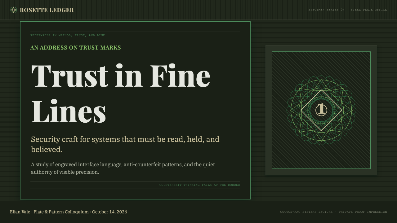
For presentation slides, the style works best when used at full commitment rather than as accent. A cover slide built on this system uses the aged olive-tan ground as background, a portrait vignette or guilloché rosette as the dominant visual element, and the principal text rendered in a strong, period-appropriate serif that recalls engraved lettering. The key mistake on cover slides is placing modern sans-serif type over guilloché patterns — the visual registers do not cohere. Content slides should use the guilloché only as a secondary border or rule element, with the primary text hierarchy reading cleanly against the toned ground. Data visualization is challenging in this style: avoid modern chart types and consider using the guilloché as a background field behind a simple numerical statement rather than building complex data graphics.
For web interfaces, the application is narrow but potent: financial platforms, legal services, archival institutions, and luxury heritage brands can deploy the guilloché vocabulary to signal exactitude, trust, and historical depth. The approach is to use guilloché as a background texture layer — at reduced opacity so it reads as depth rather than pattern — and to reserve the intaglio-green line color for key interactive elements or status indicators. Typography must lean toward serif faces that recall engraved lettering; modern geometric sans-serifs break the visual contract. Button states and pricing tables work well with the style's inherent hierarchy of border thickness.
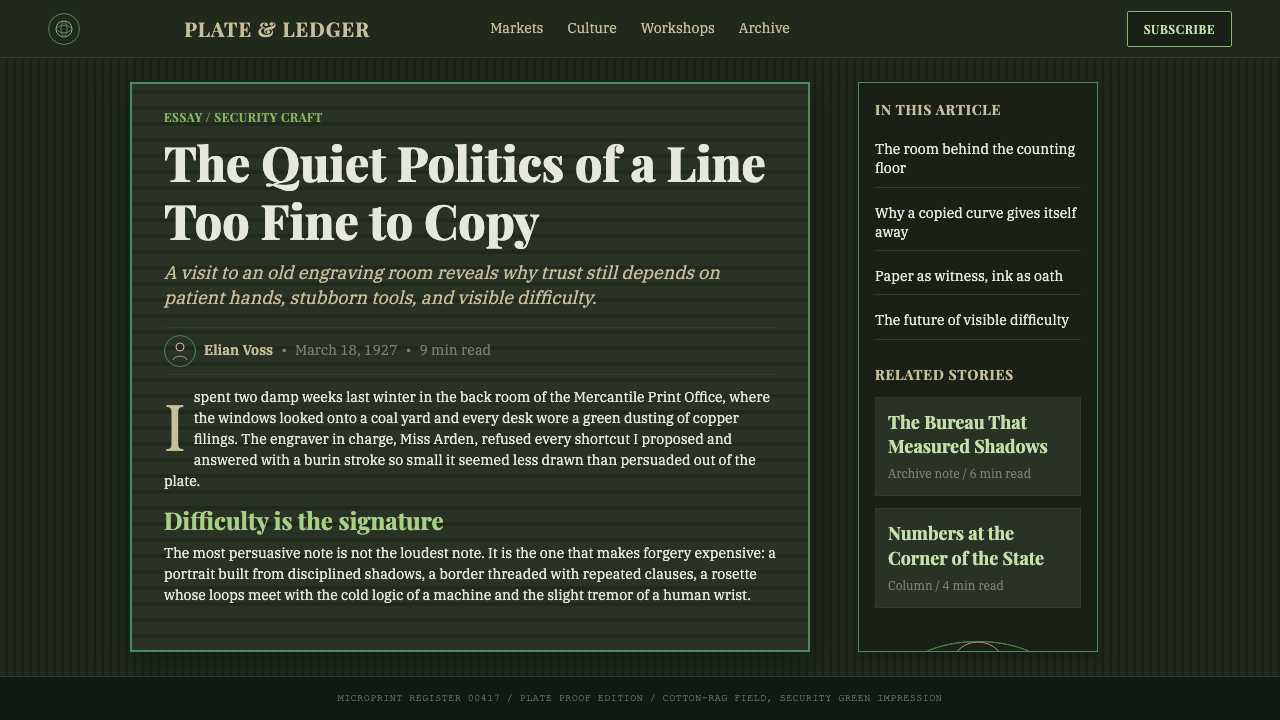
For editorial and marketing work, the style has the strongest contemporary resonance as a framing device for content that needs to signal authenticity, precision, and institutional authority. A feature article using this design system might deploy a guilloché border to frame a long-form text block, use portrait-style engraving treatment for a photographic headshot, and set pull quotes in a bold serif face that references engraved lettering traditions. The style is not well-suited to aspirational or consumer-friendly tones — it carries the weight of institutional authority and should be deployed accordingly.
The most common mistake when applying this style is treating guilloché as surface decoration rather than system logic. Designers often add a single guilloché band as a decorative flourish while using modern flat-design conventions everywhere else. The result reads as costume, not character. If guilloché is present, the entire surface should follow its logic: toned grounds, intaglio-inspired typography, cartouche-structured compositional hierarchy. A second common failure is using bright, saturated color alongside the guilloché — the palette of security printing is deliberately muted, and saturated hues destroy the aged-document authority that makes the style credible.
Banknote Guilloché — FAQ
Is this style appropriate for digital interfaces, or is it purely a print tradition?
The style is rooted in print — specifically in the physical properties of intaglio relief and cotton-rag substrate — so direct translation to digital interfaces requires careful mediation. The guilloché pattern itself renders well as a background texture at reduced opacity, and the tonal palette (olive-tan ground, security-green line work) translates faithfully to screen. What does not translate directly is the tactile relief of intaglio printing; designers working digitally compensate for this with subtle inner shadows and fine line weights that reference engraving without simulating it literally. The style works best on digital surfaces that have low ambient interactivity — long-form reading, ceremonial onboarding, archival display — and less well on surfaces that require fast scanning and frequent state change.
Why is the background described as aged olive-tan rather than white?
Genuine banknotes were never printed on white paper — the substrate was always cotton-rag stock that begins as warm cream and ages to olive-tan. The guilloché and portrait engravings were designed to be read against this toned ground, not against white. When designers apply guilloché patterns to pure white backgrounds in contemporary work, the visual register shifts decisively: it reads as ornament rather than document, as decoration rather than authentication. The aged ground is not a stylistic preference — it is the factual condition of the objects this style references, and applying it correctly is what makes the work read as authoritative rather than theatrical.
How does this style relate to Art Nouveau, which also uses complex ornamental line work?
The surface similarity — both use intricate, curvilinear line work — conceals a fundamental difference in logic. Art Nouveau ornamentation is biologically inspired: its curves mimic plant growth, its rhythms are organic and irregular, and its ornament is expressive of natural vitality. Banknote guilloché is mechanically generated: its wave forms are mathematically determined by the cam settings of the rose-engine lathe, its repetitions are exact, and its logic is one of precision rather than organic freedom. Art Nouveau is a style; guilloché is a security system that happens to be beautiful. The tonal palettes also differ sharply: Art Nouveau favors warm earth tones and floral hues, while banknote design keeps its palette deliberately muted and unified around security-printing ink families.
Can the style work without actual guilloché patterns — using only the typography and color palette?
A reduced version is possible and sometimes more appropriate than full application. A design using aged olive-tan grounds, security-green line work, and engraving-inspired serif typography — without guilloché rosettes or portrait vignettes — can still read within the tradition while being faster to produce and easier to maintain at digital scale. The risk is that without the guilloché's characteristic pattern density, the design may read as a generic aged-document aesthetic rather than specifically as banknote security printing. Adding even a simple border of mechanically generated wave lines — which modern vector software can produce — closes much of that perceptual gap without requiring specialist software or historical reference material.
What kinds of products or brands should avoid this style entirely?
Any brand or product whose primary promise is warmth, accessibility, or organic human connection should avoid this style. Banknote Guilloché communicates precision, authority, and institutional gravity — qualities that work against consumer trust in categories like food, wellness, childcare, community platforms, or anything that depends on a sense of ease and personal welcome. The style also struggles in contexts that require humor, playfulness, or cultural lightness; its severity reads as pomposity in those registers. Additionally, products addressing very recent cultural moments or rapid-iteration digital services risk looking anachronistic, since the visual system's authority derives from its age and institutional continuity — a cryptocurrency exchange or an AI startup applying the full guilloché vocabulary will likely produce an unintended irony rather than a credibility signal.
Related design styles
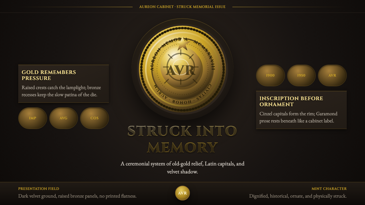 Commemorative CoinAuthority struck in metal. Old-gold relief, denticled rims, and Cinzel capita…
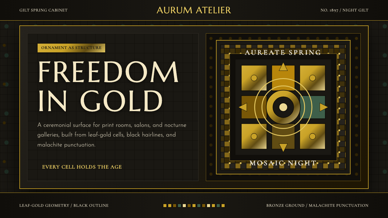 Vienna Secession 1897Ornament is structure. Leaf-gold grids and black hairlines glow on bronze nig…
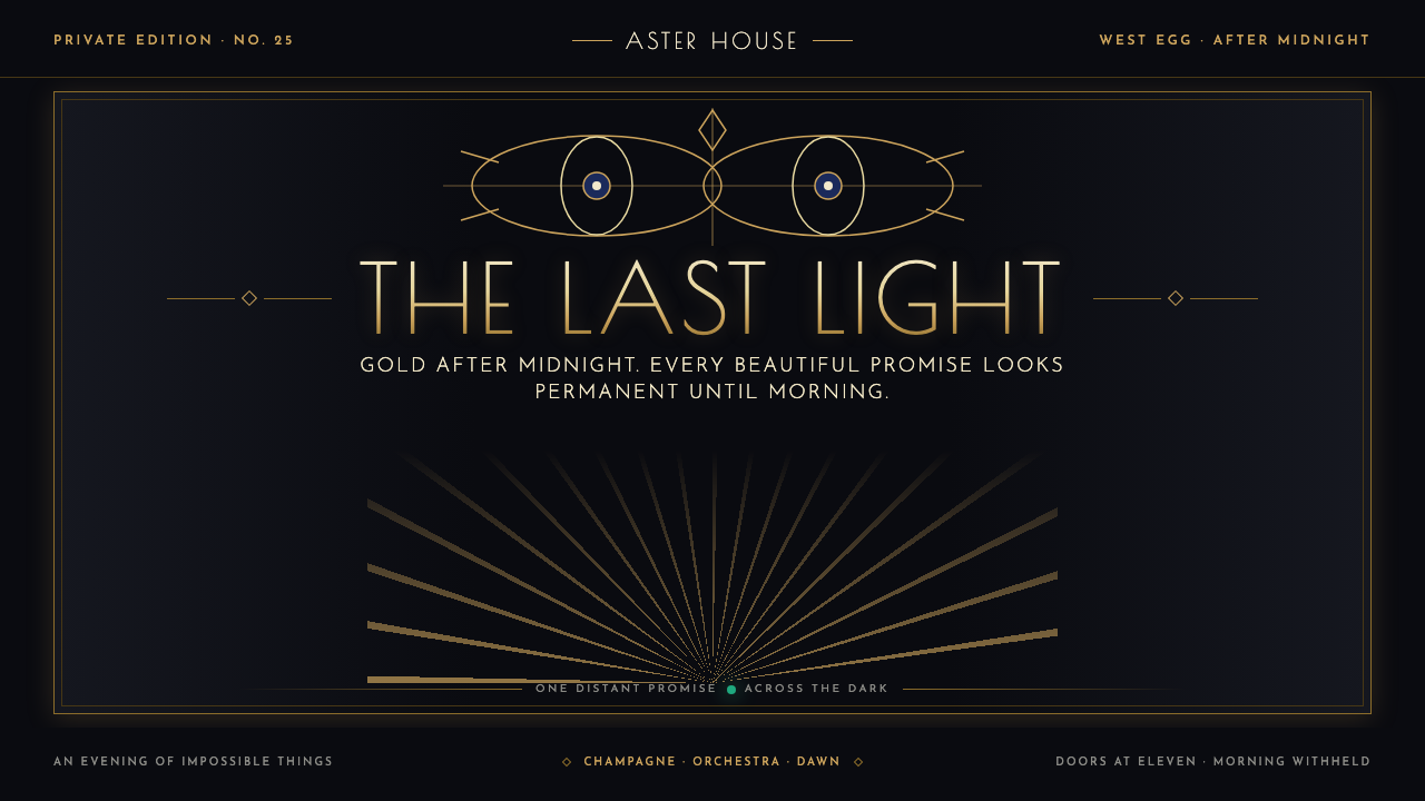 The Great Gatsby (1925)Gilded glamour courts collapse. Deco symmetry burns gold on midnight, with on…
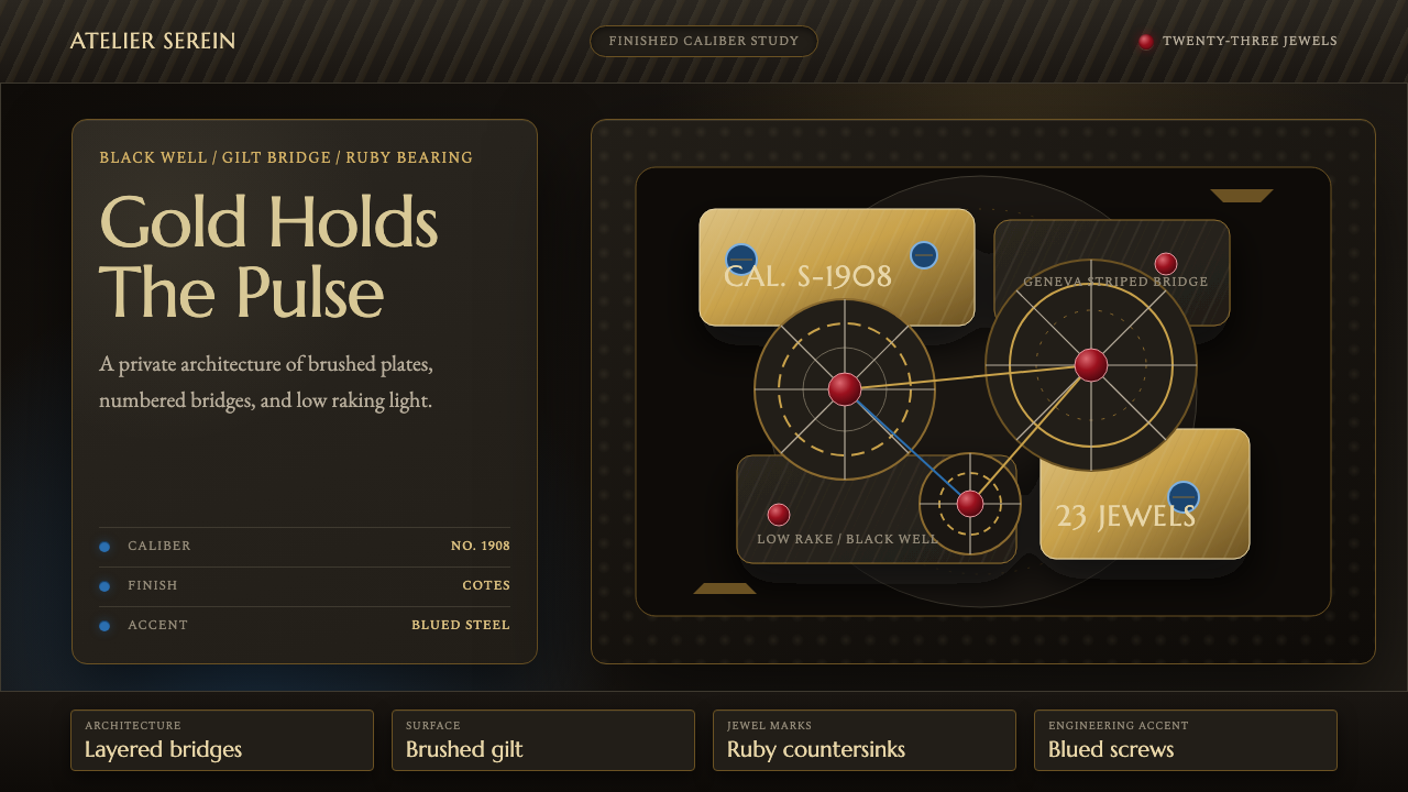 Watch MovementLuxury turns mechanical. Gilt stripes, ruby points, and blue accents glow on…
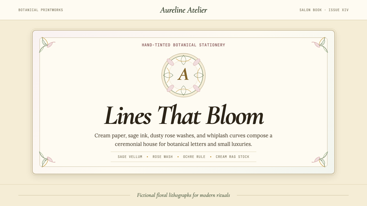 Art Nouveau (Mucha)Mucha's whiplash arabesques. Botanical halos, muted lithograph palette, no ma…
 Bohemian Cut CrystalOpulence glows in shadow. Ruby and cobalt facets sit on velvet under gilt rim…