What is Watch Movement?
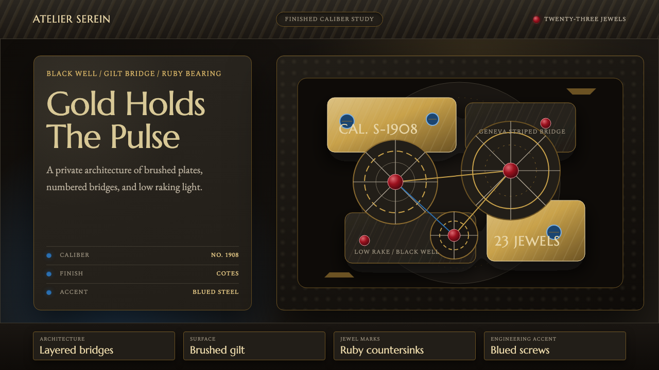
Watch Movement treats the inner workings of a fine mechanical watch as a luxury aesthetic in its own right — gilt bridges, ruby bearings, and blued steel photographed like jewelry against total darkness.
Watch Movement in brief
Watch Movement is a design language lifted directly from haute horlogerie — the small, hidden universe of gears, bridges, and jewel bearings that powers a fine mechanical wristwatch. Where most design styles borrow from architecture, print, or painting, this one borrows from an object most people never actually see: the caliber sealed behind a watch's case back, visible only through a display window or a macro photograph taken by the manufacturer itself.
The style's premise is that engineering, taken far enough, becomes ornament. A gear train has no obligation to look beautiful — it only has to mesh and turn — yet Swiss watchmakers spent a century finishing every surface anyway: bridges plated in gold, edges beveled and polished by hand, screw heads heated until they turn a specific shade of blue, wheels striped with fine parallel lines that catch the light as they rotate underneath a loupe. None of this improves timekeeping. It exists purely to reward close looking, which is precisely what makes it transferable as a visual system.
Visually, the result reads as dark, dense, and precise. Deep black or near-black grounds throw warm gold, cool ruby red, and icy blued steel into sharp relief. Circles dominate — wheels, jewels, the balance itself — arranged with a mechanical exactness that feels engineered rather than composed. It is a style built for close inspection: small details carry the meaning, and the overall mood is intimate, quiet, and expensive rather than loud or decorative.
Where does Watch Movement come from?
The aesthetic crystallizes a design tradition that runs roughly from 1900 to 1950, the period when Swiss haute horlogerie standardized the finishing techniques that define fine mechanical movements to this day. Its geography is narrow and specific: the Vallée de Joux, a remote valley in the Swiss Jura where long winters historically kept farmers indoors at workbenches perfecting tiny mechanisms, and Geneva, the trading city that gave its name to the most recognizable of all movement finishes.
Manufacturers such as Patek Philippe, Vacheron Constantin, and Jaeger-LeCoultre — all founded in the nineteenth century and still operating today — are the houses most associated with this tradition. Their workshops formalized what watchmakers now call haute horlogerie: not merely accurate timekeeping, but timekeeping finished to a standard that has no functional justification whatsoever. A movement destined to be sealed inside a case, seen by almost no one, was nonetheless decorated as if it were meant for a display cabinet.
The signature finish of the era is Côtes de Genève — Geneva stripes — a pattern of fine parallel grooves cut or brushed across a bridge or plate. Its origins are debated: some trace it to a practical need to catch dust and metal filings before they reached delicate pivots, others treat it as pure decorative convention passed down through generations of Genevan ateliers. Either way, by the early twentieth century it had become a signature of quality regardless of its original purpose, alongside practices like perlage (a stippled, overlapping-circle finish on plates) and anglage (hand-beveled, polished edges on every bridge).
Jewel bearings tell a parallel story. Rubies — originally chosen because they are extremely hard and low-friction, letting tiny steel pivots turn for years without wearing down — became, once synthetic ruby production made them affordable in bulk during the twentieth century, as much a visual signature as a mechanical necessity. A red jewel set into a gold-toned bridge reads unmistakably as fine watchmaking, a piece of engineering logic that turned into an aesthetic shorthand for luxury and precision.
What defines the Watch Movement look?
Color
The palette is built for contrast against darkness. Grounds run deep black or near-black, against which warm gold plating, a single accent of ruby red, and cool blued steel are set like jewelry in a display case. Gold is the dominant hue and carries the sense of value; ruby red is used sparingly, as a punctuation mark rather than a field color; blue appears only in small, precise touches — a screw head, a hairspring stud — never as a large surface.
Composition and Geometry
Circles govern the layout — wheels within wheels, jewels set as circular cabochons, the balance wheel itself as the compositional center. Unlike organic or hand-drawn circular motifs, these are engineered circles: concentric, precisely spaced, arranged the way gear trains actually mesh rather than the way a designer might arrange shapes for visual balance. The overall composition favors radial symmetry around a central mechanism, with bridges and plates cutting straight or gently curved lines across the circular forms.
Surface Finishing
Texture carries as much meaning as color. Fine parallel striping across a plated bridge, a stippled overlapping-circle pattern on a base plate, and hand-polished beveled edges that catch a raking light are the vocabulary of quality in this style. These textures are meant to be read at close range and under directional lighting — the surface itself changes appearance depending on the angle it is viewed from, an effect closer to a jeweler's finish than to a flat printed pattern.
Light and Shadow
Lighting is low, raking, and deliberate — the same photographic setup manufacturers use to shoot their own movements for catalogs and advertising. A single strong light source crosses the surface at a shallow angle, so that engraved lines, beveled edges, and jewel facets throw distinct highlights and shadows. There is no ambient fill; the darkness surrounding each lit element is treated as part of the composition, not empty space to be avoided.
Typography and Marks
Where lettering appears, it echoes the engraved markings found on a real caliber plate — small, precise, often serif or fine-stroke characters, sometimes accompanied by a caliber number or a jewel count, the way a manufacturer stamps its own bridges. Type is used sparingly and functions as a label or a credential rather than as a headline; it never competes with the mechanical imagery for attention.
Density and Restraint
The style is dense in information but restrained in gesture. Every element on the page has a mechanical justification — a jewel sits where a pivot needs support, a stripe pattern follows the shape of the bridge it decorates — so nothing feels arbitrary even though the overall effect is intricate. This is a crucial distinction from ornamental maximalism: complexity here is a byproduct of function pushed to an extreme, not decoration added for its own sake.
Who shaped Watch Movement?
Founded in Geneva in 1839, Patek Philippe is the house most associated with haute horlogerie finishing standards, producing movements whose bridges and plates are decorated to a level far beyond what timekeeping requires. Its historic emphasis on hand-finishing and jewel setting, maintained across generations, established much of the visual vocabulary — gold plating, Geneva stripes, hand-beveled edges — that this style draws on directly.
Founded in Geneva in 1755 and among the oldest continuously operating watch manufacturers in the world, Vacheron Constantin helped codify the Geneva finishing traditions — striping, beveling, jewel setting — into a recognized mark of quality. Its long institutional history ties this visual style directly to the specific city and craft lineage from which it takes its name.
Based in the Vallée de Joux since 1833, Jaeger-LeCoultre represents the valley side of this tradition rather than the city side — a manufacture that historically built entire movements in-house, including the jewel-setting and finishing work. Its history reflects how a remote, rural craft culture produced the same precision aesthetic as urban Geneva ateliers, arriving at nearly identical visual conventions independently.
How do you use Watch Movement today?
Watch Movement is a niche but highly effective style when the goal is to signal precision, craftsmanship, and quiet luxury rather than approachability or speed. It works best where the audience is expected to slow down and look closely — the opposite instinct from most consumer-facing design, which optimizes for a quick scan.
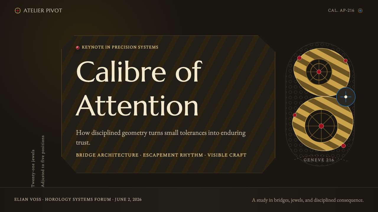
For presentation slides, the style is strongest on cover pages and any content slide meant to convey expertise, engineering rigor, or premium positioning — luxury goods pitches, technical credentials sections, investor decks for precision-manufacturing companies. A cover benefits from a single large circular motif, dimly lit and off-center, with sparse, small-scale type set to one side like an engraved credential. Content and data slides should avoid the busy, colorful chart conventions of ordinary decks; instead, treat numbers the way a caliber treats a jewel — set singly, precisely placed, with generous dark space around them rather than crowded together.
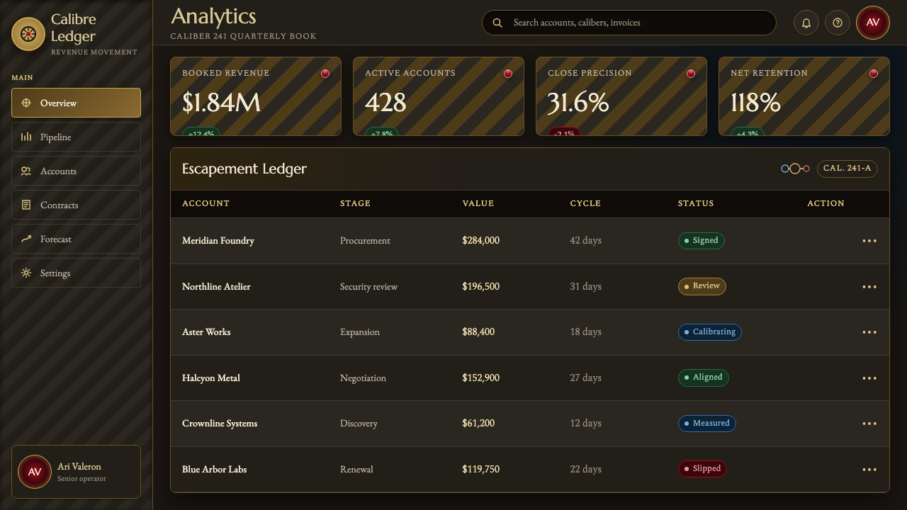
For web interfaces, the style suits dashboards and account or billing pages for premium products where the brand wants to feel engineered and exclusive rather than friendly. A dark near-black interface with gold accents for primary actions and a single ruby-red touch reserved for alerts or the most important call to action reads as considered rather than merely 'dark mode.' Pricing pages benefit from restraint: one plan tier presented with the gravity of a jeweled movement, rather than several tiers competing for attention through color and size.
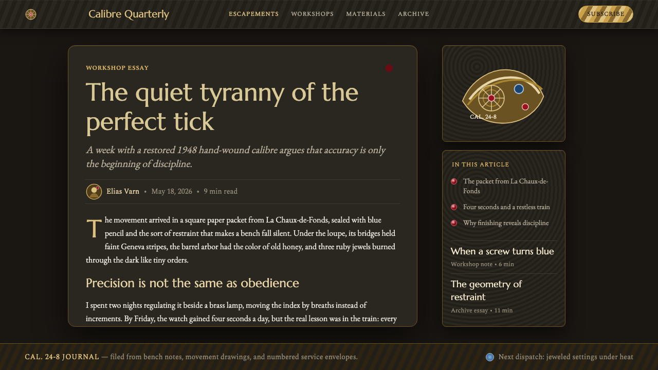
For editorial and marketing work, the style is well suited to long-form brand storytelling, heritage narratives, and any content built around craftsmanship — think of a feature article on a manufacturing process, or a marketing page for a product whose main claim is durability and hand-finishing. Full-bleed close-up photography treated with the same low, raking light described above, paired with sparse captions, communicates expense without needing to say the word 'luxury' anywhere in the copy.
A common mistake when applying this style is over-brightening it or spreading gold across too much surface area, which flattens the contrast the whole system depends on. The style's luxury reads through restraint and darkness, not through abundance of gold; a page that is mostly gold on cream loses the intimate, jewel-box quality entirely. Likewise, using more than one accent color at equal weight — ruby and blue both prominent, for instance — undercuts the sense of a single, carefully placed detail that the style relies on.
Watch Movement — FAQ
Is Watch Movement the same as a general 'luxury dark mode' aesthetic?
No. Generic dark-mode luxury styling usually just swaps a white background for black and adds a metallic accent color. Watch Movement is far more specific: it is built around engineered circular geometry, jewel-like accent placement, and surface textures (striping, beveling, stippling) that mimic actual finishing techniques from mechanical movements. The darkness is a stage for those textures and details, not the point in itself. A dark page with no circular geometry, no jewel-toned accent, and no fine surface texture is simply dark mode — not this style.
Why do circles dominate this style so completely?
Because the underlying object is built from circles by necessity, not by choice. Gears must be round to mesh continuously; jewel bearings are round because a round pivot wears evenly; the balance wheel — the timekeeping heart of a mechanical watch — is round because it oscillates back and forth around a fixed axis. The style inherits this geometry directly from mechanical function, which is what gives its circular motifs a sense of inevitability that a purely decorative circular pattern would lack.
Can this style work with a light background instead of black?
It is possible but difficult, because the style's core visual logic depends on darkness to make gold, ruby, and blued steel read as jewel-like accents rather than ordinary colors. On a light ground, gold plating loses much of its glow and blued steel can read as simply gray-blue rather than precious. If a lighter variant is attempted, it works best by keeping the circular, engraved geometry and fine surface texture intact while treating the lighter ground the way a jeweler treats a velvet display tray in a lighter shade — still built for contrast, still sparse with color, just inverted in value.
How does this style differ from general industrial or mechanical design aesthetics?
Industrial and mechanical aesthetics typically emphasize raw material and visible function — exposed bolts, unfinished metal, utilitarian roughness. Watch Movement inverts that logic: it takes a mechanism that is meant to be hidden and finishes it to a jewelry-grade standard purely for the sake of being beautiful when no one is required to see it. The mood is intimate and precious rather than rugged or utilitarian, and the finishing (gold plating, jewel setting, hand-polished edges) is the entire point, not an afterthought layered onto raw engineering.
What kinds of products or brands should avoid this style?
It struggles for anything positioned as fast, casual, playful, or mass-market — consumer apps aimed at broad accessibility, youth-oriented brands, or products where the core promise is speed and simplicity rather than craftsmanship. The style's density and low light also create real accessibility and scanability tradeoffs: it asks users to slow down and look closely, which works against products that need to be understood in a glance. It is a style for the few pages in a product where deliberate, unhurried attention is actually the desired user behavior.
Related design styles
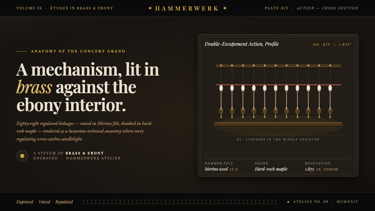 Grand Piano ActionMechanism as luxury. Brass screws and felt hammers lit out of ebony gloom, se…
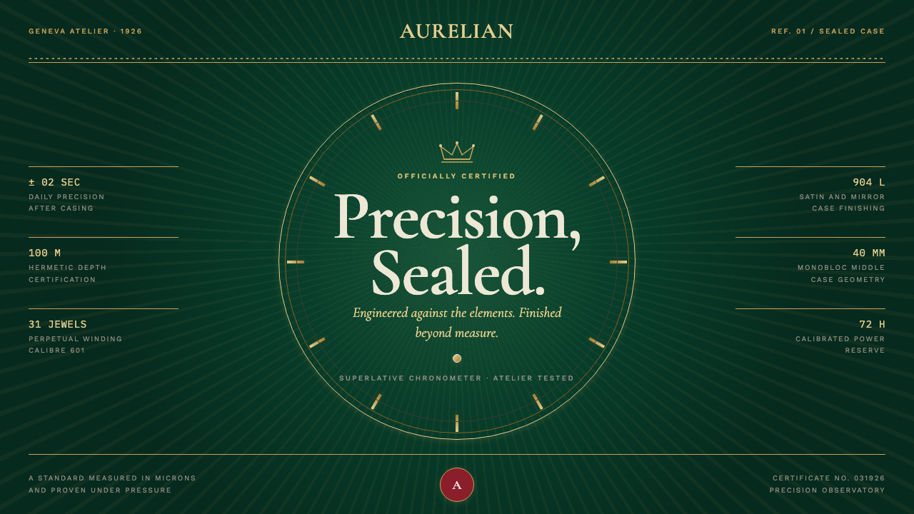 Rolex Oyster (1926)Luxury, calibrated. Champagne indices and guilloché rays lock into bottle-gre…
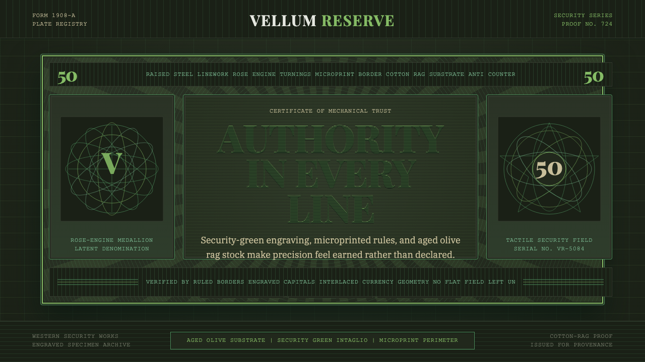 Banknote GuillochéMoney as precision. Security green guilloche frames aged olive rag stock.
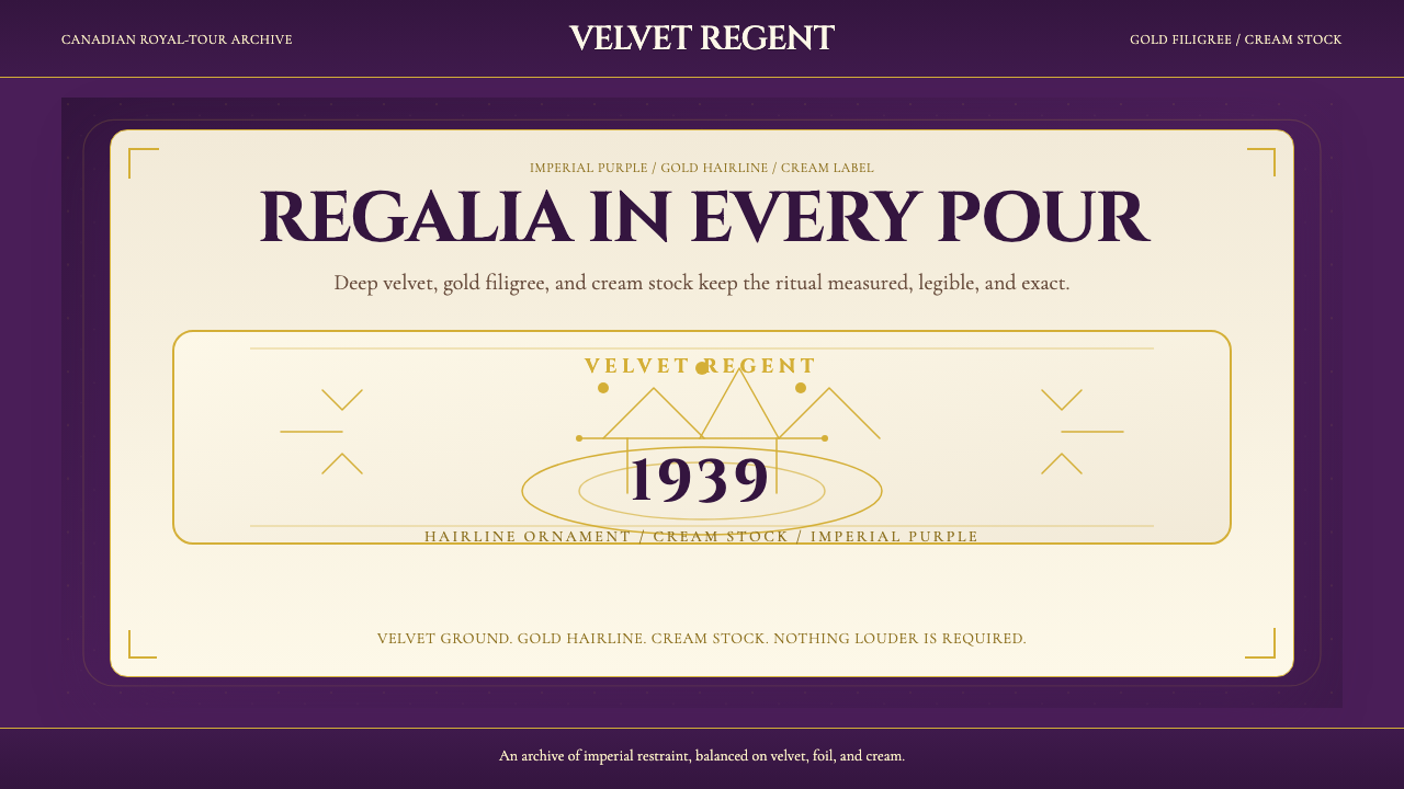 Crown Royal Purple Velvet (1939)Ceremony, not spectacle. Deep purple velvet, gold hairlines, and cream stock…
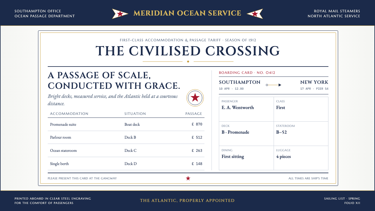 Titanic White Star Line (1912)Service made ceremonial. Navy rules, gilt capitals and a lone red star order…
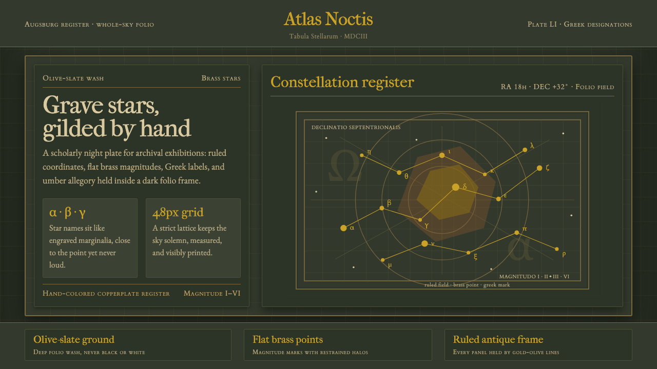 Bayer UranometriaGrave celestial folio. Olive-slate grid, brass stars, Greek labels, old-style…